#manga recolor
Text
Happy Dungeon Meshi Day! Hope you enjoy this chapter 19 coloring I made for today's episode, alternates + links under the cut ☆
If you like this, check out my other Dungeon Meshi colorings linked below, and feel free to follow me here on tumblr or on reddit @spritepepsi3
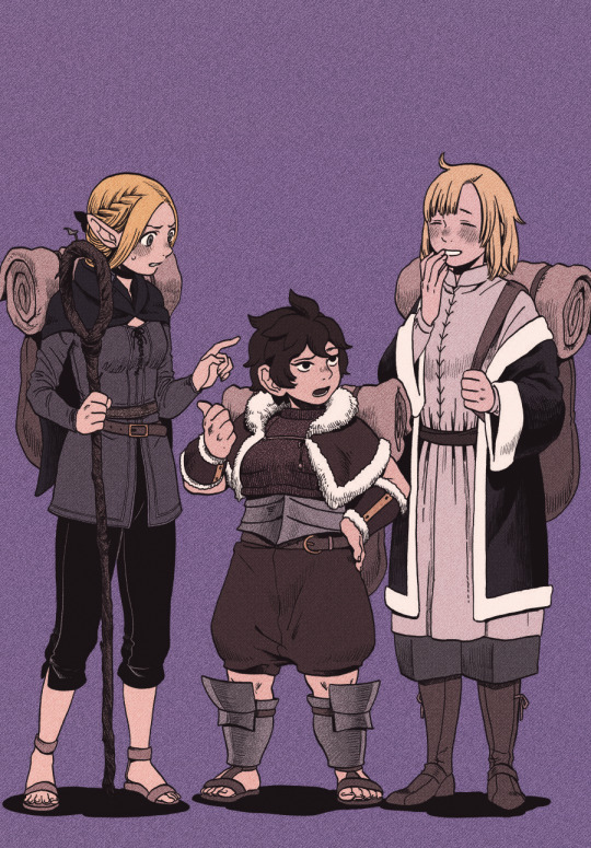
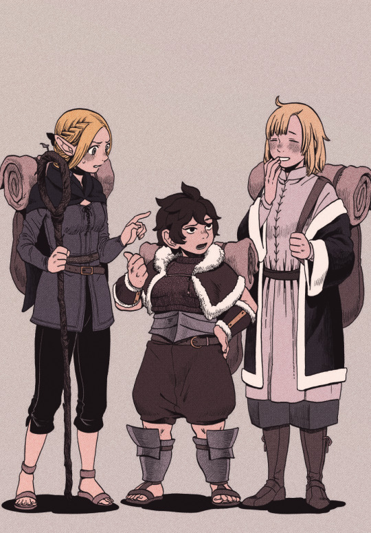
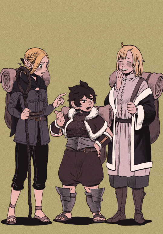
☆ Chilchuck: 1, 2, 3
☆ Marcille: 1
☆ Senshi: 1
☆ Full Party: 1
#dungeon meshi#delicious in dungeon#ryoko kui#my works#manga coloring#marcille donato#falin touden#namari#dungeon meshi marcille#dungeon meshi falin#dungeon meshi namari#art#artists on tumblr#digital coloring#ibispaint art#ibispaintx#manga recolor#dunmeshi#fantasy manga#fantasy anime
215 notes
·
View notes
Text
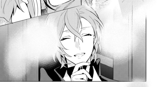
Minor manga spoiler ahead⚠️
Throwback to the time chilchuk got stung and looked like he had lipstick on for the rest of the chapter. (i recoloured the panels)
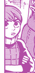
Hes definetly not beating the babygirl allegations with this one.
#dungeon meshi manga spoilers#dungeon meshi#manga#manga icons#chilchuck#chilchuk tims#chilchack#chilchuk dungeon meshi#manga recolor#tumblr sexyman#delicious in dungeon#delicious in dungeon manga
110 notes
·
View notes
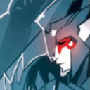
Text

#yuukoku no moriarty#yuumori#sherlock holmes#moriarty the patriot#憂国のモリアーティ#yuumori fanart#moriarty the patriot fanart#mtp#sherlock holmes mtp#sherlock moriarty the patriot#ynm#ynm sherlock#mtp sherlock#mtp fanart#ynm fanart#james bonde#james bond#james bonde mtp#my art#manga recolor#manga edit#manga pannel#manga coloring
138 notes
·
View notes
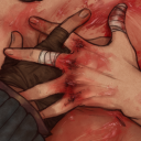
Text
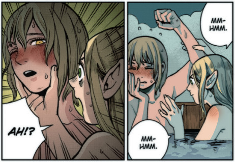
girl best friend behavior
#dungeon meshi#hey i colored in The Bath Scene. ill do the other one later too 👍#manga recolor#idk what else to tag it as. enjoy
493 notes
·
View notes
Text


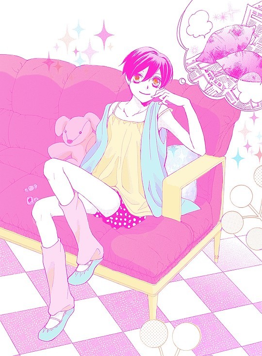
Wanted to do something with colored lines and experiment some more so have Yami again 💗
Had so much fun with this one that I stayed up for so long trying to finish it XD


Also, bonus recolors!
116 notes
·
View notes
Photo

havent colored a page in a while so yahoo
houseki no kuni chapter 87 page 6
233 notes
·
View notes
Text
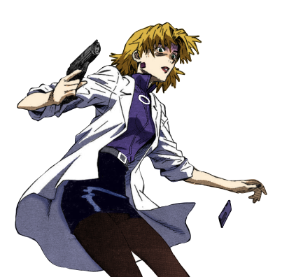
trying to get back into manga panels with my dumb doctor wife
#eva#evangelion#neon genesis evangelion#ritsuko akagi#manga#manga recolor#manga cap#manga cap color#mori colors
41 notes
·
View notes
Text

Hypmic Manga Redraw P.1 (original below)
#art#hypnosis mic#digital art#illustration#manga redraw#artists on tumblr#hypmic#rhyme anima#gentaro yumeno#digital drawing#hypmic gentaro#fling posse#yumeno gentaro#manga panel#manga art#hypnosis mic phantom#mc phantom#original art#my art#manga recolor
38 notes
·
View notes
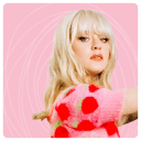
Text
Ouran High School Host Club, chapter 51
#mangacap#manga recolor#manga colorings#ouran#ohshc#ouran high school host club#haruhi fujioka#pink aesthetic#yeah idk im still trying to find out ways to make my images not blurry#when i first saw this page i knew i wanted to color it#haruhi and her sparkly yams
148 notes
·
View notes
Text

im goign crazy for him
37 notes
·
View notes
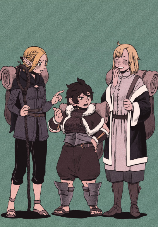
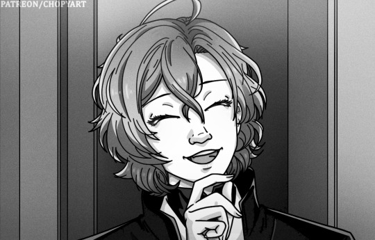
Text

Happy Dungeon Meshi Day!
Episode 12 is finally here and it was an equally suspenseful and beautiful journey. I wanted to honor Laios and Falin's reunion with one of my favorite scenes from their childhood together, which in all honesty now feels like my favorite manga coloring I've ever made.
Hope you all enjoy, and thanks to everyone who has enjoyed my works so far! Links below the cut ☆
If you like this, feel free to follow me here on tumblr or on reddit where this was first posted, along with all of my other manga colorings, or check out the links below to my previous Dungeon Meshi pages!
☆ Chilchuck : 1, 2, 3
☆ Marcille : 1, 2*
☆ Falin : 1
☆ Senshi : 1
☆ Laios : 1
☆ Full Party: 1
*= Marcille + Namari + Falin
#dungeon meshi#delicious in dungeon#my works#manga coloring#ryoko kui#laios#falin#laios touden#falin touden#dungeon meshi laios#dungeon meshi falin#dunmeshi laios#dunmeshi falin#manga recolor#digital coloring#artists on tumblr#ibispaint art#ibispaintx#dunmeshi#listening to Hozier's Unreal/Unearth while making this post and i gotta say it rly fits the post episode 12 vibes#im really happy with this coloring so i hope people will enjoy it#and i cant believe we're only halfway through the dungeon meshi anime! we stay winning!
177 notes
·
View notes
Text

Did some manga watercolors tonight!! Angel looks sooooo so pretty 🥺💜
#i think purple eyes suits him really well#akiangel#manga recolor#chainsaw man#csm#angel devil#mod ari paints
200 notes
·
View notes
Text
How I color manga panels: a tutorial
I'm no expert at doing recolors, I'm simply an artist who's occasionally too lazy to do my own lineart, and uses that of my favorite mangaka's so I can focus on other styles to simply have fun with my colors. I always try and choose panels or pages that are high quality, to avoid too much pixelization. Often I end up sourcing these from scanners or google images.
As far as programs, I use Krita (a free software). This all can be done with the standard brushes and tools that come with the software. But for some of the coloring, I have brushes from brush packs i like to use, as well as a few brushes I have customized myself. The main ones I use are from David Revoy, so if you want a recommendation for a great free brush pack, that's mine.
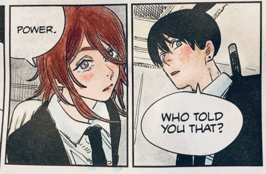
For this example I'll be using this panel from Chapter 58 of Moriarty the Patriot (I believe this would be Volume 15 of the manga) that I posted earlier here.

I'm not including the step where I crop the image, but I personally chose to remove some of the white borders that are needed for a traditional volume's page borders. Since I'm doing digital art, I don't always include them.
My next step is always to outline and fill the individual base layers. This includes the speech bubbles, each character, any independent props, the panels themselves and the backgrounds. There's no correct way to do this, but personally I use a brush to outline the object, then fill tool to well. Fill it, as well as the rectangle tool for the panels or straight lines I need to do.
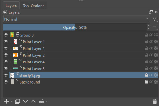
For layers, I usually put all of these color base layers in a single group that's set to multiply, and change the opacity of the base panel so that I can fill the blacked out areas with a solid color easily, here you can see I was working with the base panel at 50%, but honestly i just kind of turn it down to whatever I think looks good.
The colors I use for this step are usually brightly saturated rainbow colors so it's easy to tell the different elements apart from each other. So you end up with something that ends up looking rather horrific like this:
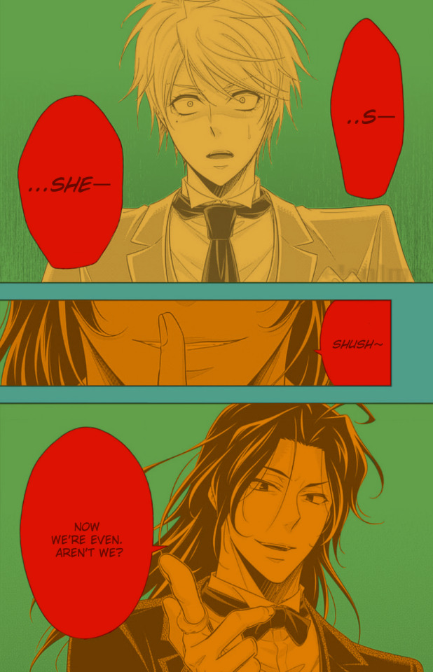
From here, I usually create a copy of the base panel to put over the top of the colors. This way I can have transparency for the colors on some of the blacked out parts, but don't loose some of the nuance of the shading entirely. Moriarty the Patriot is a very black heavy cell style, which is the style I find the "panel above, panel below" method works best on. However as I work on the colors, I tend to toggle between having it on or off.
It's about here where I start doing my coloring. Of course this will depend on your coloring style and art habits, however personally, I like to start with the characters. I use those colored layers as the base layer I can clip my coloring layers to.
I will often turn off the layers that I'm not currently using so I don't have to deal with eyestrain, and will change the base layer to something more suitable (often a grey or light tan) so my color theory doesn't get all messed up. The bright colors in previous steps are to make sure they're visually separate. Now they've been established, I don't have to worry about that.

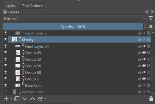
I don't usually label my layers, but for the sake of the tutorial I have to make it clearer which layer grouping is which.
I find in this step because of the multiply layer the colors can be a bit washed out, so I tend to either use much more saturated colors than I usually do, or switch to another layer style like Linear Burn of the overall color group to make the colors pop more. Ultimately though this comes down to personal preference. If your coloring style is very de-saturated, you might not have any problems with it. (I do suggest making your base color white, so the coloring of the base panel isn't off, you'll see in the screenshots above I forgot to when working on Sherlock. Ignore my mistake)
For the parts of the image where it's primarily blacked out (such as Sherlock's hair or coat) I don't bother shading at all, and only do the highlighting, as the black takes care of the darkest tones anyways.
During my coloring, I also add a separate grouping above everything for adding rendering and details above the panels. This includes things like the eye highlights (which I always do in pure #000000 white) and making certain parts of the heavily blacked out areas pop more.
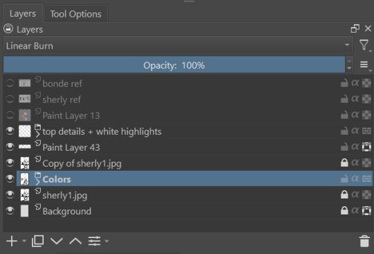
(those refs and paint layer 13 are what I'm using to color pick off of, and keep the shading colors consistent throughout the piece. There's probably a better way to do it, but I just paste them directly into the image and then delete them at the end, paint layer 43 is a color dodge layer, and so has to be outside of the layer grouping to work)
Comparison of the art without:

And with the top details and white highlights:

It's a pretty subtle difference, but I find it's the little things that truly make the piece. Especially with the strands going over the face, they need just a bit more to make them really pop. I also just really like my fancy eyes which is hard to do without the top layer.
Insert several hours of coloring here, and about another hour just trying to figure out what gradient to use for the background, and you end up with the the base colors. From here I usually mess with overlay layers as well to get the colors to all look fancy and nice together without having to do color theory (pro tip /lh).
I forgot to grab screenshots while doing the background, but for the top panel I essentially just used the [deevad 5c screentones] brush and a transparency mask to add a screentone gradient, and totally didn't google "splatter overlay" or something like that and picked something off of google, and added some borders.
Because both the base manga panel and manga panel over the top are both not at full opacity, if there is text in the page or panel (such as this one) I like to copy the just the text part of the panel and add it as full opacity in the "colors" folder to make sure it's legible and matches up the rest of the colors.
And after all that, its basically done. I'll sometimes continue to mess around with certain aspects to make sure I like how it look, but that's essentially it. This is when I add my signature, and then it's queued to post!

#krita#long post#eyestrain#art tutorial#tutorial#digital art#my art#manga recolor#manga edit#manga pannel#manga coloring#sherlock moriarty the patriot#moriarty the patriot fanart#yuukoku no moriarty#moriarty the patriot#james bonde#james bonde mtp#artists on tumblr#art resources#art help#art tips#drawing tips
60 notes
·
View notes
Text
coloured a kangel panel!! 💕

this was pretty fun as an exercise tbh, feelz like I can understand how to use brighter colours better! :3
(sorry that one bubble is blank, I wanted it in my college folder (´-﹏-`;))
#🎀gutz.art🎀#manga panels#manga recolor#nso#needy streamer overload#needy streamer overdose#run with my sick#kangel#omgkawaiiangel#nso manga
49 notes
·
View notes
Text

It’s aro spec awareness week so I did a little manga recolor of my favorite aro siblings
#jjba#jojo vento aureo#bruno bucciarati#bruno buccellati#bruno jojo#giorno giovanna#jjba giorno#aromantic spectrum awareness week#aromantic#aroace#aroace bucciarati#aromantic giorno#my shitty edits#manga recolor
19 notes
·
View notes
Text

colored this page because blorbo
#multiply my one and only#mha#my hero academia#mha fanart#bnha#boku no hero academia#bnha fanart#fyeahbnha#bakugou katsuki#manga recolor
148 notes
·
View notes
Last Seen Blogs
hextechmaturgy
big nerd hours
maisiepetersnetwork
maisiepetersnetwork
cjsdrawings
CJ’s Drawings
lockdown-lego
Lockdown Lego