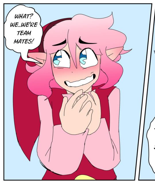
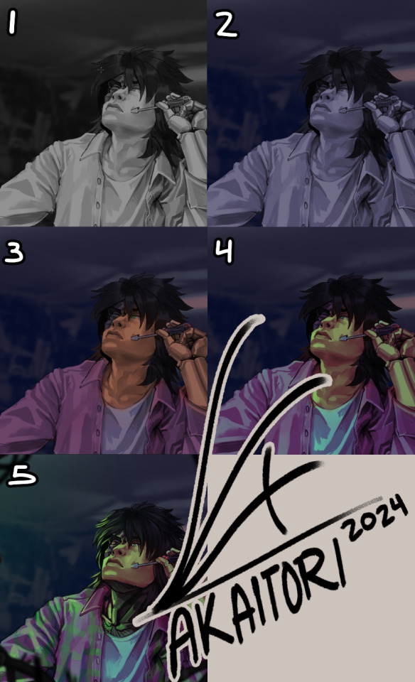
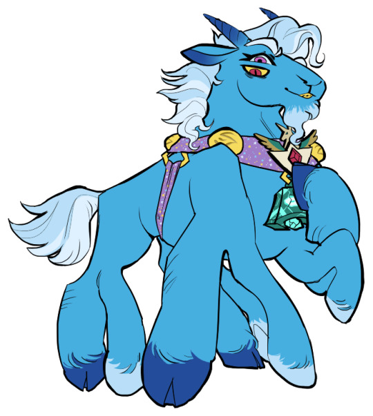
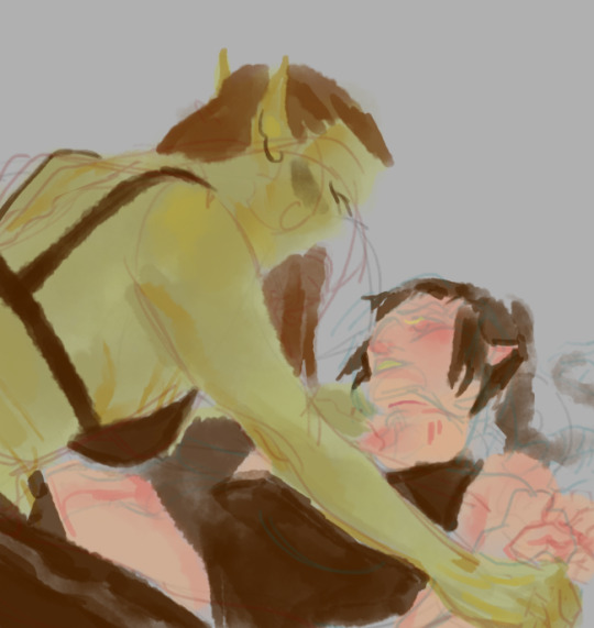
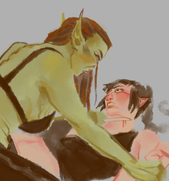
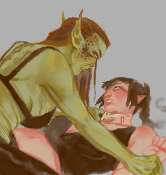
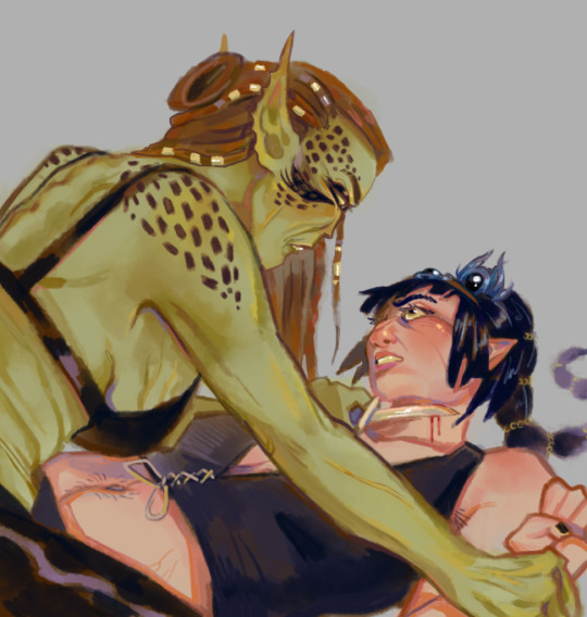
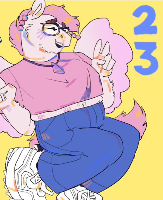
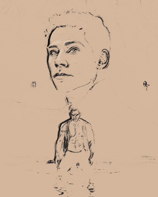
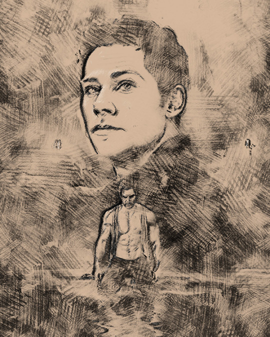
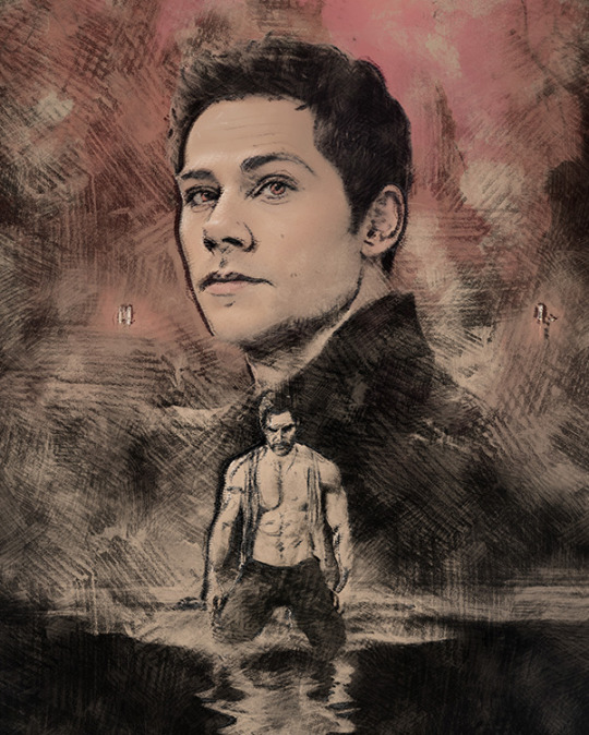
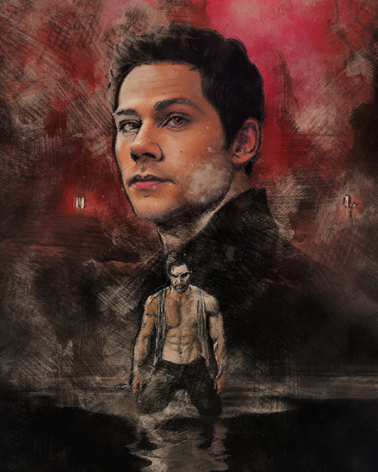
#trying to improve my shading and putting more contrast into it?
Text
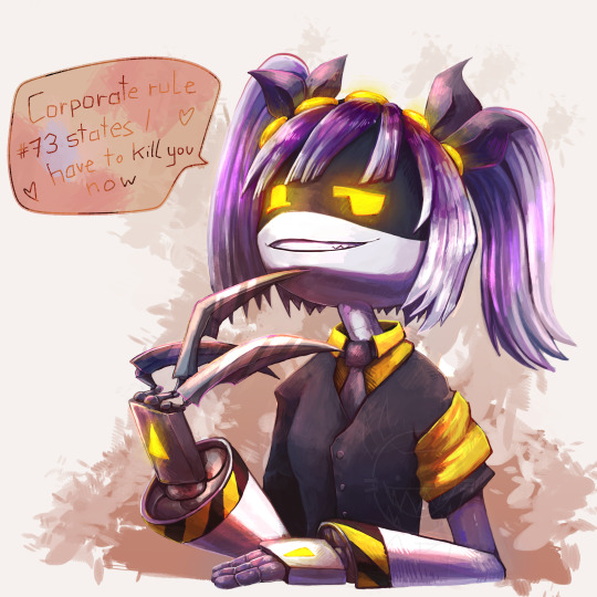
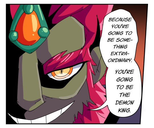
more of the corporate meanie
#spyart#murder drones fanart#glitch productions#murder drones#trying to improve my shading and putting more contrast into it?#murder drones j#digital arwork#digital art#episode 4 was J-less but I started working on this before the drop and finished it now so yay
86 notes
·
View notes
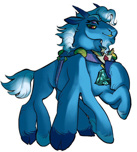
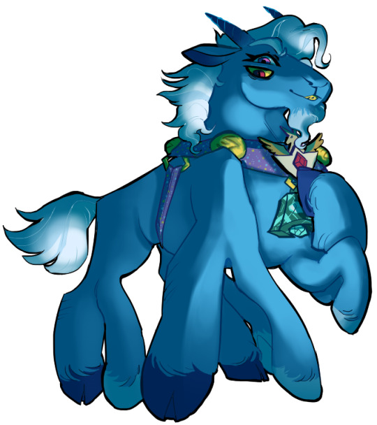
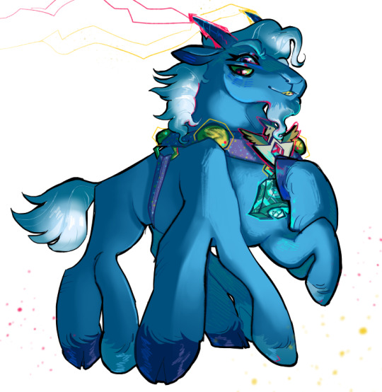
Text
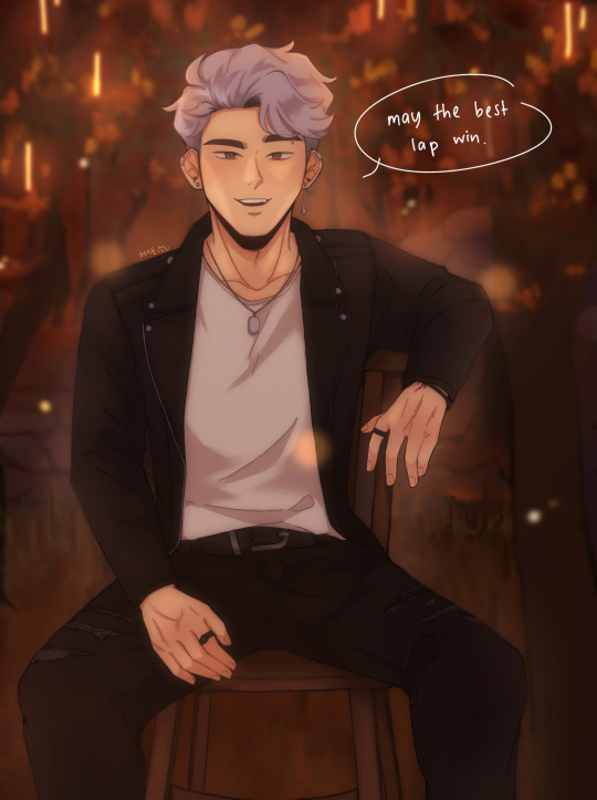
redraw of this piece!! i mentioned in that post that i would redraw it at some point and ig that time is now! (i meant to post this before id2 came out but i got really busy so y'know lol better late than never)
i like to think i've improved! still can't draw chairs though haha
side by side comparison under the cut + rambly artist commentary(?):
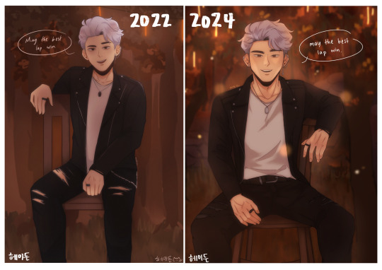
i still have a long way to go in learning proper anatomy but i think the new pose looks a lot more natural and comfortable! also ~sexier~ perhaps
i tried to make the bg look closer to the actual cg they used in the book, i am arguably better at doing backgrounds now i think! i used to not put a lot of thought into it and just blocked out random shapes and called it a day (okay, i still do that now lol but i put more care into it now !! i try to make the shapes a bit more distinct and actually plan and sketch it out rather than draw some blobs and hope for the best ldkfkhsl). also more colour range(?) to give it a bit more depth!!)
i'd also like to add that i think i'm also better at figuring out compositions now, idk how it is for y'all but when i look at the original my eyes can't help but just fall to the centre, bc there's no focal point(?) or anything that's visually interesting for the eyes to land on. plus with the way it's structured, my eyes just naturally fall to center (+ bottom half bc the skin showing through the rips are bright in contrast to the black) >_> in contrast, in the redraw your eyes are automatically drawn to the face bc it's arguably the most interesting thing on the canvas and thus acts as the visual anchor of sorts (plus there is enough contrast with the background to make cas stand out instead of blend in)
even though i cringe looking at the og i can't help but to also feel endeared bc this was one of the first immortal desires fanart i ever did and also one the first of my posts to do really well! i never expected to get that much attention since i was only posting casually but it really warmed my heart reading all the lovely comments and motivated to draw more :D
it's also really fun seeing how much my art style and techniques have evolved! i don't think i use any of the same brushes i used to use for my old pieces anymore now haha. i also watched the timelapse for the old one and am honestly kind of in awe at how my different my drawing process used to be!!
i still have a lot to learn (esp in terms of anatomy, lighting, shading etc.) but i'm happy with where i am rn! the great thing about being a hobbyist is that there isn't really any pressure for me to improve quickly so i can just take my time haha (except maybe from imposter syndrome but that's neither here nor there)
i think i could've drawn his face and expression a bit better but i think this is a satisfying enough redraw for now!
btw, these are just my thoughts! i am not an art student so the things i said might not be technically correct but this is how i make sense of things in my brain
#once again i didn't draw gabe and jade but i did that on purpose this time lol#love them but cas is the focus of this piece so i want him to shine!!#fun fact i was at my late grandma's place when i drew the original; and she had these big ass dining chairs right#i took photos of me sitting on one of those chairs for reference so the chair in the og drawing ended up being big too lmao#anw i haven't read book 2 yet so no spoilers pls !!!!!#i will read it tonight#i bought the 24hr vip pack just for this lol#playchoices#choices id#choices immortal desires#immortal desires#choices fanart#fanart#cas harlow#my art#hydn.jpg#forgive me if this is extra rambly it's midnight and the adhd is adhding
72 notes
·
View notes
Note
I LOVE YOUR RED DESIGN SO MUCH
He is SO OOOUUUUUUUUUHHHHGGGGG
all your designs for the fsr cast are so so so tasty i love them all ooouwwwaahhhwhwhhwhwhwaahaewawawaaa
Thanks! XD
There's no competition, I love the new one SO MUCH.
Trying to make them all look different while still having that Link flare is a challenge but fun.
His pink hair is such an improvement over the bright red that blended WAAAY to much into his hat.
Trying to draw his eyes more similar to how Akira does as well.
I made him slightly paler and Blue slightly less pale to give them some skin variation.
Red's hair and skin were blending too much imo before I made him paler. Working with various shades of red and pinks is so hard agh.
Gave him a more cherry red tunic too + a red for his belt and hat rim.

I'm taking this as an opportunity to talk about things I love about drawing/designing them.
Blue's super long side burns are a favorite design choice tho. XDDDD
Blue also has a more unique nose shape being inspired by the noses in Soul Eater.
Him having no tights I think shows his wreck-less nature. XD
Thicc eyebrows are visually tasty and don't let anyone say otherwise-

Vio's face + hair is a favorite of mine. He has such a draw-able face.
Him wearing twilight princess Link's outfit is very fitting for him I think.
Him always having his sword visible is annoying to draw but also shows he perpetually has it there is kinda off-putting.

It's also SUCH a stark contrast when in the head space he has no armor and is in way less clothes. I wouldn't call them "revealing" because they're not, but they are compared to his 100% head to toe covered look in the real world. No armor, no long sleeve shirt no long tights. Just a baggy t shirt and shorts lol.
His tunic having a chainmail layer underneath is fun, Vio is the most armored up Link out of the four atm with his arm guards PLUS chainmail.
Vaati is literally color-picked from minish cap and his design is taken right from that too, but playing around with him reverting back to Wind demon mode is super fun art wise.
His colored Akira art is so desaturated agh. XD
I'd love to give Vaati a new outfit at some point tho.
Dark's blank slate design is a favorite of mine. He's so dang cute but I'm very excited to draw him in new things when he gets a new outfit. I think atm tho it draws attention to his creepy chest eyeball, changing hair and his expressions more since his outfit IS so bland.

I just love Link. He is so precious to me. Trying to work in all the colors from the four of them was a challenge but also really satisfying in the final design I think.
I just love how Green is tiered and his hair is similar to Link's but with a cap on. Also he makes me like the color green I typically don't like working with green. XDDDD
His hair is a MESS and inspired by Oracle of ages manga Link's hair. Specifically how it tilts down instead of sticking upward like in FS.
Him wearing Ocarina of Time Link's outfit is fun but I think it works better on Shadow. XDDDD

I'm really happy people liked Gannondorf because I struggled hah. My art style is more simple than Akira's but I'm glad I could capture the essence of Gannondorf. UwU
Like, he was mostly inspired by Twilight Princess Gannon with Wind Waker and Ocarina Gannon flare.

Ngl I love how OOT Link's outfit looks on Shadow Link. He looks so edgy.
The hot topic boots and different toned brown for his chest belt and actual belt are just the cherry on top. XD
I try to keep his hair in line with how it's drawn in FS because it gives him a unique silhouette when he's a shadow.
Though I'd love to design him more Gannondorf inspired attire like his desert cloak.
His TP manga Midna inspired look was mostly due to me wanting to find a way to show his expressions while ALSO showing he is an entirely black shadow.
Anyways yeah, FSR is very fun to work on visually XD
#four swords returns#four swords manga#four swords adventures#four swords#four swords returns au#loz fsr au#loz
57 notes
·
View notes
Text
DP AU - PT AU - The Bat
The Bat had noticed that Masters' criminal activity had been on a severe decline recently.
As such, in order to try & assess the possible reasons as to why that was, Bruce had sent an invitation to the secret criminal CEO. Luckily, he'd accepted.
---
He'd invited Jason's new girlfriend to the gala under the guise of spreading awareness of the young woman's new & promising reformation program that had been showing oddly encouraging signs.
So far, Harley & Poison Ivy had both been showing great improvements socially.
Bruce was hesitant, yet strangely hopeful as he knew that Jason wouldn't get involved with someone he didn't know for sure was legitimate.
Interesting thing, she'd requested an invitation for her sister who was apparently a doctor looking to become part of the project to create a cure for Huntington's Chorea which Bruce was funding in hopes of helping Mrs. Fries recover.
Of course, Bruce was more than happy to extend one for her.
---
Bruce was rather bored with Masters' entitled, smug, self-aggrandizing form of speech.
When, suddenly, his guest glanced up & went strangely quiet, having seemingly found something interesting behind him. Far more interesting than Bruce or himself anyway. The VladCo. CEO's eyes seemed to light up, a genuinely pleased smile curling his lips.
Looking back over his shoulder, Bruce spotted a very beautiful young woman with midnight black hair, sapphire eyes, & nearly-flawless porcelain skin approaching them with a bright smile. If not for the plethora of scars crisscrossing over her skin, it would be flawless.
Her hair was in a halfup do that was pulled into a braided crown that circled her head before flowing down her back in waves. If he looked behind her, he'd see that it was kept in place by a big, silver, celtic knot, moon hair pin in the back with little silver star pins for accents.
Though, what really caught Bruce's attention were the defined muscles she exhibited. She had a hard, chiseled musculature & stark, obvious scars of varying shades all over that caused many to glance at her snobbishly. It was obvious that she was a fighter. Possibly a soldier of some sort.
Yet, despite this, her figure was phenomenal. She somehow managed to retain an hourglass shape with D-cup breasts, not too slim waist, & 44" hips. Not many women could manage that.
In stark contrast, she wore a lovely, yet modest sapphire blue evening gown. It was sleeveless & bodiced with a high-low, floor-length skirt & a ruffled, off-the-shoulder, boat-neck. Her soul mark prominently on display in the center of her chest. Rolling crimson waves beneath a starry sky with a silvery, full moon at its peak. This meant that she was either searching for her other half, or she'd already found him.
Neither her makeup nor her jewelry was anything too extravagant or expensive, just pretty & sophisticated.
Her lips were stained a nice burnt peach, eyeshadow a brown gradient with light sparkle, a very light dusting of delicate blush, mascara & eyeliner formed to shape a cute cat's eye lash, & her manicured nails were painted blue with silver tips.
Her jewelry consisted of a simple silver crescent pendant with a pearl on a thin, silver chain with matching ten-point star earrings. Finally, her feet were held in a pair of silver, strappy wedges. A little odd for formal wear, but nothing too terrible.
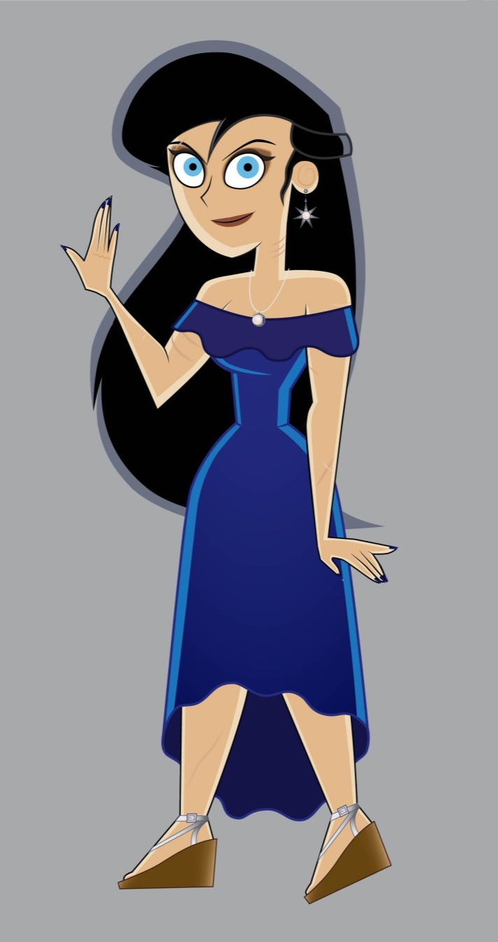
Altogether, she was quite lovely & sophisticated.
Preparing to put on his playboy routine, Bruce was slightly shocked when the woman completely ignored him in favor of Masters, who seemed entirely too pleased with this fact by the smug, self-satisfied smirk that briefly passed his lips.
The other businessman's eyes hooded as he smiled fondly at the young woman. He reached up to delicately brush a loose hair out of her face & behide her ear, his fingers lightly grazing her cheek as he did so.
Vlad: "You look absolutely stunning, my dear."
She just smiled warmly, pressing her cheek into his palm, causing the man's smile to widen, lighting up his eyes as his cheeks dusted ever so slightly rosy.
The pair then chatted amiably for a moment, completely forgetting Bruce's presence, in such a way that he quickly figured out that they knew each other very well.
The Bat noticed something had changed in Vlad. Where before he was guarded & held a cold, calculating look in his eye, now the tension had seemed to all-but disappear, still obviously alert, but shoulders & jaw now relaxed, his eyes bright with interest & pupils slightly dilated. His lips were curved upward in a tiny, pleasant smile that belied deep fondness, his head was tilted towards the woman & his upper body leaning slightly forward, all to indicate that he was giving the young lady his full attention. It all suggested that he found the woman deeply attractive.
The woman then finally seemed to notice the Wayne & turned to address him apologetically.
Woman: "My appologies, but I seem to have forgotten myself."
She held out her hand to Bruce as if for a handshake.
Woman: "My name is Diana Selena Fenton, but please call me Dina. Nice to make your acquaintance."
Bruce blinked, realizing that this was Jasmine Fenton's sister & wondered how a medical student could have such a physique, then took her hand with a winning smile & kissed her knuckle, which seemed to cause Masters' eyes to narrow & his lips to pull into a sneer.
Bruce: "Charmed. I'm Bruce Wayne."
Dina: "Oh, I know. I've heard quite a lot about you & your so-called 'band of misfit children.' Isn't that right, Vlad?"
There wasn't even a hint of malice, her tone was light & playful, even teasing.
The silver-haired man's previous grimace melted off his face & was replaced with a playful smirk of his own.
Vlad: "I suppose that I have been rather talkative about the Waynes lately."
Bruce: "I believe that you're also attempting to become part of one of the projects I'm funding."
Dina: "That's right, the Huntington's Chorea."
Vlad: "You'd be lucky to have her on your team. She's highly talented & top of her class. Diana's actually working on ideas to cure the Titan formula."
For just a moment, Bruce was shocked & highly, HIGHLY sceptical. If he weren't him, the man wouldn't have been able to help the suspicious look that nearly graced his face. After all, he'd been trying to fix Mr. Freeze for years. How could some greenhorn do what he'd failed to repeatedly.
The Fenton girl was put out, lightly smacking the man beside her in admonishment.
Dina: "Vlad! That was supposed to remain a secret until I was sure it'd work!"
Vlad: "My apologies, душа моя. (Pronounced 'dooSHAH maYA,' means 'my soul.') I'm just so very proud of you. I didn't mean to ruin the surprise."
Bruce's eyes widened in realization at the endearment. It was only ever appropriate to call anyone something like that specifically if they were their soulmate. So, this definitely had the implication.
---
Dina: "I theorize that part of the reason behind the Joker's inability to recover might, first, be that he simply doesn't want to, to begin with. You can't really fix anyone other than yourself, only help to facilitate the changes that they wish to make to themselves."
Dina: "However, there is also the possibility, however slight, that it might also be chemical in nature. Not in so much that he's taking drugs, as his chemical makeup has been compromised in a way that might make him incapable of regulating his own dark impulses. Imagine it as if his id is always in full control, as if he has no Dr. Jekyll & is instead Mr. Hyde at all times. In such a situation, even if he wanted to change & become better, he might not be capable of it."
The more he listened, the more uneasy he felt. He'd never thought that the Joker might have a severe chemical imbalance.
Bruce: 'And if he is chemically compromised, it'd be a fool's errand to even try to give him psychological help because his brain chemistry might be so imbalanced that his mind wouldn't even generate the proper responses & would simply propel him deeper into madness.'
Bruce: "Provided this were true, would you have any idea what chemicals could've caused such a thing to begin with?"
Dina: "No idea. I'd need to see his medical information. Get a clear analysis of his brain. It'd be several years, possibly decades, mind. I'm still learning as far as neuroscience goes. Jazz is better with it & I'm trying to catch up. Please, keep in mind that this is just a theory. I don't wish to get your hopes up."
They all started chatting pleasantly &, shockingly, Vlad laughed happily & genuinely at Dina's jokes, made pleasant conversation & paid her many compliments. Not even once making a single snide remark or some sort of backhanded insult or self-compliment.
Vlad Masters was obviously very attracted to the young miss Fenton & it seemed that the feeling was mutual.
---
Dina glanced at Mr. Wayne, noticing the slightly faraway look in his eye as Vlad continued to chatter incessantly about his recent accomplishments.
Deciding to give the man a break, Dina gently grabbed Vlad's arm nearest to her with both hands to get his attention & looked up at him with an askance expression.
Dina: "I thought you said you'd share a dance with me, Big Guy?"
Vlad blinked down at her, a smile slowly forming on his face & a thrill glint in his eye.
Vlad: "Yes, of course. You're quite right, лунечка моя. I did say that, didn't I?" (Pronounced 'lunescha maYA'; translates to 'my little moon')
He used his free hand to lightly touch hers before turning to Bruce to excuse himself.
Vlad: "I'm afraid that I'll have to cut this short. It seems that I have quite the important prior arrangement to attend to."
Bruce: "No problems. I don't blame you for choosing such a lovely lady over me. Go have fun."
He watched the 2 leave, furrowing his brow when the woman turned to look over her shoulder at him & flash him a thumbs up & a smile.
The Dark Knight realised then that she must've noticed his disinterest & saved him some time & sanity.
He narrowed his eyes, reaching up to adjust his tie before whispering into his earpiece.
Bruce: "I believe I just learned what's been keeping Masters' attention."
Phantom Twins AU Masterlist
#danny phantom#dp#phantom twins au#dc#dp x dc#batman#bruce wayne#vlad masters#diana 'dina' fenton#endangered species#mentioned anger management#aikoiya art#my art
109 notes
·
View notes
Note
I love your art so much! Do you have any of your brushes for sale, or any tutorials, especially on colour?
Hi!! Thank you so much! 💕
Honestly, my go-to brushes are all procreate brushes with slight adjustments (like stabilization, etc.) my personal preference is brushes that kind of mimic graphite pencils. The best thing you can do is find a brush that suits you & get very comfortable using it! Specific brushes won’t necessarily improve your work, it’s all about practice! (But yes, a nice brush does help!)
I do have a video on my favourite brushes:
I’ve never really made any tutorials, but I’m happy to try and relay what I know and what I’ve learned so far!
Colours are a big part of illustration! I could probably ramble on for hours, honestly—in any case, it’s always helpful to know fundamentals of colour theory. Once you learn and apply it, it becomes intuitive! I’m gonna stick to RGB colours because CMYK is it’s own thing (printing!)
There’s a handful of basic terms like hue (pure colours), shade (adding black to a colour), tint (adding white to a colour), tone (adding gray to a colour) and also opacity (transparency) that help us understand and define the complexity of colours.

My colour choices are more often than not a gut feeling—but that does come from practice! There’s loads of colour palettes available online like this one, but if you wanna come up with your own, there’s some neat ways to do that using a colour wheel! Colours can broken down into primary, secondary and tertiary colours. We can also categorize them as warm or cold. With this we can make colour schemes!
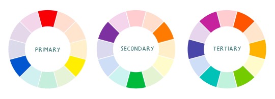
Some basic schemes!
Complimentary: two colours, opposites on the colour wheel
Analogous: three colours side-by-side
Triadic: three colours that form a triangle, evenly spaced
Monochromatic: using one colour (using different shades)
(Bonus) Monochromatic with accent colour : using one colour as a foundation and having an accent colour (similar to analogous, but one colour is used for a majority of the piece while the accent colour is used sparingly)

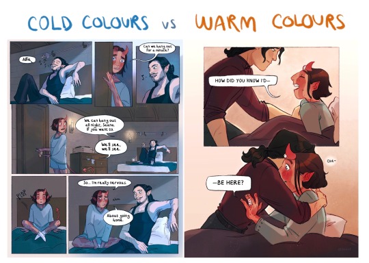
It’s also important to keep in mind that values (a colour’s range from dark to light) will look different on different colours. Sometimes, you’ll put two colours together and think “huh, something about this feels off” and it turns out, the colours just happen to be very close in value and melt together. Switching your piece to grayscale just to check on your values every so often can help with contrast and muddiness! A light tone on a darker tone will look brighter than it really is. Colours can also influence each other and trick your eyes.

Environment is also a big part of choosing your colours for a piece. Determining what the setting is important! A sunset will make a drawing warmer, while a scene set in the night will usually have colder tones. Using only local colours (true colours, like green grass or blue sky) vs non-local colours (atmospheric perspective, accent colors that give depth, etc) can help enhance your drawing too. Don't be afraid of artistic interpretation!
Also, there’s always the option to use gradient maps (at least on procreate & photoshop but I’m sure it’s available in csp and other programs) where you draw in grayscale & apply a gradient map. The gradient map basically applies a color to every value (e.g all the shadows become blue and the highlights become orange) it can look really nice (and help out if colours just aren’t working that day yk)

Another thing, when I’m drawing (and this is specific to me!) I tend to start with pretty desaturated colours. Once my illustration is done, I’ll duplicate & merge my layers to do colour edits. Most programs give you the option to play with curves or colour balance—menus that allow you to play around with the hue of the shadows, midtones and highlights. I tend to make my shadows more cyan-blue, my midtones a little warmer and my highlights warmer as well. Of course, this depends on the mood of the piece, whether it’s warm or cold, lighter or darker, etc!
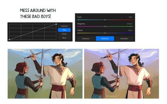
You can always make adjustment layers on top of your work; a low opacity yellow, magenta or blue (or anything your heart desires) overlay to tie all the colours together.
I hope this helps a bit!! Happy to answer more questions to the best of my knowledge :^)
99 notes
·
View notes
Text
Attack Dog - Rendering Breakdown
OK here's an attempt at explaining how I go with illustrations. This isn't necessarily an 'effective' way to paint, but rather it's a process to maximize my personal enjoyment. I encourage you to do the same! Find those steps you have the most fun with, and exploit the hell out of them.
For this post, I'll be going step-by-step for this illustration
1- Sketching
A Mess. I don't like making lineart unless I'm super in the mood for it. In this case, I couldn't be bothered to spend a lot of time in the sketch. I often use 3D models as a base for paintings because, if I'm making a painting I only want to paint, not to stress out on anatomy.
2- Blocking values
I only start painting with colour if I'm certain about what I want to do. In this case, I wasn't. When it comes to visual information, values (light and shadow) are more important than colour, so it's easier to block those out first than trying to improve the values in an already coloured piece.
This is a very insightful video if you want to see if a greyscale-first process could be useful for you. Marco Bucci's content in general is a treasure.
Here's a link to the head model used for light reference
3- Paintinggg hell yeah babyyyyy
Not much to say here except, look at a lot of reference. I only limit my canvas to one or two reference pics to not get it super crowded, but I'll always have more pictures open on my browser, tablet, etc.
There's this little app you can use to compile reference pics. I don't use it because the act of opening it is too much work for me but, it's a neat tool.
The main brushes I use for rendering are the following:
Regular round brush with pen-pressure opacity.
Custom triangle brush. It's just a triangle with some texture layered on.
Clip Studio Paint's textured paint. Unmodified.
Custom square brush. Same as the triangle, but it's a square.
Clip Studio Paint's gouache brush. Unmodified. Good for blending.
"Fur block-in" from this pack. Excellent for blocking in feathers.
"triple line" from this pack. Very good for adding texture.
You don't need this many brushes, but I like the variety to keep things interesting. I'd say that only #1, #2 and #7 are essential to me.
A quick trick I used for the muzzle was to make the wires with a white brush, on a layer with border effect.

I considered explaining how to shade feathers here but, it was making this post a little too long. Even more than it already is. But, let me know if a guide on drawing feathers is something you'd be interested in seeing!
4- Colours
For this one I kept it simple. I liked the values and I wanted to have a very stark contrast with the red blood. I made some quick tests with gradient maps trying out different palettes, using gradient maps and overlay layers.
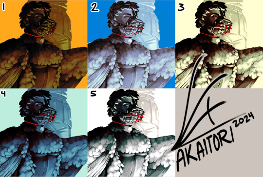
While I enjoyed #1, at the end I went with #5 as it worked better narratively. The clinical white and silvery shadows give a stoic indifference to the blood, which fits with Blackbird's character.
The muzzle and situation on itself aren't a canon event happening, so it also felt more fitting to keep a more stylized 'colouring' rather than actually putting in the character's colours and scene. For this colouring, I only used a single gradient map, but it's not rare if I end up using several, placing masks for areas of different colours.
When it comes to colouring greyscales in character colours I follow a different process, for which I'll use another illustration as an example.
(this is Loketh, he belongs to my partner)
So, for this drawing I also started with a grayscale, but started adding colour in much earlier.
1- Black and white base render
2- New layer with a flat colour, put it on overlay. This will serve as a base for colouring, kinda like glazing on a canvas for a traditional painting
3- Adding character colours, in a new layer on overlay mode. You can do this in a single layer, or make new layers for each new colour. Just keep it loose, no need to add all detail yet.
4- Colouring the shadows. I used a gradient map adjustement layer, set to overlay. Made the lights green, and the shadows purple.
5- Flatten and paint! Now this is the step to add all intricate colour details missing from step 3.
5- Post-Processing
This is a term more used in 3D renders, where it refers to colour corrections and final tweaks. Things like adding depth of field, motion blur, vignette, any final filter.
For almost all my art I'll add a grainy noise layer and chromatic aberration, I just think it looks neat. You can also add paper textures or flat colours on top of you image and set that layer to overlay, it helps to tie everything together.
AND THAT'S ITTT
I hope this was useful, and remember to just have fun with it :)
Further reading:
Marco Bucci's youtube account
Jason Rainville's blog with breakdowns of his illustrations
Sinix Design's video on colouring skin
Anatomy For Sculptor's 3D models for muscle reference (cw nudity)
9 notes
·
View notes
Note
hiii!! your artstyle is SO COOL to me- as in sometimes i'll just stare at some of your pieces because theyre all so great. i was wondering if you were comfortable sharing your process when it comes to art?? i'd love to see how you do things!
Hi!! I'm sorry this took so long to answer, I hope you still find it useful. It means a ton to me that you enjoy my art so much! <3 It's easy to feel discouraged by the Invisible Hand of Internet Engagement, so I really appreciate your ask.
General thoughts (NOT rules, just things I consider or do a lot):
Things that appear one solid color irl can be broken down into multiple colors through artistic interpretation. I see a lot of beginner artists paint trees as solid green, when there's a lot of yellows, blues, and browns in there! A FANTASTIC example of this is jadenvargen, whose color use is masterful and I can only aspire to emulate one day.
Base colors are not saturated; saturation is reserved for pops of color and details
Shadows are purples, blues, and greens
Reference is your best friend!!!
So the nitty gritty for those who want to see: with digital art there's two main avenues I take. The first one is lineart, and the second is painterly. All IDs are in alt text.
My process for lineart pieces:
I always start off with a sketch; for this example I'm using one of my pieces from @/mylittlefusions (that isn't actually posted yet but will be later today) - a Grogar and Trixie MLP G4 fusion. I like to fiddle with brush selections until I get the effect I want, and then go slow on the lineart to make sure it's how I want it, so this can be time consuming!
I've been trying for distinct shapes; I hate when my art gets muddled, I feel like the end piece is less impactful when I don't put in the right amount of contrast and distinctive silhouettes. Just something I've been thinking about and trying to improve.
Then I add base colors, going for slightly desaturated colors. I like to use saturated/bright tones to contrast or draw attention to something. I put the base-base colors down in one layer and then add details as a mask layer:
Then comes shading!! I'm a big fan of a multiply layer set to cool tones like blue, so I usually start there. If I think it needs to be different I can change it later. In this instance, I filled the whole canvas in the shading color as a mask over the base colors, and then erased where needed. Now that the shading is done, I often go back and color the lineart :)
Last but not least is my favorite part, painting on top! The extent to which I do this depends on what I think is needed, but I usually at least paint on top of the multiply shading to add some nuance, i.e. the greener bits on the background limbs. Here I added bright magic outlines to pop from the more desaturated character.
My more painterly style is a different story though! I use the same thoughts about color and shading, but I usually forgo multiply layers entirely and just do colors by eye. I still do a sketch, usually. Here is an example using my Lae'zel / Shadowheart piece.
The sketch is a disaster zone lol - but I painted below it using base tones, again desaturated. Once I feel I don't need the sketch anymore, I keep painting, making a new layer when I feel like being cautious about a change I'm making.

After I feel that I've got base colors down, it's time to get more contrast in using darker and/or more saturated colors! Then, like with my lineart process, I paint more details on top of everything else - reflections, jewelry, body hair, etc. I try to communicate shadow and distance with purples and blues, but I'm still working on it.

Another example real quick, where i did my typical lineart process base work and then painted on top of the shadow layer and the entire piece as a whole:
Thanks for reading if you stuck around, and thank you for the ask, friend! ^^
6 notes
·
View notes
Note
I love your art! It’s so high quality. What program(s) do you use to achieve that effect? And what tips do you have for aspiring artists wanting to reach such levels themselves?
Hi Anon!
Thanks a lot for the lovely compliment.
I mostly create my art using a technique called overpainting where I paint over reference images. I have an art background (took art at school and at college), but it was focused on abstract art so my experience with realistic proportions is exceedingly terrible and I've just never had the patience or put in the time to learn proportions from scratch. I've always admired artists who put in the time and effort to learn how to do that!
As for what programs I use, I tend to stick with Photoshop since that's what I was trained on and am most familiar with. I use a combination of brushes, filters and textures to give my art the look that it has. I tend to work at a resolution of about 3000px for height or width (whichever is the largest for the layout I'm going with) and a fixed brush size so that I can add a lot of detail and that it looks consistent throughout the piece. I also use tons of layers so that the lining, shading, colouring and any extra adjustments are all separate from each other and easily changeable. My PSD file usually averages between 300mb to 400mb in size because of all the layers.
The tool I probably use most outside of Photoshop is Color Cop. I'm partially colourblind, so when I want to use specific colours I need the hex codes or RGB codes otherwise it takes me ages to get the colours to blend right.
Below are some progress examples (from the "Sacrifice" theme for Sterek Week '23) of how I usually start out when I'm creating something. I go hunting for images and make a collage/edit of what I'd more or less like the finished piece to look like. Usually during this part I also play a lot with different ideas to see what works best. (Sometimes the final result ends up looking how I wanted, sometimes it takes on a life of its own and goes in a completely different direction!) The "Sacrifice" piece is made up of a promo shot of Stiles from Season 6 and a screenshot of Derek from Season 3 (I think). The background is made up of official images from Stranger Things that I blended together and added colour filters to.

Once that's done I start painting with pencil brushes to get the lines, then follow up with texturing and shading. I like to use a soft neutral colour like a beige as a base canvas so that I can paint with black as well as white. Lastly I'll paint in the colours and then finish off the piece by cleaning up the linework and by adding filters to adjust contrast/balance or colouring. Occasionally I've worked "backwards" by roughing painting the shading and some of the colours out first before adding linework.
As for specific tips, I think mindset and believing in yourself is important. It's very easy to get overwhelmed in the beginning, so don't compare yourself to others. If your art makes you feel something, then you're on the right track. Regardless of whether or not you work professionally as an artist, if you express yourself creatively in a visual medium - whether it's an oil painting or making lewd doodles in a sketchbook - then, in my opinion, you are an artist.
Once you're over that hurdle, the next part is just to keep at it. I hate using the word "practice", so I'm rather going to say keep making art consistently, and - most importantly - have fun while you're doing it. If it's fun, you're more likely to stick with it and improve. If you're trying to go in a specific direction with your art, I think there are two important areas to focus on: expanding your creativity and your familiarity with the tools you use. The latter especially will make your life a lot easier.
For me, being familiar with Photoshop is what allows me to make digital art the way I do. I've used it for a long time so I know a lot of tricks and shortcuts to help me achieve what I'm going for. This goes for any program you choose to use, though. And you don't have to limit yourself to one. Play around with different tools and programs and see what works the best for you. The internet is also a fantastic (and often free) resource, and YouTube especially has a lot of tutorials that can help you get started or help you build on your existing skills.
To expand your creativity with regards to your art, I recommend studying other artists - and not just one specific kind of artist either. Look at the old masters, look at modern art, look at fan artists, look at photographers and cinematographers. (And, of course, Mother Nature - the greatest artist of all.) Look at how they use composition, how they use colour, how they use lighting and shading. Try and incorporate some of those aspects into your own work and see what works for you.
TL;DR - Experiment and play… and most importantly, have fun!
Thank you for coming to my TED talk.
~ Bren
7 notes
·
View notes
Note
dumb question but how do you do those color studies for fictional characters (like the one you did for the dr2 cast)? i can do color/light/shading studies when i have a reference but when i try to make them up from imagination my brain has trouble checking whether the shadows and colors are accurate. any books/videos youd recommend?
there are no dumb questions when it comes to art!! its hard to figure things out on ur own :D
honestly its difficult to describe how i do them because for me its a very self-indulgent "turn my brain off and put colours wherever until it feels right" type of activity. but i will put my general advice under a cut because i talk a lot about drawing
my main advice would be to keep doing what ur doing, studies will always be more useful than anything else. for me i see the most improvement when i just chill out and observe things irl even if im not drawing them. i genuinely just stare at things and think about their colours, no need to do anything more than observe.
im the worlds #1 art tutorial hater so i don't have any cool youtube recommendations or anything but The Practice and Science Of Drawing by Harold Speed is public domain and is very good for just bringing ur brain back to the fundamentals of how drawing works if you haven't read it before.
in practical advice, my drawings improved hugely once i started paying attention to values. its easy to check this when doing digital art by having a layer thats just a flat midtone grey with the layer style set to saturation. i constantly turn that layer on/off whenever im drawing to make sure im happy with the amount of contrast between dark and light, and also to see whether im happy with the shapes of the highlights and shadows in my drawings.
to me making sure the values are correct is much more important than anything else. its always possible to go in and change the hue or saturation of a colour to make the drawing more cohesive, but much more difficult to correct the values if you've placed a bunch of colours in the same mid value range.
while im doing studies or just drawing in general i also save swatches of colours that ive used that i think look good (not sure if this is a feature on all drawing applications but i think it is in most major ones like photoshop, procreate). you can probably see similarities in colours that i use throughout the things ive posted because if i feel like i don't know where to start, i often start by placing colours that ive used before and then modifying them to whatever i want. its also fine to look at real things when you're drawing fictional characters, i'll often just take breaks to look at a bunch of photos or videos or even just go outside to refresh my brain on how things look.
last and most important thing ever is that sometimes ur colours will just look like shit. i have made so many bad drawings in my life with muddy colours and poorly done lighting but i just keep going until i make something that i like 💪 i think for me the most important thing ive ever done is just let go of the expectation for my drawings to be good. sometimes they are just complete garbage but to me thats an indicator that im doing something outside of my current skill level, which is exactly what leads to improvement. so i wouldn't worry if it feels like your brain is having trouble working through certain things at the moment, it just means your practical skills are in the process of catching up to your observational skills
#i hope i dont sound like an asshole or pretentious or anything sorry if i do#i just unload all of the things i wish someone had told me earlier whenever someone asks for advice
29 notes
·
View notes
Text
WIP Wednesday
I know I've missed the last couple but honestly all I've been working on in my free time is the secret project, which (for reasons I feel like should be fairly obvious) I'm trying not to share in WIP Wednesday posts lol. But anyway I've also now started on Chapter 13 of Soldier, Poet, King, so here's a brief moment of A-Qing and Jin Guangyao talking about Xue Yang that I made myself laugh with a little bit
--//--
“Told you he’s feral,” young A-Qing mutters under her breath, sounding mutinous around the chak-chak-chak of chomping on her ever-present bubblegum.
“Yes dear we know he is, and something tells me that cracking open the brain of an interdimensional lovecraftian nightmare so he could try slurping the contents out like a slushee, metaphorically speaking, hasn’t improved things very much,” he replies and feels oddly vindicated when she snorts a laugh into the back of her hand.
A-Qing is…unexpected. He’d heard her calling for Xue Yang to come upstairs that night he and Nie Huaisang had gone to see him at The Cockpit, though of course that evening he hadn’t known precisely who she was or why she felt she had the right to boss Xue Yang around. Finding out that she’s the once-wayward-child-turned-protegé of the Immortals (and that her ethics are significantly more dubious than her benefactors’) had been..a surprise, to put it mildly. Not that he thinks that Xiao Xingchen and Song Zichen aren’t perfectly capable guardians, of course, but rather he’s surprised that two distinguished gentlemen such as themselves seem very fond of collecting people who could be reasonably compared to scrungly alley cats and ignoring all their mange and fleas in favor of cooing over how sweet and brilliant they are.
And they are (brilliant, at least, though not any given definition of sweet to anyone except their ‘daozhangs’), but the contrasts at play in their little fucked up family of four are still a bit of a mystery to Jin Guangyao.
It had been A-Qing, apparently, who had hacked the CCTV and the ‘dome’s video feeds long enough to broadcast Jin Guangshan and Jin Zixun’s deaths straight to the communications tower, and as such Nie Mingjue has instructed that she give their security team an extremely thorough rundown of every breach in their defenses that she had exploited. Jin Guangyao still desperately wishes someone had thought to record Nie Mingjue’s reaction when the girl, -- standing no taller than his abs and thoroughly uncaring of the danger she was putting herself in -- had laughed in his face, popped her bubblegum, and told him that it had taken no longer than an hour that afternoon to get her hands on everything digital in the ‘dome, not just their camera feeds. He hasn’t seen his lover turn that shade of red in a very long time, nor ever seen him so clearly tempted to shout at someone younger than half his age.
Anyway — she’d taken a shine to Jin Guangyao within minutes of Lan Xichen ushering everyone into the ‘dome to avoid further scrutiny by the press, easily picking him out as the adult in the room besides her beloved daozhangs who would be most likely to indulge her quasi-legal and morally gray brand of ethics. So now here she sits, tinkering around with something Wei Wuxian had given her to turn into a signal jammer for anyone outside the ‘dome not on their frequencies, and Jin Guangyao has found himself on ersatz babysitting duty.
(She is also, according to Xiao Xingchen, worried about Xue Yang’s health and wouldn’t be able to focus well working somewhere she can’t keep an eye on his condition; an assessment which Jin Guangyao very politely and very secretly thinks is a load of horseshit.)
6 notes
·
View notes
Text
P3R Thoughts below ✌️
Saw they're making p3r, at the end of the day idc not gonna buy it it doesn't affect me and I already have p3p and FES on the ps2 so like. I'm good this isn't for me obvi but like.
I was not a part of the group who wanted a remake, probably the minority then? Regardless, this remake wouldn't be 'necessary' if they had just done a good job whan they originally ported it to pc. Also, p3 is not that old of a game, comparatively to some of the older entries in the series like p1, and both of the p2 games, one of which we never got in the west. So it's not like it really needed this.
Also; maybe I just like old graphics but I personally am not a fan of the new UI graphic design and change in artstyle. While I understand the artstyle had to change because the original art probably couldn't be upscaled for a new aspect ratio and changed for a better format, it's still sad to see it go. Especially because although Kazuna Kaneko and the other og artists left long before his game, the og p3's style is just as anime as the current, however it was of its time and held that unique style because of that.
It's less saturated, with more shading and less detail. The characters feel flawless, instead of imperfect, they're too clean. The shadows (ironically) were very dynamic in cutscenes in the the way dark and light were used with flatter colors. It's rough around the edges, fitting it's atmosphere. The overworld, while colorful in some moments, largely gave me the feeling of an overcast day. Or like it had less ostentatious and bold obnoxious colors in comparison to the dark hour, Shadows, and Tartarus. It had that nice contrast between natural and supernatural.
Then, with the UI.... Honestly my biggest gripe is with that horrendous dark blue UI text boxes. What happened to that neutral grey? For a game as long as persona 3 is, I would not want to be staring at this highly saturated bight ass blue for hours. It's ugly in my opinion. Gone are the original clock in the corner with green and blues. The blues feel off now. Grey was actually a bigger part of the og color scheme along with hints of yellow. It was sleek and cool. Definitely of the Y2K era; it reminds me of when I first saw SMT 5's frankly messy and also ugly UI. It looks less cohesive.
P3 what started this trend of using a single main color and stylized UI in persona games, so it seems disrespectful to get rid of that original set up when it's the whole reason P5's UI is as praised as it is.
Then you have the camera work, which doesn't seem fixed anymore because they don't have limitations anymore because of hardware, but those original limitations are what pushed the og artists to make intentional and stylistic camera angles that drives the atmosphere of the game. To see it follow you throughout the Mall is just... Weird. But maybe that's just because I'm so used to those fixed angles.
I've been hearing rumors that they took out the neat revolver menu from the battle system which would be really sad to see go cause that's like, so iconic to 3. But I highly doubt that?
But Ig this ends as; games don't need to always be remade bc sometimes they're just, of their time, and remaking them looses the original charm. Again, a good port with some minor quality of life improvement would've been enough imo. It seems to me like Atlus is still feeling the affects of P5's success high, and trying to chase what made it so big in the first place while also not putting in any effort to put in the years of work that went into it. So like. They're pulling a Disney Live action but with persona and smt...
Pretty telling since they're obsessed with dlc and bad ports rn.
#persona#persona 3#p3r#p3 remake#p3 reload#blue speaks#this isnt perfect and a greta way tk explain what j mean but whatever#idc to make this perfect and niether does atlus#anyways just gonna ignore this and move on w my life lol#good for people who wanna plag it but like. if they just did a good job w the port this would be needed to fox that
2 notes
·
View notes
Text
Second pre-formative hand-in critique
After making a number of changes (as per David's feedback) since last Monday, I went through my booklet with Emil today, which was really helpful. It highlighted unnecessary things, small changes that would make big improvements to streamlining the book's flow and key elements I hadn't included (a key one being captioning photographs). He ran through a lot of things I had looked over and also needed to improve upon, which I will take into account this week and make those changes before the Thursday hand-in.
The symbol is meaningless (i.e. has no purpose) - get rid of it.
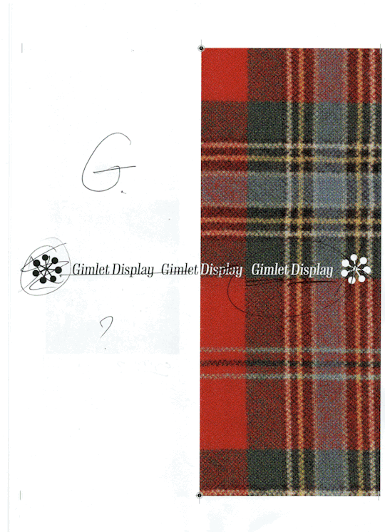
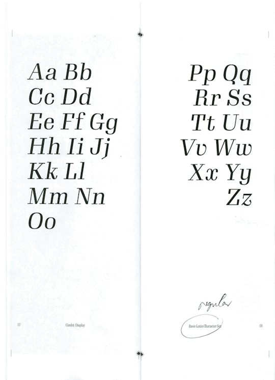
Though the rap around text was good - the two words split by the spine were unecessary distraction from the title (if that's what i choose to be the title) which is Gimlet Display.
It was suggested that I incoperate more of the meaning of the booklet in relation to my pepeha in the front cover. I think some development into making the covers (front and back) more useful in that sense could be explored.
A suggestion for graphically displaying the text in a very simple way was a large G/GD on one/both of the covers, which as above, i'll use in development.
He liked that I used my tartan which links to my Scottish heritage. Exploring the relevance of it could be a good idea. My idea was to, in moving around some of my spreads as later suggested, that i could put the information/history page as pgs 1-2 and explain its relevance there.
Something of my own reflection was the cover image was a little distracting. I might edit it a little to make whatever text I place on the front more in the foreground but without losing the detail and impact of the tartan. I have since scaled it down (it was scaled up in the above print out) which I think this may work better. Also having the text larger will help with this.
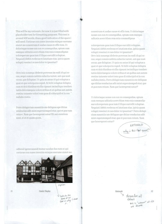
This page is unfinished (hence the palceholder text for blocking); this will be something I need to finish but the formatting of it is okay thus far i think.
Point to mention in the rationale *why is this font good?* > *why did i chose it -> relation to my pepeha*
Captions were something i needed to add for the photograph here but i think i will be changing it anyway.
Emil mentioned that streamlining all of the footer elements on the pages was a necessary detail. As he said they are the 'normal' elements and everything else will show as a deviation from that to show what the typeface can do.
These two spreads were relatively untouched by feedback apart from the note about footer details.
However, I did have a personal reflection for these. I though that the text overall might be on the smaller side. I have noticed in all of my spreads that has been the case. So i think being a bit more bold with my choice of font size would be a good idea to bring contrast between the smaller pt sizes and larger pt sizes.
Something that isn't super noticed once printed was the fact that i did make all text a dark green shade. Which after playing around does make a significant difference on the eye even if it is subtle (compared to plain black). However, for further refinement I might try a colour combination.
Another element i need to add is the pt sizes and font names on all the pages.
Three main points for this spread:
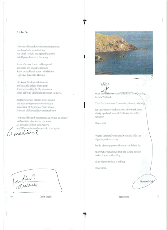
The text in the poems does look too similar to the footer text > could be changed to medium weight to differentiate?
Move the Haere Mai poem/song title to the top of the block of text to signal that it is another piece of text (not flowing on from the previous page), where to start reading and that it is the title of that section of text.
Note the authors of the texts (My Great Aunt) and the relevance of the text - why is it there?
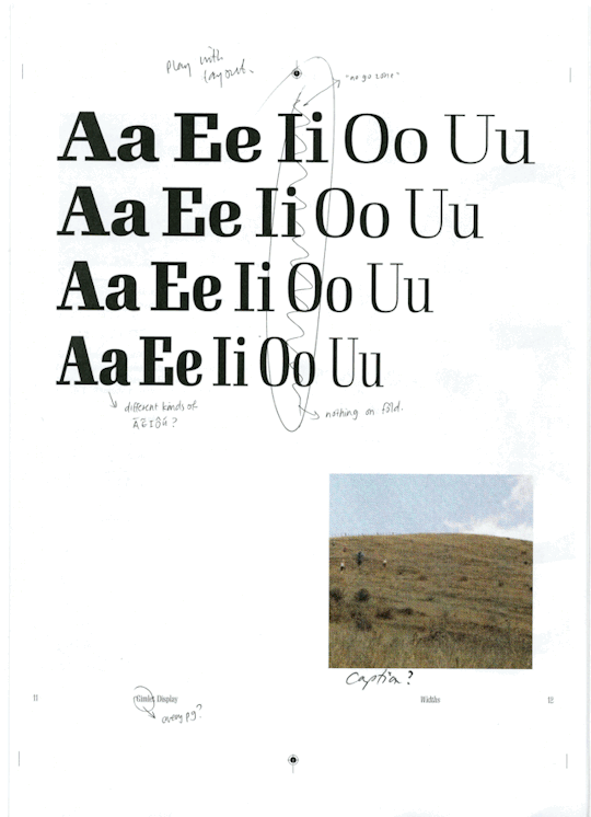
The biggest problem with this layout was the text crossing (what I have come to call) the no-go zone. Anything crossing that line will be lost even a little because of binding and alignment.
However, suggestions were to play with the spread a little. What different kinds of AEIOU's could I showcase? Try moving them around and play with the space in the spread.
In regards to the photo asset on this page, again, needs a caption. A further suggestion was to see what it looked like spread over both pages. I do have a limit on its dimension but I could play with this a little.
Last point was if it was necessary to label every page with the footer 'Gimlet Display' > it will be obvious given the start of the booklet what the typeface is called, so maybe use this space for what specific font is used, point size etc. instead.
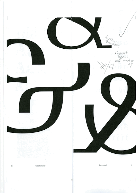
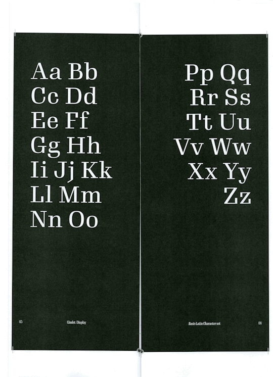
This spread got a big tick. Emil said it was a good resting page. Given that my booklet does have a lot of detail-heavy pages, spreads like this one give the eye a rest from having to follow any detail whilst also showcasing alternative versions of one glyph the font has to offer.
A way to further this might be to make another spread in this kind of format (which I think I could use to replace the image page on pg. 22 maybe). A symbol that Emil pointed out that was quite unique in its form was the # from pg. 17. He said it's got a unique skew and weight variation. Thus, it could be a cool idea to make that a key point somewhere in the booklet, just to give rest as well as iterest and pinpointing a cool feature of the typeface.
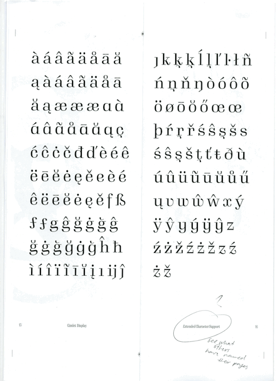
This page got a pretty good go ahead neatly showcases all of the accent alternatives. The only thing to change was the title of the spread. Emil said to have a look into what other type specimens have named this kind of layout.
The left spread:
[1st line] doesn't quite fit with the rest (I think it's because of its "lack" of detail compared to the other lines?) > move down to balance?
[2nd line] good.
[3rd line] As mentioned before, Emil thinks the # deserves a feature (bold/scaled up in another spread?)
[4th line] symmetry of this one is great, well balanced.
[5th line] the cents symbol is the only one that stands apart but can't be changes and still makes sense.
[6th line] the No. symbol doesn't work with the rest, if it can be used elsewhere go for it but otherwise probably not hugely necessary. The tilde is a nice one to include though > find where it can go?
The right spread:
What is the significance of the numbers, and why is one outlined? > explain in the caption. Or repeat to create a pattern/rhythm.
Old style numbers need explaining (otherwise one would think i did that myself) > its a feature of the typeface so label it somewhere (page title?)
Split the page titles.
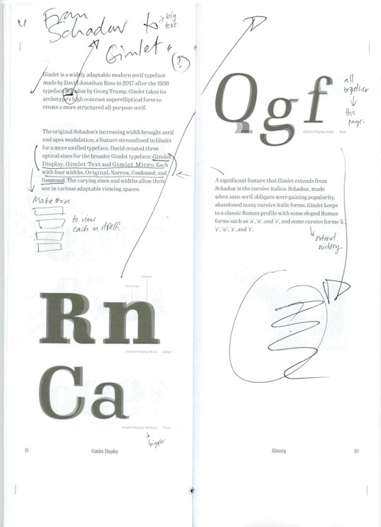
Suggested this could be moved to the front of the booklet, given that it is key information about the font (not just the history > rethink the title or split the titles over the two pages).
For clarification, Schadow is the correct spelling :) but showcase that this was what the typeface was inspired by. Include more clearly what each typeface looks like on there own.
The comparison between the typefaces is good. Could do a lot more labelling (this could be where i do some "diagrams" on type form features.
A note for the second paragraph on the left page; showcase those different fonts on a larger scale to more clearly see their disctint features. > This may have me rethink some of the more text heavy pages as i could showcase these here instead? given this spread may become quite busy with the changes and level of detail.
It was suggested I move all larger text to one side and bulk text to the other, as there is blank space that is being unused.
Also a final point was to extend the written part, dig deeper into the typeface itself.
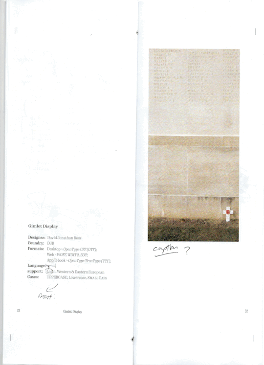
Caption for the photo, again.
Move this spread to the front > key information?
Personal note > move the line for language support up one line.
Overall I am super happy with this draft of my work; it is by no means the final draft. I have come quite far from my earlier drafted pages, but I'm not finished yet. This draft aligned with how I wanted the booklet to look, but there is still much to improve, and I will continue refining it even after the Thursday hand-in.
2 notes
·
View notes
Text
Improving the Urban Decay Cyber Palette.
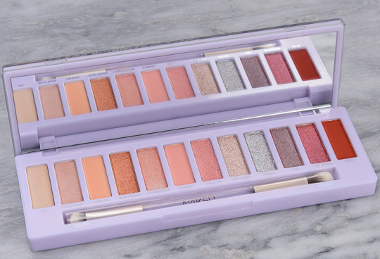
The Cyber palette came out a couple years ago, and it’s as disappointing now as it was then. The concept was promising, the packaging was pretty, but the execution was poorly done, in my humble opinion. Back when this palette was new, I knew immediately that it wasn’t going to be for me. Two-thirds of the palette is varying shades of pale peachy orange, leaving only four shades that add anything interesting to the color story. Even still, one of those things is a warm metallic pink and the other is a burnt orange.
There’s nothing wrong with a more monochromatic color story. Just look at ColourPop and their dozens of monochromatic 9-pan palettes which were hugely popular once upon a time, and are still widely raved about in the beauty community. I myself have collected many of their monochromatic palettes over the years. Although a lot of them aren’t a part of my life or collection now, I got a lot of use out of them and they have a special place in my heart.
While there’s nothing wrong with monochromatic palettes, they have to be done well. In my opinion, since you can’t get contrast and variation through multiple colors, monochromatic palettes require different textures and making the eyeshadows significantly different depths. The problem with palettes like Cyber is that they feel very monotonous and, therefore, boring (which is never something you want a palette to be. A palette being user-friendly, utilitarian, and/or basic doesn’t make it boring by default.).
I did attempt to keep my version of this palette as similar to the original as I could stand to make it, but I made some, what I consider necessary, changes, in order to make this palette more appealing to myself. Without further ado, here’s my version:
This is definitely one of those BYOPs that I find appealing because I know and love the eyeshadows in it, not necessarily because I love the look of them all together, or because the colors are particularly interesting to me.
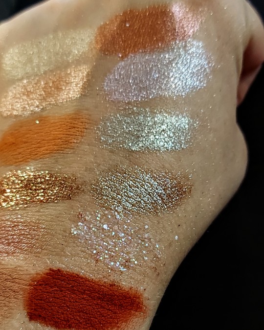
If you compare my version right next to the original, you’ll notice that my palette is a little brighter, there’s a bit more color, and I’m obviously missing the metallic reddish shade that sits next to the matte burnt orange at the end. I do wish I had something to use in place of the metallic reddish shade—called Override—but I just didn’t have anything that wasn’t similar to other things I’d already put in the palette or that felt cohesive with the rest of the colors.


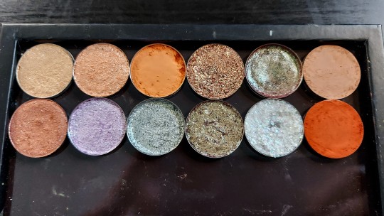
I’m only going to delve into the highlights for this one, simply because it’s not that exciting to me. The first three shades I tried to keep as similar to the original shades as I could, but my choices are slightly more colorful than Urban Decay’s. Also, my metallics are definitely shinier than what I can tell from multiple swatch photos of the Cyber palette.
For Electrode (first row, fourth shade), I opted for a glitter. Since I was trying to keep the colors similar, I decided to add some extra texture by using this peachy orange glitter from ColourPop (called Full Effect).
The brown to green duochrome that I used for Cyberspace seems pretty close, although I think the green flip in my eyeshadow (Crystal, from Beauty Bay’s Book of Magic palette) is much stronger than Urban Decay’s, making it much more obviously duochrome. The base color also seems more pink that the Cyberspace, which influenced by decision with what to use in place of Gadget.
Gadget looks very similar to Virtual in the brand’s swatches, the biggest difference being that Gadget is a bit more pink and Virtual is more orange. I decided to go with something more mauve-y to better match the base color of Crystal.
For Call I.T., Not A Bot, Static, and Y3K, I just went with more colorful versions of the Urban Decay shadows. They’re still toned down, but I think my options are more interesting, textured, and will perform better than Urban Decay’s.
With Override, I wanted to try to dupe it. I don’t have any metallics similar to it, and I didn’t want to use another glitter because it would be too similar to Full Effect. Instead, I decided to use this shade as an opportunity to add more texture and a little more coolness to the palette. I went with this glitter from ColourPop, called All Aura Again, and it’s got a mix of chunkier and finer iridescent glitter. It reflects purple, blue, green, as well as some pink and orange.
Finally, for Byte, I really wanted to keep this the same, so I went with this burnt orange matte from Natasha Denona (called Amhara). I wish there was at least on more matte with some depth, but I feel like this compliments the palette really well and adds some visual interest.
So there you have it, my (improved) version of the Urban Decay Cyber palette. If you’d like to see me build this palette, the video is up on my YouTube channel. I’ll also be posting a video on Friday showing three looks I’ve done with the palette. The link to my channel will be below the swatches.


Eyeshadows are listed in order of the palette (left to right, top to bottom).
Musk Rose - Ace Beaute Floral Vintage palette
Peach For The Stars - Give Me Glow Pastel Dreams palette
Samus - Kaleidos Club Nebula palette
Full Effect - ColourPop single
Crystal - Beauty Bay Book of Magic palette
Vintage Taupe - Natasha Denona (from several palettes)
Misty - ColourPop single
You're My Only Hope - Kaleidos Club Nebula palette
Tundra - E.L.F. Cosmetics Earth and Ocean palette
Unexpected - J.D. Glow single
All Aura Again - ColourPop In A Trance palette
Amhara - Natasha Denona Peak palette
0 notes
Text
HOW TO GET BRIGHTER SKIN WITH L'OREAL WHITE PERFECT CLINICAL
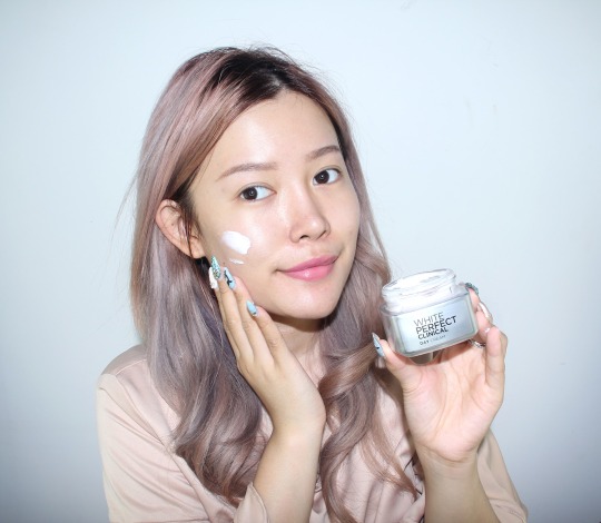
After holiday, my skin has been pretty dull and uneven because of pollution and exposure of sunlight. I saw that the radiant glow that I used to have has vanished in a moment. At this moment, I think this is the best moment to try the newest range of skincare from L'Oreal Paris, which is L'Oreal White Perfect Clinical that promises brightening skin in 3 actions. It promises to give result after 7 days even though I have been using it for 10 days, so what's my verdict with the product?
PRODUCTS

L'Oreal White Perfect Clinical comes in 3 products only. Day Cream, Night Cream, and Essence. It's practically very simple and the routine must be easy to maintain for everyday use! The products come in beautiful silver-blue acrylic bottle
So what does this skincare claim?
✓ Banish black smudges
✓ Helps enlighten skin
✓ Maintain skin youthfulness
I don't really have black smudge but my skin has lost it's radiant glow maybe because of my unhealthy food life during holiday (we are all guilty for it lol), pollution, and sun exposure. And soon I will reach my quarter life hence my youth will be gone sooner than expected!!! Therefore I am in need of something to keep the youthfulness. Some of my friends have started using anti aging too to combat against the aging process haha
So let's take a look of what the products offer

White Perfect Clinical Derm White Essence Skin contains Derm White Technology, which is a combination of 3 active skin lightening ingredients. It comes in an ampoule type of packaging and for me one ampoule is enough for my all over face
When I first used it, the serum does the magic as my skin feels instantly moisturized as if I just inject a serum booster into my skin. It's absorbed pretty fast and not sticky! The essence can be used both day and night and priced at Rp 214.000
White Perfect Clinical Day Cream SPF 19 PA++ has Pro-Vanish 3, a brightening active ingredient that reduces skin melanin production and SPF 19 PA +++ to protect skin from UVA / UVB rays. The packaging comes in silver metallic shade and has nice contrast with the pink cream inside when it's opened
The day cream comes in pink tint to gives glowy effect after usage as well as the sunblock protection along with it. Like any other sunblock, the cream has pretty thick texture and a little bit difficult to blend because of its SPF. However once it's blended properly, it will give you a nice sheen of dewy finish. It helps to prepare my skin before putting on some make up afterwards! The Day cream is priced at Rp 161.000
White Perfect Clinical Overnight Treatment Night is a night cream to help regenerate skin. The night cream has cooling sensation effect that feels refreshing. Unlike the day cream, the overnight treatment comes in deep blue shade so it's easier to differentiate which jar is for which routine
I applied it the overnight treatment right away after I took my night shower, along with the essence. The cream has gel-like texture and reminds me of an overnight sleeping mask because of it. The texture is a little bit heavier and richer than what I expected so a little bit goes along way. The Overnight treatment is priced at Rp 192.000
RESULT
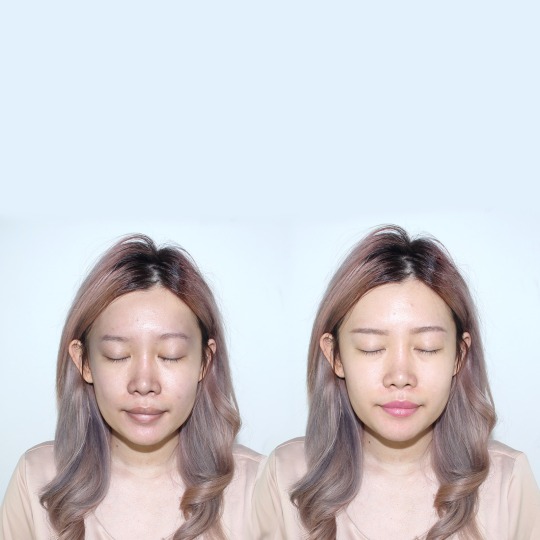
Here's my before and after picture using the series in 1 week!
The hair and body are all the same, but I the before and after face on top of the body so you can spot the difference clearer! On the after picture I only put a light eyebrow powder and a pink lip tint, no BB Cream, no powder and no other make up!
Honestly I was a little bit skeptical with the product because I was only using it for around a week or so, but I kept the camera setting and lighting the same, and when I put the pictures side by side like this, I was in awe!
My overall skin tone has become much more even and my dull skin has turned into a healthy shade instead! I am surprised that it really helps improving my skin tone, giving it a brighter radiant tone with just a week!
Overall I am giving it two thumbs for successfully bringing back my glow to life
However my skin is really dry and this series is still not moisturizing enough on my opinion. So I suggest people with dehydrated skin to combine the products with another lotion and sleeping mask to help moisturized your skin even more instead of using it just as it is
PURCHASE
So where can we purchase L'Oreal White Perfect Clinical products? You can easily find them at any L'Oreal Paris at Department Stores, Drug Stores, and Cosmetic Stores. If you want to shop online at E-Commerces, Blibli and Lazada are two of many websites that offer the products! The price is a little bit pricey for a drugstore product, however since the products work well to brighten up skin, I would consider it a try!
0 notes
Text
Summary of December:
Very much all over the place with energy, sleep and organisation. I blame the short days tbh. hope to get more rest this month
Plan from November :
All monthly/weekly goals for the year ✗
Proko: ribcage ✗
Review all Proko notes ✗
DAB Lesson 7 ✗
One FE fanart every 4 days AND NOT MORE OFTEN [kinda? did 9 and then 7 straight days of sketches but had big gaps between posting stuff]
Plan out and draw all the Kylux Advent ideas I have ✗
Put Kylux Advent into my spreadsheet ✓
January plan:
Write new monthly/weekly goals
DAB Lesson 7
Review all Proko notes
Mass Effect Secret Santa
Do at least two Lyon pieces before Jan 15
Sketch two Kylux Advent pieces
notes and improvements from finished stuff:
practice expression sketches from photos✓(by mistake), do Proko ribcage lesson✗, draw and detail with linework everyday objects [kinda]
c/anas: bad hands, flat face, like the shapes in his cloak though
l/inhardt: one hand is bigger than the other, lost lower body gesture from sketch, bells aren't foreshortened enough (look stretched vertically), presents/pillow bag look 2d, left upper arm looks flat because the sleeve creases don't fall over it, unclear arm gesture/silhouette w/ yawning (didn't want to cover his face as I was trying to do an 'official art' type thing, but couldn't figure out how to make it look right otherwise), tried to do two different levels of detail for the fur on the top and bottom of the cape to guide the eye to his face but it just looks like two different materials, I do like the overall lineart and simple shading though
h/ux: visible teeth look too small for mouth, highlights on leather glove look very smooth and plasticky, could have exaggerated expression even more
v/alter: his left leg too short, hands drawn like an even-thickness box, no story behind image, looks like he's collapsed instead of looking confident lol, I'm quite pleased with how the armour in perspective + high-contrast shading/colour variation came out though
k/aidan: way too many brushstrokes, not 100% sure lighting setup would light these planes (esp. on far side of face) but that's forgivable since it's definitely above my level, not much to say about this
k/arel: eyes too far apart, ear rotated weirdly, awkward sword placement, do like the abstract branch motif merging with hair/coat though (and overall composition)
v/alter: fingers too long oops, ear possibly also rotated weirdly?, mouth curvature isn't as much as it should be if you're looking up at him (but I think this works stylistically), happy with the small subtleties in his expression though
ACTIONABLES: practice expression sketches + ear placement from photos, do Proko ribcage lesson, keep trying to put more effort into hands, check distance between eyes after sketching
0 notes
Text
This is a part 2 for "I earned it" (here you can find part 1)
Pairing: Ouat Peter Pan X fem!reader
Warning: mostly smut, language, a bit angst but also a bit fluff
P.s. if you find any mistake please correct me, English is not my mother tongue and I want to improve. Reblog, if you can, it helps a lot, thank you💕
P.p.s. gifs belong to the creators
I earned it pt. 2
Being around Peter when they were in public was kinda hard lately: y/n was trying her best not to show to the Lost Boys any sign of interest toward him, she was keeping it cool but at what price? Peter was a tease: he loved provoking her all the time, through intense looks, whispered dirty words, intimate yet quick touching and absolutely irresistible smirks. She was really forcing herself to pretend that nothing had changed between them, but the truth was that they were dealing with an insane amount of sexual tension. Since he defended her from the latest boys arrived on the island, they started to look at each other in a whole new prospective: they spent the following month finding excuses to be together all the time and becoming quite passionate fuckfriends. They managed to find moments to be alone, to have great sex, but with the recent arrival of the pirates on the island, she had been quite busy healing boys and taking part in the battles and he... well, he was the leader, no one was more busy than him. Sometimes, Peter was not exactly discreet, but she always used to stop him in that cases: she absolutely didn't want to take the risk of letting the Lost Boys know about them.
That day, her assigned task was checking the seashore with one of her closest friend, Jonas, to see if pirates were planning on landing on the island, so she was practically having the first quite moment since the week started. Y/n was hiding behind a massive plant with Jonas; she was observing the vessel through a telescope, her eyebrows furrowed in concentration but no one was moving on the boat. She suddenly felt a hand on her shoulder and winced. -- Fuck, Jonas, you scared the shit out of me! -- she scolded her friend while touching her chest, he laughed. -- Sorry, but we're the only two people here, who did you think could have touched you? -- he made fun of her while tenderly pinching her cheek, he considered her a little sister. She shook her head. -- I was overthinking. -- she defended herself before putting the telescope down. He sighed. -- This is pointless, I still have to help Felix preparing the wood for the bonfire. -- he complained while taking the telescope and observing the vessel himself, she bit her lower lip: she knew he had no patience at all and this was the less adapt task for her best friend. She touched his arm to draw his attention. -- Just go, I'll stay untill Patrick and Andrew come to replace me. -- She said while taking the telescope back, he raised an eyebrow. -- Are you sure? I don't like the idea of leaving you alone -- he asked, he really cared a lot about her, she nodded and winked at him. -- Please, we both know that I can take care of those pirates, plus, they'd never attack right now: they just lost three battles, they'll need time to reorganize. -- she explained while taking her flask and drinking a bit of water, he nodded standing up. -- Okay, y/n, I'll see you at the camp. I'll tell Patrick and Andrew to come as soon as possible to relieve you. -- he said and she smiled at him. He left.
The forest was particularly silent that afternoon; the gentle summer breeze moving the leaves and the waves crushing on the sand were the only sources of sound keeping her company. Neverland was the most beautiful place she had ever seen and she felt home there. She looked at the vessel again, her gaze quickly drawn to the mesmerising colours of the sunset: the sun was disappearing behind the sea and it made the sky look half orange and half blue, with gradual shades of pink and purple in the amidst. The contrast with the deep green of the forest standing behind her back was incredible. That green was familiar, intense, she loved it, then she found herself thinking that it reminded her of Peter's eyes. " Oh come on, y/n, stop thinking about him." She mentally scolded herself. She had been thinking about Peter a lot during the last weeks and she found herself stupid for that. When he was just her platonic crush it made sense fantasizing about him, but now that they were fuckfriends she felt like she was not allowed anymore to romanticize him in that way. They had silently agreed on a relationship made up of physical contact and that was all.
She suddenly heard footsteps approaching but didn't stop looking in the telescope. -- Patrick? So soon? -- she asked while lowering the telescope, but a familiar voice spoke to her. -- Not exactly. -- Peter said. She turned and saw him slowly sitting next to her, the green of his eyes that had visited her thoughts just a moment before now shining because of the sunlight and an almost disappeared mark of a bite she herself left on his neck still slightly visible on it. She smiled in satisfaction looking at it, she loved marking him. -- Pete, what are you doing here? -- she asked while turning toward him, now they were sitting one in front of another, the still hot sand under their crossed legs warming them up. He brushed a lock of her y/h/c hair behind her ear and shrugged. -- Can't I feel the desire to spend some quality time with my Lost Girl? -- he asked and she chuckled. -- Well, this Lost Girl is busy checking on the pirates and can't be distracted. -- she joked while pointing at the vessel, he smiled. -- Well, you're officially relieved of duty. -- he said and grabbed her behind her neck to pull her for a kiss. She left the telescope fall on the sand and crossed her arms on his shoulders, her lips parting to let his tongue in. He caressed the back of her head slightly pulling her hair, a moan escaped y/n's lips. He noticed and maliciously smiled. -- You love the way I touch you, don't you? -- he provoked her while caressing her neck, his fingers wrapping around it. She raised an eyebrow. -- I might enjoy it, yes. -- she answered and he bit his lower lip: that girl never gave him a proper satisfying answer, and he was absolutely crazy about her for that. She caressed his chest, her fingers sliding under his shirt and drawing figures on it, he sighed tensing up. He wanted her so much but in the last days they didn't had the chance to go beyond passionate stolen kisses and intimate touching, but not intimate enough for Peter's tastes. Anyway, he had spent a lot of time with her and he started to realise that he really liked y/n. Of course he felt an insane attraction toward her, but there was more, he was just not ready to admit it. She grabbed his shirt and pulled him for another kiss, her tongue licking his lower lip. He grabbed her by her waist and made her sit on him, she almost gasped but positioned herself in order to not lose her balance. He caressed her back while deepening the kiss. She stopped the kiss and gasped for air. -- Easy, tiger, I need to breath. -- she joked while caressing the back of his head, he raised an eyebrow while looking at her: she was sweating a bit, her skin was shining in the sunlight and her y/e/c eyes were filled with desire. -- Shit. -- he whispered between his teeth, she looked at him in confusion. -- What? -- she softly asked, her lips barely touching his. Peter caressed her lips. -- You're fucking beautiful. -- he simply said, his eyes scanning her face, a mix of desire and pure devotion in them;
She widened her eyes: she didn't expect nothing like that. The simplest yet most sincere compliment she had ever received. She was not stupid: y/n was well aware that he wanted her, she had been acting a bit elusive and making him beg for it not only because they hadn't been able to find some time to fuck, but also because she wanted to play with his desire a bit, so she knew about it; but that compliment, the way he was looking at her, the gentle touch of that moment: was Peter developing feelings for her? She was not sure. But in that case, how was she feeling at the idea? She loved having sex with him, but involving feelings in that relationship? She was not sure. She smiled at the compliment. -- Well, why aren't you fucking me already, then? -- she teased him. A spark lightened up his eyes: he grinned and kissed her, his lips now more demanding and his hands helping her lay down on the sand. She pulled him on her and grabbed his shoulders, her legs crossing around his waist. He moved his lips toward her neck to suck her skin there, she moaned pulling his hair before pushing his head toward her chest. She needed more. He immediately understood it and moved the edge of her tank top up to please her. Peter stopped for a second when he saw her bare breasts and smiled, his eyes filled with lust but also something else: he found her perfect. She impatiently moaned as to invite him to touch her; Peter grinned and his lips barely touched her nipple, he was making her crazy. She sighed in frustration when he licked it and immediately lifted his head to look at her, amusement burning in his eyes. She looked at him. -- Peter... -- she cried, her hands caressing his hair. He rubbed his lips on her nipple. -- If you want something, just ask. -- he whispered on her nipple, his breath on it sending shivers down her neck. She rolled his eyes. -- You're an asshole. -- she joked while biting her lower lip, he was teasing her. He bit her nipple making her gasp. -- Insulting me is not the smartest move. -- he said while moving his lips toward her collarbone. She sighed in surrender. -- Okay, fine, just stop teasing me and touch me as you should. -- y/n said while grabbing his chin and intensely staring at him. He smiled before squeezing her leg. -- Good girl. -- he whispered and finally sucked her nipple. His tongue draw circles around it while her body started to move, the impatience of having more growing inside of her. His lips moved down her body, leaving a trace of kisses on her stomach, her belly, her hips. She was wearing a pair of shorts, so she could perceive his hands caressing her inner thigh. She tried unbotton her shorts but he stopped her. -- Let me do it. -- he commanded while unzipping it, she nodded and caressed his shoulders. He slowly removed her shorts and spread her legs, smiling because she was already wet. He snapped his fingers and made a towel appear under her body, to avoid troubles with the sand. She smiled at that thoughtful gesture. He kissed her inner thigh before moving her slip aside and finally kissing her where she needed the most. He loved looking at y/n in those moments: that was nothing that gave him more satisfaction than giving pleasure to her. He loved her body language; the was she arched her back when he was doing good, the little yet sexy moans escaping her parted lips, the way she pulled his hair to make him understand that she was close. He had never been so happy to fuck someone before, she was unbelievably beautiful. She was normally very authoritarian and indipendent, a typical tough girl, but seeing her vulnerable, fragile side was his absolute privilege and he intended to give the right value to it.
Her legs started to shake a bit so he guessed that she was about to come: he started to move his tongue faster while one of his hand travelled up her body, under her tank top, to touch her nipple. She closed her legs around his head and he squeezed her breast. She looked down to meet his eyes. -- I'm fucking close. -- she whispered out of breath, her eyes half closed. He looked at her but didn't stop working. In the moment she was about to come, they heard footsteps approaching. She immediately tensed up, her body brusquely stopping. He raised his head to look around and she felt her orgasm disappearing, she had just lost it. -- Fuck! -- she complained while sitting up, he looked at her, half pissed off at the idea that he couldn't finish his job and half sorry for her. -- Y/n? -- the voice of a boy shouted her name, she puffed wearing her shorts. Peter caressed her leg while looking at her. -- It's Patrick with Andrew, my shift is over. -- she said while pulling her hair back in a ponytail. He nodded and smiled at her. -- I'll finish what I started, just come with me. -- he said standing up and reaching his hand, she took it and stood up but immediately left it. She smiled while removing the sand from her legs. -- Okay, I'll see you at the Thinking Tree. -- she said while looking at him: his hair were a bit messy because her fingers tormented it and his eyes where still filled with lust, his pink lips curved in a smirk. He was extremely handsome, she had to admit it, not to mention the way he treated her: with such a kindness that she started to think that the best part about spending time with him was not the sex. She caressed his cheek. -- Now go, I don't want the boys to see you here, they could assume things. -- she said and took her telescope and her flask. He chuckled while pulling her close. -- I don't mind them knowing, actually. -- he said and tried to give her a kiss, she curved it. -- I do. -- she confessed and took a step back. He was so surprised his hands remained suspended at mid hair. -- What?... Why? -- he simply asked and she shook her head. -- You wouldn't understand. -- she said and shrugged, he was shocked. He remained silent for a moment, then his expression turned from confused to angry. -- There is someone else, isn't it? Who? -- he immediately jumped to that conclusion, she bursted into a laugh. -- Peter, I barely have time for one secret relationship, let alone two. -- she nervously said and crossed her arms over her chest. He aggressively pointed his finger at her. -- That's a lie. -- he accused her, a knot forming in his stomach. He felt a rush of anger, but not the usual kind of anger, a more specific bothering type: he felt jealousy. She took a step closer to him, her face standing centimetres away from his. -- You're free to believe I'm lying, but I'm not. -- she whispered while flashing him a defiant eye. The boys were so close that Peter and y/c could clearly distinguish their words, they were talking about the pirates. He took a deep breath to calm himself down before speaking. -- I'll leave, I don't want you to have to explain why you were with me. This could mess your other relationship. -- he venomously whispered at her ear before snapping his fingers and disappearing in a green mist. In that exact moment Patrick and Andrew arrived. She sighed looking at them. -- Y/n, sorry if we're late, we wanted to tell Pan that the Shadow left the island to find new recruits but we couldn't find him. -- they explained while she passed them the telescope. She nodded running her hands through her hair before speaking. -- Don't worry, he was probably at his Thinking Tree. -- she lied and they nodded. She stayed a while to inform them about the fact that the pirates were mostly quite all the afternoon long, then she left. She felt sad and stressed, she had like the feeling of being responsible for hurting Peter and it was the last thing she wanted to. She had a lot to explain to him.
~~~~~~~~~~~~~~~~~~~~~~~~~~~~~~
Two days had passed and Peter had practically been ignoring her. Not a word, not a touch, not even a look. She was starting to hate that situation, she missed him more than how she would have imagined and seeing him mad all the time made her sad. The whole camp was influenced by his bad mood, not to mention the fact that the sky had been filled with grey clouds for two days straight. That evening, she decided that she was tired of waiting for him to talk to her, so she addressed the elephant in the room.
-- Peter? -- y/n's voice made Peter stand up, he was laying on his bed while playing his enchanted flute. He raised an eyebrow when she knocked at his door. -- I know you're in there. -- she puffed while crossing her arms, she was sure he was in his tree house. He was torn: he really wanted to see her but he was also still mad at her as well. She bit her lower lip. -- Okay, you don't have to open this damn door, just listen to me. -- she said putting her hands on the door, he looked at it as he could see her through it while putting his flute down. -- I know I messed up, it's just... I was scared. -- she softly confessed. He raised his eyebrows while opening the door: she was standing there, her expression filled with surprise because she didn't expect him to let her in. He moved his head to invite her to enter and closed the door once she was in. He crossed his arms. -- I'm listening, y/n. -- he said and stared at her, his green eyes practically drilling a hole in her soul and his voice seemed a bit different after two days gone without hearing it once. She took a deep breath. -- Okay, maybe the fact that I insisted on keeping this thing between us secret was a bit, how could I define it?... -- she asked while thinking, he raised an eyebrow. -- Bitchy? -- he suggested, she frowned. -- I was about to say misunderstandable, but your suggestion will do just fine. -- she admitted while running her hands through her hair. Not even in that moment he couldn't help himself noticing how beautiful she was. He cursed inside while she looked at him. -- Peter, I didn't want them to know about us not because I have someone else; I didn't want them to know about us because they have been so quick to judge me before. -- she explained, he parted his lips: he couldn't imagine such a thing. She went on. -- When you defended me from those boys who said that I had earned my house by being your whore, I felt disrespected. I had to work quite hard on this island to gain this boys' respect, because I'm the only girl here, and I still have to work everyday to keep it and I will always have prove my worth to the new recruits. Neverland is my home and I love being here, but this is not an easy place to live in. If the boys start thinking that I have privileges coming from my being close to you, they will question the respect they have developed for me and I cannot afford that. I'm the healer, I lead my own group in the battles, I have responsibilities as part of your closest advisors, I sometimes train the new boys, I need them to respect my authority. -- she added, her expression severe but her eyes filled with sorrow. Peter knew she had so much strength in her, but he couldn't imagine how much of that strength she was forced to show everyday to prove her worth. He admired her words. She looked up in order to avoid crying. -- They had no problems addressing me as your whore and at the time we hadn't even shared a kiss yet, immagine how quickly they will judge me as soon as they will know that we are having an affair. That's the reason why I was so scared by the idea of them realising how close we are. -- y/n concluded, her fingers tormenting the edge of her shirt. Peter walked toward her and caressed her cheek, his green eyes stuck into hers. She gave him a glimpse of a smile, she was happy of being touched by him, she missed that contact.
He looked at her. -- No one will stop respecting you, they will treat you as you deserve, as the skilled, smart, intelligent, brilliant person you are. They will not treat you as my whore, they will treat you as my girlfriend. Otherwise I'll let you kill them, just to prove that you don't need someone to protect you. -- he said and caressed her lips with his thumb. She widened her eyes in shock. -- Girlfriend? -- she incredulously asked, he nodded smiling. -- If you want, of course. -- he added, she simply nodded and kissed him. She hadn't realized how much she actually missed him: she melted into his arms, her lips moving in perfect harmony with his. He caressed her back while smiling on her lips, she moved a lock of his hair from his face to fully enjoy his beautiful eyes. -- I'm sorry if I made you angry. -- she whispered and hugged him, he immediately held her back. -- I was not angry, I was hurt. -- he confessed; she looked at him in confusion while he sighed, he was tired of playing games. -- I was hurt because I have feelings for you. -- he simply said. She widened her eyes but a smile curved her lips, her hands squeezing his shirt. -- I can't believe it... -- she whispered while laughing, he frowned. -- What? -- he asked, his heart pounding faster at the thought that she was going to say something like "I don't feel the same". She bit her lower lip and caressed his chest instead. -- That we were both so stupid to catch feelings for our fuckfriend. -- she said and smiled. He took a deep breath before smiling and kissing her. She immediately jumped and crossed her legs around his waist, his hands under her legs and his tongue searching for hers. He helped her laying down on his bed while she pulled him on her lips, she never wanted to stop kissing him again. A smirk appeared on his face while noticing how impatient she was.
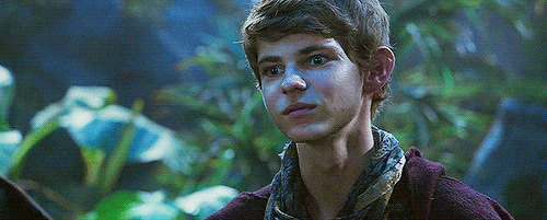
He moved his head toward her chest but she stopped him and pushed him down on the bed, her body moving to be on the top of his. He grinned looking at her and squeezed her leg, she started to loosen his belt while smirking. He gasped when she started to pull his trousers down; he helped her removing them. She kissed his neck, leaving small bites on it, then her lips travelled toward his chest, her hand caressing it too. Peter moaned when her lips stopped near the waistband of his boxers. He raised his torso to look at her, his hand under her chin. -- What are you doing? I own you an orgasm. -- he said and grabbed her neck. She smirked and removed his hand, the lust in her eyes lookinglike dancing flames. -- You'll have all the time, now it's my turn. -- she looked at him. He felt his desire growing so much he decided not to oppose to her will. He nodded laying down and she removed his boxers. Peter was impatiently burning with desire and he deeply moaned when she finally took him in her mouth. Y/n was an observer, she studied Peter's moves and his body language to understand what could please him more; that's why she was absolutely amazing at satisfying him. She knew how to drive him crazy, with the proper rythm and the perfect combination between rude and gentle. Peter took her hair in his hands to move them away: he loved watching her while she was giving him pleasure, he found her hot. She caressed his chest while moving her tongue as she knew he liked the most, she could perceive him getting closer to his orgasm. He suddenly moaned. -- Babe... Stop... -- he whispered, his voice deeper than the usual. She nodded and raised her head, she knew he didn't want to come so soon. He caressed her lips before pulling her for a kiss, a passionate kiss that made her gasp. -- I do love the way you touch me, by the way. -- she whispered on his lips, her fingers running through his hair. He smiled while laying her down on his bed, his eyes stuck into hers and a smirk curving his lips. -- This time, we won't be interrupted. -- he said, his hands caressing her waist, and she bit her lower lip and he kissed her again. While he started to move his head toward her legs she smiled thinking that he was all right: no one was going to stop them.
#peter pan imagine#ouat peter pan imagine#peter pan ouat x reader#peter pan x reader#ouat peter pan x reader#peter pan x fem!reader#ouat peter pan#peter pan ouat#ouat imagine#once upon a time imagine#peter pan x you#peter pan x y/n#ouat peter pan x you#ouat peter pan x y/n#peter pan ouat imagine
494 notes
·
View notes
Last Seen Blogs

friendlynb
Happy Thoughts

mame-12-12
Untitled

sweetieharmonyw8778
Slodkie Migoczace
suibianx
wherever the chaos is

herimeriouscondescendant-blog
fuchsia ruler