#for the colouring advice
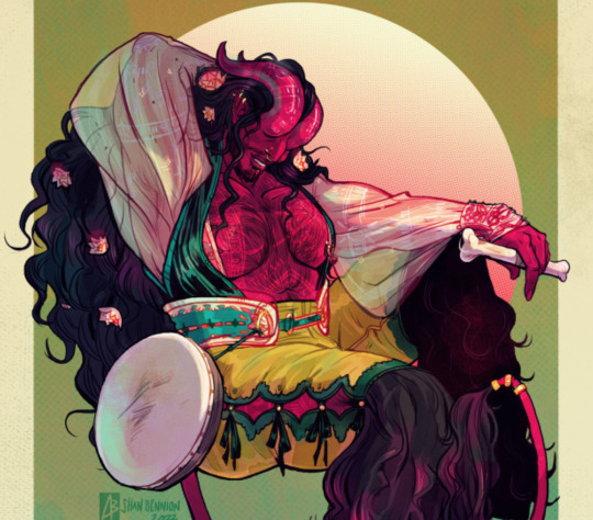
Photo

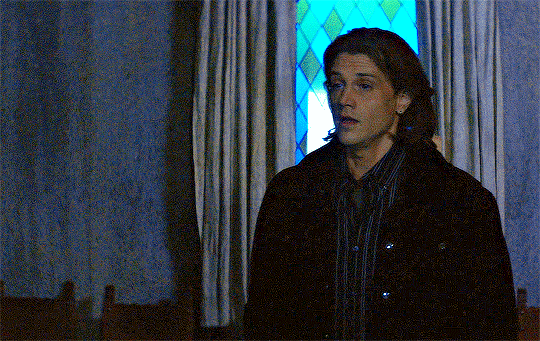
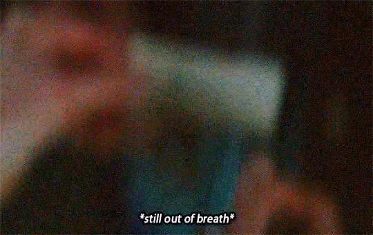
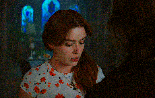
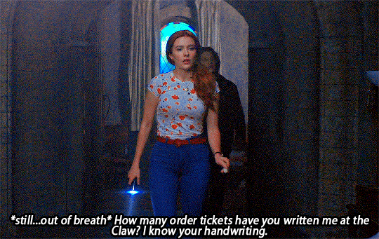
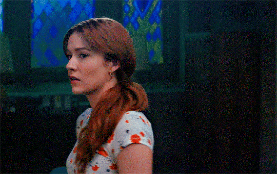
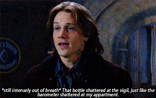

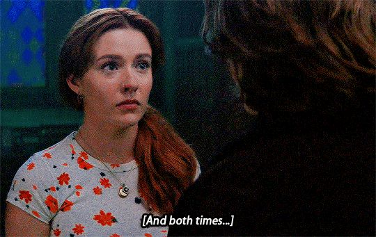
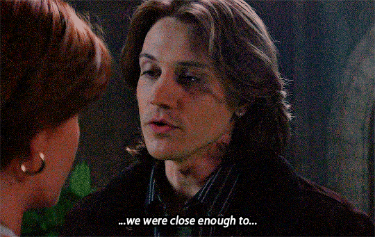
Ace, we can’t...
NANCY DREW and ACE in ‘The Dilemma of the Lovers Curse‘
#nancydrewedit#ndedit#naceedit#nancy drew#ace nd#nace#huge thanks to#bisexualalienss#for the colouring advice#tvedit#tvandfilm#filmtv#tvfilmcentral#tvfilmdailty#cwtv
227 notes
·
View notes
Text
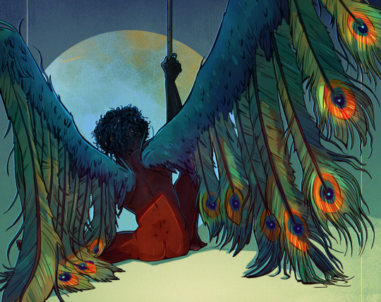
Colour Psychology (For writers)
Peace and blessings upon everyone!
I hope life's treating you well. I’m Esmeray and I welcome you to this post on my blog Dear Esmeray.
Have you ever wondered how colors can shape your readers' experience? Today, I'll share with you some color psychology and explore how it can enhance your writing.
Pink:
Sensitivity
Love
Kindness
Friendly
Tenderness
Vulnerability
Red:
Life
Victory
Blood
Wrath
Boldness
Danger
Passion
Violence
Black:
Power
Authority
Elegance
Protection
Formality
Sophistication
Mystery
Death
Boldness
Sadness
Evil
Orange:
Fire
Protection
Fresh
Cheerful
Optimistic
Warmth
Green:
Growth
Renewal
Harmony
Prosperity
Energy
Blue:
Travel
Trust
Relaxation
Calm
Authority
Purple:
Loyalty
Inspiration
Imagination
Mystery
Regal
Wisdom
Arrogance
So next time you write, consider the colors you choose – they may have more power than you think. With a thoughtful palette, you can paint your story in a whole new light. Happy writing!
With love,
Esmeray ♡
#writerscommunity#writers on tumblr#writing help#writeblr#writing#color#colour#dearesmeray#this is a girlblog#writer things#writing advice#writing community#writing tips#on writing#writer stuff#colours
959 notes
·
View notes
Text
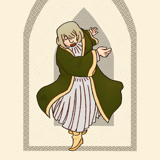
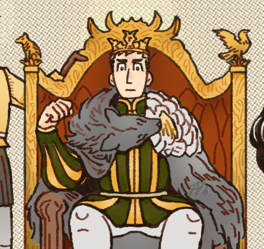
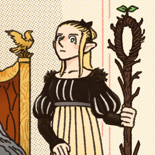
Welcome, traveler ! (manga ending spoilers below)

The King and his advisors will receive you shortly.
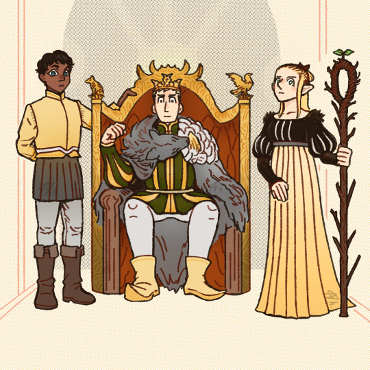
#dungeon meshi#dungeon meshi spoilers#laios thorden#falin thorden#kabru#marcille donato#dungeon meshi manga spoilers#my art#giving laios a green outfit cause he looks pretty in that color. when coloured official art comes out im gonna look like a clown but whatve#...did you know the winged lion insigna is in the center of this illustration instead of laios? it was accidental!! but now im insane!#anyway ch 97 has been everything i wanted and more. 'his capable and trusty advisorS' ? kabru being in the 2nd next panel?#after all those moments of him following & giving laios advice (like 'Do Not Go w the Elves' lol) during the feast i KNEW!! ty miss kui :)
259 notes
·
View notes
Text
Prompt #239
"You don't understand," Villain seethed, hand pushed tightly against their wound, "how hard I worked. I did..." They took several moments to pant and whimper through the pain. "I did everything I could, but you- you're the real monster here."
Hero was quiet.
"You don't"- they paused to groan. They kept bleeding, and it hurt. "You don't know me, Hero. You only see my actions; you don't- you don't consider their meanings."
******
Main writing blog: @amethystpath-writes
#prompts by dee#prompt#prompts#writing prompt#writing prompts#hero x villain#hero x villain prompt#hero x villain prompts#heroes and villains#hero#villain#we back#thank you kitty for the tumblr-saving advice#stupid black text on black screen#the solution was to change your colour pallet btw#then change it back to what you had it on before
593 notes
·
View notes
Note
Hey quick question how do you come up with the color scheme for the piece? I get stuck trying to think past what colors my characters have
oohhh, that's a hard one
It depends on what you're focusing on, the colours on a character or the colours in their background!
Backgrounds are best when they complement the figure but don't melt into them. Using opposites on the colour wheels (red/green, blue/orange, Yellow/purple) is a good place to start, as well as complimentary tones. So, for example, for the pieces below, the background contains a Lesser colour from the figure, but allows the main colours to pop! the pink/red of ahme's skin to the desaturated green, the deep but warm brown against the blue and green of the bg!
For complete pieces, full illustrations, one good way to make the character and background feel more coherent, is picking colours from the figure and incorporating them into the bg. The pink flowery dress becomes the pink of lanterns in the bg, the same yellow of the stars as the characters eyes.
And for most character designs, I find sticking to a few base colours and adding one to make it pop, works for me. Brown leather and smoky blue with Gold jewellry, Lilac silk with sage and perwinkle blue! Also, mixing warm and cool tones. All warm and all cool is borin, gotta give it a touch of the other to make it glow!
Also, make sure to look into some colour theory, my way isn't the way for eveyone, getting lots of dif info is the best way for you to find how YOU like to colour!
Hope this is helpful!!
246 notes
·
View notes
Text
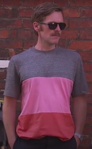
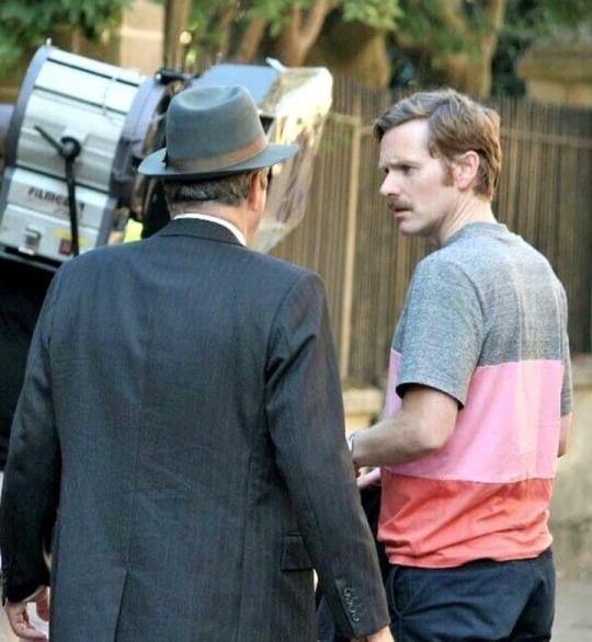
Ahh the morsetache plus the colour block pink t-shirt…
This was… umm…. a look
#shaun evans#itv endeavour#endeavour morse#moustache mondays#morsetache Mondays#it has very definitely grown on me#although I prefer it as part of a full 70s vibe#it’s somehow cooler#with the uniform and shades#than with jeans and colour block t-shirt#if you need fashion advice babe#or someone to dress you#just saying I could help with that#especially the dressing bit#or maybe undressing#ummmm#my tags are taking an unexpected turn#I should stop now#brb#hot damn evans
58 notes
·
View notes
Text
It sounds weird considering they're mute and featureless but I really like the character of C4-621. I suppose I should say I like them conceptually, rather than just liking the specific C4-621 self-insert that I play as.
I like this stoic shell of a human being who's gone through so much that at this point they're pretty much only capable of piloting an AC and doing nothing else. They're merely functional.

But they're still a person with thoughts and drives and they still manage to express themself with the sole outlet they have available, the AC they're doomed to pilot. It isn't just a weapon and a lifeline, it's a canvas which Raven uses to design (or regain) their personality.
It's my own personal headcanon, but because of the reasoning above I like to imagine that when I get obsesses over ACs working both functionally and aesthetically and spend longer on colour-schemes that weapons, that's reflected in C4-621 spending hours between missions poring over notebooks and sketchpads and colour palettes.
It helps that on Tumblr I've seen so many people interpret their own personal C4-621s in so many different ways that all feel very personal and unique.
#I also like to think Ayre eventually gives input regarding colour schemes#“Needs more red”#and Walter gives far less frequent but far better advice in that regard#armored core 6#c4 621#Raven#Handler Walter#headcanon#I'm really really enjoying this game
144 notes
·
View notes
Text
Taemin's Ending Fairy for Advice (Music Core, 210522)
#Taemin#Advice#giffedbyme#dailyshinee#solo: taemin#era: advice#other: ending fairies#Reposted it since the colouring looked too vibrant#2021#Music Core
130 notes
·
View notes
Text
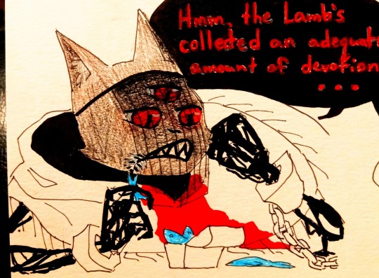
in my head this is how Divine Inspiration works
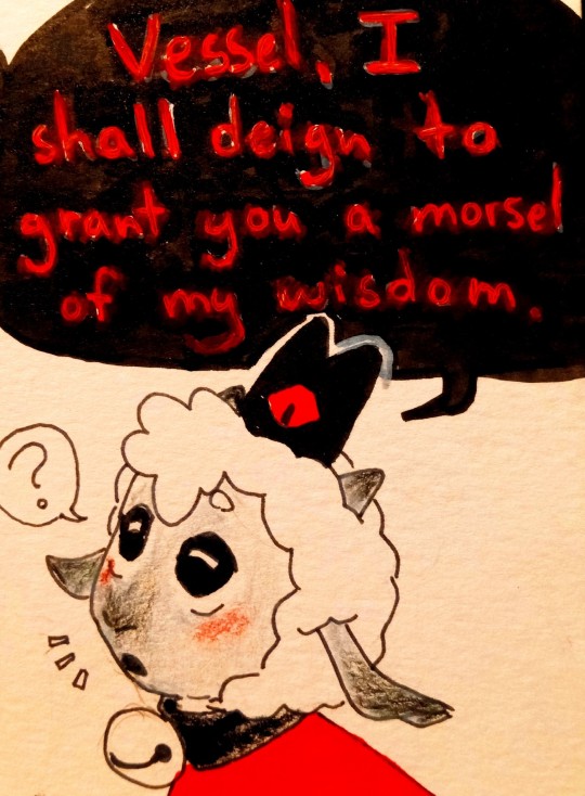
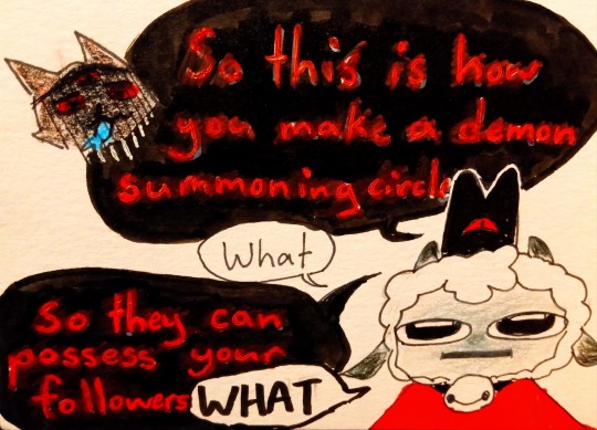
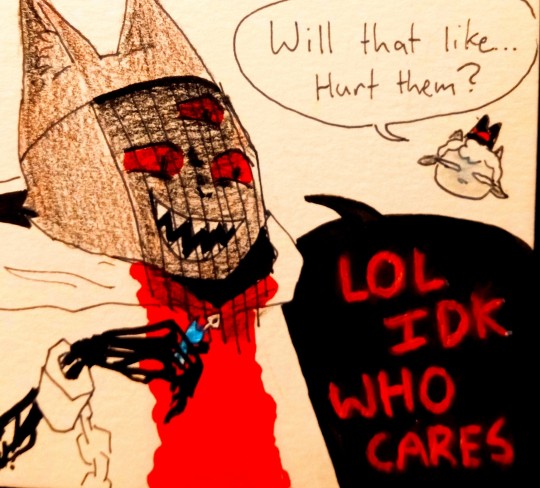
#cotl#my art#cotl lamb#cotl the one who waits#UGH i miss computer i miss being able to easily edit things😭#if you work with traditional mediums and want to make a comic with black speech bubbles and red text#my first and best piece of advice is: dont#my second piece of advice is#rather than try and do the red text first and then colour black in around it#colour in the whole speech bubble black#then use a paint marker/pen on top. i have a white paint marker so i let it dry and then coloured on top of that with red#do not recommend#anyways. i dont really think narinder would say 'lol idk' HOWEVER the image is funy to me#and also i definitely dont think he gives a shit about how these things affect mortals#i however. initially thought that 'demon possesses ur follower to accompany you into battle' would mean something like#like. they fight and can get KILLED. and run at anything that can aggro like a fucking diablo companion#so i avoided it my whole first playthrough and suffered a lot for it#i got stuck on kallamar and got really stressed about how my followers were dying faster than i could acquire new ones#and also now that i had a full set of doctrines i really regretted some of my choices bc they didnt pair up so well#so i started a new game and decided to be evil#and thats how i ended up fully filling out the folower forms! :]
91 notes
·
View notes
Text
[Trying out colours]
Please. Criticise me. Tell me what looks bad/could look better
#i usually dont work with colours so i struggle a LOT#:']#sanji#digital artist#digital art#artcore#artists on tumblr#luffy#one piece#op#zoro#artwork#art advice#criticism#your thoughts#artist#vinsmoke sanji#op sanji#sanji fanart
28 notes
·
View notes
Text
Writing Trope: Magically changing your POC characters.
You might not realise this, but if there’s a POC character on screen then there’s a good chance the character won’t stay themselves for the entirety of the story. Don’t believe me? Here are a few examples.
Princess and the Frog: The main character turns into a frog
Soul: The main character turns into a soul
Coco: The main character nearly turns into a skeleton
Brother Bear: The main character turns into a bear
The Emperor's New Groove: The main character turns into a lama instead of being dead.
You get my point, yes these are all Disney/Pixar-related stories but the point still stands, it’s a very common trope.
You might be asking yourself, why is this a thing and honestly...I don’t have a good answer for you. It’s almost the same question as “why does every black superhero have lighting powers?” It’s a common trope that again, not many people understand where it came from or why it’s a thing.
I think I might have an idea but it’s only a theory though. I think this is one of those situations where white people try not to be racist but instead create a racist character anyway and for this example, I’m going to be looking at Pixar’s movie, Soul.
If you’re a person of colour and a writer you might’ve gotten the good old. “How do I write a black character?”
“I don’t write black characters because I don’t want to accidentally become racist.”
“I just find it easier to write stories about fictional animals instead of humans because I don’t want to be racist.”
I discovered that young writers are afraid to create people of colour because they think they're going to get “cancelled” or get called out for being racist and in order to avoid the uneasiness about writing a person of colour, they make the character transform into literally anything else. This way the writer gets the benefit of no longer writing a black character but instead a [blank] one, all the while still having a black person on the diversity checklist because said character started off as black.
In the movie Soul, the main character doesn’t even stay in their own body for ten minutes before getting swapped by a white woman and in a way...that was kind of blackface the more I think about it.
While yes, there was one black writer (Kemp Powers) to help write Soul, there were two other writers who were white. One of them had been with Pixar since Toy Story. So, it’s safe to assume in the pecking order for who was in charge of creating the story, it was most likely a white person with Kemp being there to help do touch-ups. (Pure speculation).
I’ve seen countless white people try to “avoid” being racist by creating characters which are extremely black-coded but for some reason aren’t considered black because said character doesn’t have a black skin tone and the thing is, if you’re trying to avoid writing a POC because you don’t feel comfortable writing them, then you need to ask yourself, why? Why are you uncomfortable adding a person of colour to your story and why do you think people of colour are these weird foreign concepts you’ll never understand?
We’re not asking you to write a POC story, no. We just want you to add us to your story because we exist.
If you’re going to add a person of colour in your story, maybe don’t change them midway through, because I think it might come across as you’re trying to avoid writing us, by changing us into something you’re more comfortable with and we don’t want to be changed, we like ourselves for who we are.
#writing#writeblr#book#books#bipoc#people of colour#how to#writing community#writing advice#writers#writing help#writing tips#writing tropes#disney#pixar#soul#coco
41 notes
·
View notes
Text
if there's one piece of art advice i wanna give everyone i know, it'd be to
RENDER YOUR LINEART LIKE EVERYTHING ELSE!

lineart can be coloured and shaded just like every other aspect! it may be subtle but can make a HUGE difference to the finished piece.
now, it's not for everyone; some people prefer the boldness of black lineart. just from my experience, allowing lineart to blend yet still stick out just enough can help art feel smoother and open.
THIS IS ESPECIALLY IMPORTANT FOR PIXEL ART!
since your lineart is WAY more noticeable and thicker, sometime it is jarring to have all of your lineart bold-black. colouring your lineart opens up your art; it creates space for your subject to breathe. black lineart can be confining, so lightening it up to compliment the colours it contains can make your art look fresher!
AGAIN this is purely up to choice. everyone has their methods! just from me to you, try it out sometime!
24 notes
·
View notes
Text
so i'm crocheting a temperature blanket this year. my initial instinct was to say it's for my 32nd year but that's not actually how birthdays work so instead i'm awkwardly going with "the year i'm 32" and shortening it to just 32 mostly. anyway, that's besides the point.
i have the colour palette/yarn, i have the pattern (toni lipsey's linen stitch pixel temp blanket), i made a gauge swatch, i've started tracking temps (i've recorded hi/lo starting on dec. 8).... but fuck, i'm having so much trouble figuring out the temperature gauge!!!
i can't decide what the intervals should be, i can't decide if i want purples to be warm temps or cold temps or where to put the neutrals, i can't decide if i want to fiddle/tweak(/cheat?) and use the lows for the cold temps instead of the high which was the initial plan.... i just don't know!!! ugh.
#temperature blanket#temperature gauge#personal#crochet#whine whine complain complain#(i know it's not cheating bc it's my blanket/project and no one else's. i'm just so unsure)#i feel like if it was -20 early in the morning in jan but then warmed up to like -5 midday#then recording that day as -5 wouldn't accurately reflect the temperature variation? so that's why i'm thinking of using the low#but then i'm like. most often the low will be during the middle of the night which... is that representative??? idk????#and also like... representative of what??#i welcome advice or thoughts but reserve the right to ignore it if it makes me more confused lmao#i just have to pick something and stick with it for a bit#i guess if i find it's not working for me / not turning out how i'd like i can just tweak it from that point forward#except for the colour group assignment i guess#by which i mean purples = cold or whatever will be set in stone#i mean not literally. but i would not want to switch that up once i've started actually crocheting#i'm so conflicted about this bc i desperately want to start the project but i'm so so so unsure about the temp gauge
30 notes
·
View notes
Text
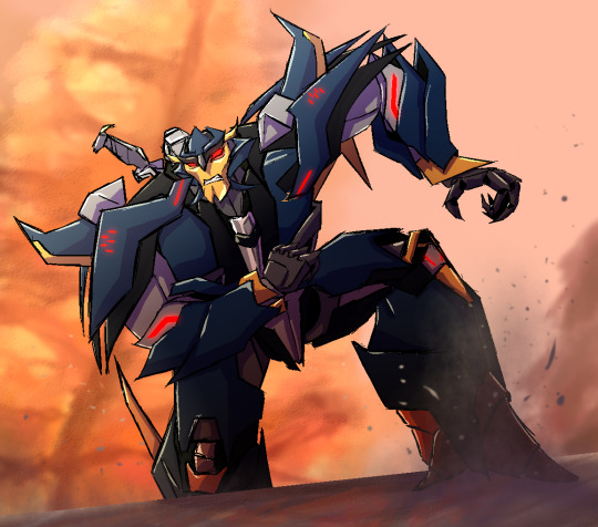
Dreadwing on the dash make-a me want to draw him so I did a screenshot redraw :) :) :)
Original under the cut

#dreadwing#tfp dreadwing#transformers#tfp#maccadam#fanart#ey i'm using the maccadam tag after some old tf fandom advice#i wanted to redraw this image because it's just a pretty image autumn colours my beloved :)#it had been a while since i've drawn either twin as a bot so i used a lot more references than i did before#though references are better to use anyway regardless if you're rusty i just forget to do that lmao#fuckinh hands though that fucks my wrist
396 notes
·
View notes
Text
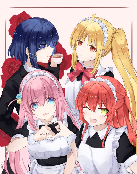
Three cute maids and a very fancy butler❤️🌹
#I love them all🥺#but Ryo is my fave by a small margin#her design is a nice mix of elegant and cool#she looks smart on the outside actually an idiot on the inside but sometimes she gives very nice advices#and I love the running gag with her money issues XD#I was hoping to start upgrading to harder concept drawings such as drawing more characters at once and doing full body fanarts#but lately I had the feeling that my colouring ability is lacking so I’ll focus on improving that for the moment🤧#bocchi the rock#bocchi the rock!#hitori gotou#kita ikuyo#nijika ichiji#ryo yamada#slacky’s art
99 notes
·
View notes
Note
hiya! i really love your art style and i was wondering how you color your pieces? they look so warm and your rendering is really cool!
I actually do struggle a bit with colours, but overlaid gradients help a lot
16 notes
·
View notes
Last Seen Blogs

duckworthmahoney
sad w Sanokie
fr3aky-fand0ms-nyart
Into JJBA rn

mgfitness-7
My weight loss Journey
themarywedding
themarywedding

personalisedplatesofperth
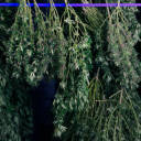
The Best Cheap LED Grow Lights for Indoor Cannabis Growing