Last Seen Blogs

tenaciousheartnacho
Untitled

tpt003
Untitled

ithehealthguide
Руководство Здоровой Жизни
wadasgetsfit
My Fitness Journey.
illement
ILLementary
Photo


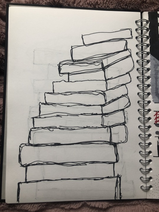

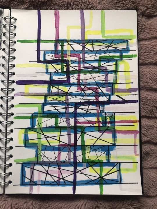
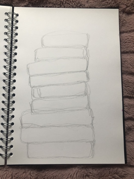
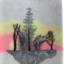
This week I have finished my sculpture drawings. I did five detailed one and five quick sketches that have been timed between 10 seconds and 45 seconds. Each detail drawing I did I used sharpies but I tried to use another media to give it a pop of colour. One of them I did use just sharpie but started with black and then coloured back into it using different coloured sharpies. I used acrylic paint, sharpies, pencils, ruler, thread, masking tape and needles.
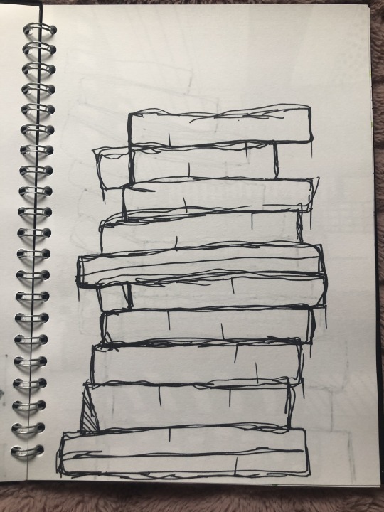
The first detailed drawing was of my sculpture but I turned into a tower and sewed back into it. I added a umbra sky in the background to make the tower stand out better a lot more. The second was a sharpie sketch with just black sharpie sketch. The third one was a sharpie detailed sketch where I used black sharpie sketch and then I filled the gaps with coloured sharpies.The fourth and fifth one was both quick sketches. The third one was about 30 seconds and the fourth 20 seconds. The sixth sketch was a quick black sharpie that I timed for about 25 seconds. The seventh sketch was just sharpies with different patterns and I used a a colour theme of tonely colours with red to give my work a pop of color. The eighth was acrylic paint, painted over a quick sketch of my structure. Once the paint had dried I used one normal sharpie and a extra fine sharpie to draw lines into each tower. The last two were just sketches that took about 10 seconds.
My favourite one has to be the acrylic paint because I love lines and shapes. I like how I used the bold colour then changed them to pastel, I think they look so pretty.
0 notes
Photo


1 note
·
View note
Photo

These are my sculpture design and photography.
0 notes
Photo


Blade Runner 2049 ~
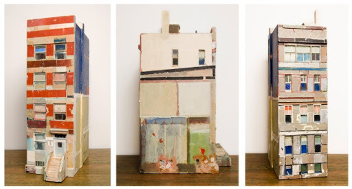
Structures
Powerful
Misty
Intense
Dreamlike
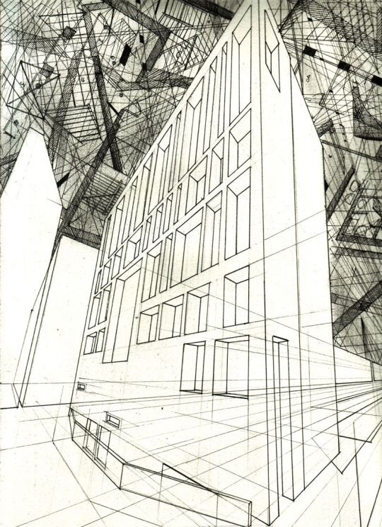
Dan Slavinsky ~
Architecture
Lines
Layered
Mechanical
Shapes
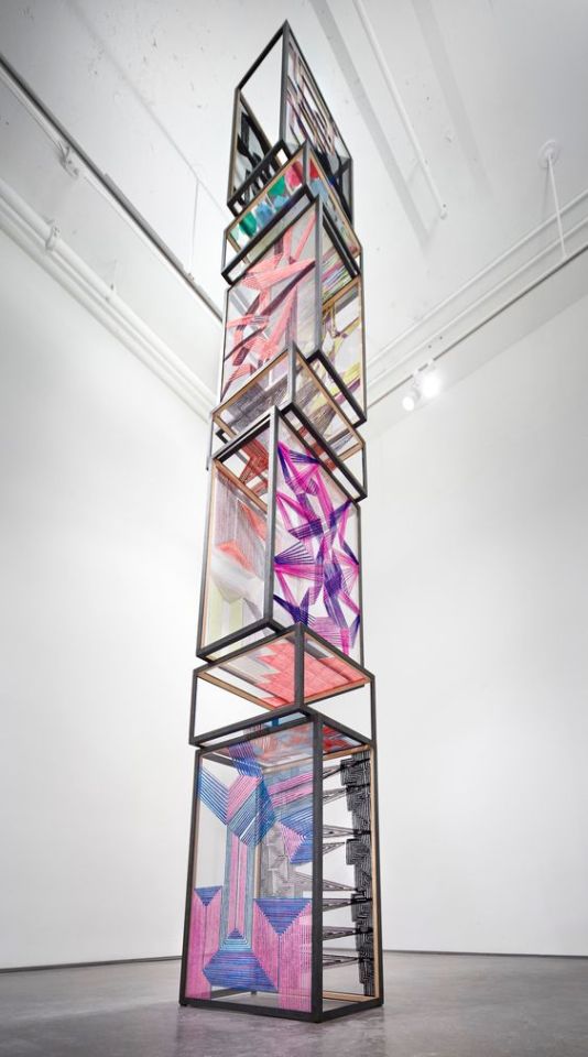
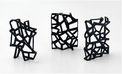
Alois Kronschlaeger ~
Colourful
Tower
Decorative
Abstract
Modern
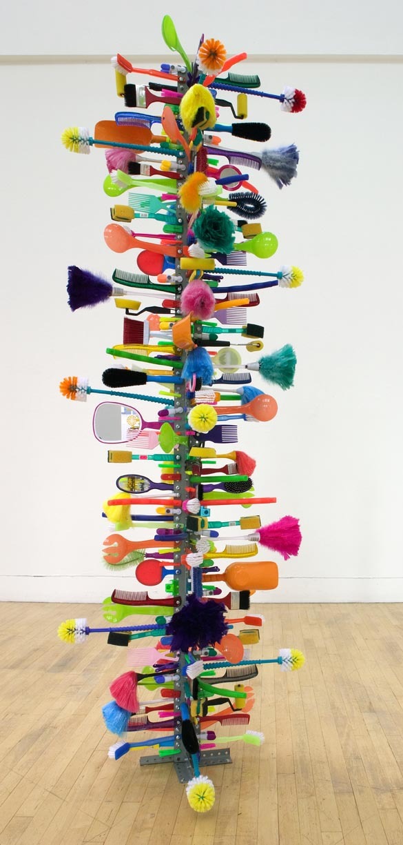
Rhonda Smith ~
Machine
Texture
Tower
Expressive
Unique
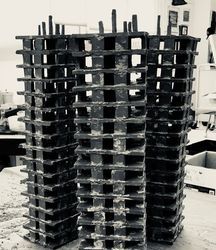
Viktor Timofeev ~
Abstract
Line
Monochrome
Bold
Forms
Gustaf Miller ~
Buildings
Surreal
Shapes
Modern
Characteristic
Susan Hefuna ~
Abstract
Line
Average
Dull
Pattern
David Batchelor ~
Unique
Bold
Dreamy
Intense
Dazzling
Antonio Dlink ~
Classic
Layered
Dull
Simple
Appealing
0 notes
Photo

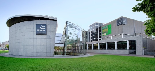

The Van Gogh Museum
The Van Gogh museum is located in Amsterdam in the Netherlands. It has the largest collection of the famous Dutch Vincent Van Gogh's artwork, it has 200 paintings, 500 drawings and 750 letters. The building itself is huge and has about three floors filled with Van Gogh’s artwork and each floor has a different stage of his life.
The ground floor is all about becoming face to face with Van Gogh and most of his self portraits. On the ground floor it contains an information centre and a restaurant. His work on this floor are mostly portraits of himself as that's what he started painting when he first wanted to become an artist. It shows you portraits he painted from 1886 and 1887. For example, ‘self portraits as a painter’ 1886. There is actually Van Gogh’s palette with tubes of paints that he used which I thought was amazing.
The first floor was his about his life in 1883 - 1889 and his beginning his art journey. There was a lot of information regarding how he started out. I read that he taught himself as an artists and that he taught himself perspective, anatomy and colour. As he got a lukewarm reaction from his painting ‘The Potatoes Eaters’ it made him realise that he had a lot to learn. This floor was filled with all the paintings where he just practised all the time. He started taking lessons and went to the Art academy in Antwerp. Then went to the studio of painter Fernand Cormon in Paris and practise for an entire year. He was inspired by 17th Century masters. He began studying the human body and drawing nudes, copying classical sculptures. He mostly concentrated on still life trying to perfect skills within painting techniques and combining colours.
The second floor was all about Van Gogh in close up and about his life journey. There’s information regarding when Paul Gauguin went to visit Van Gogh and these two artists kept on clashing. Van Gogh is said threaten Paul Gauguin with a razor and Paul leaves. To then return to Van Gogh cut off his ear. It is said that Van Gogh suffered with a series of mental health and mental breakdowns and he went to many doctors but ended up admitting himself into psychotic hospital. However, he remained confident in the healing of painting. This floor also had all of his letters he went his partners and other members of his family and a family tree.
The third floor was about his life 1889-1890 where his life was coming to a end. Van Gogh started to create artwork with nature in his finally months of painting. He produced seventy-five paintings in just severely days, he portrayed primary nature such as gardens full of lowers, close up of waving wheat, landscapes filled with emotions. He was familiar with this region of art from the paintings of Charles Francois Daubigny. Charles admired moods and personal sensibility and managed to install that into his landscapes. Van Gogh tried to convey the emotions that he experienced watching the sun rise or looking at a blade of grass or a ploughed field. On the 27th July 1890 Van Gogh shot himself in his chest with a pistol in a field near Auvers. He died two days later, all of his artist friends went to his funeral and it was then when one of his artist friends wrote about him he became a famous artist.
The painting by Van Gogh captured my imagination the most is the Irises painting because I love the colours he uses and the brush techniques. Near where I live these a house with Irises outside there front garden and it always reminds me of Van Gogh. I love his paintings of the Irises its do detailed with the colours he chooses as they all blend so nicely together and he is the reason why I love to draw, photography and paint nature. He has to be my favourite artist and I would love to go see his work in real life as he has inspired me so much.
2 notes
·
View notes
Photo
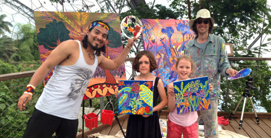
The Eden Project ~ Spirit of the Rainforest art project
This project invited thousands of children across the world to get creative and to connect to rainforest, by inviting them to submit artwork that they felt connects them to spirits of the Rainforests.
Their art was inspired by ~
Rainforest paintings by John Dyer and Nixiwaka Yawanawa.
Tribal people and culture
Rainforest plants
Rainforest animals, birds and insects
Rainforest food
In 1989 British artist John Dyer explored the Amazon Rainforest at the time he was a photographer for Thames TV. At the time, an Amazonian India called Nixiwaka was a small boy who lived with the tribe called Yawanawa in the Amazon Rainforest. 26 years later John Dyer and Nixiwaka Yawanawa met at the Eden project. John Dyer experiences turned his into an artist and painter but he discovered that Nixiwaka dream was to paint. In May 2015 they brought theses two creative minds together in a unique cultural exchange to create a new exhibition of paintings to inspire the new generation to connect to the rainforest.
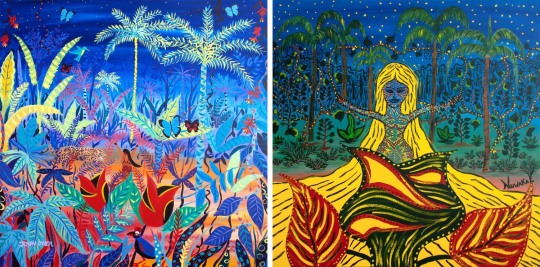
Rare - Spiritual rebirth
The painting above is called Rare - Spiritual rebirth. The one on the Right is Nixiwaka Yawanawa and the one on the left is John Dyer.
'These paintings represent the spiritual rebirth of a person who experiences the Yawanawa initiation into becoming a Shamen.' John Dyer
The Eden project was another piece of wider world research as its a project that helps the new generation to understand the significance of the Amazon Rainforest and to show people that the rainforest is somebody's home. By getting the younger generation to connect to the rainforest as it then may help for the future. They may well help stop deforestation, tribes and animals being destroyed. I am a strong believer with helping the Amazon Rainforest because we are cutting it done when we can plant new trees were someone has cut one down so the Rainforest will remain a good big size. This Eden project has help me understand more about the significance of the Amazon Rainforest and how important it is to some people and that we all should help project the Amazon Rainforest as one day it will disappear forever and the climate change will get worse and think about all those tribes and animals gone extinct.
#john dyer#nixiwakayawanawa#amazon#rainforest#eden project#new generation#conncet#spiritual#tribe#yawanawa
0 notes
Text
Wider World Research
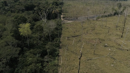
With my wider world research I decided to research about the Amazon forest because of climate change, materials and deforestation. I researched different articles regarding the Amazon forest and how it effects us all if the forests disappears.
The first articles I found was from December 2019. It talks about all the reasons why we need to help save the Amazon Forest. There are many different trees that grow in the Amazon Forest such as myrtle, laurel, palm, acacia, rosewood, Brazil nut and rubber tree. All these trees are being cut down for the oils and minerals inside as well as the timber. Brazil has about 60% of the Amazon forest in it borders, about 1,583,000 square miles in 1970. By 2016 there was about 1,283,000 square miles left. 81% of that was covered by forest in 1970. Around about 75,000 fires have occurred during the beginning of 2019. What all of this information is telling you that deforestation is effecting the Amazon Rainforest and it is shrinking.
The next article I found was WWF article. This article tells you all about climate change and how its effecting the earth and the Amazon Rainforest. The trees key role is to reduce pollutant levels by taking in the CO2 and giving out oxygen so we can breathe. CO2 is created from natural and human resources. 150 years of massive amount of Co2 in the air this is created by burning fossil fuels, coal, oil and natural gas. The whole point of forests is the trees they burn the carbon matter which is CO2 and without the Amazon Forest and the large forests our atmosphere will be polluted. Without the forests CO2 can no longer be transformed into photosynthesis. Industrial pollution and deforestation increases the amount of CO2 in the atmosphere.
These articles link with my current project because with my artwork I use paper and materials that may have ingredients from the Amazon Rainforest. I feel as a artist that we should be more careful with the materials we waste especially paper and we should make sure we should recycle. As artist we should always be reusing materials such as not throwing paper out maybe trying to reuse it. Like paint as well maybe not pouring large amounts out at a time use a little bit then keep adding a little at a time to your paint colour so there's no wastage of paint.
0 notes
Photo
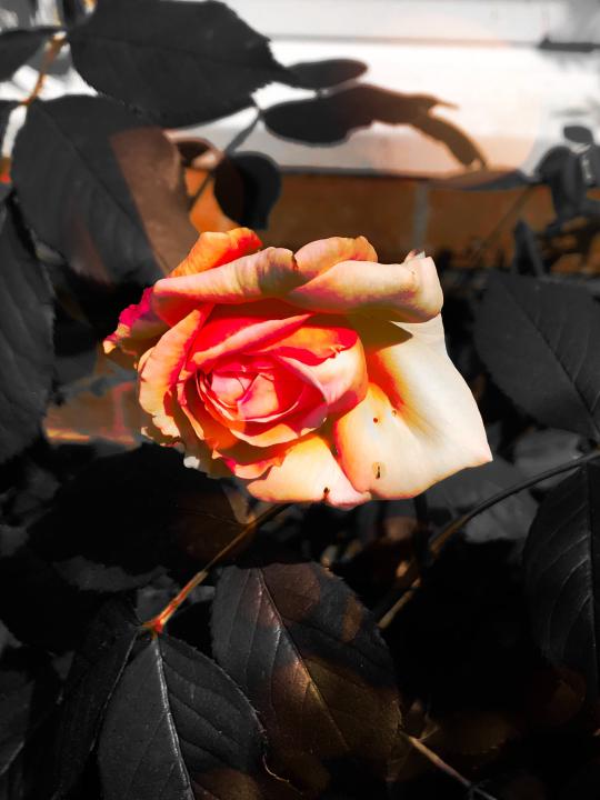


These are my own photography's that I took last year for my art and design level 2 course. I decided to use these as research for this project because they remind me of ‘The Break Away’ poem I picked out and my penguin book ‘The Reckoning’. The words I use to describe the poem and my penguin book remind me of these photography's I took. The words I mainly used to describe them was lose, separation, love, marriage and divorce. For example, the word ‘love’ reminds me of the rose as roses are a symbol of love and people give roses to the ones they love. Furthermore, the word ‘lose’ reminds me of the last photography because the photography is of a quiet and dark street. As well as the quote I choose reminds me of lose because its talks about remembering the memories but how the town was lose. These images support my project as I could use them within my theme of marriage and lose. However, my ideas of using photography for creating some artwork would of been a great idea as it shows off my skills of photography and as well I could of used of quotes from my penguin book and poem.
0 notes
Photo
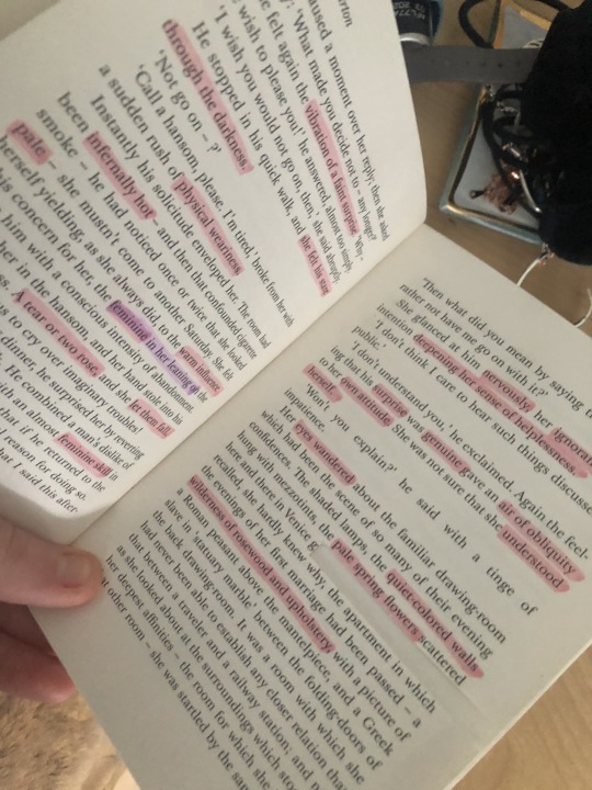
One of our tasks this week was to research ideas that are not internet based that support our project. I decided to research more about my penguin book, a poem I found about divorce and some photos I took.
My penguin book is all about two moving stories of love, lose, desire and divorce. Its called The Reckoning by Edith Wharton. This book supports my work because our project was all about typography and we had to base our ideas off of the book we were given. They were all given at random so we didn’t know what both we were going to receive. I tried to base my work on key words I choose out of curiosity in the book and pick out phrases that matched we with artwork I was producing. Some of my artwork is about divorce and love, however in the book it describes different viewpoints. For example, ‘The blue sky with its round clouds shed a brightness over everything, the ailanthus had put on a tinge of yellow-green’ with this phrase I loved picking out the colours so I could base work on just colours and basing work on different landscapes. I didn't really focus my work on marriage and divorce because it’s not something I enjoy looking into. I mostly based my work on viewpoints the characters would describe and colours they would talk about.
Your daisies have come
on the day of my divorce.
They arrived like round yellow fish,
sucking with love at the coral our love.
Yet they wait,
in their short time,
like little utero half-borns,
half killed, thin and bone soft.
They breathe the air that stands
for twenty-five illicit days,
the sun crawling inside the sheets,
the moon spinning like a tornado
in the washbowl,
and we orchestrated them both,
calling ourselves TWO CAMP DIRECTORS.
There was a song, our song on your cassette,
that played over and over
and baptised the prodigals.
It spoke the unspeakable,
as the rain will on an attic roof.
Letting the animal join its soul
as we kneeled before a miracle -
forgetting its knife.
The next non-based internet research I found was a poem about divorce. It is called The Break Away and is by Anne Sexton. I read this poem and you wouldn’t of guessed its about divorce if it didn't actually have the world at the start because its a really strange and doesn't really make sense. I had to read it through so many times until I sort of got an understanding of the poem. This poem supports my ideas as the poem describes lose and separation which is similar to the ideas I gathered within my penguin book. However, it does talk about the positives of a marriage but the negatives too. I like this poem because it talks about ‘daisies’ at the start of the poem which supports my project work as I did do a piece of work based on flowers. As well as I included flowers in different pieces of artwork. The phrase I loved and I thought did support my work was ‘ as we kneeled before a miracle - forgetting its knife’. It supports the lose and the hatred of marriage just like my work does bring across and it has got the positive saying ‘miracle’ it gives you that thought that marriage can be beautiful as well.
#lose#marriage#book#poem#thebreakaway#anne sexton#the reckoning#edith wharton#negative#postive#love#divorce
0 notes
Text
Researching the Creative Industries
The creative industries sectors I had research and found were advertising, architecture, visual art, crafts, fashion and textiles, art and design, performing arts, music, software/ electronic, cultural education, photography, film and video, computer games, radio and TV, writing and publishing and heritage publishing. The jobs and vocational roles within the creative industries that interest me are fine art, art therapist and art teacher.
Fine art can be in any medium, such as paint, wood, metal or textiles. The work with fine art is purely to be a work of art, rather to add visual appeal to something with a functional purpose. For example, making a building, clothing item or webpage to look good. Fine art make money by selling their work and many have another job too give them a regular, reliable income. You don’t have to have qualifications in art to be an artist but a degree in art is a typical starting point.
Art therapist work with people who are facing problems such as mental health, addiction, behaviour and communication issues, or who are recording from illness or brain injury. Therapists encourage them to use art as a way to explore and understand their feelings and find a way to move forwards with their lives. It’s all about using an activity that people may find easier than talking about experiences, rather than training them as artists. You may work in places such as schools, hospitals, prisons and rehab units. You may develop specialisms such as working with children or people with autism. You need a degree in art and design or start out in a career such as psychology, nursing or social work.
Art teacher can teach art in secondary school or further education college. A typical entry route is to do an art degree followed by a teaching qualification. Alternatively, you could become a primary school teacher by taking a degree in education - there are some courses that will let you specialise in art teaching.
The skills, techniques and processes that I have learnt and used on the course that will help me to get a job into the creative industries are basically all of them as I want to become an art teacher. Becoming an art teacher I need as many skills and know the techniques plus processes to achieve my dream job. Doing this course I want to widen my skills and learn about all different techniques and processes. In the future when I become a teacher I know more about art and the wider world in art.
#widerworld#skills#technique#process#art#teacher#creative industry#fineart#art therapist#qualifications
0 notes
Photo
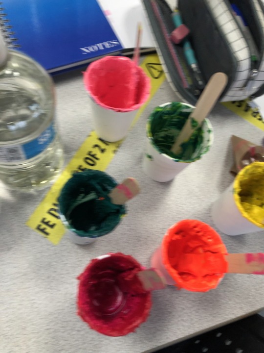


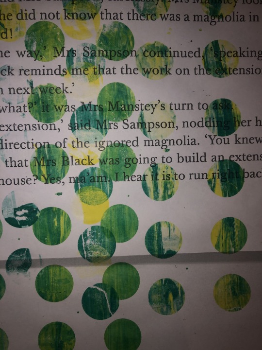

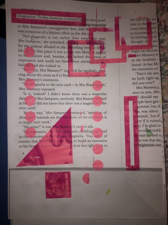
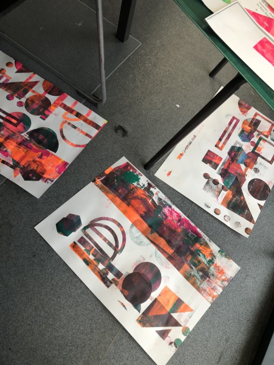
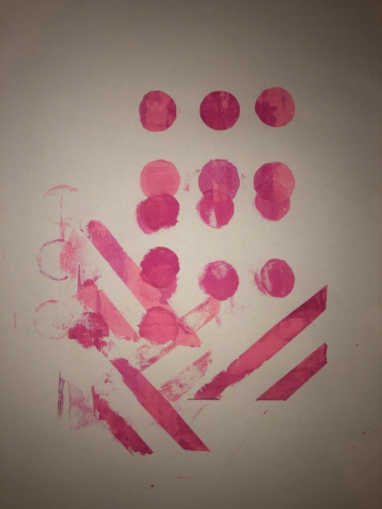

Today, I created these stencil screen printing. I used mixed coloured inks, squeegee, photocopied paper of my penguin book or card, a bucket of water with a sponge, my stencil and a stencil that had been printed by the technicians.
Firstly, I started by cutting out my stencil using a craft knife, paper and a cutting board. I choose to cut out circles and lines as I really wanted to focus on shapes instead of a illustration of something. Once I had finished cutting out my stencil I choose my coloured ink which was this bright pink and I decided to photocopy and enlarge my penguin book to then print my stencil onto. I added some ink to the top of my stencil and then using my squeegee I smoothed the ink over my stencil to print my stencil. After about two tries my stencil did break so I decided to use a screen-print stencil that had my print by the technicians which was loads of different shapes.
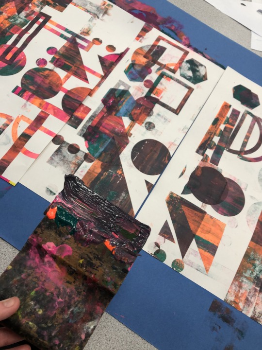
I started using the shape screen-print, using loads of different coloured inks such as purple, orange, pink, blue, green, yellow and some other colours. I started by creating my own shapes by choosing the shapes I wanted to use on the screen-print design and picking colour themes out for each design. In the end though I started to experiment by placing 3 pieces of A3 card under the large shape screen-print and repeatedly screen-printing over my designs. I kept adding different colours and moving the screen-print design to make sure all 3 pieces of paper have lots of colour and shapes all over them.
My favourite ones have to be my experimental pieces because I love all the colour and how the shapes overall. It doesn’t look chaotic which I thought it might look like instead I think it looks amazing I love where all the shapes are placed. To improve I’m going to work back into them adding bolder shapes to bring it all together.
2 notes
·
View notes
Photo
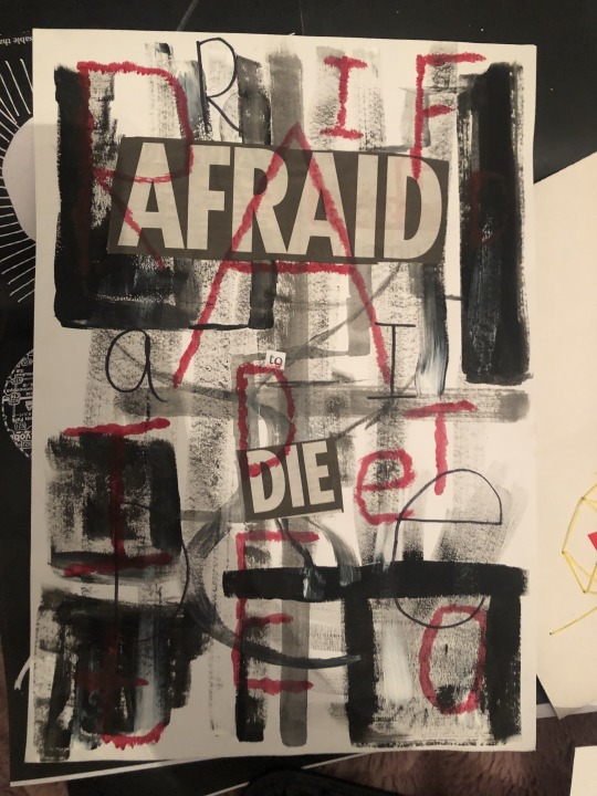
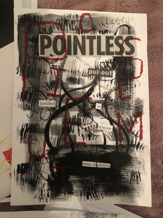
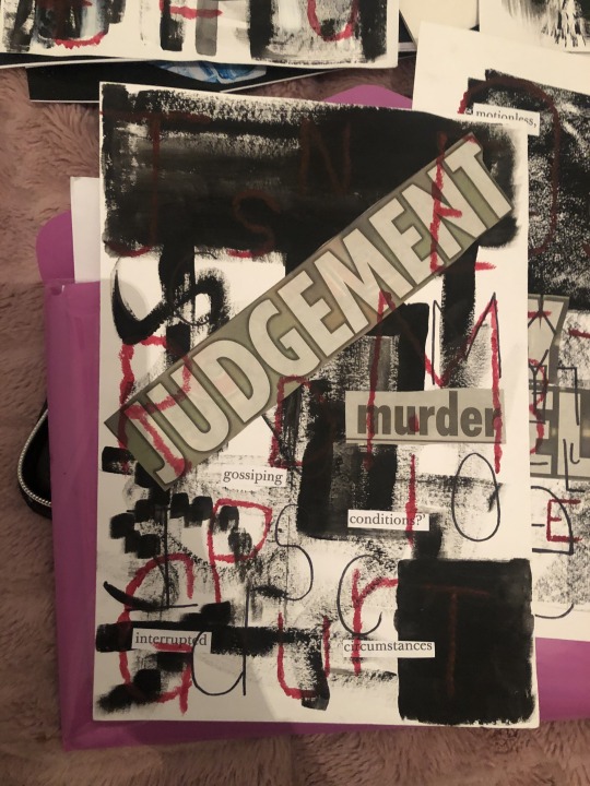
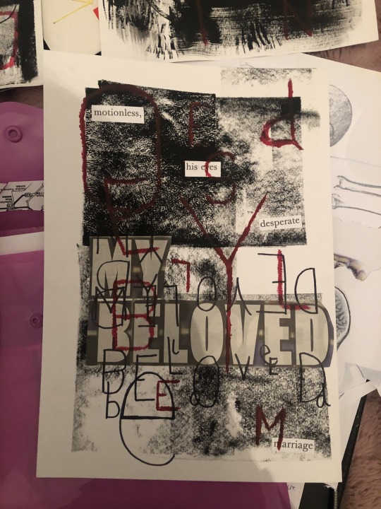
Today, I produced these mixed media illustrations. I used words from my penguin book, newspapers and other old books to create my typography mixed media illustrations. The materials I used was collage, acrylic paint, ink, watercolour and sharpies.
Firstly, I started by getting acrylic black paint and painting patterns on my blank piece of card for my background. I used black as I wanted a gruesome and dark looking background to really make my work stand out. After they had all dried I started hunting through newspapers, my penguin book and old books for words that I could rearrange and create quotes that you question what they mean.
Next I stuck down all the words I choose on each of the backgrounds and started to think about my typography design. I decided to stick with gruesome colours such as black and red. The reason being the quotes I designed are very creepy and mysterious. I used a red acrylic paint to paint on different letters to match the letters that are in all my quotes. Once they dried I went in with sharpie and drew on bold black letters from my quotes as well. I made some of the letters overlap, I changed the size and angle of the letters.
My favourite part of this piece has to be the red bold letters because I love how they add colour to my dull colour choice. As well as I love how the colour makes my work look gruesome as the red reminds me of blood. To improve I would like to maybe take them to the photocopy and invert them also change the colour.
#gruesome#typography#mixedmedia#illustration#newspaper#magazines#oldbooks#penguinbook#acrylicpainting#collage
4 notes
·
View notes
Photo
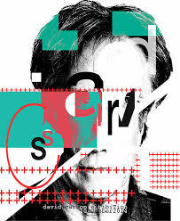
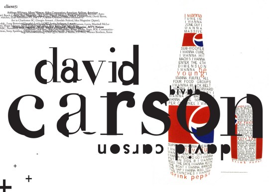
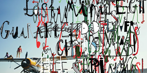
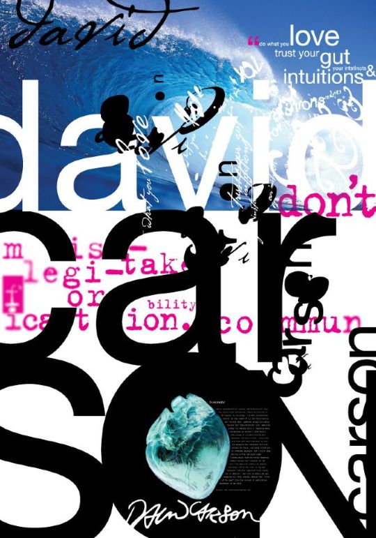

David Carson ~
These pieces of artwork are by the artist David Carson. When I saw these pieces of work it made me feel inspired because of the detail of the fonts and how he has made them each unique. The last piece of work reminds me of a magazine because of the barcode and the little white lines which could be mark of where it been folded or even those vintage lines. When I look at these pieces it makes me feel outstanding because I love the collages of text and the boldness of all the shapes. He is one of my favourite artist.
David Carson uses photography, digital effects, layering, collage and typography techniques. The mediums he uses are black and white inks and colours when he uses digital art. He mostly uses digital apps to greet his work. David Carson has inspired my work because he made me think about my theme or my piece of work. What I mean by that is he made me think more about the font and the colours I should use with the piece of work I am digital editing. He has inspired me to also use more text in my artwork as there are so many different fonts and typography out there by me being shown this artist it makes me want to use more text.
David Carson is link to my project because he uses typography in his work and are project is based on that. As well on a Tuesday we do digital work with Charlotte and we use typography all the time in our digital editing. I choose similar fonts to him as well so he links a lot into my work.
0 notes
Photo


Ben Giles ~
These pieces of artwork are created by an artist called Ben Giles. I couldn’t find any dates or names of these pieces of artwork they were mostly all called Untitled. When I first saw these pieces of work it made me feel excited because of the bright and dramatic layers of flowers. These pieces of artwork remind of a child imagination because of the chaos of the flowers and how he’s used bright colours. When I look at his work it makes me almost drawn to the image as the layers are unique and collage he uses are detailed.
The intended audience his work is aimed at is younger adult or teenagers as the colours he uses aren’t dull or pale they’re are bold and are eye catching. Whereas if he was aiming his work at a much older person he would think about the dull colours and adding more detail. I think Ben Giles is trying to say with his work is let your imagination run free and created pieces of artwork that are unique and dramatic.
1 note
·
View note
Photo
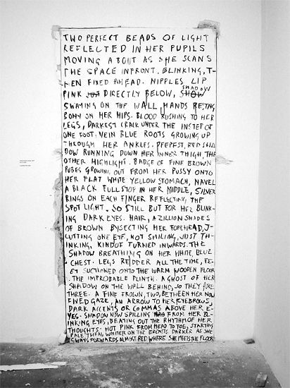
Fiona Banner ~
Fiona Banner is a British artist and was born in 1966. She produces sculptures, drawings, illustrations and text in her work. Most of her work is based on these huge scale text art, she uses basic colours of black and white in her text artwork. The background is usually a white wall but I like how she adds these almost stains around the canvas on the wall to create that ink fell from the text.
The colours she uses makes her work look quite dull but when you read her text it turns quite dark and creates this scary feeling. The texture looks smooth but the background looks messy so looks more rough. The form is 3D but does look 2D due to the angle the photo was taken from. She uses these strong lines to cross out words she doesn’t want or spelt wrong which I think gives her work a more dark felling.
I think her work is about communicating a message using typography. Its talking about a girl, describing her and talking about what she sees. With the composition of her work all the different elements it communicates the idea of sadness and depression as the lines of the crossing out words almost show that he wants to communicate something but is to scared to say something. It almost gives that feeling of that he is lost and maybe even in love but too scared to say it.
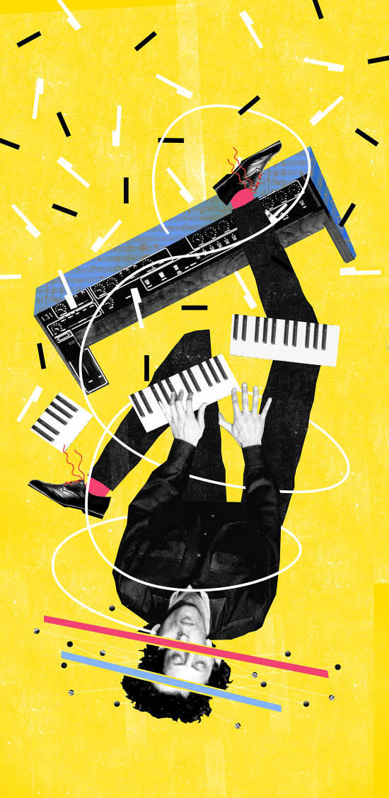
Nate Kitch ~
The piece of artwork is called Philip Glass and is by Nate Kitch. When I first saw this piece of work it made me feel it made me feel overwhelmed because of all the bright colours and collage. This piece reminds me of a musicians brain because of the piano and all the keys flying around the man. It sort of feel like we can see his imagination and see what he feels when playing the piano. When I look at his work it makes me feel interested as I can see his imagination and see what musician feel and think when playing a instrument.
Nate Kitch uses collage to create his illustrations and he try's to tell a story with his work. He likes to test people with his work to see if they know what his work is all about but everyone seems to have different ideas. He is inspired by geometry art, shapes and patterns. He starts all his work with shapes and patterns and he likes to apply textures. My eyes are drawn to the bright yellow in the background and the black and white man as both are a great contrast together.
0 notes
Photo
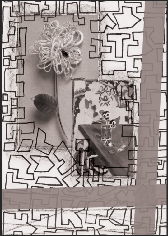
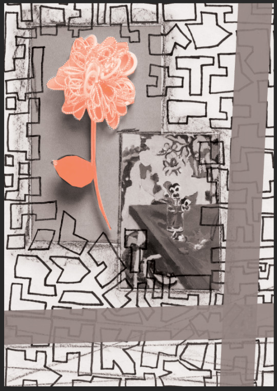
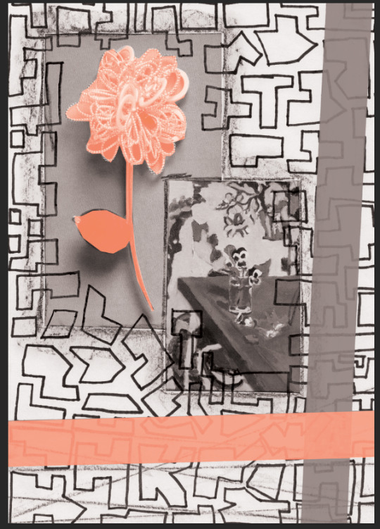
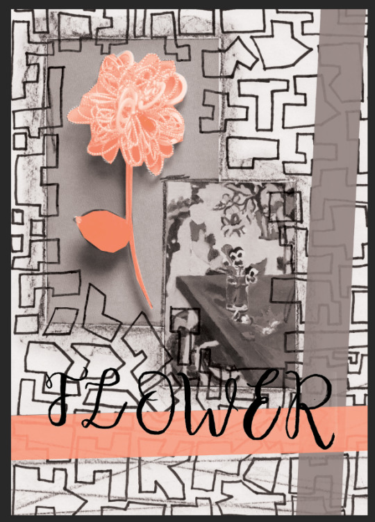
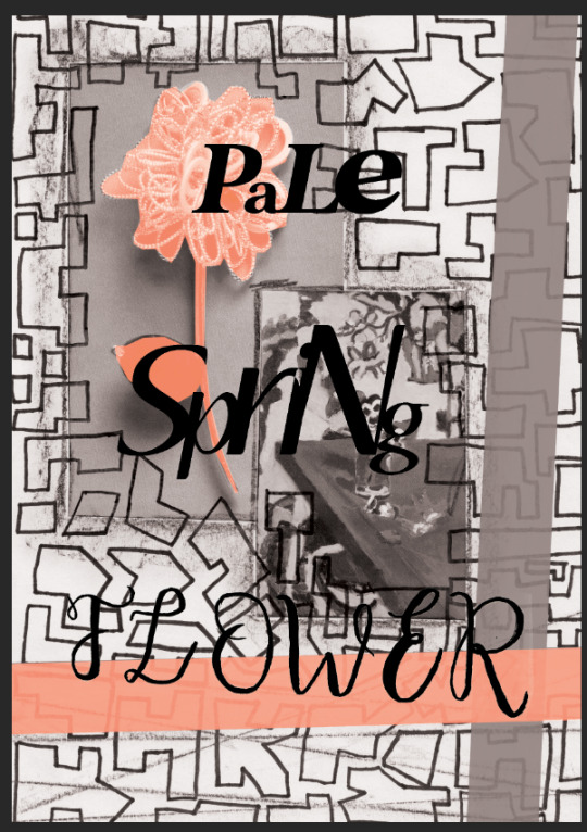

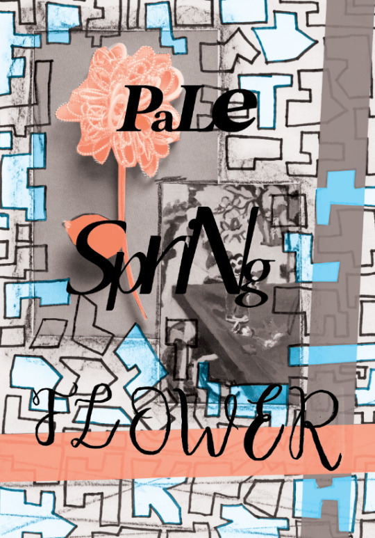
Today, I created some more developments of my postcards using work I’ve produced over the last week. I scanned all the work that I had created using a scanner and I then upload it all to photoshop.
Once I uploaded my work I used one of my collages from a couple of weeks ago as it inspired me to create my own typeface this week and I wanted to use that. First I adjusted the levels of my image by going into image then adjustments. Once levels were how I wanted I then turned it to black and white. After that I Started by using my lasso tool and outline the flower to change the colour. Then I decided to use that peach colour and the blue in my image so I again using my lasso tool outlined the tape and turned it to that peach colour.
When I added the font I thought it looked plain so I decided to use my lasso tool and outline the shapes in the background and fill them with that nice blue colour. I decided to do it with several to add that nice bright shape in the background.
With the font I had use a typeface I had download from Dafont.com but only with the word pale and spring. The flower typeface is one I designed and I again scanned it in and adjusted the levels. Then I cut it out using my lasso tool.
0 notes
Photo

The History Of Typography
We learnt on Monday all about the history of typography.
In 1400s Guttenburg created moving typefaces to make it cheaper. He created the first typeface blackletter.
In 1470 Nicolas Jenson created Roman type inspired by text on Ancient Roman buildings. It was much more easier read than blackletter and caught on very quickly.
In 1501 a man called Aldus Manutius created italics which fitted more words onto the page and was much more cheaper to print.
In 1734 Caslon created a typeface called san serif which featured straighter serifs and had contrasts of thick and thin lines.
In 1757 Baskerville created a traditional roman style with very sharp serifs and drastic contrasts between thick and thin lines.
In 1780 Didot created the modern roman typeface which contrasts more extreme and a fresher look.
In 1815 a man called Vicent Figgins created the Egyptian or slab serif and this typeface had serifs with squares and boxes.
In 1816 Caslon IV created the first typeface without serif. This was the start of the sans serif typefaces. After this type exploded and many were created to accommodate advertising.
1920′s Goudy was the first full time typefaces and created typefaces such as Copperplate Gothic, Kennerly and Goudy Old Style.
In 1957 a Swiss designer called Max Miedinger created the typeface Helvetica and this was the loved typeface of our time.
Present we have developed many typefaces. We have access to thousand of different types compared to a hundred years ago.
0 notes