#//all traced from canon art obviously
Text
Buneary Breeds
Wanted to show a list of some Buneary Breeds! I'll do an in-depth post on each one once I have all of Lopunny's down.

Translation into Unown from top left to right: Standard, Snowslipper, Angora, Blanc, Marron, Blanc et Marron, Meadow, Harlequin, Noir
(My designs can be used by anyone!)
#//all traced from canon art obviously#//except standard that one is literally just buneary's official art#pokemon variants#pokemon breeds#buneary#lopunny#pokedex#sinnoh pokedex#normal types#normal type#normal type pokemon#pokemon biology#pokemon biologist#pokemon zoology#pokemon#pokemon irl#irl pokemon#pkmn irl#irl pkmn#rotomblr#rotumblr#pokeblr#pokeblog#pokeblogging#pokemon roleplay#pokeblogging roleplay#pokeblogging rp
206 notes
·
View notes
Text
How To Be Gay, by David M. Halperin
While there are obvious fan studies classics, there are other books that don’t always fall into the “fan studies” canon that I have found incredibly useful for my own thinking. I cited one of them, Carol Dyhouse’s Heartthrobs: A History of Women and Desire (2017), a few posts ago; another is David Halperin’s How To Be Gay (2012)
How To Be Gay came out of a course Halperin taught at the University of Michigan, whose full title was “How to Be Gay: Male Homosexuality and Initiation.” The initiation in question was not sexual, but cultural: Halperin believes that there are not only gay texts, a gay canon of sorts, but also gay ways of reading that are taught and learned and that help constitute something we might call a gay subjectivity (that you don’t have to be gay actually to have): e.g. Hollywood movies, opera, Broadway musicals, camp, diva worship, drag, muscle culture, style, fashion, interior design. Halperin asked both why this set of things–why musicals? why this diva or that–and what do they tell us about gay experience? Halperin was trying to trace “gay men’s characteristic relation to mainstream culture,” which often involves collaborative and camp appropriation: a queering.
I find this book very useful, both because fandom also has its own shared languages and rites of initiation (consider the idea of watching something with fannish goggles or slash goggles or a fanfic lens, as was recently discussed in a previous post; think about all the languages and tropes and artistic structures we all learn from each other) but also because Halperin talks about modes of identification that aren’t representational or based obviously in identity politics. So, for example, he says that the gay male students in his class were more likely to express themselves vis a vis a shared text like The Golden Girls than vis a vis the traditions of what Halperin calls “good gay writing.” There is, Halperin argues, a queer pleasure in the Broadway musical that’s different than the pleasures of gay identity or even gay sex; similarly, queer female fans might find pleasures in identifying with, say, Sherlock, Crowley, or Blackbeard that are very different from the pleasures offered by a woman- or lesbian-centered text.
Here’s an excerpt that gives a good sense of the book, I think: fans might identify with this or recognize it as descriptive of their own fannish feels. (FWIW, the italics are all his!)
[H]omosexuality is not just a sexual orientation but a cultural orientation, a dedicated commitment to certain social or aesthetic values, an entire way of being.
That distinctively gay way of being, moreover, appears to be rooted in a particular queer way of feeling. And that queer way of feeling—that queer subjectivity—expresses itself through a peculiar, dissident way of relating to cultural objects (movies, songs, clothes, books, works of art) and cultural forms in general (art and architecture, opera and musical theater, pop and disco, style and fashion, emotion and language). As a cultural practice, male homosexuality involves a characteristic way of receiving, reinterpreting, and reusing mainstream culture, of decoding and recoding the heterosexual or heteronormative meanings already encoded in that culture, so that they come to function as vehicles of gay or queer meaning. It consists, as the critic John Clum says, in “a shared alternative reading of mainstream culture.”
As a result, certain figures who are already prominent in the mass media become gay icons: they get taken up by gay men with a peculiar intensity that differs from their wider reception in the straight world. (That practice is so marked, and so widely acknowledged, that the National Portrait Gallery in London could organize an entire exhibition around the theme of Gay Icons in 2009.) And certain cultural forms, such as Broadway musicals or Hollywood melodramas, are similarly invested with a particular power and significance, attracting a disproportionate number of gay male fans.
What this implies is that it is not enough for a man to be homosexual in order to be gay. Same-sex desire alone does not equal gayness. In order to be gay, a man has to learn to relate to the world around him in a distinctive way. (p. 12 - 13)
–Francesca Coppa, Fanhackers volunteer
65 notes
·
View notes
Text
saimota week 2023 is real babey
boy howdy! this is late and i know it’s late and i am sorry. no graphic to show for myself either. i (mod tox) am just doing a real waddle of shame onto here to give you these prompts.
but hello!! salutations! happy 2023-- saimota week will be running again this year from march 19th through march 25th, so please get excited with me!
here are the prompts:
day one (march 19): shadow / sunlight / intensity
day two (march 20): heart / body / intellect
day three (march 21): wisterias / evening / sanctuary
day four (march 22): fight / resolution / tears
day five (march 23): lucid / nightmare / terminal
day six (march 24): support / growth / reciprocity
day seven (march 25): pre-canon / post-canon / free space
as always, be sure to tag all entries with [ # saimota week 2023 ] and [ # saimota week ] and also make sure that you @ MENTION THIS BLOG so that i can reblog all of your entries. if you post something and the blog doesn’t reblog it within a day, feel free to message me @toxicpineapple and i’ll make sure to get on that for you.
i’ll be putting guidelines + relevant details below the cut. stay tuned for reblogs and annoying countdown posts as the week draws closer, and we’ll look forward to seeing your entries once again!
1. late entries will be accepted and boosted with no end deadline! please feel free to keep posting content with these prompts and for this event long after it has ended, we will happily continue to boost anything that you put out after the fact. additionally, the prompts are guidelines, but their use is not mandatory. you are welcome to interpret the prompts as you’d like, and even disregard the prompts altogether if that suits you best.
2. works featuring saimota in a polyamorous relationship with other characters (for example, romantic training trio, amasaimota, akasaimota, etc) will ABSOLUTELY be accepted! obviously this week is for appreciating the romantic relationship between shuichi and kaito, but it’s okay if the other partners get the same amount of screen time! furthermore, background characters and relationships will also be allowed.
3. works featuring shuichi and kaito in a queer platonic relationship will be permitted. however, as this is a romantic ship week at its heart, please refrain from posting content about their friendship or about them as best friends. it’s okay though if the themes in your works are subtle or not overtly romantic.
4. the unauthorised use, reproduction, or replication of the works of other creators during this week will not be tolerated. this includes but is not limited to plagiarism of fanfiction, tracing, uncredited edits, edits with credit but without permission, parodies of other existing fanworks, et cetera. it’s okay to draw fanart from saimota fics you like unless the author is uncomfortable with it, but it’s not okay to take another person’s hard work and use it for your own clout and if we see you reposting uncredited art we will BLOCK. (”i found it on pinterest” or “the source is right here” are not replacements for sources AND permission.)
5. be respectful towards all other entries and participants in the challenge. if someone who is participating in the week is also hating on your entries we encourage you to let us know and they will be blocked as well. we’re all here to have fun, there’s no need to cause drama.
6. nsfw content will not be accepted for this week. however, if you are a person who has posted nsfw content in the past, you are still allowed to participate in the week even from the blog which has posted such content. please do not use your nsfw account to participate if you have one, though.
7. aus and crossovers are absolutely accepted and encouraged.
8. trans headcanons of any kind, including transfem headcanons, will be accepted. cis genderbends however will not. we do not seek to place judgment on anybody who creates that content, it’s just not the kind of thing we want to see for our event. we invite you to create it on your own time.
that’s all i’ve got! thank you for tuning in, and once again, we look forward to seeing your entries come march! thank you loves! <3
#saimota#momosai#momota kaito#saihara shuichi#shuichi saihara#kaito momota#kaito momota x shuichi saihara#shuichi saihara x kaito momota#momota kaito x saihara shuichi#saihara shuichi x momota kaito#kaito x shuichi#shuichi x kaito#momota x saihara#saihara x momota#saimota week#saimota week 2023#saimomo
192 notes
·
View notes
Note
I’m curious, what are your thoughts on Seth from street fighter?
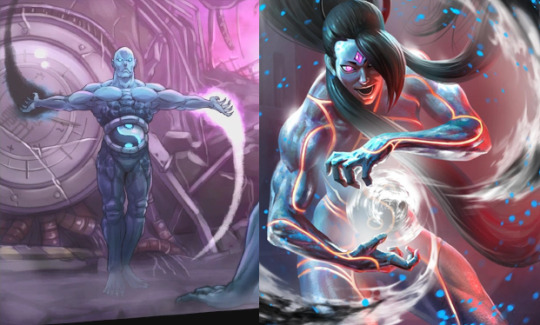
Even post-revamp, still fairly awkward and out of place as a Street Fighter character (even if that is very much the point and always has been), but as a villain, they really won me over, there's a lot of great stuff here. Seth is a self-hating robot in a CEO outfit who poisons the world around them and whose grand plans involve imitating the actual main villain while insisting they are a different unique being (unlike their 26 exact clones), and stealing the creations of everyone else around them, who then dies and gets a sexy cool makeover to become a gruesome aimless murderous ghost, who chases traces of it's creator around to kill him unaware that it's dying with every step it takes and that it's chasing something that isn't there. They went from Frankenstein's Monster play-acting as a cold calculating unfeeling chessmaster who everyone could tell was full of shit, to the Bride of Frankenstein as a barely-held-together dangerous yet tragic monstrosity that everyone reacts to with disgust and pity. They went from what we used to think AI would be, to what AI actually is, and I'd say they were pretty ahead of their time for that alone.
(art by z3dd)
Now, IV Seth was pretty uncontestedly the least popular of the Street Fighter Final Bosses, for fairly similar reasons to Gill: they were seen as too much of a fantasy supervillain, they didn't "fit" the series, they were too weird and awkward and out-there, and where as Gill at least got a pass because of his presentation and style and sheer contrast with Bison (although that "pass" only happened because people turned around on 3rd Strike), Dollar Store Dr.Manhattan was just lesser than Gill and Bison in every way and thus was a dissappointing final boss, an out-of-place comic book supervillain who didn't justify their existence.
Granted, the series actually had way more of a precedent for Seth than it ever did for Gill, given the presence of prior cyborgs and shapeshifters (the Shadaloo cyborgs from the animated movie that Seth was directly based from, Twelve and Necro) plus Gill, and the door for comic book supervillains was blasted open in the first place with Bison (and all the fighting game bosses that descended from him). But still, Bison's thing was that he was one-in-a-million, that he broke the rules as an dishonorable intrusion, that if you reached high enough to topple the greatest fighter (Sagat) you could fight the greatest fighter's boss, a man so powerful rules and structures could not apply to him and only your fists stood between him and global domination. Since obviously you can't take a step back and you can't do the same trick twice, that formula had to be tweaked for Gill and Seth: Gill was presented as someone above even Bison on the food chain and scope, a distant immortal bearing divine judgementt on trespassers, where as Seth was defined by their role irrevocably beneath Bison, and the walking inferiority complex that ensues.
They are a Bison project, one of 26 exactly like them (which means canonically most of the fighters got to defeat "a" Seth, which really does not make them very impressive), growing from Bison's leftovers to lead a subsidiary of Bison's organization, continuing Bison's plans, with their grand plot being just an imitation of Bison's plan to control Ryu's power, and generally acting and speaking and doing things exactly like Bison while uselessly whining that they are NOT Bison and that they will succeed where Bison failed, while the narrative makes no secret of the fact that Bison is still alive, still pulling the strings, and that he was perfectly fine until Seth started getting a little too big boy pants for his liking, and now Bison's gonna put his homegrown Pinocchio in the shredder with little to no difficulty and take the reigns as Final Boss again. Which, granted, did do it's job in building Bison back-up again, but didn't do a thing to negate the idea that Seth was a superfluous, inferior rip-off, given that textually, this is how they were presented as.
Even the characters didn't seem to take them very seriously, certainly not as seriously as Bison, and that was BEFORE the breakout rock star of the IV series, Juri, debuted to ensure that Seth wouldn't even be the most popular new villain. It is the least surprising thing in the world that Seth would achieve much greater popularity, in part, by being redesigned to be more like Juri. And part of what made Juri appealing was the fact that she was a conniving, cool, unique loose cannon villain ready to make Seth eat shit over thinking that they could control her, they became the big-headed authority figure for our punk bad girl to kick like a pinata. Unlike Vega and Balrog, who only talked a big game, Juri actually got to kick her dipshit supervillain boss to the curb, and we all loved her for it.
Seth's major saving graces were their gameplay, which made them very popular competitively, plenty of aspects of their design, and the fact that all of the above worked to make Seth a character who, while not terribly compelling in their own right, did a lot to make other characters more interesting, like Abel, who was designed to be a good counterpart to Seth and not remotely interesting besides (although his stint as Guile's manchild partner in SFvsT has it's moments), or like Juri and Bison, giving them an enemy they could actually defeat to gain street cred. Frequently you need villains that only exist to let other villains be cooler by comparison or retain their dignity or put one over. Sometimes you need a Cluemaster in place of your Riddler, a Mac Gargan to make all the other Sinister Six guys omlook better by comparison, a Zant to fill in screentime for Ganondorf or a Hobgoblin instead of a Green Goblin. You need your in-betweeners even if, and sometimes especially if, they will never be anyone's favorite character. Which is a harsh thing to say about Seth, but for a while they definitely didn't seem like anyone's favorite baddie, but instead someone who made their favorite baddies look way better by comparison.

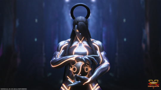
And Seth worked in this regard especially because their design was built on the idea of them being unnatural, contemptible and out-of-place. I actually think Seth's original design does work, and has been vindicated over time. Seth is a cybernetic intelligence made by scientists to consume and imitate all the brilliant techniques that the World Warriors spent years/decades perfecting, a twisted mockery of their beliefs and achievements. They look like a living yin-yang and conducts themselves posing like a Shinto god, but there is no spirituality or soul to anything they do. They are a grotesque, soulless husk that can only imitate, can only cruelly replicate the evil of their creator and not even do a terribly impressive job at it, and all of their attempts to convince others they are in any way different or unique ring hollow. They are one in many many Bison back-up bodies even among the playable cast, and all of their achievements are meaningless, either already belonging to Bison or stolen and repurposed by Bison and others.
There was plenty about Seth that already worked and was just held back by a not-particularly impressive design or presentation. The grand trick that SFV pulled was basically giving them a new one, and taking everything about Seth that used to be implied and subtextual, and basically making it textual, making it a scream they can only repeat ad nauseum, and in the process making one of the most tragic SF characters as well as one of the coolest.
Now, yes, you could argue that SFV Seth kinda missed the point in a big way by actually giving Seth a distinct and interesting design best described with the "not to be a lesbian but oh god oh fuck jesus christ" meme, when the character being soulless and unoriginal was important to their make-up. But it was never a terribly interesting idea (already done by the likes of Twelve or the Cycloids), certainly not for a fighting game character let alone a Final Boss with such massive standards to live up to, and shades of it still impart in the new design in a far more delightfully twisted way. It's Seth, except they are Juri now. They've been remade in the image of their true enemy, their hateful minion that ruined their plans, led Bison to them, killed and broke and stole them to be remade using a discarded Doll body from Bison's scrap pile, and the process has revived Seth into a pitiable broken record of itself.
The new design greatly emphasizes the corrupted Shinto / yin-yang elements of before, adding splashes of color and powerful glowing lines to the design that make it so that, while they looks less cadaverous, they look much more the part of a corrupted imitation of a deity, so that despite being downgraded from boss status they actually look much more like something you'd face as a Final Boss, something that could stand next to the other Final Bosses. And that glow-up extends to their moveset: Instead of pasting together improvised and half-hearted recreations of iconic special moves, Seth now directly steals and perfectly replicates the skills from whoever they're fighting. Seth conducts themselves with greater power and swagger this time around, with tons of new animations lifted from powerful past Capcom villains like Demitri or the Heritage to the Future take on DIO, and it works. Because even now, Seth can only imitate greatness from others. Seth has perfectly captured advancements in A.I tech because they can learn, grow, and even imitate to near-perfection, but they cannot meaningfully improve, and they are dragged down by incohence, chaos, errors and glitches in programming. In short, the fact that they are an artificial intelligence to begin with.
That's a thing about A.I and robots in general: Sci-fi has spent over a century anthropomorphizing robots and artificial intelligence characters to empathize with and make stories out of, create lovable stock fantasy characters that our culture comes back to again and again, but now that they are a real thing, and they are horrible godless abominations often used to actively make the world worse (even if it's hard to ascribe fault to something that isn't sentient enough to be malicious), we can't really deal with that. It's a cognitive dissonance that sci-fi doesn't look like it's going to catch up for a while now, if it ever will. We still like robots and robot stories and characters too dang much to know how to live with them. We still cry over Pluto, it's unavoidable.
And crying may be a strong term, but SFV actually seriously invites us to feel sorry for the dang thing, and the great final trick SFV pulled was breaking Seth under the weight of being Seth. Under the weight of being lesser, of not being real, of being an artificial creation made in an assembly line and not even the best of it's kind, of being not a terribly popular creation, of being a victim of characters that will get away with what they've done to them because nobody's gonna stand up for Seth, of being a Bison imitation made to house Bison and do Bison's bidding in the meanwhile, and thrown in the trash despite performing exactly as it was supposed to. Seth has faults of personality that make them more than a machine, and less than a person, and if the cast before generally despised them but not to the extent they despised Bison, now most characters outright pity them, as a thing living past expiration date that shouldn't be alive at all.
And because of all of this, in a way, Seth has attained a form of uniqueness. Even among the other villains and tragic characters of Street Fighter, Seth stands unique as a truly tragic, doomed villain, not even really a villain anymore so much as an obtuse, sad disaster. They are maybe Bison's greatest victim now, because even the Dolls (sans Marz) are all getting moderately happy endings, even Cammy and Abel and the Neo Shadaloo goobers got to make new lives for themselves, even Nash got to die by their terms and make his sacrifice count. Seth had nothing besides this. Seth was created for, born into, lived by, and died as an extension of Bison's evil, a tiny little bump in Shadaloo history, a piece of junk that Juri used and broke and tossed aside to resume her miserable life afterwards, and all their revival did was prolong the horror. Just one among endless horrors JP leaves behind when he's through with them.
We have yet to know what became of them after SFV, because many stories from SFV have been dropped or left incomplete in 6 (and many probably for the better), but even though Seth really was a villain and a horrible enemy to all of humanity, you kinda wind up feeling sorry enough for them to almost wish that their SFV ending happened, where they destroy Bison and ascend over their other selves, and still the question of whether they could ever be at peace lingers. This ending just fascinates me to no end, and it makes me think of the quotes that Gouken had to say to them that alone stood as an indication that Seth could be more than they appeared and insisted on being:
"Until you acknowledge the soul within, you cannot use your power for good."
"You seek individuality and identity, but you will not find it this way."
(JP win quote) "Look, you don't have to use your powers to express who you are."
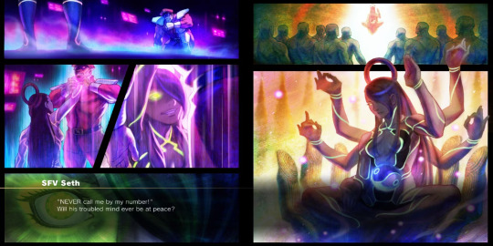
Until they appear again, that this is the note that Seth as a character goes out on might even imply that this was either their true goal all along, or that Seth has genuinely progressed as a person enough to want something new. That they are now able to seek or at least aspire for peace of mind, where as before there was only a desire for conquest and power, to show the world that Bison was a ghost and that they were the king, the ruler, the greatest fighter of all. Seth constantly expressed disgust and hatred at their other variants, killing them and flying into a murderous rage at being referred to by their number, even expressing in IV a desire to "be the sole survivor of this world" presumably with everything else as data within themselves. Here, they appear before the other Seths in a pose of ascended godhood, even seemingly benevolent, like they're ready to bring their siblings along.
The spiritual elements of their design no longer appear as a corrupt imitation, but an indicator of genuine spirituality. That Gouken was right, that there really was a soul in Seth waiting to be acknowledged, that the exorcism of the great evil that once defined them has allowed at last a pursuit of individuality and identity and self-expression, to reconcile their hatred of themselves (which manifested as a hatred of the other numbered Seths). It's such a fascinating development that it almost, almost makes me wish Street Fighter would dip it's toes a little into multiverse territory, much as I hate the superhero-ification of the series in V. I have thoughts on how MK1 handled this and very mixed ones at that, but the canonization of "every character ending from past arcade modes can have happened in separate universes and we can have it cross over whenever we feel like it" is an idea I do like, if nothing else this ascended development for Seth just seems like too potent an idea to never touch on again.
I used to not like Seth, really. They used to be one of my less favorite characters. Now I'd call them one of my favorites, and I'm just feeling horribly sorry for them. I need to know what became of them. Whether they'll still come back for one last torturous round of existence, whether they are heading for some other exciting new development, or whether the very next second after the end of their V story, they simply ended with one of their victory quotes:
"A SERIOUS ERROR HAS OCCURRED."
"A SERIOUS ERROR HAS OCCURRED."
"A SERIOUS ERROR HAS OCCURRED."
"A SERIOUS ERROR HAS OCCURRED."
50 notes
·
View notes
Text
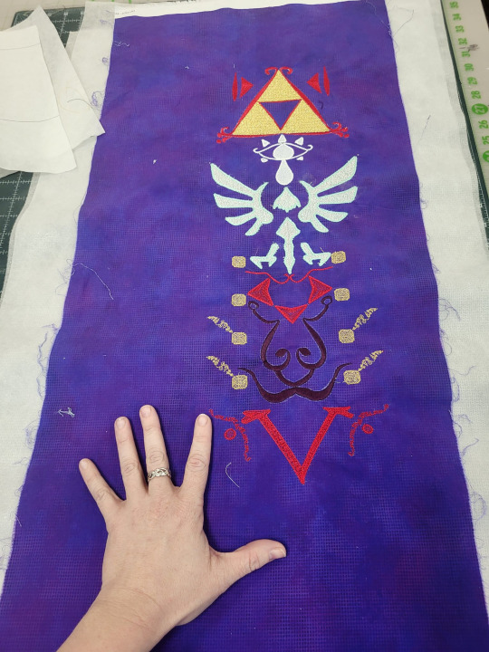
An absurdly and unnecessarily over-the-top and thorough breakdown of using my embroidery machine for a cosplay piece.
Part 1) The piece:
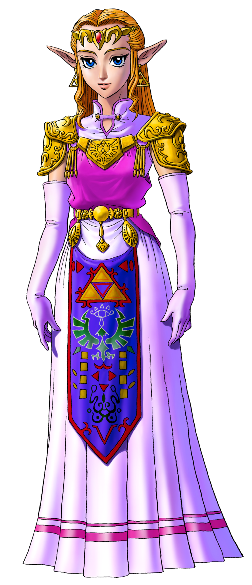
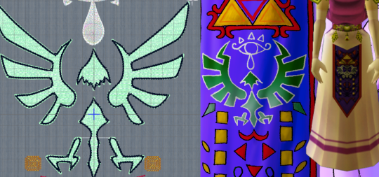
Many iterations of Princess Zelda from the Legend of Zelda series has this tapestry front piece. I've looked for a technical name for this piece as well as extant examples of it from our history, and my research is indicating that it's just a fantasy piece and doesn't have a name.
So we're calling it an apron. IDK. "Heraldic apron," sounds fancy enough.
One of the things that's been a bitch through all cosplay of all time is custom textiles. Since the early days of cosplay, we've been looking for ways to handle this at home. Back when I got into cosplay and took it really seriously, Worbla hadn't been invented, there was no Friendly Plastic, Wonderflex had to be purchased in 15-yard lots, the Glowforge and home 3D printing was just a fantasy, and Cricut machines ran off cartridges and couldn't design from your computer. Also, when I was cosplaying seriously, I was a college student with no job and a $100/month allowance for food (which I spent on cosplay, mostly). We didn't do fancy shit. You know what we did?
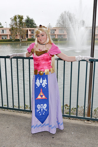
We had fuckin' hand-traced and hand-cut stencils. Mother fuckin' freezer. Paper. Stencils. Now, this version of Zelda that 2009 Me is cosplaying up there does have a much simpler heraldic apron than Ocarina of Time Zelda does. However, since I've gotten access to embroidery machines, I've had this great need to remake this sort of concept with adult me's current budget and skill set.
Now, there's a few issues from the start about making this. The notable one is that the in-game textures for the apron do not completely line up with the official artwork. When you start looking at the 3DS remakes, they re-textured the apron, giving us yet a third canonical way that this thing might be laid out.

Obviously, the easiest thing to do is to get several references, and then to slap them next to each other and compare. I've got GIMP pulled up here, and have several versions here. I adjusted color levels until the pattern in the garment was as clear as I could make it. There's horizontal guide lines going across to divide the apron into sections. We'll call those sections thusly, top to bottom: Triforce, Eyeball, Bird, 8 Rectangles, and V.
***
This is going to be long and boring. I have my reasons for writing a long and boring post, but sadly, I'm not able to share them without becoming un-boring, thus defeating the purpose of this work.
***
I forgot to label them, so that reference image is, from left to right: N64 screenshot, 3DS screenshot, N64 character model, small inset at the bottom is 3DS, official artwork that was released alongside the N64 game, a heraldic tabard, some official rendering of the Hylian crest, and another 3DS screenshot.
Some are pretty self-explanatory, and some are more open to interpretation. Notably, let's take a look at the Bird section. The official artwork and the 3DS remake both distinctly have the Hylian Family Crest there. The N64 version has a very distinctly different bird thing.
So, I had to decide, which one do I put on my apron? I had to consider several things, but one of them was the process of how game textures from the N64 era were made. Textures for this game were very small image files, smaller than your 2009 cosplay.com forum avatar. The reference art would be made and then other people would be in charge of turning that art into a usable texture file, so there was artistic license involved in adapting that. This game was released before the Hylian crest had been used in multiple places across several games. Therefore, we can justify making the assumption that the texture artists didn't have an understanding of how important it was to keep this part the exact shape it was, and turned "stylized bird" into "stylized bird" in a way that would read clearly on screen at 45x100 pixels. We can assume this to be the case, because, when Grezzo did the 3DS remake, their texture artist used the Hylian crest instead of the OoT bird thing.
***
Sorry for all the embroidery stuff in the past few days. I've attracted the attention of a couple people online and embroidery seems to bore them, so we're doing that for a little bit until I stop being interesting.
,***
Cosplay has a spectrum of screen-accuracy to full-nonsense. In some things, you can do screen accuracy very well. Screen-Accurate Princess Leia from EpIV is pretty easy to make look good. Sometimes, you can do full nonsense pretty well, too. Princess Leia, but in if Star Wars was steampunk, also pretty easy to make look good.
Some things aren't as easy to make look good when you're doing screen-accurate. Sephiroth's hair in most of the Final Fantasy games stands up off his head by like 30% the height of his face. If you math that out, you have a wig with 5" antennas swooping up in the front. When you put that on a head, it looks silly. Do you want your Sephiroth to look silly? No? Then you need to do something about that hair.
My cosplay rule that I try to stick with is this: If you need to make a decision between what is "accurate" and what looks good, you pick what looks good. As long as the character reads as the character when you're done, it's better to look good than to be accurate.
And this is why, instead of just tracing any of these aprons in my embroidery software, I broke out a pen and drew the whole thing out.

Actually, I drew half of it out. The left half to be specific. I know that I'm going to mess with this later on my computer, and I know that I want the thing to be symmetrical, so let's save everyone (mostly me) some trouble and just do half of it.
Why was it important to me to draw it full size? Remember, that texture we're referencing is less than 100 pixel wide. The final piece is going to be full size, so there's a lot of things that just don't scale up easily. We're basically going from a texture the size of my thumb nail to something that has to be more high-def than 8K. This basically meant that I needed to redraw it from scratch to get that resolution. Lots of little details are going to have to be added, and I'm much better at adding them with a pen than I am just guessing while I'm digitizing the file to embroider.

So, I took it, pulled it into GIMP, and made some adjusting. I mirrored it so that I have both a left and a right side to work with. I changed the contrast so that I could see the lines better. I didn't like the Hylian crest that I drew so I just plopped the official SVG onto it and dragged it around until it fit.
And then, and this is kind of important, I cropped the image so that it's the exact proportions that I want the final thing to be. My whole design is in this file, and there's no outside image. This is important, because I'm going to use this as a template to trace in MySewnet, and the easiest way to get the background to behave properly is to pre-set it to the exact size you need in another program. Good thing this software isn't stupid absurdly expensive, or else the fact that you needed to do that would be really annoying.
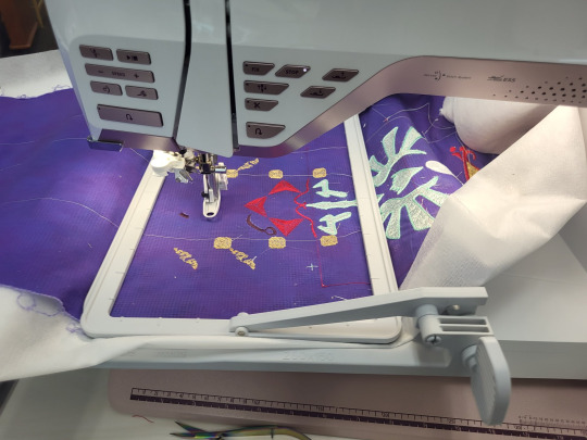
The digitizing process:
Okay, so the first thing that I do is to make a custom hoop the size of the finished project. There's no way that I can actually stitch this out this big, because a 25" long hoop doesn't exist anywhere, but it's way easier to design all of it and then split it up than it is to design in pieces and then fit them together. I open the hoop in the digitizing software and load my template as the background.
Digitizing from a technical viewpoint is really simple: you click points all around the area you want to make a shape, and then you hit "make this thing", and then it renders the thing. You can then give that thing a different kind of fill or line. Easy.
So instead, I'm going to go into the art part. Because yes, I've already drawn this whole template, but I haven't figured out how to fill each of those shapes. This isn't like a coloring book where I can just fill a shape with color. Embroidery means that I have to pick how exactly I fill all those areas.
First up, I have the legendary Golden Triumph Forks. The Magical Eating Utensils. I wasn't super sold on how this was rendered in the official art. We can vaguely see how, in the game art, it looks a little more like a red outline with corner flourishes, rather than what we got in the artwork. I probably should have looked up some historical flourishes from time periods in world history where technology matched the apparent technology of the world of the Legend of Zelda, but I just kind of picked a random frilly shape.
The Triforce is one of the most important symbols in Zelda, so I knew that I wanted it to be a bright shape. This meant that I wanted to fill the shape with stitches in such a way that none of the purple backing is showing through. In embroidery terms, this usually means either a full pattern fill, or an applique. I picked applique, because this is an easy shape to applique. I knew from the start that I was going to use metallic tissue lamé. Lamé's great for a lot of things, but it's weak and shows creases. To avoid that, I wanted to put in a fill stitch to support the fabric and prevent damage, as well as hiding any big creases. I picked a big and open motif fill that will still show a lot of the applique fabric.
Eyeball:
So this is, specifically, the Sheikah Eye. It's an important symbol in the series. The Sheikah stick this eye on pretty much everything. However, it's not a fancy, gaudy, ostentatious symbol.
I grabbed a motif line at random from the list of motif lines, and happened to like it. It's a very heavy stem stitch that goes over each stitch 4-6 times, making a big, raised area. To make sure the eye was visible, I filled in the iris, teardrop, and eyelashes. I picked an opaque spiral fill, because it's a circle and these general shapes are circles. A while back, I bought some metallic white "iris" thread, and thought that a subtly-iridescent white would fit nicely.
Those little eyelashes at the bottom that aren't there in the art? Well, there's there in the game render juuuuust a little bit, and also they fall into "if it looks better that way, it's the correct way" mentality.
The Hylian Crest.
Fuck this thing.
All you need to know about this is two things: 1) I just traced the SVG that I found on the Zelda wiki, and 2) I didn't plan on stitching it out with black outlining. That black outline is just there to confuse my software into doing what I want.
Since this is as important as the triforce, I knew I wanted to do it in silver lamé. That means all of this is an applique. Quick tip: if you're going to be breaking a design into smaller segments, don't do any applique so big that it has to be spread over two segments.
Ask me how I know.

I originally had this filled with the same chain stitch that I used on the Triforce, but it made things look very samey and very mushy. I later switched it to a triangle-shaped spaced fill. I selected the triangle as the correct shape by clicking every shape one at a time and seeing what they looked like. Since this was going to be a running stitch on a shiny applique background, the fine details don't really matter. You actually can't see them normally, which is why I had to change the color here.
The outline there is the same stem motif that I used in the Sheikah eye. I found that it's wide enough to cover an applique edge without having to look like a satin stitch.
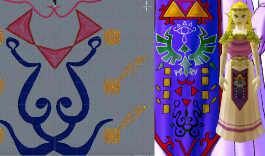
Squares, Triangles, and the Face Thing.
I have no idea what that face thing is supposed to be and apparently neither did anyone else on the internet. Since it just kind of looked like a scribble, I just rendered it as a scribble. I used a satin column so that it could have line weight similar to a drawing with a paint brush, and the shiny satin line would look like wet ink. Also known as phoning it in.
The triangles are filled with a contour fill that just traces the edges of the shape. I left some space between the lines so that the purple background can show through. This gives is sort of an optical illusion of movement. The outside of this was originally that same stem motif line from before, but after I stitched it out, I realized ti was too heavy. The final version had the same motif, but smaller, and with fewer repeats of the stitch.
I'm so damn proud of those fucking gold boxes. Okay, so, let's look at the design. Why are there gold boxes? What do they do? What do they mean? Do they represent the eight dungenons in the original game? Nope, because there were nine dungeons in the original game. Are they the eight sages? No, because there's seven sages. Is it what happens when you average the number of dungeons and sages out? I don't know. Anyway, they looked stupid just being little gold boxes, so I gave them blunted corners. I did another contour fill because I wanted them to lie flat on the finished apron and not draw any attention to themselves. As for the little tail, folks, I discovered a technique and I'm FULLY READY to abuse the heck out of it. So, I traced the lines with a satin column, ready to try to mess with the spacing to see if it'd lie flat with enough work. I hit "convert to tapered motif" by complete accident, and it was kind of cool. So, then, I went through the various motif options, found some cool looking scrolls, hit "fit to line" and slapped those in there. And I think that the little tails being written in some weird language I can't understand is SO COOL. I love how this part looks and I will not be taking other opinions on it at this time.

The V.
I didn't like how either of them looked in the original, so I just kind of winged it. I was getting bored at this point so I took a pattern fill that was supposed to be linked chains, and then I twisted it around until I was the least bored I could be with it. Again, I went with the smaller stem stitching on the outside.
Those little tails on the circles there are also filled with the scroll as tapered motif thing. If you go for this, don't forget to run the "delete short stitches" filter or else there'll be like 1100 unnecessary tiny stitches in your motifs. Ask me how I know.
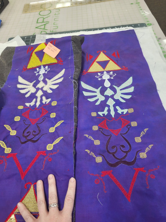
Now, we learn by making mistakes, and the best way to make mistakes is to just jump in and wing it. On the left, we have the first version of this that I tried. On the right, we have the second version, which is the one I'm going to use. I've made a couple of adjustments to the file since that final version, so if I make it again, that'll be just a hair better.
So, for starters: backing fabric. I liked the movement and texture on this subtle dot tonal better than a solid purple, so i used that for both my test and my final project. The main drawback with using a printed tonal instead of a dyed solid is that the back of the printed fabric is still white. On some things, specifically the area around the satin stitching on the ink face thing, you can see subtle white haloing where the stitching's displaced the background. I don't like it. No one else seemed to notice or care.
I knew that I'd be doing this in my endless repositionable hoop, but I hadn't taken into account that I'd be doing it in the endless hoop sideways. The endless hoop expects you to go from top to bottom, and my design goes left to right. This means that I have to fight the fabric around the clamp of the hoop. The endless hoop also doesn't hold things as tightly as a regular hoop does. Because of the way the fabric is moved through the hoop, a fusible or sticky stabilizer has to be applied to the fabric before, instead of being hooped with the fabric. All of this meant that I just didn't get the support that I needed on the first go around. You can see this in the way that the fabric has bunched up around the 8 boxes. For the first round, I used some fusible no-show mesh stabilizer. It wasn't wide enough, so I had to cut it in chunks and apply it sideways. For the second round, I used two layers of Power Mesh (same stuff but different brand) as well as a layer of light+tacky paperless sticky tear-away. I really hate that light+tacky stuff so ti's exciting to finally use it up.
My first trial was mostly to see if I could make the endless hoop work like I wanted it to. In this trial, I learned a lot of things. I kept the computer nearby to make changes as I noticed them. When I was done, I looked at what I'd made. I didn't like all the proportions in all of the design, so I dragged some stuff around in the file. This was when I realized that the heavy stem stitch motif everywhere was looking clunky, and reduced or removed it from several places. I changed the fill of the Hylian crest to the triangular fill. shout out to anyone from That One Anonymous Message Board who made it this far in this post to try to prove how deranged I am. You've got a lot of time on your hands, don't you? I completely changed all of the instructions to tell the computer how to do the applique on the Hylian crest (which I STILL got wrong), and added some aligment stitches to help with the applique process. This was when I changed the color of the outline in the software. Ideally, you should now be able to lay the applique down as one fabric, let the machine sew the whole thing, and then trim it. This is important, because that applique spreads out over two hoopings, so it's kind of a mess. The secret to making this work is for hooping #2 (eye and top half of crest) to stitch out the eye BEFORE the applique, so that the whole fabric can be placed over the completed eye. We learn.
Once it was all combined and digitized, it's important to render all the digitized elements as stitches, and then do a bit of cleaning up.

Notably, I really needed to take those tapered motifs and run the stitch optimizer program. The stitch optimizer's job is to remove stitches that are too short to stitch out nicely. When looking at the 3d views in the software, I can't tell which of the samples is the before and which is the after. If I zoom up really close in illustration mode, I can see it, but remember that this is like a 1" wide strip of stitching. The basic rule is that any time the software wants to remove 3300 stitches and you can't see the difference in the stitch-out, you REALLY WANTED to remove those 3300 stitches. That's not 3100 stitches from all over the design, BTW. That's just 3100 stitches from that one section.
I go over my test swatch, section by section, and make sure there's nothing that I forgot to put into the software. I also just delete every jump cut and then make the software add them all back in. The program that adds cuts automatically tends to be more judicious wit them than the digitizing program is when you make the design, so it's a way to make a design stitch out a lot smoother with just two clicks.
So, once all of that is done, we can just run the design splitter program. The design splitter says it has "intelligent splitting" settings, which is an absolute joke, but I use inteligent setting anyway. It's not necessarily any better at picking where to split than a straight line is, but our eyes are trained to see straight lines. The allegedly-intelligent splitting does at least split at random points, making it harder for your eyes to pick out what's a splice and what's a continuous line.

So, in addition to "intelligently" splitting the design apart, the program adds two color blocks to each split piece. One is before the stitches, and it's four stitches long. This just does one stitch at each corner of the design area.
The second block it adds is at the end. This block stitches a corner marker at each corner in the design. In this picture, the before line is green and the after line is red. I offset them by a little bit so that you can see what's going on, but they do happen directly on top of each other.
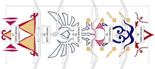
This is important, because you're trying to lay your design out so that every section of the split design lies perfectly next to the other ones. When you re-hoop your fabric, you can step through the first four stitches. If you've placed your fabric correctly, then those stitches should perfectly touch the markers that were sewn in the previous blocks. If they don't line up, you can just re-hoop over and over and over and over until it lines up.
In theory, you can line up an entire design just using these markers and the alignment stitches. You can just keep rehooping forever until it lines up. It's great. On the other hand, if your embroidery machine has literally ANY KIND of design placement setting onboard, that can help a whole lot. The astute observer will note that, on that picture way up at the top, that machine isn't my Topaz 50. That's because the T50 has some nice basic design positioning that will let you place within a certain range, but it won't let you tilt the design if you hooped it crooked. I did the first attempt at this on my Topaz, and it was fine, but there was a lot of re-hooping. So I might have taken this to work, to do this on the machine that's a step up from mine. (While I was there, I used a sit-down Bernina longarm to "hand"-baste the stabilizer on. That's not the intended use of the machine, but if you set stitch regulation to like 1 stitch per inch, and then you just pull the fabric straight through from the side, you get perfectly straight basting lines. If you're not feeling like dedicating an entire room in your house to having a free-motion machine just to baste straight lines, most mid-tier sewing machines have a fake hand-basting setting in them somewhere). Anyway, if you don't already have a bunch of hoops from HV, you can get that kind of positioning setup on Brother and Baby Lock for much less than the cost of the machine I was working on. If doing big multi-hoop projects like this is a priority for you, ask your salespeople about machines that make this really easy.
You now also have the great trade-off: the smaller the hoop, the tighter the design will hoop, and the less stabilizer you'll need. However, the bigger the hoop, the more you can shift the design around in the machine without hitting the edge. The tighter the hoop grabs, the less stabilizer you need, but the harder it is to shift the fabric that's already being held in the hoop to get it where you need it to go.
I handled this by just fucking throwing a shit ton of fucking stabilizer at it like there was no tomorrow. There's three layers on this bad boy.
You might be saying "Why didn't you just use a heavier cut-away?" and you'd be right, except for two things. 1) if I use two lighter layers, then I can trim the stabilizer away in layers, avoiding the stabilizer showing through and 2) my store didn't have any wide fusible cut-away in stock so
Anyway, here it is, time to make it into the actual apron. I'm very excited for this project. I'll probably break out the repositionable hoop again to do a border on the outside of the completed project, but I don't know for sure exactly what that'll look like.
#long post#really long post#zelda#legend of zelda#cosplay tutorial#machine embroidery#not lolita#i did this instead of doing a thing i don't want to do
109 notes
·
View notes
Note
you pointed out nova storm being yellow now and it's going to haunt me wondering if ciro neili (did some of the character designs) did that as a friggin' monkey team reference
okay so the thing is Nova Storm is a rainmaker. a character that barely exists but IS from G1.

the yellow one. but the thing is that even though the rainmakers are like, quite popular, since they are seekers, and have been referenced in fanon for decades, this character did not get a name until 2015. From Ask Vector Prime. So the rainmakers are Acid Storm (green), Ion Storm (blue) and Nova Storm (yellow.)
Obviously Nova Storm (yellow) is very confusingly similar to completely unrelated character Sunstorm. The other yellow seeker.
Apparently some old fanon staight up asserts Nova Storm is just a miscoloured Sunstorm? god. who knows. Also, to be clear, despite the fact Sunstorm's name ends in -storm, he is NOT a rainmaker. completely unaffiliated. coincidental.
this is where shit gets weird
so in 2015 Nova Storm gets a name. okay, solid. We have agreed the yellow one is named Nova Storm.
Three years later in 2018, Cyberverse airs. This is the new Nova Storm.
Purple
Girl
why girl? why purple?
"well nate," you say, "isnt more girls better? why would you question that?"
well because this is slipstream:

Why are they so similar????? Both purple, both girls. like, really similar purples, too! Theres different models for the girl and boy seekers.

so this is Cyberverse Acid Storm, another rainmaker. due to, I believe, a miscommunication during production, some episodes use the female seeker model for Acid Storm and some use the male. Addressing this on twitter staff has owned up to the mistake and instead of getting defensive, rolled with it and said hey, well, its in there, so its canon! Acid Storm is genderfluid lol. And I kind of love that.
In any case you can see distinct differences in the models, so like. if Nova Storm used the male model, at least it would be different from slipstream. as it stands purple nova storm, for some reason, is one of the most frequently appearing background seekers, so it ends up, imho, being VERY confusing. especially if you arent like me and the rest of us freaks and you cant recognize every character by a picture of their ankle.
so like, to be clear, I'm pretty sure Cyberverse is actually the first time any actual STORY used the name nova storm. I think the only thing predating cyberverse is the ask vector prime. at the very minimum this is the first major use of the name, for the purple female character. at this point the connection to the yellow rainmaker is.... tenuous??????
but then we drop the card game:
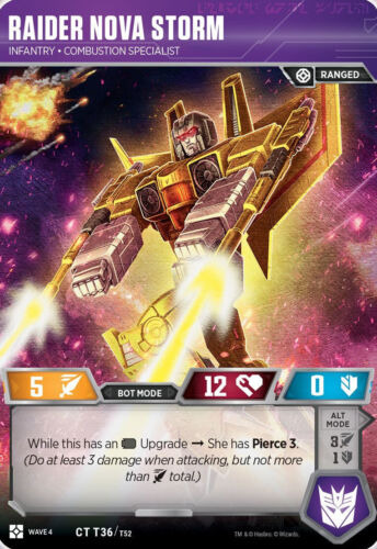
which says she, so i guess... girl?

nova storm also apparently appears in idw 2019 where, again, apparently, girl? but look. yellow. YELLOW. all yellow. rainmaker.
so THIS:
this is the art attached to the ask vector prime post. what even the FUCK is that. sorry the art is nice but what IS that. is that a SEEKER? WHO is that. that PRIMARILY black with gold accents. thats not the rainmaker design or even the purple one we'd get.

i genuinely hate referencing this but the only other appearance of nova storm is as an angry birds pig costume and while its still mostly yellow i DISTINCTLY note the black cannons and yellow and hands like. thats. thats from the ask vector prime design.
...right?
this is the Iron Factory third party Nova Storm figure from their rainmakers set. this was revealed in 2019. the angry birds costume is from 2020. 2020. i genuinely think it might be possible iron factory put their foot down and said "the black and gold design fucks" and everyone forgot hes suppsoed to be neon yellow
now HERE... HERE FINALLY.... is EARTHSPARK NOVA STORM
holy shit. look at this. we have nuked the yellow from this design. she's now PRIMARILY black with gold HIGHLIGHTS. who IS this. i guess nova storm has actually now been female in MORE appearances than male????? and as far as I can tell, the gold and black design traces specifically back to deviantart user bdixonarts who has virtually no industry credits OTHER than creating the modern design for Nova Storm???? she, uh, crushed it, i guess
also an incredibly fun note i didnt know until just now: do you know who voiced earthspark nova storm? any guesses?
Nicole Dubuc. nicole fucking duboc plays her AND skywarp. nicole dubuc is the head writer. she wrote rescue bots. and final side note, tfp ratchet's catchphrase "I needed that!" came explicitly from her scripts lol. god this is so funny to me she went from recording rescue bumblebee's lines before they were replaced with beeps to just straight up being Novastorm and Skywarp in a mainline show.
anyway who the FUCK is nova storm?
dude, who the fuck knows.
166 notes
·
View notes
Note
I have had this question brewing inside my brain since I first read your latest fic. And it got me wondering what do you think Brian’s (and Justin’s) social media would look like. I keep trying to imagine what their posts would look like if the show was set during instagram era. I feel like Justin would have some art, daphne, himself and maybe traces of Brian on it. But the idea of what their social media would look like now when they’re in their 40/50s is so interesting to think about and I for some reason can’t even imagine it. Probably because every time I think of Brian now on instagram for some reason that Gale photoshoot where he’s in a pink button up on a couch pops into my head but that’s Gale not Brian lol
Hello dear sweet anon!
I love this question!
Here are my thoughts, but they’re just mine. Obviously QAF aired before social media existed, so we can only imagine.
We know from canon that Brian has an eye for visual arts (we see him consult art books for his work in advertising, he has a nice camera, etc.). Justin obviously does as well. I think Brian would be the type of guy to post every once and a while. He would only use the grid, no stories. And it would all be a little artistic and abstract. Like an empty beer bottle, a lit cigarette, train tracks. No people, nothing like that. Sometimes things so weird you would want to know was that a photo that got taken (and then uploaded) accidentally? What does it all mean?
Justin, despite having a good size amount of pretension, I think would be much more likely to have a typical social media presence. Pictures of friends and family, some landscapes and other artistic shots, and some fun selfies. Maybe you see Brian in the back of one of his selfies. My guess is he would also have a professional account for his artwork.
What do others think?
(sorry for the delay in replying, I’ve been traveling and working while traveling so I haven’t been on tumblr in forever)
16 notes
·
View notes
Text
I saw a popular post referring to Hobie Brown (Punk Spiderman) from Spiderman: Across the Spider-verse with a lot of notes implying he is just a background character (Wrong) that is impulsive (WRONG) and felt it was Wrong so I’m gonna rant for a min major spoilers under the cut.
So the post was saying Hobie saw one bit of conflict and decided to blow everything up and while it was funny like... It’s Wrong.
Hobie had plans from the very beginning. You think Hobie, a punk anarchist, was offered to become a part of an institution that’s whole job is to keep everything canon compliant and went “yes, this makes sense”. I think Hobie had this, or something similar planned, from the very beginning. I have two major points that I think back this up.
1. Hobie’s entrance to the story is him “show boating”, setting him up as a slightly arrogant character. Miles is about to be the one to break the electric barrier by revealing how *much* more powerful he’s become and how he’s advanced in his abilities, showing he can both siphon electricity with a touch but he can also create outward blasts. Hobie makes a point of showing off, breaking the barrier around the collider first and then rubbing salt in the wound by winking and giving him the tip which, at the time, feels patronizing and arrogant, that he needs to use his palms for a more effective blast. This, combined with his friendship with Gwen sets him up as a mild antagonist to Miles for a few scenes and Miles is jealous and feels slighted and left out. However, Hobie doesn’t continue this narrative and isn’t shown to be particularly arrogant or patronizing to even Peter B’s baby, and is in fact rather supportive, in his own way, to Miles and those around him and Miles kind of goes from jealousy to kind of admiration.
You know what Hobie did succeed in doing by interrupting Miles and stealing his thunder? Keeping Miles’ abilities secret from Miguel and the other Spiderpeople on his side, until the time was right. Hobie’s making sure that if Miles goes against the grain as he suspects he will, (because he knows their plan and why they don’t want Miles involved and what they’re hiding from Miles on purpose) that Miguel will be underestimating the young Spiderman, and that Miles will have the element of surprise. He also reiterates his advice that when he initially gave it felt like showing off, to use him palms for extra power, right at the exact moment Miles needed to show his advanced abilities off.
Hobie proceeds to say “I quit” and teleports back to (presumably) his own universe, while throwing his own teleport bracelet back to show he doesn’t intend to return. This is important. He no longer holds one of Miguel’s teleporters. This brings me on to the next point.
2. When Gwen tries support Miles, she has her teleporter taken from her, she’s dumped back into her own universe and she feels hopeless. She doesn’t know how or where to start trying to find Miles, they are essentially trapped in separate dimensions. But what appears in front of her, using colours and an art style completely different from Miguels? A teleporter watch (this isn’t their official name but forgive me I can’t think of their name right now). It’s obviously a bootlegged device. And it’s also obviously in the style and colouring of Hobie, to show that it’s come from Hobie.
When we last saw Hobie, he had quit and quite notably returned his device. And we also know, that while these wrist devices are shown to help the Spiders teleport between universes, one thing it’s clear they cannot do, is time travel. Otherwise they would simply undo all the anomalies. Which, unless Hobie made a copy in the space of a few hours, means that Hobie was already working on a teleporter copy that allowed interdimensional travel that would prevent glitching and couldn’t be easily traced by Miguel and Jess. Which implies that Hobie had had a plan from the beginning. He most likely always intended to fight back against Miguel in some way, whether he always planned on Miles being the catalyst, whether Miles was the reason he wanted to fight back (because I can’t imagine an anarchist like Hobie taking the news that a huge powerful institution needs to crack down on an individual - never mind a single black teenage boy, lying down) or whether he was an opportunist and felt in the moment Miles presented his opportunity I don’t know.
But based on the story I don’t think Hobie Brown did anything impulsively and I don’t think he just saw a bit of conflict and decided to be an instigator.
Hobie Brown was the instigator the entire time. He was intrinsic to the story progressing as it did. Where Peter B Parker was the rock Miles Morales needed in the first story, Hobie was the oil for Miles’ spark in the second story and it was entirely intentional.
Hobie Brown is an anarchist with a lot of smarts and a lot of foresight and he’s got Miles’ back.
EDIT: Hobie, before Miles even joins the Spider Gang tries to stop Miles from going to Miguel's world by throwing his arm around Miles saying "he don't follow your rules" to Jess before Miles goes with them and visibily sags when Miles wants to go anyway so he's protecting him from.Min 1. He’s literally one of the most integral parts of the story.
#rant#spiderman across the spiderverse#miles morales#hobie brown#spinderpunk#spiderman#miguel o'hara#spoilers#long post#spiderman into the spiderverse#a lot of people already realised this#but i saw a surprising amount of people discussing hobie as impulsive#maybe worth a read?
47 notes
·
View notes
Text

This boy really tried to be a hero and save his friends, only for everything to backfire on him, huh?
Anyways, Yamato's design didn't really change all that much. Honestly, I thought it was good even if it didn't completely scream inventor or anything. He looks like teenager being inspired to dress up like his favorite Jojo character and I respect that, tbh. His design slays while turning it into his own. And it kinda fits since it's apparent that he likes anime or similar media at the start of Chapter 6 with the way he introduced himself, but he obviously only acts that way due to the brain damage (that is probably not written very well, I think). The most I changed was the colors and added a bit more detail to his coat or changing small details like the shoulder pads on his...well, shoulders. His button-up became a dark gray, he looks like he's wearing jeans instead of white dress-up pants which I feel like fits him more, white sneakers, and changed certain colors. Like, seriously. Why is the handkerchief in his pocket both blue AND red? The red doesn't even pop up anywhere else. And for some reason the top part of his coat collar is silver??? When it's probably suppose to be the same blue of his undercoat?? At least if you're gonna make it a different color, use the gold you're already using with his shoulder pads! Anyways, I gave him goggles which I have them hanging on his hat (which I just traced, tbh, hats are the bane of my existence next to hands). The goggles are to tie in his Ultimate Inventor status and I desaturated his eyes just a tiiiiny bit. And with his hatless sprite, he is done! Also, I ended up darkening his skin. Cause...why not.
Anyways, I've been struck with the idea of Yamato reuniting with the class at the end of Chapter 3 but still suffering from his brain damage so he struggles to communicate anything, let alone the whole Plot(TM) with amnesia in the mix, but also letting us spend more time with him and see his personality peak through more with flaws and all and actually being able to interact with the others more, especially Rei and Teruya, and maybe have his FTEs developed more by dropping hints about his family, especially about how he feels about the divorce he and his dad went through (which is canon in his concept art as LINUJ specifically wrote it like that), and his regrets in how he treated Mikako at first and how he rejected her at first, which is probably the same as his father cause divorce is not easy for everyone, especially the kids, and how getting older and becoming kinder as he matured fuels him to try and be a better person and protect others, in this essay, I will-
#DRA#Yamato Kisaragi#Danganronpa Another#DRA Spoilers#sprite edit#Star's Art#obviously if I ever sit down and write that au fic#it'd probably be a lot more polished#especially since Concept =/= Execution#you can have a good idea#but if you fail to stick the landing#it'll fall flat anyways
17 notes
·
View notes
Text
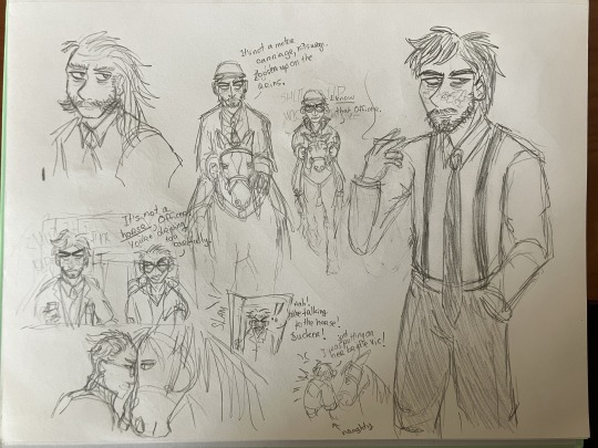
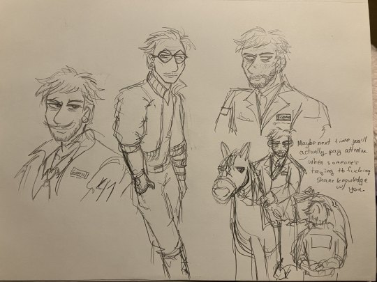

it's time for jean himages (horse images). i want to trace and color some of these digitally but itll take three years so here's what i have for now. so im posting on this blog for the headcanons and bc they're not full art pieces yet
anyways these r just sketchbook doodles so theyre not the greatest anatomywise (bc i fix them in post (ie digitally)) but you know what i stare at them so much so here
jean rides his horse in the french style which involves Lightness (a way of like. communicating with your horse and making sure the horse's needs are met, i think) so he's. really gentle with his horse. he braids the horse's hair in dressage style so button braids on top and then plaited tail. it's a big black horse with a white blaze and white socks (yeah im a horsegirl too) (in my digitally lined version of that third image, i spent like an hour making sure all the tack was accurate to the riding style. this is just the initial sketch so it's not accurate here, so you're just going to have to pretend)
harry rides horse a mixture of western and english bc he always does everything his own way, and kim (and judit not pictured) rides english bc that's the standard rcm procedure for horse. also as part of the mounted cop uniform, they have to have riding helmets lol
i think harry's horse is a small chestnut mare with a blaze and stockings, and kim's is a little bigger dark bay. they're quarter horses / thoroughbreds mostly. tho tbh they're probably elysium / insulinde specific horsebreeds that i don't know about
kim hates doing horse bc the horse never listens to him. he's used to kineema! so he's too tight on the reins. but then he ends up liking the horse anyways
obviously a lot of these r not too canon to my headcanons bc there's a few ooc phrasings and some things aren't solidified to events that i want to write about but that's ok. i'm working on writing some kinda' post-Martinaise dynamics bw Jean, memory-loss Harry, and Kim as well as the others at the 41st, and I want a lot of 'Jean has to teach Kim how to ride horse' in there. coz i think it would be fun to write kim 'wow jean is competent??? and i have to take orders from him even though i fucking hate his guts???' kitsuragi lol. making kim not good at something for once and he hates it so much how tf do you stay professional when the horse keeps misbehaving and you can't control her
also im headcanoning that all the motor carriages in insulinde at least are the british way: driver on the right, passenger on the left. carriages / horses on the road on the left (bc the rcm patch is on your right shoulder, so when you pass people on the left they can see it (if you're doing it the "normal" way ie driving/walking on the right, people can't see your patch when you pass them (i know this from experience bc i put white tape on my trenchcoat rcm-style)))
transcript for my handwriting under cut
First Image:
jean on horse in the top middle: It's not a motor carriage, Kitsuragi. Loosen up on the reins.
kim on horse in the top middle: I know that, Officer.
kim in the car middle left: It's not a horse, Officer. You're driving too carefully.
jean in the doorway bottom middle: Hah! You're talking to the horse! Sucker!
kim with the horse bottom middle: I was just putting on her bridle Vic!
Second Image:
Jean to Kim bottom right: Maybe next time you'll actually pay attention when someone's trying to fucking share knowledge with you.
Third Image:
Jean on left: Hurry it up back there Lieutenant, we don't have all fucking day.
Harry in middle: He's got this, Jean!
Jean: Don't Jean me.
Harry: He'll be fine!
Kim on right: If you had let me keep the Kineema, we'd be there by now.
#these doodles are just a trick for y'all to read my hella' long as fuck texposts#bc i have SO MANY GODDAMNED THOUGHTS ABOUT EVERYTHING#about the Characters and the Worldbuilding and the Dynamics and the Plot#literally so fixated on this media it's incredible#doodles#my art#jean vicquemare#harry du bois#kim kitsuragi#jean horsegirl vicquemare#disco elysium#horses#de#also eyes is there in the second image but dw about him thats a bad drawing of him
16 notes
·
View notes
Text
NOTICE: Hey, I would appreciate it if only 16+ people followed me because the stuff I post can be very suggestive, and just in general, my stories aren't meant for kids. I'm not gonna like rigorously go through my followers and check for ages, but like, if I spot a 13 year old following me, I'm gonna soft block 'cause it's just not comfortable
Making a new pinned post here ‘cause my old one is very lengthy and I decided to write a new one for cohost
I’m Ellery, I mostly make art for Sun and Moon from fnaf, with occasional art of my ocs as well (and maybe some Invader Zim art if I feel like it). I ship Sun x Moon so if that’s not your thing, you probably won’t enjoy following me. I occasionally post art of pregnant characters but it’s tagged so you can avoid it
I do make some tsams art now but not all my art is tsams related so if it doesn't mention tsams in the post it's not for that. Especially if it's my sun x moon art it is definitely *not* tsams art. I ship some of the characters with each other for my versions of them so if tsams ships aren't your thing, you likely won't enjoy following me.
Nsfw stuff is on a side blog (with the exception being my ao3 which has both sfw and nsfw fics), suggestive stuff is on here but it’s tagged
Commissions are open
Drawing requests are closed unless otherwise specified
You can find my art on here under the tags my art or ellery's art, you can find my writing under my writing or ellery’s writing
Asks are welcome, please keep some things in mind though. No nsfw, no gore, no venting or triggering topics such as self harm, suicide, or abuse. Also please no flashing images/gifs as they can give me migraines
Asks are currently off because of the spam bots, same with dms, these rules will apply if/when I turn them back on though
Asks have been turned back on, they'll go back off again if the spam continues though
Currently looking for different options for making/selling stickers
You can support me on kofi
My fics are on ao3. Sunflowers and Stardust is crossposted to ffn but it is the only fic I have crossposted
Info post on my Security Sun Au
Info post on You’re Everything I’m Not (my oc story)
Things you can do with my art, aus, and ocs:
- use my art as a phone/tablet/computer wallpaper (you don’t need to ask first)
- ASK to use my art as a profile picture or header/banner (the only exception to having to ask first is if I made the art for you)
- make fanart of my ocs and aus/fics, it makes me very happy to see people enjoying my stuff :D (please no gore, light blood is fine though. Please do not draw anything related to self harm or suicide, even for my fics that include such topics. Drawing Eclipse from my organic/recovery au with his canon self harm scars is fine, drawing said scars as actual wounds is not)
Things you can not do with my art, aus, ocs, or writing:
- you can’t repost, trace, copy, or edit my art (regardless of whether or not credit is given)
- you can’t repost my writing
- you can’t dub/voiceover/narrate my art or writing
- you can’t use my art or writing in AI generators or use my characters or writing in AI chatbots
- you can’t claim my art, writing, aus, ocs, or anything else I create as yours
- you can’t sell any of my stuff or otherwise use it to make a profit
- you can’t use my art for your ocs or dnd characters
- you can’t roleplay my aus or ocs
Unsure on/Ask first beforehand:
- I’m unsure if I’m ok with nsfw fanart atm, if I do allow it though it’d be something where you’d have to ask first before making it (and obviously I would not want minors making any)
- I’m unsure on gift fics as well. If you would like to write a gift fic, I would prefer you ask first and tell me what you plan on writing. If I allow this, it will only be for my fnaf aus, it will not be for my ocs (since I plan to write and hopefully publish their stories some day)
If you are heavily inspired by my aus/ocs/fics for one of your own stuff (by heavily inspired I don't mean stuff like wanting to write a genderfluid Sun too or even wanting to write a fic with a similar plot to my fic Blood and Oil, such as a fic with Sun dying and Moon dealing with the grief of that loss, I mean stuff that copies multiple and very specific aspects of my stories) please send an ask or a dm to me, I'd be happy to discuss what is and isn't comfortable so that we can work something out. Please note though that I may say something is too heavily inspired to be comfortable for me. I'd most likely be happy to help give you pointers on changes you can make so it's comfortable for me though.
7 notes
·
View notes
Note
Love Letters too?
So this is an idea that's been sitting in the back of my mind for a long time and I got to thinking about it again recently thanks to discord conversations.
This AU comes from me thinking about this concept art and some discussion about it that was floating around awhile back.
Basic premise is that this is a non-Miraculous AU Adrien and Felix are twins. Felix is more or less the same as he is in canon except he obviously lives in Paris and attends the same school as the Miracuclass.
However in this AU Adrien has never gone to public school because of a disability/often poor health. (I'm still trying to decide what exactly but I've been considering chronic fatigue/balance problems.) Because of this, he's homeschooled and housebound a lot of the time unless he's doing photoshoots etc. because Gabriel is still worst parent to ever parent.
Through some shenanigans (and Felix's reluctant involvement) Adrien and Marinette become anonymous pen pals. Even though they don't know the face behind the letters they receive, they become very attached to each other through those letters.
Here's a little snippet from my drabbles:
With the envelopes safely in hand though, Adrien could now take his time in appreciating them. He smiled as his thumb traced over the embossed shape of a sticker. It was how she sealed them. A cute sticker to hold the envelope closed, which he would then meticulously open again so that the stick would remain intact.
He couldn’t help but smile as he looked at the envelopes in hand, reminding himself of which particular decorative seal they had. One had a pink flower, another had a peach coloured macaroon and the last had a little black cat face. He chuckled at the cat in particular, because he suspected that it hadn’t always been black but had in fact been coloured in by her. He would read each letter in turn, but it was that one he went for first.
Cher Chaton,
The suggestions you made to my latest project were just what I needed. You were right for me to need to step back and look at it with a fresh eye. I finally figured out where I was going wrong and now the dress is finally coming together! And I know you suggested green (yes I got your hints about it being one of your favourite colours) but I think lime green would be a bit too much. But don't worry Minou, I still listened to you. Green makes an excellent accent colour with black after all.
Adrien smile grew as he continued to read through the letter. Her writing, while a little bit smudged and wobbly in places, was so precise in its detail and description that he could easily imagine the dress she'd been toiling over for the better part of a month now. It helped that he knew what a mermaid skirt was or a Peter Pan collar was, but even so he could visualise her delicate fingers meticulously sewing the fabric together.
I've spoken about this AU before, but it has has gone through a lot of shifts and changes sicne then. Mainly I've been reconsidering if I want it to be a non-Miraculous AU or not, because keeping the kwamis and miraculous involved does open up for more love square fun.
There was also a number of ideas the I lifted from my original concept for this AU and transferred to one of my other fics, since that fic gave way more space and scope for those ideas to work.
Sadly this fic just hasn't taken a forward spot in my active WiP rotation. I do really want to write it, but I want to make sure I do a fair job depicting Adrien's disability and struggles. Something like that just takes time and research (such as making sure that whatever disability I give him works narratively among other things) and I'd hate to do it poorly.
Ask Game
43 notes
·
View notes
Text
i’ve got like 20 mins until my bus shows up and i’m bored so, at risk of being mobbed by that specific brand of over-30-cishet-female-mat-baynton-stans, i would like to talk about why i think transfem thomas thorne could actually be a good route for his character growth !
(but it’s below the cut bc it’s long discussion </3)
so obviously being infatuated with alison is an integral part to thomas’ character, aside from being a terrible poet it’s one of his most identifying traits. even in episodes where he’s tried to ‘grow out of it’ (see: s4e2) he’s still back to his original state at the end of the episode (and while this could be chalked up to the fact that you stays how you dies and therefore can’t grow as a person i would like to raise you this: he obviously was not obsessed with alison when he died, therefore i think there’s still some hope for him yet) anyway ! got off track a bit there,
thomas can’t ‘grow out of’ loving alison until he recognises why he loves alison - or perhaps, the idea of alison (now this could lead onto a talk abt why i also think and hc that tom is aromantic but people have covered that before)
let’s backtrack for a moment and review what exactly we know and/or can infer about thomas: he’s unlike the other men we see in the thomas thorne affair, his interests, opinions on romance and accumulated skills aren’t particularly masculine.
he’s very creative (just because he’s bad at it doesn’t mean the drive isn’t there), adores the arts (written word, paintings, songs), he clearly values women for who they are as people (and to a degree, their looks) and bases his affections on that, as opposed to financial gain (squints at francis button), and he clearly hasn’t had any experience when it comes to duels or fights in general and his general ‘layabout’ personality would definitely reflect the fact that rich women in the 1800s had very few responsibilities and obviously weren’t expected to work.
now, all of these aren’t inherently feminine traits, this is obvious, we all know this, i’m not saying that men can’t do these things. kindly don’t take my words out of context, but in the case of a man who lived in the 1800s, they can be seen as pretty feminine. this also isn’t the basis for my argument, i just want to point out a few things before i get into the meat of it !
and slightly less solid reasoning: mat baynton just plays him really fruitily. if you asked me to explain it i don’t think i could, but cmon just look at him
anywa, it’s pretty much an accepted part of the fanbase by now that thomas is bad at recognising what sort of love he’s feeling, and i raise you this: what if the desire he’s feeling for alison isn’t romantic, but is instead, desiring to be her.
(if you’re a lesbian, this is a familiar concept: do i want to date her or be her?)
he could potentially see elements of himself in alison, her own appreciation for art, and maybe even traces of the physical self (slim, white, dark haired? - this could also support the reasons why he was such a strong interest in lucy, who also shares these features, but hasn’t expressed any canon interest in fanny or kitty. mary is a bit of an outlier here but it’s whatever, my hc just has pockets ig). and when we have a great appreciation for someone we can tend to idolise them a little. in thomas’ mind, alison could potentially just be an idealised version of who he wants to be, and in his own confusion when it comes to recognising that fact, he could be mistaking admiration for adoration.
thomas is very clearly an idiot, the entire series is proof of that, and generally unless the facts are laid out right in front of him he doesn’t Get things. when we consider the fact that transgenderism was extremely uncommon and likely incredibly underground, thomas probably doesn’t even know it’s an option outside of the way that literally everyone ponders what it would’ve been like to have been born the opposite sex at least once in their life.
so why do i think this would be an effective way to fix thomas’s weird infatuation with alison?
well, at this point in the series it’s obvious that thomas isn’t just going to stop ‘loving’ her, there needs to be some big wake-up call that makes him stop. however, i feel that the longer ThemThere keep dragging out this part of his character, the harder it’ll be to bounce back from it. right now we’re lucky that thomas is such an avidly romantic character, his obsession with alison is uncomfortable enough as it currently stands but at least we know it’s innocent and emotional. but as the series goes on i just worry that that line could start to blur.
at this point, thomas suddenly moving on from alison seems entirely unfeasible and he would definitely need to have some element of identity rocked to really consider what it is about alison that he’s obsessed with. of course i’d be completely happy if that happened to be the fact that he’s aromantic or aroace but i just think thomas ending up transfem would be an interesting route to go down as an alternative (bc i know some people are very much ride and die when it comes to certain ships. and i’ll admit, i do appreciate a bit of romance between tom n different characters)
i feel like it would also be a better justification for his infatuation with her aside from just ‘too much love’ (thomas thorne=ashfur.?), obviously all obsessions are a bit iffy but i feel like if it came from a place of ‘i really want to be her and don’t know how to express that’ instead of just ‘i want her’ it would be a bit less weird. less creepy i think? and it’s an issue that can actually be worked through and addressed properly with ways of helping thomas transition instead of telling him to simply stop loving alison.
plus it would make all their interactions just so much sweeter !! whenever they talk i’m always on the edge of my seat waiting for thomas to make some weird remark but augh!!!!! they could b girl best friends !!!!
and it’s not like the cast is adverse to playing trans women ! gabriel and ho-tan are such beloved characters, gabriel gets her happy ending and even though ho-tan’s wish is reversed it’s still very much implied that they respect her identity (i do wish they had explored or at least addressed this more though) (however, ho-tan’s femininity is never the subject of a joke like gabriel’s is, so i suppose they even each other out)
anyway my final reason for tom being transfem is that dear god i’m jsut a simple lesbian please please let me have this i won’t ask for anything else i swear
#bbc ghosts#thomas thorne#i know using he/him pronouns for the entirety of a post about transfem tom seems a little counterproductive#but it was mostly just for the sake of simplicity#also apologies for how much this absolutely tears tom. i prommy i love this stupid poet#i was a little hesitant about posting this tbh. i jsut hope it finds the right audiences#usually i don’t just randomly genderswap a character but the current male to female ratio in the ghosts casts is…. tugs collar. um anyway#sorry for being a lesbian (i’m not sorry)
59 notes
·
View notes
Text
HEY SO! Today I recieved an... interesting package.


Anyone remember The Savior of Salem? I don't and neither should you! /j
BUT UM. I haven't seen much archiving of this compared to the original card game, so when I found a copy on ebay I was like "screw it why not?". Feels like I've managed to obtain some kind of rare forgetten artifact lmao.
Anyway, I mainly just wanted to at least. Archive this somehow! I really wanna see if I can get a proper photo of all the cards at some point. I'm still trying to figure out the best way to do so. I'm tempted to scan them but obviously that comes w/ risks and uh. Yeah. Either that or getting a photo of everything. Just trying to get a HQ one I guess would be the issue...
Either way! I mainly just wanted to showcase some of the more interesting cards for the whole.... 2 Town of salem fans (ily /platonic)
So, uh. Lets go.
(WARNING - THIS IS A LONG POST)
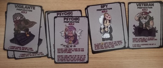
First off your role selection is. Not very good :( considering that Spy was a stretch goal, having only three possible roles you initially can obtain during the game is a bit. Hm. Also interesting that Psychic also originated from SoS, alongside the specific Vigilante skin. Shame Veteran has yet to get similar treatment.
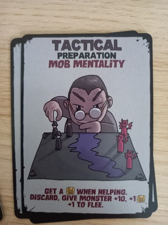
The fact that mob mentality is a mechanic tickles me. Also y he look like that.
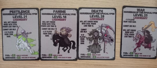
Horsemen prior to Town of Salem 2? Kinda wild.

I AM POINTING THIS ONE OUT SPECFICALLY BECAUSE. HELLO!? THIS MAN KINDA GIVES ME TUMBLR SEXYMAN ENERGY /LH WHY IS FIT KINDA COOL AS.
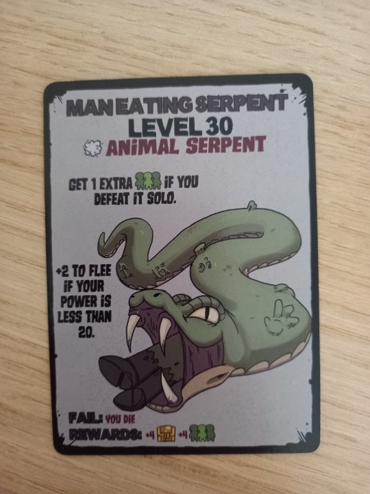
MY BRAIN IS LIKE "IS THAT THE SK?" BUT I. DOUBT IT IS NGL.
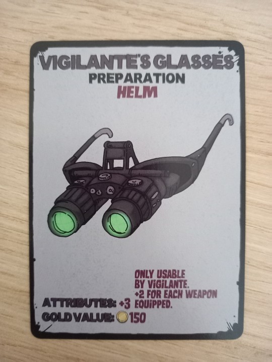
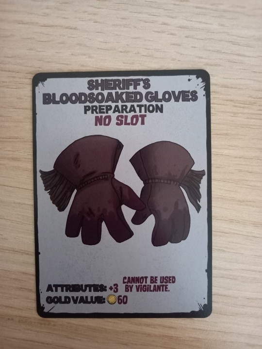
This confirms that A) The vigilante needs glasses and B) The sheriff has killed. Probably killed a townie, hence why the Vigilante can't use them /nsrs

Spy does not want to be around dogs. Spy how could you. /nsrs

The closest we'll ever get to the mafia being relevant again :( also hello stray hair that might have been from me whoops.
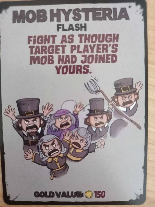
Tag u and the squad (I'm Gold Value: 150)
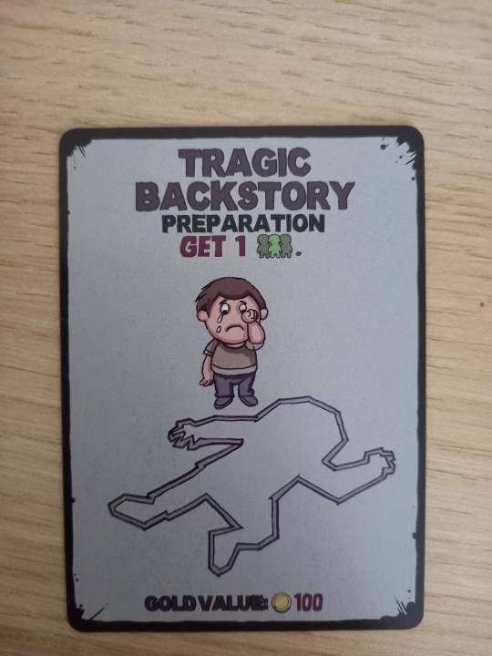
I feel like you can make a joke out of this.
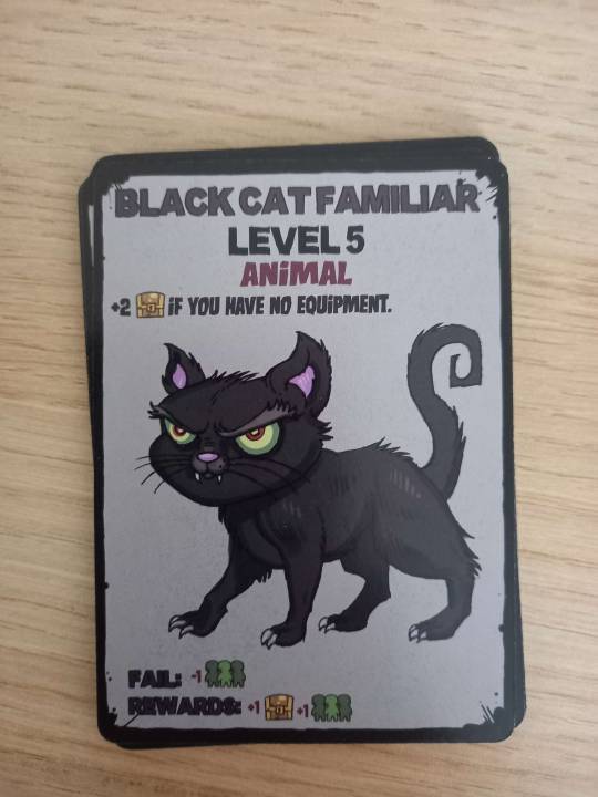
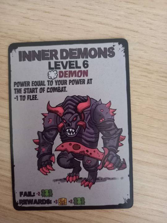


Just some neat creatures. Shout out to the inner demons specifically.

Glad to see the Amnesiac canonically has hair and is not bald.

All the other horsemen get cool weapons... famine gets the scales. Tbh who needs cool weapons anyway when you have :bread
(I mean tbh it does make sense but. Sick ass weapons either way)
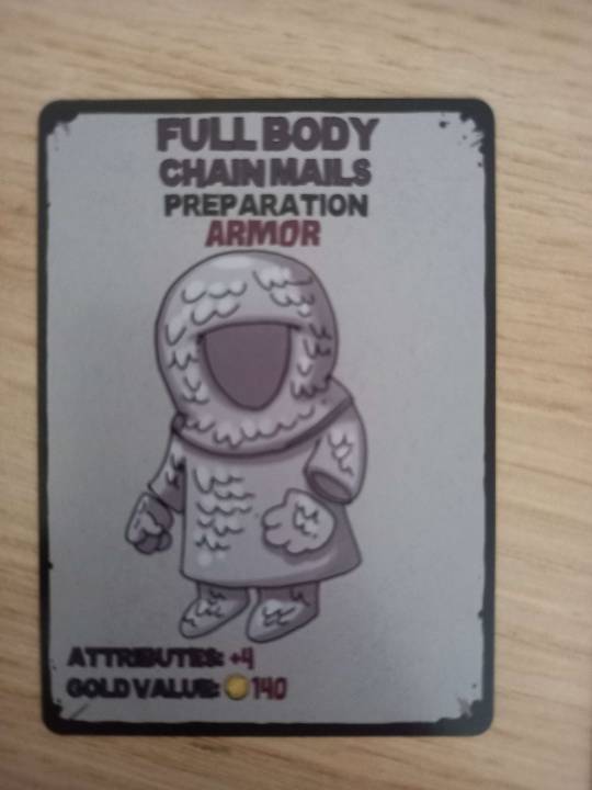
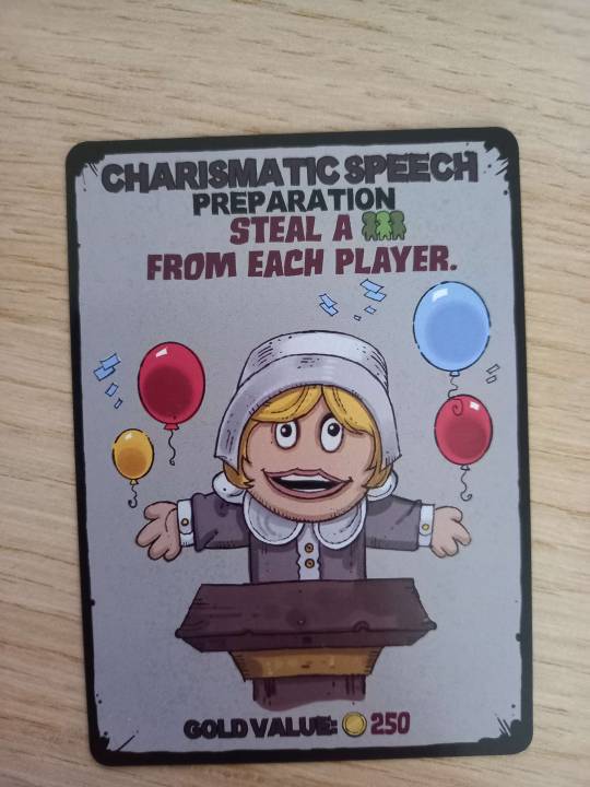
SOME EXAMPLES OF UM. art. The full body chainmail looks traced from the town of salem game art holy shit flummery.
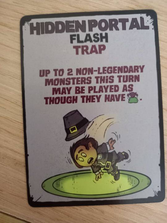
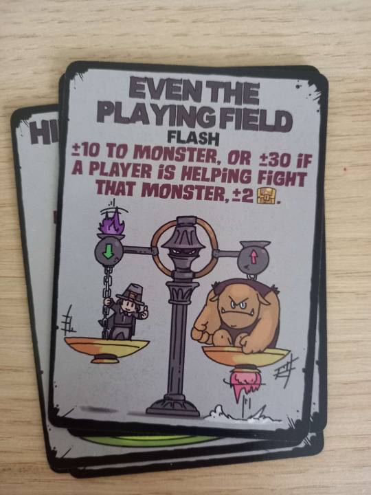
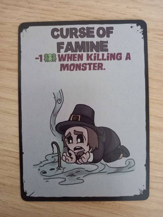
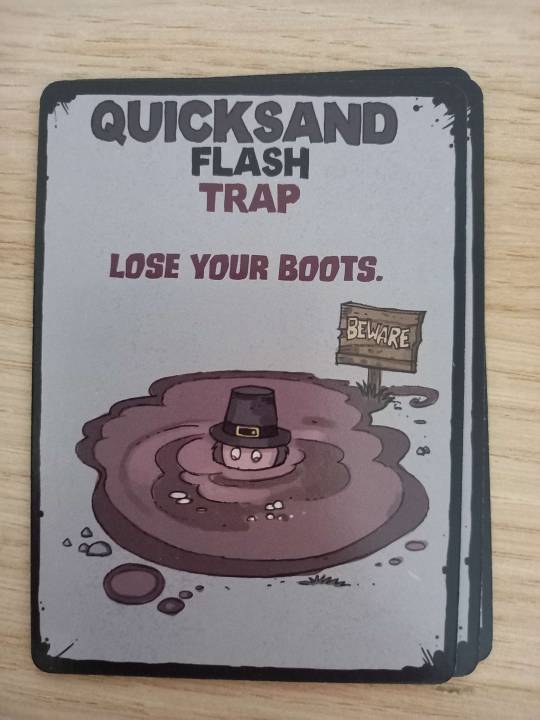
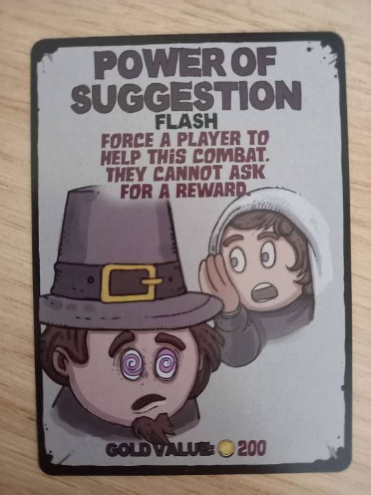
Just some townies being used and abused :)

And that's about it! At least, the ones I think are neat and wanted to share anyway. The deck came with a whole bunch of blank cards, as well as many. Many more cards. Like I didn't show you guys all the coven ones.
I definately want to get a photo of everything at some point but for now. Here you go eat up I guess.
#town of salem#tos2#long post#honestly how do you tag something like this I just wanna do a funky deep dive frfr#either way I just wanted to try and archive this a bit better so. here ya go.
20 notes
·
View notes
Note
Someone once contacted me through the social media links at the end of my fics. We exchanged exactly five quality messages in DMs before they unprompted sent me 50 consecutive messages and images, base art and screenshot tracing included, explaining their OC x canon story that was, frankly, of very low quality and full of stereotypes, clichés, and characters making everything about the OCs. My fic had nothing to do with OC x canon, I wrote about the character we both like and delved into angst and dark topics but not the ones that they focused on. Every time I would reply something short, another couple dozen messages would follow before they would then apologize and start deleting certain messages. It felt really weird and I had no interest in anything they told me after that very short initial conversation, but I didn't want to be so rude to turn them down when they obviously had no other friends to discuss this with. They barely even talked about what I wrote, just sprung that all on me. Wish that I could be among the people who made close friends through this avenue, but alas! I just couldn't pretend that I cared about this person's story and I found it rather rude that they sent so much to me without me having given any sign I was interested in something like that. They said they had autism in one message and then I felt even worse for failing to show them any interest.
--
Half of fandom is on the spectrum.
They sound like a parasite who wants to suck attention from everyone without giving back.
50 notes
·
View notes
Text
Hello!
Anyone under the age of 18, do not follow me. Please.
Decided to put effort into an actual introductory post, so here we go.
Obviously, this is my art account, and you may refer to me with any pronouns. I don't care. I am 20 years old.
DNI
Pedophiles, MAPs, PEARs, Zoophiles, etc.
Transphobes, Homophobes
Racists
NFTs, AI "artists"
Anyone who harasses, bullies, and/or doxes another person over anything that is purely fictional.
"KYS" commenters
If I see anyone described in my DNI interacting with my account, I will block them.
If I have followed a minor or interacted with anyone described in my DNI, please let me know.
(Any minors that happen to follow me will be soft-blocked.)
I am anti-harassment and anti-censorship. I do not have the energy for any negativity. Sorry, y'all.
—————————————————————————
Interactions
My ask box is open! You can put whatever you want there.
Anonymous asks are on, but if this proves to be a problem, I'll turn that off.
You can use my work as a reference, just please do not outright trace it.
I do not believe in "pose theft" or "color palette theft," so if you want to use my work for either the pose or color palette, go right ahead.
I don't know how to respond to compliments, but just know that they're appreciated, whether in comments, tags, or reblog responses!
Current Interests
Ninjago
Total Drama Island Franchise
This will be updated for every piece of media I start to consistently post about.
Of Video Games
Sims 2 and 3
Minecraft
Tomodachi Life
I'm not interested in shipping wars and will usually just stick away from things that I don't like. Also, my stuff will most likely not be sticking to the canon material. I like doing my own thing and making up shit all the time.
Specifically, I plan on eventually making pieces for Total Drama characters I feel would be related in some way to the Reboot cast. I know that some people don't like the implications when it comes to canon, but I hope it's okay if I make the original, RotI, and Pakitew Island casts a good 10-15+ more years older than the Reboot cast.
If you want to see what art I like or what fandom spaces I tend to be in, go follow my reblog-blog account, @sparksartreblog.
Ship Tags
"rajbow" - Raj x Bowie from Total Drama
"primien" or "damiya" - Priya x Damien from Total Drama
"nichayne" - Nichelle x Wayne from Total Drama
"glaciershipping" - Cole x Zane from Ninjago
"bruiseshipping" - Cole x Jay from Ninjago
"luaisy" - Luigi x Daisy from the Super Mario franchise
"mareach" - Mario x Peach from the Super Mario franchise
"bawn" - B x Dawn from Total Drama
This will be updated the more pairings I post.
My Tags
"spark arts" - My art
"spark speaks" - Where I talk
"spark wips" - Character designs, works in progress, and general unfinished or sketchy pieces
"thumbnail" - Thumbnail art I do for the VODs channel
"reblog" - Anything I happen to reblog
"spark arts reblog" - Any of my art I reblog
"art theft" / "credit the artists" / "love your artists" - Where I try to find and credit uncredited artists
"screenshot redraw" - Any screenshot/screencap I happen to redraw
Let's get this one thing straight; this is my account, and I will do what I want with it. If I like something, I will draw it. Everything I do is a work of fiction, and if you see something that seems harmful, it was not my intention for it to be harmful.
Please, for everyone's mental health, if you don't like something that I've posted, please block this account.
11 notes
·
View notes
Last Seen Blogs


dieg0brandos-wife
venice bitch

pehrsonsun95
The Journaling of Beebe 169

myjourneytoaprocard-blog
myjourneytoaprocard
wordofthevomit
word of the vomit