#I hate Indesign but I use it the most
Text
Hotel Vast Horizon by @rocket-eighty-eight
Heat (1995) | Vincent Hanna/Neil McCauley | 16,202 words | 100 pages
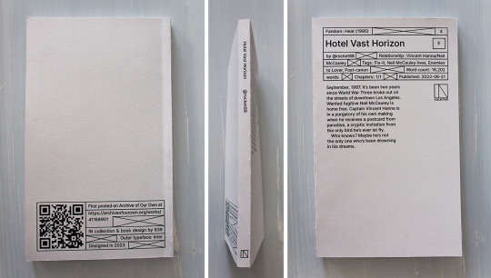
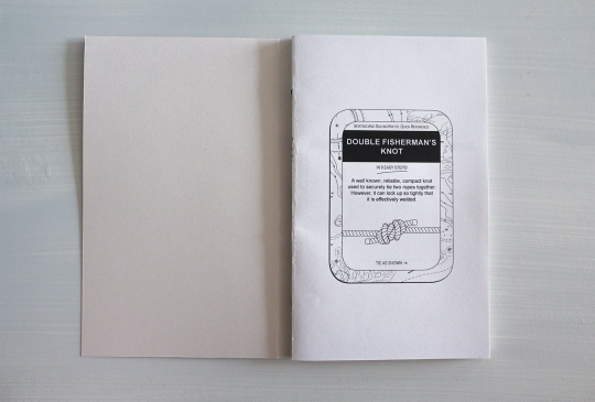
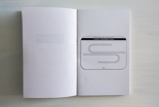
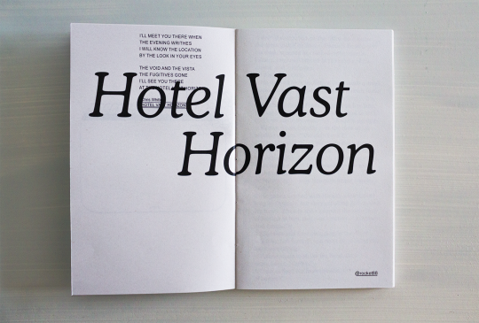

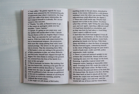
You can see and download the whole typeset HERE.
You can also print it if you want a copy for yourself! I provide printable files below. Check out the guide first ↓ The book is 11x18cm AKA 4,3x7,1" & can be printed with a coptic stitch or staples. Mine's printed on 80gsm grey recycled paper & 210gsm grey paper for the cover.
DOWNLOAD THE FILES / PRINTING & BINDING GUIDE
PRINTING NOTES: This typeset goes pretty close to the edges of the pages, so be careful when cutting it, and the first signature or so has double-spread images, so I'd really recommend making sure your double-sided printing is calibrated for this one (whether you're doing it at home or at a printing shop).
HEY!!!! HI! finally. If you've checked the Heat (1995) (Al Pacino and Robert De Niro Go on a Date: The Movie) tag on AO3 in the past year you've probably checked out Hotel Vast Horizon (Michael Mann Could Never: The Fic). Welp here it is on paper.
The common thread in the typeset was always the ocean (and shit, I said the o-word. did you know there are like 20 references to water, seas and storms in HVH, and yet never once "ocean" is said?). The other thread was the Bitstream Cooper typeface, which is round and curvy and so pleasing on the eye. Isn't it? Also Arial (underrated), because I needed it for the sequencing to show that Michael Mann is a loser. I'm kidding. Or am I? But this brings me to another major thing: the sequencing. (The common denominator between movies and books: the sequence.) That can only be apprehended on the full PDF/book, and it's really something that did not really exist (in so much depths) in the previous typesets.
As to what the sequencing is saying, or what the hell this intro is about (no I did not have a stroke when I did it), I will not say much if only that it is about the vocabulary, the image, the movie, the things that go beyond fate, a little bit Neil vs Vincent and a lot the reason vs the heart. More things shall remain unexplained because I feel they would be better experienced than laid out here.
If you'd still like to know what's actually going on in this thing don't hesitate to send in an ask lol.
More details on the technical matters + a visualization at the bottom, because there is work involved and my micro typography is so clean it could give Neil McCauley a boner.
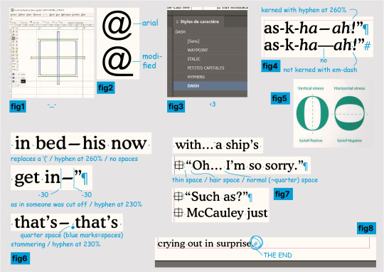
help where do i even begin? I learnt how to use FontForge to create a new typeface specifically for that symbol at the beginning of the paragraphs in order to implement it in InDesign (see fig.1 below), I changed the Arial's @ in FontForge too (fig.2) to have it fit with the underline in @ rocket88, what the hell.
2. I also drew 11 (I think) illustrations for the intro (yes, those knots......), but that wasn't as complicated as I thought it would be. I do deeply curse InDesign's "Print Booklet" function for how much it hates images though.
3. I would like you to meet my InDesign characters styles (fig.3) as they simply are impeccable and the best you will ever see, I could not have been more professional if you had paid me 5 grand for this. The hyphens! The dashes! The custom small caps!
4. To get even further in the micro typography. It is, in most, most cases, much too time-consuming to properly kern (=modulate the space between your characters and/or words) your text for how little the average eye will get out of it, and/or your average graphic designer is certainly not getting paid enough to actually do it properly. I, on the other hand, am insane and unemployed, therefore yes, I kerned this shit. Micro typo is actually the sculpture of the white spaces of your page. When done thoroughly it does mean checking every characters with your own eyeballs.
So in english, since this typeset is in english, the rules are no spaces for punctuation. Right? and not right ? It makes for a pretty tight block. I do argue too tight - although of course you'll also have times where you want tight. (And this is all within the 5% of the time where kerning matters.) That might not sound too bad until you get to em-dashes, this '—' thing. Which is a literally useless punctuation mark that is so hysterically long it'll leave an unnatural horizontal void in your text and draw all attention to it—you know, instead of the text itself. Useless, because it can always be replaced by commas, colon, semicolon, or parentheses. Unnatural, because em/en-dashes do not follow a typeface's characteristics (when hyphens do! fig4), so they hardly fit with serifs, AND characters are generally vertically stressed in latin (fig5: which one looks normal?) except... well. So you'll have the tightest group of punctuation marks humping each other?!"— then a dash literally the size of a whole ass m that looks nothing like the rest. ridiculous. absurd.
Anyway the point is I said bye-bye to this aberration and used hyphens stretched at 260% (lmao. it works so well?). And sometimes 230%. Sometimes with a space after, sometimes not - if not the same meaning then why the same treatment (fig6)? I wondered at this point if I wasn't going too far (lol) but this is the point of micro typo, so, whatever. See fig7 for more kerning stuff.
5. I have far less things to say about this part than the last even though I must have spent twice as much time on it, but I just wanted to say that I manually set the text rag on all 69 pages, it looks nice, I love tetris, AND!!!! the greatest thing about the whole fucking book (fig8): the text starts on the top line of the first column, and ends, on p.91, on the LAST line of the column, at the very bottom of the page, and IT IS NOT. BY. CHANCE!!!!!! HAHAHAHAHA!!!!!!
thanks for reading. perfection has not been achieved and there might still be typos. see you later.
62 notes
·
View notes
Text
More Blue Lock graphic design student headcanons because I love being self indulgent.
Characters: Karasu, Otoya, Yukimiya
Graphic design student!Kaiser and Ness headcanons
Tags: gn!graphic design student!reader, reader is in a friend group with Karasu, Otoya and Yukimiya, everything is based on my own experience at a vocational college here in Germany!
-Karasu's arch nemesis is Adobe Indesign. He absolutely hates using it and complains every time he has to. He knows how to use it, he just really hates it
-it's actually very funny because you're sitting there doing your work and suddenly Karasu goes on a five minute rant about the program
-out of you four, Yukimiya is the most organized. All the folders and files on his laptop are named properly so he can find anything needed
-Karasu just names his files "typography/graphic design hdkdisjdbdbs" (with different keysmashes each time) and for some reason he ALWAYS knows which file is the right one
-Otoya always procrastinates his projects until the last minute. Like, you can have four weeks for a project to work on it during class. But he doesn't make use of that. He's on his phone all the time
-Otoya literally starts all of his projects the day before or on the day when it's due. With some miracle, he always finishes on time and it never looks half-assed or bad either
-lunch breaks are either spent outside to get food or in the classroom watching meme compilations together
-Karasu loves to shittalk about the works of the classmates you guys hate
-in general, you gossip a lot about your classmates. Because. Why are some of them SO FUCKING WEIRD. (speaking from experience)
-Yukimiya installed an unnecessarily big amount of fonts on his laptop. If you ask him about it, the answer is usually "You never know when you need the perfect font"
-Otoya always finds ways to insert memes into his projects. Even if it's just hidden underneath everything else on the lowest layer, it's not a real Otoya project if there's no meme hidden somewhere
-you do the same but with a random picture of Karasu looking very stupid
-your teacher saw you inserting it once and explaining it was very awkward while your friends just laughed at you
#bllk#blue lock#blue lock x reader#bllk x reader#blue lock headcanons#bllk headcanons#blue lock x you#bllk x you#tabito karasu#karasu tabito#karasu x reader#karasu x you#tabito karasu x reader#tabito karasu x you#otoya eita#eita otoya#otoya x reader#otoya x you#eita otoya x reader#eita otoya x you#kenyu yukimiya x reader#kenyu yukimiya x you#yukimiya x reader#yukimiya x you
114 notes
·
View notes
Text
How to Publish a Book, pt 1
I told @tryxyhijinks I was gonna turn this into a shitpost, so here we go: how to publish an ebook in ten easy steps.
Write the book. This is, believe it or not, the fun part.
Edit the book. Slightly less easy, but you have to do this, no matter what anyone else has told you about "minimum viable product" or what have you. You can force your friends to read it, you can have a program read it aloud to you, you can read it backwards, you can hire someone to line edit your work, you can do some or most of the above, just get it edited. (Additional point: when hiring a professional, if you're happy with the plot, ask for line or copyediting; if you're not sure about plot points, ask for developmental editing; if you just need guidance, you may want to start with an editorial letter.)
Get a cover. You can make one yourself or pay someone to do it. You're going to want it to be about 1600x2500 pixels and 72 dpi. It's good to have a really nice cover, because covers sell books.
Typeset the book. I use Atticus to create an epub file. If you are also doing a print version or you are a control freak, I recommend it. Vellum and Reedsy are about the same, I think. If you have a lot of illustrations--big ones, I mean, not just an author photo--you should beg, borrow, or steal a copy of InDesign. You can use Calibre to compress your output epub file if you want to make sure you earn every available penny. However, my book is 6mb and it is about 8 cents to download. Also, if you're trying to do this on the cheap, you really can just do it in Word. The layout won't be as fancy, but you can do it. (Layout granularity, from least to most granular, is probably Word->Atticus->InDesign.)
If you want to publish under a press name that is not your name, you will need to start a business. Laws around taxes and registration may vary depending on where you are, but in general, you will want to register your name with your state or county registrar (for me, this cost $30 and I had to get a piece of paper notarized). Then you can get a business checking account (for me this part was free--I went through the bank I already have accounts with). In the US, sole proprietorships like this are taxed as pass-through entities, so you will pay personal income taxes on whatever money you make, but you don't have to pay corporate income taxes. If you are publishing books that could possibly get you sued (e.g., The Big Book of Welding While Juggling or Now You're Cooking with Napalm) you may want to form an LLC. Talk to a lawyer.
Open a KDP account. If you hate the Zon and want to only publish somewhere else (Apple Books, Kobo, Barnes and Noble, Smashwords, whatever), that's fine--the process is about the same. If you think you previously had a KDP account and then didn't use it, search your emails etc. to try to find out, because if they figure that out, they'll close both accounts and then you won't get paid.
Add your new title to the catalog (you will need to add metadata, like your name, series name if there is one, and a description of the book) and set the prices. Unless your book is super big, you'll probably earn more if you select the 70% option. For some reason, I changed a few of the prices. If you're planning to publish on several platforms, I don't recommend this--just set your price in one place and then let it convert those. Otherwise, you'll have to reinput everything over and over, because it's in the terms of service that you need to price things the same on Kobo as you do on Amazon (and so on).
Set the day of publication and tell people about it. Like your mom. Your weird aunt who's always so supportive. Your friend who has been listening to you bitch about how hard writing is for the past six months.
???
Profit.
Q: Hey, I want my book in several online stores, not just Amazon.
A: You have a few options. Draft2Digital/Smashwords and IngramSpark both distribute digitally to various places so you only have to set things up once. But they take a cut of the profit for this service. You can also set up independent accounts with each store and upload your stuff.
Q: What happens in step 9?
A: You know. Meet other indie writers and try to gain their trust. Read a lot. Work on the sequel. Get some sleep, because deadlines are exhausting, even self-imposed ones. Learn about advertising. That sort of thing.
Next time, I'll do the paper side of things.
26 notes
·
View notes
Text


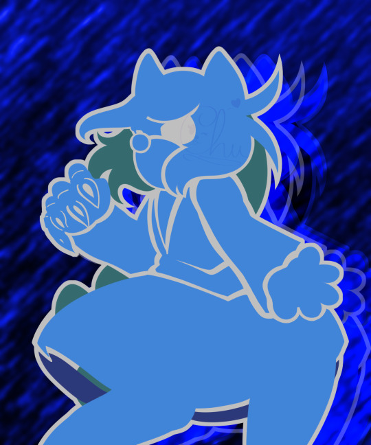
PARAMORE RELEASED THEIR A24 TRIBUTE COVER TODAY. AND I GOT INSPIRED BY THE LYRICS AND THE VISUALIZER.
youtube
IMAGE CREDITS BC VERY OBVIOUSLY THIS IS AN EXPERIMENTAL PIC COLLAGE PIECE PRIMARILY BELOW DESC (I DID NOT TAKE THE COOL PICS OBV.)
OK GIANT CREDIT BLOCK GO (Freepik and pexels my beloved saved my entire college year lmao):
1 OCEAN WAVES
2 OCEAN WAVES AGAIN
3 YES A THIRD OCEAN WAVE
4 VERY COOL DROPLETS
5 FLAME. OO FIRE PRETTYYY /POS
6 BG I CHEATED YOU INTO BELIEVING IS RAIN
The drawing though is made by my acoustic arse /lh
THE LYRICS ARE TAKEN FROM THE VID I LINKED. HAYLEY'S VOICE MY BELOVED AND FOREVER DEAREST ENTIRE BAND /POSPOSPOS. I wanna sing like Hayley so badly, she is such an idol to me, when it comes to vocals and I wish to sing as expressive as her some day 🤧✨💖
--
WHAT MORE CAN I SAY, OTHER THAN I'VE BEEN EXPERIMENTING WITH SHORT DRAWINGS, THAT TAKE UNDER A DAY TO COMPLETE TO FIGURE OUT SOME THINGS I WANNA DO AS AN ARTIST AND POSSIBLY COMMISSIONS. + These drawings genuinely kinda de-stress so it's been free therapy too, oops. I wanna do more of these vector-style drawings, that are just me taking lyrics and creating these fun collages, of things that inspire me or I like. It's a chill practice and lets my creativity actually do the work for once, instead of my usual need to outdo myself in every drawing and improve lmao. Improvement is cool and all, but dear god did I not realise how hard my need for perfection last year stress and strangle me tf out. I seriously need to re-evaluate the way I approach art as this massive, intimidating medium, when most artists literally draw for fun, and for me it's been like...A Sisyphean task.
--
If you enjoyed seeing this, I might make a sequel with C'est Comme Ca and w/ Marco in it instead and a red BG,, if I want to, I might turn these into a series, just like those aesthetic icon drawings I made of my 2 boys, started Lotta, and IMMEDIATELY lost that sketch due to my USB's death back in 2022 and lost all motivation for art due to that massive loss /neg
--
Not sure what else to add here other than my thoughts that I already did!! Other than ofc, the usual, MASSIVE thank you to my friend Hollowed-Hartlocke for introducing me to Paramore back in 2019 <3
Think I'm done rambling now tho!! OH WAIT. I can add, that I had to actually pull out Adobe Illustrator just to add stretched text for aesthetic purposes. Then I got so impatient with the effects panel not showing me the usual layer-effects and me being too lazy to look up, whether InDesign was the one, that had the usual layer effects I use in an Adobe program or not. Btw still mooching off my college acc that shoulda been dead long ago but just isn't??? LMAO I'M STILL GONNA USE IT IF I CAN ALRIGHT.
OH YEAH BTW. This drawing took 3 hours. NO I'M NOT KIDDING. PEOPLE WOULD PROBABLY BE SHOCKED THAT SUCH A LAZY LOOKING PIECE TOOK SO LONG. BUT I GENUINELY AM RATHER SHOOK THAT I TOOK SUCH LITTLE TIME TO CREATE THIS. TBF I threw MOST proportion checks and canvas flips I do out the window, so there's a BIG chance I will hate this, if I flip the canvas xD ANYWAY I RAMBLED LONG ENOUGH I THINK NOW. JUST ENJOY EXPERIMENTAL ART
^Before-bed edit; Yeah his torso's a TAD too much leaning to the left, it's off-center to the rotation of his pelvis to be in fact, but maybe? I'll roll with this mistake. It kinda gives the piece its abstract nature..I kinda like the mistake?? This is the first time in my life I ever tolerated a mistake I did and now declare it on purpose and will probably build one into the next piece as well. Hell, maybe it'll yield an interesting result. Anyway, it's 12PM as I write this, and I have to get up at 4AM for my train soOooo, yeah, gotta sleep ASAP for school.
I have NO clue again what to 100% accurately tag this, so forgive me if the tags are wrong LMAO, I just will believe what I believe it has overlaps w/ within art-genre.
This piece kiiinda gives pop art??? So I'm gonna tag it as such as well, but but might be incorrect. If a pop-art enjoyer wants to correct me, PLEASE DO. I'm going off the definitions of pop-art I learned in high-school. So I could most def be wrong about me adding this tag in particular. How tf do people confidently tag their posts when I doubt almost every tag I add man. Tagging is the worst part of uploading art to me due to how hard it is to label art really, not meant to be in a genre. xD
Def adding Paramore tags tho bc I NEED to know more Paramore fans out there bc we feel like such a tiny community, when they're literally one of the most influential rock bands of the 2000s and 2010s imho AUGH
#collage#digital collage#my art#digital art#art#artwork#artists on tumblr#character art#original art#vector#vector art#sonic fan character#sonic oc#sonic fandom#sonic original character#experimental#experimental art#abstract#pop art#paramore#pmore#Youtube
2 notes
·
View notes
Text

@salamanderpie I understood exactly what you meant, and I hope you don't mind me taking this out of replies, because good use of headings is the most important feature and I will sing about it from the rooftops.
In my day jobs I've been a print designer and laid out 200+ page books and guides. I'm now a web content editor, and an on-call expert for my agencies docs that are both print and direct-to-digital — and a proponent of digital accessibility. And I need to say:
Use built-in 'styles' to format your documents
It doesn't matter what they look like. Change the default to whatever suits you. But if your document has any kind of internal heading structure, use 'heading 1', 'heading 2' etc for that structure. I don't care if you're writing in gDocs, Libre Office, Office, Mac-whatever -- they've all got it. Use it.
Applying heading styles marks the structure of your document in code. That means:
You can use the navigation or outline pane (what they call it varies by software) to jump around easily within your own work
You can change the look of the entire document AT ONCE if you decide you hate that font you used for the headers
If you move it to the web the CSS of whatever site can latch on to those tags and format it appropriately with no extra legwork
If it's getting laid out for press, the designer can style and structure based on those tags (In InDesign or the equivalent) without having to reapply them all
And most importantly, using heading styles allows screen-reader users to easily navigate your document
That's it, that's my spiel, okay I'm done.
#digital accessibility#and now I have to admit I DON'T use headings in my writing#because I use a separate doc for each chapter#but I use them extensively in my brainstorm docs#cuz how the hell else will I know where I am in a 40k word doc?#and I have to bang this drum at work all the time#:P
7 notes
·
View notes
Text
One Thing
January 8, 2023
The task for this assignment is to become knowledgable in one topic, and, using InDesign, create an informational book or magazine.
My first topics to cover were:
The Snare Drum
Traffic Lights
Brake Lights on Cars
Yeti Coffee Mugs
Astigmatisms
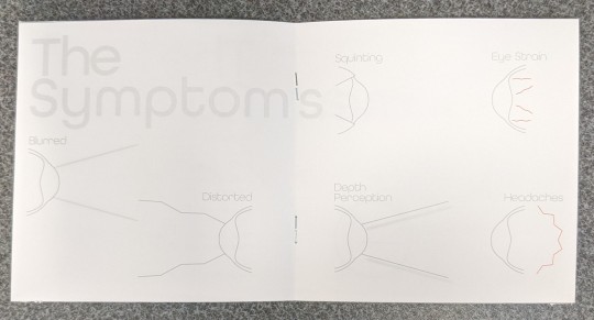
I had a few ideas on how to make interesting designs for a few of these topics, but astigmatisms provided the biggest surge of ideas. I will explore some more options, but for now I have decided to stick with this just to get a solid start.
This first day was spent researching and picking which information would be most important, as well as, provide me with options for creative design.
January 10, 2023
Today I spent some more time researching, ideating layouts, and finding the perfect font.
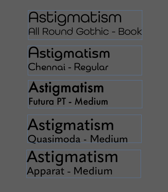
I have a few typefaces picked out, I'll just have to narrow it down to one or two. To represent the cleanliness of a medical professional's office I want the lines to be straight and consistent in width. To represent the nature of eye balls, I am choosing a geometric font to achieve a more rounded lettering.
January 15, 2023
The typeface I have chosen is All Round Gothic. I feel it is the best choice for the book because it offers choice in the weight of the text, and is more consistently round than Chennai.
I spent the day trying to figure out what to do for my cover page and came up with a few rough ideas
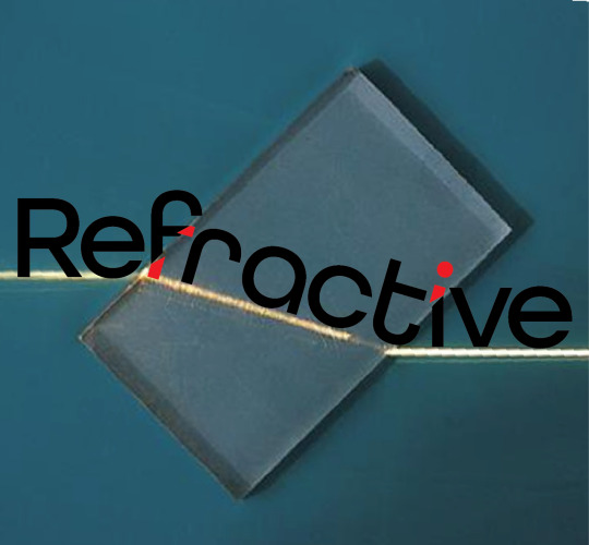

I soon decided to abandon the Refractive Error idea, and just title it Astigmatism. The main problem I had with this title was how to visualize the concept in the title. Sure, the word is probably enough, but that's boring and not nearly complicated enough for me to be happy with. So, I got to work on cracking through a few more rough drafts of the title.
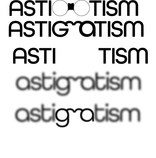
I got really stuck on glasses needing to be included with the title. I played with a form designs and wanted to experiment with the letterforms, and push the readability. I ended up settling on the last design, and played with how blurry I wanted the end product to be.
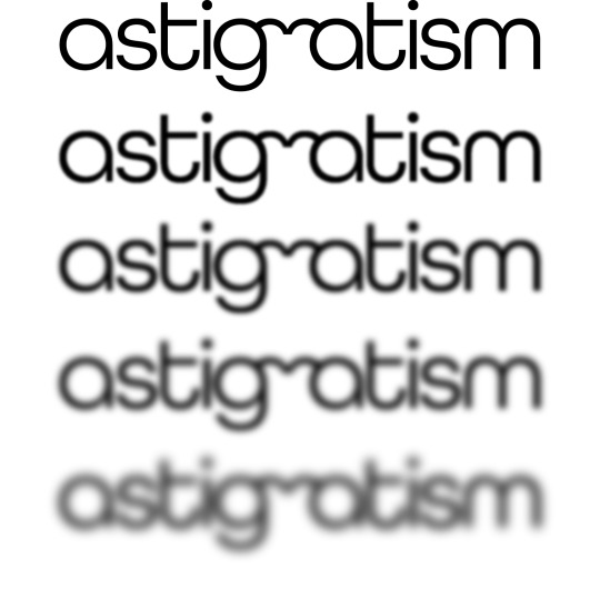
I think to really push the vision problem aspect of an astigmatism, I want to really play with the overall readability of the book.
January 17, 2023
I have begun experimenting with different layouts and so far it is not going great. I can't seem to find something I'm happy with based on the size I chose (11"x17"). My information is succinct and there's a lot of space to be filled.

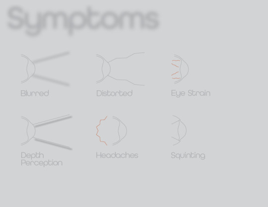


January 22, 2024
I don't know why I thought I had to make the book so big. Just got those numbers in my head and couldn't let go I guess. I've smartened up, just a little, and I'm gonna start experimenting with smaller sizes.
I also want to continue pushing the readability of the final product. This is an issue of visibility that I suffer with, so I want the experience to reflect the difficulties I have without my glasses.

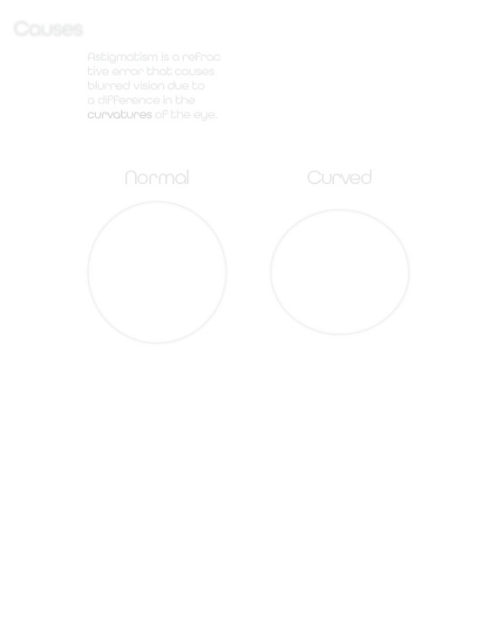
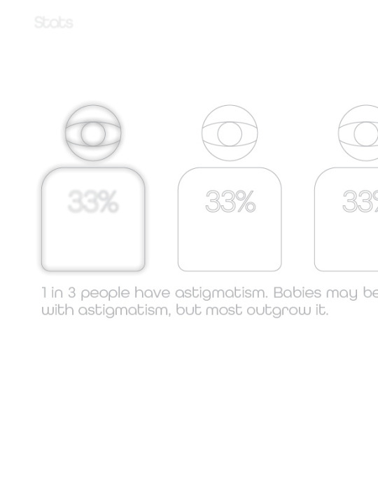
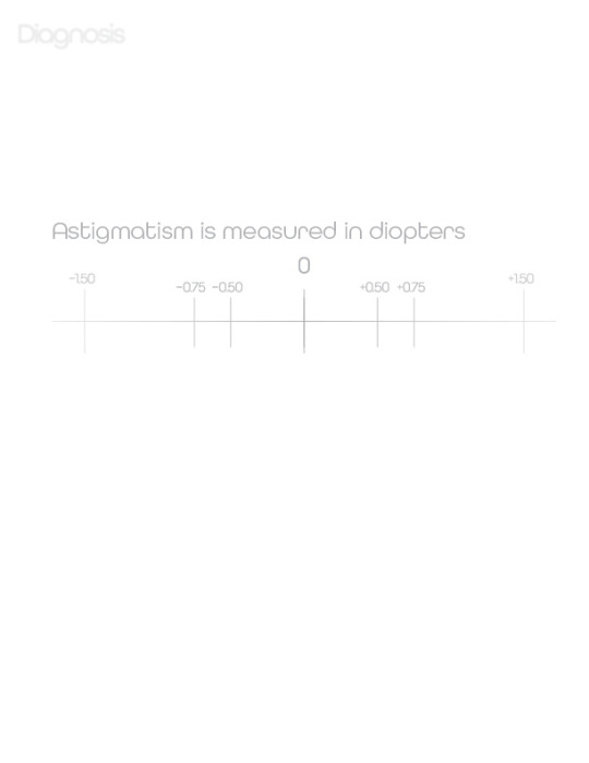
January 24, 2024
I just continued working on the previous layout of my book and began to hate it again. At least from this point on I have all the information I need in Indesign. If only I could be happy with where I end up putting that information.
January 29, 2024
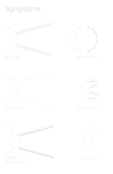
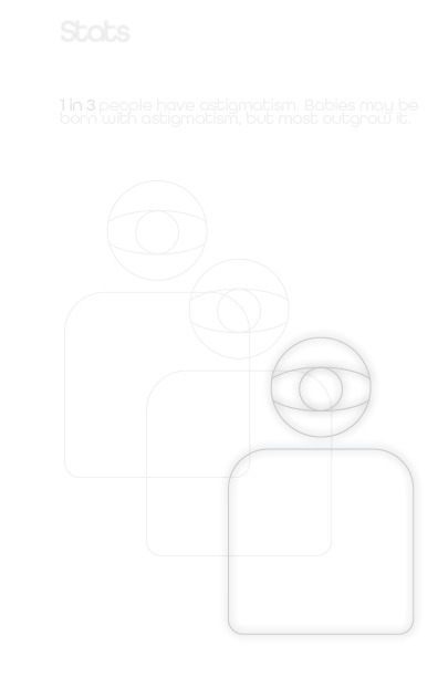
After more experimentation and reformats, I decided to go with this for critique. I wanted each page to contain one subject comfortably, without the text or symbols being too large.


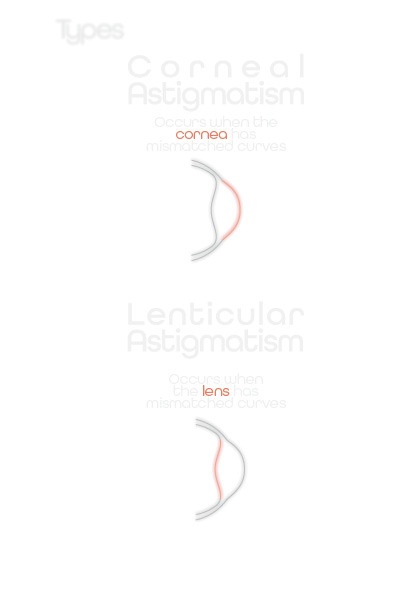


January 31, 2024
I printed it off on my home printer (not the highest quality), and it is almost impossible to read. I know I wanted to push the limits on readability, but this is a little too far. I'll have to adjust the darkness for my final print for sure.
Critique went well. A few people liked the idea, but also agreed that it was really hard to read. I'll have to adjust the tone and reprint until I have something hard to read, but not impossible.
February 2, 2024
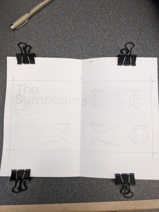
Today is the final day, I have reformatted the book to fit on 5"x5" square pages, and adjusted the tones to get a very subtle, but readable grey.
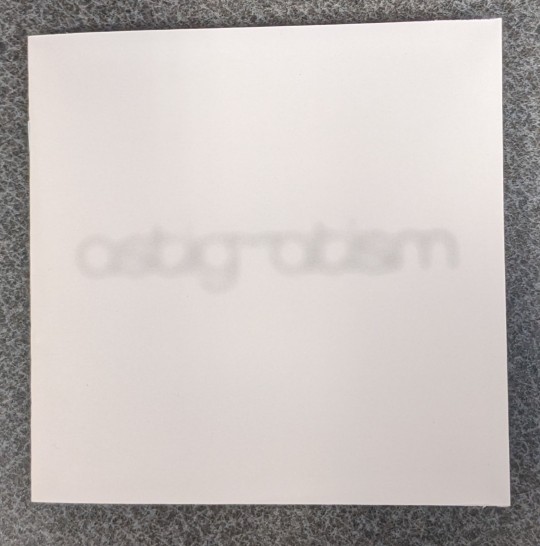
The front page with the Asrigmatism title, and the back page are blurred to capture the effect I see when I try to read black on white with my glasses off. The words are hard to see because I want the readers to have to suffer like I did for so long and squint their beady little eyes to see what I have written.
Progress Pictures


Final Book

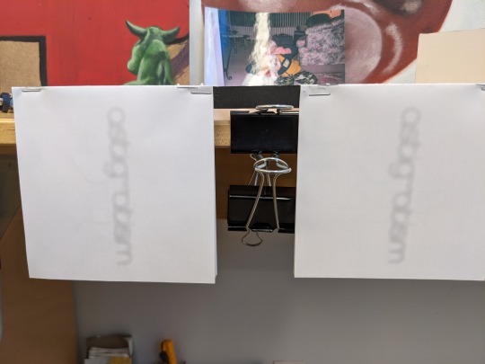
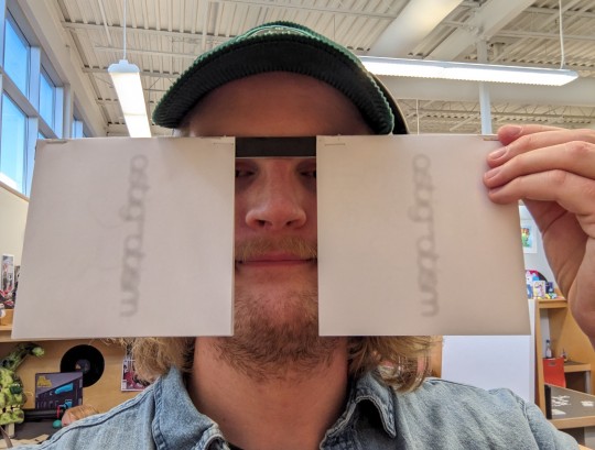
Waste Nothing
I had a couple test prints hanging around, so I wanted to put them to use. What better way to use up extra books about bad eyes than to make a pair of glasses with them.
0 notes
Text
Course Reflection
The past semester and this class were, in combination with each other, quite an intense ride, to be honest. I started my semester feeling really organized and energized, which was great. In regards to the first day of this class, I felt a little overwhelmed seeing the syllabus for the first time, because there was so much ground to cover. But I was also glad for how clear and detailed it was, and it became a really helpful resource later on.
The first project was a huge challenge for me, mainly because it was a bit of a “culture shock”. It required much more precision, effort, and time than any art/design project I’d ever been assigned before. It was a bit of a trial by fire, but the clear guidelines and instructions in the project sheet, as well as the in-class demos, were extremely helpful. I honestly think the first project was the hardest out of the entire semester, but that turned out to be a good thing. I learned more about how to use a ruler and X-acto knife in Project 1 than I learned in all of my years of education combined. It also let me gauge how much time I’d need to set aside for this course in the future and helped me learn early on how to consult all resources available to me.
As the semester went on, things in the class started to change. The projects became more technically complex in terms of design software skills (as opposed to physical media like the first couple of projects). We shifted to doing a lot of peer feedback during class, conceptual thinking became a focus, and planning projects out clearly and thinking ahead was a necessity. This was especially true for the last two projects.
“Remaking Language” was both one of my most and least favorite projects from the semester. I love typographic abstraction and manipulation and I’m somewhat confident in my Adobe Illustrator skills when it comes to these areas of graphic design. So, I loved that part of the project. However, I absolutely hate layout design and I’m unskilled in Adobe InDesign as a whole. This meant I had a really awful time trying to design my spreads during the final stretch of the project. I will say that I learned quite a lot about InDesign in the process, but I still strongly dislike it. I think this was the project that made me realize layout design is not my dream career.
The last project tied in every project we’d had previously, and I found most parts of it really enjoyable. Working on Adobe Illustrator was, of course, a highlight for me, but I also found a passion for creating brand identities and writing in depth about their archetypes, ethos, and MSCWs. Creating logos was something I’d done before in an earlier GD+I introductory course, but it never gets boring. I found it really cool to be able to look at my logo designs from that course and this course side-by-side. I think I’ve overall improved, based on my comparison of the logos, at least. However, I can see that I need to continue to work on my Adobe Illustrator skills and use of color.
Despite the challenges, I learned so much in this course. I got better at figuring out things on my own, especially with Illustrator. I also got more comfortable asking for feedback, which was a big step for me. Looking forward, I’m excited to keep working on Illustrator and Indesign. I want to get better at managing my time and planning out my projects. I'm taking the next level of this course, so I'm hoping to learn more there.
This semester was hard, but I feel like it taught me a lot about handling stress and juggling different tasks. It was a valuable experience and I’m glad for what I learned and I’m looking forward to applying it in my next classes and projects.
0 notes
Text
INTERSECTIONS PROJECT
EVALUATION OF TERM ONE.
To conclude this first term at Arts University Bournemouth, it's certainly not been the easiest mentally but in terms of work I've produced, it has been very productive.
Throughout the briefs I have catered my work and my research to what I'm already knowledgeable about, using skills I am already used to using. This has allowed me to be creative and execute the best work. I tend to work quite quickly once I have that initial spark. What I love about design is an initial idea can grow to be something amazing eventually, snowballing constantly.
I think I managed my time well, doing lots of brainstorming and the main bulk of the thinking and planning first, and then once I have my idea I can relax, create and develop. I always make sure I am on time as this takes off the pressure of deadlines and allows me enough time to make changes if necessary.
Each time I have received feedback I always take it on board. The feedback I've had has been very useful, giving me new ideas so I can further my projects, sometimes bringing me back to the brief ensuring I'm still answering the question is helpful because sometimes I can get lost within a brief slipping off the subject. The more I'm answering these briefs the more I wish I could produce my work in a physical way, like for example if I had planned my time a bit wiser I could have printed out my ‘third story' poster art design piece instead of handing it in digitally, similarly to this project I wish I could have physically painted my final piece, but sometimes I have to think about time for execution, resources, money, permission etc.
Although I have used skills, I have already acquired to construct my work, I have used watercolour in my most recent work experimenting with colours to form my background on one of my final pieces (which I don’t normally use, my work is mostly black and grey), so this was positive and new for me.
I am gutted about how the second half of this term has gone. My health has impacted me massively and not allowed me to turn up to quite a few lessons now, although this isn't a self-inflicted issue, I feel like I've missed out on lots. I have really enjoyed the workshops and learning new skills like the book binding and the letter press so it killed me missing the other workshops, I hate being behind on work it creates a whole other anxiety, and this health situation hasn’t helped. But I also must give myself some credit, I have been trying my hardest to catch up on the work outside of lessons like Adobe InDesign. I've always wanted to learn how to use it because I'm very interested in magazine design etc. but like with the other workshops, I've missed out on I’ve independently learned outside of class when I've been able to.
0 notes
Text
Reading and Ref No.4-Text
Tryreadingalineoftextwithoutspacingtoseehowimportantithasbecome.
This time around we were discussing the text aspect of typography. Which is the most visual part of designing with type. Because much of the content we consume, (such as this blog post) is filled with text. The reading stressed, that the spacing is just as important as the type. Because it affects readability and style. It was interesting to learn where the term leading and kerning originated. They both refer to physical spaces that were used with old printing presses to increase legibility. Typography/type/print allows for a sense of permanence that is not the same as with writing. In the sense that there are almost always copies of a document made in a computer or physically printed. Versus one-offs of a hand written manuscript. I also intrigued by how the text differentiated the linearity of "digital media" comparing Microsoft Word to Quark Xpress (which I hate) or Indesign (less but still hate). Where the writing process starts at the top of the page and ends at the bottoms. As opposed to building blocks of text in programs (like with Indesign.)
There is a difference between seeing and reading. The book talks about a "digital divide", where people tend to be in "search mode" rather than digesting information. Only searching for a keyword or phrase pertaining to them. As the reading says, our attention has become a commodity and we should not squander it.
"How texts are used becomes more important than what they mean."
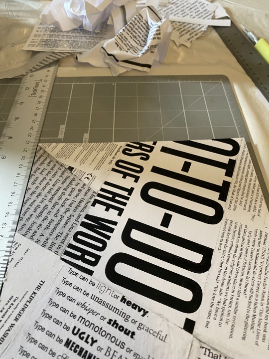
I hate glue sticks… especially the purple ones. Anyhow this project went well with the reading this time around. I sort of enjoyed this project, even though it was not a clean as would have liked. I started by piling random books I found good type in on my bed. Then I scanned them. I mostly enjoyed searching for the larger text that really stood out. But the smaller type also played a role in crafting a cohesive project. The image below was probably my favorite and I tried to loosely base the layout on the golden grid/section we read about last week.
0 notes
Text
Reflection
Today was the last day we had of Fundamental's. So now I need to write an honest report on how I felt the course went.
Firstly I want to look back at the start of the course where we looked at vector art/drawing. As much as I want to say I loved it I honestly found it very frustrating as I wasn't able to properly comprehend how the curves would go based on the anchors and branch's. Although it did get better and got everything done as necessary.
Apart of this was a group activity where we chose picture's to replicate with vector drawings. I found this helpful as I got to see how someone else delt with these drawings. We spoke on aspects of our drawing and about things we could change so the communication was there which was great.
Next we looked into photoshops photo editing and how we can make images look more alive wither its bring color or taking away. I really enjoyed this part of the course and thought I was okay at doing what I was doing. From sacrificing aspects of an image to bring forward another part was fun as it was a toss up which you had to consider. It was great being able to edit my own personal photos which were taken on a real bad phone so now they look good as new.
We moved onto cropping and editing images by moving stuff around, tacking them out, or adding stuff in. This part was pretty mild for me as I neither really enjoyed it or hated it, although I could not for the life of me get my head around the smart objects / masking layers as they never worked for me as I wanted them to. This was probably due to lack of knowledge on this part of the program. When it came to the jumping man I am still confused on how we ended up getting to make the line object to move around him. I know it uses masks and such but If I had to replicate this action I would be lost on how to do it.
And now the holy grail of Fundamentals Dum Dum Dum. In Design!!
This was by far the most fun part of the course for me and more intuitive. It really allowed for mostly free creative freedom when making the book especially. I found some parts strange as InDesign worked in places and not in others but it always seemed to fix itself or a quick google search would give me the answers. It's funny how I had a InDesign project on the go for another class that I finished and handed in a week before we started this which would have been very helpful but what can you do.
Overall I learnt lots from this course, some stuff I will hopefully remember for a very long time and unfortunately other things I have already forgotten. But a great experience and enjoyable ride non the less.
CHEERS!!
0 notes
Text
i want to use miku or teto as a voice actor in my final student film next year because it would be very funny if the professor who vehemently hates all AI on principle with exactly zero nuance to the debate accused me of cheating and using AI and got mad about it even though vocal synths even when aided by AI like synthV Are Not equivalent to techbros using art theft image generation algorithms it’s more along the lines of using a digital art software instead of physical paint and canvas or like claiming a midi sequencer is somehow a form of AI LOL this guy just fucking aggravates me because i do agree with him on the “it’s bullshit that jackasses in the same genre of guy as NFT dipshits are using image generation algorithms built on databases upon databases of stolen artwork from people that did not give permission” but this guy doesn’t know jack shit about computers he struggled to explain to us how indesign works and there’s more nuance to it than just “AI is inherently bad and inherently cannot be called art” this dude’s in his thirties he Should be smart enough to know what Nuance is. he shot down one of my initial ideas for this group project because there was a minimal chance it could’ve been read as pro AI even though it straight up was just the tropiest most derivative “robots good” plot ever that i thought up after being awake for 28 hours straight. this guy should read galley slave by isaac asimov and have to answer reading comprehension questions about it because even before the moon landing asimov was capable of having more nuance about this shit than my fucking character design professor. he also worked on that annoying ass derivative ass paranormal park show i’m so goddamn sick of seeing everywhere he did character designs for it
1 note
·
View note
Text
Process Blog Weeks 5+6
The reading for week 5 and 6 covered a variety of topics that included: Books and Book Jackets, Editorial Design, Social Innovation, Branding and Packaging, and Illustration Design. While all of these topics are important to Graphic design, the one that interested me the most was Branding and Packaging As someone who currently works part time in retail, I see firsthand how important Branding and Packaging are to a consumer. The presentation of a product is so important. Factors that play into this are Color, Shape, imagery, and font. I've never thought about how much work goes into Branding and Packaging, but you can definitely make a career out of it, and I find the design process of it super intriguing.
Project 3 Overview
The goal of project 3 was to create our own non-partisan vote poster (11x17 Portrait) . This project stems from the Get Out the Vote Campaign (GOTV). For this poster project we were not limited to a single medium. We were encouraged to use our imagination alongside quotes listed on the project sheet. The poster overall has to come together digitally in a zipped InDesign packaged file. We also must submit a JPEG Digital Mockup and include images of sketches and source images.
Below is my Initial Sketches
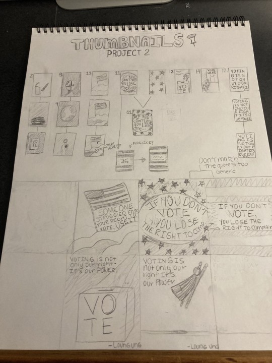
During my first round of sketches, I choose various quotes from the project list to experiment with. I initially wanted my poster to be a typographic poster. My main goal was to focus mainly on the letters. I decided to take the deconstructed flag idea and pair it with the quote "If you don't vote, you lose the right to complain". I decided to take my initial idea and create a digital sketch of it in procreate.
Procreate Sketch
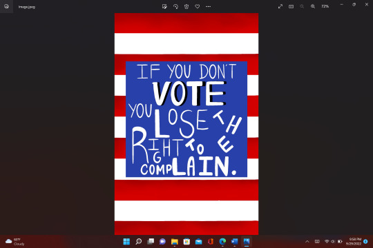
I did not like the way my idea was translating digitally. I knew I needed to experiment more with the layout of the graphic. The words on this graphic were confusing. I wanted the letters not to be straight, but the way I presented it did not come across the way I Intended it to. I decided to take my idea into Adobe Illustrator.
Below is my Illustrator Image.

Okay, so I have a love-hate relationship with this image. First of all I'm very new to illustrator and I decided I wanted to try the gradient tool for this graphic. In my mind I wanted a hand-written font for this graphic. So, I found a font on Google fonts called Barrio Regular. One of my classmates pointed out that this combination of the font and the gradient look of my graphic looked like this iconic character below.

I will never stress enough how important Critiquing each other's work is. because the truth is I would have never noticed that my design was giving "cat in the hat vibes". I didn't want my design to make this statement. I wanted my design to impact a person's decision to go out and vote. I was feeling trapped by the color palate, and the overall design I had chosen. I decided here I was going to scratch the project and start over.
I went into Adobe Illustrator and decided to just focus on the layout of my letters instead of the overall image. The Image is shown below.

After doing this I still didn't want my letters to look uniform. So, I messed around with the placement of them. I also thought about the idea to splice the word 'Right'. I thought this decision showed how important it is to vote. The fonts used are: Roc Grotesk Bold, Roc Grotesk Medium, Roc Grotesk Regular. Image shown below.

Current Progress of Project 3
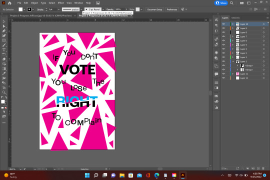
As of now I'm currently happy where I am in this project. I'm way more enthusiastic to complete this draft than the first one. I need to refigure some of the design aspects. My letters, especially at the bottom, are getting lost with the pattern of the design. I want to keep the shattered glass look of it intact. I have to add the name of the person who said the quote, and I need to add the banner in at the bottom. Overall, I'm feeling pretty positive about this project and I'm excited to finish it.
1 note
·
View note
Text
Week 3 + 4
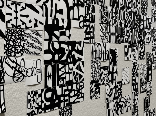
I had so much fun creating my abstract typographies for project 2. This was my first time using Adobe Illustrator, and I think I have a love-hate relationship with it. I love it because it provides features that Photoshop doesn't, but it is really nice for the type of work we did for project 2.


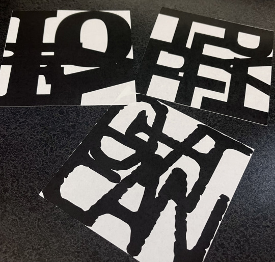
After going through the process of putting our typographies together, when then had to print them out and cut them so we could add them to a mural that other Design Technology classes contributed to. I think when every thing is pieced together it is going to look amazing.

Following project 2, comes time to start project 3. I am especially excited to work further on this project because it gives me the option to include my hand-drawn work. We started drawing out our sketches/thumbnails (See Below) of ideas we could potentially use for this new project. The goal is to create a strong message to promote going out to vote using a list of quotes given to us and a picture of some sorts to represent the quote that we each chose. The quote that stood out to me the most was "Somewhere inside of all of us is the power to change the world." - Roald Dahl
I am excited to move forward with this and put everything together using Adobe InDesign.

In this week's reading, I learned a handful of useful information about how type is used to express people's works of art even further. I liked how the author explained the importance of choosing a typeface and how you should choose it based off the message you want to send, or the tone that you want your project to express. I also really loved how the author wrote about creating logos and how experimental you can get when creating them. When I was little I always wanted one of my drawings to be featured on the Google search engine. Now that I am older and am actually learning about technology design, experimenting with different art styles, and expanding my knowledge on Adobe Apps, maybe I can turn that dream into a reality someday.
1 note
·
View note
Text
Reworked timeline
I still didn't like it so I changed it to have more of a background. The text still wasn't working for me so I moved it to InDesign as that has easier use for text. I again re-edited the image in photoshop and I made it better quality. I like this one better as it features so many of his works such as the flowers from postcards, his bus advertisement, his handwriting and also showing his cathedral piece. This is symbolising how he lived in London for most of his life, I had to keep the sky white because he hated the gloomy weather in London and also he has a lot of white space in his works ad this is pretty busy already.


0 notes
Text
42
“R is helping me fix my balcony door and already coached me through how to ask an engineer to install my new cooker”, I text V from my couch, “king behaviour”. We spend a great deal of time discussing how R is a god among men, his extensive knowledge of art handling / fixing things combined with a salesmanship that is neither creepy nor oppressive. Endless patience. In a bunch of ways I owe him my life because he put my work on V’s desk 5 years ago. I’d known him for a couple of years before that, when he was R of Old, a lost chain smoker who lived in a building without floors and smelled of blood because he temped at a metal workshop. Once he bought a pair of confusing pink cargo pants with - I can’t explain - multiple geometric tassels snaking up the leg
I hated him when we first met in the project space I’d been invited to work at for free, as the token woman. He was significantly younger than the other men and they bossed him around, so R tried bossing me around a little to establish dominance. I was an actual teenager and dutifully tended bar, was never allowed to touch the press releases in Adobe InDesign or meet with quote-unquote important visitors. Instead I helped each artist with menial tasks and ran out for Actimel. I learned a lot about how a show is made, how long it’s meant to take, which nobody teaches you at art school but should
I was never allowed to choose the music we listened to at any time of day, such was the doubt in my tastes. R would put Beyoncé’s “Halo” in such heavy rotation at the after parties I still cant listen to that song without feeling like a nobody. But my god, could R dance. His midriff had a life of its own, his legs balletic. He danced the way extroverted gay men dream of dancing. Once he stole a black-light from the gallery he would later leave to work for V, and installed it in the project space. I remember his insane gyration and his lit-up teeth moving to the lyric “I’ve been drinking / I’ve been drinking”
He and I watched each other grow up. He saw my worst heartbreak and my becoming an artist. I saw him try to make art, then his early pains of working for V and his long term relationship developing its solid foundation. At some point we both started making money and dressing nicer
We became colleagues - my paintings partially contributing to his pay check and his diligent support making my paintings happen. We both got sober, and R kicked cigarettes. I didn’t kick cigarettes but I did learn to drive - perhaps the only thing I have in my arsenal that R doesn’t. We see each other buy property which, as two kids of divorce, means something special. I want to mock his AirPods but know he could clap back with my wearing Issey Miyake to paint in. Both phenomena are obnoxious in their own ways, but both were also hard-earned. Now the guy who ordered us about at the project space is paid to wrap my paintings according to R’s specifications. We know he thinks we’ve sold our souls to some imagined art world devil, which you only really hear from people who didn’t get a seat at the table. This is why the embittered art handler is such a reliable trope. Most people from that project space era have an axe to grind; but all I wish I could do is thank them for bringing me to R, who brought me to V, who made everything I make what it now is. I also saw a cat give birth to kittens during a party, got so drunk I thought I was going to die, and saw someone shoot a rat with a gun
0 notes
Text
BAU as College Professors AU
*cracks knuckles*
Penelope
penelope is a graphic design professor
she loves teaching kids about the wonders of photoshop!!
hates illustrator and indesign with a burning passion
(the illustrator pen tool can fucking choke for all she cares)
(AND HOW THE FUCK DO YOU PUT THE FRONT AND COVER TOGETHER IN INDESIGN!?!?)
(she really hates both applications sm 😭)
is always reluctant to teach them but does it begrudgingly
(she’s just glad there’s other professors in the department that teach editorial and graphic illustration)
teaches photography!!
encourages the students to be as expressive as they want to be with their pictures!!!
she’ll be just as enthusiastic to see a close up of a sneaker as she is to see a sunset landscape shot
teaches the graphic design studio classes too!!
she always has music playing!!
half the time, her students come into the class and her glasses are all skewed, her hands are covered in paint or glue and some abstract art piece is sitting on her desk
when the students ask her what it is, she just gives the projects human names
“hey professor... what did you make there?” “oh, this?? her name is... pam.... yeah, pam”
she doesn’t offer up any further explination than that
and the students just accept it
her office light is always off
but she has multiple fairy lights in various colors hung up
her office is v inviting!!!
students come to her to vent or to talk about their problems bc the campus therapist doesn’t help all lmao
she always has on the most unique outfits but she pulls them off so well
a ray of sunshine tbh!!
Spencer
teaches major science and math courses
he teaches chemistry but only chem for majors in chemistry
it’s not that he can’t teach chem for non majors
but he sometimes gets too ahead of himself and forgets he’s teaching a course for non majors
it’s easier for him to teach for majors because the students can follow his ramblings better
he teaches upper level math courses and usually only has like three students in those classes
he’ll sit up on his desk and debate with the students for the entire hour about the riemann hypothesis
he gets excited because the students are just as enthusiastic as he is
he is two extremes
he either shows up to his classroom like a half hour early and writes out all his notes on the board so that when the students come in, he can go right into lecture
or he’ll show up two minutes before class starts with his hair disheveled, his tie undone and his expression glazed over and just be like “listen up i woke up late and just downed an entire pot of coffee i brewed with several cans of monster energy—i don’t exist on this dimension anymore”
on those days, he lets his students work on other projects for other classes because he knows it’s not fair to ask his students to focus if he’s not
he helps them with their homework
penelope brings him lunch sometimes to make sure he’s eating
he appreciates it a lot because between lesson plans and grading, he sometimes forgets to eat
he’s absolutely the youngest prof on campus
sometimes even his students are older than he is
but everyone addresses him correctly and respects him bc he’s really chill
his office is a disorganized mess
there’s files and papers all over his desk
and a sculpture penelope made for him (she named that one “roger”)
JJ
psychology professor
she really has a passion for teaching and learning about human psychology
(she may have started to become interested in psychology bc her sister was in the psch honors course before she died)
she comes across as a little hostile and unapproachable tbh
but she’s young
and she’s attractive
and she’s not conveniently what people think a professor looks like
she’ll respect her students if they respect her
she didn’t graduate the top of her class and work her ass off for the degree to not be respected
if there’s any inappropriate comments aimmed towards her or anyone in the class, she kicks the aggressor out immediately
she stands at the front of the room and lectures for the beginning part of the semester
once she’s built a good rapport with her students (and vise versa), she becomes more chill
she’ll sit on the edge of her desk and encourage discussion rather than following a book or a set plan
(she finds it’s more interesting that way anyway)
sometimes her students will show up ten minutes before class starts just to talk with her once they’re comfortable with her
she always answers her emails students send her (queen shit tbh 👑)
some kids in the psych major course playfully call her “mom” because she always asks them how they’re doing and about their week
(she hasn’t decided how she feels about it, but she also lets it slide)
always wears pants suits but cuffs the sleeves to the jackets
her office always smells like eucalyptus because she has a small mist diffuser plugged in
she also has a small fish tank with a beta fish inside (its the appropriate size too!!)
(she let a student name the fish—it’s name is sir bubbles of argon)
she also has a sculpture from penelope (“her name is maxine”)
her desk is very organized and clean!!
there’s a small couch in her office and her door is always open
sometimes, students will come in if they’re having a hard time and need someone to talk to
they know jj is there to listen and she always seems to understand (she doesn’t judge them either)
Emily
teaches three languages, both for majors and non majors
spanish, french and russian
(she’s also quite fluent in arabic and italian and can hold her own if she’s speaking in german or mandarin, but the students don’t need to know that)
she’s actually very intimidating lmao
students are so scared of her 😭
she’s serious af
(she smiles in class sometimes though!!)
(besides, she’s only serious inside the classroom)
(outside the classroom, she might even be as approachable as penelope)
always dressed in expensive black suits, polished heeled shoes with very dark makeup and a “don’t fuck with me” steely attitude to match
she also wears expensive watches
she always stands at the front of the class and slowly paces the entire hour
one time someone decided to fuck off in her spanish 101 class
she didn’t even yell at him, she glared
rumor has it the kid was never spotted on campus again after that
(BOY SHE SCARED HIM SO BAD HE DROPPED TF OUT)
despite that, her classes are some of the easiest to take
one because emily has a way of teaching that helps all students understand
and two because her voice is naturally very easy to listen to
students taking her french 101 are going to leave the class speaking fluent conversational french
she also doesn’t tolerate people being racist, sexist, homophobic, transphobic, etc in her class
if she catches a bigoted comment someone makes in her class, she kicks them immediately
she brings in her cat sometimes
he’s all black and his name is sergio
(he’s her esa that she brings in when she’s feeling really stressed out)
he’s clipped on a harness and sits on her shoulder or on her desk
if he meows, she accepts it as an answer
it’s the only time the students ever see professor emily prentiss as soft
well
other than the days she has the class watch foreign films because the students can tell emily has a fondness for them
her office is pretty organized like jj’s
instead of it being light and inviting, emily decorated her office on a more dark side
she has a few animal skulls, crystals and other gothic memorabilia on her desk or bookshelf
she has a small cat bed on the corner of her desk that sergio sleeps in
on the other corner is a sculpture penelope made her
(it kinda looks like a crow and emily named it kurt)
really, the only colors in her office are dark, deep purples and the small lesbian pride flag sticker on the back of her laptop
Derek
teaches history classes
but like modern history
from like 1940s to present
he refuses to follow most western history books bc they’re not accurate like at all
in his first year of teaching, the dean of his department made him use a book and he hated every second of it
how accurate could the information be if they portray king tut as a white guy???
he graduated under one of the best historians in the country
he also traveled a lot after he graduated and met a lot of people that had first hand experience with major historical events
that’s really what he bases his teachings off of—first hand experiences and encounters
every two weeks or so, he’ll invite in guest speakers to his classes to talk about what they went through (depending on his lesson plans)
that’s how he likes to teach and learn (bc he always loves to learn new things!!)
this is random, but also he is the type of professor to randomly box jump up onto a desk
he also sits in chairs backwards and has a more laid back style to teaching
his exams are based on what the students can learn from history rather than the information itself
he’s always dressed super casual!!
solid color, short sleeve button ups are a favorite!! (no tie)
he gets along with all the students
he’ll talk to the athletes about their games but sound just as enthusiastic and genuine talking with students who are majors in fine arts about their projects
he’s just a v down to earth professor tbh!!
he brings in clooney so much
like... every friday
it’s just another bonus of taking his history classes!!
he and penelope are dating
his office is full of sculptures she makes for him 🥺
he drops by her graphic design studio class with clooney to help out or even to just watch
he’s supportive and encouraging of penelope and her art!!
other than the sculptures penelope makes him, his office is a bit more disorganized than jj’s or emily’s, but cleaner than spencer’s
he has a few papers scattered on his desk but mostly he’s a little more put together
his office door has a small basketball hoop attached that he plays around with if he’s bored (and if penelope is busy)
both he and penelope have a dog bed in their office and water bowls for clooney when he comes in
Hotch
law professor
is the most intimidating professor on campus
like
seriously
if students think professor prentiss is intimidating, they haven’t met professor hotchner
he stands in the front of the room and goes over his lecture without pausing or asking questions
his voice is naturally low and intimidating and he actually never smiles
his attire and appearance is always so professional
suits
ties that are tied so tight, they look like they’re choking him
shoes so polished, he can see his reflection in them
hair always styled neatly
pants and jacket are always wrinkle free
his classes are difficult
not just because of the subject matter, but because he has a very organized, straight forward method to his teaching
students wouldn’t dare act up in his class—they’d be absolute idiots to
he’s quiet and reserved outside the classroom
if the others hear anyone talking shit about hotch behind his back, they’re always quick to come to his defense
they actually know hotch
they know he puts on a hardass exterior, but really he’s just a softie
he always lets them hang in his office with him
he listens to spencer’s ramblings and is extremely patient with him
he has lunch with emily every other day
even if she’s a pain in his ass 99% of the time, he likes that she sticks around and that he can trust her
he shows up to all of penelope’s art shows
and sometimes sits in on derek’s lectures when he has guest speakers
jj brings him pastries from the coffee shop on campus sometimes
he knows that he can come to her if he ever has anything he needs to talk about
(he never opens up to her but he really appreciates the sentiment nonetheless)
penelope has definitely made hotch a few sculptures
(he keeps them at home, but he does have one of her paintings hanging in his office)
speaking of his office it’s hands down the most organized out of all of them
his desk is so clean besides the picture of his son he proudly displays at the corner
he always has his lights off and his door shut
he seems so unapproachable, especially in class
but sometimes his lecture notes have crayon scribbles all over the page
or a small sock will fall out of his briefcase
and maybe, even for a moment, his serious demeanor falls when he spots them
and it almost reassures the students that he is human
Rossi
actually he’s the only one besides maybe reid i can see being a criminology professor
is a retired fbi agent
and successful author
so like that hasn’t changed from canon
but because he doesn’t work for the fbi anymore, he has absolutely no chill and tells all secrets
he’ll be like
talking to his class about a case he worked on in ‘83
and be halfway talking about details of cases that were supposed to be confidential
he’ll pause and go “oops” but keep talking lmaooo
penelope actually never made him a sculpture
instead she made him a coffee mug she made on the wheel and glazed herself!! (she even made her own glaze bc she’s extra like that)
carved on the side is “world’s best italian dad”
(this is because when emily introduced rossi to the group she was like “yeah he’s kinda like my dad” and now everyone calls him “dad”)
(he loves it so much though and proudly accepts his title)
he loves his mug so much and uses it every single day!!!
he’s the only professor besides penelope that let his students refer to him without the title of “professor”
he gives off kind old grandpa vibes
and that he’s only teaching because he really doesn’t have anything better to do during his retirement
but he’s chill and his class is interesting to take
(plus he really does love to teach)
he’ll ramble on and on about his “golden years” as an agent
he will especially talk a student’s ear off if they come up to him and tell him that they read one [or all] of his books
he writes a different quote on his board every single day
his attire is always business casual
he sits on the edge of the desk or on a swivel chair because it’s comfy
he was doing a lecture on jack the ripper and just pushed himself around on the swivel chair, slowly spinning around the front of the room
his voice kept changing in volume every few words because of him facing the wall and then a few moments later facing the classroom
his students refer to him as a “living breathing meme”
he has no idea what the fuck that means
but he take it as a compliment
his office is empty because he goes home after he’s done with classes lmao
he doesn’t do paperwork
or fuck with technology (he never fucking responds to emails smh)
so he has no need for an office
#criminal minds au#penelope garcia#spencer reid#jennifer jereau#emily prentiss#derek morgan#aaron hotch hotchner#david rossi#honestly not much has changed about rossi from canon#but#ye#also#half of these are based on my college experiences lmao#my history professor brought his pair of poodles to class like every other week and it was the only reason i didn’t drop the class#my math professor walked into class one morning and just fucking box jumped up onto a fucking desk for no reason#during dead week my graphic design professor let us watch katy perry music videos for an entire class period it was grear#my gd studio professor was a weird dude but his class was so much fun#i’m still pressed about professors not responding to my emails tbh#professors: email me if you have any concerns or questions#me: (emails profs)#profs: (never respond or even read emails)#fuck right off lmao#long post#emily has a sculpture now pls#college professor au
410 notes
·
View notes