#digital accessibility
Note
I'm very sorry. Six months ago you commented on a Gordon Ramsey accessibility post that your job to help make websites accessible. How do I get that job? I would love that so much. I'm sure you've answered this before but I can't find it.
I, too, am sure I've answered this before, but I can't remember where and I'm not about to brave the Tumblr search feature to go looking, so you and @the0dd0ne get a twofer.
Hi, I'm not a bot, and I was wondering if I could ask you a weird career question? I saw your addition on that "Accessibility Nightmares" post where you mentioned it's your actual job to email websites about their lack of accessibility and what they need to do to make it accessible, and can I ask how you got into that? I got injured on the job and need to make a huge career change, and that type of work has always been really interesting to me, but I don't even know where to start to get into it! Also feel free to ignore this lol I know it's out of left field.
(This is actually the third question I've got on this, so no, not that out of left field.)
So the first thing to understand is that it's actually pretty hard to get into digital accessibility because there just aren't that many companies doing it. As far as I know from company meetings there aren't that many schools teaching it as a part of their core web development curriculum. It's just not that common to think about it as part of web development. Which is vastly irritating.
I started mucking around with the web when there was first a web to muck around on, but when the pandemic hit and my Mom suggested (in a hilarious twist of circumstances) that I go to one of those Learn to Code boot camps to get a certificate that said I actually knew my shit so I could get a job in web development. A number of these boot camps also have job placement programs and pipeline agreements with certain companies. and in a nutshell that's how I got into it. The company sent my boot camp a letter saying "we need N warm bodies" and they sent the company a list of names, I got interviewed, I got hired as a contractor, and after a couple years of good work for them I got invited to interview for a permanent position, which I got.
These days due to the state of the everything, there are probably 10-50 programmers for every open development position, depending on language and job type and company. It's a rough field out there and I got very, very lucky in my timing. But if you want to try it, the boot camp to job pipeline is probably your best bet. Ask the boot camp recruiters if they have connections to accessibility firms. If they don't, you can always try asking if they have connections to web development/site packaging firms and then check if the firms have an accessibility department. Tell the recruiter up front what you're looking to work in, and keep in mind that the recruiter's job is to convince you to give the boot camp your money. (Mine was $12k USD.)
For resources to study in the meantime, there's the A11y Project which has discussions, videos, articles, posts, etc about digital accessibility, a lot of good information. You can also look at the resources for the CPACC exam, I don't recommend taking it unless you have a few hundred USD to burn but you can definitely study up on the Body of Knowledge, which is a free PDF to download. And there is, in fact, an accessibility job board, although I don't have any experience with applying for any of these jobs cold.
The languages I use most in my job are HTML and jQuery, and I passively use (meaning I read and interpret but don't actually program in) JavaScript and CSS. This is mainly because we work with client sites and there's only so much of the client code we can touch; if there's a problem in the client code we can't touch we have to write it up and tell them to fix it. If you end up in house for some large brand you may end up working in more web development languages, but a lot of accessibility can be handled by basic HTML attributes called ARIA attributes (and roles) and there's the documentation on that. Another tool to have is your soft skills: communication, specificity of language, writing up good descriptions of what code does what so you can explain exactly what needs to be fixed where and why. You might also want to look at documentation on what makes good alt text, where it's needed, what kind of labels are standard, etc. I think you can find that in the A11y Project pages, but honestly I just learned it on the job working with senior developers.
It's a hard time to get into software development at all, let alone a niche field like web accessibility. But Europe is about to have a digital accessibility law come into effect in July of next year (that encompasses more than just the web, that's just my area of expertise) and the US is making slow but steady strides in requiring digital accessibility as well, so there are jobs out there and there might be companies hiring to capitalize on the need. There will definitely always be companies putting off conforming to regulations until the last possible minute, and then needing services and specialists. So study up, practice, and good luck!
18 notes
·
View notes
Text
Accessible agere #2: image descriptions
Time to talk about image descriptions!
What are they?
An image description is using words to say what's happening in a picture. For example, a photo of a red ball would be described as "a red ball."
Why are they used?
Image descriptions help people who are blind or have low vision, as well as some people who have visual processing issues, to be able to know what an image is, the same way most people would with their eyes.
How do I write one?
I'm not the best person to explain, because my language issues make them difficult for me to do, so I'm using information from other websites (linked at the bottom of the post.)
Think about what's most important to you or jumps out right away when you look at the image you're describing. What is the main focus of it? If you were telling someone about it, what would you say to them?
Don't over complicate it! Use simple, easily understandable language and put the most important parts first and in the most detail. Try to keep it to 125 words or less if possible.
How do I add them to my images?
Tumblr has the ability to add descriptions to images! Click the three dots that appear on an image in a post you're making and select "add alt text." Pictures that have alt text added will have a badge that says ALT that you can click to show the text.
Can I add them to someone else's post?
You can't directly add them to an already posted image without editing the post, but you can reblog and add a description in regular text.
Do I have to do them for every image? What if I can't?
Ideally, every image would be described, but that's not always possible. You might not know how to describe something, or you might not have the energy for it. You can try reaching out to other people for help with it. If it's an image of text, like a interaction banner or a screenshot, you can put it through an image to text converter. If you can't describe it at all, tagging the post as "undescribed" can help people who need image descriptions to avoid it by filtering it out!
(Sources / recommended reading: https://uxdesign.cc/how-to-write-an-image-description-2f30d3bf5546
https://www.accessiblepublishing.ca/a-guide-to-image-description/ )
Thank you for reading! Questions? Comments? Requests? Feel free to reply or send asks, just keep things polite!
#accessibleagere#digital accessibility#agere community#age regression#image descriptions#guides#disability
24 notes
·
View notes
Photo
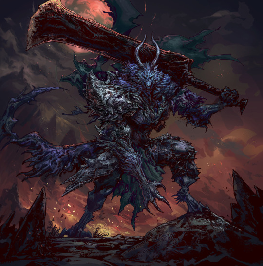
A fierce beast! Really enjoy working on werewolves :)
--
Metal print available at Displate: https://displate.com/displate/6110163?art=638931d95017d
Prints available at INprnt: https://www.inprnt.com/gallery/marcelo_orsi_art/warlord-werewolf/
Shirts and other merch: https://www.redbubble.com/shop/ap/141221046
--
Full process here: https://www.patreon.com/posts/warlord-werewolf-76226485
#works#werewolf#eldenring#darksouls#dark souls#elden ring#big sword#berserk#wolf#fur#armored#warrior#fiery#illustration#print#displate#digital accessibility#digital painting#dark fantasy#horror#action#warlord#hound#monster#creature#medieval#huge sword#detailed#painting#beast
83 notes
·
View notes
Text
This is a little late, but for those who are really interested in digital accessibility: WCAG 2.2 is live as of October 5, 2023!
Intopia has a nice overview of these new standards, which includes a wonderful WCAG 2.2 Map that helps conceptualize the various criteria. The latter is 100% screen reader accessible, by the way, they don't just talk the talk.
If you'd like a slightly more in-depth discussion, The Web Accessibility Initiative's What's New in WCAG 2.2 article is what you want (this one has the benefit of having easily accessible links to details on specific criteria too).
28 notes
·
View notes
Text

Attention Kataang Week artists, gif makers, and anyone using images in their work!
Please consider making your images accessible! It’s easy—just add a brief description in the alt text of your images. Adding alt text is NOT a requirement to participate in Kataang Week, and we are happy to reblog your posts whether you use alt text or not. But we encourage you to think about doing it—making images accessible can help visually impaired fans to better enjoy your creations.
What is alt text?
Alt text is a brief description of an image that is read aloud to people who use screen reader software.
How do I write alt text?
The description of your image doesn’t have to be long or detailed. One or two lines, plus any text in the image, can be very helpful.
Example: A digital drawing of Aang and Katara holding hands and kissing.
See the header image of this post for another example: click or tap the “ALT” in the bottom left corner of the image
A quick guide on how to write useful alt text here
How do I add alt text to images?
Adding alt text is easiest to do on the tumblr mobile app—just follow the steps here.
We hope that was helpful! Kataang Week is just around the corner, and we’re super excited to see what everyone has created 💖
- The Mods
42 notes
·
View notes
Text

@salamanderpie I understood exactly what you meant, and I hope you don't mind me taking this out of replies, because good use of headings is the most important feature and I will sing about it from the rooftops.
In my day jobs I've been a print designer and laid out 200+ page books and guides. I'm now a web content editor, and an on-call expert for my agencies docs that are both print and direct-to-digital — and a proponent of digital accessibility. And I need to say:
Use built-in 'styles' to format your documents
It doesn't matter what they look like. Change the default to whatever suits you. But if your document has any kind of internal heading structure, use 'heading 1', 'heading 2' etc for that structure. I don't care if you're writing in gDocs, Libre Office, Office, Mac-whatever -- they've all got it. Use it.
Applying heading styles marks the structure of your document in code. That means:
You can use the navigation or outline pane (what they call it varies by software) to jump around easily within your own work
You can change the look of the entire document AT ONCE if you decide you hate that font you used for the headers
If you move it to the web the CSS of whatever site can latch on to those tags and format it appropriately with no extra legwork
If it's getting laid out for press, the designer can style and structure based on those tags (In InDesign or the equivalent) without having to reapply them all
And most importantly, using heading styles allows screen-reader users to easily navigate your document
That's it, that's my spiel, okay I'm done.
#digital accessibility#and now I have to admit I DON'T use headings in my writing#because I use a separate doc for each chapter#but I use them extensively in my brainstorm docs#cuz how the hell else will I know where I am in a 40k word doc?#and I have to bang this drum at work all the time#:P
7 notes
·
View notes
Text
Informal poll time! A query on accessing YouTube audio descriptions!
#accessibility#digital accessibility#audio descriptions#youtube descriptions#poll#Tumblr polls#video audio descriptions
4 notes
·
View notes
Text
Back at it again with the digital accessibility course. Today's lesson is focused on developing inclusive digital applications!
Featuring such handy dandy tips as:
"offer instructions from the very beginning and make those appealing (for example via video tutorial)"
Bite Maim Kill I will eat the devs of this eLearning platform for breakfast don't try me. their own work is riddled with bugs bc of the constant updates and it clearly started out unfinished and full of language and lay out errors and my shitty internet connection made it impossible to watch their gazillion 2 minute videos that couldve (Should Have) been infographics (they only added video summaries months after launch and Hide Them BEHIND A GODDAMN LINK) BUT THEYRE GONNA TEACH US ABOUT IN FUCKING CLUSIVE WEB DESIGN??????
#Inclusive web design#ur digital inclusivity course isn't adhd accessible if its video heavy yall#Bringing back an old tag bc im right#Boohoo ppls attention spans suck we must add videos :c#1. Dont patronise people 2. Material inaccessibility is important 3. U MENTION THESE IN UR OWN FUCKIN COURSE#digital accessibility#Visuals can be unmoving i beg of u you can use limited animation to grab attention but I just want text#Instead of mind numbingly boring interviews with experts in the world's blandest office#Librarian blogging
6 notes
·
View notes
Text
does anyone know if strikethrough text on Ao3 is screenreader compatible / is there a way to make it so using html?
#ao3#ao3 tips#accessibility#digital accessibility#screenreaders#blind#visually impaired#hopefully these tags can help get this in front of someone who might know lol#I will make a note in the intro that the start will be in strikeout so that if any screenreaders dont pick up on it they will have info#but if there is a way to mark it that would probably be best
4 notes
·
View notes
Text
Choosing The Best News Media Type Tv Radio Or Newspapers
In the world today, we are constantly faced with new world events. We hear about how terrorist bombings are going on all over the world, about stocks going up and down, and about crime offenders being reprimanded. These kinds of issues are important to all of us…it affects our economy, our way of life, and mostly, our future.
What goes on around us whether worldwide, nationally, or even just in our community, is the topic of many conversations. You can be in your elevator, at the office water cooler, or your maybe even in your grocery store line-up, people like to talk about who’s being voted for what, which football team to cheer on, and what the weather is going to be like on the weekend. Being informed on these topics makes us part of the community.
How can we stay up-to-date? There is always the radio. There are several stations available on the radio that we can tune in to while commuting to work and running errands. Unfortunately, many of these radio programs do not give you a full coverage. You are probably not commuting long enough to listen to the whole program, and there are so many commercials!
Then there’s your 6 o’clock news on the television. Let’s face it…we are busy people. The children have after-school activities, we have social events, the dogs need to be walked, gym, dinner needs to be made, then there’s that thing called work. We no longer have the evenings free to ourselves to sit on the couch and watch the news.
Your best option? Definitely a newspaper. With the newspaper, you can choose what sections you want to read. You can skip the ads that do not interest you, and it is very portable! You can take it with you to read at your leisure. You even get comics and puzzles to do in most newspapers! Subscribing to a newspaper offers the most convenience.
With a newspaper subscription, you can be assured that your newspaper arrives at your door and is ready to be read at YOUR liberty. You have the benefit of not having to tune in at any certain time, you can put it down when you want if you are interrupted, you can even cut sections out for memorabilia!
>>CLAIM YOUR FREE SUBSCRIPTIONS<<
#eNewspapers#news#politics#U.S. Newspapers#kindle#USA#digital accessibility#knowledge#community#entertainment
2 notes
·
View notes
Text
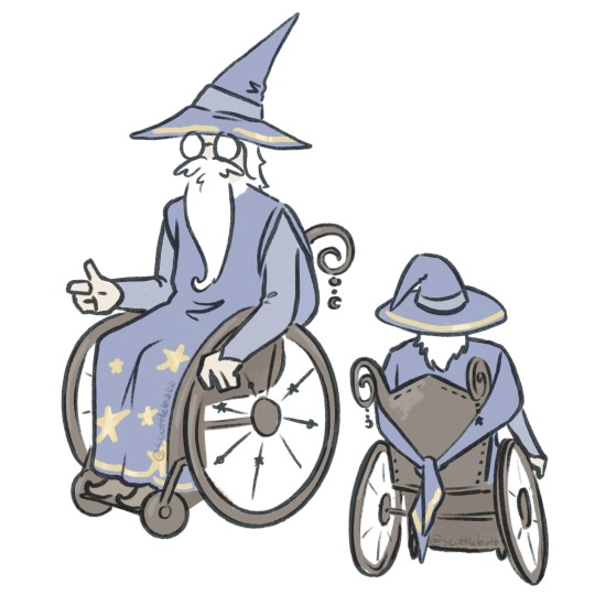
I Have Found A Solution!
So, obviously classic wizard robes aren’t wheelchair friendly. (Alright, admittedly this isn’t common knowledge and also this definitely isn’t a problem for most but listen, this is a problem for me and I’m pleased to present a solution for it nonetheless.)
The issue is in the sleeves and the length of the robes. The traditional trumpet style allows them to get snagged, dirty, and caught in the wheels.
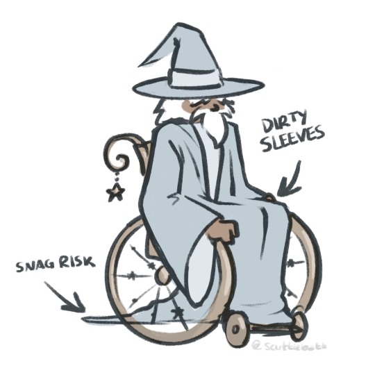
This is distinctly not an issue with other mobility aids such as canes and crutches, these wizards are fine to carry on with their trumpet sleeves simply rolled up if needed.
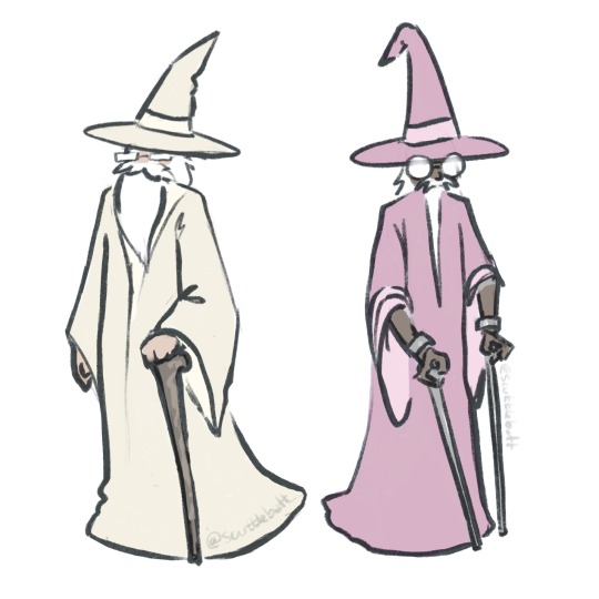
Now, one solution might simply to shorten the sleeves and hem to be out of the way, but that looks rather silly so I won’t do that. Instead I propose the more elegant design of a hanging sleeve to maintain that flowy magical feel while allowing for better range of motion.
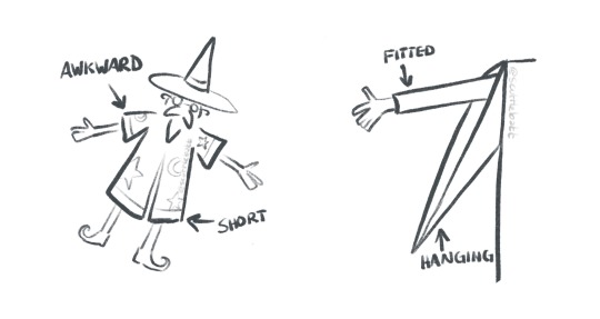
Honestly I just love the look of hanging sleeves in general and think more people should appreciate them, wheelchair user or not.
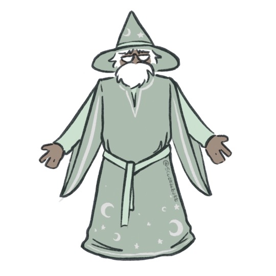
In conclusion…
#this is basically free character design hacks baybe so go make your fantasy worlds accessible and inclusive or else#digital illustration#wizard posting#wheelchair wizards#my art
30K notes
·
View notes
Text
Replacing physical buttons and controls with touchscreens also means removing accessibility features. Physical buttons can be textured or have Braille and can be located by touch and don't need to be pressed with a bare finger. Touchscreens usually require precise taps and hand-eye coordination for the same task.
Many point-of-sale machines now are essentially just a smartphone with a card reader attached and the interface. The control layout can change at a moment's notice and there are no physical boundaries between buttons. With a keypad-style machine, the buttons are always in the same place and can be located by touch, especially since the middle button has a raised ridge on it.
Buttons can also be located by touch without activating them, which enables a "locate then press" style of interaction which is not possible on touchscreens, where even light touches will register as presses and the buttons must be located visually rather than by touch.
When elevator or door controls are replaced by touch screens, will existing accessibility features be preserved, or will some people no longer be able to use those controls?
Who is allowed to control the physical world, and who is making that decision?
#i get why this is happening; it's way cheaper to buy an off-the-shelf touch kiosk or tablet and run your ui on a web server#rather than integrating with custom hardware and physical inputs#but that should not just removing accessibility features#and I know that digital devices can help a lot with accessibility: e.g. screen readers#but I wouldn't rely on any of those being installed on someone else's device
47K notes
·
View notes
Text
Accessible agere #1: colored text and fonts
Very many agere posts use Tumblr's colorful text feature and fonts either from Tumblr or outside it to fit aesthetics. Unfortunately, this creates an accessibility issue for people who use screen readers, as well as many people with visual or processing disabilities who don't use screen readers.
The problems:
Screen readers read out the name of the color of the text each time it changes, which isn't a problem for the most part, BUT gradient text will make it read the color before each individual letter, which makes it basically impossible to understand what the post says.
People who have difficulty seeing, or difficulty with processing visual input, or sensitivity to visual input, may have difficulty with reading some or all colors of text. Colors close to the background color of the post can be a problem for people with low vision, and bright colors or several contrasting colors can cause pain and seizures in people with migraines and photosensitive epilepsy.
Fonts that exist in Tumblrs code (the ones that come up if you select the "Aa" button) can be processed by screen readers in the same way as colors. However, fonts from outside of Tumblr will not be recognized by most programs and may cause them to not read the post, read confusing sounds, or crash entirely. This also applies to many copy pasted aesthetic symbols, some of which will make the program try to swap between languages.
Fonts can also be a problem for other people with vision and processing issues, like dyslexia. They may not be able to read the text.
Solutions:
Simply not using colored text or fonts is the easiest solution.
However, if you would like to use them, adding a warning to the post itself and/or a content warning tag such as "cw colored text" or "cw fonts" and making a separate post that has the same content, but without colors or fonts. The accessible post can be linked at the top of the main one for easy finding by people who need it.
Thank you for reading! Questions? Comments? Requests? Feel free to reply or send asks, just keep things polite!
16 notes
·
View notes
Text
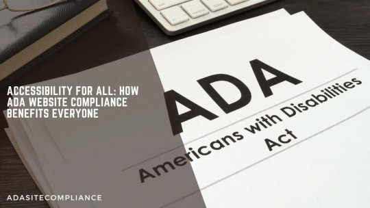
Accessible Websites
Design websites with features and functionalities that enable individuals with disabilities to access and interact with online content effectively, promoting a more inclusive and equitable digital experience!
#ADA Website Compliance Benefits#ADA Compliance#ADA Accessibility#Americans with Disabilities Act (ADA)#Web Accessibility#ADA Website Benefits#Web Content Accessibility Guidelines (WCAG)#ADA Compliant Websites#Accessibility Standards#Accessible Websites#Digital Accessibility#Free Website Scan#ada site compliance#web accessibility#accessibility services#diversity and inclusion#ada guidelines#inclusive design#accessible website development#ada compliance solutions#web accessibility audit#digital accessibility#equitable web design#ada regulations#inclusive user experience#ada consulting#accessible content#ada accessibility#web design for disabilities#disability compliance
0 notes
Text
Observations on Squarespace Accessibility
Summary: Squarespace, like other no-code content management systems (CMS), is a common choice for people who want to easily create a website. Choosing Squarespace comes with pros and cons when making a site accessible for people with disabilities.
Table of Contents:
Disclaimer
Squarespace Overview
Is Squarespace accessible?
What can you do to make your Squarespace site more accessible?
Be…
View On WordPress
0 notes
Text
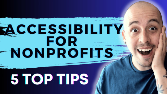
5 Tips To Boost Nonprofit Accessibility
Learn expert strategies for enhancing nonprofit accessibility from The Accessibility Guy, Shawn Jordison.
#NonprofitAccessibility #AccessibilityTips #InclusiveOrganizations #AccessibilityGuidelines
Maintaining an accessible nonprofit organization is a moral and legal obligation. It’s also a key factor in ensuring that nonprofits effectively reach, engage, and serve their target audiences. Today, we’re discussing five strategies to boost nonprofit accessibility, both practically and digitally. Let’s dive right in.
Video Guide
1. Ensure Digital Accessibility
Prioritize adhering to WCAG…
View On WordPress
0 notes
Last Seen Blogs

noura1695
Noura

locationblog697
locationblog

ex-altada-blog
exalte-se

wizardled
🌻sleepy mind🌻

yoongsb
semi-hiatus