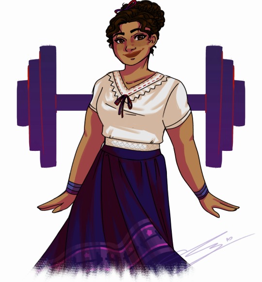
#There is a lot that comes from duplicating and blurring your layers
Note
I know it's a horrible tome to ask this cause your tablet died and shit but uhh how do you get your line are to be soft but still be prominent
LOL YOU'RE SO FINE
For the prominent lines and such, I just make sure to put my lines down with a lot of weight, since the softness comes more from the brush type! The actual soft part comes more from me duplicating the lineart and blurring that layer a good bit, in that case the thickness and weight of the brush doesn't even matter! Pen and default brush are good for defined lines, while the pencil and watercolor brush are good for softer detail. Most times I'm using the watercolor brush!
#ask box#Hope this makes sense still#There is a lot that comes from duplicating and blurring your layers#And coloring them!#Colored lines tend to blend in with the drawing way more which gives it an overall softer look#grrgrg I love softness
24 notes
·
View notes
Text
(instagram)
Tutorial in After Effects under the cut.
ALRIGHT let's get into it. Straight to the point, no nonsense tutorial.
• Create a new composition 1080px x 1080px, let’s call it Design.
• Write some text, turn it into shapes (right-click → Create → Create shapes from text).
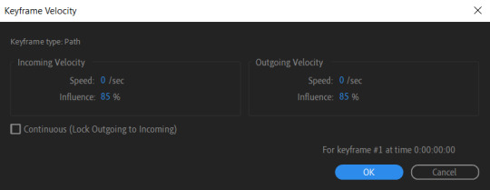
• Animate the path so the text stretches like so in a few seconds time. When animated, right-click on a keyframe and select Keyframe velocity and change coming & going velocity influence to 85%:

• Create another new composition and call it FX. Add your Design pre-comp in this composition.
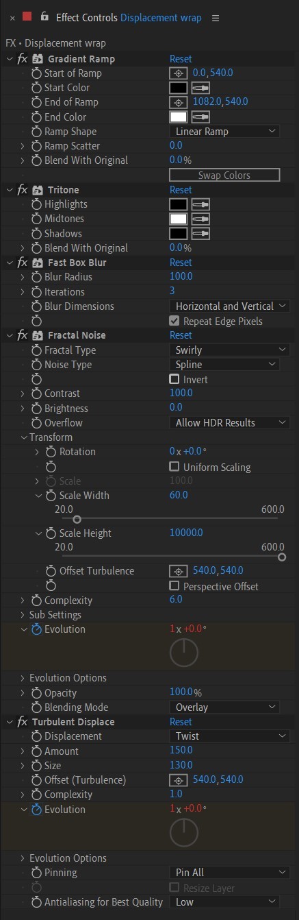
• Add a new Solid layer on top, call it Displacement map. Now we’re gonna add a bunch of effects on that solid layer.
• First add Gradient Ramp. Make it so the white color would be on the right side (End of Ramp) and black would be on the left side (Start of Ramp);
• Next add a Tritone effect and change the Highlights color to black and Midtones color to white.
• Add Fast Box Blur and change Blur Radius to 100.
• Then it’s time to add Fractal Noise effect, and change Fractal Type to Swirly, Noise Type to Spline. Then bring down the Transform panel and uncheck Uniform Scaling, make Scale Width 60, and change Scale Height to a very high number, such as 10000.0.
• Add a keyframe to Evolution at the beginning, and the second keyframe at 2 seconds rotating the slider for one rotation. Add an expression loopOut() on these keyframes so it loops.
• And lastly change the Blending mode to Overlay (at the bottom of the effect).
• The last effect we’re gonna add is Turbulent Displace. Change Displacement to Twist, Amount to 150, Size 130. Add the same keyframes to the Evolution as we did previously on Fractal Noise and loop them with the same expression.
So far your work should look something like this:

• Then it’s time to add colors! Create another new composition, add your FX pre-comp to it, add a background with a new solid layer (CTRL + Y).
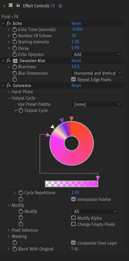
• Then add Echo effect to your FX pre-comp, change Echo Time to -0.030, Starting Intensity to 0.03, Decay to 0.94.
• Next add Gaussian Blur effect, make the Blurriness 10.
• Add Colorama effect, change Get Phase From to Alpha. Then go to Output Cycle and change the color presets (Use Preset Palette) to let’s say Solarize Red (it doesn’t really matter, we’re gonna change the colors, we just need it to have two sliders instead of a lot). Then grab a bottom slider and put it on the left side and choose the lighter color you want. I chose pink.
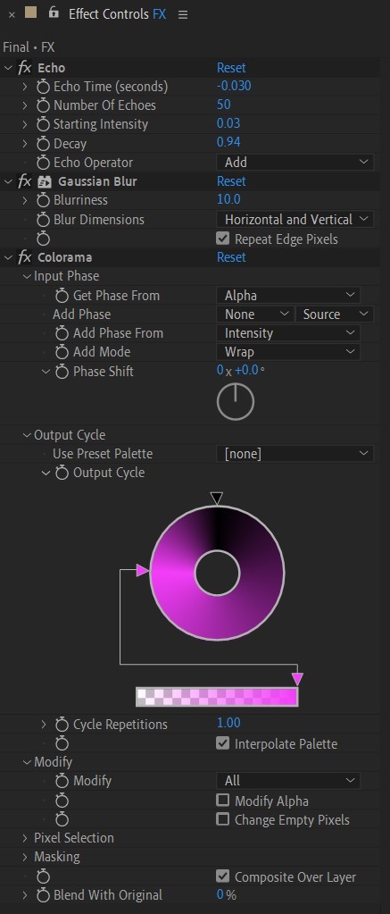
• Now duplicate your FX pre-comp. We’re gonna change some parameters on the effects.
• So the first thing you want to do is change Echo Time to -0.005, Starting Intensity to 1.
• On Colorama go to Modify and uncheck Modify Alpha. Then go to Output Cycle, and add more colors like you see in the screenshot.
• Duplicate your FX pre-comp one more time and delete all the effects on it.
• Last thing to do is add an Adjustment Layer (Ctrl + Alt + Y), add the Noise effect, and make the Amount of Noise 15.0%.
• And you're done!
#art tutorial#tutorial#friday#art#motion design#artists on tumblr#tips and tricks#art tips and tricks#tips#artwork#digital art#gif#animation#visual art#loop#gif tutorial#learn after effects#illustration#2d animation#infinite loop
32 notes
·
View notes
Note
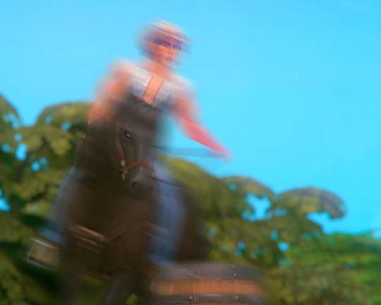
hey! i was wondering how you edited a pic from a long time ago in this post /post/713085926742605824/8-months-earlier-translation-l%C3%A1zaro-im-coming where it looks like she is falling off the horse and like blurry? thanks in advance
Hello! Sorry for the long wait, but in case you still want to know, here's a quick tutorial(??):
I used photoshop to edit the pic.
Duplicate the layer
This is basically in case we make a mistake, we will not use the first layer lmao
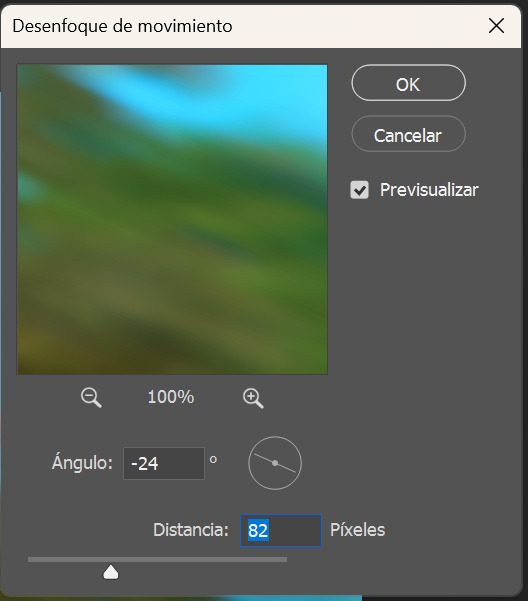
2. Add motion blur to the top layer: Filter > Blur > Motion Blur
Make sure you change the direction of the blur so it fits the movement. Also, add how much you want, I usually add a lot if i want the movement to be really obvious but that way you won't really be able to see faces/details.
3. Add layer mask (not sure if this is the actual translation, but here's a screenshot)
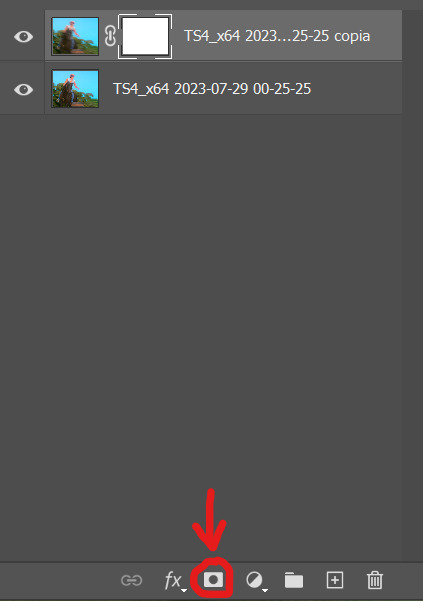
4. Now you have two choices, a) erase the whole mask with the eraser tool and then paint the parts you want the blur effect to go or b) erase only the parts that are not moving. Basically, do what's easier/quicker to do. You can also play around with oppacity. You'll get something like this.
5. You're done. Admire your masterpiece and remember, if it doesn't follow the laws of physics (or whatever) it's ok, if it looks good it looks good
15 notes
·
View notes
Note
Thanks for the info! Also, just wondering what your software/brushes are? I always have a tough time figuring out that soft, nice watercolorish look that so many amazing artists (yourself very much included) are able to pull off!
I use procreate on ipad! I'm not very picky when it comes to brushes so I'm always trying new ones/switching brushes half way through a drawing, but all of them are procreate default brushes.
These are the ones that I always use: HB pencil and procreate pencil for lineart (both of them are in the sketching section) and the default flat brush. For harsher shadows and rendering, the dry ink works super nicely in my opinion. Brushes with texture will help you achieve a more "traditional" look. If that's what you're going for, Id advise you to avoid using airbrush or the smudge tool on procreate (if you do, using a brush with a lot of texture from the painting section will make it look more organic!!).
As for the soft look, I think the best advice I can give you is to make sure to color your lineart!! Also, I always duplicate my lineart layer and add a bit of gaussian blur so it looks softer and then I lower the opacity till i get the right balance between both lineart layers, i hope this helped!!! <3
#brushes#replies#arun talks about art even tho they have no idea what theyre doing most of the time !!
119 notes
·
View notes
Note
could you make a detailed tutorial on how you do your big gifs, specifically the hotd ones? i struggle a lot with coloring cause everything is so grainy and dark. i have every episode in 1080p but the quality just doesn't seem to be that good once it's giffed
hi anon!
i have a comprehensive tutorial of sorts in the works, but i have, uh, absolutely no idea when it will be done. that said, i do have some tips/example psds i'm happy to share right now ✨
basic tips
to start off: my giffing process is the same no matter the size of the gifs. i use the process outlined in tay's incredible tutorial, so just follow that if you want to do exactly what i'm doing
always gif from 1080p or higher (i’m using 1080p here)
use the "load files into stack" method (see tutorial above) instead of "import video frames to layers"; this will give you much clearer, crisper gifs
crop once and do not attempt to resize once you have cropped; resizing/recropping will introduce a lot of fuzz
coloring tips
some caveats! coloring is hard, yo, and there are a million different way to go about it. the best (and least immediately helpful) advice i can give you is honestly to just screw around and figure out exactly what each adjustment option does—curves, exposure, levels, channel mixer, etc.—and start piecing together your own style
when it comes to "grainy" gifs, there are gifs with film grain and gifs that are noisy/fuzzy. hq footage will have film grain, and lightening aggressively tends to highlight that. if you're worried about noisy or fuzzy gifs, "files into stack" and cropping only once should help minimize those issues
also, hbo hates gifmakers. got and hotd are both straight up nightmares to color, so if you feel like you're struggling, just know that everyone is struggling :/
lighten first: i usually try one or two curves layers first to see if i like what the rgb "auto" option gives me. if i don't, i move on to exposure and adjust using that tool
darken the blacks: it sounds counterintuitive, but as you lighten the scene, you need to make sure you're not washing it out as well. darken blacks using selective color or increase contrast using levels (or both)
adjust colors: hotd is hideously yellow a lot of the time, so channel mixer is your friend here. i typically increase the green slider in the blue output channel and then fine tune by decreasing yellows in selective color. if i'm still struggling, i'll go to hue/saturation and adjust the yellows there
smooth artifacts: artifacts are blocky sections that don't match the coloring on the rest of the gif. do your best to correct them by adjusting in selective color or by cheating and applying a black and white gradient map over the gif— set the blend mode to color and reduce the opacity to around 10-20% to smooth out some of the artifacts
duplicate + blur: if you're really struggling with excessive fuzziness/artifacts, you can duplicate your base gif directly on top of the original, add gaussian blur at 3.5, and set the opacity to somewhere between 10-25% to smooth out the mess. be aware that this will increase your overall file size
adjust export settings: i use "diffusion" exclusively, but that's a personal preference. some people think "pattern" looks cleaner, and sometimes it can help reduce noise
and finally, here's a selection of psds i've used for hotd scenes:
psd #1
psd #2
psd #3
psd #4
there you go! these psds should give you a pretty good look at how i color, but feel free to send me another ask if you any more questions or want tips on coloring a particular scene!
good luck!
79 notes
·
View notes
Text
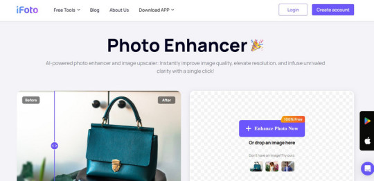
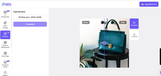
How to Improve Image Quality in Photoshop: A Complete Guide
In the last few years, digital media has taken a leap with the integration of several new-age technologies. Now, low-quality images don’t really work and can’t help you grab the attention of your audience. For this, you need to use engaging, high-quality visuals like JPG, PNG, or GIFs. Thankfully, with the help of Photoshop and AI tools, you can easily turn your low-quality images into HD. In this post, I will let you know how to improve image quality in Photoshop and by using an AI-based tool.
Why do you Need to Improve the Quality of your Photos?
If you are still using low-quality photos, then you might consider improving their quality for these reasons:
- Clear, high-quality photos effectively convey messages and emotions, making them ideal for sharing experiences with others.
- Quality photos enhance your professional appeal, whether for resumes, portfolios, or social media profiles, helping you make a lasting impression.
- High-quality photos preserve memories more vividly, allowing you to cherish and relive special moments for years to come.
- HD images grab attention and engage viewers more effectively, whether on social media, websites, or marketing content.
- Clear, detailed photos are more likely to stand out in crowded online platforms, increasing visibility and attracting more attention.
- High-quality images provide accurate documentation of events, projects, or products, ensuring clarity and detail for future reference.
Using Photoshop Tools to Improve the Quality of your Images
Adobe Photoshop offers a wide range of tools and features that you can use to improve the quality of your images. Here are some of these Photoshop tools that you can consider exploring.
Image Size and Resolution
Mostly, low-quality images suffer from restricted size and resolution. That’s why users take the assistance of Photoshop to upscale their while improving their sizes. You can learn how to improve image quality in Photoshop by upscaling it in the following way:
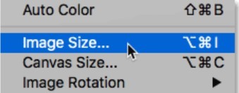
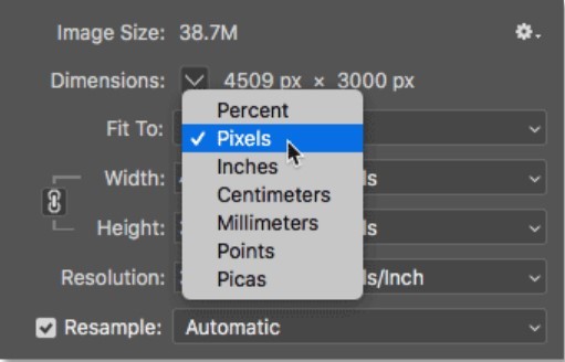
1. Start by loading the image you want to edit on Photoshop images and then select it. Now, go to the Image menu and select the Image Size option.
2. This will open a dedicated window where you can specify the target size for the image. For instance, you can manually enter the horizontal and vertical size of the image here. Make sure you keep the aspect ratio the same so that the image will fit in the right way.
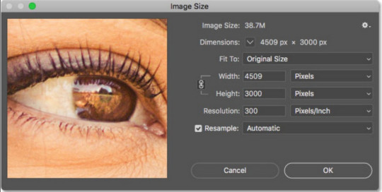
3. Apart from pixels, you can also upscale the image based on different parameters like percentage, points, centimeters, and so on.
Sharpening Images
Another issue that a lot of people face is that their images are just not sharp enough. After increasing the overall size and dimensions of your photos, they might become blurry. That’s why you can consider following this trick to make your images look sharper.
1. To learn how to improve image quality in Photoshop and make it look sharper, first make a duplicate layer of the image. Now, consider working on the duplicate layer instead so that you can keep the original image intact.
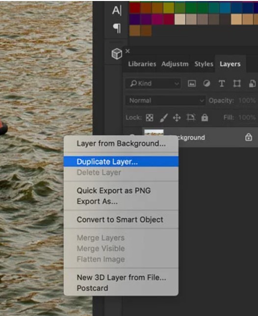
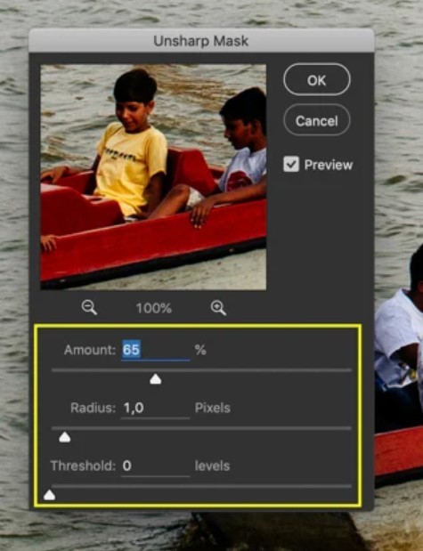
2. Afterward, go to the Filter option in Photoshop and select Sharpen > Unsharp Mask feature.
3. This will open a new window in Photoshop. Here, you can enter the amount of sharpness that you want to apply. You can even manually select the radius and threshold for sharpness to get better results.
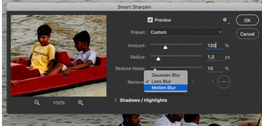
Noise Reduction
Just like sharpness, you can also reduce unwanted noise in your photos. There is an option in Adobe Photoshop that lets us manually denoise images by selecting a preferred algorithm.
1. Firstly, just load the image to edit on Photoshop and create its duplicate layer.
2. Afterward, you can just head to Filter > Sharpen option and click on the “Smart Sharpen” feature.
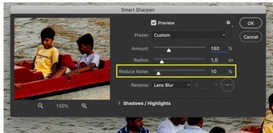
3. Once the Smart Sharpen window opens, you can manually select a level to reduce noise (on a scale of 0 to 100 percent). You can even select the type of noise reduction algorithm you want to apply (Lens Blur, Motion Blur, or Gaussian Blur) to get better results.
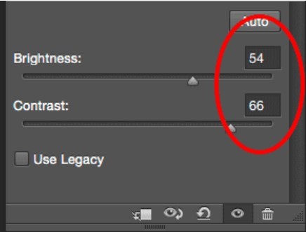
Adjusting Brightness and Contrast
Nobody likes to look at dull pictures, particularly when it comes to marketing and digital media content. That’s why you can use a professional tool like Photoshop to improve the overall brightness and contrast of your images in the following way.
1. To change the brightness and contrast levels of an image in Photoshop, you can first upload the image to the tool and create another layer (if needed).
2. Now, go to the top-most menu on Photoshop, navigate to Image > Adjustments, and click on the “Brightness/Contrast” option.
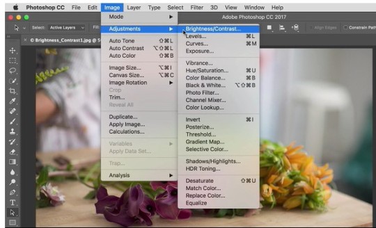
3. As this opens a new dialog box, you can manually change the level of the image’s brightness and contrast. To get instant results, you can also click on the “Auto” option, which will let Photoshop automatically correct the image’s brightness.
Color Grading
Are your images suffering from a lack of colors or there are different colors in them? The decolorization of images is one of the most common issues that people face. Thankfully, you can easily learn how to improve image quality in Photoshop and make color corrections in the following way:
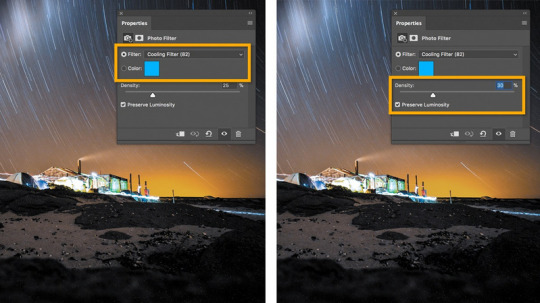
1. Start by loading the photo of your choice on Adobe Photoshop and then visit its adjustment layer. You can do that by selecting the picture and browse to Image > Adjustments > Photo Filter.
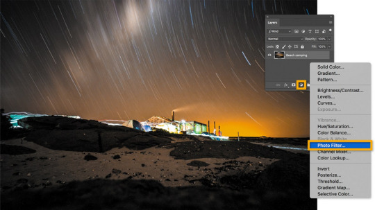
2. As the new dialog box opens, select “Color Filter” in the type of filter option. Now, you can select a color to induce and even mark its density. Simply apply the option and feel free to change these properties to get the desired results.
Blur and Sharpen Tools
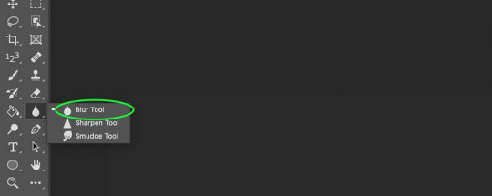
Adobe Photoshop also provides two powerful tools that can help us change the overall appeal of any image – blur and sharpen. For instance, you can use the blur tool to blur the background of any image, and with the sharpen tool, you can easily put any object or individual in focus.
Blur tool
After loading the image on Photoshop, you can just go to its side panel and click on the blur tool. This will change your cursor and you can simply select the objects that you want to blur out. Once you apply the effect, the selected area will go out of focus.
Sharpen tool
The sharpen tool works just opposite to the blur tool. After loading the image on Photoshop, you can select the sharpen tool from the sidebar. Now, all you need to do is carefully mark the object that you want to sharpen. After applying the effect, the object would be focused.
Using Filters and Effects
Adobe Photoshop also offers a wide range of filters and effects that you can use to improve the visual appeal of your images. To learn how to improve image quality in Photoshop, you can just upload the image, and go to its Menu > Filters.
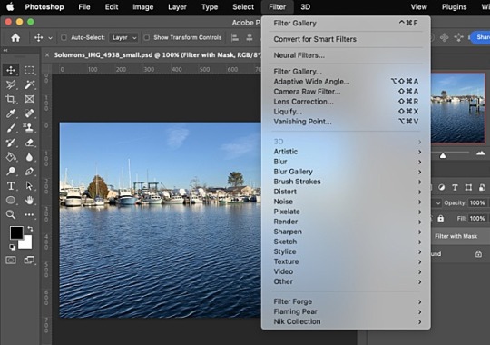
Here, you can see a wide range of filters and readily available effects that are offered by Photoshop. These will be listed under different categories like Artistic, Enhance, Blur, Sketch, and so on. You can just go to any category, apply the filter/effect, and review the results.
Improve your Image Quality with an AI Photo Enhancer
As you can see, learning how to improve image quality in Photoshop is not only time-consuming, but requires product experience as well. Not just that – even after using Photoshop, it can end up providing inconsistent results.
To overcome these issues, you can consider using a user-friendly AI Photo Enhancer from iFoto. A part of the iFoto Studio, it provides a quick and highly effective solution to improve the overall quality of your photos. From reducing noise and blurs to getting rid of issues like decoloring or over-saturation, iFoto Photo Enhancer can overcome all these problems in a single click.
Here’s how you can also take the assistance of iFoto Photo Enhancer to quickly improve and upscale the quality of your images:
Step 1: Upload the photo to enhance
Firstly, just visit the official website of iFoto Photo Enhancer or launch the iFoto app. From here, you can just drag and drop the photo of your choice or manually upload it on iFoto.
Step 2: Improve the quality of the uploaded image
Once the photo is uploaded on iFoto, you can preview the image, and even reupload any other image.
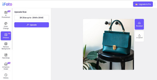
After uploading the image, you can just click on the “Upscaler” button on the side of the web interface or tap on the “Upscaler” button at the bottom of the app.
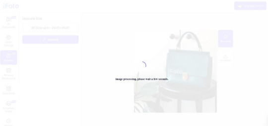
Step 3: Preview results and save the enhanced image
That’s it! You can just hold on for a few seconds and wait as iFoto will automatically remove all kinds of issues with your photo while improving its quality.
In the end, you can just preview the results of the iFoto Photo Enhancer and click on the download icon to save the image.
Conclusion
If you have a low-quality or blurry image, then you can easily take the assistance of Adobe Photoshop to fix it. In this guide, I have provided different solutions that you can also follow to learn how to improve image quality in Photoshop. However, using Photoshop can be a tedious and time-consuming process and you can consider an automated AI-powered alternative like iFoto Photo Enhancer. Using it, you can instantly improve the overall visual appeal of your photo, get consistent and high-quality results, and that too without any manual efforts.
Read the full article
0 notes
Text
Save separate layers photo image editor pixelstyle

Save separate layers photo image editor pixelstyle for mac#
Save separate layers photo image editor pixelstyle mac os x#
Save separate layers photo image editor pixelstyle full#
Save separate layers photo image editor pixelstyle mac#
Hide, duplicate and merge layers easily.- Select several layers at one time and freely align, flip and transform (move, rotate, skew, affine) the layers.- Your file could be saved as a project - you can edit them next time.- Work with all popular formats like TIFF, JPEG, PNG, GIF, BMP, etc.- Add text layer effects like shadows, strokes, inner glow, outer glow, or fills.- Half Circle Text Tool: Quickly and easily place your text on a half-circle to create logos and other useful text designs. With faster speed, more precise selection tools, a variety of dazzling effects, and much more, from retouching to restoring to creative composites, the only limit is your imagination.- More than 100 built-in drawing brushes (pencil, airbrush, watercolor brush, chalk, charcoal, neon pens.) for oil painting, sketch, texture painting.- Create custom brushes and use different brush sizes, shapes, hardness, and blending modes.- Fill in the object with texture and color.- Support for a variety of gradient modes including symmetrical, rotate, clockwise and counterclockwise.- Easily add non-destructive layer effects like shadows, fills, inner glow, outer glow, or strokes.- Support over 50 different filter effects and blending mode options.- Resize layers without any loss of quality.
Save separate layers photo image editor pixelstyle mac#
This Mac Photo Editor's functionality is similar to what you can do with Photoshop on Mac.
Save separate layers photo image editor pixelstyle for mac#
This best photo editing software for mac even lets you lay in text over your images, along with multiple drawing tools so you can add shapes and objects to your heart's content, including vector-based objects.In short, PixelStyle Mac Photo Editor version has many of the requisite features you'll need to get your photos looking better, plus a lot of other stuff besides. It's very quick, sports features like layer support and non-destructive filters, curves and levels.
Save separate layers photo image editor pixelstyle mac os x#
VersionDate ReleasedRelease Notes3.5.11.App stability improvement.3.3.5Bug fixed.3.301.Allow of deleting points when drawing with the pen tool.2.A layer can be filled with transparent color.3.Correct the falsely displayed name of text layer.4.The angle can be changed when shapes are filled with gradient colors.5.Add background autosave feature.6.Support Chinese version.2.801.Copy the selected shapes.2.Red eye remove tool:reduce the effect of red eye caused by your camera flash.3.Basic SVG support! You can now import SVG files.4.Beautify the UI of toolbar.5.Fix some other small bugs.2.40New Release.MAC Photo Editor PixelStyle Photo Editing Software for Mac PixelStyle Photo Editor for Mac is an all-in-one photo editing and graphic design software, providing professional high-quality photo processing tools to edit the photos, enhance and touch up photos on Mac OS X Mac Photo Editor PixelStyle comes with a huge range of high-end filters including lighting, blurs, distortions, tilt-shift, shadows, glows and many more.EffectMatrix developed PixelStyle Photo Editor for Mac as an easier-to-use alternative to some of the more expensive and complex apps out there (like Adobe's Photoshop). Support regular, retina and multi-monitor set ups.PixelStyle Photo Editor for Mac is an excellent and all-in-one photo editing and graphic design software which built in a lot of functionalities that are similar to what you can do with Photoshop on Mac to make your photos look a whole lot better. Fully optimized for 64-bit and multi-core processors. Use the Touch trackpad to paint with pressure sensitivity.
Save separate layers photo image editor pixelstyle full#
Designed exclusively for Mac - Takes full advantage of the latest OS X technologies.
0 notes
Text
Photo image editor pixelstyle paste selection

#Photo image editor pixelstyle paste selection software
#Photo image editor pixelstyle paste selection plus
#Photo image editor pixelstyle paste selection professional
Hit the delete key or choose Cut from the Edit menu to delete selected areas.
Rendering: Display Alpha transparency and export files as PNG image. A lot depends on the background of your photo and how complex the image is.
Saving file as a project to be edited later.
Export images to svg, pdf, bmp, png, tiff, jpeg, jpg, gif, jp2.
Work on almost all popular formats: png, jpg, gif, bmp, pdf, svg, raw, heic, jpeg, tiff, pict.
#Photo image editor pixelstyle paste selection plus
FotoJet's all-inclusive editing tools can be used to level up any photo: crop, resize, rotate, straighten and add text are all included as basic features, plus sharpen, dehaze, vignette, clipart, filters, photo effects, radial and tilt shift, and many more options for more.
Multi-Layers Management: Duplicate and Batch operation. An Online Photo Editor That's Simple to Use and Powerfully Effective.
Single layer: Rotate, Resize, Move, align, arrangement, integrate, scale, Trim to Edges.
Layer adjustments: Sharpen, Blur, Exposure, Saturation, Brightness, Contrast.
Just learn more about the process as below.
#Photo image editor pixelstyle paste selection professional
Non-destructive layer effects: Strokes, Inner Glow, Outer Glow, Shadows, Fills. GIMP is a free and professional cut and paste photo editor for Windows 10/8/7, which you can extract the desired parts of an image with different Scissors Select tools. PixelStyle Photo Editor easily edits your photos and creates original artworks.
Free Transformation Tools: Zoom, move, resize, rotate, skew, align and free perspective transformation.
Drawing Tools with adjustable pressure sensitivity: Basic Drawing, Pixel-drawing and Texture Painting.
RGBalpha and Alpha Channel Editing Tools.
Image Editing Tools: Cloning, Smudging, Alpha channel editing, Cropping, Paint bucket, Gradient Filling.
Text Tool: Change the text setting as bolding, italics and kerning and draw the text along the path.
You will get numerous wonderful features from PixelStyle Photo Editor: With state-of-the-art photo processing engine, PixelStyle Photo Editor quickly processes high-quality photos and gets amazing results instantly on Mac. In addition, Photo Editor offers a large variety of effects to images Your photos including. Options include adjusting color hue, saturation, contrast, and brightness. Adjust color, add effects, rotate, crop, resize, frame, mirror, and draw on your photos. Download the best royalty free images from Shutterstock, including photos, vectors, and illustrations. Photo Editor is a simple application and easy to manipulate image editing.
#Photo image editor pixelstyle paste selection software
It brings dozens of high-quality filters and comes with useful editing functions similar to PS software such as making selections, copying elements or layers, transforming, color picker, painting with hundreds of brushes, image resizing, gradient filling, healing scratches, cropping, erasing, fill bucket, cloning, smudging, alpha channel editing, and more. From the Shopping Cart menu, select Redeem Codes. PixelStyle Photo Editor easily edits photos & images and creates original unique artworks.
0 notes
Note
You always make such beautiful gifs!! I've been trying my hand at gifmaking recently and am running into one big problem: all my gifs turn blurry on tumblr mobile even though they look fine on desktop and (I think) adhere to the 540px width dimension guidelines. If you have any advice on how to create gifs that don't turn into a potato on mobile, I'd appreciate it massively!!
First of all, thank you!!! 🥺 Sweet appreciative messages like this always makes me smile :)
I tried to put together some tips that might be useful when it comes to making clearer gifs :D
1) Footage
If you want your gifs to look really good, try to use 1080p videos for giffing! (or atleast 720p) (DM me and I’ll drop you a link for a collection of 1080p bbc merlin videos if you want :D) Afterwards, you can either use screencapping or you can extract the scene you want as a clip. This tutorial explains the basics of gifmaking (and the process of screencapping) very clearly so do check it out :D (click here)
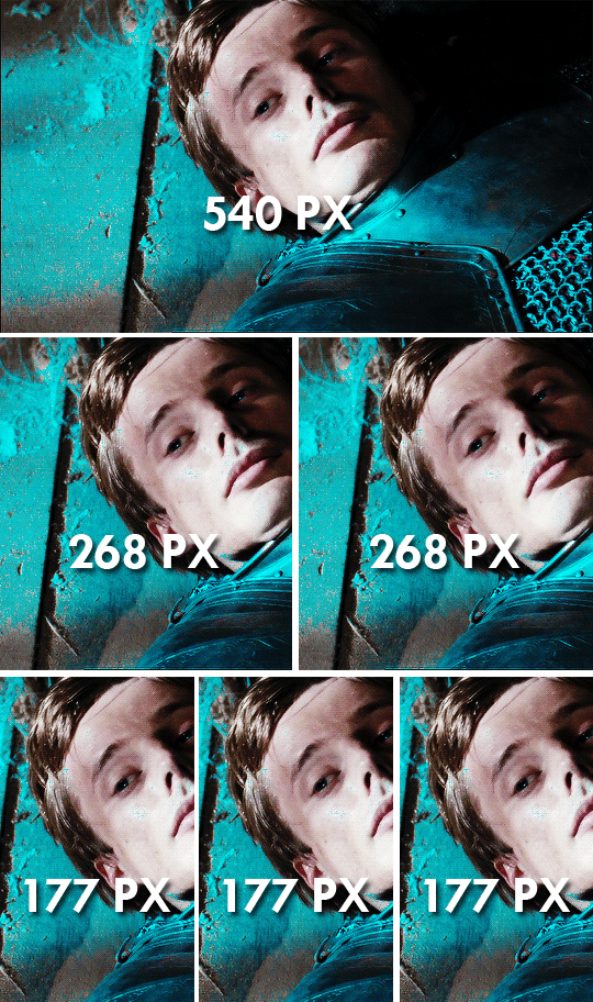
2) Tumblr Dimensions
Dimensions! are! so! important! The width of your gif matters. The height? not so much. I made a gifset for the appropriate sizes below. Always make sure your gifs are sized accordingly. Or tumblr resizes your gifs to fit its dimensions, and that makes them go all wonky and grainy :’)
3) sharpening
This is probably the most important step in the gifmaking process. I use a gaussian blur to soften the gif, but sharpen settings mostly depends on the gifmaker!!!
1) Convert your layers into a smart object. (filter > convert for smart filters)
2) Duplicate the smart object. (now you have 2 layers)
3) Apply smart sharpen to the layer below. [ filter > sharpen > smart sharpen and 500% radius 0.3px (or 0.4px sometimes) I change my sharpen settings according to the scene I’m working on tbh ]
4) Apply a gaussian blur filter to the layer on top. (filter > blur > gaussian blur and 1px. Try playing around with the settings and see what fits your gif best!!) and then you can change the opacity of the blur layer as you wish. (from the slider)
Try not to oversharpen because that might cause gifs to look grainy too :( (it’s especially tricky when working with season 1/2/3 of merlin because the footage is old and the quality is kinda worse than s4/5.)
Play around with the sharpening settings until you find a satisfactory result. Save a gif you experimented on as a draft and view it from your mobile, and check whether you like how it looks! If not, keep playing with your settings and proceed when you feel like you found the best option!! :D
4) Colouring
When colouring your gif, don’t overdo the colour balance layer. Go wild with selective colour,(I love using selective colour) but use colour balance wisely. Overdoing it might cause your gif to be grainy :)
Using a lot of layers (colouring layers etc.) on your gif might affect its sharpness and quality. It has never been an issue for me, but I’ve seen some gifmakers having problems with it.
5) Save settings
Save settings play an important role on the final outcome of your gif. So make sure you choose the best one! These are my save settings :
You can use “selective” instead of “adaptive” and “diffusion” instead of “pattern” :) Choose the option that looks best on your gif :) and the looping option should be set to “forever” (I have mistakenly set it to “once” in my screenshot) As for the “quality” option below “Bicubic” works just as well as “bicubic sharper.”
.
.
I think this covers the major points of sharpening :) I hope you find this useful anon 🥺 and please don’t hesitate to drop me an ask if you need any further help!!! <3
*hugs*
116 notes
·
View notes
Text

So per anonymous request, here are some tips on how I myself go about drawing portrait tiles similar to those found in the Dragon Age Keep. I hope this is of some help to those interested in trying yourself! (Or I’d also like to point out that I do offer commissions. 🙂)
GIMP is my app of choice for these.
To start off, a few generic notes about the style:
Almost everything should be symmetrical, aside from a few distinctive features
Pieces are, for lack of a better word, chunky
Lighting is top-down, except for the head, which has shadowed, blank features
I’ve found the build-a-bear approach is the best way to go about constructing these tiles, piece by piece. By which I mean, creating layer groups for each part of the portrait; head, outfit parts, hair, etc.
Because almost everything is symmetrical, I suggest before anything else, creating a vertical guideline to help you. (Image > Guides > New Guide by Percent.)
Draw one half of a whole piece at a time, then duplicate and flip it vertically. I always start with the head.
With the piece’s base done, create a layer above it and fill in the shadowed part(s) with solid black. Use Alpha to Selection to select all the black, hide that layer, and in a new layer in soft light mode, use the gradient tool to fill in the selection from top to bottom with black to transparency. In a third layer above this, select the entire piece by Alpha to Selection, and use the gradient tool to fill it in from the centre of the forehead outwards with white to black. This should also use soft light layer mode.
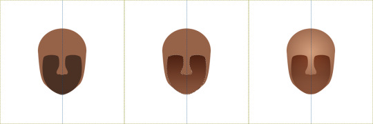
Save all these layers into a layer group named after the piece. By the end of it, you should have quite a lot of layers, so organizing them by groups makes it a) easier on the eyes and b) easier to adjust.
Then it’s just a matter of repeating this process for each piece! The only difference is on the hair and clothes, you’ll also want to add lighting with a white to transparent gradient.
When you have the whole portrait done, create a new layer from visible and hide all the layer groups below it. Add a black outer glow, and blur the glow with guassian blur by 15.
This outer glow especially helps the eyes differentiate between the figure and the background, if the figure has red or purple pieces. Change the glow’s layer mode to either overlay or soft light.
Now comes the final part: Textures. The keep tiles all have a gritty, grunge look to them, which can be achieved using overlays of textures. You can make your own textures with brushes and renders, (I love GIMP’s render > clouds > plasma), and/or find them from some sites I can suggest here:
freestocktextures.com
pxhere.com
onlygfx.com
peakpix.com
Searching for “grunge” is your best bet.
Your textures should be in greyscale.
That’s really all there is!
150 notes
·
View notes
Note
Hi Meg! Hope you're doing well (and happy New Year!) I was wondering if you could give any tips on layers when it comes to digital art? I'm slowly learning digital and slowly getting the hang of it, as I'm more of a traditional artist rather than digital, but it's the layers that gets me and that confuses me the most and I was wondering if I could get some tips or advice from the master?😅 I've been in love with your style for a long time and was I've always wanted to know how you do it
Hey there!
First of all thank you so much! 💕
My coloring and shading style especially have gone through quite some changes since I first started digital art - shading with black and the airbrush tool, which doesn't equal art being bad, but most of the time soft shading (like with the airbrush) in black looks dull and takes the colorful out of your drawings. If it is part of your style or intention, obviously you can share with black too. If done right, like in many superhero comics for example, it looks incredibly impressive. (The shading in those are sharp though most of the time, not soft)
I got carried away, sorry. Just wanted to say that my technique/style changed and so will yours with time!
Second, I am by far no master. I've been drawing digitally for almost 6 years now but I'm still learning a lot.
However, I always try to help people and when directly asked to, how could I refuse.
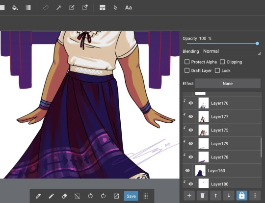
I'm going to show how I draw simpler pieces like the current Madrigal family portraits with the help of Luisa, our beloved, and will mainly talk about the way I use layers.
Disclaimer: my way is not the only way and if you use layers differently that's fine, there are multiple ways to use layers and the tools connected to them. I'm NOT trying to tell you how to use those but am simply, by request, trying to explain how I use them
✧・゚: *✧・:*✧・゚: *✧・
Program used: Medibang Paint Pro
Media: Samsung Galaxy Tab S6 Lite (this is not sponsored by Samsung lmao I wish)
I start out with a blank canvas and sketch my intended motif
Luisa doing a little spin (indicated by the skirt) ♡
Now I do the lineart. It's not gonna be ideal in this case because that's the style I'm going for in this series but that's secondary.
I add a layer. Most of the time it should be a button with a plus.
The plus let's me add layers, the bin delete layers, the arrow up is to move a layer up and the arrow down is to move a layer down (though I do that more by just directly holding down my S pen on the layer and move it as far up or far down as I want), ignore the lock, the 3 dots are other features like duplication of a layer, gaussian blur etc.
After the lineart comes coloring. I start with skin (eyes etc. included sometimeson separate layers sometimeson the same lol), then hair, then upper clothing, bottom clothing, and lastly accessories - though I also tend to just put them on the same layer as one of the clothing layers.
The thing with layers is that when you fill an area with color, add a layer underneath it and draw over - or rather under - the previously colored area it will be on the layer but it will be covered up by the layer above it.
I'm bad at explaining but basically we artists are inpatient a lot especially in coloring and in traditional art drawing out of the line or accidentally drawing over already colored skin or anything else so with traditional art you have to take care of that.
Layers make your life so much easier. Just draw the area out. If it's underneath another layer f.e. skin, it is covered by that layer.
You can see this here with the red in the bows (layer 164). They obviously are drawn over their actual lines but because they are layered underneath the layer for the blouse and hair, that doesn't fill the area of the bows (because if it would there'd be no red there as it's covered up), the red does not actually draw over the intended line. I hope that makes sense- 😭😭
Another cool feature digital art gives you is ✨clipping✨ that also saves you sanity you'd spend on not drawing over.
I use it for shading a lot.
I add another layer, tick the box saying "Clipping" and everything I draw on that layer will only be on the layer I clipped it to. For example, if I clip a layer to shade skin, I can only draw on the skin. Not the hair, the blouse or anything else. It's literally clipped to the skin layer.
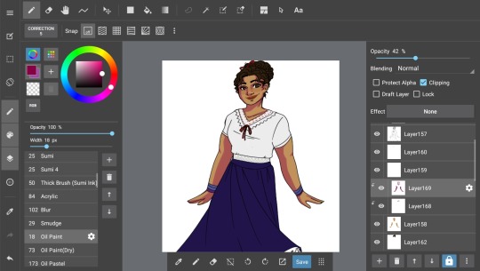
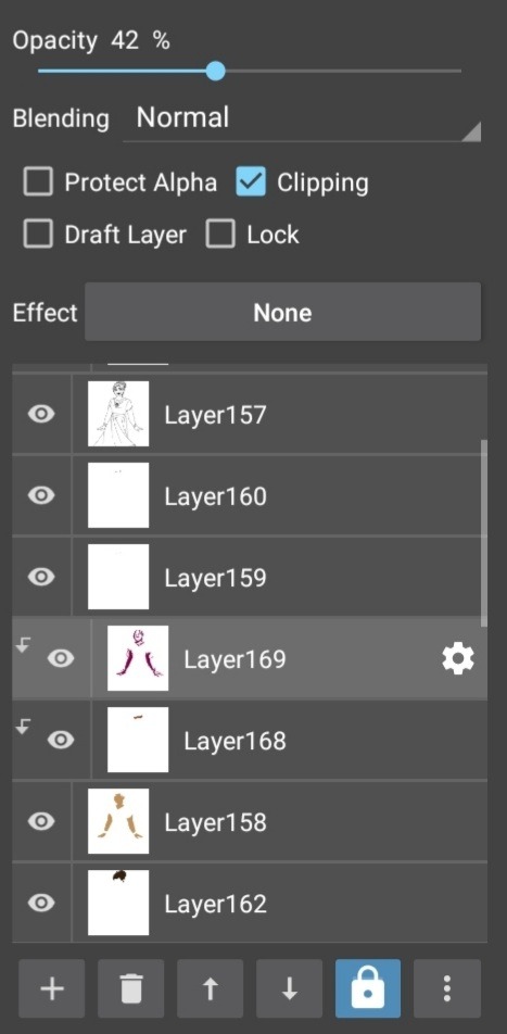
The great thing: You can clip as many layers on top as you want. Clipped layers can't be clipped to another clipped layer. It'll always be the skin layer.
(Used the clipping tool on the lineart, specifically the lips as you maybe noticed. This means you can change the color of the lineart or any desired colored area with the clipping tool)
("Protect Alpha" works similar but I haven't exactly used it a lot lol)
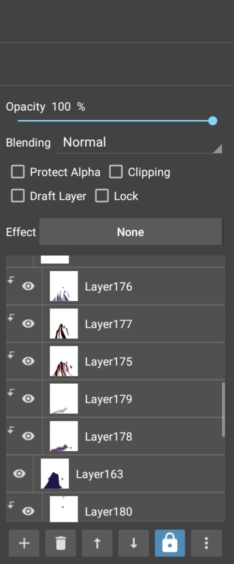
(A not clipped layer is selected in this screenshot thus Clipping is not shown as activated)
And that's basically it.
It's worth mentioning the "Blending" application. Experiment with it. Try out different blendings like "Add" (makes color on the layer lighter/ almost glow) or "Multiply" (makes color on the layer darker) and many others. Go wild.
✧・゚: *✧・:*✧・゚: *✧・
Someody make a counter for the term "layer" and "layered" 🗿😭
Hope this was somewhat helpful I'm seriously terrible at explaining especially in a language that is not native to me so uh if something's unclear please tell me -
Happy drawing!~
#long post#meg trying to teach art again#medibang#art tutorial ig???#there's probably so many grammer mistakes and violation of the English language here im so sorry 😭
22 notes
·
View notes
Note
Your stained glass Aurora fanart is SO GOOD. I gotta know, what's your secret? I keep trying to make stained glass style stuff, and it always ends up looking flat. (Seriously, though, SO GOOD.)
oh gosh, thank you!
I'll be honest, that was my first foray into stained glass art myself, and most of it was fucking around and finding out? But I did learn some stuff while I was making it, sooo here's that?
Stained glass gets thicker around the edges, and gets thicker at the bottom the older it is. That means usually more saturated colors around the edges. I use CSP, so I made an overlay layer of just black around the edges for this effect.
Stained glass is super saturated. This gets offset by the light passing through, but for a base layer, I went full saturation for eeeverything, and just lowered the opacity a bit for that see-through factor.
Textures add a lot. I looked up "stained glass texture" on the CSP assets website and used it as an overlay for the colors, and it added a lot of depth.
GLOW LAYERS OUT THE ASS. Seriously, the thing that gives stained glass the wow factor is all the light coming through it. Here's a few lights I kept in mind when I did the Aurora pic:
a. Ambient sky light (same color as the sky, usually affects/shows up on the material around the glass moreso than the glass itself)
b. Sunlight (dependent on time of day but usually a yellow, shines more on the center of each little piece of glass than the edges)
c. Light rays (these are affected by whatever color the stained glass is and usually shows up on those really cool aesthetic photos. I duplicated the base color layer, made it a glow layer, and used a motion blur on it to get the streak effect, then played around with it until it looked like it was actually coming from the window in question)
Having something behind the stained glass window, like trees or buildings, adds a lot more depth and makes it feel more like an actual window rather than just cool art (I mean it is cool art but it's pulling double duty here, y'know?).
Research and reference photos are an artist's bread and butter and help a lot with accuracy, ambiance, etc; whatever it is you're trying to get across with the picture, you cannot go wrong with more reference pictures. Or research.
That's about it? I guess most of this boils down to research and observation, but I hoped this helped you some!
12 notes
·
View notes
Note
its late at night,,,and you hear someone downstairs watching TV,,, who could this be? You slowly get down the stairs,, and g a sp?!?! Oh dont worry its just berri✋💖🤗
So like,,, Do ya have any art tips/knoweldge or wisddom/tips and tricks that ya Wanna BEstow? And make me enlighten???👁👀👀
Hi Berri :D I've been racking my brain for HOURS since 4 am and can't think of anything useful at all : D
I don't know how you color/or how much of common knowledge this is ?? HOWEVER, if you select a section you want to color on your lineart layer, then go to your color layer, press "select > expand selected area" and do like 2 pixels (depends on the size of the drawing/lineart width) and then use the bucket tool on the color layer, v fast and effective way to color :3 this is on clip studio, but it works on firealpaca and Photoshop, I don't know if it works on sai ?? I think I had trouble with that
Shiny things !!!!! If you want something to glow more, I duplicate the lighting layer and use gaussian blur on it a bit. I use it a lot on the little light particles in my drawins !! I do the same on the lineart too sometimes, but just a teeny tiny bit. If I also don't have a background, I just put it to a dark color and make a copy of the color layer, put it behind the main color layer and blur it a lil, it make them do a glow :3
And also atmospheric lighting !! Try putting a multiply layer over the whole drawing and putting it to a tiny bit opacity, I do this and then mess around with all the modes like screen, overlay, add (add glow) and soft/hard light. And for lighting I use the gradient tool and just add a ray of light of my color of choice. Then go over the edges of the drawing and add highlights :3
Also more tips for lighting and shading, do the lighting FIRST, it's way easier to do the shading more accurately when you've got the lighting down first. Or draw like a little sun in the place your light is coming from.
I hope any of this is useful :3 if you know it already I am vewy sowwy v_v
9 notes
·
View notes
Note
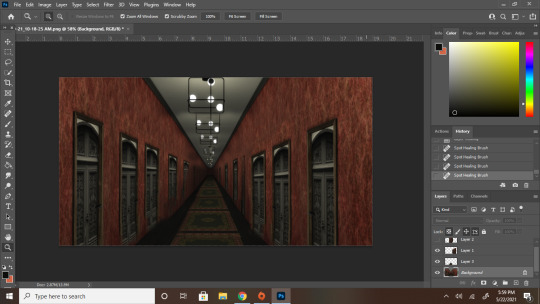
hey bestie quick question how the FUCK did you make that hallway look like it goes on forever please and thank you
Firstly this is the only way i will ever accept small tutorial/explanation requests from now on secondly it's actually easier than you'd think, bestie. This can be done in pretty much any editing program that you can layer in but i will be using photoshop 2021 (because adobe updated without me knowing) but that's besides the point
{Tutorial under the read more}
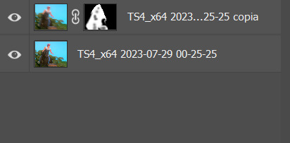
Alright step one: Make your hallway
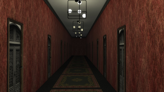
Still kinda long, but nothing dramatic as this was done on a small lot in a basement...but i digress. When adding lights make sure the farther the light is from the "camera" the darker you have the light set too. Like in mine the first light is about half of warm white, and after that it is a third, then a quarter, then a little bit higher than nothing, while the last one is off. Add doors to get some more depth, and space them out a little better than i did if you want the door vibe. But if not, then just make a long and narrow hallway and [IMPORTANT] Make sure you get a SOLID V SHAPE FOR THE CIELING AND FLOOR! This is what makes it feel like it goes on and on and on...
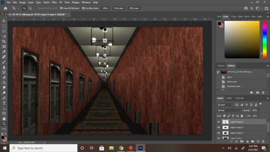
Step two: Take it into your editing app of choice and make it a layer.
Then duplicate that layer 2 or more times. With each layer, make the picture smaller and smaller. Make a very solid effort to line up the Vs of the ceiling and floor (but if the floor doesn't quite line up then just focus on the cieling as that will be what really sells it)
In this example, i had 5 layers. You can see where the next picture begins by the banding of the lights. You can kinda see what I meant about the floor thing hear
Step three: BLEND FOR YOUR LIFE
This part involves a LOT of erasing and little spots of correction as you go. Focus on blending the walls the most. Although the cieling and the center point are what really sells it, the whole wall give it away because that's what makes if very obvious that this is just a screenshot you made gradually smaller and smaller. What i've done in mine, because i like making things easier on myself, was i just copied one side and mirrored it with the other. And for the floor i just copied the bit with the smooth lines and made them bigger.
Now you're probably looking at this and thinking "Hey bestie...that looks a bit crap still" And you'd be right because i'm rushing and also have like 5 more steps HOWEVER if you're keeping the hallway fairly well lit then this would be your final step and you'd clean all the obvious flaws way more. But to me the fun part is always the mood lighting
Step four: LIGHTING
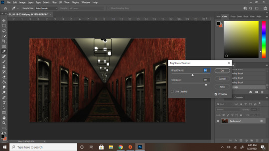
Merge your layers together (If you trust yourself like that. If not then merge everything into a folder if possible and do everything else I'm about to say on adjustment layers.
4a: Brightness and contrast make it a bit more moody and darker so the flaws become a little less noticeable. After this i also used curves to make it a little darker and the red richer. But that was more of a me thing than a necessity so i didn't capture that part
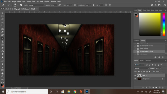
4b. Now make a new layer and go HAM on the shadows with a soft brush with zero hardness. Imagine an X where it is the darkest where the cieling and floor Vs connect while the ones along the wall are a little lighter. After make that X go into Filter > Blur Gallery > Field blur and mess with the settings of the shadow layer until you feel its as harsh/soft as you want your shadows to be, I personally went for 103 while my shadow layer was at 83% opacity
Before blurring
After blurring
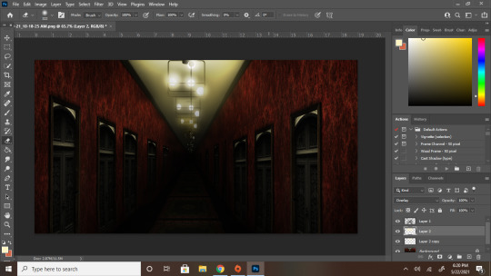
She a little smoother now and is coming along nicely YOU'RE PRETTY MUCH DONE!
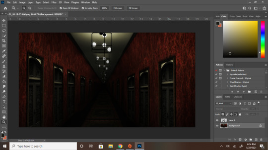
4c. High lights! Follow the lines of where the little lights are and blast them with some light yellows or full white depending on how heavy you want the lighting to look IN A NEW LAYER. Once you're done with that layer, change your normal setting to overlay and blur it to your hearts content as stated with the shadows. You usually won't need to blue highlights as much as you need to blur out shadows. For example I only blurred mine to a 25 px for the lights as opposed to the 103 for the shadows
Highlights in normal layer
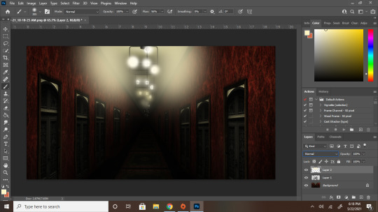
Highlights in overlay and blurred
Step 5: The final touch, Depth of field
To get the deep look for this i'd reccomend going into blur gallery one more time and creating a t with your blur points and each 2 less than the last. For example, in my the center point was 6 px blurred. The four points around that were 4, then 2, and then 0
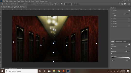
And YOU ARE ALL SET! After all of that your deep and spooky hallway is complete! Now go forth and cause chaos, bestie
#ts4#simblr#ts4 edit#ts4 tutorial#tutorial#ps tutorial#hall posts#hall tries to edit#i know i said i had another post to edit and yeah i still absolutely do but i wanted to make this first so i went back and reedited#the hallway so it looks...better#better for the tutorial at least#hall tries to help
55 notes
·
View notes
Photo
Welcome to soonhoonsol’s gif tutorial!
As a nice anon asked me how I make my gifs, I thought it’d be cool to create an in-depth tutorial :) Perhaps this can help some others enter the gif-ing world too!
What we’ll be using for this tutorial:
Software: Bandicam, Avisynth, Photoshop CC 2018, Topaz Labs
File Format: .mp4
Operating System: Windows
Disclaimer: This is just my method. Every gif maker works differently and has different preferences. What works for me may not work for you, and that’s completely okay!
Let’s get into it!
1. Find the best quality video you can find
This really depends on the content you want to gif. For variety shows, music videos or photoshoots, any video of [1080p] should be sufficient. Try not to use anything below 720p.
For stage performances, fancams tend to have higher resolutions [1440p, 4k]. Use these if your computer can handle it. If not, usually 1080p works fine. The best option would be to download .ts files, which provide clearer and less grainy videos.
For Seventeen, you can get .ts files from The Rosebay on Twitter :)
2. Screen recording
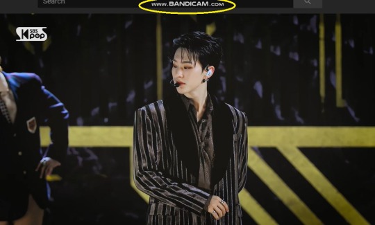
As a Windows user, I don’t have a built-in screen recorder on my laptop. So, I use Bandicam, which is a free screen recording software. The only con to it is that it has a watermark.
To combat the watermark, I always have the boundary box a little bigger than the video itself so that I can crop it out of the gif.
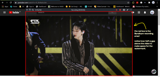
This is what the recording would look like:
Just record the scene(s) that you want to gif so your video file doesn’t end up too large! Your recording should be in .mp4 format.
(You may use pure .ts files in Avisynth but it never worked well for me so I usually screen record the .ts video and move on)
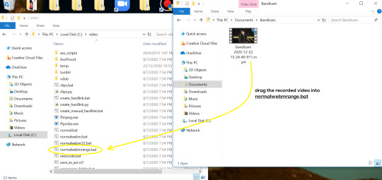
You can find your recorded videos in Documents > Bandicam.
3. Avisynth
I followed THIS tutorial to download Avisynth. This software is really helpful if you want sharp and clear gifs! I recommend to follow the steps in the tutorial as the below method stems from it.
- Once you have downloaded it, open up your recorded video from Step 2 and watch it. Take note of the duration you want to gif. (e.g. from 00:01 to 00:05)
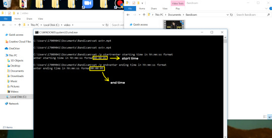
- Drag your video file into normalwebrange.bat. On Windows, you can find this in File Explorer > Local Disk (C:) > video. For other .bat files, you may check out THIS tutorial.
- In the pop-up box, key in the start time for your gif (e.g. 00:00:01). It has to be in hh:mm:ss format. Press “enter”.
- Key in the end timing and press “enter” again. A resizer should pop up in an Internet Browser. I found that Firefox works best for me.
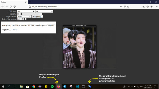
- In the resizer, you may indicate the size of the gif you’d like to make. You can also click and drag the video to resize and frame it to your liking. You may refer to THIS post for Tumblr dashboard sizing.
(These are some common gif sizes for stage performances):
1 gif - 540px by 540px (square)
2 gifs - 268px by 350px
3 gifs - 177/178px by 250px
- Under “Preprocessor”, select “debilinear” for the second box. For the first box, you may pick between qtgmc 30 (same frame rate as video) or qtgmc 60 (doubles the frame rate; smoother).
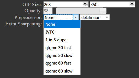
- You will also see “fast” or “slow” options. These are just how long the video will take to render. “Fast” will give you slightly lower quality as compared to “slow”, but usually is good enough.
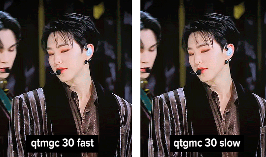
(You can see that his features are sharper and more defined in the “slow” gif as compared to the “fast” one.)
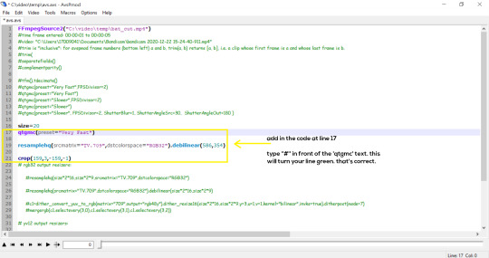
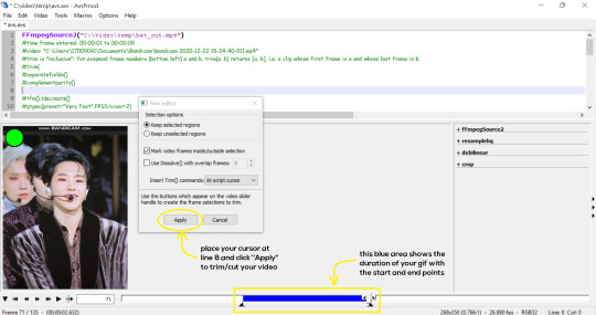
- Copy the code in the white box. Navigate to the scripting window (it should have popped up with the resizer) and paste the code at line 17. Type a “#” before qtgmc on the same line. This will prevent the software from lagging.
- Click on the inverted triangle at the bottom of the screen. Your video will now appear in the scripting window. Drag the slider to the intended starting point of your gif and press the “home” key on your keyboard.
- Drag the slider again to the intended ending point of your gif and press the “end” key on your keyboard. This blue area you see is the duration of your gif.
- On an empty line (I usually go to line 8), place your cursor there and click “Apply” in the mini pop-up window. Afterwards, remove the “#” from line 17.
- Go to File > Save or press Ctrl + S to save the code. Close the scripting window. The video renderer will pop up. When it’s done, it will automatically close by itself.
4. Using Photoshop and Topaz
I’m using my school license for Photoshop 2018, but if you don’t have that, there are plenty of cracked versions for free. I don’t have any to recommend though so I’m sorry about that :(
I followed THIS video tutorial to download Topaz plug-ins for free. I use Topaz DeNoise (the most helpful) and Clean, but you may use others if you’d like :)
Alright, let’s dive in to the steps!
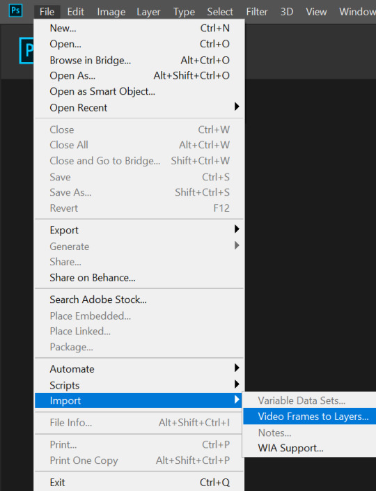
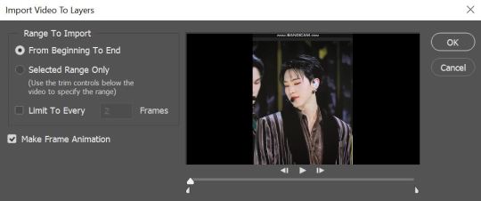
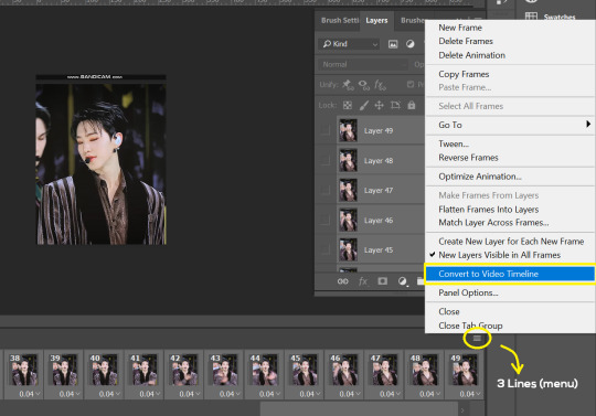
- Open up Photoshop and go to File > Import > Video Frames to Layers.
- A pop-up will appear. You can find your deinterlaced Avisynth video in File Explorer > Local Disk (C:) > video > temp > video.avi. Follow the settings in the picture and click “OK”.
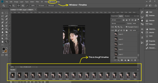
- Go to Window > Timeline to open up the timeline. You should be able to see your gif spread out in frames. If you press the play button, it should play like a video.
- (Quick optional step I learned from THIS tutorial) Go to Image > Canvas and set the Resample option to “Bicubic (smooth gradients)”.)
- Select the first frame of your gif in the timeline. Shift select the last frame. Go to Window > Layers. Shift select these layers as well.
- With everything selected, click the 3 lines at the top right corner of the timeline. Select “Convert to Video Timeline”.
- At the top of the screen, select Filter > Convert for Smart Filters. Your layers will condense into one layer. Don’t worry, your gif is fine.
- Now it’s time to sharpen the gifs. Go to Filter > Sharpen > Smart Sharpen. Play around with the settings to your liking!
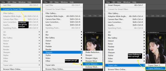
- If you’ve downloaded Topaz correctly, it should appear under Filter > Topaz Labs. If a pop-up asks you for an activation key, you may use THESE to activate it for free.
- Go to Filter > Topaz Labs > DeNoise and/or Clean and play with the settings until you’re satisfied.
5. Blurring
If your gifs have captions/logos that are distracting, you’d want to blur them out. Don’t be like 2018 me that blurred out the logo frame by frame; it’s very tiring. Instead, using this method from @scoupsy‘s tutorial, you’ll save lots of time.
- In the Layers tab (Windows > Layers), select the “New Layer” icon. It should be blank.
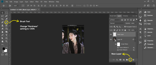
- Select the Brush tool. Make sure the “Hardness” setting is below 20%. This will blend the blurring nicely into the gif.
(For the sake of this tutorial, I will be blurring out the Bandicam logo to show you.)
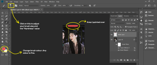
- Paint over the captions/logos. Make sure this is on the blank layer!
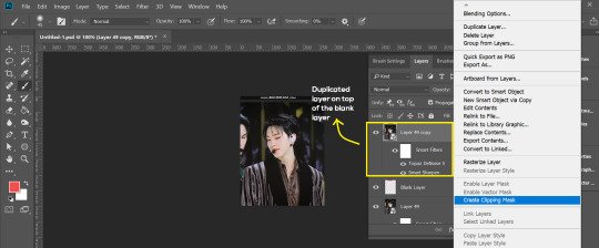
- Duplicate (Right Click > Duplicate) the gif layer and drag it so that it’s on top of the blank layer.
- Right click on the duplicate layer and select “Create Clipping Mask”.
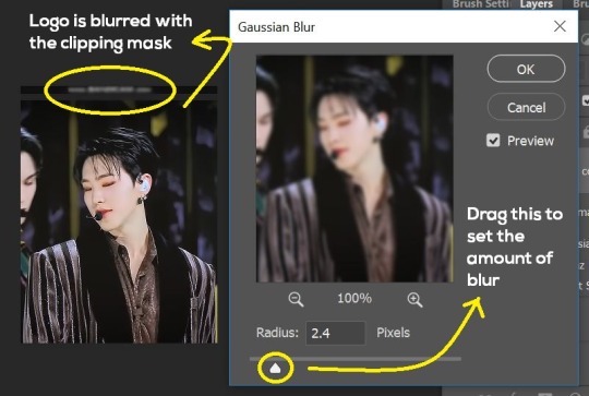
- Go to Filter > Blur > Gaussian Blur and play around with the settings until you’re satisfied with the level of blurring. Click “OK”.
6. Flattening & Colouring
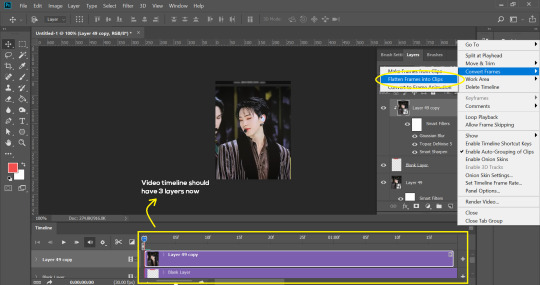
- Once you’re done with sharpening and/or blurring, click on the 3 lines on at the right corner of the video timeline and go to Convert Frames > Flatten Frames Into Clips.
- Topaz layers and blurring will take some time to render so you can just chill for now~
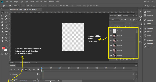
- When it’s done rendering, click again on the 3 lines and go to Convert Frames > Make Frames From Clips.
- Convert it back to the gif timeline by clicking on the 3-box icon at the bottom left of the timeline.
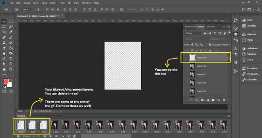
- Select the first frame of your gif. It must be the FIRST.
- Scroll to the top of the layers and select the layer at the top. Any other layers you add should be on top of this layer. VERY IMPORTANT!!
- In the Adjustments Tab (Window > Adjustments), there are many different things to play with. There’s a high chance you won’t use everything, but here’s a few of my favourites.
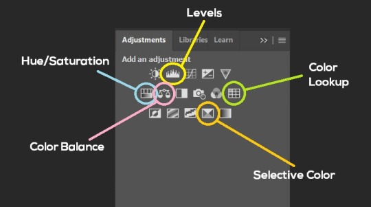
Levels - Adjust the brightness and contrast of your gif in depth.
Hue/Saturation - Useful for changing colours, or switching it to black and white.
Color Balance - Tweak the colours to your liking.
Colour Lookup - Comes with built-in LUTs that you can use as a preset. Great starting point for colouring. Saves time too. You can even download plug-ins for this. 11/10 tool.
Selective Colour - Adjust the vibrancy of specific colours.
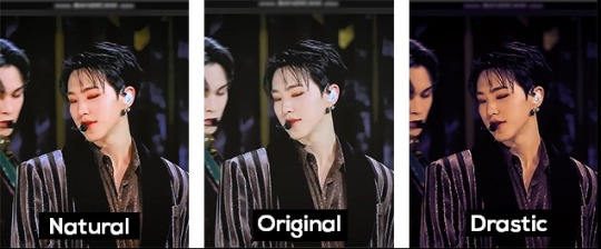
- Colouring is completely up to the gifmaker. Go crazy go stupid :D
7. Exporting
We’re almost to the end!
- Set the timing for your gif.
If you used qtgmc30, the best timing would be 0.04s / 0.05s / 0.06s.
If you used qtgmc60, the best timing would be 0.02s / 0.03s / 0.04s.
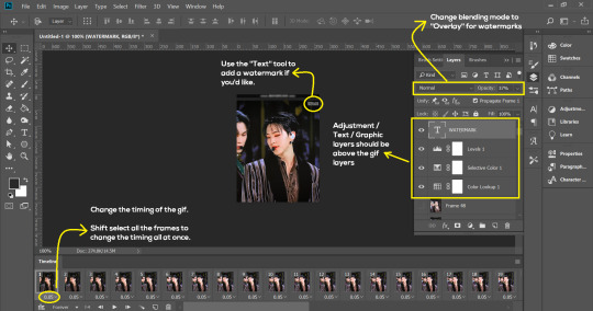
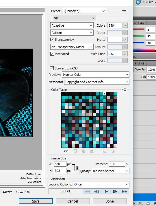
- Once you’re satisfied with everything, go to File > Export > Save for Web (Legacy).
- Follow the settings in the picture below:
- Tumblr’s gif limit is 10mb per gif. Check the gif size at the bottom left of the pop-up window. Make sure it’s below 10mb; the smaller the better.
- Click “Save”. Choose where you’d like to save the gif.
- Done!
~~~~~~~~~~~~~~~~
And that’s it! You’ve successfully made a gif! Good job you :D
I hope this tutorial was helpful! Please leave some feedback if it helped, or if you have other methods you’d like to share :)
Lastly, if you have any questions, feel free to send in an ask or DM me!! :)
Good luck and happy gif-ing :’D
#gif tutorial#kpop gifs#avisynth tutorial#topaz tutorial#gifs#chey.resource#kpop#idk what else to tag so...#i finally posted the tutorial yay!!#please spare a reblog if you find this even remotely helpful thank you <3#also to spread it hehe i spent a lot of time on this#if anyone has any questions please feel free to DM me!!#i apologize if there are any spelling errors
224 notes
·
View notes
Note
Hey! Can I ask how you gif? Your gifs are so pretty and I’ve been wanting to learn how to do it. I know I could also probably google it so if you don’t feel like answering I understand
it's a bit of a process so i'll put stuff under the cut! not sure if this will be the best tutorial but i'll try!
things i use: a torrent downloader, kmplayer, photoshop cc
first off! download the episode you want the gifs from! i get mine off piratebay and use utorrent as my downloader. lots of tips on how to do that online so i'll skip over that
open up the episode in kmplayer and hit ctrl+g (or cmd+g if ur on mac i think? the rest of this will be PC specific since thats what i use for gifs) to open up the capture settings. the top bar is where you want the caps to be sent to- make a different folder for each gif u want to make.
these are the settings i use. bitmap format is a lil faster and wrecks ur pc less and its perfectly passable! png is the best quality but it makes my laptop chug like hell so i use jpg (the happy medium)
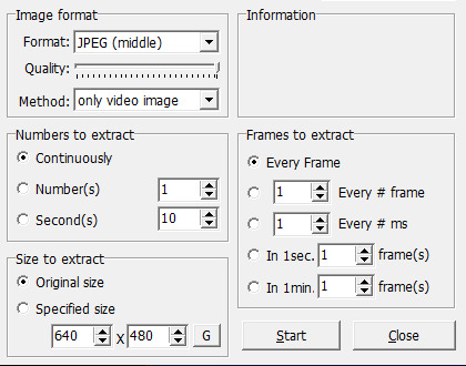
make sure its continuous, original size, and every frame! start the video playback a little before the segment you want and hit start on the capture menu, then hit stop once you're done. there will likely be a few extra frames on either end, so just go and delete those!
next up take those caps and upload them to photoshop! w the version i have i go to files -> scripts -> load files into stack. go into your caps folder, select all of em, and hit ok. it'll take a while for all of them to load in, especially w a larger gif, so just wait a bit before doing anything else or photoshop might crash haha.
once that's up, go to window (in the top bar) and check "timeline". click "create video timeline", and then immediately click the three small squares on the bottom left to convert it to frame animation. now click the three lines on the top right of the timeline window and click "make frames from layers:. they'll come in in reverse, so go to the same menu and click "reverse frames" next! go into the same menu, hit select all frames, and then change the frame duration to 0.05 by clicking the arrow next to the time under a frame, clicking "other," and typing in that value.
i usually crop my gif next. for a gif with one gif per row the width is 540px, for two gifs per row it's 268px, and for three it's 177px except for the middle gif which is 178px (meaning you have to kinda plan the layout in advance). the height can be whatever you like.
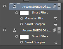
next up is sharpening! to sharpen easily, convert your timeline back into video animation by clicking in the same spot you did to convert to frame animation, then select all of your layers on the right, right click, and "convert to smart object". should look like this now:
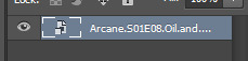
one single layer. now click filter -> sharpen -> smart sharpen, and use these settings:
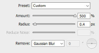
duplicate that layer, then hit the duplicated layer with filter -> blur -> gaussian blur with a radius of 0.5 pixels. set that layer to 50% opacity. you layers should look like this now:
after this is colouring! all of these upcoming layers can be found under layer -> new adjustment layer. the process i tend to follow is a standard curves layer to up the brightness:
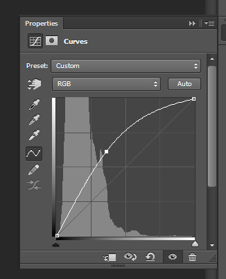
another curves layer to get some contrast going:
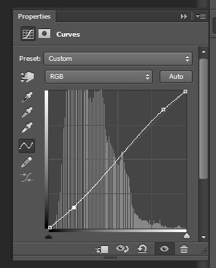
and from there on out you can kinda do whatever you want! i use a vibrance layer to get more saturation followed by a gradient map layer set to soft light and 50% opacity to kinda tone it down a bit while increasing contrast, and then selective colour and colour balance layers to mess with the overall colours of the scene, and finally a levels layer if i want a little more contrast! so my layers tend to look like this:
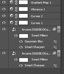
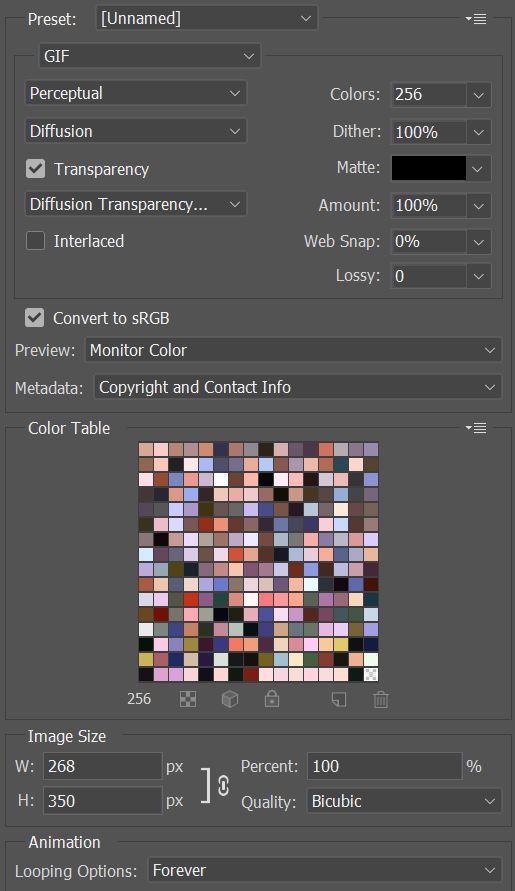
and now your gif is pretty much done! to save, go to file -> save for web. i use these settings:
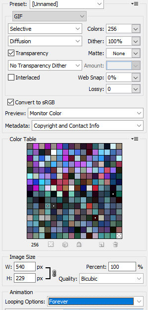
make sure your loop is set to forever! for gif size, im not quite sure what the hard limit is, but i think i remember reading somewhere that the quality starts tanking once it's bigger than 5MB, so i try to keep it under 5. if a gif is too big, start by cutting frames. you can also reduce the amount of colours to lower file size, but it will start affecting the quality!
now for a little tricky thing i learned recently- converting your gif to video timeline actually automatically changes the frame duration to 0.07, which is a little slow. to fix this, just open up your finished gif in photoshop again, which will automatically open it as a frame animation, and change the duration back to 0.05! save as normal, and you're done!
WHEW this got long. honestly it just gets easier with practice once you're not thinking about it as much. if you have any specific qs feel free to reach out, and happy giffing!
9 notes
·
View notes
Last Seen Blogs

leasung
For ðínum leásungum

artmarirodrigues
Art Mari Rodrigues
artmarirodrigues
Art Mari Rodrigues
stelladrawsfanarts
Stella_Draws_Fanarts

milramemo
Milra Blorbo Cafe