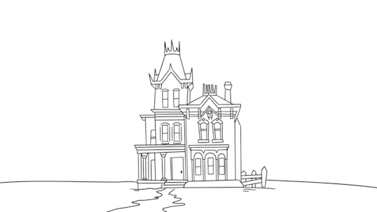
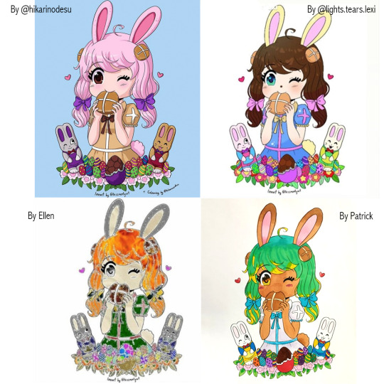
#back when i did lineart after colouring instead of before
Text
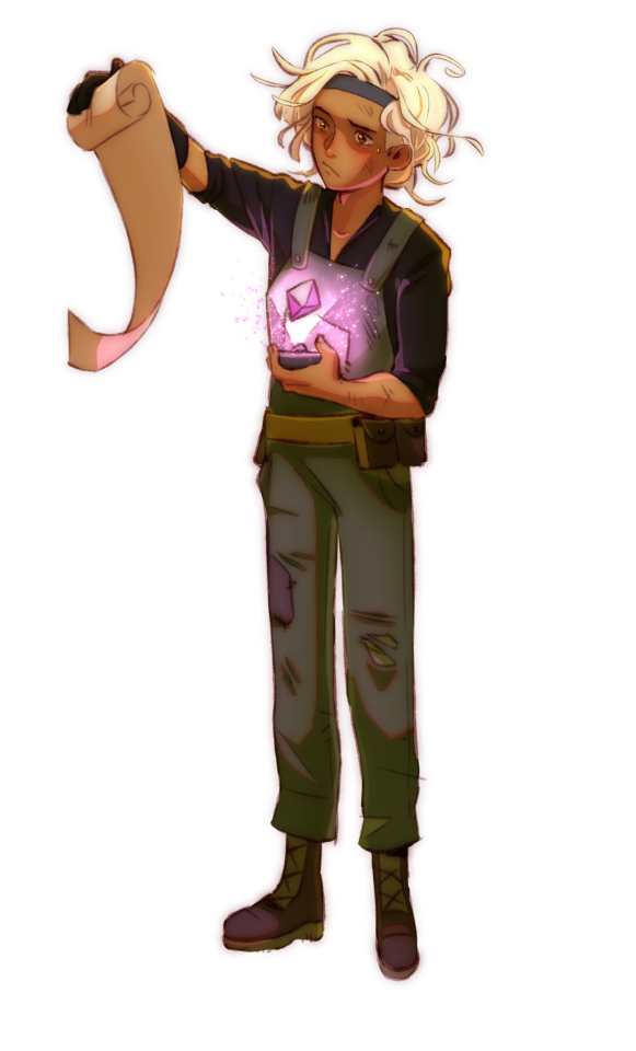
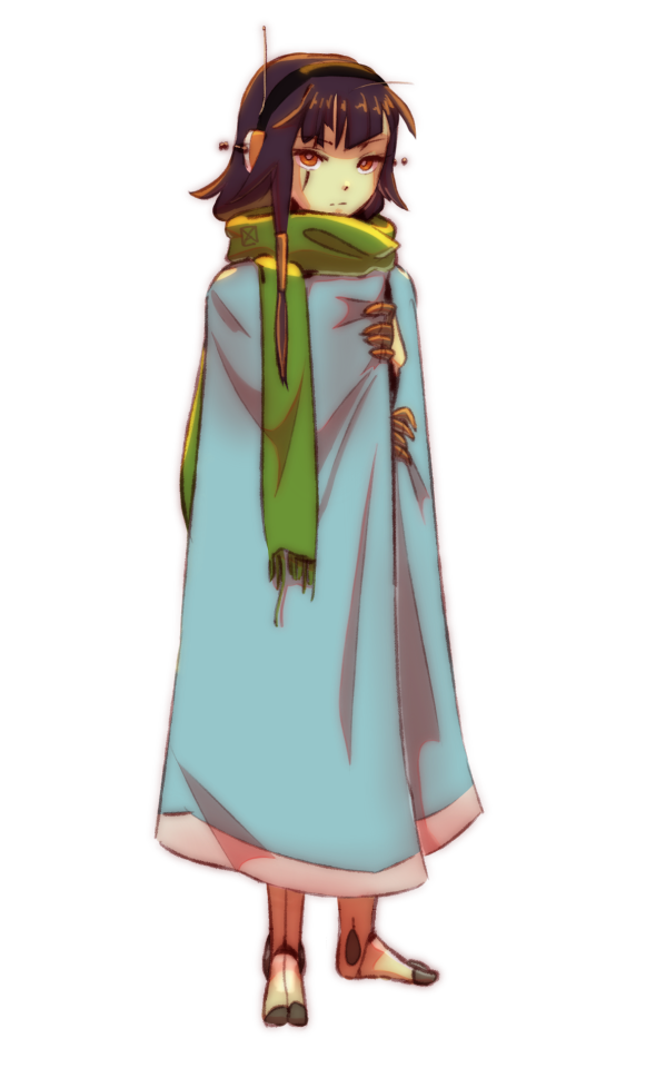
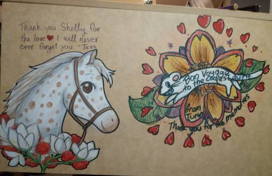
God, it's been a while since I've done digital art. If only I have a tablet, I might have an easier time drawing there instead of a tiny phone, but no use crying over spilt milk. Here's the reference sheet for Techno Branch!

Man do I love a quality drop.
I don't know how to make my drawings aesthetically pleasing like I've seen other artist do, so this is all you get lol. But anyway here's the boi!! (Ignore my handwriting, it's usually better than it is here, I just have difficty writing on a phone).
I was actually gonna make his Grey version and True Colours version, but I was an idiot and hadn't copied his lineart before I combined it with the colours. So, I might have to redo his entire lineart from scratch. Art is so fun :)
More info below the cut!
So Branch here is more dull and glow less brightly (or not at all) compared to his brethren. Probably a side effect of going Grey for so long. I doubt the Techno Trolls of today would know how to help him fully because, while they probably have a better way of helping traumatized Trolls than the Pop Trolls, they wouldn't exactly know how to bring Branch's True Colours back, as he doesn't know Techno culture and they don't know him well, and that grey Techno Trolls were a rarity in it of itself.
Back when he was Grey, at some point in time the heart on his chest was split in two due to relentless trauma. Ater regaining his True Colours did it combine again, but after being Grey for so long I doubt it'll ever be truly whole again (trauma, amirite?).
Combined with that he probably doesn't like looking at his arm lights, as it reminds him that he's different than the rest of the Pop Trolls, adding more hurt to his already painful life (yikes). So he covers it with arm warmers, and by the time he regained his happiness it became a habit to wear them.
I like to think that Branch likes being on the ground more than swimming, so he's constantly walking and climbing around. Hence, the crease marks on his fins. 'Cause I like to think that Techno Trolls are not built for long periods of standing up straight. And Branch has done the exact opposite of that. Building a bunker by himself is hard, imaging doing that with a pair of swimming flippers. My feet would cry in pain lol.
Anyway, that's all I have for now, if you have questions feel free to ask and I'll do my best to answer. With this out of the way, I can finally finish up my notes on what happens in World Tour. Hope you don't mind long paragraphs 'cause WHOO BOY lol.
173 notes
·
View notes
Text

EO3 (partial) lineup - November-December 2022
Peak MAbo is collaborating with your best friend for a(n admittedly unfair) final project (for web development!!!! an elective!!!), saying you would post it, forgetting about it for a year, posting it on Artstation and forgetting about it again.
As always, AC drew the lineart, and I colored. Designs were more of a collaborative effort between the two of us!
Probably should have shared this when the HD collection came out... anyway it's here now!
Some design ramblings under the cut :0! There's a lot i wanna share especially given that we recently did a soft rewrite that departed from the guild system entirely ^^" and EO3's cast was actually one of the first that we had, surprisingly!
Micah is quite clearly alt gladiator 3, but in an entirely different profession. instead of going into the labyrinth, he works in what i imagine would be an analogue to the forge in Tharsis (aka helping people make things busted af). It probably works best for his character, since he was always a gizmo freak even in his first iteration! geomagnetic (or submagnetic, ugh) gizmo is AC's idea!
Micah's brother, Eva, is a very loose spin on zodiac 3, but with a wayyyy lighter colour palette. Admittedly, i did steal a little bit of the spiritmaster's coat from bravely default, but AC managed to spin it back to resembling the original coat that the class had. Eva works as an astronomer, hence the little telescope he always has on him.
Next up we have Eva's protégé, Miri (who was imported from AC's stories)! Theoretically, Miri would be a second zodiac, and, after watching some EO3 speedruns, would probably be really strong in the earlygame when working with Eva in an actual playthrough. AC's design heavily borrows from Patho II's Grace, hence the coat + dress combo.

Following Miri in this lineup would be Noa, her admittedly very lazy but clingy sibling. I think it's apparently here that we didn't have much time to filter what a believable design would be in an EO setting, given that Noa's clothes were translated directly from our designs of them in school attire. It's actually funny how for we diverged from their original portrait (buccaneer 3) to the point that she is literally unrecognizable. Truly a pipeline from good sea boy to j-horror twist character.

Last in the OC section would be Masaru, who recently found work for the Senatus. Admittedly he does have another example of "incongruent time period" clothing (the jacket), though it's a lot more reworkable than Noa. We also made his design a lot less poofy and rugged compared to the original, and I mixed the base and alt color palettes as well to make him less, well, glaringly red. Probably one of the funnier things is that his clothing palette made him blend in more with the likes of Kujura, but given that they work for the same place, it'll probably work out fine.

Now we go onto NPCs, and who better to start than with Flowdia! Admittedly, her art was one of the last ones that we did, hence why her design looks relatively plain (sorry lola). Probably one of the things I would like to add would be more ornate patterns, perhaps of butterflies to tie her closer to Gutrune!

Before we get to the Princess, we gotta get through her bodyguard first! >:0 I honestly don't like Kujura because I answered honestly in his first question, and he said that I was prideful, but AC likes him so he looks really good here. He isn't as rendered here as he is in his portrait, since he was also one of the last characters we made, and I didn't really get to notice that he doesn't have as much value contrast in his clothing as Masaru does. Probably something to think about next time I color him >:0
Next up we have Gutrune!! We decided to make her look more jellyfish-like, while still keeping it a bit uncanny and unsettling. We tried to give her a more traditionally Filipiniana look (mostly on the Maria Clara gown), but we haven't yet made a poncho design that mixes well with butterfly sleeves without looking cluttered. As such, she has a more nightdress-y look here. AC drew in a few tentacles, and I couldn't help but make them look squishy.
Last but not least is Olympia! We wanted to align her appearance more with her background, hence her altered design :0 Having rips of the artbook easily accesible online also helped us flesh out her hair in particular, since we didn't want to just transplant Gutrune's hairstyle onto her.
And that's all of them!!! I'm honestly hoping to draw more EO characters, though Seyfried's design scares me (honestly the reason why I couldn't make a Reversed Emperor comic).
Currently, I've made a lot of progress on the EO4 game, and I'm excited to draw up the three N-turned-PCs + Xiuan >:'0!!! I don't think I can ever get as cool as Morika tho. If you've come this far and aren't into EO, please check out their blog!! Their art is stunning and has come a really long way :")
#etrian odyssey#etrian odyssey 3#etrian odyssey iii#idylls of the abyssal forest#gawang abo#colorist#long post#noa kazetani#miranda kazetani#gutrune#olympia#kujura#flowdia#micah#eva#I'LL GIVE THEM SURNAMES WHEN I NEED TO#honestly why i never got to finalize work on the CR x RGU series is not just because I wanted to animate it#but also because i had to give the students surnames#like ye they're ~10 characters but surnames don't come easy to me >:'000#and i'm super particular with names so :AAA:#issa trap i'd rather sidestep entirely#also if you follow me for CR... hi i'm sorry but i reverted back to my oldest brainrot to cope with thesis + the new game updates#NOT TO SAY THE NEW UPDATES ARE BAD#but i realized i cared more about crafting a story than following along the trail of another :")#i still want to work on the CR stories and animate them and put them up!#it's just that i need time to recoup i guess#community is also really buck wild. I don't think i ever got over the whiplash of them saying “we will not play *ends up excited anyway*”#it's ok if u enjoy it naman but the speed in which they get stoked for updates was like “:”D? i thought we were protesting. what y'all doin#i'm sorry if u read thru all these tags and saw me processing my trauma with the cr fandom#i'm doing a lot better now!!! please have a good day as well and take care of yourself!
23 notes
·
View notes
Note
May I ask how you do those screenshot edits?? I think that's what they're called?
I actually did a whole tutorial back about 2 years ago, but since I've changed some of my tricks I'll do a new one for you anon!
Before I start, this is all done with Paint Tool Sai. I don't know how to do it on other programs, so this will follow that program.
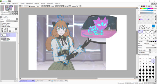
So first, you need to pick the screenshots you wanna use for whatever you wanna edit! Since I'm doing one right now for my Ever After!Penny AU, I'll go step by step with that.

Now that I've got the screenshots I want, I erase the background and move the characters where I want them in the edit. Here, I want Penny gesturing to Curious. I also shrunk her head so it's not so bobble-like, and reduced the gap between her eyes.
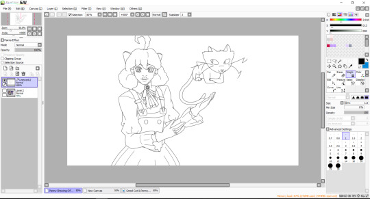
After that, you'll wanna sketch out the lines for the new design. This is also the time you'll wanna change the body shape and such if your character has a different body shape, especially given the super thin figures the girls have.
It does not have to be super neat, just enough that you can then put down the cleaner lines.

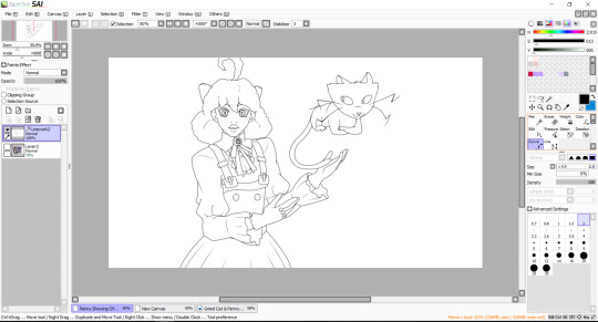
Now is when you put down the final lines for the edit. I used to use 0.7 width on the curve tool, but now I use 2 width instead. When you're done, you change the width of the eyes and certain lines like the bottom lip/cloth wrinkles/hair puff.
The eyes are bigger at 3 width, while the other lines are 1. It gives more variety in your linework. It should look like this:
After that, using the pressure tool, you'll pinch and widen the lines. Typically you pinch the end of the lines like the end of folds, while I widen some parts of Curious' whiskers to vary the length.
So it'd be like this when it's all done.
Now it's onto the colouring. Make a new lineart layer, put it under the main lineart layer, and jot down the lines for the eye whites and the shading for the eyes, like this:
This just makes it easier to colour in the face and the eyes without the colours trying to mix together.
Before we start the colouring phase, a point I wanna make is that put any layer that has lighter colours under the layers with darker colours. It doesn't do it if the lineart is thicker, but if you don't, you notice some bleeding between the colours, especially when you zoom in to colour and shade.
It's not awful but it is annoying so, best safe than sorry.
You can also make a folder and label it after the character you're colouring in, so that all the layers are in that folder and makes it neater, rather than leaving 743274893274 different layers to scroll through.
With the flat colours jotted down, we quickly go to Curious for a second, since they're coloured in a bit different to how I colour in other characters like Penny.
I make another lineart layer in their folder and line out their markings. Once that's all done, you can colour it in! It also works when you have designs on clothes that have coloured outlines, as then you can shade and highlight over it without having to remove the lineart underneath.

Since Curious doesn't have any shading, they're all done. But if this was a pattern on another character, I would clip another layer on top of the pattern layer and use overlay so that the highlight colours match the colour underneath.
Back to Penny, with the flat colours done, create another lineart layer under the main lineart layer and, in a colour different to the character's colour pallete, line out the shadows on them. At this point, it's best to figure out what background you want so you can match the light source with your characters.

When that's done, you can start putting down the highlights and the shadows to give the character depth. I use a highlighter colour, a base to shadow colour, and then a shadow colour.
Changing the contrast between the highlight/base/shadow would give the art a different texture. Penny's skin would have a softer contrast compared to the leather of her chest piece to the metal of her bow and buttons.

I leave her hair to last as Penny's hair is shaded different to how I shade other's hair. Since she has an afro textured hair, I use a range of orange-yellow-red to shade it in using the pen brush and blur.
And that's the last thing for the actual drawing process! Now you put the picture on a background, which is from the Paper Pleasers episode for this piece.
Compress the lineart layers with the colours too, as that's necessary for the next part.


The first layer is a multiply layer with the colour that matches the lighting of the background. The easiest way I get this is to colour drop the whites of a character in the screenshot I use. After that, clip another layer and apply overlay on.
With the same colour as the multiply, put down the highlights where the light would be hitting the character, and blur it in.
And that's it! After that, you can add any details you want to the piece, which I did with some anime style highlights around Curious here.
The finished piece is here, and thanks for reading this far! I hope it helps!
16 notes
·
View notes
Text
the take
notes from the class:


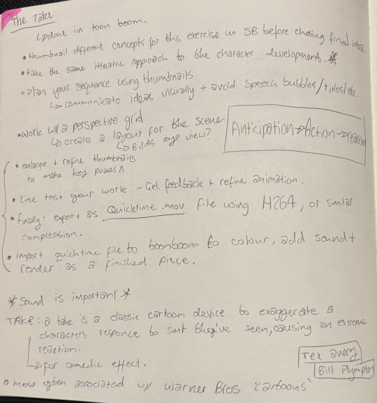
For the take the standard structure of it is the anticipation, the action, and the reaction.
For my take, the animation is set in a haunted / abandoned house and the character will see various creepy things, before getting a big scare from a shadow that grows and then it ends up being just a little mouse with a top hat that comes through the door.
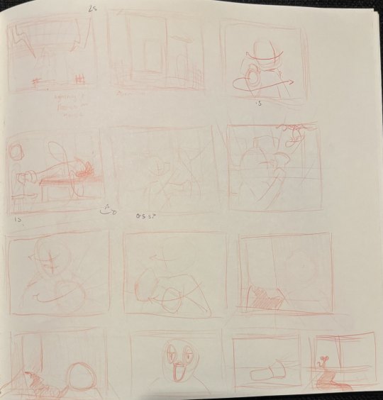

Here is the rough / thumbnails for the animation. I am completing this animation on toonboom harmony at 24 fps, I will be animating most of this on 2s and 4s, using 1s when necessary for quick actions.
In this animation, I want to try making use of some dramatic lighting and using the torch and the light from the doorway to create a nice effect with it.
After recieving some feedback on the various shots in the animation I have adjusted the timing and order of some of the shots for the take and am now happy with the thumbnails and will start sketching the animation out now.
I reduced the amount the camera zooms in the first shot of the house, and moved the spider so it was the reason he turns around and not just after he looks at the dripping tap. I also changed the camera angle a bit so you just see him holding the torch when looking at the door making the camera seem closer to him instead of having the over-the-shoulder shot.
Once I got the thumbnails for the animation and my ideas sorted I then worked on the character's design and made a few little reference sheets to look back at while animating.
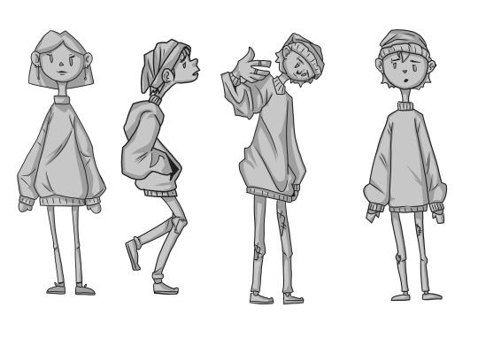
i went through a couple design ideas - testing if it should be either a boy or a girl. I ended up deciding to go with the boy. i did think these original designs reminded me of the characters in a game called papas cupcakeria, so I ended up changing them a bit further and ended up with this:
-----------
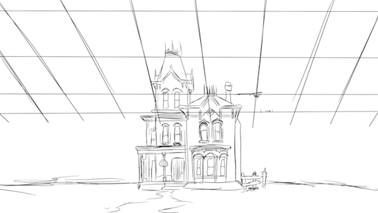
My toonboom files ended up corrupting and I had to start again working from the video I had with the thumbnails, I ended up importing the movie to a new Toonboom file and then tracing over the sketch to create the background.
After drawing the line-art for the background it looked like this.
I then did the lineart for the face, starting with the key poses and then doing the in-betweens.

then after animating the head, I did the same process for the hat and the hair, putting in the keyframes and breakdowns first and then doing the in-betweens.
And then doing the same process for the body again.

I then did the lineart for the hands, and then filled with flat colours. i also used nodes to set one of the layers to an 'add' blend mode and then used a softer airbrush for the torch shine.
Using the nodes, I also set the shadow coming out the door to a multiply layer.
Then finally to finish it off i created new layers for shading each section that my animation was split into and adding shading using multiply nodes on the layers and using cutting noted so they only affected the colour of the animation.

then after finishing the shading i had one layer over the background set to multiply to darken the background and then one layer over the top of the whole animation set to overlay to give it all a cooler tone.
I also added lightning using the same method as the torch light and adding them as an add layer.
I animated the lightning as straight ahead.

This was my node setup once the animation was finished.
Then finally added the sound effects to the correct places. I got all my sound effects from pixelbay.com .
and this was my final animation:
0 notes
Text
FAQ
~~~~~~~~~~~~~~~~~~~~~~~~~~~~~~~~~~~~~~~~~~~~~
1.0 TOOLS
.01 What materials/programmes do you use?
iPad Pro 2020, 12.9” with Apple Pencil Gen 2
iOS Procreate (drawing process)
Photoshop 2022 (post-edit process) + XP-pen Deco 01 (v2) tablet
.02 What brushes are you using?
I use a combination of brushes released by Lotusbubble, JingSketch, Jeremy Fenske, and Devin Elle Kurtz.
.04 Where would you suggest I learn about…
anatomy: Morpho Anatomy books, life drawing classes, pinterest, theposearchives (dA)
colour theory: Marc Brunet’s tutorials, Colour.adobe resources
character design: Marc Brunet’s tutorials
.06 Art book recommendations?
Here’s a list of my favourite books:
Creating a Champion (The Legend of Zelda: Breath of the Wild)
The Art of Raya and the Last Dragon
The Art of Encanto
Tokyo Storefronts by Mateusz Urbanowicz
The Art of Heikala by Heikala
The Art of Kiki’s Delivery Service
.07 Do you do tutorials?
Not at the moment. But in the future I would like to do tutorials on my Patreon page.
2.0 Art and Bee
.00 Who are you even?
I am a very short girl, who enjoys drawing fandoms such as Harry Potter and The Legend of Zelda. As of now, I am 26 years old, and I work as a freelance artist and ESL teacher. I LOVE peach tea.
.01 Did you go to art school?
No. I am self-taught. I actually have masters in chemistry. I dropped out of my Chemistry PhD in my first year because I realised that science is not something I want to pursue in my life. I do not regret studying chemistry though - it was a very interesting and valuable experience. Would I have the chance to choose now though, I’d go study degree in Illustration.
.02 Who are your favourite artists?
Here are some that I often turn to for inspiration:
Mimimaru, Heikala, Mateusz Urbanowicz, Ladowska, Mehkuni, Devin Elle Kurtz, Marc Brunet and many others.
.03 How do you motivate yourself to draw every day?
I really make sure I draw what I enjoy. There are days I wake up and I do not feel like picking up my pen. When this happens, it is about time to turn back to studying. I go to my Morpho books, youtube tutorials and my favourite artists and I dedicate the day to anatomy studies, colour theory etc. That way I do feel accomplished although no illustration is done in the process.
.04 How to get out of art block?
Take a break. No seriously. If art frustrates you, it is time to put it down and take-a-well-deserved-break. I hit the wall 2-3 a year and usually, it comes after a big project or when I refuse to pace myself.
This relates to the previous questions, but when a time like this hits, I often restrict myself to no art for up to 3-5 days. Instead, I go back to passive studying - watching tutorials, watching an animated film, reading some books, playing video games for inspiration.
Sometimes it also helps to switch a medium. So for example I go from digital to traditional.
.05 What is you digital art process like?
I start with light gesture drawings followed by detailed soft lineart. Then I shade in black and white. When this is done, I turn the black and white sketch to red (using curves) and with multiply layers, I block in the basic colours. Then I create a normal layers and I begin to paint in all other details. I often finish the background first before I move on to the characters.
.06 Why don’t you do traditional anymore?
In 2020 I had to move to my parent’s house for 4 months while I was recovering from an illness. I had to leave all my traditional media in my flat in a completely different country. I only had my old iPad with me, which was the only way I could do art. I have been drawing digitally on my iPad since.
Once in a while, I still use the good old pencil and paper, but I found that digital painting gives me great creative freedom and helps me to visualise my light-up fantasy brain cells. hahaha
In general - I just enjoy digital painting more at the moment.
I still do oil painting once in a while tho!
3.0 USE OF MY ART
.01 Can I use your art for my pfp?
Yes, BUT! Please do message me for permission and make sure you credit the art appropriately.
.02 Can I use your art for bookbinding fanfictions?
Now - please read this carefully.
I ONLY allow use of my art in fanfiction bookbinding if it’s a NON-PROFIT bind (ie only cost of materials is paid for). Please DO message me in dms (ig, twitter, tumblr) if you want to use my art in your binds. The chances are most likely I will say yes and be very excited to see the outcome!!!
4.0 COMMISSIONS
.01 Are you available for commissions?
Yes! You can find the link to all the details here.
.02 Why are your commissions so expensive?
I only charge for labour and the time spent on the commission. For a full-illustrated type of commission, I can spend up to 30 hours working on it, hence the high price.
.03 How long will your commission take?
I ask for my customers to count with 2-4 weeks from the date the payment is received. This is because often I have a couple of projects before I commence on your commission. I also count in any unexpected events such as an illness, my teaching job hurdles, art block, and inspiration dips.
.04 What you will/will not draw for me?
Will do: humans (fanart, OCs, irl), pfp’s, larger illustrations, and character designs
Will NOT do: nsfw, fetishes, gore, mecha, furry, animals/pets, hateful art, ships I am not comfy with
1 note
·
View note
Photo


I already posted this card on main a while back so I thought for this blog I would share a little bit of the in-progress stages. I did originally have the full version of the knotwork behind François but lost the screenshot in a discord purge... rip
Thoughts & process breakdown ⬇️
Anyway the way I approached this was to first set out all me symbolism. In this case it’s the wheel of fortune so it’s about breaking cycles. François is linked by bloodline to a living weapon, his bow, who is also a snake (kind of), and the snake would have continued endlessly perpetuating an ancient war if our man François hadn’t stopped it and essentially opted out of ending the central conflict of the book with violence. So the snake/bow/oroboros is the wheel of fortune here, and François is pictured talking to it instead of using it to fight. i don’t think i did a great job with the actual central figure here lmao i was a little more focused on the embellishment. I think my historical art style influences are pretty obvious, you can see in the sketch that I was going in a different direction for the 4 funny guys in the corners but when i was doing lineart I decided on a new route (i freehanded those)
The four creatures in the corners are set dressing because in the normal wheel of fortune card there’s just some guys hanging out. The top two are the important ones - top left is one of the creatures that François befriends and heals at the climax of the book, and it’s a manifestation of generational trauma tied to certain werewolf bloodlines. The bow hates werewolves and would rather wipe out those monsters, but François instead goes and just kinda hangs out with them (he is a very chill guy). Top right is his own werewolf form but separate from him because a large part of his journey was fighting the bow’s assertions that his lycanthropy wasn’t a natural part of him and was something to be crushed down and disregarded, but he ends up accepting it too.
idk who the two guys at the bottom are
So when I decide on the layout of the card I do up my sketch. If you look closely you’ll see that I used the exact same brush for sketch and lineart lmao (6B pencil my belovéd). Then i plot the colours under the sketch and then go nuts with curves/levels/gradient maps/anything i can use to produce a nice palette. and in this case it took foreverrrrr because i was waffling hard between having pink or gold to contrast the blue (as u can see i ended up veering towards gold). Then i draw my silly little lines and doing my flats, which I never use colour adjustments on (since I already did that stage in the sketch) and I think that took me like 2 days. I totally forgot to darken the lineart on his face so that’s why it’s like that (oops). After that I flatten it.
To get the old print look, I first edit the levels a bit so that there’s no bright white and there’s a slightly faded blue tinge like it’s been out in the sun for too long. Then I add chromatic aberration (displacement) and then noise at 4%, then i duplicate the layer and on the duplicate a gaussian blur to about 5%, then lower the opacity to less than 20%
I use mostly default brushes and the true grit texture supply free trial pack lmao. This was from before I discovered the life-saving properties of colour shifting brushes so all colours were done by hand.
If i could change anything it would be the oroboros.. the colours in particular don’t match the tone of the rest of the pic and it stands out a lot to me. i also probably should have put more effort into François himself
#thinking about him today#setting: inver#(no tags for publicity on this one since it already got a bunch of notes on my other blog)
54 notes
·
View notes
Text
Agapanthus - Art Process! (Part One)
Lemme just say - Agapanthus is by far the most hardest track and art I’ve ever made. Like sleep was basically non-existent here-
Step One: Rough Draft
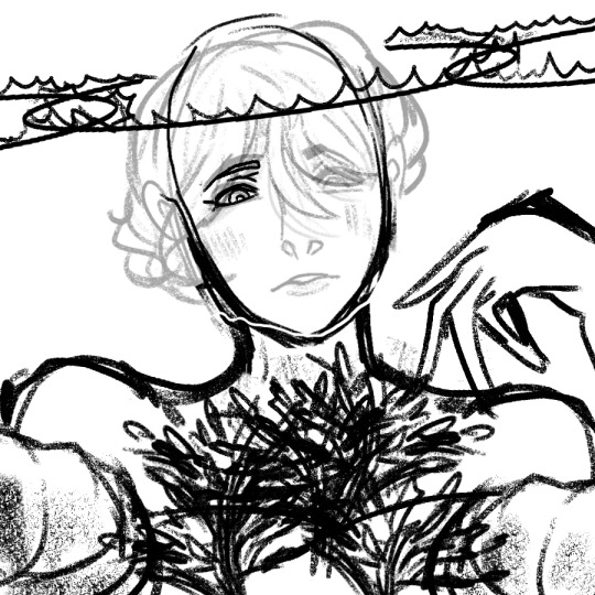
This was created on December 27th - around 4 days before the release of Agapanthus, I believe. However I’m not gonna lie, this is looking pretty horrible. I’m glad I didn’t even continue with this reference ( 。_。) .
I remember using myself as reference, but that wasn’t really working out. I really wanted Vil to have an intimidating look to him, and he’s just staring you down - underestimating MC/Yuu. But I realized...
That isn’t Vil. Vil isn’t like that at all, and it completely changed the idea about him. So I decided to change the expression and pose that Vil was making and start it all over instead.
Step Two (1): Rough Lineart + Cleanup (Head)
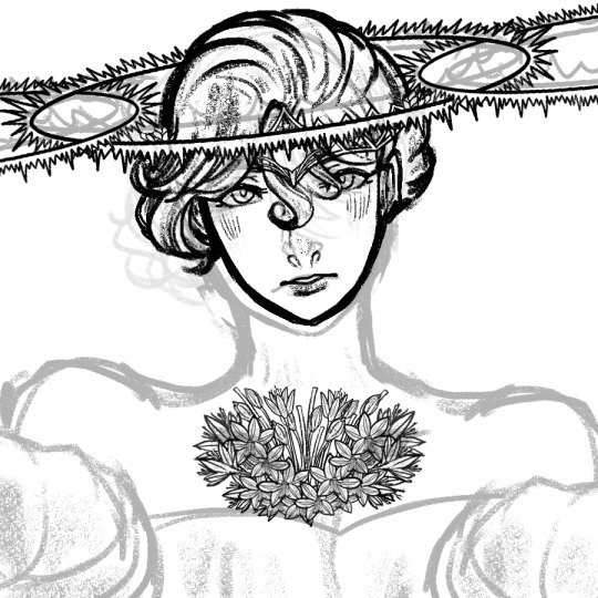
Okkkkkkkkkkkkkkkk....
I had to change and redraw a lot of the pose I was making! It was incredibly risky, but I had to do it anyways!
Just for you guys, I made sure to break it down a bit more so you can see what’s behind the scenes in more depth...
I did the head in the following order:
(1) Head
(2) Eyes, Nose, and Mouth
(3) Hair
*(4) Halos - Zwei (middle)
*(5) Einz (left), Drei (right)
(6) Crown - I used the crown from The Aphrodites and add it to his hair heheheh
(7) Agapanthus #1 - THIS ONE TOOK ME LIKE 6+ LAYERS TO DO LOL
*For Step 4 - I split the structure of the halo into two layers: A circle, and sharp pointy things before merging the layers together. I made sure to not let the pointy areas overlap with the circle. Lots of Control + Z was used here LOL
As for Step 5 the halos can be one or the other, I don’t know which one I started with at the time.
For his expression, I must admit that I don’t like it. It makes Vil look puzzled, or dumbfounded yet...a bit hopeful. But after seeing what happened to Step One, I decided to go along with it (:P).
< Note: For Step Two, I did the rough lineart -> cleanup for each part - so that’s why I merged Step Two and Three together. >
Step Two (2): Rough Lineart + Cleanup (Agapanthus AND Crocus)


OH HELP ME NOW LOL (˙ ͜ʟ˙ )
I’m sorry, this part was the most longest things I’ve ever taken when it comes to lineart. I’m sorry.
Seriously! This was one of the longest because it was not one flower, but a BOUQUET of flowers!!! I remember my back hurting a lot and didn’t getting enough sleep as a result...this took me 12 hours to finish just the bouquet alone.
Apologies for the detail below!!!
Note: For some information, I won’t go into detail since it’s impossible to see with the picture above due to the picture limit.
(1) Drawing the Flowers:
(1) Agapanthus (wide, inward, middle flowers)- This took about six layers to do the following:
(1.1) FLOWER (DRAFT) - Here, I drew the basics of its form and its shape. I drew a donut-like shape and short piece of the stem before doing the lineart.
(1.2) Flower (Lineart):
(1.2.1) Flower - Lineart - OPEN FLOWER: I did the five petal shaped flower first, then refined it to have a finished look.
(1.2.2) Flower - Lineart - CLOSED FLOWER
(1.2.3) Flower - Lineart - UNBLOOMED FLOWER
(1.2.4) Flower - Lineart - STEM STICKS (idk what to call it) - and that’s it!
(2) Crocus (outward, left and right flowers) - I have the full process of this, so here it is:
(2.1) FLOWER (DRAFT)- I made sure to do a rough outline of the shape so I could have an idea of what I was doing, and make sure the flower was proportionate to the track cover.
(2.2) FLOWER (LINEART) - This is where I drew the lineart and added detail for the petals and their design (at the same time).
(2.3) STEM (DRAFT) - Even though I don’t have it in the art file, I believed I did it to make sure it was proportionate to size of the flower.
(2.4) STEM + LEAVES - This is when I did the lineart and added the details (at the same time). I then did the leaves as an additional design.
(2.5) MERGE LAYER OF STEM + FLOWER- and it’s finished!
(2) Cleaning up the Flowers:
The cleanup took the longest, since you have to erase the details of the flowers that was overlapped. Took the longest out of the 12 hours.
(2.1) Agapanthus:
(2.1.1) AGAPANTHUS - MIDDLE OF PAINTING/CENTRE (one touching Vil’s face)
(2.1.2) AGAPANTHUS - MIDDLE/CENTRE: LEFT (touching Vil’s left shoulder)
(2.1.3) AGAPANTHUS - MIDDLE/CENTRE: RIGHT (touching Vil’s right shoulder)
(2.1.4) AGAPANTHUS - BOTTOM OF PAINTING: LEFT
(2.1.5) AGAPANTHUS - BOTTOM OF PAINTING: RIGHT
(2.2) Crocus:
(2.2.1) CROCUS - TOP LEFT
(2.2.2) CROCUS - TOP RIGHT
(2.2.3) CROCUS - BOTTOM LEFT
(2.2.4) BOTTOM RIGHT
Step Two (3): Rough Lineart + Cleanup (Upper Body)
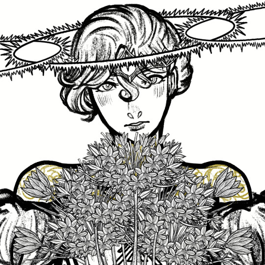
As usual, I love the lineart more than the final product (˶′◡‵˶). Especially this lineart - it’s rather mesmerizing to me!
Even Vil without colour looks absolutely beautiful...I love him (I’m starting to stan him (kind of))
But anyways! Here is the order I did the body in:
(1) Head (already completed by then)
(2) Neck
(3) Neckish Shoulders (I don’t know what to call them - his toned necked muscles??? But it’s located around his neck)
*(4) Shoulders
*(5) Lower Body
*(6) Golden Details + Corset!
*For Number 4, I had to do multiple attempts because the shoulders weren’t proportionate to his body. I remembering 2 - 4 layers before choosing a final rough draft to work with.
As for Number 5, I also had to do multiple attempts as well because the original rough draft was not proportionate with the pose above. I did two rough drafts (I believe), but I don’t think I used them - I worked with the layer that looked the best.
For Number 6, the golden details were originally in black, but I used the Fill Tool and a bit of erasing and adding to give the final look above. I would say cleanup was the hardest thing for the details, since it heavily overlapped the Agapanthuses and Crocuses...
<>
Thank you for reading this whole post! A Part 2 will come out in the next few days, so please stay tuned.
ALSO THE CLEANUP FOR ME SUCKED LOLOLOL. I CAN REMEMBER THE PAIN (◎ܫ◎ ◎ܫ◎ ◎ܫ◎ ◎ܫ◎ ◎ܫ◎ ◎ܫ◎ ◎ܫ◎)-
Have a wonderful day you guys! :D!
#TWSTxDAL#TWSTxDAL art process#twisted wonderland#twst#date a live#pomefiore#vil schoenheit#twst vil#bruh this took me forever and a dayyyyy#I was kind of rushing on Vil but honestly he's looking MIGHTY FINE#plus it's 11 PM and I'm hoping for the best for my poor soul :)))#I'm gonna admit that Vil was a sTEP uP of my art process and my tracks#though the piece is a double sword for me - I love it and hate it (but love it)#anyways bye now! AND I'M SO SORRY FOR NOT UPLOADING ANY ORIGINAL CONTENT#it's just that work and school isn't working well...but luckily I'm getting a break!#...soon...
6 notes
·
View notes
Text
2020 year in review
It’s funny, last year I never actually got around to doing one of these. I didn’t think it was overly interesting. Oh 2019, how I miss you so 😭Such an innocent time ....
I’ll do a quick recap, cause hey no-one but me reads these anyway. 2019 was a glorious time. I went to Italy for the first time, went on an awesome Hunter Valley trip with my friends, had a 100th birthday celebration for my pop, I got to see the show I worked on air on TV, we saw the Lano and Woodley apartment in Melbourne .... Good times!
I didn’t give a rats about being unemployed and took matters into my own hands by making loads of new merch and selling at the most conventions I’ve ever been to. I tabled at Sydney Supanova, Adelaide Avcon, Sydney SMASH, Coffs Nexus Con, Sydney Oz Comic Con and Brisbane Supanova! I did so much travelling and events, it became my full time job. It was exhausting, but it was loads of fun, it paid the bills nicely, and it was wonderful to meet followers and mutuals in person.
My partner was very invested in counting up the numbers of what was selling and what wasn’t, and taking note of what was inconvenient with my setup and how to make it better. He even made a powerpoint presentation on what I could focus on for 2020, what kind of merch I could focus on and adding more conventions to my list. We were both excited about the idea of trying out Armageddon in New Zealand, which would have been my first overseas convention!
Cue 2020.
It started off uneasy. There were still bushfires everywhere and smoke hanging around, but I was optimistic they would die soon and the rest of the year would be fine. I booked a bunch of conventions early as usual. Got a whole bunch of new things made and ordered for the first convention of the year, Melbourne Supanova in early April. Some Acrylic charms didn’t make it in time because of COVID, but I thought that’s ok I still have a whole years worth of conventions to sell them at!
COVID-19 was just a spooky mysterious thing that was happening overseas at that point. I think there might have been 1 case in Australia, so all the toilet paper and hand sanitizer was sold out, but we were still able to do our usual travelling for the event. Little did I know, Melbourne Supanova was the first and last event I could do in 2020.
COVID hit Australia hard, Melbourne especially. There were lockdowns, quarantines, planes were grounded, airmail was halted, the cases kept multiplying, rules kept changing and changing and it was all so new and such a headache. Seeing every single convention I had booked cancel one after the other was hard to process. This was my main source of income in 2019 and now it’s up and vanished. Everyone were losing their jobs too, so the idea of getting a new job was completely out the window.
I tried to cheer myself up by drawing ‘Toilet Paper Chan’, my new magical girl character who has the ability to summon toilet paper in a time of need 😅
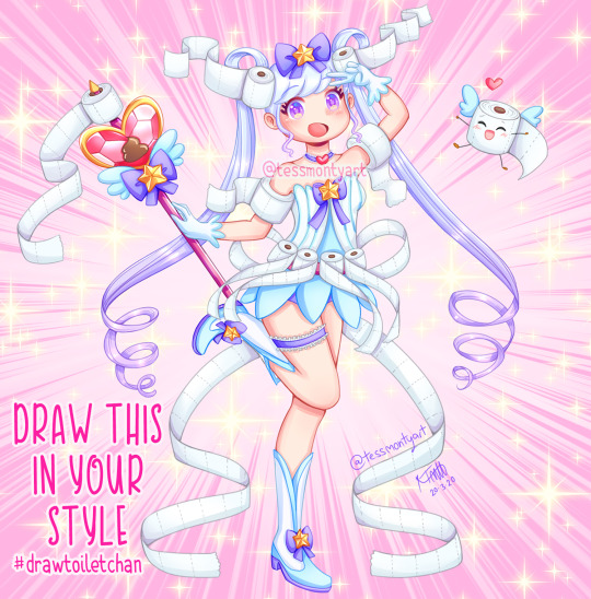
I made it into a Draw This In Your Style challenge, seeing as everyone was bored out of their minds in quarantine I hoped it was something people could pass the time and have fun making.
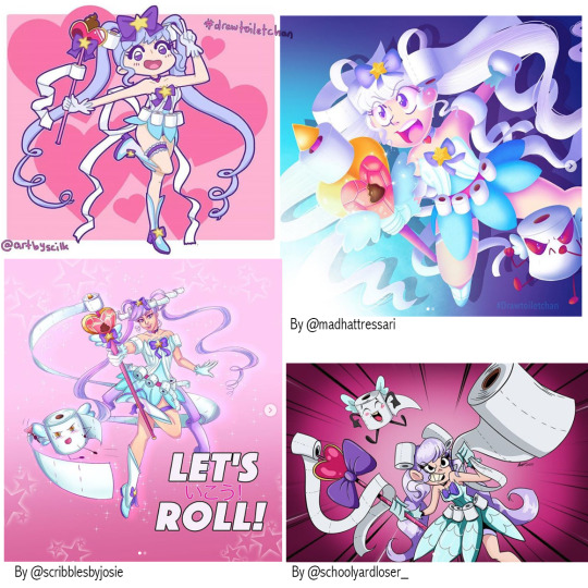
(here’s a handful of my favourites) I had a few entries which were all very adorable, but I admit not as many people joined as I expected. I don’t blame them though, this whole pandemic was very soul sucking and demotivating, especially hearing the constant stream of bad news when it all started.
I also made some lineart of a cute Easter girl, encouraging people to colour her in if they are bored in quarantine.
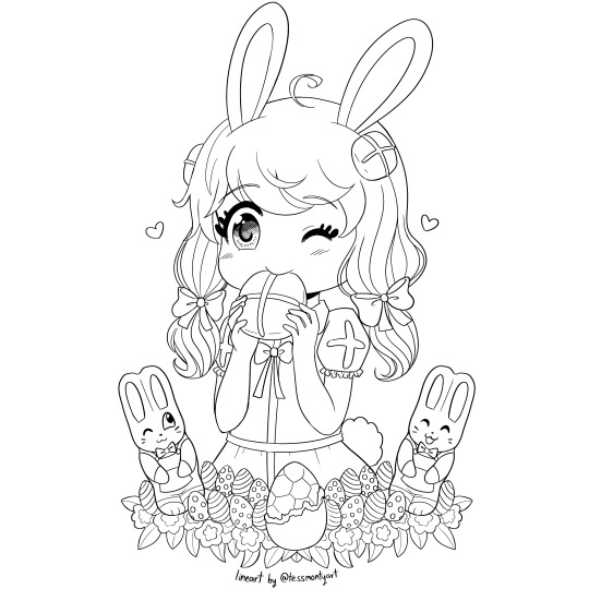
That was really fun, and I planned to do more, perhaps whole colouring books for a small price to download.
Then, out of nowhere, my friend from the last animation studio I worked at in 2018 contacted me. “Hey Tess, are you looking for work?”
“Um .... yes?”
Work? In 2020? What?
It turns out the animation industry is one of the only industries that are doing fine in the pandemic. Literally the only change is that animators have to work from home instead of at a studio. If you have the animation software and an internet connection you have everything you need.
So my good friend had recently scored this job for a studio which outsources all their animation for their animated TV series. The role is just fixing up any animation errors inhouse to minimize the amount of back-and-fourth between studios. It doesn’t sound like much but it became too big a job for just one dude to handle, so he contacted me and 2 of my other animation friends to help out. We had a ball!
It was loads of fun, and the contract lasted the whole year!

It wasn’t just fixing up errors either, I got to animate walking/ running / jumping / flying cycles for the overseas animators to use, which was great practice for me, and we even had a whole episode to ourselves to animate from scratch which I really enjoyed.
And then ... the year just flew by, because I was busy working the whole time. It was really quite surreal!
There were a few highlights, such as being a bridesmaid for my best friend’s wedding and organising her hens party, which is one of those once-in-a-lifetime things.
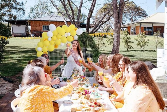
(Hens Party - it was yellow themed (her favourite colour) and High Tea.. it was adorable!)
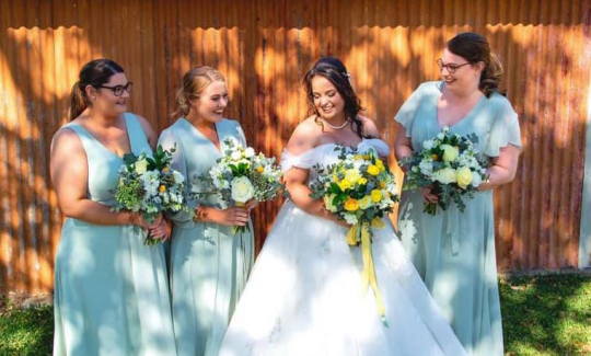
(The bridesmaids and the bride on the Wedding Day)
Unfortunately there were some lowlights too ... This was the last year I got to see my aunt.
She was the craziest, funniest aunt, and still far too young to go. I honestly don’t think I’ll ever be the same without her.
As always, drawing is the only way I cope with anything. My family chose a plain wooden casket, encouraging everybody to write a message or draw something on it, before it would be sent to the crematorium. I drew Spotty, her awesome horse I remember from my childhood, surrounded by her favourite flowers. Monty draw Mingus, her awesome ferret we also remember from our childhood.
That wasn’t the only bad news either. Pat’s Grandpa passed away later in the year, and a handful of my friends had relatives who either passed away or were diagnosed with cancer or some other horrible life threatening disease. A musician who collaborated with favourite artist collaborated passed as well, and even though I didn’t know him personally, it was still horribly devastating. Not to mention all my friends/relatives pets who didn’t make it through 2020. There was just so much loss this year, and I’m still grieving my cousin and my friend’s mum who both passed last year, it’s getting harder and harder to cope. It’s gotten to the point where I’m paranoid about who the next person will be because I haven’t finished grieving the last ...
All I can say is I hope 2021 is a little kinder when it comes to my loved ones.
The small light at the end of the tunnel is; any suicidal thoughts I used to have frequently have all completely vanished, because I’ve been faced with the reality of it all. You really don’t realise how many people love you, people you don’t even know.
...
That was very dark, but it’s definitely something I needed to get off my chest.
Lets go back to a much lighter note.
More highlights:
🌻Animal Crossing New Horizons came out this year! I used to play Wild World back in the day so it was wonderfully nostalgic, and me and Pat have made the cutest little town with all our favourite villagers. It’s a nice way to escape from it all ^_^
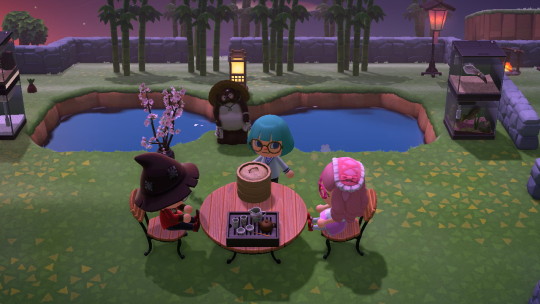
(Monty’s island when we started)
🌻Speaking of games, the brand new Crash Bandicoot came out this year too! It was actually jaw droppingly amazing seeing all the awesome new ideas and mechanics they came up with while still keeping it classicly Crash. I loved it and I’m so excited to see if they give Spyro the same treatment!

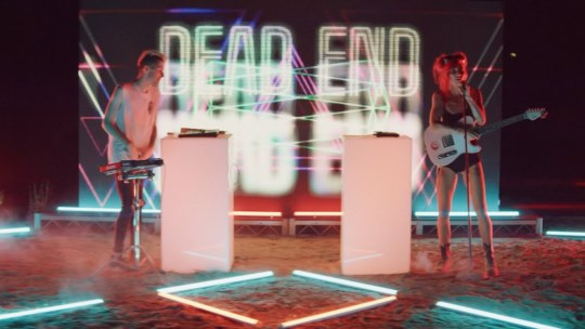
🌻2020 brought about new and interesting ways to still enjoy Live entertainment. Lano and Woodley did a Zoom show which was absolutely hilarious, and Lights did an amazing online Dead End show which had me so pumped!
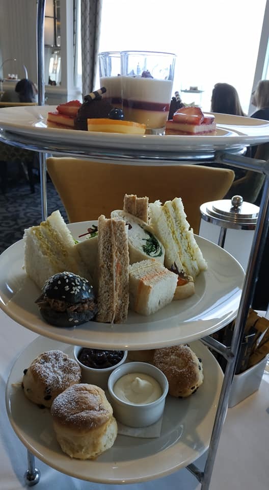
🌻Pat and I continued our anniversary High Tea tradition, this time trying it out at the Hydro Majestic hotel in the Blue Mountains!
🌻Speaking of Pat, his sister got married this year too, despite the pandemic. Congratulations!
🌻Pat randomly bought a Miku figure for himself, out of the blue, completely unravelling years of unnecessary ‘shame’ I’ve inherited caused by a pushy mother and a crappy ex. I used to love figure collecting but was convinced by certain judgy people that it was stupid and I needed to sell them all. I kept my very favourites in a cupboard ‘just incase they increase in value’. But now I can finally display them all again knowing Pat loves them just as much as I do!
We also added a ton more to the collection to make up for lost time (and because there’s SO MANY CUTE MIKUS NOWADAYS)
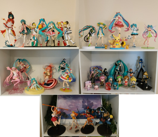
It’s a bit messy because we recently got new ones and need to make more space for them. The shelf with the Vocaloid nendoroids were my original ones hidden away in the cupboard, the rest we got this year ^_^ They make me so happy!
🌻Speaking of Pat unlocking things I’ve always wanted to do in the past: I am now planning to revive my old OCs Yui and Lotto! They were just characters of mine back in the day, but since I’m not good writing I never really came up with a story for them. But with Pat’s writer wisdom and my kawaii art style, I’m now planning a webcomic featuring the two cuties ^_^ It’s still in the very early planning stages but I’m super excited, and forever grateful for Pat, for believing in me ;w;
🌻This year I drew 31 more Owl City songs in copic markers, to go towards my ongoing project to draw every song! I’m actually getting quite close to my goal now which is exciting!

🌻This year I went to a Drive-In movie theatre for the first time to see the new Bill and Tedd movie, it was glorious and now I wanted to try more drive-ins. Going out to see a movie on a big screen *without* being able to hear smart-asses or screaming babies? Yes please!!
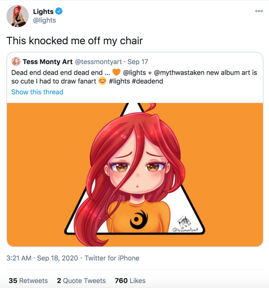
🌻How could I forget, this was the year my idol noticed me!! Lights shared and retweeted my Deadend fanart! Life = made.
What to to look forward to in 2021:
This is the first New Year where I actually have an idea of how 2021 will go! I managed to secure another animation job at a new studio starting January, ending January 2022 😊So thats the financial security for this year sorted! :P
As for general goals for 2021;
I’m hoping to have a decent plan, concept art, chapter ideas and hopefully even a script done for my new webcomic! I also wanted to make some cute simple animations of the characters just because c:
I’d also like to just do more of my own animation in general ... I animate every day for work but I never get to do my own animated projects. It will be hard with a full time job, so maybe this can be a 2022 goal ... but hopefully I can do at least one little animation of my own!
I suppose another goal is to make a social media accounts for my animation, too. Even if I don’t fulfil my goal, I still would like a page to showcase everything I’ve done so far.
And if all else fails .... Another goal is to draw more Miku. It’s crazy that I love her this much and haven’t drawn any fanart!
I think I’ll leave it there because I’m babbling now. 😅
I’ve done so many of these now o_o
[2018]
[2017]
[2016]
[2015]
[2014]
[2013]
[2012]
4 notes
·
View notes
Photo
Gravitační traktor
This lineart is almost exactly one year old, drawn at the last winter school. (The one where I drew all those Arig x Krevel sketches.) It’s A4 in size, so it’s been uselessly sitting in my lineart folder since I didn’t have the guts to colour it traditionally. Today I was on a roll with my tablet, so I thought: “Why not colour it?”
I must say, I am pleased with the result. After an all-day-long practice, I found a neat way to shade in MyPaint.
1) Fill in the base colour. Tools: “bulk” pen and bucket. (I thought MyPaint didn’t have a bucket until today, but it does, and once I assigned a keyboard shortcut to switch between freehand drawing and the bucket, the colouring became almost as fast as in Sai. God bless Sai, I still miss it.)
2) Add a “burn” layer filled with middle-grey. Tools: “bulk” pen, bucket and “blend+paint” tool to dissolve the cell-shaded edges. (For lack of experience, I am terrible at “paint” shading. I am, however, good at cell-shading, so I combine the two.)
3) Deepen the shades with a “darken” layer below the burn layer (this one is colourful, matching the base). Tools: “blend+paint” tool.
The trick is that the two shading layers synergise. The burn layer effortlessly deepens the shading and the darken layer lends it definition and volume. Plus the “blend+paint” tool creates a neat klay-like texture. I had a lot of fun painting this. Yay~
Not to forget, this picture actually comes with a fanfiction! It’s called Gravitační traktor (Gravity tractor in Czech) because I was attending a presentation while drawing it and the teacher said “gravitační traktor”. I found it immensely funny. The fanfic is also pure crack, so don’t take it seriously.
Usha was minding his own business (surprisingly) when his acute hearing picked up a foreign sound among the usual chatter of the Neverhood. He perked up and focused on it. Had it come from the south?
Then, suddenly, there was a sharp yelp of pain. Immediately Usha recognised the voice – his brother Arig. The location – the Garden. Cause – must be eliminated.
Before Usha’s brain had the chance to think, the Guardian had already invoked his second contract. His back sprouted large wings; he beat them fiercely and in a span of two breaths he was high above the Garden, overlooking the scenery.
Down below, somebody was brawling with his brother! Without a second of hesitation, Usha dove head first. He grabbed his brother by the shoulders, pulling him away from the perpetrator. But alas, Arig was too burly for the lean Usha and he wouldn’t budge. In a spasm of desperation, the Guardian swept his wings and blew the attacker away with a wild gust of air. The red-skinned bitch rolled a few satisfying meters before stopping, limbs tangled.
Usha huffed. Nobody messed with Arig! Nobody!
He leaned down to check his brother’s well-being. Arig seemed stunned, but unhurt. “...Huh?” he uttered, mouth hanging open.
“Are you okay?” Usha asked him. Arig looked up. Usha smiled down at him. Arig did not appear thankful, however. Instead, he shook his head a little and began tearing up. It was then that Usha felt that something may have been wrong.
The sprawled Hoodian groaned and, after some effort, managed to roll onto his back. Usha recognised him in the process – it was Krevel, Arig’s friend. Seeing that the Hoodian no longer posed a threat to his brother, Usha straightened and folded his wings back. “Why were you fighting?” he asked curtly.
Silence followed. Then Krevel repeated: “Fighting?”
Usha’s feeling that something was wrong intensified. At his feet, Arig was slowly curling into a ball, his breath betraying the onset of crying. “Weren’t you?”
Krevel pushed himself up, swaying dizzily. But the moment he saw Arig’s state, he focused remarkably fast. He got to his feet and barked at Usha: “Go away!”
Usha goggled at him.
“I said, go away!”
Half subconsciously, Usha spread his wings out. But Arig turned toward him, nodding and mumbling: “Please.”
Quite confused, Usha obliged and took a few steps back. Krevel hurried forth, pausing two metres before Arig.
“May I?” he asked anxiously. Upon receiving a nod, he knelt before his friend and embraced him protectively. Over Arig’s shoulder, he shot Usha an extremely dirty look. Bewildered, the Guardian noted that suddenly he was the one Arig was being protected from!
At that point, Usha’s brain, which had gone on standby when it had registered Arig’s yelp of pain, began to function again. The Guardian noticed how his brother was leaning into Krevel’s chest. He recalled that Arig would always shy away from other Hoodians, and that he wasn’t entirely comfortable even with his brothers’ touch.
He noticed the complete familiarity and trust of their embrace.
“Why are you still here?” Krevel growled, twining his fingers through Arig’s stems and placing a kiss on the top of his head.
Usha blushed. Since he had no damn clue how to ask whether he had just interrupted his brother’s first time, he just flapped his wings and quietly flew back to minding his own business.
10 notes
·
View notes
Text
𝕮𝖆𝖙𝖈𝖍 𝖚𝖕 | 04/11/19
We began with a brief reminder of why we are doing this assignment in particular and where we all are individually, as well as going over where we should be at this point.
So far we have had just a few hand ins during term 1; Pick & Mix and now also movers & shakers. For Movers & Shakers, we need to hand in the following, with the deadline being Thursday the 14th November - 4 pm:
All work from Pick & Mix, completed; both folder & blog.
Movers & Shakers completed; both folder & blog but also a usb that contains all the files for this brief; this would be things such as gifs or videos of each animation as well as a showreel (mp4 file) + current working sketchbook.
For this brief and briefs to come, there are no exceptions to not be finished with everything before the deadline given. Deadlines are there to replicate workplaces in real life so you can work more professionally.
We also went over the checklists for this brief which includes one for the production file and the blog; making sure that everybody were caught up with understanding everything on these two lists:
For the blogs, it’s important to keep in mind to follow the formation of;
Introduction
Body
Conclusion/Evaluation
It’s also important that we, at this point, know what all the terminology includes and that we have a clear understanding of what all of the terms and keywords mean. Some of the more important process related terms are additive and subtractive animation; these will come up soon so it’s a good idea to have a good understanding as to what these are for future projects, tasks and challenges.
Use the questions that have been given to help articulate the blogs. It’s accessible and there to help review and evaluate all the work we do as we go along through the briefs.
For this whole term, visual language has been the root for everything, main focus. we are right now looking at tone and texture.
Can we quickly define them?
Tone: Contrasts between different colours and shades, it’s the different between light and dark. The relations of these shades that describe tone.
Texture: Texture is tactility. Raised surface.
✄┈┈┈┈┈┈┈┈┈┈┈┈┈┈┈┈┈┈┈┈┈┈┈┈┈┈
Quick task:
Spend five minutes in groups to discuss;
Ways to describe a texture:
Rough, smooth, jagged, silky, soft, hard, spongy, wet, raised texture, sharp, shiny, matt, gritty, solid, liquid, grainy, spiky, fluffy, scaly, pointy, lumpy, chunky, dry, brittle.
Ways to describe a tone:
Light tone, dark tone, medium tones, warm tones, cold tones, dull tones, bight tones, contrast, colour, solid, harsh, soft, concentrated, rendering, juxtaposition, positive & negative space, richness and deepness, shade, viscosity of colour, opacity/translucence/sharpness, opaque, hue, saturation, vibrancy, desaturation, shadows; chiaroscuro.
Materials and mediums you could use in this project?
Wax crayons, watercolour, ink, acrylic paint, graphite, chalk, pencil, graphite stick, foam, paper, pastels, gouache, tissue paper, foil, fabric, plastics, plasticine, cardboard, sandpaper, glitter, sequence, lino printing, oil paint, card, ORE, coloured pencils, markers, pen, string, tape.
We also went over these with the class, adding as many ideas for each point as possible.
Today’s focus and task:
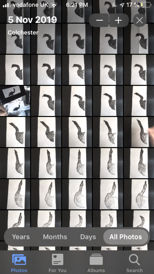
Use your own footage to create a working rotoscope sequence.
I am going to use the video of a swan.
Pick a describing term/terms for both texture and tone.
Texture: Rough yet soft
Tone: Contrast, hue, juxtaposition.
Pick a medium/material/media aiming to reflect the selected texture and tone.
I am going to use ink (brush pen) on paper and let loose.
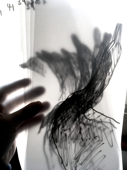
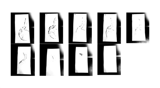
So, the first thing I did was go onto Photoshop on a mac in the studio to then import the video of the swan into the program. The final number of frames were 46 after removing ever other frame from the initial video. I then printed each of these frames out on A4 paper. After this was done, I could start the drawing process. At this point, I didn’t really know exactly what I wanted to do for this task, but I decided to start the way we started this brief (Muybridge movers); with tracing paper and some ink. I began doing some simple and rather bold lineart with a brush pen. This was time consuming, but it turned out rather successful in the sense that it reads quite clearly what is happening and what the subject is.
At this point I had finished all the frames, making sure to number all of them to keep track. Since I still, at this point, didn’t know exactly where to go with this just yet, I decided to continue by roughly colouring each frame in with the same brush pen.

As I went through, I thought about when we did subtractive animation a few weeks ago, (”Mealt”) and so by taking inspiration from that lesson, I applied what I had learnt then about this process to this animation as well.
So now with every frame outlined and coloured in, what now then? I have now finished with the tone aspect of the task, now it’s time to incorporate texture into it, and I had the perfect idea. The ink lines are quite rough or somewhat harsh, and I wanted to create juxtaposition, so what better way of doing that by using texture opposite to anything rough or harsh? The answer is bubble wrap. It’s great texture and it is soft compared to many other mediums.
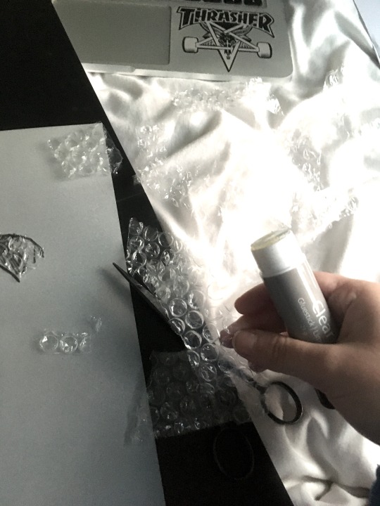
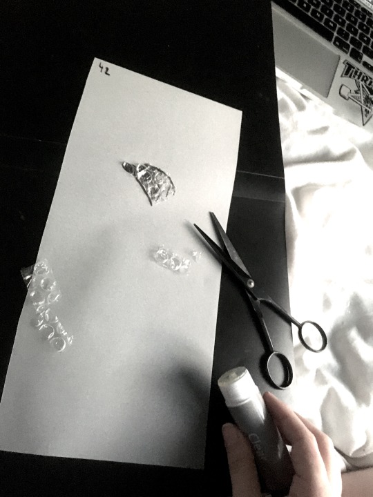
So, I took my bubble wrap and began cutting out random shapes of it to then use these to glue onto each frame with a glue stick. This was a tedious process, but fun since it’s nothing like I’ve ever done before.
As I was working, I suddenly realised the potential of this sequence. There is an incredible amount of pollution happening in the world at the moment, and today there are literal islands made out of plastic, floating about in our oceans. Every day, wildlife is affected negatively to this by either getting hurt or dying from it in one way or another.
When I had finished gluing the bubble wrap onto a selection of the frames, it was time to start photographing every frame:

This was my setup. I used the back of my production file to create a solid black background for the pictures. I took all the pictures using my phone; I have learnt from the “Mealt” workshop that this is quite an effective way of doing it instead of scanning in 40+ different frames.
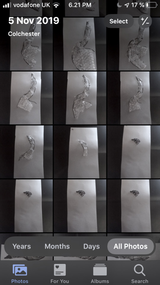
Above are some screenshots of my camera after photographing all the frames. Now it was time for editing them to my own personal liking, which I did on my laptop using “Preview’s editing tools. They are a bit primitive, but for the purpose of this exercise, that will do just fine.
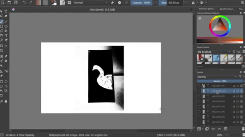
After editing, the final number of frames came to 39, even though the initial was 46. I cut it down a little since I felt some of the frames were unnecessary; something I should have thought about earlier on when choosing which frames to use in the video. I decided to do my animation the same way I did when I did my Mealt animation; so, to do this, I replicated the process from then. That means that the next step would be to import all of the now edited frames into Krita (the program I’m going to use for this). This part is quite tedious but definitely still important to get right to avoid chattering when playing it back in the end. I’m simply just lining up each frame in order to the best of my ability. It was at this part of the process that I decided to invert all the hues of the frames. I did this to replicate how the swan originally is white; also, symbolising how pure the animal is in contrast to the pollution (black background)- and how it takes over.
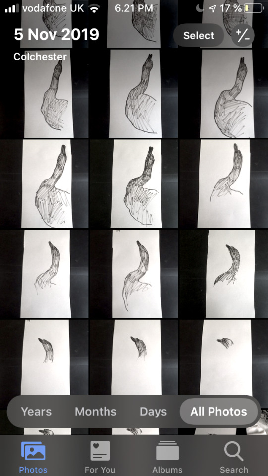
Here are all of the frames put in order:
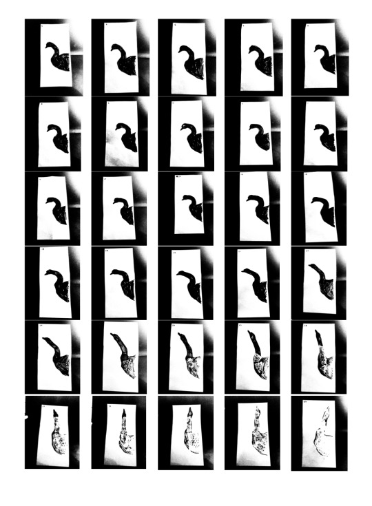
Here are the same frames, but with all the hues reversed:
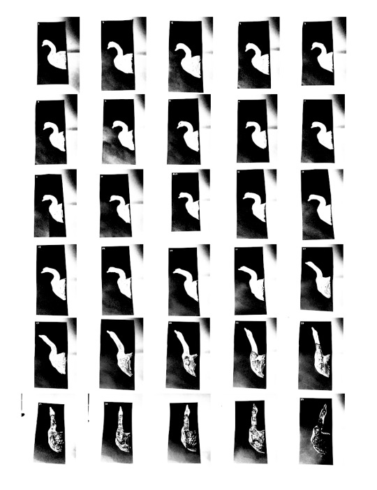

After then exporting all the frames lined up to match each other better, it was time to animate it together. For this (and all my gifs) I use Giphy.com.

Like the Mealt workshop; I copied and reversed a selection of the frames to successfully make the animation loop; also, making it appear as if it’s “breathing” or growing.
Here is the finished rotoscope of the swan:
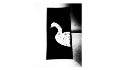
And here is the original snippet of the video:

With the use of the bubble wrap, it tells the story (which in fact is no story at all, but reality) of how the more plastic we throw out into the ocean, the lesser the population or the animals living in this environment there are. If this keeps going, all life will eventually be gone; (shown by how the bird eventually fades away into nothing) - but if action is taken globally, we can reverse this and start anew; letting wildlife thrive without plastic choking them up.
It is no coincidence that I made the subtractive element happen during the last 10-15 frames as it is meant to replicate how quickly it (plastic and pollution) can kill nature.
2 notes
·
View notes
Text
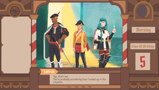
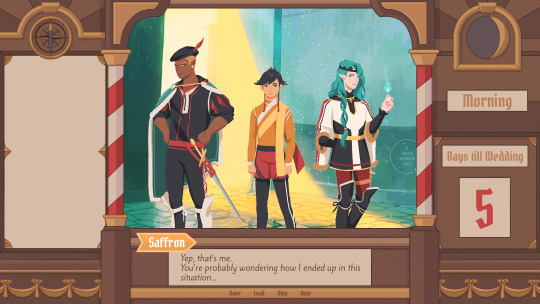
Devlog #34 - Status Update, Character Design, and UI
Hello! It's time for another update on the development status of Brassica. It’s also our first actual devlog purely about Brassica!
After working on separate projects for a while, we are now in the process of getting back on track working on the same game again.
Because of that we're happy to announce that the rest of Brassica's Act 2 will be released in March!
It grew a bit in size from what we originally planned but that just means more game for you~
The exact date will be announced when we can more clearly estimate how long the remaining tasks will take but we're in the process of finishing everything up so it shouldn't be too long.
As for Act 3, our current plan is to release it in April. From now on development should be a lot faster but because we mainly worked on it on the side until now, that is still only a rough estimate. We'll definitely keep you updated on any developments regarding the release dates though!
Well, and that's about it for the status update. Because it's been a while since our devlogs actually described much of our development process (and we haven't shared much about our thought processes behind Brassica), we decided to bring that back with today's devlog.
PECTIN will tell you a bit about Saffron and his design while eZombo describes the development of the UI.
So without further ado, here we go:
Art - PECTIN
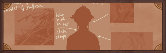
Saffron is the curious prince the player takes control of in Brassica. Before I began concepting him Felix and I defined his character. At this point we already knew he would be one of the princes Sappho tricks into going on the journey. (And would then fall in love with another prince because YaoiJam'18). We soon agreed on naming him Saffron. So I already associated the colours of the spice "saffron" with him here.
We also wanted to make him a protagonist with his own personality. Thinking of the player who role-plays him we thought it would be cool to have his character split into three separate personalities he could have:
- the cunning and a bit wild prince
- the typical goody two-shoes type of hero
- and the soft boi who's overwhelmed by the whole predicament and really needs a hug
Another external influence was, my intention to try and fuse traditional things with modern sportswear. Brassica is a fairytale but it's told in a contemporary voice. That's where the idea came from.
...Okay. So I had his name, colours I could associate with him, the three archetypes and my goal to fuse sportswear with traditional clothing. Having all of these "pointers" I began looking for reference pictures. I browsed through online stores of popular sports brands to find things that would fit the character. Due to Saffron's character ranging from cute to rather untamed (in the sense that he would climb a tree without hesitation) I thought that wearing shorts would be most suitable and comfy. But for the top and the overall outfit I wanted to let myself get inspired by traditional elements. The name "Saffron" reminded me of the spice and then its use in Indian culture. I never designed a character with Indian influences before and thought researching into that would be interesting. I found a lot of stuff I could translate into the design. Even the leggings Saffron wears were intially inspired by my findings about Indian culture.
Here's a visual breakdown of what inspired what (excuse my srawly handwriting >-<):

During the process of drawing out his design, as I always do, I thought about how each component of the outfit would "flow". There're lot's of lines and intersections in his outfit that guide the eyes along the his body:

And here is our boy again as a sprite. Not much different right? Here I put one of his hands in his shorts' pocket, because I think it would suit someone who is either unsure and does that or feels liking hiding something.
That's it about Saffron! I could go on about his colours but I'll save that for when I explain the general artstyle of Brassica! :3
UI - eZombo
Because Brassica was planned as an entry for Yaoi Jam 2018, we thought about ways to keep the scope small. One idea we came up with was to reduce the size of the screen that shows backgrounds and characters so producing the art is a bit faster than filling a full HD 16:9 canvas. One inspiration for that was Sticky Zeitgeist by Porpentine & Rook but something like the Undertale console version where the graphics at the border of the screen change based on the in-game location was also something we considered.
When it came to actually planning the screen, Undertale's influence came through again, because the main area of the screen actually has an aspect ratio of 4:3. This obviously leaves a lot of unused screen space but one thing we knew we could definitely use to fill this was the text box. Having it separate from the main screen also made sure that it didn't overlap with the characters or backgrounds so the space that was reserved for that could be used to its full potential.
With two elements already on the screen, we still had the sides to fill with content. Just using graphics as borders definitely was an option but because Brassica's story plays out a bit like a road movie, we thought having a map of the game world would definitely add to the feeling of that. And to make the UI visually more balanced again, the last bit of free space was then filled with some information on the time of day and how many days were left for the quest of the princes which basically added all the important context for what is going on in the center of the screen.
A first mock-up of the UI featuring a familiar face and St. Bernard...
Around that time, we also developed the idea of presenting the whole game screen like a paper or puppet theater. This seemed like a good way to bring all these different elements together while still supporting the colorful fantasy-ish look of the game art.
I did a quick sketch of how this could look, which turned the mock-up into this:
Aside from adding some more purely graphical elements, I adjusted the text box and the flag that showed the name of the character that is currently speaking.
The map was graphical now instead of just a list (which would have given away future locations) and I was overall fairly happy with the direction the UI was going in.
A few of the border elements overlapped with the main screen now but I tried to make sure it only happens in areas where we wouldn't put any focus.
After getting some feedback from PECTIN I then went on to work on the final lineart while also trying to simplify all the shapes. By then, the characters were also being concepted so instead of Luke I could put Ode into the mock-up (along with a reference for a possible background style).

As you can see, some unnecessary lines, elements, and text were removed to simplify the look of the UI and make sure that the important elements aren't overshadowed by anything else. Overall I tried to keep the lines clean without making them look overly sterile, so any round shapes are generally drawn freehand instead of using any vector shapes. Except for the compass, moon, and their enclosing arcs. Those just looked sloppy when they weren't exact. Not using fixed line widths was another way to make the lines more organic even when they were perfectly straight.
The idea to use different colored flags for each character also came into play now, although Ode's color here is actually used by Hans now…
Colors were next on the agenda. First a basic pass, followed by some adjustments and line colors to make the lines fade more into the background. Having the concepts for the three princes was very helpful for this step because it was important that the UI colors fit into the overall color scheme while keeping the focus on the actual game art.
That's why red is only used close to the center and for important UI elements (the current location on the map is also marked in red). The rest of the colors are rather muted and monochrome on purpose with only a little bit of gold to break it up.
Throughout the whole process my main references were old paper theaters but especially during the coloring process I deviated from these references in favor of using colors that would match with most backgrounds.
Once we were happy with the colors, I did a relatively quick shading pass, just adding shadows with a fairly abstract light source to keep most shadows parallel to the lines. I also added some subtle noise to make everything look a bit more organic.
For the most part it still looked too clean though, so PECTIN suggested overlaying the UI with some watercolor textures.

Which lead to this final mock-up and not only solved the problem but also gave the UI a more painterly look that didn't interfere as much with the general artstyle.
Well, but as always, there are still a few things that changed on the way into the engine.
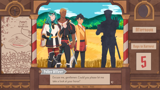
The map was obviously added (which could probably fill a devlog by itself), the text on the side was changed to better reflect the current quest of the princes (although the other sign may or may not return in future acts...), I added a CTC icon and updated the quick menu (although I can't remember why "Load" was removed so maybe that will return again), but most importantly:
The text box was reduced from three to two lines of text. This wasn't as much an active decision as it was caused by the fact that small line spacing in Ren'Py cuts of parts of some letters until all lines of text are displayed. There are some games that still do this but personally I don't really like how it looks while the text appears. Increasing the textbox would have caused a lot of work because I would have had to shift around more elements of the UI to keep a balanced layout so it was simply easier to remove a line of text and increase the line spacing.
This had a pretty strong effect on the writing because sentences have to be fairly short now or if that doesn't work, broken up into multiple lines.
Even if it wasn't exactly planned, it still influenced the writing style of Brassica and further distinguished it from our other games (although there's more to say on that one) and in hindsight, only two lines of text also look a lot cleaner in this layout.
I could go on about the actual implementation of the UI but this has already been a pretty lengthy post so maybe I'll save it for another devlog.
But that's it for now! We'll be back in two weeks with some more development insights and our current status. We also plan to start posting these devlogs regularly again, so stay tuned for that!
As always, thank you so much for reading and we hope you could find a few things of interest in this devlog.
#brassica#fairytale#devlog#gamedev#game#development#otome game#romance#tutorial#visual novel#indiedev#indie#okay
8 notes
·
View notes
Text
Let’s read Hiveswap Friendsim - volume 15!
Just to clear up a misconception - this is Hiveswap Friendsim, not to be confused with Hiveswap proper, which is a point and click adventure game spinoff of Homestuck, of which so far only one volume has been released. So Friendsim is basically a spinoff of a spinoff!
The characters in Friendsim are apparently set to feature in Hiveswap volume 2, although the actual events of Friendsim may not have happened exactly as portrayed. It’s impressionistic, or something.
I suspect this explanation may be more confusing than clarifying.
This volume is called Of Creatives, Conventional and Otherwise.
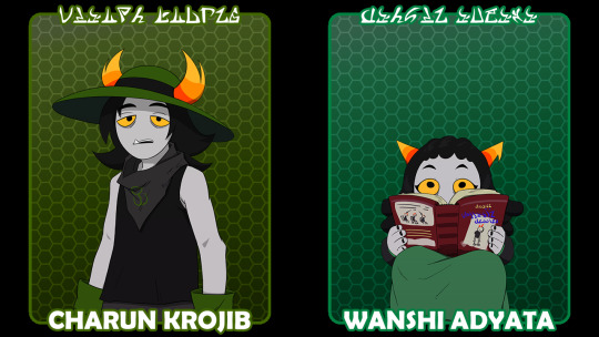
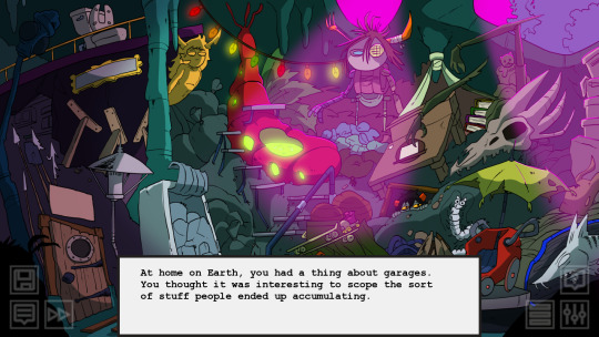
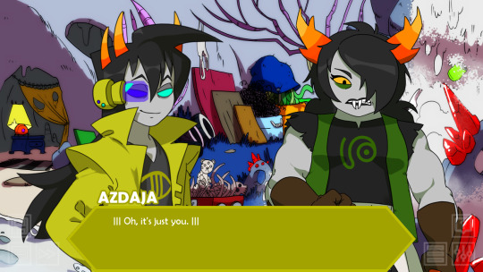
Charun looks like some kinda gardener, and Wanshi evidently has a book (the title of which seems to be ‘DIARY [of a] CULLABLE WIGGLER’).
Charun
Charun is by Kieran Miranda, who previously wrote Azdaja (the DBZ guy) and Stelsa (Tyzias’s gf with the pink coat).
The protag begins this arc by questioning their entire character trait!

They’re having a day in due to depression.
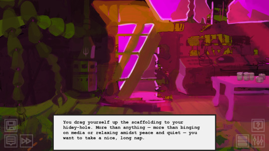
Unfortunately, we can’t sleep for long. Someone is crawling about in our ceiling!
...or not in our ceiling, but in the edge of our room, anyway. We poke our head out of some kind of telescope- or camera-hole. And meet...
This person! Pizzicato strings (hey I know some music words). This piece is actually by Toby Fox, of Undertale fame, who also did music for Tegiri, Lynera and Galekh. Huh.
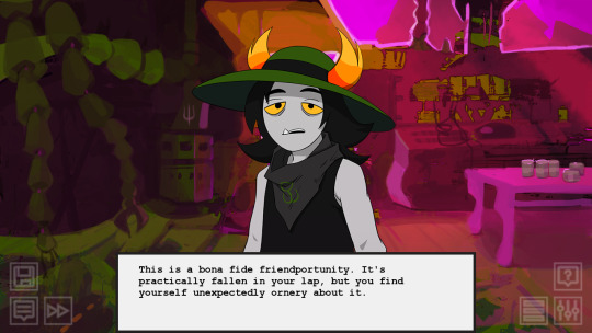
The protagonist grumpily asks if they’re here to move in or something, and Charun says some words at last.
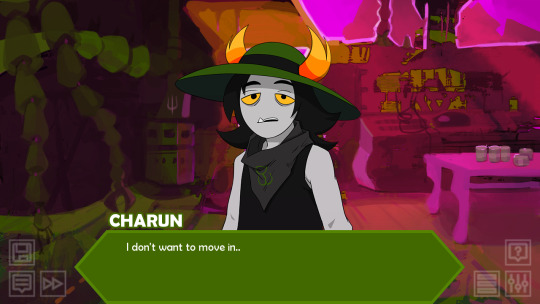
It turns out they were here to take this strange lens thing. But now they’re stuck.
The narration uses ‘they’ pronouns, which we haven’t seen since Cirava, so that’s nice :)
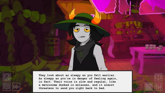
Their quirk is speaking very slowly, with lots of pauses, marked by ‘..’ - just two dots - on either side.
Apparently the reason they want it is ..............................art.
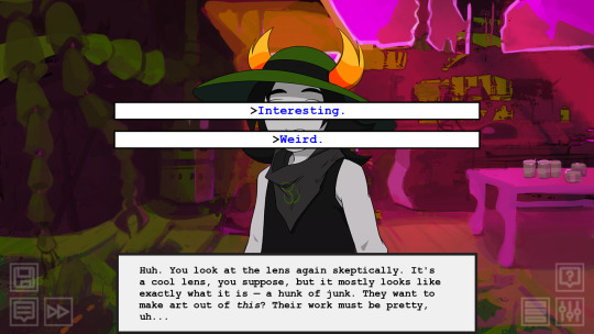
We get our first choice. Interesting or weird? I’m inclined to be nice. Let’s say interesting. Kind of damning with faint praise there though, I guess.

Charun picks up on our like... noncommittal use of ‘interesting’. They say...

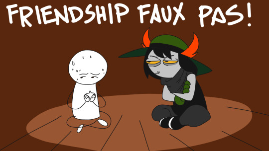
And that’s pretty much shot our chances of friendship.
Well, let’s be more engaged. Sounds weird, ya weirdo, etc.? Engaged.
‘Haha.. yeah..’ is about what we get for that.
There’s a dig at the format.

Instead, our choice is...

Mmmm.
Let’s go with... two dots?
They’re apparently too tired to lug this lens back down the tower. We get another set of options (guessing .. vs .... was a fakeout)

Let’s carry it! I want to see what they do with it.
We make our way out, and get the long shot of our watchtower again.
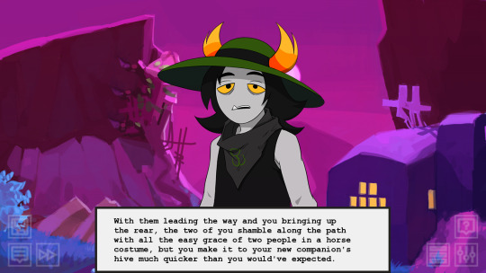
Charun, it turns out, lives in a cave just down the road from our watchtower. We get a very detailed background.
Back to back, the difference between this background - lineart, cel-shaded - and the previous one - painted, kind of impressionistic - is striking.
Notably, there seems to be a troll back there, looking out from over a pile of stuff. Also is that like... bug thingy Charun’s lusus?
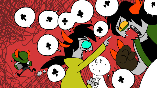
Charun inquires as to our opinion of their art. We flounder.
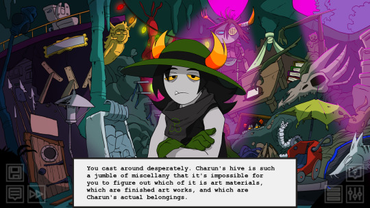
Charun calls us on having no idea what we’re talking about. But this prompts the protag to decide this would be a great time to learn how to make art.
We get some wisdom... “All art.. is dicking around..” True words.

But apparently we’re overthinking it. Our second attempt...
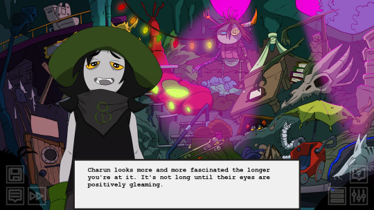
Soon enough, they decide to join in. We collaborate...
I’ve seen that episode of The Get Down.
Our results seem to be worth it.
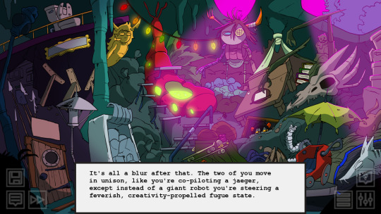
The narrator celebrates.

I’m actually kind of put in mind of some words by Porpentine here.
Build the shittiest thing possible. Build out of trash because all i have is trash. Trash materials, trash bodies, trash brain syndrome. Build in the gaps between storms of chronic pain. Build inside the storms.
And this masterpiece created...

Well I guess we go for a joyride? That seems entirely unrelated to what happened in the episode, but what do you know.
So now let’s propose finding some more portable trash, I guess. Which is another colourful background...

Apparently the background artist for this episode is Phil Gibson. This is a river which is accumulating a pile of rubbish on the bank.
After extracting a promise not to share this secret location, we get to work.
They get us to install instaGram.. uh...

PincerSpam. We check out their aesthetic...
Apparently they’re friends with Cirava. That’s cool :)
At that point, we stumble on some familiar faces in a cave. Awkward segue, but what ho.
What sort of lethal shenanigans are these two up to today? Apparently their quarry is expected to be somewhere in this dump. Uh-oh... hope it’s not our new dear friend Charun.
Charun, meanwhile, has found some kind of gadget with a satellite dish. The protag figures it probably belongs to whoever Azdaja and Konyyl are tracking, and Charun asks us to distract them while they run away with it. Before we can refuse, they’re off.
And that’s that. Meanwhile, Azdaja and Konyyl seem to be tending blackromwards so... yeah. That’s a thing.
Wanshi
Now for a very small troll. Wanshi is written by Lalo Hunt, who wrote Tagora, Tyzias and Galekh. Really likes to write the nerds, huh.
We decide to spontaneously pop down to the library.
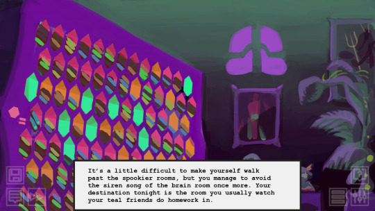
The narrator makes the same observation as me about the shelves...

It turns out this shoe is on a troll, hiding inside this shelf to read ‘Scribblejournal of a Cullable Wiggler’. Guess they changed ‘Diary’ to ‘Scribblejournal’ during production at some point.
Wanshi’s theme has soft piano music. It’s titled ‘idk man you name it i’m tired’. Oh, that James Roach and his wacky song names!
We decide to butt in on her reading.

On realising how young Wanshi is, the protagonist muses that they’ve managed to befriend a few other kids, and we get a very interesting bit of narration...

So our protagonist dreams about the failure branches? Given the connection between dreams, death and the Furthest Ring, that fits.

Since she’s a Jadeblood, she’d likely know Bronya, right. I’m very curious about this brain room. Let’s go there first.
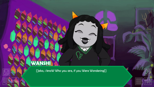
Her quirk, apart from the little bookending []s, is capital Ws and lowercase everything else. She’s five and a half sweeps old, which is almost the age of the Homestuck cast when we first encounter them (so she’s about 12 in human terms).
We wonder why she’s wandering outside the caverns. She explains...

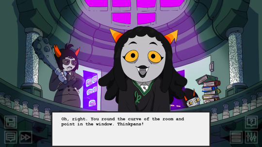
We make our way to the brain room. She asks us what a ‘brain’ is - because of course Trolls say ‘thinkpan’.
Considering that there’s no reason for Alternian and English to be the same, I kind of half suspect Doc Scratch has just been fucking with us all this time.
Unfortunately, we can’t enter the thinkpan room, and there’s a scary looking guard there. So we move on. Apparently the reason she was escaping was to go to ‘beastcon’.
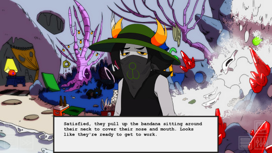
Oh god have we found a troll furry.
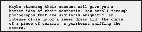
Apparently she writes ‘soldier purrbeasts’ fanfic. Hmm... not sure what that is. It could be this series of YA books?
We hear what the Jades have been saying about us.
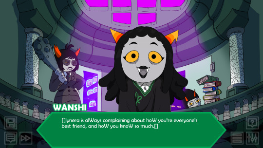
Aww.
I’m not sure what it is we know, except for occasionally being able to give out fairly good relationship advice, but who knows? Our reputation precedes us.
She asks us to take her to the con.

I want to see this con. We make a hurried escape from the library as the guard approaches.

Of course the anime nerds would go.
We head off, guided by Gorgle Maps, and Wanshi excitedly observes the world outside the brooding caverns.

Alas, on the way to the con, we find a dead troll.
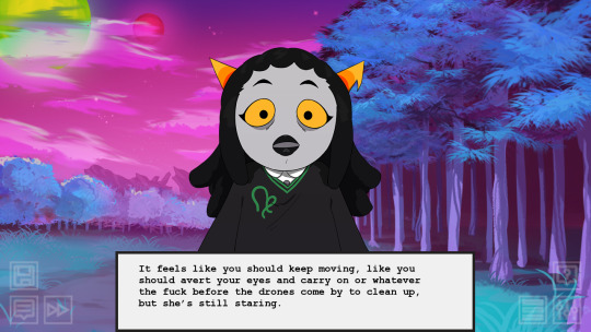
For once, we’re with someone who isn’t utterly desensitised to brutal violence.
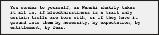
Indeed...
Indeed.
She shakes it off relatively soon, and we reach the con.
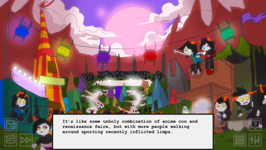
Honestly I’m not exactly sure what this is a parody of, if anything specific. ‘Anime con and renaissance faire’ indeed.
Apparently the attractions include cholerbear riding and a... ‘coslay competition’. Which is entirely different, we soon learn, to ‘cosplay’. We consider calling Bronya to pick her up, when...
a rampaging bear interrupts the conversation.
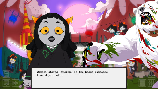
Whoops. Not exactly a place for kids. We throw her in a bush and... grab a katana? That’s just lying around? Yeah good luck with that...
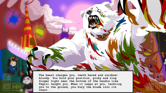
We fucking stab a bear with a katana to protect a small child we met less than an hour ago. Alternia must be getting to us.
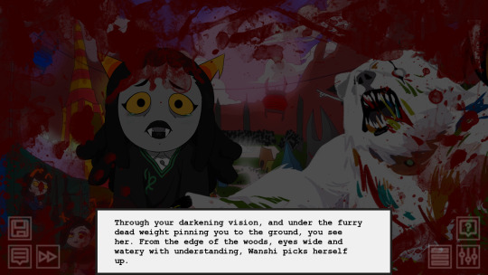
Unfortunately, sheer guts doesn’t save us. We get crushed under the bear.
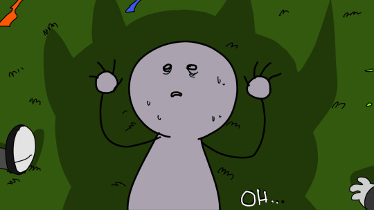
That’s one way to go out, huh. Well, I guess Wanshi learned way more about death than she bargained on.
OK, side branches. First, asking if Bronya is around instead of taking her to see the brain room.
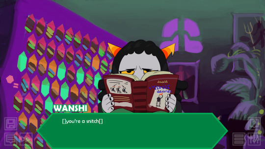
Snitches get stitches.

Well, the kind you get from running, anyhow. Wanshi’s out.
OK, now to actually befriend her and survive the process. We’ll pretend to take her to the con instead of actually going.
The narrator tries to figure out how to refuse her request.

We narrowly escape from the guard - which Wanshi terms ‘bonding hijinks’ - and take her on a roundabout route home. She gets to enjoy the sights.

The protag is so endeared that they decide to take her to see their crashed spaceship. This reminds them that Vikare exists and they haven’t texted in ages.
I guess Vikare isn’t just forgettable to the readers!
Anyway, after pocketing a few of the remaining bits, Wanshi asks us to get a move on to get her to the con.
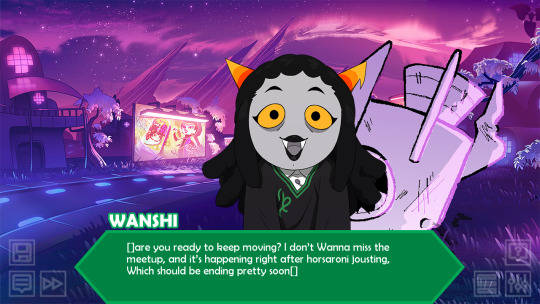
So we fess up.
She’s not pleased.
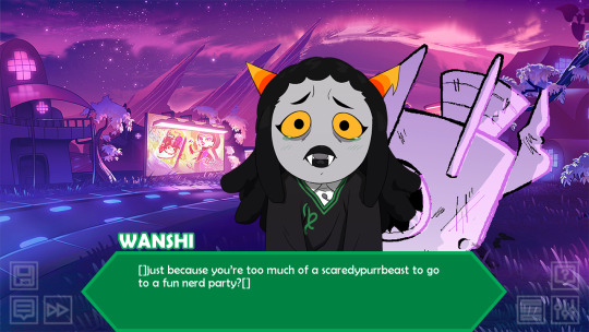
We have a slump. There’s an allusion to that ‘bitch of an Earth’ line that didn’t quite make it from ‘popular Tumblr post’ to ‘meme’.
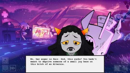
Though she’s still pissed, she appreciates our honesty. Some Social Commentary...

At that point, we get some texts from Tegiri and Polypa, respectively telling us to come to the con and stay far away. Seems the whole cholerbear incident does happen in both branches this time.
This, at least, cheers Wanshi up a bit.

Anyway, though she didn’t get the chance to make friends at the con, she’s got us. We get invited to RP with her...
...as cats.
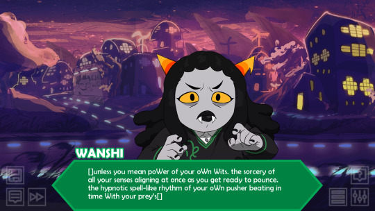
She’d get on well with Nepeta, huh.
We learn a little about Soldier Purrbeasts.
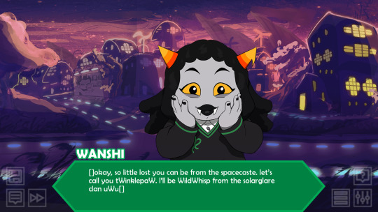
So...
Warriors is a series of novels published by HarperCollins.
It is written by authors Kate Cary, Cherith Baldry, and Tui Sutherland, with the plot developed by editor Victoria Holmes, who collectively use the pseudonym Erin Hunter. The series follows the adventures of four, later five, clans of wild cats—ThunderClan, ShadowClan, WindClan, RiverClan, and SkyClan, who will not be introduced into the territories until "A Vision of Shadows" —in their forest and lake homes, who look up to StarClan, the spirits of their warriors ancestors, who guide the four clans. They also follow the warrior code, a set of rules established in order to keep the clans as civil factions.
...sounds like I was write to guess it was a parody of this franchise?
The narrator kind of struggles to get it.

But with some prodding from Wanshi, we purple up our prose and find our way to suitably overblown dialogue. Even if it’s ‘not really a starcaste approach’.
Eventually, we get back to the Jade caverns, and find Lynera at a full five knives.

Luckily, our presence calms her down somewhat - as low as two knives! But before we can leave them to sort things out, Wanshi has a gift...
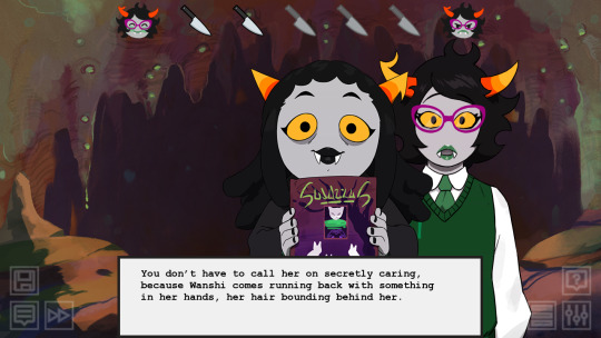
That says ‘Soldiers’. So yeah, definitely a parody of Warriors. These books were first released around 2003, roughly contemporary with books like Mortal Engines, The Edge Chronicles, Artemis Fowl, Alex Rider, and Maximum Ride. Given that, I’m honestly surprised I never read them! Maybe it was more of an American thing.
And like that, we’ve made a friend. uwu

We’re in the endgame now. Expecting I’ll finish this... probably not tomorrow, but likely Friday.
6 notes
·
View notes
Text
16.02.2021 - Project Meeting Week Three
This week I had the third week of the Art of Experiment project meeting. Continuing from last week, I ended up developing the mixture of different comforts and instead decided to focus on one. I decided to focus more on my love of The Legend of Zelda: Breath of The Wild. As a starting point I decided to write down all the different memories I have from when I first played the game. A memory I have from playing the game for the first time was when I first ran into a Stone Talus; one of the ‘mini-bosses’ of the game. I knew the main objectives of the game where to find and defeat the four divine beasts and then go to defeat Gannon; the main boss of the game. I was walking to Gerudo; one of the main towns of Hyrule, where I came across an odd rumbling noise as I was walking across a rocky desert plain when I heard an odd rumbling noise. When I turned around I saw a giant Stone Talus emerge from the ground as their battle thee started playing; to m playing this game fir the first time and seeing something much bigger than me, I for some reason, assumed that this was a divine beast. I vividly remember this part of the game and its something I still fondly remember to this day after playing it for nearly two years. I decided to in a way commemorate this moment, especially considering that it’s The Legend of Zelda’s 35 year Anniversary on the 21st of February and this is one of my earliest memories of playing Breath of The Wild. One part of the fight I remember is using remote bombs to defeat them when I manage to climb higher up. I realised they had a shiny ore deposit placed on their backs so I decided to focus on it to see if I could defeat them. I found it really interesting how I had never came across this creature before or even know what it was but from how they designed the creature I realised I couldn’t hurt them by going for the body, and rather had to try and find a ‘weak point’ such as with the ore deposit.
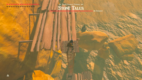
As I didn’t have a screenshot from when I originally played this, I decided to go and recreate the scene by taking some screenshots. After I had the screenshots I then went into Photoshop to try and develop a sketch, I started sketching out the proportions and perspective until I ended up with this:
SHOW SKETCH
After I had developed this sketch I decided to do a rough line art so I could get a better idea of where all the details where, especially for Link since I still had to fix his proportions and the details of his clothing.
SHOW LINEART
After this stage I wasn’t sure what direction I wanted to go in, so I decided to look at an art book I had for Breath of The Wild to get some inspiration. After looking at some of the sketches and developments of the characters from the book, I thought I’d try and emulate the same style the artists crated the concept art for Breath of The Wild. I the used a rough textured brush to colour everything and shade it all on the same layer as when I observed the artwork of Breath of The Wild it looked as if they shaded and coloured everything on the same layer; I assume for efficiency and texture since they would be going through thousands of concepts and ideas. After completing all the colouring and shading within the piece I decided to make the text I wrote white to make it resemble the game more.
Overall, I don’t really know how I feel about this piece. When I first started I felt happy with the progress I had made and I was really pleased with how the line art turned out, especially when looking at Link. In the beginning I was happy with the colouring and shading I did when I started out with the Stone Talus. But as I continued on to the background and Link, I started to loose that sense of confidence with how I was painting and shading. When I look at the piece now I like it, but I don’t feel massively impressed with myself overall. I feel like I could still improve and do better if I decide to continue down this path of comforts and digital art.
0 notes
Text
So I had this kind of strange, elaborate underwater torture experiment testing mind control dream. It was through my perspective, so I was…consciously me? But I was supposed to be Atumu. Like it might have been his body, but it was me in there. Idk. [Dream under cut]
I don’t remember how we got there, but it was the three of us brothers, me, Atemu, and Yumi. I remember Atemu entering with us, going through the beginning of the process, but by the middle of the dream, I don’t know where he went. Yumi was with me until the .. actual torture scenes.
There was a large pool – like a swim tank. By this point, we were already more of less under their control. But it was a loose sort of control. Like our will was under their control but our thoughts were relatively free? All I could recall regarding that was that we were allowed to roam free around the premises – when we came to this place, we thought that was strange. That there were so many people just walking around, freely being experimented on. I think we got caught snooping and that’s how this all started.
Anyhow, it seems that all the subjects are free to walk around, without shackles or guards, because they don’t have the will to escape. They have only the will to be compliant and to help continue the steps of the experiment, and so they continue about their path like clockwork. Numbly going from one station to the next, completing tasks as they should, and getting checkups.
I think it started with an initial health screening. We laid on a cold metal slab of a platform and they took our fluids to assess the levels of…idk. A lot of things? These were values they would check up on and update after every round of testing. Possibly to see what effects their experiment had on the human body – for various endpoints.
The task at hand was timed. We were to go underwater – had a minute to swim down to the other end of the pool – at the bottom, there was a sign – an image. Usually a series of images. We could bring down a notebook to sketch out or take notes on the image. And when we got back up above water, we had one minute to recount in explicit detail all the things on the image/series of images. There was also a component before the underwater part. There was an above water set of images that primed us for what we’d see at the bottom of the pool (the pool was some 25-30 feet deep [~10 meters], so it wasn’t a shallow pool at all – and standard length).
I can only recall the first image I did – it was some images in a 4 panel comic format; 3 of them had content (image and text), and the 3rd was explanatory (it also had image and text, but was in a different format). The text was scratchy block letters in yellow with green accents, and the background was black. The picture was of a disturbingly veiny cat – just the lineart of it. The text read something explaining the experiment and the three other panels (which were just kind of lineart). I had to essentially recall enough of this poster to describe it with enough detail to recreate it completely when I was above water.
I remember when I first hit the water, I was struggling to get a solid breath. Because apparently we don’t have control over when our bodies are dragged under water – it happens automatically with incredible speed (because tbh to be able to swim the length of a full Olympic sized swimming pool AND swim down 10 meters, that would take up… the entire minute and then some).
I’m almost certain I spent a lot more than 1 minute under there. And by almost certain I mean absolutely certain. I was underwater for probably close to 2.5 minutes if not more.
Somehow, I had a little bit of air still trapped in one of my nostrils – I could “breathe” underwater with this little bit of air, but if I inhaled too much, I’d inhale water and get water in my lungs and…die. Still, I knew I was running out of air – and fast. I hadn’t even gotten to the image by the time I thought I’d run out of air twice.
Maybe being physiologically Atumu took over once I got to the image because I stopped thinking about air. Just the task at hand. It was incredibly stressful. I had to draw and write down with incredible detail the many aspects of the set of images I was seeing and there was… so much. I ended up completely reproducing the first image on my notepad before I realised I had used up a lot of time doing that. I hadn’t even begun to look at the other 3 panels. I was getting light headed as I scrawled out some words in terrible handwriting for the other three, as well as some hard-to-decipher shapes and scratches that were supposed to represent the position of the parts depicted in the image. Like a storyboard. It felt like I was down there for close to 5-6 minutes, idk.
When I surfaced, I gave my account as prompted, and proceeded to another room for a physical examination/another health checkup. It was this room that I had vaguely recalled from earlier – this was the room we had seen and contemplated why the subjects were not leaving. I realised now. We were those subjects. We weren’t leaving. Hm.
This is a bit of a tangent but… I had… kind of like sheets of glass/ice coming off of my body? Idk why or how. But like attached to my foot was a decently thick sheet of glass/ice that I broke off and tried to sort of file down to make it smooth again where the surface of my skin was. Yumi walked over to remark that he had seen me crying? And I made a sheet of glass/ice from crying? Earlier, that is. Around the time of the above water task. I can barely recall it but I guess it must be true. I’m feeling alright now – a bit numb maybe. I remember cutting off a pretty big chunk of the glass/ice and remarking how clear it was to look through. Idk. Irrelevant.
Yumi and I compared notes (our underwater notebooks) and he was amazed at the amount of detail with which I replicated the first image. Yes, but that was why I ran out of time and I should have planned my time better.
It seemed okay.
But then the “flashforwards” started happening. Incoherent scenes, snippets, just flashing. It wasn’t a narrative set up like the previous portion of the dream.
The tests get significantly harder. Instead of a series of images, they become videos. The videos become increasingly long and complex. It is very difficult to recall with tremendous accuracy every aspect of the videos. The colours, the characters, the moving figures in the background, the text.. it’s just a lot. And there are repercussions now too. As I am unable to come up with all the details required, I am punished with shock treatment. This too progressively worsens. As far as I can tell, Yumi is not facing similar treatment, and I am grateful for that I guess.
But anyhow, it’s around this point that I wake up.
Mm, like I said, I tend to be able to feel physical pain in my dreams and often times the pain is enough to wake me up. So there’s that.
8 notes
·
View notes
Photo
I’M SCREAMING
We’re 3 months away from this glitter-bomb and they gave us some stuff to scream about. I think I’ll do just that. I took my sweet time putting this together, I know, but there’s a fair bit to unpack and a lot to be excited about so, let’s go through it all!
Animation
Okay, so first things first: people are calling this a 2D movie and that’s not really that accurate.
It certainly has some 2D elements, like the backgrounds, but the style of animation only makes the characters look 2D, when in fact they’re 3D models.
You can tell in how they move. If I were to give you a still screen shot, you might guess that it was from a 2D animation, but in motion, you can tell what it actually is: cel-shading.
I had a hunch that’s what it was so I asked a storyboarder who worked on the MLP movie (and the show) if I was right and she said:
The program they’re using is ToonBoom, which does rigs with 2D toon shaders, among other things!
You know, I don’t often call things, but I fucking called it. Let me have this. Just to give you a quick definition from Wikipedia:
“Cel shading or toon shading is a type of non-photorealistic rendering designed to make 3-D computer graphics appear to be flat by using less shading color instead of a shade gradient or tints and shades.”
3-dimensional figure with cel shading, has the effect of making it look 2D. Typically seen with thick outlines on the outside and little to no outlines on the inside:
(Team Fortress 2 itself isn’t normally cel shaded, but that’s a great example a fan made of what cel shading usually looked like when I was growing up)
Cel shading without outlines, as seen in Wind Waker.
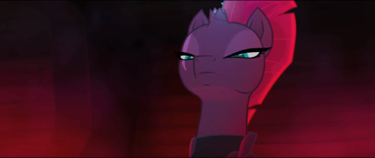
Like I said, just seeing this still image, it looks 2D, but watching it move, you can tell there’s a 3rd dimension to the character with the features and lineart mapped out onto the models to make it look 2D
Which by the way, is really unique for a major release! I don’t know about anyone else, but I was excited that MLP: The Movie seemed to be 2-D since there hasn’t been a domestic 2-D animated movie since Winnie the Pooh in 2011. 6 damn years! While I maybe would’ve ideally liked a completely 2-D animated movie, the backgrounds and the cel shading works in really neat ways, and it will definitely make the movie stand out
The purely 3-D objects seem unfinished at the moment (but that’s not out of the ordinary, CGI seems to be one of the last processes). It needs texture or shading or something, and I can tell because most of the ship looks too soft (too much like a model) to be metal. I really think this will be fixed for the final product, but that’s probably the most jarring part of the style at the moment
Not all of the 3-D looks unfinished, but the best looking parts are still the painterly, 2-D stuff (look at those towers; they’re really stylized, but you can tell they’re 3D in a more 2D environment)
THAT DIGITALLY PAINTED VERSION OF CANTERLOT THOUGH:
The light effects are definitely 3-D in the fireworks and rainboom
Oh, and speaking lighting, so much of it looks so pretty! There are one or two times when the colours are slightly off, but the majority of the time it looks freaking gorgeous
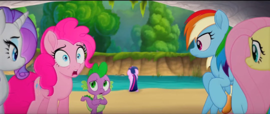
You can kinda see by looking at Rarity that the shading is juuust slightly off here (kinda like they were for the teaser trailer), but then you look in the background and see this BEAUTIFUL background and Twilight all upset and worried about this invasion, and it feels like such a nitpick to worry about what will probably still be cleaned up before it hits theaters
We also get some really great expressions, so they’re not really limited by the 3D models underneath (if I’m right about that)
Also, just as one last little note here, the style is detailed enough to see little things about the characters we didn’t know up until now, like the fact that the spines on the side of Spike’s head are translucent, or that the colours of RD’s mane aren’t 100% perfectly separated
Overall with the animation, I’m so impressed not only by how gorgeous it is,but by how willing they were to take a risk and incorporate a 3D element in the form of (I think) cel-shading. This only really matches the creative spirit of the MLP team, though. Whether or not you agree on how well they always execute everything, they always try to step up their game with every new season and push themselves to be and do better.
And while I will say that if some of the more 3D parts (yeah, I’m talking about the zeppelin/airships mostly) aren’t fixed for the final release, I would have a bone to pick with them, but I have faith that we’ll be seeing a much smoother integration of that 3D on the big screen.
Story and Character Details
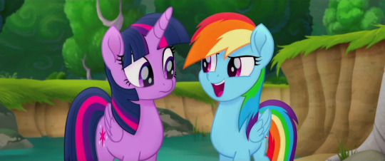
I really appreciate that they didn’t outright spoil anything too big. It’s definitely a well-cut trailer! We basically only know about the same information we did before, with just a hint or two as to things like who the true villain is.
Just based on the focus given to these characters in the trailer (and what I know of the Storm King’s characterization in the first Movie Prequel comic that was just released), seems like he’s not as big of a threat as the commander of his fleet, Tempest.
It’s a kind of villain we haven’t seen on the show or even in EQG, and not only that, but
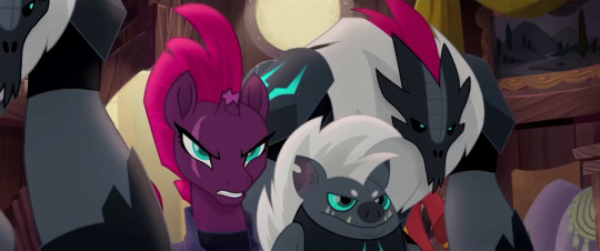
She’s got a fantastic voice actress behind her, so she can pull off the deliciously evil vibe well without, say, reminding us too much of Chrysalis or other powerful animated villains from Disney classics
Plus her design with the broken horn and her magic sparking up out of it is instantly intriguing to me: for such a powerful presence, it’s awesome to see her weakness (and most likely shady past) is always on display---especially for a commander character, that’s just really cool
Grubber seems to be pretty standard so far, nothing he’s done has really impressed me quite yet, but I’m hoping his best stuff is saved for the movie itself
The sky pirates (or skyrates) look like a lot of fun, and in context I can see how well the bipedal birb pirate blends with the universe (the bipedal designs were the ones I had the most trouble with)
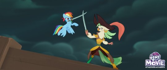
On top of that, we have sea ponies at last! And they’re far more adorable than I ever could’ve hoped
The original sea pony designs from G1 looked a lot more like sea horses, with curling tails and fins on either side, but I think the meraid-ish look is both more marketable for Hasbro and more appealing to look at (the original sea ponies always seemed like a joke in the fandom to me, I admittedly never understood why people would actually want it in G4)
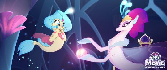
And a-ha! Good queens do exist! Poor Celestia and Luna. Always a princess, never a queen.
Oh, and Seaquestria? It’s freakin’ beautiful. I LOVE the rich blues and purples here. If you haven’t had a chance to check out the 360 image of the underwater palace complete with an excellent piece of background music, treat yourself.
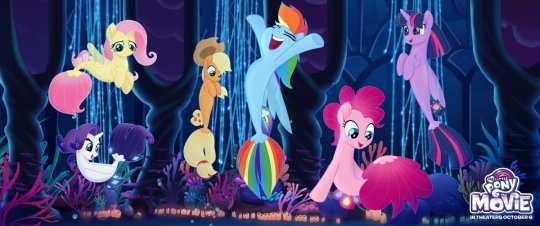
The Mane 6′s sea pony designs are pretty dang adorable. I don’t have anything interesting to say, I just like the cute water horses, okay?
Minor Details and Incidentals
I’ll start out by saying Twilight’s narration in the trailer is pretty standard, but still heartwarming (mostly because I already know and love these characters though). It sort of reminds me of the bits of narration from the How to Train Your Dragon movies, although those had a bit more character to them.
The what could possible go wrong? line, though. It just makes me laugh thinking of all the flashbacks we could have to the series.
I guess she’s talking about that festival specifically that she’s organizing, and in that way it’s a show of character development (in a similar way to the character development on display in A Flurry of Emotions, where Twilight is told she’s late and doesn't have a panic attack or worry about what could go wrong... too much), but it’s still hilarious to contrast the idea that nothing could go wrong in Equestria to... literally all of the show.
AJ and RD protecting their friends even before the others have gotten over the shock of whatever they’re seeing tho
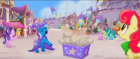
Starlight and Trixie get a bit of screen-time together and it’s adorable. Starlight might be stuck in Canterlot for the duration of the adventure, but I’m glad to see her included. Characters like Discord who might be too hard to explain to new audiences are understandable losses, but even if Starlight’s cameo is brief, it’s good to see her role acknowledged
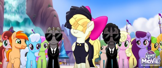
In terms of music, Sia’s looking adorable so far, and Lukas Graham’s as of yet unreleased Off to See the World sounds pretty catchy (it’s the song at the end of the trailer), so they’ve got talent behind the vocals!
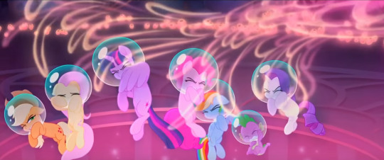
Jumping back to little details, it’s neat how sea pony magic has a very distinct look from unicorn/alicorn magic. Also, the bubbles are really cute
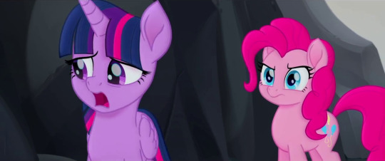
And, okay, I just wanted to take a minute to appreciate how serious this ponk is. Can we all just stop and take a look, because in this scene Twilight’s saying how she’s the one Tempest is after, and she should probably face this alone, which seems to be our Princess of Friendship’s big dilemma in this movie, and Pinkie’s clearly trying to tell her she’s crazy
Gotta love that they didn’t just go for hyperactive comic relief Pinkie Pie; they don’t seem to be boiling down these characters to just one trait (which is partially why I loved the moment where RD and AJ defend the girls; RD’s ego will no doubt be on display throughout the movie, but you’ll also see she’s ready to lay down her life for her friends)
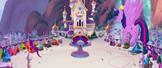
And hey, lookie here! Canterlot got a make-over... and a contractor. There’s more pink than there typically is and it doesn’t necessarily match what we’ve seen of it in the show. Especially places like the throne room:
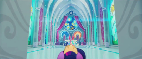
And you know, I’m a little torn on this detail? It’s beautiful, and I’m digging the starry night mosiac they’ve got going on back there, but it would’ve been nice to see the throne room we know and love rendered in this new style, you know? I’m gonna miss the deep magentas and the stain glass windows of the Mane 6′s accomplishments. I know that’s mostly the fangirl in me, but I like seeing continuity nods back to the show (like hey look: Cadence gets a cameo!)
Unless Canterlot gets destroyed and subsequently rebuilt in the season 7 finale, in which case I’ll shut my mouth
Speaking of which, I still have to wonder exactly when this will take place in the series, or if it exists slightly to the left of canon like the Equestria Girls movies (which, I mean, I consider canon, but still). I know there’s ties into the comics, but I wonder if/when the show will acknowledge the events of the movie... I guess only time will tell
And for now, I think that about wraps it up! All in all, I’m beyond excited to see this thing, as anyone could’ve guessed.
It should also be noted that a lot of kids movie trailers focus on the fun, comedic portions of the movie, so while I do think it’s mostly going to feel like this, I’m also looking forward to the more character-driven feelsy parts. As we well know, you can never get the full scope of a movie from just the trailer, but it’s usually especially true for kids movies.
Even just from what we have seen, it looks like we’re in for a ride. Can’t wait to get on.
Hey, if you’d like more MLP stuff, you can click right here to see my editorials or here for episode reviews. And if those links don’t look pretty enough, have the last three things I’ve done right here:
Parental Glideance Review, Celestia/Daybreaker Editorial, and LGBT+ Editorial
Year of the Pony
#year of the pony#yearofthepony#mlp the movie#my little pony the movie#mlp#my little pony#friendship is magic#my litte pony friendship is magic#twilight sparkle#pinkie pie#rainbow dash#rarity#applejack#fluttershy#spike the dragon#animation#animated movies#cartoons#mlp analysis#mlp articles#movie trailers
139 notes
·
View notes
Text
Portfolio Breakdown: Recycling
Water Bottle:
Original version:
This was my original first rough design for the water bottle. I wasn’t super pleased with it as it was a bit rushed. We felt that an empty water bottle fit well with the recycling theme.
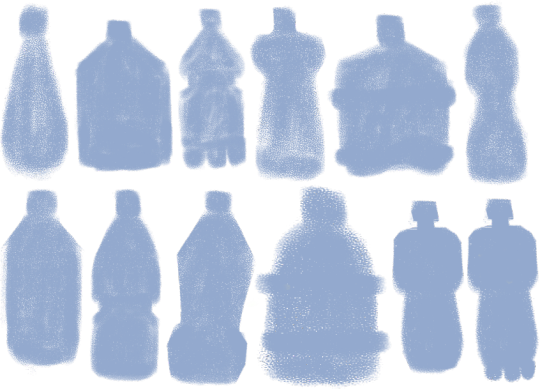
To redesign the original, I made a bunch of silhouette shapes of bottles to see which people liked the most.
I especially liked the bottom right one, as it is shaped in a somewhat human-like way, with a neck, large shoulders and the bits on the bottom look like feet (albeit three of them, so not so human). This one became my initial base for the final designs.
Final Variations:

Blue bottle, angular eyes.

Pink bottle, large angry eyes.
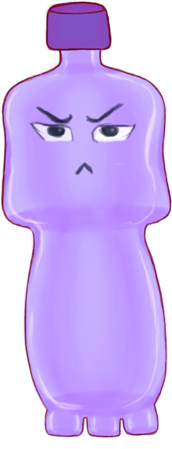
Purple bottle, smaller squinty eyes.
Out of these, the blue version was my favourite. I provided a variety of eyes for the character here to vary their personality through their expression a little, but different eyes could be combined with a different from colour from that which I gave.
I am fairly happy with how the design came out, although I would now redesign it to be more symmetrical and use a proper reference for the ‘feet’ on the bottom as I improvised those, although they are supposed to be exaggerated anyway. I would also clean up the outline a bit.
Progress:
I used Hue/Saturation layers to provide the different colour options and set the eye sets all on their different layers in groups.
When I sent over silhouette bases to the modellers, those they liked they sent back to me with stars marked on them, as seen above, so we all agreed on the design. I took the base above into Photoshop and used it to set the general shape of the bottle.
I cleaned up the shape in another layer. This was one of my very first designs for the game so I had not set the outline very cleanly like I learned to with my later designs. The outline I added later disguised the mess of it.

I added another layer and used a Soft Brush with a lavender shade. I wanted to give the bottle depth, to show it was transparent.
I added some soft shading in the middle sections.

I added some lighting on another layer to show the bottle is shiny.

I added the first light outline and the first set of eyes in another layer.

I duplicated the outline layers to darken them, and then later used the Hue/Sat layers and eye sets for the other versions of the bottle.
References:

(Staples, N/A)
It was a while back, but I believe I took my reference for the bottle shape from a bottle similar to this and squared it out myself to look more human-like.
Soap Bottle:

This was another early design which only has one version, as the modellers had not considered adding it to the game after viewing it. If they had, I would have created alternatives and a better design.
This type of object was chosen as a character as it was not super clear what kind of things we would be having for the recycling level early on. It turned out to be mostly food related, with bottles, drink cups, wrappers etc. However, I still feel something like this could have added some variety into that theme.
I shaped it to appear a little like a bird, with the top of the bottle being like a ‘beak’ with where I positioned the eyes. If I were to redesign it, I wouldn’t set the eyes on the ‘top’ of the bottle as I have here, it is incorrect. I would thicken the top section and put them on the side just below, so that the top isn’t pointed downward as if it were bent. However, I am pleased with the vibe the character has.
Progress:

I started off with a roughly shaped out bottle. As with the water bottle, it was an early concept and so wasn’t blocked out as neatly as later concepts.

I added some basic shading to show the depth of the bottle and transparency with a soft brush in a new layer.
I added more shaded in the centre to show the centre pump.

I added some violet shade to add some colour depth in a new layer. I also added in the eye in its own set of layers for the pupil, iris, shade and outline.
I added a new layer for shine, also adding some shine to the eye it.

I lastly added an outline, which helped to disguise the rough outline.

(Rail19, N/A)
I did not use many references for the bottle design, but it was such as the above which gave me the reference for how to draw the pump down the centre and the cap. I gave the bottle a curvier body as a design choice.
Candy Wrapper:

Being made of plastic and food-related, this was chosen as a good idea for the recycling level. This was another of my first designs, as I designed the majority of the Recycling designs before the Deforestation ones, as we had not yet set which level we would have first.
I only designed one version of this, but had plans to design it in different ‘flavours’ as this is meant to be raspberry - as seen by the bottom left berry - and I wanted to create orange and blueberry, perhaps grape.
This was my favourite design out of those I created, as I like how the candy rip appears like a scar across the left eye. However, I had plans to change the shape from less square to more rectangular, because it may only be my view, but the way the rip goes with the shape also reminds me a bit too much of a condom. This is the main reason I added a berry in the bottom left, to make it clear it is food packaging. I would also clean up the outline a bit if I redesigned it.
Progress:

Originally, I had blocked out the outline of the wrapper in one uniform block but I later in the same layer added on the jaggedy bits on the top and bottom and the erased parts for eye hole and scar slashes.

In here, I added a new layer in a lighter colour to add some shine depth.

I added another layer of shine and some lines on the top and bottom, as many food packages have this detail. I also added lines to show the plumpness of the package and a red iris to the eye.

I added a flat colour layer for the berry design.
I added shading and a green leaf to the berry and outlines to the package.
References:

(Birdman, 2017)
It was actually difficult to find any good references for a ripped/used candy wrapper which looked aesthetic enough. This is why the rip in my design is pretty stylised.
With the above, I used it as a reference for the spiky bits on either end of the wrapper and the little lines there also.
Plastic Cup:
This idea was another very early enemy concept idea, back before I was set as the concept artist.

The above was the initial sketch done by Carolina.
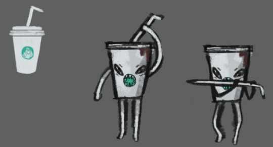
This was a little later design which she made of it also, where the logo in the centre turned into a mouth and the straw turned into a type of sword.
Although it was not super necessary for me to do so, I designed a couple of alternative cup lids for this design below, as the facial features/straw/limbs were already something set in stone. So this is more of a shared concept where I offered small alternative tweaks.
I believe this is one of, if not the first concepts which were modelled, which was why I was behind in doing the full design all by myself. It was very early on and Carolina was already attached to her initial design.
This was an alternative lid design, where it could be more like a bubble tea type of cup, rather than a coffee cup. I also added the little ‘platform’ detail at the bottom which it could have instead of just a straight bottom.
This is very similar to what you may find on a Starbucks cup, which was what she was modelling hers after initially, but the very top is more akin to a McDonald's cup in a sense, such as with the little x in the centre and the very centre circle pops up a little, rather than laying flat. It is transparent, rather than white, which makes it more akin to a fast food drinks cup.
I am quite happy with how the design turned out. The outline could be neater, but I am pleased how the shading came out, particularly on the plastic bubble lid. If I were to redesign it, I would add slightly more blue hues in the lid as it is too grey and flat.
Progress:

I initially started out by blocking out the silhouette in one layer with a soft brush.

I used layer constraints in a second layer to shade over the cup with a soft brush and add in some base lines around the lid and bottom to draw over later. I shaded this section as an open cup, as the lids would be transparent and placed over them, so that the transparency would be more accurate.
I drew in the outline of the cup and the first flatter lid in more layers.

I used layer constraints in another layer to shade the plastic colouration of the lid and add lighting with a soft brush.
Lid #2:

I used the first flat lid as a base when drawing in the bubble lid, as you can see from the outer rim. To do this, I duplicated the first lid layers and erased the centre colouration and lineart.
In here, I partly erased the lineart on the other side of the bubble lid, so that they are still slightly visible but only to give a transparency effect. I also added the base colour for the lid in another layer.
I created another layer and used a soft white brush to add a shine effect.
References:
(Lukianov, N/A)
This was one of the main references I had for the bubble tea lid. As seen, it has the top gap for the straw and basically the same bubble shape.
(Glowe997, N/A)
This was a reference I used for the flatter lid. As seen, it has an inner section which pops up a little and, although not seen, the entrance for the straw is the same. The rest of the lid arrangement was improvised.
Batteries:
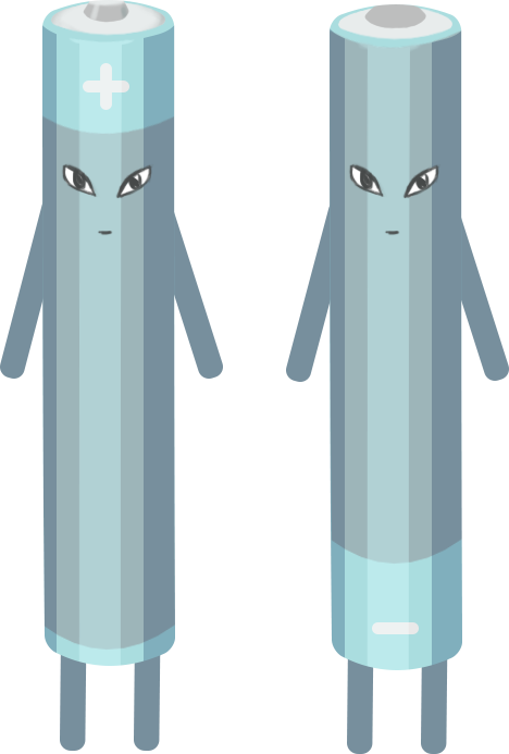
These were another design based off of an initial sketch by Carolina before I was set as the enemy concept artist.
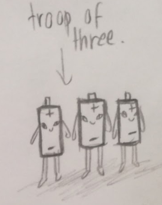
This was the sketch which Carolina created. My updated version of the design was the final design I created for the Envirovaders project.
There was some conflict within the group over creating this design. As the 3D modellers are supposed to create the designs I give them as the concept artist, and I had given them a bunch of finalised concepts which had not been created yet, Carolina decided to ignore that fact and go back and create her own, this design, instead.
I felt this was incredibly rude, as she had not told me to update the sketch to a final concept, as is my job, she merely told me she would be modelling her own design here, ignoring all the concepts which I had designed which she had not made yet and removing my input from my own role. There were several designs for her to work on. I felt she was stepping out of her place here as the concepts are my job and we already had this issue at the beginning, back when solidifying my role as the concept artist.
I decided that if we were to be using this design, that is fine, but I would be turning it into a finalised concept, as I am meant to do, and so I did.
I only got around to creating the one colour version, but I changed the set of batteries from a troupe of three into two, as this made more sense, as batteries tend to work in pairs. I also made one positive and one negative, so their designs are opposites, rather than all one of the same.
I did not have time to create more versions, as I had already been running around creating my original concepts when Carolina threw this at me. I had to create a finalised design before she finished the modelling she had already begun. This is also why the shading is blocky, as I used shape layers instead of painting the shading, so that I could complete the design faster. If I were to redo it, I would soften the shading, paint it organically, and give more colour options. However, I am happy with the plus/negative flip to the design.
Progress:

I created the basic shape by creating a rectangle using the preset Photoshop shapes and then using the Warp tool on both ends to get the rounded shape.
I made the legs and arms in duplicates from one rounded rectangle shape. I made the base for the top of the battery from a warped oval shape.

I added some shade to the battery top using layer constraints and added detail.

I added a middle stripe section to the battery by duplicating the body layer, changing its colour and warping the top of it down into the opposite curve. I created the plus sign from rounded rectangle shapes.
I added blocky shading to the sides using rectangle shapes. I constrained these shapes to the main body layer, so that the sides of them would constrain to the main shape and not go over the lines. I warped the top end of them to fit around the top rim.
I duplicated the battery layers and flipped its design for a negative battery twin, changing its sign to minus by turning off the layer for the horizontal plus sign in the duplicate layer.

Lastly, I added the same set of eyes to each, as I wanted them to be twins.
References:

(Petovarga, N/A)
This was my main reference for the batteries, in particular for I shaded them in blocks.

(Schututman, 2014)
This was a reference for the colours I used. I felt that the blue/grey colouration looked pretty, although mine is not precisely the same. I did of course plan on providing different versions if I had had the time, such as orange/black similar to Duracell batteries. The top part was also a reference for me on how to set the top of the negative battery, as their tops tend to be flatter than positives.
Works Cited:
Birdman, 2017. Sustainability. [Online]
Available at: https://sustainability.stackexchange.com/questions/6320/what-is-this-candy-wrapper-made-of-solely-plastic-or-mixed-with-something-else
[Accessed 5 May 2019].
Lukianov, A., N/A. [Online]
Available at: https://yellowimages.com/stock/orange-bubble-tea-cup-mockup-high-angle-view-13821/
[Accessed 5 May 2019].
Petovarga, N/A. [Online]
Available at: https://www.123rf.com/photo_50386389_stock-vector-vector-illustration-of-isolated-cylinder-batteries-in-cartoon-style-.html
[Accessed 5 May 2019].
Rail19, N/A. Rail19. [Online]
Available at: https://rail19.com/beach-blue-glass-lotion-soap-dispenser-with-metal-pump/
[Accessed 5 May 2019].
Schututman, D., 2014. Alamy. [Online]
Available at: https://www.alamy.com/stock-photo-cartoon-illustration-of-two-batteries-fighting-for-energy-111634524.html
[Accessed 5 May 2019].
Staples, N/A. Staples. [Online]
Available at: https://www.staples.co.uk/water/cbs/223326415.html
[Accessed 5 May 2019].
0 notes
Last Seen Blogs
posher5
Untitled
jodifiction
Jodi Fiction
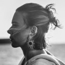
thecursedcasketofminge
I'm A Haunted House.
magamaga000
Magamaga000