#brittany fonte
Text

Bonjour Yannick
#Bonjour Yannick#Yannick Schutz#photography#photographer#pictures#words#shop#documenting the seemingly ordinary details#Bretagne#Brittany#Finistère#France#portfolio#blue#type#typeface#font#Iowan Old Style#System-ui#2023#Week 42#website#web design#inspire#inspiration#happywebdesign
5 notes
·
View notes
Text
Love. Set. Match.
I didn’t know you in 1996,
a time of mixed tapes and
slipped-or-stolen compact
discs. If I had, I wouldn’t have
been able to feel your warmth,
anyway,
as our suns followed separate
orbits. But the spark
of your denim in ‘99—
Levi’s more intense than the liquor store line
in a college town
where Boone’s Farm was an appropriate
wine for a social soiree (at least mine)—
you saved mice from mouthing…
View On WordPress
0 notes
Text
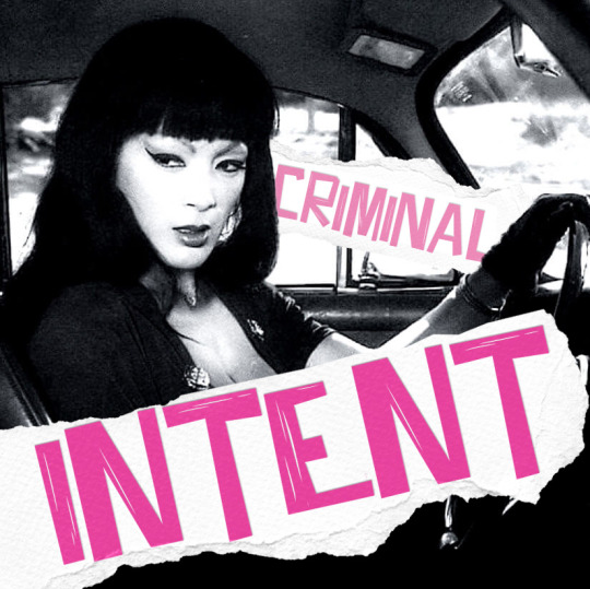
CRIMINAL INTENT // more heist jams (SPOTIFY)
♠♥♣♦
1. also sprach zarathustra / shawn lee's ping pong orchestra
2. big booty ft. megan thee stallion / gucci mane
3. bubblin / anderson .paak
4. next big thing / west rose
5. iconic ft. rapsody / femme it forward
6. sway with me ft. galxara / saweetie
7. nitty gritty / skeewiff
8. come live with me / dorothy ashby
9. tapwe / boogey the beat, young spirit, drezus & pj vegas
10. crash course ft. biig piig / blu detiger
11. first i look at the purse / the contours
12. broke ft. thomas rhett / teddy swims
13. pink venom / blackpink
14. spooky / dusty springfield
15. goddess / pvris
16. monaco / bad bunny
17. paint the town red / doja cat
18. we are going to rob it / daniel pemberton
19. big girls / masego
20. testify / davie
21. kelen ati leen / orchestra baobab
22. more life ft. tinie tempah & l devine / torren foot
23. mojo / claire laffut
24. girls / the dare
25. welcome to jamrock / damian marley
26. obxessed / fire choir
27. it's a man's, man's, man's world ft. brittany spencer / jason isbell & the 400 unit
28. ratata / skrillex, missy elliott, mr. oizo
29. hit & run / ralph dollimore
30. e-pro (capelion v2 remix) / beck
♠♥♣♦
vol 1 | vol 2 | vol 3 | vol 4 | all
(cover: tura satana in "faster pussycat kill kill"/paper textures from unsplash/font)
#mixes#whatever dude! maybe i'll have a fanmix renaissance in 2024! who can say! none of my business what i do!#heist jams
232 notes
·
View notes
Text

Some fonts I use that I like a lot
✿ Billo ✿ Pixel flag ✿ Bigup ✿ Cute stitch ✿ Hearts ✿ Kawaii ✿ Mamae Que Nos Faz ✿ MilkyWell ✿ School Script Dashed ✿ Scribble ✿ Life lessons ✿ Mastodon ✿ NEON LED light ✿ Retrolight ✿ Rough ✿ Stampwriter-Kit ✿ Stranger things ✿ Through the night ✿ zai Royal Vogue Typewriter 1929 ✿ Lemon Juice ✿ Back to Fishing ✿ Baby doll ✿ Avocado cake ✿ Collection new style ✿ Brittany Signature ✿ Doctor punk ✿ Heavy Rain ✿ Jokerman ✿ Magic Retro ✿ Retro computer ✿ RetroKing ✿ Semi-coder ✿ Surfing Capital ✿ The Owl ✿ Tomatoes ✿ Top Secret Stamp ✿ Typewriter_Condensed ✿ VCR OSD mono ✿ Virtue ✿ WRESTLEMANIA ✿
#fonts#typography#free fonts#cute fonts#typeface#not art related#holy hell it was hard to re-find some of these#hearts and rough were a nightmare#I had to dig through my search history all the way back to September 2022 to find where I got them#Tell me if any of the links break#I have them written out separately so I can fix them if needed
246 notes
·
View notes
Text
I don’t know if it’s because it’s 6:30 in the morning and I haven’t slept yet or if I’m just in a silly goofy mood but Brittany Broski and Neil Josten share the same vibe?? Like same person different font almost? Just completely fucking unhinged and feral all the time but also so fucking smart and kind.
I don’t know is if I really mean this or if the TikTok Brittany posted about being let loose in the woods and being able to domesticate a hawk in four hours just spoke to me but I feel this in my bones.
#all for the game#aftg#andrew minyard#neil josten#andreil#aaron minyard#kevin day#nicky hemmick#dan wilds#matt boyd#allison reynolds#renee walker#foxhole court#the foxhole court#my aftg
40 notes
·
View notes
Photo


“Now, Bishop Gervais so cherished Hugh, whom he had held on the baptismal font, that he sought for him the hand of the noblest lady Bertha, formerly wife of Alan, Count of Brittany.” This Alain had died in the year 1040. He had had a son from Bertha, the brave Conan, who was poisoned under the walls of Château-Gontier. Bertha was the daughter of Odo II, Count of Blois. "This greatly displeased Count Geoffrey," adds the annalist, "as the event proved. Hugh went with his men-at-arms to Bertha; Geoffrey ran to the Château-du-Loir and set it on fire. "In a charter that we have already mentioned (1), we find some details about the siege of the Château-du-Loir. Geoffrey did not seize it, but he ravaged the streets of the square, the village that surrounded it, and even a church founded in honor of Saint Guingalois, where Gervais had recently established canons. The soldiers of the Count of Anjou dispersed them. These actions,” we read in our manuscript, "now rendered the count to the bishop and the bishop to the count odious to each other. Geoffrey, therefore, seeing that, by the advice of Gervais, who wanted to harm and lose him, Count Hugh had taken a very powerful woman, and carrying Judas in his heart, called the bishop near him, in order to treacherously surprise him. Having seized him, he had him thrown into prison and held him in irons for seven years, hoping to thus make himself master of the Château-du-Loir. But it was of no use to him, because the castle was well defended by the garrison. While these things were going on, Count Hugh died, the bishop Gervais being still a prisoner. This death greatly afflicted the bishop and greatly delighted the Count of Anjou.” Count Geoffrey ruled the province for ten years. Indeed, the inhabitants of Le Mans having driven out the grieving widow of Hugh with her children through one of the gates of the city, had Count Geoffrey enter their walls full of joy.
- Jean-Barthélemy Hauréau, Histoire Littéraire du Maine: Tome 5
20 notes
·
View notes
Note
That totally makes sense!! I definitely feel something (mostly pain and awe) when i see your sets <3
What would you say are some of your go to fonts and colors?
– style swap partner 🩵
stop it I'll blush
for colours, I love my reds, blues, and purples <3 my favourite combinations are probably red/black and purple/gold
fonts are harder, but I tend to gravitate towards script and serif as opposed to sans serif fonts! if I had to pick I'd probably say times new roman, paragraphy, the centurion, ambroise, tw cen mt, ettlora, rometano, pelagic bird, esthetique, brittany signature
this is by no means exhaustive! the most fonts I've used in one set was for this set for the usergif typography event, and they're all named in image alts if you'd like to check those out!
2 notes
·
View notes
Photo
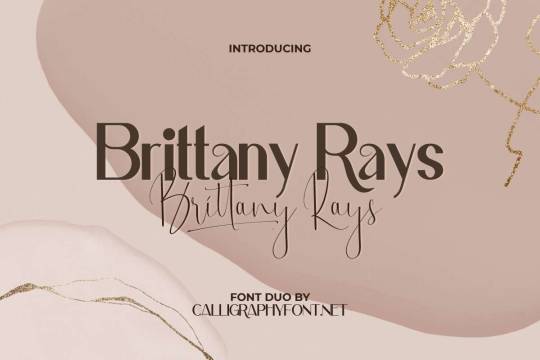
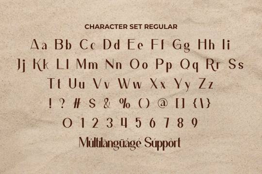
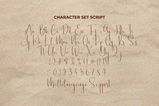
Brittany Rays font designed by Calligraphy Fonts
#sansserif#script#handwritten#calligraphic#fonts#typography#calligraphy#design#web design#webdesign#lettering#handlettering#font#type#typeface#wedding fonts#wedding invites#wedding invitations#wedding inspiration#save the date#wedding details#brand#branding#brand design#branding design#book cover#book cover design#magazine cover#magazine cover design#ttf
12 notes
·
View notes
Text
recent news: yay I post art now.
This blog is Sfw :D
I still accept asks, but no art will come with it, also:
Pokemon asks:
Krystal's text color Including font
Pikmin asks:
Fawn's text color
Alph's text color
I guess Olimar's text color
Brittany's text color is a no-brainer
...Charlie's? I guess.
The Plasm's
Quick FAQ (more will be added)
Q: can I make fanart and/or have a collab with you?
A: Sure! as long as you tag me.
Q: How long have you been drawing?
A: about six years, give or take. I don't really know.
About me
young aspiring drawer ready to draw Pikmin content at all moments.
What I will draw:
MalexFemale ships (I have nothing against the LGBT community btw)
Pikmin OC's
Anything appropriate
What I won't draw:
fetish content
Sexual themes
3 notes
·
View notes
Photo
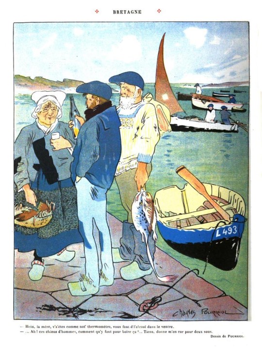
Bretagne
- Hein, la mére, v's'étes comme not thermométre, vous faut d'l'alcool dans le ventre.
- ... Ah ! ces chiens d'hommes, comment qu'y font pour boire ca ?... Tiens, donne m'en cor pour deux sous.
Brittany
- Hey, mother, it's like our thermometer, you need alcohol in your belly.
- ... Oh! What do these hounds of men do to drink that?... Here, give me a horn for two sous.
-- Charles Pourriol (1871-1910), Le Rire (The Laugh; French comic)
#Brittany#Bretagne#Charles Pourriol#French cartoonist#illustration#vintage illustration#comic#vintage comi#fisherman#fishing humour#le rire
8 notes
·
View notes
Text
RANKINGS UPDATE (08-20-22)
I even put little emojis by the names of the actual houseguests to depict whether they moved up or down compared to last week (joke spots are not included in this. The font was made smaller for them).
Taylor🟰
The Lays
Joseph (25)🟰
The Ants
The Live Audience
Turner (Muffin Bandit)⬆️
Monte⬆️
Jasmine’s Muffins
Michael’s Cider
Brittany*⬇️
Michael*⬇️
The Blindside Butterbeans
The Pool Floatie (deserved better, TBH)
Skippy (Production)
Jasmine’s Accent
Jasmine⬆️
Alyssa⬇️
The HOH Room Ceiling Tiles (BB23)
Terrence⬆️
Kyle⬇️
*Colour may vary between pink and purple depending on the day
7 notes
·
View notes
Note
Oooh I saw the banner for your “leave the light on” Gojo fic. May I ask what font you used?
yeah ofc!!! i used canva to make the banner and on there it's called "Brittany" :))
#[ 🏩 – chatting ]#i was excited to see it bc it was one of the only cursive fonts I've seen that is actually legible
2 notes
·
View notes
Note
I've reread NR and OAC like three times and it's still my favorite comfort fic, even after 9 years! I'm kinda biased since Brittany is basically me but in a different font lmao. I'm actually making a playlist based off of her and I wanted to ask you if there were any songs that you feel represent her? Any sad songs, happy songs, or just songs that she'd get pumped up to?
Whew, so many possible answers to that one! I'm torn between expressing my music taste now or just my music taste from when I was in high school haha. Probably my high school tastes. I guess I'll throw out a few...
"Scars" - Papa Roach
"Thunderstruck" - AC/DC
"American Girl" - Tom Petty
"Fire Woman" - The Cult
"You've Got Another Thing Comin'" - Judas Priest
"New Divide" - Linkin Park
"My World" - Sick Puppies
"Kickstart My Heart" - Motley Crue
There you go, a few songs to get pumped up to intermingled with a nice blend of teenage anger and angst lmao
4 notes
·
View notes
Text
Brittany Amastry Beauty Script Font
Brittany Amastry – Handwritten Script font is a natural and modern handwritten font. It’s perfect for logos, invitations, stationery, wedding designs, social media posts, advertisements, product packaging, product designs, labels, photography, watermarks, special events, or whatever
#fonts#font#handwriting#handwritten#displayfont#best fonts#script font#letter logo#logotype#logo#illustration#logo design
0 notes
Text
LOVE HURTS aka MOST HORRIBLE THINGS Reviews and free on Freevee, Plex, Tubi, Vudu and YouTube
‘Let the horror begin’
Love Hurts is a 2022 horror film about six young couples invited to a romantic get together which turns into a deadly survival game. Also known as Most Horrible Things
Directed by Hiroshi Katagiri (Gehenna: Where Death Lives) from a screenplay co-written by Aviva Dove-Viebahn and Brittany Fonte. Produced by Andrei Dunca.
The Sean Sprawling production stars Sean Patrick…
View On WordPress
#2022#Andrés Erickson#free on YouTube#horror#Love Hurts#movie film#Natalie Burn#review reviews#Sean Patrick Flanery#Sean Sprawling#Simon Phillips#trailer#Valentine&039;s Day
0 notes
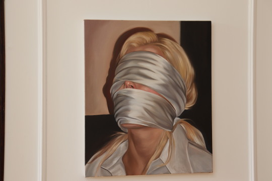
Text
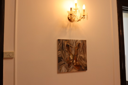
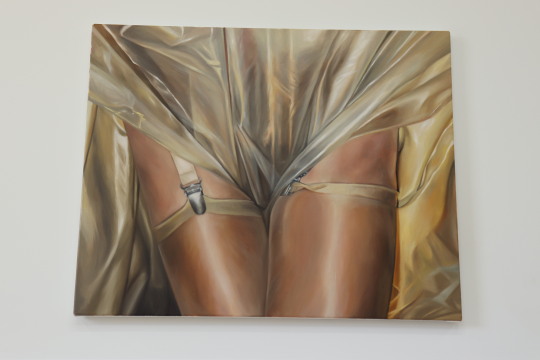
Réflexion sur l'exposition
Dans le cadre de mon cours d'art, nous avons eu la chance de visiter une exposition à la galerie d'art Pangé. Au deuxième étage de cette galerie, deux expositions d'artistes aux styles totalement différent étaient présentées, ce qui encourage l'appréciation artistique plus diversifier. Étant particulièrement attiré par la peinture, c'est l'exposition "Phantasma" de Brittany Shepherd qui a retenu mon attention.
Ce projet artistique se distingue par son caractère unique et innovant. Chacune des peintures de Shepherd explore le thème des fétichismes, qu'il s'agisse de pieds, de soie, de dentelle, ou d'autres motifs. En art, les fétichismes sont souvent des significations cachées ou déguisées dans l'œuvre, car ils sont souvent perçus comme tabous. De tels sujets suscitent souvent des réactions controversées de la part du public, il est donc rare de voir des œuvres qui les représentent pleinement, comme le font les siennes. Ce qui différencie sa représentation du thème vient en partie de l’absence de honte ou dégoût dans celle-ci. Au lieu de cela, elle représente ces aspects sans préjugés ni jugement .
L'installation des œuvres joue aussi un rôle dans l'exposition. Les œuvres sont disposées de manière à créer une atmosphère intime, donnant l'impression d'explorer un espace personnel plutôt que de parcourir une exposition traditionnelle. Les salles d'exposition, neutres, offrent un environnement idéal pour se concentrer uniquement sur les œuvres. L'emplacement de l'exposition contribue aussi à renforcer cette sensation d'intimité. Puisque la galerie Pangé se trouve dans une vielle maison nous avons l'impression d'explorer la maison d'un étranger.
Les œuvres exposées se caractérisent par leur réalisme. Chaque détails est représenté avec une telle précision que nous avons l'impression de pouvoir sentir la texture des matériaux et la transparence des vêtements sur la peau si on y touchait. La qualité du rendu est réaliste au point de croire qu'il s'agit de photographies.
Cette exposition a eu un impact profond sur ma perspective artistique. Ayant toujours voulu suivre les règles à la lettre par peur de l'échec, elle m'a montré qu'il est possible de sortir des sentiers battus et de poursuivre une carrière artistique. Sa pratique m'a également inspiré à explorer différents styles et médiums afin d'élargir mes horizons.
Parmi les œuvres exposées, celle qui a le plus captivé mon attention est celle représentant une chemise mouillée collée sur un torse. Cette pièce se démarque non seulement par sa magnifique représentation du corps féminin mais aussi par la technique incroyable utilisé par Shepherd. Ce qui m'impressionne le plus dans cette œuvre, c'est la manière dont l'artiste a réussi à reproduire avec précision la transparence du vêtement collé sur la peau. Cette transparence crée une profondeur et un réalisme impressionnants dans l'œuvre. Aussi, la texture de la chemise, où certaines parties apparaissent plus froissées que d'autres, est représentée avec précision. On dirait presque qu'on pourrait toucher les plis du tissu tellement elles sont réaliste.La texture de la chemise est aussi représentée pour que certaines parties paraissent plus froissées que d'autres.
Dans l'ensemble, cette exposition a réveillée en moi une profonde appréciation pour l'art et a enrichi mes connaissances sur la diversité artistiques.

0 notes
Last Seen Blogs

haruksy-blog
김신영

tailormadeitineraries
Untitled
starfleetsmutineer
A Starfleet mutineer

jonundone
Jon™

uryyb-jbeyq
^_^ ✧・゚: *✧・゚:*