#currently on book 4 and loving it
Text
Okay voyeur series by fiona cole is freaking AMAZING!
1 note
·
View note
Note
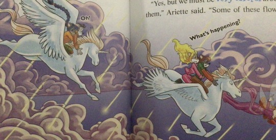
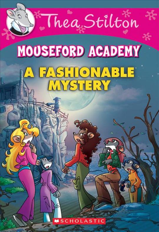
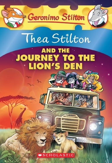
The art style of Cloud Castle is absolute ass bro why are their eyes so big
Idk man it just looks.... off
I wish they brought back the og art style like Blue Scarab Hunt because that was gorgeous
Well if you’re referring to the book's artstyle as a whole, then calm down buddy the illustrations as a whole are pretty good all things considered (believe me some of the illustrations in the later books are waaaaayyyyy iffier)
But if you are referring to Danilo Barozzi’s illustrations in the book then uhhhhh… yeah I don’t blame you, I didn’t like the big anime irises either, she didn’t cook with this one,,,
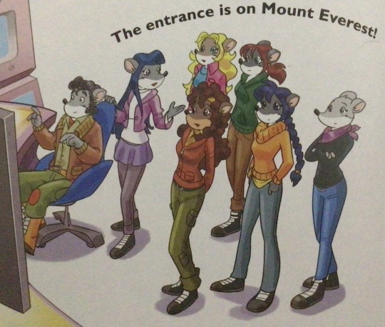
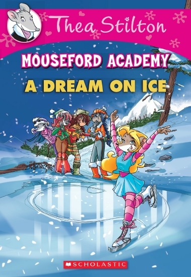
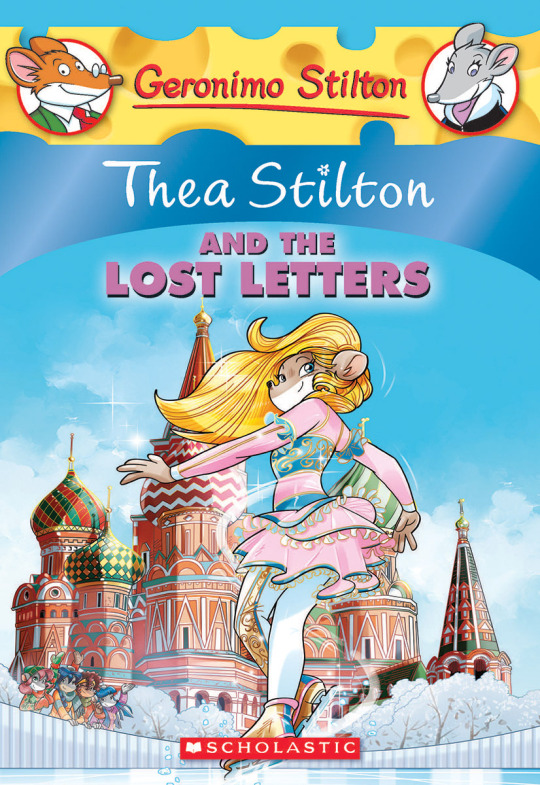
The interesting thing is Barozzi also did pieces for Secret of the Snow and those looked fine (she did well enough that I have to squint to determine which ones were done by her). My guess is either she did a lot of the illustrations for the latter half of SotS and we just got used to it, or it’s because the artstyle of special editions 2 and 3 were more… experimental? Books 4 onwards developed a very specific… look for the artstyle that adhered very closely to the main book illustrations of Spanish Dance Mission onwards, thus the illustrators had to follow suit, resulting in whatever looks off to look especially off.
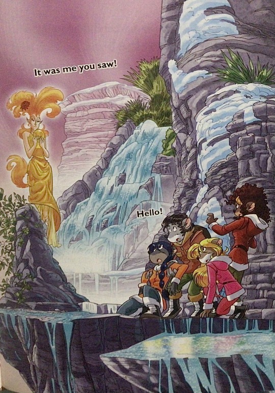
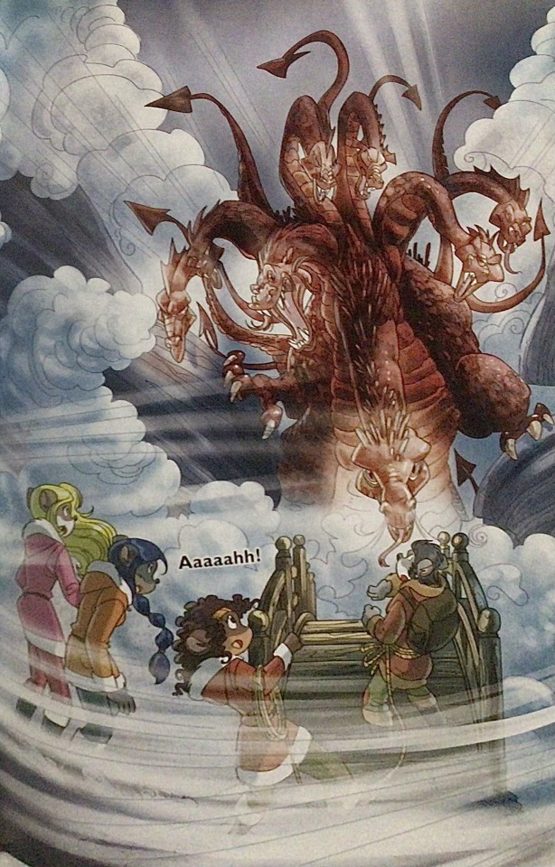
(Even with this set of pictures, I’m only about 70% sure these are Barozzi’s because of how alike yet different the styles are from each other in the book. The first one could be Barozzi’s, but it could also be Giuseppe Facciotto’s, since he also did illustrations for SotS and his stylization means he sometimes puts the eyes really close to each other in a way that’s weird but still makes sense somehow.)
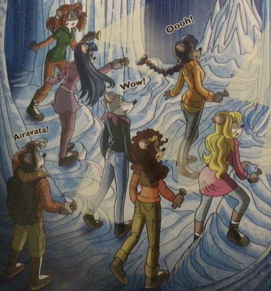
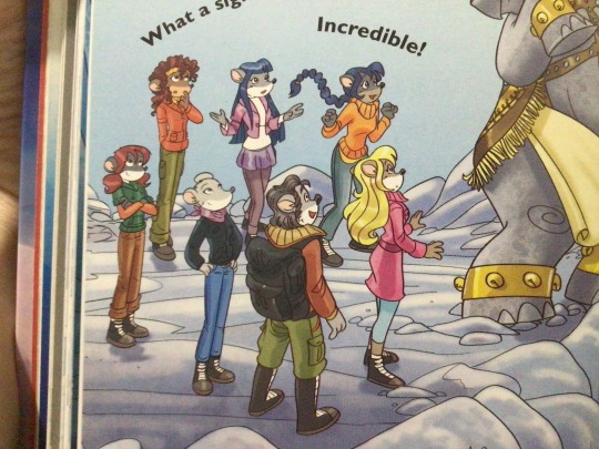
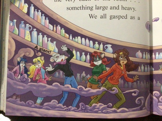
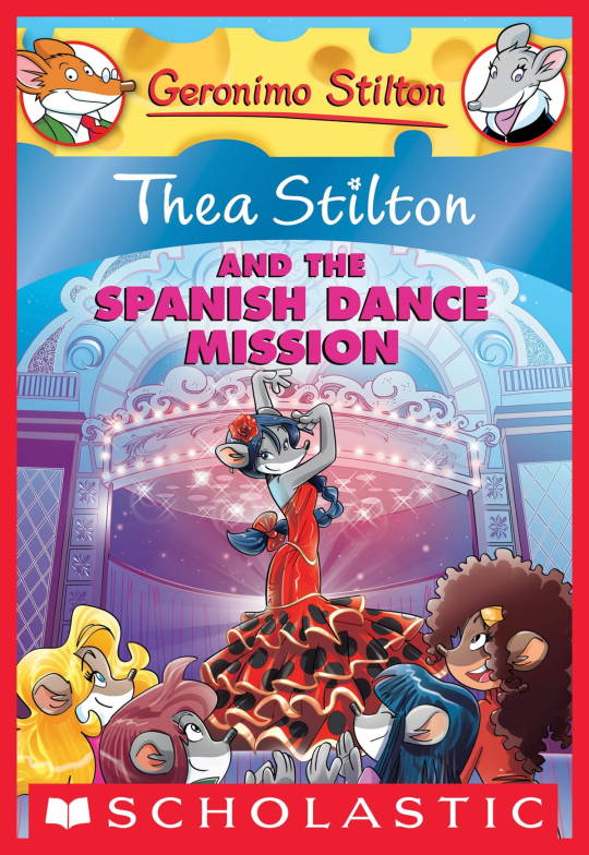
On the contrary, books 2 and 3 (and I would probably even include book 1 there) had a more experimental look to the illustrations, which seems to be based more on (and this is just a theory of mine) Giuseppe Facciotto’s iconic work for the covers of Mouseford Academy books 2-12, 14, 15 and 17 in the English books (he did waaayyy more covers for the Italian Mouseford books— he was basically the cover guy for the Mouseford books for a WHILE) as well as the books from Spanish Dance Mission to Lost Letters. If you’re wondering why those covers go as hard as they do, then now you know why.
(These aren’t all of Facciotto’s works for the covers we know in English but you can see that he popped off <3)
But yeah as you can see with special editions 2 and 3, the art direction seems to be heavily inspired by Facciotto’s artstyle.
However, when Barbara Pellizzari’s works became the aesthetic poster child of the books’ brand, that was reflected in the illustrations and how their aesthetic changed, as seen in the main books and how they look currently, special editions 4-9, and the Treasure Seekers trilogy.
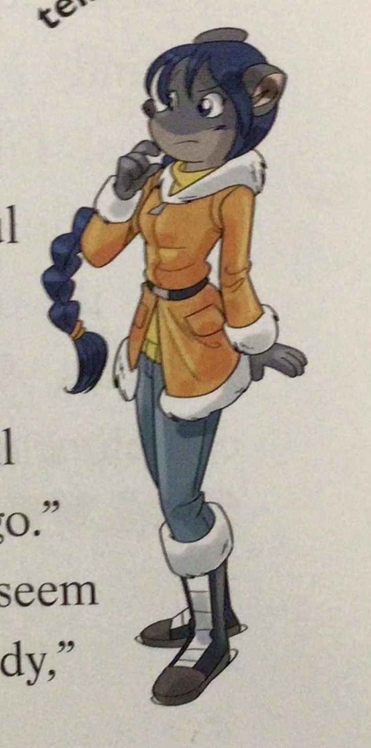
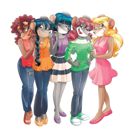
This new profile thing of the girls? This was done by Pellizzari (coloring was done by Flavio Ferron), and thus it became the main reference for how the girls look in the book’s illustrations.
And it’s not just in the general direction to the artists for how to draw the Thea Sisters, but also in the direction given to the colorists. Alessandro Muscillo was the colorist for the special edition books since book 1 and the Treasure Seekers trilogy, and you can see that the direction for the style varied through books 1-3, like maybe direction was experimenting with the mood the illustrations were to convey, beginning with the cartoony and bright colors of book 1, easing into the more grounded and layered palettes of books 2 and 3
Then book 4 was when they transitioned to using digital art /j
I jest, but seriously book 4 was the debut of the coloring style we end up keeping for the rest of the special editions and for all of Treasure Seekers, which is very… bright :D
(I would show more picture examples but I manually took pictures of my physical copies for the Cloud Castle and SotS illustrations and gwuh I’m too lazy to grab my entire collection just to take pictures,,)
Bright as in like… the colors are very defined and saturated. I dunno how to describe it, but when you see it, you get what I mean. It’s very bright and pretty and colorful and it stands out. There are still variations that happen on occasion (Star Fairies in particular uses a good dose of airbrush for the lighting and shadow effects, and Crystal Fairies looks like someone had a bit of fun using sparkle brushes), but other than that, it’s very bright. I don’t hate it, but I do acknowledge that yeah, if I was introduced to the series when it had fully transitioned to the new style, I never would’ve gotten into the series in the first place, because the older books had something that didn’t make it feel specifically catered to girls. The colors were bright, but not too bright. Colorful, but unified. They weren’t that complicated, and they didn’t have to be because the colorists (plural, there were at least 3 per book once upon a time) were popping the hell off with the colors they were given. But y’know, the newer books’ consistent style did give me a good spot to practice drawing mouse furries so I’m not complaining too much about the newer style, haha.
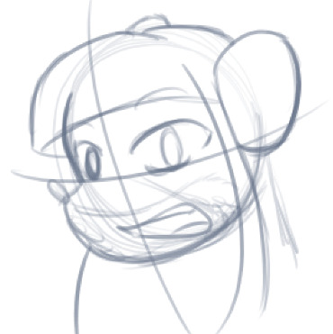
(Tiny baby E’s (it’s literally from 2020 what’re you on about mate) her first mouse Violet drawing using Barbara Pellizzari’s artstyle in Treasure Seekers 1 as an anatomy guide!!)
With that said tho, yeah I miss the old books -m- dunno if it’d fit the aesthetic of the special editions but m a n we could’ve had it and it probably would’ve looked cool
Also the illustrations go way harder in the older books, like Prince's Emerald? I've talked about Prince's Emerald and how it goes hard before, and I still stand by it and say that it does in fact still go hard
Maybe it won't fit the uh splash of color they gave the hardcovers, but imagine they grabbed Giulia Basile's coloring work for the graphic novels and used that as sort've a basis for the coloring style of the hardcovers. Not exactly the same-- would probably still add a touch of whimsical watercolor and/or paint to the very cel-shaded style, but we could've had something pretty dope -m-
Anyway that's my ramble simultaneously defending the hardcovers' artstyle and reminiscing on what could've been haha
#geronimo stilton#thea stilton#thea sisters#questions with e#rambles#the style of the older books is gorgeous but the main thing I'm wondering is can it pull off fantastical whimsy#that's the main thing i dunno if it can do (i would love to be proven wrong tho)#the style is so grounded that i'm wondering if it can pull off what the hardcovers needed it to do#which is convey the otherworldly fantastical thrill of exploring the fantasy worlds (which uh the newer books were able to do but#my main gripe is that fantasy and reality are near indistinguishable in vibes coloring-wise#sure there are sparkles and stuff is more saturated but the girls' dorm in book 4 still has the same-ish feel of the land of clouds#i dunno what it is. the bright colors just feel mundane somehow and don't take a shift when returning to reality)#looked at my books again and i think it might be the fact that the later books have no grounding color?#compare book 3 to book 5 and you'll see it the most distinctly methinks#the newer coloring style doesn't have a color that grounds the illustrations' palettes and thus everything's always bright 100% of the time#the girls' colors are always at their most saturated#like they're always under broad daylight in terms of lighting#it's not eyebleeding or anything but they don't look affected by the lighting in the setting they're currently in#and the result is it looks.... meh?#we get so used to the bright colors that they end up looking meh somehow#i'm not an art expert by any means this is just my observations as someone with a little too much brainrot
33 notes
·
View notes
Text
Packing is so stressful and I hate it.
#i would love traveling if it weren’t for the packing#this is the least amount of clothing i’ve ever packed and i am actually spiraling about it#i managed to narrow 9 books down to 4#i’d like that to be 3 but not sure i have the willpower#everyone who is like ‘this is why kindle is handy’ doesn’t get me#i have learned that if i want to read for fun it’s got to be a hard copy or i get too distracted#currently trying to decide if this 4th book is more important than an extra pair of leggings#personal
11 notes
·
View notes
Text
souP..
#just me hi#sou p#now That's a word#//it's 5 a.m. and i woke up like 4 hours ago for whatever reason and i've been scrolling the hurt/comfort tag on ao3 for like 2 hours hfbvs#do you ever realize that you aren't very interested in many things sometimes? bc it's definitely a Feeling loll#like it's nice! i don't get very overwhelmed with things i like but also. very sorry that it's so hard to get invested hbhdb#/i Know what i wanna read and unfortunately anything less and i will mentally file it under Ah. Okay :/ fvsh#and ALSO the things i am currently interested in are either my own Ocs (<///3) or shows made in the 50-60s that have nothing written at all#'why don't you write it yourself' 1) that's what the Ocs are for babyyy (and i don't trust myself to get other characters right HFvbs)#and 2) sometimes you just wanna read. you know. reid#oh and also Books written in the 40s. i cannot win out here Lollll#love Farewell My Lovely but also i can completely understand not really wanting to interact with it after reading fhfshc#the main guy is just So silly-putty to me. anyway#there was another book but i aem forgretting the Nayme#//anyway shoutout to the shows and books and my own projects that on every existing state of being i just Can't be/stay interested in hfhsb#:)
9 notes
·
View notes
Text
I had a dream yesterday night that I got two full requests and was really happy, woke up today and thought nothing of it then came back from school, checked my email, and guess what I saw- a full request!
I was honestly really bummed out about starting another round of queries at the end of August because in the previous round I got 3 fulls that ultimately ended in rejections. Even now I'm scared to post this because what if this full ends up as a rejection too?
But tbh any progress is still progress, and I'm trying my best to look at this whole thing positively. How is everyone else's writing/publishing coming along?
#haya: talks#haya: talks the traitor's throne#querying is a very inconsistent process you really can't predict what comes next#i've gotten a full request within 20 minutes of sending in a query and i've also gotten full requests 4 months later#i've had people say they love my book but can't offer rep because it's not fit for their current list while others think it's the right fit#it really all just depends on the agent's current mindset and work goals#and as annoying as that can be you can't hold it against them#but honestly i can't deny it feels good getting this request kind of like a confirmation that I'm going down the right track#querying agents#literary agent#querying process#traditional publishing
10 notes
·
View notes
Text

Sheridan Le Fanu, Carmilla
#sheridan le fanu#carmilla quarterly#carmilla#quotes#A Wonderful Likeness#Carmilla: Ch.4-7#on love#love quotes#gothic literature#dark academia#1800s literature#vampire fiction#currently reading#current read#wlw literature#light academia#moon#moonlight#book quotes#literary quotes#books#bookblr
35 notes
·
View notes
Text
hello good morning beautiful friends!
#another day! what are we all planning on doing with it! what is everyone reading right now! having finished gios room yesterday i#am currently not reading anything except um. hex hall. with ren. because i love ren. but a second hand book site had a sale going#on so i got 4 secondhand books for 13.30 and they're arriving this weekend :-) today i am planning to. carry on looking for jobs which#is miserable especially considering my cv is underwhelming and looks like i dont have much meaningful experience because i was#unable to find a delicate way of mentioning that on top of my old job i also did my managers' job starting from the ripe old age of 16#because they decided to just stop putting managers on most of the shifts i used to work so all the stuff that the manager was responsible#for was left to me and was not reflected in my pay...not that im bitter about that or anything...ANYWAY. also today i plan to#make some genuine progress with planning [noisy train passes by] and also get my paints down and sort through them to find which#ones havent dried up..maybe paint something..like a pigeon although i dont know how to draw or paint pigeons i just love pigeons and sheep.#(ridi's) bigmouth strikes again
19 notes
·
View notes
Text
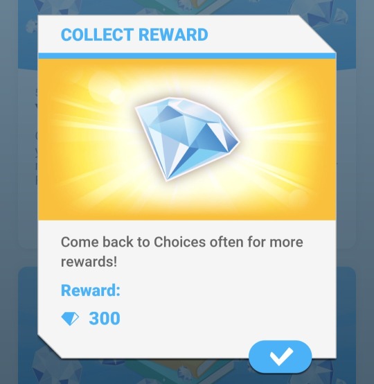
You best believe I autoclicked the shit out of books I have no intention on ever reading... Next time if they do this I will autoclick through my two first loves because that book has hella short chapters.
#playchoices#I did distant shores then roommates with benefits then first comes love...#Because I hadn't read them I was up roughly 200 additional diamonds because you get 4 per chapter on vip#It was boring as hell but I wanted the diamonds#Even though I hardly play this app but I'm currently playing that wolf book the Dalton affair and blades...#choices vip
8 notes
·
View notes
Text
natsume book of friends season 4 opening sequence has got me incredibly fucked up. the lyrics. kid natsume's tiny little legs and teenage natsume watching him run. the lyrics. nyanko-sensei burrowing into his arms. did i mention the lyrics? ending frame on the fujiwara family. including natsume. because he's part of their family. as the lyrics ask him to "please [not] keep suffering alone"? somebody fucking hold me.
#i'm actually almost done with season 4 because i have no self-control. and every time i watch the opening i'm like#no this has only gotten more potent since the last time i watched it. we are reaching danger levels#natsume yuujinchou#natsume's book of friends#my posts#season 4 is the season of tanuma just completely destroying me on every level. why is every single character like this??#every time he learns something about natsume he's like oh so this is what it's like for natsume?#and then it happens again and he's like wait natsume ALSO has THIS OTHER THING to contend with??#and again: AND A THIRD THING?? WHY MUST THE WORLD'S BEST BOY NATSUME TAKASHI SUFFER???#he just wants to help natsume deal with stuff and i am on the fucking floor#his thought process is just#this is hard for natsume. i wish i could help him. maybe here's a way i could help him? he doesn't want me to though because it would#put me in danger. but i don't want him to be in danger either. and i'm telling him that to his face. i don't think it's really#gotten through to him but that's okay i will just keep telling him. now i'm realizing that the thing i did to help him maybe just made#things harder for him. this is hard for natsume. i wish i could help him. maybe sometimes the best way to help him is to just#respect his wishes and yet remind him that he can lean on people and that people love him as much as he loves them#the part where tanuma realized why natsume doesn't tell the fujiwaras about youkai gutted me#this kid is so emotionally astute and such a sweetheart#i just watched the episode where natsume loses his picture of his parents and his old house is getting sold and i cried. SO many tears.#tanuma putting his foot down for once like no actually you need to admit that something is bothering you this time#we can find this picture. ask us to help you do this thing that we can actually do for you. you don't need to be sad for no reason#mmm can't be coherent about it just rest assured it was extremely harmful to me and also exactly what i needed#anyway the season 4 opening song as the thing you say to your younger self who lives inside your current self because#you can't actually go back in time and be the person your younger self needed to have in their life. so all you can do is love that child#in absentia but so so so fiercely and with your whole entire heart#all you can do is give your current self all the love you have for the child you were#jesus CHRIST
25 notes
·
View notes
Text
“Guys I’m going to be completely normal about this new media I like”
He was infact not normal about this new media he liked
#autism#a book I read out of pure spite is now my biggest hyperfixation#there’s to many thoughts to many things I need to rant but no one cares#my fallowers are currently watching my insanity arc#I WANT TO BE NORMAL ABOUT ONE THING I LIKE FOR THE LOVE OF GOD#a picture of dorian grey#this was spoused to be a 2 week fun littlr hyperfixation it’s 4 months later and now Iv spent hundreds on books and merchandise god dammit#gothic literature is such a expensive hyperfixation fuck#gothic literature
5 notes
·
View notes
Note
what's your favourite fic that you've written? (Or, I suppose a scene from a fic that you're particularly proud of?) (although saying that so much of your fic is top tier 🩵🩵🩵)
hello anon!! this ask made me 🥺🥺, thank you so much for dropping it in my inbox <3
my favourite fic that i've written... this is actually more difficult than i thought, as there are some that were hell to write but i'm really pleased with how it turned out, and some that are not absolute masterpieces but i had so much fun writing them. and the one that's a mix of all of the above (as contradictory as it may seem) hasn't even been finished and posted yet lmao. i think, overall, my favourite that i've posted is we left the book of love signed in blood on every page, which looks at the breakdown of gwaine and merlin following lancelot's death. i enjoy writing angst like that and i also had fun with the sustained imagery
but in terms of a scene that i'm particularly proud of, the moment in bitter is the antidote where gwaine begins to relax around lancelot and both of them are pressed close to each other and reaching out to merlin is one that i'm quite proud of. the full scene is below the cut and i enjoyed trying to depict the hesitancy on both gwaine's and lancelot's parts. also i really like the line 'so he let his tea go cold and his shoulder grow numb' but i couldn't tell you exactly why
thanks for the ask anon, hope you have a wonderful day! 💜
Lancelot had one hand buried in Merlin’s hair again, twisting the short strands between his fingers, knees pressed against the bed. Hesitantly, Gwaine hovered on Lancelot’s left side before sinking down to the floor, one leg strewn out beneath the bed. His hand reached for the one Merlin had draped over the edge of the bed, taking it between his fingers and, upon receiving murmured permission, gingerly leaned against Lancelot’s leg. He was aware of the bone pressing into his shoulder, just as he was aware of Merlin’s grip tightening around him, but it didn’t scare him half as much as it should have done.
Never, never had Gwaine thought that he would be so close to two others when all three of them were conscious. Never had he thought he would be confronted with the knowledge of his best friend having magic, either, and Gwaine couldn’t help but wonder what other unexpected things fate had in store for him. He didn’t dare move, in case it all proved to be an illusion and the slightest twitch dispelled it. So he let his tea go cold and his shoulder grow numb, let his abdominal muscles ache with the effort of not allowing all of his weight to fall on Lancelot’s leg and his hand be manipulated by Merlin’s touch.
Merlin, assured by their physical presence, had closed his eyes and Gwaine took the opportunity to use his gaze to sketch out the angles of Merlin’s body in his mind, safe in the knowledge that Lancelot couldn’t see his face. Before, he’d been convinced that he’d successfully memorised each dip in Merlin’s form in the same way that he’d memorised the placement of his own gaping traps in woods over the years. He’d thought that he’d be able to sculpt Merlin flawlessly from ribbons of clouds and wind. But, as Merlin shifted and the tip of what looked like an old scar peered over the neck of his shirt, Gwaine realised just how wrong he’d been. It was a blessing that the hand not holding Merlin’s was engaged with a cold cup of tea because Gwaine could feel temptation running its fingers along his arm, leaving a trail that ended at Merlin’s chest.
The skin looked leathery, much like Merlin’s burned leg, and, if it had been fire… Just how many times had Merlin narrowly escaped the flames? How much of himself had he kept protected from Gwaine with a clumsy cut of material tied around his throat? Dropping his gaze to his right hand, Gwaine pushed one side of it into the bed, careful not to squash Merlin’s hand. He was one to talk.
Faintly aware of a subtle movement behind him, Gwaine rotated his head by several degrees, glancing over his shoulder and through his hair. Lancelot was no longer holding the cup in one hand – if Gwaine shifted his hip, he’d knock against it on the ground – and the hand was now hovering above Gwaine’s shoulder. Gwaine began to phrase a silent question but cut himself off as he reached an answer; it seemed that Lancelot was reluctant to place his hand in his own lap for fear of elbowing Gwaine in the head.
Returning to look straight ahead, Gwaine raised his left hand and took his little finger away from the cup, hooking it around the tip of Lancelot’s middle finger. Careful not to spill his drink, Gwaine slowly lowered his hand, taking Lancelot’s with him, until Lancelot’s palm met his shoulder. As Gwaine rested his own hand on his thigh, Lancelot made port with his thumb at the muscle between Gwaine’s shoulder and neck. It was then that Gwaine registered that, in leaning against Lancelot, his jacket had slipped a little off his shoulders and had dragged the neck of his shirt down with it.
Most of Lancelot’s hand was planted firmly over Gwaine’s shirt, his wrist grazing the collar of the jacket, but his thumb was on that muscle – a muscle bearing layers of tension that Gwaine hadn’t even been aware of – and his index finger was dangling over Gwaine’s collarbone. And then Lancelot began to sweep his thumb back and forth along that single muscle, collecting the tension in Gwaine’s shoulder like a bee picking up pollen, and Gwaine couldn’t hold himself up any longer.
#hey nonny nonny asks#honestly i was not expecting this ask and it was such a lovely surprise when i checked tumblr last night#(i was in the middle of a rewatch of go2 at half 11 at night so decided to save it for this morning)#for the record i am also proud of much of mortality clings to butterfly wings but i'm trying to appreciate my recent writing#as my brain has been telling me it's not as good as my writing from 2021 and yeah it's slightly different but that doesn't mean it's worse#i am very excited for the day when i finish a fic i started last year and post it bc it is frankly hilarious if i do say so myself#it's the first fic that actually feels like a comedy and it's just. silly.#it's a merwaincelot fairytale au based on a tale called the bear that was collected by andrew lang in the grey fairy book#but with some changes and more comedic value#anyway i'm aiming to get it done for au day for merwaincelot week 2023#currently have 6 active wips and 4 of them are merwaincelot whoops#thanks again for the ask anon and for enabling me to ramble!!#lit talks#lit writes
4 notes
·
View notes
Text
People reading books, how many books have you read this year?!!!!
I'm at 4 as of January 30th! I haven't read this much since high school!!
#i have read 4 books this year#currently reading#reading goals#blktumblr#black tumblr#blackgirlthoughts#black girl magic#90s baby#quotes#good vibe tribe#self love#happiness#manifestingmindset
6 notes
·
View notes
Text
rereading books is awesome until youare in the middle of reading two series and you also want to reread (checks list) four more. asap. and also like ten new books at the same time.
#chat#current: terra ignota and machineries of empire#wanna reread: baru (BUT IM WAITING IM HOLDING OFF TIL AUGUST. 4 THE LAKE)/imperial radch/hunger games (adult re-consideration)/septimus hea#wanna start: tensorate/piranesi/les mis or hunchback/c&p/every book on my dads tbr shelf (like. eight? ten?)#fuck i just remembered i never finished desolation called peace. so i need to reread teixcalaan too and finish that. Books. BOOKS!!!!!!!!!!#oh and ofcourse the. comics and manga. bsd/bride's story/dungeon meshi/transformers idw collection#im chewing. i love . boosk
5 notes
·
View notes
Note
oughh I agree so hard with you w/ death stuff. Tbf I've never actually seen a dead body close up or had someone close to me die so idk if my feelings will change after that but I think we're a part of nature and should return to nature after death
YA ive only ever seen dead bodies who have been prepared (in person at least, ive seen pictures of unprepared bodies) so yk. but ive lost a couple of family members and i just think likee. speaking from experience when you dont have the time with the deceased to process the death. it makes it sm harder to like. Feel your grief. bc yr so pushed into the like. Well the funerals over so grieving is done
#theres jusr sooo much.#IDK if yr aware but caitlin doughty (ask a mortician on youtube) has a couple of rly good books on death ive only read her first 2 (the 3rd#is on hold rn 🙏🙏) that i highly recommend ALSO obviously her yt channel... her videos r rly rly rly insightful#shes a huge advocate of green burial (she owns a green burial funeral home) so i think a lot of her stuff could be rly relevant to you!#specifically i recommend her video reacting to famous film corpses MAINLY rhe second half of the video#where she visits a facility (idt thats quite the word) where they make animal feed blocks out of cremated remains#i saw u mention youd like to be eaten by animals after death and currently with all the legal stuff i thjnk thats one of the best/only ways#2 do that rn :]] ALSO her 2 human composting videos r less abt feeding animals and more abt feeding plants obviously. but still very#interesting and ties into the returning to nature stuff...#APOLOGIES IF U ALREADY KNOW HER. shes one of my idols DNFNFJNF so i shill 4 her every chance i get#i love love love her videos basically. highly recommend her cannibalism trilogy as well.. a lot of her videos r judt very insightful#a2t
1 note
·
View note
Text
Love finding out that the girl I closely worked with for a few hours yesterday tested positive for Covid last night
#not totally surprising bc right now we have several people out with Covid#but like really 😭😭#of course I DO NOT want to have Covid but at the same time I’m like….. then I get 5 days off#but then our opening and mid shift is totally fucked#because it’s 3 of our mid shift people and a manager that are currently out#and it gets worse because my absolute favorite manager just told me that she might be leaving#and then I’m assuming the other girl that I love working with is gonna get promoted to manager#and I don’t really want to be a manager bc I like the hours I’m working and as a manager I couldn’t be working those#so like idk I think if the position was offered to me again I might take it#but also if 2/4 of my favorite people are managers who are never on shift with me anymore#if 1/4 of my favorites only works three days a week and is only ever in the back prepping things so I hardly get to see her#and then the last 1/4 is leaving us (bc of a promotion that I’ll be mad if she doesn’t actually take it/get it bc it’ll be so good for her)#then like……. I don’t see why I should stay here#I’ve been looking for a reason to leave for the last like 3 years (for perspective I’ve worked here for like 3years and 4 months)#and having none of my favorite coworkers with me anymore might just be that reason#and I’ll go work at like Barnes and noble or something bc I was there yesterday and I love books and the employees seem like good people and#I feel like I could do that#that was the first place I applied for a job and I either didn’t answer the phone when they called me back after my interview or I just#never got a call back#anyway……. I feel like this is enough of my ranting of my concerns for the day#I came up with a new fic idea! so that’s interesting#it’s not related to any of this don’t worry…. it is based off a Disney movie I love though and it will probably be about mark or xiaojun#and I was about to write more about it in my drafts before my favorite manager came to talk to me on my break
9 notes
·
View notes
Text
as we all know i'm almost always very fussy and difficult but. atfots katabasis good.
#like i'm sure i could come up with complaints if i tried but. love 2 be borne on a current of rippling rapturous delight 4 once.#(ALSO love 2 still have like 300 pages left. books paced for my own voracious heart 2 make a full meal of.)#bookblogging
2 notes
·
View notes
Last Seen Blogs

magnificrazylove
reflexione
journalofahotmess-blog
fucked if I know
dododan
DodoDan

mypeaceafterdeath-blog
If I can help