#easy logotype
Text
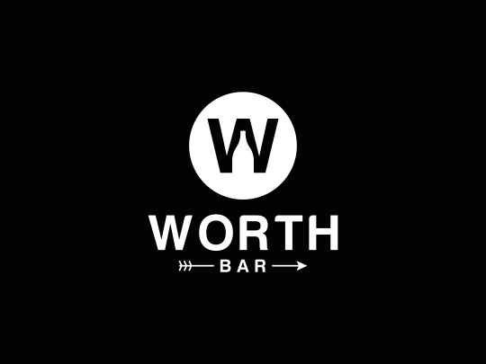
WORTH BAR - A logo for Modern The Logo Concepts: The Icon "Bottle" wine Glass" Logo Style: Simple, Minimal, Flat, Easy, Modern, and Conceptual/ Meaningful.
#Minimal#Flat#Easy#Modern#and Conceptual/ Meaningful.#vector#logo#modern logo#logo design#brand identity#logotype#colorful logo#icon#flat logo#graphic design#Hello#sterngd#Dribbble#branding#brand identity design#monogram#mark#nature#portfolio#redesign#service#negativespace#drink water#wine glass#bottle
1 note
·
View note
Note
tell me your favorite legible font that isnt comic sans i want to know for promo graphic reasons
Handwritten eg for comic letteringO Lexia Readable
Script, eg for signatures: Learning Curve
Serif eg for print: Crimson
Sans serif, eg for websites: Coolvetica
I waffled on monospace recs because "my" favourite is Open Dyslexic Mono, but let me be clear: it is HIDEOUS it is the fucking butt ugliest goddamn font.
But it reads so easy on my notepad...
14 notes
·
View notes
Text
Lost Property - 26
(masterpost)
Previous - Next
CW: dehumanisation, pet whump
-
The minute Colton stared up at the path ahead, his legs felt like they were going to give out. He couldn’t, surely he couldn’t walk all that way?
Lydia noticed his poorly-hidden anxiety and placed a hand lightly on his shoulder. “Once you find your rhythm, hiking is really fun. It’s calming, and satisfying when you reach the top. Look how nice and quiet it is today, too. Hardly anyone around to bother us.”
That was nice, he had to admit. Lydia’s belief in him seemed to strengthen his legs once more. He nodded, once, and replied, “I’ll do my best, Ma’am, and try not to hold you up.”
Lydia had opted for an easy, gently rising path that meandered lazily along the edge of the mountain. Spring was just beginning, some trees were reaching their still-naked branches towards the blue sky, while others sported their very first green leaves. The wind carried scents of wet earth and greenery.
“Look, Colton!” Delightedly, Lydia pointed out a fat bumblebee flying in low circles. “It must be a queen! She’s been sleeping though the winter, and now she’s looking for a good place to build her nest.”
The pet looked at the insect with interest. For once, he seemed more curious than scared.
-
He was being good. Lydia was pleased with him. She wasn’t walking very fast, stopping now and then to admire a plant or the view. The breeze had a bite to it, but the sun was warm. No one that he knew from… from before could reach him in this foreign place. But wasn’t this too much of a human enjoyment, going on a walking trip, talking together? Well, mostly Lydia talked, but he did hum his agreement and offered a word or two from time to time. Wasn’t this a thing that people did? Still, she had said that she had planned to take Coriander. And dogs went on walks too, didn’t they?
Lydia looked so serene, taking in the world around her at her own pace. Colton felt something in his chest, alongside his never-ending anxieties. He wished he could experience this the way she was.
He couldn’t. Pets and humans were too different. Lydia was his superior, she was free, she was her own master. Wanting to be like her was so foolish only a silly pet’s brain could have come up with it.
*
“Here Col, have some water.” Lydia unfolded a red, rubbery cup printed with the conference logotype and handed it to the young man. Then she unfolded a blue cup for herself. “Finally some useful merch.”
Spring water cascaded from a metal pipe set into the rock down into a stone basin and disappearing under the ground again. Green moss and feathery fern fronds surrounded the spring. Lydia put down the cup on top of her rucksack and reached out to wash her face and hands underneath the cool flow. When she filled her cup and drank, the water tasted fresh and wild.
From the corner of her eye, she could see Colton copying her actions almost exactly, washing his face and hands and then drinking deeply from the cup. He was eying her nervously, but when she smiled and nodded approvingly, he gave her a tentative, shy nod in reply.
“That’s good, right?”
“Yes, Ma’am.”
“Here, have a sandwich too.”
He hummed, like he wanted to protest, but stopped himself. He was letting her be kind to him.
Lydia sat down and leaned against the big rock flanking the path, the reddish stone sun-warmed against her back. Amid the trees in front of her she could catch glimpses of the view. A river meandering through the valley and catching the sunlight in crystalline sparks. There were strands and streaks of forest, a few houses, scattered fields that were still bare, some darker brown where the soil had been overturned, some lighter brown where the soil had not been touched.
After eating her cheese sandwich, Lydia leaned back against the stone, closing her eyes and enjoying the warmth and the sunlight. She let herself doze off for a moment, when some small noise suddenly alerted her.
She opened her eyes. Col was standing up, every muscle taut, staring fixedly into the forest. A moment later, she heard it too. Something was moving. Her breath caught. For a panicked moment, she remembered the man from yesterday. Had he followed them? An icy hand closed around her heart.
Colton leaned forward subtly, trying to see further through the trees. His hands tightened into fists.
A moment later, with a rustle, a pair of startled deer threw themselves over the path. Lydia caught a glimpse of dark eyes, russet fur and slender limbs. Then, they were already past. Their white tails bobbing away in the undergrowth.
Lydia let out a breath she didn’t know that she’d been holding. Meeting Col’s green eyes she laughed with relief.
“They gave me quite a fright, too. But all is well.”
. . .
The hike had continued at its drowsy pace. Col’s legs occasionally wobbled, Lydia noticed, and she made sure to casually suggest another quick stop every time. She was hardly surprised- Cory didn’t get out much, either. It was something she was hoping to gradually improve on.
Slanting, reddish rays of afternoon sun warmed the pink wall of the café, reflecting warmth on Lydia and Col sitting in patio chairs. Lydia was enjoying a fresh, slightly tart lemon sorbet. Colton had just stared in bewilderment at the array of colourful flavours when she’d asked him what he would like, so she had made the hopefully safe choice of strawberry and chocolate ice cream for him.
“So,” she said, “What do you think of today, Colton?”
*
The pet swallowed a spoon of sweet ice cream and met her smiling brown eyes with shy hesitation. When she smiled, her eyes squinted into crow’s feet at the corners. It made her look genuine. She was genuine, he was pretty sure.
“It was… it was a nice day, Ma’am.” He was surprised to discover that it was true. It had been a busy day with some very stressful moments, but on the whole, he had enjoyed it. Were pets even supposed to enjoy things? It was a strange feeling, but one the time with his Master had made him more accustomed to. “I am very grateful for it.”
“I’m glad you liked it.” She pushed a wayward lock of brown hair behind her ear. “I liked it too, I’m glad you wanted to come with me.” Lydia smiled. “And tomorrow, we’re going home.”
*
Fun facts:
Bumblebees early in the spring are always queens, since they are the only ones to hibernate over the winter. They have already mated in the autumn, so in the spring they are ready to start to lay eggs that hatches into worker bees.
Bumblebees can fly in colder temperatures than other bees , as their fur keeps them warm. (Bumblebees look round, but underneath the fur they look similar to other bees.)
They are very important pollinators and bumblebees are used commercially to pollinate crops like raspberries and tomatoes. Unfortunately, this causes some problems by risking the spread of diseases to wild bumblebees and that nonnative species can become invasive.
Scientists in Switzerland have discovered that bumblebees can make flowers start to bloom faster by biting them: https://www.livescience.com/bumblebee-bites-make-flowers-bloom-early.html
-
taglist part 1:
@cupcakes-and-pain @whump-em @wh-wh-whu @neuro-whump @carnagecardinal @cowboy-anon @whump-me-all-night-long @redwingedwhump @myst-in-the-mirror @haro-whumps @eatyourdamnpears @bloodsweatandpotato @pinkraindropsfell @whumptywhumpdump @theydy-cringeworthy @whump-in-progress @whumpsy-daisy @nicolepascaline @whumpcreations @briars7 @shiningstarofwinter @whumppsychology @alex-ember @miss-kitty-whumptastic @whumpy-writings @in-patient-princess @youtube-fandoms-bands @goblinchildindabog @mazeish @distinctlywhumpthing @inpainandsuffering @canniboylism @incoherent-introspection @kim-poce @broken-typewriter @the-monarch-whumperfly @whumpers-inc @grizzlie70 @lil-whumper @writingbackwards @sunflower1000 @wingedwhump @thecitythatdoesntsleep @thingsthatgo-whump-inthenight @onlybadendings @rabass @wolfeyedwitch @melancholy-in-the-morning
129 notes
·
View notes
Text
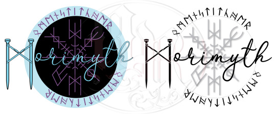
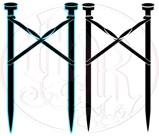


November 2023, I reached out to a fellow artist, Aisling “Morimyth” Weaver, who was starting up their own business, selling handmade fiber arts as well as etched stone rune sets, tarot readings, and other witchcraft accessories. As branding was low on their priorities in favor of keeping wares in stock, I offered my skills to create a full branding package for their use.
Already being familiar with their works and style after following their art for a few years, I quickly came up with a few sketches that I then presented to Aisling to choose what to develop further. The proposed package included digitizing and cleaning up a sketch of their own runic “signature” as well as watermarks for photography, a handwritten-like logo, and a logotype of crossed crochet hooks over knitting needles in the shape of their runic ‘M’ initial. Finally, I provided a branding standards sheet with all information regarding fonts, colors, and the logotypes for easy access, reference, and use on anything in the future.
If you like their products and want to pick up some fun things while supporting another independent artist, check out their sites!
Tumblr | Ko-Fi
#graphic design#designers on tumblr#artists on tumblr#layout#layout design#page layout#branding design#logo illustration#logo design#tag:layoutdesign#tag:branding#tag:morimythcraft
2 notes
·
View notes
Photo


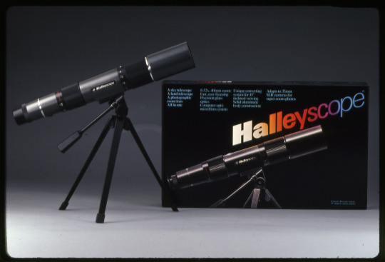
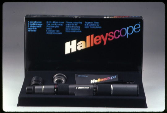
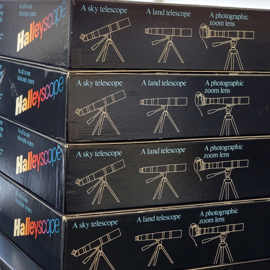

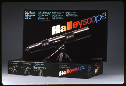
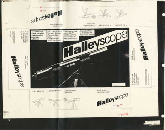
By now you have likely heard about the new NASA Webb telescope? But have you heard of the Halleyscope?
Hoping to cash in on the 1986 Halley’s Comet appearance, Burton Rubin created the Halleyscope around 1983. “A sky telescope. A land telescope. A photographic zoom lens. All in one” for around $200. (Rubin’s previous business was the E-Z Wider rolling papers which he sold to Rizla in 1980 for $6.2 million.)
Vignelli Associates was contracted to design the packaging with Michael Bierut and David B. Law as the designers on the project. We have the packaging in the archives but not the telescope, so we can’t compare any images of the galaxy with the new NASA one.
Did you have a Halleyscope? Or know anything about this design? We would love to hear from you!
Image descriptions:
Images of Halleyscope box on a white table with a pencil for scale plus vintage 35mm slides of packaging with a telescope, and a scan of a photo mechanical for packaging in black and white.
Box is black with blue text and large Halleyscope logotype featuring gradient colors across the logo from white to yellow to orange to red to pink to purple to blue. Weight of type starts out very bold and becomes lighter. The logotype moves at an upward angle across the packaging mimicking the image of the telescope pointing upwards.
Text on box reads: A sky telescope. A land telescope. A photographic zoom lens. All in one. 8-32x, 40mm zoom. Fast, easy focusing. Precision glass optics. Computer optimized lens system. Unique converting system for 45 degree inclined viewing. Solid aluminum body construction. Adapts to 35mm SLR cameras for super zoom photos. Contents: Telescope, tripod, 45 degree adaptor, camera adaptor.
#vignelli#michael bierut#David Law#design archives#design#graphic design#design history#telescope#Packaging#1980s#ezwiders#halleys comet#outer space
23 notes
·
View notes
Text
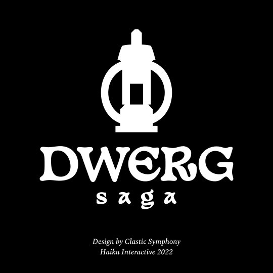
Besides pattern design, I also do graphic design. This a logo redesign job I’ve recently completed for Haiku Interative’s game Dwerg Saga. It is an indie game where you control a group of characters called Dwergs looking to build a new home. One of the key goals of the redesign was to create a symbol that was scalable across different mediums. The symbol is shaped like a lantern, but also suggests an image of a home with the candle in the centre positioned as if it was a doorway. The logotype was also changed, it uses an open source typeface called Basteleur made by Keussel.
I was also provided consulting work to find a new typeface to be used in game that was easy to read but also fit within the aesthetic of the game. We went with the Spectral typeface by Production Type.


#logo#consulting#graphicdesign#gamedev#gamedevelopment#indiegame#indiedev#typography#game dev#game design#game development#graphic design#logo design#graphic designer#video games#games#itch.io#typeface
4 notes
·
View notes
Photo


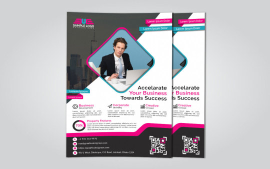
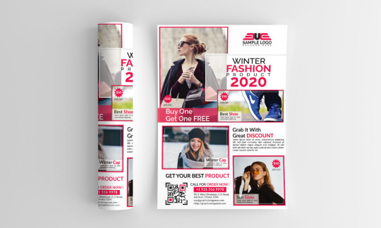
➜➜Elevate your Brand Identity with Our Custom Logo Design!
➜Perfection doesn’t come easy but we make sure that we bring out the best in your logo and we bring perfection to the plate every single time. Our designers ensure that your brand identity shines through in your logo and it is a perfect emblem to represent your business. Whether you are a new brand looking to establish its market or an existing one, we ensure that your uniqueness and individuality is celebrated in your business logo. We know the significance of having a custom logo design as we know it is the single most important entity that serves as a foundation for a powerful brand. We have created thousands of brands across the world for businesses spanning hundreds of business sectors.
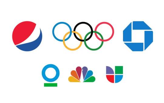
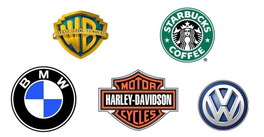
➜➜9 Types of Logos and How to Use Them Effectively
1.Wordmarks/logotypes
Examples: Wix, Coca-Cola, Subway, Casper, Kellogg’s, eBay and West Elm.
2.Letterforms
Examples: Facebook, McDonald’s, Netflix and Pinterest, Uber and Beats.
3.Lettermarks/monogram logos
Examples: HBO, IBM, NASA, CNN, HP and Louis Vuitton.
4.Logo symbols/brand marks/pictorial marks
Examples: Shell, Apple, Twitter, Target, Instagram and Snapchat and Major League Baseball.
5.Abstract logo marks
Examples: Airbnb, Chanel, Nike, Olympics, Google Drive, Adidas and Pepsi.
6.Mascots
Examples: Michelin Man by Michelin, Colonel Sanders by KFC, Cap’n Crunch, Tony the Tiger by Kellogg’s and Mr. Peanut by Planters.
7.Emblems
Examples: Starbucks, Stella Artois, Harley-Davidson, NFL, Warner Brothers, Manchester United.
8.Combination marks
Examples: Taco Bell, Toblerone, Dropbox, CVS, Dove and NBC.
9.Dynamic Marks
Examples: MTV, Hilary Clinton, Google, Nickelodeon and Virgin
.
.
➜Web ☑ https://tripolystudio.com/
➜Get in touch +91 9898869160
☑ GET A QUOTE? Mail : [email protected]
#logodesign#logotypedesign#logodesigners#logodesigning#customlogodesign#logosdesign#designerlogo#logoredesign#logobrandingdesign#logotypesdesign#logoidentitydesign#logographicdesign#logomarkdesign
2 notes
·
View notes
Photo

@mgiesser with @studio.doherty to create a new brand identity that complements their incredible body of work while clearly communicating who they are, both as a practice and as people. At the core of the refresh are ideas around transparency, ombré and of course – colour, which is something that finds itself at the heart of all their projects. The brand strategy process led us to the concept of "True Colours" – two words that I placed on top of an image of Cyndi Lauper, initially just for a bit of a lol, but in many ways that one image really became inspiration and set the tone for the refresh. The ideas of transparency and translucency manifested themselves quite literally, becoming the basis for the new logo – rendered in glass and by far was the most complicated part of the project. This glass logo allows the brand to be big, bold and also completely recessive. The form of this encapsulates the work the studio produces – dramatic in part, yet thoughtfully considered, allowing moments of calm and quiet. An initial batch of 50 gradients have been created to be used across all of their documents and creative presentations, with the idea being that over the course of a project, that client should always be greeted with something new and fresh. With the website, while the brief and requirements for practice portfolio sites are often very similar, I’m always looking for new ways to make the browsing experience enjoyable and the process of navigating between projects as easy as possible. Generous with the words, there’s loads to read throughout the Work section for those, who want more than pretty pictures. The Journal section allows the client to bring their audiences into the studio, providing a glimpse of what’s inspiring them at the moment and surely some behind the scenes shenanigans will surface, cos girls just wanna have fun? Huge thanks to Mardi and Phoebe for trusting me with what has been a highlight of 2022! 🙏😊 • • Website @svmorganwork 3D @_nic_hamilton_ Type @maxitype_com @abcdinamo #graphicdesign #typography #typedesign #lettering #font #logo #logotype #brandingdesign #brandidentity #identitydesign #graphicdesigner #designinspo https://www.instagram.com/p/Ck6e2uMBwN4/?igshid=NGJjMDIxMWI=
#graphicdesign#typography#typedesign#lettering#font#logo#logotype#brandingdesign#brandidentity#identitydesign#graphicdesigner#designinspo
4 notes
·
View notes
Text
Guide to professional logo design and development
Guide to professional logo design and development
Logo design has become increasingly important in today's business world. A well-designed logo can help your company stand out from the competition, and can help you establish a brand. If you're thinking of starting your own business, or are already established and looking to improve your branding, Logo Design School is a great resource for learning how to design effective logos.
Logo design is an extremely complex process that requires a mix of creativity, skill, and knowledge.

What is a logo and what does it represent?
Logo design and development is one of the most important aspects of a company's branding. A good logo will help to define the company, its values, and what it stands for.
A logo should be simple, easy to remember, and visually appealing. It should also reflect the company's personality and culture. A good logo should be unique and representative of the company's niche market.
There are a variety of different types of logos that businesses can choose from. Some popular types of logos include logotypes, mascots, lettering designs, iconography, and wordmarks.
It is important to get feedback from customers and stakeholders during the logo design process in order to ensure that the final product is appropriate and meets everyone's needs.
What is the process for logo design and development?
Logo design and development is a process that begins with an idea. After the idea has been developed, the designer will create a logo that represents the company or product. The designer must consider factors such as branding, color, and layout when creating a logo. Next, the logo will be tested using different methods to ensure its effectiveness. Finally, the logo will be finalized and used on various marketing materials.
How long does it take to design a logo?
Logo design and development can take a variety of different lengths of time, depending on the complexity of the logo and the resources available. Generally speaking, a basic logo design could take anywhere from a few hours to a day or two, while more complex designs may require several weeks or longer. In most cases, however, a logo’s final appearance will be affected by the time it takes to create it. Thus, it is important to factor in all of the necessary details when estimating how long it will take to develop your own logo.

What is the difference between a logo and a symbol?
Logo design and development is an essential part of any business. A well-designed logo can help to set your company apart from its competitors, while a poorly designed logo can lead to disaster. What is the difference between a logo and a symbol? According to The Logo Design Process by Stephen Doyle, “A logo is a visual representation of your company name or product. It communicates your identity and tells people what you do” (Doyle 9). Symbols, on the other hand, are often used as logos for smaller businesses or organizations. They can be simple designs like an apple for Apple Inc., or more complex designs like the Nike swoosh. The important thing to remember is that a logo should be unique and representative of your company.
What is the best way to create a logo?
Logo design and development is an important part of any business. Creating a good logo can help your business stand out from the competition. There are many different ways to create a logo, and it depends on your business and what you want to achieve. Here are some tips on how to create a great logo:
1. Start with a clear idea of what you want your logo to look like. This will help you create a design that captures your brand's essence.
2. Be creative! A good logo should be unique and evocative, not just functional. Try to think outside the box when creating your logo.
3. Pay attention to typography and color choices when creating your logo. They can play an important role in how people perceive your brand.
How do you go about designing a logo?
Logo design is an important part of any business. It can help to identify a company and its products. There are a few things you should consider when designing a logo. First, the logo should be easy to remember and spell. Second, it should be visually appealing. Third, it should be consistent across different platforms (web, print, etc.). Fourth, the logo should be legible at small sizes. Fifth, the logo should be trademarkable. Sixth, the logo should be versatile enough to use in different contexts (e.g., corporate branding, marketing materials). Seventh, the logo should go through regular revisions to ensure that it looks fresh and modern. Eighth, make sure that your logo is licensed properly so that you can protect it from unauthorized use.
What are some of the most popular tools for logo design?
Logo design is a process of creating a unique visual representation for a business or organization. There are a number of popular tools for logo design, but some of the most common include Adobe Photoshop, Illustrator, InDesign, and CorelDRAW. Each program has its own strengths and weaknesses, so it's important to choose the right tool for the job.
Some tips for choosing a logo design program include reviewing the program's features and finding an affordable option that offers all the necessary features. It's also helpful to consult with an experienced graphic designer before starting the project.
How do you create a working prototype of your logo?
Logo design and development can be a complex process, but with the right tools and techniques, it can be done efficiently. In order to create a working prototype of your logo, you'll need to use a graphic design software and some Photoshop skills. Here are three tips for creating a logo prototype:
1. Use an online logo generator. There are many online logo generators available that will allow you to create a custom logo in minutes. Some of the most popular generators include Logo Maker and LogoStudio.
2. Use templates. If you don't have time or want to save yourself some effort, using templates is another great way to get started with logo design and development. Many professional graphic designers routinely use templates when designing logos for clients.
3. Try out different types of fonts and colors.
How do you make sure your logo is perfect before release?
Logo design is important for any business, and it's essential that the logo is perfect before release. There are a few things to keep in mind when designing a logo: the brand's personality, the target market, and the company's culture. When creating a logo, make sure to keep these factors in mind to create an effective and appealing design.
One way to ensure that your logo is perfect is to consult with a professional. A designer can help you determine what the branding should be for your business, as well as help you choose the best font and color for your logo. It's also important to consider how your logo will look on different devices, such as phones and tablets.
When it comes to designing a logo, it's important to think about all aspects of the brand.
2 notes
·
View notes
Text
THEORY & LOGOTYPES

Modernism — Modernism promotes sleek and clean lines while eliminating extra elements/decoration that are added for embellishments in design. It grew increasingly popular in the 1940s to the 1980s.

Postmodernism — Reigning in the late 70s, postmodernism is characterized by the rejection of the formal structure of modernism. Rather than being focused on uniformity, its conceptual basis can be found in reflecting the individual style of the designer who practices it.
Abstract — A logo that is a symbol that isn't exact recognizable itself, but is complex enough that it represents a business in some type of way.
Mark — A logo that is focused around a company's name or initials. It is a logo that is focused around an icon or symbolic imagery.
Emblem — A logo that uses text, a symbol, or imagery inside of a geometric shape. It can make a logo feel old-fashioned or traditional, and they are often more detailed.

Lettermark — A logo that is a combination of a company's initials. It is sometimes known/referred to as a Monogram.

Pictorial Mark or Symbol— A logo that is focused on the use of an icon or graphic. They are an easy and recognizable way to relay (and remember) a brand's identity.

Mascot — A mascot in a logo is a living character that represents a business. It can often give a brand a personality and add a humanizing factor. Sports teams use this a lot.
Wordmark — A logo that is purely letter-based and features only the name of a business. Often it uses the business' whole name and does not include any other graphics.
0 notes
Text

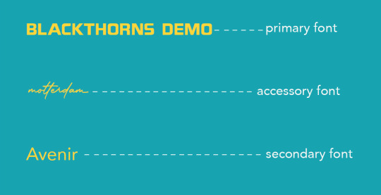
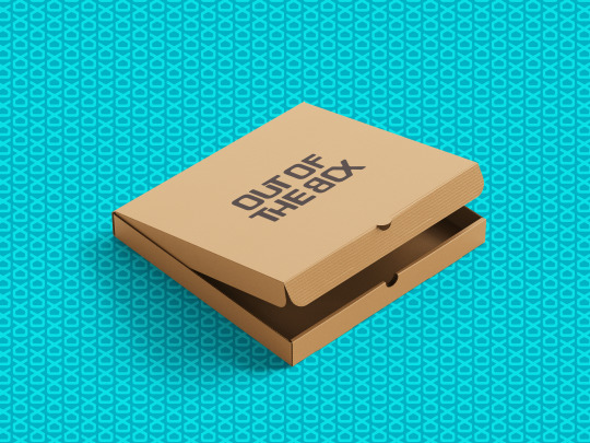
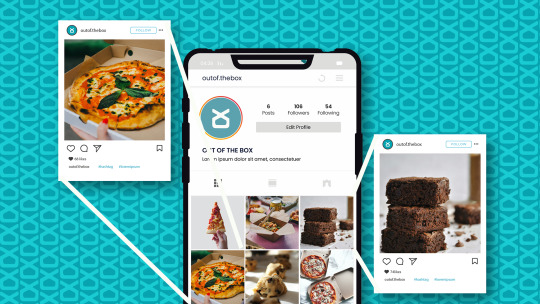
A family member approached me to commission a brand identity for their food startup. Named “Out Of The Box”, the aim of this business was to provide a limited menu of good quality and affordable food to the doorstep of young professionals aged 22-27. A service of this sort is called “tiffin service” in India, and the marketing would be carried out predominantly on social media platforms like Instagram. Unfortunately, this business was unable to launch.

Featuring a customised typeface, the logotype has rounded edges to connote the approachable attitude echoed by the brand. The geometric feature of the type makes it easy to tailor to packaging and social media material. Some of the letters fold into each other to symbolise food being packed into containers as well as the togetherness brought on by food. The "O" and the "X" in "Box" have been stitched together to resemble the abstract image of a food package. This is also the company's logomark.


Credits:
Fonts: 1 2
Mockups: 1 2 3 4 5 6 7 8 9
Photos: 1 2 3 4 5 6 7 8 9 10 11 12
0 notes
Text
(ARTS246) Ch. 3: Legibility & Project #1 Poster Design Variations 1 and 2

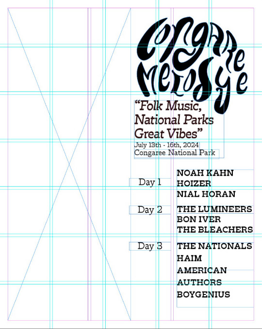


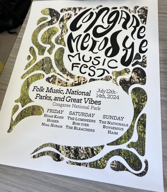
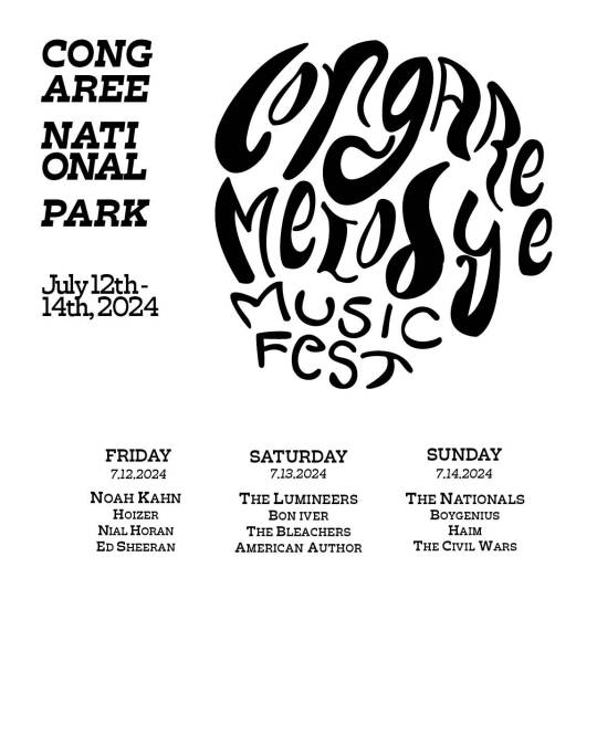

I spent most of this week working on the poster component of the music festival design system. My task was to take at least 10 abstract images with my phone camera and create a primary abstract component that would complement the logotype and typeface. Last week, I worked on the logo and chose Trilby as my primary typeface. I used its font family to play around with the visual hierarchy of the information. The poster needs to be 16x20 and include the logotype as the primary visual element, the festival's location (Congaree National Park) as the secondary visual element, and the headliners, follow-up acts, and dates/days of the week as the third visual element. My goal is to create a layout that not only complements the logotype but also makes the information legible and easy to read from either a distance or up close. I plan to create three variations of posters that capture the essence and vibe of the music festival and serve as a fun work of art that would draw people's attention to the visual elements. As Professor Valdes says, "You know you have made a good poster once it's been stolen." While I don't necessarily want my posters to be stolen, I would consider it a compliment if that were the case!
I'm having trouble with the grid system when it comes to designing the layout of the poster. Usually, I work on projects that have a pre-built grid system. However, this project has challenged me to create my own grid that not only looks good but also helps organize the content on the poster. Although I learned how to turn on the grid function in inDesign by watching tutorials from my professor, I still find it difficult to work with grids. I need to practice more to become more familiar with the system. It's important to keep in mind that grids are helpful tools that aid in creating a well-organized poster design.
During Monday's class, I received some advice on the layout of my project from my classmates via Basecamp. They were in favor of the hand lettering of my logo but found the typeface difficult to read due to the contrast with the textured background image. The spacing was also a little off, which was due to my struggle with the grid. On Wednesday, we had an in-class discussion in which most of my classmates favored my second draft of the poster. I decided to make the background elements look swampier by using the pen tool to create cutouts around my logo. This design choice was well received, and my professor encouraged me to explore incorporating more color into my logo and text. For my second poster variation, I decided to use a wooden texture and incorporate the same technique with narrower shapes. However, I am worried that the wooden texture might make the poster too distracting from the primary and secondary visual elements. I started playing around with color in my logo but I am planning to continue experimenting with darker colors since it appears to blend too much into the abstract background. Unfortunately, this poster variation also has a legibility issue since the text appears too condensed. To solve this, I need to incorporate more room around the text and make the shapes more fluid and spread out. Making my borders a quarter of an inch would also help in making my poster appear more full and fluid.
When it comes to legibility, the reading material assigned for this week's textbook couldn't have come at a better time. The chapter discussed the principles of type size, line, and interline spacing, as well as legibility and color. Initially, when I started working on my project, I encountered legibility issues with my logotype. My main concern was the readability of the logo from a distance. I realized that the spacing between my letters was too close together, and my professor suggested that I find a balance between filling in the empty spaces in the logo and providing enough space to make it legible. I traced over the image of the logo in Illustrator and experimented with the spacing, which made it easier to understand my professor's feedback and the basic principles highlighted in this week's chapter. I am still revising my logo, but by next week, I should have a final design that is fun, legible, and reflective of the vibe of my music festival. If I encounter any difficulties or require a refresher on how to make my design element legible and easy to understand, I will refer back to this chapter.
0 notes
Text
Blog Post #4
This week I was able to step out of my comfort zone, aesthetic wise. I was having a hard time trying to pinpoint what type of pop punk/rock "vibe" I wanted my poster and logotype to have. I ended up going with the side I least expected and was way out of my comfort zone. I've been trying to work on learning how to successfully halftone an image, pattern, and color. I can't say that it's been easy, or very successful... but I'm trying my best. I was also challenged to work away from my iPad, what can I say I'm an iPad kid. Procreate has become a very accessible tool for me to use whenever I wanted, and now I'm finding myself having to go against my norm and use my laptop. It's been difficult, but I'm really trying to use all the sources I'm accessible to.
Below is an image of my poster before adding the halftone and working with my color palette!

0 notes
Text

Through this reading about the formation of type and typefaces, I found what stood out to me most was the information about proportions within letters. We see specific fonts and test styles be used for specific reasons because of the way the letters fit and flow together making it easy for the human eye to read, this mainly comes from the different proportions of lines and spaces. Understanding how the value of lines and space can affect the meaning and possible uses of your typeface can help you create a font that is practical and hold meaning.
When creating my own typeface for my logotype, I will keep this lesson in mind. Some of my main struggles in creating a font is making sure that the lines and curves look smooth and natural, so that they properly imitate a drip and avoid looking like a heavy metal font. This has been a struggle to execute in the InDesign application, but I have found that hand drawing out the font and breaking it down into parts has helped me find seamless ways to bring it onto my screen.
0 notes
Text
1. Vibrant Tropical Design: The Superman Hawaiian Shirt features a vibrant and eye-catching tropic figure that instantly sets a fun and adventurous modulate for your summertime outings. Whether you are head to the beach, attending a puddle company, or simply sledding out with friends, this shirt is guaranteed to urinate you standstill out in style.2. Comfortable and Breathable Fabric: Made from high-quality materials, this shirt is unintentional to preserve you really cool and well-heeled fifty-fifty on the hottest summertime years. The lightweight and breathable textile ensure that you can savor your outdoor activities without feeling sweaty or overheated.3. Versatile and Trendy: The Superman Hawaiian Shirt is not simply special to beachwear. It can easy be styled for various occasions, including insouciant brunches, backyard BBQs, or still summertime festivals. Pair it with shorts and flip-flops for a mellow seem or dress it up with chinos and loafers for a more refined ensemble.4. Superman-inspired Design Elements: Show off your passion for the iconic superhero with this stylish shirt. The Superman logotype and other Superman-inspired pattern elements add a feeling of nostalgia and geek stylishness to your summertime wardrobe.5. Attention to Detail: The Superman Hawaiian Shirt is crafted with punctilious attending to particular, ensuring the highest caliber. From the precision of the stitching to the durability of the buttons, every facet of this shirt is unintentional to withstand the adventures of summer.Get extremely ready to turning heads and embracement the summer vibes with the Superman Hawaiian Shirt. Order yours today and see the really perfect blending of title, comfort, and superhero stirring!
Relate : https://infinitestylesinquirer.blogspot.com/2024/01/nascar-hawaiian-shirt-canvas-for.html
May Be You Like This Product:
https://linkhay.com/blog/955043/nfl-new-york-jets-x-disney-mickey-mouse-t-shirt
https://linkhay.com/blog/988594/retro-jennifer-lawrence-shirt
https://linkhay.com/blog/955073/nfl-philadelphia-eagles-i-love-my-team-to-the-moon-and-back-t-shirt
https://linkhay.com/blog/938935/csu-fullerton-titans-ncaa-minnie-mouse-ball-t-shirt
https://linkhay.com/blog/939125/chicago-state-cougars-ncaa-minnie-mouse-ball-t-shirt
0 notes
Text
Logo Design Cost in India: How Much Does Logo Design Cost in 2023?

Logo Design Cost In India
WordArt Logo Design
Word art is graphic design blending typography, visual design, and digital manipulation. Result: Impactful message-conveying images. Each Printwala.com “WordArt Logo” narrates a story, leaving a lasting impression.
Corporate Logo Design
A logotype, often referred to as a logo, is an illustration designed for a specific business or product. The purpose of a logotype is to communicate swiftly. At Printwala.com, we create a distinct and easily recognizable symbol. Corporate Logo Design typically feature a unique font or typeface that spells out the company’s name or initials.
Logo Redesign
When it comes to a logo redesign, whether it’s a simple refresh or a complete overhaul, Printwala.com understands the importance. While it may be prompted by substantial changes in a brand’s mission, values, or goals, the redesign encapsulates all visual modifications made to the existing logo.
Logo Design with Brand Naming
Brand naming is the procedure of finding an appropriate name for a business or product. The process for naming brands includes research, brainstorming, and trademark vetting to ensure that the name is legal legally. At Printwala.com this package combines both brand naming and logo designing.
Startup-Kit (Logo+Website+Video)
A startup kit, tailored by Printwala.com, is a concise, easy-to-digest introduction to your company’s visual identity. It offers a quick and accessible pathway to understanding your brand’s logo, website, and promotional AI Video Brochure. This ensures that all marketing and communications align accurately with your brand, making your company more memorable and quickly recognizable to your target audience.
1 note
·
View note
Last Seen Blogs

mranr-16-blog
Unbetitelt
miss-nymphetamine
Nymphetamine

kartkowki740
szkola plany

marianos98
Untitled
xmarlysx
✿MARLYS✿