#i have much to learn of this fandom
Text
the way my jaw dropped when i found out that Javert is the character receiving the fandoms babygirlification.
#i have much to learn of this fandom#ive already seen the enjoltaire side#and the interesting valvert fanart#which btw most of it is like the most stunning thing ever#i shamelessly have one saved on my phone#thank you pinterest#les mis#javert#like fr he gets the babygirlification????#i mean y'all do y'all im just a wee bit taken off guard#i always think ive learnt eveything bout this fandom#fandom things
46 notes
·
View notes
Text
I want to post this here too because I’ve seen it happen a few times
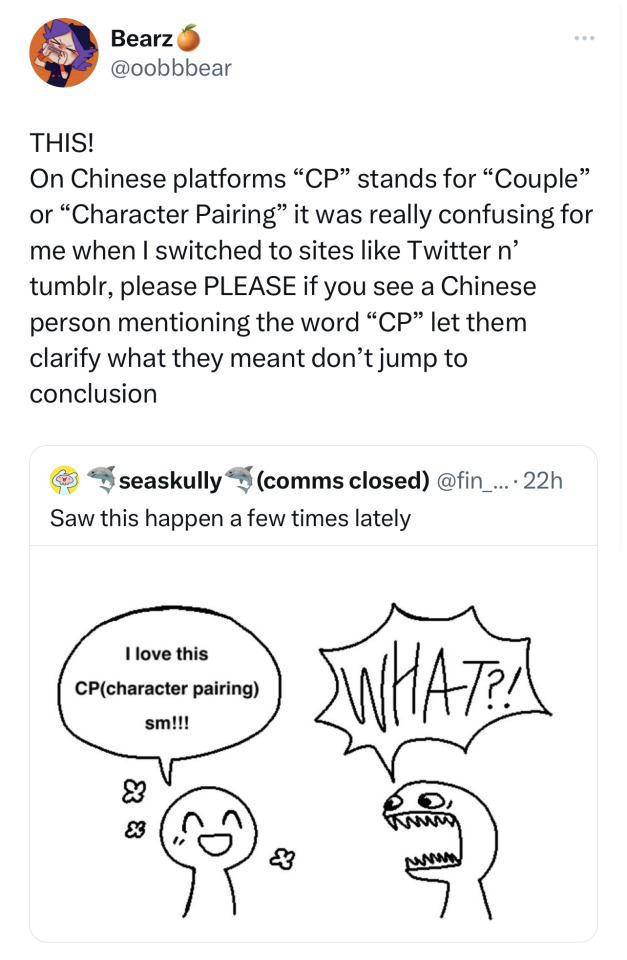
Please understand that there are cultural differences and language differences, if you see this happening let the person clarify what they meant, that person might just not be familiar with words the western side of the internet use
#bearz rambling tag#no it’s not really possible to let everyone who uses this term to change#because as far as I know this is the most common word with use on Chinese websites#I didn’t know that pairing are called ‘ship’ here#like why would I even know that#‘ship’ makes zero sense to me#it took me a while to learn the fandom language people speak here#it’s hard#give people time#shipping culture is very different too#Like on Chinese site you HAVE to clarify the Top and the Bottom of this ship in the ship name#it is very very important to them#people who like the same ship but with different Top Bottom preference will fight till no end#imagine how confused I was when I first got here#where there’s no top bottom differences#it’s not really a smut thing#it’s more a dynamic thing#AxB and BxA is very different#oh I can talk so much about the differences on fandom cultures#if ya are interested in more please feel free to ask#it’s very interesting to me#I wanna talk about it
8K notes
·
View notes
Text
actually that ao3 post about calculating kudos-to-hits ratios to decide if a fic is worth reading has me so pissed off. someone put real time and energy into something they are SHARING WITH YOU FOR FREE on a site where you can quite literally filter and search by anything you want and you're STILL trying to find a foolproof method to find stuff that's "good enough to read"???
YOU ARE NOT THE TARGET AUDIENCE FOR EVERYTHING
you don't have to like or read everything in a given fandom or tag, but you also don't have to be a cunt about it and imply that it's not worth reading. this is the kind of shit that moves people to stop creating altogether, and to see people agreeing in the tags is so disheartening. absolutely unserious behavior.
#some of y'all would not have survived pre-ao3 fandom spaces and it really fucking shows#i have so much more i could say about this but at my core it really just makes me sad#i'm obviously not tagging the op of the original post or anything but i hope they and everyone agreeing with them learns to chill tf out
4K notes
·
View notes
Text
i can't wait to be 30+ and still in fandom and i can't wait to be 40+ and still in fandom and i can't wait to be 50+ and still in fandom and i can't wait to be 60+ and still in fandom and i can't wait to be 70+ and still in fandom and i can't wait to be 80+ and still in fandom and i can't wait to be 90+ and still in fandom and i can't wait to look back on my life and know that i loved things deeply and passionately and was inspired to create and was part of communities with incredible people from all over the world brought together by the stories that touched us
#and still be mad at shithead executives for unfairly cancelling my pirate show#also imagine what my ao3 word count will be like. gonna be writing my little fics in the nursing home#sometimes when i get frustrated over my writing i have to remember that i've only been doing it for a little over a year#and not in my native language#there is still so much time and so much to learn and try and discover and explore and i am EXCITED#there is something so ancient and beautiful about humans being brought together by stories#storytelling is what humans have always done and will always do and what will always connect us#to our past to the future to each other#sorry for the 1 am ramblings#fandom#🐭📓
4K notes
·
View notes
Text
There are many new friends on the archive, and many are young and have only known social media, which is why I wanted to say something!
Ao3 does not have an algorithm! It isn't a social media site, it's an archive.
Posting fics on Tumblr isn't the same as posting fics on Ao3
Ao3 is like a giant virtual bookshelf, and everyone is able to add their own stories to the bookshelf, all stored with different tags and different fandoms. Works are automatically sorted by newest to oldest, but filters, looking at bookmarks, and using the search function can change that.
Certain works are not pushed to the top like social media posts. More kudos and reads don't push a single work to more viewers by some algorithm. Unless otherwise filtered, works will be at the top of the page based on how recent it was posted.
Smaller fandoms get less views, less kudos, less bookmarks, and larger fandoms get more simply because of the number of people inside the fandom.
Ao3 is a giant virtual bookshelf- there is no algorithm, and there is no man behind the shelf pushing certain books forward.
Happy reading, and if you'd like to have more people notice a fic, why not share it with them! Send a dm to a fandom friend and it might turn into one of their favorite fics!
#ao3#archive of our own#organization for transformative works#i have admittedly only been a member of the committee for a couple of years BUT ive been a member on ao3 since i was much younger#and it took me a hot second to understand how ao3 works; so i wanted to write a lil post about it after seeing this comment#no shade or blame to the person who wrote this by the way!#after being on social media so much it's a completely understandable mistake and i totally get it#and in fandoms populated by younger ppl typically it's even more understandable!#so absolutely no hate no shade no passive aggressiveness#but i do think it is important to learn how the archive works#so if you'd like to share this it would be greatly appreciated! <3#okay have a good day sorry this post/tags became so long haha
43K notes
·
View notes
Text
why Aurora's art is genius
It's break for me, and I've been meaning to sit down and read the Aurora webcomic (https://comicaurora.com/, @comicaurora on Tumblr) for quite a bit. So I did that over the last few days.
And… y'know. I can't actually say "I should've read this earlier," because otherwise I would've been up at 2:30-3am when I had responsibilities in the morning and I couldn't have properly enjoyed it, but. Holy shit guys THIS COMIC.
I intended to just do a generalized "hello this is all the things I love about this story," and I wrote a paragraph or two about art style. …and then another. And another. And I realized I needed to actually reference things so I would stop being too vague. I was reading the comic on my tablet or phone, because I wanted to stay curled up in my chair, but I type at a big monitor and so I saw more details… aaaaaand it turned into its own giant-ass post.
SO. Enjoy a few thousand words of me nerding out about this insanely cool art style and how fucking gorgeous this comic is? (There are screenshots, I promise it isn't just a wall of text.) In my defense, I just spent two semesters in graphic design classes focusing on the Adobe Suite, so… I get to be a nerd about pretty things…???
All positive feedback btw! No downers here. <3
---
I cannot emphasize enough how much I love the beautiful, simple stylistic method of drawing characters and figures. It is absolutely stunning and effortless and utterly graceful—it is so hard to capture the sheer beauty and fluidity of the human form in such a fashion. Even a simple outline of a character feels dynamic! It's gorgeous!
Though I do have a love-hate relationship with this, because my artistic side looks at that lovely simplicity, goes "I CAN DO THAT!" and then I sit down and go to the paper and realize that no, in fact, I cannot do that yet, because that simplicity is born of a hell of a lot of practice and understanding of bodies and actually is really hard to do. It's a very developed style that only looks simple because the artist knows what they're doing. The human body is hard to pull off, and this comic does so beautifully and makes it look effortless.
Also: line weight line weight line weight. It's especially important in simplified shapes and figures like this, and hoo boy is it used excellently. It's especially apparent the newer the pages get—I love watching that improvement over time—but with simpler figures and lines, you get nice light lines to emphasize both smaller details, like in the draping of clothing and the curls of hair—which, hello, yes—and thicker lines to emphasize bigger and more important details and silhouettes. It's the sort of thing that's essential to most illustrations, but I wanted to make a note of it because it's so vital to this art style.
THE USE OF LAYER BLENDING MODES OH MY GODS. (...uhhh, apologies to the people who don't know what that means, it's a digital art program thing? This article explains it for beginners.)
Bear with me, I just finished my second Photoshop course, I spent months and months working on projects with this shit so I see the genius use of Screen and/or its siblings (of which there are many—if I say "Screen" here, assume I mean the entire umbrella of Screen blending modes and possibly Overlay) and go nuts, but seriously it's so clever and also fucking gorgeous:
Firstly: the use of screened-on sound effect words over an action? A "CRACK" written over a branch and then put on Screen in glowy green so that it's subtle enough that it doesn't disrupt the visual flow, but still sticks out enough to make itself heard? Little "scritches" that are transparent where they're laid on without outlines to emphasize the sound without disrupting the underlying image? FUCK YES. I haven't seen this done literally anywhere else—granted, I haven't read a massive amount of comics, but I've read enough—and it is so clever and I adore it. Examples:


Secondly: The beautiful lighting effects. The curling leaves, all the magic, the various glowing eyes, the fog, the way it's all so vividly colored but doesn't burn your eyeballs out—a balance that's way harder to achieve than you'd think—and the soft glows around them, eeeee it's so pretty so pretty SO PRETTY. Not sure if some of these are Outer/Inner Glow/Shadow layer effects or if it's entirely hand-drawn, but major kudos either way; I can see the beautiful use of blending modes and I SALUTE YOUR GENIUS.
I keep looking at some of this stuff and go "is that a layer effect or is it done by hand?" Because you can make some similar things with the Satin layer effect in Photoshop (I don't know if other programs have this? I'm gonna have to find out since I won't have access to PS for much longer ;-;) that resembles some of the swirly inner bits on some of the lit effects, but I'm not sure if it is that or not. Or you could mask over textures? There's... many ways to do it.
If done by hand: oh my gods the patience, how. If done with layer effects: really clever work that knows how to stop said effects from looking wonky, because ugh those things get temperamental. If done with a layer of texture that's been masked over: very, very good masking work. No matter the method, pretty shimmers and swirly bits inside the bigger pretty swirls!
Next: The way color contrast is used! I will never be over the glowy green-on-black Primordial Life vibes when Alinua gets dropped into that… unconscious space?? with Life, for example, and the sharp contrast of vines and crack and branches and leaves against pitch black is just visually stunning. The way the roots sink into the ground and the three-dimensional sensation of it is particularly badass here:

Friggin. How does this imply depth like that. HOW. IT'S SO FREAKING COOL.
A huge point here is also color language and use! Everybody has their own particular shade, generally matching their eyes, magic, and personality, and I adore how this is used to make it clear who's talking or who's doing an action. That was especially apparent to me with Dainix and Falst in the caves—their colors are both fairly warm, but quite distinct, and I love how this clarifies who's doing what in panels with a lot of action from both of them. There is a particular bit that stuck out to me, so I dug up the panels (see this page and the following one https://comicaurora.com/aurora/1-20-30/):

(Gods it looks even prettier now that I put it against a plain background. Also, appreciation to Falst for managing a bridal-carry midair, damn.)
The way that their colors MERGE here! And the immense attention to detail in doing so—Dainix is higher up than Falst is in the first panel, so Dainix's orange fades into Falst's orange at the base. The next panel has gold up top and orange on bottom; we can't really tell in that panel where each of them are, but that's carried over to the next panel—

—where we now see that Falst's position is raised above Dainix's due to the way he's carrying him. (Points for continuity!) And, of course, we see the little "huffs" flowing from orange to yellow over their heads (where Dainix's head is higher than Falst's) to merge the sound of their breathing, which is absurdly clever because it emphasizes to the viewer how we hear two sets of huffing overlaying each other, not one. Absolutely brilliant.
(A few other notes of appreciation to that panel: beautiful glows around them, the sparks, the jagged silhouette of the spider legs, the lovely colors that have no right to make the area around a spider corpse that pretty, the excellent texturing on the cave walls plus perspective, the way Falst's movements imply Dainix's hefty weight, the natural posing of the characters, their on-point expressions that convey exactly how fuckin terrifying everything is right now, the slight glows to their eyes, and also they're just handsome boys <3)
Next up: Rain!!!! So well done! It's subtle enough that it never ever disrupts the impact of the focal point, but evident enough you can tell! And more importantly: THE MIST OFF THE CHARACTERS. Rain does this irl, it has that little vapor that comes off you and makes that little misty effect that plays with lighting, it's so cool-looking and here it's used to such pretty effect!
One of the panel captions says something about it blurring out all the injuries on the characters but like THAT AIN'T TOO BIG OF A PROBLEM when it gets across the environmental vibes, and also that'd be how it would look in real life too so like… outside viewer's angle is the same as the characters', mostly? my point is: that's the environment!!! that's the vibes, that's the feel! It gets it across and it does so in the most pretty way possible!
And another thing re: rain, the use of it to establish perspective, particularly in panels like this—

—where we can tell we're looking down at Tynan due to the perspective on the rain and where it's pointing. Excellent. (Also, kudos for looking down and emphasizing how Tynan's losing his advantage—lovely use of visual storytelling.)
Additionally, the misting here:

We see it most heavily in the leftmost panel, where it's quite foggy as you would expect in a rainstorm, especially in an environment with a lot of heat, but it's also lightly powdered on in the following two panels and tends to follow light sources, which makes complete sense given how light bounces off particles in the air.
A major point of strength in these too is a thorough understanding of lighting, like rim lighting, the various hues and shades, and an intricate understanding of how light bounces off surfaces even when they're in shadow (we'll see a faint glow in spots where characters are half in shadow, but that's how it would work in real life, because of how light bounces around).
Bringing some of these points together: the fluidity of the lines in magic, and the way simple glowing lines are used to emphasize motion and the magic itself, is deeply clever. I'm basically pulling at random from panels and there's definitely even better examples, but here's one (see this page https://comicaurora.com/aurora/1-16-33/):

First panel, listed in numbers because these build on each other:
The tension of the lines in Tess's magic here. This works on a couple levels: first, the way she's holding her fists, as if she's pulling a rope taut.
The way there's one primary line, emphasizing the rope feeling, accompanied by smaller ones.
The additional lines starbursting around her hands, to indicate the energy crackling in her hands and how she's doing a good bit more than just holding it. (That combined with the fists suggests some tension to the magic, too.) Also the variations in brightness, a feature you'll find in actual lightning. :D Additional kudos for how the lightning sparks and breaks off the metal of the sword.
A handful of miscellaneous notes on the second panel:
The reflection of the flames in Erin's typically dark blue eyes (which bears a remarkable resemblance to Dainix, incidentally—almost a thematic sort of parallel given Erin's using the same magic Dainix specializes in?)
The flowing of fabric in the wind and associated variation in the lineart
The way Erin's tattoos interact with the fire he's pulling to his hand
The way the rain overlays some of the fainter areas of fire (attention! to! detail! hell yeah!)
I could go on. I won't because this is a lot of writing already.
Third panel gets paragraphs, not bullets:
Erin's giant-ass "FWOOM" of fire there, and the way the outline of the word is puffy-edged and gradated to feel almost three-dimensional, plus once again using Screen or a variation on it so that the stars show up in the background. All this against that stunning plume of fire, which ripples and sparks so gorgeously, and the ending "om" of the onomatopoeia is emphasized incredibly brightly against that, adding to the punch of it and making the plume feel even brighter.
Also, once again, rain helping establish perspective, especially in how it's very angular in the left side of the panel and then slowly becomes more like a point to the right to indicate it's falling directly down on the viewer. Add in the bright, beautiful glow effects, fainter but no less important black lines beneath them to emphasize the sky and smoke and the like, and the stunningly beautiful lighting and gradated glows surrounding Erin plus the lightning jagging up at him from below, and you get one hell of an impactful panel right there. (And there is definitely more in there I could break down, this is just a lot already.)
And in general: The colors in this? Incredible. The blues and purples and oranges and golds compliment so well, and it's all so rich.
Like, seriously, just throughout the whole comic, the use of gradients, blending modes, color balance and hues, all the things, all the things, it makes for the most beautiful effects and glows and such a rich environment. There's a very distinct style to this comic in its simplified backgrounds (which I recognize are done partly because it's way easier and also backgrounds are so time-consuming dear gods but lemme say this) and vivid, smoothly drawn characters; the simplicity lets them come to the front and gives room for those beautiful, richly saturated focal points, letting the stylized designs of the magic and characters shine. The use of distinct silhouettes is insanely good. Honestly, complex backgrounds might run the risk of making everything too visually busy in this case. It's just, augh, so GORGEOUS.
Another bit, take a look at this page (https://comicaurora.com/aurora/1-15-28/):

It's not quite as evident here as it is in the next page, but this one does some other fun things so I'm grabbing it. Points:
Once again, using different colors to represent different character actions. The "WHAM" of Kendal hitting the ground is caused by Dainix's force, so it's orange (and kudos for doubling the word over to add a shake effect). But we see blue layered underneath, which could be an environmental choice, but might also be because it's Kendal, whose color is blue.
And speaking off, take a look at the right-most panel on top, where Kendal grabs the spear: his motion is, again, illustrated in bright blue, versus the atmospheric screened-on orange lines that point toward him around the whole panel (I'm sure these have a name, I think they might be more of a manga thing though and the only experience I have in manga is reading a bit of Fullmetal Alchemist). Those lines emphasize the weight of the spear being shoved at him, and their color tells us Dainix is responsible for it.
One of my all-time favorite effects in this comic is the way cracks manifest across Dainix's body to represent when he starts to lose control; it is utterly gorgeous and wonderfully thematic. These are more evident in the page before and after this one, but you get a decent idea here. I love the way they glow softly, the way the fire juuuust flickers through at the start and then becomes more evident over time, and the cracks feel so realistic, like his skin is made of pottery. Additional points for how fire begins to creep into his hair.
A small detail that's generally consistent across the comic, but which I want to make note of here because you can see it pretty well: Kendal's eyes glow about the same as the jewel in his sword, mirroring his connection to said sword and calling back to how the jewel became Vash's eye temporarily and thus was once Kendal's eye. You can always see this connection (though there might be some spots where this also changes in a symbolic manner; I went through it quickly on the first time around, so I'll pay more attention when I inevitably reread this), where Kendal's always got that little shine of blue in his eyes the same as the jewel. It's a beautiful visual parallel that encourages the reader to subconsciously link them together, especially since the lines used to illustrate character movements typically mirror their eye color. It's an extension of Kendal.
Did I mention how ABSOLUTELY BEAUTIFUL the colors in this are?
Also, the mythological/legend-type scenes are illustrated in familiar style often used for that type of story, a simple and heavily symbolic two-dimensional cave-painting-like look. They are absolutely beautiful on many levels, employing simple, lovely gradients, slightly rougher and thicker lineart that is nonetheless smoothly beautiful, and working with clear silhouettes (a major strength of this art style, but also a strength in the comic overall). But in particular, I wanted to call attention to a particular thing (see this page https://comicaurora.com/aurora/1-12-4/):

The flowing symbolic lineart surrounding each character. This is actually quite consistent across characters—see also Life's typical lines and how they curl:

What's particularly interesting here is how these symbols are often similar, but not the same. Vash's lines are always smooth, clean curls, often playing off each other and echoing one another like ripples in a pond. You'd think they'd look too similar to Life's—but they don't. Life's curl like vines, and they remain connected; where one curve might echo another but exist entirely detached from each other in Vash's, Life's lines still remain wound together, because vines are continuous and don't float around. :P
Tahraim's are less continuous, often breaking up with significantly smaller bits and pieces floating around like—of course—sparks, and come to sharper points. These are also constants: we see the vines repeated over and over in Alinua's dreams of Life, and the echoing ripples of Vash are consistent wherever we encounter him. Kendal's dream of the ghost citizens of the city of Vash in the last few chapters is filled with these rippling, echoing patterns, to beautiful effect (https://comicaurora.com/aurora/1-20-14/):

They ripple and spiral, often in long, sinuous curves, with smooth elegance. It reminds me a great deal of images of space and sine waves and the like. This establishes a definite feel to these different characters and their magic. And the thing is, that's not something that had to be done—the colors are good at emphasizing who's who. But it was done, and it adds a whole other dimension to the story. Whenever you're in a deity's domain, you know whose it is no matter the color.
Regarding that shape language, I wanted to make another note, too—Vash is sometimes described as chaotic and doing what he likes, which is interesting to me, because smooth, elegant curves and the color blue aren't generally associated with chaos. So while Vash might behave like that on the surface, I'm guessing he's got a lot more going on underneath; he's probably much more intentional in his actions than you'd think at a glance, and he is certainly quite caring with his city. The other thing is that this suits Kendal perfectly. He's a paragon character; he is kind, virtuous, and self-sacrificing, and often we see him aiming to calm others and keep them safe. Blue is such a good color for him. There is… probably more to this, but I'm not deep enough in yet to say.
And here's the thing: I'm only scratching the surface. There is so much more here I'm not covering (color palettes! outfits! character design! environment! the deities! so much more!) and a lot more I can't cover, because I don't have the experience; this is me as a hobbyist artist who happened to take a couple design classes because I wanted to. The art style to this comic is so clever and creative and beautiful, though, I just had to go off about it. <3
...brownie points for getting all the way down here? Have a cookie.
#aurora comic#aurora webcomic#comicaurora#art analysis#...I hope those are the right tags???#new fandom new tagging practices to learn ig#much thanks for something to read while I try to rest my wrists. carpal tunnel BAD. (ignore that I wrote this I've got braces ok it's fine)#anyway! I HAVE. MANY MORE THOUGHTS. ON THE STORY ITSELF. THIS LOVELY STORY#also a collection of reactions to a chunk of the comic before I hit the point where I was too busy reading to write anything down#idk how to format those tho#...yeet them into one post...???#eh I usually don't go off this much these days but this seems like a smaller tight-knit fandom so... might as well help build it?#and I have a little more time thanks to break so#oh yes also shoutout to my insanely awesome professor for teaching me all the technical stuff from this he is LOVELY#made an incredibly complex program into something comprehensible <3#synapse talks
744 notes
·
View notes
Text
so when are we gonna start appreciating undertale AUs for fueling a metric fuck ton of the creativity and longevity of the fandom because if i see one more person calling them the cringiest part of the last 8 years i might lose it
#trousled rants#been feeling a bit salty about this for a while but im letting it out now because i Can#but its insane seein ppl say “oh the fandom's mellowed out a lot its way more peaceful now” and agreeing bc it IS#and then “yeah now that AUs aren't so popular anymore its way more bearable” and its like :) okay#and if i told you that fan game you've been talking about for the past month is an au. what then#sighsghs its just like man i GET that a lot of aus are just edgy for the sake of it but shit dude!!! people were just having fun!!!!!#a lot of them were an avenue for ppl learning how to make their own stories!! even if they're not perfect or in character#making a shit ton of papyrus aus is one of the main things that helped me realize how much i love character design#and i KNOWWWW i'm not the only one and youre trying to tell me that's not awesome as hell!!!!!#yeah i probably i have nostalgia glasses but maybe i do kinda miss when everybody was a bit more insane actually . maybe i do#undertale
296 notes
·
View notes
Text
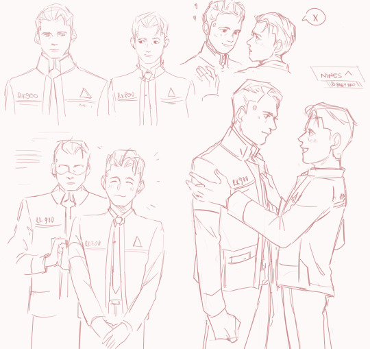
double trouble
#detroit become human#rk1700#the boys....baby boys....woobies...#listen i just think nines would have such an overprotective streak for connor..#he protecc and he want to attacc. connor will teach him well#my favourite headcanon is nines quietly admiring the hell out of connor and learning from him and his mistakes as well#choosing the most optimal way to exist within society. hes so impressed with connor who is bumbling terribly but doing his best#connor has the experience and higher social relations but nines is much quicker to catch on#they both admire each other and are pushed forward by each others existance and improvement#ive seen a few fanfics where they have that dynamic and its my favourite#they work so sweetly in a brotherly bond it warms my heart (though i am a shameless rk1700 enjoyer)#anyway thats enough rambling#i wish there was a dbh fandom still#im just throwing up doodles now with no thought of making any solid pieces yet#my art#dbh#rk900#connor detroit become human#also i know theres zero consistency with the art style and keeping them looking the same but fuck that i dont have the patience rn#also also lmao i just noticed but the top one looks like hes trying to kiss connor but no that was a continuation of bottom left sjdjfjdj#feel free to interpret it any way yoy want hajdjfjfjd
660 notes
·
View notes
Text
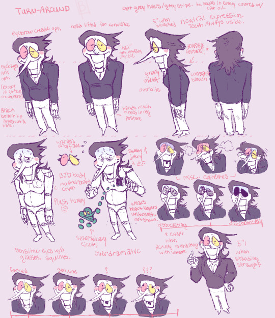
woah. actual thought out reference?
Completely disregard wtf the reference from a couple weeks (a month?) ago looks like. Completely inaccurate. not sure what I was thinking w/ that one. This time I thought this one through, lol. wahoo!! Ive been kind of lazy and totally leaving out features the past few times Ive drawn him and I dont want that to happen again because he loses all the fun features.
notes written out for those who need it (glances behind my shoulder at the mobile app) under the cut. be warned, its long, lol.
starting from the top left, going across to the right side in rows.
-TURN-AROUND
-opt grey hairs/grey stripe. he keeps it evenly colored with car oil.
-eyebrow crease opt.
-head lifted for convenience (for the pose. Also spelt that wrong on the image whoops)
-5" when slouched.
-neutral expression. Teeth always visible.
-eyebags NOT opt. (Except in certain circumstances.)
-"Tail" not usually visible
-HORRIBLE posture*
-black bottom lip pokes out a little
-hands reach knees in reg. posture
-Gnarly mullet
-Overbite
-Constant slouch.
-Warped lens/frame
-Sweaty & jittery a lot
- \___ misc. extremes ___/
-BJD body
-Motherboard cover
-Plush tummy :-)
-wears heart boxers underneath. Not shown.
- |dissociating-----|-------disconnected|
-sensitive eyes w/o glasses. Squints.
- :arrow: Sparratically ejects
-overdramatic
- *except when actively interacting with someone
- 5"1 when standing straight
- |forced--|genuine--|?----|???---|
#DISGUSTING freak. I love him so much.#Reblogs encouraged.#He is absolutely balding btw. The glasses even out the horrifying forehead.#the way the fandom has influenced my hcs and my design is crazy actually. he was kinda a twink before.#I am not about to have a twink spamton in my household#no sir. He is old and disgusting and needs to be such. Also there was no exaggeration in his shapes before. no idea how i survived.#also yippee!!! I figured out how to fix my stylus pressure issue.#this one and the last post were in firealpaca. Still learning it because its a new program but it is so much better. Phhhew.#i love the animation feature#Im messing w it currently muwahahah. I hope i can finish it.#zoom in to see the notes better lol.#if needed i can write out all the notes!! lmk if you need it.#deltarune#deltarune spamton#spamton#spamton g spamton#deltarune chapter 2#spamton fanart#rotates him in my mind#killing him with hammers#never done a turn around w him but i think i did good this time#also this is mostly for myself because i kinda slack off. It ruins his body structure when i do and i want him to keep the triangle chest.#BuwheArt
172 notes
·
View notes
Text
I started replaying fire emblem: path of radiance earlier this week after recently really only playing modern (awakening onward) FE for the past 5 years and it's really hitting home for me how much of modern fe's script is taken up by useless minutiae. camp conversations in por are the thing really hitting it for me. In more recent fe games, there's a lot of little bits of dialogue in the between-level hub but it rarely ever adds to our understanding of a character or interact with the story. It's just there because the characters are in the hub and therefore they need a sentence or two to say to the protag.
meanwhile path of radiance has these wonderful little conversations in the camp. they're not all like, peak fiction or anything but they almost always deliver on short nuggets of story that let you know how specific characters are reacting to what's going on in the story, or otherwise just something about them. I can count on my hands the amount of moments in three houses and engage where characters outside of the "main cast" of those games actually react to story events but they're doing it left and right in path of radiance.
this, along with the fact that most characters only have 3-5 supports means that the characters all feel sharper, more present, and like they're a part of the story. I'm not gonna pretend that every character in por is a masterful study or anything but even the weak characters in por feel less annoying than some of the strongest characters in three houses or engage because they're just inserted into the world more elegantly.
so much of the dialogue in the newer games just feels superfluous by comparison. xander doesn't have checks notes 12 romantic supports because the devs/writers felt that he as a character needed that much fleshing out. he has them because they needed him to have that many girls to kiss for the eugenics mechanics to work! part of the reason why characters in the newer games feel significantly more one note in comparison is that they're stretched thin. there's so much pointless shit they have to say, decided by quota before the writers even got their hands on the characters and it all builds up into a weaker end product
anyway this has been one elitist whinging about the new games that I like less
#anyway you cant get mad at me for hating the new games because i dislike change#awakening was my first fire emblem and i played it when i was literally 13 so ill always love it despite its obvious flaws#fire emblem#fire emblem 9#fe9#fire emblem: path of radiance#path of radiance#im too much of a coward to tag this with the names if the games i insult in this post#btw do people in the fire emblem fandom still call people who like the older games better elitists?#i disconnected from this fandom when edelgard discourse got bad so i have no clue what the culture is like#and i refuse to learn
324 notes
·
View notes
Text
It's just that ppl who woobify the yt antagonist ALWAYS get the fan service. They ALWAYS get to live in their little fantasy world where the guy did nothing wrong and they can just go about their lives pretending everything is fine.
But for once a showrunner didn't choose them and they can't fucking handle that.
#Void Rambles#fandom crit#like I genuinely think I liked Izzy more this episode than I have since his introduction#and its not because he died its because he showed how much he let the crew change him when he faced Ricky at the republic#he didn't make excuses he didn't belittle them#he was offered a second opportunity to betray Ed for the English again and he made the wise decision to learn from his mistakes instead#if Max had given us those extra 2 episodes I think we could have gotten an actually fulfilling redemption arc#because clearly he did the work off screen and I would have loved to see some of that
164 notes
·
View notes
Text
Honestly I think the most unforgivable crime comitted by the new ATLA adaptation is bringing back the fucking kataang/zutara discourse🥰
Like, I can forgive a lot, but I can't forgive the fact that my own eyes, in the year of our lord 2024, have to be subjected to takes I first saw on 2011 DeviantArt
#tbf not to poke the hornets nest but its honestly just zutara people complaining abt 'haters' and being 'bullied for their ship'#like could you guys at least double check that the 'hater' opinion ur disagreeing w has actually been expressed by anyone THIS DECADE lol#atla#natla#avatar the last airbender#zutara#kataang#|<- REALLY poking the hornets nest by maintagging these lol. but you know what. maybe i do wanna fight. just to feel something#in that case to be clear im not talking abt zutara fanart or whatever im specifically talking abt the dumb discourse#y'all might not have been in the trenches but i was there and boy was there so much DUMB SHIT from both sides#i dont even care abt either of them lol. literally babys first fandom experience and i had to learn QUICK to avoid both#of them like the fucking plague#honestly is the concept of a 'shipping war' still a thing even?#i havent really been involved in fandom for a while lol but it just feels like such an early 2010s thing#looking at these posts in the atla tag really feels like a time window back to like 2014. even the tone#like is that still a thing?#are you guys bringing back the concept of 'lemon' and 'no flaming plz' next#you really dont want to revive 2012 fandom culture guys fucking trust me
97 notes
·
View notes
Text
looking back on everything that happened in the vld fandom now as someone in their 20s with a more developed brain...nothing fictional shouldve ever been that serious LOL
#i didnt learn abt all the shit that went down until like a couple months ago bc i stopped watching after like s3#ya i think the creators shouldnt have fucked with the story so much to spite the fandom#but dude if i got harassed by hoards of children (and adults) online and called p3d0 for being ok with a fictional ship#and leaked material that u arent supposed to legally have on the internet as blackmail for making kl canon#and got sent cupcakes with needles in them???? like wtf???????#id be fuckin spiteful too#a notp can just be a notp u dont have to justify disliking something 💀#just late night thoughts 🙏#text#mine
79 notes
·
View notes
Text
Drew WWX and LWJ after I finished my rewatch of The Untamed a few months ago. I have gotten marginally better. May this set a benchmark for what to expect from this blog.
Edit: June 2023 redraw
#Poorly Drawn MDZS#MDZS#wei wuxian#Lan Wanji#there are a lot of great artists in this fandom. I am not one of them#I've always admired artists a lot so I wanted to try learning how to draw#And the only way to start is to draw a lot. Enter the audio drama (and my desire to listen to it guilt free)#doing both at once was my way of participating in my own fandom#as much as I wanted to be super social on the MDZS forums...I honestly got really nervous#I have nothing to contribute besides going 'cool!' to other people's art#Writing and historical/theory posts. It kinda felt worse than isolation...#That aside...I am just here to dump my silly comics and I expect absolutely nothing to come of it#I'm blogging like that lady from that julia child movie. about the cookbook. I forgot what its called. this is just a journal to me
434 notes
·
View notes
Text
I have been swallowed whole by Danny Phantom x DC Universe
The only problem is?
We were marvel kids
So, so, so much catching up to do
And also several mistakes already made
It's Wayne Enterprises, not Wayne Industries.
I'm TRYING 😭🤣😅
I have so much fic fodder in my brain
But I need to know moreeeee first
#dc x dp#danny phantom#dpxdc#dcu#dc universe#new fandom#I have been reccomended to start with BTAS#And I know Young Justice is good?#Grew up on OG Teen Titans#So much to learn#Why did my dad have to be a marvel fan#Okay well...#We grew up on the movies#But#I don't think those count much
94 notes
·
View notes
Text
i know I've mentioned my interpretation of mizu's gender a million times on here but i don't think i ever fully elaborated on it.
so on that note i just wanna ramble about that for a bit. basically, it's my reading of the show that mizu is nonbinary, so let me dig into that.
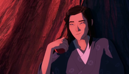
putting the rest under the cut because it ended being pretty long lol. also here have a cute mizu pic of her being happy and most at ease with herself, symbolised by her letting her hair down. <3 ok let's proceed.
okay note that nonbinary is an umbrella term, and applies to a vast range of gender identities, but it's my personal preference to use it as is, simply because i'm not a fan of microlabels. more power to you if you are though, but anyway.
essentially when i refer to mizu as nonbinary it means that i interpret mizu as a woman, but not ONLY a woman. not strictly a woman. she is also a man. she is also neither of these things, she is something in between, while at the same time she is none of these at all. i've said as much many times, but i just don't want people to think that by nonbinary it inherently means a "third androgynous gender" that essentially turns the gender binary into a gender trinary. not only is that going against what the term nonbinary was crafted for (to go against rigid boxes and categorisation of gender identities), but also, not all nonbinary people fall under that category or definition, and that's definitely not the way i interpret mizu.
also, before anyone fights me on this, let me clarify further that gender means something different to everyone. it's not your biological sex or physical characteristics. but at the same time, gender is not mere presentation. you can be a trans woman and still present masculine—either because you're closeted and forced to, or because you just want to—and either way, that doesn't take away from your identity as a woman. same goes for trans men. if you're a trans man but you wear skirts and don't bind or don't get top surgery, that doesn't make you any less of a man. because gender non-conformity exists, and does not only apply to cis people! some lesbians are nonbinary and prefer using he/him pronouns while dressing masculinely, but that doesn't mean they're a man, or that they're any less of a lesbian. neither does this mean that they're a cis woman.
the thing about queer identities in general is that, like i said, they mean something different to everyone, because how you identify—regardless of your biological attributes and fashion or pronouns—is an extremely personal experience. so a nonbinary person and a gnc cis woman's experiences might have plenty of overlap, but what distinguishes between the two is up to the individual. there's no set requirements to distinguish you as one or the other, but it's up to you to decide what you identify as, based on what you feel. either way, by simply identifying yourself as anything under the LGBTQ+ umbrella, you are already communicating to the world that you are not what a conservative, cisheteronormative society wants you to be.
which is why i find all this queer infighting on labels to be so ridiculous. because we're all fighting the same fight; the common enemy is a societal structure that divides us into set roles and expectations purely based on our biological parts. that's why biological essentialism in the queer community is a fucking disease. because by arguing that women are inherently weak and fragile and soft and gentle and must be protected from evil ugly men, while men are inherently strong and angry and violent and exploitative of women, these people are advocating for the same fucked up system that marginalises and abuses women as well as effeminate and/or gay men.
anyway. i'm going on a tangent. this was meant to be a blue eye samurai post. so yeah back to that— the point i'm trying to make is that there's no one way to identify as anything, and everyone views gender in a specific way.
so with that being said, yes you can definitely interpret mizu as a gnc cis woman and that's a totally valid reading. however, interpreting her as nonbinary or transmasc also doesn't take away from her experiences with misogyny and female oppression, because nonbinary and transmasc folks also experience these things.
me, personally, i view her as nonbinary but not necessarily or always transmasc because i still believe femininity and womanhood is an inherent part of who mizu is. for example, from what we've seen, she does not like binding. it does not give her gender euphoria, but is instead very uncomfortable for her both physically and mentally, and represents her suppressing her true self. which is why when she "invites the whole" of herself, she stands completely bare in front of the fire, breasts unbound and hair untied. when she is on the ship heading to a new land in the ending scene, she is no longer hiding her neck and the lack of an adam's apple. we can thus infer that mizu does not have body dysmorphia. she is, in fact, comfortable in her body, and relies on it extremely, because her body is a weapon. instead, what mizu hates about herself is her face—her blue eyes. she hates herself for her hybridised identity, hates herself for being a racial Other. hates that she has no home in her homeland. these are not queer or feminist themes, but postcolonial ones.*
* and as a tiny aside on this subject, i really do wish more of the fandom discussion would talk about this more. it's just such an essential part to reading her character. like someone who's read homi k bhabha's location of culture and has watched this show, PLEASE talk to me so we can ramble all about how the show is all about home and alienation from community. please. okay anyway—
nevertheless, queer and feminist themes (which are not mutually exclusive by the way!) are still prevalent in her story, though they are not the main issue that she is struggling with. but she does struggle with it to some extent, and we see this especially during her marriage with mikio, where we see her struggle in women's domestic spaces.
on the other hand, though, she finds no trouble or discomfort in being a man or being around other men—even naked ones—and does not seem stifled by living as one, does not seem all that bothered or uncomfortable navigating through men's spaces. contrast this to something like disney's mulan (1998), where we do see mulan struggle in navigating through men's spaces, as she feels uncomfortable being around so many men, always feeling like she doesn't belong and that she's inherently different from them. mizu has no such experiences like this, as her very personality and approach to life is what can be categorised as typically "masculine". she is straightforward and blunt. her first meeting with mikio, she tells him straight to his face that he's old while frowning and raising a brow at him. she approaches problems with her muscles and fists (or swords), rather than with her words or mind. compare this with mulan, who, while well-trained by the end of the movie, still uses her sharp wits rather than brute strength. this is a typically "feminine" approach. it's also the approach akemi relies on throughout the show—through her intelligence and persuasive tongue, she navigates the brothel with ease. mizu, in contrast to someone like mulan and akemi, struggles with womanhood and femininity, and feels detached from it.
thus, in my opinion, mizu is not simply a man, nor is she simply a woman. she is both. man and woman. masculine and feminine. she has to accept both, rather than suppress one or the other. her name means water. fluid.
as a side note, while i do believe mizu is nonbinary, i also primarily use she/her pronouns but this is a personal preference. i find it's easier, plus it's what the creators use, and because, in general, being nonbinary simply doesn't necessitate the use of they/them pronouns. nonbinary is not just a third gender. it's about breaking the binary, in any which way, and that's exactly what mizu does.
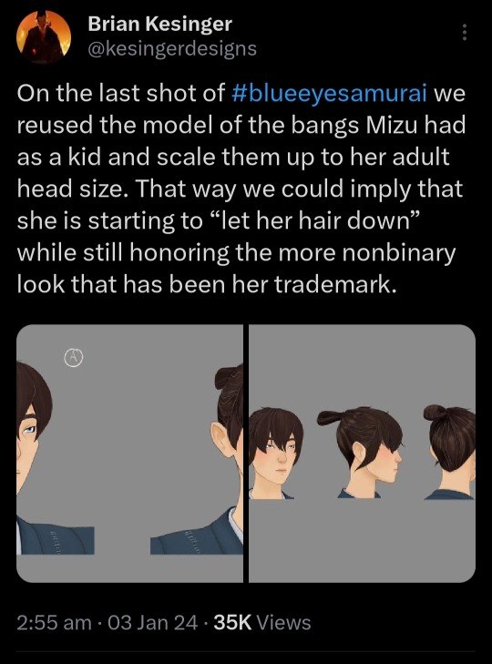
also, i'd also like to mention that one of show's head of story even referred to her with the term "nonbinary", rather than simply "androgynous" (see pic below). and it's possible this could be a slip up on his part, in which he believes the terms are interchangeable (they're not btw), but regardless i find it a very interesting word choice, and one that supports my stance.
so anyway yeah that's my incredibly long rambling post.
TL;DR nonbinary mizu rights 👍🏻👍🏻👍🏻 congrats if you reached the end of this btw. also ily. unless you're a TERF in which case fuck off. ok i'm done.
#mizu blue eye samurai#mizu bes#blue eye samurai#blue eye samurai meta#sorry if this is redundant btw i just cant stop thinking thoughts :3#btw i am a mixed* southeast asian who is also nonbinary. just in case that's important context#by mixed* i mean i'm asian+asian but diff ethnicities lol. i dont have a white bone in my body god bless<3#my whiteness is purely learned thru cultural osmosis + bcs my parents taught me english as a first language (boooo 🍅🍅🍅)#also i live in the global south so i think EYE know a thing or two about being gnc in a society of rigid awful gender roles‼️#so likeee i think its ridiculous that its an either-or thing#mizu can be nonbinary while still being a woman of colour ¯\_(ツ)_/¯#also ummm as much as i love queer themes and gay people i wish people would talk more about the racial otherness / community aspect#as mentioned in the post above#you don't need to read bhabha's whole book btw but just take a look at some of his ideas and you'll get what im talking about#like the fact that the fandom mostly ignores those themes in the story makes me feel like :( :/#cuz to me THATS the thing that spoke to me most and its a shame that its just not talked about enough#i mean i know why thats likely the case. but still.#whoops im rambling again 🤪#fandom.rtf#shut up haydar#meta dissertations.pdf
60 notes
·
View notes
Last Seen Blogs

sugar-grigri
l o u l o u

signagecompanydubai
Signage company Dubai | Indoor & Outdoor Signage company Dubai

lyt24
Untitled

alex77777sstuff
tatapan mata

starrycranes-archive
archived