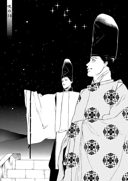
#mostly because there's so much lineart involved
Note
How do you draw Abodes Dreads/Braids? I'm a black creator and still (embarrassingly) struggle with them in the arcana style. (And in general XD) the way you draw her is gorgeous. And I must know the magic you poses.
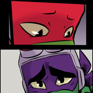
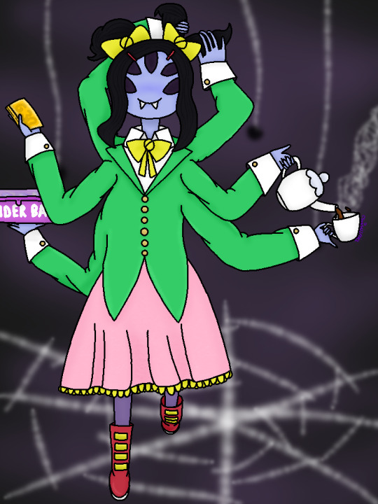
Nothing to be embarrassed for! Unfortunately there's not much reference for black hair in the Arcana, so we all have to guess. I'd highly recommend looking at @kianamaiart and Simkray's hair brushes for other examples of stylising black hair (if anyone has examples of black hair in angular art styles, please share!!)
Anyway, I hope this helps!
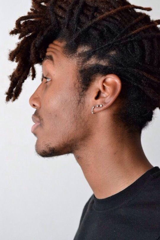
Dreads and braids are both segmented styles which makes their basic construction similar, however dreads are stiffer and hang less than braids, which are quite heavy
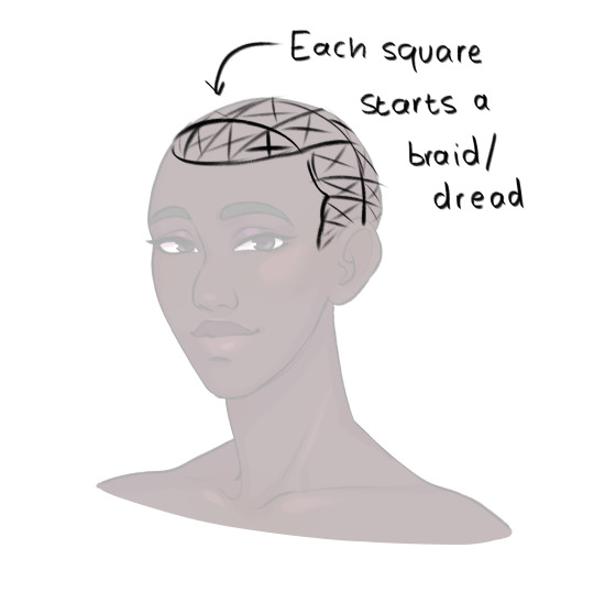
She usually pulls her hair back so I only have to pay attention to the hairline, but I draw each dread as a somewhat stiff tube. Where it connects to the scalp I feather in short, fine lines for the edges/thin hair that's attached to the skin.
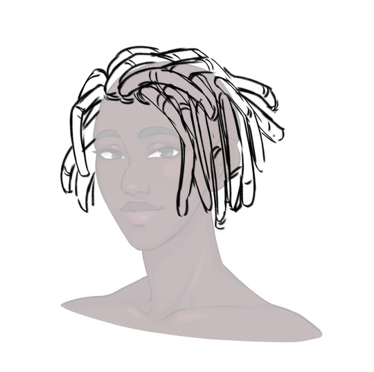
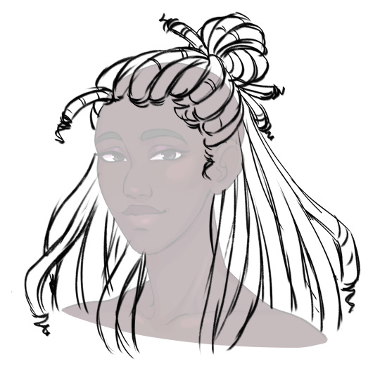
To show the twisted texture of dreads, I add curved lines along each one. For me, this is a good balance of detail for the style (though I can still get tired of lineart -_-)
Then, as a final detail, I give Abosede imperfect ends, topping most dreads off with a thin twist. This is optional as some dreads don't have this.
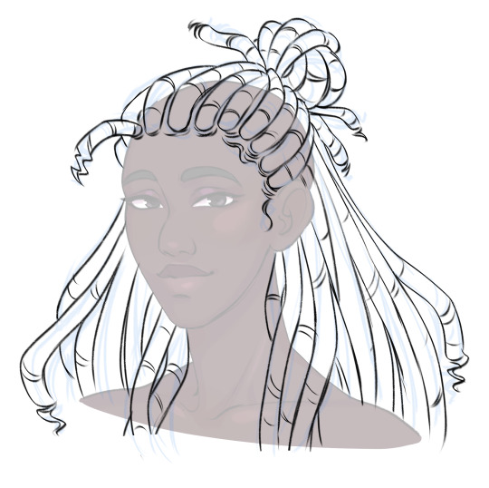
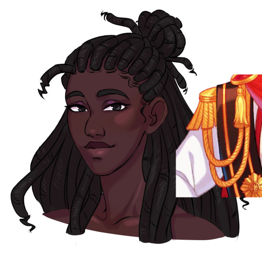
Then finally, for colour. I take reference for how they render ropes and add a series of light lines along each dread. Dreads don't reflect much light, so these are pretty faint.

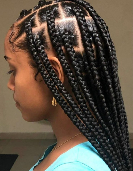
For some braided hairstyles, you just replace the tubes I use for dreads with a simple plait pattern (as seen in Lucio's masquerade outfit). If you're aiming for cornrows, instead of the segments, draw the tubes along the scalp with sharp ends. Then fill them with a plait pattern. For extra detail, you can hatch lines in between the cornrows where the hair is pulled into the braid.
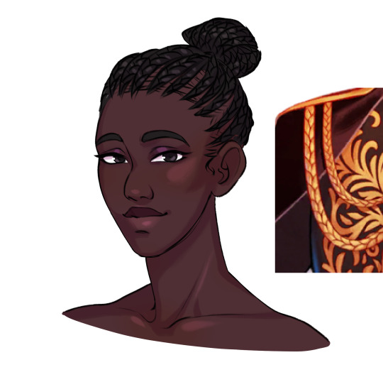
Braids have stronger highlights than dreads, and I tend to dot them in the centre of each part.
So this is my basic process. If you have more questions, feel free to ask!
#the arcana#the arcana game#hair tutorial#art ref#art tutorial#black hair#afro hair#art#i honestly haven't rendered abosede's hair much#mostly because there's so much lineart involved#for other art i tend to use braid/twist/loc brushes to make it easier#maybe i could try making some for the arcana style
3K notes
·
View notes
Text
Got myself involved in making some art for a Dungeons and Dragons campaign set in Breath of The Wild!
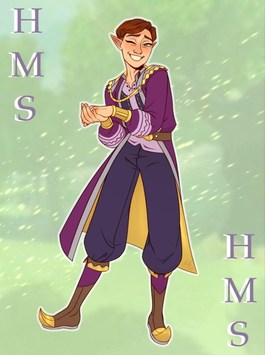
I initially was just reached out to by the GM for advice and assistance on designing and characterizing a Happy Mask Salesman NPC (which was a huge honor 🥹), but it's starting to look like I might be able to go furthermore insane about this and start helping out with other NPCs, too! Particularly original characters, now, because HMS only needed a new look due to the fact that his original outfit is from a different, older era of TLOZ.
We sat down in a Discord call for a while to talk, and I streamed my art program and helped to sketch out the GM's vision for what HMS would look like in his campaign. It was mostly inspired by the clothing of both the BOTW merchants and the royal family/people affiliated with the royal family, along with the DM's own personal flair and of course keeping as much of the original vibe of HMS's character as possible (though the style of this era has a lot more detail than we're used to seeing on him)!
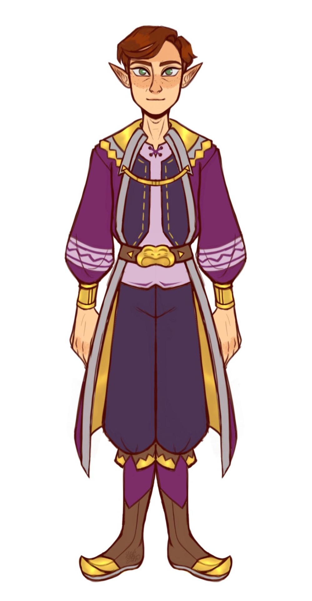
(Excuse the quality of the proportions/lineart etc. looking more rushed than usual, the first drawing up there on this post is the finished character graphic and took 14 hours to make while this one is only an outfit concept and took around 6 hours.)
His gorget was honestly the hardest part to try to incorporate with the time period and other desired details, so we settled for a general homage of shapes. BOTW fashion has a lot more triangles and zig-zags, so we switched that up, too.

Thanks to everyone in the Whispers of The Wild server who was so kind and welcoming and excited to see my art while I spectated during this week's session! You're all doing so amazing, and this was incredibly fun. I've been very sick and struggling for a while, so this was a breath of fresh air and gives me things to look forward to. I'm glad to be a part of this. 😊
#happy mask salesman#loz happy mask salesman#the happy mask salesman#legend of zelda#loz#legend of zelda majoras mask#majora's mask#majoras mask#zelda majora's mask#loz majoras mask#dungeons and dragons#zelda dungeons and dragons#whispers of the wild#breath of the wild#loz breath of the wild#loz tears of the kingdom#legend of zelda tears of the kingdom#the legend of zelda majora's mask#legend of zelda breath of the wild#legend of zelda majora's mask#the legend of zelda#tloz#botw#legend of zelda botw#botw happy mask salesman#botw fashion
114 notes
·
View notes
Text
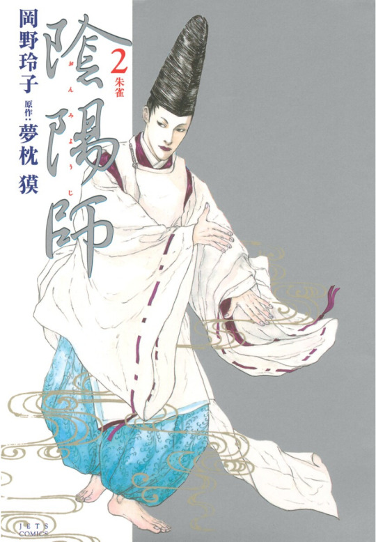
Onmyoji Manga List
Back at it again, this time with all the Onmyoji novels series based manga I'm aware of! You can purchase all of these from Bookwalker without needing to be in Japan as for as I'm aware, but your experience may vary. Note that none have official English translations as of 2023.
Reiko Okano's Onmyoji
This series is apparently the manga adaptation for Onmyoji - it won the Tezuka Osamu Cultural Grand Prize (yes, that Osamu Tezuka) in 2001 and the Seiun award (think Japan only Hugo awards) for best comic in 2006. I haven't read much of it unfortunately (I can't afford to buy all the volumes!) It has 13 volumes and a sequel (where you get to see Seimei's son!!!) A few volumes of this manga have been translated in French, but I haven't been able to get my hands on a copy :(
Mitsuki Munku's Takiyashahime
A mostly straightforward adaptation of the two-part novel series Takiyashahime. If you can't read the novels, you can read this and get a rough idea of what's going on if you can't read much Japanese (or watch the drama special I mentioned in this post!)
Itou Sei's Takiyashahime aka 瀧夜叉姫 陰陽師絵草子
(Takiyashahime Onmyoji Ezoshi)
Okay okay SO THIS MANGA. It adapts Takiyashahime, but puts its own spin on the characters. Seimei is now Haruaki (which is just the kun'yomi reading of 晴明 - Seimei is the on'yomi reading. I could talk about nanori and azana more but that's for a separate post), a young, talented onmyoji who is nonetheless still a mere apprentice. He's a lot more hot-headed and kitsune-like, but also a lot more insecure with being friends with Hiromasa due to his social status. Yasunori also plays a larger role in this as Haruaki's main mentor/shishou instead of senior disciple, probably because the author had a previous manga that involved him as a character (unrelated to the Onmyoji series) I have MANY words about the flavour of Seimei/Hiromasa in this, but it's hard to explain without context!!!
This manga has absolutely GORGEOUS art - beautiful lineart, dynamic panelling, and lovely watercolour splash pages. However, it does not shy away from graphic violence, with multiple instances of animal death, human death (including children) and one instance of graphic sexual assault (which is in volume 3, pages 109-111, if you would like to skip it) It is currently ongoing as of 2023, and you can follow it here.
#瀧夜叉姫 陰陽師絵草子#takiyashahime onmyoji ezoshi#mitsuki munku#reiko okano#itou sei#minamoto no hiromasa#abe no seimei#fyi i've bought digital versions of all of munku's takiyashahime and the currently released itou sei volumes#i started a solo scanlation project for itou sei's manga a while ago but life got in the way...might have to bring it back again haha
30 notes
·
View notes
Text
Progress talk thread
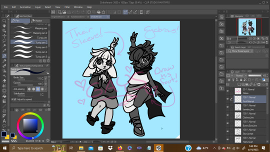
I like to take a lot of backups as I draw so we I can show off my widdle Lilly wips!! I'm drawing again that means I get to talk about drawing again yahoo
Lately when starting a drawing I've been trying to block out very rough thumbnails as seen above! I usually just start drawing like, the head, and trying to then figure out a body under neath and line by line it all ends up pretty similar to my past stuff because it's just not planned out! I don't know where the road is taking me!
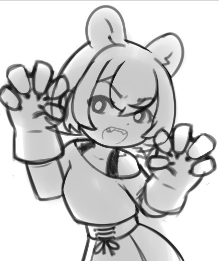
So by starting out and trying to throw together the general pose with just a blown up light brush I'm coming up with much more interesting piece! I can figure out the general shape of the entire piece and then start working on top. No making a shoulder then drawing the hand over it and then erasing the shoulder and getting frustrated because it just doesn't look connected right because I didn't plan it out… where does this drawing end? where's the limits?? where am I going?? So my current workflow involves
Make the dimensions of the piece roughly (just throw a coloured rectangle down) -> very roughly block out the shape of the body within it
This also has the benefit of inspiring me to fill in the blanks with a pose I didn't initially expect! The body is reversed from my initial vague idea because seeing the blobs made me go OH IT'D BE COOL IF I DID IT WITH THE BODY FACING THIS DIRECTION ACTUALLY LET'S MAKE THAT WORK!! If you look at the initial you can kinda see it looks more like she's looking down at you with the raised arm being the one facing you.

Anyways after doing my personal Holiday pic the other day, I was like, it would be cool to do a small run of postcards to send to people yahoo!!
I checked the sizes of postcards and none were even close! They all had like an extra inch on of extra space on the bottom whoops! I free style my rectangle sizes when planning an illustration and I guess they're closer to square than the ideal rectangle! Whoops!
So for this one after getting the initial sketch down I thought, hey how close is this to 5x7? AND LO AND BEHOLD IT WAS THE SAME ISSUE!!! So I took filling out the extra space as a challenge. I'm trying to be more dynamic with my art after all!
I spent time adjusting the piece in sai2 using the transform tool with it's perspective skewing on. I wiggled and rotated and pushed n pulled and you get what you see above. A much more dynamic piece filling out the canvas!
The thing that took the most time in this phase was getting the skirt to a shape I found acceptable.
Up next was moving towards making it a finished piece!
Thick lineart is something I've been deciding if I want to stick with or not but honestly it's my natural state! I love thick lineart!! I grew up on manga I wanna see some black lines!!! In the future I wanna go back to colouring lineart as well but for now I believe I need to lean into my natural tendencies for thick lines!
I threw down my lineart to a mostly acceptable state, and brainstormed ways to fill the empty space surrounding Lilly. I found there was just a lot of empty space in the bottom left and I didn't really solve that in the final, but that's ok. It's something I'm trying to be aware of as I actually attempt illustrations. I want to finish pieces right now, I'm not in a place where I can let perfectionism slow me down.
Currently my layers are (face) and (lineart)
I throw down some flat colours, a light layer above and for once I tried a shade layer too! It might of been a multiply layer. It was probably was. Anyways this is what I was happy with before moving forward with refining it. I'm currently going with more focus on like, backlighting/rimlighting because it's easier to make it work with my no context existing in da void illustrations haha.
To refine it, right now, I'm playing around with mainly using one layer. So I slammed together my layers other than the face (I made that mistake with my previous piece and that's how we ended up with the eyebrow incident. I wasn't going to put myself in a place where I had to erase an eyebrow again) and started sculpting!
I think sculpting is the best way to describe it, really. It's a lot of slamming down chunky lines, and since the lineart is on the same layer, I'm constantly pushing colours out and finding the ideal shape of both it and the lineart. It helps me push my shapes even farther and let the colours take priority when they need to. Instead of them being separate things I worry about they're all just one big piece!
I was a bit worried about merging the plaid pattern down as well, but I did my best to get the skirt in a place I wasn't going to adjust much after the merge. That was the biggest priority of the previous step really.
It's a lot of fun! I recommend people try it! Try sculpting your lineart a bit!
I added the necklace accessory after since I knew trying to fit it in earlier would also be a pain in the ass haha. I'm not a one layer purist! I'm just having fun!
The background, I went in with no idea for a bg. So this is what we get. I think it works fine for this piece, it's a vtuber attacking you with big fluffy bear claws with no context other than that they are a bear and they're going to fucking get you. Red fits, Lilly has a very orange/red hued design and it's an aggressive attack so the mood works. I could of even gone harder and made it look a bit more splattery but I wasn't sure if I was going to fill up the bottom left space or not.
Looking back maybe I could fit in her name on a cool blood splatter there but I am not a graphic design major my brain is growing slowly in this department thank you
Also fluffy claw gloves usually have much less defined fingers but I couldn't make mitts look good with my initial plans so I stuck with my initial idea!!! Thank u.
Anyways follow Lilly [Twitch]
15 notes
·
View notes
Note
Just wanted to day that I really love your work!!! And Aldo was wondering if you'd be able to talk through the process of how you make your comics? You get them done so quick!! And their always so good from backgrounds to expression their amazing!!! Loving your aftermath comic BTW, I look for it constantly even tho I know you post mostly on Tuesday lolol.
Also- Ace solidarity unite!!! ✌️
Hey there! It is possible that you have me confused with @happyfoxx-art who is the one who does the Aftermath comic, so maybe she can say a thing or two about her comic process.
The comics I'm more known for are "The Brains and The Brawn", "Puppet on a String", and "Mikey Bakes a Cake."
In case you are asking about me specifically, I'll talk about my comic process. I usually start with lots of brainstorming in the form of daydreaming and occasionally scribbling out ideas. I often switch between creating a script and sketching out rough scenes depending on how visual the moment is. If there's more dialogue or I want to note down the events panel-by-panel, I'll script more, if the scene is more action-y and I have a specific idea for the layout that I want to visualize, I'll sketch it. I already talked about how I figure out posing in my sketchwork on a previous ask.
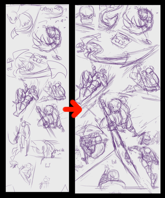
Often I create the scenes out of order and write/draw whichever comes to mind first. For example, these are an assortment of drawings I did on my first concept sketch page for "The Brains and The Brawn".
These are from pages 3, 4, 8, and 10, and while they have nothing to do with each other, they represented the main ideas I had for the comic overall.
After that I'll essentially finalize my written script to make sure everything flows well story-wise, and then go about adding or subtracting panels to lay them out in a proper page-like format. It's kind of like slotting puzzle pieces together to see what fits. This is how I get more dynamic action paneling in my comics. Below you can see some of my more disjointed initial sketches (left) become a bit more finalized (right):
From there I block in all the panels with lines, then trace over the sketches with lineart, and fill in the lines with color. Those stages involve a little less thinking on my part, since a lot of it is just filling in what I already have planned out.
I would personally like to get a bit better with color since I tend to color-pick from other source material a lot. I'm hoping in my next comic project to get a bit more trippy and abstract with the coloring. I make sure to keep each color on a separate layer, and group the layers by character to keep things organized. I usually fully color a character at a time.
After that, I add in lights, shadows, and any special effects. I think the shading and lighting is where it really comes together because it adds a nice sense of depth to everything.
Eye shines are very important to me.
I do dialogue and sound effects last. Yes, there is a basic dialogue I put in the script, but honestly, I struggle most with dialogue (I am shocked folks think that the lines are so in-character), so I put the most time and effort into finalizing that. I will make sure to keep space for where the dialogue bubble should go, but it's often filled with placeholder dialogue until I finalize it on the last step.

I'm aware that this is rather rare for comic artists - often the dialogue comes/is blocked in first for most from what I hear, But for me, the final drawing helps me figure out the right mood/tone for the dialogue in the end anyway. That's just what works for me.
Anyway, that's at least how my comic process goes. Thanks so much for asking! And if you were looking for @happyfoxx-art, then maybe she'll add onto this post. I, for one, would be interested in her process as well :3
(also, heck yeah! Ace solidarity baby!!! [shakes your hand])
111 notes
·
View notes
Note
Hello!!!
First off, I absolutely ADORE your art! It is some of the finest work ive ever seen and is just a joy to see! Secondly, i am equally upset about the abrupt rqg feed ending and would like to ask, if you are still taking requests, for any Grizzop and/or Vesseek doodles? Or just anything involving our favourite goblins! Hope you have an amazing day💜💜

RQG request #21! oh, friend, thanks so much for your words, you’re always so ready to support everyone 😭💙 and yes, same, it’s been months but i’m still salty. doing this one was funny because i did the sketch before you commissioned me, and the rendering after, so it was cool to draw them twice with different vibes!
i did very much cheat and made this one self-indulgent because, at the time when i was going to sketch this one, i was working on the chapter of my fic where they’re introduced, so... here they are! the mean girl supreme of the art world and his endlessly patient star assistant!
the rendering didn’t come out quite as i’d hoped, but the lineart is on point. like, that was Exactly how grizzop was supposed to look. well done, me. this is a cool one. thanks so much for your request!!! <33
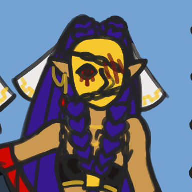
mechanical pencil on yellow paper and digital color.
ID under the cut!
[ID: an illustration of grizzop and vesseek. it's drawn traditionally with a mechanical pencil, and rendered digitally with dark sepia tones. it's a low shot that shows them both looking down at the camera, with high windows to their back, leaving them mostly in shadow. grizzop is to the left, leaning against the side of a wooden table. vesseek is in front of him, to the right, sitting on a wooden crate. grizzop has his arms crossed and is looking down with a dismissive eyebrow raised. he's wearing a plain button up with rolled up sleeves, trousers, and an apron. there's a rag hanging from his belt. he's lean and wiry, with long, pointed ears from which three arrow piercings hand. he's bald and freckly, with narrowed eyes and a rounded nose. vesseek is dressed the same way as him, and they smile relaxedly at the viewer. their left leg is dangling from the crate, and their right knee is up, with the corresponding hand resting atop of it. the left hand is on the front edge of the crate, towards the camera. they're smaller and fatter than grizzop, but a little closer to the camera. they have shorter ears and short, messy hair. they're slightly fuzzy. the windows are bright behind them both. end ID]
#rqg#rusty quill gaming#grizzop drik acht amsterdam#vesseek#rqg vesseek#mixed media#fanart#finished works#yeah sure#2022#the great swarm of rqg requests 2k22
113 notes
·
View notes
Text
I should really change my profile I think, Starbucks Shadow isn't doing it for me anymore .-.
Anyways hi :D
Haven't hadn't much time for art recently, but mostly because I jump into far too many projects at once...and I have no sense of commitment
I managed to scrap together like- two forever w.i.ps to showcase. I wasn't really planning on showing any unfinished stuff here, but a friend of mine said I should post more art so
Here's an OC I haven't really shown here(there's a lot of those lmao), her name's North! This was supposed to be a project to "expand my horizons" aka use more applications, and also a perspective practice!
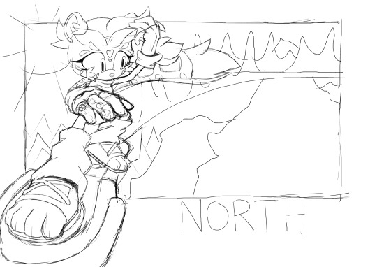
I think I did that part pretty well! As for everything else...I couldn't get myself to finish the lineart part of it
Kinda disappointing too, I was hoping that when I finished it I could use it for my artist portfolio, but I guess that'll have to wait!
The next one may be a bit triggering, as it involves a bit of disfiguration, so I'm gonna hide that under a spoiler <:)
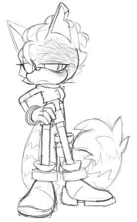
It's Ashes! But "canon" Ashes. All the previous art of her is a younger version of herself, I think I've mentioned that. She's really 19 when she goes with the whole "usurping the government" stuff
But that's gonna be all from me, just reminding people I'm still alive and somewhat working hard
Although it's gonna be a while until any more Sonic-related art comes from me, since I'm currently working on Pokemon stuff! Woah!
#sonic the hedgehog#sonic#sonic fc#sonic oc#sonic original character#ashes the ringtail#north the snow leopard#glazed ocs#glazed art#oh to be an artist#i so badly want to try new things with art#y'see somehow i got roped into drawing a map#so that's gonna be fun!#never really made a map before
8 notes
·
View notes
Text
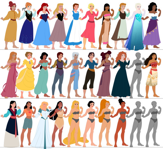
So I'm going to post about an ongoing project of mine even though it's probably a bit premature. I call it the Princess Paper Doll project although it involves a fair number of not princesses. It technically started as the Disney Princess Paper Doll project but it stopped being Disney about ten minutes after I conceived the idea. Anyway, it's gonna be a long one so if you're at all curious it's under the cut.
About a decade ago now (I think) my mom bought a set of Disney Princess paper dolls for my niece. This delighted me, first because I had Disney paper dolls as a kid, and second because of a unique feature of this particular set.
See, in this set, all of the princesses were in the same pose. Like so:
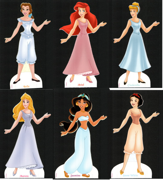
And I immediately thought that was pretty cool because they could all wear each other's clothes. I also thought that because they were all posed the same and they could therefore all wear each other's clothes, it would be fairly easy (for a moderately savvy artist) to copy the base and add other characters to the lineup and even if it took longer to make their outfits, they wouldn't have to be naked in their underwear. The Princess and the Frog being the last movie that Disney had released at the time and my niece being from New Orleans and some of her family being kinda grossly racist I decided to begin with Tiana:

However, the more observant among you may notice, as I did not for a while, that they cannot all wear each other's clothes. Tiana here, along with half of the other princesses, is wearing a wide skirt. So none of them can wear anything designed for Jasmine. Also, the set kind of sucks so Aurora up there can't even keep one of her own dresses on, there are just not enough tabs to defy gravity.
So I started over with a new base and tried again.

I worked on that long enough to get most of the bases for the Disney Princesses done, decided I didn't like the pose, I think, and set it aside.
Time for version 3.

I apparently did not get very far with this one. I only made 4 bases this time (Anna, Ariel, Pocahontas, and Mulan). But I made an entire dress for Anna (her coronation gown) and all of the outfits for Mulan. Then I started drawing clothes for Pocahontas and realized that I'd made a terrible mistake. See, Pocahontas, in the sequel, wears a ballgown and full cage crinolin and they weren't going to get along with that hand on the hip. So time to try again.
Version 4 is where I start gaining some consistency. The model here is mostly what I stick with going forward and I made some pretty good progress.
I did eventually scrap this one too, because I was having trouble navigating some of the skirts on the wide stance as evidenced by Charlotte (I do not profess to be a master artist).
So version 5.

You'll note that aside from Chel they are all only in Kida's underwear and that's because I decided fairly quickly into the clothing process that these ladies were too damn skinny. I'm not actually sure why they got so much skinnier from v4 to v5 but it had to go.
Version 6. Actually, I'm going to skip version 6 entirely here. It is identical to version 7 (the current version) except that I decided their busts were a little too big to accommodate everyone (and even the ones it seemed to accommodate looked better with the adjustment). Luckily this is the point where I started using Illustrator for the lineart so it was fairly easy to make the adjustment on the wealth of clothes I had already finished in v6. Anyway, now I've made most of the bases I have planned and at least one outfit for each (except Rapunzel because there is soooo much detail that after I did the rough sketch I was not prepared to do the clean lines). I started experimenting with how to make the different hairstyles work with Belle and Anastasia (why those two? who knows) so they have all of their hairstyles to go with their bases, and Tiana and Pocahontas have all of their clothes (and almost all Tiana's hair, though I haven't fixed it for actual interchangeability when printed).

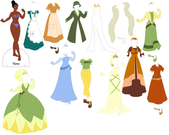

These do have tabs, by the way, they're just hidden unless I'm running a test print to make sure they work.
Now, full disclosure I mostly traced their heads from screencaps. I am not sufficiently versed in animated women that I can confidently draw all of those faces. I drew the base and I'm drawing the clothes.
Nothing is shaded partly because I'm not great at shading and partly because I've learned the hard way that it sucks to do all the shading and then make a minor adjustment and have to do it all over again.
Also I say Tiana has most of her hair because I want to include her Wreck-It-Wralph 2 hair (you'll note the outfit is there) but I am shit at drawing hair in general and worse at drawing curly hair (you'll note Merrida) and I can't find any 2d art of her with that hairstyle that I can use either to trace or as reference.
Incidentally, as much as possible I am trying to make each piece separate so the aprons come off of the Duke's and Cal's diner dresses for Tiana, Anna, Ariel, and Aurora are wearing a blouse, skirt and corset, so on and so forth. It allows for a lot more mixing and matching and it creates a more 3d effect that's kind of neat.
The full list, in case you can't recognize everyone or read their name on the base is: Anastasia (Anastasia), Anna (Frozen), Ariel (The Little Mermaid), Aurora (Sleeping Beauty), Belle (Beauty and the Beast), Charlotte (The Princess and the Frog), Chel (The Road to El Dorado), Cinderella (Cinderella), Elsa (Frozen), Esmeralda (The Hunchback of Notre Dame), Giselle (Enchanted), Jane (Tarzan), Jasmine (Aladdin), Kayley (Quest for Camelot), Kidagakash (Atlantis), Marina (Sinbad), Megara (Hercules), Merrida (Brave), Moana (Moana), Mulan (Mulan), Nani (Lilo & Stitch), Odette (The Swan Princess), Pocahontas (Pocahontas), Rapunzel (Tangled), Snow White (Snow White and the Seven Dwarfs), Thumbelina (Thumbelina), and Tiana (The Princess and the Frog).
I'm planning on adding Amalthea (Last Unicorn) at some point. I also keep waffling about Mirriam and Tzipporah (Prince of Egypt) because they are awesome animated women who deserve to be included but also I am not Jewish and I worry it's disrespectful somehow (although Pocahontas is in there so that ship's kinda sailed, hasn't it?). I'll probably try to add Mirabel (Encanto) eventually. I ought to add Nancy (Enchanted), but that's still a big question mark. In the theoretical grand plan I'm going to do the fellas eventually to, though that may be a bit more complicated. I'm also open to suggestions. However, I'm probably gonna try to get more of these ladies finished before I add to the roster.
By the way, do not come on this post to complain about women's body types in animation. This is for fun. I'm having fun with it. I worked really hard to make this work at all. Just don't.
8 notes
·
View notes
Text
OH BTW watched catu today :] i havent seen it since it first came out in 2019 and id forgotten almost everything about it since then! i was worried it was gonna be mediocre, i know there's plenty of folks who weren't too keen on it, but i really liked it! not as much as the 2nd dimension, but it was definitely a fun time.
rather than the like, more Movie type experience that 2d or notlp have, catu felt more like just a looong episode of pnf. id mostly just say it was fun! i do love stuff like 2d/notlp where the drama is heightened and things get more on the serious side, but the "just slightly more dramatic than your typical pnf episode" isn't a bad place to be for a pnf movie.
i have a couple gripes for sure- i don't think many of the songs were up to the usual caliber, ferb had too many voice lines, and some bits were wayy too drawn out.. i'm glad ferb was more involved but i think if he talks too much to do that you really lose his ferbiness :( there were jokey lines where you definitely couldve replaced him talking with something else and it'd work just as well. i adore ferb, he doesnt need to talk to be involved!!
that said, i really like the art. they had fun with angles and a lot more fun than usual with character expressions which i really appreciate, it was all very good to look at. and the action-type animation has DEFINITELY improved a lot- actiony scenes from stuff like the 2d movie always had a certain awkwardness to them that was not present here. the lineart was a bit thicker and i think the way they did the lineart coloring was slightly different? the differences were, like, small enough to be hard to pinpoint but distracting because i'm very familiar with regular pnf. so, not something bad, just different and throwing me off because of it.
the writing also felt, for the most part, on point. there were a lot of super funny lines and good bits. and i enjoyed candace's story! i'm an older sister, and the difference between my & my little sister's age is just about the same as that between candace and p&f (depending on which episode's timeline you reference..) and a lot of her emotional development in the movie rang very true to shitty-teen me, my conception of my self-worth back then, and how my relationship with my little sister changed as we both got older.
overall i liked it and it makes me very excited for the new seasons :]
7 notes
·
View notes
Text
✦

Hello! Welcome! I'm Ambiguous Hybrid!
Welcome to my portifolio + personal blog, i do not assure you i will be very active here. But i do will try to maintain this place going for as long as i can :]
Feel welcomed to ask and interact!
Please know, english is not my first language
DO NOT INTERACT:
If you're an active AI user, and claim yourself to be a "AI artist", you will be blocked instantly.
You're in favor of NFT's
I will block spammers. (does not envolve spam liking)
Repost artwork or even worse trace it. (NO, my work is not avaliable for repost not tracing, if any of theses happen you will be reported and blocked.)

My name is Lee, AKA Ambiguous Hybrid. I’m a asian digital artist from Brazil. My main focus currently is digital art, but i do traditional art in my spare time!
I have a huge love for fantasy related stories, and a deep interest in creating lore and original characters. I’m open for art commission and freelance work as a main hobby.
In this page you can see my artwork, that can involve the multiple fandoms i’m in, and my OC’s!
my carrd (with all my socials)
commissions

T R A D I T I O N A L
Faber Castell Eco-Pencils: i mostly use the faber castell green eco-pencils, they are very comfortable to draw, i mostly use them for black and white drawings. One package has a limited types of graphites going from HB to 8B, the 8B being the most softer and easier to blend.
Staedtler 4 pigment liner: I don't usually do lineart when doing traditional art, but i use them mostly for writting on the drawing pages, as well as doing small scribbles and abstract paintings. But when i do use for lineart, i use 0.8, 0.3 and for details 0.1 or 0.05.
Faber Castell Eco Super Soft: I had theses colored pencils for a few years now, they are great for gradients and mixing colors (As long as you don't do it too hard then the colors won't blend). No they're not watercolor pencils unfortunately. I use them for silly sketches or just to add more color on a simple sketch.
SketchBook Canson, A5, with the black covers: They are very water and ink resistent, but in my opinion they are not great for alcohol markers like copics, since they bleed right through the pages. They are overall one of the best sketchbooks i've ever used.
Faber Castell Dust Free eraser: Theses are like the best of the best erasers i've ever bought. I use them for everything, but again do not use too much pressure on the pencils, if the color is too bright or too dark, the eraser will not be able to clean if you put way too much pressure.
D I G I T A L
Gaomon Display Pd1161: I've bought this display 3 years ago, gaomon is not as expensive as other displays brands, yet is very good, i never had any problem with this brand, and honestly so far it's one of the best i've had.
Paint Tool Sai 2: I've bought SAI in 2018, at the time in Brazil it was around R$160, few years ago a friend of mine told me it was now at R$260. I enjoy SAI, it's a program i've used since i started digital art. But the app is still going through a lot of updates, which causes the settings archive of the software to get constant errors, making users delete their settings to avoid this error. Though i'm looking for new art softwares to use in the future and not be totally stuck on SAI.
KRITA: My experience with krita so far is very good, i believe it only lags a lot because of how bad my laptop is lol XD But so far i've enjoyed it! It has a huge variety of filters, brushes, etc. At the moment i enjoy it a lot, though you do have to set your settings if you're not used to the keyboards shortcuts the program has!
I'm currently looking on investing on a IPad so i can draw remotely during travels or when i'm at university, when this happen i'll update it here!
N A V E G A T I O N
My artwork is under #my art
Any ask or rambling will be at #gnomeo rambling
Friend's reblogs #friend's art reblog
Thank you for reading and enjoy your stay <3
4 notes
·
View notes
Note
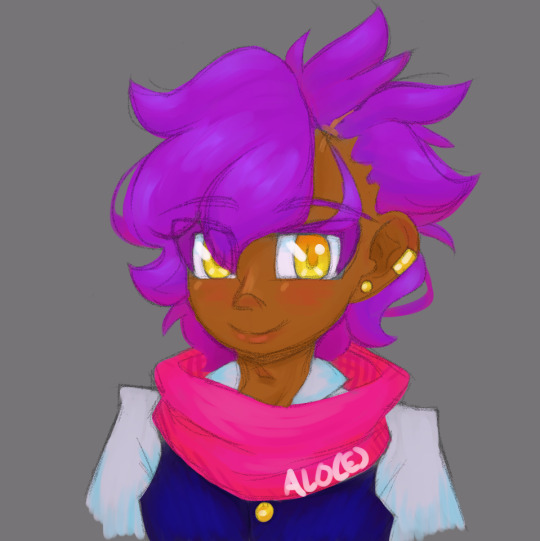
Do you have an info or art about the other characters involved with Kalamari??? Esp Glass since you mentioned them directly!!! OwO
Okay SO I do have a few things!! Most of these are old and a lil messy/outdated, so I'm really hoping to whip out a bunch of new stuff soon, but!! I'm gonna put everything under a ReadMore link again bc boy I have things to say and none of it is organized or really coherent so good luck (and also I am still shy)
I've got my two protagonists, Iso (I-20) and Aerani--
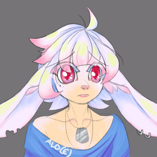
[These are Old outfit designs, I redesigned them sorta recently but haven't finished a drawing of them, sobs] I first drew Aerani in like, 2016 I think? and Iso followed not long after! Iso is a bunny chimera, so he's got big silly ears, wahoo. Chimeras have identification codes to keep track of like, when they were created, and Iso's is I-20: Chimera Generation I, Specimen Number 20. Aerani gave him the nickname Iso <3
Here was Iso in like. 2017? 2018? idk but it was ages ago. He's changed quite a bit, mostly bc I would Constantly misplace sketchbooks and Constantly forget exactly what things looked like lksad;f

This era of my art was so cute,, I wanna draw hair more like that again tbh
Here's a semi-recent doodle wip of their new outfits, hoorayyy. Don't mind how unfinished it is and my silly notes all over the place. I'm gonna just redraw this at some point bc my art has improved since then aklsdjf;lskdk
Comfy boys!! Iso's clothing is always kinda ill-fitting bc he Hates skintight stuff, and he is gonna lose those cute slouchy boots SO fast bc I'm gonna drop him in the desert. Woe, sand be upon ye
Iso used to live in a mansion w a rich guy that was Kind Of A Dick, until that guy's daughter-- Iso's childhood best friend-- snapped and killed her dad w a fireplace poker. I haven't drawn her yet and honestly How Dare I. I wanna draw her making flower crowns w Iso
I was Nervous about jumping straight into making smth about them, because I feel like I need wayyyy more practice to be able to tell the story I really wanna tell, so I ended up scooping up my dorky purple merchant Kalamari like 'you know what sure, you can be the protagonist of my practice project and it will be Silly As Hell'. I call my main Eventual Goal 'Quote Unquote Quest', so Kalamari's adventure I'm calling 'Quote Unquote Quest Negative One', since it becomes before the main thing! Aerani will be in that practice project as a side character, bc he's Glass's little brother, but Iso won't be
Also, please witness Aerani's pet, a squishy jello-like blob he calls a frog. It is absolutely not a frog. It sits on his head a lot and makes squeaky lil noises

Here's another chimera! She's much older than Iso, from gen F! The only one left from gen F actually. She calls herself Fa, and she doesn't like to talk, she just hangs out by a pond all day to watch the fish

This is OLD so I'm def gonna redraw it soon, but here's one of my antagonists! They by the name Scratch, and they're sort of. the opposite of Kalamari. I have So Much I wanna draw abt them omg,,
While I do like their color palette, I'm gonnadesign one to match. everyone else. The colors I wanna use for this project (that might eventually change ofc) are brown, orange, golden yellow, magenta, a slightly more purple magenta, violet, indigo, and blueee, with Very Dark Blue and Very Light versions of the other colors for lines and junk. Basically Kalamari Colors ft. some extras to spice things up, since my silly littol practice project revolves around her and how he sees the world:
Everything is very saturated of course bc I'm. cannot and will not use desaturated colors. It's kind of like my chunky lineart-- I can try So Hard to make it thin, but that just doesn't look right to me and as I work woopsie everything is thick and I'm dying
AND FINALLY. MESSY SKETCHY WIP OF GAY PEOPLE IN MY ART PROGRAM
Glass and Kalamari!!!!!!! I hadn't drawn Glass yet and I'm crying bc she's turning out so cute. sobs. I was working on this before I realized oh shit yeah the oc tournament is posting Kalamari tomorrow, and I had to stop to go finish up my other art + my oc sideblog bc I wanted that to all be ready to go
#pikaposts#alo(e) art#quote unquote quest#slides facefirst down the stairs. thank you for attending my chaotic infodump. don't ask me how long i spent writing it#i wonder what it's like to be a person that can write a simple post in a reasonable amount of time. must be wild.#what do y'all do w all that free time#anyway i need to practice drawing more i am Dying
3 notes
·
View notes
Text
Uhuhu~!
Yes, I wanted to draw it for a long time, but when I finally started drawing it I finished it in... 3 days I guess.
First day - Sketch
Second day (yesterday) - Lineart
Third day (today) - Colors
So yessssss it is proof that I can draw more... And yes, despite school and a few other things I have a lot of time. Well... Now I have description of Grillby appearance so I can draw him soon. About Mettaton I don't really know how he should look like. I have some ideas for his appearance but I didn't decided yet. And also I know that in my plan I wrote about Muffet, Grillby, Mettaton and short description about some other monsters involved in some businesses in one post, but I decided to make a few posts after all.
So I don't really have much to say about Muffet. She still is avaricious and like in Undertale well-being of spiders is the most important for her. She joined to Smile Program because of financial assistance. I didn't mention it ealier but businesses in Smile Program have financial assistance from authorities. It's for advertisement, employees, product quality. Financial assistance is kind of motivation to join to Smile Program.
More money for advertisement means more customers.
More money to pay employees means more employees and better motivation for them.
More money for product quality means customers will like your product more.
And in general it means even more money! That is why Muffet joined.
You can see in her appearance that she is in Smile Program, mostly in colors. She wears mostly cheerful colors like yellow, green or pink. And yes, she got into it so badly that she even curls her hair =w=
6 notes
·
View notes
Text
Based on an old sketch about a very silly Discord discussion with @storyknitter, that started with her joking about Theron being an undercover electrician planting spy devices in someone's home, and then somehow literal plants got involved.
(aka -- I just wanted to try out a new lineart techinque, but didn't want to bother sketching anything new so I just resurrected this. Art talk under the cut)
I finished watching an open tab I had forgotten about for several months on some quick and dirty line art tips in which you use the border effect inside of Clip Studio to quickly block out shapes and create line art. Wanting to try it out on something, and not in the mood to sketch, I went and found this extremely silly sketch I did on Discord a few months back. Like this sketch, I didn't spend really want to spend too much time in making things super pretty, just wanted to see how quickly I could finish.
Conclusion: I like it! Need to mess around with the anti-aliasing settings a bit more so that when removing the white color and converting the lines to vector (mostly because i wanted some latitude to adjust the line width) it doesn't get quite so crunchy and jagged. Something you can see along the lines around the "flower". If you're using Clip Studio Paint and want a new line art method, worth giving it an experiment.
#greyart#i don't know if i really want to use the fandom tags for this#as i was just farting around#and the anatomy and everything is wonky#lmao#i was just doing this as an experiment#i kind of forgot it was thursday while doing this too XD
5 notes
·
View notes
Text
FrontierFest, Day 20
Frontier fanartist/author recommendations? [you can recommend yourself!]
I don't know anyone who exclusively draws Frontier fanart, but I have been a fan of @koucholate's art for a long time. They have an adorable style, and draw the absolute CUTEST Koujis. Here is my #1 favorite; Kouji babysitting Tomoki and Shinya is amazing and 100% deserves to happen.
@raynef-art is mostly on Twitter these days, but has posted some great Frontier art (as well as other Digimon seasons) on Tumblr. I really admire her lineart and coloring skills!
As for fic, I haven't read any Frontier fanfic in years, so these recommendations are from me-several-years-ago and not necessarily me-from-today, but I'm mentioning them because they did leave quite an impression on me at the time:
The Spirits Within by SilvorMoon checks ALL the boxes for what I'd love to see in a Frontier sequel (except it is, sadly, unfinished). But it's still a very enjoyable ride! A new quest in the Digital World, a struggle with new evolutions, and a very sympathetic villain in Witchmon! As soon as I'm caught up with all the OTHER fanfic I'm behind on, I think I'll give this a reread, and yearn(tm).
Whiteout, also by SilvorMoon, is a cute Junzumi fic, and is probably the first and (until recently) only place I had seen Junpei associated with model trains, which does seem like a natural fit as a hobby he would have later in life!
Issues with Younger Brothers by Higuchimon scratches that itch of human characters who never interacted in the show having a scene together, in this case Takuya and Yutaka (pre-series!)
And hey, I might as well plug the scant Frontier art I've posted on my other blogs, and my one (silly) fanfic that offers a slightly different take on the ending of episode 15. The only other Frontier fic I ever made any progress toward writing was going to serve as gap-filler for the time that Takuya spent in the real world and focused on a Kouji + Tomoki interaction and (slight) character development... but sadly, that has been stalled as a partial draft for many, MANY years. This event has given me a few other plot bunnies though, so I've been toying with the idea of writing a little scene of Kouji going back to pick up those flowers from the florist, and MAYBE a fic based on something that was mentioned in the Blu-ray audio drama (and has involved researching a lot of operas!). Will I actually start, much less finish either of those? Doubtful, but I can dream! :P
However, since 2022 IS the Year of Frontier, I am motivated to draw more art at the very least!!
6 notes
·
View notes
Text
new digital projects
So it's been almost a year since I've posted anything here. I have been drawing (though not every day, unfortunately), but it's been mostly just doodles or figure studies - nothing particularly involved.
I bought myself an iPad 9 for college and received an Apple Pencil for Christmas, so of course that led to me getting Procreate from the app store and messing with it. After a few hours of doodling, I finally watched some tutorials and started getting serious.
I've been wanting to get into digital art for a while. Don't get me wrong, I love the tactile elements of traditional art, but it's unforgiving towards mistakes and all of the supplies/materials take up more space than you'd expect.
I was fortunate enough to receive a small drawing tablet from a good friend @dieselsardine several years ago, and worked with a free digital painting program called Krita for a while -- as mentioned in this post where I got into drawing mice -- but the tablet pen stopped working after my cat knocked it off my desk and onto a hardwood floor, and I felt uncomfortable spending the money to replace it. I found Krita to be... overwhelming. There were so many things I could do, and none of it felt particularly intuitive. Also, the program crashed OFTEN and I was terrified of working with more than 4 paint layers at a time.
Procreate feels like a breath of fresh air in comparison.
Admittedly, I have gotten used to more "typical" painting programs, so it took me a while to learn how the circle tool and color picker worked, and there's still a bunch I don't know -- I'm sure that, after less than a week, I've barely scratched the surface of what Procreate is capable of.
I was looking for something to draw in Procreate, something complex that would be an actual challenge. I'm terrible at coming up with ideas, so I decided to copy this stock illustration of a steaming teacup wreathed with a blackberry vine.
Now, copying ≠ tracing. (Trust me, if I'd traced, my final product would look a LOT better than it does, and I'd have learned nothing). I just used the stock image as a reference and tried to recreate it as best I could.
In Krita, I would try to use as few layers as possible. I had one layer for a sketch or background, one for lineart + colors, and 2 extra for any miscellaneous details. It wasn't a good system. With this project in Procreate, though, I found myself using more than 7 paint layers at a time and the app didn't so much as stutter under the load. I'm very impressed.
I started with a basic sketch of the whole scene:
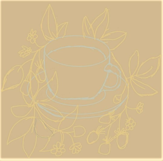
(Note: this image has been altered to enhance contrast, since I wasn't sure it was easy enough to see).
I used the circle tool a few times! I wanted this stage to just be a general idea of whether everything goes, as opposed to a refined sketch. Because the original stock image doesn't have a lot of shading/shadows, I didn't feel the need to block in lots of values. (Also, IDK how to do the trick where you paint in grayscale, working exclusively with values, and then can switch the grayscale to color. I want to learn but I need to watch more tutorials).
I worked on the blackberry vine next, since I like botanicals. This part took me... about three days, working for maybe 1-2 hours per day.
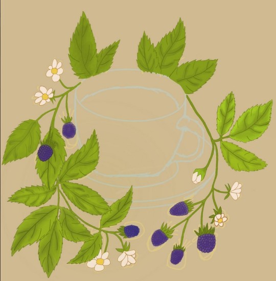
I still only have the default brushes. I mostly used the technical pen for the lineart, since I like very opaque, thin lines. Adding color was done primarily with the round brush and the syrup brush, and you can see with the leaves that I was trying a lot of different blending methods -- some more successful than others -- before realizing that the smudge tool existed.
By the time I finished this part I was reaching the 50/50 stage of pride vs. loathing whenever I looked at what I had created. The teacup itself would make or break my feelings about this project.
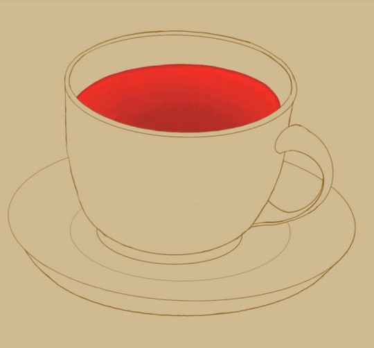
The cup looks... okay. The circle/ellipse tool is a godsend and saved this entire project. I did some shading, which ended up being the easiest part of this entire picture, then overlaid the layer with the botanical elements, and all that was left were some wisps of steam.
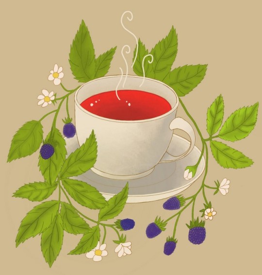
And that's it! The stock illustration uses more subtle shading and adds a bunch of lines to give an impression of depth, but I prefer the more dramatic shading here. (Though tbh I worry that it's a very different style from the blackberry leaves themselves, and that the 2 styles aren't especially harmonious). My pride vs loathing is now at 65-35, in favor of pride. I can tell that there's still a lot I need to learn how to do, but as a first art piece on a new digital art application I think I did pretty well.
3 notes
·
View notes
Note
[skin]: obviously colour, but also if they’re inclined to run hot or cold, do they have any blemishes or unusual markings, are they inclined to blush, are they freckled, do they tan, what does their skin feel like, etc.
Olive-toned, with a gold undertone. I’d actually make her a shade or so darker in-game, if I could, but the palettes there leave a little to be desired and jump from a light brown to dark quickly, and her orange markings in her hair look real bad against the next few skintones. So! I make do. I know what she looks like, and I try to convey in my writing what she looks like better than the game can capture.She is, remarkably, scar-less, save for the three small scars on her face! It’s a backstory point that bothers her to no end, but she won’t bring it up out of nowhere unless scars are, in fact, the topic of conversation (and she never mentions her own 3 scars that she DOES have). As for temperature? She’s maybe a touch warmer than average...but mostly because I know how cats work and they, too, run hotter than humans by a smidge. But she’s not like, obviously more warm or cold to the touch - though she WILL bitch endlessly if she has to go to a cold locale. She tans easily - being a native to the desert, after all - and there’s likely light freckling along her cheeks, but not nearly as distinct as her twin brother’s are. She also doesn’t blush much - unless you’ve managed to well and truly shock/surprise her. As for what her skin feels like - soft. Always soft. Supple. She is meticulous about grooming (what cat isn’t?), and her hair/tail are the first things she works her spiced oil into, but you better believe she has a skincare routine that involves her oil as well. Soft as she is, it remains a soft cover for a well-oiled machine, and the small woman has no small amount of lean muscle to her...that’s partially covered in an eastern-styled dragon tattoo that spans almost the whole length of the right side of her body. Her inner left forearm has a lineart style jackal inked on, and her inner right wrist has 3 phoenix down feathers tattooed on, as well. I think that covers things!
2 notes
·
View notes
Last Seen Blogs
painfulsstuff
Ich hab es verkackt...Unglaublicher Selbsthass
roughforest
Roughforest
aritahou-blog
Top Specialist Divorce & Family Lawyer
missingposter
missing