#take it now ig lol
Text

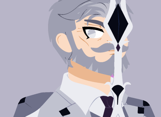
my new roman empire
#I meant to say the picture#but actually mick schumacher is my roman empire#this man-#honestly#I dont even have words#now im endlessly wondering about sitting beside him during a flight#the way he would take the time and the privacy of the first class to kiss you until his mouth is tired#and then just make you lie on top of him and cuddle most of the flight#just *sighs dreamly*#Im such a simple gal#mick and a bottle of water and I would be fine#anyways lol#komh#fic inspo#just saving it here#mick inspo#via ig#ms47#mick schumacher
216 notes
·
View notes
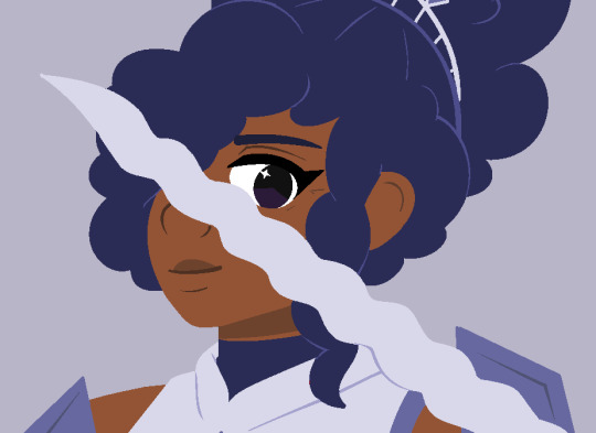
Text

a painting of Häärijä and Chelsea
#häärijä#käärijä#digital art#here take this before i spend any more time on it lol#i really underestimated how long this would take#i've been working on it on and off for almost two weeks now#even though i didn't want to spend more than two days on it lmao#still not totally satisfied with it but whatever#i'm considering story tagging häärijä on ig but i'm not sure if i should lol
306 notes
·
View notes
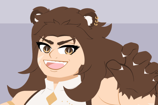
Text

NAOMI: …Everyone should join me. I'm... so... lonely...
YUKA: Big brother, I'm so lonely...
two different girls, two different deaths, only one thing to say to the boy who failed them.
#corpse party#corpse party rebuilt#satoshi mochida#naomi nakashima#yuka is there..... in spirit ;DDDD#get it bc shes dead. this is the ending where both naomi and yuka dieeeee#anyway i know this ending was ported in PART to bloodcovered but like... not the naomi part... thats the BEST part... ig it just didnt work#something about satoshis greatest fear being that theyll be lonely .#also he let both the girl he loved and his little sister die by his cowardice.#no wonder hes feelin haunted lol. also hes literally being haunted.#interestingly it takes .5 seconds for ghosts (even nice ones like yuka and naomi) to turn evil in rebuilt?!!??! they NERFED the school l8r?#it takes. so. long. in the other games. not here. ^_^ its been 5 minutes naomi has made up her mind she wants 2 kill now.#i will always love rebuilt :3#my nyart#ofc i have 180000 alternate versions ig ill put em on insta as usualllllll#i miss queue#as always i am queueing bc its 3 am
67 notes
·
View notes
Text

and now for something stupid
#but really i also just wanted to play around w this sort of coloring style bc its been FOREVER since ive used it#and i think i can make it look better now#AND i think i can make more sillay stuff like this and not have it take as long w cleaning up lines#anyway now you all understand the terrible dynamic between these three#phobo's infodump text is just copypasted from the wikipedia page for knives.#julliet ALSO uses knives is the thing so hes actually mansplaining < JOKE#he just wants to share. even if it gives her a headache. but he wouldnt mansplain he doesnt have it in him. hes ok with felonies tho#but julis life hasnt known peace since she was told to take care of the newbies#and shes ALSO a newbie (just slightly less so) so really this is probably just tartarus hazing her#theyd take one look at the two disorganized unserious overeager newbies and think ''you know what would be fucking hilarious''#and pass them onto the neurotic slightly-less-newbie who takes everything as seriously as possible. disaster combination.#i cannot stress enough that this is a group of bandits and murderers theyre NOT above hazing.#deimos actually is doing the best job at it since he is stealing as we speak#i mean hes not supposed to do it to his teammates but still. on the right track#as for the dynamic between deimos and phobos themselves its like. theyre just bros. theyre both pretty similar in personality#except deimos is kinda more mean and cynical while phobos can be kinda. dense and naive despite literally where hes at in life#but most of the time theyre basically beavis and butthead#i would also like to stress that juli is not being homophobic she just already cannot stand these guys and cant believe the audacity#but. complete misunderstanding. karma for stealing wallets ig#this will never be cleared up by anyone ever#but again thats not their dynamic they are just beavis and butthead. and i guess that makes juli daria LOL#finn's ocs#finn's art
32 notes
·
View notes
Text
Wow, so umm... This looks bad, not only is it inaccurate due to using the wrong ink demon design [unless this is confirmation BATIM Ink Demon has been outright retconned... Which would make me pissed enough to make a new post just about THAT] but from an art standpoint this is just... Confusing and poorly done.
I wouldn't care if this was fanart, of course you should support young, indie artists... But for a Graphic Novel making sure your cover doesn't look like something Butch Hartman shat out in an afternoon is kind of important. Remember they're going to be asking us to give money to them to read this. The artist likely won't see any of that money and neither do the authors most of the time, not to mention this art screams of the artist being underpaid and overworked.
Like they Had to get something on someone's desk and their boss said 'good enough'. A concept Joey Drew Studios is very familiar with considering the allegations of poor working environments that Kindly Beast. Not to mention Mike Mood admitting in a Reddit AMA that they did in fact rush projects like Showdown Bandit. [Which they sold at full price]

He also says they can in fact say no or yes to designs involving their IP. Either Mike or Meatly had to say yes to this cover, according to his own damn words.
And do you really think this company in particular would care enough about its fanbase to not sell them garbage? They have done exactly that on several occasions. It's not like they care particularly about art either, considering their previous use of AI Art. There was no apology or even posts addressing it... Instead, they just rushed out an archives update to their game to get people to stop talking about it... Even forgetting an entire character in it. Again
This company is [or at least SHOULD BE] on thin ice when it comes to being suspected of misleading their fans or rushing out crappy products to them.
So with all that context in mind, I'm gonna talk about why this cover sucks ass.
The light sources are all over the place? Why does it look like someone put maces or knight armor on his shoulders but it's just flesh?? It looks both gross and weird [not in a good way either]
To explain more I'm going on a rant below but sadly this seems to have been confirmed to not just be a rough pass but the final cover and man... I am not excited about this graphic novel just at all. This felt like it really drained any possibility of it turning out good for me and I already had expectations low.
Okay first point, the light sources?? And there is no consistency here with the shadows or lighting, it looks like there's a hundred light sources all at once but none of them are even consistent!
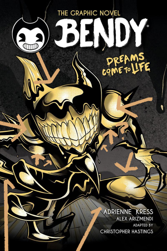
the arrows here represent all the different light sources I can make out and yet the the shadow clearly implies there's only one. I understand wanting to use highlights to give the character a more clear shape but then just give him one or two lights behind him or in front of him? No matter how u follow the light sources, the highlights make no sense and the shadows make even less sense.
Why are the shoulders like that? Like on the legs it's a little understandable, at least those are clearly very heavily affected by perspective, for me I think they are so exaggerated it makes it look like one of the legs is either huge or one is small but that's maybe subjective.
However, the shoulders are unjustifiable, what happened there, what did they do??
I could pick on so much more honestly, how the color choices of piss yellow with no other colors being used, and the harsh pitch black being used for every part of his body is weird. How it looks straight out of Butch Hartman's recent crappy art. But to put bluntly bad start! Also what the HELL is going on with this background??
Seems once again the Bendy team is fine with sending out stuff thinking it's "Good Enough" for Bendy fans and honestly the people trying to tell me to "Be Grateful" for this are just proving that no matter how many times you betray your audience some of em will defend you!
Which is sad tbh. If anything we should be putting MORE pressure on the Bendy team to do better. Cause we deserve better than this, honestly we do. There are amazing artists in the bendy community who could do so much better for a cover. They've employed their fan artists before... Wouldn't it be great to do that for such a lore important book? The book that gives us the identity of one of the main characters in BATIM? The character you spend the entirety of Chapter 4 fighting to save? Not to mention will give several major characters their human designs?
But I guess this is... Good enough...
#ramblez#batim#batdr#bendy and the ink machine#bendy and the dark revival#sorry I've been on a positivity streak with bendy I know but I have to be honest and being honest I think this sucks lol#Im sure plenty of people Disagree and while I would argue this is more objective than subjective people will ignore me if they want to#maybe Im just a hater idk#but I do know one thing I sure do hate this and Im pretty sure Ill hate this novel and its designs#but maybe I wont ya never know#anyways if they do retcon batim ink demon I will make a post abt how much I dislike batdrs ink demon design#and why I think all the people saying its better than the og seriously arent understanding#what made batims ink demon good or character design in general tbh#to put bluntly just bc something is popular opinion DOES NOT make it right or a good idea design wise#not everyone is qualified to be a character designer and thats just good advice in general tbh#anyways yeah thats it sorry im being mean today </3#I simply think corporations shouldnt be able to rush out crappy products to their fans and get paid for it but ig thats a hot take now#but esp with how bad that updated employee handbook was too and it still had stolen renders from fans in it...#yeah I dont think theyve learned a damn thing
24 notes
·
View notes
Text
doing my anatomy study is fucking torturous bc every time i read some shit like “birds dont have a diaphragm” my brains like “hmmmm…… birdperson…..” and then i end up thinking abt him instead of studying
#it is rlly fun tho. thinking deeply abt alien (bird guy) biology all the time#ok typing this bc its fun and counts as revision.#(if i get anything wrong idgaf. this is from memory)#birds only have tiny kinda rigid lungs so they have a bunch of air sacs instead for air to flow into#and no diaphragm! so they use the intercostal muscles to breathe in and out#which r like the muscles around the ribs#but also means if u squeeze them around the middle they cant breathe#birds also have a kinda weird digestive system due to not having teeth etc#but of course bp .. does. but his diet is similar to that of seed eating birds#we dont see him eat i dont think. ?#its possible he has a mixed style of digestive system.. with a stomach like a human and gizzard like a bird#assuming he just swallows seeds whole without chewing lol#hmmm… id say its probably more likely he just has a proventriculus/gizzard combo and maybe like. a larger proventriculus than normal birds#hard to say. we dont rlly know enough abt his diet ig#altho i imagine it to be omnivorous#also smth fun is birds often swallow stones to help digest seeds. now if he chewed it probably wouldnt be necessary. but think abt it. silly#ok take this w a pinchhh of salt. but diet aside the teeth could be used simply for speech.#i vaguely remember learning abt that in language.#also he does Canonically have a cloaca ! wont go into that rn. but hmmm. much to think abt.#basiclaly bp pussy reallllll#kinda.#in the ways that matter !#oooooh what else.#ooooh. yes. birds dont have vocal chords. they have a syrinx for vocalisation#but of coursee bp can talk.#butttt there are birds that can imitate human speech. so its possible bp just uses similar techniques for speech#but it also gives him a far greater control over his voice than most … making him perfect as the lead singer :]#oh and ummm. he veryyyy likely has hollow bones. so even tho hes huge hes deceptively light. TEE HEE#ok thats it. i need to actaully revise this shit now LOL#but ooohhgghhhg. i need him.
23 notes
·
View notes
Text
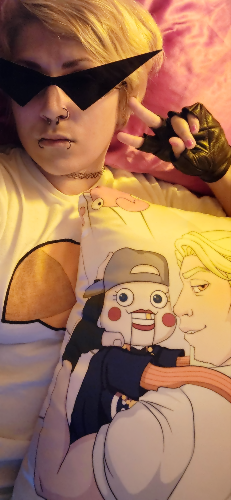
Bros only. You're not invited.
#idk lol i was in my dirk shirt all day and like#it takes 2 seconds to put on the shades and gloves#why not do a casual lol#i just restuffed my pillows after washing the cases so i was like... man lets get some brodirk up in this home#(dont forget cal in the equation tho brocal is 4lyfe)#(i just havent gotten around to remaking cal yet so pillow will have 2 do)#fuck what if i threw on bro and took another brobro pic#homestuck#homestuck cosplay#dirk#dirk strider#casual cosplay#me#selfie#striders#413#its awk lighting bc my lightbulb right here is orange (i have pink and red also in other parts of my room lol)#i dont feel like burning my eyes w the ceiling light#ramble ramble lol idk what to tag this bro#brodirk#stridercest#(implied ig just tagging bc ppl are weird about it now)#brocal#mmmm what tag uhhhh#cosplay#even tho this hardly qualifies lol#bro#lil cal#i still wanna do a full dirk cosplay again its just.. the hair.. i dont wanna gel it.. it takes a blowdryer to get the zero grav lift#...and thats too much effort when im the only one who cares lol
13 notes
·
View notes
Text
"your violence is unspeakable now " ive always committed grievous acts of violence and war crimes . You are just mad at me for killing someone who matters
#hector#book 22#book 24#again imbued with themes ig#cause while yeah this is haha silly#it is also very much a take ive seen lol#less so in the case of achilles and more so with hector post patroclus#and can be applied to practically any other character#like there is horrific violence and devastation everywhere in this story#the evil isnt the person acting it is the totality of it. war and violence make monsters of men#there is a totality of devastation that is recognized in what happens between the 3#but it isnt just limited to the characters alone. if u limit it to that it is so so deeply one dimensional#anyways if yall can stomach war crimes discussion#i would forever recommend the doc the act of killing#every so often i think about it and just…..god.#i havent watched the second doc still and im sad about that cause it is about a victim confronting the abuses exacted by these people#but the act of killing is just…..interviewing these people years after they horrifically maimed and killed so many. and then#asking them to describe the act. and how they felt. and how they feel now. and if it was justified. is just……god fr a must watch if u can#handle that type of pain. both visually and in spoken word#but yeah. nuance is the point of this aside lol#oh but also just cause no one gets upset over all those men who die. like that post that is like is the whole book just like this#these descriptions of death at a massive scale in another catalogue type form#hell ik people have talked about character kill counts on here. i have been that bitch#to prove a ferocity in battle or whatever the hell#but there is no recognition of that depravity. it is only when it touches someone we know by the narrative to be loved#to be powerful. to be good. to be worth something to the people around him#and to see him act with his family and in battle before the end and with the gods and#humanity makes it hit more obviously. that is how stories work. but to step back from that and recognize#oh so many men also died terribly. so many things happened to their bodies. and they only get a line. that is what gets me
78 notes
·
View notes
Text
Orb...
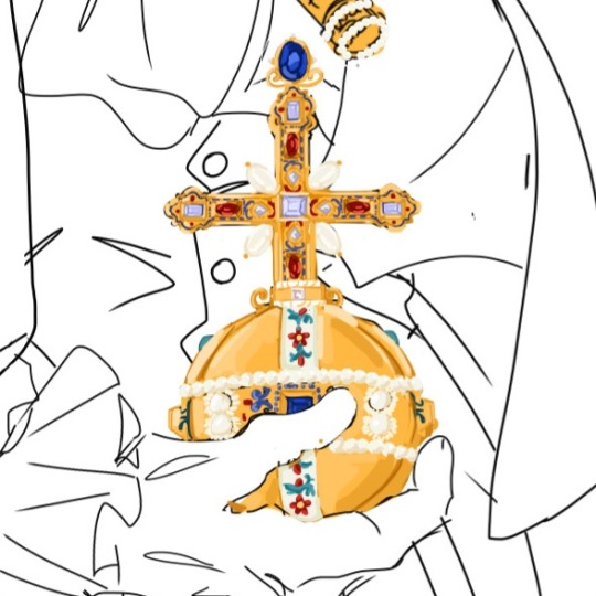
+ process kinda

#istg lineart is just a horrible terrible thing LOL#i sketch and it goes very well and i am very happy and i feel very creative!!!#i have to do lineart and it makes me want to give up the piece .....#i get to paint and im like omg i could do this for hours !!! this is so fun !!!!!!#thus: orb#im very happy w it so thats why im posting#idk how long the actual piece is gonna take so might as well post a little sneak peak ig#lmfao i gave up on the crown bcs it was too complicated and then drew this. maybe the crown will come back. prob not#im surprised w the process of this. i usually struggle a lot w accurately referencing real life things#and i usually end up tracing them just to understand how the form works#and god ive drawn so many complicated things for this piece and havent had to trace at all???? okay?????#i mean ofc its not entirely accurate bcs the craftsmanship on the original orb is actually insane#but i think ive got it down p well :)#ill have to try to make the gold look a bit better at some point later on but for now its !!!#i like how half my art i post here is either chibis#or just the most brainrot intense historically detailed shit ever#yes no one i talk to probably knows what a globus cruciger is but GOD DAMN IT IM GONNA DRAW IT ACCURATELY#had this thought ^ when i looked at my top posts and my last post was those nando chibis#and then after a week of not drawing after that im like yeah let me draw several imperial relics#catie.art.
17 notes
·
View notes
Text


Haven't drawn mexico in a while I kinda missed him
#kinda redesigned canada a bit#he finally has ears now lol#i was gonna make his hair longer but he was starting to look too much like france#which like good for him copy your dad ig but i don't want ppl to get these 2 confused#but also i started thinking about this idea where America takes on more physical trates from England while Canada takes from France#basically the brothers resembling their respective father#enough Canada talk now this is a Mexico post#hetalia#aph#hws#aph mexico#hws mexico#aph canada#hws canada#aph cuba#hws cuba#cucan#blue's doodles
45 notes
·
View notes
Text
If I'd actually posted all my pjo art when I made it instead of hoarding it like a little goblin for no apparent reason today I might have been known as the octavian guy instead of the joffrey guy...scary thought...
#.txt#went thru my old pjo art the other day...man#I actually didn't draw him that much compared to how much I draw joffrey lol. ig i had more shame#but also there's simply less to his character. what am I even supposed to take inspiration from#'less to his character' there's NOTHING#woahhh a villain that poses no real threath has no depth and is just there to be laughed at how interesting#i say this as if I didn't make up 1048399574 scenarios in my head with him#when i wasn't into got yet but i was like. vaguely aware of joffrey I'd look at him like woah octavian fancast#now I'm like. um no??? they have a completely different vibe you idiot -_-#what did I see in this guy like genuinely#ok but the thing is that octavian enjoyers were so removed from the source material. I mean obviously they were. bc he's not well written#or even that much of a character tbh. ofc you'd have to make shit up#so like what im saying is that maybe I woulnd't have been actually. bc I enjoyed him in the evil rat bastard way#meanwhile everyone else was like 'aw poor baby :( rick sucks he doesn't understand him :(( I could treat him better'#once I did see someone say that about joffrey but they turned out to be a weirdo so. lol#'what did I see in this guy he's a nothing character...anyway I love tommen and myrcella my little meowmeows <3'#they're very layered TO ME. my beloved canon ocs
28 notes
·
View notes
Text

when the confusion is r e a l
#aka ‘im doomscrolling on the birdsite to escape the horrors of real life bUT WHY IS MY DASH COMPLETELY FILLED WITH THE SAME 2 GUYS KISSING’#i dont even go here help where are they from who is ivan and how does he fit into the kissing guys thing is he one of the guys or??#im confused as to why they are people comparing the kissing dudes to the pair of main dudes from o.rv but hey good for them ig#but now im seeing them on my yt recs too. help what is an algorithm anyway#d o i want to know who they are#i get the feeling that i’d only end up seeing more of them if i tried to find out more. lord.#uh. stay kissing ig??? flashtag lovewins???#(maybe i should just take it as a sign to return to reading o.rv lol im not even halfway through this 6k page epub)
8 notes
·
View notes
Text
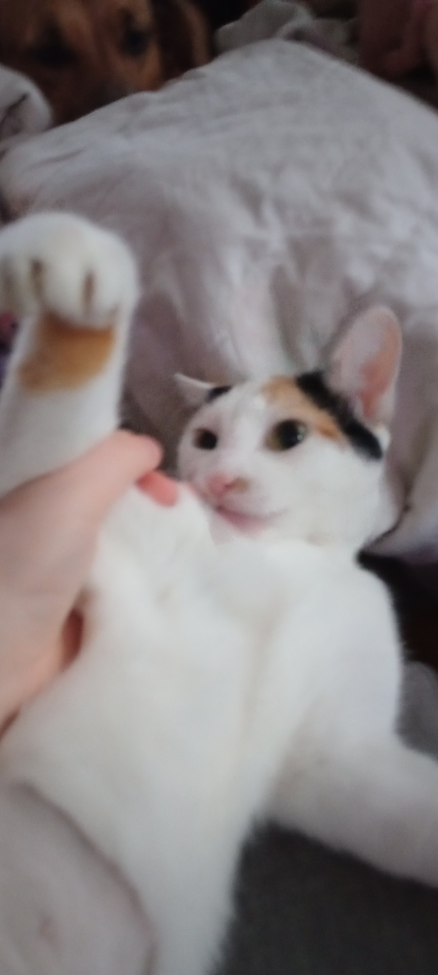
I am proud to say that after dropping my phone in my bath, this is the first photo I captured with my new phone
#my new phone takes sooo much better photos and it was so cheap! loving it so far#also happy new years ig lol#if i dont post more cat pics yall better beat down my door telling me to post some more because i can now show these assholes in detail#ive already got some to post but im really tired and my head did not like how bright ny screen was until i adjusted it#but yea! kitty#animals#petblr#cat life#cat lovers#catblr#cat#my cat#cats#cat photos#silly cats#calico#calico cat#MY PHONE! HAS A STYLUS!!! I CAN MAKE SO MUCH TERRIBLE ART!!!!!!!
12 notes
·
View notes
Text
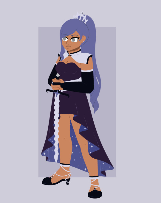

wanted to post the royals and co. as a set for reference, though the only new things here are the king+queen and koe's updated design :p also most of them didn't get little infoboxes so those will be a first under the cut here ^_^
Name: Andromeda (Andy)
Name origin: The Andromeda Galaxy, named for the mythical princess
Pronouns: She/her
Age: 20
Title: Heir apparent
Weapon: Flamberge (Same as her mom's)
Ethos (Power): None
Flaw power is based on: N/A
Notes: She wants to go on adventures someday, and make a lot of friends, and be normal. So please drop the "Your highness" and call her Andy!
Name: Cepheus
Name origin: The constellation Cepheus, the king
Pronouns: He/him
Age: 54
Title: King
Weapon: Scepter
Ethos (Power): Authority (The ability to control people’s actions through his words, but not their minds)
Flaw power is based on: His controlling and paranoid nature
Notes: He prefers not to use his ability unless it seems necessary, but ends will justify the means.
Name: Cassiopeia
Name origin: The constellation Cassiopeia, the queen
Pronouns: She/her
Age: -
Title: Queen
Weapon: Flamberge
Ethos (Power): Alis (The ability to generate wings)
Flaw power is based on: Her overconfidence in her own abilities, ironically like a completely different winged mythological figure...
Notes: Before being the Queen, she was the Hero.

Name: Koeia/Koe
Name origin: The star Koeia, whose name literally means "Star"
Pronouns: She/her
Age: 20
Title: Maid/Andromeda's lady in waiting
Weapon: Twin Sickles
Ethos (Power): Blessing (She can make others more powerful through cheering them on)
Flaw power is based on: Her Obsequiousness
Notes: She assures you her devotion to the princess is strictly for non-homosexual reasons

Name: Perseus/Percy
Name origin: The constellation Perseus, the hero
Pronouns: He/him
Age: 21
Title: 1st Knight/Andromeda's personal guard
Weapon: Harpē sword
Ethos (Power): Divine swordstrike (An all-powerful swing of the sword with no limit)
Flaw power is based on: His incredible arrogance and show-offishness
Notes: He assures you that his showy devotion to the princess is as heterosexual as it seems. Also he's the cousin Io from Nova Stella
Name: Ursa
Name origin: Ursa major, the big dipper.
Pronouns: She/her
Age: 38
Title: Major
Weapon: None
Ethos (Power): Bear-handed (Her claws are unbreakable and can slice through any material)
Flaw power is based on: Her hyper-diligence. Her ruthless devotion and adherence. Literally nothing could ever stand in her way.
Notes: She’s the mama bear of Kochab (Ursa minor) from the timber scouts
#reason i wanted to change koe's design was bc i felt like the first one was a bit too basic ig?#wanted to give it more personality beyond being a maid outfit#so a funkier skirt and shorter sleeves and gloves and stuff. idk its more koe and less maid. but still maid#other than that obviously are the two wholly new characters#honestly designing them was interesting in a way bc it was like reverse engineering andys face#i think she takes after her mom more tho#but she also does try to emulate her so thats also part of it#honestly andy is really similar to amary in a lot of ways not just bc of the whole princess thing but the family dynamics to a degree too#there are still some pretty big differences (andy wasnt abused but her father is still really strict and constraining out of worry#and amary's mom was actually kinda the polar opposite of andy's and their emulations are completely different too)#BUT#look read cepheus's flaw. hes not going to be a good guy lol#hes the type that starts out nice enough on the surface but when pushed it will become. again. ends justify the means#very.... 'my way or the highway' type guy i guess. but with power#cassiopeia s more noble than that though despite any arrogance in her skills#its like one side of a balancing act lost#again look at her power. its wings! wings mean freedom! no restraint! touch the sky!#unfortunately kingdoms arent usually about that is the thing#maybe andy can fix it now though#but honestly andy percy and ursa are pretty much all just here for convenience#it wouldve been easier to have a ref post lumping all royals and andy's entourage together. and ursa i guess idk where else shed go lol#i thought abt putting her w the zodiac knights but their theme is too uniform. background color is the same tho so same affiliation#w the royals#also does anyone get my amazing joke. shes a major. major ursa. ursa major. i know i know#ill be here all week#finn's ocs#oc references#finn's art
25 notes
·
View notes
Text
what if?
and i mean what if
i just got my ass out of the chair
got dressed
put the clothes out to dry outside
and did something?
what if?
huh?
what if
#why does this seem like a poem? LOL#and i need to got to my 'sister's' place to take care of her dog after lunch#because she has to go to work and the dog is a ball full of anxiety and can't be alone for too long#so i should try to get something done around the house before i go#and the longer i take to put the clothes outside the more i'm wasting time and then the clothes won't dry properly#why am i like this#why aren't the meds a fix all#why can't i just do things#why must i hate myself like this lol#i'm just bitching dont worry#i'm going to get my ass up right now#ig i just needed to say it to do it#i'm breathing i'm doing it#cool#mine#ig i'll tag it as one of my poems hahaha#might as well make something out of nothing#my poems
9 notes
·
View notes
Text
Sister Maggie when Father Lantom dragged her 30 year old sopping wet half-dead grieving feral son back to the orphanage to get medical attention from nuns who patch up boo boos on 10 year olds all day long

#like ??#im rewarching#warching lmao#season 3 and maggie takes having matts broken emo ass dumped#on her very well lol#she was like 'we are doing this now ig'#god gives his toughest battles to his strongest soldiers#maggie got matt murdock#daredevil#matt murdock
79 notes
·
View notes
Last Seen Blogs

thats-so-homestuck
1N 7R0LL5 W3 7RU57

dreamscometrue1981
عندك خبر شو حلوة انتي ❤️

xiang2017
Life
volkopesn
volkopesn
volkopesn
volkopesn