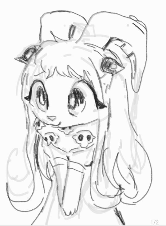
#that mimic traditional art tools
Text
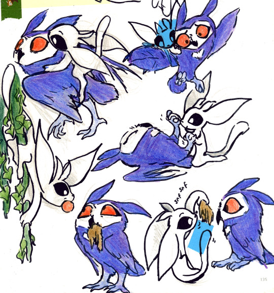
Jason, when Bruce asks him where the Joker is after 3 weeks of no sightings:
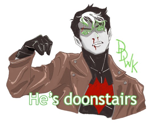
This was honestly just an excuse to practice drawing a leather jacket and then somehow transformed into another Jason Todd doodle.
Alternate textless version and meme inspiration below cut
DO NOT STEAL/REPOST MY ART.

#dreamer doodles#mine#jason todd#red hood#saw this meme for the first time the other day#and couldn't stop laughing#digital art is trippy man#i feel like it only makes sense when i use brushes#that mimic traditional art tools#still not sure how i feel about this one#making myself post it#so i stop obsessing over it
240 notes
·
View notes
Note
Ang ganda yung art mo GGHHHOORLLLL!
I was looking at the line work you do and was wondering: do you ink it physically and then scan it, or is it fully digital? It's really good and gives a solid grit to it and adds texture to your works. How do you do that?
shdhfh maraming salamatttt 💞💕
99% of what I post here is all digital because I don’t really have access to a scanner very often! my inking style looks the way it does because I draw traditionally in my sketchbooks a LOT and the way I ink digitally is Exactly The Same as I do traditionally (which is why you see a lot of double lines in my inking, stray lines, or scribbling when I fill in solid blacks without the fill tool, I also always turn off any stabilization features a brush might have bc I don’t like the way it feels) and I often go looking for brushes that are gritty or crunchy so that it looks similar to the pens I use on paper!
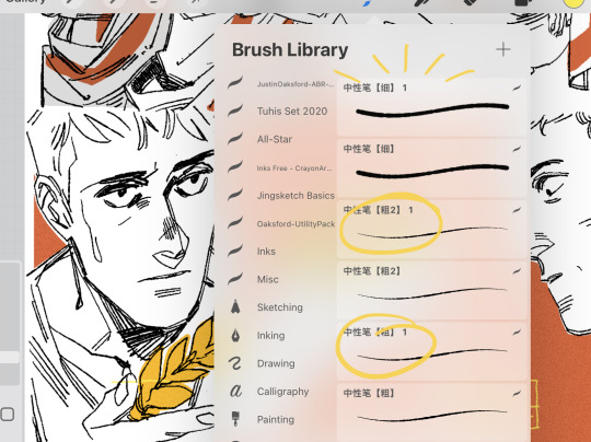
You can see a bunch of the stray lines and general scribbling I did here, which is exactly what my irl sketchbooks look like, and the circled brushes (I edited these after I downloaded them all to have 0 stabilization) are the ones I used for it!
#I consider myself a traditional tools artist first and digital second so I frequently use traditional drawing techniques but. uh#make it digital??#Wendy Xu has a flex nib brush that I grabbed when it was free that feels exactly like the flex nib pen I use so that’s the other one#I like dead line weights a lot tho so these brushes (above) are really fun to me#I have HUGE respect for people that do really clean and smooth line art and I love looking at it but I simply cannot stand it for#my own stuff. feels Wrong and Not Fun and low key kind of unrecognizable when I look at it after#ask tag#basically my whole digital art experience is trying to recreate my traditional art experience in some way. I’m on a constant#journey attempting to accomplish it#I also add a noise effect to the flat colors (between 5-7%) to mimic a paper ish texture
77 notes
·
View notes
Text
thought I was Dying but it was just a caffeine headache 👍
#I can consume less caffeine but never zero#but my headache is going away and we’re gonna watch OTGW and I downloaded some procreate brushes that are basically#Posca pens!!! they’re perfect#for me getting better at digital art has required finding brushes that mimic my traditional tools and also getting autistic about TPN#anyone can do this. it does have to be TPN tho sorry you can’t pick another series#I like pencil brushes and alcohol markers and these new paint pen brushes
0 notes
Note
would you consider dropping some tips on how you color? your art always has such a nice feeling to it
Thank you so much, and yes, absolutely!
So... I have been agonizing over how to answer this question for over a week because I tend to make a lot of my major decisions based on what looks and feels good to me in the moment. It’s sort of hard to explain. Then I started getting philosophical with it (“how does one color? How do I explain aesthetic?”), and I started rambling, and had to cut the answer way, way, way down lol.
But here’s what I can help with right now. I think the most important part of how I color is my tools and what they allow me to do. These are currently my favorite brushes to use:

From top to bottom, I use Kyle T’s Gouache for just about everything. A lot of my recent pieces are done entirely in that– I love the chunky texture and how the pressure mimics traditional gouache. It’s great for children’s book illustrations, and filling linework, and realistic portraits. She is my soft wife and I love her.
I practically never use the default hard round. Ignore that.
The roller brush is another one I use for painting. It was my go-to before KT’s gouache, so you’ll find it a lot in my older work (and as a big texture thing in my current works). The “Sampled Tip” below that one I usually use for children’s book styled illustrations. It’s like a really dense, waxy crayon, so it’s fun for textured lines and details.
I always paint in my own shadows and highlights, but I like to use the soft round if I want to blow the shadow or highlight out. It’s for extra large areas.
And finally my pencil. I use it for sketching as well as linework, if I plan on doing a linework-centric piece. I don’t think there’s much of a difference between the two there… one is probably smoother than the other.
______________
The reason why I like textured, pressure-sensitive brushes so much is because they’re important to how I paint. When I blend, I don’t use a blender brush or a smudge tool. What I do is layer two colors– lightly– then use the eyedropper to select the color between them and continue painting with it. That’s probably the key to most of my work. I’ve gotten pretty fast at it, so I’m constantly selecting colors from the painting and reusing it throughout my painting.
I still use the color-wheel to hand-pick what I think will look best, though. This is probably going to be a really frustrating answer, but I choose color palettes based on basic color/lighting theory combined with personal aesthetic preference. It can take some studying (of both theory and other artists’ work). If you’re ever looking for a really great reference on the former subjects, I highly recommend Color and Light by James Gurny. Even if you’re not into watercolor or dinosaurs or realism, the guy is a master at explaining all that different stuff in depth.
Shape and negative space are also pretty important to me, but that's a whole other thing. And as a side-note, I recommend following more children’s book illustrators. Their work may look simple, but a lot of intention goes into how they use color, shape, space, and texture.
Also, on texture, I hand-draw most of mine. I love to add little scratches and drops and splashes when the painting is almost over. It's one of my favorite things to do :')
____
Now, the other most important tip:
Once I’m happy with the sketch/linework, and once I’ve laid down the basic colors of my piece, I do a Really Terrible Thing. I become a graphic designer’s worst nightmare and collapse everything onto one layer.
Then I paint directly on top of it, linework and all.
I do this for a lot of reasons, but mostly because 1) my tiny brain is overwhelmed by the clutter of too many layers, and 2) it forces me to approach a piece as if it was traditional media– a process which I find a lot more comfortable and rewarding. I paint right on top of the base colors, and right on top of the linework, effectively redoing and cleaning up what I already have there. Even if I'm working with a blank background, I'll paint a new blank one on top because it gives the feeling of a more unified piece, if that makes sense.
Basically, I approach my drawings as if I’m using traditional media. I like chunky brushes, utilizing (what I personally think are) interesting color combinations and textures, and smashing everything down onto one page so I can just paint.
Anyway, please let me know if there’s anything specific you’d like me to go into detail on, any pieces of mine you’d like to know how exactly I went about it, etc etc etc. I’m happy to answer ^^
113 notes
·
View notes
Text
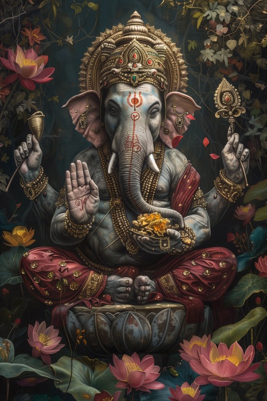
"Om Gajananaya Namah"
Ganesha Sharanam Mantra Meaning
There are a number of mantras to Ganesha. This video is a variation of one of the more common ones: Ganesha Sharanam, Sharanam Ganesha (2x), Sayisha Sharanam Sharanam Ganesha Sharanam (2x). Meaning: I take refuge (sayisha) in Ganesha. I surrender (sharanam) to Ganesha.
Qualities of Ganesha
Ganesha is associated with success, wisdom, learning and writing. Ganesha is a patron of the arts and sciences. In the natural world, elephants are known for high intelligence. In fact, they have the largest brain of any land animal.
Ganesha as a Mentor
In addition, elephants are artistic, can use tools and mimic human speech. In keeping with these things, Ganesha is a very curious and intellectual god. Thus, he holds great meaning in Hinduism as the god of intellect and wisdom.
Ganesha as a Spiritual Teacher
In contrast with his reputation as the remover of obstacles, Ganesha is occasionally thought to place obstacles in the path of those who need to be checked to establish a stronger foundation before moving further forward.
Role of Ganesha as Guru
Obstacles help the student to stay focused on immediate challenges in life. This is sometimes the role of an archetypical guru: to place obstacles along the path of the student to help them gain mastery. Thus, Ganesha meaning can include both help and hindrance.
Origin of Ganesha
The symbolic and psychological meaning of Ganesha primarily centers around his role as the lord of new beginnings and the overcomer of obstacles. He is thought to bring good luck. Mantras and prayers to Ganesha are often used at the beginning of an undertaking. Ganesha is an unusual and beloved part of Hindu tradition.
How Ganesha Was Born
Tales of Ganesha’s origins differ widely. In some stories, Parvati created him from clay. Another legend says that Parvati created Ganesha from the soap suds in her bath. Another myth claims that Shiva’s laughter created him. In yet another tale, Ganesha simply appeared mysteriously and was found by Shiva and Parvati. Ganesha also has a brother named Kartikeya, the god of war.
Malini, Elephant-Headed Goddess
In a simple version of the story, Ganesha was born from Malini. Malini is an elephant-headed goddess. She drank bath water that Parvati had thrown into a river. Subsequently, Ganesha was born. These stories do not necessarily explain Ganesha meaning completely. The longer version of Ganesha’s origins below involves the separation and eventual reunion of Shiva and the goddess Parvati.
--Ganesha Meaning & Symbolism
29 notes
·
View notes
Text
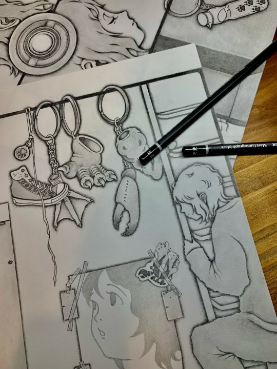
here's some tips to copy my cross hatching style on procreate, sorry no pics bc I don't know how to screenshot on an ipad
1. get a really textured brush: the chalk brush is what I use, but I also bought chromagraph brush sets from True grit texture supply, and they can mimic traditional brushes super well.
2. this style really works well with linearted stuff, so. fill in your lines with the base color a shade lighter than your intended color. Don't use a textured brush for the base. use a really smooth one, or even the fill tool.
3. when you're done with the base, make a new layer on top, and set it to multiply, but make the opacity low. Mine is usually set to like 30%, but adjust as needed- Start coloring in with the textured brush.
4. layer in your colors like youre actually working on traditional art. lightest to darkest, this will really work well if you avoid using any blur tools. When you're done with the first layer of colors with the textured pencil, merge it down, start a new layer, set it to low multiply, and add the next layer of colors, just like how you would color pencils irl.
5. if you can comfortably eyeball the colors, try to add in more colors to the piece *without* using the layer tools like multiply or overlay, and just try to guess which color harmony would work. Don't be afraid to use more grays rather than the really vivid colors.
6. once you're done with the drawing, you can use the sharpen option to make the textures more prominent!!
7. try to add just One filter above it, just to make the drawing feel more natural !
183 notes
·
View notes
Note
I think it’s kind of a question, kind of a statement but, there seem to be a lot of people upset about you utilizing ai art recently. Correct me if I’m wrong, but if you’re training an ai on your OWN art, doesn’t that cut out a lot of the unethical things about mainstream ai art generators? And if I may ask, how do you feel about mainstream ai art generators and the way it utilizes others’ art? I apologize if this comes off as rude, I’ve not seen someone train an ai specifically on their own art and I’m curious about your thoughts. Thank you for reading, I hope you have a lovely day. Your world building and art is phenomenal and inspiring.
My opinion is that the only unethical bits stem from how an operator uses a tool, not the tool itself. Stable Diffusion isn't a person, it's isn't good or evil, it is incapable of acting on it's own without a human's input.
I could do some extremely unethical things with oil and canvas if I bothered to dig them up from the closet. I have the skills to theoretically mimic the style of a known artist and then sell it as if it's genuine. I could use the same traditional tools to straight up copy an artwork and claim that I came up with the composition and plot myself.
I then could come up with an original plot and composition in my head and then achieve that with prompts and inpainting using Stable Diffusion. The prompt might have some artist's name in it to achieve a particular style, but the end result won't match anything that artist has drawn before. You can't steal a style after all.
If I did all that it doesn't make oil and canvas evil and an AI good. The only thing that mattered was my intent. If your intent is foul anything you create with any tool can be unethical.
My attitude towards mainstream AI art isn't all that different from that towards normal art. Majority of both is unoriginal, boring, poor quality or all three in that order.
On AI's side it'd be big titty babes just standing around or Midjourney stuff (I hate MJ's style with a passion), on normal art's side it'd be what I call "face in flowers" types of drawings. You'll see that exact type infesting all of Instagram.
Should these artworks not exist? No, they can stay, they have their fans so whatever. I just personally don't find them interesting.
And then a small percentage of both is truly interesting. It has surprising plot, style, other quirks or is just genuinely funny. Good art is memorable regardless of what it's made with. It's just my opinion though.
If you haven't seen anything memorable made with AI yet, I recommend you search for "Will Smith eating spaghetti checkpoint". It's burned into my mind and still causes an ugly laugh each time I remember it exists.
Or "Anime rock paper scissors" for something less meme-y.
Thanks for the compliments btw, nothing is more rewarding than inspiring others.
41 notes
·
View notes
Text

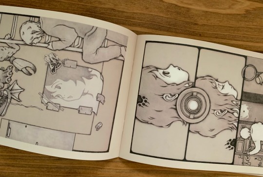
Here's the quick mini tutorial @totally-not-jackie !
Here's some more about my process: I don't really spend too much time on the sketch but I do try to take into account the different shapes that I can make and try to push my shape language a bit more. I try not to make the sketch too detailed since it makes the drawing be more suspectable to becoming stiff in the inking phase. I also do not want to copy the reference exactly so I end up making it more expressive and lively.
Most of the rendering takes place in the inking stage. I love inking so its the most fun part for me and I tend to ink with brushes that mimic traditional tools as I love texture. For the colors I try to apply color theory such as if the reference has grey and orange like this one does I make the grey on the bluer side since both blue and orange are complementary colors and adding some in the grey really helps.
I really recommend learning the fundamentals of art especially color theory and learning how to do different inking methods.
Hope this helps you or anyone else!
Also included a timelapse since I'm not the best at making image tutorials and would rather just show my process and talk about it.
21 notes
·
View notes
Text
Welcome! ⸜(๑⃙⃘' ᵕ '๑⃙⃘)⸝⋆︎*
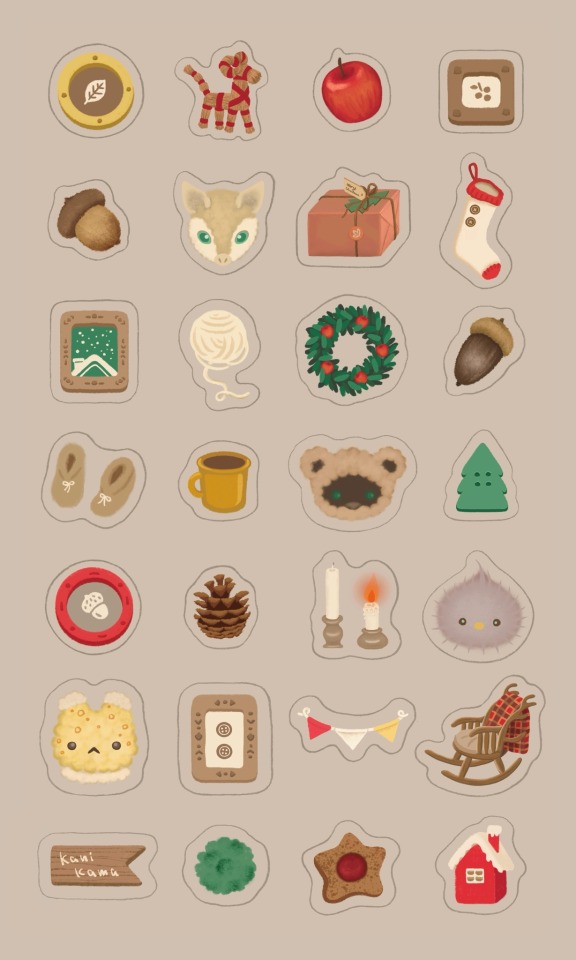
I draw original manga under the pen name @ mu-me. When creating fan art, I use the pen name @ kani-miso or @ kani-kama.
✩︎* •̑‧̮•̑@ mu-me ©️mu-me
My pen name comes from the Japanese words mu無 "nothing" and me.
Feeling as if kindness has been lost in this world, when my own existence seems on the verge of fading away, I want to connect with kind individuals in a gentle world where, in the end, compassionate people come together. With this in mind, I named myself "mu-me."

*✩︎ ̀⁽⸌̠̇⸍̠̇⁾ ́@ kani-miso
"Kani" means "I" in Ainu, and "miso" refers to the Japanese ingredient "味噌" (fermented soybean paste). However, in Romanized form, "kani" translates to "crab" in Japanese and English. In Japan, the innards of the crab are known as "かに味噌" (kanimiso) and are favored as a luxury ingredient. Although it differs from traditional miso, both in taste and appearance. Additionally, "かに味噌" (kanimiso) can be interpreted as "crab brain," and since "kani" means "I" in Ainu, I have infused the name Kani-miso with the meaning "my brain."
*✩︎ ̀⁽⸌̠̇⸍̠̇⁾ ́@ kani-kama

In Japan, there is an inexpensive food called "Kanikama" (imitation crab or fish cake), which mimics the texture, shape, color, and fragrance of the luxurious ingredient, crab (written as "kani" in Romanized Japanese). To draw a parallel in fan art terms, while the original is the high-end crab, what I create could be likened to an imitation crab stick (fish cake) resembling the original. Additionally, crab claws can resemble scythes (written as "kama" in Romanized Japanese), serving as the crab's defensive weapon. Similarly, for me, drawing becomes a form of self-defense, akin to my own weapon. Therefore, I infused the name with the meaning "my weapon," combining "kani" (meaning "I" in Ainu) and "kama."
Thank you for reading this far! I'm not confident in English, so I use a translation tool for posting on Tumblr and browsing everyone's pages. There might be typos or misreadings, but I hope you can overlook them. Although I'm a slow artist, I plan to post drawings at my own pace and enjoy the process. Thanks for stopping by! Feel free to connect if our interests align! ◡̈︎*♚︎‧*˚✩︎‧₊˚
37 notes
·
View notes
Note
I love your art so much, you’re part of the reason I started drawing again. Your old art is cool, and your new art just has so much emotion and detail in it, it deserves so much praise. Do you have any advice on how you upskilled so well into the amazing art you do today? I really want to learn to be skilled like you are and improve to your level
Dude, thank you so much. I'm super flattered but also have major Impostor Syndrome right now lol.
The biggest thing that helped me was getting a drawing tablet and learning how to use digital art programs like Canvas or Procreate. I am a very messy artist - my traditional sketchbooks were always a nightmare because of how often I erase shit, so being able to use programs where I can simply undo or reposition a line was a game-changer.
I'm also incredibly indecisive and struggle with linework, but I found some great brushes that mimic the effects of ink pens and watercolor so I can achieve the messy, painted look. (This Sketchbook set and lineart set are the two I use the most)
Use as many references as you need! Gather a bunch of base poses to get the hang of proportions and anatomy (my go-to artist is Mellon_Soup. Screenshots from movies and shows work great too)
Try out posing tools like this one
A fun exercise that helps me is to paste a photo or drawing on one layer, and then on the layer above, sketch the main aspects in 30 seconds. Delete the first layer and then work solely off of the sketch (and yes it will absolutely look spooky and/or silly). If you need more time at first, start with 60 seconds and work your way down as you get the hang of it:
Take pictures of yourself in the poses you want to draw
Find artists with a style that resonates with you and study their work
The Multiply tool on Procreate is AMAZING for adding depth to artwork. I use this on almost everything. Add a slightly darker color on top of the whole set of layers, switch it to Multiply, and then go in with the eraser to mark the areas where the light hits
Keep practicing, no matter how shitty you think it looks! Just keep going!!
Uh I think that's it? I'll add more if I remember anything else.
I wish you the best of luck on your art journey! <3
19 notes
·
View notes
Note
Ok, so I have another set of questions about the world, particularly about the Cultural differences between Porphyal and Atomata.
1. What is the traditional look/outfits of each kingdom? Do they have specific colors? Accessories? Textile decorations?
2. What is the architecture like? What does it look like? What materials are used?
3. Is there any traditional music for each kingdom? (Lol I just pictured techno being played in Atomata for all occasions, I apologize for my immaturity)
4. What is the main language that is spoken in each kingdom? Do they have other dialects?
5. I imagine they have spies during the war that get intel for the kingdoms, but do they have any citizens that are genuinely invested in the other culture? Like, citizens that would love to go visit and write books about what they learned? Obviously they can’t because war, but maybe they have libraries with information?
6. What traditional festivities do they have that the other culture may find confusing or maybe be blown away by it if relations were better?
7. What urban legends do they have? Or traditional cautionary tales? Stories children or young bots are told during bedtime/charge time?
8. What are the schools like or rather how does each culture handle education?
9. What would you say is one of the coolest thing about each culture you really like?
10. Is there a tradition Sun, Moon, Pry/ncess dislike/love about their culture?
I hope these aren’t too many questions… 😅
Never too many questions!
1. In general, I lean towards whatever looks coolest/most interesting, but its really just fantasy medieval clothing. However I will say that Atomatan clothing leans far more colourful with big shapes and styles, while Porphyal leans more into subtle textures and practicality
2. For porphyal, classic medieval architecture! For Atomata, classic medieval architecture with a TWIST that it all looks like sets for a childrens tv show! I have a pinterest board here with some examples!
Atomata: https://www.pinterest.ca/strawbubbysugar/atomata/
Porphyal: https://www.pinterest.ca/strawbubbysugar/porphyal/
3. Porphyal enjoys a classic lute, while Atomatan instruments mimic human ones, but sound like chiptunes/8bit music! Like this!
4. its just "common", like dnd, so as not to single it out as being english for people who read in other languages :) There are def dialects, for animatronics their dialects mimic humans but they also have varying levels of echo/static to their voices. Older models tend to have far more echo
5. Of course! Both sides have citizens that are just normal people, and want to see the war end!
6. Animatronics know all about the human world's holidays/festivities, but they all are shifted ever so slightly. Humans know little to nothing about animatronic festivities, thanks to the level of information control in porphyal
7. Humans have an urban legend of "The Mangle", an animatronic that steals people from their beds and twists their bodies into something unrecognizable. Animatronics have an urban legend about a purple man, but it differs so widely from person to person, there isnt a consensus on how the story goes
8. Simple schooling for humans, small villages usually have one person that teaches children in the same class regardless of age, simple stuff like reading & writing, maybe a small bit of math, and some history. Animatronics have basic knowledge downloaded into them at birth, and if they want more knowledge they need to seek it out themselves
9. Ooo good question! I love that human beings are practically built to create, and any human can make art if given the tools and time to do so. I love that animatronics use kindness and compassion as a staple of daily life, with being anything else an outlier
10. Sun loves animatronic kindness and willingness to share, but he hates how hard it is for them to step outside their comfort zone. Moon loves the ease of access to knowledge, but hates that kindness is expected when it is not earned. Pry/ncess has a hard time feeling any particular way about anything in porphyal. Theyre a little bottled up about those feelings.
40 notes
·
View notes
Text
starting to wonder if the reason i've been scratching my head at how seemingly perfect everyone else's line art always looks to me...is because it's all been digital for years & i just didn't always know or recognize it? i'm starting to recognize fancy brushes that mimic trad media as brushes now, like i always assumed everyone was editing digitally like me but i thought a lot more people were starting on paper...
& it turns out if you draw digitally with good tools (an actual graphic tablet or iPad, stabilization, etc.) you can achieve clean, "perfect" lines that just aren't possible traditionally without being an inking master
the ability to immediately undo & rework things near-infinitely also brings out the perfectionism. granted i'm still just learning Procreate (or like. even how to use a damn iPad) but it's taking me a looooong time to draw because i can just fuss & fuss with it. there are things i really like about it but other things i know i need to watch out for. i wonder if it's gonna give me more of an appreciation for the imperfection of my traditional work
#rambling thoughts#trying to do a tattoo commission totally in procreate because i want very clean lines#hoo boy it's rough
7 notes
·
View notes
Note
How do you get that painterly texture on some of your work?? Like the one w Viktor from arcane where he’s holding the shimmer
On the Viktor piece you mentioned, I got the painterly look by using "Rebelle 5", which is an art software that has tools that specifically tries to mimic traditional art mediums. I honestly don't really recommend the software, especially to people who are just starting out, but I bought it a while back when it was on sale, so... might as well use it, right?
You can still get your art to look like an oil painting by using overlay layers and such, but that heavy-paint sorta look really isn't achievable unless your art software has tools that can create that effect. I would absolutely love to make a tutorial video or something like that in the future to really show how I do it though, so thank you for the inspiration! 😊
#thank you so much for asking too!#there are other art softwares out there that can create the same effect I'm pretty sure#but I'm so used to using Clip Studio Paint that I don't really feel like switching#-or even look for other softwares to use instead#if you're using CSP and are looking for great painterly brushes though' I recommend DAUB brushes!
31 notes
·
View notes
Text
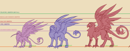
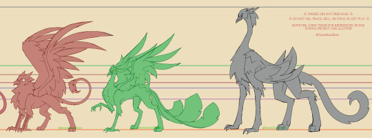
~Griffis Supspecies Height Comparison + Info~
------------------------------------
Just doing this for fun~
I made this so I can use this to design more griffins oc if I want to save time.
Also explaining the differences. Not just for these that I show here, also included for other bird species. Of course, I can't filled all in here. Just try and use common senses, if you can.
There's a few things that I explained based in my universe world, so, just want to make that clear.
If the pic is kinda hard to see here, you can view the full and close up image on DA: https://www.deviantart.com/greenmaneheart/art/Griffis-Supspecies-Height-Comparison-Info-in-des-978901373
I will explain more details of what features they had. have fun reading~
------------------------------------
Very small - HUMMINGBIRD
This also included other small bird species such as kingfisher, kookaburra, cockatiel, parakeet, parrotlet.
They have a certain natural ability based on what bird species they are; kingfisher griffins can catch fish. Kookaburra griffins can make loud and chaotic cry. And more.
Their small size makes it easy for them to fly swiftly or hide in small spaces.
------------------------------------
Medium small - OWL
This included all types of owl species out there.
They can fly without making a slightest sound of their wings flapping while flying.
Their common traits are usually quiet, watchful, sly and deep-thinkers. They seem more active hunting during night time, making them nocturnal creatures.
Owl griffins are considered as the calmest griffin compared to other subspecies griffins.
They are not usually aggressive and only do so when it's necessary like defending their home.
Despite also being considered as a predatory kind, they're pretty calm.
------------------------------------
Medium - MACAW
This included all types of macaw and medium-sized parrots species such as cockatoo, African grey parrot, scarlet macaw, black palm cockatoo and more.
Their habitats are usually in the jungle or rainforest.
Some have the ability to mimic sounds. Their special beak is for macaws, able to crack open any hard nuts easily, without any tools.
Their common traits can come in pretty friendly, intelligent, crafty and creative. They're considered as the smartest and creative subspecies of griffin.
------------------------------------
Large - NORMAL GRIFFIN
A common griffin, half eagle, half lion. However, this also included all types of eagle species, including hawk and falcons. Usually predatory birds.
This type of griffin has the biggest wingspan of all other griffins. A strong flier and the fastest flier than all other griffins.
They are also considered the strongest griffin subspecies.
They are also common subspecies and the most populated compare to other subspecies griffins.
Most of these griffins are very well known to hunt any certain food or animal easily.
------------------------------------
Medium Large - PEAFOWL
Male peacock griffins are usually a bit bigger than female peahen griffins.
However, this size can come from other types of bird such as Lyrebirds and birds of paradise.
Usually the royals are a bit bigger compared to it's average size.
Peafowl griffins are considered as the most beautiful creatures in Griffonia due to their unique pattern and colorful feathers.
Peacock griffin can fly but not as fast as other griffins. Peahen griffin cannot fly properly and can only glide.
Certain peafowl families will wear a certain gem on their forehead to easily identify their close relatives and family. This also to show off their beauty and high quality of themselves.
This has been going for many generations and now considered as their tradition.
Most peafowl are from the royal family. They live in a high ground place called The Proud Tree Kingdom.
They're usually very graceful, elegant, and well mannered. They always try to maintain their appearance to stay clean and beautiful to show that they are more superior than other griffins.
------------------------------------
Very tall and large - OSTRICH
Ostrich griffins are considered as the largest griffin subspecies.
They are also one of the griffins that cannot fly.
Females can have pale, pastel, whitish or brown color feathers, while males have dark coloring feathers.
However, as a normal ostrich would have, they're able to run fast compared to other griffins. Their highest speed limit is almost the same speed as the normal griffin's flying speed.
Most ostrich griffins participated in a racing sport game, and so were considered as professional racers.
These griffins can usually be found in many populations living somewhere in the desert western land, which is where the racing stadium for ostriches is located.
#base#bird#griffin#griffon#gryphon#macaw#ostrich#owl#referencesheet#refsheet#royal#griffonia#griffonoc#avian#fantasy#hummingbird#peacock#reference#heightcomparison#Description
13 notes
·
View notes
Note
hey what brush do you use to draw in digital and traditional (if that doesn't bother you!💦)
No worries! I don't mind. :3 The answer isn't so interesting though ww
I just use the pencil tool in MS Paint & the binary tool in SAI 2. Default settings. Most of my art is done this way. I often sketch in MS Paint, and complete in SAI.


(a few examples)
I find it's easier to work within the simplicity of MS Paint, but I do like SAI's features, and sometimes I need the flexibility of pressure sensitivity to really chip away at my thoughts... I find myself relying on it more recently, as I got into JSHK. Human characters aren't actually my forte, and it takes many passes for me to get something legible... Trying to mimic Aida-sensei's ability to render clothes is also breakin' my back lol.
(just taking you behind the scenes :p)
Oh um ... Hm, I draw in my phone notes more often recently as well, so that's the only other variable at times. If you see something like this:

It's just me using the notes app on my samsung galaxy. I use it to jot down ideas for future me. Or... sometimes I'm just passing time. Nothing special about it, I would say, aside from the fact that it's more robust than the previous phone notes app I would draw on. I was fingerpainting back then, but now I have a stylus.
Edit: Wait I feel like an idiot for saying all this and literally posting a piece I made in CSP... SORRY!! My brain is small. That's what I use to animate as well!! !!! Sorry, I just use it once in a blue moon...
On CSP, the brush I like the most has been this one.
As for traditional, I use an assortment of things! It's a split between mundane art supplies (dollar store mechanical pencils, ball point pens, etc.) and some fancier stuff I've been gifted. Currently I have a set of prismas and a couple of ohuhus I use for commission work often. I also have some faber castell brush pens. I prefer inking pens with a flat tip, basically I disprefer fine points/microns etc. (I... um, have a bit of a harsh grip, so I'm prone to crushing them...) My traditional stuff varies a lot more so I'll just paste examples directly. For fun!

Mechanical pencil!
Sharpie!

Faber castells! (The greys are as well!)
Ball point pen and highlighters!
Crayons!
Woodless color pencil! (+inking pens, pencil...)
Ohuhu markers! (+pencil)

Prismas!
Overall, I like having an assortment of things to grab and mess around with, for different moods. I'll draw on any scrap of paper also (to the burden of my wife, who scans and edits ALL!!!! of my art, lol.) If you're at all seeking for a similar experience, I recommend playing with whatever odds and ends you got in your possession. It's not really a matter of skill... imo, cuz, I don't really feel as though I use anything very 'well', I just use it. Perhaps all equally sloppy, and for fun. Just have fun. ╮(╯▽╰)╭
12 notes
·
View notes
Note
Hiya! I was thinking about the remastered animation Cel style evil Conan post you put up recently, and I just wanted to say how amazing and impressive it is! I love love love the look of old animation and you really nailed it. I’ve been trying for ages to mimic that look myself and haven’t been able to crack it, so if you ever wanted to talk about your process on this piece, I’d be all ears! Wonderful work, again!
Waaah hi liv!! Thank you, I'm so glad you like it, and that it comes across so convincingly!! One of my favorite things is to make digital art that can have a second life as a different medium, and I wish I had an easy answer for you as to how I go about doing that, but the truth is that it's mostly the result of a lot of trial and error. And a metric ton of references.
Here's a quick process video of my last piece to try to show off what all my layers are like, but I know it's mostly useless without an explanation!! I can't explain it all because I was kinda winging this one for funsies but I can give you general tips for this particular look.
Clip and words below the break!
As a disclaimer I didn't really go into this one intending for it to come out looking the way it did. So it's more of a hybrid look between my usual "clean" digital rendering and a fake screenshot.
[1] Reference, role models, and inspiration - I'm not kidding when I say I used to tote around an entire, dedicated folder filled with printed reference. These days that usually takes the form of about a million browser tabs ( ̄▽ ̄) I stare at early Detco and the first six movies a LOT. And Cowboy Bebop. And Akira. And and [insert your choice of 80s-90s anime film]. Depending on the exact look you're trying to replicate, you can always look to a more era-appropriate movie.
I love pulling inspo from films in particular (both animated and live action) because cinema is a whole other art that employs all kinds of techniques for our usual considerations (like lighting and framing), and looking to them can inspire some pretty poignant imagery, especially when you're trying to create something that's meant to mimic a single-frame capture of exactly that. I don't keep up with movies or anything, but I do have my favorites, and it didn't really occur to me to look to them until some of my favorite artists revealed that they do the same with theirs.
For this particular piece, I also had to establish some consistency with the other piece that bookends the scene, so I actually referenced my own art, too.
[2] BIG canvas! I usually work at two or three times the size I expect to export. Following standard aspect ratios for animated productions can help sell the look. Letterboxes have their own ratio, too, if you choose a widescreen canvas; and subtitle fonts are usually standardized to certain font families and colors since their primary purpose is to help make the media accessible. All this is usually a quick google search away, OR… if you're like me, and you still watch physical media… you can just yoink most of this from a real DVD.
[3] Thin lines!! I still can't quite nail the right line weight for these-- I definitely went too thick here-- but they tend to be very fine. And imperfections are good! Nobody has a perfectly steady hand, especially with traditional cels.
[4] Less is usually more when trying to sell a screenshot look… it's easy to over-ink and over-render and-- in my opinion-- restraint is necessary to sell it. This is the hardest thing to explain… it's design vs. rote emulation, I think. But that said, digital aids (next point) do a lot of the heavy lifting in these - as far as the art is concerned, a little will go a long way! These were some of my easiest lines and shading. So on that note…
[5] …Blending modes, masks, and filters are all your friends o___o I get a lot of mileage out of the default tools already available to me in the art software. There's plenty out there that's available for free, too! I recommend you find a fake anime screenshot tutorial, follow it once, and just go nuts when you get to the part where you can play with these settings. The make-or-break for a convincing screenshot-- in my opinion-- is texture and bloom, and all these digital tools will help you achieve that.
I hope this helps!! Hopefully the video can help you see a bit more of the process since I can only really offer tips. It shows everything at full size so you can see the details, so go nuts!
Thank you for the ask! Beaming plenty of good luck that you can find the look you want!!
ALSO I REALLY HOPE THIS IS THE PIECE YOU MEANT I'M LITERALLY ABOUT TO QUEUE THIS UP AND JUST REALIZED THE ONE THAT CAME BEFORE THIS IS MORE REMASTERED CEL ANIMATION LOOK SKSKSKSK
the same tips apply though so i hope they still help all the same :3c
10 notes
·
View notes
Last Seen Blogs
dontknowmynamelol
Like fish seeking dark places

balamurali24
Untitled
enjaken
✧˖° enjaken .ᐟ
aussiebeekeeping
Untitled