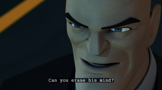
#thats not how it was in the og right?
Text
having Zuko’s crew as the 41st division was genius, I’m literally in tears
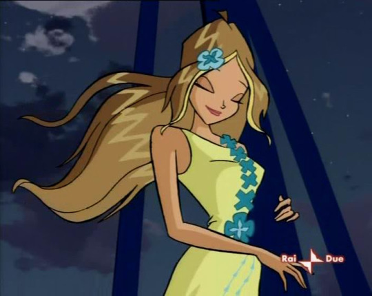
#thats not how it was in the og right?#it’s been awhile#episode 6 was so fucking good I can’t even lie#so far I actually really like the show as a whole 😭😭#omashu was weird#(episode 4 in particular)#but I can look past it I think#im just excited for the North ahhhhhh#natla live posting#natla#atla#avatar the last airbender#netflix avatar the last airbender
19 notes
·
View notes
Text
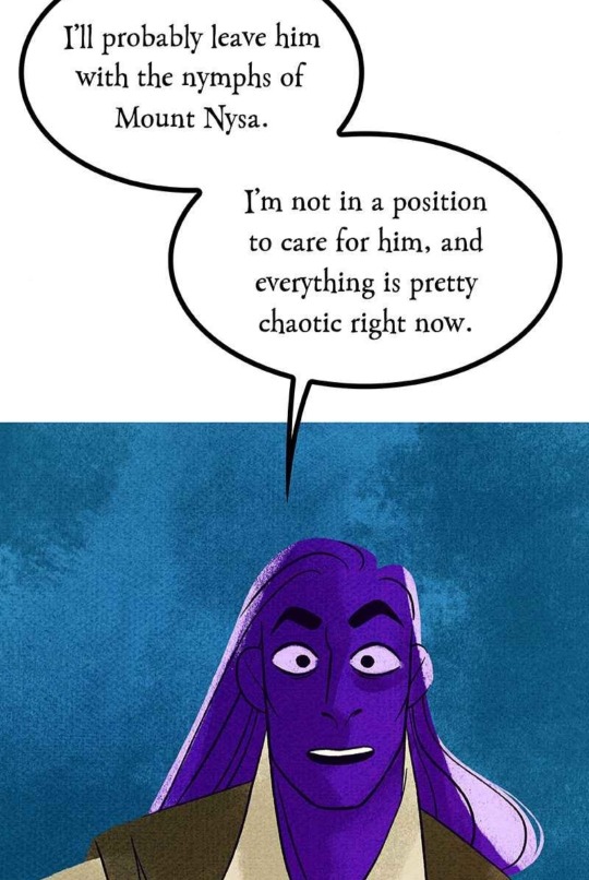
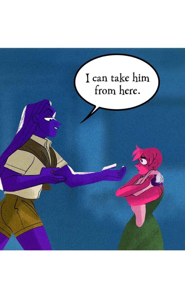


oh my god shes going to kidnap this baby. girl you are in no position to care for a child and your boyfriend has a HORRIBLE PARENTING TRACK RECORD. do NOT kidnap this baby!
#og post#liveposting#THE NYMPTH IDEA ISNT BAD#is it shitty zeus is abandoning him? yeah but like. thats how zeus himself was raised! nympths do a pretty good job!#DO NOOOOT KIDNAP THIS BABY#ZEUS IS MAKING A MORE MATURE DECISION HERE. HES RIGHT! ITS CHAOTIC RIGHT NOW! DO NOT KIDNAP THE BABY
54 notes
·
View notes
Text
OG Choi Han they could never make me hate you cause if some random rich boy was yelling at me and telling me my family deserved to die like a day after it happened and all I wanted was to know how I could get help I’d beat him up too
This plus the added fact that the Harris Village people were the first people to take Choi Han in and take care of him after years and years in the dark forest. Like he’s obviously not going to be mentally stable after all that, and he was so young when everything happened to him like I cannot blame him at all. I don’t think I can ever hate OG Choi Han like ever, he’s flawed, he has problems, but I love him dearly. He deserves the world. This kid who had to fight for his life, was taken away from his family, and in the process had to give up parts of his own humanity to survive, and like went to war two years later, they could never make me hate u OG Choi Han…
Like yeah violence is bad I guess but OG Cale had it coming(saying this as an OG Cale fan, I love him, but he was mean as hell when he was younger!)
If I’m honest, I think they were both in the wrong to an extent. Like OG Cale shouldn’t have said all that no matter the circumstances, and OG Choi Han shouldn’t have beaten him up so much. But u say mean shit and you get hit, that is how it will work when you’re talking to the guy who just saw his entire village get murdered like idkkkk man
I understand where OG Cale was coming from, but he had many issues and while he wasn’t an awful person, he was capable of doing bad things because of his own internalized pain and emotions that he never got to properly process because of his emotionally distant childhood and relationship with his father who should have been there for him more when he was younger.
Okay speaking of his childhood, Deruth isn’t the WORST father in the world but there are a lot of things he could have done better. I think a lot of Deruth’s flaws come from his fear of failure and messing up. He’s scared of doing the wrong thing, and so he sticks to doing what he knows and using what he knows best. That’s why he uses his money, that’s why gift giving is his way of showing affection, he knows that it is one thing he cannot mess up.
The problem is that money and gifts is NOT what OG Cale needed. I think what that guy needed the most was a parent who wasn’t afraid to talk to him, to ask him questions. Not to say that Deruth gave up on OG Cale, but I think in a way he gave up on OG Cale by giving up on himself. Deruth didn’t trust himself to have the capabilities to talk to OG Cale, which is why he never did. It’s because that Deruth was scared, and didn’t trust himself, that he could never face OG Cale
If Deruth was able to trust himself a little more, and pull himself together, I don’t think OG Cale would have turned out the way he did. As a kid, he probably thought the only way he could help his family without relying on anyone(no doubt this whole ‘I have to do it myself’ thing came from the fact that he couldn’t rely on his father when his mom died, and instead was acting as a pillar of support for his father when it should have been the other way around) was to sabotage himself, the only heir. If he was shown to be unfit to be heir, then everyone else would have no choice but to direct their hatred towards him instead of his family.
If Deruth had talked to his son at least ONCE when he was a kid, asking him why he was upset or why he did the things he did, I think OG Cale would have told him. Why? Because he’s a kid!! A kid will obviously want to rely on his father, if he just had one sign telling him that he didn’t have to do it alone I’m 90% sure OG Cale would have said something.
Basically, while Deruth isn’t the worst father, he’s not really a great father either. I think he does do his best, but he has issues with communication lol
OG Cale and OG Choi Han are both complex characters and had their own reasons to behave the way they did. The thing is with people is that they’re complicated and have layers, so the situation with them would have layers behind it as well with multiple co-existing truths and stuff
#guys I’m a big fan of Choi Han#and I get sad when people bring up this scene and all the blame is on him#like okay he was wrong but if YOU saw your entire family dead and some random rich boy started yelling abt how their lives were worthless#you’d be mad too no?#like his feelinsg were totally justified cause OG Cale was REALLY mean in that scene#‘their lives are worth less than the bottle in my hand’ OHHHHH OKAY OG CALE THATS ENOUGH THATS ENOUGHHHH#I love OG Cale but u have to admit he wasn’t very nice when he was younger#like the statements ‘he had his reasons’ ‘being trash was an act’ ‘he wasn’t a bad person’ ‘but he did say bad things’ can co exist#yes being trash was an act but he is ALSO capable of saying mean things and things that are wrong#LIKE TELLING THE GUY WHO JUST GOT HIS FAMILY MURDERED THAT THEIR LIVES WERE WORTHLESS#HE WAS NOT INNOCENT FOR THAT#Younger OG Cale is not a black and white character#and neither is older OG Cale but this post isn’t abt him#okay I’m gonna bring up someone who isn’t from TCF#but take Eunyung Baek from no home as an example okay#eunyung did bad things and was a bad person because of his childhood right#the reasons to being a bad person do not take away the bad things he did#but just cause he did bad things and was capable of them did not mean he could not change#I love OG Cale a LOT and I just think that his character has a lot behind it#Older OG Cale is obviously very different from his younger self#years and years of war and tragedy have matured him and like he’s not the same person he was anymore#okay back to Choi Han I love that guy I will defend him with my life#beating up people is wrong yeah but with the circumstances I’d say OG Cale had it coming#like okay it would be different if it was unprovoked but it was very much provoked#I swear I love OG Cale I just think he was very wrong for that#not to say he can’t change or isn’t capable of change he definitely is#idk I guess my point is that OG Cale was wrong but he changed as a person#and OG Choi Han was wrong for beating him up so much but it wasn’t unjustifiable#tcf#lcf
22 notes
·
View notes
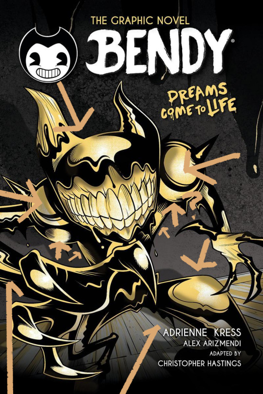
Text
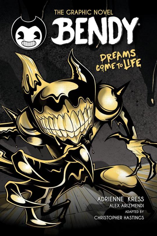
Wow, so umm... This looks bad, not only is it inaccurate due to using the wrong ink demon design [unless this is confirmation BATIM Ink Demon has been outright retconned... Which would make me pissed enough to make a new post just about THAT] but from an art standpoint this is just... Confusing and poorly done.
I wouldn't care if this was fanart, of course you should support young, indie artists... But for a Graphic Novel making sure your cover doesn't look like something Butch Hartman shat out in an afternoon is kind of important. Remember they're going to be asking us to give money to them to read this. The artist likely won't see any of that money and neither do the authors most of the time, not to mention this art screams of the artist being underpaid and overworked.
Like they Had to get something on someone's desk and their boss said 'good enough'. A concept Joey Drew Studios is very familiar with considering the allegations of poor working environments that Kindly Beast. Not to mention Mike Mood admitting in a Reddit AMA that they did in fact rush projects like Showdown Bandit. [Which they sold at full price]

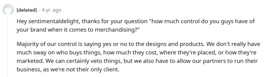
He also says they can in fact say no or yes to designs involving their IP. Either Mike or Meatly had to say yes to this cover, according to his own damn words.
And do you really think this company in particular would care enough about its fanbase to not sell them garbage? They have done exactly that on several occasions. It's not like they care particularly about art either, considering their previous use of AI Art. There was no apology or even posts addressing it... Instead, they just rushed out an archives update to their game to get people to stop talking about it... Even forgetting an entire character in it. Again
This company is [or at least SHOULD BE] on thin ice when it comes to being suspected of misleading their fans or rushing out crappy products to them.
So with all that context in mind, I'm gonna talk about why this cover sucks ass.
The light sources are all over the place? Why does it look like someone put maces or knight armor on his shoulders but it's just flesh?? It looks both gross and weird [not in a good way either]
To explain more I'm going on a rant below but sadly this seems to have been confirmed to not just be a rough pass but the final cover and man... I am not excited about this graphic novel just at all. This felt like it really drained any possibility of it turning out good for me and I already had expectations low.
Okay first point, the light sources?? And there is no consistency here with the shadows or lighting, it looks like there's a hundred light sources all at once but none of them are even consistent!
the arrows here represent all the different light sources I can make out and yet the the shadow clearly implies there's only one. I understand wanting to use highlights to give the character a more clear shape but then just give him one or two lights behind him or in front of him? No matter how u follow the light sources, the highlights make no sense and the shadows make even less sense.
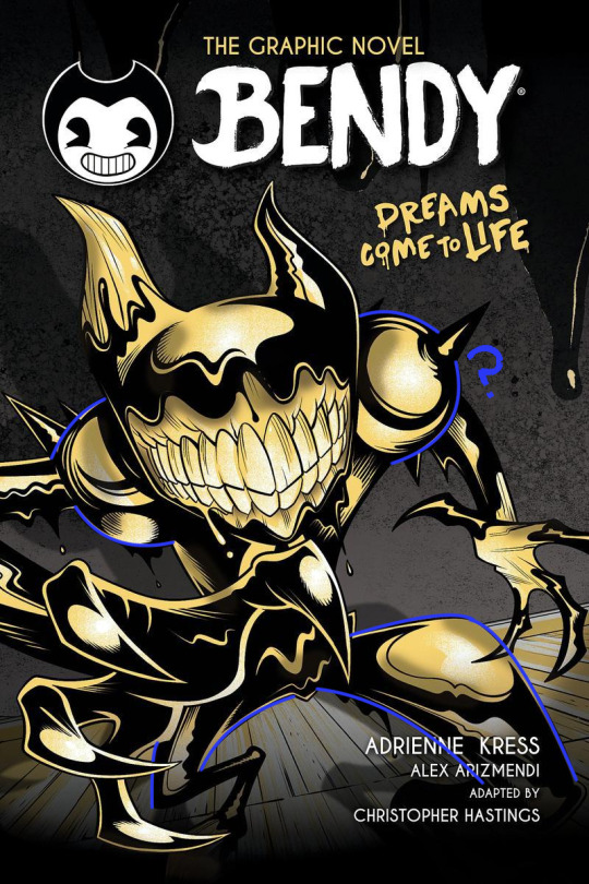
Why are the shoulders like that? Like on the legs it's a little understandable, at least those are clearly very heavily affected by perspective, for me I think they are so exaggerated it makes it look like one of the legs is either huge or one is small but that's maybe subjective.
However, the shoulders are unjustifiable, what happened there, what did they do??
I could pick on so much more honestly, how the color choices of piss yellow with no other colors being used, and the harsh pitch black being used for every part of his body is weird. How it looks straight out of Butch Hartman's recent crappy art. But to put bluntly bad start! Also what the HELL is going on with this background??
Seems once again the Bendy team is fine with sending out stuff thinking it's "Good Enough" for Bendy fans and honestly the people trying to tell me to "Be Grateful" for this are just proving that no matter how many times you betray your audience some of em will defend you!
Which is sad tbh. If anything we should be putting MORE pressure on the Bendy team to do better. Cause we deserve better than this, honestly we do. There are amazing artists in the bendy community who could do so much better for a cover. They've employed their fan artists before... Wouldn't it be great to do that for such a lore important book? The book that gives us the identity of one of the main characters in BATIM? The character you spend the entirety of Chapter 4 fighting to save? Not to mention will give several major characters their human designs?
But I guess this is... Good enough...
#ramblez#batim#batdr#bendy and the ink machine#bendy and the dark revival#sorry I've been on a positivity streak with bendy I know but I have to be honest and being honest I think this sucks lol#Im sure plenty of people Disagree and while I would argue this is more objective than subjective people will ignore me if they want to#maybe Im just a hater idk#but I do know one thing I sure do hate this and Im pretty sure Ill hate this novel and its designs#but maybe I wont ya never know#anyways if they do retcon batim ink demon I will make a post abt how much I dislike batdrs ink demon design#and why I think all the people saying its better than the og seriously arent understanding#what made batims ink demon good or character design in general tbh#to put bluntly just bc something is popular opinion DOES NOT make it right or a good idea design wise#not everyone is qualified to be a character designer and thats just good advice in general tbh#anyways yeah thats it sorry im being mean today </3#I simply think corporations shouldnt be able to rush out crappy products to their fans and get paid for it but ig thats a hot take now#but esp with how bad that updated employee handbook was too and it still had stolen renders from fans in it...#yeah I dont think theyve learned a damn thing
24 notes
·
View notes
Text


partners in crime
#i can post this here too right#i dont wanna hear the 'bb b but ken had a different vibe!!1' well i took something else. whatchu gonna do about it#besides gan ning does have some himbo energy in 6-8 like hes just street smart#is it how thats called? i mean like he can resolve stuff quickly (his way) and deal with stuff but if it came to actual studies hed fail#dumbass but can fight and get thru everything by maiming and killing#like i feel like 6-9 gan ning is somehow ooc when compared to the real thing but so is ling tong so idc. i like these characters not the og#well the og is cool too but you know what i mean#anyway#dynasty warriors#gan ning#ling tong#barbie meme
65 notes
·
View notes
Text
One thing about canto VI is like. I see so many people predicting it'll be about Fighting Evil Wife or Breaking Codependent Toxic Relationship and I just kinda think that would suck? If the major theme isn't grief AND love and the way both are seen as like Kinda Weird/inappropriate in the setting of the city. Then I'll be very sad.
#bell.txt#not putting it in the tag i dont wanna spam but yes limbus posting yes girls will be thinking about mortal regret#LIKE. LIKE. remember the discourse on twt about how like it was bad writing that yi sang didnt mourn dongbaek etc#and like that was the thing right. thsts not a thing you do in the city. that was part of why roland (who takes lots after wh's themes)#was so exceptional. that is the whole thing about the sickness of the city#to say it in comedia literary criticism terms: sins are split between wrongly-directed love and excess of love with sloth (lack of love)#being an outlier. i think heatho and generally og wh is about excess of love and not wrongly-directed love. it is the thing that lasts#all the way to the other side. it is the shared coffin and meeting again in the next life#i think itd be AWFULLY disappointing to get some boring boring 'they make each other worse' take. being APART due to societal pressures#makes them worse and horribly lonely. death makes them worse baby. so in my mind thats it#we get to see cathy die or still be unreachable in some way and then in very roland style we get furioso mode#and then the ending is about recognizing the love that has in fact been there all along and carrying it with u. and hoping to reunite some#where some other time. NO more slander of that awful girl. YES to the comfort of the memories.#me typing over my foscolo notes like i can surely post about heathcliff really fast and not write a novel in the tags (unaware)#i have more thoughts about this in regards to ruina with xiao and some stuff from leviathan but in the meantime. listen to my ramblings boy#ALSO. considering that implication. he feels for her what queequeg feels for ishy. ARGHH. RIPPING MY HAIR OFF#ok actually its been enough hours to not spam ppl I'll tag it now for blog org. i should maybe have a tag for posting specifically#limbus company
17 notes
·
View notes
Text
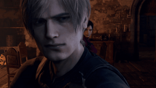
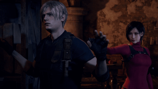

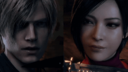
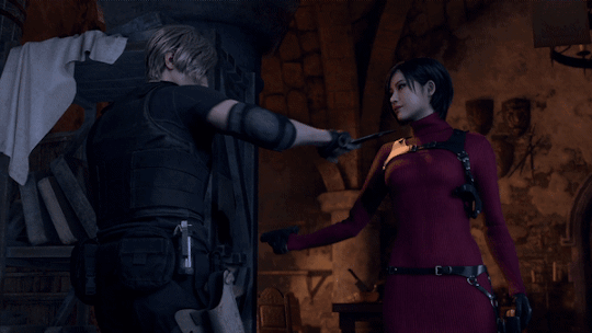


Ada Wong & Leon S. Kennedy: The History [ Resident Evil 4 (2023) ]
#crimson's gifs: resident evil#Resident Evil 4#Resident Evil 4 Remake#Resident Evil 4 (2023)#RE4R#RE4MAKE#RE4 Remake#Ada Wong#Leon S. Kennedy#Leon Kennedy#Leon S Kennedy#Leon Scott Kennedy#Aeon#LeonAda#AdaLeon#Pairing: Keeping Score#Leon x Ada#Ada Wong x Leon S. Kennedy#Ive decided I fucking HATE re4r aeon#They cut their interactions and chemistry down to bare fucking bones and I dread to see what they do to 6#Its the way that they've stripped Leon of all his compassion towards Luis and Ada and made him Vendetta angry when he WASNT#THATS THE FUCKING POINT!! HES NOT CHRIS#Sure hes in a shitty situation and hes angry about it but he also knows THATS NOT SPECIFICALLY ADA OR LUIS' FAULT#THATS WHY HE DOESNT TAKE IT OUT ON THEM IN THE OG#Hes annoyed with Ada at most in the OG because imo it follows Leon B where she dies for him so they never got closure and thats frustrating#But hes not specifically nasty to her when shes HELPING HIM LIKE IN RE4R#Even in remake timeline terms the stark shift in their relationship is just too bleak to feel right or make sense#Sorry to rant I just hate how this game massacred the camp fun and the compassion of the OG#This game is what re3 og fans think re3make did to them but at least that game only cut locations and strengthened the characters story#This game kept most locations intact and shit but massacred some of the most important relationships in the story and it kills me
8 notes
·
View notes
Text

Ajin Week Day Seven:
Fruits Basket aka Fruity
I actually really liked Carley she was cool. Also yay i finally drew Izumi! Score for the woman lovers out there
OG image under cut:

#ajinweek23#ajin#shimomura izumi#carley myers#watercolor#LobsterArt#Izumi is Bi in my heart <3#but yeah i liked Carley and how she was put in. feel like she could have been used more but its cool#i need to both go rewatch and read ajin#yay thats all the days#was gonna just say what the og picture was but couldn't get my words right so i just put it in
20 notes
·
View notes
Text
DP as in dick and pit the way the cobras/Kreese would pound Johnny till he cried and shove his face in their sweaty arm pits
#Actually they’re all nasty bitches and huff musk#See each other get all sweaty and go ‘I wonder how you’d taste if I lathered you in honey and licked you up and down’#had to be said#But he specifically likes sucking their dicks after they worked out/wrestled each other#This is actually not my fault someone else put these ideas in my head ok#Looking RIGHT at you person#ok maybe I had already thought about it#og cobras x Johnny#guess my underwear nasty brain developed#sweat kink#scent kink#Thats just how it is fellas#safety first#nsft#kreerence
21 notes
·
View notes
Text
ok its really funny that the title smt indicates the importance of a female goddess but when it comes to the games outside of 1 and 2 its like. Who.
esp for me personally. i assume in nocturne the goddess is meant to be aradia? If so thats the only one where i care about the goddess. But TDE totally destroys her significance so like. Lol.
In smtiv i just like. Burroughs doesnt add enough and really just complicates and confuses story components so i toss her out when im writing. Which is so funny its like yeah ill just pretend shes siri >> she is a god. She has no presence in smtiva so hilariously smtiva supports tossing her. smtiva doesnt really have a goddess either like. Lmao.
Strange journey has so many women in it idk who the goddess is supposed to be but i dont think anyone actually fulfills that role, redux or originally
smtv has tao but then its like half her content and like all explanations about whats going on with her was left on the cutting room floor so like. Her impact is sort of wrecked.
#Shitpost#tbh. I hate how TDE renders all other endings irrelevant. Like. Utterly#its interesting but its soooo shitty that nocturne has basically an indisputable canon#And its like. Will i ever see the other endings#no. Lol.#vs like strange journey even the og endings are worth seeing because then you understand what Alex seeks to modify#and why the new ending literally exists. It actually builds on it. And theres something awesome there with like#not choosing the new ends despite Alex and being like. Nah i do think the world you see as hell is still the right world to create#and all smtiv endings good and smtiva only has the two main ones (technically has 4 tho) but its so so good#Smtvs endings are interesting but a liiittle less fully formed because the alignment lock is. So late#but still.#anyways. Tldr who tf is this goddess thats having a revelation. i dont even know her.
3 notes
·
View notes
Note
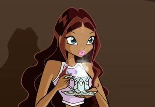
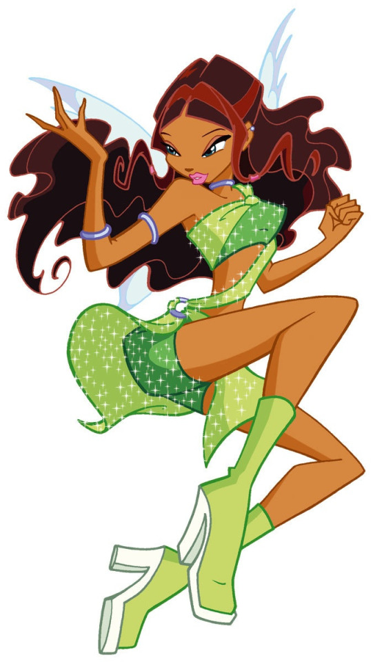
on flora's whitewashing: is it possible that flora has been whitewashed in the show/movies with her artwork (illustrations) being fairly consistent with her skin tone, even prior to the reboots/nick era? like in season 1 and the movies iirc
examples: s1e3, and the movies like secret of the lost kingdom? i remember thinking she looked lighter in several scenes of lost kingdom and in that episode of season 1
i wonder if this is something that happened with flora in s1, with it not being or less a problem in s2 and 3, with the movie having a similar skintone to the reboot pictures. i swear that this has happened but i dont really see any discussions on rainbow lighting her skin other than in newer media (where it is more prevalent and more obvious) so if you have any thoughts? maybe also slightly on the merchandise/doll side of things if youre interested?
Rainbow whitewashing characters like Flora and Aisha has absolutely been an issue for a very long time. Unfortunately, a lot of white fans don't notice unless it's more of an extreme example (like Flora being stark white or Aisha looking like Bloom).
In the first three seasons, it's really not seen as a big issue because it's genuinely innocent on their part. Those seasons were hand drawn so every now and then you get a scene where the skin is too light or too dark and doesn't actually make sense with the lighting. Usually, it's an innocent mistake due to multiple artists, not understanding lighting, and things just slipping past them because they're looking at these scenes for hours and they get used to it.
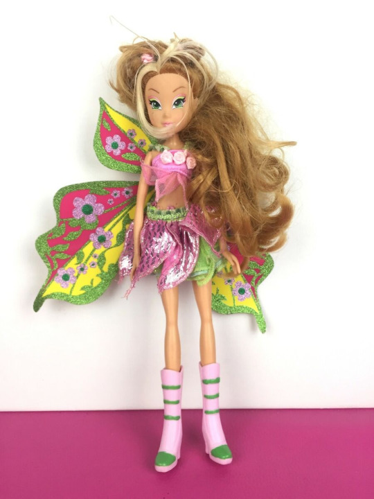
Here are some examples from the first four seasons where their skin is too light even with the lighting happening around them.

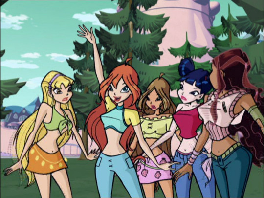
And for reference, this is what their normal skin tone is (and what they look like in most scenes).
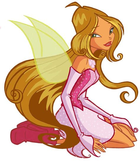
Again, people don't usually talk about these because it (most likely) wasn't racist or malicious intent from Rainbow. They just didn't understand lighting ajdhglad This actually happens with all of the winx! Just go through some episodes and you'll notice that even the white characters get lightened in ways that don't make sense.
As for the movies, Flora was 100% whitewashed in the first movie.

Flora got the brunt of it in sotlk - she's whitewashed for the entire movie, while Aisha is only whitewashed in certain scenes. There are scenes where both of them look normal and aren't whitewashed so maybe some fans just didn't realize, but if you watch the movie, you'll notice that Flora is whitewashed completely and only looks right when they're in super dark places which,, yikes ahdgalhg
The dolls were also a problem! The whitewashing in the doll lines heavily depended on the manufacturer though so it's very hit or miss.
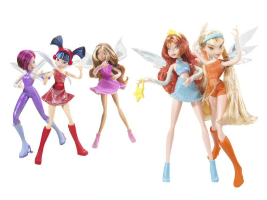
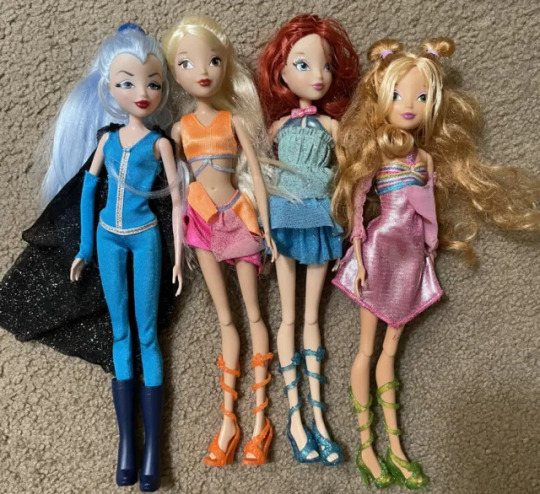
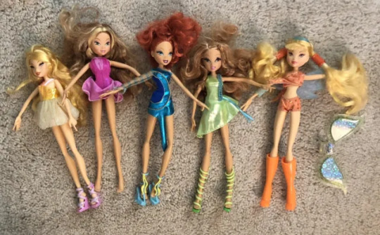
A lot of the early dolls are perfect or almost perfect but some of them are whitewashed like in these examples. It's the later dolls that have the most whitewashing though so they tend to get more criticism (plus the early dolls are no longer being made).
Most of the other early (s1-s3) merchandising (like the magazines, bags, stickers, etc) didn't whitewash either of them.
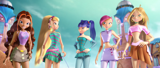
I'd say almost all of the promotional art for the first three seasons was consistent and didn't whitewash any of the characters. It's hard to believe now of course but Iginio was initially really excited to make winx diverse (like he intentionally changed Flora to latina instead of white to make it more diverse). Rainbow intentionally whitewashing them really started with the first movie and then snowballed into what we have now. Unfortunately, I think so many white fans are so used to the whitewashing, that they've started to no longer even notice it unless it's super extreme. Like with the recent s9 promo art, most people weren't noticing Flora at all (and not ignoring her, specifically not noticing), and in a lot of fanart, they do not notice unless they're literally white.
Whitewashing has been a big issue in winx for years but I think there are a lot of fans who look at the early seasons with so much love and nostalgia that they don't want to admit it, or they don't understand how lighting affects skin, or their favorite character isn't Flora or Aisha so they just never pay attention to them (blorbo hyperbeam is very real). I'd still say that a lot of the early whitewashing was due to innocent mistakes regarding lighting and manufacturing, but the first movie was extremely on purpose (and so is everything after that).
#fans are naturally going to bring up the later things more since its happening Right Now#like the s9 promo art. the entirety of fate. s8. etcetc are all more relevant than a random doll thats not being made anymore yknow?#its still important of course but we can't change what happened unfortunately#but we can influence them now!#s9 is actually a really good example of how fans have pressured them to stop whitewashing! just look at aisha!!#she looks absolutely gorgeous and they even took the time to give her a real black hairstyle#(obviously not saying that her og hair isnt natural but you get what i mean. her having vaguely curly hair is not the same thing)#especially since they often give her Super Straight hair like in the movies#unfortunately flora still looks too light but if fans actually notice and make noise about it we Can make a change#even if that change is s10 instead ajdhgal#also holy shit s10... god its been so long i feel old now what the fuck#adhgladhglj#age crisis aside the whitewashing has been around for a while now#i didnt even touch on world of winx adhglhadg#answered#long post
15 notes
·
View notes
Text

holy shit they fucking lobotomized deathstroke
#og post#batposting#hey so thats like. extremely fucked#and something any good-aligned bruce should be against right#like there was an entire jlu episode about how the evil versions of the justice league lobotomized their villains...
12 notes
·
View notes
Text
time a flat circle why the hell am i usin the same loafers i bought for one cosplay of my fave antagonist for another fave antagonist
#snap chats#can i even call it cosplay. why are police sirens going off in the bg oh my god shut UP#anyway yeah ill elaborate. Super Snap Stalkers will remember my p4 era and will remember the time i did in fact do an adachi cosplay#i deleted the og post like an hour later. plus that blog's gone. but im sure some freak can find it if they dig hard enough#ew i think i was 17/18 in that pic (not at all that long ago) ok anyway.#i use the same loafers for my aoki outfit. and yeah i do Regularly wear my rgg outfits i TOLD YOU its functional cosplay i QUIT#just funny that like.... damn everything always goes back to square one LOL#these busted ass old ass loafers still rockin with me years later#if im feeling cheeky i think i will post all my rgg outfits actually. for halloween#hang on gotta be depressed and cringe for a moment#cause ive always liked cosplay but whenever i did it it never felt. Good Looking#like i always just felt like my face never worked for the charas i wanted to portray and so thats why i say with a heavy heart#that aoki's round-ass square-ass head is perfect LOL it makes me wanna throw up looking in the mirror#i got the same weird lips. ok not that squished Similar but Its Awful that he makes me feel comfortable with my face now#at least my eyebags arent double deckered... i at least look like i get sleep.. some days.#breaking !!!! objectively one of the most vile bitches in this franchise makes you feel comfortable with your body and existence#NAW to continue from last post if i had a webcam i prob coulda done a cosplay y7 stream LOL thatd be funny#anyway since this tag ramble is just pure cringe let me round it off with a final bit of cringe#the Forbidden Mention of my trans masato hc cause one reason why i have a Teehee over the thought is how raspy his voice is#and i only really now realized how right i was tonight because my prof called on me to speak and when i tried speaking DAWG.#the forbidden acknowledgement of Myself GROSS#BUT DAWG MY THROAT WAS FUCKIN CRUSTY it felt like sandpaper EW?? WATER FOR YOU?? christ. i hope that was just a one-time thing#ok im leaving now BYE
6 notes
·
View notes
Text
watching this lpers grestalt playthrough to freshen my memory and i entirely forgot about the kiss thing which like. does anybody else find that an utter crock of shit
#like not to be like this but i have to. but is this in both games#cause if so how goddamn old is kaine#cause the father we have a canonical age or 40 pre 45 post skip directly from out his mouth#and iirc the boy isnt an adult until post skip#so giving him absolute flexibility og being 19 pre skip and 24 post skip#thats still a 20 years in age difference between the two#which either way can make this feel incredibly creepy#cause if shes closer to boy niers age that makes the father cutscene creepy#and if shes closer to father niers age that would make it being in replicant creepy#like i cant see any way for them to have this in both games without it being suuuuper weird#but i dont known if its in both. i hope not#wait isnt the boy canonically like 17 in boyhood. so post 5 years hes 22. that puts the age gap at 23 years#please god above tell me thats not in both games right everyone RIGHT????
4 notes
·
View notes
Text
i made me n my gf sonas based on this one species i made and i love them so very very dearly their names are eros and zelda
(eros's marking are made to look like scars, but only the ones that are like. pink and dark pink are actually scars. so lil tw 4 that :3)
tumblr ruined the quality 😔
#eros is a hellhound wolf plushie#and zelda is a starbunny plushie#teeechnically theyr an og species because ive worked out a lot of mechanics on how they work anatomically and the species backstory#but none of that matters all that much so if u wanna make a plushie that looks like tis dw im not some insane furry whos like#GRRR THATS MY SPECIES AND U DIDNT PUT THEIR TAIL AT THE RIGHT SPOT GRR#idc man that shits dumb#RANT#art#artists on tumblr#digital art#oc art#original character#my art#oc#oc artwork#furry#furry art#sfw furry#furry oc#anthro art#anthro#fursona#furries#furry fandom#plushies#stuffed animals
6 notes
·
View notes
Text
hit tag limit on the last post cos i started talking about roller coasters again 😔
#toy txt post#wish there was a way for me to like. Do. something. with my roller coaster hyperfixation. but im not an engineer i dont want to design them#thats so scary and i couldnt be a ride op cos im scared of riding most of them (disclaimer I KNOW HOW SAFE THEY ARE THATS NOT THE PROBLEM#I DONT HANDLE THE PHYSICAL EXPERIENCE OF THRILL RIDES FILLING ME WITH ADRENALINE VERY WELL IT CAUSES ME PAIN#i do not enjoy it. but i love to see coasters and watch them and read about them 🥺 and also sometimea i read about. the incidents which#felt like very foolish at first like okay this isnt gonna help me get comfortable riding them but honestly actually it did help?#to see how many of the incidents are like. truly like either freak accidents or someone fucked up#but like the rides safety mechanisms usually are very good and not the reason for an accident. most errors seem to be like. act of god or#like. operator or rider error. and some of the operator errors are kind of terrifying BUT ALSO seem like things that can be prevented#maybe the new wave of unionizing in the us will sweep into theme park employees and make sure theyre paid well and recieve good benefits#and that they are not pressured to prioritize profits or faster throughput at the expense of safety. and (really optimistic i know) maybe#we as a society and culture can unlearn our systemic fatphobia to the point that its doable to turn someone away for being#too big to ride safely without making them feel like shit or like its their fault and MAYBE we'll even possibly just maybe figure out how#to make rides that can actually accommodate larger guests safely so they can participate in the fun without fear or bodyshaming#logically i know theres no way to remove 100% of risk and that there is still heightened risk especially for ppl w various#medical conditions but idk i think we as a society can keep theme parks and do them well. i believe in us.#i should go to more of them....ive been to like. not that many but i do still have favorites#hershey my beloved. i LOVE how visible all the coasters are all the time i LOVE the skyview going right through great bears track#i hope i can go again this yr and see the new wildcat 🥺 absolutely not going to ride that fucking thing but i am definitely going to stare#at it. jenn if youre reading this i cannot fucking believe you got me to ride og wildcat honestly#p sure that rattle gave me a headache and i would not do it again that was a rough fucking ride lol but im glad u somehow got me into that#i have. such a complicated relationship with being peer pressured onto rides lol#like on the one hand i do need that a little bit or i definitely wont do it but on the other. being forced onto comet as a child was#slightly traumatizing and definitely marked my turn from wanting to ride all the coasters to jot wanting to ride anything#to my parents credit on that one they do recognize it as a mistake and were sorry about it like immediately so i dont hold it against them#but also dont. force ur children to ride coasters lol. but i do need to go spend a day at hershey just forcing myself to ride great bear#over and over. fav coaster best coaster. its so fucking loud. its shaped so good. pretty color scheme. its constellation themed#i do love and am obsessed with how hershey packs all those tracks together like that it looks so cool i love to see it#candymonium right at the entrance like that is Extremely distracting very immediately
4 notes
·
View notes
Last Seen Blogs

jueboo-blog
HUR MAN RENGÖR EN GRILL

alysonmowat
BOTANIQUE
superinjun
Waniyetu yawapi

dejavu-125-blog
Untitled
