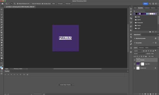
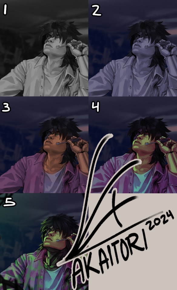
#there are 5 different blending layers on that mask
Text
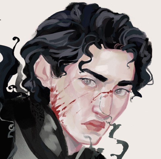
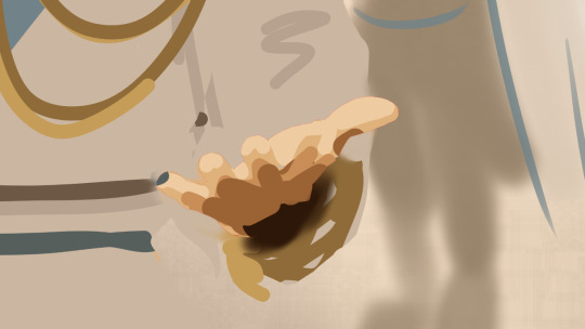
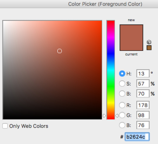
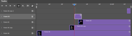
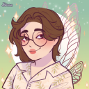
@blackbutlerfanweek / Day 5: Masquerade / Fanart of Undertaker
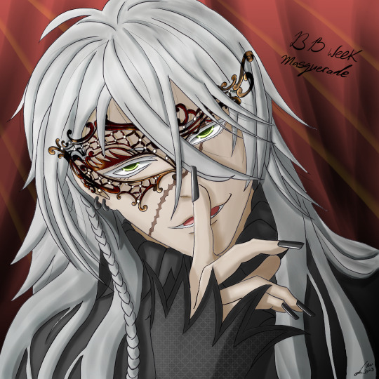
#blackbutlerweek#black butler#black butler fanart#kuroshitsuji#kuroshitsuji fanart#undertaker#drawing prompt#masquerade#digital art#my art#there are 5 different blending layers on that mask#I have no idea what I did#do not ask to recreate#literally have no clue#i screamed
37 notes
·
View notes
Note
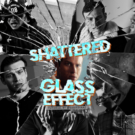
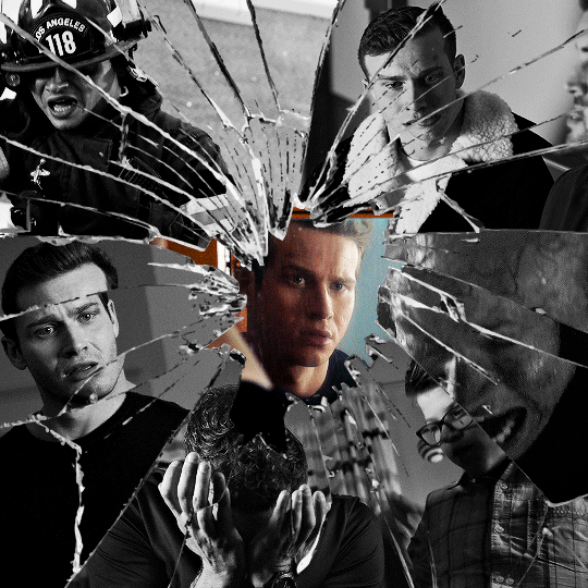
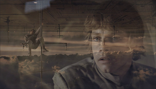
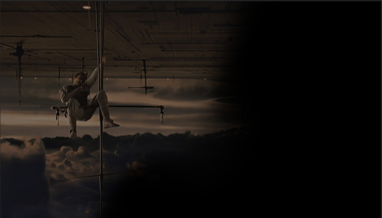
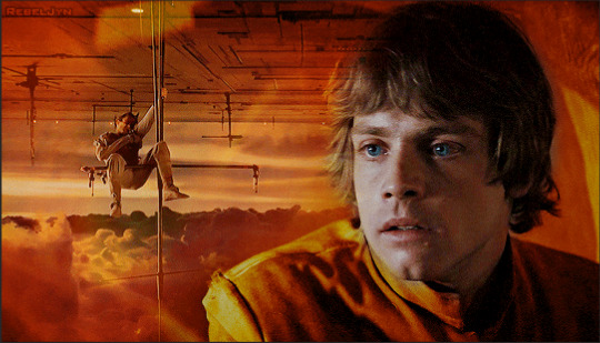
alie! I absolutely adore this mirrorball x buck set that you made last year! (/post/701462848238403584/) (also I can't believe it's been a year, like seriously what is time?) I was wondering how you did the shattered glass effect in the first gif? in particular how you made the black and white gifs appear distorted within the glass if that makes sense? thank you!!!
ahhh thank you so much renee! literally what is time lol, this gifset is still one of my faves that i made. the shattered glass effect is mostly just a lot of layer masks to be honest hahaha. i'm so glad i still have the psd, so here's how i did it under the cut~
(this tutorial assumes you know how to put multiple gifs in the same canvas and are familiar with layer groups and masks)
I. PREPARATION
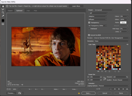
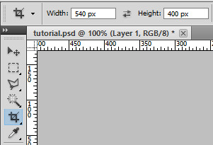
first things first, create an empty canvas of your desired size. mine was 540x540 px.
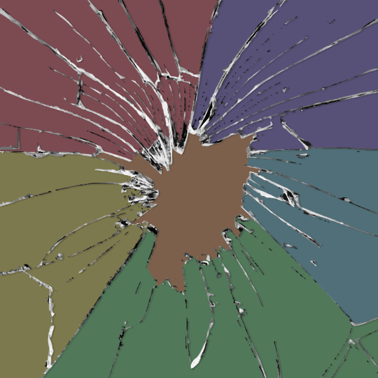
then, you need to find a cracked glass texture. if i remember correctly i simply googled something like "broken glass png", "cracked glass png", because i wanted something already transparent.
(a texture that's something like black lines over a white background definitely works too, you'll just have to put that layer's blending mode to darken or multiply.)
here's the png i used (and a download link for best quality):
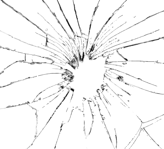
and after positioning it into my canvas.

II. CREATING MAIN SECTIONS FOR GIFS
so basically when i did is i sectioned parts of the texture for each gif that i wanted to put. following the texture's lines, i zoomed in and carefuly drew a first shape along the lines with the polygon tool. you can also put a color fill layer behind the cracked glass layer so it's easier to see, like i did.
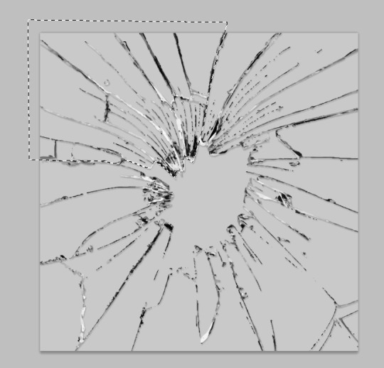
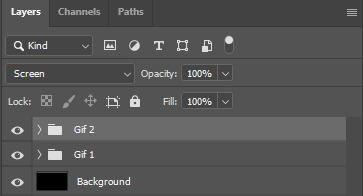
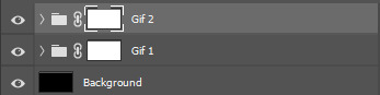
once you have your shape selected, click on the folder icon (1), then on the layer mask icon (2). it should give you a nice masked group to put gifs in hehe
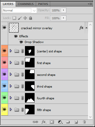
then i repeated the process until i had all of my desired shapes. i've put some color layers so it's easier to see, but here are my 6 main shapes and how my layer groups look like so far:
III. GIFFING TIME
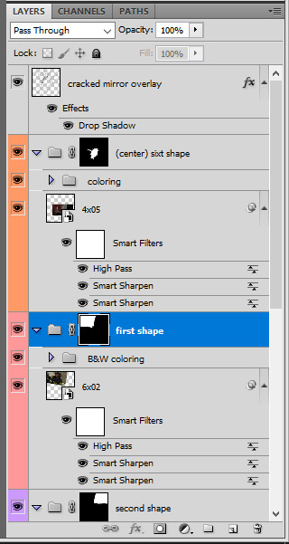
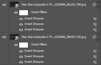
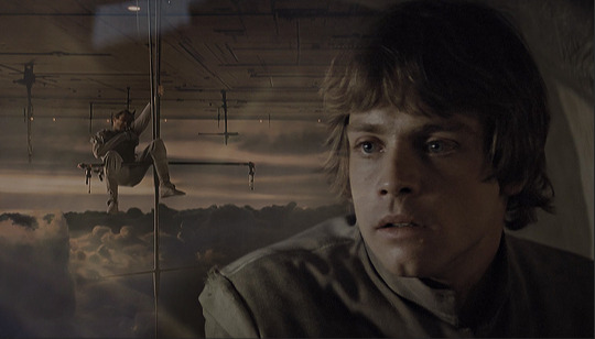
after screencaping and making all 6 gifs required for each section, you need to put all of them in the same canvas. i simply put one smart object gif layer in each group created earlier. then, i resized and rotated each gif to fit its group (by hitting ctrl + T while selecting the gif layer), as you can see with the gif labeled 6x02 in the layers preview. for the coloring, i went simple with black and white for most of them.
once i have all six gifs sharpened, colored, and placed in each shape group, the gif looks like this. the broken glass texture does most of the work to be honest:


obviously the center gif doesn't have any kind of effect, it's just colored as usual, so i'm not gonna go over it. it's just one gif layer in a masked group.
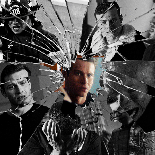
IV. SUBSECTIONS FOR DISRTORTED EFFECT
okay so for the distorted effect it's even more layer masks! basically i created more smaller sections within each main shapes already, still following the cracked glass texture's lines with the polygon tool and put them in individual masked groups like i did in the second step. here's how i ended up dividing each main sections:
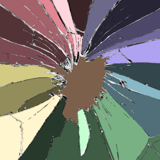
yep, each color here is a different masked group, for example the 2nd and 3rd shape sections:
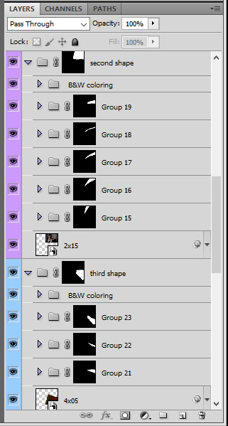
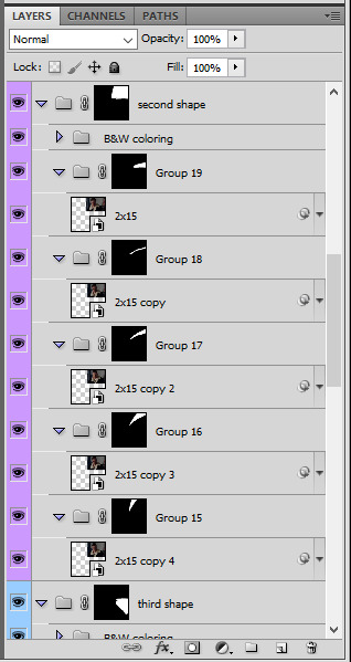
for each main shape section, you want to duplicate your gif layer the same amount of times as you have subsections within that shape. so if the main shape has 5 smaller subsections, i want 5 layers of that same gif. just make sure to not change its duration or position yet, and make sure the coloring layers/group stays on top of the groups in its shape section. then, simply put one gif layer duplicate in each group. example of my layers for the second shape so far:
then just repeat this until all subsections have its own gif layer.
V. DISTORTED EFFECT
this is the best part! and it's really easy. basically you want to slightly move each subsection by a few pixels, so they're in a slightly different position than the ones next to it.
to do so, select one of the gif layers and with the arrows on your keyboard, move it left or right, and even up or down if it looks good. i do this for all duplicated gif layers, making sure it looks like they're all slightly offset. focus on the cracked glass overlay's lines while nudging the gif layers, it's easy to see how the shapes break when you move them. for example here:
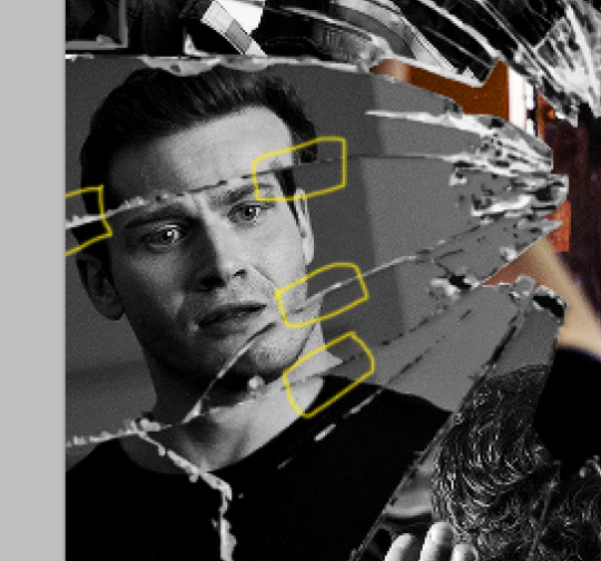
this is really just all trial and error, you just need to move each subsection gif layer by a few pixels with the keyboard arrows until it looks good to you.
here's my result once i've done this for all (23!!) subsections:
VI. FINAL TOUCHES
i don't think i did much else to this before typography besides adding a bit of contrast overall and a thin drop shadow to the cracked layer texture on top of everything. if you have a transparent png this definitely helps to give a bit more dimension to the effect. so here's the final result:
i hope that was clear enough hehe :D
#alie replies#tutorial#photoshop#resource#*ps help#completeresrouces#allresources#userhella#userabs#userkarolina#userdena#tuserheidi#usercats#userrainbow#userbunneis#usersmia#tuserabbie#usertreena#usernik#swearphil
370 notes
·
View notes
Note
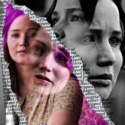
hi, your latest edit for thgweek24 is absulutely stunning and i thought if i can ask if you can make a tutorial about the ripped gifs/paper effect? if not, that's okay! have a nice day <3
RIPPED PAPER EFFECT TUTORIAL
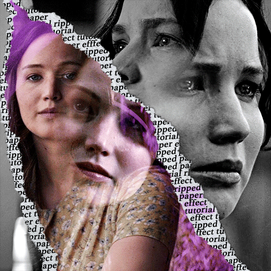
hi! thank u :D (thgweek set referenced)
below the cut are the steps that i took to create this effect. this tutorial is very screenshot heavy and assumes some basic knowledge of photoshop and giffing.
i do my best to try and explain my process so hopefully this is helpful! if you have any questions, please don't hesitate to ask.
STEP 1: Choose and arrange your two gifs
with this specific use of the ripped paper effect, there's one gif on the "outside" of the rip and one on the "inside." in this example, the outside is the b&w and the inside gif is the colored:
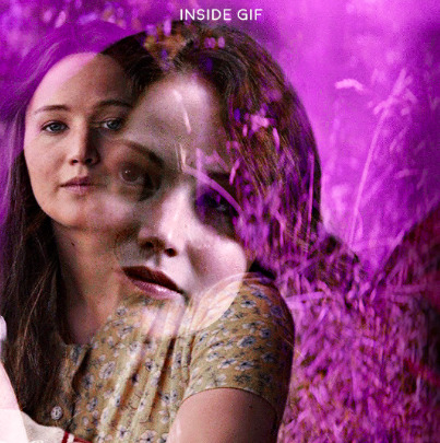
for me, the outside gif determined the positioning of the inside gif and the position/direction of the rip. as can be seen, outside gif has a lot of space on the left. therefore, i knew i was going to position the subject of the inside gif more on the right so i could create the rip without hiding too much of the b&w gif.
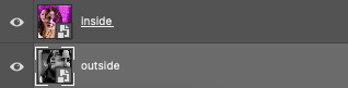
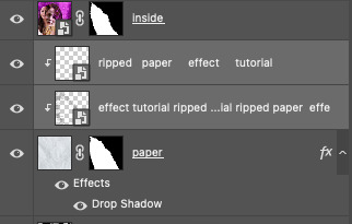
next, you want to arrange the inside gif on TOP of the outside gif. your layers panel should look like this:
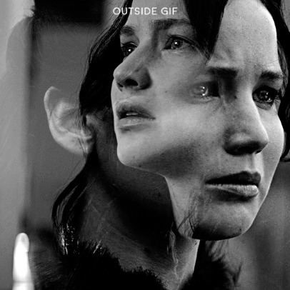
STEP 2: Creating the ripped effect
here comes the fun part! in order to create this effect, you're going to need torn paper brushes. here and here are some packs you can download (w credit to owner).
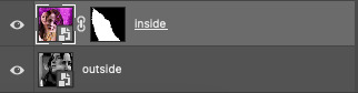
next, create a layer mask on your inside gif. you're going to use the brush of your choosing as an ERASER. then, you can play around with the size and angle of the eraser to create the look you want. this is what the gif and the layers panel now look like:
STEP 3: Adding the paper
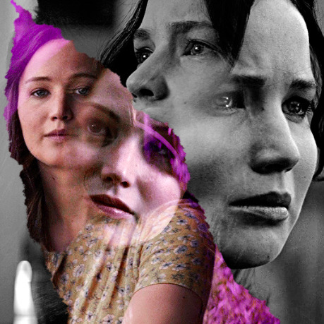
in order to add the paper around the edges of the inside gif (where the text goes), you now need to download a paper texture. i found mine on google by searching "paper texture png."
place the paper png IN BETWEEN your outside and your inside gif. this is what everything should look like:
now, similarly to what you did in the previous step with the inside gif, you are going to create a layer mask on the paper layer. using an torn paper brush as an eraser, you will erase the paper, creating the shape you want.
be sure to leave enough room for whatever text you want to be on the paper. also, i suggest making the rips of the paper different from the rips of the inside gif so it looks more organic.
here is what my gif looks like after erasing the paper:
optional: add a drop shadow on the paper layer (right click -> blending options... -> drop shadow)
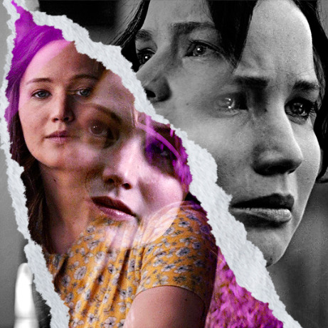
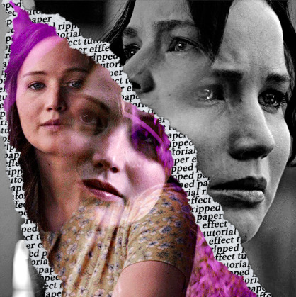
STEP 4: Adding the text
first, you want to identify the space where you will have room to place your full quote within the paper. if there are no spaces, you can always use your brush/eraser to modify the layer masks.

next, add a layer on top of the paper layer (and below the inside gif). select the text tool and start typing your repeated text!
because you can see which text is hidden by the inside gif and what is on top of the paper, a shortcut i use is the "tab" button and only type words that will be seen.
type the repeated words around the quote you want highlighted:
now, in order to contain the text within the paper, convert the text layers into smart objects. then, create a clipping mask on both layers (right click –> create clipping mask). this is what your layer panels should look like:
with that, your gif should now look something like this, with the text contained inside the paper:
STEP 5: Highlighting the quote
as you can see, it just looked like a bunch of words. so, in order to highlight the quote you carved out in the previous step, add a new layer below the layer of the quote you want highlighted:
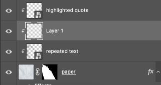
now, use a round brush (softness around 10-15% and opacity at 70-80%) with the color of your choice to highlight the words you want.
and there you have it!
i hope that this made sense and was helpful! if you have any questions or clarifications, please don't hesitate to ask :)
143 notes
·
View notes
Note
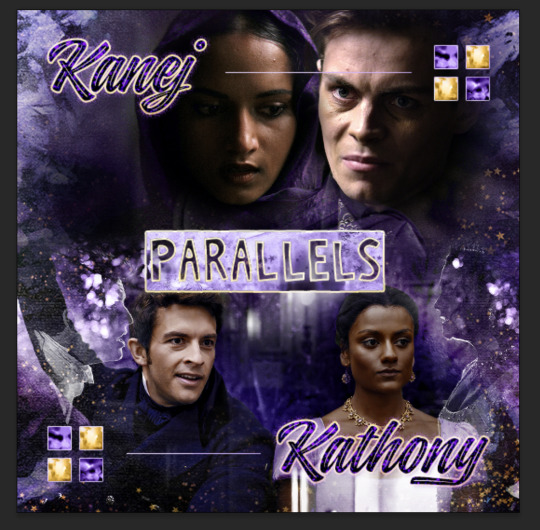
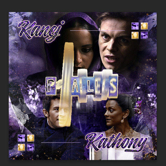
Oh I’m sorry I have GOT to ask! How did you do the text animation in the first gif of 718688291365502976/pscentral-event-15-favourite-ships-kanej?? It’s just. It’s so beautiful
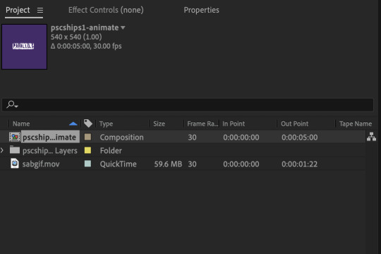
Hi anon! I've used After Effects to create the text animation in the first panel of this post. I'll show you the basic idea of how I've created the animated text effect here :D
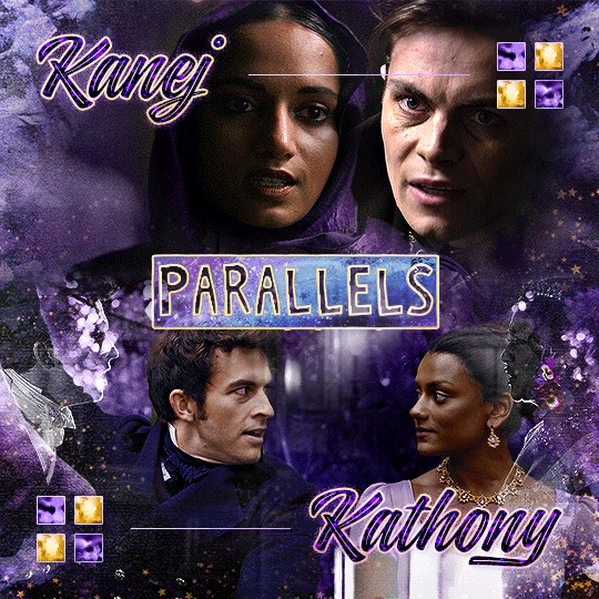
What you need:
A cutout font (the font that I've used is Trouble Child Outblack by @justlikethistrain)
Adobe Photoshop with Video Timeline feature
Adobe After Effects
Supplementary files: gif prep action pack / golden outline layer style / assorted textures
Difficulty: advanced; knowledge in gifmaking with the video timeline interface assumed
Note: This tutorial assumes that you're working with all of the composite gifs in a Photoshop composition file and using the video timeline interface
Other useful tutorials to refer to: Text overlay effect / After Effects text animation / clipping mask vs layer mask
Tutorial under the cut. Like / reblog if you find this useful!
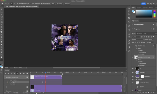
1) Photoshop: Preparing your gif panel
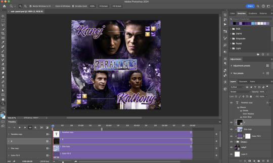
Setting up your PSD composition panel: Create a blank PSD file and set it to Tumblr dimensions (540px x 540px in this particular gifset)
Enable Video Timeline and drag all of the component gifs from your folder to the PSD composition file. Resize / move these gifs around until you're happy with the placements.
Trim the timeline work area so it's the same length as the shortest component gif you've added to the PSD composition file. You can also add some textures & additional adjustment onto this panel.
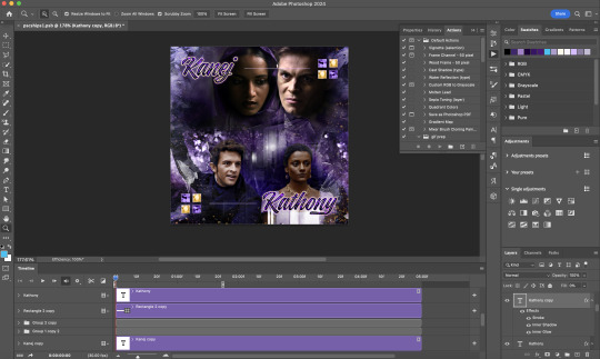
2) Photoshop: Exporting your base gif
I highly recommend exporting the base gif right now, to ensure a smoother experience scrubbing through the video timeline when adding finishing touches later on in the workflow.
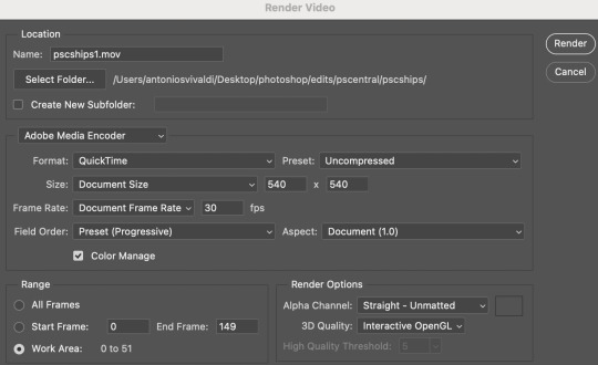
My preferred method is to render the composition as a video clip from File > Export > Render video.
To get the optimal export quality, I use the following settings:
3) Photoshop: Preparing your text layer
Make a new Photoshop composition file of Tumblr dimensions

Drag in the video clip that you've just rendered (the base gif) to this composition file
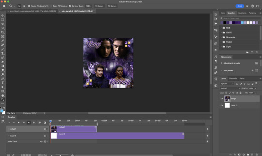
Add a new text layer in your PSD composition file and set the colour to white then tweak this layer until you're happy with the text placement.
For performance optimisations on After Effects, I duplicate the PSD composition file and delete all other layers. This PSD file contains only the text layer that will be animated.
4) Photoshop: Adding overlays & decorations on the text layer
This step allows you to preview the text effect without the animations (i.e. allows you to tweak the texturings & colourings)
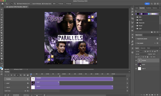
Duplicate the text layer. Set the bottom layer's (highlighted in red) blend mode to Exclusion and apply the gold outline layer style to the top layer (highlighted in green). Make sure the Inner Shadow is disabled!
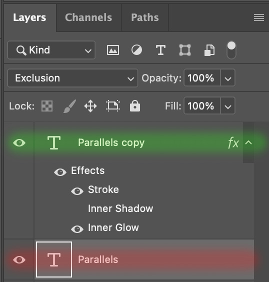
The panel now looks like this
I want to have the liberty to use different colours & textures on the bottom text layer with animation, so the next thing I do is to right click on the bottom text layer and select "Group from Layers"
To change the colour of the filled text layer to purple:
Collapse the Group that you've just created
On top of the collapsed Group a purple Colour Fill layer,
Set the Fill layer's blend mode to "Colour"
Right click on the Fill layer and select "Create Clipping Mask"
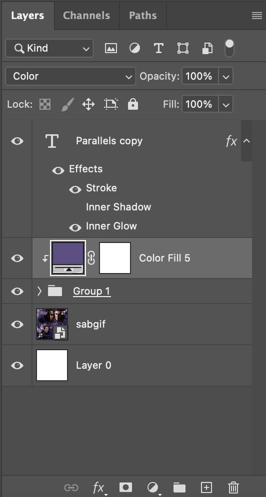
Now the colour of the filled text layer is purple
After adding more textures & decorations on the text layer (with photo negative effects) I get the following:
5) Photoshop: Adding overlays & decorations on the text layer
To avoid performance issues on After Effects, I make a new PSD file of the same dimension. With both the PSD files open, I select the text layer (highlighted in red) while holding Shift, I drag this to the blank PSD file (see the green arrow)
Holding Shift ensures that the layer's placement is preserved when it's copied to a separate PSD file.

In the new PSD file, I set the text layer's blend mode to "Normal"
6) After Effects: Animating your text layer
Make a new project on After Effects and drag in the text layer PSD file. Import this file as a Composition

Also drag in the base gif video clip to the AE project.
While we won't be exporting anything with the base gif visible, having this file in the project file is useful if you want to have a better picture of how the animation will look in tandem with the gif.
Double click on the composition. Hide the colour fill and background layers. Then right click on the text layer, go to Create > Convert to Editable Text
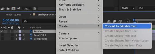
To be able to preview the animation with the base gif, drag the video clip to the composition file and below the text layer. The visibility of the layer can be toggled on / off anytime in the After Effects workflow
Now we prepare the text layer to be animated. Because the final animated effects is 3D & has motion blur, right click on the text layer and select "3D layer" (highlighted in green) and Switches > Motion Blur (highlighted in red)

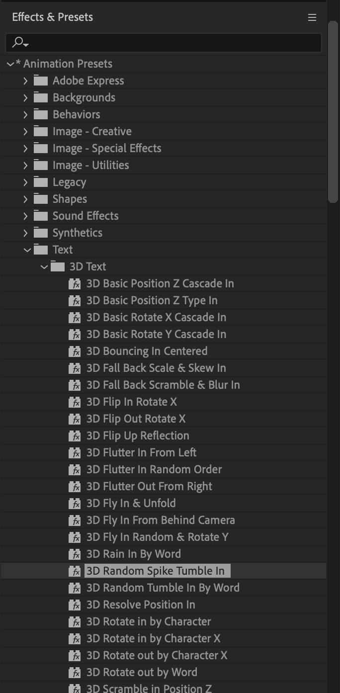
Go to Animation Presets > Text to browse through some presets that you could use to animate the text layer. For this gifset, I've used a preset within the 3D Text folder called "3D Random Spike Tumble in".
While selecting your text layer, press U to view the keyframes and you can adjust the position of these keyframes until you're happy.
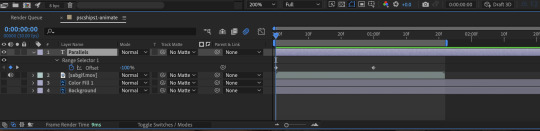
For more finishing touches, press U again to tweak more options in this preset. In this case, I do to Animato 1 > Range Selector and changed the Colour Fill to #fff (the default colour is light yellow)
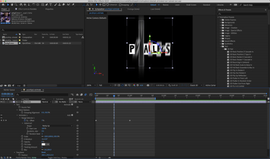
Then do you File > Export > Add to Render Queue
Click on the Output Module and use the following settings to render the text layer as a video file with transparency
Then after specifying the folder in which you'll export the video to, click "Render" to render the video file containing your animated text layer.

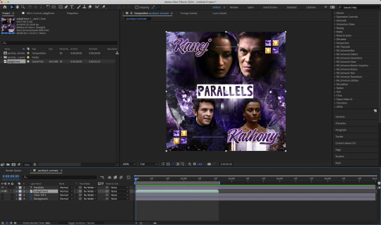
7) Photoshop: Adding the animated text & finishing touches
On Photoshop, drag the rendered clip containing animated text, to the PSD composition file with the static text layers.
Duplicate the animated text video layer
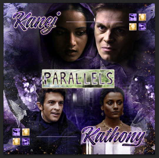
Drag one of the layers inside Group 1 and set the blend mode to "Exclusion" (Highlighted in green)
Move the other layer to the top and apply the gold outline layer style with Inner Shadow disabled (highlighted in red)
Hide both text layers (highlighted in yellow)

By scrubbing through the timeline, I've noticed that the animation didn't look clean enough, so I'll add some finishing touches
By selecting the upper text layer containing layer styles, go to the timeline and add opacity keyframes going from opacity 0% to 100% a few frames apart
Once you're happy with the finishing touches, flatten / render your PSD composition file, change the frame delay to 0.05s and export your gif and voila!

I hope this helps 💖
#tutorial#gif tutorial#photoshop tutorial#after effects#chaoticresources#dearindies#userriel#useralien#userraffa#usershreyu#user.tee#useryoshi#usernik#userjoeys#usersole#arthurpendragonns#userhallie#*#my tutorials#my resources
105 notes
·
View notes
Text
a trashcan’s guide to coloring
using @thoughtfulshepherdmongerkid beautiful ivy rose, because I’m thinking of her always and also really struggling w the comm sorry (also this is long as hell fair warning)
sketch/line-art. I suggest making it at least kinda neat so you have a solid guideline, but honestly just do whatever you gotta do. I also like to set my sketch layer to multiply so that the line art meshes w the base
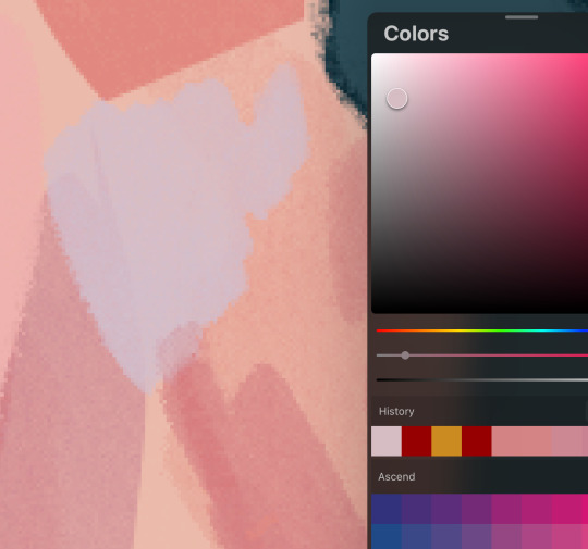
2. usually I lay down one base color (in this one it’s pink), then I use a clipping mask to lay down some flat colors. the brush you use for this won’t really matter because it’s gonna get covered by rendering (merge layers when you’re done)
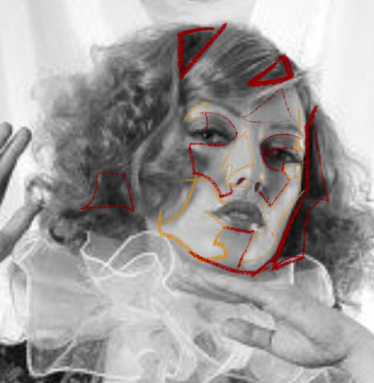
3. get your references!! you’ll need them for when you start painting over your base, trust me. references changed my life and saved my summer harvest
4. now, on a layer created above your sketch and base, go in w/ a mix of lasso tool/freehand brushing and start blocking in your colors. the values on our faces naturally form blocky shapes, so try to focus your energy into getting those down
I like to use the spectra brush to render because it adds a nice texture, but feel free to experiment with what you’ve got. also, I tend to go darkest -> lightest -> middle in terms of coloring order
if you struggle with value, I suggest finding any picture (make it black and white by turning saturation down) where there are 3 clear values (black, grey, and white). then with a colored brush, outline all of the different shapes those values make. kinda like this!
5. quick color theory run down before we wrap up: use a cool toned grey (red based, pink based, purple, etc) for the blue parts of the skin, a desaturated red/pink for purple, and gray yellow for green. this will give you very lively and compelling coloring without being too crazy. obviously, you can do whatever you’d like, but I’ve found that this makes my palettes more cohesive and adds depth to the skin
6. so I can’t really finish this piece because I have to start working on commissions again, but after an hour ish of blocking and blending, you should end up with this
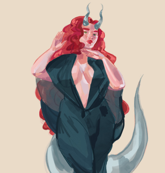
and then if you continue and blend a whole lot more, you’ll end up having something more like this!
also, little lasso tool guide
to lay down the colors you’ve gotta click the brush, personally I like to freehand instead of color drop, but you do you
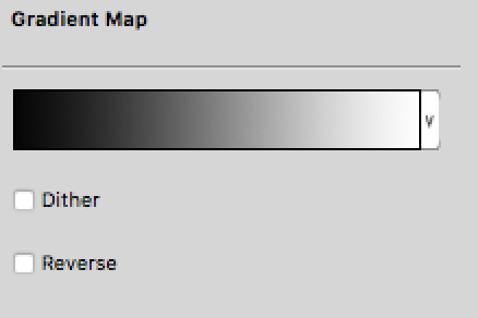
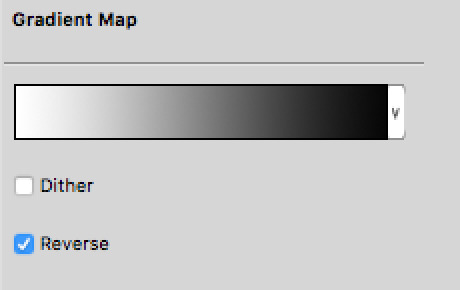
finally, if you aren’t satisfied, you can either 1) merge all of your layers and add a gradient map, or 2) merge your layers, duplicate your new layer, add a gradient map at 100%, and change your canvas blending mode to soft light + change the layer opacity. this’ll make your piece more vibrant and cohesive
#final disclaimer: you will not get these exact results if you aren’t at my skill level#art tutorial#sage’s art tag
72 notes
·
View notes
Text
Mini painting process breakdown
I'm really bad at explaining my mostly-winged-it process, but since a couple of people asked here's a mini-breakdown of what I have been doing on my journey to this pseudo-painterly style:


Disclaimer: I have no formal art training of any kind, I'm guessing my way through this artsy season of my life that just restarted last October; this is merely a general description of what I am doing these days, not a tutorial or a guide to tell anyone what they should do. Anyone has a different process and I am a strong believer in doing whatever works for you, no matter what "The Rules" or other people say.
0. Before I even start drawing, I collect a bazillion reference pictures for every single thing that I plan to represent, from Michael Sheen's face to gold embroidery texture on 1800s extant garments;
1. (undocumented because when I said that I'm bad at this I meant it and sure enough I forgot to grab a screenshot of this step) I establish the general background color and draw a very loose sketch of the character;
2. I switch to a basic hard round brush and free-hand some color blobs to establish the position, general shape and values of the character, using the colors that are already in the background to make sure that the charater "belongs" in that space (tip: if I need to introduce new colors I pick a shade that seems close to what I want, put it on a separate layer, and then lower the opacity of that layer until the background color bleeds through and harmonizes the new shade);
3. I divide the character into smaller bits (face, hand, jacket, sash...) and apply clipping masks to bring the color blobs into reasonable shapes, in this case a left hand (I found that I can fine-tune the shapes at any moment by playing with highlights and deep shadows on the edges);
4. I then switch to an equally basic airbrush for the main rendering, using the color picker tool to blend midtones and highlights/shadows until my shape starts looking 3Dish (this part can be quick or take forever depending on a variety of factors that I honestly cannot explain);
5. I bring down the airbrush size to add finer details that can sell the illusion (here still in progress);
6. (eventually) I add a ton of adjustment layers to make sure that the completed part is consistent with the rest of the image (tip: if there are more bits of the same "family", e.g. skintones, I use the color picker tool to grab the midtones that already exist instead of mixing them ex novo).
That's it, I believe, unless I am forgetting something. Feel free to ask if there is something more specific that you'd like to know!
35 notes
·
View notes
Note
The blending in your Lucas gifset was absolutely gorgeous! Do you have or know a tutorial on how to do it?
Blending Tutorial!
Firstly, thank you for the compliment anon! Now, I'm going to go through the process considering that you already know how to make regular gifs and know how to use adjustment layers, so I'll be focusing specifically on blending but if you need those tutorials I can make them, just ask!
This is gonna be our end result after the whole process:

This specific gif from this gifset(with the typography removed) is focused on a color palette with only two adjacent colors so it's a bit easier to make the blending look good but this process works for any kind of gif! So let's start the tutorial!
1. Get your desired gifs into the same canvas

These are the two gifs I'll be blending for this gifset. Make your gifs and resize them to the size of your final gif. Remember to turn the layers of each gif into Smart Objects so that you can move them around properly when blending.
I usually make the gifs and just copy and paste one of them onto the canvas where I made the other one. You can also make your gifs and save them separately from each other first and then put them into the same canvas, but I prefer to make all adjustments except for resizing in one canvas so I can tweak the positioning of each gif as well as the coloring so everything looks the way I want it to.
2. Put each gif into a folder

This will make it easier for when you start using adjustment layers on each gif so that the adjustments don't interfere with other layers.
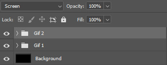
3. Set layer mode to screen
Set both folders to Screen, this will help blend them together better than if you were relying only on the opacity of the layers. I also usually create a new layer and use the paint bucket tool to color it black. Your gif should look something like this:
And your layers like this:
The black background makes sure there aren't any transparent spots in your gif when you use the layer masks to blend them as you can see here:


4. Create layer masks

Select each group one at a time and go into Layer > Layer Mask > Reveal All. Your layers should now look like this:
5. Start erasing each gif on the layer mask
Use a soft airbrush to erase each gif to your liking. With layer masks you can use the eraser tool or the brush tool. Layer masks work based on color value(how light or dark the color is). The darker the color you paint with your brush the less opaque it will be. Painting in black will erase the area completely and painting it white will make it completely visible. The eraser defaults to the same effect as if painting with a brush in black.
This is the final result of the blending:
This is how each of the gifs look after I erased them with the layer masks:

This is what my layers look like:

As you can see I've erased one of the gifs way more than the other, that's because I only erased parts of the gif that would interfere heavily with the gif I wanted to be more visible. Make sure to move around the timeline of your gif to see if you need to erase more or less of each gif since the person or thing you're trying to keep visible can move around and get covered.
6. Make your color adjustments
If you've already made your adjustments before pasting both gifs into the canvas you can skip this step. Since this gifset was focused on orange and yellow I adjust my colors to match that. I keep my adjusment layers in groups inside the respective gif's folder so I can turn them all on or off easier and so they occupy less space in my Layers tab.

And this is what the colors look like in the end:
7. Export your gif
This is what my export settings look like:
This doesn't interfere with the blending and a lot of these settings are personal preference but I thought it was worth sharing.
And finally we've arrived at our final result as shown previously:
Other blending tutorials:
Now the links to some other blending tutorials that might have different methods(sometimes because of different desired outcomes). I'll be tagging the creators for if anyone wants to look at their content!
Tutorial using gradients and lighten mode by @linda-darnell
Tutorial using erasing with layer masks by @eddiediaaz
Tutorial adding color on top by @miriammaisel
Tutorial using screen and color layer modes by @disaster-lineage
That's it! Hope this was helpful!
112 notes
·
View notes
Photo

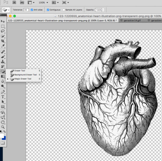
BEATING HEART EFFECT TUTORIAL:
I was asked by the amazing Samantha @shegos how I made the animated beating heart effect on my Witcher gifset so I thought I would make a tutorial about it! I’ve used this same effect before on this Merlin gifset. This tutorial assumes you have basic giffing skills and work on Photoshop with a timeline.
step 1:
To start off, I have made my gifs, colored them, blended them so this is where I’m at. You don’t need a blended gif for this, you can use it on any gif you want, this is just mine.
I had to find a heart shape to work with so I went over to google and typed various types of “heart png” “real heart transparent” till I found what I wanted. This is the heart I used, you can use anything that attracts your eye. I open it on Photoshop and use the Magic Eraser Tool (you can see my settings in the image below) and delete the background and tiny specs of the background seeping into the heart.
step 2:
You open up your gif (we need the frames here so you save your gif and open it again) and you drag your heart atop the layers while having chosen the first frame on your animation. This is what your timeline should look like now.
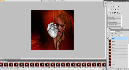
I didn’t like how straight the heart looked, so I tilted it a bit to the left by going over to Edit > Transform > Rotate. Lastly, I changed the heart’s opacity to 83, depends on what you prefer.
step 3:
Now we have to prepare the heart for the animation process. We make a group, add the heart inside, and make these adjustments layers set on normal:
Then you create a new layer and color it with this hex:
You set this layer to blending mode overlay. Then you duplicate it three times and set the new three layers to blending mode soft light. Lastly, you select all of the adjustment layers, right click and create clipping mask, so your other layers are safe and set the entire group mode to darken. So now, this is what your layers tab should look like.

The last last step before animating, is to duplicate your group, and change the new one to blending mode luminosity and opacity 30%, again here depends on your preference.
step 4:
Here comes the fun part! To time this as correctly as I could (I’m sure you folks are better at math than me) I went over to youtube and found a beating heart sound. Be careful, for this part, you only change the opacity of the first group you made, I’ll tell you later what you do with the second one. You choose your first frame in your timeline and go over to the first group and choose only the colored layers, not the gradient maps. So then you start with 100% opacity and then change it depending on how the sound feels frame by frame. I was basically starting the sound, stopping at points, changed the opacity, played it again, changed things e.t.c. These are my settings, with my gif speed being 0.07.
1 to 4: 100%
5: 25%
6: 50%
7. 60%
8: 75%
9: 100%
then 4 frames 100% again and then 5-9 then again 4 frames 100% you see how it goes. While doing this, I was saving my gif and opening it up on tumblr a lot, to test out different types of opacity settings and speeds. It took a while but worth it.
step 5:
Here are the last steps. You go over to the luminosity blending mode group, select the four colored layers, and set them all to 25%, while having chosen the first frame in your timeline so it works on all of them. It looked a bit too colored for my taste so I changed that little thing.
Then I added the text I wanted I wanted and voila!

I truly hope that was helpful, for many of these steps I was playing around on photoshop, so you do what works for you. Also, I used some different blending modes and settings for my Merlin set, so this effect depends a lot on how your og gif looks like. So try around things and any questions you have, my askbox is open ❤️
#tuserssam#usergif#userbecca#usersugar#ps help#tutorials*#userk8#photoshop tutorial#tuserdi#chaoticresources#completeresources#dailyresources#resources#tutorial#userrobin#usernik#userace#uservivaldi#allresources#**#i hope this makes sense i'm so chaotic on photoshop
385 notes
·
View notes
Text
Attack Dog - Rendering Breakdown
OK here's an attempt at explaining how I go with illustrations. This isn't necessarily an 'effective' way to paint, but rather it's a process to maximize my personal enjoyment. I encourage you to do the same! Find those steps you have the most fun with, and exploit the hell out of them.
For this post, I'll be going step-by-step for this illustration
1- Sketching
A Mess. I don't like making lineart unless I'm super in the mood for it. In this case, I couldn't be bothered to spend a lot of time in the sketch. I often use 3D models as a base for paintings because, if I'm making a painting I only want to paint, not to stress out on anatomy.
2- Blocking values
I only start painting with colour if I'm certain about what I want to do. In this case, I wasn't. When it comes to visual information, values (light and shadow) are more important than colour, so it's easier to block those out first than trying to improve the values in an already coloured piece.
This is a very insightful video if you want to see if a greyscale-first process could be useful for you. Marco Bucci's content in general is a treasure.
Here's a link to the head model used for light reference
3- Paintinggg hell yeah babyyyyy
Not much to say here except, look at a lot of reference. I only limit my canvas to one or two reference pics to not get it super crowded, but I'll always have more pictures open on my browser, tablet, etc.
There's this little app you can use to compile reference pics. I don't use it because the act of opening it is too much work for me but, it's a neat tool.
The main brushes I use for rendering are the following:
Regular round brush with pen-pressure opacity.
Custom triangle brush. It's just a triangle with some texture layered on.
Clip Studio Paint's textured paint. Unmodified.
Custom square brush. Same as the triangle, but it's a square.
Clip Studio Paint's gouache brush. Unmodified. Good for blending.
"Fur block-in" from this pack. Excellent for blocking in feathers.
"triple line" from this pack. Very good for adding texture.
You don't need this many brushes, but I like the variety to keep things interesting. I'd say that only #1, #2 and #7 are essential to me.
A quick trick I used for the muzzle was to make the wires with a white brush, on a layer with border effect.

I considered explaining how to shade feathers here but, it was making this post a little too long. Even more than it already is. But, let me know if a guide on drawing feathers is something you'd be interested in seeing!
4- Colours
For this one I kept it simple. I liked the values and I wanted to have a very stark contrast with the red blood. I made some quick tests with gradient maps trying out different palettes, using gradient maps and overlay layers.
While I enjoyed #1, at the end I went with #5 as it worked better narratively. The clinical white and silvery shadows give a stoic indifference to the blood, which fits with Blackbird's character.
The muzzle and situation on itself aren't a canon event happening, so it also felt more fitting to keep a more stylized 'colouring' rather than actually putting in the character's colours and scene. For this colouring, I only used a single gradient map, but it's not rare if I end up using several, placing masks for areas of different colours.
When it comes to colouring greyscales in character colours I follow a different process, for which I'll use another illustration as an example.
(this is Loketh, he belongs to my partner)
So, for this drawing I also started with a grayscale, but started adding colour in much earlier.
1- Black and white base render
2- New layer with a flat colour, put it on overlay. This will serve as a base for colouring, kinda like glazing on a canvas for a traditional painting
3- Adding character colours, in a new layer on overlay mode. You can do this in a single layer, or make new layers for each new colour. Just keep it loose, no need to add all detail yet.
4- Colouring the shadows. I used a gradient map adjustement layer, set to overlay. Made the lights green, and the shadows purple.
5- Flatten and paint! Now this is the step to add all intricate colour details missing from step 3.
5- Post-Processing
This is a term more used in 3D renders, where it refers to colour corrections and final tweaks. Things like adding depth of field, motion blur, vignette, any final filter.
For almost all my art I'll add a grainy noise layer and chromatic aberration, I just think it looks neat. You can also add paper textures or flat colours on top of you image and set that layer to overlay, it helps to tie everything together.
AND THAT'S ITTT
I hope this was useful, and remember to just have fun with it :)
Further reading:
Marco Bucci's youtube account
Jason Rainville's blog with breakdowns of his illustrations
Sinix Design's video on colouring skin
Anatomy For Sculptor's 3D models for muscle reference (cw nudity)
9 notes
·
View notes
Text

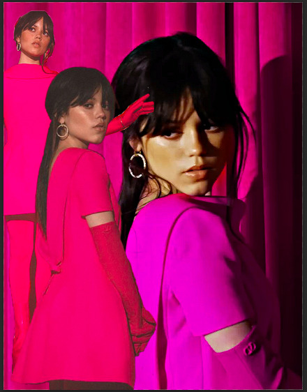
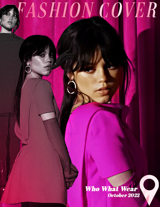
anonymous asked 💬 Hello there! Could you please make a tutorial on how you combined gifs and images in your edit THE RECENT FASHIONS OF JENNA ORTEGA? It's incredible. Thanks!
tysm for this ask 🫶🏼 below the cut is a step by step on how to do this kind of set. i will be using photoshop 2023 for this tutorial.
original inspiration was taken from sith-maul’s zendaya lookbook gifset !
step 1: cropping
for this style to work, your gif needs to be tall. the best dimensions are 540x700. make sure you don’t have too many frames because the bigger the crop, the bigger the file size !!
the other thing you want to do is crop it a little to the left or to the right, whichever works best. this is so you can slot in the photos of the outfit :)
step 2: colouring
to make the whole thing more cohesive later on, how you colour your set is important. for the demonstration, i’m using a clip of jenna from her interview with who what wear, which has a lot of easy to manipulate colours. because the main colour is obviously pink, i’ll use a colour balance layer, a selective colour layer and a hue/sat. layer.
be mindful when using hue/sat and colour balance that you’re not whitewashing your subject or dramatically altering their skin tone. if there is low movement in the gif, you can use layer masks to prevent this.
you can see here that there’s a huge difference in the old vs. new colouring, which is what we want !!

step 3: source your pics
probably the easiest step. you can either just google search for pictures [person] [event/photoshoot] is the best way to search for that, or you can search for something on pinterest. you want one picture that’s ideally head to toe, plus another showcasing the outfit from around waist up.
step 4: edit the photos.
now that we’ve got our photos, load those into ps. once loaded in, you’re going to want to go to select > subject and then go option + cmd + x (for mac, i’m sorry idk the windows prompt !) and then just paste that on a new layer.
depending, the photo may select some of the background. but there’s really nothing you can do about that, so you just have to tidy it up manually using the eraser tool.
now my photo looks like this !

crop the photo to the same size as your gif and repeat the same process for the other photo.
step 5: placement of the photos
first off, duplicate your photos onto the gif. then, resize them to your liking. ideally, you want the full shot going from top to bottom on the gif, and the medium shot positioned down from it.
i also make the medium shot a little bit smaller, so we can highlight the head to toe. as well as that, put the head to toe shot behind the medium shot by swapping their layer orders.
here’s a ss of what mine looks like, just to give you an idea.
step 6: colouring the photos
first stop: add a black and white gradient map. completely ignore the fact the gradient map will go over everything; we’ll fix it in one sec ! colour the photos as normal: curves, levels, anything you do in your normal colouring process. just make sure all the layers are underneath your gradient map layer !
on top of it all, add a gradient layer and change it to a colour in the outfit. you can click and drag it in all different directions to get to a good point. don’t forget to change the angle of it so it fits best !
for example, here’s mine:
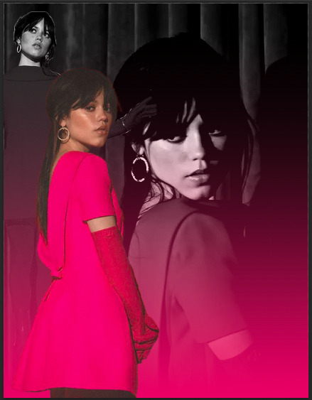
you can see that the gradient gradually goes up on the outfit, leaving it almost half half.
now, select all the layers that are over the first picture and right click > clipping mask. this clipping mask will make sure that all your colouring layers ‘clip’ only to your picture. DO NOT select the picture layer as well. this should be what you have:

the arrows show that it has clipped to the subject.
now, just repeat those colouring steps on the other pic so you’re starting to look like this:

OPTIONAL: i usually change the blending mode of my gradient layer to ‘colour’ so it blends nicer on the picture, it’s not compulsory, but the result looks better. you can also choose to sharpen your pictures if you like !
step 7: typography
there’s two main things you want: the title of it (this could be a fashion brand or maybe a show/film name if you want to do this for a character) which will be in a statement font as well as the location or the date (could be the episode and the episode air date or the film premiere date) to start, create your layer above the colouring layers for the gif, but below the pictures of your person.
for this tutorial, i’m using the font ‘magazine’ but you can really use any font you want, as long as it stands out against the cover.

next up, you’ll want to search ‘map pin point png’ on google and get your little pin point icon. this will be so you can add the location and the date, or whatever you want to add. i change the font that i use for the subheading, just to switch things up ! you can do whatever you like though.

here’s what i’ve got for my subheadings. make sure that you’re placing it in the empty space on the bottom corner, not on top of your pictures.
and that’s it ! you can add any other finishing touches that you’d like, or do any other effects that you want. this is simply a base for you to work off, but you can change things wherever you deem it necessary to improve upon. apologies for this being so long 😭 hopefully it helped a little though !
#*tutorial#asks#gif tutorial#clubgif#userriel#tusercat#usercim#usersmia#userv#thingschanged#userzesty#userlp#userpjo
39 notes
·
View notes
Text
12 watercolor techniques in one page
Explore 12 Essential Watercolor Techniques in One Page
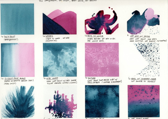


Exercise to explore different expressions and see what watercolor can do. It's an opportunity to test new paper and watercolor paint, creating a valuable go-to glossary for future illustrations.
Remember, this is an exercise, a practice - embrace the process, without focusing on final artwork results.
Tips:
Note down the paper and watercolor type for reference. Different paper textures provide different results. Understanding the materials is key.
Use an easy-to-peel washi tape to create a 4x3 grid. Use a hairdryer to remove the tape glue for easy peeling when done.
Enjoy.
1. Solid colour


Apply a generous amount of solid watercolor paint, keeping the surface wet.
Use for: Creating solid backgrounds
2. Layers

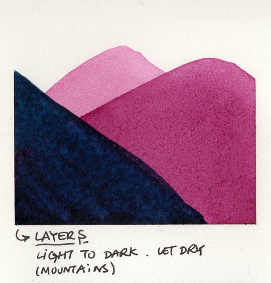
Begin with a light, watered-down paint. Allow it to dry completely. The first layer is always lighter, in the background, far away.
Apply the second layer darker, adding depth and perspective. Let it dry fully.
Add a third layer.
Use for: Mountains and enhancing landscape perspective.
3. Spots on colour
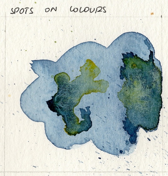

Create a shape with watered-down paint. Let it dry.
With a different color, add spots (small, concentrated areas of paint). Depending on the amount of water and drying time, these spots will create a smooth overlapping effect.
Use for: Mimicking animal skins
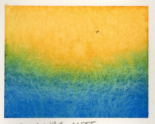
4. Wet color spots


Create a shape with very wet watered-down paint, with sharp details.
With a different color, add spots, and let it freely blend. Watch the paints blend and create a feathery effect. The first layer will define the space where the second paint can go.
Be mindful of water quantity, as it can crumble the paper.
Use for: Silhouettes.
5. Soft blend of two solid colors


Apply two different watercolor paints, each one starting on the opposite side. Let them touch.
Blend with an empty dry brush (no water, no paint).
Use for: Foggy or smooth sky transition effects.
6. Wiping away
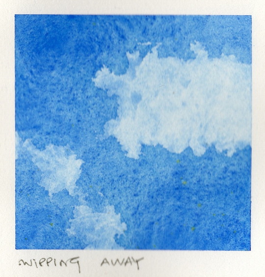
Apply very wet watercolor paint.
Use dry paper tissue to soak areas, revealing the paper underneath and creating create fantastic random shapes.
Use for: Clouds.
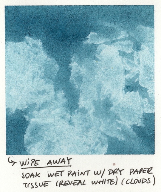
7. Texture
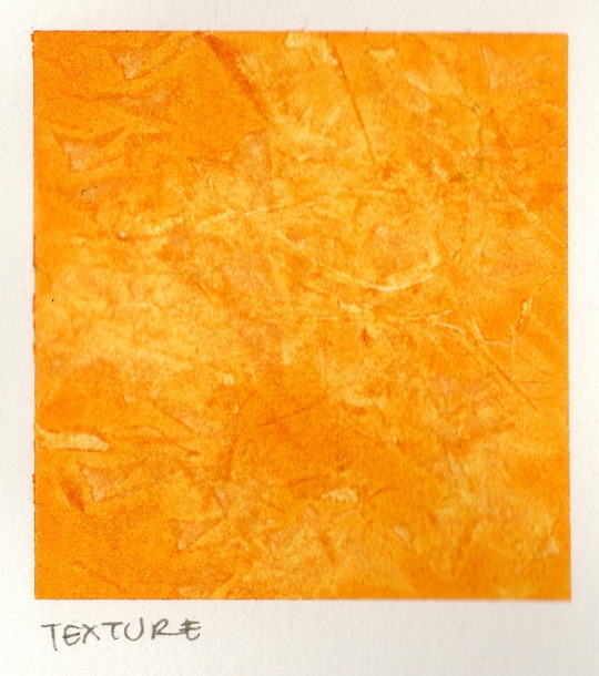

Apply very wet watercolor paint and allow it to partially dry. Soak areas with newspaper to create a sharp crack effect.
Use for: Clothes and movement.
8. Spots with brush


Cut a piece of paper to mask the area that will not receive paint.
Splash paint with a brush. Use your finger horizontally to tap your brush.
Use for: Creating textured spotted backgrounds.
9. Dry paint brush


Use paint on a dry brush. Do not use too much water, use solid paint.
Dry the brush slightly on a separate napkin, then open the brush fibers before applying.
Use for: Grass and fur
10. Wet paper


Wet the paper with clear water. Let it dry, but not 100%. (It will take some time to dry.)
With a different color add spots to create blurry non detailed shapes. Do not use too much water with the new color. It will blend very smoothly.
Use for: Background elements like distant trees.
11. Water on paint
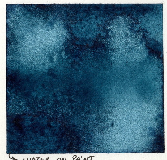
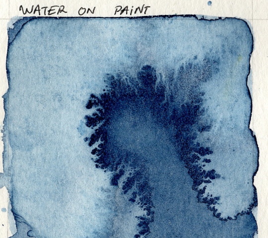
Watercolor solid wet paint (prefer a dark shade). Wait a few seconds… when the paint is still wet, drop clean water drops.
Tip: For a more dramatic effect, add grains of salt to the water drops that will absorb and distort the cleared-up areas.
For: Underwater effect.
12. Wet colours meet

Two different very wet watercolor paints, each one starting on the opposite side.
Allow them to blend naturally.
---
Enjoy the unpredictable and be surprised by the effects. This exercise is a learning opportunity
An exercise in letting go.
#WatercolorTechniques#ArtTutorial#CreativeProcess#PaintingTips#WatercolorInspiration#ArtisticExperimentation#WatercolorTips#ExploreWatercolor
4 notes
·
View notes
Note
Hiya! I was thinking about the remastered animation Cel style evil Conan post you put up recently, and I just wanted to say how amazing and impressive it is! I love love love the look of old animation and you really nailed it. I’ve been trying for ages to mimic that look myself and haven’t been able to crack it, so if you ever wanted to talk about your process on this piece, I’d be all ears! Wonderful work, again!
Waaah hi liv!! Thank you, I'm so glad you like it, and that it comes across so convincingly!! One of my favorite things is to make digital art that can have a second life as a different medium, and I wish I had an easy answer for you as to how I go about doing that, but the truth is that it's mostly the result of a lot of trial and error. And a metric ton of references.
Here's a quick process video of my last piece to try to show off what all my layers are like, but I know it's mostly useless without an explanation!! I can't explain it all because I was kinda winging this one for funsies but I can give you general tips for this particular look.
Clip and words below the break!
As a disclaimer I didn't really go into this one intending for it to come out looking the way it did. So it's more of a hybrid look between my usual "clean" digital rendering and a fake screenshot.
[1] Reference, role models, and inspiration - I'm not kidding when I say I used to tote around an entire, dedicated folder filled with printed reference. These days that usually takes the form of about a million browser tabs ( ̄▽ ̄) I stare at early Detco and the first six movies a LOT. And Cowboy Bebop. And Akira. And and [insert your choice of 80s-90s anime film]. Depending on the exact look you're trying to replicate, you can always look to a more era-appropriate movie.
I love pulling inspo from films in particular (both animated and live action) because cinema is a whole other art that employs all kinds of techniques for our usual considerations (like lighting and framing), and looking to them can inspire some pretty poignant imagery, especially when you're trying to create something that's meant to mimic a single-frame capture of exactly that. I don't keep up with movies or anything, but I do have my favorites, and it didn't really occur to me to look to them until some of my favorite artists revealed that they do the same with theirs.
For this particular piece, I also had to establish some consistency with the other piece that bookends the scene, so I actually referenced my own art, too.
[2] BIG canvas! I usually work at two or three times the size I expect to export. Following standard aspect ratios for animated productions can help sell the look. Letterboxes have their own ratio, too, if you choose a widescreen canvas; and subtitle fonts are usually standardized to certain font families and colors since their primary purpose is to help make the media accessible. All this is usually a quick google search away, OR… if you're like me, and you still watch physical media… you can just yoink most of this from a real DVD.
[3] Thin lines!! I still can't quite nail the right line weight for these-- I definitely went too thick here-- but they tend to be very fine. And imperfections are good! Nobody has a perfectly steady hand, especially with traditional cels.
[4] Less is usually more when trying to sell a screenshot look… it's easy to over-ink and over-render and-- in my opinion-- restraint is necessary to sell it. This is the hardest thing to explain… it's design vs. rote emulation, I think. But that said, digital aids (next point) do a lot of the heavy lifting in these - as far as the art is concerned, a little will go a long way! These were some of my easiest lines and shading. So on that note…
[5] …Blending modes, masks, and filters are all your friends o___o I get a lot of mileage out of the default tools already available to me in the art software. There's plenty out there that's available for free, too! I recommend you find a fake anime screenshot tutorial, follow it once, and just go nuts when you get to the part where you can play with these settings. The make-or-break for a convincing screenshot-- in my opinion-- is texture and bloom, and all these digital tools will help you achieve that.
I hope this helps!! Hopefully the video can help you see a bit more of the process since I can only really offer tips. It shows everything at full size so you can see the details, so go nuts!
Thank you for the ask! Beaming plenty of good luck that you can find the look you want!!
ALSO I REALLY HOPE THIS IS THE PIECE YOU MEANT I'M LITERALLY ABOUT TO QUEUE THIS UP AND JUST REALIZED THE ONE THAT CAME BEFORE THIS IS MORE REMASTERED CEL ANIMATION LOOK SKSKSKSK
the same tips apply though so i hope they still help all the same :3c
10 notes
·
View notes
Note
Can you please do a blending/overlay tutorial!?!?!
ohhh i can definitely give you some tips on how i do it!
so, assuming you know how to make gifs and use the timeline/smart object gifs, this is how i usually go about it. I use photoshop cs5, for reference.
i'll use this recent gif from my don’t blame me gifset as an example:

1. Choosing what to blend
It's much easier to blend 2 gifs together when at least one of them has dark areas. Two bright gifs don't usually work as well, but it's still doable with some work. For example these 2 moments are both mostly dark, so it makes things easier:

2. Bringing 2 gifs together
To put 2 gifs on the same canvas, what I usually do is:
In one of the gifs, I select the size I want with the crop tool (540px by 400px in this case). You then drag the resize box how you want it on your gif. This will resize and crop your gif.
Then I go to the other gif and do the same thing. With that resized and cropped layer, I right lick on it, go Duplicate layer... and then choose to send it on my other gif's document. When both gifs are on top of each other you can start moving them around and blending them.
3. Blending options
Photoshop has multiple blending options that will give you many different results. What works best for blending gifs is usually the option Screen. This is what I get when I put these 2 gifs on top of each other, with the top group with the left gif set to Screen. Make sure the Screen layer is always on top.
I like to put the gifs in groups, it makes things easier (and tidier) further down the road, but it will work anyway with the smart object gif layers. For this particular gif, groups were not 100% necessary, but for more complicated gifs with different colorings, it's definitely a must in my book.

4. Layer masks
As you can see, this works, but there are definitely parts I would like if they didn't overlap, especially on the right ride. You can easily remove unwanted parts by painting them out with a Layer mask. In this particular case I want to remove the right side of the left gif, so I selected that group and made a layer mask by clicking on the icon at the bottom of the layers window. You'll get a white window next to your layer name. Select it. You then want to use a very soft brush and paint in black what you want to remove.
These layer masks act as "alphas" to drive the opacity of the layer. What is white will be at 100% opacity, and what is black will be at 0% opacity. You can definitely brush in some gray if you want an in-between look. Here I went full black.

This is the result I get after masking out the unwanted right part. Now I only have that one gif showing on the right side, instead of a blend of the two:

5. Painted layer
So you can see other characters still showing through on the left side of the gif. You can definitely go and paint the parts you want to remove on the right group as well, but if your layer masks overlap, it can create some transparency in your gif and we don't want that. Instead, I create a new empty layer by clicking on the icon, and put it in between the two groups. This layer doesn't need a different blending mode. With a soft brush and the black color, I go paint where I want to mask the right gif, so it doesn't show on the left side.
I played with that layer opacity because I liked to still see some of the right gif's details peeking through. Here's the result:
6. Final touches
At this point I will usually sharpen both gif layers and make the coloring, and then I will adjust the layer masks if I feel like I need to. In this case I thought it was fine as it was so I didn't change anything.
For this one I simply put the coloring on top of both gifs because it worked fine for this example, but you can also have a different coloring for each gif if you want. Just make sure you put the two different colorings in their respective gif groups. Remember that the top folder should always be set to Screen for the blending to work, even with coloring layers/groups inside that "main" gif group.
And that's pretty much it! This one was quite simple, but it's incredible what a screen layer and some layer masks can do :) I hope it helps!
Also, @usergif has an amazing tutorials directory for more resources if you need! I always find great tutorials there.
#*ps help#resource#usergif#blending tutorial#userrin#tutorial#uservivaldi#userkosmos#usermills#usermarsy#userdean#userelio#usermadita#flashing gif#alie replies#anonymous#tusereste#userives#tuservaleria#usermorgan
664 notes
·
View notes
Text
oc asks: character design edition
(asks are from this post!)
FACE & FEATURES
glance: At first glance, what stands out most about your OC's appearance? What's their distinguishing feature?
For most people it's definitely the scales, but for lizardfolk specifically it's their colors. Blackscale lizardfolk are widely believed to be descended from black dragons, while Poison Dusk lizardfolk have the unique ability to shift the colors of their scales to either blend in with their environment or stand out, attracting others to them (or drive rivals off) with vivid displays. Because Bash can't shift the color of his scales, he's essentially peacocking all the time.
face: Describe your OC's face. What's their smile like? Are their orbs cerulean? What would someone notice first when looking at them?
Bashmuz has a broad and short snout, rounded at the edges in contrast to his parents' longer and pointier faces and streaked with black scales. This, combined with his hefty jowls, gives him a relatively soft (by lizardfolk standards) looking face, though his general disposition does a lot to undo that first impression.
He's not exactly known for the warmest of smiles since he has no lips to shape them with, so typically he just flashes his teeth in a stiff grimace - the more the merrier, unless he's hissing at you.
His eyes are probably one of the first things people notice - they're an unusually bright, sickly green that almost looks like they're bubbling at certain angles, with black sclera and slit-like pupils. His resting face is so flat and laser-focused that people tend to feel like they're being pinned under a layer of glass if they're not used to it.
Second thing people tend to notice is his tongue - dark blue, forked, and frequently tasting the air (or words?) as people speak.
stature: What's your OC's body type? How tall are they? Do they wear clothing to accentuate their look or do they try to mask it?
I looked to tegus, iguanas, and monitor lizards when designing his body type: short, thick limbs, stubby fingers with long claws, long rectangular torso and a broad, chunky tail.
He's much, much shorter than the average Blackscale lizardfolk, and a great deal taller than the average Poison Dusk, it still ends up putting him a full foot shorter than the average lizardfolk at 5' flat.
motion: How does your OC move? How does their clothing help or hinder their range of motion? Are they flexible, coordinated, clumsy?
His movement is far more stiff on land compared to water, though in general he tends to move slowly if there's no sense of urgency (or danger) nipping at his heels. His claws can often be unwieldy when it comes to using smaller tools, but years of practicing medicine on himself and Dim have otherwise given him a preternaturally steady hand, and whatever he lacks in flexibility* he makes up for in decisive lunges when hunting.
*His tongue is a different story.
stillness: How does your OC act while still? Are they fidgety? Do they have any common gestures or tics? Does their clothing affect how they hold themselves while at rest?
Bash is definitely a lot more fidgety when he's in Waterdeep - or in any place where the Dragon's Wards are prickling underneath his skin. One of his most common surface tics is scratching; the intensity of it and location are a pretty reliable barometer for how much discomfort he's feeling, with the elbows and forearms getting the worst of it.
There is, of course, the classic tongue flick, meant to measure and taste the truth in someone's words, the flaring of the ear fins when startled by sight or sound, and the asynchronous blink of his eyes as he stares at someone. The ear fin is the only intentional threat display of the three, though all of them tend to leave most strangers mild to moderately discomfited.
Cheeks are for digesting information and/or feelings, puffing them out to make room for them and tapping at them with his claw to help speed up the process.
The tail tapping is an instinctive movement he makes when chasing after a lead or planning an angle of attack; the vibrations on the ground are thought to attract glowworms and other prey to the surface, and it's also something he's picked up from his dearly detested (and very dead) landlord.
In general, he tries to avoid excessive movement that might strain at already worn seams in his clothing; the tics he does have are limited in motion and range, and often done slowly.
canvas: Does your OC have any scars, piercings, tattoos, or other markings? Do they display or cover them up at all?
None yet, though now that the gang has a little bit more spending money Bash is definitely going to get some piercings for cool sensory/pain/aesthetic reasons and, if he's able to find the right person for it, etch some magical runes on his scales for similar reasons + spice up his life and get his hands on some magic that isn't from Semuanya for once.
CUT & CLOTHES
night: What does your OC wear to sleep? Do they have a favorite pair of PJs, or are they more the birthday suit type?
Unfortunately for everyone Bashmuz is a pussy out kind of lizard, but he does make up for this by burrowing himself in as many layers of blankets, clothing, and miscellaneous detritus he's accumulated from adventuring as possible.
day: What does your OC wear on a normal day? Why do they default to those clothes? Do they wear similar things, or do they change it up?
On a normal day Bashmuz wears as little as he can get away with, which is usually just his scratchy pants made of a 60/40 blend of sackcloth and patches, and a coarse. Until he started adventuring with the Dreamers, clothes were a frivolous expense in his eyes when the Sargauth had enough bodies floating downstream for him to fish up whatever he needed. He's very much a creature of habit and sticks to clothes and textures that are familiar to him, so he'd rather patch what he has to the last fraying thread than try something new.
formal: What's your OC's formal look? Do they like dressing up? Do they have different looks for different occasions?
Whatever Cressida or the more fashionable Dreamers put in front of him. Until very recently Bashmuz didn't see the point in dressing up - and though Mina has convinced him there's at least some benefits to making an effort, he'll only do so if he thinks it's "necessary" and/or if he'll otherwise get turned away at the door.
informal: What's your OC's lazy-day look? How do they like to dress when they're winding down?
Honestly Bash doesn't really have discrete categories for clothing like this; he either wears his clothes or he doesn't. And for the sake of the Dreamers, he's better left keeping them on.
outerwear: What's your OC's outerwear situation? Jacket, sweater, cloak? What sort of weather do they deal with most and how do they protect themselves?
Early on in Bashmuz's adventures he salvaged a handmade cloak from the sewers, lovingly crafted by Malik's grandmother, and right now it's the closest thing he has to outerwear. Skullport has a pretty consistent climate with humid air, and while the lower levels run a bit colder, the Guts and Garters typically had enough warm bodies to help him get through the winter months.
Going to Luskan and other places with extreme cold or dry air will definitely be a challenge for him, and he'll have to get himself something more durable and more suited for inclement weather than the shitcloak.
footwear: What does your OC wear on their feet?
Nothing! Bashmuz has never lived or walked anywhere that his scales couldn't handle, though as the party moves on to colder places like Luskan he's going to have to figure out how boots work.
road: What does your OC wear while traveling? Do they have high-quality equipment, or are they making do? What does their gear look like?
Travel gear is currently not different from his day gear, though he's definitely going to get himself more durable/travel friendly clothes before their next big adventure.
armor: What kind of armor does your OC wear? Is it well kept? Bonus: where does it come from? Is there a story behind it?
His scales are his armor! And he'd prefer to keep it that way - armor is cumbersome and slows him down.
arms: Does your OC have any weapons? What weapons do they carry, and how do they wear them when they're not fighting?
It used to be just teeth and magic that carried Bashmuz through earlier battles, though now he has a mace to help him hit things without getting ichor gunk in his mouth. When he's not fighting he just loops it in his belt, ready to pick it up again whenever he needs to.
roots: Is your OC's look inspired by any specific style of clothing or fashion trend? What are the roots and/or inspiration for their look?
Bashmuz's looks are heavily influenced by crustpunk and leatherdyke subcultures, adapted and filtered through a setting and era appropriate lens with some bone jewelry as a nod to his lizardfolk roots and upbringing. I very much wanted him to look like someone who hasn't spent a copper on his clothing and either scavenged or made everything by hand in season 1 of the campaign.
Though old habits die hard, I'm excited to see his look grow and evolve in season 2 and beyond as he gets a bit of money to invest in gear more specifically tailored to his looks and tastes.
texture: Does your OC favor any specific kinds of cloth or textures? Is there anything they can't wear or don't like? What sort of fabrics do they prefer?
Bashmuz actually has a preference for coarse textures like hemp or sackcloth; especially in Waterdeep where the Dragon's Ward is inflicting constant sensory hell, wearing rough fabrics helps keep him grounded. This doesn't mean he'll turn up his nose at smooth fabrics, though - leather is another favorite of his, thick and weighty and a good heat insulator to help with thermoregulation.
While he's attracted to the finer fabrics in life, Bashmuz has never really been one to take good care of his clothes, so they often get shredded or quickly gunked up by the Sargauth or whatever ichor corrupted being showers its blood over the party.
wardrobe: How big is your character's wardrobe? Do they wear things threadbare, or can they afford new clothes often? Are they any good at mending and repairing their own clothing?
Pretty big all things considered, but mostly as a consequence to hoarding years' worth of threadbare junk and mending it down to the last fiber holding it all together. Even though he's able to afford newer and better clothes now, it'll take some convincing for him to part with his coin (though the threshold is a lot lower for a skilled and fashionable caster like Mina or Eminae.)
ACCESSORIES & ACCENTS
bling: What jewelry does your OC wear? Does it have any meaning?
Bashmuz has a handful of lizardfolk teeth strung around his neck, donated from his father's skull. There are a few characters etched on it in Draconic that suggest they were once enchanted with a minor Guidance spell, perhaps meant to aid in concentration or prayer, but the magic has long since dried up.
He also has a couple studded leather armbands after noticing that patrons at the Guts and Garters who wore leather often shared the same interests (biting) as him.
hair: How does your OC wear their hair? Does it have some kind of meaning?
Bashmuz is crestless and has no (feather) hair which means he's double bald, but it's the one bit of asceticism that he can get behind so he's not bothered by it.
makeup: Does your OC wear makeup? How often? What kind? Why do they wear makeup, and do they like it?
Very, very rarely - he's only ever worn it for ceremonial purposes and the association is too strong for him to consider wearing it for any other reasons.
favorite: Does your OC have a favorite article of clothing or accessory? What is it? What's the meaning behind it? Do they wear it all the time or do they wear it sparingly to keep it safe?
The shitcloak is currently his favorite article of clothing, and Bash wears it everywhere he goes. While he has more than enough money to get another cloak, it's one of the first fancy mage things he found and got for himself, so he's reluctant to let it go. It's a testament to his friendship with Dim that he was willing to offer it in exchange for help with a cure.
change: Has your OC ever drastically changed their appearance? Significant haircuts, big tattoos, complete wardrobe swap, etc? Why? How do they feel about the change?
Complete wardrobe swaps are avoided as often as Bashmuz can help it, but water damaged and moth eaten clothes looted off bodies don't have the longest shelf life. That said, he's been pretty consistent with his current outfit choices outside of formal events, though once the party moves to Luskan I'm sure he'll be absolutely thrilled (not) to have to find a whole new wardrobe to avoid getting hypothermia.
alternate: What would your OC's alternate universe look be? If they're a fantasy character, what's their modern look? If they're sci-fi, what's their fantasy look? What AU would you want to see your OC in, and how would they dress themself? Bonus: Prompt an AU!
Cybergoth. Club kid. Leatherdyke. Crustpunk. Mash it all in a blender and that's what modern Bash would look like. I think in a sci-fi setting if the tech was advanced enough he'd definitely try to make himself into a cyborg or some kind of AI consciousness because what better way to achieve immortality than through transhumanism?
7 notes
·
View notes
Note
💝💌 gif maker appreciation post! post a link to your top 5 sets and tag 5 other creators to do the same 💌💝
thank you, kind anon! I've sat looking at this for a few days, but Jackie just asked me what my favourite set I've made this year was, so I had a dig in my archive and I'll link some here too.
This is my favourite I've made this year. It's my pinned post, so that probably gives it away 😂 but I've giffed these boys so often, I had to put a lot of time and effort into thinking of something different for them. I had a lot of fun trying out different layouts and different information. There's probably half a set worth of scrapped gifs for this somewhere.
The first gif of this came out so well. A lot of masking and fiddling, but it really captured what I wanted to show.
Did I mention I like blending? I do! I love adding layers to scenes this way Blending my beloved.
Much as I love blending, typography is my behated. I am so bad at it. So this one took some work, but I am pretty happy with the results!
I also love making templates - there were some great Netflix ones, but I wanted to have a go at an up to date Netflix UK one. Plus I had fun making up an ongoing storyline.
tagging @nyx4 @aheartfullofjolllly @yibo-wang @eohachu @dimpledpran
12 notes
·
View notes
Note
Hi! I really love your Ikaris + anti hero set and I was wondering if you would be willing to share how you did the glitch in that? It’s really pretty!!
Hi!
Since I alternately used glitch, overlay, and transition gifs in the Ikaris set, I had a slightly different processes for each type of gif. The starting point for all gifs in my set was individually cropping, sharpening, and coloring each shot. Once I was done, I converted all layers (coloring + smart object) back to frames (explained in this post). At this point, things diverge a bit.
For the transition gif, I simply figured out where I wanted to start the transition, selected all frames from that point on, pasted the frames from the other scene over them, and then increased the opacity of the newly pasted frames by 5% with each frame until I reached 100% opacity. (You can also do this at 10% per frame, but, when possible, I prefer a smaller, more gentle transition).
For the overlay gif and the glitch gifs, I continued as follows:
After converting all layers back to frames, I used the layers menu/box to select every layer EXCEPT for the very bottom smart object layer (it should have the little smart object symbol on it):

I then converted the selected layers BACK to smart object and copied that smart object (which in the timeline, should look significantly shorter than the smart object layer below it) into a new document. I would then repeat the same process with whatever other shots I wanted to use in that gif. After this point, things diverge again:
For the overlay gif, I simply applied layer masks to both smart objects, set the top scene to overlay and used layer masks on both scenes/smart objects to erase or reduce the opacity of different elements of each scene and thus create a blending I was satisfied with.
For the glitched gifs:
I used this tutorial as a guide. However, rather than use multiple copies of my smart object with different layer masks, I duplicated each smart object only once. Then, on each copied layer I used the rectangular marquee tool to select multiple different parts of the layer. Aside from that, I essentially followed the tutorial as written, aside from leaving the blue channel selected rather than the red channel.
Explaining how I transition between scenes is a bit tricky, so, before I attempt that, here is what my timeline for the first gif looks like:
As you can hopefully see, I start with the first scene and then introduce the second glitched version of that scene/layer close to where I want the second scene to start. After a few frames of scene one glitch (it is SUPER hard to judge how many frames your smart object is currently set to show for, especially when working with more scenes or longer scenes, so I honestly spend a lot of time going back and playing with length when I do gifs like this), I introduce the second scene's glitch layer (in the above image, that is the selected layer) and then, after a few frames of both gifs glitching, I introduce the non-glitched version of the second scene, and, after a few more frames, have that non-glitched layer as the only visible layer.
For the fonts, my settings were fairly simple: type layer set to different, drop shadow, gradient overlay set to color. I used BlackCasper and Victoria (which I got in a font pack posted on here centuries ago and which I can't find any trace of online anymore). (On the first two gifs, I should note that I included the type layers in the smart objects).
#elysia's inbox#photoshop help#gif tutorial#i don't know if this makes any sense but i'm about to have family visit so it was now or *never#*(an unknown number of days because my parent is not good at communicating their plans!!!)
7 notes
·
View notes
Last Seen Blogs
rygacripto
Ileana Cosânzeana
helpiamlostsomewhereinthegarden
Just Another Incorrect Quotes Account
reitziluz
Aha! You've discovered my rotting bones.
furballtsarina
doodling is love

ceciliarosa0228-blog
net para estilo