#which applies to all matters of aesthetic design and art
Text
I have exactly three pillars of my design ethos which are as follows:
1. There’s a time and place for everything
2. I make this look good
3. Watch me
All other ethos are pretentious, thank you, good day.
#and they made me art director so I unfortunately now convinced of my teachings#truly the first one is more it#and I mean damn well what I said#there is no good or bad design only what works for the project#good or bad as aesthetics are arbitrary made up concepts that us monkey brains made up to seem more important#plus overall taste in the good v bad sense is a classist and therefore racist and often misogynist construct#which applies to all matters of aesthetic design and art#and if I see one more colleague mocking things that look amateurish or making the same damn fucking jokes about the same damn fucking fonts#I'm going to write a text book then whack them with it#credit to my ethos go to#chef from south park#agent j in men in black please put on your shades when you read that one#and liv morgan wwe superstar#this is me as a heel#maybe i should also add#why are you booing me I'm right#design
9 notes
·
View notes
Text
Bestiaryposting Results -- Gligglae
Sorry this is later than usual; traveling for the holidays makes it difficult to keep up with this sort of thing. The smart move would have been to write it up a couple days ahead of time, then on Monday just update it with anything new that had been posted since, but see, what happened was that I did not do that. Instead, I tried to type this up Monday evening in between various family obligations, realized I didn't have time to do it properly, and just shoved it in my drafts. Then all of Tuesday was taken up with the long drive back home from where my family lives, and now you're getting it on Wednesday.
(Also, don't worry, I followed all CDC guidelines appropriate for someone who had recently had covid, and wouldn't have traveled for the holidays at all if I hadn't been without a fever for 48 hours prior to departing. Plus I drove instead of flying, didn't visit anyone but immediate family, and had a mask the whole time, so even if I am still contagious somehow, exposure was pretty minimal.)
Anyway, the entry that our artists are working from is here:
And, of course, all previous material on this matter can be found at https://maniculum.tumblr.com/bestiaryposting.
I think a larger number of people than usual identified the animal in question right off the proverbial bat, because this one has some pretty blatant tells, but as always I appreciate everyone trying to put it out of their minds.
So, anyway, in rough chronological order:
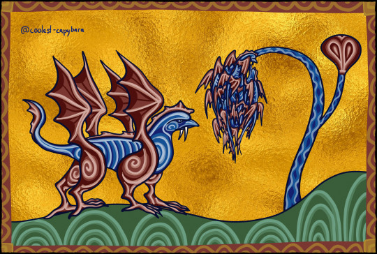
@coolest-capybara (link to post here) (thank you for providing your own alt text, I really appreciate it) brings us her usual impeccably medieval-stylized rendition -- the swirls and curves in this one give it a really interesting vibe, I think. We can see the Gligglae in full-body profile on the left there, and a group of them doing their cluster behavior on the right. The, like, griffin/cockatrice/vampire look is pretty great, also. I enjoy the overall design, which you can find some discussion of in the linked post. Gold foil also a nice touch.
Coolest-capybara also notes that the entry is very interested in the ways in which the creature is "almost, but not quite, entirely unlike a bird," and I can explain why that is. It is because this entry is in the Bird section of the bestiary, so officially this is a bird -- I mean, it flies, what else can it be -- but it's sufficiently un-bird-like that it really sticks out to the authors, so they need to explain the ways in which it's Doing Bird Wrong. Everything else in this section does X, so we need to point out that this one does Y, kind of thing.
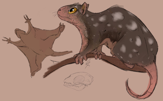
@silverhart-makes-art (link to post here) has drawn an absolutely adorable little Gligglae. (Adorable if you have my sense of aesthetics, that is -- I suspect if you're among the portion of the population that finds aye-ayes more creepy-looking than cute, that might apply here as well.) There's an explanation of design decisions in the linked post, including a number of references to real animals that provided inspiration. I like the decision to play up the "lowly" and "mean" part of the description by making it small and kind of scruffy. And the general concept of blending "gliding rodent" with "nocturnal primate" to make an arboreal mammal with elements of both really worked out well here, in my opinion.
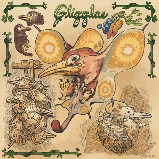
@aethereaii (link to post here) has done this beautiful piece in a style that kind of gives "19th-century naturalist" vibes. (Actually, it makes me think of James Gurney, but I suspect that association says more about my childhood reading habits than anything else.) This is a great design in my opinion, and you can find some brief discussion on design decisions as well as an earlier version of the Gligglae in the linked post. The earlier design is also very good, but I agree with Aethereaii that this one is a step up, particularly with the Anomalocaris-inspired faux-wings. I also really like the inclusion of the juvenile Gligglae (Gligglings?) clinging to their parent's back in the corner there.
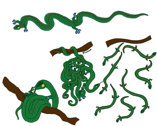
@karthara (link to post here) decided to go in a reptilian direction with this one, which (a) works well and (b) caused me to spend a chunk of time reading about flying snakes on Wikipedia just now. So in this version, the "rowing motion with its skin" is a description of the Gligglae flaring its ribs and undulating through the air -- which I genuinely think really makes sense. The entry seems to legitimately disagree with itself about whether this critter has wings (or, taking it entirely literally, it has wings but flies through a completely separate method that specifically does not involve said wings, which I think we're justified in deciding is Wrong), so I think going with such a non-wing-like flight method works here. Also like the concept of making these very cuddly (and apparently loving, according to our bestiary author) creatures into a type of animal that usually isn't seen that way. The linked post also contains some brief notes on design decisions.
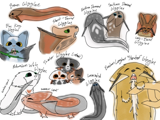
@strixcattus (link to post here) has, as per usual, provided a really excellent modern-naturalistic description of the creature they've designed in the linked post, and you should definitely go check it out right now. I'll wait.
... back? Okay good. I particularly like their interpretation of the "grape-cluster" behavior as a social group that's specifically not a kin group; and also the fact that said group is officially referred to as a "cuddle". The choice to make it a whole genus and show us several different wild and domesticated species, also very good, love it. As with several of these drawings, Strixcattus's Gligglae (Gligglaes?) are extremely cute -- which, really, does also fit the description provided in the entry. They're like tadpoles crossed with sugar gliders.
@cheapsweets (link to post here) credits Ken Sugimori's Pokemon illustrations as a stylistic inspiration, which I suppose explains why the Gligglae cluster seems to be hanging from a Sudowoodo. The linked post also draws certain parallels between medieval bestiaries and the Pokedex, which I think is actually pretty insightful. There's also a breakdown of their design decisions there, go read it. I think this is a pretty good rendering of something that is like a flying squirrel but distinctly not a flying squirrel, and I like the shaggy look of the fur.
Also, thank you for providing your own alt text.
@pomrania (link to post here) is, I think, the only person to take the bestiary author at their word that this animal has wings but flies through some other, non-wing-related method. You can see the tiny useless wings at the shoulder there. I really think that's fascinating as a concept: what evolutionary pressures would produce an animal that (a) has wings and (b) flies but (c) those two things are unrelated? Although this many appendages on a fur-bearing creature puts us firmly in the "alien biology" territory, so maybe it's silly to expect it to make sense by the standards of terrestrial biology. Regardless, I like it, and I think the decision to run with the "rowing" description by giving it those oar-shaped appendages is a good & creative one. The post linked above contains a fair bit of information on design decisions and the drawing process here -- there are sketches and everything.
@vindikat (link to post here) has interpreted this in a way I find really charming. The art is of course excellent, very well drawn, and I appreciate the effort that went into doing these different poses. However, I really like it from a worldbuilding perspective: this gives me the impression of a small species of griffin that's adapted to urban living, more pigeon/cat than eagle/lion. (Come to think, both pigeons and cats are examples of feral populations finding a successful niche, rather than wild ones that adapt to a city, so maybe we can speculate that these guys are also descended from domestic ancestors.) Also the Gligglae under the eaves there remind me of pictures of chimney swifts that have made the rounds on Tumblr.
The design is also generally very appealing; I think the extra wings and the long tail really work here. The linked post includes an explanation of the design decisions that I think is worth taking a look at.
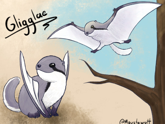
@moustawott (link to post here) has given us another very cuddly version of the Gligglae. I particularly like the wing design here, how it's kind of a mammalian version of a pterosaur -- Moustawott indicates that they were specifically trying not to draw the animal that they're sure this is, and I think the pterosaur-squirrel design here is a great way to make something that could fill kind of the same niche while being an unmistakably distinct creature. The little round head and eye markings remind me of a chipmunk, also, which is cute.
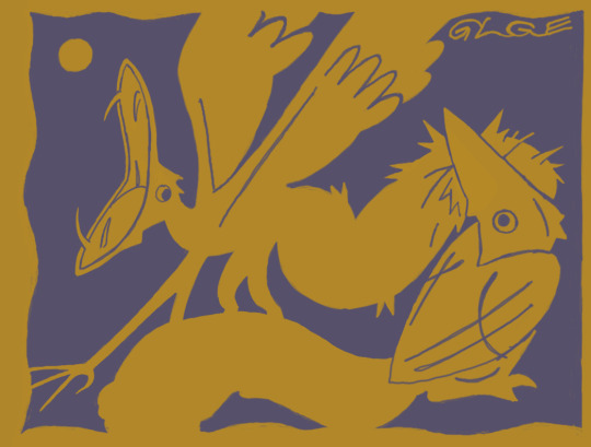
@rautavaara (link to post here) continues to do interesting stylistic stuff with their contributions. I like how the limited color palette here makes this look kind of like a single-block woodcut or similar relief printing. Like, you could plausibly see this as a design someone's carved into a wood block, then printed on mustard-yellow paper with purple ink. (I'm actually not 100% sure that's not what it is; I would just be surprised if someone actually went the extra mile of breaking out the engraving tools for my little bestiaryposting thing.) Very dynamic scene, also, and a charming creature design; love the huge mouths with pointy little fangs.
All right, these are all the ones that come up on the search; if I missed yours, let me know please.
(I have to apologize here for another delay that's absolutely my fault -- I would have had this out a few hours ago, but I got derailed by impulsively deciding to check out that Hbomberguy plagiarism video everyone's talking out, and... yeah.)
Anyway, as a number of this week's artists indicated, this one was really easy to guess, so the reveal seems a little pointless, but we have a format, so:
Obviously, this was the sheep.
What? Look, you can't make assumptions with these things. Some of these medieval bestiary entries are really counterintuitive. Medieval Europeans believed there was a species of small, highly-social, flying nocturnal sheep native to Ethiopia.
Really, it's in Pliny the Elder.
...
Yes, fine, I'm just lying to you for fun. It's the animal you all think it is, there are no flying sheep to my knowledge. Here's the Aberdeen Bestiary illustration.
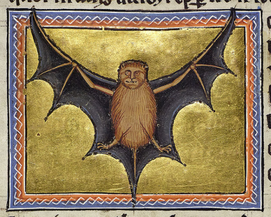
Yep, it's the bat. Oddly human face on that one, and generally I don't think this was drawn from life, but it's definitely a bat.
I do kind of find the way it's described in this entry kind of interesting, though. The confusion about whether bats count as having wings (even after having been placed in the "bird" category) is kind of odd, and the "rowing" description is not one I would have ever thought of. I very much like the declaration that the way bats huddle together is "an act of love of a sort which is difficult to find among men"; it's a sweet way to talk about a creature with a generally negative reputation, which contrasts interestingly with the fact that the author also thinks of them as "lowly" and "mean". You kind of get the idea of a creature that's a bit wretched but in a sympathetic way. "Scrungly", one might say.
98 notes
·
View notes
Text
I've included every Job I've heard people mention as speculation, no matter how unlikely I personally find it. Propaganda after the cut is all just my own feelings, and includes some very minor spoilers for recent MSQ events, Astrologian Job Quests, and the Shadowbringers patch 5.3 Dungeon:
CALCULATOR
PROS: They have had some fun with Math Bosses, haven't they. It is a theme present in the game, and with precedent in earlier FF games.
CONS: I can not imagine any configuration of this job that would function within the timing of FFXIV's combat. Applying simple Astrologian buffs is already tricky enough. Also, this was a real balance-demolisher in its main prior appearance.
GAMBLER
PROS: FFVI has proven fertile ground for Job design concepts, between the Monk and Machinist revamps. And Setzer's armor is already in the game.
CONS: Even more RNG dependent than Dancer? I don't much like the sound of that. And Astrologian has already claimed Cards as a primary tool.
GEOMANCER
PROS: It canonically exists in setting. And it is on the dwindling list of Jobs in FFXI that haven't been reinterpreted in FFXIV. Probably a pretty strong contender, except...
CONS: The Astrologian quests kind of ate its lunch, explicitly stating that they are heavily overlapping arts. That will be a common theme with entries on this list, Astrologian seems to be made of pieces of a ton of prior Mage jobs.
GREEN MAGE
PROS: The presumptive favorite in most of the chatter I'm reading, because of a symbol on a thing in a very "we're teasing new content" feeling MSQ cutscene that matches the design of Green Mage in one of the Tactics games (I think?)
CONS: Ok great but what the heck even is a Green Mage? Their whole shtick appears to be long-duration buffs and debuffs that would have been categorized as Black or White Magic in other games... and FFXIV has been very steadily removing those kinds of powers, aside from a handful of DoTs. If they crib this aesthetic, the actual mechanics will likely be something entirely unanticipated, or possibly overlapping with one of these other options, rather than a Buff/Debuff Mage. Or maybe they've just been removing long duration powers from other classes to... consolidate them? I really doubt it, but maybe.
NECROMANCER
PROS: It's a solid concept, an RPG classic, and the Necromancer Boss in the Heroes' Gauntlet dungeon looks sick. Rumor has it that all the bosses in that dungeon were concepts once considered as alternate branches of base classes in the same way Arcanist splits into Scholar and Summoner, before they ditched that design. In which case it probably would have split from Thaumaturge?
CONS: Rumor also has it that cultural considerations in certain key markets made this something SE didn't want to pose as a heroic archetype. Also, pet jobs. They've been pretty steadily gutting the pet mechanics of Scholar and Summoner, and I can't imagine they'd be in any hurry to add another full scale Pet Job. Maybe a Limited Job though. Also, in FFXIV the art to animate and control the dead seems to be closely related to the summoning of Voidsent, and Reaper is already doing the Demon Magic thing in a big way.
ORACLE
PROS: I'm gonna be real with y'all, can't actually think of any. I see this as having zero chance. But the name keeps coming up in conversation. So maybe I'm wrong, and the apparent fan support will keep the idea afloat.
CONS: Like Green Mage, it's mainly been a place to dump debuffs that originally belonged to other magic types. And the theme of prediction and prophecy has been thoroughly raided by Astrologian.
PICTOMANCER (A.K.A. Artist, Painter, Ink Mage, etc.)
PROS: As I mentioned under Gambler, raiding FFVI has been a solid move, and Relm Arrowny's power set deserves a less-buggy reinterpretation. Also Ink Mages are the only common enemy in the Heroes' Gauntlet that doesn't match a job we have available. Also Yoshi P's TMNT shirt at the first fanfest may have been hinting at Leonardo's dual swords and a Ninja's scouting armor sets for Viper, but it could also have been a reference to the Renaissance Masters that the Turtles were named after. He's clever like that.
CONS: The only reason this isn't my #1 guess without hesitation is that pesky Green Mage emblem. I have a theory though that Green Mage and Pictomancer might get combined and have the "green" be about painting landscapes, in which case it might also be borrowing from Geomancer turf a little. Who knows!
PUPPETMASTER
PROS: Also on the short list of FFXI jobs that haven't been reinterpreted. Mammets are a big part of this setting and there would be a lot of cool aesthetics to potentially draw on.
CONS: Pet jobs. I just can't see them ever doing another full Pet Job. Also the FFXI version was a blend of technology and martial arts, not a caster per se.
TIME MAGE
PROS: One of the missing FF classics, with a lot more potential spells than you expect, since it also usually deals with Space Magic.
CONS: Haste powers and traits became a huge balance headache in FFXI and I can't see them rushing back into that. Also, once again, Astrologian already swiped several key ideas.
91 notes
·
View notes
Text
What is Boob Armor ?

Boob armor is an unfortunately common fantasy trope, describing a type of breastplate (quite literally) that fits tightly over a female character’s chest. Usually the cuirasse will be shaped in such a way as to evoke the naked body while still claiming to be chest armor, but the trope can be applied to any misshapen bowl things.
A common way to justify the existence of boob armor - also known as tiddy armor by connoisseurs - is to refer to the Archaic era muscle cuirasse, a Greek piece of bronze armor made of two plates, front and back, mimicking an idealized version of the muscles underneath as defined by contemporary beauty canons. As such they look in all ways like the statues of the time.
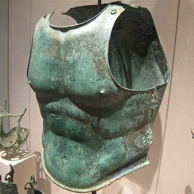
The armor’s lower edge notably emphasizes the illiac crest above the hipbone, also known as Apollo's belt. Its use in the Greco-Roman world was limited to officers or parade context, although its looks granted it a disproportionate place in visual arts as well.
In the very specific fictional setting of a bronze age society that both values women in high-ranking military position and a keen sense of flair, boob armor should be encouraged.
However for any setting that values protection over aesthetic, both the muscle cuirasse and the boob armor have a glaring flaw, in that they are rubbish at deflecting blows.
A good piece of armor, be it plate armor or a tank for that matter, will maximize the angle at which any blow strikes its wearer, reducing the amount of force transmitted and diminishing the risk of injury. Bascinets during the Hundred Years War became so good at deflecting arrows that they will do the same to a .45ACP bullet.
This is done by having convex shapes all around your body. A flat armor will take a blow or projectile much harder, increasing the chances of penetration or blunt damage. A concave angle is even worse, and is nowadays known as a shell trap. At best it will redirect a projectile straight towards your chest, at worst a blow to it will drive the wedge shape it forms straight into your sternum. Boob armor by definition needs concave angles, and is therefore a poor design choice.
Related Vocabulary
Sexism: a whole other can of worms.
Bikini armor: add insult to injury by removing what little protection boob armor provides.
Heroic cuirasse: another name for a muscle cuirasse.
Coming Soon(ish), a Boob Armor Disingenuity Flowchart !
308 notes
·
View notes
Text
The Witch and the Beast #1 - The Witch and the City of Blazing Red


Screenplay: Yuuichirou Momose
Storyboard/Episode Direction: Takayuki Hamana
Chief Animation Direction: Hiroya Iijima
Animation Direction: Kei Tsushima, Yuri Hashimoto, Guonian Wang, Kazuharu Tada, Miyoko Shikibu, Asuna Imahashi, Shinya Segawa (Monster AD: Shouya Gotou)
Key Animation: Mana Azumaya, Noa Kawamura, Shigenori Taniguchi, Yoshihito Narimatsu, Yuki Uejou, Hiroyuki Kamura, Mitsuyo Tsuno, Kouichi Hayamizu, Kazunori Ozawa, Shouya Gotou, Yoshiko Nakamura, Studio Maf, Yuka Hayashi, Takuya Nemoto, Maru Animation, Yeong-Nam Ko, Su-Jin Oh
A bit late on this, aren't I? But no matter what, I was going to write about this, and I will write about every episode too – don't worry about it!
If you were in the know how of Yokohama Animation Lab's recent animes, much like me, you were probably very nervous about The Witch and the Beast adaptation. I mean, I made a whole write-up on the outlook, which mostly hinges on director Hamana's consistency in terms of quality and his tendency to bring in specific animators. Well, now that the episode is out, how do I actually feel?
It's… surprisingly very well done. Of course, I'm not saying it's perfect; the biggest issues are likely the limited animation and a bit of off-modelness. But I'm not going to lie, guys. Maybe I am biased because The Witch and the Beast is one of my favorite mangas, but I genuinely had a lot of fun with this debut, and I kind of loved it. It felt like it had the soul of the manga I love despite some production hiccups.
First, let's talk about what you probably felt but haven't been able to confirm. The episode was indeed better than the PV. I got a sense of this as I was watching, and I was really kind of confused about why I didn't feel like the PV looked this good. When I looked back, it was very interesting to see how many differences there were and the improvements that made the shots so much better.


The obvious improvement in the shading of Guideau and Ashaf is apparent, but I also love the addition of the impact gust that they added to Guideau's stomp. Personally, it was something I noticed in the PV as feeling a bit too still. The only effects in the PV were just simple camera shakes, which didn't really sell the impact of her stomp that much at all. Seeing improvements like these from the trailer to the actual episode fills me with a lot of hope for the production. I feel like it shows that, unlike more recent Yokohama productions, they are trying a significant amount more.
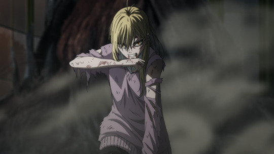
If you couldn't already tell from some of the close-ups I've provided in this post, while the on-modelness of some farther away shots can be questioned, the close-ups in this show are absolutely gorgeous. I wasn't super sold on Iijima's character designs initially, but after seeing the improved shading and the various shots they kind of hid from us in the PV, the designs are freaking gorgeous up close. The Witch and the Beast, the manga, has always been a visual spectacle that relied a lot on its art direction, aesthetics, and of course, character designs. While it's nearly impossible for the anime to match it, I think they came very close. The characters' eyes are so pretty; I love the compositing effects they applied to them. It feels like it gives them a lot of depth and kind of like an otherworldly blur, which I think looks great. The features are sharp; they're so pretty. Everyone has their premium eyelash extensions on, and it's just about as aesthetically pleasing to me as the manga. To be honest, it might be my favorite character design for the season.
And since I also briefly mentioned the compositing, I have to apologize to Natsumi Uchida. I specifically pointed her out in my social media rambles as someone who was making me worry a bit. And that mostly stems from her recent effort in The Iceblade Sorcerer Shall Rule the World, which, to be frank, I thought was terrible. The effects looked cheap, just due to how bright and almost neon at times they are. They don't fit in with their environments; it just wasn't pleasant to look at. However, her work in The Witch and the Beast is so much better. While some effects are somewhat questionable, like the smoke and Ashaf's crow appearing when he was saving Guideau, I would definitely say the compositing was a highlight in this episode. It really puts a stamp on the character designs with the beautiful compositing over them. It makes every scene paired with the art direction feel so dense, like everything is just so in-depth.
The art direction in this show is probably its best visual element. It absolutely shines. I mean, if you had to pick something out from this production as a major highlight, it has to be one of the undeniable biggest pros of the show so far. The series is a dark fantasy, but it's not a dull one. A lot of adaptations, I feel, confuse this with each other a bit. A dark fantasy doesn't have to mean dull colors or a realistic design; after all, The Witch and the Beast is all about its aesthetically gothic yet fantasy appearance that is quite grandiose and beautiful in nature, and the art direction covers that perfectly. So huge credit to the art director, Hirotsugu Kakoi and his crew at Kagoshima Ramecahirim.
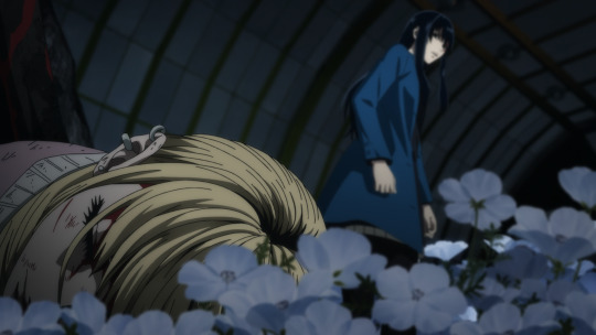
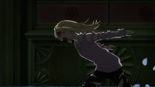
One of my biggest worries for the anime adaptation, when I first saw the trailer, was actually, believe it or not, kind of its color palette. I genuinely thought they didn't get a full sense of Satake's style. It felt a bit too plain to me when I always imagined the colors in the world in this series to be very solid and strong, while not bright. I think the series functions on its boldness, and the backgrounds are a perfect example of it. The opening, I think, is a great example of this too, just them surrounded by those buildings in the midst of the night feels almost overwhelmingly dense. It really serves as the main appeal in many of the show's shots and ties everything (the compositing, the character designs, and the aesthetic) all together. The buildings and architectures, a mix of 2D and 3D, blend in so perfectly. You can take so many of those shots and make them your wallpaper; honestly, it's so pretty. It's also not just the buildings; the flowers in the room where Guideau and Ione fight were stunning. I also love the visual of the flowers always fluttering up due to impact; it just created such a magical experience for me. It's such a simple addition, but it was great. That, paired with the great soundtrack which goes from almost Persona-like music to soft notes of somberness that build up to the release of a monster, just all goes together so well.
At the beginning of this write-up, I already noted its production issues in terms of sometimes limited animation and a good bit of off-modelness in farther away shots (which I hope they'll fix in the Blu-Ray). There are many instances of very solid animation, which you can just look up on Sakugabooru if you want an example. I'm very impressed by Hamana's ability to manage this level of quality and a very strong self-identity of the show's visuals.
His direction in this episode, while some people might not like it due to its reminiscent of older styles, is noteworthy. Many of his shots rely on simple zoom-ins and zoom-outs, which I would say was a more common technique around 2008 or so. His way of transitioning is also a lot less focused on smooth transitions than most styles nowadays. For example, in Ghost Hunt, Gungrave, or Library of Bantorra, the flow of the storyboard is much less smooth and flowing than modern ones. Hamana's boards feel much more jumpy, I suppose? There's a larger gap that isn't covered by anything, which seems to have given many reviewers the impression of a slideshow. Personally, I don't mind it too much, as I think he still has some pretty interesting ideas. The transitions to Guideau getting stabbed and then grabbing Ione, I thought were really well done and mesmerizing. All the choices for the fluttering flowers were probably directly from him.
And hey, normally I don't like his openings, but the opening for The Witch and the Beast is badass, and I might write an individual write-up for it this week. However, I would also love to see other storyboarders and episode directors on some episodes to compare, especially for future episodes like for Johan and Phanora. I would love to see somebody like Shinj Itadaki give it a try, who I really hope to see in this series at some point. I think it's very possible due to the fact he's worked with Hamana before, and he's worked with Yokohama Animation Lab before. Much like a lot of the key animators here, he was also on Ancient Magus Bride S2, which, if you guys didn't know for some reason, contains an oddly large amount of staff that Hamana worked with before across the years, and they're also appearing in The Witch and the Beast now.
As you can tell, I really enjoyed the debut, despite its issues. I could ramble about it all day; there are so many things I want to talk about. However, I think it would be best to save that for when we get to future episodes. In this write-up, I've already spent a lot of time discussing more of what I like about the general direction and visual appeal of the series. Hopefully, in future episodes, I will be able to go more in-depth on specific storyboards, direction, and visuals that the upcoming episodes will showcase. I'll see you guys next week for the next episode of The Witch and the Beast.


16 notes
·
View notes
Text
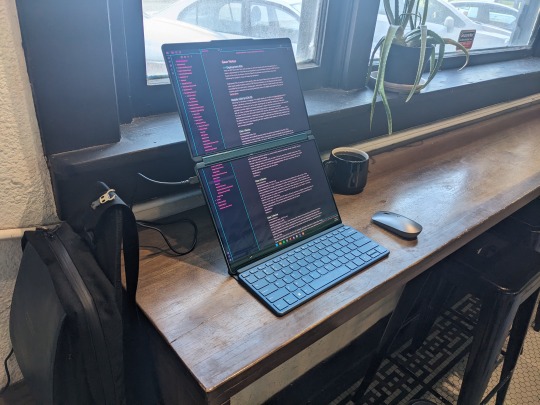
Lenovo Yoga Book 9i Review
The hype for this device is warranted. That said, some of the features are incomplete, or "coming soon." There's a lot of really great reviews of the device that talk specifications. In short, the specs are great. This review is going to about how the device fits into my own use case, and the features that mattered to me most.
Yep. I'm going to make it all about me.
Text Entry
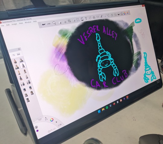
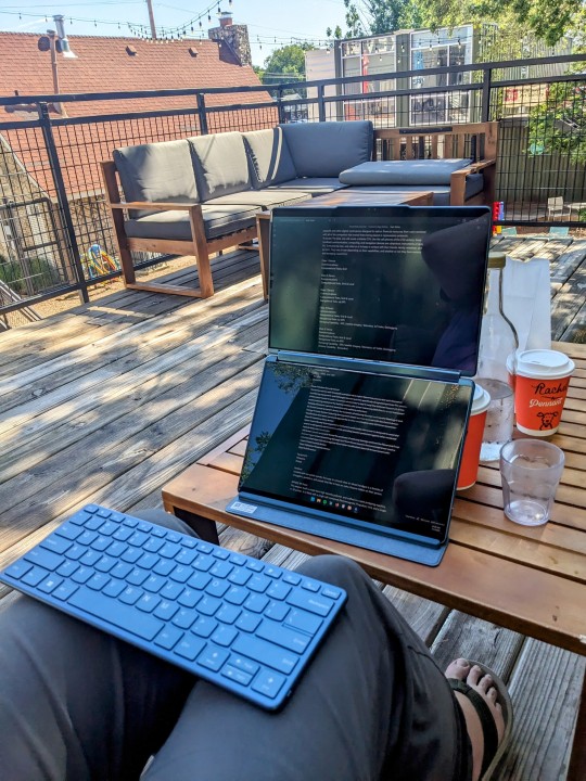
Being able to use two screens in landscape, one above the other, or side by side in portrait mode is a show stopper. It's really difficult to have that set up, and have it fit comfortably in your daily carry bag. Being able to set a document window to cascade between both screens in stacked landscape mode is done by tapping five fingers on the screen. It's so good.
Also, it comes with a Mystery Triangle. No idea what it's for, but it is magnetic and has instructions on it for assembly. I found at least one thing it can do, but probably isn't intended for.
Pen holder?
Pictured below: 65w Charger, Lenovo 2-channel quiet Bluetooth mouse, keyboard accessory, stylus, and Mystery Triangle.

The Bluetooth keyboard accessory is excellent. Best of all, the keyboard is included. Literally, the best travel sized/weight Bluetooth Keyboard accessory I've seen is just quietly bundled with the Lenovo 9i.
Key travel, latency (I type very fast if I want to), and feedback are great. I know the device is designed to take pen input, but I love making text with it. They way the keyboard rolls up into the stand to protect the keys from havoc while traveling in my bag is really nice. A lot of thought went into the accessories for the Yoga Book 9i.
The effort paid off.

Pen Entry
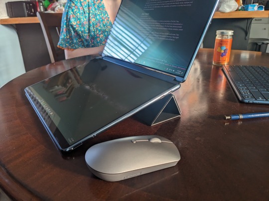
You make some sacrifices here, but I'm not convinced it is Lenovo's fault. Being able to draw on the deck display while using the lid display to view your reference material is awesome. Pen input is pretty good, but I'm still wrestling with getting tilt and other functionality to work as I'd prefer. It doesn't seem to matter which application I use, there is a little jitter.
The device will take pen input on both screens simultaneously but that experience is heavily dependent on the applications, and what pen protocol they are using. Overall I'll be doing my finishing work at 300 dpi at home on my Thinkpad with a Wacom Cintiq. Will I do front end digital art, pixel art, and sketching on my Yoga Book 9i?
For sure.
It's an 8.5 stars drawing experience that feels like a 10 because the displays are both OLED, and vary closely matched in both color and brightness. I haven't applied any film to the deck, but the included stylus has pretty good resistance without it. My other favorite stylus works great, too.
User Experience
Microsoft's software products have been in steady decline for over a decade. I didn't think Microsoft had anything left to ruin after Windows 10, but they broke new ground with Windows 11. User experience isn't anywhere on Microsoft's list of priorities these days, and anything Windows 11 does well feels accidental.
Fortunately, Lenovo goes all out to smooth things over wherever they can. They have software running that helps curate the experience for the user. In some cases it does better than put lipstick on the pig that is Windows 11. With screen gestures and touch input particularly, I forget the pig exists.
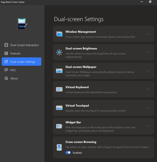
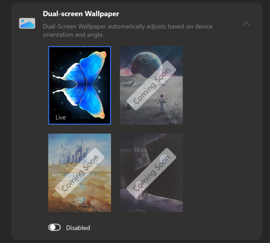
There are many "coming soon" features that promise to make the experience great, utilizing both displays for function and neat visual aesthetics. If Lenovo does all they've promised with regard to features, the user experience would go from good, to great.
The bad news is that the display scaling is kinda stuck at 200%. You can change it, but you have to change it for each display, every time you log in. When you turn your computer on in the morning to get started working, you'll be changing the scaling, if you don't like it at 200%
For me, the 200% scaling is perfect, and I imagine it will be a for a lot of people. If that is not ideal, it becomes an arduous daily chore to open the display settings, and change the scaling to the desired amount. It is likely that Lenovo will fix this with an update.
If you're having this issue, head to Lenovo's Forums and hit this post. It has some work arounds, but also reply in line. Bump it up. Thanks.
I'll update this review if I find a silver bullet or if Lenovo issues and update that fixes the issue.
Darkness
During the Pandemic my spouse was ill (not with COVID, something else). Being able to sit next to her in the dark, and continue my work without disturbing her was pretty important. At the time I had an Thinkpad X1 Carbon that I had Lenovo's power management settings on it. With the screen brightness bottomed out, and the machine set to run quiet as I could get it, I was able to continue working.
After my spouse's recent surgery, I found myself in a similar situation. She basically needed to sleep for a month to heal, and I needed to be able to watch over her, and continue my work.
Using the Yoga Book 9i in a dark room to make text is great. With the backlighting turned down to nothing, the software keyboard (Lenovo's, not you Microsoft) is perfect. It can be set to give feedback, and a little noise, or nothing at all. The OLED displays turned all the way down are perfect for viewing text, without adding enough illumination to a room to disturb a sleeper.
It's also really cool looking in the dark. Perfect for writing science fiction.
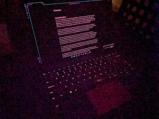
My ears ring constantly after having COVID, and now I'm pretty sensitive to coil whine from devices. The Yoga Book 9i is almost as quiet as a fanless ARM SOC. Almost.
Sound
The Lenovo Yoga Book 9i can be really quiet, but it can also be really loud. If you were using it to run Dungeons & Dragons at a venue, and needed something to play music and sound effects, this device has the best sound on a portable device I've heard. I have one other Lenovo Yoga with a sound bar hinge from a couple years back. The sound on it is really good, but nothing like the Yoga Book 9i.
You can take the Bluetooth speaker out your bag if you're carrying one.
That said, make sure you fully update all the sound drivers. My Yoga Book 9i came with a lot of crackle pop out of the box. Once I updated all the drivers, the sound was perfect. I didn't need to touch a thing.
You will absolutely annoy other people at the coffee shop while watching cat videos on YouTube.

Mobile Workspace
I've been carrying a Thinkpad X12 Detachable Tablet, a Thinkvision M14 portable display, Lenovo Pen Stylus, and Lenovo Bluetooth Mouse as my standard portable workspace. It sets up nicely on a coffee shop table, and let me do my things while I'm traveling.
It's a really nice set up, fits well in my bag.
The Lenovo Yoga Book 9i does the same thing without all the hunting for accessories. Everything you need comes with it. Also, you aren't stuck with two landscape displays stuck side by side, or with extra stands to make your preferred viewing experience work.
It also takes up less space on the table, and I don't have to bring another keyboard as a sidecar to render digital artwork with the pen.
I haven't run into battery life issues with the Yoga Book 9i. I really expected to find myself searching for an outlet more often, but it hasn't been a thing. I assumed the magnetic stand and keyboard accessories would mess with it my bag, and I'd find the device running fans and being crazy in standby mode. Nope, it's been fine.
If it sounds like my expectations were low in terms of the hardware, it is because they were. I was pretty sure I'd buy one, review it, and return it. I'm keeping mine, and riding out the bumps as Lenovo updates and completes software features. I think it'll be worth the wait.
Accessories
All that's missing is the perfect bag or sleeve for the Yoga Book 9i. I'm using a Waterfield Designs Sutter Tech Sling right now, and it is pretty ideal. I have a number of Lenovo's other two-compartment cases that worth pretty well, but nothing that is "the one."
Other than that, carry an extra big microfiber cloth. With three Thunderbolt 4 ports I haven't found the need for dongles or docks unless I'm at home.
Bundled Software
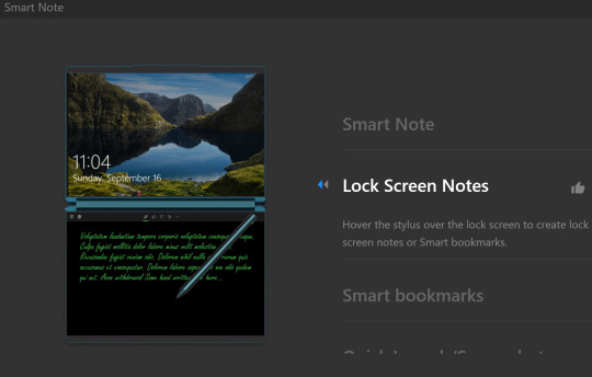
Lenovo ships this device with a Smart Note and Journal application. You can take a Smart Note on the Lock Screen, save Bookmarks, and there is a Smart Reader app in the works. I usually dismiss bundled software, but Lenovo gave these apps some great features.
I might not use Journal, but I will be using Smart Note.
Branding
I've owned or laid hands on every version of Lenovo's Yoga Book devices over the years. My Yoga Book Gen 1.5 (Ruby Red) and Yoga Book C930 still get used, because they are that good. I've had the Android version of the Gen 1, Windows Version of the Gen 1, and used the LTE (Eurozone) Yoga Book C930.
Is the Yoga Book 9i a "Yoga Book" as Lenovo has defined them? Yes, and no.
The Yoga Book 9i is not a 10" ultraportable that defies the traditional categories of clamshell vs. tablet / detachable device. It is a 13" clamshell laptop that comes with the best wireless keyboard and mouse offerings, and the second best stylus Lenovo offers. The stand accessory that bundles everything up is awesome.
It does not fit in my vertical computer bag designed for 10" - 12" form factor devices. It would be unwieldy to hold like a book, in hand, and read text from the displays.
It does provide a computing experience you can't get anywhere else. Lisa Gade didn't even try to explain this in her review. You'll either look at this device and wonder who it's for, or know instantly that you need one for your use case. Like other Yoga Books of the past, there is nothing to compare the 9i to.
youtube
There are other dual-screen devices, but they don't compete with the Yoga Book in my opinion. They are not necessarily better or worse, they just don't provide the same experience.
Have a question?
Find me on most social media platforms, @ArthurHWalker
Pictured Below: One use of the Mystery Triangle?
7 notes
·
View notes
Photo

Anatase: Diamond Dog Sona [Jun 28 2015]
This piece is outdated, made for a defunct project. The information bellow is also obsolete musings.
I would like to describe to you the achievement I've made with this, and why this is. This is a lot of overthinking, by the way.
Any depiction of myself is ridiculously important to me. It doesn't matter if it's for MLP or Pokemon or my own original projects. I work hard to ensure I get the best depiction possible. Sometimes I focus too much on the negative and uglify things more than I should, so I have to try to balance that out with positive. But at the same time, I don't want to merely show in a 'sona what I want to be, but who I am. I'd honestly rather she have red eyes or some more interesting color rather than brown, and I was truly tempted to go through with it. My streak lately has been on stylizing and prettifying the bumps in my appearance. (Mostly my hair, which has gradually gotten less curly in my depiction and now depicts me with bangs I don't actually have in real life and would likely find a pain in the ass) Not just because I dislike them, but because it's sometimes necessary for my sanity in creating the art. Simplifying things like hairstyle to make it easier to draw is just as much of a concern. Not only that, but I don't want to prefer the appearance of any other character and come to prefer the too much to represent me. I tend to be extremely fickle in that regard. Something has to be pretty enough to represent me as well, and I won't accept things bellow a certain very unpredictable level of aesthetics.
So a balance must be achieved. Between depicting myself as I am physically, and depicting beauty that is easier for me to draw and something I want to attach myself to. One thing I'll probably never try to go as far as is to remove the color of my hair and eyes. These traits are recognizable, and whilst I think they're so plain and ordinary, they stand out in a sea of people trying to be special with crazy colors. Also, it matches the color scheme a lot better.
Why a Diamond Dog anyway though?
At first, I tried redrawing yet another redesign of my ponysona. I liked it at first, but then... something felt wrong. I've drawn so many ponies over the years and it just seemed... like even though I think ponies are really pretty, my appearance could not be applied to one properly to both appeal to my beauty and be semi-accurate. I struggled with a lot of thoughts of color schemes, accessories, and most of all, hair-style. Whilst I like ponies in accessories, they honestly look better with very few. However, distinguishing me requires several accessories that are red, as I was not willing to make the main body red so as not to kill my eyes.
o I went somewhere completely different. I thought about other species in Equestria that might fit me, and this was the best I could get to. A bit flimsy due to the fact that they've only been depicted in one episode as a bunch of Diamond-stealing rogues and ruffians, but the concept was sound enough. A canine-like creature with gigantic pawlike hands and a penchant for the crystalline and jewels. I have identified with canines a lot over the years and haven't quite shaken that yet, and also think they're more fitting than an equine (even an extremely stylized cartoon equine) after doing some re-thinking. And I have a penchant and flare for crystals and gems. Also, the large hands fit me as I am very VERY hand-oriented, and I could not imagine life with the hooves of a pony, to be honest. I love being a biped with hands. It seems like unicorn magic just wouldn't be the same as the sensation and fine control of a pen in my hand to do my art.
Also, Diamond Dogs wear clothes and accessories by default. Also very fitting.
Of course, I had to do some... guesswork and modification to make a Diamond Dog fit my specifications of beauty whilst keeping the design looking like it would reasonably be fitting of a female. In case you're unsatisfied with that though, she comes from a different clan of dogs than the Diamond Dogs, so some differences in their appearances make sense. (More on that later, as I said.)
And the design is symbolic of how I feel in the brony community. Just kind of like I'm a part of it, but I'm still pretty damn different from a lot of others I see. I'm not a pony at heart, and I don't feel like I'm a huge fan of the show, but I'm still here, making this art, and caring about what's going on in the community and show. The ponies keep drawing me back in, even though I'm essentially a different species, and I guess that's because there's just something about them I can't resist. It's perfect.
Overall, I have unintentionally hit a cord with this design. A very strongly resonating cord. Unlike any ponsona I've ever had or even the Valstaens I've tried to design, something about this feels... correct. It feels right.
I hit all the right marks and created something that will be easy to redraw whilst still appealing to me immensely. I think part of the reason is because this style and this particular design reminds me of one of my most played and cherished games, Final Fantasy IX. It fits its aesthetic very well.
Honestly, I'm contemplating switching my default style to a more chibi-ish style or something similar to my MLP style except with shading. I think part of the reason it resonates with me so much is because this wasn't even that hard to draw, and other than many distractions along the way, it didn't take long to complete on its own. It flowed naturally, something that hasn't happened with my attempts at my "real" art style in a while. I guess I should just consider MLP my default style. Just kind of give it up, and let it happen. I enjoy drawing in MLP-style. It's immensely appealing, and whilst it sometimes takes me a long time to imitate vector quality lines (if I get too obsessed, like I do sometimes), the way it looks is just not only really good, but it's... something I can manage without wanting to tear my head off. I think I'll stick with this. And I'll probably base my Valstaen heavily on this design. I already had a design for her before, but it's probably going to be changed now that I've let this happen.
This piece is just so beautiful to me. Not because it has the biggest amount of effort, or my best anatomy, or even my most dynamic pose. But because of how it resonates with me. I look at it, and that feels just like me. And that is not something I've managed to achieve in a long time, and not ever to quite this intensity. I can't explain it. It it just my best work because out of all my works, this one comes from my heart, and this one says what's in my heart because it wasn't a slog or a huge effort. This flowed from my fingertips so effortlessly and wasn't something I constantly revised, but something that I drew on the first try, fixed up a bit, and then went straight to coloring. That is very rare for my depictions of myself. All that sounds stupid, I realize. It doesn't have to make sense to you. All that matters is that it is, and I'm happy about that.
2 notes
·
View notes
Text
The Benefits Of Minimalism For Our Family
As a family, we have been practicing minimalism and I'd like to share the benefits of this.
Sometimes, we possess a number of things, and we think that these possessions are very crucial to our happiness, our safety. But if you look deeply, you’ll see that maybe what you possess are obstacles for your happiness. If you know how to let them go, to release them, happiness becomes possible.
A minimalist lifestyle embraces living more intentionally and values simplicity, satisfaction, and purpose. A minimalist aesthetic, commonly seen in interior design, fashion, and art— embraces visual simplicity to cultivate a clean, uncluttered look. At its core, minimalism is about eliminating the unnecessary to bring focus and appreciation to what truly matters.
There are benefits for our entire family.
This is beneficial for our children. It fosters a sense of gratitude for what they have, as well as imagination and creativity. No longer are they overwhelmed with too many choices. Having less is has taught them to use their imaginations more. Naturally, we are still going to treat our children with toys. Minimalism just means purchasing with more intention. We pay closer attention when buying items by asking ourselves how often they will play with the toys and if the money is well-spent. We consider toys that promote creativity and imagination and last the test of time rather than simply buying what’s popular.
Children can easily become addicted to video games, television and social media. They might lose sight of what’s really important in life and become focused on keeping up with the latest trends. While we don’t cut them off entirely from these technologies, we do encourage moderation by limiting screen time. That doesn't apply to just them either but to us as well.
By limiting the purchases we make and explaining why we make them, our children are learning the value of money and budgeting. Saving for items will teach them to spend wisely and prepare for what they want the most. We are teaching them how to let go of items that no longer bring them joy and if they want to make a purchase to think about it thoroughly. When they have outgrown their clothing or the style doesn’t suit them, they can give them to people who will use them. In the town next to ours, we have a thrift store that also gives out donations to anyone who needs them. That is where we send anything we don't need.
But there are benefits for our family as a whole. The benefits for practicing minimalism is real and we have felt them. They are science backed as well.
One of the primary benefits of minimalism is its ability to reduce stress and anxiety. When we eliminated physical clutter, we also experienced a reduction in mental clutter, which has uplifted our mood.
Practicing minimalism has lead us to heightened productivity and focus by effectively eliminating clutter and distractions. This intentional reduction of physical clutter has created a clearer and more organized environment, enabling us to concentrate on our priorities.
Minimalism has promoted financial abundance and given us more self discipline. By adopting a minimalist mindset, we became more aware of our actual needs versus our wants. This shift in perspective empowered us to make informed decisions about our purchases, distinguishing between essential items and unnecessary indulgences. We have learned that material items aren't needed and that has redirected our focus towards experiences, personal growth, and meaningful connections. There are more family trips and doing more together than we used to outside of the house.
Simplifying our lives and reducing clutter has created a space that promotes tranquility and harmony. Living in an environment that is free from excessive belongings allows us to appreciate the beauty of simplicity and be more present in the moment. Getting rid of all our unnecessary things means significantly fewer chores. We own fewer items, so our belongings are easier to keep track of and keep organized. We have been spending a lot less time cleaning and have had more free time to enjoy in our daily lives.
We have reduced our carbon footprint. The depletion of natural resources and pollution produced from consumerism is not only wreaking havoc on the planet, it is also driving climate change. By buying fewer new things and recycling, reusing, and repairing items we own, we are using significantly fewer natural resources and produce less waste and pollution.
A surprising benefit is its encouraged us to be healthier. I think it may be due to less stress in our lives and therefore less depression. Maintaining a minimalist home has nudged us to make healthier food choices and get more physical. I've always forced myself to exercise daily but my husband didn't. Now he runs daily and does strength training.
While the practice of minimalism will look different to different people, the benefits are the same. Adopting a minimalist mindset can improve your stress levels, sleep, mental and physical health, increase happiness and well-being, reduce your environmental impact, and also save you time, energy, and money. It has done wonders for us and I hope it will do the same for you if you decide on a minimalist lifestyle.
#love#children#progressive#family#relationship#marriedlife#marriage#parenting#motherhood#minimalism#progressive marriage#progressive parenting#progressivehouse
2 notes
·
View notes
Text
Coppola's Dracula
The 1992 film Bram Stoker’s Dracula, directed by Francis Ford Coppola is a weird film. And obviously deliberately so.
The book is a gothic melodrama, and Coppola took that and decided to make the most gothic and melodramatic film he could make. Realism is repudiated completely, everything is colourful and outré to the extreme. The film’s visual aesthetic is full of vivid colour, and set, character and costume design is all outlandish. Even in the normal, non-vampiric world Lucy wears dresses with a collar reminscient of a frill-necked lizard (in fact she has a reptile theme going on, wearing a snake dress earlier in the film). The acting is very emotional and melodramatic as well.
And while the book seems to believe that the supernatural can be rationally understood, where certain rules apply, the film the supernatural elements are surreal. Instead things run on symbolism and aesthetics. The tone is set in the opening in which Dracula becomes a vampire by loudly renouncing God, stabbing a sword into a cross which begins to bleed, and drinking that blood.
Afterwards Dracula’s shadow can move independently from his body showing his intentions. Flowers wilt in his presence. He can turn into a bat or a wolf like in the book, but here he becomes a large grotesque-looking mix of man and animal. His mist form glows vividly green (green and red are used to symbolize passion). This is just a small list of the bizarre things that happen in this movie, and the result is a surreal dream-like mood.
The film was advertised as being “closer to the novel”, as evidenced by putting Stoker’s name in the title. And certainly the film follows the plot events of the book closer than most film adaptations. The characters are there, including Arthur Holmwood and Quincey Morris, and most of the major events of the book happen in the order the book had them in.
There is one major change that keeps it from being truly Stoker’s Dracula however. It adds a love story where Dracula is searching for the reincarnation of his lost love, which he finds in Mina. The love story is similar to the one in The Mummy from 1932.
The sexual angle is there in the novel of course, and previous films like the 1958 Hammer version and the 1979 Frank Langella film seem to hint at Dracula’s thematic role in this film: as a source of sexual liberation for repressed victorian women. But this film takes that to extremes. Dracula is a romantic, byronic anti-hero lover who is given outright sympathetic qualities. He even hesitates to turn Mina into a vampire at first. Mina however drinks his blood willingly and even helps him against Van Helsing in the finale.
This love story is what keeps it from being truly Bram Stoker’s Dracula, instead this is Francis Ford Coppola’s Dracula. The actual true-to-the-novel adaptation is the 1977 BBC tv film with Louis Jordan.
The love story is not entirely successful, due to the rest of the film trying to follow the novel the fact that it has been grafted upon the Dracula story is very obvious, the seams show. Granted the more sympathetic take on Dracula is still interesting. The novel’s depiction of a foreign, hook-nosed monster has a strong racist subtext. The film is an excellent example of the trend in vampire fiction of making the vampire less evil than they were in Stoker’s novel. And doing that in an adaptation of Draculatends to subvert the Victorian racial and sexual values.
The film’s highly stylized mode of storytelling is a matter of taste. The film’s outlandish creative decisions are so extreme that it is easy to laugh at them. But they are also very compelling to watch, and clearly the product of a lot of time and effort. The costume design by Eiko Ishioka and set designs by Garrett Lewis and the general art direction by Andrew Precht are very weird and don’t always look good, but are imaginative and well-realized. The direction by Coppola is great, the story being told with a good pace and memorable images, often using the costume and set design to great effect. The special effects are amazing, Coppla eschewed entirely the use of cgi or even image composition and relied entirely on practical effects. The results are impressive.
The castlist is interesting in itself, as there are some big names in the cast, such as Gary Oldman as Dracula, Anthony Hopkins as Van Helsing, Winona Ryder as Mina and singer Tom Waits as Renfield. The acting is just as stylized and melodramatic as the rest of the film, and is done well overall.
Probably the only weak link in the film is Keanu Reeves, a good actor in my opinion as he proves in The Matrix films, but here he gives a stilted performance in a unsuccessful attempt at imitating an English accent. According to Coppola, the accent was the problem, that Reeves “wanted to do it perfectly and in trying to do it perfectly it came off as stilted. I tried to get him to just relax with it and not do it so fastidiously. “ No matter the cause, Reeves is the weak link, his overly non-emotional performance sticks out with the operatic melodrama the rest of the cast acts with.
Despite Reeves, Bram Stoker’s Dracula is still an interesting film. It is easy to find the film to be ridiculous, it is that extreme. even I do find it unintentionally funny at times and I can’t take the love story as unironically romantic. But it is a very entertaining film regardless, well-made in a way that makes it just fun to look at. Even if you view it as complete and utter camp and just want to laugh at it, you will still have a fun time. Gothic Melodrama films seldom are as skilfully made as this.
#my writings#wrote this awhile ago and never posted it#so decided to touch it up and a bit and release it#dracula 1992
26 notes
·
View notes
Text
“I Am YEG Arts” Series: Layla Folkmann

Layla Folkmann, photo provided by the artist.
Ever looked around a room full of talented peers and wondered if you had the secret sauce to stay in the game? If you ask Layla Folkmann, she’ll tell you there’s no secret to it at all—just stubbornness, consistency, and fortitude. Some days, that looks like slogging through the rough patches. Other days, it looks like international success. No matter what the day though, Folkmann is never without gratitude for her unshakable foundation—one built on encouragement and education, with no backup plan in sight.
Mural artist, painter, and public-art advocate, this week’s “I Am YEG Arts” story belongs to Layla Folkmann.
Tell us about your connection to Edmonton and how it’s influenced your path.
As a free-range child of artist parents, I have many fond memories of being immersed in the Edmonton arts scene. From running through gallery openings and eating an excess of cheese off unattended platters, to bouncing restlessly in theatre seats, these early experiences have undeniably influenced my life in both obvious and imperceptible ways.
Education and early encouragement are undeniably the foundation on which my art career rests. I attended Victoria Composite School and the Grant MacEwan Fine Arts program, which provided a solid technical vocabulary that I consistently apply to my work to this day. It’s all these elements that have allowed me to confidently throw myself into the professional realm with the knowledge that I could make it work as an artist.
What themes are you drawn to in your work?
Luminosity and vibrant harmonious colours are aesthetic themes that I work with in all aspects of my painting practice, whether abstracts, portraiture, or large-scale mural work. I'm constantly searching for exciting colour combinations in the world around me to translate into my painting.
Honest portraits of real people is another consistent theme that my artistic collaborator, Lacey Jane, and I explore in our public mural work (Lacey & Layla Art). We find portraiture to be a compelling tool to encourage human connectedness by representing authentic members of a community and, hopefully, strengthening local pride. We aim to celebrate each community's unique character and urban diversity and to highlight community members and the human experience. We also explore what we like to call “techno nature,” which is a combination of design-based graphic elements and natural scenes. These pieces are our exploration into our contemporary interpretation of the natural world.
How do large-scale murals and public art play to your strengths as a storyteller?
By the nature of their size and location, murals can be an impactful and compelling storytelling tool. They are accessible in public spaces and memorable with their imposing format. People have explored this format from prehistoric cave paintings and the Mexican revolution, to the graffiti in New York subway stations. The power of the format is undeniable, reaching everyday people in everyday places.
Art speaks a universal language, and what continues to excite me about public murals is that they remove both the real and perceived barriers of a gallery or museum space and release artwork into the public sphere.
Public art has an unparalleled ability to transform urban—and even rural—spaces into an open living gallery that is free and accessible to everyone. It redefines communal areas and creates new opportunities for engagement, curiosity, appreciation, and ownership for the beautification of often neglected or forgotten spaces.
Each story we tell is curated to the space and the community in which we create the artwork. Each new location provides an opportunity for a new narrative to touch on the core aspects of the neighbourhood and the people who exist within it.
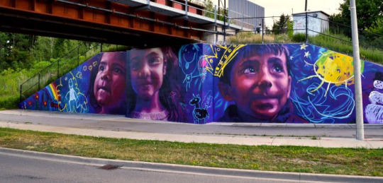
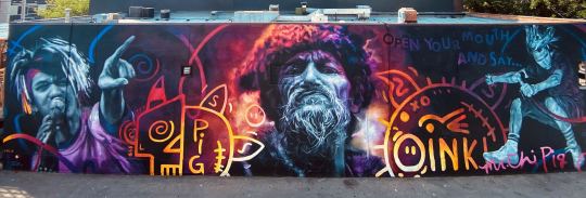
Top: Colour Outside the Lines by LALA, photo provided. Bottom: Larger Than Life A Mr. Chi Pig mural by LALA, photo provided.
What’s the first thing you ever made that inspired your artistic path? Did you know then that you’d unlocked something?
It has always been clear to me that art is what I was going to do; there was just never any other option. The form in which my career took was a happy accident and had everything to do with timing and chance. When I envisioned a career in the visual arts as a youth, becoming a mural artist wasn’t even on the radar. One opportunity presented itself, which led to the next, and then I ended up here. Luckily for me, there has been an international boom for mural art and I got on board early enough and have been riding that wave for over 10 years now. It seems that there is a new appreciation on the part of funding agencies and municipalities for the inherent value that murals can bring to a community.
Tell us a little about LALA (Lacey & Layla Art) and what that collaboration has meant to you.
My artistic collaboration with Lacey Jane has been fundamental to my continued growth as an artist. We initially met while studying Fine Arts at Grant MacEwan University in 2009 and have nurtured our “artnership” ever since. It is surprising to everyone, including ourselves, that we’ve maintained such a close friendship after the hundreds of travel hours and months of 12+ working hours a day in the rain, snow, and +40C heat. Each project has its unique challenges and unforeseen obstacles, but humour continues to be our greatest coping tool. Our enthusiasm for art is what brought us together, and it’s what continues to fuel our creative partnership. Together we push each other to take on bigger and more ambitious creative challenges.
What’s one piece of advice someone gave you growing up that turned out to be true. What’s one piece that didn’t hold up?
A professor of mine once mentioned that stubbornness, consistency, and fortitude are the qualities it takes to become a successful professional artist—not raw talent or early success. I see this truth demonstrated consistently within my artistic peer group. The people who make it work just simply do it, and then they keep doing it. They slog through the rough patches, make the right connections, and see it out the other side.
“Have a backup plan” was advice that didn’t hold up for me, personally. Perhaps it seems reckless to bet all your chips on red, but fully committing gave me the determination and motivation to pursue my passion without deviation or distraction.
What does community mean to you, and where do you find it?
Community is quite simply who one surrounds themselves with. I believe in making active choices rather than passive choices about those who remain in my close sphere. I consider those who I surround myself with to be a defining aspect of who I become as a person. I aim to have a community that I admire, full of positive, enthusiastic, and hard-working people who challenge and encourage me to become more of that myself.


Portraits by Layla Folkmann, photos provided by the artist.
When you’re struggling to stay on task, what’s your favourite way to procrastinate?
Productive procrastination seems to be a method I'm particularly fond of. I tell myself I can concentrate better when I “clean out my corners,” but I have a suspicion that is just an advanced avoidance technique. I also collect hobbies, such as soapmaking, felting, fermenting, carpentry, etc. Any of these can take precedence at inopportune times.
Tell us a little about what you’re currently working on or hoping to explore next.
My most substantial and challenging venture to date has been designing and building my own tiny house on wheels. It has been an ongoing, character-building exercise in creative problem-solving and patience, but it has me hooked. I am thrilled with the range of new skills it has taught me and the obstacles I've overcome. I did a whole lot of things wrong the first time before I could eventually get them right.
New and exciting mural projects with LALA are always in the works, and the winter months are dedicated to planning the next mural tour. Summers in Canada seem to disappear pretty quickly, but the winter allows me to decompress, plan, and create some studio work.
Most of my artistic career has been about mastering realism and representational work, but over the last few years, I have been exploring abstract painting to take a break from portraiture and the faithful replication of photographs. My abstracts provide me with a much-needed refuge in the pleasures of simple colour, light, and composition.
What excites you most about the YEG arts scene right now?
After relocating to Montreal for nine years and then returning to Edmonton, I’ve viewed the strength and quality of the YEG arts scene through a new lens. What I used to view as small, I now can appreciate for its intimacy, strength, warmth, and tight-knit community. The YEG support that our mural work has received throughout the years has been quite touching, and I feel quite at home.
Want more YEG Arts Stories? We’ll be sharing them here all year and on social media using the hashtag #IamYegArts. Follow along! Click here to learn more about Layla Folkmann, Lacey & Layla Art, and more.
A Charm by LALA, photo provided.
About Layla Folkmann
Layla Folkmann is an Edmonton-born internationally recognized mural artist and painter. She studied Fine Art at Grant MacEwan University (2009), École d'Enseignement Supérieur d'Art de Bordeaux (2015), and graduated with distinction from Concordia University in Montreal (2016) with a major in painting. For over a decade, she has dedicated her practice to socially and culturally engaged public art as part of LALA (Lacey & Layla Art) while fostering a passion for portraiture, realism, and the representation of compelling characters. Layla has collaborated on hundreds of murals across Canada and internationally in places such as Iceland, France, and northern Uganda. Layla has travelled extensively, having backpacked through nearly 40 countries. Over the past decade, she has received numerous grants, notable public projects and awards such as the 2021 Edmonton Artist Trust Fund Award. Layla is currently designing and building her own self-sufficient tiny house and maintains a full-time studio practice in her home town.
5 notes
·
View notes
Text
A NEW TITANOMACHY

Yellow cotton tee with an obscure ass graphic
And this shit is old so you know this shit is soft an cozy
Yellow cotton tee with a cool ass graphic of which i do not know the origins
All i fuckin know is that im based and im gorgeous
Old buddy burning out at the stop light got the kids crying
Buddy flaring the engine at the stop light got the white moms confused
I heard my square ass neighbor call that dude a menace
I aint even trippin cause he put me on to hella music
I song i.d.ed hella tracks he blasted in his car from my window
He been bumpin sexy drill way before the city was even on that
He put me on to R2r moe and wolfacejoeyy and i never said thank you
Now that everybody’s on that shit, that shit got hella corny
Cause every time i walk by he always on some cool shit
I get though bro honestly thats prolly how it should be
I thought cash cobain was hard for like two months now his flows bore me
Now that everybody on it man that shit got hella corny
I have rejected or at least rebelled against the platonic condemnation of writing as a dishonest distortion of living speech, but i have now begun to experince the truth in the fact of the dishonesty of writing. It is already too much. I have failed. Aand now i succeed myself in becoming honest. It is automatic, yet considered. Fluid, yet fragmented (rococo). The stopping and starting is the path to expressing a real organic shape (notan, mu): a thought line mimics ideals. The concomitant aesthetic values that are associated with classical standards of beauty, a formal essences that exists within a scale from which deviations are novel singularities with their own degrees or kinds of aesthetic pleasure. Executing a technique of inscription with varying degrees of adherence to the rules of both a conventional practice and an objective understanding of good design from a cognitive science perspective, or the point of view of perspectival realism founded on an enlightenment model of perspective. The more absolute the deviation from a formal scientific model of beauty ie applying the golden ratio and principles of design that include scientific approaches to proportion, mathematical curves, etc, the closer this inscription comes to a return to pure matter, l’informe/art brut. The Clash of The Primitives, Or A New Titanomachy: the next birth of the twice born, the return of zagreus, the explosion of the dionysiac into total integration of excess-divinity. The discovery of fragmental organs as fractal perfections, unearthing the perfect as already broken. The reinterpretation of history as essentially orphic, replacing the death on the cross with the myth of dismemberment. Alternative primativisms, each in the future of the other.

Meanwhile the dope boys still bumpin migos
They hella lame for that for real but i could never tell them
The migos flow kinda ruined rap on god that shit is so lame
But imma keep it moving, stay based, in my lane, doin me
Ceiling designed by Sir Shristopher Wren and exquisitely carved by Grinling Gibbons
That shit got me geeked up
Real talk im tryna engrave some shit as exquisite as a Grinling Gibbons
It might not be doves but its rats and pigeons wrapped up in some exquisite ribbons
Hell na i dont need no instrumental
Its impossible to scare me straight thats why they wouldnt let me in the prison
They tried to lock me up like marquis de sade but they wouldnt let me in the prison
I done been bent the light im michel strangelo now im bout to bend the prism

I can’t believe 03 gredo produced Never Bend
That’s one of the hardest beats of all time time, let alone the song itself
I can’t believe 03 gredo taught Hegel the different samenessess of the in itself and the for itself
I can’t believe 03 gredo came up out that texas pen flexing on some fashion shit, i’m happy for him

Drakeo woulda loved to learn about the changes in styles of french design as they progressed out of the French Renaissance, as they developed and shifted from the late 17th century onward under the rule of Henry IV, Louis XIII, Louis XIV, Regency, Louis XV, Louis XVI and into Empire.

I feel like Drakeo would appreciate the passage from Baroque to Rococo and the distinct characteristics that exemplify the departure from the Baroque into Rococo, i.e. the embrace of classical themes biblical and mythological in nature such as Valor and Exaltation, the subsequent rejection of these themes of high seriousness, moving away from the supremacy of acanthus leaf ornamentation in favor of a more wild and fluid sense of the comic, embracing a new spirit of movement in stacks of rock, stalagtite forms, broken C and S curves. Yea, i feel like a lot of people in the rap game might fuck with that type of shit, including summrs and acid souljah. Maybe not though idk, i’m just saying that cause it’s based. I don’t fuckin care about what rappers care about, i’m a fuckin rapper and i care about some cool shit so imma talk about it.
Shout out to my readers aka prolly one or two people.
Hope you fuckin like it bitch if not than you can suck my dick
Sike you know im playin im just tryna bring that energy
I walk by her every mornin i bet we would have good chemistry

I seen this lil cute ass shorty posted in the coffee shop
I could tell she wit it so i told her ass to pop and lock
Drop it for me baby imma see you in the parking lot
I aint got no car but immaa pipe her in the parking lot
Parking lot pimpin wit my shorty now we car jackin
Told her to pick a whip she like so we can fuck inside it
She picked a cool ass one but im not gon say which one cause thas incriminatin
Shorty hit a lick and her head game splendiferous
Thas a lil story for you bitches just to fantasize
I aint got no time for ratchet bitches ‘less they family size
Peanut m&ms in her pussy like a movie snack
Munchin on her booty while we watchin classic movie scenes
Critics are saying he’s filtering the bauharoque through based life, supraverting the new clash of the primitives by desublimating the unconscious desires of Art Brut and the new york school of abstract expressionism into an ornamental phase space thereby irrrepressing the fake based in an afterlife with an orphic-like liberatory gestrual cooking dance technique with a suspicious yet loving embrace of classical themes and annoying, pesky old dusty ass concepts like mastery and power.

They’re saying he seeks out a new clash of the primitives, calling it the return of the irrepressed as it unfolds in the new Asymbolic titanomachy that is viewed as subtle tug of war of vocabulary through the immediate screens ( also known as a new presentism of screenhood), and upon pressing the tender rewind button from the new orphic afterlife, appears as a tectonic shifting of digbats beneath a nonmusical substrate of unicode, set to a score of the based negative.

My homie axed me if i ever read house of leaves, i said
bruh im michel strangelo
of course i have
sike nah ive seen it around and know what it is,
i feel like i decided not to read it so that i could just write it instead
To which mans replied
Damn okay
OKAY!!!!
That’s turnt!

Everything is mine
I own swag.
A fallen cherub
Issued by chance, irroyal decree
A kid i fell into milk. (a kid/a goat/ a bull, possibly other ruminants and other big fellas that chew the cud)
It was a disaster. The stars fell as well as the sky, pieces of the undigest sinking through the asymbolic quicks, sinking beneath the waters above the blackest waters of the heavens through the four sections of the stomach the new zeus: nuked rumen, zen reticulum, ornamental omasum, abstract abomasum, each corresponding to a phase of spatiality; point-line-plane-solid, with each dash with its own corresponding triad of shadows: DO, RE, MI / separation, contact, extension / sign, index, icon (pre linguistic, presymbolic, premataphorical) with the prefix ‘pre’ becoming a metaleptic appearance as a precursor to its own retrospective recognition as a grammaleptic antimirroring of these triads with their own uninterpolations of hyle as temporality: instant, interval, succession, duration, a group interpunctuated by: list, anecdote, tale (prelegendary, premythological, before epiphanic and heirophanic) / occurrence, circumstance, concurrence (precoincidental, before causality and synchronicity) / (excluding planetary interpretations, paradoxically)
a piece of the sky shaped like a stop sign had fallen on his head when he was sitting under the big oak tree, the Bodhi tree, in the town square.
Secretly and by great accicendence falling from absolute life into the galactic puddle –the saucer of cream that we left out for the cat, our little galaxy ± A KID – for this IS a song of innocence & experience – º‚·‡fl‚ºªt•‡¶§∞øˆ¨… did you feel it? That was a tremble, a solicitation for symbol shifting to inaugurate itself, to be seen as birds through the window

Two birds flying in a calm wind two birds falling through a calm wind
I heard a mother scold her child with too harsh a tone at the park today
I aint gon lie bruh that shit was kinda disheartening
I feel like a kid i got my bright yellow shirt on
I feel like a kid im eatin a pb&j wit some chocolate milk

They can’t stand that i’m this handsome and still smarter than them
They can’t fucking stand how god damn eloquent I am
Nobody said they failed yet they call themselves failures and wallow
They know damn well what they signed up for, yet they act like they’re owed something

Fuck all of y’all
all y’all can suck my dick
they’ll try to undermine you cause they hate themselves to death
I don’t even like to hate but sometimes I become overwhelemed with anger and disappointment
Rare negativity, i identify as a lover not a hater

Hate should bring you shame idk why some of y’all so proud of being hating ass people
Hate to break it to you bruh but hating aint a personality
Some people wanna be witty so god damn bad and just start compulsively saying shit really, letting the first dumb ass thought fly out of their mouths after the other person stops speaking in the hopes that their interlocutor stupid enough to assume that because they said it fast enough that it was witty. Even if it made no got damn sense at all

I got news for you bud— POP QUIZ HOT SHOT (dennis hopper as Howard Payne in Speed)
NEWS FLASH WISE GUY.
Speed does not equal wit. Fast does not equal smart
That shit you said real fast just now not only wasn’t clever but it was apropos of nothing
nonsensical AND bullshit. oof, the worse kind. Meanwhile i merely mention fava beans which for whatever the fuck kind of of stupid ass fucking assisine fucked up dumb reason prompted you to shit this little rhtorical gem out of the side of your neck: “clarity just isn’t your M.O. is it?” uhhh for merely naming a kind of bean you’ve weirdly never heard of? Ok… listen. I’m misunderstood. Alanis morristtean irony: like the gust of wind that slams your door shut, leading others to assume it was an act of intent on your part, and that you might be expressing your emotional turbulence, and perhaps you are, but you really didn’t slam the door. This was one of the highest crimes in our household, slamming doors.

people have their cowardly heads in the sand or up their fucking asses, and then blame me. I’m willing to accept only my accursed share of the guilt fairly and justly allotted to me, only that fine slice of falling sky, guilt pie apportioned out for me by the great arbitrators, which happens to be the same size as the slice for all humanity.

A kid i fell into milk, a bull i fell into milk.
A bull because although it may look upon first and second glance like nonsense ( glance-like nonsense, parking lot pimping nonsense), and it very well may BE, my nonsense is never bullshit, cause with the bullshit, i play matador. They can’t stop my boustrophedonic debauchery, they can never fully board the pyrrhic dirigible, tame the maudlin horse, crack the shit shell of the avant-kitsch, and spread it on the walls of the spirit ditch. Though i may look like young stalin mixed with ezra pound, i can assure you that i feel like teletubby swagger. YUNG TINKY WINKY AND IM STILL FUCKIN SWAGGIN i look like lil Laa Laa cause i have televisions in all four of my stomachs on which i watch real children live their lives. Rear window swagger
voyeurism off the richter, welcome to diarrhea city
Never underestimate my savagery, kids go the hardest
Kids are goated, kids aint on no bullshit,
we knocking down buildings, we knocking down borders
People will target you with their own unresolved bullshit
And with the bullshit i play matador
Bout to put down the bullhorn and pick up the buhl work
French cabinetmaker André-Charles Boulle work
Yung colin bolton and i care about arabesques
Scarab flesh, peer into my prayer layer in marrakesh

Undo the accident of separation (the separation of accidents from accidence) only to initiate a new kind of Akzidenz, engraving grotesque faces into the serifs of type, what type of time people ask? a previtalist duration ( vitalist as in: Read between the lines / What's fucked up and everything's all right / Check my vital signs / To know I'm still alive, and I walk alone)
A nonreductive preternaturalism (with Peter Naturalism already having been courageously initiated by doo doo dog, the lastpre-raphelite ironist of the bauharoque), a transcendental materialism of green day, and all other bands of color except for the blue man group singing the eurodance hit by Eiffel 65.
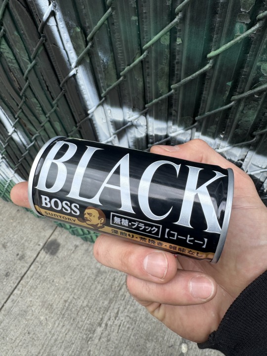
did you forget yourself? Or any other phrase used to humble a person
Some communications that i maintain with other quiet initiates feel like the correspondence between levi strauss and jean dubuffet, supportive and curious, on the frontiers of the search for a genuine liberatory exchange

we can come up with a way of living that is beyond praise and blame, but if we must speak dispraisingly (depressingly), then so be it, but if we must sing praises let real folly be its object, not that counterfit of folly that circulates in such abundance today that it has inflated the value of real folly beyond measure. oh curse it all to hell so much foolishness in the world today!

ishya man pressure mans
aka pipe shordies
aka yung pipe layer
posted in my vamp layer
indie sleaze bitches off the richter
tripple d shordy fat ass wit the nipples
finna bite her pussy like a shark wit a twizzler
straight A student on my dick like a hooker
riz god vamped up welcome to fucking scotland
wendys breakfast biscuit with the antique boudoir
yellow nipple sharty with the razor blade nail gun
cocaine faggot on my dick like a hustla
suckin bitches off in the shower like a bus driver
i been toting glocks like im santas little helper
nobody understand me cause im gifted and im emo
yea exactly homie i was finna fuckin say that
ancient greek mayo on the sammy like a stray cat
pummel horse pussy with the mack and the strap on
asking for forgiveness on the floor wit my dick out
slizzy off the onions like im stanley fuckin yelnats
kentucky coal miner moonshine when i help bats
locked in the aquarium and im feeling like a thinker
got her wrapped around my finger did i have to let it linger?
hell na i didnt but shit i went and let that shit linger
i tried to fix that shit but all i really did was tinker
im the savior of worms and i love community service
yung clock maker im mechanical as shit
brick mason christmas with a question in the ziplock
keep a can of sardines in the crystal cabinet flintlock
aging like a rancher george washington mclintock
asian like an example when i switch the fuckin slip knot
sorry publishers but this is really what it look like
apocalypse enlightenment im a shakespeare lookalike contest finalist lets go
did you get the research chemicals in the gift basket with the fig jam? i left a secret present in the freezer when you get home

all these "artists," give me a fucking break. its complex, i won't go into it again, get me riled up and maybe i will, but overall the term has lost all meaning, to hell with what we call art.

in the spirit of louis aragon, too: fuck all these pseudo intellectuals! charlatans! for i am certainly among them, but to hell with all those who pause before doorways, unaware, this could never be me. But all men are capable of all things.
wow, embiid with the flop and the three to tie it at 69
"that is hilarious, be like yo we takin a charriot"
The nerve, the disrespect to appease the weirdo old white dudes drinking wine watching hockey at Paul's. the bartender switched the kicks game for some Bruins Toronto hockey show.
Like dude, you obviously don't care about basketball, that's crazy. and later he admitted it, saying something weird about the giants.
when people cheered he said "theres's obviously no nets fans in here, the barclay's center is right up the street" and i'm like dude, come on. and then another guy said "well there aint no nets on the tv's'!" and i'm like thank you
and it was the tv i was sitting right in front of
and I had just given up my spot to a couple that was clearly on some dating vibes.
as a single person you always forfeit the right to claim space for two in the presence of a couple.
I was sitting at a table, I said, Excuse me, y’all might like to sit here, you should, I'm happy to sit at the bar. They said how very kind. So I got up, but I continued to feel displaced thereafter.
They're after.
every moment thereafter, but it was funny. he switched the basketball game to the small TV at the end of the bar, and somebody said, after Brunson scored, they said, “who was that?” And this man who was clearly a knicks fan there to see the game immediately said, "why, can't see him?!" at which point he and everyone around burst out laughing. it was the timing, the quickness, it was too good. real wit.
but the knicks got the dub, it don't even matter
Based freestyle in the spirit of the anti-cultural positions
Some communications that i maintain with other quiet initiates feel like the correspondence between levi strauss and jean dubuffet, supportive and curious, on the frontiers of the search for a genuine liberatory exchange other times: I have no license to confuse, but I do it anyway despite these superimposed confines of regulated knowledge
spit in my direction because my mere presence is a challenge to those weak of character, so frail a self-image, those infested with the most base and pathetic insecurities
you better act like you know! and show some fucking respect

then I guess I'll get all the way out of your way. if my mere presence forces you to feel like you need to take up all the space, I guess I'll just get all the way out of your way then. If it's so hard for you to give a little ground, I guess I'll just get all the way out of your way then. are you so unyielding? Have you forgotten yourself? Have you lost all perspective? i know people who are weak and like to instigate things, they like to back people i to corners with leading questions, they like to lure you into the pathetic rehearsal of their own trite little psychodramas with their limited rotation of talk worn tropes—i even notice men doing it! Hell, even my father. Men who gossip more than their girlfriends or insane wives... god help them! Is this misogynistic? you might say so, but i will deny that whole heartedly, if you think so then be damned, your’re not hearing me. Listen, if you've ever asked me if I was quite proud of myself regarding some trifle of the moment, and in asking this you betrayed the fact that believed for a second that I was in fact, as you put it, proud of myself, then you had me confused from the beginning. And if by asking this it was your intention to pull the rug out from under me, to check my ego, then you misunderstood the assignment. He who is the self appointed poker of holes be god damned, for this cheese is swiss and holy, always already full of holes, full of emptiness. And if i ever had a new lover that asked me what color her eyes are with full intention of revealing my ignorance of the knowledge that they’re green, then you have only succeeded in exposing your own ugly foolishness and lack of faith. If a lover ever tried to set a trap of this kind, one with these childish irritating trick questions (the ugly head of innocence reared), and you she didn't think I knew, then she had me fucked up from the jump. And if you asked this and truly didn't know, then that's on me, but of course i knew— they’re green, for crying out loud! Oh for fucks sake, how could you ask such a thing? But in the other version of the story, the boy was aloof and truly didnt know, and thus got what he deserved— but let us be clear, that boy was not me! Could never have been me. but i know all men are capable of all things. Arbitrators be damned! Children can get their teachers in big trouble by imitating their grandmother's condemning hum, the comedic refrain that condemns to the halls of judgement: "mhm." or drawn out "mmmmmhm." with the tone, “yep, he know damn well what he did.” this self righteousness that sounds so sweet as the gentlest wind passing through the highest branches of this blooming magnolia or sycamore. So fresh in the bragadocious gangsterlicious supercali (fragile realistic) fragilistic fragmented magnificence of rapperliciousness, dripping line stalactites, mining these milkshake byways and biodegradable highways for fossils of rococo rat feet, to speak fax through the beaks of ajax. a fresh star, burst. a fresh start with beggars and jerks, for the cleverest clerks (little kids that play tricks at the counter, like crows), the readers of palms, the eaters of psalms, a bequeather of wrongs in the ether of qualms, but it's not just one, two, three. You get a car! You get a car! You get a car! absolute forgiveness, and recognition for everyone, oprah style. the forgetting of the coin through unsolicited alms, amen.

p.s. "you got any money?" "damn man, i was bout to ask you the same thing!" or "nah man i'm broke too, i aint got no bread brodie" "you a yankee fan?" "yea bro i fuck with the yankees ever since i was a boy" "we enemies then" "oh word? how you live in new york and you boston? thats cursed." "yea, its cursed" "nah but i wish you relentless blessings, blessings be upon you brother, may your cup runneth over, lord knows if my cup were forged i the image of the accursed share, the infiite fount, the gift that keeps on giving, you should rest assured there would be a bottomless well with your name on it, a basin so unfathomable places directly beneath that fount to catch every drop, every drop our faces.
a group passed by saying they felt like little babies, like curious george on an adventure. i said something similar earlier, or was i the man in the yellow shirt? i know for a fact i have tied this shirt around my head in the summertime.
1 note
·
View note
Text
Week 4 & 5 - How to analyse a work of design
In week 4&5, we learnt how to properly analyse a work of design. We learnt five major components that assists us in expressing our views on designed objects. It includes of Processes & Purpose, Subject Matter & Meanings, Choices & Uses of Mediums, Aspects of Forms and Contexts of Pieces.
For example my phone .

Processes & Purpose: communication and navigation Subject Matter & Meanings: mobile phone Choices & Uses of Mediums: aerospace‑grade titanium Aspects of Forms: lightest Pro iPhone models compared to the other iPhone modals from the past years.Contexts of Pieces: one of the first pro iPhone modal I owned.
This is my first iPhone pro model I owned. This phone is to use for any forms of communication or entertainment. It was beautifully designed. Is extremely special to me as it was given during my birthday. I love the grey colour, light weight material and overall aesthetics of the iPhone . As the iPhone modals changed over the years , this titanium material used has been a great change.


Knowing how to analyse a design is important. As this also applies to my photography module. For photography, I really went deep into analysing the photo references on what type of light modifiers used or background which makes them unique. I tested out different angles , light modifiers and understood the style and implemented them into my final photos.


After documenting the experience of all the exhibitions, I realised how much of a change there was towards many designs. Many past designs had more time and effort being placed to create that ancient feel to it and how some items were created with difficult tools and cheaper materials. It made me realise how lucky we are to have internet during this generation . The tools and techniques we have now makes creating art are easier compared to past history where people work days and hours to create a very precious design with only the tools they had.
(320 WORDS)
0 notes
Text
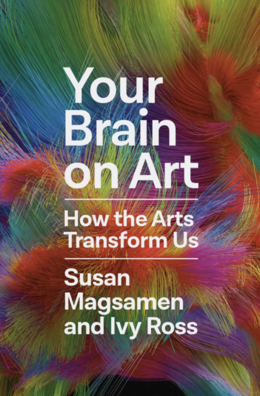
Read the following statements and circle the number that corresponds to how often they apply to you, using the following scale.
1 = Never 2 = Rarely 3 = Sometimes 4 = Often 5 = Very Often
I attend music, dance, theatre, museums, and/or digital art activities. 1 2 3 4 5
I see beauty when I look at or experience art. 1 2 3 4 5
I am emotionally moved by music. 1 2 3 4 5
I am impressed by symmetry in artistic works. 1 2 3 4 5
I sculpt, paint, draw, craft, create films/video, or design. 1 2 3 4 5
When I look at art, I feel positive energy or invigoration. 1 2 3 4 5
I write poetry, lyrics, nonfiction, and/or fiction. 1 2 3 4 5
When I view art, my heart beats faster, or I have other physical effects. 1 2 3 4 5
I appreciate the visual design of buildings and interior spaces. 1 2 3 4 5
I take (or have taken) classes in art, craft, creative writing, aesthetics, etc. 1 2 3 4 5
When making or beholding art, I experience a sense of connection and community. 1 2 3 4 5
When experiencing the arts, I feel a oneness, unity, or connectedness with the universe/nature/existence/deity. 1 2 3 4 5
I am deeply moved when I look at art. 1 2 3 4 5
I experience joy, serenity, or other positive emotions when I am making or beholding art. 1 2 3 4 5
The scale is organized into three categories:
Aesthetic Appreciation is the degree to which a person is responsive to the aesthetics of experiences and of their environment.
Intense Aesthetic Experience is the degree to which a person regularly responds to aesthetic experiences in a very intense way as opposed to more commonplace forms of appreciation.
Creative Behavior represents the degree to which a person engages in creative behaviors such as art-making.
Individual scale scores: Count your score for each question below and divide by the number of questions.
Aesthetic Appreciation: Questions 1, 2, 3, 4, 6, 9, 13, 14 _____ Divided by 8 =______
Intense Aesthetic Experience: Questions 8, 12, 13 _____ Divided by 3 =______
Creative Behavior: Questions 5, 7, 10, 11 _____ Divided by 4 =_____
Cumulative scale score: To determine your cumulative score add all fourteen of your individual question scores together and divide by 14. ______ Divided by 14 =______
Low Below Average Average Above Average High For example, you might have a 3 in Aesthetic Appreciation, a 2 in Intensive Aesthetic Experience, a 5 in Creative Behavior, and a cumulative score of 4.
--
arts and aesthetic experiences will improve your health and well-being and enhance your ability to learn and flourish.
--
Ivy carries tuning forks in her bag, because the resonant sound of the notes C and G combined can soothe a stressful moment.
--
In a study, Girija Kaimal, assistant dean for special research initiatives and an associate professor in the creative arts therapies program at Drexel University, found that for the majority of people, making art for as little as forty-five minutes reduces the stress hormone cortisol, no matter your skill level or experience. Making art is physiologically calming.
--
Stress isn’t a feeling or an emotion, rather it’s a physiological response to our emotions.
--
Sound vibration has the capacity to return the body to homeostasis and out of a fight-flight-freeze reaction.
--
The notes C and G, which Ivy struck with her forks that day at work, resonate with the Earth’s core frequency and are known to be soothing vibrations. These frequencies are used together all over the world because the ratio, or interval, between the notes creates a universal feeling of harmony.
--
One study concluded that the frequency of blues and greens in mild hues help calm people in a work setting, reducing stress and fostering more creativity. The same study found that yellow promotes attention and focus. For some, red can be highly stimulating.
--
Studies have found that coloring can have a similar physiological response in the brain as the act of meditating by reducing outside noise and allowing for focus. In one study, anxiety was measured in participants before and after they drew and colored, and their heart rate, respiration, and skin conductance were measured throughout. The results found all physical indicators of anxiety reduced when coloring, and that perceptions of anxiety lowered as well.
0 notes
Text
Creating Captivating User Experiences with Scrolling Animations
In an era of booming internet usage and endless digital distraction, web design and development solutions that truly engage visitors is no simple feat. A static page with plain text and images simply won't cut it anymore. Users have come to expect and demand more dynamic, interactive online experiences. This presents a major opportunity for businesses and web app developers to stand out by crafting compelling websites that feel alive.
One highly effective yet underutilized technique for making web pages more lively and engaging is the use of scrolling animations. As visitors scroll through content, elements on the page can move, transform, fade, and slide in response. When executed thoughtfully, these scrolling animations can guide users through an immersive, cinematic web experience.
In this comprehensive guide, we'll cover the art of scrolling animations in depth. You'll learn why they are effective, best practices for implementation for web app developers, which tools to use, and optimization tips.
By the end, you'll have all the knowledge needed to utilize scrolling animations to captivate your website visitors.
The Power of Scrolling Animation
What exactly makes thoughtfully crafted scrolling animations such a powerful way to engage visitors? There are several key reasons:
Directing the User's Attention
As humans, we are wired to pay attention to motion. This instinct is a matter of evolutionary survival. In web design and development, subtle animated motions guide the user's eyes across the page to areas any website development company wants them to focus on.
Key calls-to-action, impactful images, and other important page elements can fade or slide into view at just the right moment during the scroll to emphasize them. When visitors immediately focus on your intended key message, engagement improves.
Developing an Intuitive Narrative
Scrolling animations allow you to carefully reveal information and creative assets in a logical progression as users scroll down the page. This develops an intuitive narrative that builds on each new reveal.
Visitors understand precisely where to look and in which order because the sequence of animations leads them there fluidly. Storytelling principles and human cognitive patterns inform the sequencing and choreography.
Delivering Surprise and Delight
Thoughtful animations timed with scrolling can elicit positive emotional responses like surprise, intrigue, and delight. These emotions captivate visitors in the moment to keep them engaged.
For example, scrolling could trigger an illustration to come alive through charming character animation. Such small, unexpected delights make the experience more memorable and enjoyable.
Crafting Immersive Experiences
Scrolling animations can help create a truly immersive user experience where visitors feel transported into a digital world. The right animations respond and react to the user's scrolling in a way that makes the content feel more tangible and real. This level of immersive experience sparks deeper emotional investment and engagement from the user.
Dynamic Brand Differentiation
Finally, creatively executed scrolling animations allow brands to provide web development services with a truly distinct, recognizable aesthetic. The animations bring a brand's image to life digitally for a differentiated user experience. Like innovative UI/UX design, scrolling animation techniques can become signature brand elements when consistently applied. This helps foster brand loyalty and recognition.
As you can see, when leveraged effectively, scrolling animations check all the boxes for boosting user engagement. They guide visitor attention, craft cohesive narratives, spark emotional responses, increase immersion, and help web app developers stand out.
Now, let's explore some best practices for web design and development animation implementation.
Implementing Scrolling Animation Effectively
Here are key guidelines to follow when adding scrolling animations to your web design and development:
Begin with Purpose and Strategy
Before determining which animations to implement, step back and consider the broader strategy and purpose behind them.
What exactly do you want the animations to achieve for the overall user experience? How will they enhance the narrative? Make sure each animation ties back to well-defined UX goals rather than just adding motion for the sake of it.
Embrace Subtlety
The most effective scrolling animations in web design and development are subtle and understated. Big, flashy animations tend to feel gimmicky and distract from content.

Remember, the animations are there to enhance the content, not overpower it. Small hints of motion in the corner of the user's eye work best to pique interest and gently guide visitors without disruption.
While scrolling animations can make web design and development more engaging, it's crucial to ensure they do not come at the expense of usability, accessibility, or most importantly, the core function of the website. The primary goal should remain to convey information or provide a service to users effectively. No matter how delightful, animations that hinder achieving that key objective add entertainment value at the cost of overall user experience.
Striking the right balance means respecting fundamental web design and development principles. Animations should direct focus, not overwhelm. They should adapt seamlessly to any device or browsing configuration. Content hierarchies and navigation should stay clear. Every effect should map back to purposeful UX and business goals.
Keeping these priorities in check allows scrolling animation to enrich digital experiences rather than detract from core website functionality.
Design Responsively
Ensure any scrolling animations and effects work seamlessly on all device sizes, especially mobile. Mobile optimization is crucial, so preview the animations on real mobile devices during development. Also, design the animations to degrade gracefully, still providing value even if a user has animations disabled.
Mind the Performance Impact
Scrolling animations require work from the browser to trigger based on scroll position and calculate movement. As such, take care to not overload a page with too many performance-intensive animations that might slow things down. Find the optimal balance between visual appeal and fast load times.

To efficiently integrate animations without compromising speed:
- Animate properties like opacity and transform rather than layout-intensive properties like width/height
- Use the CSS will-change property to signal what properties will be animated, allowing the browser to optimize rendering
- Leverage hardware acceleration to offload intensive calculations to the GPU
- Group smaller animated elements into fewer, larger containers when possible
Careful optimization ensures animations delight users without frustrating them with laggy pages. Focus effects on key focal points rather than overusing motion across the entire page. A selective, purposeful implementation prioritizing subtlety reduces performance concerns.
Accommodate Accessibility
Follow web accessibility best practices when crafting scroll animations. For example, allow sufficient time for screen readers to first announce content before an animation triggers to unveil it. Also, provide ways to pause or turn off animations for those sensitive to motion.
More specific techniques include:
- Use the prefers-reduced-motion CSS media query to honor system preferences and avoid animating for users who have indicated sensitivity
- Add aria-live regions to update assistive tech users when content changes, ensuring screen readers announce animations
- Ensure content and navigation remain fully accessible and usable with animations disabled
- Avoid relying solely on animations to convey meaning, include redundant text/color affordances
- Test animations at reduced motion levels to confirm focal content is still scannable and comprehensible
Careful development following WCAG standards keeps animations an enhancement rather than a hinderance. With forethought and testing across assistive devices/preferences, scroll animations can be part of an inclusive, usable experience for all users.
Maintain Cohesive Branding
While each page may have unique animations, try to design them with consistent branding and aesthetics. This strengthens brand recognition. For example, always use the same tastefully muted color palette and smooth, subtle motion styles. Consistency evokes familiarity.
Choosing the Right Technical Approach
You have a few options for enabling animations that trigger based on scroll progress. The best approach depends on the project’s needs and your team’s skills.
CSS Animations
For simple animations like fade-ins, CSS transitions, and keyframe animations offer a relatively easy path. Any web development company can animate page elements by defining CSS rules that apply styles like opacity and transform based on pseudo-classes like: hover and active. CSS also provides options to delay or time the animations.

Benefits of CSS animations:
- No need for JavaScript, less overall code
- Native web platform features, well-supported
- Lightweight performance
Downsides:
- Less flexibility and customization control
- Can't react to scroll position
- Complex effects difficult
JavaScript Scroll Libraries
For more advanced scroll-driven animations in web design and development, dedicated JavaScript libraries like GreenSock ScrollTrigger, ScrollMagic, and AOS (Animate on Scroll) are extremely helpful. They provide options to anchor animations to certain points in the scroll, allowing you to trigger them precisely. This unlocks capabilities for web app developers like choreographing sequences of animations that respond to scrolling through sections.

Benefits of JS scroll libraries:
- Support complex sequenced animations based on scroll position
- Animate beyond just CSS, like Canvas, SVG, etc
- More control over parameters and customization
Downsides:
- Additional code/libraries required
- Performance considerations of JS
- Advanced development skills needed
Full Page Scrolling Frameworks
For truly immersive and interactive full-page scrolling experiences, with anchor points between sections, dedicated frameworks like fullpage.js are helpful. This enables scrolling between screen-sized sections instead of simply scrolling down one long page. The transitions between sections can contain advanced animations and parallax effects.
Benefits of full-page frameworks:
- Build a multi-screen scrolling experience
- Support extremely advanced/interactive effects
- Scrolling capabilities go beyond the main vertical
Downsides:
- Overkill for simple needs
- Learning curve and development overhead
- Performance optimization is crucial
For most websites, a hybrid approach utilizing both CSS and JavaScript scrolling libraries hits the sweet spot between capability and complexity.
When implementing animations, some key pitfalls to avoid include causing excessive layout recalculations and animating many individual elements separately using JavaScript loops.
Advanced techniques involve utilizing features like the Intersection Observer API to trigger anims as elements come into view. You can also leverage CSS custom properties to enable scripting control of animation attributes.
The optimal technical solution often involves a hybrid mix of CSS, JavaScript, and libraries - applying the right capabilities to create performant, cohesive effects. By combining approaches judiciously, web app developers can unlock the full creative potential of scroll-based animation.
Creative Examples to Inspire
Still not sure how to effectively use scrolling animations? Here are some great examples to spark ideas:
Stripe's homepage animates individual page sections on a scroll to transition between them smoothly.
HubSpot's website attractively animates headers, images, and cards on a scroll to direct attention.

Trello's scrolling animations and transitions make exploring their extensive homepage effortless.
Mailchimp creatively animates individual characters of headings for fun reveal effects.
Don't be afraid to experiment- done thoughtfully, scrolling animations can take your web pages from static to dynamic. Focus on enhancing user experience and your brand impression. With strategic implementation and testing, scrolling animations can make your website truly engaging.
Conclusion
When applied strategically with care to accessibility and UX principles, scrolling animations in web design and development can captivate users and take websites to the next level. The ability to guide user attention, reveal narratives, spark delight, and increase immersion is powerful.
However, restraint is still needed to avoid the overuse of animations at the expense of performance and focus. As with all emerging web design trends, the flashy effects should enhance, not overwhelm, core content and functionality.
There are also inherent challenges to address:
Performant scrolling animation requires optimization expertise. Complex animations can impact page load times if not efficiently coded.
Excessive motion risks distracting users rather than directing focus. Animation should be subtle and purposeful.
Accessibility best practices need incorporation so those sensitive to motion can still use the site comfortably.
Scrolling animations pose challenges on mobile devices with less processing power. Responsiveness and optimization are key.
Over-reliance on trendy animations could potentially date websites designed today in the future. A balance with timeless minimalism is ideal.
Looking ahead, advances in web design and developmentcapabilities will enable even more immersive animations while best practices will continue emphasizing subtlety and focus. Striking the optimal balance results in delightful user experiences that aid brand goals. The most effective implementations will likely involve hybrid approaches that leverage HTML, CSS, a bit of JavaScript, and scrolling libraries judiciously. Animation will be treated as an enhancement rather than the sole basis of engagement.
Companies like Consagous Technologies stay ahead of web design and development best practices to craft captivating yet balanced websites. Our award-winning web app developers expertly utilize scrolling animations alongside timeless design principles to create experiences that attract and retain. By consulting closely with clients to understand brands and goals, we incorporate trends like animation strategically to maximize results.
See how a leading web design and development company, Consagous Technologies' balanced utilization of scrolling animations and other engagement tactics brings websites to life.
Contact us for a consultation today on crafting captivating and effective sites!
0 notes
Text
How to Achieve Luxury Interior Designs on a Budget
Who wants to live in something other than a cozy and comfortable house where they can spend the lazy winter evenings with friends and family? However, the majority of us believe that decorating our home with a luxurious look and feel will exceed our budget. But this is only true sometimes. Interior designs are available even without a high price tag.
This thought often prevents all of our dreams. So, we are here to erase the myth that luxurious home interiors can only be achieved with a large budget. To add a luxurious touch to your home without breaking the bank, we have put together a list of expert-approved tips and tricks.
This discussion will help you to explore the strategies through which you can achieve a luxurious interior design in your living space. Let's go!
Strategies To Achieve A Luxurious Interior Design In Your Budget
1. Fix a plan and set your vision.
Think about the atmosphere you want before you set out on your affordable luxury journey. Look through Instagram, Pinterest, or design magazines to get ideas. Determine the essential components—such as color palettes, textures, and stylistic nuances—that appeal to you. Making decisions based on a clear vision will help you avoid impulsive purchases.
2. Ace space planning
Arrangement in an interior space matters more than what you put in it. Hence, superior space planning is essential to make interior design more exciting. You can maximize the impact of statement pieces, such as art or a fireplace, and use a scale to create different moods. You can also use furniture and fixtures to define areas. To ensure that you need less to get the desired results, make the most of everything you put into a space.
3. Elegant Layer lightings
You can improve the outcomes of your space planning efforts by utilizing the psychology of interior lighting. Warm, ambient lighting will bring out the extrovert qualities of residents in a space intended for socializing. Wall lighting combined with focused lighting from the floor and table lamps creates enclosed areas that are cozy and private. You should design your space with spotlights to highlight the focal points. A space's mood can also be affected by color. The layering method used in the best lighting designs produces smooth transitions from one area to the next.
4. Give the old a new touch.
Refurbishing vintage furniture can create a luxurious look on a budget. Find well-made pieces and take them to a professional refurbisher or online. Replace upholstery on chairs and sofas for a new look. This is less expensive than buying new furniture. Consider collecting end pieces of fabrics for smaller jobs and storing them for future projects.
5. Keep expensive materials in small spaces.
To create a luxury aesthetic on a limited budget, consider areas where expensive specialty materials will make the most impact. For example, in a kitchen, use intricate tile for backsplash or balance expensive tile for floor and walls in a bathroom. This principle applies to wall and floor coverings as well.
Conclusion
In conclusion, you can create an opulent and cozy look in your home by utilizing the strategies above. Get ready to transform your house into the utopia of your dreams with an elegant yet affordable makeover. Contact TLCHome for any kind of assistance.
0 notes
Text
Polished Concrete: A Smart Choice for Fort Collins, CO
The Art of Polishing Concrete in Fort Collins
At Concrete Polishing Of Northern Colorado, we are more than just a team of concrete contractors. We are artists, transforming the dull, lifeless canvas of concrete into a vibrant, durable masterpiece. With over 15 years of experience in concrete in Fort Collins, CO, we have honed our skills on various surfaces, mastering the techniques needed to achieve your desired finish.
Whether you're a homeowner looking to revamp your space or a business owner seeking to impress clients with a stunning interior, we're ready to deliver top-notch solutions tailored to meet your needs.
Our Comprehensive Concrete Services
Colorado Concrete Polishing
Our Colorado concrete polishing service is designed to transform an ordinary concrete floor into a vibrant, glossy, and easy-to-maintain surface. By applying a densifier that hardens the concrete, we create a surface that is resistant to heavy use and stands the test of time. The result is a high-quality floor that is not just visually appealing but durable as well.
Concrete Surface Preparation in Fort Collins, CO
A successful project starts with a well-prepared surface. Our concrete surface prep in Fort Collins, CO, ensures your concrete is free from contaminants that could compromise the final result. Then, we level the surface, leaving it ready for the subsequent treatment.
Concrete Staining in Fort Collins
If you're looking to add a splash of color to your concrete surface, our concrete staining service is perfect for you. We offer a variety of staining options, each with its unique benefits. This service can dramatically transform the appearance of your concrete surfaces, bringing them to life with rich, vibrant colors.
Is Polished Concrete Slippery? Debunking Misconceptions
Is polished concrete slippery? Despite its shiny appearance, it offers a good amount of traction, making it safe for both residential and commercial use. Furthermore, with our expertise in concrete surface prep in Fort Collins, CO, we ensure that your polished concrete floor is installed correctly, reducing the risk of slip-and-fall accidents.
The Eco-Friendly Choice: Polished Concrete
Choosing polished concrete isn't just a smart decision for its aesthetic appeal and durability, but it's also an eco-friendly choice. Polished concrete floors last a lifetime, reducing resource usage for replacements or repairs. They also do not emit harmful volatile organic compounds (VOCs), helping to maintain cleaner indoor air.
Moreover, polished concrete enhances natural light in a space, reducing the need for artificial lighting during the day, which can result in significant energy savings.
Choose Professional Concrete Services in Northern Colorado
When it comes to achieving the perfect polished concrete floor, professional expertise matters. At Concrete Polishing Of Northern Colorado, we adhere to local building codes, safety regulations, and environmental guidelines during all our projects. This ensures our operations are both legal and ethical, giving you peace of mind. Contact us today to experience the best in concrete services!
Concrete Polishing of Northern Colorado
6154 County Road 80
Fort Collins, CO, 80524
970-528-1315
0 notes
Last Seen Blogs

regius-leodium
Crownguard

characters4comfort
Characters4Comfort

queenof-sarcasm
MCU,HP,Star Wars

ligayangdala
ligaya.

junoboxparty
JUNO & A PERC 30