#100 font size
Text

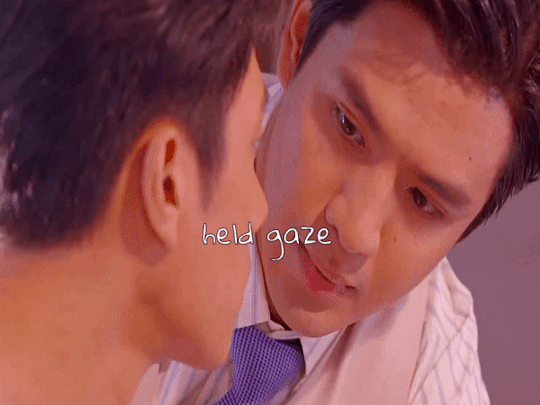

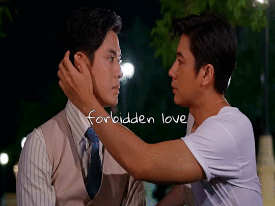
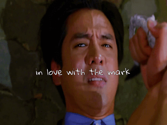
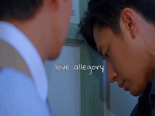


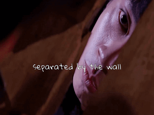
𝓳𝓲𝓾𝓽𝓲𝓪𝓷 + 𝓽𝓻𝓸𝓹𝓮𝓼 >> jam rachata as jiu & film thanapat as tian
#to sir with love#khun chai#jiutian#jiu x tian#jamfilm#jam rachata#film thanapat#thai drama#asianlgbtqdramas#asian lgbtq dramas#edit tag#tropesedit#my tropes gifsets have returned from the war!!!#im not 100% happy with the last one because it's more of a character trope than a romance trope#but i had to make do#i belatedly realised the size of the font was bigger in my previous gifsets but i can't be assed to fix it atp#it's fine. i don't need them all to look the same. as long as they look nice
42 notes
·
View notes
Text

Rainy day in the library with deliberately thematic snacks for writing fanfiction of our favorite undead Victorian man and his deranged goth wife.
#and yes i am writing risque stuff on a library computer#but i lowered the font size and changed to a frilly font to reduce ease of readability#honestly at this point if anyone gets traumatized by reading about zombie sex it is 100% on them squinting to make it out#especially since it's a private study room#consider this a warning against being nozy in a public library
4 notes
·
View notes
Photo
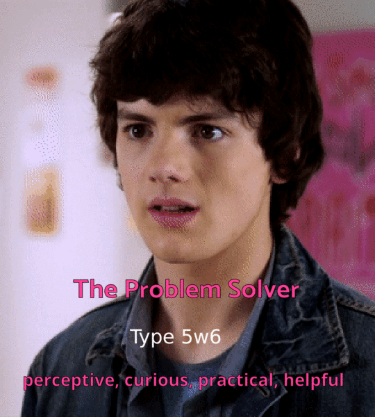


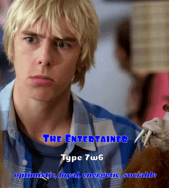
The Gang and Enneagram Types
#my babysitter's a vampire#mbav#mbavedit#ethan morgan#benny weir#sarah fox#erica jones#rory keaner#my gifs#this took me only over a year to finish#i researched all of these for hours to get the best accurate type so i'm pretty confident#but of course tell me if you agree or disagree#rory's took me so long none of the types fit 100% but i'm fine with this#i wanted to include links to the sites i used but i remembered something like you can't put links on posts anymore...? idk#lmk if you want the links#i wish i managed to make this more cohesive the font sizes and the gaps in between the lines are all different in every gif#they're only slight differences but it bothers me but i can't change it anymore#i just wanna post this now
90 notes
·
View notes
Text


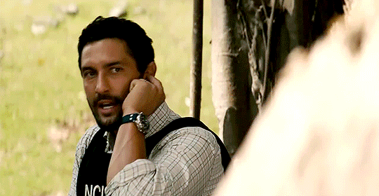
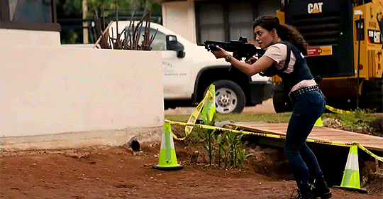
go team go!
NCIS Hawaii 2x05
#ncis hawaii#ncis hawi'i#spoilers#look at these loves#jane tennant#jesse boone#kai holman#lucy tara#mine#mine: ncis hawaii#kai's comment about it being a terrible plan or idea was 100% true#but they went all in anyway#and lucy with the gun that is half her size#wait i can make font small on mobile now!
25 notes
·
View notes
Note
hiii what does it mean, exactly, to regress in orv? like what events can cause a regression? is it a sort of punishment/penalty??
i can’t believe how quickly i’m flying through orv right now (light novel),, i found an epub at libgen and it has 7,441 pages so maybe it contains volumes 1 - 5 (hopefully, bc I don't know where else to read the light novel since i prefer it over the manwha (T — T))
i started it yesterday and i’m @ exactly 217 pages out of the 7,441 which isn't a lot but my average pages a day (digitally) just ranges between 20 - 30 so i was just like 👁️ 👄 👁️ HSUWHSHWH
THANK U for introducing me to orv im really liking it so far, and am enjoying kim dokja’s pov so much, his audacity to say certain things is so fun to read like he’s so annoying to the dokkaebi it's funny
hope ur having a lovely day bye now HSUWHHSWH
Omg hi so glad you're reading it and that you're enjoying it so far!!
In the context of yjh's regressions it just means that when he dies, everything resets and he goes back to the beginning of the scenarios (iirc he's the only incarnation with exactly this ability.) As for whether it's a punishment or not, i think the novel does spend some time on exploring those themes, but the real reason and purpose of yjh's regressions doesn't come to light until the epilogues, so i won't say anything more! You'll also find out later what exactly happens to everyone else in the world each time that yjh regresses.
Hope you have a lovely day as well ❣️
#it's hard to tell how much your epub contains because it depends a lot on the font size and what app you use etc#i read with very large font size on my phone so my epub had like 100 000+ pages skfjsjdhsjdhjs#but it should be 551 chapters in total#i also have a complete epub i can send if you ever want another version :)
7 notes
·
View notes
Text
people who have unreadable dnis who get mad that no one read it when people like/rb their tumblr post are so funny im sorry
#like idk if you wanted ppl to pay attention to that maybe you shouldve made it even slightly more readable#but no. light text on light bg. no spacing. 1000 words when you couldve used 100#flashing glitter gifs. size 2 font. one million links to click#and youre surprised people keep missing stuff lmao
0 notes
Text
Video description: A Firefox user on an Android phone changing their AO3 site skin from Art Deco light mode to Purple Galaxy dark mode by changing their browser settings from light to dark. The video has no sound.
If you want to be able to use a light mode skin during the day and a dark mode skin at night, you can do that! I've figured it out for an Android phone, and it works with both Firefox and Chrome.
[if you change your browser settings to follow device theme, you can have this happen automatically, so that if your phone is light mode then AO3 is light and if your phone is dark mode then AO3 is dark]
If anyone out there has an iphone and can test it, please share your results in the notes!
Instructions under the cut:
To create exactly what I show in the video, you'll be making a total of 3 skins: 1) a light mode skin 2) a dark mode skin 3) a skin that combines those other two skins together
In the links above, you can get both the code for those skins and instructions for applying them on your account. Do that. When you're done:
Edit the light mode skin.
Scroll down to below the CSS box and find the word Advanced and tap the button labelled Show
In the new window that opens up, find the scrolling list called Choose @media and tick off the check box next to handheld and (prefers-color-scheme:light)
Update your site skin.
Do the same for your dark mode skin, but this time select (prefers-color-scheme:dark)
After making those changes to the skins, create a third site skin. You'll need to put some code into the CSS box, so here's a snippet that won't do anything:
#workskin p {
font-size: 100%;
}
It sets the font inside fics to 100% of whatever your device currently sets it at. If you want the font bigger, change the number to something more than 100. If you want it smaller, change it to a number smaller than 100.
The magic happens when you do this:
Scroll down to below the CSS box and find the word Advanced and tap the button called Show
In the new window, scroll past the media section you used before and find the button on the right labelled Add parent skin. Tap it.
type in the name of your light mode skin and select it
Tap Add parent skin again
type in the name of your dark mode skin and select it
Save your skin
Use your skin
Enjoy!
shoutout to @ao3skin who showed me how to do this for a tiktok video like 3 years ago and I only just remembered this was possible 🤣
649 notes
·
View notes
Text
here are some things that would help me as a blind person regarding online accessibility (mobile for me):
- all apps should display all text sizes (iphone goes up to 310%)
- all apps should display bold text if it's turned on in the system settings
- there should be a standard for text size; if my text size is 100% across all apps, then an instagram post, a toot, a text message etc. should all be the same size, no more "instagram and tumblr are always slightly smaller for some reason" bs
- an app's formatting (such as buttons, alerts etc) needs to be compatible with large text! large text doesn't help me if all the buttons are suddenly overlapping or i can't get out of an alert window because they forgot to program the ability to scroll. no more overlapping shit, no more missing shit, no more "i can't get out of this window without closing the app and changing my text size"
- usernames, channel names, all word and sentences should be fully visible even with large text! i don't know what channel "# ge..." is on discord. find a way to make it visible, either make it multiple lines, give me the ability to side scroll or make it move like a spotify song title
- make sure things that shouldn't be affected by large text aren't! if i need to scan a barcode and my large text settings make it unrecognisable to the machine, that's unhelpful
- all apps should have a light mode and a dark mode! certain conditions make it easier to see light mode, others make it easier to see light mode
- dark mode should be as high-contrast as light mode, i.e. white on black, not white on dark grey
- probably have other options beyond regular dark and light mode
- on apps that let you customise your profile a lot visually, give the option to view it in your phones' settings, i.e. if someone's got a dark red on black serif-font tumblr, i wanna be able to make it into a white on black plain font tumblr
- alt text should be accessible without a screenreader
- there should probably be a dedicated field for video descriptions too
- apps that give hashtags a different colour than the rest of the text should let you choose the colour
- all apps should let you view someone's profile picture in full size
- this one is specific to instagram: let us fucking zoom in normally! why do i have to do finger gymnastics just to stay zoomed in and read text on a picture? the zoom should work the same way it does in my photo library and literally everywhere else
most of these shouldn't be that hard and they would make my life a hell of a lot easier. i'm tired of running into issues because i'm too blind to read regular size text.
i WISH it was as simple as "describe your images" and "no fancy fonts", which is something people can easily choose to do to make things a little more accessible, and if they don't, i can unfollow and surround myself with people who post accessible stuff.
but all of the things i listed are things done my developers and not regular users, it's stuff i can't just ignore by surrounding myself with people who care about blind accessibility if the people who create the spaces don't care about blind accessibility.
#and that's not even getting into android's so called large text#disabled#disability#blind#low vision#visually impaired#sight impaired
965 notes
·
View notes
Text
Industrial Automation In Life Sciences Market Size 2022 by Key Players, Types, Applications, Countries & Forecast to 2028
0 notes
Text

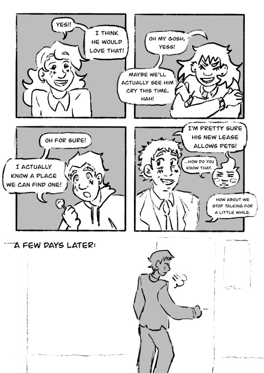

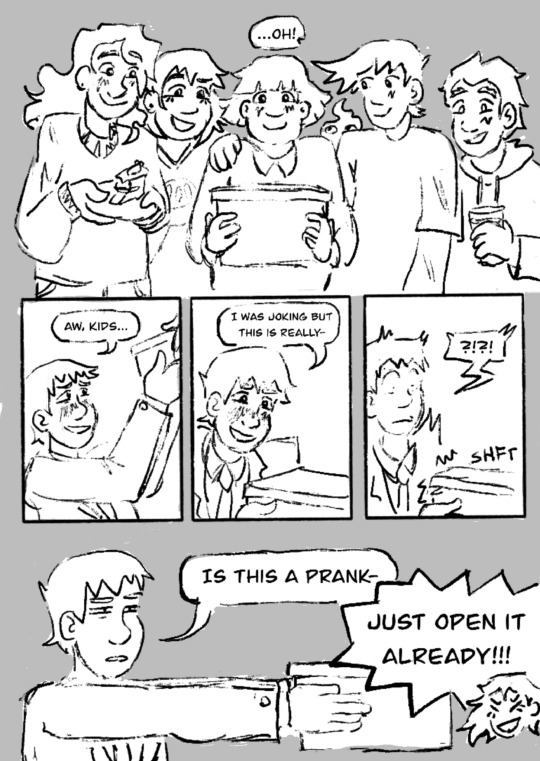
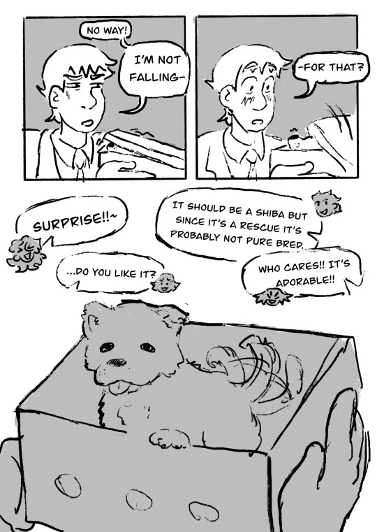

HAPPY BIRTHDAY R- what the hell do you mean I’m two days late
[ID: A Mob Psycho 100 comic set post-canon. Mob, depicted with chin-length hair and wearing a skirt, says to Ritsu, "I just haven't been able to think of a gift he'd actually like. And I want it to be special, cause this time he'll expect the party."
She looks down with a frown. "Especially since Teru accidentally added him to the group chat." Ritsu laughs with a "Hah!" and says, "I do have an idea, if you want to hear it." Mob smiles tiredly and says, "Please." Ritsu says, "Okay, but it's a pretty big gift so we should check in with everyone."
Teru, shown with hair past his shoulders, exclaims happily, "Yes!! I think he would love that!" Tome grins and says, "Oh my gosh, yess! Maybe we'll actually see him cry this time, hah!" Shou looks interested and says, "Oh for sure! I actually know a place we can find one!" Serizawa smiles, "I'm pretty sure his new lease allows pets!" Dimple squints and says, "… How do you know that," and Serizawa says, "How about we stop talking for a little while."
Next, marked "a few days later:", we see Reigen opening the door to Spirits and Such. The door creaks open, and he screams with terror when people loudly go, "Happy birthday!" We see scenes of the party: Reigen sweating and grimacing as Tome offers a cake with Ritsu laughing in the background, Serizawa and Reigen smiling fondly at each other with a heart floating between them, and Reigen looking dead-eyed as everyone photographs him and his cake-covered face.
Reigen, now cleaned of cake, flops on the couch and smiles, "Wow! All that's missing now is a present!" He sweatdrops. "… I can feel you all staring. Then he exclaims "Oh!" at the sight of all the kids looking happy and excited. Mob is in the center, smiling with anticipation and holding a box about the size of a large shoebox.
Reigen takes it with a fond smile, saying, "Aw, kids… I was joking but this is really--" He breaks off with a shocked sound as something shifts within the box. He holds the box away from himself and says flatly, "Is this a prank--" but is cut off by a laughing Tome shouting, "Just open it already!!!"
Reigen, frowning, exclaims, "No way! I'm not falling--" As he speaks, a canine nose pokes out from the boxes lid, and his expression turns to shock. "-- for that?"
We see a small puppy excitedly wagging its tail from within the box. The kids all talk. Teru: "Surprise!!~" Shou: "It should be a Shiba but since it's a rescue it's probably not pure bred." Mob, nervous: "… Do you like it?" Tome: "Who cares!! It's adorable!!"
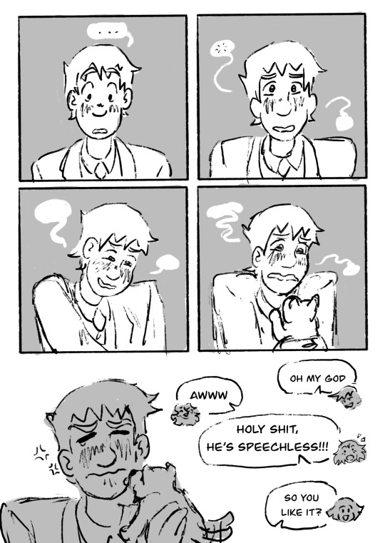
Reigen stares down with silent shock. Making a hiccuping noise, he looks at everyone with an overwhelmed expression that moves to tears as he picks up the dog, making wordless wavering noises as he does.
The puppy licks Reigen's cheeks, and Reigen scrunches up his face as he tries not to cry. The kids exclaim: Ritsu, grinning: "Oh my god." Teru: "Awww." Tome, surprised: "Holy shit, he's speechless!" Mob, happy: "So you like it?"
Reigen sniffs loudly and says, "You guys…" Everyone looks at him eagerly. Once again crying, Reigen says, "Get out of my office." The kids looks surprised, and Serizawa sweats and wryly raises his hands, saying "Reigen--" Reigen cuts him off by shouting so hard he motion blurs. "I said-- get out." His shout is also blurred, and it's bold and in large font.
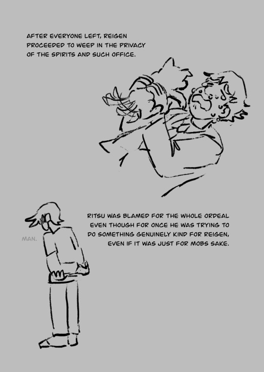
The final page shows Reigen lying down and blubbering while holding the puppy, who keeps wagging its tail. Narration says, "After everyone left, Reigen proceeded to weep in the privacy of the Spirits and Such office." Ritsu is shown facing away fromt he camera, arms crossed behind his back as he mutters, "Man." Narration says, "Ritsu was blamed for the whole ordeal even though for once he was trying to do something genuinely kind for Reigen, even if it was just for Mobs sake." End ID]
ID by @princess-of-purple-prose thank you so much!
#mob psycho 100#mp100#reigen arataka#shigeo kageyama#ritsu kageyama#teruki hanazawa#serizawa katsuya#tome kurata#mp dimple#happy birthday reigen#and rest in pieces ritsu. amen.#yes that is girlmob wahoo#\
609 notes
·
View notes
Text
why do i change the layout of every fanfiction i read on here
0 notes
Text
HOW TO: Make Animated Neon Text
Hi! No one asked for this tutorial, but this is one of my favorite typography effects as of late — so I thought I'd share how I do it. You can see this effect in the first gif of this *NSYNC Celebrity set and the last gif of this Anthony Bridgerton set. Disclaimer: This tutorial assumes you have a basic understanding of gif-making in Photoshop. It's also exclusively in Timeline and uses keyframes for the fading effect seen on the blue text.

PHASE 1: PREP YOUR BASE GIF
1.1 – Choose a dark scene.
This effect looks best contrasted against a dark background. You can definitely do it with a bright background, but just like a neon sign irl, you only turn it on in the dark/at night — so keep that in mind!
1.2 – Determine the length of your clip.
Depending on how much you want your text to flash or fade in, you'll want to make sure you have a scene long enough to also allow the text not to flash — reducing the strain it takes to actually read the text. For reference, my gif is 48 frames.
1.3 – Crop, color, etc. as you would.
New to gif-making? Check out my basic tutorial here!
PHASE 2: FORMAT YOUR TEXT
Before we animate anything, get your text and any vectors laid out and formatted exactly as you want them!
2.1 – Finding neon sign fonts.
It's easy as going to dafont.com and typing "neon" into the search bar!
2.2 – Fonts I used.
Neon Glow by weknow | Neon by Fenotype | Neon Bines by Eknoji Studio
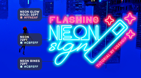
And to not leave my fellow font hoarders hanging, the font for "tutorial by usergif" is Karla (it's a Google font) 🥰
2.3 – Group your text layers. (Conditional)
If you plan on having multiple text layers like I did and you want them to appear connected (like how the last letters of "NEON" and "sign" intersect with the wand icon), I suggest putting the layers into groups according to color (the shortcut to group layers is Command+G). If you don't group your text and just apply the outer glow settings to each individual layer, you'll end up with something like this:
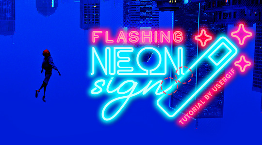
—where you can see the glow overlap with the line, instead of the smooth connection you see in my final example gif. I'm using 2 colors for my text, so I made a group for red and a group for blue.
2.4 – Apply Outer Glow.
Right-click your text layer (or your group if you have several layers) and select "Blending Options" to open the Layer Style menu. Check "Outer Glow" and feel free to play around with the settings until you like the way your text looks!
Your outer glow color should be darker and more vibrant than the color of the text itself. The text should be within the same color family but much brighter and, sometimes, almost white (see Step 2.2 again for my text colors).
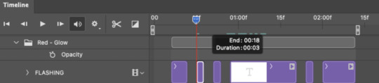
Here are the settings for the Red Glow (the glow color is #FF3966) and Blue Glow (#00F0FF):
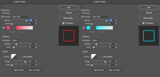
These aren't always my exact settings but they're pretty close to my standard. I always set the blend mode to Hard Light and usually have the opacity at 100%.
For every gif I use this effect on, I like to play around with Spread and Size. Spread will make the glow look denser and "expand the boundaries" (source: Adobe) and Size will diffuse the glow and blow it out so it covers a larger area (Adobe says it "Specifies the radius and size of blur").
2.5 – Duplicate your text layer/groups and remove glow.
We're only going to be animating the glow on our text, and since doing this affects its opacity/visibility, we want to preserve the base text by creating a duplicate.
I just hit the Command+J shortcut to duplicate my groups and delete the Outer Glow effects, making sure that the "No Glow" version is above the "Glow" version:
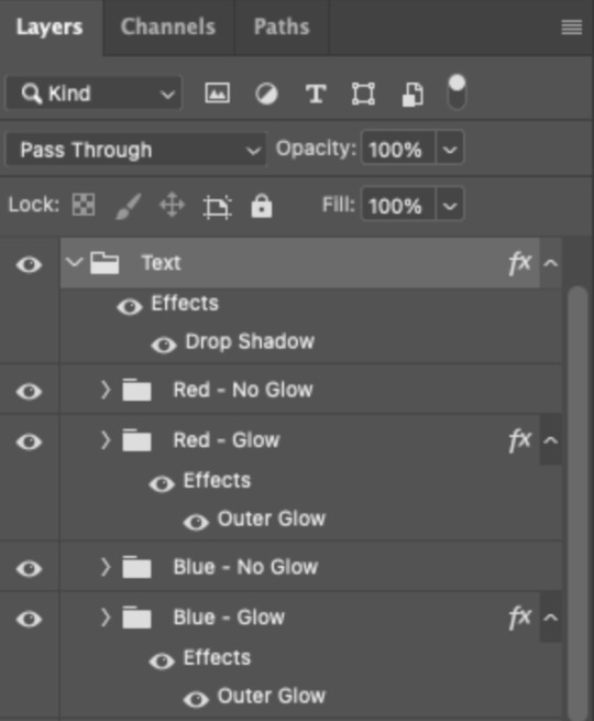
I also put all these groups into one group called "Text" for organization and so I could apply a drop shadow to all the elements for better visibility.
PHASE 3: CREATE THE FLASHING EFFECT
This is for the effect you see on the RED text in my gif!
3.1 – The 0.03-Second Rule
If you've read any of my animation tutorials before, you're probably already familiar with this rule. In my experience (and for reasons I can't explain), Video Timeline pauses every 0.03 seconds (try clicking the forward button a few times, you'll probably find a "duplicate" or paused frame). So, keep all your layers a duration of 0.03-second increments (e.g. 0.06 or 0.09 seconds can also work) and align them on the Timeline at 0.03-second intervals. If you don't follow this rule, you'll get duplicate frames when you export, resulting in a choppy final gif.
3.2 – Trim and arrange your text layers.
Only on the layers/groups WITH the Outer Glow effect, trim them into several segments of varying lengths where the glow will be "on" (visible) and leaving spaces where the glow should be "off."
Typically, I'll have a mixture of 0.06 and 0.03-second text. That's when the glow will be visible. Between each "flash" of visibility, I've got a 0.03-second blank space, baby *pen clicks* and I'll write your name:
The layers shown above are arranged with a few flashes and two long segments of no flashing. This is the order and duration of each segment shown above (purple = visible segments):
0.06 blank, 0.06 visible, 0.03 blank, 0.03 visible, 0.03 blank, 0.03 visible, 0.03 blank, 0.24 visible (the long bit where "FLASHING" doesn't flash at all), 0.03 blank, 0.03 visible, 0.03 blank, 0.12 visible
(I only did this for the text that says "FLASHING" to give it a glitching effect. The other red text keeps the glow visible starting at the first long segment.)
PHASE 4: CREATE THE FADE-IN EFFECT
This is for the effect you see on the BLUE text in my gif!
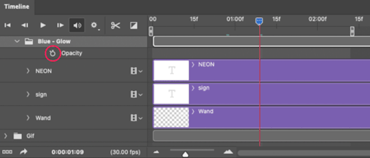
4.1 – Animate using the Opacity Keyframe.
Again, we're only touching the layers/groups WITH the glow effect. If you only have one layer of text, you'll find the Opacity Keyframe by clicking the film reel icon:
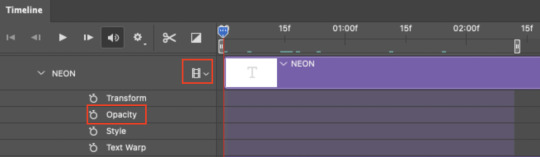
If you're working with groups like me, you'll find it in the Timeline panel under the group when it's expanded:
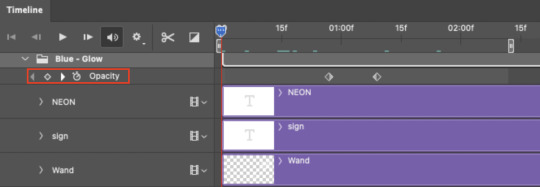
As you can see, I already added my keyframes (lil diamond babies). And luckily, it's super easy to do!
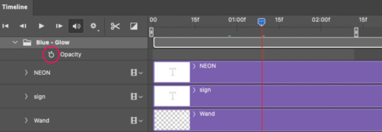
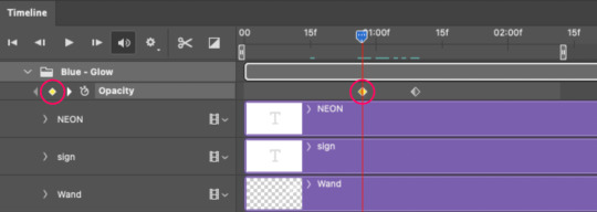
4.2 – Add the ending Keyframe first.
We're starting at the end because our layers/groups are already at 100% opacity. Drag the playhead (the blue arrow attached to the red vertical line) to a spot where you want the glow to be 100% opaque — this is where the glow will be fully "on" or visible. [Again, follow the 0.03-Second Rule. You will get duplicate frames regardless when using keyframes (this will be explained in the note in Phase 5), but abiding to the rule will mitigate the amount of dupes you get.]
Then, click the clock icon by "Opacity" to place a keyframe:
4.3 – Add the starting Keyframe.
Go backward from the ending Keyframe you just placed (I went back 0.12 seconds — but you can play around with the duration of the fade, just keep it a multiple of 0.03):
And drop another keyframe, this time by clicking the diamond icon by "Opacity":
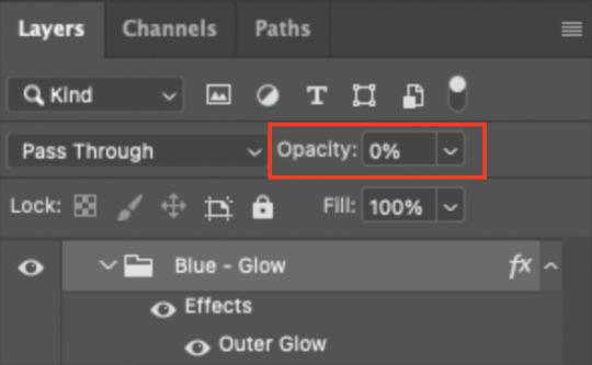
4.4 – Reduce the opacity on the starting Keyframe.
Keeping that keyframe you just placed selected, go to the layers panel and reduce your layer's/group's opacity to 0%:
Now, this Outer Glow will slowly fade from 0% to 100% opacity.
And just for a visual aid, here's where my fade-in keyframes are in relation to my flashing segments:
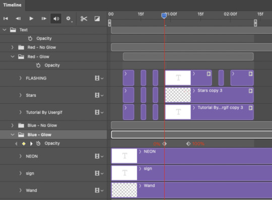
To refresh your mind, the 0% Opacity Keyframe starts when "FLASHING" is visible for 0.24 seconds (the first long segment of visibility).
With these keyframes, you'll get a smooth fade-in à la ✨light switch with a dimmer✨
PHASE 5: EXPORT
Yay, we're finished! Convert from Timeline back to Frames and export your gif!
NOTE: If you only did the flashing effect and followed my 0.03-Second Rule, you shouldn't have any duplicate gifs.
BUT if you included the fade-in effect using keyframes, you WILL have duplicate frames. 'Tis the nature of keyframes. 🤷♀️ I had 4 extra frames where the fade-in starts, which I deleted. So, as always, I recommend checking your frames when you convert from Video Timeline back to Frame Animation — and manually delete any duplicate frames.
Sorry this tutorial is so long 🙈 I over-explain so you're not just mechanically copying steps, but understanding the WHY behind each step! Thanks for bearing with me
If you have specific questions about this tutorial, feel free to send a message to usergif and I'll try my best to help! :)
More USERGIF tutorials • More resources by Nik • USERGIF Resource Directory
#typography#gif tutorial#completeresources#usershreyu#useryoshi#userelio#userzaynab#userives#usertreena#usercim#userrobin#userkosmos#usersalty#userhella#alielook#uservalentina#uservivaldi#*usergif#*tutorial#by nik#flashing gif
736 notes
·
View notes
Text
A jitsuin (実印) is an officially registered seal. A registered seal is needed to conduct business and other important or legally binding events. A jitsuin is used when purchasing a vehicle, marrying, or purchasing land, for example.
The size, shape, material, decoration, and lettering style of jitsuin are closely regulated by law. For example, in Hiroshima, a jitsuin is expected to be roughly 1⁄2 to 1 inch (1.3 to 2.5 cm), usually square or (rarely) rectangular but never round, irregular, or oval. It must contain the individual's full family and given name, without abbreviation. The lettering must be red with a white background (shubun), with roughly equal width lines used throughout the name. The font must be one of several based on ancient historical lettering styles found in metal, woodcarving, and so on. Ancient forms of ideographs are commonplace. A red perimeter must entirely surround the name, and there should be no other decoration on the underside (working surface) of the seal. The top and sides (handle) of the seal may be decorated in any fashion from completely undecorated to historical animal motifs, dates, names, and inscriptions.
Throughout Japan, rules governing jitsuin design are very stringent and each design is unique, so the vast majority of people entrust the creation of their jitsuin to a professional, paying upward of US$20 and more often closer to US$100, and using it for decades. People desirous of opening a new chapter in their lives—say, following a divorce, death of a spouse, a long streak of bad luck, or a change in career—will often have a new jitsuin made.
The material is usually a high quality hard stone or, far less frequently, deerhorn, soapstone, or jade. It is sometimes carved by machine. When carved by hand, an intō ("seal-engraving blade"), a mirror, and a small specialized wooden vice are used. An intō is a flat-bladed pencil-sized chisel, usually round or octagonal in cross-section and sometimes wrapped in string to give a better grip. The intō is held vertically in one hand, with the point projecting from the carver's fist on the side opposite the thumb. New, modern intō range in price from less than US$1 to US$100.
The jitsuin are kept in secure places such as bank vaults. or hidden in a home. They are usually stored in thumb-sized rectangular boxes made of cardboard covered with embroidered green fabric outside and red silk or red velvet inside, held closed by a white plastic or deerhorn splinter tied to the lid and passed through a fabric loop attached to the lower half of the box. Because of the superficial resemblance to coffins, they are often called "coffins" in Japanese by enthusiasts and hanko boutiques. The paste is usually stored separately.
A ginkō-in (銀行印) is used specifically for banking; ginkō means "bank". A person's savings account passbook contains an original impression of the ginkō-in alongside a bank employee's seal. Rules for the size and design vary somewhat from bank to bank; generally, they contain a Japanese person's full name. A Westerner may be permitted to use a full family name with or without an abbreviated given name, such as "Smith", "Bill Smith", "W Smith" or "Wm Smith" in place of "William Smith". The lettering can be red or white, in any font, and with artistic decoration.
Since mass-produced ginkō-in offer no security, most people either have them custom-made by professionals or make their own by hand. They were traditionally made of wood or stone; more recently of ivory, plastic or metal, and carried in a variety of thumb-shape and -size cases resembling cloth purses or plastic pencil cases. They are usually hidden carefully in the owner's home.
A mitome-in (認印) is a moderately formal seal typically used for signing for postal deliveries, signing utility bill payments, signing internal company memos, confirming receipt of internal company mail, and other low-security everyday functions.
Mitome-in are commonly stored in low-security, high-utility places such as office desk drawers and in the anteroom (genkan) of a residence.
A mitome-in's form is governed by fewer customs than jitsuin and ginkō-in. However, mitome-in adhere to a handful of strongly observed customs. The size is the attribute most strongly governed by social custom. It is usually not more than 20 millimetres (0.79 in) in size. A man's is usually slightly larger than a woman's, and a junior employee's is always smaller than his bosses' and his senior co-workers', in keeping with office social hierarchy. The mitome-in always has the person's family name and usually does not have the person's given name (shita no namae). Mitome-ins are often round or oval, but square ones are not uncommon, and rectangular ones are not unheard-of; irregular shapes are not used. They can produce red lettering on a blank field (shubun) or the opposite (hakubun). Borderlines around their edges are optional.
Plastic mitome-in in popular Japanese names can be obtained from stationery stores for less than US$1, though ones made from inexpensive stone are also very popular. Inexpensive prefabricated seals are called sanmonban (三文判). Rubber stamps are unacceptable for business purposes.
242 notes
·
View notes
Text

-screams- okay listen, I was up till 2 AM doing this, I did my best, oh my god I did, but in combination with what @ewitsewwie and @thewiglesswonder posted here: Click
and all the crap I posted over here: Click
And some interpretive dance in my sleep-deprived fueled art season. This is what I came out with, a lot of it.. i had to work from tiny, tiiny images okay. so it's not 100% accurate but I am hoping its at least 80%?
6 and 9 I am glad are the same emblem just flipped... Uh i'd need some help making it into a font as I would once again need to redraw all these and correct sizing and spacing and oh god it would kill me.
Have fun @kathaynesart
#rottmnt#rise of the teenage mutant ninja turtles#rise of the tmnt#rise krang#Krang#Kraang#reference#resource#save rise of the tmnt#save rottmnt#save rise of the teenage mutant ninja turtles#Art#doodle#doodles#alphabet#Runes#rune
459 notes
·
View notes
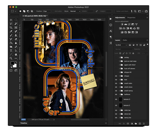
Note
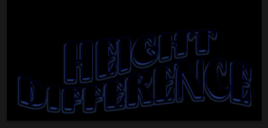
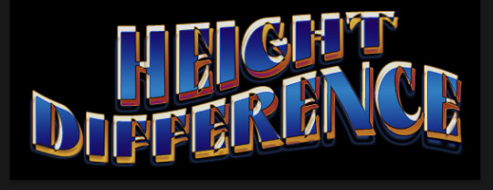
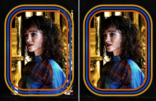
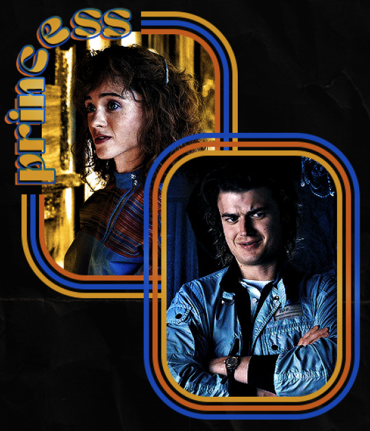
hello! I love your edits and I wanted to know, for the "Steve Robin and Nancy" Gif you posted.. How would I go about doing something like that? More specificly, the bottom two where it says "Height Difference" and where it labels them as "Princess, Jock and Loser"
Thank you! Sorry this took a while to answer. I finally had time to sit down and write this. Link to original post.
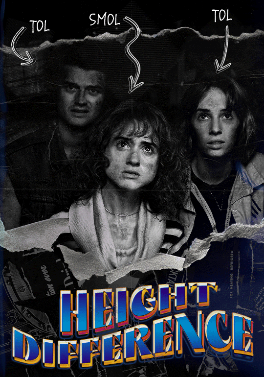

Quick notes:
I'm using Photoshop 2021 on Mac and working in video timeline. Must have basic gifmaking skills and know how to use layer masks. This is primarily a gif layout and text tutorial.
Fonts used in first gif:
Pea Wolfe Tracks — link here
King & Queen — link here
Fonts used in second gif:
Kiera — link here
Post — link here
Ellianarelle's Path — link here
Heina's hurry — link here
I used a light leaks/film texture, ripped paper textures, folded paper textures, and transparent pngs (arrows + post-it notes + smiley face).
We'll start with this gif.
Make your gif! The gif here is 540x600px. I color and sharpen it to my liking. Go to image > canvas size > change height from 600 to 770px. I left the anchor in the middle, though it doesn't really matter.
I drag and drop my folded paper texture and change the layer order so it's under my gif. Then I change the blending mode on my gif to Screen so the texture shows through the gif, but I keep the texture at 100% Opacity and Fill.
Now I move my gif around and add my ripped paper textures. I wanted to give it a sort of poster-like feel to it, so I made more room on the bottom for my main text and ended up with something like this. Blending mode is set to Lighten for the ripped paper textures.
I then use layer masks to hide what I don't want shown and add my light leaks/film texture. Blending mode on light leaks/film texture set to Pin Light, Opacity: 50%, Fill: 70%.
I use Levels and Brightness/Contrast adjustment layers to darken the gif up a bit more, then I add a patterned paper texture. Blending mode for patterned paper texture set to Lighten, Opacity: 100%, Fill: 75%. Result:
Now on to the text!
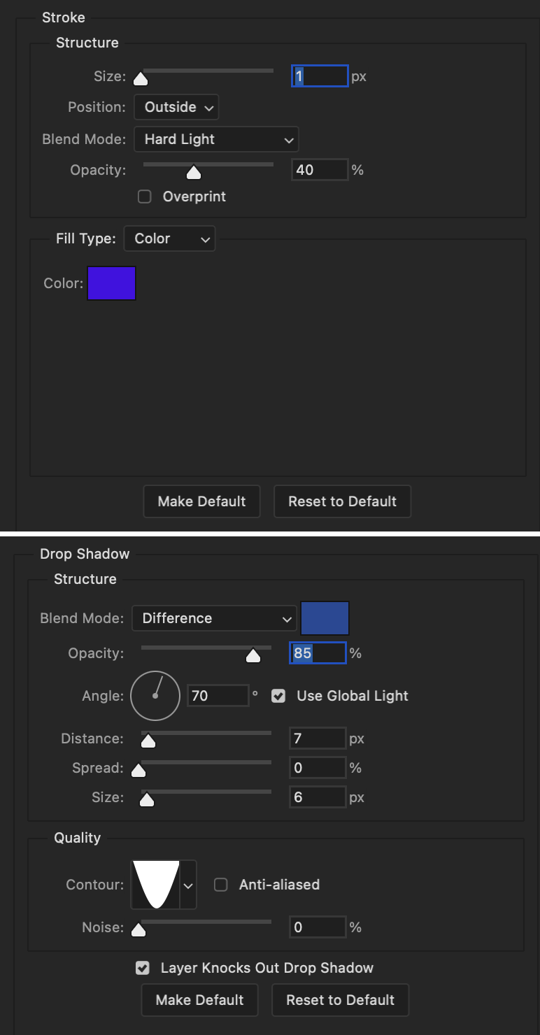
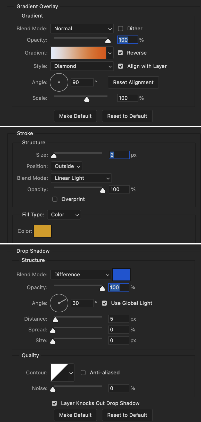
I'm going to be honest here, a lot of this was clicking around until I settled on something I liked. There's three layers to create this text effect. The font used here is King & Queen.
For the first text layer, the font color is set to black (#000000), font size: 87 pt, leading: 80 pt, tracking: 25.
Layer styles used here are stroke and drop shadow.
Text Layer 1
Stroke settings:
Size: 1px
Position: Outside
Blend Mode: Hard Light
Opacity: 40%
Overprint: unchecked
Fill Type: Color
Color: #5911ed
Drop Shadow settings:
Blend Mode: Difference
Color: #2d5ba8
Opacity: 85%
Angle: 70°
Use Global Light: checked
Distance: 7px
Spread: 0%
Size: 6px
Contour: Cone - Inverted
Anti-aliased: unchecked
Noise: 0%
Layer Knocks Out Drop Shadow: checked
Blending mode for text layer set to Overlay, Opacity: 100%, Fill: 85%.
Warp text settings:
Style: Wave
Horizontal: checked
Bend: +60%
Horizontal Distortion: +10%
Vertical Distortion: 0%
With all those settings applied, the first text layer looks like this:
Duplicate the layer, clear all layer styles, and change the color for the second text layer to white (#ffffff). All other text settings (including warp settings) should stay the same. The only layer style then applied to this text layer is stroke.
Text Layer 2
Stroke settings:
Size: 1px
Position: Outside
Blend Mode: Difference
Opacity: 100%
Overprint: unchecked
Fill Type: Color
Color: #d48f16

Blending mode for the second text layer is set to Difference, Opacity: 90%, Fill: 100%. Nudge the second text layer a bit so the first text layer is a little more visible or move to your liking.
With both those layers active, it looks like this:
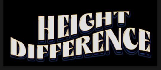
Duplicate the second text layer, clear layer styles, and change the color of this third text layer to a dark grey (#1a1919). Again, all other text (and warp) settings should stay the same.
Layer styles applied to this layer are stroke and gradient overlay.
Text Layer 3
Stroke settings:
Size: 1px
Position: Outside
Blend Mode: Difference
Opacity: 100%
Overprint: unchecked
Fill Type: Color
Color: #d48f16
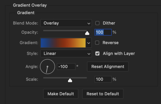
Gradient Overlay settings:
Blend Mode: Difference
Dither: unchecked
Opacity: 100%
Gradient: #cd3f00 > #ffdb5d
Reverse: unchecked
Style: Reflected
Align with Layer: checked
Angle: 90°
Scale: 100%

Blending mode for the third text layer set to Exclusion, Opacity: 100%, Fill: 100%. I also moved the third text layer around, down and to the right a few pixels to give it that 3-D Word Art effect.
With all three text layers active:
Next are the arrows.
Take your transparent pngs and place them to your liking. Blending mode for these is set to Difference, Opacity: 100%, Fill: 100%.
Command + click on an arrow thumbnail to select all the pixels in that layer. This is why the image must be transparent!
With that selection made and on a new blank layer, right click the selection and click on stroke. Settings for that are width: 2px, color: white, location: center. Move that a couple of pixels over.
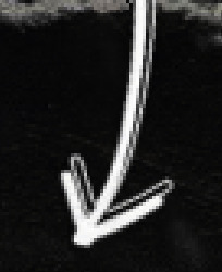
Do this for all arrows for a total of 6 layers for arrows. I group them together to keep my workspace clean, then I duplicate my arrows group with no further changes made to the second group to get what you see in the final gif.
Next is the smaller text. It's three separate text layers for each word, so I can move each of them around to my liking.
Font used is Pea Wolfe Tracks, font color: white (#ffffff), font size: 24 pt, leading: 6 pt, tracking: 25. Bold and italic options checked. I set the blending mode to Difference, Opacity: 100%, Fill: 100%.
And that's it! That concludes the tutorial for this gif!
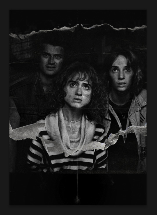
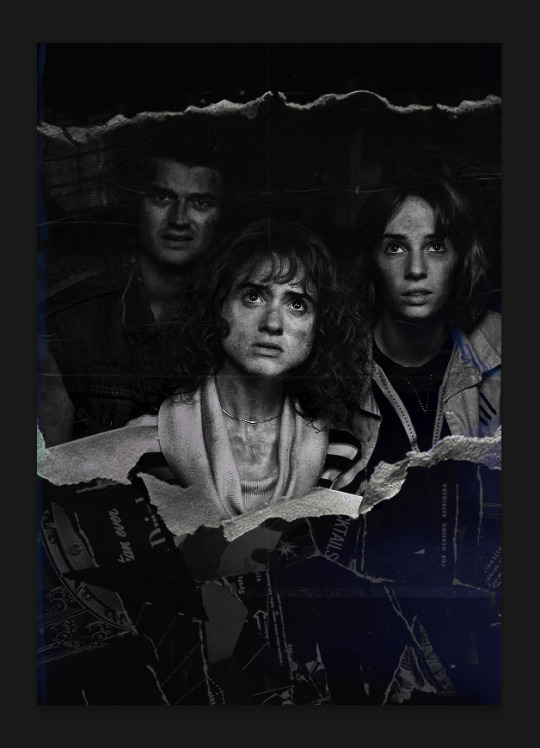
Now on to this gif.
We'll start with the background gif. There are three separate gifs. You could make them one gif, but I wanted the option to order them differently if I needed to.
All gifs in the background are the size of the canvas: 540x770px. Color and sharpen to your liking, but keep them all black and white. To get the blurry effect go to filter > blur > guassian blur. Set radius to 7.0 pixels. Add this to all three gifs.
Then I add two folded paper textures. Blending mode for one set to Lighten, Opacity: 60%, Fill: 100%. The other set to Screen, Opacity: 70%, Fill: 90%.
I found this tutorial a while back for a halftone effect. They include links to the halftone pattern used here as well as textures and gradient maps not used here.
I'm only using the halftone pattern here.
Pattern fill settings:
Angle: 66°
Scale: 8%
Link with Layer: checked
I also added a gradient overlay layer style to the halftone pattern which gives the gifs the color you see above.
Gradient Overlay settings:
Blend Mode: Overlay
Dither: unchecked
Opacity: 100%
Gradient: #0059ac > #a33600 > #e6b801
Reverse: unchecked
Style: Linear
Align with Layer: checked
Angle: -100°
Scale: 100%
Now on to the square shapes with rounded corners. In the interest of keeping this tutorial short(er), I found this tutorial on youtube that explains how to make squares with rounded corners.
I set my stroke size to 6px, stroke color to white (#ffffff), and fill to no color. I don't use the stroke layer style to make the borders of the shape like in the video! I'm only linking the video to show how to curve corners with square shapes.
Note: Be sure you know how big or small you want these to be and how they're going to fit on your canvas in order to make all the shapes and edit them. It can be tedious to change the settings.
Duplicate and resize to your liking.
In this instance, I wanted to make three squares total, so I had to duplicate twice and resize until I had something I liked.
Settings for the shapes used here are:
Innermost shape: W: 200px, H: 280px, corners: 50px
Middle shape: W: 220px, H: 300px, corners: 60px
Outer shape: W: 240px, H: 320px, corners: 70px
Once I have the size I want for all three shapes, I group them together to make a set and duplicate that group twice, then adjust each set on the canvas for my layout.
What the sets look like all together:
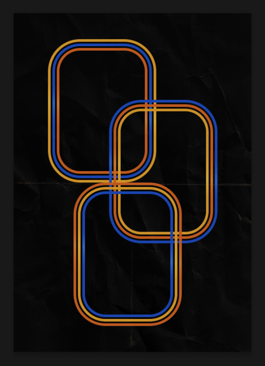
Colors used: orange #e47100, blue #0062d1, yellow #ecac00
To add color to the shapes, either change the color of the shape itself or use layer styles. I used layer styles.
Note: I didn't add the colors until the end after I knew what gifs went where and what color scheme I wanted, but I don't want to add more images than I need to here.
To keep this short, I found this tutorial on youtube that explains how to wrap text around a shape. However, I wanted the text to align on the outside where the white line is and not the green line (left image):
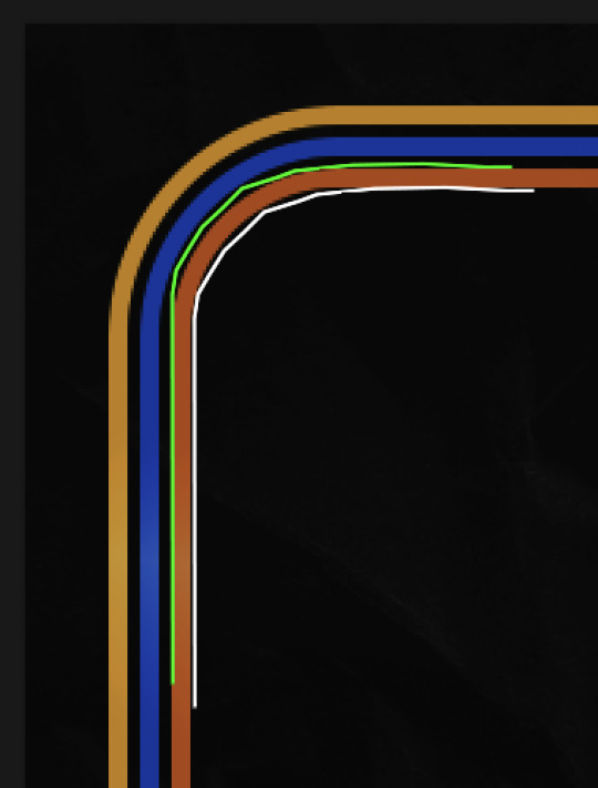
So I created another shape just inside the innermost square and used that as a path for my text (right image). Adjust the text to your liking until you have your text where you want it. Refer to the video tutorial if you need help moving the text along the path!
You don't need the shape path once you have your text where you want it, so use the layer visibility tool to hide it. You can hide your other shapes too so you can work with your text.
Do not delete your shape path!
I duplicate it once I start working with my "jock" text since all the sets are the same size. The "loser" text has to be worked a little differently, but we'll get to that later.
For the princess, jock, and loser text, there are two text layers to create the overall effect. For both layers, font used is Kiera, font color set to white (#ffffff), font size: 60 pt, blending mode set to Normal.
I added a gradient overlay layer style to the first text layer which I'll call the base layer. Opacity for this layer is 100%, Fill: 100%.
Base Layer
Gradient Overlay settings:
Blend Mode: Normal
Dither: unchecked
Opacity: 100%
Gradient: #f0b002 > #e7f0fd
Reverse: checked
Style: Diamond
Align with Layer: checked
Angle: 90°
Scale: 100%
The second text layer is your stroke and drop shadow layer. For this layer, opacity is set to 100%, Fill: 0%.
Stroke and Drop Shadow Layer
Stroke settings:
Size: 2px
Position: Outside
Blend Mode: Linear Light
Opacity: 100%
Overprint: unchecked
Fill Type: Color
Color: #0064cb
Drop Shadow settings:
Blend Mode: Difference
Color: #fb7c00
Opacity: 100%
Angle: 30°
Use Global Light: checked
Distance: 5px
Spread: 0%
Size: 0px
Contour: Linear
Anti-aliased: unchecked
Noise: 0%
Layer Knocks Out Drop Shadow: checked
End result looks like this:

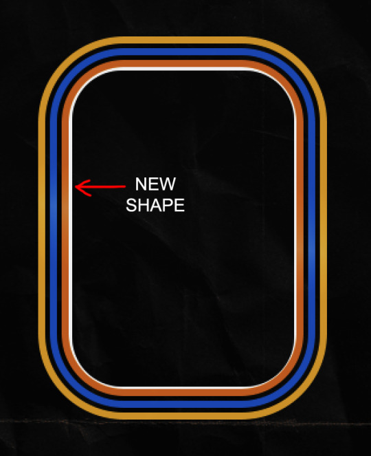
When I make my shapes visible again (minus the one I used as a path), I get this:
The shapes are clearly in the way of the text, whether they're above my shapes layer or under it. I use layer masks to hide what I want, so the text is legible. It looks cleaner this way and I wanted the text to be a part of the shape itself. I do that for each rounded square.
Now on to my smaller gifs. I like to crop, resize, sharpen, and color separately because my laptop and Photoshop would kill me if I tried to do it all on one canvas. I use the size of the middle shape for my gifs (220x300px), so I can have a little wiggle room when adjusting. I then use a layer mask to hide the parts of the gif that are outside of the shape.
A quick way to do this is to command + click on the thumbnail of the innermost square. With that selection made, I got to my gif layer and add a layer mask. Sometimes you need to invert it. Use command + i with the layer mask selected (not the gif) to invert the layer mask.
I repeat this process with my Steve and Robin gifs. I have to go back and forth with all the layer masks to hide parts of the gif/shapes I don't want for each set. It's kind of a long process, but not all that difficult. I label and group my layers together as I work to keep things clean and it helps me keep track of what I edited and what needs to be edited when it comes to things like this.
The picture below shows where I hid the bottom right corner of Nancy as well as the shapes that make up her set using layer masks. I also did this with the Steve and Robin sets, hiding the bottom left corner of Steve.

Similar text settings used for jock. The gradient overlay layer style for this base layer is different than that of princess because of the positioning of the text. Again, same as princess, two text layers are used here. Blending mode, opacity, and fill for both are the same as the princess text layers as mentioned before.
Base Layer
Gradient Overlay settings:
Blend Mode: Normal
Dither: unchecked
Opacity: 100%
Gradient: #007aec > move bottom middle dot to 80% > #e7f0fd
Reverse: checked
Style: Diamond
Align with Layer: checked
Angle: -140°
Scale: 100%
Stroke and Drop Shadow Layer
Stroke settings:
Size: 2px
Position: Outside
Blend Mode: Linear Light
Opacity: 100%
Overprint: unchecked
Fill Type: Color
Color: #a05700
Drop Shadow settings:
Blend Mode: Difference
Color: #ffba00
Opacity: 100%
Angle: 30°
Use Global Light: checked
Distance: 5px
Spread: 0%
Size: 0px
Contour: Linear
Anti-aliased: unchecked
Noise: 0%
Layer Knocks Out Drop Shadow: checked
Image 1: We start with Robin.
Image 2: To make the loser text, I had to create a new path.
Image 3: I make it so the text is on the inside of the path instead of the outside. (Hint: Refer to video tutorial if you don't know how to do that.) I then adjusted the tracking between the letters in the word "loser" so they didn't look so squished together.
Image 4: Then I use layer masks to hide the parts of the shape I don't want shown.
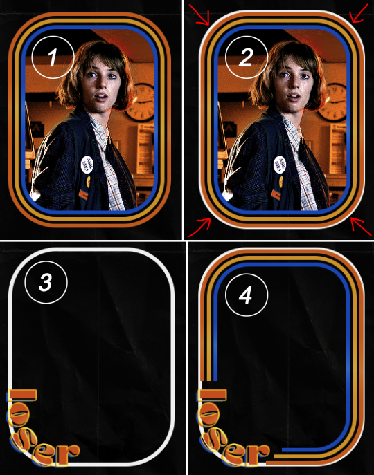
You can then hide the path or delete it. You only need it if you want to adjust the placement of the text. I keep it (hidden) just in case.
Text settings for loser are just like those for princess. Blending mode, opacity, and fill are also the same.
Base Layer
Gradient Overlay settings:
Blend Mode: Normal
Dither: unchecked
Opacity: 100%
Gradient: #eb6400 > #e7f0fd
Reverse: checked
Style: Diamond
Align with Layer: checked
Angle: 90°
Scale: 100%
Stroke and Drop Shadow Layer
Stroke settings:
Size: 2px
Position: Outside
Blend Mode: Linear Light
Opacity: 100%
Overprint: unchecked
Fill Type: Color
Color: #e1a900
Drop Shadow settings:
Blend Mode: Difference
Color: #0068de
Opacity: 100%
Angle: 30°
Use Global Light: checked
Distance: 5px
Spread: 0%
Size: 0px
Contour: Linear
Anti-aliased: unchecked
Noise: 0%
Layer Knocks Out Drop Shadow: checked
Next are the post-it notes! This is probably the easiest part of making this gif. You just have to repeat this process for however many post-it notes you're making.
Image 1: To start, place your transparent post-it note where you want it. You can also rotate it if you'd like.
Image 2: Then create a text layer and write what you want. Font used here is Post. I wanted this text underlined to give emphasis, so I click on the underline option. I also adjusted the leading because I wanted more space between the word and the line. Rotate the text so it looks like it's written on the post-it note.
Note: It looks better if you choose a font that looks handwritten.
Image 3: I wanted another line to give emphasis to the "Dingus!!" text and make it seem more handwritten. I use the line tool to create another line.
Image 4: Then I adjust that line to my liking.

Fonts used for notes: Post, Ellianarelle's Path, and Heina's hurry
Repeat this process for all post-it notes!
That finishes the tutorial! (And I hit the 30 image limit lol.) I hope this helps. If you have any further questions, feel free to send an ask or IM and I'll try to answer to the best of my ability.
Happy photoshopping!
#ask#pcocana#photoshop#photoshop tutorial#tutorials#*tutorials#userchibi#userbunneis#uservivaldi#userriel#userabs#usertiny#useralien#useraljoscha#userfanni#userraffa#tusermona#userbess#userrobin#userroza#quicklings#janielook#usernaureen#userrlorelei#tsusermels#tusermimi#userelio#usertj#userbarrow#usernolan
139 notes
·
View notes
Text
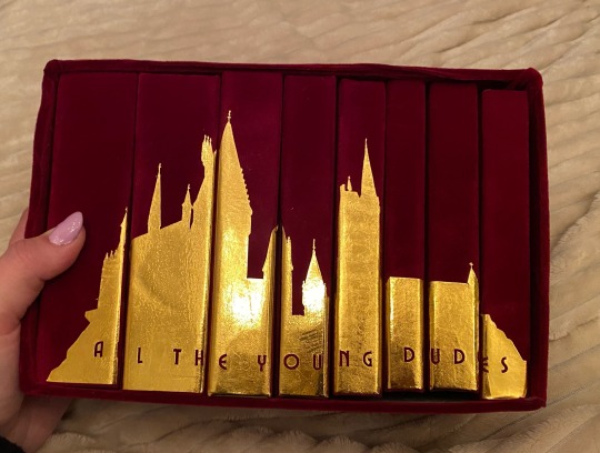
this is the one. the most popular fic in the harry potter fandom. the fic that got me into fanfiction. the fic that i sobbed to for months after reading it.
i tried to bind this three separate times over the last two years and bro the first two sucked ASS. it was legit the very first fic i tried to typeset which is like, not the greatest thing to start off with LMAO. it looked funky, i hadn’t fixed any of the spacing, my footers didn’t match the text font or size. it was very much a baby binding.
the second one was my first time using a cricut and there is a very steep learning curve w the cricut, especially in creating designs that aren’t too complex or too plain. i tried to copy one of the popular printable book jackets and omg i spent weeks modifying my designs and printing and reprinting on my cricut and it looked like trash when i was done.
so finally, we have come to this.
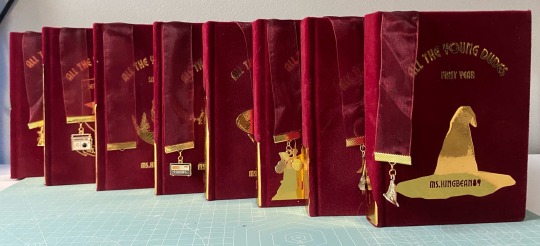
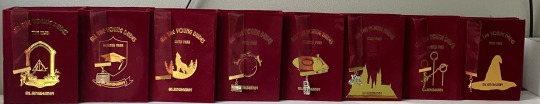
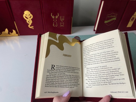
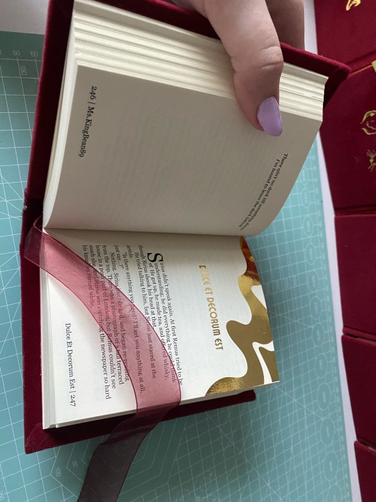
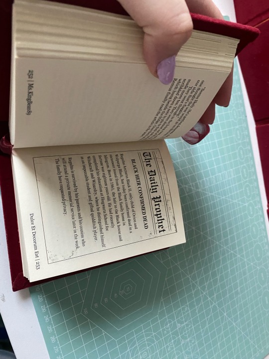
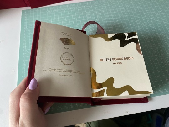
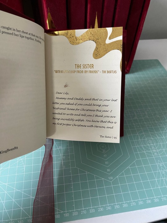
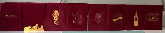
i got really into quartos during the winter and was like omg the editing process for this would be so much more manageable if i broke it down into years! so then i did lol. it allowed me to customize each chapter into sections so i could add the chapter title to the footers, and break down graphics into separate years so i didn’t have 100 pages in one canva file. it was just a lot easier to feel accomplished having broken it down bc this fic is a MONSTER.
every chapter heading is the same - just the swirl. i gilded all the chapter titles using toner reactive foil and my laminator (she broke in the middle of this project. i ended up having to buy another laminator, and about 3 packs of foil from icraft. this is my most expensive fic binding to date🫠). i included the songs ms.kingbean put at the top of every chapter, and the bootleg tapes and christmas special.
i am seriously so proud of how this turned out, and can’t believe it’s actually done. sorry this is super long, but this really was a labor of love. they’re not perfect, i’m still really bad at measuring and cutting straight lines, but i’m satisfied. really satisfied.
#fanfiction#harry potter#harry potter fanfiction#bookbinding#ao3 fanfic#fanbinding#wolfstar#atyd#atyd marauders#atyd fanart#atyd fandom#remus lupin#sirius black#grant chapman#bound in peel and stick velvet flocking#chipboard#and gold htv#fucking hell it’s DONE!!#typesets in my drive#free for personal use#don’t sell fics!!
92 notes
·
View notes
Last Seen Blogs
stakook-blog
Need a Dollar

neapenning
Dear Mario, Do NOT come to the castle.
parrotpolish
Parrot Polish