#I'm having way too much fun designing these
Note
That's good. Even the small ones can be hella pricey, which is understandable and all. I wanna get a big one on my back when I save the money up and when I decide I have the courage to go through that pain because I have some scars on my back that I don't want to be tattooed over, they'll hurt too much.
My dad was an asshole but he always taught me to be considerate of others and I know how it is to be overwhelmed so I try not to be too, like, annoying when sending in asks.
Also, sorry, I've been trying to restrain from sending in anything long and shit but I've had a thought lately and I just need to know, how did the sexual thing between Hound and Makarov start? Like, was it just one time Makarov was feeling horny and Hound appealed to him? Was it a reward or punishment? I'm curious
- 🪒
Okay sorry for the late reply lol
Yeah the back scars are understandable, depending how they are you could maybe make a design flow around the scars so you don't need to get them tattooed?
Nah dude, normal chatter doesn't really overwhelm me nor is it annoying in any way! It's just with the requests that I get a little overwhelmed lol. With just chatting it's like, I intend to respond when I see the message, but then I get the ADD and forget about it lol.
Also for the question; I think there were a few reasons. It started as an ego thing for Makarov. Seeing a much larger, much stronger man than Makarov submit to him was a boost to his pride. Making Hound into his sex pet, essentially, also was a dig at Price. Makarov hadn't yet been sure whether he was going to keep Hound when he was completely broken or if he would just kill him when he had his fun, so the sexual aspect started as a way to horrify Price; 'see how I can make your most loyal soldier willingly choke on my cock before I kill him' type of psychological attack on Price, ya get me?
Plus I reckon it had to do something with the fact that Makarov grew up in the USSR times, and back then and now there are very strict social norms. Being gay is wrong, but being on the receiving end is worse, and Makarov has an image to uphold. But with Hound? He can do what he wants, why not enjoy himself?
Also yes, a part of Makarov was just straight up horny, and got hornier when Hound gave him his first prostate orgasm while sucking him off.
#gnome's tea break#gnome correspondence#cod mw2#🪒anon#hound-reader#good dog fic#vladimir makarov x reader#vladimir makarov
26 notes
·
View notes
Text
I've been wanting to do this forever so why not now
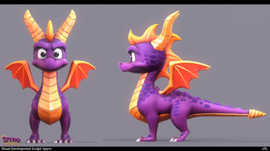
RATING SPYRO'S MODELS IN EACH GAME (these are the models themselves, not like his designs outside of the games in like promotional materials and stuff. That may be a later post idk yet)
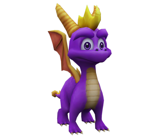
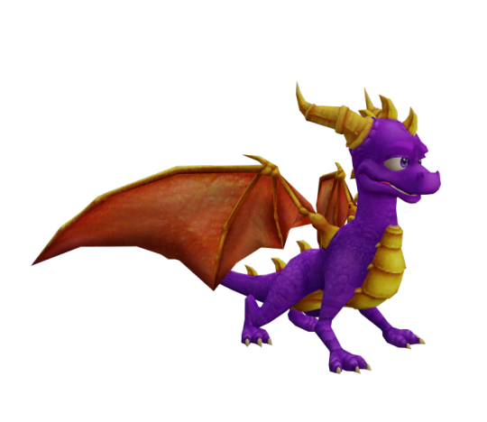
Spyro 1

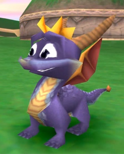
The classic Spyro design. The small line of blue scales. The little yellow gradient on his cheeks and snout in cutscenes. The brown horns and big, expressive eyes. Oh yeah, this is prime Spyro right here. Will take points because the wings are very small and awkwardly shaped, which to be fair it is 1998 playstation so like. What can you do.
9/10
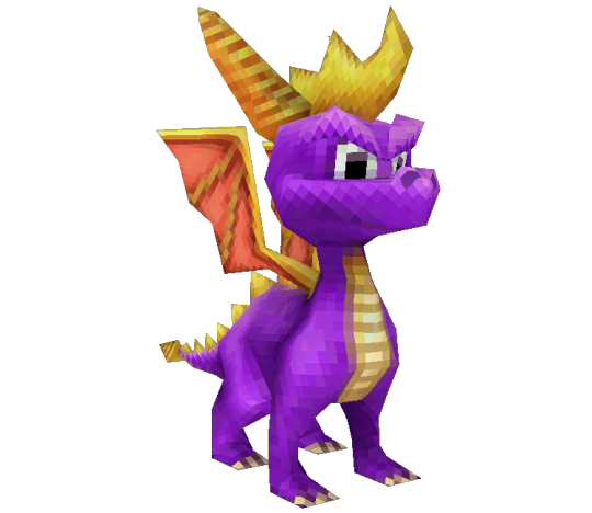
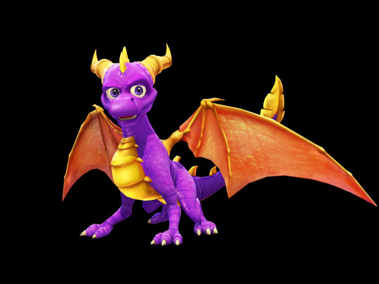
Spyro 2/3

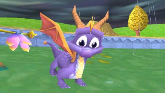
Now this? This is perfection here. Takes everything the Spyro 1 model does and does it better. Still has the little blue scales I love so much and the brown horns, but with much better wing shape and size. Top tier Spyro model. Might be my favorite of all of them, even.
10/10
Spyro: Enter the Dragonfly
I like how they decided to texture in more scales during the jump from ps1 to ps2. Sadly this may be the only thing i like about this model. It's not the worst thing i've ever seen, but it looks so... gummy? Some of the details look kind of odd to me, like the yellow claws and unevenly spaced lines along his chest. This also removed the blue scales lining around his underbelly and adds the yellow horns which I'm not crazy about. A few points for still trying to be mostly loyal to the ps1 designs shape wise.
5/10
Spyro: A Hero's Tail
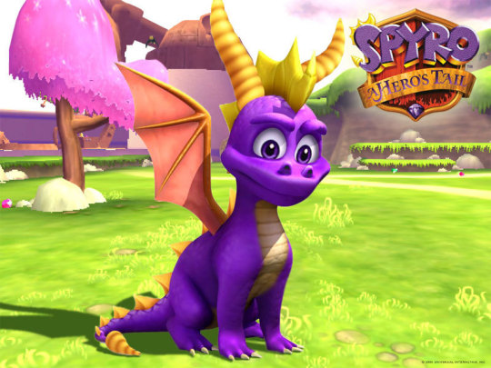
Now this is a pretty good improvement from the enter the dragonfly model. I'm not crazy about the snout shape, looks a bit too round and i think the nostrils are a bit too high on his face, but overall a good spyro! the introduction of the purple eyes is cool too (personally im a red eyed spyro truther but still)
7/10
Spyro: Shadow Legacy
HAHAHAHHAHAHAHHAHA HOLY FUCK HAHAHHAHA. okay okay okay to be fair this one is a ds game and spyro himself is suuuuper small on the screen so like. of course he'd be low poly. does get some points for spyro having sharper and more mean features. though you probably wouldn't notice in the game
4/10
Legends Spyro New Beginning/Eternal Night

Might be nostalgia talking but I actually still really like this design. I like his snout shape and more lightning bolt shaped horns, and i find his head and back spikes kinda cool, even if i like the classic shape of them better, it works for this design. His horns are a tad bit more brownish (it's more visible in the game), which you know I love. This spyro is overall very cute!! Maybe a bit too cute, but I enjoy him
8/10
Legends Spyro Dawn of the Dragon
I don't. like him.
the back legs look fucked up, the wings are way too thick at the base by the shoulders and then they're so small but then get so long by the end. i like the little added scales along his underbelly. that's about it. you would think taking the previous model and making him older would be easy but i guess not. a point because you can tell he's older and if you only look at his head the model is nice. not the rest though. god.
2/10
Skylanders

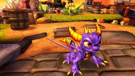
This might be controversial but i dont care. i actually like the skylanders spyro design. he leans more into the cool factor than cute, which i can appreciate, and he kinda reminds me of a pug a little bit and i really like pugs. he's got kind of a beast/monster factor i really like. i love love love the horn shape and the big claws, and the yellow claws dont even look awkward here!! the red eyes really pop too! i think he's really fun
7/10

side note i also LOVE spyro's design in the skylanders show too ESPECIALLY HIS COLORING LOOK HOW NICE HE LOOKS it takes the best parts of the game model and improves it. i know this isn't from the game but it's too good not to include.
9/10
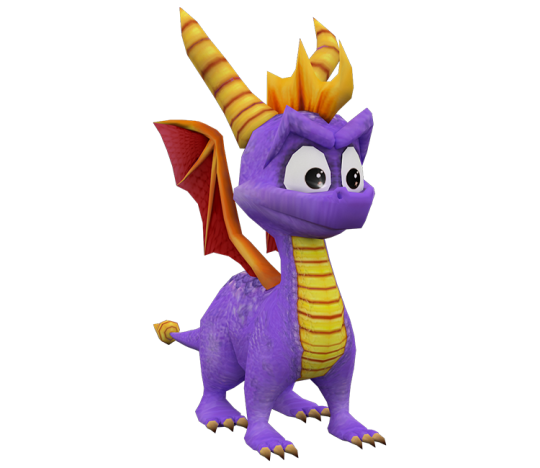
Spyro Reignited
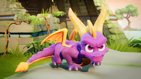
I do really really really love this model, it's near perfect. perfectly balances the cute/coolness factor. the shapes are all good, the wings are small but not too small. love the darker scales across his body. his little thumbs are so fun too. honestly this is the best they could have done for a remodel of the first 3 games. only taking off a point because im not crazy about the colors, i prefer the darker purples and brown horns.
9/10
BONUS: CRASH ON THE RUN
Im so torn on this one because on one hand the cartoony stylization really works in these models. i love the bigger snout, i think it's fun, and i LOVE LOVE LOVE taking his head spikes and kind of splitting them up like hair. that's so fun! but on the negative end I HATE THE WAY HIS FEET LOOK SO MUCH OH MY GOD. they're like wretched lumps of clay with little claws jammed into them. granted this was for a mobile app BUT STILL. the feet really just fuck me up a lot
6/10
Okay that is all thanks for reading <3 maybe next time i'll rate spyro renders or something <3
22 notes
·
View notes
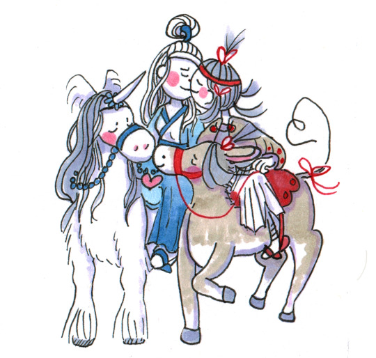
Photo
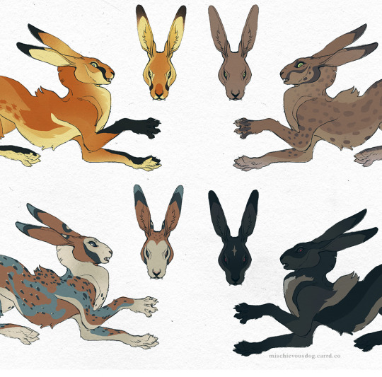

More progress pics of the bunny adoptables I’m working on
#artists on tumblr#adoptable#adoptables#hare#rabbit#I'm having way too much fun designing these#i love character designing so much#art#wip
1K notes
·
View notes
Note
Oooo starstruck dee has little stars at the bottom of her feet! Are they just aesthetic or would they make imprints into the ground? (like pawprints)
exactly like that! though she's not the only one...
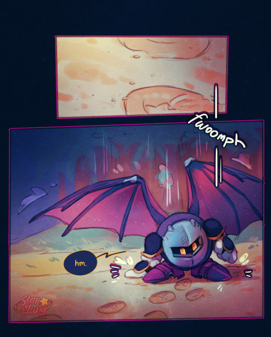
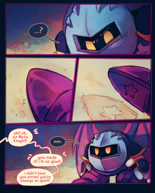
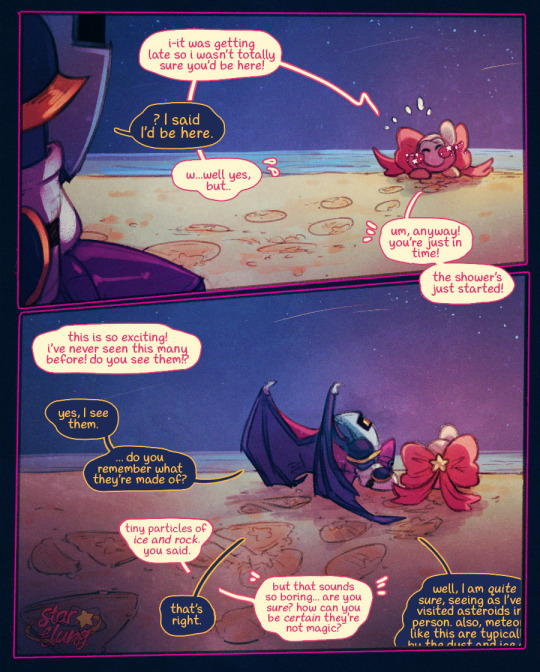
edit: might need to add some additional dialogue to this to make it more clear, but a clarification in the interim; he knows about his own footprints. he's just surprised to see something similar already there when he knows he's only just landed. he lifts his own shoe to confirm that they're not identical (and also to reveal this to the viewer). seems his stoicism beat off the clarity in this one, sorry 😭
#meta knight#starstruck dee#have had this one sitting around for *months* while i bit my nails on posting it#and then i thought maybe i *shouldn't* during the shipaganza bc it's not a direct prompt; though i do think you can read it that way#and for ~Reasons~ i needed to post this one sooner rather than later so i had to bite the bullet.#though meta knight has understandably been the second most prompted. they do indeed have the Funnest Possible Dynamic for it#stoic guy and the bug eyed little Creature he doesn't really trust as far as he could throw her (long long way)#so just to clarify this one is NOT for the shipaganza but you can read it that way if you want to#this is just a canon scene between them from her storyline. this is just something they canonically share. starry eyed idiots.#also fwiw i think i probably picked up the shoe-patterns for the knights from postitnotes7#been a headcanon in the back of my mind for a long while but i'm pretty sure i osmosis'd it from their work#especially after drawing post's designs so much for the hnkss. i temporarily forgot how i used to draw their armour ngl#and also btw starstruck deetectives psspsps#i'm planning a much better post about this later (probably in march) but i'm going to start using this tag for Important Posts for y'all#🎀🔍#<- for the starstruck deetectives when there's something significant in the post.#i worry about making it 'too easy' but also want stuff to be accessible. it's just for fun? the OC lore game! ARG but it's just my oc.#that would be fun right? maybe? is that too indulgent? i could probably pull it off if folks were actually interested enough to participate#anyway!! go to bed starflung#also if you read this far: anon is open again! still open for shipaganza prompts but i'm not gonna be finished them in february 😂
183 notes
·
View notes
Text
Horse Yaoi trotted so Horsegirl Yuri could fly.
#poorly drawn mdzs#mdzs#equineswap au#wei wuxian#lan wangji#little apple#xiao pingguo#lan wunian#This is the first and second kiss I've ever drawn. And its horse yaoi and horsegirl yuri. Wouldn't want it any other way tbh.#And with that...Horse week has come to a close#Not the end of this AU mind you; I'll still throw some doodles in here & there and reblog any fanart#The concept behind this was to make something with the vibes of that one picture with the guys holding girls up on their shoulders#so the girls can kiss. And the guys are kissing too. I hope someone knows what I'm talking about.#Maybe one day I'll draw the unswapped version. Ill flip a coin to decide whether or not wangxian are carrying their equines or riding them#Thank you all so much for the extremely enthusiastic reception to my equineswap AU#The love for both sides of the swap has blow me away. These designs have been sitting around for a while and I wasn't sure I'd post them.#In the end it became a way to celebrate a follower milestone *and* this blog's 3 month anniversary#also...It has been a hard few weeks and I needed something light and fun. I really mean it when I say “you guys helped me pull through”#Love you all B'*)
640 notes
·
View notes
Text
Completed the Shenkuu Stamp collection some time ago, so it was only fair to draw my girl Mirsha
#neopets#neotag#neoart#vin doods#gnorbu#drawing this was actually really fun in a way that when i was looking for references i didn't know she was such a lesbian icon#not surprised but hey lets cheer for the lesbian alpaca!#I'm not as happy with the colors as I thought#I'm a bit rusty in just really warm colors without it looking burnt for some reason HJSD#but looking at pictures of AC teams have made me really fall into my old virtupets fix#i love everyone so much on that team and not really that many ppl play for it#i still remember winning a long long time ago and was completely blown away as it was basically just 5 ppl in a forum going mad#i just really love the designs of most of the players on all groups??#i don't even like playing in the AC that much i just love the characters LMFAOO#i think i still remember I drew fanart of Sela and the gelert from the darigan team when i was like 8-9 and submitting in onto deviantart#and getting hate comments probably like 8 years later because i missed his wings or i made them too small or sth#that was hilarious thinking about it now but it did made me hate the darigan team for that year SDHFKSD#ok this is too long it always ends up wit me just rambling#I love my boy XL Striker 3.8 and Sela#ok nobodys reading uhhhh#send me an ask with the weirdest emoji out of context if you've read this far tbh nobody cares by this point HJSKSFD#idk if ill draw someone for the AC team everytime i complete a stamp collection but if i'm feeling like it maybe#or if they're requested tecnically#thats it bye
109 notes
·
View notes
Text
"Claw Noir should've had a buzz cut or a mohawk. Why does he have so much hair?" I don't know, maybe it reflects how wild and unrestricted he feels:

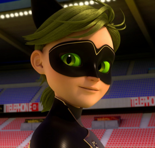

#I told myself I wasn't gonna make this post but here we are#seen some people say that Cat Walker and Claw Noir's hair is the same green#I thought the same when i first saw it but uh.. definitely not#anyway I'm having way too much fun with Claw Noir's design#I both unironically and ironically love it#miraculous ladybug#ml paris special#ml paris spoilers#claw noir#cat walker
378 notes
·
View notes
Text
Darla/Angelus is also great because the show has a competing designated OTP and they exist to serve as contrast and hateful competition to THE ship. they are soulless monsters even by the standards of soulless monsters, they literally make the other soulless monsters go "yikes... your relationship seems not good maybe." but they love each other so fucking much. the writers can't help it. they are constantly trying to find their way back to each other. the way she hits him over a head with a shovel and leaves him to an angry mob while he tries to say he doesn't mind dying if it's with her AND the way they coo about it to each other afterwards. the way she takes him back against her better judgement because she missed him so so much but then kicks him out again later because he still can't be who she needs him to be. that's just how they say i love you.
#press says btvs#the thing i appreciate about buffy/angel the shows and the ship#is that it really does set up a designated otp. and like i would argue that for a time at least it succeeds!! who isn't#being sent to hell right alongside angel at the end of season two?#but everyone is having too much fun even in early seasons to just pick a ship and stick to it. they really say you're going to love so many#people in so many ways. sometimes you'll be in denial about it or the way you loved them will feel gross or demeaning or small in hindsight#but like. you're gonna love a lot of people. you're going to have a community. you will also have sex with a lot of people#probably.#the overlap between these two categories will be a source of much conversation on the internet#incidentally thank u to the comic strip goofus and gallant for perfectly exemplifying a particular kind of morality play and having a fun#little name. your contributions to online discourse should never be discounted#da is not the goofus to ba's gallant but you kind of expect it to be going in#anyway i'm so glad they decided to expand their family/polycule#even if the mixed metaphors got my tumblr temporarily suspended like i cannot stress how much they mixed those metaphors IN THE TEXT#I DIDN'T DO THAT. drusilla did that. Darla also did that a little
146 notes
·
View notes
Text
Sirius Black wereanimals multiverse/animagus fancasts

here you go, these are my fave Sirius Black fancasts, @plecotusauritus. Credit for "toujours puddles" goes to @hollyivydruzy, I stole that, as well as the duck and the goat from a conversation about marauders as herd animals we had a few weeks ago. toujours puddles has lived on in my brain ever since then lol!
This post is the sequel to the Remus Lupin wereanimal moodboard
#sirius black#wereanimal multiverse#bat tag#i'm having way too much fun with these moodboards I wanna do moreeee#also sorry bat i promise i did look but i couldnt find a picture of a black rat that fit the vibe :(#all of the good ones i found had white backgrounds and they fit weirdly with the other pics i had already selected when i looked for rats#i did try to pick an extra cute bat one though!!#and i also just realised i forgot bunny sirius and i didnt even make him a scorpion even though hes a scorpio :(((((#but i'm too lazy to go back and fix it now#maybe ill just create another version some other time#graphic design is my passion#i finished this at 2am but scheduling the post for tmrw morning bc i want to go to sleep now 😴
60 notes
·
View notes
Text

IMPORTANT UPDATE FOR BATMAN AND ROBIN (2023) FANS!!!...he eat a burger [ID in alt]
(taken from Nicola Cizmesija's insta, who's on art for B&R issues #5 and #6)
#ramblings of a lunatic#batman and robin#damian wayne#dc comics#''ladel are you gonna get obsessive about the character again and hunt down any and all official art of them-'' no what makes u say that#nikola cizmesija was the artist on the recent red hood gotham wars tie-ins btw! same colourist as those issues too#...idk how much dc tumblr is actually in to the production side of comics. i know i am but i have a feeling that's not universal#anyway i actually really like to know the individual artists colourists and inkers on stuff if i can it's fun!#anyway i quite liked the art in those red hood issues so i am :] excited for issues 5 and 6!#there was also a cover(?) defs done by cizmesija that has damian and bruce in like underwater batsuits? like they're wet suits#and they're fighting orca on it! and cizmesija mentioned getting to design new suits so! it seems like we're getting an underwater adventure#for that arc at least! the writer joshua williamson said that he's trying to focus the structure more around shorter arcs this time#so it seems like in the shorter breather arcs we might get little artist changes to break it up?? neat imo#i like a book w consistent art if I'm really vibing w the art but i get that a lot of ppl have mixed feelings on di meos art for b&r#so I'm interested to see what the reception will be to cizmesijas when it comes out in...i think January? same month as the annual#i saw a solicit that said the art for the annual was by Howard Porter but i could be wrong#god this got way off track. ANYWAY! he eat a burger#(also williamson has said before that damians a vegetarian so I'm assuming it's a veggie burger)
53 notes
·
View notes
Photo
Wander-ful! (Patreon)
#My art#Wander Over Yonder#Wander#Was I specifically drawing him with his eyes closed to avoid learning his particular eye style? Maybe#But hey look! I did for the second one! That's something! Lol#There's no consensus on his eye colour but I've chosen blue for the moment - it's the eye colour that seems most consistent#There are a lot of elements to his design where I kinda have to unlearn from my own habits lol#The rubberhose is no problem :D I really enjoy rubberhose even if I don't use it very often!#But things like his mouth shape and his teeth only showing when he's like fully smiling - or eyes touching in that cartoony way!#No pun intended but it's very alien to me lol#But it's little things like that that I'm noticing about the ''rules'' of his model like what I was talking about before#He'll still be recognizable as himself if I were to do those things but would they be true to his actual look? Hmm#And I'm totally not against taking some liberties lol - this is fanart that /I'm/ making and very much Not the show lol#But learning and paying attention to details and seeing just how close I can from within the constraints of my own abilities >:3c It's fun!#Plus then it makes my own little touches - calling cards - stand out even more hehe ♪ Blush marks are too fun to ditch completely!#He's a fun and cute lad to work with :3
64 notes
·
View notes
Text
Boothill's presentation being entirely on the twitter post makes me think he will be irrelevant in the story in the long(ish) run, and that the game itself won't dwell on him almost at all
#Kinda like Argenti but Argenti seemed to be part of a larger lore and worldbuilding#Boothill doesn't even give me that vibe#Cool design though. I do love revenge stories and western films so...#*sighs* I guess I may consider him if he's fun to play with and the story is interesting. I hope he takes Aventurine out of the grave#(Or do I? Emotionally I do. Rationally I think I may lean more towards 'keep Aventurine dead' tbh)#Imagine if his revenge is against the IPC in general and Aventurine in particular but when he gets there Aventurine is already dead#The enormous fail that would be hahaha#Automaton cowboy is such a good design though I would have liked it more had they taken the automaton way enhancing the clockwork thing#instead of the cyborg one with the futuristic air. What can I say I do love automatons and clockwork#and to me they're far superior aesthetically than cyborgs. Not into cyborgs and robots at all. Sorry Screwllum. Herta most beloved design#I wonder if his gameplay will revolve around some killing himself mechanic#I don't know what to say I do love those things gameplaywise. I love the risk they add and how they make one strategise a little more#Even beyond the story and the lore‚ Blade is still my fave character to use. So fun so flexible and ironically so reliable despite the risk#Abfksndk rambling#I am thinking of Aventurine and I'm thinking of Fu Xuan. I think I'll skip Robin unless they go dark-dark with her#but I'm still considering Sunday if they make him shady. I was looking forwards to Firefly but I've disliked her writing a lot#so for now she's a big skip. I wouldn't mind getting Topaz given I love the FUA mechanics and the SU#but I like other characters more and I don't like her design at all so I'll skip her too#Couldn't care less about IL (I have him in an alt account and I don't like him at all) so that's a big skip too#I like Screwllum but not enough for now. Hmmm I guess I could get one shielder since I do love them as characters#and then save until one character really convinces me. Boothill‚ Robin‚ Sunday hmmm I hope Sunday is shady and grey#I wonder if they'll bring Huaiyan. I would give a leg for Huaiyan. Yeah I've not moved on from the Xianzhou I love that place#and I adore Huaiyan and the Zhuming. I so hope we'll get to see that ship#I talk too much
12 notes
·
View notes
Text
woe! cringy absolutely-not-canon-to-my-fic fankid be upon ye
(aka, i'm still going through old art files, found a character design experiment from like a year back and decided to touch her up)

#anyway i truly don't believe bill would purposefully have kids-- even in the silly screwball mlp au she was a complete magic accident#and it took a while for him to get truly attached to her and even longer to get attached in a way that wasn't “she's an extension of me :)”#he's completely uninterested in that sort of thing and has no desire to step into that sort of role. no rules no responsibilities after all#and kryptos at most had super vague “maybe it'd be nice” feelings about being a dad in the second dimension#and then post 2nd dimension burning partying with bill 'till the end of time seemed like so much more fun#so yeah. very much not fic canon in any way shape or form. pun intended#but i think the design is cute and i'm just a sucker for making fankid designs-- especially with nonhuman characters-- so... vernie!#you'll notice that this is the same name i gave the “daughter of a tumblr sexyman” meme design i did and a very similar “flatland form”#i just decided to touch her up a lil because she was leaning way too much into looking like kryptos#my art
20 notes
·
View notes
Text
I just spent three hours redesigning pegasi from My Little Pony for the whole mlp infection au trend
I had fun, but still
#i overcomplicate thing WAY too much lol#mlp fan art#mlp infection au#mlp infected au#mlp g4#mlp#my little pony#they have clouds on their hooves because they can walk on clouds#i'm having a lot of fun designing them lol
12 notes
·
View notes
Text

here's some various dhmis doodles ee
#i don't do doodle sheets like this very often but this was fun!!#and by not doing them often i mean this is the first time#also this is my first time drawing pretty much all of these characters so the way i draw them is definitely subject to change#i came up with these designs on the spot#anyway yay i did a bunch of 15 minute doodles#dhmis#don't hug me i'm scared#dhmis fanart#don't hug me i'm scared fanart#yellow guy dhmis#red guy dhmis#duck dhmis#tony dhmis#sketchbook dhmis#mean steve#unemployed brendon#colin dhmis#actually no i don't feel like tagging all the characters that'll take too long nvm#should i have an art tag since im posting my art on here now instead of sideblogs#i probably should#uhh#aacart
112 notes
·
View notes
Text

First one down! if i feel funky i might add a spellbook & carbuncle later, but for now i wanna get the others done first x'D
#i think he ended up looking a bit too short oops#but yea!#can you tell i'm having way too much fun pushing the creature features fldksfl#lalafell have rodent vibes to me so i'm taking that and running with it#not sure if they'd have fur all over? probably not but i like to imagine them w a really short velvety fuzz#also yes i am going with his default outfit xD#if i can get around designing outfits i will lolol#oc: kokosamu#my ocs#my art#ffxiv
16 notes
·
View notes
Last Seen Blogs