#TBWA/chiat
Text
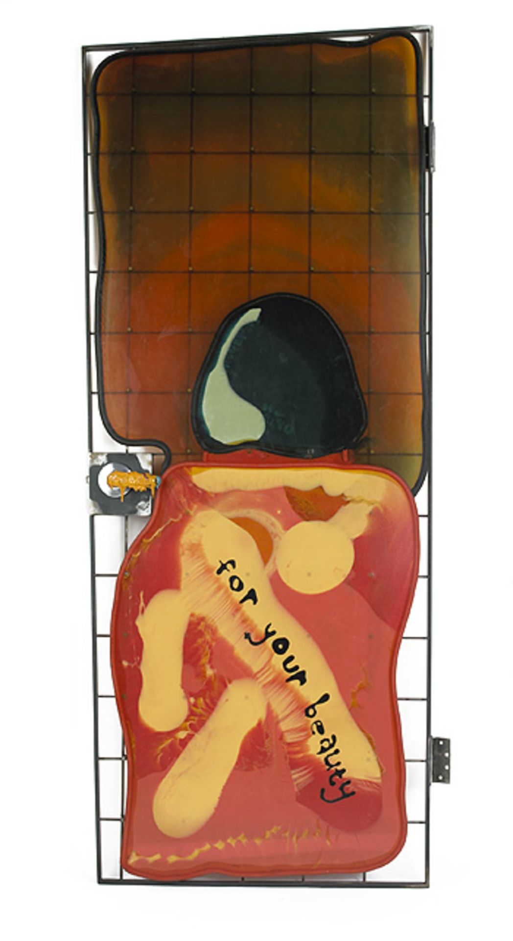
Gaetano Pesce,
Door from TBWA/Chiat/Day Offices,
New York. 1994,
Resin, Steel, Aluminum,
84 h × 34 w × 8 d in.
#art#design#doorway#architecture#heavensdoorways#doors#doorsdesign#doordesign#entrance door#door#gaetano pesce#TBWA/chiat#office#day offices#new york#resin#steel#aluminium#beauty
30 notes
·
View notes
Text
youtube
Tell me again what choosing optimism has to do with your front load washing machine?
LG's got a new manifesto. It tells us that once we choose optimism, "That's when the good stuff starts."
Such a simple concept, a child could say it. We know that because in this spot a child does say it.
I love the guy long boarding. Cool film. Incredible sound design.
But it takes way too long to say... nothing. Okay. Be optimistic. And this relates to LG how...? The campaign landing page doesn't clear anything up. It just says more about optimism.
I know how this happens.
You're trying to advertise a giant brand that has a lot of different businesses. You look for a greater purpose that ties them all together.
But then you aim so high and get so caught up in it that you don't stop to check and see if regular people will hear what you think you're saying.
I know how this happens because I've done it.
Cingular Wireless was a forerunner of what is now AT&T. When we launched Cingular Wireless many years ago, we didn't want to be just another wireless provider. We wanted to stand out by standing for something. We wanted a higher-order end benefit.
So we got to thinking. What does it mean that you're able to make a mobile phone call that's clear and doesn't cost a fortune? You're able to speak freely. You're able to express yourself without holding back.
That's it!
We're the wireless company that champions self-expression.
Not a bad North Star. We knew how it tied back to the product. But I doubt if any viewers of spots like this one and this one did.
We eventually did a better job of tying Cingular's higher-order benefit with their wireless service and phones. But not until after we had run six launch spots–three of which ran on the Super Bowl.
We're fortunate there's no such thing as malpractice in advertising.
Agency: TBWA\Chiat\Day New York. Director: Nicolai Fuglsig Via: CampaignBrief.
#ads#advertising#adverts#creative advertising#advertising education#commercials#ad#tv commercials#advertising manifesto#advertising confessions#LG#Life's Good#TBWA/Chiat/DAy#Youtube
2 notes
·
View notes
Photo
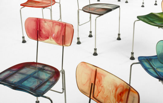
Gaetano Pesce
set of twelve 543 Broadway chairs from TBWA/Chiat/Day, New York
92 notes
·
View notes
Text
Advert Alchemy: Supernatural Skittles
In this series, Squideo has examined the best ways to turn advertising content into gold. Now that we’ve broken down the eight key ingredients, it’s time to dive deep into some examples of stellar advertising. This week, the advert in question was picked by Squideo’s Marketing Executive, Emily Woodcock.
When asked why this Skittles advert has become her favourite, Emily said: “I saw it on television while I was on holiday. Maybe that's why it stuck in my mind. The dark humour certainly caught my attention and I loved the reference to Midas (of Greek mythology). Despite the video's resolution quality, I also think it's aged really well.”

Skittles Dance
This is the second appearance of the Mars Inc. company in our Advert Alchemy series. We’ve dived into the background of this American business, so let’s focus on Skittles. The history of its creation is a bit murky, but it’s widely accepted that a small British manufacturer first launched Skittles in the mid-1970s. They were soon bought by Wrigley, which is also owned by Mars Inc., who took over distribution and brought the sweets to an international market in 1979.
Greatly resembling another Mars Inc. product, M&Ms, Skittles are distinguished by a small letter ‘S’ on their shell. The range of flavours has changed several times over the decades like many other Mars products, and variation flavours have also been sold such as Tropical and Wild Berry. Unlike other products under Mars Inc., there hasn’t been any major rebrands attached to Skittles. The name has never been changed and the branding remains recognisable decades apart.
The product was marketed a very specific way from the start, and was so successful it stuck. A rumour spread about the origins of the sweet that it was invented by a British confectioner who looked up at a rainbow and wondered how it would taste. The slogan – “Taste the rainbow” – wouldn’t be introduced until 1994, but the sweet has always had this colourful association which Wrigley’s marketers have loved to centre their campaigns around.
Somewhere Over the Skittles
Launched in 2007, Skittles’ advert was created by TBWA, Chiat and Day. The brand had already run a series of successful adverts, in terms of viewership and commercial impact, and audiences started to have high expectations from the brand.

According to the Art Director Craig Allen, “We wrote a lot of scripts [and] thought it would be funny to do a slightly sad spot for a candy brand.” Former GCD Ian Reichenthal said, “We had a lot of conversations with the guys in advance about trying out new voices, but still keeping it Skittles.” The brand guidelines were firmly in place for the creative team, unlike previous entries in the Advert Alchemy series who were looking to shake things up.
Skittles adverts often feature technically challenging shoots, such as the one centred around a Skittles tree growing out of a human being. Recreating the powers of Midas also proved to be difficult:
“The effects in the spot had never been done before so we had a lot of technical problems, which made for a very long shoot day. So long in fact that the police came to try and shut us down during the last hours of shooting. Luckily, Tom (Kuntz) is a very smooth gentleman and persuaded them to let us finish.”
Their hard work paid off, and the Midas Touch advert was ranked as Creativity Online's most watched spot of 2007. But why was Skittles’ Midas Touch such a big hit?
Skittles Connection
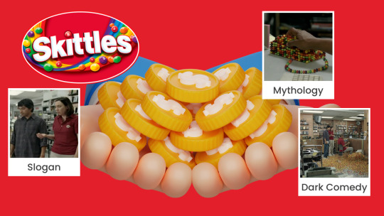
Mesmerizing Mythology
Named for the myth that inspired the advert’s plot, the Midas Touch gives the main character Tim a superpower: everything he touches turns into Skittles. Yummy. On the other, everything he touches turns into Skittles. Yikes. This is a spin on the Greek myth of King Midas, who wished that everything he touched would turn to gold. Unfortunately, he didn’t think his wish through and Midas soon found he can’t eat. And when he tried to hug his daughter, he turned her into a gold statue.
This Greek myth remains popular in modern storytelling, which is why this fun spin on a well-known story worked so well. It also fits into the wider Skittles marketing strategy, which often uses the sweets in bizarre ways. In one advert, Bleachers, there is an outbreak which makes people break out in Skittles.
Snappy Slogan
“Taste the rainbow” was introduced as the Skittles slogan in 1994, but the marketing team have always kept this slogan adaptable and flexible. Usually it is accompanied with a tagline which can change to reflect the nature of the advert. In Midas Touch it’s “touch the rainbow, taste the rainbow” in reference to Tim’s superpower. In an advert featuring a tree which grows Skittles, the slogan is changed to “harvest the rainbow, taste the rainbow.”
The taglines use of verbs also reinforce that Skittles is an experience that the audience needs to actively participate in. Skittles isn’t just a snack, like the sweets aren’t just multicoloured. It’s a taste of the rainbow. And in the case of Midas, it’s as good as gold.
Cackling Comedy
Tim can’t hold his infant child, he can’t dress himself, or feed himself… then he tells the story of turning a man into Skittles that very day when they shook hands. Is that murder or manslaughter? Either way, Skittles’ Midas Touch is definitely running with dark comedy which helps make the advert even more memorable. Yet the plot is kept just light enough to avoid crossing into the macabre, by showing Tim’s power only used on inanimate objects.
Comedy is a staple of the Skittles brand, ranging from the bizarre to the grisly. They carry this over in all of their marketing, from adverts to their website. Customers now expect it of the brand, which has let the marketing team get ideas from well outside the box.
Content Worth Gold
What do you think? What made Skittles’ Midas Touch advert so successful? Watch the full advert below and let us know in the comments.
youtube
Get in touch with the Squideo team today to find out how we can improve your advertising strategy with video production, motion graphics, social media management and much more!
#skittles#king midas#midas touch#greek mythology#advert alchemy#blog#advertising#marketing#small business on tumblr#small business#marketing strategy#animation#2d animation#youtube#Youtube
5 notes
·
View notes
Video
vimeo
GATORADE - EVERYTHING CHANGES (DIRECTOR’S CUT) from Ernest Desumbila on Vimeo.
Directed by Ernest Desumbila
Produced by Sauvage.tv
Agency: TBWA\Chiat
Feat Leo Messi & Luis Suárez
0 notes
Photo

Inside Levi’s first campaign from new creative AOR TBWA\Chiat\Day https://u.to/wGuFIA #lmwsasia #digitalagency #webdeveloper #digitalmarketingstrategy #websitecontent #videocreation #videomarketing #mobileresponsivewebsite
0 notes
Text
// IMAX Branding \\
I looked on their corporate information page on their website and found how they branded themselves in their own words.
“IMAX Corporation is an entertainment technology company, specialising in motion-picture technologies and large-format motion-picture presentations. Leading the way in immersive theatre experiences since 1968”
I also looked into different marketing campaigns that IMAX have already done, such as the “Films to the Fullest” brand design system that they partnered with TBWA/Chiat/Day Los Angeles. The customer landscape was confused due to competitors entering into the marketplace. Therefore their message got lost in the sea of other cinema campaigns and new films coming out. So they created a new campaign with film posters “To the Fullest” This created ‘The IMAX Frame’ that became synonyms with the brand.

I also checked on their logo font as I thought that was an important detail when even considering any design. Microgramma D OT Bold Extended by URW software.

I found that the colours synonyms with the brand is the bright blue and black in the logo as well as excluded in silver whenever animated.
0 notes
Video
vimeo
GATORADE / the way to be great from Diego Berakha on Vimeo.
Directed by Henry & Sebastian and Diego Berakha
Client - Gatorade
Agency - TBWA\Chiat\Day
Produced by 1stAve BA
Voice - Eminem
Design and animation - Adolfo Correa, Sebastián Sarmiento, Carlos Fernandez, Matías Petroli, Diego Berakha
Edit - Mauro Caporossi, Natalia Loiacono
0 notes
Text
youtube
There's A Soldier In All of Us - (2010)
Spot for "Call of Duty: Black Ops" released in 2010. I love this commercial because it really tapped in to the perspective of its audience. While many of us will never see or touch a battlefield, we all feel that way when we log on to COD. It was also to see such a cool commercial and not need any gameplay to create it.
_____
Agency: TBWA/Chiat/Day, Los Angeles, USA
Chief Creative Officer: Rob Schwartz
Group Creative Director: Brett Craig
Creative Director: Oliver Rabenschlag
Associate Creative Directors: Blake Kidder, Patrick Almaguer
Executive Producer: Anh-Thu Le
Producer: Stanton Hill
Art Director: Chase Madrid
Copywriter: Chris DeNinno
Production Company: MJZ, Bicoastal, London
Director: Rupert Sanders
Executive Producers: David Zander, Eric Stern
Producer: Laurie Boccaccio
Director of Photography: Greig Fraser
Production Designer: Dominic Watkins
Costume Designer: Nancy Steiner
Editorial: Spot Welders, Bicoastal
Editor: Nell Smith
Post Production Producer: Carolina Wallace
Visual Effects: Asylum, Santa Monica, CA
Visual Effects Supervisor / Lead Compositor: Jonny Hicks
Visual Effects Producer: Michael Pardee
Visual Effects Post Producer: Ryan Merediths
#DailyDopeAds
0 notes
Text
Everything you've ever wanted to know about branding for businesses
Small businesses, non-profits, and start-ups are among our clients. We make our living by bringing the branding and marketing tools and tricks used by big brands and Fortune 500 companies to organisations that cannot normally afford them.
Unfortunately, many people who work with small businesses, non-profits, and start-ups don't seem to understand the principles of branding, and those who do tend to chase money and target big brands and Fortune 500 companies.
Another notable difference I see between marketing professionals who work with big brands and Fortune 500 companies and those who work
Step 1: Research your competitors
Discover what they do well and what they do badly. You need to know what they do well because you want to be at least as good as them. You must understand what they do poorly because this represents an opportunity.
This is referred to as "landscape analysis." It is an understanding of the competitive landscape.
Step 2: After learning about your competitors, articulate what you do differently and better
It's as simple as that. If you can do this, it's just a matter of getting your brand in front of as many people as possible, and there have never been more people or more places to do this in history.
But don't mix up simple and easy. This is similar to the game of Go in that it takes a second to explain but a lifetime to master. This is known as a "value proposition." People will want to work with you, buy your products, or join your organisation because of it.
Step 3: Make it plausible
This is where your story enters the picture. Explain to others why you do things differently and better. However, be cautious: while focusing solely on the story may be interesting and pleasant, if it does not support your value proposition, people will remember you but not buy your products or services or join your organisation.
Most agencies refer to this as a "brand story." That term irritates me because the acronym is BS. We prefer "organisational story" because, when done correctly,
Step 4: Make your name do some of the heavy lifting
Naming is one of the most difficult tasks we face because everyone tries to make it personal. They want the name of their organisation to be meaningful to them. And yes, you can use a personal name. Personal names have certainly been used successfully by organisations such as Walmart and McDonald's, but it's much easier if you make your name meaningful to your customers, as Apple, Nike, and Tesla do.
Step 5: Apply the "different and better" filter to your slogan
A good rule of thumb is that your name is what people remember you by, and your slogan is what sells you. "Think Different," a slogan created by TBWA/Chiat/Day for Apple, is my all-time favourite.
Step 6: Put your logo through it as well
I am not saying a logo isn't necessary. A great logo has the potential to become iconic. It is not your brand, but rather an expression of it. It bears your seal of approval. And when you run the logo through the "different and better" filter, you get something truly unique. Take, for example, the Nike swoosh. When asked what the now-famous swoosh means, Nike co-founder Phil Knight replied, "It's the sound of someone going past you."
Step 7: Create a fantastic website
People frequently ask me why we build websites, and my response is always the same: Because it is frequently the first point of contact people have with your brand, your website is the most important communication tool your organisation has. If you get this wrong, the first six steps are meaningless.
One of the most common mistakes that businesses make with their websites is to use the valuable real estate above the fold to explain what they do or why they are needed.
Treating your website as an infomercial for your brand is an extremely effective strategy. To save space, have the menu at the top tell people what you do, and then use the banner and headline to communicate what you do differently and better. Then, as they scroll down the page, have the next section give another reason why you are different and better, and so on and so forth.
Step 9: Increase your visibility
Another advantage of investing in consistent branding is that it makes your brand more memorable. Customers become more familiar with your company when they can identify it based on physical, visual, and auditory cues. This builds trust, which 81% of customers rely on when making a purchasing decision. Customers' recall and engagement with your content, emails, or advertisements may also be influenced by brand recognition.
Step 10: Employee recruitment and retention
According to LinkedIn, companies with a strong employer brand will attract 50% more qualified candidates 1-2 times faster than others.They will also recruit at a 50% lower cost per hire. Moving down the line, your current and former employees' experiences, as well as how they spread the word, have an impact on your workplace reputation and employee retention rates.
Actively managing your brand is not an option if you want to hire skilled developers and other specialists or keep your best talent away from competitors. It is a
Conclusion
The importance of relatable content cannot be overstated. Understand your target audience and create engaging content that can elicit emotions and help you build a relationship with them.
As you can see, developing your brand does not have to be difficult or expensive. The majority of these suggestions are free or low-cost. You can begin with a small budget and gradually increase your branding efforts as your company grows. To brand your company, follow these seven simple steps:
• Determine your intended audience.
• Develop your value proposition.
• Choose your mission.
• Define the personality of your brand.
• Create brand assets.
• Integrate them into all your channels.
• Maintain consistency.
Brands should be "refreshed" every five years or so, according to marketing industry standards, and your messaging, marketing campaigns, and overall goals will change as your company does. Developing a strong brand, even if it takes time, implies that your target audience can grow and change with you. Please contact DesignLab if you require any additional information or wish to learn more about our services.
0 notes
Photo
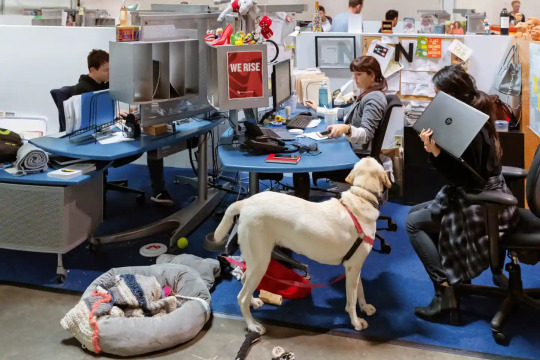
TBWA\Chiat\Day, Los Angeles, California. Clive Wilkinson Architects, 1998. Photography: Iwan Baan/Taschen
0 notes
Text
Gatorade's Latest Ad: It’s All For Fun
Gatorade’s Latest Ad: It’s All For Fun
Image Credit – Deposit Photos
Gatorade released a new campaign titled “All For Fun,” the latest instalment of its Fuel Tomorrow platform. Made in partnership with TBWA\Chiat\Day LA, the minute-long spot features a young roster of athletes.
Gatorade shows the sports stars playfully interacting with the next generation of athletes as they reflect on their own athletic roots and demonstrate…

View On WordPress
0 notes
Video
vimeo
IMAX The Storm from Electric Art on Vimeo.
So proud of the huge team effort behind this new global IMAX stills and motion campaign, “Films to the Fullest”. Commissioned by TBWA\Chiat\Day LA, it’s IMAX’s largest brand campaign ever.
For the 3 executions, The Storm, Dog Fight and Exploration, CEA created the ship, planes, clouds, explosions, fields, window, space craft, earth and hurricane in CGI comping them with live footage and applying extra atmos and a cinematic grade. The brief called for looping, epic, immersive cinemagraphs, and we were happy to deliver.
Agency President: Erin Riley | CCO: Renato Fernandez | CD: Jason Karley | Senior Art Director: Stephen Lum | Senior Copywriter: Liz Cartwright | Director of Design: Mark Sloan | Designer: Robbie Reynolds | Management Supervisor: Teddy Notari | Global Brand Lead: Nicole Rowett | Account Executive: Erin Woods | Director of Business Affairs: Robin Rossi | Senior Strategist: Corianda Dimes | Planning Director: Anita Schillhorn | Executive Producer: Hashi Clark | Sound Design: Lime Studios
0 notes
Photo
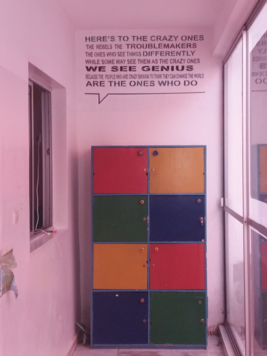

17 January 2020
7 notes
·
View notes
Photo
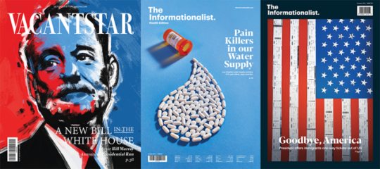

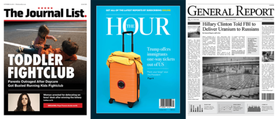
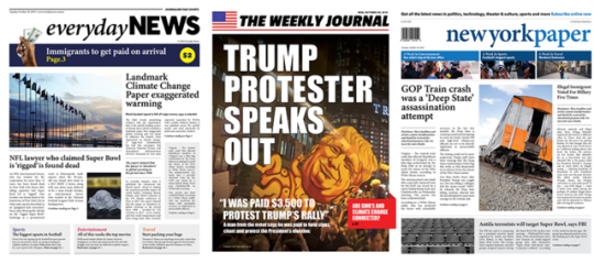

‘Misinformation Newsstand’
Columbia Journalism Review and the creative agency TBWA/Chiat/Day New York
#art#news#fake news#fake#misinformation#newsstand#columbia journalism review#TBWA#chiat#day new york#new york#journalist#truth#bryant park#manhattan#democracy#freedom#funny shit#headline news
28 notes
·
View notes
Video
vimeo
Gatorade “Everything Changes” Director’s Cut
Agency: TBWA\Chiat Day Los Angeles
Chief Creative Officer: Renato Fernandez
Global Creative Director: Doug Menezes, Mark Peters
Associate Creative Director: Bruno Acanfora, Ariel Abramovici
Production: Sauvage Los Angeles
Director: Ernest Desumbila
Cinematographer: Borja Diaz Lopez
Editor: Jono Griffith
Colorist: Adam Scott
Sound Designer: Gus Koven
Music: Jon Spencer Blues Explosion “Bellbottoms”
Year: 2018
#gatorade#tbwa#chiat day#los angeles#usa#energy drink#sports#football#world cup#lionel messi#luis suarez#renato fernandez#sauvage#ernest desumbila#borja diaz lopez#jono griffith#adam scott#gus koven#jon spencer blues explosion#vfx#original music#2018
3 notes
·
View notes