#art wise popularity i think i draw greens and reds most
Note
favorite rainworld lizard 🥺?
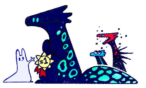
Cyans win first place, They are just extremely cool looking. Plus theyre Sillay
Blues and reds take second!! Blues are just cute in a kinda pathetic small animal way and reds are just very pretty with how long and spiky they are
#rain world#art wise popularity i think i draw greens and reds most#reds because they have cool factor and greens just because i think theyre kinda fun to draw as big fat lizard tanks#ask
258 notes
·
View notes
Note
bestie-
i don't even know what Taylor looks like, but if you can't already tell, i think about them a lot and would draw them if i knew 😩😩😩
okay okay im asleep now i promise-
bestie ... did you get any sleep?? 😪 im worried ... just a smidge 🤏🏾 but i love these questions so i’ll let it pass ... just this once.. im totally kidding 😂 i love that you sent all these, they’re very great questions btw!!
so here’s a physical description of our lovely taylor
i wrote them with they/them pronouns bc i didn’t wanna assume what gender Chris is attracted to {i know he’s fictional but that’s just rude to me to automatically make the love interest male or female w/o any consideration y’know? 😕 also why i try to make most, if not all, of my fanfics gender neutral}
they’d prob identify as androgynous or use they/them pronouns irl. i think working in film has taught them a lot about sexuality especially during this time period which rebelled against the previous victorian era. art is liberating for some so i think not adhering to a specific gender for them was freeing in and out of work.
we know they wear glasses but i had to look up the styles of those in the 20s. they’d wear the popular circle styles we see now but they’d prob be a brown tortoise frame, not black though bc that’s too dark for them and def not metal frames bc those are too flashy.
based off the previous description we can tell they’re very mild-mannered? idk if that’s the right word but they don’t like anything too flashy or dark. if i had to pick an aesthetic i’d say a splash of light academia {only for work clothes though} with a big heap of cottage core! idk how cottage core was in the 20s though.. maybe blouses with billowy sleeves... you’re talented so im sure you’ll come up with smthn. ooh, and they don't like tight fitting clothes btw but they’ll sacrifice when it comes to pants.i feel like they’d wear more dresses if they didn’t move around so much at work but i think they’re fav outfit would be a long patterned skirt which stops above their calfs {i’ll explain why below} with a billowy white blouse that has one of those saggy bow ties at the neck and the cutest little oxfords!! agghhhhh, they dress to impress 😌✨💞
taylor is short like 5′3 short. they’re not very athletic but they do walk a lot so they have nice, strong, defined legs. you ever see ppl’s calfs and you’re just like dang.. that’s a nice leg 😂 i prob sound so weird but like that! body type would prob be rectangle :)
baby is a natural brunette but they died their hair once and it hasn’t been right since :( so it’s a slight undertone of copper in there. sometimes it looks like a dark red wine when the sun hits hit {which prob makes chris go crazy} they don’t like to have long hair bc they’re so busy and don’t have time for the upkeep so they keep it short and wait for it... it’s curly!! it looks like a mini cloud 🤧 for reference look up ny mcfly on youtube 💕💕 omg, i might just make them a moodboard and tag you in it!
green eyes with flecks of gold like sun breaking through a field of grass 😭 i’ve always imagined taylor with green eyes so i knew this for sure! ooh, long eyelashes and their brows aren’t bold or as defined as nicky’s but they’re very soft and natural looking.
i never really considered skin tone before but this is the perfect moment for representation so taylor is brown and they have freckles across their nose! skin tone wise, i’d say they look like adwoa aboah who is beautiful🥺❤
they have a round face with the cutest cheeks 😪 and when they smile or laugh really hard the dimple on the side of their cheek pokes out. their lips would be full but they’d have a dominant cupid’s bow and their nose would have a little up turn at the end, like a little button 🤧 bc they’re as cute as a button??
hopefully i didn’t go overboard but i enjoyed doing this! it makes me wanna create a moodboard for them 😌💖 ooh and if you want reference pics of the ppl i mentioned lmk!
11 notes
·
View notes
Text
When I'm writing (fanfic or otherwise), I often find it difficult to incorporate songs in a way that doesn't sound or look jarring. Recently, while going through a few older books I own and my own writing, I figured out partly why this is. Really, it boils down to the type of song paired with the format of how it is presented.
Take this passage here from Howard Pyle's 1946 'The Merry Adventures of Robin Hood';
[At last the feast was done, and Robin Hood turned to Allan, who sat beside him. "Now, Allan," quoth he, "so much has been said of thy singing that we would fain have a taste of thy skill ourselves. Canst thou not give us something?"
"Surely," answered Allan, readily; for he was no third-rate songster that must be asked again and again, but said "yes" or "no" at the first bidding; so, taking up his harp, he ran his fingers lightly over the sweetly-sounding strings, and all was hushed about the cloth. Then, backing his voice with sweet music on his harp, he sang:
MAY ELLEN'S WEDDING
"May Ellen sat beneath a thorn,
And in a shower around
The blossoms fell at every breeze
Like snow upon the ground,
And in a lime-tree near was heard
The sweet song of a strange, wild bird.
...
There is ancient men at wedding's been,
For sixty years and more,
But such a wondrous wedding day,
They never saw before.
But none could check and none could stay,
The swans that bore the Bride away."
Not a sound broke the stillness when Allan a Dale had done, but all sat gazing at the handsome singer, for so sweet was his voice and the music that each man sat with bated breath, lest one drop more should come and he should lose it.
"By my faith and my troth," quoth Robin at last, drawing a deep breath, "lad, thou art –Thou must not leave our company, Allan! Wilt thou not stay with us here in the sweet green forest? Truly, I do feel my heart go out toward thee with great love."]
This format, where the song lyrics are written out on their own, was what I most commonly used when I first started out writing. It never felt quite right to me, and now I think it's because it works much better for older songs or music with a set or rigid structure, ballads if you will. It just looks odd to me when modern music is written in this way.
Now take this passage from some of my more recent writing, using a slow song from the 80s called 'Pharisee' by the late Stan Rogers;
[Ace picked away at a simple melody for a minute, trying to get the hang of it while his buzz was throwing him off centre, and he narrowed his eyes in concentration.
"I used to be a Pharisee. Cynical and wise, telling rich and godly lies of humanity…" his voice was gravelly and deep, and wavered with each change in pitch; it was not a traditionally appealing voice as perhaps Marco or Estelle possessed, but the mere fact that he was singing was enough to catch his audience's full attention. "But in the marketplace was seated a cripple with a lyre… I looked at him and said 'I've been rich but so unhappy, what sets you so on fire?'" he lost his place on the harp and cursed slightly, and then re-oriented himself a moment later. "And he said 'look upon me brother, I'm a man with peace of mind. You know I've never been much good at nothin' but the words I wrought-in-rhyme…'"
...
"Hold on to young friends you make of old… and cleave to the woman that keeps you whole… and keep a warm fire for all your friends who come in from the cold…" he stretched the word until it faded from his throat, and picked the strings without words for a few beats before he finished out the song. "Now I love you all as brothers and I don't have to know your names. I used to be so different, now I know I'll always stay the same…"
Ace stopped once the melody was through and squared his shoulders like he expected to be laughed at, but when all of his brothers began to heartily clap and called out praise for his show he actually cracked a small smile.]
Or, take this other example from a more energetic song, 'They'll Never Keep Us Down' by Hazel Dickens;
["United we stand, divided we fall! For every dime they give us a battle must be fought!" Donna belted out -face a ludicrous shade of red even in the fire's light. "So workin' people use your power to-keep-to-liberty! Don't support that rich man's style of luxury!"
Marco laughed at the look on Ace's face and sang along with their sister and Vista, who dropped down on his other side to join in. "An' there ain't no way they can ever keep us down, oh, no! There ain't no-way they can ever keep us down! We won't be bought, we won't be sold, we'll be treated right –well, that's our goal! An' there ain't no way they can ever keep us down!"
"I need another bloody drink," Ace said.]
 The lyrics of the song are still there, but they're more incorporated into the actual dialogue, and the use of italics or bold font simulates the stressing of different words and changes in tone while the character is singing. The descriptions of the singer also add to the visual, especially for scenes where I want you to feel the emotion. It definitely takes a bit more effort to write, which may be why it isn't as popular. But for modern songs, especially ones with atypical changes in pitch or odd word structure, it feels like it flows more naturally. When looking it over again later, it definitely forces me to edit more thoroughly.
I'm certainly not educated when it comes to writing, nor am I trying to tell anyone how to structure their story. But since I've made this change in how I format written songs, I feel more comfortable including them. Maybe try it out and see how it works for you!
#writing#writing reference#fanfic#writing resources#story structure#incorporating music into written media#robin hood#howard pyle#reference#music in writing#musical representation#musical reference#this isnt calling songfics out bc those are their own beast imo#just that a few books and fics ive read lately have had#REALLY JARRING song inclusion in them!#so jarring it actually broke my immersion in the story#so this is partly my pen writing progress but also like#i want so see people try new things! and grow!#not that you have to but its food for thought yo#long post#sorry!
2 notes
·
View notes
Text
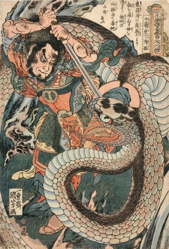
Different types of tattoos
Batek tattoo


In the Philippines, there is a tradition that has been practised by women for many years. This is popularly referred to as “batok” meaning the art of tattooing your body with tribal designs using bamboo stick and thorn. Batok is believed to have been practised for about one thousand years.
Sak Yant tattoo
The Sak Yant Tattoo has become ingrained in the Thai culture as a way to provide protection and gain good luck through the mystical side of traditional philosophies and the Buddhist influence. Usually the Monk or Ajarn who preforms the Sak Yant has studied the magical side of the ancient traditions and incorporates charms and magical blessings in addition to the design of the Sak Yant itself. This additional learning comes from the pre-Buddhist era, and while not strictly part of Buddhism, it is part of the traditional culture of Thailand.


Irezumi tattoo
Like much of Japan's art, tattooing can be traced back centuries.
The earliest indication of the body art phenomenon can be found on the seemingly tattooed faces of clay figurines from 5000 BCE. Another ancient mention of these markings is evident in Wei Chih, a Chinese chronicle from the 3rd century. The telling text reveals that, at the time, “men young and old, all tattoo their faces and decorate their bodies with designs.”
In the 7th century, however, the art form took a turn. At this point, people began to view tattoos unfavorably. By 720 CE, they were even used as a form of branding and punishment for prisoners, courtesans, and criminals. This practice would last for over 1,000 years.
In the 18th century, Japanese tattoos underwent yet another transformation. Due to the prevalence of the colorful and pictorial Ukiyo-e woodblock print, tattoos rendered in this style became popular among groups of people with lower social statuses, like laborers, peasants, and even gangs. Given its ties to the lower class and its long and unsavory history, Irezumi was eventually outlawed in Japan—though artists based in the country could still legally tattoo foreigners.
This loophole proved particularly important in the 19th century, when artists began tattooing nonnative sailors. As a result of this, their work—and all of the cultural motifs, symbols, and styles that accompanied it—was eventually “exhibited” all over the world. Thus, though still an illegal form of art for residents of its home country, the Japanese tattoo gained unexpected global prominence.

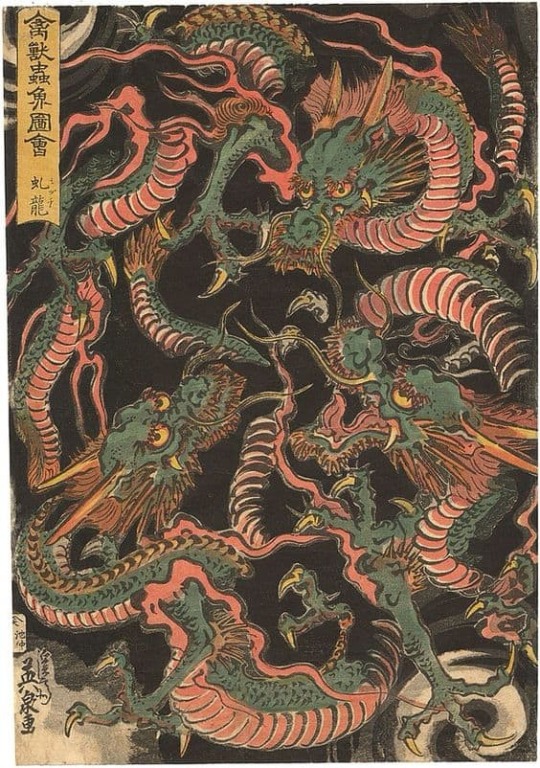
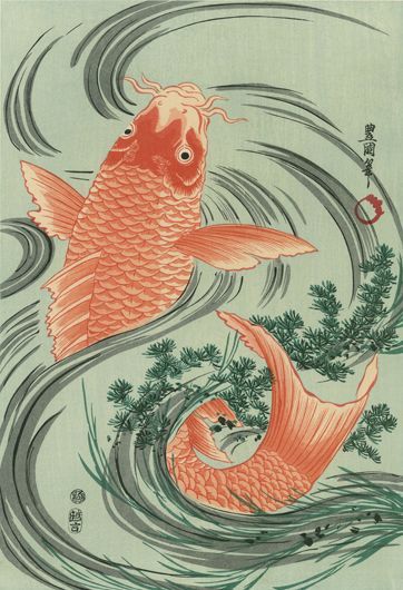
The meanings of Irezmi Drawing.
Dragon_They are beloved and revered mythical creatures who are all-powerful creatures that fuse together the forces of a serpent’s flexible body, the koi’s hard-wearing scales, the eagle’s formidable claws, and the mighty deer’s horns. With all this strength, they aren’t portrayed as savage beasts, but as wise protectors of humanity.

Koi Fish_They’re believed to bring prosperity and good fortune, so households often have them as pets. But more than being physical beauty, they are very strong and resilient creatures who are able to swim upstream through rough currents.
Snake
While being called a snake is never a good thing, the Japanese also see snakes as very wise creatures. Much of this is influenced by Chinese beliefs, which is a common theme in almost all of the motifs in this list. The Chinese zodiac says that people born in the year of the snake are highly intellectual and philosophical. Additionally, because snakes periodically shed their skin, they also denote healing, regeneration, good health and even immortality.

Kintaro
This ‘golden boy’ was named this way more for his superhuman strength than the color of his skin. The stuff of legend, Kintarō was said to actually have truly existed during the Heian Period (794 – 1185), smashing rocks, bending and uprooting trees, wrestling bears, and battling demons from a very young age.
He was also believed to have been the guardian of a samurai named Minamoto no Yorimitsu later on in his life. He is often rendered with red skin and wrestling a giant black koi.
Kintaro is chosen as a tattoo to either impart his legendary strength to the person or serve as a guardian, as he did to the samurai.

Oni Mask
Personally, I don’t think Oni masks are the best tattoos to have just because their bulging eyes and aggressive expression can be a shocking thing to see on a mirror when you wake up in the morning. Well, maybe that’s part of why its chosen in the first place. An Oni is a fierce-looking demon or ogre with horns, fangs, and tusks.

Head
Head object is Gore and barbarism aside, there’s actually more to it than being a creepy tattoo to freak people out. It’s a nod to the samurai practice of headhunting and symbolizes fearlessness.
Old school tattoo
Tattoo called Old School began to use navigation-related factors to tattoo when sailors were influenced by the natives of other continents during the past ship trade.
These tattoo drawings were used as a means of recording wishes, superstitions, or navigation at sea.
Generally, it uses monochrome (blue, yellow, red, green) and is made of a thick black outline.
It is characterized by few or few shadow representations.
Previously, tattoo machines were not developed, so rather than sophisticated work, they had a rugged and concise design.
Typical navigation-related tattoos include swallows, sharks, ships, women, or anchors.

swallow tattoo is the myth that if a sailor was to drown on their journey, if they had the tattoo, the bird would lift their soul to heaven.

shark tattoo is Sailors were often exposed to sharks on their voyages at sea. By wearing a shark tattoo it was thought to protect you from the perils of the ocean. Sharks have no natural predators and this represents a reluctance to be victimised by others. Sharks have a strong sense of calm yet they are constantly on the move/rarely rest. This is representative of determination and a ‘keep moving forward’ attitude towards life and the ongoing challenges one may face.

Also falling within the Maritime theme is the imagery of a ship. This of course, is a big part of a sailor’s life as it represents freedom. Once you set sail, there are no restrictions holding you back. As sailors are natural explorers, nothing could symbolise adventure more than the biggest tool used to execute their exploration and discoveries.
Furthermore, ships also have a homely nature to them. As this vessel was representative of one’s home away from home and also a means to return home when the time came.

The anchor tattoo meaning is one of the most literal of tattoo designs. As an anchor will prevent a ship from drifting away, it represents stability and the grounded nature of one’s personality.
References.
https://whenonearth.net/7-of-the-unique-traditional-tattoo-styles-around-the-world/
https://coldteacollective.com/batok-traditional-filipino-tattoos/
https://www.sakyantchiangmai.com/what-is-a-sak-yant-tattoo/
https://www.sakyantchiangmai.com/sak-yant-designs-and-meanings/
https://mymodernmet.com/japanese-tattoo-history/
https://www.irezumiart.co.uk/irezumi-symbology/
https://japanjunky.com/what-is-irezumi/
https://www.cloakanddaggerlondon.co.uk/tattoo-styles/traditional/
1 note
·
View note
Text
Blood Magic in Fantasy
So I write a lot of these ‘scholarly’ papers about different kinds of magic. If y’all like them, I can post more.
Also, discussion is awesome! I love talking magic theory, so Ask away!
+++
Blood magic is an interesting topic and one that many researchers tend to shy away from due in large part to the dangers inherent to the practitioners of the same.
This is not an unreasonable stance. Many blood mages are deadly, and no few are also bad-tempered. Some however, are scholars in their own right and are willing to set differences aside to contribute their knowledge.
Blood magic is, in no small part, the magic of iron. As many know, iron can seriously hamper most mage, but it, when usable, is also one of the finest conductors of magic to be had. Recent spells to determine the make-up of objects have revealed that iron is present in many gemstones, and for that reason, is being reevaluated as a magical substance.
Blood has its' own power- that of life force- and so does pain. The two together are a reliable source of magic for those who are barely talented and a valuable resource for the mage who does not wish to use their personal power or need a boost for a spell.
Runes drawn in blood channel magic through their iron and through the life-power they contain. They conduct spells particularly well and for that reason, are favored by many blood mages, although unless the power is anchored in something more substantial, it will fade as soon as the runes are dry. Iron powder and red glass are both popular choices.
A blade with blood forged into it is lethal indeed. It is common for blood mages to be better-than average smiths as well, using iron in ways that many mages would never dream of.
Jewel carvers and jewelers are crafts some blood-mages favor, however both fabric and wood are difficult, for their impermanence. There are exceptions, but they are uncommon at best.
(Personal note: the mages I spoke with on the matter expressed doubt that fabric could be used at all, but one admitted to instances of runes carved in wood and then soaked in blood to both color and power them and suggested that fabric could be used the same way. He promised to try it and inform me of his findings.)
Gemstones are another area that are a surprising specialty of blood mages. Since, although powerful, the magic of blood fades very quickly once spilled, most blood mages use gemstones- ruby particularly- to store that power for later use.
Through the use of gems and blood spilled over time, a blood mage could potentially store far more power in one place than a light-path mage. This allows them to cast incredibly powerful spells, although it takes some time to store the power up.
A blood mage who is willing (and able) to kill can store more power still, since the power of a life ended before its' time is incredible. This power is what tends to draw most blood-mages to their path and what keeps them there.
As for gemstones, very often rubies are the first choice of a blood-mage, both for their color (there is a marked preference for the darker shades, as they tend to be more powerful) and for their iron.
To that, garnet (all shades but particularly red) peridot (green, but still an impressive conductor), emerald (better for life spells however), and sapphire (blue is acceptable, but if the reddish pinks or black are available, those are preferable). Other than those, red-colored gemstones, black-colored gemstones, and fire colors are frequent selections.
Most blood mages avoid pearls and softer stones like opal (with fire opal being the exception) due to their delicate nature. Diamond is avoided for its' strong light-magic and its' tendency to dispel darker magics. Likewise, any gem known for purification is to be avoided. Amethyst in particular was spoken about with amusing distaste.
Stone that contains these gems (Basalt most frequently. Ruby-bearing basalt is rare, but a main reason for the black color of many blood-mage towers. If they can find it, they always build in it) are desired for the building of towers and walls.
For this reason, gemstone mines are in particular peril from blood-mages, as they are a preferred building site for towers and as a source of bodies to power those gemstones.
That said, a blood-mage in a good mood may be willing to trade their protection in exchange for the crafting of their tower and the steady stream of criminals that often plague mines.
Towns built in the shadow of a blood-mage's tower can be very prosperous. Even blood mages have to eat after all, and the protection of their particular magic is not to be lightly set aside. Their very reputation has the pleasant effect of keeping bandits away- and the fate of those bold enough to venture near anyway usually makes the point inescapably.
Frequently the local mage is more than willing to pay- sometimes handsomely- for exceptional gemstones and other components that might be hard to acquire.
Children might very well earn a penny or two just for the work of an afternoon capturing live grasshoppers, mice, or small birds. Components that are common, but that a mage might not wish to spend the time catching themselves when the village children are quite willing.
(Personal note: one of the mages I spoke with pointed out that willingly-shed blood, and accidentally-shed blood have their uses and are considerably harder to come by. These are easier to acquire when the village is willing to trade them for small charms and protections.)
As protectors they are ruthless, but have their own odd brand of kindness as well. Many blood mages turn to their sort of magic because of the terrible things they have survived.
They understand pain and heartbreak intimately, and can be understanding (although not always all that sympathetic) listeners to ones' problems. If they are feeling particularly benevolent, they may offer advice. (Not always wise to take- remember that these are blood mages. Death is a frequent and familiar component in their lives. While it might be satisfying to murder someone who has done you wrong, it is not strictly the best solution.)
As lovers, they are very territorial, and it is unwise to cause them heartbreak. Not often admitted is this- blood mages one and all, tend towards emotional, rather than logical, responses particularly when things are not going well.
Flares of temper are not uncommon and their lover had better be able to face them down in a rage, because such things are an inevitability, not a likelihood. That said, they are loyal past death and love fiercely when they manage to retain enough of themselves to love.
(Personal note: This is a common and very real fear to most blood mages. The loss of self can be a creeping disease that they don't always notice before it consumes them. It nearly always results in the kind of madness that circles the words 'blood-mage' like a rabid wolf.
All of the mages I spoke with knew at least one- frequently a mentor or friend- who had been devoured by their own magic. The more conscientious of those took their own lives when they realized how far they had fallen.
Many times, it was a student or friend who had to take up a curse-blade and end the danger while it could still be contained. There.... there was anger, and some tears as my mages told me of this and it was all too clear that they fear nothing more than the madness.)
These traits can very well mean that having a local blood mage is not strictly a bad thing. Among their other talents, they can be quite able as healers- not with magic but the more common sort.
Some can even be persuaded to midwife, as birthing-blood is another rare component and (according to one of my sources) absolutely cannot be taken from the unwilling if its' potency is to be preserved.
All of this comes together as an interesting puzzle. Most blood mages are dark, some are evil, some are mad. None of these things are inherent to the blood-path, however and it was suggested (with no small amount of vindictive pleasure) that even the lightest mage uses blood sooner or later, although largely unknowing.
What, it was asked, did those light-mages think they were using when they brought up that last bit of power when they were injured but still had to fight. When they put some of themselves into a potion or spell. Birth-spells are always blood magic, although the purest kind.
The last point is truly the most important, and that is the subject of demons. While we of the lighter path shy away from them, blood-mages frequently contact, and sometimes work with demons of varying degrees.
They are also the ones who watch for signs of demon activity beyond the expected. Incursions do happen- several have been recorded- but according to the mages I spoke with, there have been many more that we never knew of until now (the particular mage in question is quite aged and a very fine scholar in her own right.)
She laughed at my surprise, but there was a terrible light in her eyes when she told me of the battles she had been in, before she retreated to the sanctity of her tower. When I asked her for proof of her claims, she revealed a scar that cut between her breasts- a scar which glowed black and was all too clearly demon-born).
Attacks which sometimes cost a great deal to stop while they could be stopped- and which did not allow for the time to call in aid, even if aid was desired.
They also police their own to an extent (as I mentioned above, this often comes at a cost which is all too personal) and watch for blood-mages who are growing too quickly in their art, which is a sure sign of a demon-pact.
The insane who stumble on the power, the sociopathic who do not believe in a greater purpose, and the psychopathic, who see life only as fuel for power- these are the threats that these blood mages have faced in their lives, and continue to face as the payment for the evil they have done themselves- and will continue to do- as long as they live and practice.
This, my colleagues, is why I ventured to speak with our dark-path kin and learn who they are. Without them, we might be facing a far greater threat than even we could imagine- for what would become of us if there was no one watching the shadows for that which we know not of?
+++
Worldbuilding Essays
Blood Magic
Elf Forest
Green Magic
Forge Magic
Thread Magic
Dragons
+++
Support me on Patreon!
#magic#magic theory#spells#blood magic#fantasy discussion#fantasy#spilled ink#spilled thoughts#spilled words#gems#gemstones#lee hadan#mage#magic user#essay#prompts#prompt#creative writing#writing#writers#writing inspiration#writing ideas
38 notes
·
View notes
Note
yo i got a question, why/how are your original character designs so consistently excellent??
AAAAAAAaaaaa!! o(*≧□≦)o Thank you so much!!
I less design my OCs to look good and rather, try my best to design them around their personalities and backstories if you know what I mean? I apologize I’m probably going to go on a bit of a ramble here with little to no knowledge of design because I really love my OCs;
Edit now I’ve actually written all of this: ITS SUPER LONG IM SO SORRY
Like, for example, Neta’s design is based all around looking warm and making her look short. She’s the start of her plot, always kind and helpful. Somewhat impulsive (extremely impulsive at times really). She’s also a somewhat abstract detective too. So for her I gave her a warm palette for her personality, also a really long coat because characters wearing long drapey clothing like the trench coat that covers most their body seems to make characters look smaller to me? I went with the boots for the same reason.
On the other hand, her girlfriend Fuyu (excuse the old art I’ve not drawn her recently) is different because of this. Their colours are blue in hues because she’s like a “Cool untouchable” looking person, since her character has a job based in fame. Her outfit while it had to be something water-based for plot reasons, could of quite easily been a wetsuit. It’d of been less sexually appealing though and that’s not in her personality. She’s the type of person to exploit people she doesn’t know by using her charm, and showing off her legs (which are muscular! but i cant draw that properly yet), and having her long, flowing and glowing hair is meant to make her look enchanting too.
On the other hand! An extra point about Fuyu, I tried my best to show her casual personality in her look too, with a puffy blue jacket from her girlfriend and the way her hair hangs limp and in her face outside of water is supposed to show a sort of down-to-earth look to her too.
Hahahaha, not sure if I’ve pulled that off though.
I say the most important part of character designs is trying as much as possible to put a character’s personality and history into their design.
I give shy or cool standoffish characters mostly blues and cooler colours to show how not-fiery their personality is. The lighter the colours, like pastels, the more likely the person looks cheerful or happy or innocent (the except for this is when a character uses white and are used for bad guys, probably in an attempt to show off how ‘blank’ their feelings are). Greens are mostly kind, nurturing people, like nature. Pinks and yellows are for more happy carefree people (while writing this I realize Tokyo MewMew is a really good example of using colours to show personality)
Is your character non-confrontational? Draw their body language inwards, have them hunching their shoulders, holding their hands close to their chest and their legs closer together too. Have them avert their eyes a lot from the camera or be just-off from looking at the person.
On the opposite hand, a character with a loud boisterous personality that would confront people a lot, have them look directly at the person they’re looking at if they are, they’d almost be looming over other people. Definitely not hunching. They’d probably use their arms and body language a lot more to talk to people in order to express themselves better. Draw them with their arms more spread out too! Open, maybe even slightly claw-like unless they’re angry or intending to punch someone.
I don’t think I draw confrontational characters a lot actually.
The next thing you need to think of which is really important is their nationality.
Biologically wise and how they were raised too.
Now, I know that people say you need to add more variation in skin colour and nationalities to your OCs, but they’re your OCs. Circumstances may make them all from the same country. For example if you have something based in Japan, obviously more of your characters are going to be Japanese. You might worry this won’t give you variation, but don’t worry! If you do it right then despite them all being japanese- heck, they could all have black hair and black eyes- you could still make them completely different.
I find showing nurture is just as important as showing everything else.
My earlier OCs show a lot less of this. One of them, a character called Dannie (I can’t find her right now) I made in middle school, has a look that is different from their past, from their nurture. Her clothes show her as a tough person, a crop top with a popped collar, an exposed stomach, dirty jeans. Spiky hair done up in a ponytail. Sharp red eyes. All of this shows a somewhat rebellious child in her looks, but her personality isn’t really like that at all. I’ve hopefully improved by then!
One of my favourites of diversity and character design I did are the six main characters from my Haven story. Though they don’t have names yet (and honestly, I’m using colours for their names so often they might as well be), the most important part of them are their personality showing in their looks.
The first one, orange haired, eyes averted, wears a thick coat and a scarf in any weather is me trying to express they’re trying to hide and cover themselves up.
The second one, the white one, uses blues and whites in order to seem colder, with unnaturally yellow eyes to put the casual person off even further. They also have extremely formal wear with layers of clothing that are also rather traditional compared to everyone else. Most of her design is trying to show how anti-social everything about her is.
The third, the yellow guy is sort of portrayed to be a delinquent. In most Japanese culture that I know of, males with dyed blonde hair are seen as delinquents. His sleeveless jacket is also there to show how rebellious he is (honestly, who wears a sleeveless jacket? they’re so impractical). Actually, while I’m on about him being impractical, if you look closer everything he wears is impractical. His roots are showing, he has a turtleneck under under the shirt which is under a jacket. The heck? That’s because when you get to know him he’s actually a really awkward person who just doesn’t know how to express himself so resorts to blustering a lot.
The fourth one is honestly my favourite. Pink, despite being the prettiest, the most popular, and even a cheerleader, is actually the main fighter of the group. Her body language is supposed to show confidence and show off her muscles proudly despite being a female. I used pinks and pastely colours to attempt to show off how cheerful she normally is.
The fifth is supposed to be the opposite of her despite dressing similar. The hair is in a ponytail but it’s cut straighter and more conservative. They’re both wearing jackets but despite that one has their sleeves rolled up while the other has theirs zipped up (and if the hands were showing, they’d have long sleeves too). The darker and more purple colours are supposed to show some sort of maturity but also I was trying for some detachment.
The last one with the grey is honestly the easiest of them all, The hair is messy, their jacket is a mess, they’re wearing goggles, and feathers. Everything about them is designed to be ‘wild’ and practical but still somewhat civilized. They’re also the most confrontational of the bunch!
Ah I totally went on, and I could of gone on longer too if I thought you wanted to hear a whole essay on how much I love my characters. o(*≧□≦)o
Maybe I should draw you something sometime? (●´ω`●)ゞ Ehehehehe..
#djinndaijun#i remember seeing you a lot in my activity you're like a really loyal follower it makes me blush#not etihwsart
4 notes
·
View notes
Text
Deep learning in Satellite imagery
In this article, I hope to inspire you to start exploring satellite imagery datasets. Recently, this technology has gained huge momentum, and we are finding that new possibilities arise when we use satellite image analysis. Satellite data changes the game because it allows us to gather new information that is not readily available to businesses.
Why are satellite images a unique data source? What is currently available, and what properties do you have to take into account when choosing which images to use?
Satellite images allow you to view Earth from a broader perspective. You can point to any location on Earth and get the latest satellite images of that area. Also, this information is easy to access. There are free sources that allow you to download the mapped image onto your computer, and then, you can play with it locally.
One of the most important aspects of using satellite images is that you can also browse past images of certain locations. This means that you can track how the area changed over time and predict how it will change in the future. All you have to do is define the properties that are relevant to your use case.
To give you an idea of how satellites track our progress on Earth, we have to take a look at what is above us.
Source: European Space Agency
There are currently over 45 hundred satellites orbiting the Earth. Some are used for communication or GPS, but over 600 of them are regularly taking pictures of the Earth’s surface. Currently (as of end of 2018), the best available resolution is 25cm per pixel, which means that 1 pixel covers a square of 25cm x 25cm. This translates to a person taking about 3 pixels on an image.
The current technology we have actually allows us to get an even better resolution, but it is not available, as many governments don’t allow us to take more detailed images due to security reasons. Meaning, you won’t be able to access better quality unless you have security clearance.
Available sources of satellite images
The first group is free public images. Amongst them are American Landsat and European Sentinel, which are the most popular free images. Landsat will provide you images with a resolution of 30m per pixel every 14 days for any location. Sentinel will provide images with a resolution of 10m per pixel every 7 days.
There are also commercial providers, like DigitalGlobe, that can provide you with images with a resolution up to 25cm per pixel where images are available twice a day. It is important to strike a balance between the different properties that you need, as the best resolution doesn’t always mean that you get the most frequent images.
Also, cost is an important factor. The best images can cost up to a couple hundred dollars so it is wise to start building your solution with lower quality images. Just make sure you use the best ones for your particular use cases. Of course, commercial sources offer subscriptions, which will reduce the images’ cost.
Properties of satellite images
Let’s go through the properties that you have to balance out when choosing an image source. First is spatial resolution. As you can see, technology has been rapidly advancing, and there is more and more money being invested into launching better satellites and making them available.
The second factor is temporal resolution. This is how often you get a picture of a given place. This is an important aspect because of how clouds may block your point of interest. For example, if you only get 1 image every 7 days, and your location is in a cloudy area, then it is likely all your images in a month might be blocked by clouds, which stops you from collecting data in your area. There are some algorithms being created to mitigate this issue, however, it is still a big problem when browsing images. For the most part, it is better to get the highest possible frequency to improve your chances of getting a clean shot of the given area in the selected time frame.
Now, the third factor is interesting. It is spectral resolution. When you think about an image, you usually think of three layers: red, green, and blue; these layers compose a visual image of the area. This is because our human eye has three color-sensitive cones, which react to red, green, and blue.
Satellites offer more than RGB photos
However, satellites can have many more sensors that allow them to record spectrums that our human eyes cannot see. An image taken by the satellite can have 12 or more layers, and each layer brings more information. By combining the layers, you can create indicators that will give you additional insight about what is happening on the ground.
One fascinating indicator is the normalized difference vegetation index (NDVI), which can be used to estimate the condition of the plants. When you look at a normal picture of a field, you see different shades of green, but it doesn’t tell you how healthy the vegetation is.
We can measure vegetation health by looking at the near-infrared light that gets reflected from flora in different ways depending on the amount of chlorophyll. This allows us to see how healthy the plants in our observation area are, which is not possible to derive from an RGB image.
Another example is soil moisture, meaning how wet the land is. During droughts, like in LA, authorities introduced water restrictions. It turned out that wealthier individuals didn’t follow these restrictions and continued to use large amounts of water. Thanks to satellite images, the government could see which fields had high soil moisture, helping them to better enforce these water restriction laws.
It is, also, worth mentioning that there is radar technology that allows you to see through the clouds, but it won’t fit every use case you may want to apply it to.
The current, state-of-the-art satellites have 25cm resolution or images twice a day. This is an example of a standard image.
Sydney Beach by DigitalGlobe
Clearly, you can see people, and you can even count the number of tables outside the restaurant.
As I said before, you have to strike a good balance between these properties to serve your problem. Spatial resolution may not be the most important factor in your research. You also need to consider the temporal and spectral resolutions, cost, availability, and ease of processing.
How can we leverage this data source in our R projects?
Let’s start with what shouldn’t be done in R. There are two main categories: data pre-processing and resource intensive operations. One image will weigh around 1GB and will cover a large area, like half of the state of Washington.
Downloading 100 images and cutting them on your computer is very resource intensive and shouldn’t be done locally in R. There are platforms available that will do the pre-processing and send you the small cut outs of the shapefile that you want. Amongst them, there is Google Earth Engine and Amazon Web Services (AWS), which allow you to simply query the API. They already have public image sets available, and you can upload your own image sets. All of this is available at your fingertips. You just say, “Google, I want a set of dates for Sentinel images that cover small square containing Loews Hotel,” and you are set. From there, you choose one or more dates and ask the API to send you already cropped images, reducing the image size by hundreds of kilobytes.
This all happens quite quickly, as you’re using huge distributed infrastructure to do the calculations. In addition, you can actually conduct computations there and receive indicators. For example, you can receive the NDVI indicator, which is a simple, mathematical combination of the near-infrared and red channels.
R Shiny dashboards for satellite imaginary
Now, R shines when you build dashboards to present the data. You can analyze and forecast the indicators that you’ve built. Operating on small images allows you to leverage many useful R packages to experiment with this data and gain valuable insight. Of course, you can also build neural networks that will help you indicate objects on these images.
Here is an example of a dashboard that you could build with R.
By combining publicly available geospatial data for parcel shapefiles, you can draw any parcel on a map and request available dates of images for that parcel. Then, you can analyze the image, indicate where crops are destroyed, or where they are unhealthy.
This is an example of visualizing an NDVI indicator.
As seen above, there are sub-areas with healthy crops, while there are others with unhealthy plants. Also, the clouds here are distorting the results, which should be accounted for.
One example of applying deep learning to the pre-processed images that I can share is one where we used Kaggle data to indicate if there was a ship located in an image. If you don’t have such a data set available, you have to combine other data sources.
We can use a system called AIS, it requires ships to report their positions on a regular basis. From there, we got a satellite image of the sea, combined that with the ship positions at that time, and cut out the images to prepare the data set.
In the maritime industry, it is important to know where ships are, as there are some restricted areas. For example, there are areas where it is forbidden for fisherman to catch fish. Some of them would turn their AIS off and go there to catch fish. Scanning the satellite images allows us to identify some of these illegal acts.
Also, R is great to augment your data set and produce even more examples.
Here is the network that we used to identify these ships.
It consists of two convolution layers, one max pooling, two convolution layers, max pooling again, and then a softmax function. We also use a dropout to avoid overfitting. Using Keras simplifies the process of defining a network like this.
In this problem, we achieved 98% accuracy, and if you’re interested in the details, you can check out this article on our blog by Michał Maj.
The architecture of complete satellite imagery solution
Now, let’s break down a full architecture of a solution that you could build to analyze satellite images and present the results.
First of all, you need a data source. It can be either a platform or you can get them from providers.
You have to pre-process them, and you need large resources here so it is useful to either build your own solution in cloud or leverage existing platforms. You can batch process many images at once and store them. You can also use an API to get the pre-processed images on demand.
With the prepared images, you can train your network and save the model. Then, you can run a batch process to label your images and store them. Finally, you can build a dashboard that will use them or use the API to request an image, run the model on it, and present results.
Although presented architecture is based on R & Shiny, Python is suited for this job as well and we tested it in our commercial projects.
Business applications of satellite imagery
Let’s look at some emerging applications in different business areas. These are just some examples, but we are seeing more and more different use cases each day.
First is agriculture. Farmers can have a live overview of their crops that show their crops’ health and damages. Using this technology, they can quickly estimate their losses after drought, flood or hurricane. Recently is also used in fertilizing process.
Second is real estate. For example, construction companies can use this technology to see what their competition is doing and benchmark their performance comparatively. Further, they can see which areas are expanding to know what locations might be good to invest in. Also, rooftops themselves provide information about the state of a given building, which is valuable to builders.
The third is finance and insurance. Traders can forecast the supply of goods based on the number of containers being delivered from particular areas. This gives them a huge advantage. For example, they can predict that the price of the given goods will rise in the future if there is a supply shortage. With better spatial and temporal resolutions, you can learn more details about an area. For example, you can use this technology to identify cars in different neighborhoods and assess if an area is wealthy. There were even use cases where the companies count the number of cars in a parking lot to see how well a given supermarket was doing. Note that for this type of work, you need to use much more frequent data.
Summary
The technology is getting better and better. If you start experimenting with these images now, you will be on top of this wave soon. It is important to realize that these techniques are technology agnostic, meaning they don’t only apply to satellite pictures.
In the future, it might be possible to even apply these techniques to live drones or airships. The industry is on the rise, and if you start soon, you can get big returns in the future. Use images, share your results with the community, and, most importantly, have fun. Playing with these images, while valuable, is also very exciting.
Please enable JavaScript to view the comments powered by Disqus.
DataTau published first on DataTau
0 notes
Text
Color meanings and the art of using color psychology
You see colors in everything around you, every moment of the day—but do you ever stop to think about the impact each of those colors is having on you? Whether it’s the calming effect of blue skies and fields of green, or the saliva-inducing red and yellow of your local fast food chain, each color is tapping into an emotion. There’s a whole science (and art) in the meanings of different colors. As an entrepreneur or designer, it’s essential to be aware of these color meanings to help you choose your colors wisely and tap into the magical power of color psychology.
A bright and colorful business card design by Daria V. for Mama J.
For a business—whether it’s yours or your client’s—there are all sorts of places where color comes into play. You might immediately think of branding elements like the logo, business cards and stationery. Color choices will also be meaningful across online communication and marketing materials: your website, social media, emails, presentations as well as offline tools like flyers and product packaging.
Millions of years of biological conditioning have created certain associations between colors and objects or emotions, while some associations may be more recent. Understanding these associations will give you a shortcut to your customer’s heart, provoking a specific emotion and maybe even a behavior. Feelings are much more powerful than rational thoughts based on facts and figures and applying color psychology will make your branding efforts and designs much more effective.
Choosing colors
—
Choose your colors carefully. Design for a pencil set by ve_sta for Vibrant Colors.
Before getting into the meanings of different colors, there are a few things you want to have in mind first:
Your target audience—You always want to start with a clear idea of who you are talking to. Marketing to kids (and their parents) will require a different approach to marketing to high-end luxury consumers.
Your brand personality—Is your brand more masculine or feminine, playful or serious, modern or classic? You’ll need to have a good feel for your brand identity so that you can choose the best color fit. (Read this article for more on creating your own brand scheme.)
Your competition—This is a tricky one: sometimes you’ll want to play by the rules of your industry to make sure that people recognize what your company does and sometimes you’ll want to break those rules so that you stand out against the crowd with a new and innovative approach to the industry.
Your color choices can have a huge impact. Wine label design by it’s a DOG’s life.
A few things to watch out for, as well:
Cultural differences—Red represents good luck in China but in South Africa it’s the color of mourning. Americans associate green with money as that’s the color of dollar bills but that isn’t the case globally. You’ll need to be sensitive to these differences depending on where you are operating. Colors may also change in significance over time: red used to be seen as a strong, masculine color while blue was a feminine color suited for girls.
Shades and tones—A color may have a general meaning but lighter shades can vary dramatically compared to darker shades, while more natural, muted shades will differ from artificial neon colors. Make sure that you look at the specific associations of the different shades and tones. For example, if you’re using neon green, don’t assume that just because you’ve chosen a shade of green it’s going to be a good fit for an eco-friendly brand.
Color combinations—You’re probably going to be using more than one color and so you’ll need to give some thought to which colors work well together as well as which secondary colors can help you to add some highlights or accents. You can read more about the color wheel here.
For an example of a business that got it wrong, just take a look at the disaster that was Heinz purple ketchup.
Now let’s explore what all those colors mean…
All the colors of the rainbow
—
Red is for energy, passion and danger
Red and yellow is a classic combination that screams ‘fast food’. Logo design by chocoboracer for Chicken Heads.
What it means
Red is associated with the heat of energy and passion, we “see red” when we’re angry and it’s also the color of blood, making it a powerful color in branding. Think of the bold red of a fireman’s truck or the ‘stop’ sign in traffic. Red is also said to stimulate appetite, which is why it’s popular in fast food chains—most famously in McDonald’s, which combines red with another primary color, yellow.
Netflix uses red to attract users to its platform, with red calls-to-action to join or sign in. Another famously red brand is Coca-Cola (and, as the story goes, it was Coke’s marketing campaign that branded Santa Claus red). It will be interesting to see what happens with Coca-Cola’s recent packaging redesign as they move away from that iconic red to match its new Diet Coke flavors with other colors.
How to use it
Red and black is a bold combination that’s masculine and powerful. Design by torvs.
If you have a loud brand and want to stand out, then red could be the color for you. Its high energy makes it a great choice for caffeine drinks, fast cars or sports. With its appetite-stimulating qualities, it’s a good match for restaurants who want to bring in hungry customers. It can also be used as an accent color to draw attention to something on your packaging, or to get visitors to ‘buy it now’ on your website.
Orange is for creativity, youth and enthusiasm
A juicy, bright orange label design by WolfBell.
What it means
As a secondary color, orange combines the warmth and heat of red with the playfulness and joy of yellow. It attracts attention without being as daring as red, and is used for warning signs like traffic cones and high-visibility clothing. It’s an energetic color that can bring to mind health and vitality, given its obvious link to oranges and vitamin C. It’s a youthful color as well, bringing an element of vibrancy and fun.
A good example of using orange to connect with a young audience in a fun way is Nickelodeon. To promote energy and activity, Gatorade uses an orange lightning bolt, while orange is also a popular color for tropical drinks like Fanta. There may be unusual historical reasons behind a brand’s choice of color: luxury brand Hermès chose orange because it was the only paperboard available during World War II! It’s a confident color but not usually associated with luxury.
How to use it
The orange brings an unexpected creative touch to the finance business in this logo by Cross the Lime.
Orange can be a great choice for a youthful and creative brand that wants to be a bit different to the mainstream. It’s a friendly color that also stimulates action so, like red, it can be used as an accent color to catch the eye and promote activity.
Yellow is for happiness, hope and spontaneity
Uplifting, yellow quinoa packaging design entry by Mila Katagarova.
What it means
Ah, yellow. The color of the sun, smiley faces and sunflowers. It’s a happy color, full of hope and positivity. It’s another color that grabs your attention and for that reason can also be used to signify caution, like red and orange.
The golden arches of McDonald’s (well, they’re yellow, really) are a globally recognized symbol that can be seen from far away and immediately gets associated with fast food. In the same way, Best Buy’s yellow tag indicates a reduced cost for its cost-conscious customers (say that quickly three times!).
How to use it
This shade of yellow works well for a happy, healthy brand like Why Bar in this packaging by Martis Lupus.
Yellow is a great choice if speed, fun and low cost are attributes that you want associated with your brand. Be careful with different shades, though: a bright yellow will grab people’s attention right away and it’s a useful way of highlighting or accenting a design, a pale or warm yellow can look natural and healthy, while a neon yellow can instead be very artificial.
Green is for nature, growth and harmony – but also wealth and stability
The green works well with the natural material in this organic bamboo packaging by tomdesign.org for Midori Way.
What it means
Green is universally associated with nature, linked as it is to grass, plants and trees. It also represents growth and renewal, being the color of spring and rebirth. Another association is “getting the green light” to go ahead, giving it an association with taking action. In the US, green (and especially dark green) is also associated with money and so represents prosperity and stability.
Green is also often seen as a fourth color on top of the primary red, yellow and blue (think Microsoft and Google), bringing a sense of visual balance and, as a result, a soothing and relaxing influence. Famous brands that use different shades of green include Starbucks, Spotify and Whole Foods Market.
How to use it
The two shades of green are a perfect fit for this eco-friendly brand logo by ultrastjarna.
The connection to nature makes green a natural choice (see what I did there?) for a brand that’s eco friendly, organic or sustainable. As with yellow, be wary of the fact that while muted or lighter shades of green can represent nature, neon versions will have the opposite effect and will feel more artificial and less harmonious. On a website, a green call to action can suggest ‘go’—although the battle rages on with red buttons, which can instead suggest urgency.
Blue is for calm, trust and intelligence
Business card design by KreativeMouse.
What it means
Blue is the most popular color in the world, both when it comes to personal preferences (for both genders) and usage in business logos. It’s a serene and calming color that represents intelligence and responsibility. It’s the go-to color for trusted, corporate institutions, often in combination with a mature grey:
IT companies e.g. Intel, Microsoft, IBM, HP, Dell
Finance institutions e.g. American Express, Visa, Goldman Sachs, Paypal
Big corporations e.g. Procter & Gamble, General Electric, General Motors, Boeing and Lowe’s
Blue is also the natural choice for professional network LinkedIn.
Interestingly, blue is the color of choice for many other social networks too. Facebook is blue – apparently because founder Mark Zuckerberg is red-green color blind and blue is the most vivid color that he can see. The association with trust and dependability does work well in the context of a social network, with all the concerns around data privacy and so on, and you’ll find that Twitter is also blue, as are Instagram, Russia’s VKontakte and even social media site Mashable.
How to use it
Another area where trust is paramount: blue works well in this BabySafe packaging by daenerysALEINA.
If you want to be immediately associated with professionalism and trust, then blue is the color for you. Since it’s universally liked, it’s also a great choice if you want to appeal to both men and women. Its association with calm and tranquility means that blue is also a good fit if your business is in things like relaxation, therapy or meditation.
Purple is for luxury, mystery and spirituality
Magical, purple book cover design entry by Meella.
What it means
Purple is an interesting beast: it’s both warm and cool and combines the passion and energy of red with the calm and serenity of blue. Because of its associations with royalty, purple is inherently prestigious and luxurious. Purple dye was historically expensive, which meant that only wealthy rulers could afford it. The ruling classes and kings and queens of old would wear purple and Queen Elizabeth I even forbade anyone outside of the royal family from wearing it. Purple is also associated with religion and spirituality, since the ancient rulers were thought of as descendants of the gods and the color holds a special meaning in religions including Catholicism, Judaism and Buddhism. On top of all that purple is on trend, Ultra Violet being Pantone’s choice for color of the year 2018.
Funnily enough, brands are not always as strategic in choosing colors as they should be. Yahoo, as the story goes, ended up purple because that was the cheapest paint color available to renovate the offices back in the early days. You can see a more typical use of purple in the Asprey brand, a British luxury company with a heritage that goes back to the 1700s and a Royal Warrant for every British monarch since Queen Victoria.
How to use it
Purple is a good fit for a mystical fairytale book publisher (not to mention the name of the publisher!) in this Purple Pixie logo by yase for Purple Pixie.
Use purple when you want to evoke those luxurious, royal connections—combine it with gold for that extra ‘wow’. Or use it when you want to add a dash of mysticism and spirituality to your brand. Add some green for a really striking contrast or with pink to emphasize the feminine.
The neutrals
—
Black is for power, elegance and sophistication
A striking, all-black wine label design by Dan Newman.
What it means
Although black can have negative connotations—it’s the color of death, fear and grief—it’s more generally associated with power and elegance when it comes to branding and marketing. It’s bold, powerful and a little mysterious and it can be intimidating and unapproachable as well. At the same time, it’s an inherently neutral color and is often used for typography and other functional elements.
Luxury brands like Chanel and Dior keep things stylish with an iconic black-and-white logo. Brands like these want to be a little intimidating and unapproachable as that makes them more exclusive and aspirational. The James Bond 007 logo is black. Newspaper logos also tend to be in black, given the historic black-and-white printing presses. Of course, most brands will have a black-and-white version of their logo as printing in black and white tends to be cheaper than color printing.
How to use it
Simple black logo design by Project 4.
If you want to convey a sense of luxury, you can’t go wrong with a simple black-and-white color scheme. Combined with a gold, silver or why not a royal purple, you’ll give your brand an air of exclusivity and prestige. On the other hand, black can also be used with bright colors for contrast and when combined with other powerful colors like red or orange it can be quite impactful, even aggressive.
White is for purity, innocence and minimalism
This minimalist design emphasizes the purity of the spirit while letting the brand’s big red ‘C’ stand out in a simple label design by Wooden Horse for Cabby’s Rum.
What it means
If you know your science, then you’ll know that white light actually contains all the colors of the rainbow—but to the naked eye at least, white is the opposite: it’s the absence of any color. White represents purity and innocence and creates a minimalist aesthetic. It can be very simple, clean and modern. It’s also the most neutral color of all and can be quite non-descript as a base for other, more exciting, colors.
Apple’s advertising and packaging give a powerful illustration of how white can be used for a modern and minimalist aesthetic that puts the beautiful product design center stage. Marc Jacobs prints a simple black logo onto white luxury retail boxes and shopping bags. Health and beauty brands that want to convey an air of purity and natural ingredients will also tend to use white in their packaging. It’s an obvious fit for wedding brands as well, given the traditional association with virginity and white wedding gowns.
How to use it
This white packaging design by Imee008 keeps things very clean and simple.
White space can be as important in a design as all the other creative elements. White tends to be the color used for website backgrounds as it ensures that your text is easy to read. It’s also often used as a secondary accent in a color scheme. Together with pastels, it can bring to mind spring and femininity; combined with simple black it becomes classic and minimalistic. When it comes to white, it’s a lot about the colors you put it with.
Gray is for professionalism, formality and conventionality
A modern and formal – but in this case a little unconventional – grey and black web design by Mila Jones Cann
What it means
Gray is a more mature, responsible color, associated with the gray hair of old age. Its positive connotations include formality and dependability, while the negative side can mean being overly conservative, conventional and lacking in emotion. It’s safe and quite subdued, serious and reserved.
Gray is rarely the star of the show. Nintendo briefly favored a gray logo from 2008 to 2016 but has since gone back to its earlier red. Jewelry brand Swarovski does have a gray logo, although if you look at the website the version used there is black. You’re more likely to see the color gray as a secondary color, playing a supporting role to some other, stronger, character.
How to use it
This rare use of grey as the main color works well for a sleek packaging design by syakuro.
Use gray if you have a serious brand and you want to communicate the authority and stability of a corporate institution. Combine it with blue for the ultimate in conservatism and dependability. It’s actually also a very popular color in web design. You may want to consider using gray as an alternative to white for a softer website background—or as an alternative to black text for a less harsh contrast and an easier read.
The best of the rest
—
Brown is for wholesomeness, warmth and honesty
The brown color choice adds to a traditional-looking stamp effect in this Welsh bakery logo design by ultrastjarna.
What it means
Brown is a natural color, associated with the earth and as a result giving a sense of stability and support. Given its link to the earth, brown brings to mind farming and agriculture and other outdoorsy activities. It’s warm and friendly, practical and dependable, and can also represent the old fashioned and well established.
Brown is not used that often in logos. When it is, it tends to represent utility. Although blue is the typical corporate color, UPS has used brown to represent dependability (along with a later addition of yellow to bring an element of warmth and friendliness). Up until recently (well, 2010), they even used the color in their tagline: “What can brown do for you?”
How to use it
A bold splash of pink gives this chocolate brand a more contemporary feel in a design by Zoe Schtorm for Chocodiem.
Brown is a warm, neutral color that you can use as a background that conveys warmth and wholesomeness. Use it for an earthy brand and in a natural pairing with green to really capture that organic feel. You can also use brown to give the impression of a well-established heritage and a sense of tradition. Brown works well for chocolate brands, for obvious reasons.
Pink is for femininity, playfulness and romance
Pink tells you that this product is for women in this packaging design by FreshApple for My Fit Day.
What it means
In modern times, it’s impossible to see pink and not think of little girls, cotton candy and brightly colored bubble gum. Pink represents femininity and romance, sensitivity and tenderness. It’s inherently sweet, cute and charming.
Together with brown, pink is among the least common colors in logos. Typical uses of bright pink include Barbie and Cosmopolitan, with their obvious target markets, and Baskin Robbins and Dunkin’ Donuts who are tapping into the ‘sweet’ side of the color. Wedding companies and other feminine brands often favor a lighter pink. Less typical uses include Lyft and TMobile—both challenger brands, who aim to stand out from their competitors and bring an element of playfulness and approachability.
How to use it
Pink snack packaging design entry by Martis Lupus.
Using pink is a quick shortcut to communicating “this is for women” and if you know it’ll appeal to your female target market, then it’s a great choice. For some audiences, though, it can be off-putting and you may want to be more creative in communicating femininity without resorting to clichés. You can also use it in unexpected ways to stand out versus your dull and dreary competitors or add a surprising element to an otherwise sophisticated design.
Multicolor is for fun, diversity and optimism
A bright and multicolored web design by Denise M.
What it means
We’ve looked at the meanings of individual colors. So what happens when you bring them all together? What feelings are evoked with multicolored designs? Well, while monochromatic branding can bring focus and style, colorful branding can show that a brand is playful, informal and creative.
As you can imagine, kids’ brands often use multicolored designs—think Toys”R”Us or Crayola—but grown-up brands can get creative too! Google uses multiple colors in its logo to represent the playfulness of the brand. An interesting case is ebay, which had a similarly colorful logo up until 2017 when it simplified its logo to one color in its marketing (although the colored logo is still used on the website). Likewise, Apple evolved its logo from the multicolored striped apple to a sleeker silver one.
How to use it
A multi-colored logo communicates “this is for kids!” in this dentist’s logo by Carmen Vermillion for Juanita Kids Dentistry.
Why choose one when you can choose them all?! Using many colors in your branding and designs can be a great way to stand out, show your playfulness and appeal to children or a more creative audience. Think about whether you want to use complementary colors to provide a real ‘pop’ (colors that are opposites on the color wheel, for example, purple and orange), analogous colors for greater harmony (colors that sit next to each other, for example, red, orange and yellow) or triadic colors for a more dynamic effect (colors that are evenly spaced around the color wheel). You can read more about these different color combinations in this article on color theory.
Metallics are for wealth, prosperity and success
This combination of silver and purple on black communicates the exclusivity of this party rental business—it’s definitely not for kids!—in a business card design by ultrastjarna for Specialty Party Rentals.
What it means
Gold and silver are both precious metals, associated with riches and expensive jewelry. Often combined with black, adding a touch of glimmering metal can immediately give a brand that element of glamor. Gold is also the color of a winner, associated as it is with the medal for first place, and can represent success. It’s a warm color related to yellow and as a result shares the attributes of feeling bright and cheerful. Silver is cooler and a little less luxurious, coming in at second place but still representing grace and elegance. Third-place bronze captures the qualities of brown and so it’s more earthy, natural and mature.
Rolex uses a gold crown in its logo, while Lamborghini and Porsche use elements of gold as well. The Louis Vuitton monogram could be said to be gold and brown (although the gold shade is actually called ‘dirt!’). Clearly, gold is the color of luxury! On the other hand, silver is used a lot in car logos—VW, Toyota, Hyundai, Nissan, Audi, Mercedes—where it denotes quality and workmanship.
How to use it
Hot gold foil on a black background gives this wine label design and packaging by Esteban T an exclusive feel for Petit Verdot.
Metallic effects can be hard to recreate online—they’re more materials really, or textures, than they are colors. Gold is essentially a shiny yellow, silver is shiny gray and bronze shiny brown. You can still suggest metallic tones on a website or in a logo using shading and highlighting but the full impact will be seen on printed materials where you can use a foil to get that metallic sheen. For a look that instantly says ‘luxury’, you can’t go wrong with black and gold.
Heading out into the world of color
—
Different color options open up a whole world of possibilities. Packaging design by Catus for vivo bem.
So there you go, an epic journey through colors, emotions and brand identities.
Of course, it’s not an exact science. People may have personal preferences that override any deeper biological tendencies, cultures vary in their interpretations and there may be other things you want to take into consideration as well.
Now that you know the rules, you can play around with them and see what works for you. Feel free to break them, too, you crazy rebel you. Just make sure that you’re doing it on purpose and not choosing crazy color combinations without any consideration of what effect they might have.
Want to find the perfect colors for your business? This article on choosing branding colors will teach you everything you need to know.
The post Color meanings and the art of using color psychology appeared first on 99designs Blog.
via https://99designs.co.uk/blog/
0 notes
Text
Color meanings and the art of using color psychology
You see colors in everything around you, every moment of the day—but do you ever stop to think about the impact each of those colors is having on you? Whether it’s the calming effect of blue skies and fields of green, or the saliva-inducing red and yellow of your local fast food chain, each color is tapping into an emotion. There’s a whole science (and art) in the meanings of different colors. As an entrepreneur or designer, it’s essential to be aware of these color meanings to help you choose your colors wisely and tap into the magical power of color psychology.
A bright and colorful business card design by Daria V. for Mama J.
For a business—whether it’s yours or your client’s—there are all sorts of places where color comes into play. You might immediately think of branding elements like the logo, business cards and stationery. Color choices will also be meaningful across online communication and marketing materials: your website, social media, emails, presentations as well as offline tools like flyers and product packaging.
Millions of years of biological conditioning have created certain associations between colors and objects or emotions, while some associations may be more recent. Understanding these associations will give you a shortcut to your customer’s heart, provoking a specific emotion and maybe even a behavior. Feelings are much more powerful than rational thoughts based on facts and figures and applying color psychology will make your branding efforts and designs much more effective.
Choosing colors
—
Choose your colors carefully. Design for a pencil set by ve_sta for Vibrant Colors.
Before getting into the meanings of different colors, there are a few things you want to have in mind first:
Your target audience—You always want to start with a clear idea of who you are talking to. Marketing to kids (and their parents) will require a different approach to marketing to high-end luxury consumers.
Your brand personality—Is your brand more masculine or feminine, playful or serious, modern or classic? You’ll need to have a good feel for your brand identity so that you can choose the best color fit. (Read this article for more on creating your own brand scheme.)
Your competition—This is a tricky one: sometimes you’ll want to play by the rules of your industry to make sure that people recognize what your company does and sometimes you’ll want to break those rules so that you stand out against the crowd with a new and innovative approach to the industry.
Your color choices can have a huge impact. Wine label design by it’s a DOG’s life.
A few things to watch out for, as well:
Cultural differences—Red represents good luck in China but in South Africa it’s the color of mourning. Americans associate green with money as that’s the color of dollar bills but that isn’t the case globally. You’ll need to be sensitive to these differences depending on where you are operating. Colors may also change in significance over time: red used to be seen as a strong, masculine color while blue was a feminine color suited for girls.
Shades and tones—A color may have a general meaning but lighter shades can vary dramatically compared to darker shades, while more natural, muted shades will differ from artificial neon colors. Make sure that you look at the specific associations of the different shades and tones. For example, if you’re using neon green, don’t assume that just because you’ve chosen a shade of green it’s going to be a good fit for an eco-friendly brand.
Color combinations—You’re probably going to be using more than one color and so you’ll need to give some thought to which colors work well together as well as which secondary colors can help you to add some highlights or accents. You can read more about the color wheel here.
For an example of a business that got it wrong, just take a look at the disaster that was Heinz purple ketchup.
Now let’s explore what all those colors mean…
All the colors of the rainbow
—
Red is for energy, passion and danger
Red and yellow is a classic combination that screams ‘fast food’. Logo design by chocoboracer for Chicken Heads.
What it means
Red is associated with the heat of energy and passion, we “see red” when we’re angry and it’s also the color of blood, making it a powerful color in branding. Think of the bold red of a fireman’s truck or the ‘stop’ sign in traffic. Red is also said to stimulate appetite, which is why it’s popular in fast food chains—most famously in McDonald’s, which combines red with another primary color, yellow.
Netflix uses red to attract users to its platform, with red calls-to-action to join or sign in. Another famously red brand is Coca-Cola (and, as the story goes, it was Coke’s marketing campaign that branded Santa Claus red). It will be interesting to see what happens with Coca-Cola’s recent packaging redesign as they move away from that iconic red to match its new Diet Coke flavors with other colors.
How to use it
Red and black is a bold combination that’s masculine and powerful. Design by torvs.
If you have a loud brand and want to stand out, then red could be the color for you. Its high energy makes it a great choice for caffeine drinks, fast cars or sports. With its appetite-stimulating qualities, it’s a good match for restaurants who want to bring in hungry customers. It can also be used as an accent color to draw attention to something on your packaging, or to get visitors to ‘buy it now’ on your website.
Orange is for creativity, youth and enthusiasm
A juicy, bright orange label design by WolfBell.
What it means
As a secondary color, orange combines the warmth and heat of red with the playfulness and joy of yellow. It attracts attention without being as daring as red, and is used for warning signs like traffic cones and high-visibility clothing. It’s an energetic color that can bring to mind health and vitality, given its obvious link to oranges and vitamin C. It’s a youthful color as well, bringing an element of vibrancy and fun.
A good example of using orange to connect with a young audience in a fun way is Nickelodeon. To promote energy and activity, Gatorade uses an orange lightning bolt, while orange is also a popular color for tropical drinks like Fanta. There may be unusual historical reasons behind a brand’s choice of color: luxury brand Hermès chose orange because it was the only paperboard available during World War II! It’s a confident color but not usually associated with luxury.
How to use it
The orange brings an unexpected creative touch to the finance business in this logo by Cross the Lime.
Orange can be a great choice for a youthful and creative brand that wants to be a bit different to the mainstream. It’s a friendly color that also stimulates action so, like red, it can be used as an accent color to catch the eye and promote activity.
Yellow is for happiness, hope and spontaneity
Uplifting, yellow quinoa packaging design entry by Mila Katagarova.
What it means
Ah, yellow. The color of the sun, smiley faces and sunflowers. It’s a happy color, full of hope and positivity. It’s another color that grabs your attention and for that reason can also be used to signify caution, like red and orange.
The golden arches of McDonald’s (well, they’re yellow, really) are a globally recognized symbol that can be seen from far away and immediately gets associated with fast food. In the same way, Best Buy’s yellow tag indicates a reduced cost for its cost-conscious customers (say that quickly three times!).
How to use it
This shade of yellow works well for a happy, healthy brand like Why Bar in this packaging by Martis Lupus.
Yellow is a great choice if speed, fun and low cost are attributes that you want associated with your brand. Be careful with different shades, though: a bright yellow will grab people’s attention right away and it’s a useful way of highlighting or accenting a design, a pale or warm yellow can look natural and healthy, while a neon yellow can instead be very artificial.
Green is for nature, growth and harmony – but also wealth and stability
The green works well with the natural material in this organic bamboo packaging by tomdesign.org for Midori Way.
What it means
Green is universally associated with nature, linked as it is to grass, plants and trees. It also represents growth and renewal, being the color of spring and rebirth. Another association is “getting the green light” to go ahead, giving it an association with taking action. In the US, green (and especially dark green) is also associated with money and so represents prosperity and stability.
Green is also often seen as a fourth color on top of the primary red, yellow and blue (think Microsoft and Google), bringing a sense of visual balance and, as a result, a soothing and relaxing influence. Famous brands that use different shades of green include Starbucks, Spotify and Whole Foods Market.
How to use it
The two shades of green are a perfect fit for this eco-friendly brand logo by ultrastjarna.
The connection to nature makes green a natural choice (see what I did there?) for a brand that’s eco friendly, organic or sustainable. As with yellow, be wary of the fact that while muted or lighter shades of green can represent nature, neon versions will have the opposite effect and will feel more artificial and less harmonious. On a website, a green call to action can suggest ‘go’—although the battle rages on with red buttons, which can instead suggest urgency.
Blue is for calm, trust and intelligence
Business card design by KreativeMouse.
What it means
Blue is the most popular color in the world, both when it comes to personal preferences (for both genders) and usage in business logos. It’s a serene and calming color that represents intelligence and responsibility. It’s the go-to color for trusted, corporate institutions, often in combination with a mature grey:
IT companies e.g. Intel, Microsoft, IBM, HP, Dell
Finance institutions e.g. American Express, Visa, Goldman Sachs, Paypal
Big corporations e.g. Procter & Gamble, General Electric, General Motors, Boeing and Lowe’s
Blue is also the natural choice for professional network LinkedIn.
Interestingly, blue is the color of choice for many other social networks too. Facebook is blue – apparently because founder Mark Zuckerberg is red-green color blind and blue is the most vivid color that he can see. The association with trust and dependability does work well in the context of a social network, with all the concerns around data privacy and so on, and you’ll find that Twitter is also blue, as are Instagram, Russia’s VKontakte and even social media site Mashable.
How to use it
Another area where trust is paramount: blue works well in this BabySafe packaging by daenerysALEINA.
If you want to be immediately associated with professionalism and trust, then blue is the color for you. Since it’s universally liked, it’s also a great choice if you want to appeal to both men and women. Its association with calm and tranquility means that blue is also a good fit if your business is in things like relaxation, therapy or meditation.
Purple is for luxury, mystery and spirituality
Magical, purple book cover design entry by Meella.
What it means
Purple is an interesting beast: it’s both warm and cool and combines the passion and energy of red with the calm and serenity of blue. Because of its associations with royalty, purple is inherently prestigious and luxurious. Purple dye was historically expensive, which meant that only wealthy rulers could afford it. The ruling classes and kings and queens of old would wear purple and Queen Elizabeth I even forbade anyone outside of the royal family from wearing it. Purple is also associated with religion and spirituality, since the ancient rulers were thought of as descendants of the gods and the color holds a special meaning in religions including Catholicism, Judaism and Buddhism. On top of all that purple is on trend, Ultra Violet being Pantone’s choice for color of the year 2018.
Funnily enough, brands are not always as strategic in choosing colors as they should be. Yahoo, as the story goes, ended up purple because that was the cheapest paint color available to renovate the offices back in the early days. You can see a more typical use of purple in the Asprey brand, a British luxury company with a heritage that goes back to the 1700s and a Royal Warrant for every British monarch since Queen Victoria.
How to use it
Purple is a good fit for a mystical fairytale book publisher (not to mention the name of the publisher!) in this Purple Pixie logo by yase for Purple Pixie.
Use purple when you want to evoke those luxurious, royal connections—combine it with gold for that extra ‘wow’. Or use it when you want to add a dash of mysticism and spirituality to your brand. Add some green for a really striking contrast or with pink to emphasize the feminine.
The neutrals
—
Black is for power, elegance and sophistication
A striking, all-black wine label design by Dan Newman.
What it means
Although black can have negative connotations—it’s the color of death, fear and grief—it’s more generally associated with power and elegance when it comes to branding and marketing. It’s bold, powerful and a little mysterious and it can be intimidating and unapproachable as well. At the same time, it’s an inherently neutral color and is often used for typography and other functional elements.
Luxury brands like Chanel and Dior keep things stylish with an iconic black-and-white logo. Brands like these want to be a little intimidating and unapproachable as that makes them more exclusive and aspirational. The James Bond 007 logo is black. Newspaper logos also tend to be in black, given the historic black-and-white printing presses. Of course, most brands will have a black-and-white version of their logo as printing in black and white tends to be cheaper than color printing.
How to use it
Simple black logo design by Project 4.
If you want to convey a sense of luxury, you can’t go wrong with a simple black-and-white color scheme. Combined with a gold, silver or why not a royal purple, you’ll give your brand an air of exclusivity and prestige. On the other hand, black can also be used with bright colors for contrast and when combined with other powerful colors like red or orange it can be quite impactful, even aggressive.
White is for purity, innocence and minimalism
This minimalist design emphasizes the purity of the spirit while letting the brand’s big red ‘C’ stand out in a simple label design by Wooden Horse for Cabby’s Rum.
What it means
If you know your science, then you’ll know that white light actually contains all the colors of the rainbow—but to the naked eye at least, white is the opposite: it’s the absence of any color. White represents purity and innocence and creates a minimalist aesthetic. It can be very simple, clean and modern. It’s also the most neutral color of all and can be quite non-descript as a base for other, more exciting, colors.
Apple’s advertising and packaging give a powerful illustration of how white can be used for a modern and minimalist aesthetic that puts the beautiful product design center stage. Marc Jacobs prints a simple black logo onto white luxury retail boxes and shopping bags. Health and beauty brands that want to convey an air of purity and natural ingredients will also tend to use white in their packaging. It’s an obvious fit for wedding brands as well, given the traditional association with virginity and white wedding gowns.
How to use it
This white packaging design by Imee008 keeps things very clean and simple.
White space can be as important in a design as all the other creative elements. White tends to be the color used for website backgrounds as it ensures that your text is easy to read. It’s also often used as a secondary accent in a color scheme. Together with pastels, it can bring to mind spring and femininity; combined with simple black it becomes classic and minimalistic. When it comes to white, it’s a lot about the colors you put it with.
Gray is for professionalism, formality and conventionality
A modern and formal – but in this case a little unconventional – grey and black web design by Mila Jones Cann
What it means
Gray is a more mature, responsible color, associated with the gray hair of old age. Its positive connotations include formality and dependability, while the negative side can mean being overly conservative, conventional and lacking in emotion. It’s safe and quite subdued, serious and reserved.
Gray is rarely the star of the show. Nintendo briefly favored a gray logo from 2008 to 2016 but has since gone back to its earlier red. Jewelry brand Swarovski does have a gray logo, although if you look at the website the version used there is black. You’re more likely to see the color gray as a secondary color, playing a supporting role to some other, stronger, character.
How to use it
This rare use of grey as the main color works well for a sleek packaging design by syakuro.
Use gray if you have a serious brand and you want to communicate the authority and stability of a corporate institution. Combine it with blue for the ultimate in conservatism and dependability. It’s actually also a very popular color in web design. You may want to consider using gray as an alternative to white for a softer website background—or as an alternative to black text for a less harsh contrast and an easier read.
The best of the rest
—
Brown is for wholesomeness, warmth and honesty
The brown color choice adds to a traditional-looking stamp effect in this Welsh bakery logo design by ultrastjarna.
What it means
Brown is a natural color, associated with the earth and as a result giving a sense of stability and support. Given its link to the earth, brown brings to mind farming and agriculture and other outdoorsy activities. It’s warm and friendly, practical and dependable, and can also represent the old fashioned and well established.
Brown is not used that often in logos. When it is, it tends to represent utility. Although blue is the typical corporate color, UPS has used brown to represent dependability (along with a later addition of yellow to bring an element of warmth and friendliness). Up until recently (well, 2010), they even used the color in their tagline: “What can brown do for you?”
How to use it
A bold splash of pink gives this chocolate brand a more contemporary feel in a design by Zoe Schtorm for Chocodiem.
Brown is a warm, neutral color that you can use as a background that conveys warmth and wholesomeness. Use it for an earthy brand and in a natural pairing with green to really capture that organic feel. You can also use brown to give the impression of a well-established heritage and a sense of tradition. Brown works well for chocolate brands, for obvious reasons.
Pink is for femininity, playfulness and romance
Pink tells you that this product is for women in this packaging design by FreshApple for My Fit Day.
What it means
In modern times, it’s impossible to see pink and not think of little girls, cotton candy and brightly colored bubble gum. Pink represents femininity and romance, sensitivity and tenderness. It’s inherently sweet, cute and charming.
Together with brown, pink is among the least common colors in logos. Typical uses of bright pink include Barbie and Cosmopolitan, with their obvious target markets, and Baskin Robbins and Dunkin’ Donuts who are tapping into the ‘sweet’ side of the color. Wedding companies and other feminine brands often favor a lighter pink. Less typical uses include Lyft and TMobile—both challenger brands, who aim to stand out from their competitors and bring an element of playfulness and approachability.
How to use it
Pink snack packaging design entry by Martis Lupus.
Using pink is a quick shortcut to communicating “this is for women” and if you know it’ll appeal to your female target market, then it’s a great choice. For some audiences, though, it can be off-putting and you may want to be more creative in communicating femininity without resorting to clichés. You can also use it in unexpected ways to stand out versus your dull and dreary competitors or add a surprising element to an otherwise sophisticated design.
Multicolor is for fun, diversity and optimism
A bright and multicolored web design by Denise M.
What it means
We’ve looked at the meanings of individual colors. So what happens when you bring them all together? What feelings are evoked with multicolored designs? Well, while monochromatic branding can bring focus and style, colorful branding can show that a brand is playful, informal and creative.
As you can imagine, kids’ brands often use multicolored designs—think Toys”R”Us or Crayola—but grown-up brands can get creative too! Google uses multiple colors in its logo to represent the playfulness of the brand. An interesting case is ebay, which had a similarly colorful logo up until 2017 when it simplified its logo to one color in its marketing (although the colored logo is still used on the website). Likewise, Apple evolved its logo from the multicolored striped apple to a sleeker silver one.
How to use it
A multi-colored logo communicates “this is for kids!” in this dentist’s logo by Carmen Vermillion for Juanita Kids Dentistry.
Why choose one when you can choose them all?! Using many colors in your branding and designs can be a great way to stand out, show your playfulness and appeal to children or a more creative audience. Think about whether you want to use complementary colors to provide a real ‘pop’ (colors that are opposites on the color wheel, for example, purple and orange), analogous colors for greater harmony (colors that sit next to each other, for example, red, orange and yellow) or triadic colors for a more dynamic effect (colors that are evenly spaced around the color wheel). You can read more about these different color combinations in this article on color theory.
Metallics are for wealth, prosperity and success
This combination of silver and purple on black communicates the exclusivity of this party rental business—it’s definitely not for kids!—in a business card design by ultrastjarna for Specialty Party Rentals.
What it means
Gold and silver are both precious metals, associated with riches and expensive jewelry. Often combined with black, adding a touch of glimmering metal can immediately give a brand that element of glamor. Gold is also the color of a winner, associated as it is with the medal for first place, and can represent success. It’s a warm color related to yellow and as a result shares the attributes of feeling bright and cheerful. Silver is cooler and a little less luxurious, coming in at second place but still representing grace and elegance. Third-place bronze captures the qualities of brown and so it’s more earthy, natural and mature.
Rolex uses a gold crown in its logo, while Lamborghini and Porsche use elements of gold as well. The Louis Vuitton monogram could be said to be gold and brown (although the gold shade is actually called ‘dirt!’). Clearly, gold is the color of luxury! On the other hand, silver is used a lot in car logos—VW, Toyota, Hyundai, Nissan, Audi, Mercedes—where it denotes quality and workmanship.
How to use it
Hot gold foil on a black background gives this wine label design and packaging by Esteban T an exclusive feel for Petit Verdot.
Metallic effects can be hard to recreate online—they’re more materials really, or textures, than they are colors. Gold is essentially a shiny yellow, silver is shiny gray and bronze shiny brown. You can still suggest metallic tones on a website or in a logo using shading and highlighting but the full impact will be seen on printed materials where you can use a foil to get that metallic sheen. For a look that instantly says ‘luxury’, you can’t go wrong with black and gold.
Heading out into the world of color
—
Different color options open up a whole world of possibilities. Packaging design by Catus for vivo bem.
So there you go, an epic journey through colors, emotions and brand identities.
Of course, it’s not an exact science. People may have personal preferences that override any deeper biological tendencies, cultures vary in their interpretations and there may be other things you want to take into consideration as well.
Now that you know the rules, you can play around with them and see what works for you. Feel free to break them, too, you crazy rebel you. Just make sure that you’re doing it on purpose and not choosing crazy color combinations without any consideration of what effect they might have.
Want to find the perfect colors for your business? This article on choosing branding colors will teach you everything you need to know.
The post Color meanings and the art of using color psychology appeared first on 99designs Blog.
0 notes
Last Seen Blogs