#era: 2000s
Photo
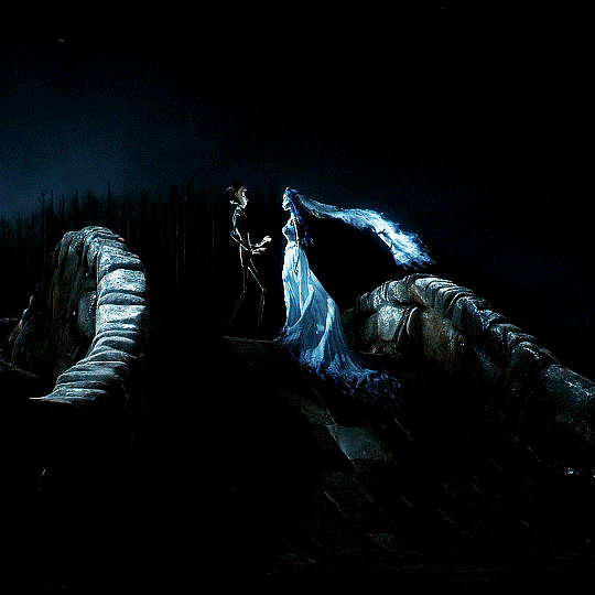

Corpse Bride (2005)
#halloweenedit#filmtvdaily#fyeahmovies#moviehub#dailyflicks#tvfilmsource#moviegifs#usereste#cinematv#animationsdaily#film: corpse bride#type: film#era: 2000s#ours#by danni
2K notes
·
View notes
Text
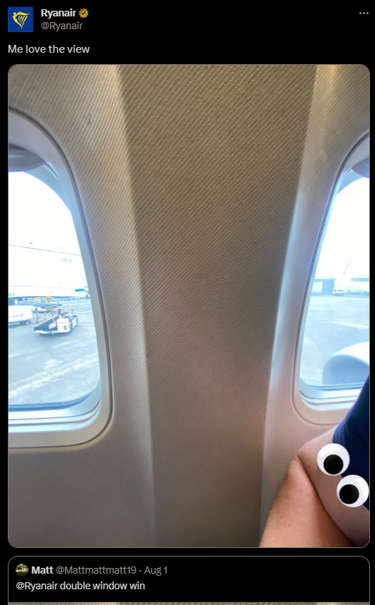
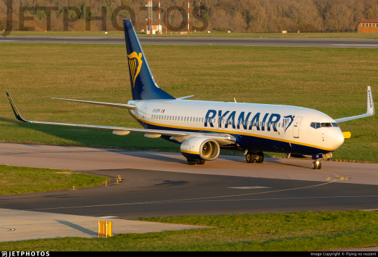
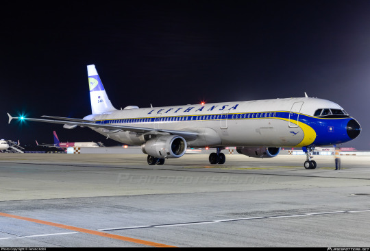
No. 54 - Ryanair

You are watching a video on a popular video sharing service. It is a full episode of a popular and long-running show, generously uploaded for free. It is narrated by a calm man with a BBC accent of the sort which belongs exclusively in documentaries.
The narrator names a date between 1903 and the current year. It is accompanied by a location - an airport. An airplane is on approach. It has a certain number of people on board, and it flies for some airline. There are pilots, most likely two of them. They make some sort of mistake, and maybe there's an issue with the weather, or the ILS is down, or the instruments are giving misleading information, or some other thing has gone tailcone over teakettle in an alarmingly short timespan and now their approach is tremendously unstable. They aren't on the glideslope. They're too fast or too slow. They really need to declare a missed approach, but for whatever reason they don't.
The plane lands, or 'lands' - finds itself on the ground, regardless - either on or short of the runway. It bounces, or flips over, or just pancakes into the ground. The fuselage cracks, or splits, or peels open, or horribly catches fire. There is an evacuation. It's all very stressful at minimum, and an unmitigated tragedy at worst.
You scroll down to the comments for some reason. "Average Ryanair landing," says one near the top.

Ryanair (not to be confused with Ryan Air, a real but unrelated airline) is Europe's largest air carrier. It has over 550 airplanes and serves over 200 destinations. It is difficult to imagine an airline with a worse reputation - their CEO is a literal troll, their customer service is legendarily poor, and their ultra-low-cost model is one in which you inevitably get what you pay for. They are memetically despised, and their rough landings are the stuff of legend.

And yet their livery is understated, with a certain head-held-high gravitas. It is difficult to describe the legitimate cognitive dissonance which arises from Ryanair's aerosartorial choices, an effect that seems to touch more people than just me. On another airline, I wouldn't find this livery particularly thought-provoking. Enough substance to write a post about, but not something which lurks in my mind and draws my attention. But on Ryanair, it's downright fascinating.
I've said what I've said, but I'm actually a defender of Ryanair. Look, it's like getting a ticket on a bus or the metro. It's cheap (at least in theory - they seem to be getting pricier lately) and it gets you where you need to go and it's probably not going to be that long of a flight anyway so, I mean, whatever. I've flown some pretty long flights before in-flight entertainment was standard, Ryanair is fine. I never even noticed the hard landings until I saw people talking about them, and to be perfectly honest I didn't notice them afterward either. Maybe I'm just not bothered by hard landings, the same way I'm not bothered by turbulence. Who really knows? My point is that I'm something of a Ryanair apologist. I live in the US, where you just don't get dirt cheap flights like that and getting anywhere outside of your home metropolitan area by train (and even sometimes bus) costs even more than flying. Ryanair could make me board the plane by abseiling up it myself to save money on airstairs and I'd be fine with it if the price was right. I'm not a millionaire. I haven't got the money to go jetsetting around Europe on a real airline. So I mean this when I say it: thank goodness for Ryanair.
I mean, I'm not saying this because Ryanair is good, don't get me wrong. They are the Big Bill Hell's of airlines. They are the closest thing we have to John Mulaney's version of Delta. Ryanair is not just no-frills, it's hot-glued fabric scraps in the vague shape of a garment. They are legitimately comical in their commitment to service so Kafkaesquely bad that you almost wish you'd travelled by trebuchet instead! And all this for the low, low price of...well, I mean, they do get pretty low.
When I released my first questionnaire I added a question about Ryanair specifically because of its reputation and my own feelings about the airline. Multiple people did agree with me - well, it's definitely not comfortable at all, you won't enjoy yourself, but it's so obscenely cheap that this isn't really objectionable. You are getting exactly what you pay for. And, well, if you do want some semblance of the full-service experience you can pay an extra fee. Or a lot of extra fees. That's how they get you. The ULCC model relies on stripping out everything possible and then charging you extra for it. That does mean that if you need things like printed boarding passes or the ability to pay by credit card that come standard with literally any other airline you could end up paying a decent amount for your miserable cramped flight, but if you truly want the bare minimum they will charge you appropriately, and that is so important to me, because I have too little money to insist on being comfortable.
I do feel...particularly sorry for one respondent.
It isn't bad press they are legitimately a nightmare. A attendant once lied to me and told me that type of plane just didn't have toilets (it did. There was a working toilet on board) then proceeded to lecture me about 'not planning ahead and going in the airport'
This is kind of hilarious in a sad way and I'm very sorry that this happened to you. Ryanair is infamous for its bad customer service but it's rare you'll hear about cabin crew behaving this poorly at any airline. While this particular incident was a one-off, you probably will have a pretty miserable time if you need to call the airline about literally anything.
One person just answered 'bitches'.

Well, that answers the question "what is Ryanair", but why is Ryanair?
The world is full of low-cost carriers. Wizz Air, EasyJet, airasia, Allegiant, Jetstar, FlySafair, Volaris, T'Way, Azul, Nok Air, Frontier, Lion Air, jetBlue, and SpiceJet are just some of the dozens which fill the skies. They are often colourful, frequently grumbled about, and essential.
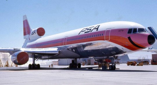
Low-cost carriers, and especially ULCCs, are a relatively recent phenomenon. They only sprung into being after aviation stopped being by necessity a luxury product. It's generally agreed that PSA (Pacific Southwest Airlines), an intrastate carrier from California colloquially known as the Poor Sailor's Airline, was the first low-cost carrier. While the large interstate carriers of the time had a sort of detached gravitas to both their services and their prices, and were often prevented from lowering said prices anyway due to federal taxes that didn't apply to intrastate carriers like PSA, a ticket on "The World's Friendliest Airline" was cheap and the service was casual and personable. The low-cost model is built on being an option for a normal person. If you don't have the money to fly TWA, you can fly on an airline which is made for normal people and charges you accordingly.
The model didn't really catch on immediately, though. I couldn't exactly say why - it might have to do with the lack of demand for air travel that wasn't either commuter flights or long-haul. There was some activity in the market, with Loftleiðir (a precursor to Icelandair) offering cheap-as-dirt transatlantic flights in the 60s and Laker Airways having a three-year tenure in the late 70s serving a similar market from a Western European base. Even today the long-haul low-cost market they served is notoriously difficult to make anything work in.
What is generally thought to be the next major player in low-cost airlines, Southwest, emerged in 1971. David Neeleman further refined the model, first with innovations in cost-cutting at Morris Air and later by raising the bar for customer experience at jetBlue. David Neeleman, though, was active right at the turn of the millennium. Low-cost carriers only really began to emerge in real numbers in the 80s and 90s, with examples that are long-gone, like the infamous ValuJet, existing alongside ones US residents have probably seen at their local airport, like Spirit.
Spirit is different from jetBlue and Southwest. Spirit Airlines is not just a low-cost carrier but an ultra low-cost carrier. As the name suggests, the difference is one of scale. A low-cost carrier provides less comprehensive and less ritzy service than a full-service airline, but they do so in the tradition of PSA, trying to provide a comfortable experience that makes people want to choose their airline. The ULCC model, on the other hand, guts out literally every possible feature and then dangles it in front of you on a string, telling you to pay extra if you want it. These airlines do not provide a good experience. There will be no baggage allowances, no extra legroom, and no priority boarding. The base fare, however, is almost absurdly low relative to even low-cost carriers, and as air travel becomes a fact of life more and more the humble ULCC becomes a necessary part of the ecosystem as the only way many people can afford to travel.
Ryanair is technically 38 years old, but it's only been a low-cost carrier since 1990. This pivot is the brainchild of then-CFO, now CEO (and ouster of the eponymous Ryan) Michael O'Leary, one of the wealthiest and most unpleasant men in Ireland.

image: Associated Press
Yes, this is actually a real image of the CEO of Ryanair. I imagine this may clear up a thing or two.
Why is Ryanair? Because Michael O'Leary, is the simple answer. Michael O'Leary is - and there is genuinely no better way to describe the man - a troll. If you take David Neeleman's image during his tenure at jetBlue, a sweet everyman trying to improve the experience by sitting in on flights and giving up his salary to employee medical funds, Michael O'Leary is the literal exact opposite of him on every point. A self-described "gobshite" and "obnoxious little bollocks" who has admitted to "not liking" aeroplanes, Michael O'Leary is a cruel, selfish, belligerent, publicity-seeking freakazoid on a mission to piss off everyone in Europe which has so far been largely successful.
I don't want anything I say about the man to come off as positive. Michael O'Leary is a wealthy ghoul (and, yes, he was born wealthy, no rags in his tale) who publicly berates, mistreats, and underpays his staff. He has expressed prejudice against racial and religious minorities, fat and disabled passengers, women, and just about anyone who expects to be treated with some measure of dignity. He has committed legitimate crimes, like impersonating journalists. He denies climate change and has accumulated his massive wealth by abusing the pilots and cabin crew who keep Ryanair adequate. In 2010 Ryanair was named one of the least ethical companies in the world. The fact that he is so absurd as to be hilarious isn't an endorsement or a defense of him.
That said, here is a short, curated list of Michael O'Leary's, and Ryanair's broadly (as their public image is really an extension of his and vice versa) most Ryanair shenanigans:
O'Leary installed a taxicab license plate on his luxury car and driving it in the bus lane to avoid traffic.
Advertisements have taken open and somewhat sneering shots at other major European airlines, like Lufthansa ('bye by Late-hansa'), British Airways ('expensive BAstards'), and the now-defunct Sabena (using a reference to the famous Manneken Pis statue). These have not been simple comparisons but outright name-calling.
One time they advertised sales to 'sunny' vacation destinations, like Norway.
Generally, their advertisements push so many boundaries that they were once found to have committed seven violations of advertising law in just two years, and I'm shocked they didn't begin an ad campaign centring around this dubious achievement.
They frequently misbrand airports way outside of major cities as being in that major city, with the most insane example being "Vienna Bratislava" - yes, Bratislava, the one in Slovakia.
Pilots are forced to pay for simulator checks while cabin crew are forced to pay for uniforms and training. Employees are even forbidden from charging their phones from office sockets, apparently.
Sometimes passengers are forced to carry their own luggage to the planes! Not carryons, luggage.
O'Leary, in a bold move, outright denied that the 2010 eruption of Eyjafjallajökull had created a massive cloud of volcanic ash hazardous to airplanes (it very obviously had).
He also said he would like for there to be a recession, since it would let Ryanair keep costs low. He said this in 2008.
One time he said travel agents ("fuckers") should be shot .
O'Leary claimed that Ryanair would begin offering business class, featuring "beds and blowjobs". I'm personally not sure I would want a Ryanair blowjob. That sounds really horrible.
Also, bold coming from an airline with no seatback pockets.
Apparently they tried to get planes delivered with no window shades (though they weren't able to because of regulations).
They've floated the idea of standing seats. I don't believe this will or indeed could ever happen but it definitely is truly dystopian.
Ryanair keeps trying to buy Aer Lingus. They keep failing, and they keep trying. Obviously, everyone in Ireland has a vested interest in making sure this does not happen.
Fundamentally, Ryanair doesn't care. They can and will essentially throw tantrums to get airports to charge them lower operating fees and if they can't get an airport to do this they just won't operate there. It's like negotiating with a seven-year-old. Except that seven-year-old is Europe's largest airline.
They wanted to buy the C919. This isn't, like, a bad thing, it's just really strange for a hardcore Boeing loyalist airline and I can't imagine how it would save them money.
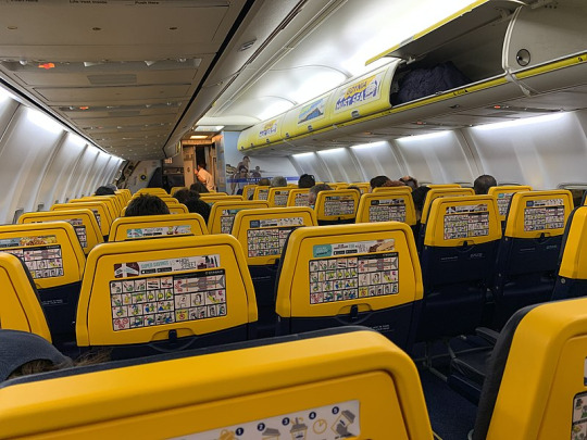
image: Robot8A
This is the interior of a Ryanair plane. Note the safety cards attached to the seatbacks due to the lack of pockets, plus additional adverts on the seatbacks and overhead bins like this is a sports match in a massive stadium. It's also just quite ugly.
Fundamentally, Ryanair is just perpetually doing Ryanair things. Why is Ryanair? Because Ryanair is one giant publicity stunt. A couple of people answered my question by referencing the CEO saying he'd like to charge people to use the toilet, and that's sort of true in the sense that he's said he'd like to do this, but he's always been pretty clear that it's a publicity stunt:
Short of committing murder, negative publicity sells more seats than positive publicity.
Like, it's a bit. He's doing a bit. He's 100% in on the joke. For every one of the more particularly insane claims, like charging to use the toilets, he's outright denied it. Even some claims that are pretty borderline are ones he's contradicted at other points. He's a legitimate bigot who's created one of the most nightmarish work environments out there and just wants to suck money out of people by any means necessary, and he's indefensible, but that's not really what people talk about when they talk about Ryanair. They talk about charging for toilets.
Charging for toilets continues to be the number one story that resurfaces in the press and it’s the gift that keeps on giving. We’ve never done it, but it keeps coming up on social networks every three or four months, the media picks up on it and then someone writes a story on it.
Which I think is misplaced effort when he's also, for instance, a climate change denier who forces disabled passengers to pay for wheelchairs. And I don't believe for a second his climate change denial is based on legitimate convictions - he just doesn't want to have to spend more money. He would absolutely knowingly feed the world into an incinerator if it lowered costs.
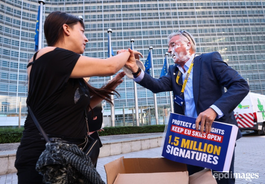
Anyway, here is a picture of him having his face violently introduced to a pie.
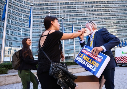
image: Olivier Hoslet
All of this said, there's no such thing as an ethical airline - he's just playing it up to the extreme for essentially business clickbait.
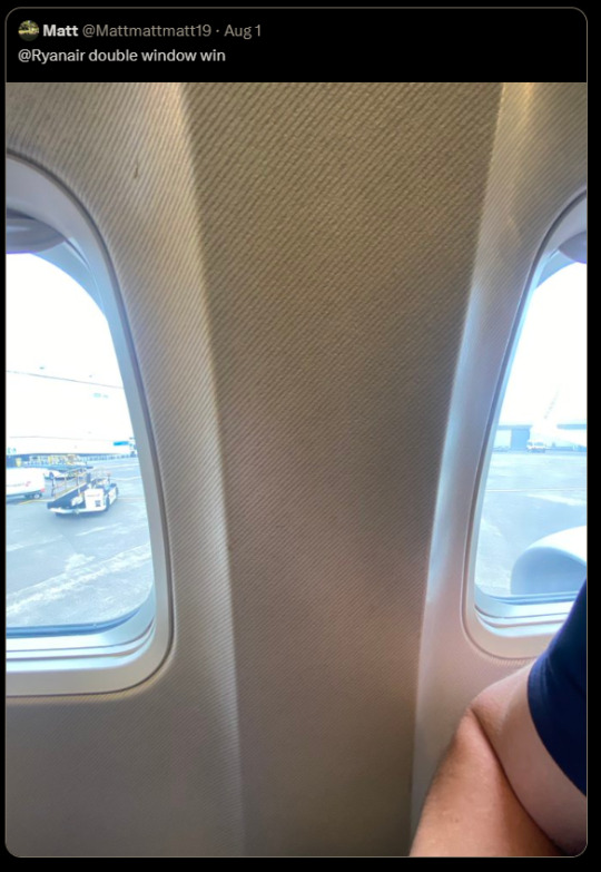
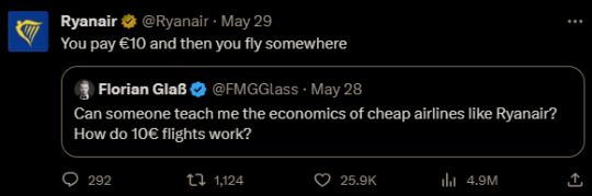
I feel like the best example of Ryanair's general...Ryanairness is their Twitter account, which I have a sneaking suspicion Michael O'Leary runs himself to save money. It's mostly composed of firing back at complaining customers, Formula 1 opinions, and jabs at everyone from Boris Johnson to the British Museum. (Heartbreaking: the worst person you know just made a great point.) Their description, 'we sell seats, not windows', references the frequent complaints about seat 11A, which does not have a window. (To be fair, their website does warn you about this.) Their weird window situation actually generated my all-time favourite Ryanair tweet.
Here are some other winners.
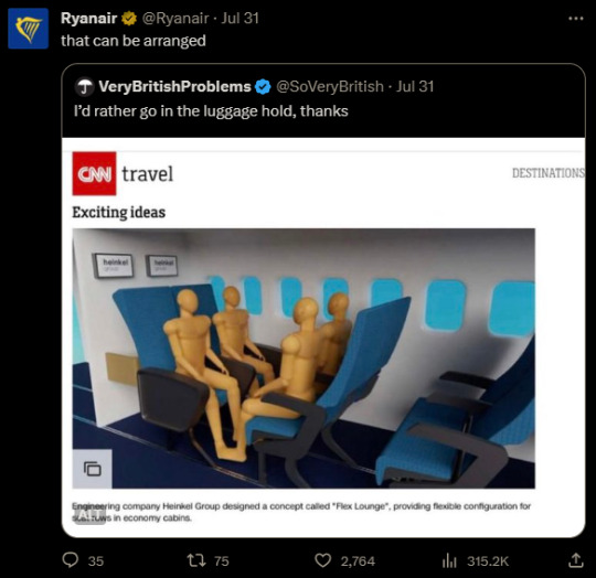
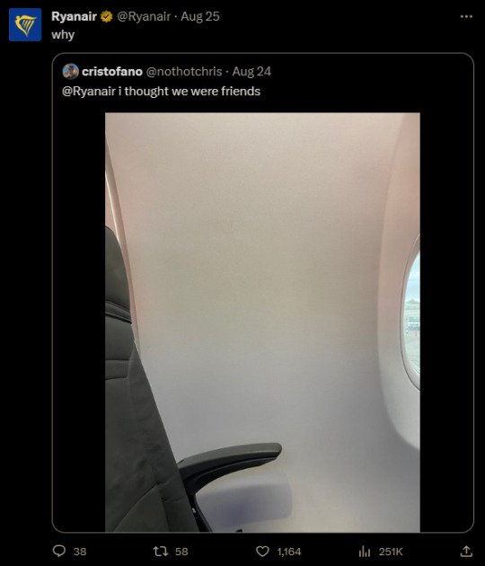


No, seriously, I think Michael O'Leary might be writing these. I also really don't know how to feel about the fact that it appears someone at the airline - potentially O'Leary himself - has made an edit of a yassified Ryanair plane.
But at the end of the day, it's Ryanair. O'Leary himself has described aeroplanes as "a bus with wings on". As one individual tweeted,
THANK YOU to [Ryanair], for letting me see Europe for Feck All
and that's why I do think I genuinely have primarily positive feelings about Ryanair as a product rather than a company - you truly do see Europe for Feck All. (O'Leary has claimed both that he would introduce $10 transatlantic tickets to the US, and that he would make tickets literally free and make all profits from ancillary fees - while neither has yet happened, it takes one hell of an airline to claim that it's on the table.)
Ryanair isn't affordable, it's dime store. It's an airline you bought from Wish.com. It's the free pen you stole from a cup of identical pens at the bank which stops working within days. You're not just in steerage, you're on a tramp steamer. You get exactly the misery you pay for, and you go from one place to a different place.
And it's worth noting that Ryanair has at least one positive feature - safety.
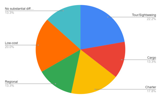
When I ran my first questionnaire I asked respondents what type of airline they thought was most dangerous. Other than what's shown there was also an option for mainline full service carriers; unsurprisingly, nobody chose this. There were 50 respondents but 5 declined to answer this particular question, so the sample size isn't really significant enough to draw any conclusions from, but it's what I have. (I kind of wish I could stop to re-run this with my current follower count, but this post is actually a request. No, not for my wonderful beloved followers - for my dentist. Not joking. Thank you for making my teeth not have holes in them.)
20% of respondents indicated that low-cost or ultra-low-cost airlines probably had the worst safety records and practices. It's completely understandable why someone would think this, but without going into the actual statistics of plane crashes this simply isn't true, and in fact they're the safest category on here. While it obviously depends on the specific airline, low-cost carriers as a category are no less safe than mainline carriers. This is despite the fact that they tend to fly shorter flights and thus they operate more takeoffs and landings, which are the points in a flight where the majority of crashes occur.
How does that make sense? Well, part of it is that the airline industry has gotten very close to eliminating accidental crashes via innovations in technology and an incredible safety culture built on years of hard lessons. The world has paid in blood for crew resource management and GPWS, but it has paid, and now the sorts of crashes that would have been unremarkable just 20 years ago are completely unthinkable. Actually, in the 2010s it's quite possible more people were killed by planes brought down deliberately than accidents. But beyond that, the costs low-cost airlines cut tend to be ones that aren't safety-critical. They tend to operate shiny new fleets (better fuel efficiency, purchased in bulk) with large maintenance teams (shorter turnaround and less planes grounded for long periods of time) at less congested airports (lower operating fees) and indeed when I think about famous accidents that involve massive cutting of corners it's nearly always full-service airlines, save for egregious examples of low-cost industry pariahs out of business within a few years. Focusing on eliminating operating costs by making the passenger experience cramped and miserable allows for pouring all your budget into running a smooth and well-oiled operation.
The axiom "if you think safety is expensive, try a crash" is often attributed to EasyJet founder Stelios Haji-Ioannou. And it's true. Beyond the cost of writing off a plane, of financial compensation to survivors and families, of lawyers and PR, of having to update your operation to make sure it never happens again...as O'Leary himself said, all press is good press...short of murder. A heinous, clearly negligent crash, on the other hand, can kill an airline as easily as it can kill people. It has done in the past and that threat will never stop being there. Airlines go out of business all the time for any number of mundane financial reasons. In many cases margins simply do not allow for something like a crash. Crashes have even ended the lives of deeply historic, beloved, well-established nationalized flag carriers, so this particular sword of Damocles could cut Ryanair's control cables just as easily. And they've managed to avoid this fate, with zero passenger fatalities and only one written-off airplane - the 2008 crash of flight 4102, caused by a birdstrike during landing.
And I'll be honest, "miserable and safe but a tenth the price of a train ticket from Boston to New York" (I am unfortunately not exaggerating) is a pretty appealing package to my non-millionaire self.

...so why do their planes look like this? I'm dead serious, it vexes me. I don't know what to make of this. Hey, did you remember I'm an airline livery review blog? Look, I can't help myself. Low-cost carriers as a topic, and how they're viewed, is probably the most interesting facet of the aviation industry to me. I feel like if I had infinite time and resources I might genuinely sit down, hit the databases and archives, run a few studies, and write a book about it - it's fascinating, and low-cost carriers are something that only economists and businesspeople seem to want to talk about. I think it's about time someone approached them through a lens of history and social psychology. There's not really academic value to what I do here, on Runway Runway, my tumblr blog where I call Lufthansa planes ugly, but if something doesn't exist I will create it even if my sample size is 50.
So how about how they're literally viewed - like, what their planes look like? Well, here are some low cost carriers I've reviewed. Notice something? They're bright and eye-catching. They don't take themselves too seriously. They're fun. The original low-cost carrier literally painted big smiles on their bright pink and orange planes.


Okay, yes, they don't all look like this. WestJet and IndiGo, for example, are fairly normal-looking. And there are full-service carriers like TAP Air Portugal (and condor. Absolutely condor.) that I would say have a pretty low-costy look to them. There is nothing wrong with that. Low-cost liveries are frequently colourful and exciting, with much more thought put into distinctiveness and charm instead of a passionless appeal to dignity. Indeed a lot of my most highly esteemed liveries, including all the ones pictured above, are low-cost airlines. GOL, for example, is a snappy, eye-catchy design in bright colours that's clearly not meant to look expensive. The same goes for Breeze Airways. There's even more examples out there I've yet to touch on, like EasyJet; ValuJet; Scoot; Spirit Airlines; Frontier Airlines; PLAY (and the late WOW air); Volotea; airasia, so on - to be dignified or clean is not the goal here. Even the names of low-cost carriers frequently are very hastily stapled together and generic, like EasyJet or Super Air Jet or Wings Air; JetSmart; SkyUp; Smartwings; FastJet; Sky Airline (just one!); MYAirlines; the classic ValuJet; flyadeal; and the legendary jet2.com, making no attempt at all to seem as if they have a legacy to fall back on. And there's even more out-there specimens, like Mango or even Nok Air. Many of them have specific themes, like Batik Air, Tigerair, or Buzz, which isn't something you see on full-service carriers, which brand themselves on national identity and the promise of luxury and good service - which is boring. Low-cost airlines, if they want to succeed, have to do something to make people remember they exist.
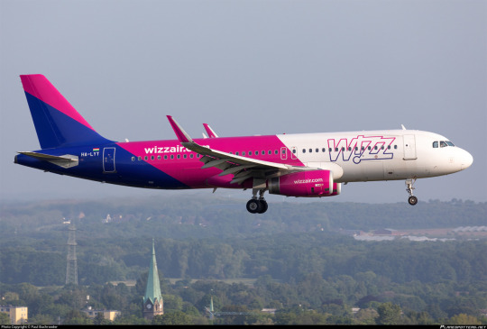
This is the fundamental shape taken by the low-cost product, which operates with few laurels to rest on and a mission of getting people to remember their website at any cost. Much like a can of Arizona iced "tea" guaranteed to cost ninety-nine cents, literally cheaper than a bottle of water, the package it comes in makes no attempt to look classy. And I am a heavy tea drinker who considers myself fairly discerning, whose favourite type of tea is gyokuro yamashiro (which is absurdly expensive), but you literally can't beat Arizona! It's potable and it's ninety-nine cents and it sort of resembles tea if you don't think too much about it and Massachusetts summers are surprisingly hot and the can is pretty and colourful. Sure, I'd rather have Ito En, but that costs normal money and Arizona costs 99 cents, and sometimes that's all I really have, and it gets the job done even if my teeth aren't enjoying the experience. A Wizz Air plane is a can of Arizona iced tea. It is ninety-nine cents and potable.
This isn't Arizona, this is a box of Darjeeling from Harrods. Ryanair outfits their fleet in handsome navy blue and gold. Their logo, an outline of a woman with harp-like wings taking flight, is simple yet elegant, and that feels so very wrong. I actually asked in my questionnaire what the colours of the Ryanair livery were, because I had seen people expressing casually that they weren't sure they could recognize so much as a Ryanair logo, and the results aren't worth showing in a chart because they're basically as good as random. I do want to specifically appreciate the person who answered "I don't remember but it must be whatever the cheapest colour of airplane paint is", though.
But the truth is that they have such a rich palette, and I do mean that in the sense of 'wealthy'. A deep royal blue paired with a saturated gold used as a sparing trim, these are the colours of an overstuffed plush armchair, not a budget airline. Aside from the name on the winglets and the giant billboard wordmark there is nothing, and I mean nothing, that is typical for a low-cost airline. This is not garish advertising, this is stately.
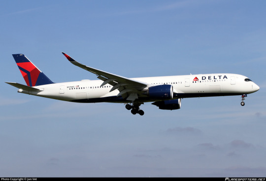
The layout itself is what I call "Deltalike". Delta certainly did not invent this style of livery but they are the carrier I associate most with it, likely due to the fact that I live right by one of their hubs. The Deltalike is a white plane with a painted tail unconnected to the main fuselage body, painted winglets, painted engines, and a painted underbelly large enough still be visible when viewed directly from the side. While a 'true' Deltalike uses a consistent palette for the engines, tail, and underbelly, there is significant variation. The detached tail is, in my opinion, the harbinger of the Deltalike, and I call liveries with an incomplete presentation of Deltalike features Deltalites.
This scheme is not as common as the Lufthansa Line variants but it is still very common, with its popularity probably peaking in the 2010s. Some examples of the true Deltalike include Air Canada, 2006 Icelandair, Azul, the old GOL livery, and jetBlue. Some colour-varied Deltalikes are the old Flair livery, the SAS red engine livery, and British Airways. An example Deltalite is the old Croatia Airlines scheme, which has a painted tail and belly and engines that are sort of painted. Sure, the engines are just grey and a bit of the tail extends onto the body, but it's got the colour concentrated in the right place and it has the painted belly, it's a Deltalite. A lot of liveries have painted engines and detached tails but no painted bellies, and I do consider these to be on the far end of the Deltalike spectrum, but they aren't what I mean when I refer to a Deltalike. They're what brown dwarves are to actual stars - related but not really the same.
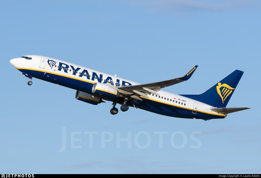
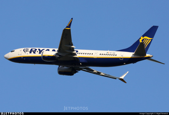
Ryanair is a true Deltalike, but I would even call it an elevated Deltalike. The gold trim, like the cord adorning the hems a of a thick brocade smoking jacket, has an effortlessly shallow curve as it trims the rich blue underbelly, larger than that of a typical Deltalike and with a very deliberate shape to it which at the rearmost point covers half the fuselage by height but fades away to a sort of goatee at the front. This is not a plane which sat in a puddle of blue but an intentional cloak impeccably positioned, visible not just from the side but from the front. The engines, instead of being plain or just one colour with a website printed on, large and garish, are the same white and blue with yellow trim, the last traces of the setting sun melting into a glassy deep blue ocean below a stark white sky with which it inexplicably coexists. Sure, the detached tail still looks bad, it always does, but you can ignore it at most angles.

From below the dark blue creates that distinct cetacean effect, a certain brightness-inverted countershading effect, similar to what you see on airlines like KLM and other blue-side-up liveries. The underside doesn't have a huge, legible logo, visible even from the ground on final approach. One of the defining features of the low-cost livery, in my mind, is a large, prominent website. It's tacky and a little pointless (I mean, surely they can Google your airline's name if your wordmark is large enough) but it is downright ubiquitous. Even full-service carriers frequently heavily feature their website, but it's nowhere on a Ryanair plane. That's so, so incredibly weird.
Just...think about it. Their entire identity is outrage marketing. They are the xQc of airlines - bigoted, constantly in the news, and obnoxious. And nobody remembers what their livery looks like because it doesn't look obnoxious. This is like if MrBeast's thumbnails were lovingly curated aesthetically pleasing shots of scenery that could pass for screenshots from an actual film. It's not tacky and cheap and it's not generic and cheap, it's elegant and cheap. And of all airlines to look like this...Ryanair? Seriously? Ryanair?
image: Associated Press
The CEO.

The airplanes.
Do you see what I mean? Do you see why I find this deeply strange? This is not a clickbait plane. This plane is downright unclickable. It has never been clicked. I bet if I covered the name up and showed it to people (again, I wish I'd had the time to do this) I could fool people into thinking this is like United. Hell, I've learned from my other survey that the average person clearly knows less about liveries than I, the Joker of liveries, do, and can't identify basically any from memory. I could probably fool at least one or two people into thinking this is Singapore Airlines. I may try this on a few co-workers and then get back to you.
How did we get here? I have no clue. While Ryanair did start out as a charter carrier rather than a low-cost airline, and they always had blue and yellow as their colours, their very early liveries were just white planes with wordmarks.

This livery seems to have appeared very early in the history of low-cost Ryanair. Unfortunately, I can't date it precisely - the only thing I can say is that the earliest photograph I could find in this livery was from 1994. Based on the fact that their planes were photographed in different liveries right up to then, including this very brief TAM-like BAC 1-11 livery, I think 1994 is most likely the point they committed to it.
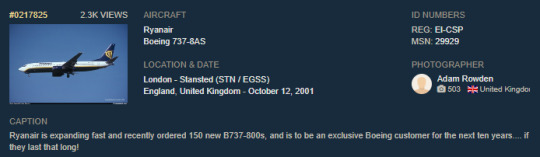
Oh, Adam Rowden, what a different world you lived in.
Even for 1994 this is a pretty conservative livery. Sure, this was before the real boom of bright and venomous flying billboards, but it's still strange. And Ryanair is no stranger to literal flying billboards in the form of logojets for such companies as Vodafone and Hertz, often sort of hideous ones, though I imagine these days nobody would ever want to associate with them like that.
And they never changed it, except that they did - to the modern, softer curve. This I can pinpoint with much more accuracy. It was changed in mid-2003 as new aircraft were delivered, while the older livery was phased out together with the secondhand airframes which wore it. I do not understand this at all. If any airline were to just make the decision to go full circus tent and be as garish as possible it should be Ryanair, right? Ryanair is a brand incapable of cowardly behavior. But they look far more sober than even the average modern flag carrier livery. I guess they don't think they need an eye-catching livery, but I just don't buy that as a full explanation. Imagine the news they'd make for introducing something truly heinous. I think their genuine best move would just be to put a huge picture of Michael O'Leary's face, blown up massively and poorly aligned with visible JPEG artefacts, all over their fuselages. All of Europe would be furious. So why? Why is this the situation?
So what's the verdict? This may be the hardest decision I've made so far. The options here range widely. I'll lay them out.
If I were rating this based on pure visual appeal, I would give it a B-. I am dead serious - this is a visually pleasing, well-balanced livery, simple yet elegant. The detached tail is my only major complaint. But I think Saudia's planes are quite pretty and I graded them low because I think they fail at representing their airline or having a distinct identity, so this cannot be my sole criterion.
I almost want to give them an F because of just how un-Ryanair they are, like how Copa's livery is literally not the Copa livery, but that feels wrong because that's still the Ryanair livery, it's not just a refusal to design a livery at all.
Do I marry these two into a tepid union destined for either divorce or a dramatic act of arson after a seeming eternity of languishing in mutual dysfunction in Tallahassee? I really don't want to do that, because attempting to balance these factors betrays the fact of their contradiction, the mental strain I've been afflicted with over this simple, pointless choice with zero consequences except maybe one of my followers disagreeing with me, which is fine. Unlike certain individuals I will not call you swear words and say you're an idiot.
The final option is maybe my least favourite of them all, because it's capitulation. It's admitting Ryanair is special, just the most annoying golf-ball-sized hailstone in the blizzard of absurd and comical frustrations which is the airline industry. But I just don't know what to make of this miserable little pest, this plague on the patience and knees of the traveling public.
Z. FUCK YOU IT'S RYANAIR.
It defies categories by being good, but being Ryanair. I hate that. I hate it, I hate their beastly little CEO, and I dislike that their planes are sleek, elegant, and could easily pass for an airline that doesn't instruct stewardesses to kick their passengers' shins as they walk down the aisles. If I am buying a ten-euro plane ticket I do not think the plane should look like this, teleologically speaking. At the end of the day I just have no better way to quantify my feelings.
Prick.
#tarmac fashion week#grade: z#era: 1990s#era: 2000s#era: 2010s#era: 2020s#region: europe#ryanair#low cost carriers#ulccs#deltalike#cabin fever#long haul#questionnaire 1#questionnaires#double sunrise#yeah I guess. it goes in that tag sure
136 notes
·
View notes
Text


ten frames.
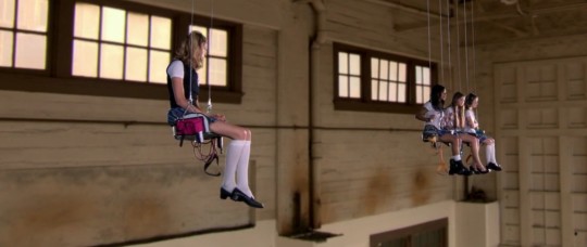
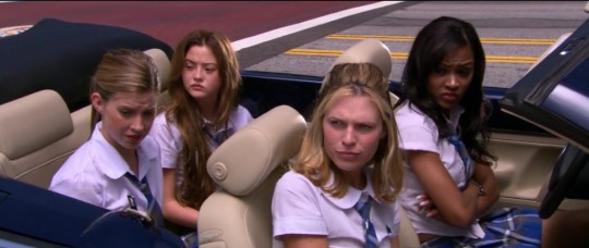
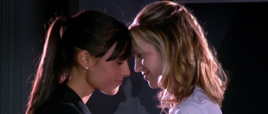
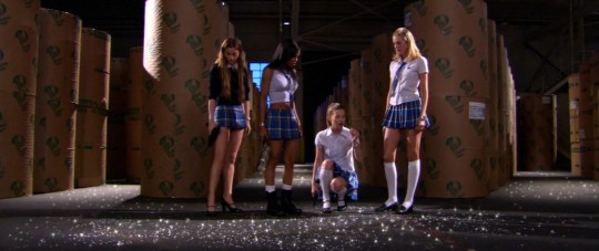
d.e.b.s. (2004) — dir. angela robinson
#debs#d.e.b.s.#movie log#june 2023 watch#pride watch#10 frames#genre: action#genre: romance#era: 2000s#country: usa#film screencaps
137 notes
·
View notes
Text

top 10 most ominous tweets in recent memory
#soda offers you a can#does this mean we have less frequent releases to give devs more time to work on the games??#a return to the 2000s era where lore carried over from game to game???#do the unhinged sonic youtubers get whatever it is they want from their funny little animal game????#find out next time on sonic x
29K notes
·
View notes
Text
man 2004 was a big year for gay people with issues

#mcr#my chem#three cheers for sweet revenge#saw 2004#saw#saw franchise#saw movies#saw 1#adam saw#adam faulkner stanheight#adam stanheight#chainshipping#bandom#three cheers era#my chemical romance#emo#emo kid#2000s emo#sawposting
4K notes
·
View notes
Text
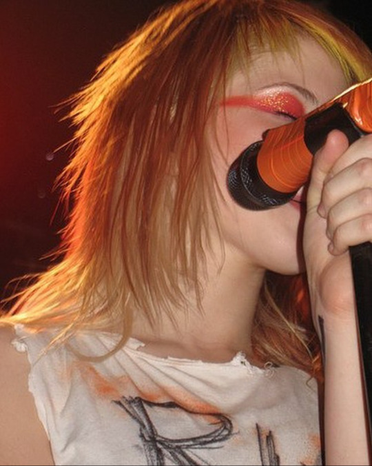


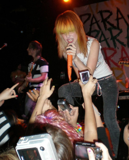

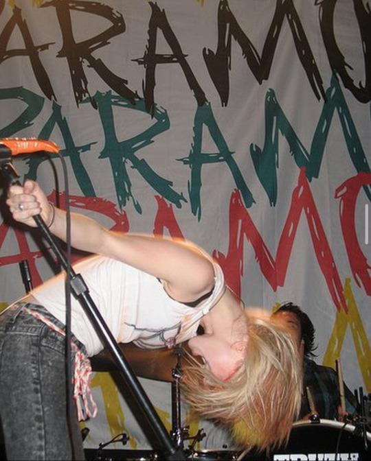
Hayley Williams, New York, 2007
#early 2000s#paramore#hayley williams#riot!#2007#emo#girlblogger#im just a girl#if ya nasty#crushcrushcrush#misery business#that’s what you get#riot! era#live#concert
2K notes
·
View notes
Text
Evanescence on the French magazine Hard N' Heavy, 2003
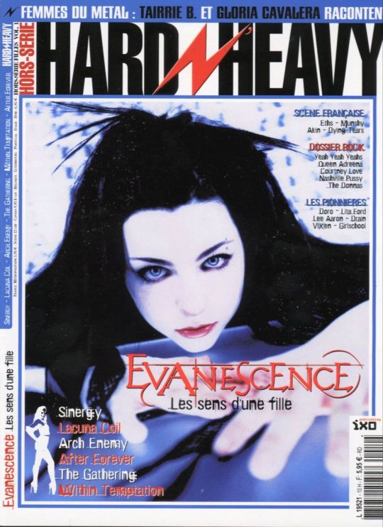
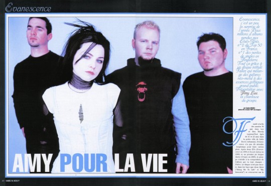
#evanescence#amy lee#nu metal#early 2000s#2000s#2000s nostalgia#goth#2000s emo#oldschool#2000#magazine#2003#20 years of fallen#fallen20#fallen era#fallen#gothic rock#alt rock#french#old school#old magazines#photos#photoshoot#fallen photoshoot#ben moody
2K notes
·
View notes
Text


☆ ★ ✮ ★ ☆ ꒷꒦꒷꒦꒷꒦꒷꒦꒷꒦꒷👾 ꒷꒦꒷꒦꒷꒦꒷꒦꒷꒦꒷☆ ★ ✮ ★ ☆
#myspace#scene#scene kid#scenemo#2000s#2000s emo#emo scene#early 2010s#emo aesthetic#emo#myspace era#twilight sparkle#my little pony#2000s scene#scene blog#scenecore#scene fashion#scene aesthetic#2000s fashion#scemo#inspo#scene emo#scene girl#scene hair#scenekid#y2k#2000s blog#2010s#rawring 20s#2010s aesthetic
739 notes
·
View notes
Text

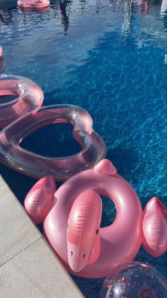
barbie summer🎀💓👙
#barbie#ririthedoll#early 2000s#trashy y2k#tumblr girls#dollblr#dollcore#best era#dolliest#early 2010s fashion#iconic#juicy couture#mcbling#summer#early 2010s nostalgia#coquette#pink y2k#pink victoria secret#pink bows#pink aesthetic#pinkcore#pink#pinterest#spotify#y2k aesthetics#cyber y2k#y2kcore#y2k aesthetic#y2k#2000s core
678 notes
·
View notes
Text
#early 2000s#mcbling aesthetic#mcbling#2000s trash#trashy 2000s#y2k trash#y2k era#y2k#2000s fashion#trashy#y2k aesthetic#mcbling moodboard#y2k fashion#trashy aesthetic#trashy moodboard#y2k moodboard#mcbling outfits#2000s style#2000s web#2000s#bratz#bratz doll#bratz fashion#trashy y2k#y2kcore#bratz aesthetic#early 2000s outfits#moodboard
4K notes
·
View notes
Text
#mcr revenge era#mcr gerard#my chemical romance#my chemical fucking romance#my chem romance#my chemical gerard#mcr5#mcr fanart#mcr#gerard way#emo scene#i love ptv#2000s#2000s emo#pierce the vic#pierce the veil#ptv#ptv gif#ptv lyrics#ptv quotes
1K notes
·
View notes
Text
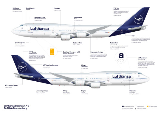
No. 1 - Lufthansa
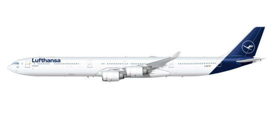
We begin with a large fish even by the standards of the large pond in which we operate. A very intentionally chosen large fish. Deutsche Lufthansa is Germany’s flag carrier and the second largest carrier in all of Europe by passenger volume. In 2018, they unveiled a new standard livery for their fleet of airplanes, and it...well. It’s this.
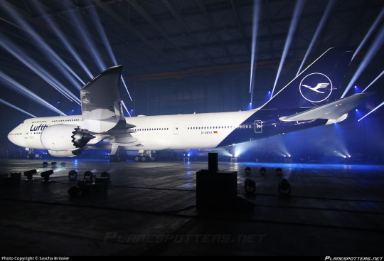
Even the presentation - good lord, is this an auto show?
My feelings on Lufthansa’s 2018 livery are visceral. There’s no mental evaluation required, no taking it in, thinking about the choices made - I look at the modern Lufthansa livery and immediately, profoundly know that I hate it. And that’s not just because of the specific choices made - which are bad - but because of the space they occupy amidst a creatively barren wasteland within livery design. This is going to be a very long post, which isn’t standard for this blog, but my goal for an introduction is to break down exactly the sort of design that made me feel the need to start doing this to begin with.
But in reality that’s only the beginning. Yes, Lufthansa’s livery is specifically disappointing, but it is so much more than that. It is the purest distillation of the greatest challenge aviation faces today, far weightier than scheduling issues, outdated IT, and runway incursions. It is not the worst example of it, not in the slightest, but it is a large airline which has a very textbook presentation of symptoms and thus feels like a great example to describe exactly what I hate about this sort of design. Let me explain.
Essentially, airlines have found a formula. It goes as such:
Almost entirely white body. (There is a name for this trend: Eurowhite.) In some cases, there may be a colour on the underside, generally either a light grey or whichever secondary shade the airline has committed to. In the case of this Lufthansa livery, it is just white.
Aside from the white body there will be either a single colour (generally some dark blue, or less often some sort of red) or a few colours, usually but not exclusively on flag carriers to match their national branding. (The proliferation of red, white, and blue flags out there means that a disproportionate number of airline liveries are these colours.) Unless it is literally just a white plane meant to be as generic as possible for short turn-overs when leasing, it will at least attempt to have some sort of design, but it will be minimal, and:
All of the detail will be on the tail. There may be coloured winglets or engine nacelles, but other than that it is only at the rear of the plane that you begin to see any interest. Usually this is just a logo, though it may be an abstract design which looks like a default tumblr header. It will often only be on the tail, with nothing at all on the body proper.
The name of the airline written in a sans-serif typeface which is set as default on at least one word processor. Rarely will anything creative be done with this. It will (usually, except in egregious cases) match the impotent attempt at graphic design which has been confined to the empennage and it will have all the charm of a large retail chain’s flyer describing the benefits you’ll definitely totally get if you work for them - sickeningly corporate. Low-cost airlines may slightly vary the theme by putting their website onto the livery, either towards the back or just instead of the airline’s name. The brave will also write it on the ventral fairing, but most don’t even bother with that simple act. Some airlines have their name written in the language spoken in the country they’re based in, usually beside the English text, but most are only in English despite operating in countries where this is not the most widely spoken language.
Not every livery which has these features is badly designed, as seemingly small changes can make all the difference. There is the occasional livery that fits most, if not all of these features that has some clever tweaks or design choices which makes me actually think it’s fine, acceptable, maybe even decent. (I have taken the initiative of making sure a few of these are among my early posts, just to demonstrate that it can be done). And some airlines depart from this entirely and come up with something even more hideous. Yet I somehow find myself respecting even these more than I do Lufthansa.
The Corporate Standard Livery Design (Lufthansesque design, if you will) is - and I do not think I am being dramatic at all here - an epidemic. Taxiing through most airports, you sometimes have to actually try to tell the planes parked around you apart in the sea of red, blue, and mostly white. And I spend a lot of time looking at planes.
These liveries do not only fail to inspire me. They instill in me a profound disgust. They are not trying to be good. They are trying to be what I described earlier - decent, not worth complaining about, because that’s cheaper and easier than designing something good. Graphic design is not anyone’s passion here. They’re just trying to toe the line. They’re so poisoned by the modern minimalist-design brain virus that they don’t realise that to be acceptable a livery this simple needs to do something interesting. There must be a creative decision made somewhere, a compelling feature, or you may as well be flying an MLA-formatted plane. In their striving for adequacy they become not just ambient, but lukewarm. They are a bottle of water which has sat in the sun for so long that when you drink it, even though you’re overheating and parched, it feels only negligibly better than the air you’ve been breathing in.
To be fair, I do not only hate the Lufthansa paintjob because it exemplifies whatever-ness. Even in an industry saturated with gross in-flight nothingburgers served with some stale biscuits and a paper cup of Lipton tea, Lufthansa manages to offend in specific and unique ways.
Throughout its long history Lufthansa has had a handful of different liveries, but from 2018 onwards this has been the situation. They’ve never been brilliant, but it’s only gotten worse over time. I normally would commit to a separate post for historical liveries, but in a move that I don’t foresee becoming particularly common I’d like to talk about the history and evolution of Lufthansa’s liveries from the golden age to now - the fall, if you will.

(image: lufthansa bildarchiv)
Their early liveries were already pretty much plain white or metal, but they still had a few features that made them seem a bit less like photocopy paper which was meant to be printed plain blue but only got through a tenth of the sheet before ink ran out. To begin with, they used a lighter blue and combined it with a vivid yellow to add some actual visual interest. The layering of the yellow over the blue where it curves around and below the nose and on the ends of the tailplane actually draws the eye. The font choice is nice and legible, spaced apart in the center of the fuselage. I imagine it was easy to read even from far away. (Shame it’s a bit blocked by the wings from some angles, though.)
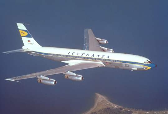
(image: lufthansa bildarchiv)
This early 707 design keeps the cheatlines extending past the nose but makes them sharper than the ones on the Connie to match the sleek profile of the jet. Back when this plane was painted adding white to your plane was a choice rather than the thing everybody was doing, which allows me to respect it for the choice it was instead of considering it the factory default. The bottom half, denoted by the cheatline, is left unpainted, which only adds to the sleekness of the overall profile, and the text is clear and plain but still aesthetically pleasing. The 707 is by modern standards pretty antique-looking; you can take one look at one and tell it isn’t particularly streamlined. This paint scheme, though, makes the plane look sharp and aerodynamic, despite not being revolutionary. I would go so far as to say I like this particular livery. This is, unfortunately, as good as it gets.

Oh. Oh no...
Let’s assess the damage here. The cheatlines now simply meet at the front without wrapping down to the belly of the plane and the nose is a simple black tip. I like it when airlines paint their planes’ radomes, and I wouldn’t mind it here if not for what it was replacing. The font has been replaced with a generic sans serif font which is closely spaced and put up into a corner, like the name on a homework assignment - it’s not really part of the total package, just there for administrative purposes. Most upsetting to me is the tail. While I wouldn’t say I love the little section on the old plane, it at least felt like it belonged there, creating a second blue-and-yellow layer above the white. Its placement on the fin above where it begins to taper gives the plane a bit of an aerodynamic feel. It’s certainly not changing the world, but it feels at home in the livery.
The new fin is a sharp downgrade. With nothing to mark the transition the fin abruptly goes from the white of the upper fuselage to a shiny blue which contains an enclave of the only yellow to be found on the entire aircraft. This makes the yellow stand out, as it has nothing to tie it in with the rest of the plane, and the fin itself feels almost like it’s been Frankensteined onto the fuselage from a different plane by a different airline. There’s nothing to mediate the transition from a block of white to a block of blue, like how the cheatline separates white and grey. It just is blue now, stop asking questions. This also means that the only part of the plane that the eye is really drawn to is...the tiny portion of the whole that is the fin, which may as well be floating detached in midair.
This is foreboding. Knowing what I know now, it feels like looking back at when a romantic partner began to act strange years later, after the divorce, as you walk by the house he bought with his mistress.
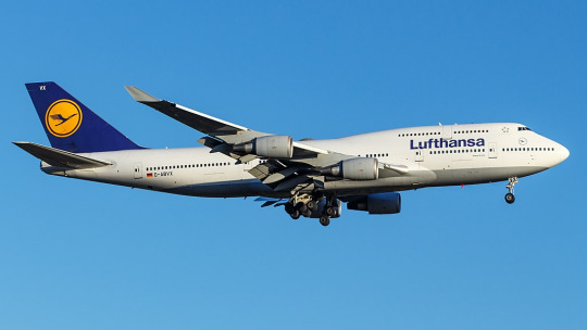
(image: g najberg)
The most recent, and only, time I flew on Lufthansa was in 2014 and was aboard one of their 747-400s. (Actually, if you’d still like to fly on a passenger 747, Lufthansa is basically your only option.) At the time, they looked like this. This is...just sad. They got rid of the cheatlines, because that’s trendy now, and they painted the whole plane white and made an attempt at lip service to the old metal lower half by painting just a bit of the plane grey, like if a human stepped into a puddle of paint that only covered the very sole of their foot. And I’m being generous by showing a 747, a plane which inherently makes any livery look less boring by being interestingly shaped itself, instead of the classic slightly pointy single-decker tube. Not to mention the double-decker design makes the text vertically centered instead of the default Lufthansa look of awkwardly shoved nearly all the way up the fuselage.
In defense of the modern livery, it’s possible to argue it’s an improvement on this. Honestly, looking at them next to each other, it’s difficult to pick out which one I find less defensible.
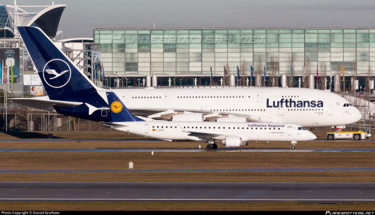
But then you see D-AIDV, an A321 painted in a heritage livery, and you feel the immediate, visceral “no!!! no go back!!!” as you remember that this is a false dichotomy and we could have something so much better if they weren’t peer-pressured into generic modern design.

And for what? For this?

(image: hvdfonts)
For the third time, I remind you of what we have been reduced to. We have achieved a state of reductio ad absurdum where this barely qualifies as a design. This plane is more or less a white blot. You can put as many insets as you want and it is still a white blot.
I am relatively sure that the font used is literally Helvetica. EDIT: I have been informed that it is not, in fact, Helvetica, but a custom typeface that happens to look almost exactly like Helvetica. This is, in my own opinion, worse! They did apparently use Helvetica in the past, though. Here is a very detailed description of the design process of the font, which manages to contain a grand total of zero ideas.
I would hate this on its own already, but it’s also so closely spaced and located so far up that it makes me feel like I’m suffocating. In my own experience as a dyslexic person, kerning is the single weightiest feature when it comes to if I can easily read something or not. While Helvetica, ugly though it may be, is generally considered a very legible font, any benefits from that are more than cancelled out by committing to making sure the entire name of the airline fits between the frontmost two doors with room to spare. It feels almost hostile.
Now, all given, I at least somewhat enjoy the shade of blue used for this livery, which is darker than the normal fare. I do miss the way the grey broke up the endless white space, though, and I mourn the yellow even more - in addition to being something to look at, losing it has also lost any visible reference to the flag of Germany, the country for which Lufthansa is the flag carrier. They don’t even have the black part of the German flag despite that being basically free. If they went for black instead of dark blue I would honestly respect this a hell of a lot more. One of the most recognizable flags in the world and instead your airline looks like a discount SAS.
Yeah, I said it. If we want to go even further with comparisons by including airlines that aren’t Lufthansa, this is basically the SAS livery. Except not, because the SAS livery does a lot that this doesn’t.
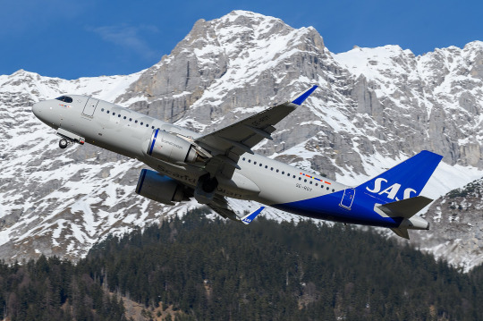
This is about Lufthansa, not SAS. I’ll look at SAS soon enough, because comparing their look to Lufthansa’s has made me appreciate it in a way I never used to. But I don’t think I need to elaborate too much for it to be clear why SAS’s livery works and Lufthansa’s doesn’t, despite the superficial similarities. SAS took their absolutely horrid previous livery and turned it into something which might not wow anyone but at least feels uniquely theirs, while Lufthansa had something which accomplished much the same and then diluted it into nothingness, Eurowhite writ large. Two washes and you’d wonder if your Lufthansa flight is actually a Smartlynx lease.
The way that the blue slices into the bottom of the fuselage and doesn’t fully cover the tailfin is...something? It’s a design element. It’s not nearly enough to save it, but it’s a design element. However, this presents another issue specific to Lufthansa’s paint job, best demonstrated with a specific plane:
(image: lufthansa)
Lufthansa is the world’s largest operator of the Airbus A340, a somewhat eccentric airplane which is perhaps best thought of as a four-engined A330. I love this airplane, and am delighted seeing it overhead on my walk home from work, because Lufthansa is kind enough to operate a daily service with it to my home airport, but that’s beside the point. The point is this: what I have pictured is specifically the A340-600, which is the world’s second longest in-service airliner. Yes, longer than the A380 and the 747-400, and, in fact, only shorter than the 747-800. With a plane this long, the Lufthansa livery creates an incredible look of rear-heaviness. This plane looks like it should uncontrollably pitch up until it’s perpendicular to the ground every time it takes off. Of course this effect is less pronounced on shorter aircraft, but it’s still there, and I dislike it.

You can barely even tell there’s paint at all on a much smaller plane! And the white bit on the front of the rudder which looks okay on a conventional empennage looks downright horrible when it’s only on the very tip of the t-tail’s forward point.

Oh, and when you take the windows out for a freighter conversion it gets even worse.
This is a generic-brand airplane. It genuinely reminds me of generic branding. There is a specific brand that has this exact appearance and I can’t remember what it is but it’s right there and I’m fairly sure I’ve seen it at CVS. I don’t think that’s what you want to go for when designing an airline livery, especially for an airline representing a country, but if Lufthansa wasn’t going for that they’ve failed.
__________________________________________
Overall, Lufthansa’s livery is superbly boring and not terribly well thought out. It’s not worth this absolute dissertation on its own, but I’ve singled it out to complain about general trends, and for that I probably owe it an apology. Said apology is predicated on the fact that it is still a very underwhelming and bad design which could have used a lot more thought. There are a million ways this could have been made decent, and none of them were implemented because that would have taken effort and time and creative vision. I think this post actually required more time and effort than Lufthansa put into designing their planes.
That said, Lufthansa gets a final grade of D. It’s...bad, it definitely is. There’s the vague flavour of the start of something, like the very distant smell from a barbecue happening three blocks away, but is that really even a redeeming factor?
No. The second-largest airline in Europe should be able to do better. If I have to stare at rows upon rows of their planes any time I’m at a German airport, they should have the decency to make them interesting to look at.
#tarmac fashion week#region: europe#region: west/central europe#lufthansa#region: germany#grade: d#era: 2010s#era: 2020s#era: 1950s#era: 1960s#era: 1970s#era: 1980s#era: 1990s#era: 2000s#retired liveries#flag carriers#double sunrise#long haul#lufthansa group#lufthansa line#scandinavian airlines system#deltalike
183 notes
·
View notes
Text


ten frames.
[rec] (2007) — dir. jaume balagueró & paco plaza
vfg31 horror film challenge: day 21 · found footage
#rec movie#rec 2007#movie log#october 2023 watch#10 frames#vfg31#genre: horror#era: 2000s#country: spain#film screencaps
45 notes
·
View notes
Text

ME TBH
#emo#scene#2000s emo#scene hair#scene queen#emo aesthetic#myspace#2000s scene#scene aesthetic#scene king#scene kid#2000s#emo boys#myspace era#screamo#emo bands#emo boy#scene boys#funny memes#memes#emo memes
10K notes
·
View notes
Text

korn // issues (1999)
#korn#issues era#1990s#late 1990s#early 2000s#y2k#nu metal#mall goth#1990s metal#jonathan davis#brian head welch#james munky shaffer#reginold fieldy arvizu#david silveria#glittercore#glitter edits#mine#tw eyestrain#tw flashing#tw flickering
633 notes
·
View notes
Text
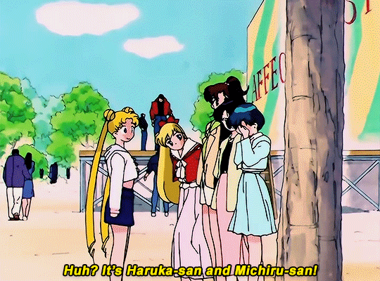

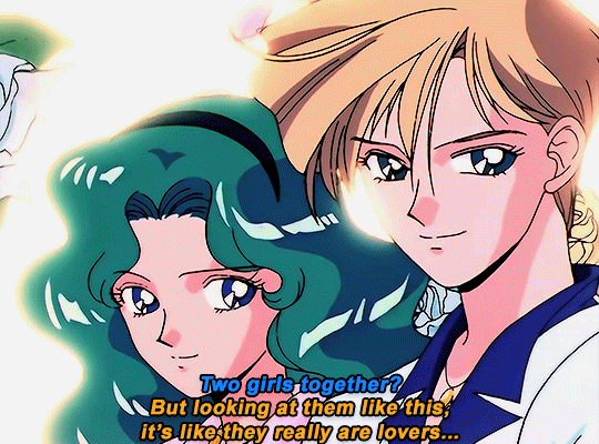
SAILOR MOON S: Episode 6 - "Blinded By Love's Light"
↳ "True love is what needs to win. Love... love is everything!"
#sailor moon#smedit#sailormoonedit#animeedit#wlwedit#harumichi#anime#uranep#haruka tenoh#michiru kaioh#haruka and michiru#sailor uranus#sailor neptune#shoujoedit#watching 90s sailor moon again as my comfort show#and now im back in my harumichi era LOL theyre just SO iconic as a pair#5 year old me in the 2000s was confused at first LMAO but i quickly took the hint after a few eps#i think the tagalog version never censored it like the west so theyre pretty implied#ANYWAYS i think im kinda deep into SM and harumichi so i might make more lol sorry arcane the drought kinda gave me some burnout#mine#my gifs
838 notes
·
View notes
Last Seen Blogs

ei497
倉庫番
mytourniquetmysuicide
Carol

solarisburns
Solarisburns

funnywormz
just a silly guy

jujutsubaby
fluorescent adolescent