#i can get back to posting art
Text

Bruh. FINALLY. MY PRINT SHOP IS LIVE!!!! And just in time for some deals goin on, it appears. neat.
Yall...... it genuinely felt like the world was telling me "Just don't make a print shop jeez" for a while..... I kept running into ridiculous roadblocks for over a month...
But it's FINALLY DONE and i can stop stressing about it. I went with inprnt :") If there's a piece you'd like that I haven't added on the shop, just let me know and I can very easily add it.
Alright, shameless self-promo post done. I'll probably quietly link to here in some pieces from now on, so it's less intrusive. Hope yall have been well, thanks!
#random rambling#IM SO HAPPY THIS IS DONE WITH#literally been thinking how i need to put an official shop together for uh- years#ok now that i feel like i sufficiently advertised it with a post#i can get back to posting art#soon#i have a pretty significant backlog#print shop#prints#dragons#fantasy prints#dragon prints
32 notes
·
View notes
Text
hes thinking real hard about eating a yummy sandwich

one with no crazy filters cause why not zzzz
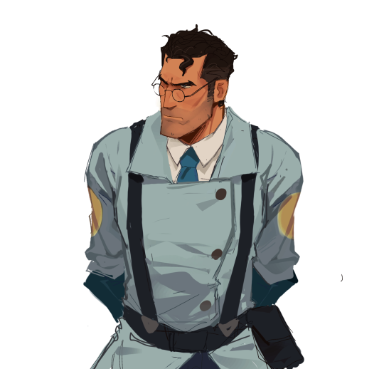
#tf2#team fortress 2#tf2 fanart#tf2 medic#blu medic#is this even anything#can you see that i figured out how amazing the lasso tool was halfway thru the process cause i feel i can and it’s HORRID#MORE ART SOON i hope i’m really trying to get back into working on stuff and not being lazy#i’ll prob post this one insta w a few changes cause idk if i’m completely happy w how this looks
4K notes
·
View notes
Text
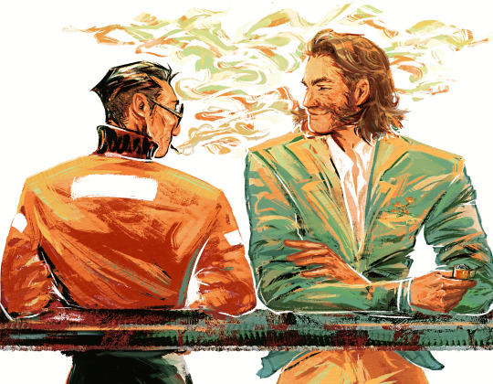
#my art#harry du bois#kim kitsuragi#disco elysium#disco elysium fanart#harrykim#kimharry#or whatever they're called#let this man have happiness or so help me#im a firm believer in harry getting a slow post-recovery glow up alright. it's the least i can do for the guy.#man i was listening to so many banger songs while making this#im still getting back in the flow of painting so most of my stuff is kinda messy still#but i suspect ill find a middle ground between this and my last piece style-wise#gearing up to drawing kim in all his glory too now that ive finished two different side profiles of him. only a matter of time now#also fun little fact. i drew over half of this (~4 ? hours) using just my finger on the trackpad of my laptop lol#sometimes it helps me to just put shapes and colors down. when ive got a pen i get too nitpicky about being perfect/using fancy techniques#sometimes all you need is. finger 🫶#OH!! i forgot to mention someone spotted it in the tags—yes this is based on that one leyendecker piece!!
4K notes
·
View notes
Text
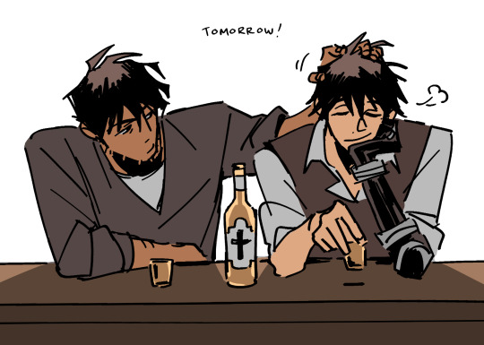
tomorrow :)
#TRIGUN MAXIMUM SPOILERS#trigun maximum#vashwood#vash the stampede#nicholas d wolfwood#ok...... one more......... yall can have a little vashwood as a treat......#i actually love them so much SO BADLY but u prob wouldnt b able to tell bc i dont post a lot of ship art#but trimax vashwood. holay shit. hydrogen bomb yaoi#ive also just been like. digging into so much post-canon vashwood (<- sad and delusional and coping)#LIKE DONT GET ME WRONG I LOVE LOVE LOVEEE WOLFWOOD'S CHARACTER ARC and i think [redacted] is SO IMPORTANT AND VITAL TO THE STORY#BOTH THEMATICALLY AND FOR VASH'S CHARACTER ARC. i literally would not have it any other way unfortunately </3 BUT A PERSON CAN STILL DREAM!#ok ya ill stop talking now bc i think i could talk about them and think about them forever.. *scratching the back of my head*
3K notes
·
View notes
Text
I think 90% of my gripes with how modern anime looks comes down to flat color design/palettes.
Non-cohesive, washed-out color palettes can destroy lineart quality. I see this all the time when comparing an anime's lineart/layout to its colored/post-processed final product and it's heartbreaking. Compare this pre-color vs. final frame from Dungeon Meshi's OP.


So much sharpness and detail and weight gets washed out and flattened by 'meh' color design. I LOVE the flow and thickness and shadows in the fabrics on the left. The white against pastel really brings it out. Check out all the detail in their hair, the highlights in Rin's, the different hues to denote hair color, the blue tint in the clothes' shadows, and how all of that just gets... lost. It works, but it's not particularly good and does a disservice to the line-artist.
I'm using Dungeon Meshi as an example not because it's bad, I'm just especially disappointed because this is Studio Trigger we're talking about. The character animation is fantastic, but the color design is usually much more exciting. We're not seeing Trigger at their full potential, so I'm focusing on them.
Here's a very quick and messy color correct. Not meant to be taken seriously, just to provide comparison to see why colors can feel "washed out." Top is edit, bottom is original.
You can really see how desaturated and "white fluorescent lighting" the original color palettes are.
[Remember: the easiest way to make your colors more lively is to choose a warm or cool tint. From there, you can play around with bringing out complementary colors for a cohesive palette (I warmed Marcille's skintone and hair but made sure to bring out her deep blue clothes). Avoid using too many blend mode layers; hand-picking colors will really help you build your innate color sense and find a color style. Try using saturated colors in unexpected places! If you're coloring a night scene, try using deep blues or greens or magentas. You see these deep colors used all the time in older anime because they couldn't rely on a lightness scale to make colors darker, they had to use darker paints with specific hues. Don't overthink it, simpler is better!]
#not art#dungeon meshi#rant#i'm someone who can get obsessive over colors in my own art#will stare at the screen adjusting hues/saturation for hours#luckily i've gotten faster at color picking#but yeah modern anime's color design is saddening to me. the general trend leans towards white/grey desaturated palettes#simply because they're easier to pick digitally#this is not the colorists fault mind you. the anime industry's problems are also labor problems. artists are severely underpaid#and overworked. colorists literally aren't paid enough to do their best#there isn't a “creative drought” in the anime industry. this trend is widespread across studios purely BECAUSE it's not up to individuals#until work conditions improve anime will unfortunately continue to miss its fullest potential visually#don't even GET ME STARTED ON THE USE OF POST-PROCESSING FILTERS AND LIGHTING IN ANIME THOUGH#SOMEONE HOLD ME BACK. I HATE LENS FLARES I HATE GRADIENT SHADING I HATE CHROMATIC ABBERATION AND BLUR
2K notes
·
View notes
Text


Redraw of this post from 2 years ago lol
#I saw the old post get a little trickle of notes and yknow how you can get that old art jumpscare#well. anyways it’s back everyone take this one instead#everyone bullies gerome hour…2#myart#fanart#fire emblem#fire emblem awakening#fe awakening#not tagging chars I’m lazy#thinly veiled excuse to bully inigo my true target
2K notes
·
View notes
Text
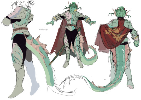
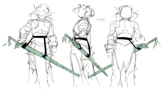
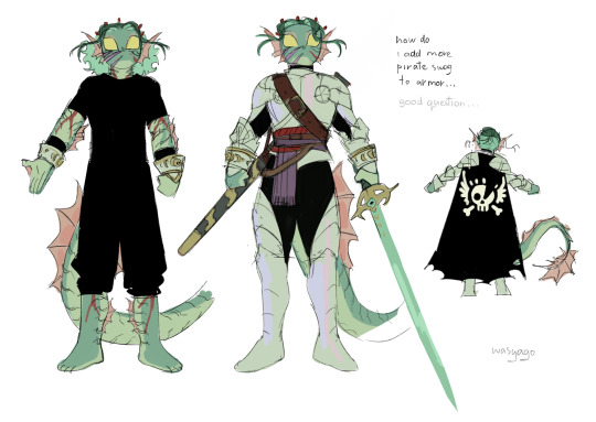
we're at it again🕺
#jrwi riptide#gillion tidestrider#my art#sketch#back on my bullshit woo yeah woo yeah woo yeah#genuinely a lot happier with this design than the previous ones. the lighter metal looks better on him#and this one doesn't have a lot of detail (or any detail tbh) so it looks more solid and fun i think#and you can see im trying to figure out how gill would carry his sword around#technically he should just carry it in his hands and don't have a scabbard because its a longsword and isn't supposed to be sheathed...#but like... its not practical to always carry it in his hands. especially in a day to day life. because he always has the sword on him-#but he doesn't necessarily always hold it? like. he needs hands for stuff#i think i like the back scabbard better (even if i drew the whole turnaround for the hip one) just because it doesn't mess with his tail#plus that way destiny's blade is higher up and gets to look around at stuff and i think its funny#but then like... the cape is a little awkward if it has to go above the sword...#but its not a big deal. if he has a cape and armor on he probably holds the sword in his hands anyway#am i putting too much thought into this unnecessary detail? yes#am i rambling in the tags again instead of making a separate post? also yes
2K notes
·
View notes
Text
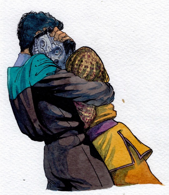
got him off-balance!
#my art#ds9#star trek deep space nine#julian bashir#elim garak#garashir#watercolor#image desc in alt text#i normally post on mondays but. today im breaking my pattern! getting a little silly. getting a little wild. garashir jumpscare#“tumblr user chitinleg garak would neot easily let himself be swooped off his feet into a hug like that” yes i know BUT!#look at his expression. look at how his arms r pinned. he didnt let this happen LMAO julian just surprised him. grabby huggy human behavior#if you look really closely you can see the tiniest frown in the world on Garak's face. because he's like “EEP !”#cant see bashirs face at all in this only his body but i think we can all imagine that whatevers going thru his head. he needs this hug bad#ALSO. for anyone wondering what the fucked up shadow is that starts at the juncture of the teal sleeve-cap where its set into the armhole#the jumpsuits have a bit of a fold of extra fabric (called an Action Pleat) there which allows for a little more maneuverability of the bod#AND creates a really sleek and flat back panel#because you can see the fabric twists along the side arent grabbing the flat back fabric theyre grabbing the fabric folded beneath it#often times i think about drawing out a dissection of kiras first uniform and this voy era one for other artists to use. bc god knows#i struggled at first to find full body references#they like to shoot ds9 very close to peoples heads. and the camera is so blurry. they smeared butter on that thing. god bless
3K notes
·
View notes
Text

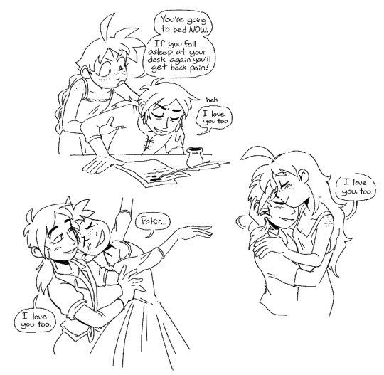
even after settling down, theyre pretty cautious.....
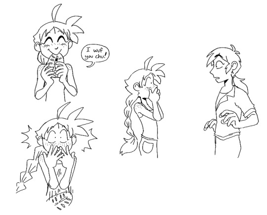
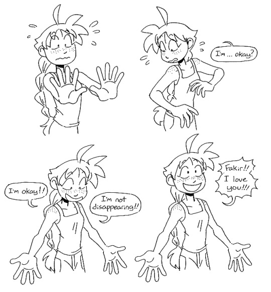

.......it doesnt last long
#princess tutu#princess tutu spoilers#ahiru#fakir#fakiru#art tag#my anime straight couple ever. nobody is doing it like them#anyway i know theres not a lot of reasons to think the 'confessing love = disappearing' rule still applies post-canon#but ahiru being human again necessitates that there are still reality-warping powers at work#and it's because of drosselmeyer that she was ever human in the first place so i can see them being nervous about it#also this is an aside but i picture after fakir writes ahiru back into a girl they kinda have to flee gold crown town#to avoid fakir getting his hands chopped up by cultists and everything yknow#they settle down somewhere else in the german countryside with a little village nearby and have a simple life#ahiru keeps practicing ballet and fakir keeps writing and theyre happy :)
2K notes
·
View notes
Text
looks like I can draw again!!
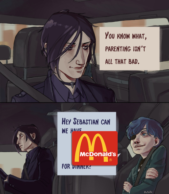

Sebastian called him "orphan" for the rest of the week.
#YEHAAAAAH MATEE GUESS IM GOING TO ANIMATION SCHOOL#IT WAS ALL WORTH IT. and now it's all over#actually this may mean I'Il be busier later... but for now- I'm back into the swing of things! kuro art; thoughts; tears; and what have you#it feels like a while since I've posted a big project so I hope I can make it up by finally getting back to the one's ive had in my WIPs!#thank god I got this thingy done. my brain is firing again so i gotta keep up#I know how to draw cars😅🙃#sorry if the eccess of screen prints is annoying I was experimenting#modern!au#kuroshitsuji#black butler#kuroshitsuji fanart#fanart#sebastian michaelis#ciel phantomhive#digital art#o!ciel#this would make a good ad but no not sponcered😌#sebastian starts vibrating
7K notes
·
View notes
Text
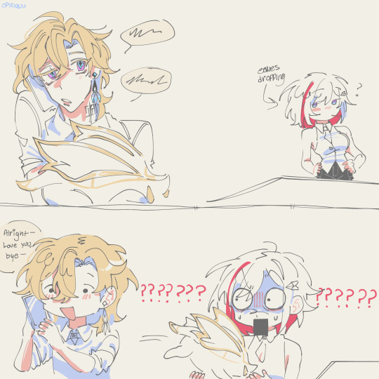
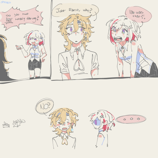

iknow my comics are ugly please just hear me out
#So me and my friend were talking about ‘whos the most likely to’ with ratiorine#and she asked ‘whos the most likely to confess first?’#and i said Nobody. Theyre both doomed forever. Unless it happens on accident.#and this is what i imagined#★ my art#art#honkai star rail#should i tag ratio even if hes not here#hsr aventurine#ill tag ratio because his husband is here#hsr dr ratio#hsr topaz#ratiorine#aventio#Someone reblogged my post with the tag golden ratio.#golden ratio hsr????#excuse me???#why are yall making new ship names without me. How DARE you be so creative without me in the room.#GET BACK HERE#i can literally talk about these two for hours im so serious its getting bad like it already was bad but now its worse
805 notes
·
View notes
Text

Lackadaisy Enrichment
#in our enclosures!!#video linked as source; which i'm glad to see already has a million views and is trending. That's Right#lackadaisy#WHICH i have been reading since at least '07 when i was thirteen my god b/c this animation is based on the ongoing webcomic#like does its influence show up Directly in some Discrete way i can point to in my art? not very easily probably. And Yet.#the inspiration....i wasn't able to be Regularly Only for at least another year / art done Nonprofessionally Online was novel to me#like wow ppl can make & post fanart of w/e they love huh....didn't know webcomics were a thing & i never really read that many since but.#good god the quality of Lackadaisy at its onset is like this is superb?? this person putting in all their talent and effort???#and Then you get years & years more art and i don't even know what superlatives to throw out abt its quality as it evolves. obsessed w/it..#if i see a new lackadaisy comic page i Will be acting out. obviously this animation is a delight & also stunning. and fascinating to also#juxtapose as a Translation / Interpretation of the comic in a different medium & standalone snippet of Story#and that we're not even quite there in the comic timeline; Taking Notes abt character info we get distilledly here....genuinely love like#take it back to '07 i'm like oh boy can't wait for the dream team to assemble. then a decade later when it did? Oh Boy. that is payoff lol#namely hooray for stitches and mudbug at the field office for every passing gangster. killing one marigold associate but not the other#which seems like a promising start to shootouts w/the other dream team triumvirate. i adore that in canon so far mordecai freckle & rocky#have met but only over a nice brunch. re: all intentions anyways. anyways i'm like Gifs Must Be Made while i'm also so riled afresh abt the#comic that i've been sooo hype for for over fifteen yrs now babeyyy Deservedly. i've done a couple of rereads & ought to do another....#For Interest it'd probably take a few sittings to catch up from the start but there is much to be engaged over....this ongoing story that's#historical fiction prohibition bootlegging cats with plenty of focus on characters & several Mysteries. which i'm better at parsing now lol#like one of the more recent rereads like Oh Of Course x (probably) accidentally killed his y & z took the fall & that's a binding secret...#Not [oh of course] abt the circumstances surrounding a's death & how b & c were involved. nor the ''what's marigold's damage'' mystery#which is great. love to not know things. love that we can readily follow all the emergent drama everyone's wading in nowadays. hell yeah#anyways admire my organized approach to gifs here. four shots each Expressions Atmosphere Action Groupshots#sure might've muddled through gifmaking for this anyways but fr being a huge lackadaisy comic enjoyer for now most of my life helps#and its very Overall Inspiration like. just really getting the [you can really just draw stuff out here] going. fr the art's detail & skill#and that enrichment like i'm gonna have a great time following this. And I Have#you don't expect a crowdfunded indie animation in the mix back then but hell yeah fellas#SIGH ok removing a 4th gif that's broken / not displayed despite reuploading then entirely remaking it. if it's a bug i'll try again later
4K notes
·
View notes
Text
Unprofessional yuri save me.. save me unprofessional yuri.. (image description in alt text)
#cithadol#cithis#pattadol#before anyone starts clowning the prison warden is Not a teen! seems to be the fanon for some people but respectfully i Strongly Disagree#anyway back to business - anyone else started shipping them after the modern AU company meal outing comic that kui posted some time ago ?#this ship is even funnier the longer i think about it because Pattadol is not even Cithis' warden ! thats mithrun !#i could see cithis wanting to do her 'seduce my warden' strategy twice (see her lore page) but then she gets mister depression man#so all she can do to amuse herself is focus her efforts on the other cop there as a little hobby. probably helps that pat is young & pretty#but also deeply annoying so finding ways to make her shut up and stop nagging the crew is a motivating endeavor#okay ill shut up now#dungeon meshi#just cooking my stew (art tag)
643 notes
·
View notes
Text

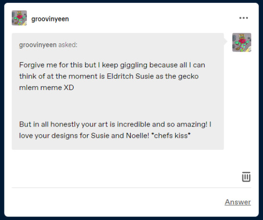

Oh hey, they found a big salt lick! Please imagine the little Yoshi mlem noises here.
(Also, thank you for the kind words!!)
#ask lynx stuff#lynx art#Eldritchrune#finally I can get back to posting a bit more art!#and had to start with this because it was a hilarious image#alas I lack the ability to add sound
1K notes
·
View notes
Photo


fav fic trope #38493284932: wing go fwoof (grian’s wings subconsciously fluffing up, thus giving away when hes been flustered)
#scarian#hermitshipping#trafficshipping#unsure if i should tag this as desert duo or not...? :0c#i spent way too long on this i gotta just post it so i can finally draw smth else (more desert duo hehehhe)#i thought i could get away with winging (HAHA BA DUM TSS) grians wings... but i couldnt so i had to go back and redraw some of them w/ refs#anything for my blorbos.... my little block guys..... microwaving them in my mind#ALSO working on this between con crunching aka i wouldve been done with this weeks ago by now if not for youmacon#which is tmrw AAAAA which is why im finally just gonna post it. if theres mistakes no there isnt <3#my art
6K notes
·
View notes
Text
I'm thinking abt that pretty fall leaves embroidery pattern post and about how like... it is categorically a repost, it's a reupload. right? a thing that is generally disliked. but because it's credited, it's genuinely boosting the artist in question.
and it could ALWAYS be like this. reposting content could ALWAYS be a symbiotic relationship, but because sourcing back to the original creator of something is so uncommon, it's just easier to ask people not to repost it at all. and people still don't understand the difference. or they'll go to the effort of cropping out usernames/signatures to repost something, which is More Effort than literally crediting the creator of something you liked enough to want to repost.
Like. I literally don't actually care if my own shit gets reposted, you have to understand. I just don't want it STOLEN. But "do not repost" is easier to write on my art than "you can repost this, but don't alter the image/remove my signature, don't you dare write 'credit goes to the artist' because that is not credit, please link back to my original post or someplace that you can actually find me. please use an actual link/url instead of writing a non-clickable link of my username, because making it text instead of a clickable link cuts the number of people who will go to the effort of visiting my own page in Half."
All those aggregate themed accounts, those fuckin annoying as hell instagrams and facebook groups that are like "body positive art we love wamen 💕 hashtag feminism" and then MASS-STEAL plus sized art created by women, if pages like these that always go and steal my older self-portraits and other works... If they just put a link to my prints of those pieces in the text of those posts, or, fuck, my commission info page? I would literally be living on the moon right now. I would have a house on the moon
#there is actually nothing morally wrong with running an account that just reuploads ppl's artwork or their jokes or their cosplays#if you just put a VISIBLE LINK in the description of your post with proper credit then it would be beneficial for everyone#because you can get your little clout or whatever it is you want by putting a bunch of same-category content on a page#but nobody's getting fucked over because if your post blows up then people just get FUNNELED to the source#because it's placed so plainly where everyone can see it#and yeah it's better to retweet or reblog but#on the rare occasion that I see my shit reuploaded on tumblr WHICH IS WEIRD BC I MAKE MY OWN POSTS HERE but anyway#someone making their own post where they upload my stuff. and it's always the floral self portraits so let's say it's a post with all those#if I scroll to the bottom and it says like. Artwork by Serglesinner on Twitter <-- clickable link [Sergle's Prints] <-- clickable link#to my etsy#I'm like oh okay and all the anger leaves my body and I'm like ah I see. and I toss the rock aside#like oh okay so you actually care that a person made these pieces. Instead of posting the caption ''women <3'' or smth#like you've GOTTA die if you do that. but if you just link back#or if you go to the effort of writing like a description with a BLURB? like it's a damn museum. like a light paragraph of info#about what the art is and who made it and their links#I am literally sucking you in a strange and peculiar manner. that is extremely helpful#and maybe other artists don't want this AT ALL and they'd rather people not reupload even if it is credited#but I feeeeeeeeel. like 99% of the time this would solve the issue#reposters could genuinely be helping ppl. sometimes the repost gets more traction than the real thing#as long as it credits the creator then that's an okay thing to happen!#that can land somebody a sale! a commission order! a new fan! A JOB#A JOB!!!!!!!!!!#sergle.txt#I didn't write this eloquently AT ALL what the fuck ever barkbarkbarkbark
791 notes
·
View notes
Last Seen Blogs