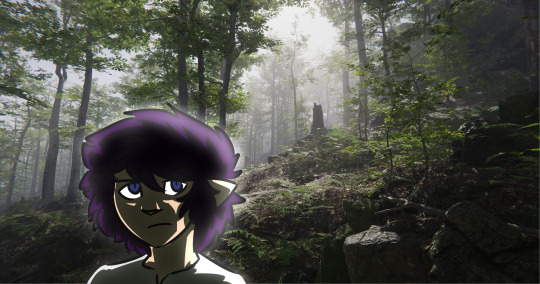
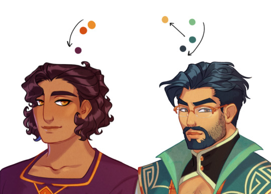
#i wanted to use a different color-scheme-palette then the other drawings when coloring this so it's back to excessive purple babey!
Photo
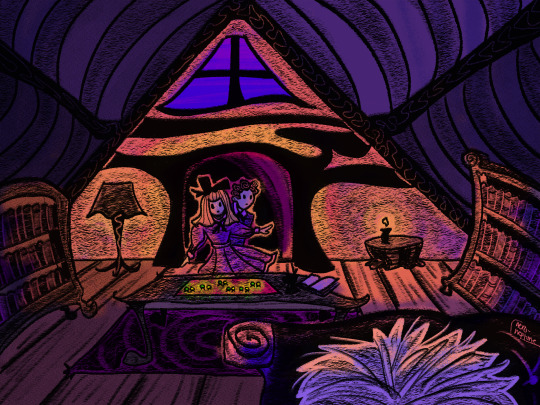

a third part to this, but this time the scene when polly and digory sneak into the attic with the magic rings (“what [polly] noticed first was a bright red wooden tray with a number of rings on it”), thus beginning their adventure. this had been mostly done for a while, i just forgot about it lol
#narnia#the magician's nephew#artists on tumblr#my art#digory kirke#polly plummer#andrew ketterley#i wanted to use a different color-scheme-palette then the other drawings when coloring this so it's back to excessive purple babey!#i don't remember what time of day those kids end up in the attic but let's say it's sunset
67 notes
·
View notes
Text


so i like the april fools shuffle units a normal amount. i have done redesigns for almost all of them and i draw them A Lot.
rambling additional notes on all of the redesigns below
a couple notes if you ever want to draw any of these redesigns for yourself at any point: i'd appreciate being credited for these redesigns (obviously anyone not redesigned i don't need credit for lol) and you don't need to follow my specific skin tone + hair/eye color schemes i have laid out. those are how i personally like to draw the characters and i've included them for anyone who might want to stay completely accurate to my redesigns, but you're welcome to use your own preferred color schemes for the cast when drawing them with these outfits!
now onto the fun(?) stuff
aoharu is pretty straightforward with redesigns, its basically just leoni but with a sun theme instead of stars. adding the image for the color palettes for the unchanged designs just because it has the notes for ichisaki too (their changes were too minor to completely redraw them, in my opinion).
ichika remains entirely unchanged design-wise other than adding a sun pin to her suspenders. saki stays mostly the same too, other than changing the design on her armband and switching her pigtails for a ponytail (in an attempt to seem a little more mature/imitate airi's hairstyle/move on from her childhood self since she's started to believe that honami and shiho want nothing to do with her and ichika anymore).
not too much to say about airi and ena's outfits either, i wanted to go a little more cute with airi and cool with ena, but there's minor changes with both of their hairstyles, with airi switching her pigtails for a ponytail as well (moving on from her idol days but still maintaining her usual sort of style) and ena's hair being a bit longer/messier.
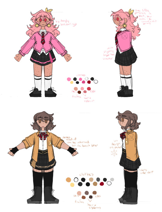

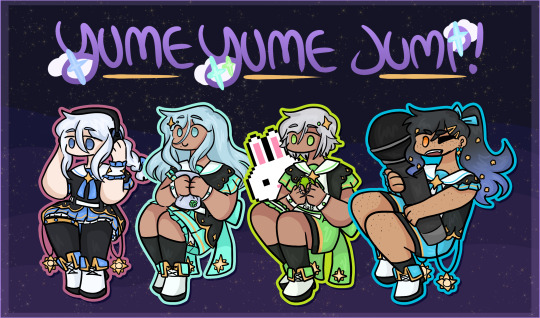
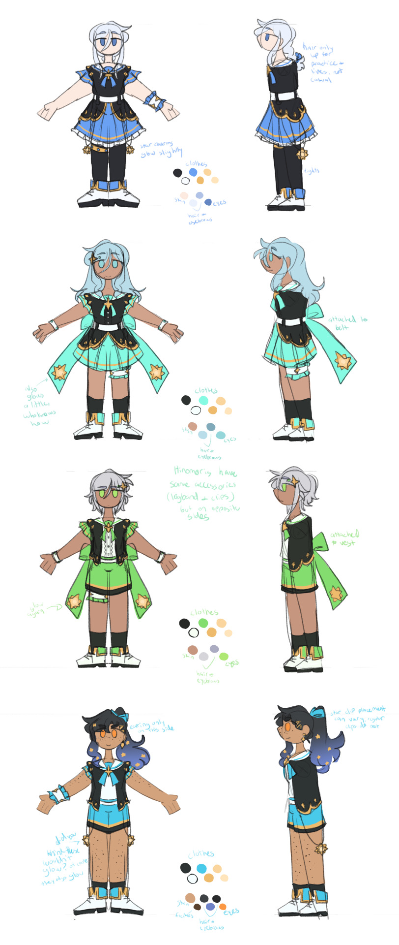
yyj is definitely the most drastic, they're the only unit where i changed every single character... i have a lot of trouble drawing the mmj outfits, but also the lighter color scheme and clover theme just didn't really make sense for yyj to me? so instead i went with a mainly black and character color combo for their color schemes, alongside gold and white to accent it and a more spacey/dreamlike theme. everyone's black and white are slightly tinted with their character colors too!
they're split into pairs for matching accessories, but it doesn't mean much otherwise. kanade and an both have the dangling star charms and a single larger wristband (with those being on opposite sides from each other) as well as no buttons on the front of their outfits, while both hinomoris have the large bows on the backs of their outfits, smaller wristbands on both arms, a legband, and star shaped clips (like the other pair, the clips and legbands are on opposite sides from each other) and they do have buttons. they're split differently for the same style outfits though, with kanade/shizuku and shiho/an being the matching pairs this way.
kanade has the most obvious design changes. i swapped her character color to a medium-light blue rather than red, because tbh she kind of stood out too much if she was still red. she's not meant to be the leader of the unit, she doesn't want to stand out. her hair is a lot shorter than canon and she usually keeps it braided for practice and performances (and leaves it loose otherwise) (both the haircut and style were initially suggestions from shizuku). shes the only member of the unit to wear tights and to lack any star shaped hair accessories.
shizuku i don't have that much to say about, i had designed kanade first and then shizuku to match. its pretty straight forward i think? she's got the tallest socks not counting kanade's tights though.
for both an and shiho i wanted to go a slightly cooler/less feminine direction, while still sticking to the general theme i had going. which lead to the shorts and vest combo! otherwise the only notable change with either of them is that an's changed her clips to two regular gold ones and she's got a ponytail now when they practice/perform, much like kanade's braid.
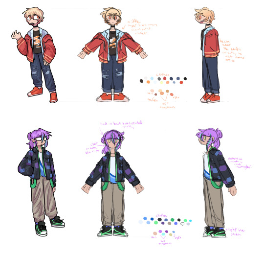
fts was both very fun and an absolute pain to redesign because on one hand, i can do whatever i want, on the other hand, it's like vbs there's really no consistent theme to carry through everything. except a lot of layers i guess. so my goal was to kind of merge their casual aesthetics with something more vbs-like.
tsukasa wearing his jacket incorrectly was inspired by my own tendency to do so whenever i get too warm. i think he just does it because he thinks it looks cool though (its a little silly and a pain to keep it on but he's committed to the look). also leaving his middle layer as his fish jacket from his casual sprite was a funny little thing i thought worked for him.
with rui my goal was just pockets. lots of pockets. they're probably hiding little robots and tools in those pockets. i should have put more pockets on their pants too but oh well. combine that with wanting some obnoxious bright greens and blues and at least one item that kind of clashed color-wise with the rest (their pants in this case) and this is the result. the sketch doesn't convey it well but their black jacket and pants are both kind of loose, while the green hoodie and tshirt underneath fit okay. also their hair is kind of long if they ever untied it, but no one ever sees that.
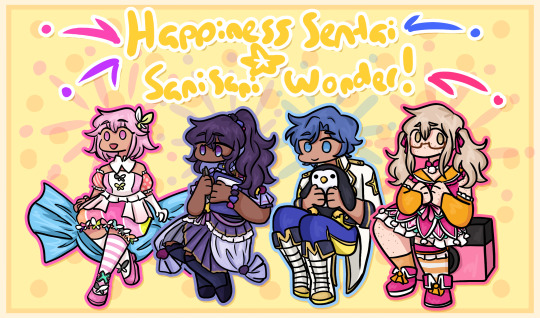
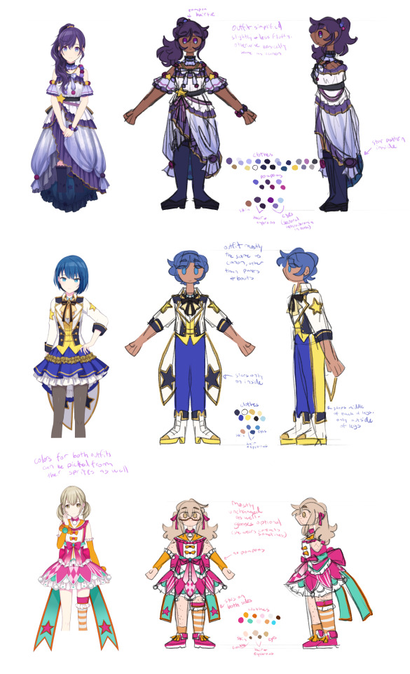
hapisen for the most part sticks to their canon sprites, just simplified slightly for my sanity. mafuyu's costume still drives me insane to draw though, that's so many layers to think about.
other than questioning my sanity every time i draw mafuyu, there's only one change from her sprite, which is making her hairtie one decorated with pompoms much like a lot of other parts of her costume. i just thought it tied things together a little more.
the upper half of haruka's outfit is more or less completely unchanged (other than making it fit in a way that looks slightly more masculine), but then i replaced his skirt with pants and gave him boots (wxs meiko, who is the sprite haruka's outfit is originally just a recolor of, wears heels). i figured if i was going for a more princely sort of design for haruka then changing those felt fitting. beyond that he's obviously got shorter hair (a choice he makes after seeing kohane decide to change herself, wanting to embrace the genuine person he wants to be beyond the idol people knew him as) and that's about it. hits this guy with the transgender beam.
kohane's outfit is really just a bit simplified from the original with sizing/proportions of elements adjusted to (in my opinion) suit her better. the ribbons in her hair felt like a cute addition (and i like to give kohane ribbons in general), while her hair length is an in between of her two standard canon ones, longer than the usual one we see but shorter than pre-canon/early mainstory. her glasses are optional, she changes between them and contacts with how she's feeling for the day and what kind of shows hapisen is planning. the more intense the show, the less likely she is to wear her glasses.
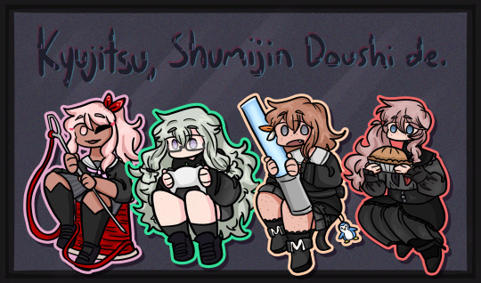
kyushumi was kind of intended as niigo but without one member in a mostly white outfit since they don't have someone like kanade who is intentionally trying to save people. although they're also a little happier off anyway, so they don't need someone like that. they're my most drawn shuffle unit, so also probably my most thought-through redesigns.
each design takes slight inspiration from a member of niigo (nene/kanade, minori/ena, honami/mafuyu), but that was just kind of as a personal guide for what kind of vibes to go with for the outfits. they've all got personal touches to them.
nene's hoodie is very loose on her body and arms, but a normal fit in the length, and her shorts are actually long enough to be seen. she just wants to be comfy, she's tired a lot, very low energy girl. glasses because i think nene should wear glasses anyway, so as opposed to canon nene who i like to believe just favors contacts, this nene does not.
minori is pretty obviously similar to ena's outfit, but there's a few nods to mmj in here. she's got clover shaped earrings, the pattern along the bottom of her dress is meant to resemble the tips of the clover leaves from mmj's symbol, and her shoes are just the mmj unit outfit shoes in different colors.
the goal with honami's outfit was simply "how little skin can she have exposed" because i imagine her being more worried about that than usual here. so long sleeves, long skirt, high collar, etc. her hair is longer (for no particular reason tbh, i simply liked how it looks) but still styled the same, and she's got a solid red scrunchie now. the four buttons on her outfit are all meant to look like the moon, two full moons and two opposite facing crescents. also i will never stop joking about the fact that she's naturally the second tallest girl in the cast (not counting vs, then she's third tallest) and i gave her tall heels on top of that. she is towering over all of her unitmates here.

while you're welcome to use these designs for any (non-incest) ships you'd like, i do have a personal list of ships that are canon to my own au with the shuffle units, which is what i originally designed these for. the "canon" ships are
ichika/saki
ena/airi
honami/kanade
akito/touya
mafuyu/rui (qpr)
haruka/kohane
mizuki/nene
however you are not by any means required to follow these specific ships! i have no desire to enforce the ships that go with these, so draw whatever ships you might prefer with these designs. i'm happy to see anything!
anyway if you made it this far congrats on surviving i know this is a lot of text o7 i hope you've enjoy my silly little character design insanities ^^;
#you guys have no idea how much these live rent free in my head#the chibis were a fun little project#and then it turned into the full sketch references for everyone once i realized i needed a better way to share my designs#project sekai#prsk art#project sekai fanart#prsk fa#w1f1 draws#saki tenma#ichika hoshino#airi momoi#ena shinonome#kanade yoisaki#shizuku hinomori#shiho hinomori#an shiraishi#akito shinonome#touya aoyagi#tsukasa tenma#rui kamishiro#emu ootori#mafuyu asahina#haruka kiritani#kohane azusawa#mizuki akiyama#nene kusanagi#minori hanasato#honami mochizuki#april fools shuffle units
157 notes
·
View notes
Text
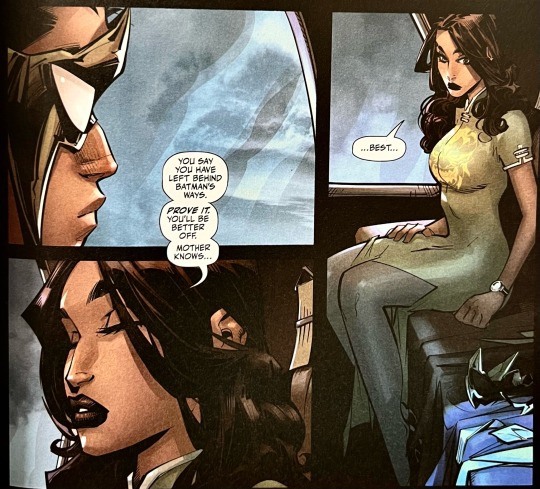
started reading robin 2021 and i wanted to take the time to appreciate two of the most beautiful spreads in issue #1. they captivated me with how gorgeous and momentous they felt, which must have been the point bc i ended up staring at them sm that the symbolism finally kicked in
SPREAD 1:
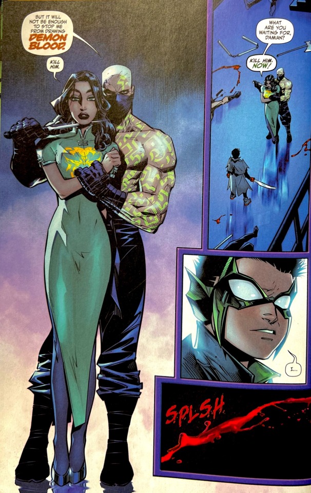

1) LOVE the red and green at play, it’s such a difficult color scheme to get right lest you end up making the whole piece feel like a christmas card, but gleb melnikov pulled it off. the environment is rich and elegant and well-contrasted; it rly brings out damian’s classic red/green robin combo, even tho he’s not actually wearing his robin suit here. the green of his clothing highlights the green of talia’s, as well as the assassin’s tattoos, and, when combined with the cool-toned background, makes the red just pop out at you. pretty palette aside, it’s a very calculated choice in colors.
2) speaking of red, melnikov rly wanted you to notice the blood in these two pages. from the emphasis of the words DEMON BLOOD to the reflection of damian in the blood puddle, it only draws attention to the fact that his blade is perfectly clean of it in the second panel. one can only assume that talia killed that guy so hard that damian’s sword was caught in the collateral (damn talia !). it frames damian as the one to land the killing blow, as though his doubts/restraint with killing mean nothing because he still has the blood on his hands, blood passed down from talia. that doesn’t necessarily make it true ofc, but it does give us a reflection of his mindset with the blood acting as a literal mirror.
now before we delve into the second spread, lemme preface this with some context: many characters will refer to damian as an actual bird (“what better way to take out a robin than with a hawke,” “i’ve fought little birds like you before,” etc.) which speaks to his reputation, but i think it’s most notable when coming from talia:
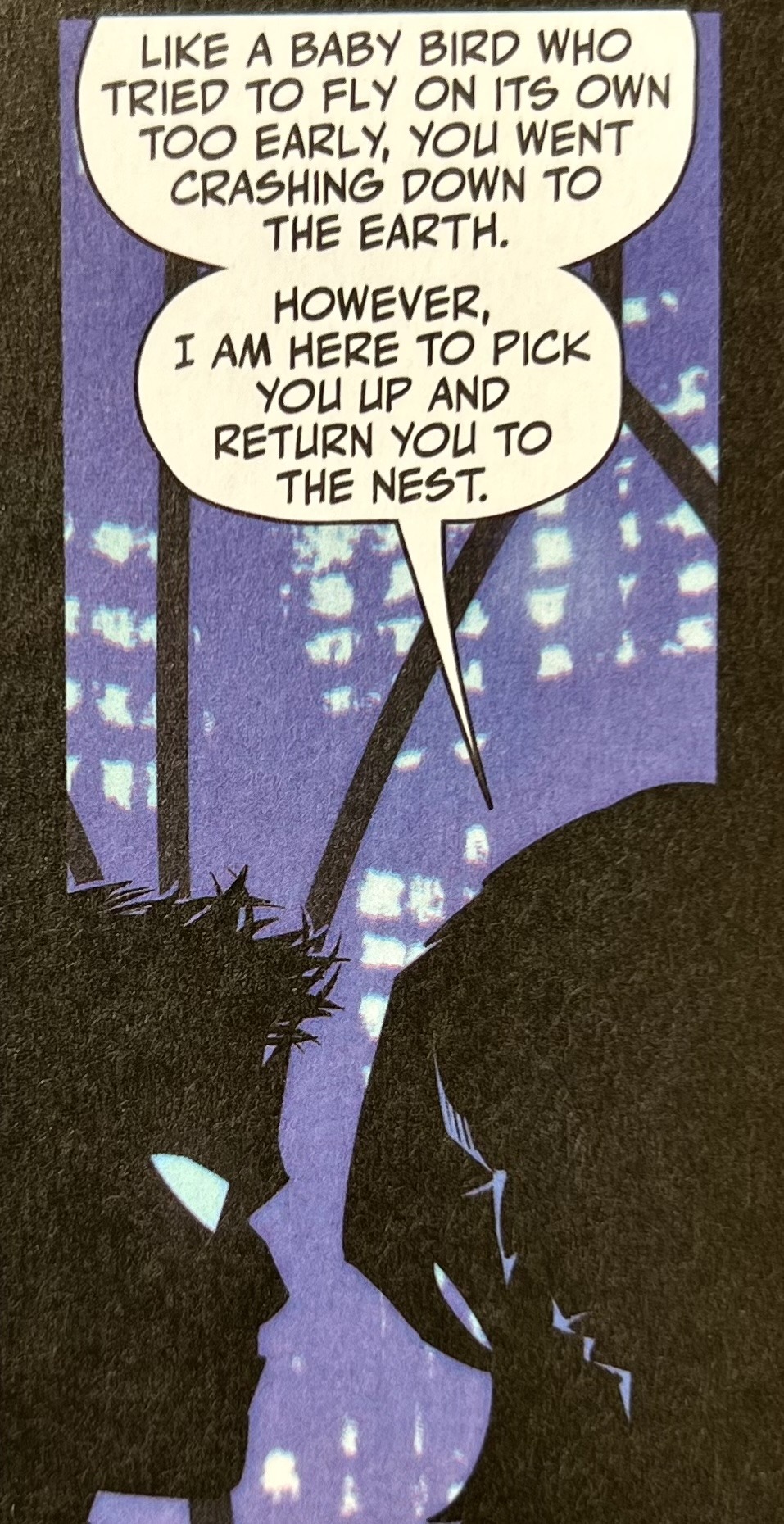
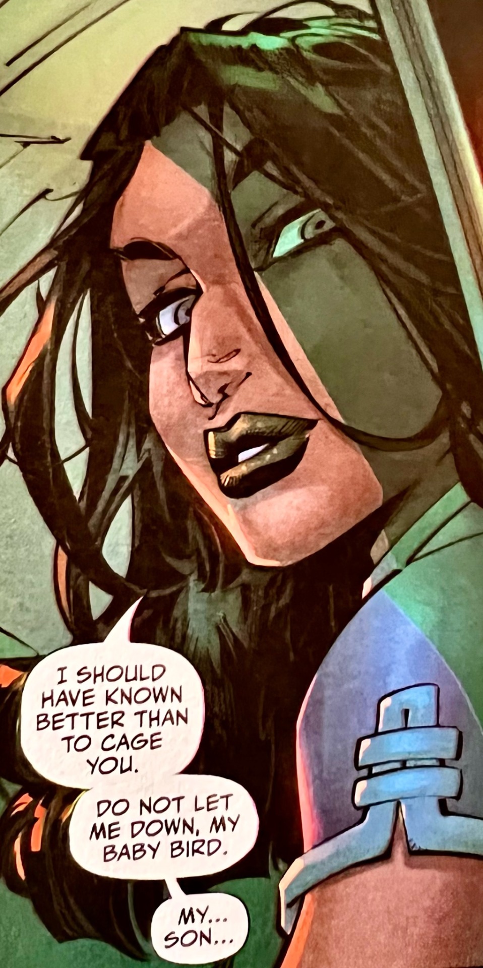
at first, it’s used condescendingly, as it usually is from most ppl, and she speaks in a possessive tone when she talks abt returning him to the nest. she even tells him that if he IS to be taken under her wing, she would not treat him as her son but as a weapon. however, we know that this contradicts her intentions as she later uses the same “baby bird” petname as a term of endearment, even to calling him her son—notably when he is out of earshot.

you get the sense that they have this unspoken code of conduct around each other—family dynamics tend to be rigid in that way—but there’s also this feeling of regret as well as unfamiliarity navigating it coming from talia. i mean, she said it herself: damian was just a baby bird. he flew out of the nest too early.*
*see read more
so why does she taunt him for running back to his mother? why is she pushing him away? and why does she monologue for so long that she lets her guard down and closes her eyes long enough for him to disappear…?
SPREAD 2:

BECAUSE DAMIAN IS JUMPING OUT OF THE HELICOPTER!!! BECAUSE TALIA IS PUSHING HIM OUT OF THE NEST !!!!
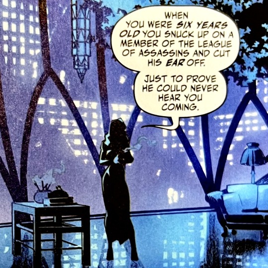
talia doubled down on her militaristic plans as an opening for damian to leave. with that sense of regret mentioned earlier, talia knows she raised damian under harsh conditions, but she doesn’t know to raise him differently either, so she urges him to find his own path. presenting “the way of the demon or the way of the bat” as the only 2 options to her already rebellious son was guaranteed sabotage. she pushed him too early when he was younger, but she knows that her baby bird is ready to fly now :”)
bonus: what a classic jason todd move to wear a mask underneath your mask btw. guess it just runs in the family! (but on a deeper, unironic level, damian switches out both his robin and his demon suit into this new one. this obviously symbolizes his forging a new path, but also reveals his intent/doubts abt the whole confrontation. a mask underneath his mask? he was never truly looking to rejoin the league. after running away from bruce, he runs to talia to test the waters and see if he would do better there. and when it ends in the same shadowing of an ambitious parent, he ditches the whole thing. the fact that he had a back-up plan meant that his heart wasn’t in it, just as talia’s heart wasn’t in keeping him caged. a confirmation bias given permission by a mother’s facade. god, the al ghul mindgames are truly smth to behold)
*so much can be said abt how talia’s approach to parenting parallels and contrasts bruce’s. they both have the same good intentions for their son, and they both realize that he’s too young to face what he had and what he’s abt to. but talia wants to start the healing process of her control in his upbringing, and bruce wants to prevent damian from having to face it alone knowing firsthand what suffering he “endured to become batman.” one is letting go, the other is desperate to bring him back.
it’s such a fascinating look into the push and pull of their fatal flaws and mistakes as parents, as well as making them feel human and reasonable within the limits of all they know and are capable of. OF COURSE they’re overcompensating for their regrets, that’s just so… them!
and the fact that you can see both parents’ traits and influence in damian as he searches for his own identity just makes the whole family feel well-rounded. robin 2021 is so good you guys, it’s too fucking good
#damian wayne#damian al ghul#talia al ghul#bruce wayne#batman#dc#robin#robin 2021#panels#meta#danbles#long post#alt text#described#no spoilers please i only just finished issue 2 🫶#god i can’t wait to get to talia and damian’s reunion that shit looked tense
169 notes
·
View notes
Note
how do you get your colors to look so nice and your lineart so red and vibrant? i love it
omg anon thank you!! 😭 im going 2 be honest I am Not Great with color theory... but i like having my sketch pages look cohesive to me...
BUCKLE UP this is going to need a readmore bc i like talking.
I always sketch in neon colors it's a habit i picked up from an old teacher but I'll think of a color usually on a whim and draw with that. and then if i want to draw something else ill pick another color that i think goes well with the page. usually most of my color schemes r analogous (colors right next to each other on the wheel)

yanked this from recent dunmesh post; i kept most of my colors within the pink/red/orange range.
i wouldn't recommend doing everything in monochrome or analogous palettes though because it's sort of a guilty crutch of mine XD.
sometimes when im coloring ill change the layer mode of the sketch. color burn gets you either very very bright or very very deep colors depending on the color of the flats underneath. multiply and linear burn do the same thing but they're a lot tamer and generally always return darker colors. im sure there's some technical bits behind this though. ill either color my lineart afterward to compliment the color of the flats, leave it as is, or mess with layer modes if i feel like it. my favorite trick is color burn + linear burn + some combination of two lineart layers and just fiddling until i get a nice burn effect.
mithrun was done with crimson red on color burn.
coloring... like 999% of this is relative color which is like. kind of the idea that colors look different when placed next to each other. if you eyeball it a bit it's pretty noticeable.

what i used to do a bit ago was i would fill in the area i wanted to color with one big mask of color, make a new layer that has a clipping mask down to the flat layer of color, and then draw my actual flat colors. the color of the mask helped me pick my flat colors bc if I picked a color i think stood out too much next to the mask i could kind of just adjust it until it looked a little more cohesive.

old ish drawing next 2 a canon reference. i ignore local color a lot...mea culpa....but my overall color palette here was a light pink, so the shirt here is actually a desaturated pink? or violet i believe. if you shift sort of that purple color far enough into the gray area of your color wheel it can take on a blueish or even greenish hue. it being next to a lot of warm pinks/fuschias helps.
a neat thing that kind of helps is that if you desaturate or saturate certain colors they can kind of take on a certain hue? not sure if this makes sense. sort of how orange here turns tealish blue the grayer it gets. so if im drawing something that's predominantly orange and i have a blue color i can just take an orange color and desaturate it until i get a color that sort of looks like blue. and that way it kind of looks more harmonious? at least to me XD
shading. i don't apply serious lighting to a lot of my drawings, but a helpful bit is that the shadows tend to be the opposite of whatever color the lighting is? i try to think first about the "mood" or the main color i want to go for in the drawing and then i pick a shadow color opposite of that. so for here, i wanted the lighting to be a coolish magenta so the shadows r lime green. if there's anything off i fiddle around until i get something i like. the shadows on the skin here were too green initially so i shifted them a little more orange.
there's a "band" of color going on between the transition of the shadows to the light. generally this could be for a lot of reasons and i tend to use it differently (core shadow? overexposure? etc etc). but this is a color post so ill try not to go too off track.
but generally digital doesn't "mix" colors the same way traditional colors do if you use RGB (cmyk is a bit better with this but is kind of a pain to get used to), so to make blending a little less muddy, i sometimes add an intermediate color to smooth things out a little. for example, mixing digitally blue n yellow tends to get you gray, but generally, blue + yellow makes green, so if im making a blue->yellow transition ill slap some green color in the middle so it flows a little better.
I do a lot more cel shading nowadays. if you've been on here for a while earlier this year i have another style of coloring but it's not really accurate to how shadows really work so i wouldn't recommend looking at it. it's mostly to add zest and texture to the underlying flat colors.
coloring your lineart does a TON to helping your colors look vibrant, though its like the garnish on a dish to me (same with shadows). i think it's good to try and play with your flat colors and try to make sure those look in order first before adding flourishes. usually ill leave it a dark, saturated color that again matches my overall palette but sometimes i go in and color them by alpha locking my lineart layer and picking a color that matches the flat colors underneath? not sure how to explain it properly.

i used a darkish purple for shuro's ponytail to match the dull red of the flat colors (more relative color! trying to simulate a black/brown while keeping the pink palette there) but a lighter crimson for laios's blond. the light was this super intense like blush pink so i thought it might be cool to add this neon salmon red in the areas of that light to really give off that vibe of a very bright intense rim light.
sometimes you could also tweak with gradient maps or color balance, which adjusts hue based on how light or dark a color is. these r fun to mess with as a final touch but i need to watch using them because they can become crutches real fast XD but those are also just tools to help you. in the end just developing a good sense of how color works and how you want to use it is the best place to start.
LONGASS ramble but yeah. tldr just kind of train ur eye for color and look at what you like best. which is unhelpful and a little sucky but it really is just observation and practice and maybe some personal zest.
happy drawing!
#SORRY THIS IS THE SIZE OF CANADA I YAP A LOT#i like being thorough when explaining myself a lot XD but i think the easiest way to get good with this is just repeat practice n observing#and figuring out how stuff behaves in certain situations and what you like to do and blahblahblah#if you have artists u like that do this well looking at how they use color might be cool#...i feel this entire post is just putting my entire thought process on blast LOLLL.#“eyeball it out” -> study some actual fundamental stuff and or intake new info or art -> apply it back to just eyeballing it out#i dont think i have a natural sense for some basics#but i dont think im naturally one of those people who grind out studies all the time and breakdowns either#i guess i just kind of like knowing the mechanations behind why to do a certain thing or how stuff works and then figuring out#how that translates into what i know nerd emoji#james gurney has a good book on color and light#if you like reading. but its very informative!#quirinahscreams#ask#anon#this is mostly just me talking about how i draw i dont think this is meant to be educational or informative XD um
10 notes
·
View notes
Note
your colors are alwasy SO GOOD.... do u have any advice for how u pick them
thank you! for advice, i have a few tips:
the first is to always keep in mind what color palette you are using. as you become more experienced this will likely become something you do subconsciously, but when i was starting out with drawing i would usually deliberately choose a color palette and reference that while coloring in my drawing.
i'll go into some basic color theory (ha ha) but feel free to skip this if you're already familiar with it.
there are many different types of palettes to choose from, but the most common ones are:
monochromatic
analogous
complementary
split complementary
triadic
square
tetradic
for example, the drawing i just posted follows a split complementary palette (which is favorite scheme btw)
i can explain this more in-depth if anyone want me to but for the sake of brevity i'll leave it at that. the only other thing that i think is important to note if you're following a color palette is that it's important to balance out the values of the colors that you are using (how light and dark they are) as well as use it as a guide but you don't have to strictly adhere to your pallete 100% if the time within your piece. for example, the my drawing uses MAINLY blue, green, and red-orange, but there is also some orange, yellow-orange, yellow-green, blue-green etc. in there as well
my second tip is to experiment! i hear the phrase "learn the rules before you break them" a lot when people are giving advice to beginner artists, which i don't always agree with because i think experimenting and finding out what you like and what you think works is very valuable (especially when you are drawing for fun and not professionally!) have fun with it, do the opposite of what people tell you to do just to see how it looks, etc. i remember getting the advice to always shade warm tones with a warmer tone and cool tones with a cooler tone (this is only a rule of thumb btw) and one day i started doing the opposite and found that it can look cool in certain circumstances
my third tip is to use references! i joke a lot about colorpicking from the most random images but i think that looking at other images and asking yourself "how is the artist/photographer using the colors to make it look this way? how do i recreate that?" and using that as a way to study their use of colors can be really helpful. i you find a drawing that has cool colors, try using those colors in your own drawings and see how they look!
the fourth tip is to play around with contrast. some drawings will look better with LOTS of contrast (where the darkest points are black and the brightest points are white), while others will look better with low contrast. stylistically, i prefer using low contrast. going back to the drawing above, there is no true #000000 or #ffffff used anywhere (except the white outline). i find that in certain situations this can help colors stand out. but like i said, it's more of a personal preference
the fifth tip is more for digital art, but it's to play around with blending layers, adjustment layers, and gradient maps if you don't like your colors but have no idea how to fix it. some programs don't have this feature but using blending layers/adjustment layers/gradient maps is sort of like using a filter to change the hue/value/saturation of your art in different ways
hope that helps! if there's anything i need to explain further please lmk!
40 notes
·
View notes
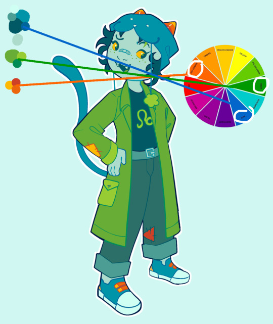
Note
how do you like,,color schemes, or like color pallets? i have ideas for colors but when i put them down it all looks muddled or disjointed or just weird, even when i plan it out, so do you have any advice?
(ik you get a lot of asks so no pressure to answer 😭 also thank you for the advice on dynampic panels! it was rlly helpful and im getting the book you and the commenter reccomended soon.)
That's a tough one. I know a lot of artists really play around with color schemes and color theory, but I never went in for that stuff. All my color palettes were generated initially by drawing the character, coloring them in different ways until I found one I liked (lots of playing with HSB sliders) then saving those colors to the palette for future consistent use.
I think this is a fine way to handle things - some of the pallets have even shifted a little over time as I swap out individual colors for ones I like more. For instance, my pallet for Falst still has a dark brown saved in it from when my design for him had darker hair, before I decided I liked the aesthetic of the lighter, more golden hair.
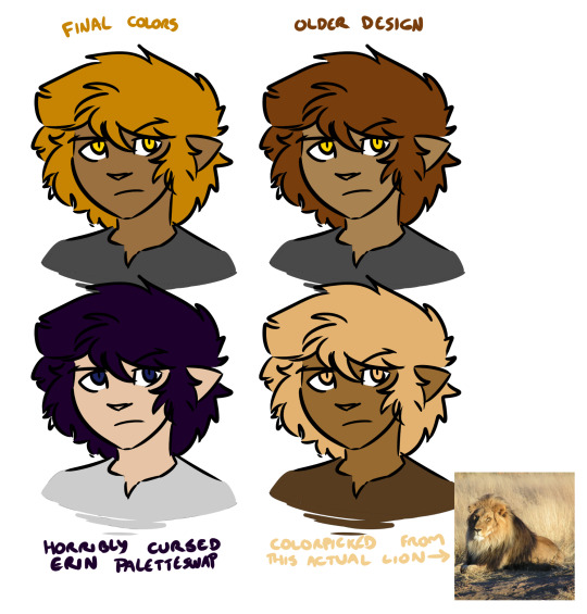
There's no right or wrong answer here (except the cursed paletteswap) and a lot of alt color schemes would look good, but the trick here is that as far as I'm concerned this matters a whole lot less than your shading and lighting.
If the colors look disjointed and weird, it's entirely possible that this is because the figures aren't matching their environment. If we were doing physical art, this would be a huge pain in the ass to fix. Fortunately, because I do digital art, I don't need to worry about all the complexities of paint mixing and underpainting and all that jazz - I can just use layer combine modes.
Suppose we want to put a character into this lovely unity asset.

If we just slap our figure on top, this isn't going to look good.

He looks like a desktop icon. We can do better. The light source in this shot is high and centralized in the frame, and it appears to be a dusty blue-white. The shadows it's casting are quite dark and stark. For now let's not worry about the color of the shadow layer - let's just draw in how we would shade this figure given this directional light. I'll use a nice light purple to start with, but we can play with this later. Benefits of digital art! Other benefit: when set on a Multiply layer, a light purple shadow immediately makes our figure look like this.
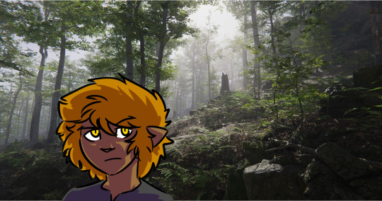
That already looks a lot better! But part of what's making this figure stand out against the environment is that the darkest points on his design are a lot darker than the background he's standing in front of, and at the same time the shadows on him are much lighter than all the shaded areas we see in the background. This is also one of the telltale visual indicators of bad VFX compositing - the light levels and black levels need to match between the different parts of the image. (there's a late episode of columbo where they use this to catch the killer!)

So, for the easiest first step, let's see what happens if we shade the figure with a dark green colorpicked from the image instead.

Immediate improvement! We've got the shadows lined up and the figure looks like he belongs in the environment. And while we could leave it as-is, I find it also helps to address the highlights as well, especially in dark environments. So I take a mid-tone gray from the light part of the image, I select the negative space of our shading layer, I fill that space on a new layer set to the Add (Glow) combine mode, I use a soft eraser to mellow out the really harsh glow that's farthest from the edges of the figure, and I blend the whole thing by 200 pixels.
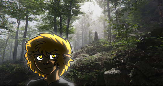
We could keep playing with this, but at this point we have a character who, regardless of underlying palette, looks like he fits in with his environment. Heck, we can even hit him with our cursed paletteswap and he still looks like he fits in the space.
It'll work even if he's a uniform neutral gray.

So while precisely playing with color palettes is very important for certain styles of art, one huge benefit of digital art is you can just use your own freeform aesthetic sense to lock in a very basic starting palette that defines how your characters look under theoretically perfectly neutral conditions, and then you can do all the other hard work of coloring them and matching them to the space by way of shading and highlighting without ever worrying about the underlying base colors. And if you decide some part of the figure is too saturated or dim or weird or whatever, you can play with that one part until it looks good and then just update your palette with the new shade.
171 notes
·
View notes
Note
any tips on lineart or coloring? I adore your art style!!!!!
thank you! this post might be a little rambley because i'm not the best at explaining things
ok for starters, i don't want to go into my own personal preferences for choosing colors too much. when i started drawing i really stuck with what other artists said was the "correct" way to do things and that can really hinder your art a lot, so i'm going to give general descriptions of colors and color schemes and let you decide which ones you find the most appealing or enjoyable to use. i think choosing colors comes down to personal preference most of all. don't take anything i (or any other artist) say as law, drawing is a lot more fun when you make your own decisions about it. if you want to use a lot of super bright/dull colors, or no colors at all, go for it! your art should be what you want it to. this post is more for people who want to know more about color schemes than for people who want to draw exactly how i do lol
also you can use solid black and white in your art its not illegal and it doesn't always look bad idk why this is such a common thing people say in tutorials/tips about colors

color schemes can be monochromatic or polychromatic, with my art i usually use different colors but i like to use monochromatic schemes sometimes too, art can look very nice with both of them. characters with multiple colors (like kirby) can be drawn with monochromatic palettes as long as you have varying values of the color.
with polychromatic color schemes, remember that less is more! limit your colors and try not to use way too many, it makes things less confusing. reuse colors for different things instead of adding new ones
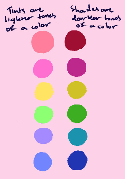
value is how light or dark a color is. i like to use color schemes with a lot of tints (or pastel colors), usually with a few darker colors in order to define shapes a little better. value is Very important to make the thing you're trying to draw clear to see and separate details from each other, so i'd study this before learning about picking colors individually.
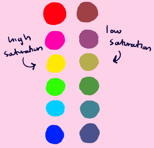
saturation is how "intense" a color is. it's different from value, and it works alongside it (saturated/desaturated colors have tints and shades.) i don't use many very saturated or destaturated colors, and a lot of my art kind of lies in the middle. when i do use them, i try not to put very saturated and very desaturated colors together in the same color scheme, as using all of one or the other can make things more cohesive. (also, don't make dark skintones too desaturated. they should be in the middle)
the most important thing to remember about color schemes is that colors don't work independently, they look best when they're cohesive with other colors. think about how you want something to look before you color it, consider if it's supposed to look cute or have a gloomy/dark feel, if its daytime or night, etc. try not to follow a character's reference sheet colors too strictly, and change them as needed given what you want your finished art to look like.
lineart is a lot more simple (at least to me). i usually use a dark blue or whatever color i associate with the character for it, and i like to keep the stablization setting very low, as that helps it make look more sketchy/painterly. (i use clip studio paint, so if anyone wants these brushes let me know and i'll put them in a different post)

hopefully this was a little helpful and not too much of a pain to read! i've gotten a Lot of asks about this so i felt like i should make this post as detailed as i can. do look for other resources if you want to learn more about this stuff, there's people way better at explaining things than i am lol
#i don't like those ''this is wrong and this is right'' kinds of art tutorials/tips so i hope this doesn't feel like that#except the cym and ryb thing. use cyan yellow magenta its infinitely better alway;s#asks#not daily#long post
26 notes
·
View notes
Note
Hello there, I’m having issues with character designs, specifically Eris
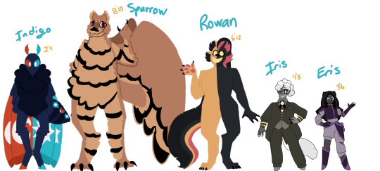
When I asked some people to guess who the main character was, they mostly answered Indigo or Rowan. My guess is probably either because of where I put them or maybe because they have brighter color palettes. As for why both Iris and Eris look so different compared to the others, they are a different species that’s mostly human but with some animalistic traits(example being Iris’ tail and ear) originally Iris colors are gray and white(more prominent in an alt outfit) and Eris uses black + the rainbow(same situation as Iris as well, uses them in an alt outfit) but I’m considering maybe having them be more in line with their colors because of that. Another thing, the circle pendant on Iris is supposed to be basically a symbol of her magic type, Eris and the others are supposed to have them but I just didn’t draw it. And just in case: here’s the animal I used for each + their magic:
Eris: Butterfly + uses all types of magic
Iris: Fox + uses all types of magic
Indigo: Moth/Butterfly + Light and Shadow magic
Rowan: Lion/Axolotl + Water and Fire Magic
Sparrow: Bear/Sparrow + Air and Earth magic
Thank you in advance
Oh yeah, I remember them! I see the Axolion and Bearrow have made an appearance, lol.
Yeah, the position and color saturation are likely factors making people think either Indigo or Rowan could be the MC. But what I also find interesting is that Indigo is so much taller than both Iris and Eris in the lineup, despite the numbers labeling him as shorter. He's a little over two feet tall, Iris and Eris are nearly five and three and a half, respectively, yet his depiction is easily twice their size?? The math ain't mathin'. (If you need a helpful resource to compare character heights, I recommend this.) And I get that sometimes you need to enlarge a small character to show detail, but there's no label clarifying that-?
So to recap, you've placed Indigo at the leftmost side of the image (which is the first place an English-speaking audience's eyes will go when they need to "read" things from left to right), you've given him the brightest colors of anyone here, and you've made him much larger than the actual main character despite the height labels stating otherwise. At this point I have to ask: Are you sure you don't want Indigo to be the main character? Because, intentionally or not, you're making him a visual priority. Just something to think about.
As for Eris, you might consider reverting to her rainbow color scheme to make her stand out more. It'd be helpful to recall why you ditched it in the first place, and what changes you could make so it doesn't cause the same issues. Were the colors too garish? Were the stripes so skinny it was hard to differentiate them from a distance? Was one color so saturated that it hogged the spotlight while the others faded into the background? And so on, and so forth.
Hope that helps!
4 notes
·
View notes
Text
Week 03 - 02-01-2024
What was planned this week:
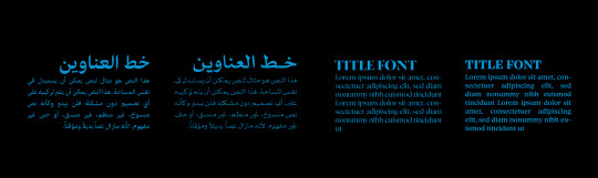
Work in Identity - logo - Digital
Work in Identity - color scheme - typography
Work in Identity – start work on the graphic element
What actually happened:
I have drawn more sketches of the logo
I collected more materials for inspiration for the graphic elements.
I chose different color schemes and typefaces that matched the tone of voice for my project.
I started to design the graphic elements and chose the style that I aimed for
I'm still experimenting with the logo, but I've roughly decided what I want to do with it.


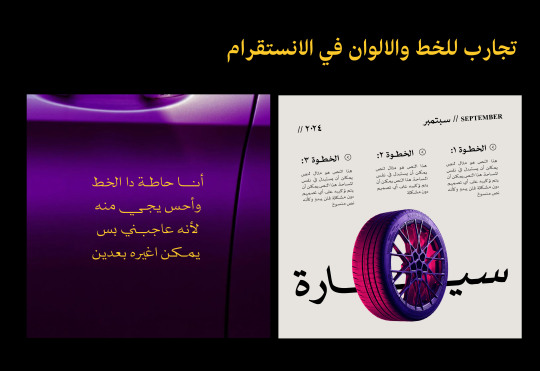

Reflection:
This week, I concentrated on figuring out how the identity will look. I drew some logo ideas and sketches, picked colours and fonts, and started planning the overall visual style.
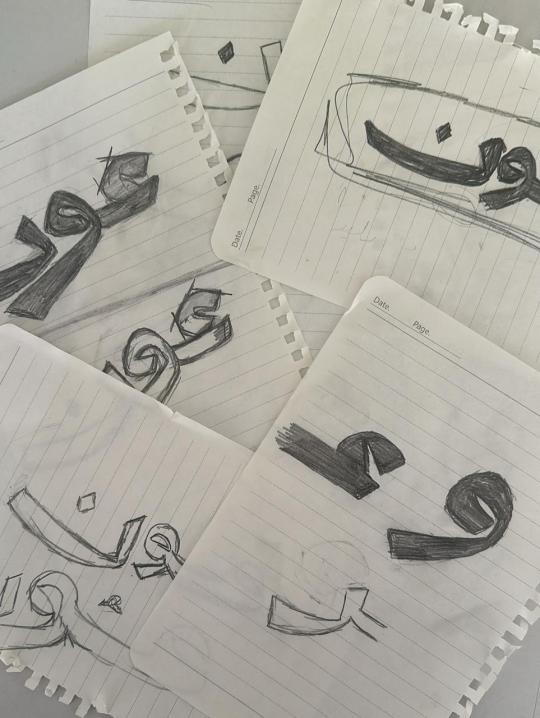
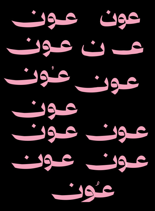
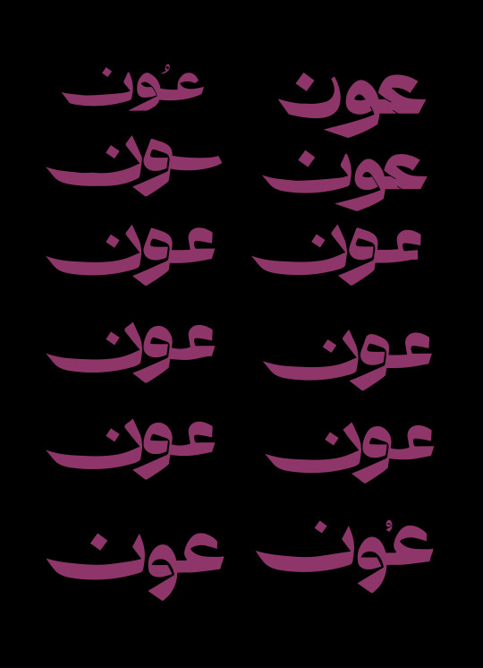
Regarding the logo, I redrew it by hand to give it more character. I made several adjustments to the letters until I got the desired result. I think I'm satisfied with the direction, but I'm still unhappy with the logo. I struggled with drawing the letter "ع" and making it cohesive with the other letters, so I believe I'll need more time.
To save time, I chose the colours I wanted to use. Since my identity relies on photography, I selected two colour palettes with the possibility of adjusting shades when using images. Both palettes convey the same feeling I want to express.
I did the same for the font. I have a main font that suits the identity tone, and as a backup, I chose a similar font that is clearer if needed. I experimented with placing the font on the colours and created mock layouts for posts to see if the fonts and colours complemented each other.
Finally, I started sketching some graphic elements to save time and focus more on the logo. I think I succeeded to some extent; however, it needs adjustments. It's somewhat similar to the desired result, but I know there's still work to be done.
3 notes
·
View notes
Text
Since I posted and been improving and fleshing put the character I wanna show the other concept when I first got into Spooky Month
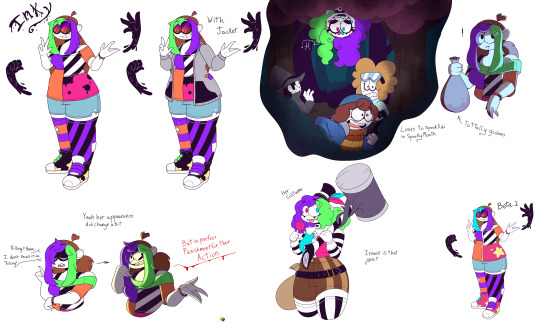
First concept of how she was she was gonna have the Ink manipulation ability like my Sona in Zodiac Oasis (My AU) but it was scrapped out plus the color scheme was every where

Second concept, I was trying to make her look like a chilled girl, but it was kinda confusing since this version of Inks is a subject for an experiment she was in, and this is where her tail showed being this swirl later to just normal stripes.. But where I was trying to get the hang of Sr Pelo still that was iffy.

Third concept it was mainly trying to doodle Inks friend who were also subject of the same experiment but the AU was still in progress, like how the world works in it.. So the story was iffy
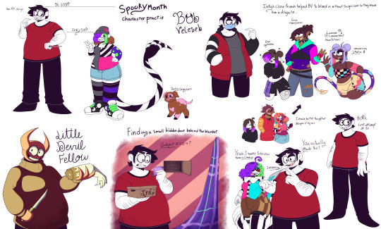
Not really a concept but some practice on a character, which I chose Bob Velseb of BV cause well been awhile since I drawn different body shapes and BV is a sorta fun character a cannibal that tells facts. But the funny thing I kinda made look younger in these doodles, also THROUGH THE DOODLES OF HIM I FRICKED UP HIS EYES

This is the last one, and basically I was literally using my Sona for Insanibeast in Spooky Month but I scrapped and and reworking it cause I want to separate the difference of Insanibeast in Zodiac Oasis and Spooky Month also it was also in time where Sr Pelo couldn’t access the forum.
So yeah that’s all the old doodles and concepts I had with this character which I was funny how her color palette change from Spooky Month colors with the greens purples organs and black, to how you see her now in latest concepts.. But ye I’m glad I got into the Spooky Month fandom and phase since it helped my with different art style and different shapes, and seeing other artist in the fandom how they made there’s
But that’s all hope ya’ll have a lovely day
#spooky month#spooky month oc#digital art#spooky month fanart#concept art#sr pelo#spooky month au#bob velseb#Insanibeast
6 notes
·
View notes
Text

//Right now I have an art goal I am going to try to accomplish, and that is to practice/master basic application of color theory and character design.
I know what color theory is; every single book, tutorial, and youtube essay on what it IS doesn't help me in trying to APPLY it in my artwork. That is until I have been watching videos on HOW wrong certain artists apply their colors ahem Bu t ch H a rtm an that I finally have direction, and now I want to try to apply this to both Devil's Eye and Ba'tala.
The levels of application will be different on virtue of Devil's Eye having human characters and Ba'tala having anthropomorphic animals. With Devil's Eye, the cast features a variety of different ethnicities, races, eye and hair colors, etc., so addressing color schemes will be a skillset unique to those elements. For example, I cannot give shades of green to Abena (a very dark-skinned woman) what shades I can give to Ravyn (a fair-skinned woman). Meanwhile, Phoebus' color scheme is fine as the Sin of Sloth (greens and blues to contrast his red hair), but I will always struggle with his twin brother Guy as the Sin of Lust (pinks to his red hair--a MAJOR no-no in color theory application unless he follows monochrome). So this one, I may have to observe existing examples of palettes seen in fashion and makeup to find the best color combinations to make everyone appealing.
Ba'tala's application of color will not just be different, but deliberately set to avoid certain trends and tropes I frankly cannot tolerate or stand when designing anthropomorphic characters, especially in furries. When I go back to my more recent art, while the lineart and anatomy has improved, the application of color never went past kindergarten wherein I'd just use every crayon in the box. In other words, my characters look like Lisa Frank rejects. But that tends to happen when a good number of the metaspecies have spots, stripes, or other patterns that will not jive well with textured, detailed clothing. So the challenge I hope to overcome is to balance simplicity without sacrificing authenticity in the metaspecies' most notable traits, such as Kitoah's feather spots or Ki'a's tabby stripes. All while not sacrificing features of ethnic clothing such tassels among the Hitoh and fringes with the Himmelia.
So it's a lot to focus on--so I am taking it one baby step at a time, starting with characters who are intended to draw the audiences' eyes the most often. I'll take as long as I have to. So expect loose and inconsistent character designs as I update. I'm sorry if I end up confusing everyone.
8 notes
·
View notes
Text
Recently, while drawing that girl with the daylily, I realized: oh, her story is about to be 10 years old… So I decided to compare the very first and one of the most recent drawings of some of the characters to see what time has done to them.
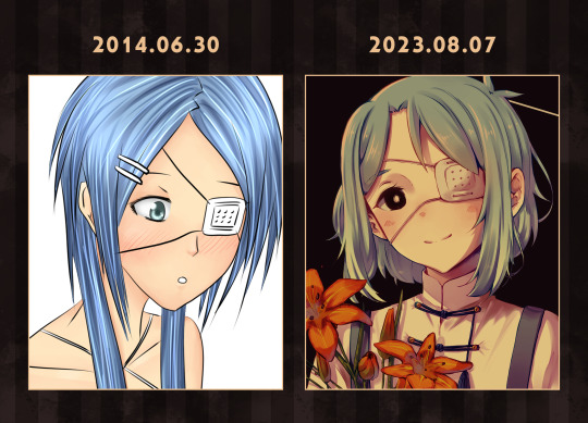
The protagonist probably had the biggest design change of all. The character, inspired by the color palette of forget-me-nots and blue hydrangea, eventually shifted to greenish hues. On the one hand, it's sad that the girl lost this zest, on the other hand, this color scheme, as I think, better emphasizes her character.
But nothing is as eye-catching as the new hairstyle. The hair now has a specific shape (yay!), the second layer with longer strands is gone. A short haircut is much more practical in her case, and the cowlicks make it feel more spontaneous.
As far as I remember, the character was originally intended to be much calmer, more skeptical, and smarter. But over the years she has become a silly, but very sincere, self-sacrificing girl who can find the best in the worst. One thing remains the same: she is still frighteningly naive, thanks to her hyper-patronizing father. In pictures, of course, it's funny to joke about storks and a complete lack of understanding of the concept of romantic relationships, but in reality it's dangerous. Poor kid.

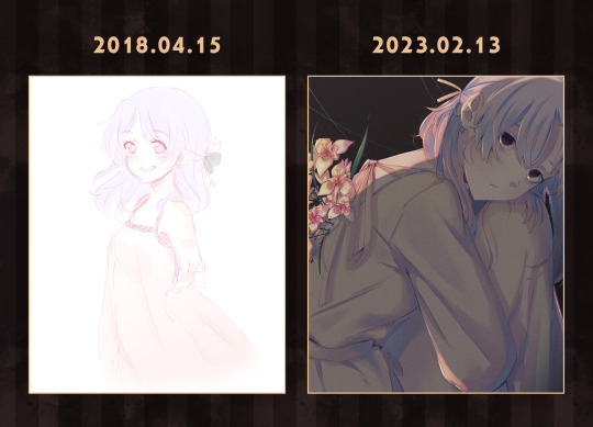
Speaking of father. After years of searching without success, I finally found the very first sketch of him. I've never been good at stereotypical grown men, which is especially evident in this kid of fifteen. :"D
I've gotten better at it with years of practice, but that brightly colored, disheveled hair still causes dissonance. I often think about redesigning it, but then I realize I'm too used to seeing this guy like this. I want to tug on his ahoge…
This character used to seem like a bit of a scatterbrained relaxed slob. And then he gradually transformed into a sensitive melancholic who adores anguished literature, who loses and forgets things not just because that's his archetype. He's not just a good dad anymore. He's too good a dad, in a bad way.
In short, he's a funny character. It's hard to draw him because of his masculine features, but it's fascinating to dig into his head.
This character hasn't changed much in appearance. Except that the ahoge on the right became a key element of the hairstyle and ombré appeared.
The evolution of her character is a literal embodiment of the proverb "beware of a silent dog and still water". And that's description enough.

The concept remained, but the details changed so much that the character became very different. They are now in khokhloma, which I congratulate them on. Aside from the jokes, the character is now shorter in stature and has a more muted color palette.
I rarely draw them lately (which I regret), but I still try to gracefully cover their groin with any object I can find. Because despite the lack of genitalia, it makes me uncomfortable.

I didn't really know what I wanted when I drew this character the first time, which is summed up in the first picture by the weird hair. But then I decided to use the good old cliché of appearance clashing with temperament, so I got a kid with stereotypically angelic golden curls and a manipulative, cunning nature with a pinch of cynicism. You know, those anime kids who act like they're at least 40.
Due to the lore revision, he's also lost his collar. Now the dog is free, woof.

Not much of interest here either, other than the fact that I learned how to draw curls better. All the meaningful changes happened on the inside of the character, because I was able to find a heart among the ice that I originally associated the character with. And it fascinated me.
This is one of my favorite characters, if not the most.
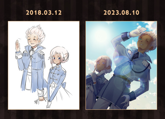
Tom and Jerry, Scooby-Doo and Shaggy, Woopsie and Poopsie…. In short, guys who complement each other's characters. Both pictures are primitive in their poses, so the differences are easier to see. The male character's long cloak has become a decorative cape, and the leaf pattern has disappeared (it's all the lore's fault). The female character is almost unchanged. Well, maybe she looks older now because of my experiments with style.
Their story is pretty simple, so I didn't think much about them. I think they've only grown more attached to each other over the years. Woopsie and Poopsie, yeah.
2 notes
·
View notes
Text
striker design process notes
a bit about the process for designing my fake omega strikers character. posted separately since not everyone will be interested.
the base character design comes from my pngtuber i use while streaming, which is loosely based on my irl appearance/outfits.
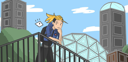

obviously, there were going to have to be some major changes, but i wanted there to be some consistency between this character and the striker character. the haircut is the same, but i iterated it two different ways (one tied, and one down). the jacket also makes an appearance in one of the striker designs with most of the same patches and pins, but recolored to match the color palette. some other aspects made it to the striker design like the baggy pants and chunky shoes, but they aren't as iconic or important in my mind.
the originals are both pen sketches i jotted down while running errands. tbh most of my projects start off as shitty, quick, and EXTREMELY rough sketches or thumbnails in my tiny pocket notebook. i find that having a basic idea of what im gonna draw makes me feel infinitely more confident while transferring it to digital, even if i know i'll have to make edits. i usually force myself to draw these initial sketches in pen, so i dont overthink and waste time redrawing it a million times. im sure that strat doesnt work for everyone, but i still thought id share.
honestly the hardest part of this was making sure that my character fit into the omega strikers "aesthetic", which is this sort of futuristic, streetwear, sportswear combo??? to match this, i added things like the goggles, arm guards, knee pads, straps, sneakers, etc.
this past week ive drawn a metric ton of omega strikers fanart b/c there are so many interesting aspects of the character designs. here are some things i tried to integrate into my own:
a striking color scheme. this doesn't mean having ALL striking/saturated colors (although some characters do that). it just means having a set of colors that define the character, usually one or two colors to make up the majority, and one or two to highlight parts of the character and make them pop.
so many accessories... i tried to make sure that there was no "dead space" in the design. with most strikers, even if their outfits are very straightforward, there's a pattern or accessory to break up the monotony.
weirdly, a lot of strikers have a sort of... triangular, chevron pattern? idk how to describe it but SO many of them have it somewhere on their outfit. so i went wild with it, occasionally converting it into straight stripes when necessary.
some strikers have something dramatic on their outfit that indicates motion. so like, something that will move around when they move. this could be hair, ribbons, straps, jackets, capes, etc. since my character's hair isn't quite long enough to float around, i added the scarf. this step was especially important for me since i sort of wanted my character to be a speed-based zoomy striker, so the impression of movement was essential.
sheeeesh i've written a lot. sorry for the wall of text lmao
i have a lot of other projects this week, so i wont be able to draw lots of omega strikers for a while, but ill come back to it, promise >:)
that's all. see ya ~
3 notes
·
View notes
Text

Stars Palette drawing rules:
use only 24 colors that represents each talent
no blending
just my thoughts just the cut
━━━━━━━━━━━━━━━━━━━━★
I was gonna post this without the link to my inspiration. But this morning I randomly found it!! It was a Hakka drawing by WhiSha on Twitter (it was just a WIP when I saw it). I normally would bookmark posts but for some reason I didn’t bookmark that drawing. I know I liked it but I have this habit of going on my Twitter likes and would unconsciously like it again, thus removing the like. It’s been months and I don’t even know if the artist tagged the drawing. But today I found it! Funny thing about Twitter, you can search posts made by a user if you go to their profile and use the search box on the page BUT this only works on mobile.
Initially, I was planning to do just a couple of drawings. The simplest one I think would be Miyabi and it didn’t take me long to draw it. It wasn’t good though, so I ended up redrawing it. I was gonna stop after Arurandeisu but I don’t know I just feel like doing more. I did stop drawing by May to draw other things. Then continued in the last half of September and drew the first three graduates. I guess I was somewhat still sad because of Magni and Vesper. I was gonna stop at that but just to make it look good as a post on Tumblr, I also drew Roberu.
Then I just continued until I realized, I only needed to draw a bit more and I would have drawn all 24 Holostars talents. So I just drew the rest..
I really don’t know what I was thinking. Whenever I draw, I would either listen to Magnus Archives or a true crime podcast. Surprisingly therapeutic honestly.
I had 2 rules when I started. First one is obvious, use only the 24 colors representing Holostars. There are official Hex codes (mainly for Rio and Tempus HQ) but the rest I based on the background of the talent profile from the Holostars Official website. For Kaoru and Suzaku, I came across the color codes on Twitter. But I do take advantage of the canvas color which is always white. I’d like to think the color white represents Yagoo or Daidou Shinove. And the last rule, no blending. I was thinking, when you blend there will be a new color in between.
I do make sure to try to incorporate all the colors, which would explain why the details on Bettel’s collar are colored differently. Of course I couldn’t do that for all the talents so I just drew stars on the empty space.
I used an app called Sketchbook. When drawing I mainly used one brush that draws the sharpest lines, nothing much to say about that.
There were a couple of drawings I was worried about which is why I drew them last. But along the way, I kind of figured out what to do. Not all of the drawings were perfect. And when I couldn’t figure out what to do, I just changed the color instead of staying faithful to the design. Of course I wanted to stay as close to the original design, sometimes it just doesn’t work.
One drawing that surprised me was the Magni drawing. I was substituting colors but Magni with blond hair (Temma’s color), just looks weird. It feels like looking at a Magni we haven’t met. But somehow I managed to make it look different using grey for hair shadows (Vesper’s color) and using the skin shadow color (Rikka’s color). Then make sure to have a clear but subtle divide between hair and skin color. I was avoiding outlining the drawing but sometimes I can’t avoid it.
There are also moments that I’m thinking of a pose that would fit the talent’s personality (like Shien, Shinri and Uyu), then regret it cause gloves are hard to color especially because all of their gloves are black! But I kept it, especially Shinri cause I really want to draw his blue hand.
I wanted to draw Oga right from the beginning since he is one of my kamioshi but then again I was hesitant since Oga’s color scheme is dark. Also out of all the Stars, his skin tone is darker and it doesn’t look right to suddenly give him a light skin tone just cause it's convenient. I was going back and forth with the skin tone, I was debating Rikka’s color or Shinri’s color for the skin tone. Though Shinri’s color is probably the closest, it’s way too dark. I also wanted to color the hair mainly Magni’s color but there is no other darker color to give his hair shadows. So I ended up using the darkest blue (Izuru’s color) as base for the hair and every single black piece of clothing. Of course the colors are quite different from the original but it actually looks nice.
I’m planning to post the clean version. If you have noticed, on the posts I made, it has the line art. But I haven’t decided if I should post the clean version on the post I already created or post 3 new image sets (having 8 drawings each) for the clean version.
Well I’m done! I’m definitely gonna try and draw some other things. If I feel like it. But since I’m also doing a drawing summary for this year, I will definitely draw a couple more before the year ends. Heck, maybe I’ll draw Yagoo.
━━━━━━━━━━━━━━━━━━━━★
If the links aren’t working, here are the URL you can copy paste:
Rio debut: https://www.youtube.com/watch?v=kEmz1bLVUNk
Tempus HQ debut: https://www.youtube.com/watch?v=Jar19J3HXQY
Color codes from Twitter: https://twitter.com/byongbyongbyong/status/1610860361745567745
Hakka WIP by Whisha: https://twitter.com/WhiSha_Sub/status/1643568245503324160
Hakka finished by Whisha: https://twitter.com/WhiSha_Sub/status/1643947160222695424
0 notes
Text
Playtesting Session
Unfortunately today I managed to leave my WIP program in my car on a USB so this blog was all people could see of my environment. Nonetheless, it was a good session and it was inspiring to see what other people were doing with their environments. I also thank everyone for all the feedback they gave because it boosted my confidence in my idea and assured me I was moving in a good direction.
I apologise for the following wall of feedback but I wanted to have this on my blog instead of tucked away in a google document.
First of all, love the concept. I can tell that each room clearly represents the different emotional periods in your life and thus connects to the assignment of portraying meaningful change/a transformational experience. What I found really interesting to read were the interactive elements you’re planning (or have) implemented. I also like how organised and thoughtful your planning was on your blog as it shows you’ve thought about this assignment. One question though, will there be prompts for these interactive things? I mean it might be obvious in the game but based on your blog I feel like the player might not know what to do??? Again, it will probs be different when the build is being played. Very exciting project and I love the drawings :)
I loved the idea and the concept of your environment. It seems really personal to you which will help you create an environment that is meaningful to you. You've really planned this out and gotten inspiration to help you navigate this assignment. Great job, and can't wait to see the final design.
I think its pretty neat idea to have the survival type of theme with the ropes and also the color schemes of the rooms is quite cool too! Using the transitional changes is cool too through the change aspects.
This is a really cool idea! Showing the colour scheme with inspo photos really helps for the mind to imagine what it will look like, as well as the concept sketches! Looks like its gonna be really good.
I think that this is a really strong concept. I like how each area communicates the emotions that you were feeling during these periods by making the player experience a representation of this time.
This is a really strong concept, I love the colour palettes that you have portrayed in your planning, as well as your draft in unity. It really fits it.
The narrative being separated in three parts is a really powerful concept. I really like the simplistic gameplay of moving to the monument, telling your story as you get to it. Make sure to use loads of props and lights, and don’t overlook the power of sound design. Really looking forward to seeing what the final game looks like!
I think that the concept is super cool, the color palettes are nicely planned and accurate. I love the interaction idea of it, feels like an escape room and really immerses the audience into the journey. Can’t wait to see it :D! Please send it to me :0
The only real concern that was raised was the player potentially being confused on how to interact with the environment. Luckily I was already planning on implementing prompts where needed but this reminded me and gave me the time to think about how I could use these prompts to enhance the story telling further.
0 notes
Note
Any tip for choosing colors? Is just, i really like the color palette that u use :3

I mainly try to remember the colour wheel and different palette types you get from it. It’s usually in the back of my mind when I’m thinking of what colours to use.
You should limit yourself to a maximum of 5 colours, at least as you’re getting comfortable with colour schemes. Less if often more with colour.
In my art, I lean towards analogous or split-complementary colours and they’re the most common. For Isha and Tashi I use only 3 or 4 distinct colours plus a neutral. Neutral colours like white, grey, black, and brown can be worked into any colour scheme and it’s good to use them to balance the drawing.
Complementary colours schemes work best when used as an accent. You tend to want the majority of the drawing to be one colour and use its opposite sparingly. For example, the majority of the drawing on the left is dark and purple, with the light green used only for the highlight.
Also, when it comes to chosing colours for light and shadow, it works best when one is warm and the other is cool, even with analogous colours. I wanted to keep the drawing on the right mostly warm and pink, but for a more diverse pallet, I used a cooler purple for shadows to contrast the warm orange light.
It helps to keep the different hues in a drawing at different brightnesses. This helps keep them distinct so they don’t fight for attention. Even when you want a piece to be bright or dark, keeping the values distinct is still important. For example, on the left, I kept the reds darker to better contrast the light yellows and mid greens, even if the pallete is overall bright.
In addition to the hue wheel, you can look at the brightness and the saturation of colours in quadrants. To balance a colour palette, I’ve found it’s best to choose from multiple quadrants.
I’d say the second pallette looks better than the first as, despite having the same hues, they have different brightnesses and saturation in contrast to being all heavily saturated and dark.
I hope this can help and if it doesn’t, there are some great resources on colour theory you can find around on the internet and I highly recommend looking those up.
#art ref#tutorial#colours#i need to learn to be more adventurous with my colours#but i'm pretty happy with how i use them#chirysune
1K notes
·
View notes
Last Seen Blogs
phandom-against-onision
fuck onion man
banditchika
at least she's marrying a doctoe

njnj0000
Untitled
ryamusic
Always daydreaming
campyvillain
my party my rules