#james gurney art
Text
y'all, not only does James Gurney have an active website, but he's still selling hardcover signed copies of Dinotopia — and for less than $50?!? 😭
He's still selling large art prints too!!

10 year old me is reeling and I cannot wait to fulfill my lifelong dream of having Dinotopia art in my home 😭🩷🦕
#i know I can't be the only person excited to learn this#dinotopia#james gurney#hmm how else can I tag this for visibility lol#dinosaurs#dinosaur art#bookblr#personal#magical posting
488 notes
·
View notes
Text
Homecoming, paperback cover by James Gurney, 1984
#homecoming#james gurney#1984#1980s#vintage#scifi#scifi art#science fiction#science fiction art#art#illustration#painting
446 notes
·
View notes
Text
Wild Sage, the Mountain Goats
#the mountain goats#my art#i want to try to make a painting for every song on Get Lonely#but i have a lot going on rn so we'll see#i tried james gurney's technique of painting on red to bring out the greens more
4K notes
·
View notes
Text
this is just an appreciation post for the dinotopia books and their incredible illustrations, all by author james gurney. these books are so meticulous and detail and feel like you've just found the long lost field journal of someone who got stranded on an island co-inhabited by humans and dinosaurs in a hybrid society. i love these books with all my heart.
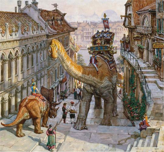


108 notes
·
View notes
Text
Homecoming Cover Art by James Gurney
103 notes
·
View notes
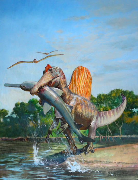
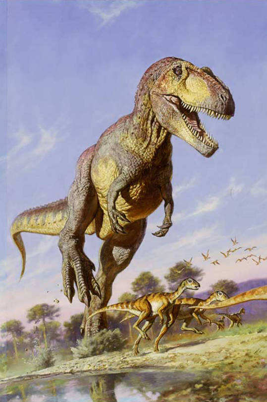
Text
art by james gurney

2K notes
·
View notes
Text
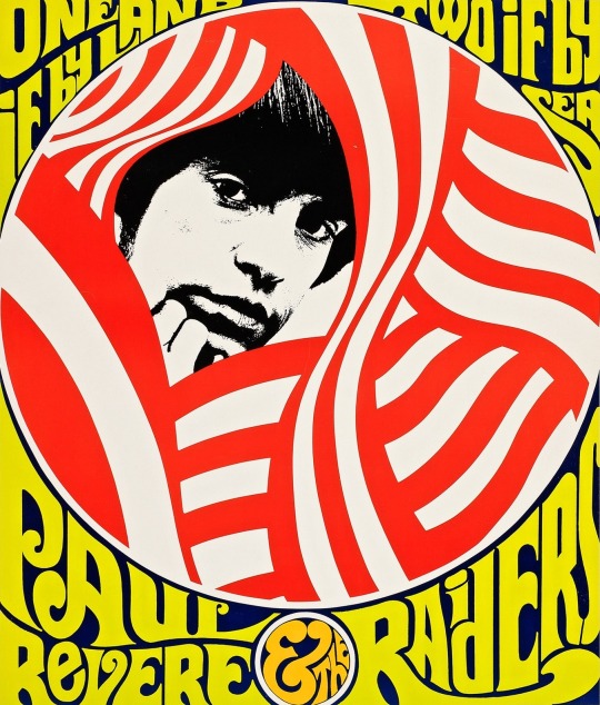
Paul Revere & the Raiders, 1967.
Artwork : James K. Gurney.
114 notes
·
View notes
Text

James Gurney, 'Quozl', 1989
"Quozl…was painted for the Alan Dean Foster novel of the same name. The novel tells the humorous story of the Quozl, rabbit-eared aliens who land on planet Earth to establish a settlement or "Fist Burrow." The Quozle, like rabbits, reproduce at an alarming rate and have been forced to travel from their overcrowded home plant of Quozlene to colonize other planets…Quozl shows the moment in which a group of these aliens explore the dwelling of a typical Earthling family."
James Gurney writes of his planning of the cover painting:
As a fantasy illustrator, my goal is usually to create a completely new kind of architecture. With Quozl, my goal was to introduce the fantastic rabbit_like creatures into a familiar American living room and show them reacting to common, everyday things, like televisions, posters, and VCRs. I followed Alan Forster's description of this moment in the book, but elaborated the idea with images that i gathered on a research tour though a local shopping mall. When the painting was finished, it showed a number of trademarked images, like Wonder Bread and Bugs Bunny. The lawyers at the publishing company were nervous about showing these in the final image as it appeared on the book jacket, so, with my approval, they has an art director touch uo the painting (with water-based paints that could later be removed) so that all the recognizable images became just a little different."
The image reproduced on the paperback book jacket stretches across the spine, so that the right-hand portion of the painting receives prominence as the front cover."
Source
Addendum: I don't think it needs to be stated that what's being presented here as your "familiar American living room" reads as white and middle class. Not necessarily a criticism, just an observation. I guess I did need to state it.
26 notes
·
View notes
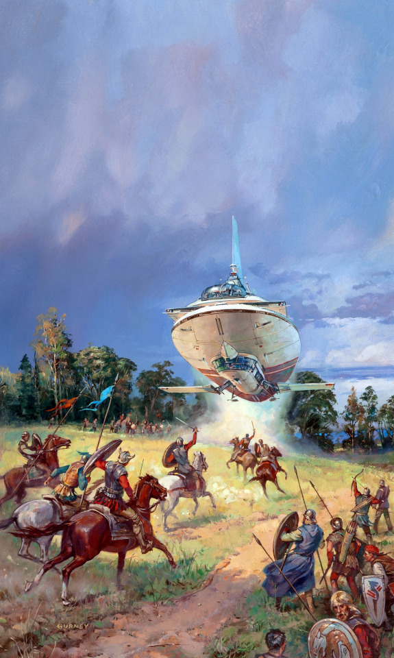
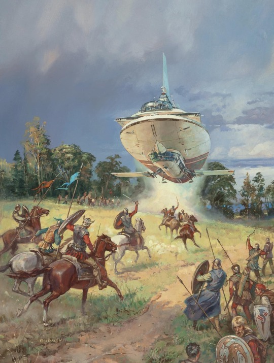
Text

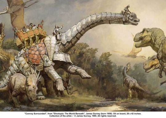
This image by the amazing James Gurney is a great example of how to tell when something is or isn't AI generated, because finger weirdness will not always be around.
What jumps out in this image that makes it feel (because it is) human made?
1 Distance is indicated by a reduction in detail and temperature.
2 It's not a static ship+landscape+figure. A dog is napping. . A ship is launching. The exhaust from the launched ship is filling the hanger. One guy is drinking. Another is fixing a thing while lying prone.
3 There are places of low detail for the eye to rest.
4 Cables are contiguous. They start and end in specific locations and do not appear out of no-where.
5 People are wearing different outfits, not variations of the same outfit.
6 When the viewer focuses on something, a small detail, it resolves into a legible something, it doesn't fall apart under scrutiny.
At this point in time, I think the most telling aspect (no pun intended) is the little mini-narratives. Things are HAPPENING. I've seen 10's of thousands of AI images. This is extremely uncommon. They are almost always compositions. Evocative at times, sure, but not narrative.
This painting is by James Gurney, a tremendously talented AND generous artist. Check him on YouTube - he does a lot of painting videos. His blog is: https://gurneyjourney.blogspot.com
23 notes
·
View notes
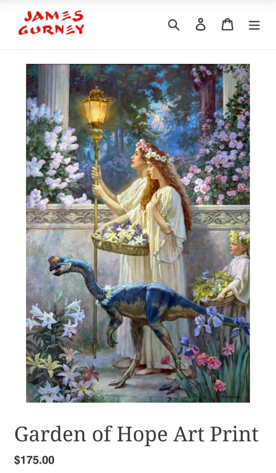
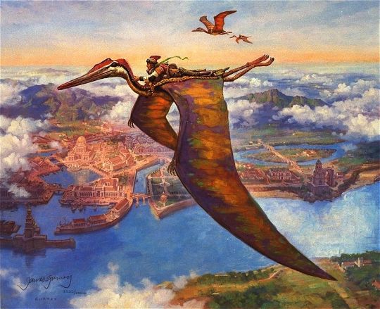
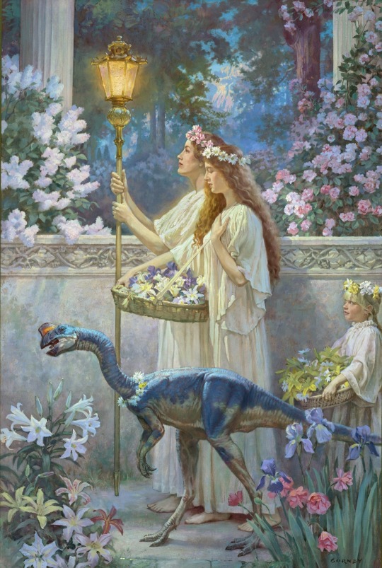
Photo

The Art of Fantasy: Forgotten Worlds and Wonderlands – Unquiet Things
Image: Garden of Hope, James Gurney
87 notes
·
View notes
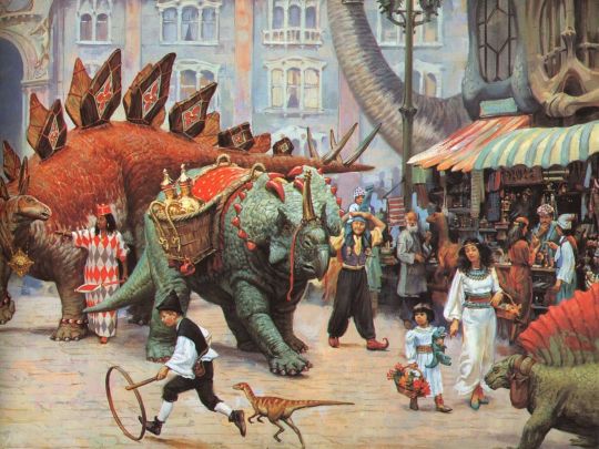
Photo

art by James Gurney
183 notes
·
View notes
Text
Gigantosaurus with Clouds ART by James Gurney
#James Gurney#Gigantosaurus with Clouds#gigantosaurus#art#painting#artwork#illustrator#illustration#dinosaurs#dinosaur
122 notes
·
View notes
Text
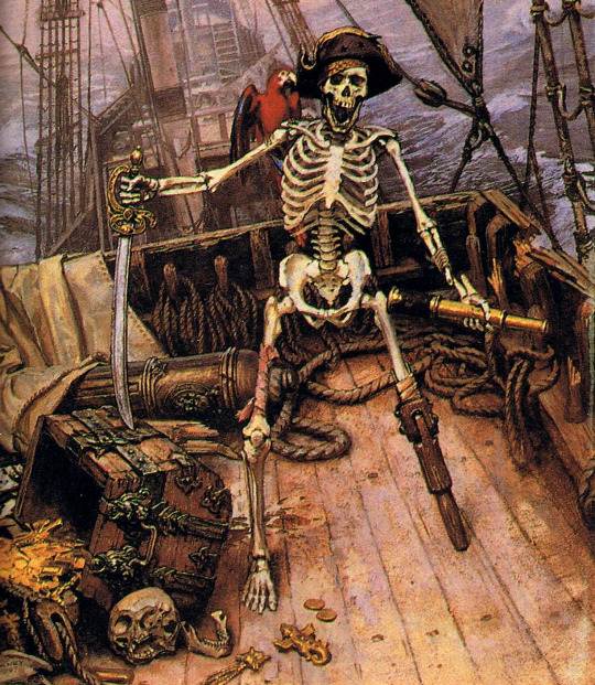
On Stranger Tides by James Gurney
692 notes
·
View notes
Note
how do you get your colors to look so nice and your lineart so red and vibrant? i love it
omg anon thank you!! 😭 im going 2 be honest I am Not Great with color theory... but i like having my sketch pages look cohesive to me...
BUCKLE UP this is going to need a readmore bc i like talking.
I always sketch in neon colors it's a habit i picked up from an old teacher but I'll think of a color usually on a whim and draw with that. and then if i want to draw something else ill pick another color that i think goes well with the page. usually most of my color schemes r analogous (colors right next to each other on the wheel)

yanked this from recent dunmesh post; i kept most of my colors within the pink/red/orange range.
i wouldn't recommend doing everything in monochrome or analogous palettes though because it's sort of a guilty crutch of mine XD.
sometimes when im coloring ill change the layer mode of the sketch. color burn gets you either very very bright or very very deep colors depending on the color of the flats underneath. multiply and linear burn do the same thing but they're a lot tamer and generally always return darker colors. im sure there's some technical bits behind this though. ill either color my lineart afterward to compliment the color of the flats, leave it as is, or mess with layer modes if i feel like it. my favorite trick is color burn + linear burn + some combination of two lineart layers and just fiddling until i get a nice burn effect.
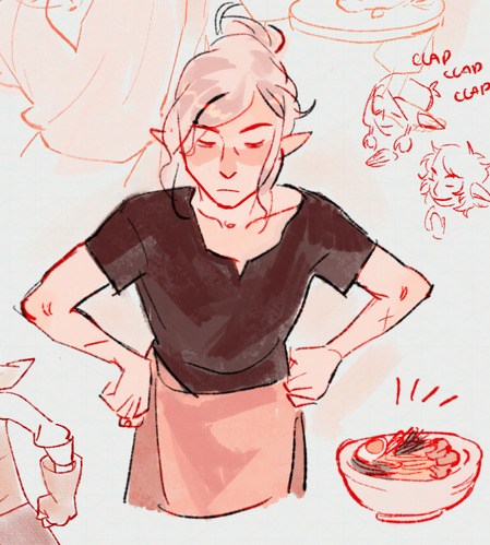
mithrun was done with crimson red on color burn.
coloring... like 999% of this is relative color which is like. kind of the idea that colors look different when placed next to each other. if you eyeball it a bit it's pretty noticeable.

what i used to do a bit ago was i would fill in the area i wanted to color with one big mask of color, make a new layer that has a clipping mask down to the flat layer of color, and then draw my actual flat colors. the color of the mask helped me pick my flat colors bc if I picked a color i think stood out too much next to the mask i could kind of just adjust it until it looked a little more cohesive.

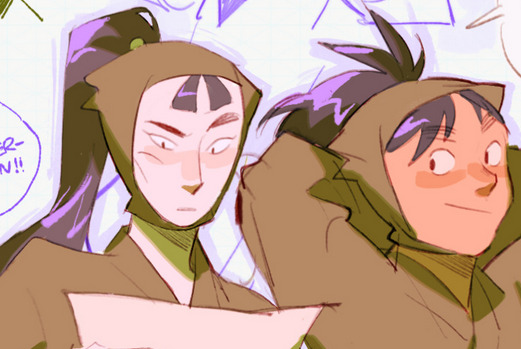
old ish drawing next 2 a canon reference. i ignore local color a lot...mea culpa....but my overall color palette here was a light pink, so the shirt here is actually a desaturated pink? or violet i believe. if you shift sort of that purple color far enough into the gray area of your color wheel it can take on a blueish or even greenish hue. it being next to a lot of warm pinks/fuschias helps.
a neat thing that kind of helps is that if you desaturate or saturate certain colors they can kind of take on a certain hue? not sure if this makes sense. sort of how orange here turns tealish blue the grayer it gets. so if im drawing something that's predominantly orange and i have a blue color i can just take an orange color and desaturate it until i get a color that sort of looks like blue. and that way it kind of looks more harmonious? at least to me XD
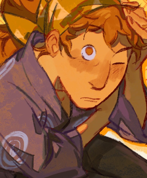
shading. i don't apply serious lighting to a lot of my drawings, but a helpful bit is that the shadows tend to be the opposite of whatever color the lighting is? i try to think first about the "mood" or the main color i want to go for in the drawing and then i pick a shadow color opposite of that. so for here, i wanted the lighting to be a coolish magenta so the shadows r lime green. if there's anything off i fiddle around until i get something i like. the shadows on the skin here were too green initially so i shifted them a little more orange.
there's a "band" of color going on between the transition of the shadows to the light. generally this could be for a lot of reasons and i tend to use it differently (core shadow? overexposure? etc etc). but this is a color post so ill try not to go too off track.
but generally digital doesn't "mix" colors the same way traditional colors do if you use RGB (cmyk is a bit better with this but is kind of a pain to get used to), so to make blending a little less muddy, i sometimes add an intermediate color to smooth things out a little. for example, mixing digitally blue n yellow tends to get you gray, but generally, blue + yellow makes green, so if im making a blue->yellow transition ill slap some green color in the middle so it flows a little better.
I do a lot more cel shading nowadays. if you've been on here for a while earlier this year i have another style of coloring but it's not really accurate to how shadows really work so i wouldn't recommend looking at it. it's mostly to add zest and texture to the underlying flat colors.
coloring your lineart does a TON to helping your colors look vibrant, though its like the garnish on a dish to me (same with shadows). i think it's good to try and play with your flat colors and try to make sure those look in order first before adding flourishes. usually ill leave it a dark, saturated color that again matches my overall palette but sometimes i go in and color them by alpha locking my lineart layer and picking a color that matches the flat colors underneath? not sure how to explain it properly.

i used a darkish purple for shuro's ponytail to match the dull red of the flat colors (more relative color! trying to simulate a black/brown while keeping the pink palette there) but a lighter crimson for laios's blond. the light was this super intense like blush pink so i thought it might be cool to add this neon salmon red in the areas of that light to really give off that vibe of a very bright intense rim light.
sometimes you could also tweak with gradient maps or color balance, which adjusts hue based on how light or dark a color is. these r fun to mess with as a final touch but i need to watch using them because they can become crutches real fast XD but those are also just tools to help you. in the end just developing a good sense of how color works and how you want to use it is the best place to start.
LONGASS ramble but yeah. tldr just kind of train ur eye for color and look at what you like best. which is unhelpful and a little sucky but it really is just observation and practice and maybe some personal zest.
happy drawing!
#SORRY THIS IS THE SIZE OF CANADA I YAP A LOT#i like being thorough when explaining myself a lot XD but i think the easiest way to get good with this is just repeat practice n observing#and figuring out how stuff behaves in certain situations and what you like to do and blahblahblah#if you have artists u like that do this well looking at how they use color might be cool#...i feel this entire post is just putting my entire thought process on blast LOLLL.#“eyeball it out” -> study some actual fundamental stuff and or intake new info or art -> apply it back to just eyeballing it out#i dont think i have a natural sense for some basics#but i dont think im naturally one of those people who grind out studies all the time and breakdowns either#i guess i just kind of like knowing the mechanations behind why to do a certain thing or how stuff works and then figuring out#how that translates into what i know nerd emoji#james gurney has a good book on color and light#if you like reading. but its very informative!#quirinahscreams#ask#anon#this is mostly just me talking about how i draw i dont think this is meant to be educational or informative XD um
9 notes
·
View notes
Text

Armor Cover Art by James Gurney
13 notes
·
View notes
Text
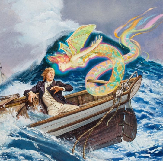
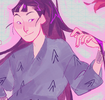
This James Gurney painting giving me big queer vibes
9 notes
·
View notes
Last Seen Blogs

different-marlene-blog
Cut the Cord
sameasitneverwas101
Dial-less, Radiohead
misconceptionaly
Misconceptionaly
sameasitneverwas101
Dial-less, Radiohead
sameasitneverwas101
Dial-less, Radiohead