#like what opacity the layers were at and what not
Note
how do you make your colours so scrumptious... that's a vague ask but it's like, how do you make the colours mash together well and make sure they don't clash against eachother. And when you do designs, what inspires you to make your agent ocs outfits or do you just make them because they look silly.
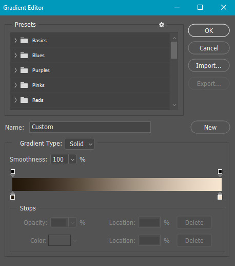
hmmm... no.1 i stay away from pure black and pure white. i always use an off-white and a dark desaturated color of whatever i'm using, as well as for when i use grays. here's an example vv
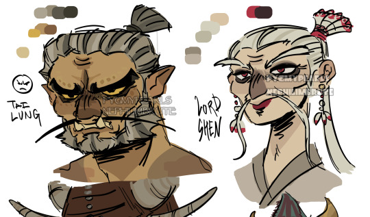
^^ all of the colors on my tai lung come from yellow hues in various shades (if that makes sense). same with my lord shen. the red is a reddish-pink, and the black is, of course, a desaturated and darker shade of the red

i tend to stay in the middle area here, i don't really like to use bright or very saturated colors. another example is when i choose an ink color for marina, i don't use something that's TOO bright, but going for something a little darker to pair with the primary color of her tentacles and her skin
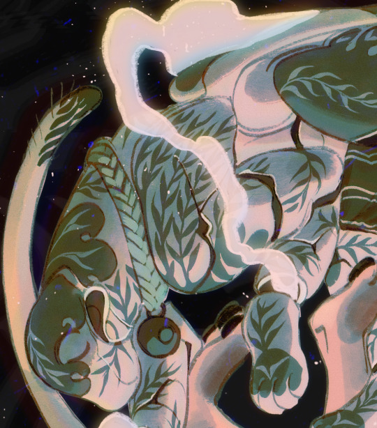
now, here's my chameleon vv
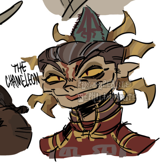
her colors were a little difficult to figure out, but i'd say they work together somewhat...they all fall into the category of being desaturated and such. mainly warm colors with the exception of the green, but i made the red a little pinkish/purpleish so it wouldn't contrast as much
it REALLY depends on the character but most of the time my lighter colors will be less saturated, and for darker colors they'll be saturated. this obviously varies, like with undead characters all of their colors would be a little more muted
i also have a theme i keep in mind for my colors. like with my fantasy marina, i think of olive or yellow-green. the only colors that i don't change (often) in the palette are the skin tones. another example is my young craig design, i think of the sepia filter and...old looking colors? like grayish browns and yellows and stuff like tha.t...i dunno
the main way i learned how to color is actually by coloring...normally? the colors all looked weird and had such contrast, but i'd overlay another layer on top with a solid color, set the blending mode to multiply, and lower the opacity. sometimes i'd do this with the mono color filter instead of a solid color
i also take inspiration from other artists! wolfythewitch is one of my biggest inspos for art in general, great coloring and anatomy. if you're looking for an artist with saturated colors that pop, check out bigskycastle!
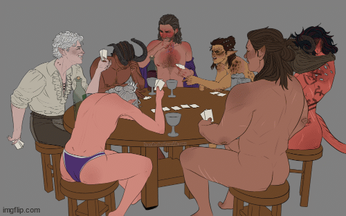
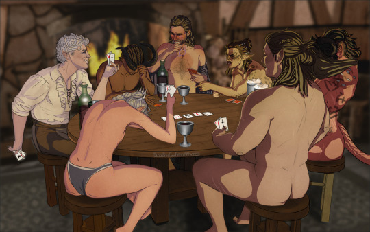
now onto the second question...if you mean their uniforms..yeah i just went with whatever looked silly. (OLD ART ALERT ERR ERRR) cap3's uniform is intended to be a few sizes larger since it was most likely supposed to be for val before she got fired. and she wears pants instead of shorts since she wants to cover up a lot
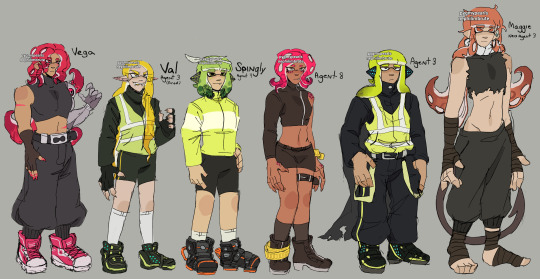
not much is different with maggie. other than the fact that she's wearing a uniform too small for him and it ended up looking weird
but if it's for outfits in general i just scroll through the lists of gear on inkipedia and pick whatever i think the character would wear
52 notes
·
View notes
Photo

Parallels 👀
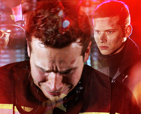
(I've noticed that when Piccolo is injured, Gohan sets his gaze on the enemy...but when Gohan is injured, Piccolo sets his gaze on Gohan 🥺)
#dbz#dragon ball z#gohan#son gohan#piccolo#db#dragon ball#sketch#annoys me that the colours on each are not exactly the same#and that's cause i did something stupid on the first drawing: MERGE THE LAYERS THEN SAVE IT#which means when I wanted to go back to the file and use the same method to make a new image#I couldnt parse out what I did to the first image#like what opacity the layers were at and what not#hence they're slightly different#lesson learned!
2K notes
·
View notes
Photo

GUYS IT’S DONE *PTERODACTYL SHRIEKING*
#look look look look LOOOOK#look at what I MADE#dnd oc#I did a bunch of new things!!!#for example I did a layer of shadow/highlight 'references' first in really high saturation#and then I drew over them cleaner with the darkest shadow#and then popped the highlights on top#and I tend to put like four layers of highlights on any one thing#so after I'd done that I realised id grown quite attached to the dimension my references were giving the piece#bc the 'cleaner' official shadows and highlights were a bit too minimalist for me#so I dropped their opacity and cleaned them up a little and I actually kept them here!!#full disclosure I am SHIT at shadows#I have no formal training and do not know how shading works beyond the first infographic in those DRAW MANGA books#so im VERY proud of this here!!#it looks so good!!!#also I haven't put this much effort into a piece I wasn't being paid for in about six years#the last piece that got this much love and pushed my existing talent to this degree was my sanders anime poster#how the time flies#anyway im so fucking happy with this#this is my favourite piece I've done to date#I hope they love it!!!!!!! gonna send it via my beautiful partner to the appropriate discord#personal favourite#revelart
5 notes
·
View notes
Text
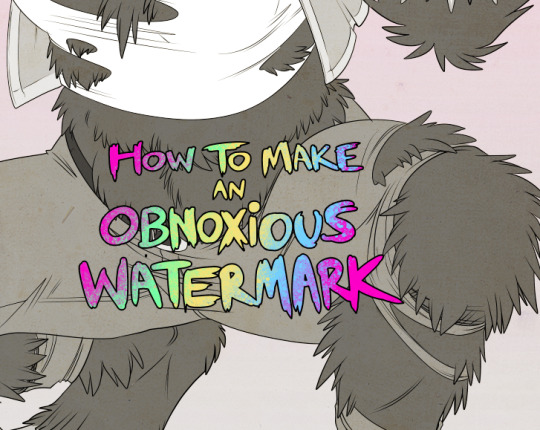
...that your audience won't hate.
This is a method I started using when NFTs were on the rise - thieves would have to put actual work into getting rid of the mark - and one that I am now grateful for with the arrival of AI. Why? Because anyone who tries to train an AI on my work will end up with random, disruptive color blobs.
I can't say for sure it'll stop theft entirely, but it WILL make your images annoying for databases to incorporate, and add an extra layer of inconvenience for thieves. So as far as I'm concerned, that's a win/win.
I'll be showing the steps in CSP, but it should all be pretty easy to replicate in Photoshop.
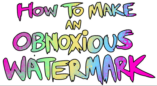
Now: let's use the above image as our new signature file. I set mine to be 2500 x 1000 pixels when I'm just starting out.
Note that your text should not have a lot of anti-aliasing, so using a paint brush to start isn't going to work well with this method. Just use the standard G-Pen if you're doing this by hand, or, just use the text tool and whichever font you prefer.
Once that's done, take your magic wand tool, and select all the black. Here are the magic wand settings I'm using to make the selections:

All selected?
Good.
Now, find a brush with a scattering/tone scraping effect. I use one like this.
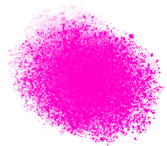
You can theoretically use any colors you want for this next part, but I'd recommend pastels as they tend to blend better.
Either way, let's add some color to the text.
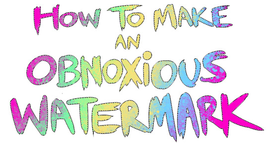
Once that's finished,
You're going to want to go to Layer Property, and Border Effect

You'll be given an option of choosing color and thickness. Choose black, and go for at least a 5 in thickness. Adjust per your own preferences.
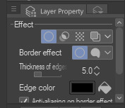
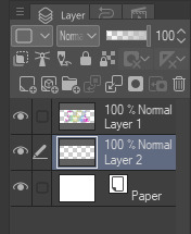
Now create a layer beneath your sig layer, and merge the sig down onto the blank layer.
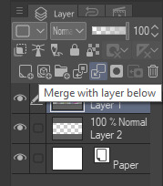
This effectively 'locks in' the border effect, which is exactly what we want.
Hooray, you've finished your watermark!
Now let's place that bad boy into your finished piece.
You'll get the best mileage out of a mark if you can place it over a spot that isn't black of white, since you'll get better blending options that way. My preference is for Overlay.
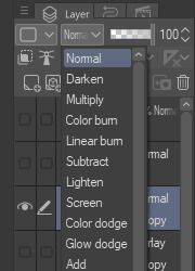

From here, I'll adjust the opacity to around 20-25, depending on the image.
If you don't have a spot to use overlay, however, there's a couple other options. For white, there's Linear Burn, which imho doesn't look as good, but it still works in a pinch.
And for lots of black, you have Linear Light
Either way, you're in business!
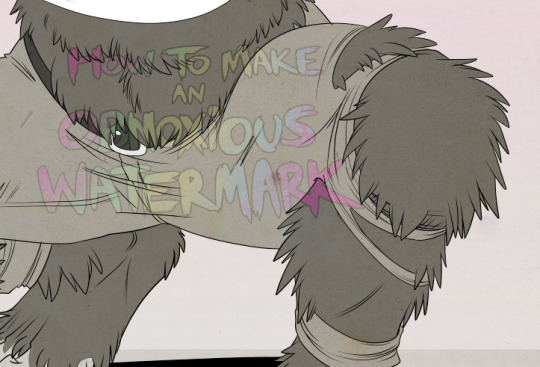
EDIT since this has escaped my usual circles, and folks aren't as familiar with my personal usage:
An example of one of my own finished pieces, with watermark, so you can see what I mean about 'relatively unobtrusive'-- I try to at least use them as framing devices, or let them work with the image somehow (or, at the very least, not actively against it).
I know it's a bummer for some people to "ruin" their work with watermarks, which is part of the reason I developed this mark in particular. Its disruption is about as minimal as I can make it while still letting it serve its intended purpose.
There's other methods, too, of course! But this is the one I use, and the one I can speak on. Hope it helps some of you!
52K notes
·
View notes
Note
hi i'm sorry to bother you but do you have any tips on giffing dark indoor scenes? yours always look so good!
hi there! not a bother at all :) i can definitely try to explain the steps i usually take under the cut!
this tutorial will assume that you already know the basic steps of gif-making — if you don't, there are lots of great tutorials floating around on this site that can help you out! :)
here's the gif i'll work with to explain my steps, the bottom being the original and the top being the coloured/brightened version.
before we start, a general tip i recommend keeping in mind: if you want to brighten a dark scene, you'll want to get your hands on the highest quality download you can find. 1080p is decent, but if your laptop can handle 2160p 4k hdr files* without sounding like it's about to explode, that'll get you even better results!
(*colouring hdr 4k files requires a different set of steps — the scene will appear washed-out on photoshop, so you need to make sure that you don't end up whitewashing anyone if you do choose to work with this type of file.)
since most of my downloads are 1080p, i'll use this type of file in this tutorial.
the first step of my gifmaking process with 1080p files is almost always the same no matter what scene i'm giffing. i make a brightness/contrast layer and set the blending mode to screen:
now my gif looks like this:
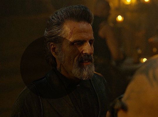
depending on the scene and how washed out it looks after this layer, i'll play around with the opacity. for this gif, i didn't touch the opacity at all. use your best judgement for this, because every scene is different!
i find that dark indoor scenes are usually tinted in yellow or green. one of my first goals is to try to fix the undertone of this scene before focusing on brightening it any further. i go to colour balance for this, and play around with the midtones, shadows, and highlights.
again, every scene is different, so the amount to which you use colour balance will differ, but for this specific scene, my goal was to neutralize the yellow. i focused particularly on the midtones and shadows of the colour balance layer, moving the scales to the opposite of the reds.
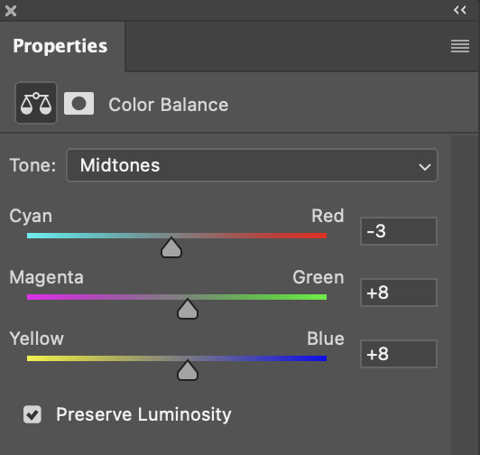
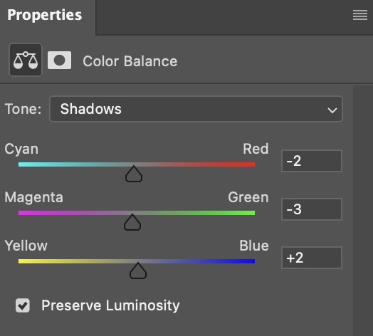
doing so will help with neutralizing the yellow. the only reason i moved the scales towards magenta and blue (therefore making it a bit more red than less) rather than green and yellow in shadows was because i wanted a darker contrast in the blacks. moving them to green and yellow made the overall scene more yellow since there were so many dark spots that shadows affected. (you'll see what i mean when you start experimenting with your own gif — this part of the process really just depends on your preferences!)
our gif might not look that much better yet, but it will soon! our best friend channel mixer is gonna help us out. for an in-depth post about how to use this adjustment layer, i recommend checking out this tutorial.
i'm someone who prefers to make more than one layer for the same adjustment layer for a reason i can't even explain (i just find that it helps me stay more organized). so don't think of this process like i can only use this layer once so i MUST fix it NOW. you can create multiple layers of the same adjustment layer, because every layer on top will affect the ones underneath it.
since my priority is getting rid of the yellow tint, i went to the Blue section of the channel mixer and increased it in all of the scales:
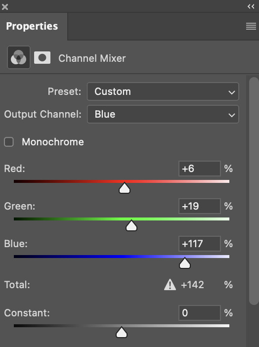
this step alone has helped us out so much, because look at our gif now!
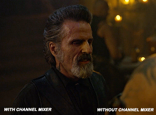
not only does the background look less yellow, but so does izzy's skintone.
now i'm going to focus on trying to brighten the scene even more without destroying the quality. the levels layer can actually help out a lot with this.
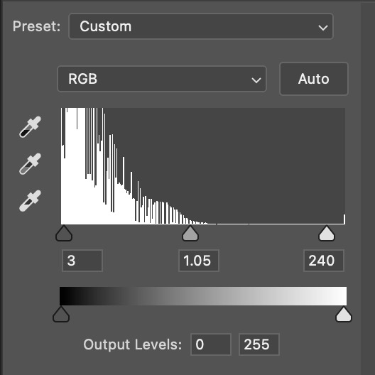
the amount to which i move each toggle differs per scene, and i think experimenting depending on your gif works best for this layer.
side note: i prefer not to use the ink droppers on the side because the contrast in the result usually ends up feeling too strong for my preferences, but if you find that this works better for you, then go for it! basically, the first dropper with the black ink should be clicked before you select the darkest part of the scene that you can find, and vice versa for the third dropper with the white ink — click it, and then select the brightest part of your scene.
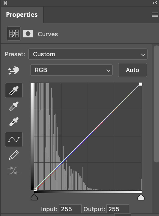
curves is the next layer that does fantastic work! unlike the levels layer, i do actually use the ink droppers for this. it's the same concept, with the first dropper being used on the darkest part of the scene, and the third dropper on the brightest.
try to think of curves as something that not only further brightens your scene, but also helps with the colour neutralizing process.
i grab the first dropper, then click the darkest parts of the gif that i can see. depending on the undertone of the blacks that you're clicking on, the tint of your gif might actually change significantly. this is why i prefer to click once, then undo the action if i don't like what it gives me. izzy's leather jacket was the sweet spot for this gif.
when i'm satisfied, i make another curves layer and use the third dropper to click the bright/white parts of the scene. for this gif in particular, the lights in the background were a good fit because they carried a yellow undertone — this meant that my curves layer actually helped to further neutralize the yellows in the scene as a whole!
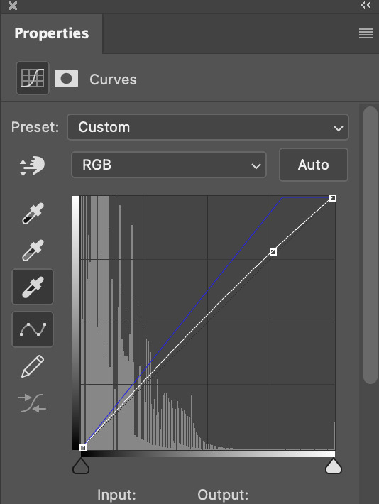
(i manually dragged the curves graph upwards for the third dropper to make it brighter. i don't need to do this if the dropper does this for me automatically, but since the lights were pretty bright, it only changed the tone of the scene and didn't increase the brightness — hence the manual step.)
pat yourself on the back, because this is what our gif looks like now!
this is good, but it's not great — there's still just a bit too much yellow in the scene for my liking (sorry, i'm picky! :P)
i created another channel mixer layer and played with the toggles until i was satisfied:
ta-da! the gif as a whole is much less red/yellow now:
this is when i start fixing the colouring now — namely, his skin tone. selective colour will be your best friend here. i wanted to make his face just a tad brighter and less of a yellow-ish magenta shade, so i focused on the reds and yellows.
then, out of habit, i created another selective colour layer and took out more of the "yellow" in the whites to make them whiter, and increased the black (just by +1, since the contrast is pretty good enough already).
note: i switched to "absolute" for these two colours. basically, relative = less vibrant colour manipulation, and absolute = more vibrant/stronger colour manipulation. i prefer to stick to "relative" for fixing skin-tone since "absolute" can be a bit too strong for that.
our gif looks like this now!

his face looks brighter and much less yellow, so i'm satisfied!
this next step is not mandatory at all — again, i'm just picky and despise yellow-tinted scenes. i personally believe that indoor scenes that are yellow/green tinted make them look more dark than they actually are, so i do my best to get rid of these colours.
i also don't always do this, but for this gif, i just simply went to hue/saturation, selected the yellows from the drop-down menu and decreased its saturation.
be careful not to do this too much. depending on the quality of your download, this can significantly decrease your gif quality. i tend to worry less about this when i'm working with 2160p files, but again, those files require an entirely different set of steps when it comes to brightening/colouring.
since this was a 1080p file download (and one that was actually less than 1GB, oops, don't do that), i played it safe and decreased it by -39 only.
note: you also want to be cautious of colour-washing skintone when it comes to this step. i find that another selective colour layer can help perfect the skintone in case the yellow drains out of it too much, but skip the hue/saturation step if it's too difficult to work with — better to be safe than sorry.
anyway, this is the final gif!
that's usually what i do when it comes to colouring dark indoor scenes! i hope this tutorial makes sense, and if you have any further questions, don't hesitate to reach out! :)
#tutorial#gif tutorial#resources#completeresources#coloring tutorial#allresources#dailyresources#userraffa#userdean#uservivaldi#alielook#usercats#usermoonchild#usernaureen#userbarrow#userabs#useraish#useralison#userisaiah#*mytutorials#i am so sorry if this is incoherent#it’s so hard to explain things coherently 😫
614 notes
·
View notes
Text
gif tutorial
i was asked to make a tutorial for this set i made, so let's get right into it!
first things first, i downloaded the music videos from youtube in 1080p using 4k video downloader. unfortunately, the quality of youtube videos always seems... not great, to put it simply. plus these music videos are from the 90s, so they've been upscaled to 1080p after the fact. all of this works against us, but i've definitely worked with videos of lesser quality than these, so at least there's that!
when i gif, i import video frames to layers rather than screencapping. this comes down to personal preference. after everything has loaded, i group all my layers together and set the frame delay to 0.05. i then cropped my gif to 540x500.
the next step in my process is sharpening. i did play around with my settings a bit given the quality of the footage and the dimensions of the gif. i compared both @hellboys low-quality video gif tutorial to my regular sharpening action and my vivid sharpening action and in this case, i preferred my normal vivid sharpening action. i used this tutorial to create the action for myself, and you can find other sharpening tutorials here. this action converts my frames to video timeline and applies sharpening.
once my gif is sharpened and i'm in timeline, i begin coloring. i wanted to simplify the amount of colors used in these gifs, again because of the video quality -- i knew it wasn't going to have the crispness i would normally like for my gifs. here are my coloring adjustment layers and their settings (not pictured: my first layer is a brightness/contrast layer set to screen) (explanation in alt text):

all of these layers and their settings will vary depending on your footage and its coloring (and obviously, feel free to make the gradient map whatever colors you like if you aren't going for this exact look).
pretty basic coloring, especially with just slapping a gradient map on top (my beloved), but at this point, i still didn't like the quality of the gif, so i added a couple textures/overlays.
i put the left one down first and set the blending mode to soft light and the opacity to 8%. depending on what look you're going for, you could increase or decrease the opacity or play around with different blending modes. i like using this texture with lower quality footage because even when it's sized up a bit, it adds some crispness and makes things feel more defined. for the second texture, i set it to overlay and 75% opacity. we love and respect film grain in this house.
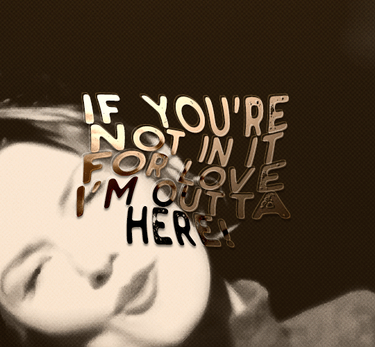
now for the typography! sometimes i really enjoy typography and other times it's the bane of my existence for the sole reason of just how many fonts i have installed. anyway, here are the settings i used for this set:
make sure the color of your font is white and then set the blending mode to either difference or exclusion. i can almost never see a difference between the two, but for this set, i used exclusion. below are the blending options (double click on your text layer to bring up this menu or right click and select blending options).
now we have to add the warp effect. with your text tool still selected, click this icon at the top of your screen:

from the dropdown menu, select twist. these were my settings, but feel free to play around with different warp options and their settings. the ones i use most often are flag, fish, and twist.
this last step is completely optional, but it's an effect i use in most of my sets with typography. duplicate your text layer (select the layer and ctrl+j), turn off the layer effects (click the eye icon next to effects), and set the blending mode to normal. right click on the layer and select rasterize type. right click on the layer icon itself and choose select pixels.
at this point, you should see the moving black and white dotted line showing that only your text is selected. then go to edit > stroke. here are the settings i almost exclusively use.
this is what your text should look like now:
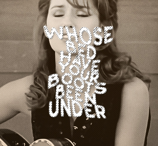
using ctrl+T, move the layer off the canvas so you can't see any of the text anymore. you should be left with only your outline. click anywhere on your canvas to de-select the text we just moved. use ctrl+T again as well as your arrow keys to nudge the outline over to the left 2px and up 2px. this is personal preference as far as the positioning, but i almost never move it any other way. you can leave it like this, which i sometimes do, or you can set the blending mode to soft light like i did for a more subtle effect.
and that's it! rinse and repeat for each gif in your set or use a different warp effect on each gif to switch it up! if you have any questions about this tutorial or would like me to make one for anything else, please feel free to ask any time!
#gif tutorial#my tutorials#gifmakerresource#completeresources#dailyresources#chaoticresources#userdavid#coloring tutorial#typography tutorial#tutorial#photoshop tutorial
172 notes
·
View notes
Note
Hii you're so talented!! i wonder if you could explain how you did this gif effect with the squares? and do you have any tips on colouring because yours is always top notch <3333
heyy thank you so much 🥹 and of course! i've never really done a tutorial before but i'll try my best to explain it in a way that makes sense 😅
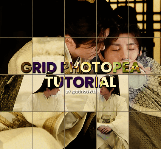
so i start off with making my two gifs seperatly and colouring them as i normally would, once i've done that i load both gifs into the same project and once i've done all that i started on the grid part:
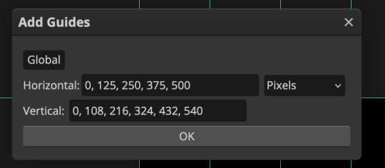
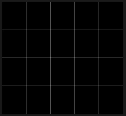
now go to view -> add guides and this window should pop up:
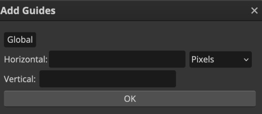
(it's was so daunting at first when i saw this i was like ????? and started putting in random numbers and was like oh that's how this works 🤣)
here's the settings i used for my gif which is 540px x 500px in size with 5 squares x 4 squares: (if you want more or less you just have to play around with it)
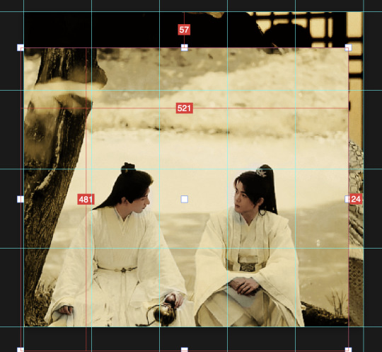
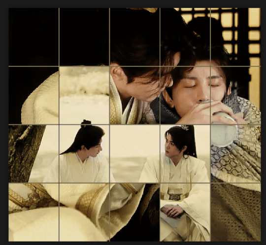
once you've done that it should look something like this:

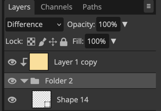
now the next part is really up to preference again: add a vector mask onto the gif that's above the other one like this: (ignore the name of my folder that is irrelevant 🤣)

and then i used the rectangle select tool (this is because the rectangle select should lock onto the grid squares making it easier to erase certain sections) + a black brush tool to erase the squares to show the other gif that's underneath (you can reposition both gifs to your liking which is what i did)
before & after:

so my vector mask looks like this afterwards
(you don't have to do the squares so close together like i did it was just how i liked it & because of the scenes i had chosen that mine turned out this way)
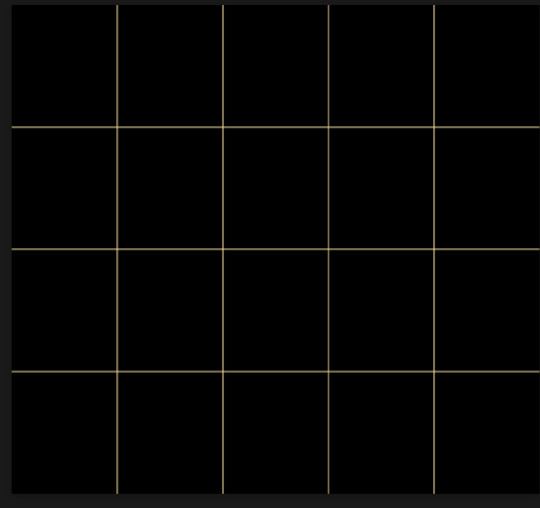
now onto the grid lines: i used the line tool with these settings

just like with the rectangle select tool the line tool should lock onto the grid line you want to redraw, do this for every line that you want/have for your grid & once you're done go to view -> clear guides and it should look something like this: (added a version with just a black background so it can be seen a little easier)

(i'm ngl idk why my lines ended up kinda faded and not white 🤣 i think it might be because i used a white fill instead of white stroke but it doesn't really matter to me because i got my ideal outcome anyway 🤣)
bonus step: you can stop here if you'd like but i wanted my lines to match my colouring & my intended typography so i put all my line layers into a folder and set the mode to difference & added a yellow fill layer with a clipping mask, like this:
and it should look like this:
you can also play around with the opacity of the lines too which is what i tried out but i prefered for my set the lines being at 100% opacity but it's really up to you with what you want to play around with
now once you're happy with everything merge those layers together (make sure they have the same amount of frames first before merging them) and either save as it is or add some typography like i did and you should end up with this:
for tips when it comes to colouring it really depends on what you're colouring, if you want to manipulate the colours as much as i do i recommend choosing a colour within the scene so you're not having to change too much, or finding scenes that have colours that can be manipulated more easy (any colour that aren't skin tones, unless you're working with red or yellow like i did here, i chose yellow because one of the outfits in the gif was yellow toned and it looked better with the gifset being yellow than my original colour which was blue), also looking for scenes were the people in it don't move as much also is a big help!
i hope this helps :) feel free to ask more questions if you didn't understand or want some more tips i honestly don't mind!
#replies#mrmalcolmslist#photopeablr#tutorials#photopea tutorials#completeresources#usergif#mine | tutorials#gif tutorial#photopea#resources#gif resources#gifmakerresource#i hope i didn't forget anything aksjdskds#photopea tutorial#tutorial#gif tutorials
127 notes
·
View notes
Note
I was wondering how achieve such a wonderful textured finish on your pieces? They are wonderful and I love their resemblance to aged photographs and the speckles of colors in the backgrounds. Your art is mesmerizing :)
you can see some of the texture brush sets i use in my #info_asks tag but i have some more (procreate) tips aside from just brushes
also hi i made this whole thing and then stupidly hit ctrl z to erase ONE word and i lost the entire bottom half of the post and all my image descriptions so fuck you tumblr i had to make this twice
to get a faded photo or old digital screen look, consider duplicating the canvas (once all the layers are merged) and using a gaussian blur tool on the new duplicated layer. then set that to low opacity to add a misty sort of look. looks nice in combination with some chromatic abberation and a small bloom effect. then a subtle noise filter on top:
for faded print effects, it's really worthwhile to learn how to use layer masks. you can use a layer mask to non-destructively 'weather' blocks of colour or lineart, without erasing the layer itself. the weathered ink/block print effect here was made using layer masks which means that if i just hide the mask, the lineart becomes solid black again and easy to alter or colour in:

for old paper effects you can just set a paper texture on multiply over the art sure, but you can also combine it with the blur & bloom thing, a really subtle drop shadow and canvas tilt, and highlights to make it look like an aged photograph of a card. this originally had a transparent bg but i'll post it here with a white bg so that the drop shadow is more obvious. the scuffed edges of the card (left) were hand drawn, simple white stucco brush. the bigger patch of scuffed ink (top right) was a texture stamp.

for block print looks you can move the colour layer out of alignment by a few pixels - but only after you're absolutely sure you're done with it, otherwise you'll get something like this -

i forgot to erase out her eye before i moved the red layer so now her eye defeats the 'look' of a misaligned print. the black lineart and red layer were also given the same layer mask treatment as described above to make them look faded or like the ink didn't stick down right to the paper
you can do this with multiple colour layers too. if the colour layers are separated and set to multiply (as in this cmyk example), it'll leave halos and edges around each shape which mimic old comic book print
just to show what you can do WITHOUT any special brushes, here's a piece of one of my mez tarot cards from before i got any extra brushsets at all. for this one, i added a green tint over everything to mimic a sun-bleached or faded print (my actual goal wasn't 'medieval illustration' but actually 'trading card from the 60s that got left on someone's windowsill for decades'). the background texture is the procreate noise brush. the texture under the green lion drawing is the procreate concrete brush (to make it look painted onto a wall). the lettering and lineart is procreate's 6B pencil. but to properly aim for The Look of it being a printed physical object, i also used a perspective blur so that the edges are out of focus, and metallic gold highlights which don't match the lighting of the actual illustration and appear to be catching some other external light. that texture was made from the procreate noise brush
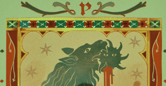
it's pretty simple compared to my later stuff but i still really like the effect
in terms of colours, you need to keep them unified so that they all appear to be acting under the same external light source, like if someone is holding up a torch to a painting then the painting colours will be glazed with firelight even if there's no painted fire. a really easy way to do this is to slap a multiply layer over everything in one shade - grey-yellow for a weathered paper look, or greenish blue for sunbleached photos. this unifies all the colours of the drawing. or you can apply a gradient map at a low opacity so that there's only a subtle change. or just do it by hand - if you want everything to be slightly tinted yellow, just pick the colours you normally would, but move the colour wheel towards yellow to get a yellowfied version of the base colour. easy
it's really important to consider how fading and weathering can affect printed colour. white paper yellows, black fades. you will rarely see pure black or pure white. which means you can use pure black or pure white to add external effects like the white scuff marks on the hierophant card. if the whole drawing is yellowed from age but there's some white somewhere, it's an easy shorthand to show that the scuff mark or whatever was not originally part of the drawing (great way to add some nasty stains lol)
#info asks#i don't have like a specific set of steps i follow i kind of freestyle it every time#obviously i have favourites i like to use but like that sphinx drawing? don't ask me how i did it because i don't remember#i just played with it until it looked nice. the blue dots are ... some sort of effect layer i don't remember which
637 notes
·
View notes
Note
hi nik! i was wondering if you have different coloring settings for anime like jujitsu kaisen? i was wondering if you could do a tutorial for it?
hi!!! sorry this is 10 days late 😭 my coloring for anime is only two steps different from my normal coloring process, but what's very different are my sharpening settings! this won't be a lengthy tutorial since I ended up just making a downloadable action pack, but I'll still explain a few things below the cut. also, these actions work well for for any anime, including ghibli, or classic disney animated film with black outlines
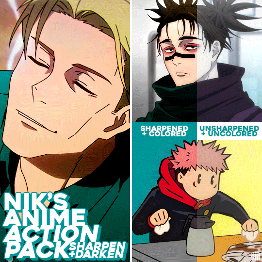
Get the free action pack via Ko-Fi!

ADDITIONAL RESOURCES:
– My basic gif-making tutorial
– My color manipulation tutorial via usergif
– Anime gif sharpening tutorial by aq2003
– How to load and use actions
I should preface that I always gif footage that's 1080p or 4K. For JJK, it's always 1080p!
MY SHARPENING SETTINGS:
Firstly, shoutout to the tutorial above by aq2003 where I learned the minimum and surface blur filter trick! My sharpening actions use some of these tips mixed with my usual sharpening (with some slight modifications)! Here are my settings (click for higher quality):
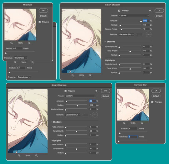
Also, I will very rarely increase the first sharpening radius to 0.4. I've only had to do that, like, twice when giffing anime.
Here's how I used these actions in the Nanami gif:
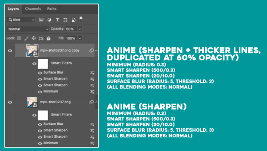
I typically only use Anime (Sharpen) since my usual anime gifs are small 268px wide gifs. But occasionally, depending on the scene and gif size, I'll duplicate the gif and use Sharpen + Thicker Lines set at an opacity between 40-60% if I want the black outlines to look smoother. I only use Sharpen + Thicker Lines at 100% opacity for chibi scenes (like the Yuji gif in the preview gif above) where the outlines are already very thick.
The differences between my actions and the tutorial I linked by aq2003 are my sharpening settings and that all of my filters' blending modes are Normal (whereas they used Darken on their sharpening filter).
MY COLORING AND DARKEN ACTION:
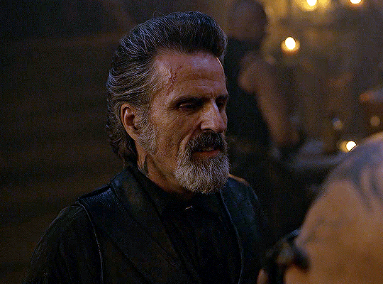
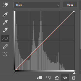
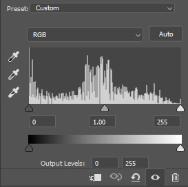
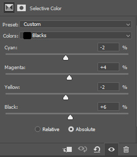
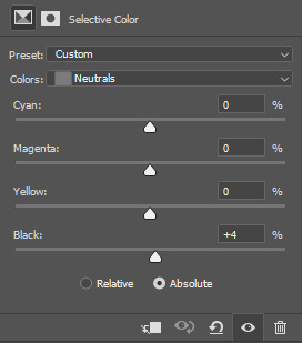
I'm not going to go too deep into coloring since my basic gif-making tutorial covers my usual steps, as does my color manipulation tutorial. My goals for anime gifs are to accurately represent character skin tones (especially taking care to NOT whitewash or color-wash, especially pink-wash, their skin tones since many anime characters are characters of color) and to feature vibrant backgrounds/accent colors.
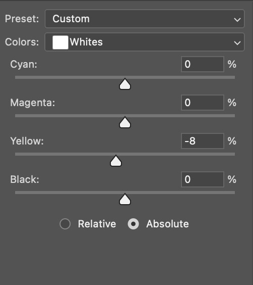
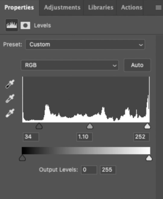
Two of the first adjustment layers I do for almost every anime gif are Levels (to darken) and Selective Color (to lower the white levels). I only do this for very bright anime scenes, which are many of the scenes I've giffed in my experience. Please note that my darken action won't suit every scene without tinkering with them yourself, and it definitely shouldn't be used on already dark scenes. You'll either need to lower the opacity of the layers or play with the sliders yourself.
For example, the Nanami gif was VERY bright (almost over exposed) and uses my darken action as is:

The Choso gif is also very bright AND washed-out; it needed both darkening and color correcting:

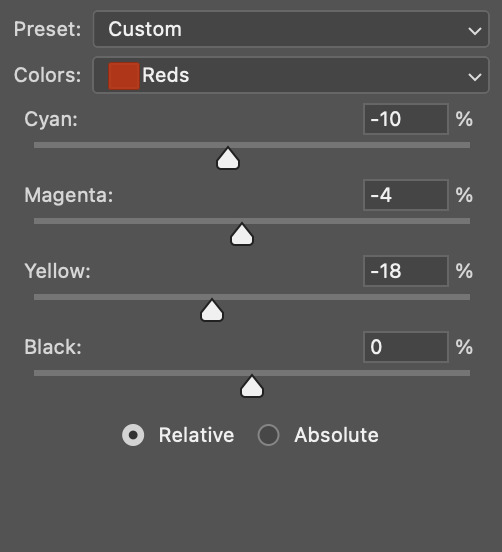
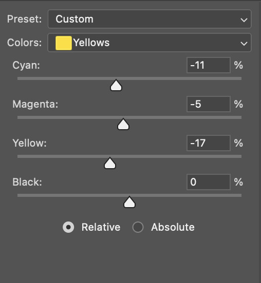
Notice the color sliders are also adjusted in Selective Color, Whites. This was to bring color back to Choso's skin which had been washed out due to the fluorescent lights in the Shibuya train station.
Here are some additional color-correcting adjustments I made before continuing on with my usual coloring process:
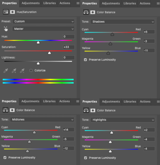
(Note that there were several more adjustment layers after these before I landed on my final Choso gif in the preview.)
The Yuji gif is already at a good level and didn't need darkening, and I actually even brightened it a bit and increased the blacks:
That's as much as I'll explain about the basics of my anime colorings! Everything after these darkening steps follows my usual routine as laid out in my basic gif-making tutorial, even for dark scenes.
That's it, hope this helps! :)
#animeedit#completeresources#useryoshi#userelio#uservivaldi#userisaiah#usertiny#usershreyu#usercats#usertj#userbuckleys#userdean#userbarrow#userraffa#userfnuggi#userkraina#tusercat#ask#nik.help#resource*
101 notes
·
View notes
Text
alright, the other day i loosely implied that i would make a behind the scenes/tutorial type of thing. momma didn't raise no liar, so here goes nothing i guess!
step 1) rough sketch
honestly i skip this entirely if have a really concrete idea of what i want to do. sometimes compositions are just beamed into my brain from On High and a sketch is unnecessary.
step 2) 3d ref

this is where i refine the composition, lighting, camera angles, props, etc. i use DAZ studio for model posing and blender for almost everything else (props, horns, lighting, rendering).
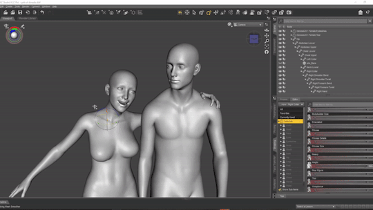
here's a 10 minute video on how to pose models in DAZ if you're interested in doing something like this! it's not very hard! basic posing requires almost no technical know-how.
i've heard magicposer and virt-a-mate are also good for model posing, but i don't have any experience with either program.

after i'm done posing, i transfer the models to blender so i can work on props, environment, and lighting because doing it in DAZ is ass. you can see that i went overboard on the ref for the paladin i worked on last year by modelling armor.
step 3) lineart

at this stage i'm synthesizing my 3d models, reference images, and style choices into lines.
the 3d likeness of my models is poor because I don't have time for that shit, so this is where my humongous folder full of bg3 screenshots comes into play.
for example: looking at my screenshots, astarion's forehead tilts back towards the back of his skull, much more so than my reference model. his chin and jaw are sharper and longer, and the transition between his brow ridge and nose is almost a straight line. if i combine the information from my 3d model and astarion's face, i get something like this:

3d models aren't fleshy (ie, tummy rolls, wrinkles, muscle deformations, butt squish) unless one puts in A LOT of effort like absolute madman chris jones.
you guys know bernini, right? he has a couple great examples of this. see how hades' hands press in on persephone's leg?
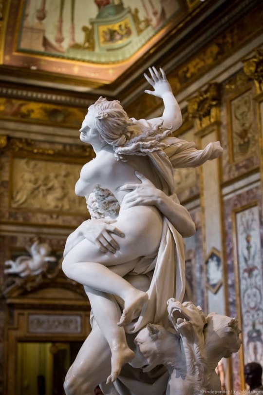

this is what we want to add in the lineart because it's too much effort for 3d. laziness is king.
i guess i draw clothes at this stage too, but for some reason there aren't many in this image. ( ͡° ͜ʖ ͡°)
step 4) base color
i have a little color picked palette that i use for everybody so i get their skintones right before i start messing with colored lighting. i'll use overlay and hard/soft light layers clipped to the base layer during the shading step later.
step 5) shading
if you thought we were done with the 3d part, guess again! i posterize my 3d reference so i can see the shapes of the shadows and highlights better. if i'm not feeling it, i can go back to 3d and change the lighting really easily.
could I make a cel shader for this? yes. am I going to? No. custom shaders are for people with intelligence and I am fresh out. posterization it is.

from there, i do a pretty standard cel shading deal that i usually blur and set to low opacity. (for this image i stuck to no blur because i had been looking at a lot of morebird's art and was really feeling the hard edges)
photoshop is what i use for final rendering because it has bangin tools. the brush customization alone make ps worth it, but i also particularly abuse puppet warp, noise generation, the camera raw filter, and layer styles.

step 6) background
i put the least effort possible into a background and then i blur it into oblivion so you can't fathom the depths of my ineptitude.
and then i have a finished image! ᕕ( ᐛ )ᕗ
#art tutorial#this got long!! the rest is under the cut#i encourage everyone to try out DAZ and blender! theyre both free!!#i love goofing around in 3d
71 notes
·
View notes
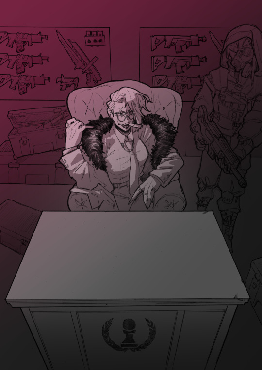
Text
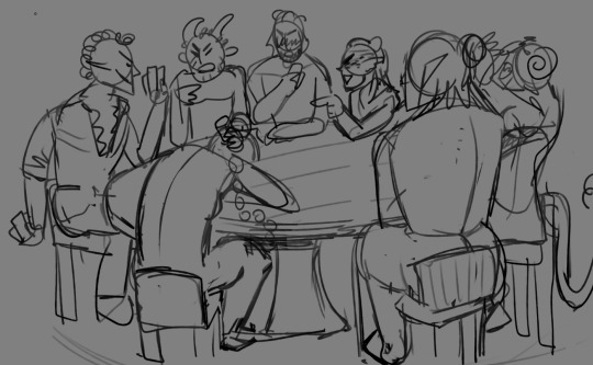
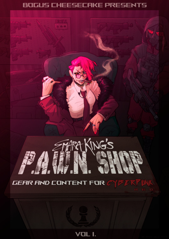
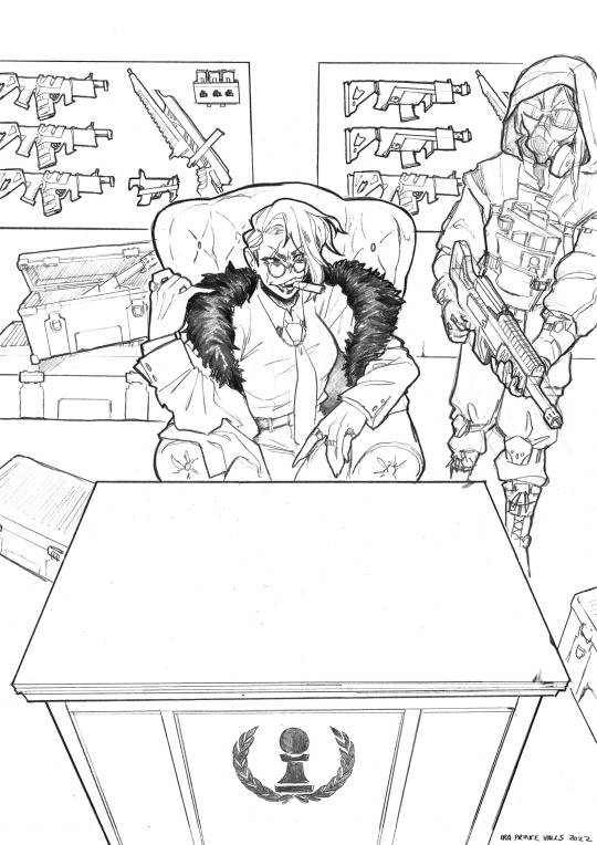
TIME FOR A PROCESS POST let's talk abt getting from this (client sketch - which, btw, i know other artists have talked about this plenty, but i LOOOOOOVE a client sketch as early direction on a commission. LOVE it)
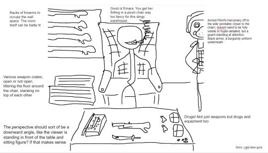
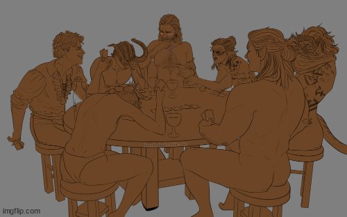
to this!
at first we didn't know if the title was going to go across the desk, or over the central figure (emara's) head against the back wall. so there was a 1st version where we were favoring a higher title, then we started favoring the desk so we scrapped the clutter + centered it more

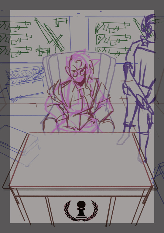
i used clip studio's 3D models (particularly for the chair, guard, + weapon crates) and perspective rulers to help with laying everything out at this stage, tho i abandoned the 3D pretty early on bc it's a bit too clunky for me. maybe i'll find it quicker to use w more practice!
(the rest under the cut!)
once the basic layout was approved, i threw together a value study to explain how in the final image all the clutter of the bg detail would be unified and pushed back. lately i find myself thinking abt value earlier + earlier in the process; planning ahead saves me a lot of time!
i fiddled with starting to refine things digitally, but then i got A BRAND NEW LIGHTBOX delivered in the mail with perfect timing (lmao) so i just ended up printing off the digital sketch, finalizing in pencil, + scanning back in

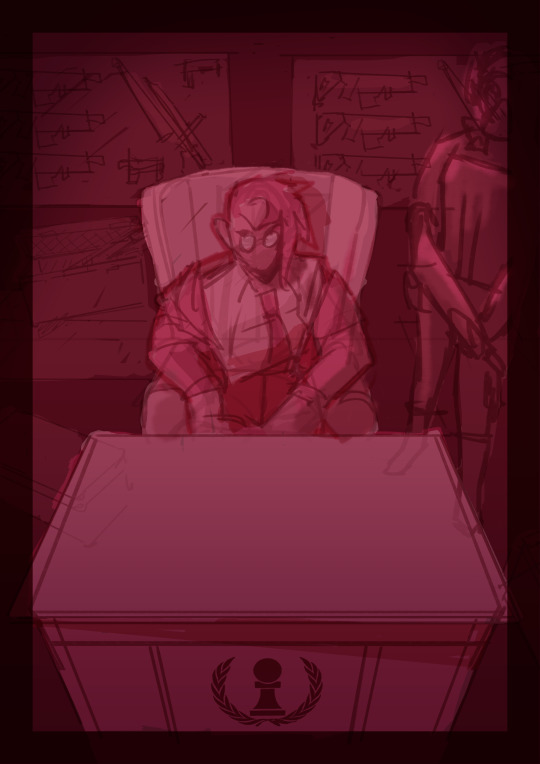
then comes five billion different steps of locking in values, again. i did everything greyscale first, but i didn't worry abt getting things super polished at this stage bc i knew color would factor in a lot to later decisions
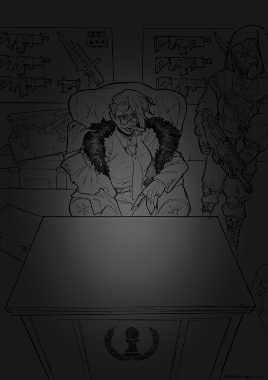

this is the point at which presenting these wips "step by step" is kind of misleading; i didn't do these stages one at a time, but rather had a BUNCH of different lighting/shading layers that i kept toggling on and off as i worked to make sure everything was coming along well.
(to get some of these caps i actually went into the main file again and turned a bunch of stuff on/off just for the sake of getting specific examples, because actually when i was actively working on it there was rarely a point where i was actually working on something with "all lighting turned off and just the shading on," or anything like that; but i AM interested in showing what effects different lighting/shading changes had on the base colors, even if i wasn't really making these changes in a rigid order.)
i.e., just for the sake of interest, here's how the flat colors look without those adjustments!! but i honestly never looked at it like this on its own for long...i had all the shading/lighting turned off so i could see what i was doing while flatting, but i was constantly checking back and forth.
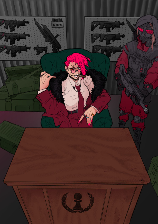
then tones added on top (which were actually just two copies of the tone folders in the above posts, set to linear burn and overlay) -
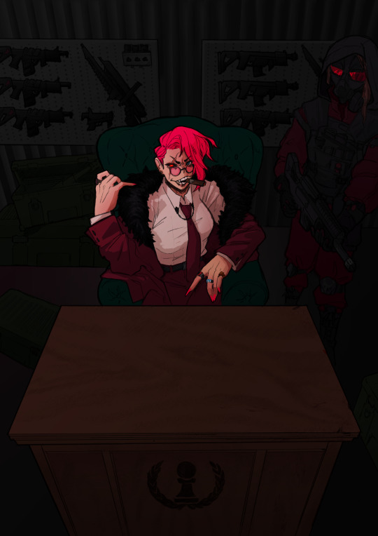
which makes it get HORRIFYINGLY dark, but that's when we go in and add a bunch of lighting adjustments.

the most obvious lighting change above is the big burst of hot pink light from the corner, but there was also some masked overlay + burn layers to pop out the guard + emara and make sure they were pulled out from the bg. if this were a standalone illustration, i maybe would have let the bg (and all that painstakingly drawn detail..........) stand out a little more, but a cover functions differently, and i wanted to make sure the eye goes to the title first. that means sacrificing bg detail even if it looks sick lol
then final touches! a lot of my very last touches are things that are close to invisible; gradient maps on very low opacity, noise, a little bit of scribbling on upper layers. the typesetting was all by the client, except for the lettering for "emara king's," which i did myself!
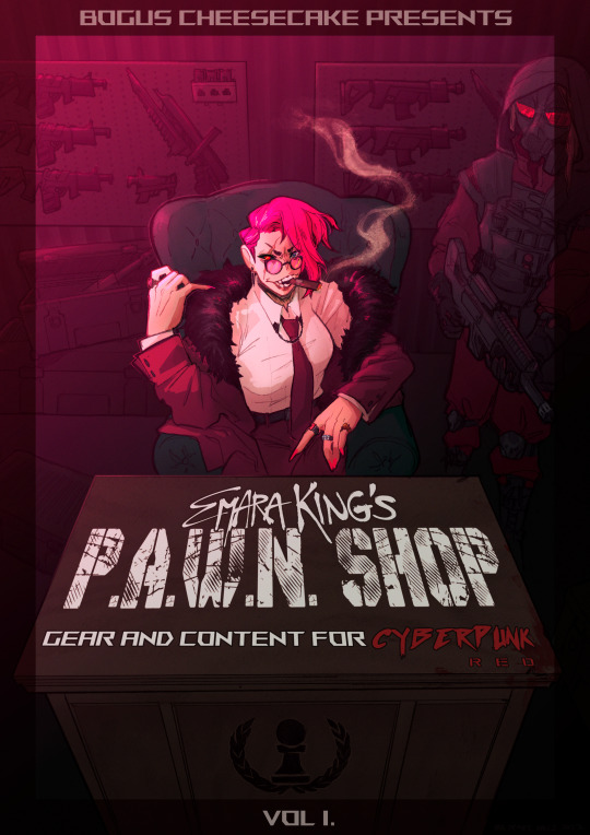
finally, here's a comparison of ⬅where i left off one night close to the deadline thinking "it's probably done, but i'll sleep on it just in case," then all the adjustments i made the next day with fresh eyes.➡ and that's it!!! phew!!! that's how i make a cover!
#my art#process#wip#tutorials#<- not really but. i just figure someone browsing my tutorials tag might be into this#i am so so so so so fucking mad that i didnt think to turn timelapse recording on for this#bc a timelapse wouldve been so fucking sick. but i can at least share this
596 notes
·
View notes
Note
Hiya! Hope this message finds u well :3 I absolutely love your art; found you from insta! Quick question also; I’m not sure if you’ve answered this before, but which brushes do you use for ur digital art? I love the textures they’re so crunchy (endearing)!! Have a lovely day!! :D
hello!! here's a little brush tour ft. this half rendered martin.
also, a great app for ipad artists who really want to dig into texture is art set 4. i swear by it and i've been using it for about two years. none of my more recent art uses it, but that's just because i'm experimenting with my process rn
so here's a list of my most used brushes lately, and there will be links to all of them at the bottom of this post.
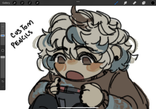
the two labeled "custom pencil" are both my own personal modified pencils (both sourced from the 6b pencil) but the narinder pencil and the vanilla 6b pencil are both very similar to them. i use these two for sketching and flat color specifically, and if you do specifically want these two brushes then i'd be happy to upload them somewhere for you to download, but they're not really necessary for texture
i also use G&B halftone brushes sometimes! but i greatly prefer the RSCO sample pack, and i cannot find the link to the G&B brushes no matter how hard i google, and pretty much any halftone brush set will do the same job
and here's what they look like in practice!
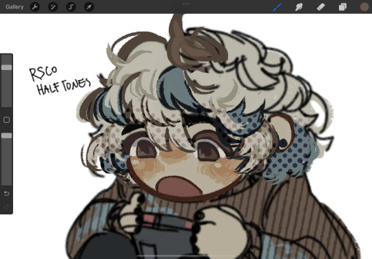
(i like to set these halftones to color burn. color burn is my most used blending mode, even for shading)
and then i hit "copy all," paste, and duplicate it. so you should have two layers of just your entire canvas. then import a paper texture
i'm partial to the set i'll link down below, my favorite is #5. you should absolutely check out the rest of the free texture packs on their website if you're wanting to diversify your texture process btw, all of their stuff is fantastic.
to use that texture, your layers should look like this!
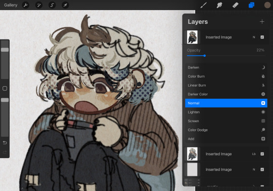
on the layer set to the linear burn, i also like to go into the adjustments menu and bump up the brightness until all of the colors are at similar values to what they were before. and the normal layer on top is just to control the intensity/opacity of the paper texture!
after all of that, sometimes i'll go in with brushes like MM rake follow, or more from COFE's weird pencils, on top of all of those layers for finishing touches.
definitely play around with it, try new free brushes all of the time (i heavily recommended subscribing to Manero. they have a lot of free stuff and it's all fantastic) and see what works for you <3
here are the links to the brushes in this post, as well as some extras! some of them are paid and some of them are completely free. + it wasn't mentioned here, but i use the tatyworks linen fabric brush for blending! for any of the paid brushes, i'll try to link some free alternatives
paid brushes:
alternatives to paid brushes:
free brushes:
extra goodies:
#procreate art#procreate brushes#art tutorial#artists on tumblr#digital art#digital artist#art recommendations#art resources
41 notes
·
View notes
Note
Can you please do a blending/overlay tutorial!?!?!
ohhh i can definitely give you some tips on how i do it!
so, assuming you know how to make gifs and use the timeline/smart object gifs, this is how i usually go about it. I use photoshop cs5, for reference.
i'll use this recent gif from my don’t blame me gifset as an example:

1. Choosing what to blend
It's much easier to blend 2 gifs together when at least one of them has dark areas. Two bright gifs don't usually work as well, but it's still doable with some work. For example these 2 moments are both mostly dark, so it makes things easier:

2. Bringing 2 gifs together
To put 2 gifs on the same canvas, what I usually do is:
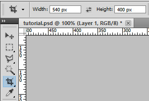
In one of the gifs, I select the size I want with the crop tool (540px by 400px in this case). You then drag the resize box how you want it on your gif. This will resize and crop your gif.
Then I go to the other gif and do the same thing. With that resized and cropped layer, I right lick on it, go Duplicate layer... and then choose to send it on my other gif's document. When both gifs are on top of each other you can start moving them around and blending them.
3. Blending options
Photoshop has multiple blending options that will give you many different results. What works best for blending gifs is usually the option Screen. This is what I get when I put these 2 gifs on top of each other, with the top group with the left gif set to Screen. Make sure the Screen layer is always on top.
I like to put the gifs in groups, it makes things easier (and tidier) further down the road, but it will work anyway with the smart object gif layers. For this particular gif, groups were not 100% necessary, but for more complicated gifs with different colorings, it's definitely a must in my book.

4. Layer masks
As you can see, this works, but there are definitely parts I would like if they didn't overlap, especially on the right ride. You can easily remove unwanted parts by painting them out with a Layer mask. In this particular case I want to remove the right side of the left gif, so I selected that group and made a layer mask by clicking on the icon at the bottom of the layers window. You'll get a white window next to your layer name. Select it. You then want to use a very soft brush and paint in black what you want to remove.
These layer masks act as "alphas" to drive the opacity of the layer. What is white will be at 100% opacity, and what is black will be at 0% opacity. You can definitely brush in some gray if you want an in-between look. Here I went full black.

This is the result I get after masking out the unwanted right part. Now I only have that one gif showing on the right side, instead of a blend of the two:

5. Painted layer
So you can see other characters still showing through on the left side of the gif. You can definitely go and paint the parts you want to remove on the right group as well, but if your layer masks overlap, it can create some transparency in your gif and we don't want that. Instead, I create a new empty layer by clicking on the icon, and put it in between the two groups. This layer doesn't need a different blending mode. With a soft brush and the black color, I go paint where I want to mask the right gif, so it doesn't show on the left side.
I played with that layer opacity because I liked to still see some of the right gif's details peeking through. Here's the result:
6. Final touches
At this point I will usually sharpen both gif layers and make the coloring, and then I will adjust the layer masks if I feel like I need to. In this case I thought it was fine as it was so I didn't change anything.
For this one I simply put the coloring on top of both gifs because it worked fine for this example, but you can also have a different coloring for each gif if you want. Just make sure you put the two different colorings in their respective gif groups. Remember that the top folder should always be set to Screen for the blending to work, even with coloring layers/groups inside that "main" gif group.
And that's pretty much it! This one was quite simple, but it's incredible what a screen layer and some layer masks can do :) I hope it helps!
Also, @usergif has an amazing tutorials directory for more resources if you need! I always find great tutorials there.
#*ps help#resource#usergif#blending tutorial#userrin#tutorial#uservivaldi#userkosmos#usermills#usermarsy#userdean#userelio#usermadita#flashing gif#alie replies#anonymous#tusereste#userives#tuservaleria#usermorgan
664 notes
·
View notes
Note
i don't know if this has been asked before but how do you do the paper effect on your art?? it looks so cool and the way you ad texture to your whole art plus the almost pencil texture if that makes sensse?? just what makes ur art style u!!
Alright, this is gonna be a bit of a tutorial and I've never done one of those, so forgive me if something's amiss
First off, check this other ask here to see what my usual brushes are, including the ones used here!
Now, I'm not sure if you were referring to this, but I do put some sort of print-like effect in my art sometimes (often in the more complex pieces). For that, it's quite simple, really.

Well, here's our finished piece, with some chromatic aberration added for good measure

What we do now is add a noise layer and set the layer mode to Overlay (ignore the fact that my Clip Studio Paint's language is set to Spanish, it's the same thing.)
After that, we set the opacity to somewhere over 10 to 30 percent (or, really, whatever you want. I usually do 20.)
Then we add another layer and paint it all with a halftone brush in black and, as well, set it to overlay.

Now all that's left to do is to set the opacity (I usually do betweem 30 and 50 percent) and It Is Done!!! Our Wonderful Piece!!!

Other Paper textures I use while drawing for backgrounds and such are:
This leaf of Paper my beloved
These watercolour textures
These paper textures
If you have any other questions, don't be afraid to ask!
130 notes
·
View notes
Text
I got quite a few DMs over the weekend on twitter asking about my brushes, and as with anything, your mileage may vary, and digital art isn’t made or broken by brushes, but having them never hurt! Talking about how you use your tools is just as important as talking about what tools you use, so consider this a small breakdown of my process for digital sketching.
First thing’s first, I avoid sketching on an untextured canvas. If you like to have a flat, solid canvas, I recommend working at 50% grey, or adjusting your canvas to be slightly off-white. The harshness of black on pure-white can be a hang-up for many people, including myself.
I sketch on paper textures sourced from my own old sketchbooks and papers. The one I use most frequently is available in my Sketchbook Paper Pack, and named Off White.
While a true-to-life pencil look is not what I’m actively going for with my sketches, these papers certainly help achieve it.
I do almost all of my work in Procreate, but learned digital art first in Photoshop. Anything I share here in regards to how I use brushes can be applied to any brush, I’m certain!
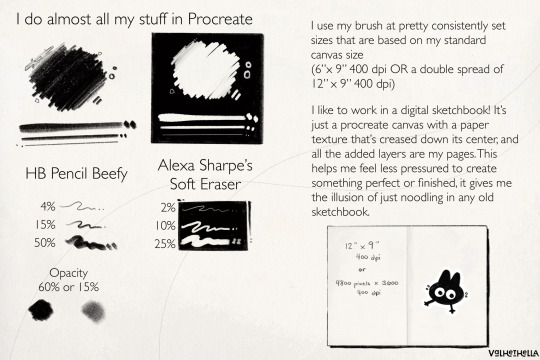
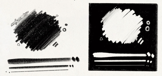
For my sketches, you’re seeing the work of one brush and one eraser.
For my brush, I use an altered version of Procreate’s native HB Pencil brush that I’ve named HB Pencil Beefy. It’s available in my 2021 Brush Pack.
For my eraser, I use Alexa Sharpe’s Soft Eraser. It’s available in their Eraser Brush Pack.
I use my brush at pretty consistently set sizes that are based on my standard canvas size, which is 6″ x 9″ 400 dpi or I use a double spread of 12″ x 9″ 400 dpi.
(If you work in pixels that’s 2400x3600 at 400 dpi and 4800x3600 at 400 dpi)
HB Pencil Beefy I use at 4%, 15%, and 50% size, with the brush’s opacity set to either 60% or 15%.
I set the brush to 15% opacity when I want to go in very softly with lots of that pencil texture. I use this when I need to scale back and really rough something out, or if I’m trying to get a sense of volume with some shadows or contours.
With Alexa Sharpe’s Soft Eraser, I use the eraser set at 2%, 10%, and 25% size. I only scale back the opacity on the eraser if I want to take something back to nearly gone, but still want those lines, faint, there as a guideline.
Jumping back to my file setup really quick, I like to work in a digital sketchbook! It’s just a procreate canvas with a paper texture that’s creased down its center, and all the added layers are my pages. This helps me feel less pressured to create something perfect or finished; It gives me the illusion of just noodling in any old sketchbook.
Okay. Back to the pencil. Below, I have a small idea of my process in sketching and drawing. This is not a how-to-draw demo, and it’s definitely not an anatomy demo – it’s just how I approach drawing using this brush. The page below, and the one above, were both done on a 9″x 6″ canvas at 400 dpi.
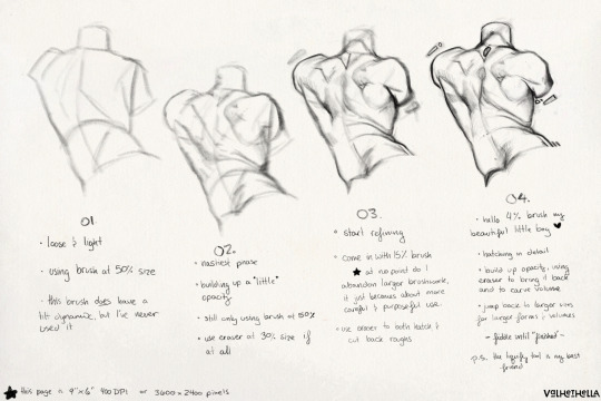
01.
Loose and light
using brush at 50% size
this brush does have a tilt dynamic, but I’ve never used it
02.
Nastiest phase
building up a little opacity
still only using brush at 50% size
use eraser at 25% size, if at all
03.
start refining
come in with 15% sized brush
at no point do I abandon larger brushwork, it just becomes about more careful and purposeful use
use eraser to hatch and cut back roughs
04.
hello 4% brush my beautiful little boy ♡
hatching in detail
build up opacity, using eraser to bring it back and to carve volume
jump back to larger sizes for larger forms and volumes
fiddle until “finished”
P.S. the liquify tool is my best friend
149 notes
·
View notes
Note
I look at your art and i cannot even comprehend how you do it. Do you use procreate? what brushes do you use? I’m deeply in love with your work
Hi anon
Thank you so much for your message and for taking the time to contact me. 💗 Sorry about the late reply, I was quite busy in the past two weeks. 😳
Ok! So, to answer your question, I very rarely use Procreate. I used it a bit when I installed it on my iPad one-two years ago: it was exciting and new but I must admit that now, I work mainly on Photoshop. Don't get me wrong, Procreate is an amazing app, you can create tons of effects but I'm much more confortable with Photoshop. However, this artwork and this one were created using mainly Procreate.
More recently (= about 10 days ago 🤓), I bought an app called Rebelle 6 that emulates oil painting and watercolors. I used it on this Sherlock portrait but also on this one on Twitter. If you see this kind of textures in my art from now on, it's thanks to this app.
These were the exceptions, though. As far as the rest is concerned, I use Photoshop CS6 with an Xp-pen tablet. I tried all kind of brushes but the ones I always come back to give my artworks an "old painting" effect are the Mar-ka brushes and the Deharme brushes. (look at this artist's DA page, you have several sets of brushes available). However, sometimes, I change the settings: I add more texture, change the spacing, the brush dynamic, etc…(everything can be found in the PS brush settings). You have to see what works best for you.
On some artworks, I also add a paper texture a bit like the one below, at a low opacity (layer: soft light). Make sure it's a bit grainy and don't hesitate to adjust it using the "brightness/contrast" or "levels" tools.
However, the opacity and the paper vary according to the artwork. What can work for one artwork is not going to work for another one because of the lighting, the exposure, the effects you want to give. You'll have to try different textures and opacities to reach the effect you want.
The rest is…my style. 🤓 I did a post HERE about how I draw realistic portraits and HERE about a step by step (it was several years ago though so I don't talk about textures, just how I block colors and how I draw realistically).
I hope I managed to answer your question. Thank you for enjoying my work so much and see you at the end of the week with a Stede Bonnet portrait (and then, I'll go on a break to rest a bit ^^)
76 notes
·
View notes
Last Seen Blogs
infernalbellhop
a world of entertainment

otoel192
One to One Engravers
shizgig
Untitled
salad-006
Sal D. Barr