#typography tutorial
Text
gif tutorial
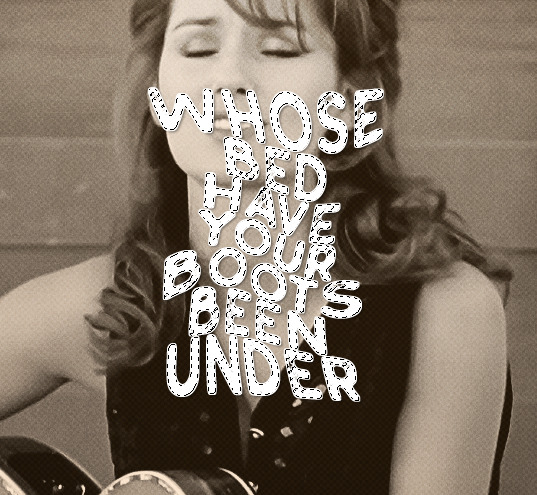
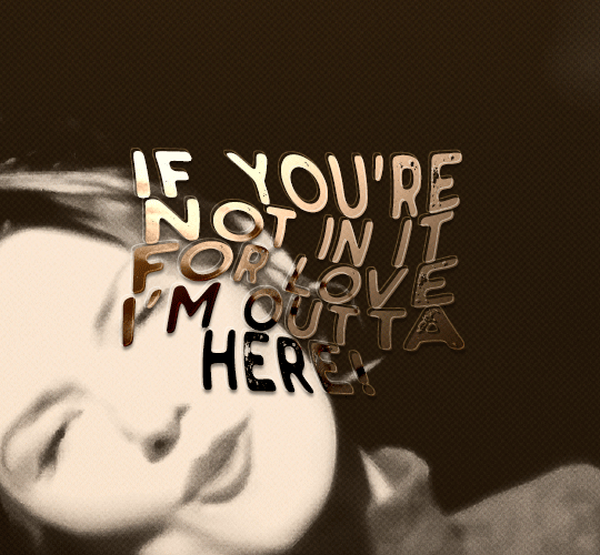
i was asked to make a tutorial for this set i made, so let's get right into it!
first things first, i downloaded the music videos from youtube in 1080p using 4k video downloader. unfortunately, the quality of youtube videos always seems... not great, to put it simply. plus these music videos are from the 90s, so they've been upscaled to 1080p after the fact. all of this works against us, but i've definitely worked with videos of lesser quality than these, so at least there's that!
when i gif, i import video frames to layers rather than screencapping. this comes down to personal preference. after everything has loaded, i group all my layers together and set the frame delay to 0.05. i then cropped my gif to 540x500.
the next step in my process is sharpening. i did play around with my settings a bit given the quality of the footage and the dimensions of the gif. i compared both @hellboys low-quality video gif tutorial to my regular sharpening action and my vivid sharpening action and in this case, i preferred my normal vivid sharpening action. i used this tutorial to create the action for myself, and you can find other sharpening tutorials here. this action converts my frames to video timeline and applies sharpening.
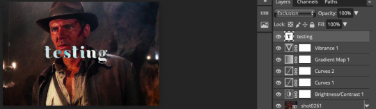
once my gif is sharpened and i'm in timeline, i begin coloring. i wanted to simplify the amount of colors used in these gifs, again because of the video quality -- i knew it wasn't going to have the crispness i would normally like for my gifs. here are my coloring adjustment layers and their settings (not pictured: my first layer is a brightness/contrast layer set to screen) (explanation in alt text):

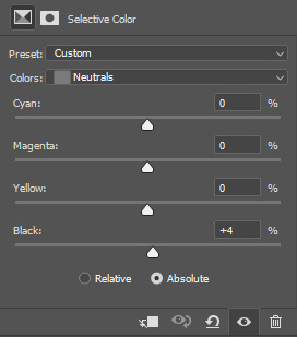
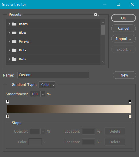
all of these layers and their settings will vary depending on your footage and its coloring (and obviously, feel free to make the gradient map whatever colors you like if you aren't going for this exact look).
pretty basic coloring, especially with just slapping a gradient map on top (my beloved), but at this point, i still didn't like the quality of the gif, so i added a couple textures/overlays.
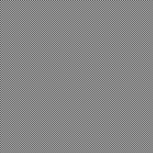
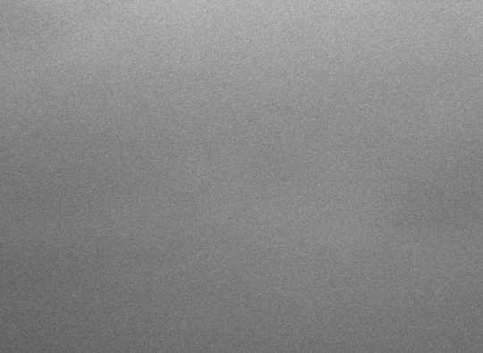
i put the left one down first and set the blending mode to soft light and the opacity to 8%. depending on what look you're going for, you could increase or decrease the opacity or play around with different blending modes. i like using this texture with lower quality footage because even when it's sized up a bit, it adds some crispness and makes things feel more defined. for the second texture, i set it to overlay and 75% opacity. we love and respect film grain in this house.
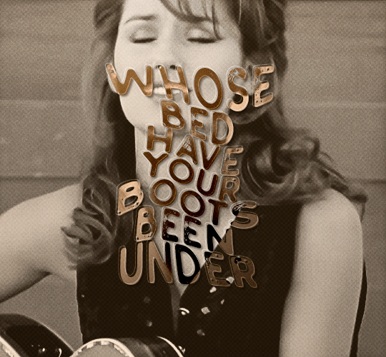
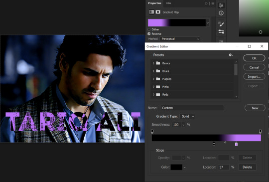
now for the typography! sometimes i really enjoy typography and other times it's the bane of my existence for the sole reason of just how many fonts i have installed. anyway, here are the settings i used for this set:
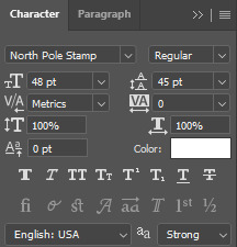
make sure the color of your font is white and then set the blending mode to either difference or exclusion. i can almost never see a difference between the two, but for this set, i used exclusion. below are the blending options (double click on your text layer to bring up this menu or right click and select blending options).
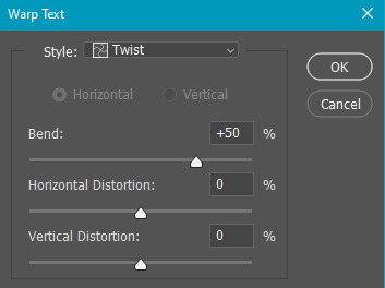
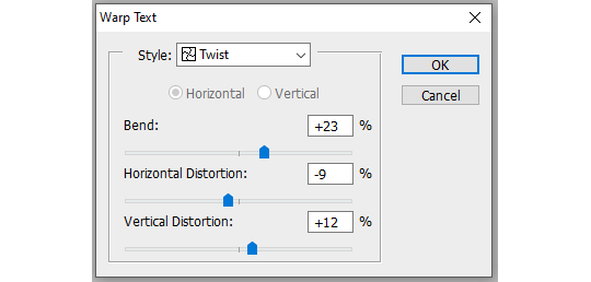
now we have to add the warp effect. with your text tool still selected, click this icon at the top of your screen:

from the dropdown menu, select twist. these were my settings, but feel free to play around with different warp options and their settings. the ones i use most often are flag, fish, and twist.
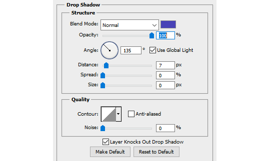
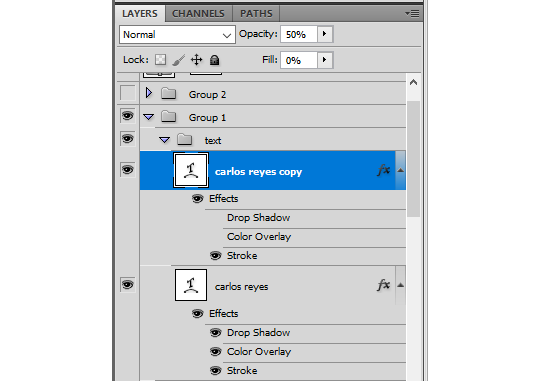
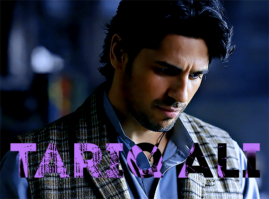
this last step is completely optional, but it's an effect i use in most of my sets with typography. duplicate your text layer (select the layer and ctrl+j), turn off the layer effects (click the eye icon next to effects), and set the blending mode to normal. right click on the layer and select rasterize type. right click on the layer icon itself and choose select pixels.
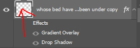
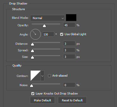
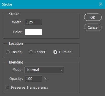
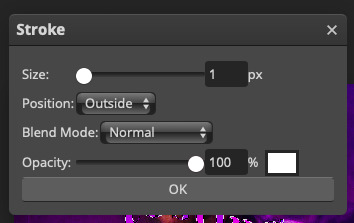
at this point, you should see the moving black and white dotted line showing that only your text is selected. then go to edit > stroke. here are the settings i almost exclusively use.
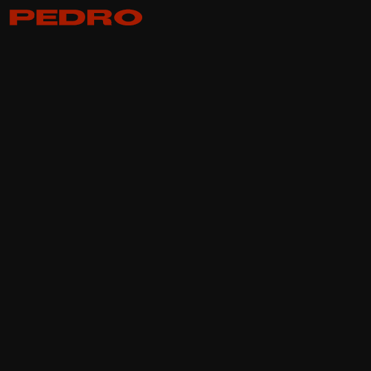
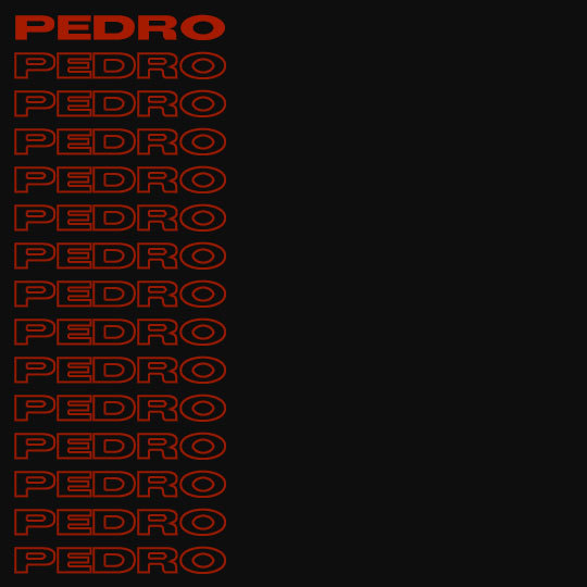
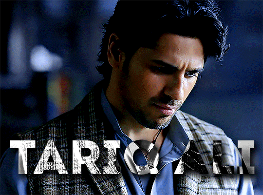
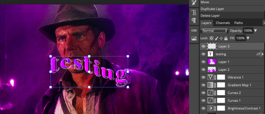
this is what your text should look like now:
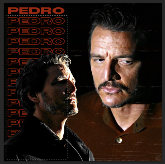
using ctrl+T, move the layer off the canvas so you can't see any of the text anymore. you should be left with only your outline. click anywhere on your canvas to de-select the text we just moved. use ctrl+T again as well as your arrow keys to nudge the outline over to the left 2px and up 2px. this is personal preference as far as the positioning, but i almost never move it any other way. you can leave it like this, which i sometimes do, or you can set the blending mode to soft light like i did for a more subtle effect.
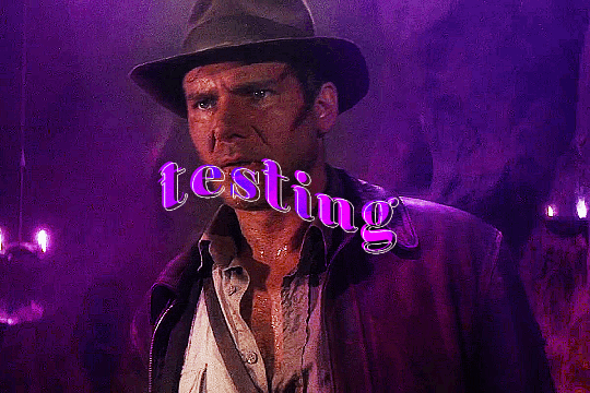
and that's it! rinse and repeat for each gif in your set or use a different warp effect on each gif to switch it up! if you have any questions about this tutorial or would like me to make one for anything else, please feel free to ask any time!
#gif tutorial#my tutorials#gifmakerresource#completeresources#dailyresources#chaoticresources#userdavid#coloring tutorial#typography tutorial#tutorial#photoshop tutorial
170 notes
·
View notes
Text
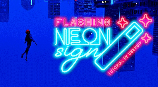
HOW TO: Make Animated Neon Text
Hi! No one asked for this tutorial, but this is one of my favorite typography effects as of late — so I thought I'd share how I do it. You can see this effect in the first gif of this *NSYNC Celebrity set and the last gif of this Anthony Bridgerton set. Disclaimer: This tutorial assumes you have a basic understanding of gif-making in Photoshop. It's also exclusively in Timeline and uses keyframes for the fading effect seen on the blue text.

PHASE 1: PREP YOUR BASE GIF
1.1 – Choose a dark scene.
This effect looks best contrasted against a dark background. You can definitely do it with a bright background, but just like a neon sign irl, you only turn it on in the dark/at night — so keep that in mind!
1.2 – Determine the length of your clip.
Depending on how much you want your text to flash or fade in, you'll want to make sure you have a scene long enough to also allow the text not to flash — reducing the strain it takes to actually read the text. For reference, my gif is 48 frames.
1.3 – Crop, color, etc. as you would.
New to gif-making? Check out my basic tutorial here!
PHASE 2: FORMAT YOUR TEXT
Before we animate anything, get your text and any vectors laid out and formatted exactly as you want them!
2.1 – Finding neon sign fonts.
It's easy as going to dafont.com and typing "neon" into the search bar!
2.2 – Fonts I used.
Neon Glow by weknow | Neon by Fenotype | Neon Bines by Eknoji Studio
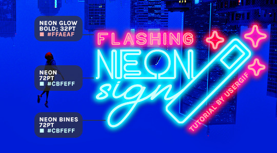
And to not leave my fellow font hoarders hanging, the font for "tutorial by usergif" is Karla (it's a Google font) 🥰
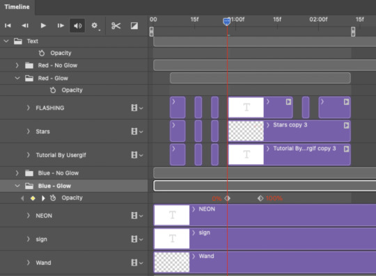
2.3 – Group your text layers. (Conditional)
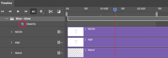
If you plan on having multiple text layers like I did and you want them to appear connected (like how the last letters of "NEON" and "sign" intersect with the wand icon), I suggest putting the layers into groups according to color (the shortcut to group layers is Command+G). If you don't group your text and just apply the outer glow settings to each individual layer, you'll end up with something like this:
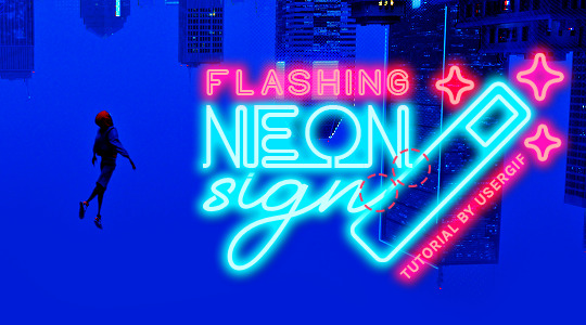
—where you can see the glow overlap with the line, instead of the smooth connection you see in my final example gif. I'm using 2 colors for my text, so I made a group for red and a group for blue.
2.4 – Apply Outer Glow.
Right-click your text layer (or your group if you have several layers) and select "Blending Options" to open the Layer Style menu. Check "Outer Glow" and feel free to play around with the settings until you like the way your text looks!
Your outer glow color should be darker and more vibrant than the color of the text itself. The text should be within the same color family but much brighter and, sometimes, almost white (see Step 2.2 again for my text colors).
Here are the settings for the Red Glow (the glow color is #FF3966) and Blue Glow (#00F0FF):
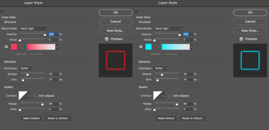
These aren't always my exact settings but they're pretty close to my standard. I always set the blend mode to Hard Light and usually have the opacity at 100%.
For every gif I use this effect on, I like to play around with Spread and Size. Spread will make the glow look denser and "expand the boundaries" (source: Adobe) and Size will diffuse the glow and blow it out so it covers a larger area (Adobe says it "Specifies the radius and size of blur").
2.5 – Duplicate your text layer/groups and remove glow.
We're only going to be animating the glow on our text, and since doing this affects its opacity/visibility, we want to preserve the base text by creating a duplicate.
I just hit the Command+J shortcut to duplicate my groups and delete the Outer Glow effects, making sure that the "No Glow" version is above the "Glow" version:
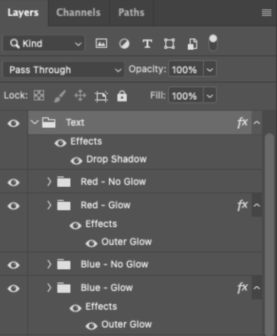
I also put all these groups into one group called "Text" for organization and so I could apply a drop shadow to all the elements for better visibility.
PHASE 3: CREATE THE FLASHING EFFECT
This is for the effect you see on the RED text in my gif!
3.1 – The 0.03-Second Rule
If you've read any of my animation tutorials before, you're probably already familiar with this rule. In my experience (and for reasons I can't explain), Video Timeline pauses every 0.03 seconds (try clicking the forward button a few times, you'll probably find a "duplicate" or paused frame). So, keep all your layers a duration of 0.03-second increments (e.g. 0.06 or 0.09 seconds can also work) and align them on the Timeline at 0.03-second intervals. If you don't follow this rule, you'll get duplicate frames when you export, resulting in a choppy final gif.
3.2 – Trim and arrange your text layers.
Only on the layers/groups WITH the Outer Glow effect, trim them into several segments of varying lengths where the glow will be "on" (visible) and leaving spaces where the glow should be "off."
Typically, I'll have a mixture of 0.06 and 0.03-second text. That's when the glow will be visible. Between each "flash" of visibility, I've got a 0.03-second blank space, baby *pen clicks* and I'll write your name:
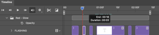
The layers shown above are arranged with a few flashes and two long segments of no flashing. This is the order and duration of each segment shown above (purple = visible segments):
0.06 blank, 0.06 visible, 0.03 blank, 0.03 visible, 0.03 blank, 0.03 visible, 0.03 blank, 0.24 visible (the long bit where "FLASHING" doesn't flash at all), 0.03 blank, 0.03 visible, 0.03 blank, 0.12 visible
(I only did this for the text that says "FLASHING" to give it a glitching effect. The other red text keeps the glow visible starting at the first long segment.)
PHASE 4: CREATE THE FADE-IN EFFECT
This is for the effect you see on the BLUE text in my gif!
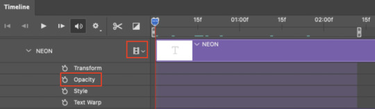
4.1 – Animate using the Opacity Keyframe.
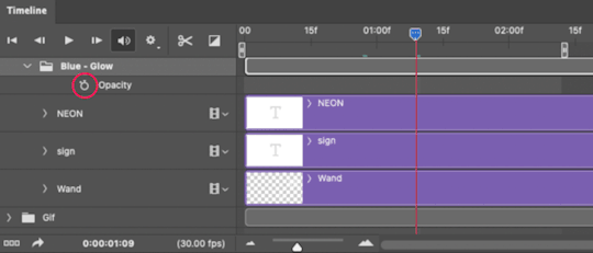
Again, we're only touching the layers/groups WITH the glow effect. If you only have one layer of text, you'll find the Opacity Keyframe by clicking the film reel icon:
If you're working with groups like me, you'll find it in the Timeline panel under the group when it's expanded:
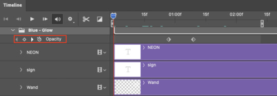
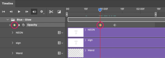
As you can see, I already added my keyframes (lil diamond babies). And luckily, it's super easy to do!
4.2 – Add the ending Keyframe first.
We're starting at the end because our layers/groups are already at 100% opacity. Drag the playhead (the blue arrow attached to the red vertical line) to a spot where you want the glow to be 100% opaque — this is where the glow will be fully "on" or visible. [Again, follow the 0.03-Second Rule. You will get duplicate frames regardless when using keyframes (this will be explained in the note in Phase 5), but abiding to the rule will mitigate the amount of dupes you get.]
Then, click the clock icon by "Opacity" to place a keyframe:
4.3 – Add the starting Keyframe.
Go backward from the ending Keyframe you just placed (I went back 0.12 seconds — but you can play around with the duration of the fade, just keep it a multiple of 0.03):
And drop another keyframe, this time by clicking the diamond icon by "Opacity":
4.4 – Reduce the opacity on the starting Keyframe.
Keeping that keyframe you just placed selected, go to the layers panel and reduce your layer's/group's opacity to 0%:
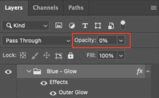
Now, this Outer Glow will slowly fade from 0% to 100% opacity.
And just for a visual aid, here's where my fade-in keyframes are in relation to my flashing segments:
To refresh your mind, the 0% Opacity Keyframe starts when "FLASHING" is visible for 0.24 seconds (the first long segment of visibility).
With these keyframes, you'll get a smooth fade-in à la ✨light switch with a dimmer✨
PHASE 5: EXPORT
Yay, we're finished! Convert from Timeline back to Frames and export your gif!
NOTE: If you only did the flashing effect and followed my 0.03-Second Rule, you shouldn't have any duplicate gifs.
BUT if you included the fade-in effect using keyframes, you WILL have duplicate frames. 'Tis the nature of keyframes. 🤷♀️ I had 4 extra frames where the fade-in starts, which I deleted. So, as always, I recommend checking your frames when you convert from Video Timeline back to Frame Animation — and manually delete any duplicate frames.
Sorry this tutorial is so long 🙈 I over-explain so you're not just mechanically copying steps, but understanding the WHY behind each step! Thanks for bearing with me
If you have specific questions about this tutorial, feel free to send a message to usergif and I'll try my best to help! :)
More USERGIF tutorials • More resources by Nik • USERGIF Resource Directory
#typography#gif tutorial#completeresources#usershreyu#useryoshi#userelio#userzaynab#userives#usertreena#usercim#userrobin#userkosmos#usersalty#userhella#alielook#uservalentina#uservivaldi#*usergif#*tutorial#by nik#flashing gif
736 notes
·
View notes
Text
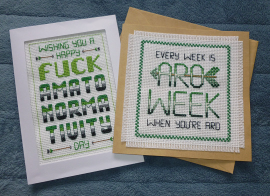
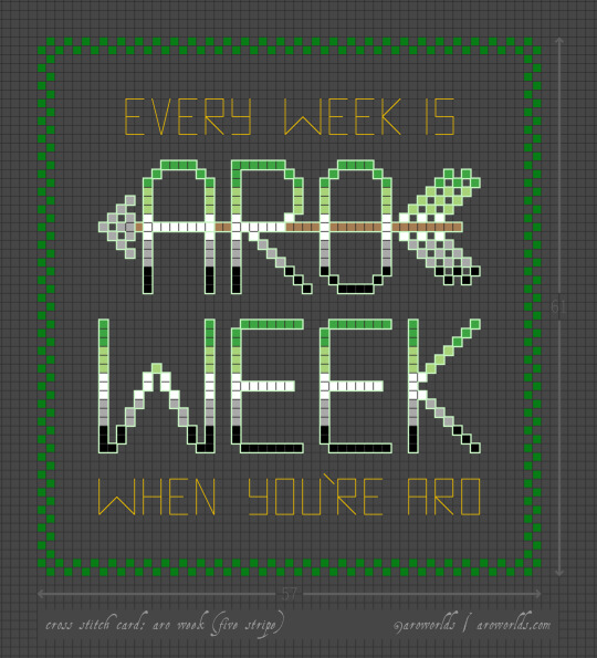

This Aro Week, I've made cross-stitched card designs perfect for gifting to your favourite slightly-snarky aromantic.
The free tutorial includes patterns, card and fabric dimensions and a materials run-down as well as instructions on attaching an aida swatch to cardstock and other border techniques.
#aromantic#aro week#cross stitch#aro feels#aromantic feels#amatonormativity#pride crafts#sewing#embroidery#needlecraft#needlework#green aro pride flag#typographic art#typography#arrows#aro symbols#aro symbolism#link#aro worlds wordpress#tutorial#image description in alt text#text in image#long post
312 notes
·
View notes
Note
Hi! Would it be possible to post a tutorial of how you created the white text in this set /post/695221752725422080/buckpendragon-911-verse-coc-week-day-1 thank you :)
hiii! you mean the text in the first gif, right? it's actually a pale green so i hope that's what you meant 😅
i somehow still have that psd so i was able to go grab the exact settings for the two text layers used here:
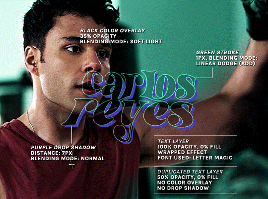
(if you meant the little white text, it's simply the font candara with different values of tracking/letter spacing)
the font i used is called letter magic, and i've given my bare text a bit of warp (right click ont the text layer > warp text > style: twist). by the way, the color of the text doesn't matter, so no need to pick one.
BASE LAYER
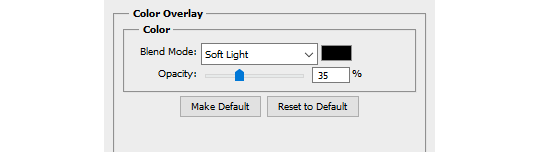
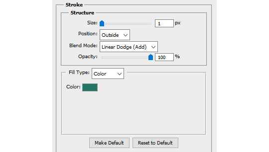
first, put the text layer's opacity to 100%, and the fill to 0%. the text will become transparent, it's what we want. then double click on the layer to get to the layer style options. you'll want to add a drop shadow, a color overlay, and a thin stroke:
DUPLICATED LAYER
i found the stroke a bit too thin on my gif, so i duplicated the base layer (right click on the layer > duplicate layer > destination should be the same canvas), put its opacity to 50% and kept to 0% fill. and disable the drop shadow and color overlay by clicking on the little eyes on the layer:
voilà :)
#alie replies#Anonymous#*ps help#photoshop#tutorial#resource#photoshop tutorial#typography#mialook#tuserzee#userabs#usertj#userchibi#userhella#userkarolina#usertina#quicklings#userraffa#usercats
292 notes
·
View notes
Note
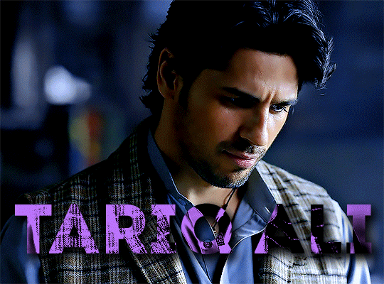
hi can i ask you how you did the typography effect in this edit? it's so cool! post/713510625377189888/happy-birthday-to-the-king-of-tv-pedro-pascal-2
hi! thank you! here's a (hopefully) quick tutorial for this animated text effect under the cut:
(btw I'm using timeline and keyframes, but this could easily be done frame by frame)
STEP 1: Arrange all your text
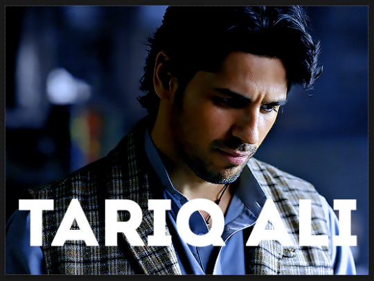
here's another ask I answered on usergif for how to turn any font into its outline which is what I did here!
STEP 2: Put all the outlined text (or whatever text you want to disappear and reappear) in a group by selecting all the layers and using the shortcut Command+G
STEP 3: Put a layer mask on the group and use the rectangular marquee tool to make a box over the text you want to disappear:
use the paint bucket tool to fill that area on the layer mask with black:

the outlined text should be hidden now
p.s. be sure to UNLINK the layer mask so you can move it with the keyframes (click the chain so it disappears):
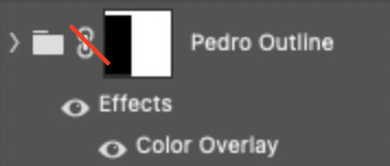
STEP 4: put down 4 keyframes on the "layer mask position" line
(1) text group isn't visible (2) text appears (3) text still visible (4) text disappears:
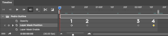
I placed my keyframes with some buffer space at the beginning and end so the animation wouldn't start right away:
if you're wondering, you need the 3rd keyframe so the text doesn't start disappearing at keyframe 2
STEP 5: select keyframe 2 (it'll be yellow) and move the playhead (red vertical line) over that spot. select your layer mask and move it down until your text is revealed


STEP 6: right-click keyframe 2 and select copy. then select keyframe 3, right-click it, and select paste. keyframe 3 should now have the same layer mask position as 2!

STEP 7: double-check that keyframe 4 has the same position as keyframe 1 (if something went wonky, just copy-paste 1's position onto 4)

and that's it! hope this helps :)
151 notes
·
View notes
Text
gradient text tutorial
This tutorial is for @ladynephthyss but y’all can have it too xD
We’ll be adding text so the final gif looks like this:
This tutorial assumes basic knowledge of gif-making, Photoshop, and coloring. I’ve only described the text tutorial in this.
Tutorial under the cut:
Couple things to note beforehand:
There is a lot of trial and error involved when doing any sort of text, and this is no exception! You might have to play around with the colors and the settings before you find something that looks good and readable!
This tutorial is inspired by the difference text effect in these tutorials: one and two by @anya-chalotra (highly recommend checking those out!), just done a different way.
This text effect works better on big gifs (540px width) that have quite a bit of movement below the text so you get that effect.
Find fonts that have bold shapes or some width to them, so you can see the movement.
This is my starting gif, after sharpening and coloring.

First, I position my text where I want it. (this can be moved around later, I just like to get an idea). Remember what I said about fonts? Try to use ones that are thick for this effect so you can see the gradient/movement underneath the letters. I’m using Intro.
It doesn’t matter what color the text is at this stage, I just do white text so I can see it:
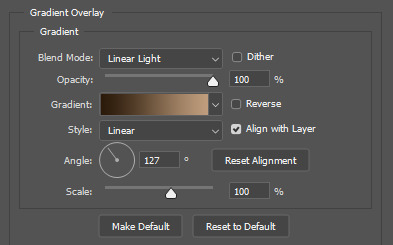
Then, add a gradient map in the color you want your text to be. For this one, I chose black and purple. The more contrast there is in your colors, the better it looks. You’ll be able to change this later though, if you don’t like the way it looks.
This is how it looks with the gradient map:
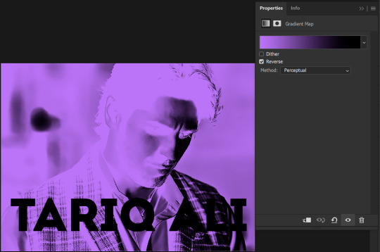
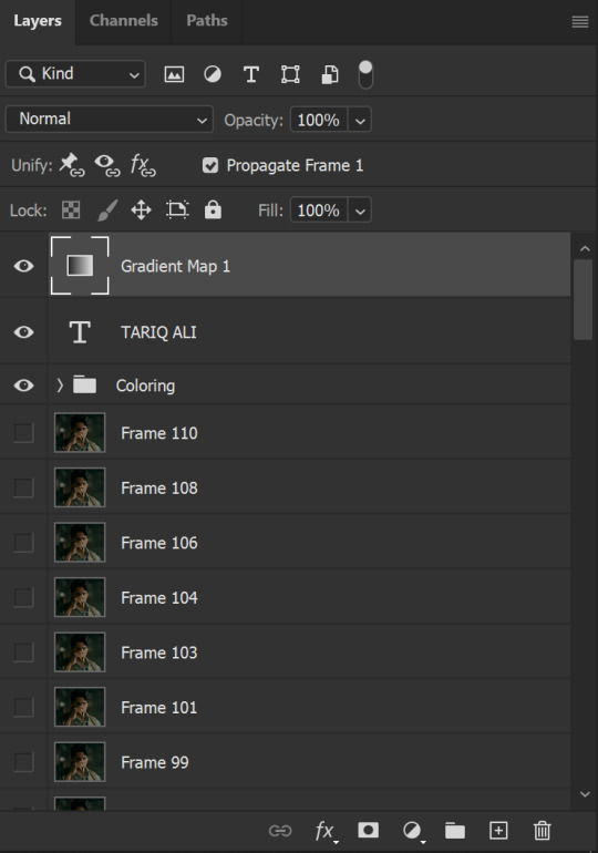
Now, we’re going to go over into our layers panel, and where we have the white box (the layer box), we’re going to select and delete that...
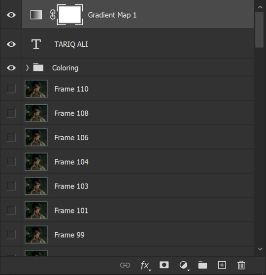
...so it looks like this:
Then, while pressing Ctrl, we’re going to hover our mouse over the T in our text layer. Your cursor should show a white box with a dotted border. Press the T in the text with the specialized cursor, and you should get a dotted line all around the letters, like so:
(I’m not able to get a screenshot of the cursor for some reason but I hope the instruction made it clear!)
Then, make sure you have your gradient map layer selected, and press the layer mask button (shown by a white arrow in the below image - it looks like a white rectangle with a black circle in the middle.)
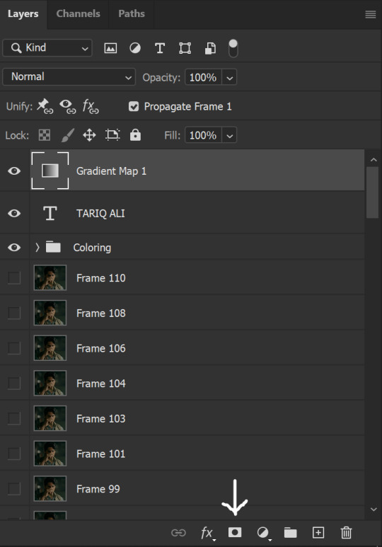
This is what it should look like:
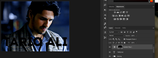
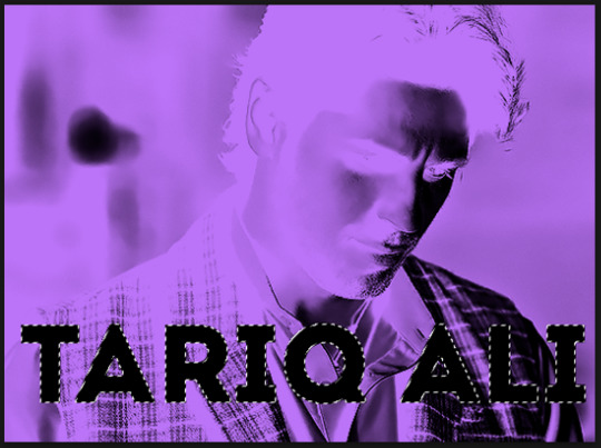
Right now, it’ll look like some solid color (which depends on your gradient). This is because we still have the text layer visible. Once we press the eye icon next to the actual text layer to hide it, you can see that this is what it looks like:

(You can also delete the text layer, but I don’t, just because if I decide to put these two words on two lines, or change their spacing or whatever, I don’t want to have to make a new layer. I can just edit that one before re-masking.)
As you play your gif, you’ll see that this is what the whole movement looks like:
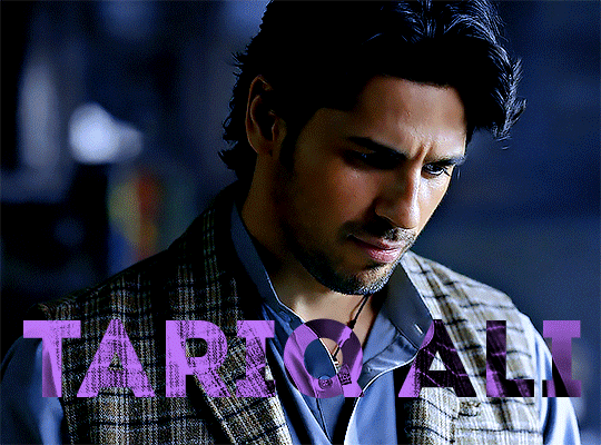
You can see that the movement of him lifting the glass to drink his tea shows through the text, too. Almost like a weird color X-ray type thing, where the lighter color shows on darker shades of the gif, and the darker color shows on the lighter part of the gif.
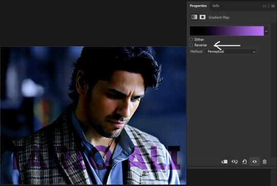
Note: sometimes, depending on the way your gradient is made, you might get text that looks like the picture below. Just hit the reverse button (shown with a white arrow), and you should get the text looking like it does above.
This is the basic way to do it. Now, we can easily edit this, if we feel like there’s too much purple and not enough black. To do that, we go into the gradient, and change the slider positions of the colors. This is purely an aesthetic preference, but I’ll show you how to do it below:
For example, I moved those sliders so there’s more black and less purple, and the gradient feels more like two colors only, instead of all the various hues of dark purple/gray-purple.
This is what the gif looks like:
In the gif before this one, the black was more of a muted gray. In the one directly above, you can see that it looks much more striking. So play around with that until you find something you like.
It still doesn’t look very visible to me, so I’m going to add a drop shadow underneath (again, this is a preference thing). You’d do it just like you would with a regular text layer. Right click the Gradient Map layer and select Blending Options. Add a drop shadow.
This is what mine looks like:
And that’s it! You can keep playing around with the whole thing until you’re happy with it. You can even keep changing the color, and the great thing about that is you’ll be able to preview it as you change it to see what works with your scene. For example, I tried white and black text here:
And that’s it! Feel free to drop me an ask if anything’s confusing! Happy giffing!
#zee's tutorials#tutorials#gif tutorial#typography#gradient text#photoshop tutorial#resources#ps help#dailyresources#completeresources#itsphotoshop#allresources#dailypsd#userisha#userdahlias#alielook
417 notes
·
View notes
Note
Hi! Would it be possible to post a tutorial of how you created the text in this post /post/707087448305451008/removing-yellow-tint-on-photopea-heyyyyyy thank you :)

💜 TYPOGRAPHY TUTORIAL (PHOTOPEA EDITION) 💜
Hi anon! It's really easy! here's how i do it! <3 as always, basic gifmaking knowledge is required. feel free to ask if you have more questions <3
tutorial below the cut 💜
i. prep-work & coloring
You write out your text as normal in white, then you change the blend mode to exclusion
right-click on your text layer, and click on blending options to open the layer style window. Tick the color overlay box and click on the tab. there you'll be able to change the overlay color and the blend mode (i used pin light for this, but you might have to play around with the color and blend modes to find the one best for your gif)
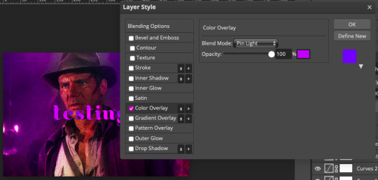
(i also added a background color to match the text)
at this point you'll also want to add drop shadow to make the text readable. i usually turn down the distance to 0 and keep the rest of the settings as is, except maybe increase the opacity (which i didn't do here bc i'm laaaaazyyy)

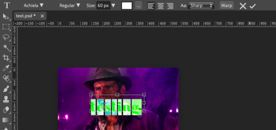
ii. wobbly text
okay! so now the coloring bit is done. double-click on the white square on your text layer to select all of your text. on the top of the page you'll see options to change font, text size etc (idk what this is called but you know what it is). you'll need to click on the box that says wrap
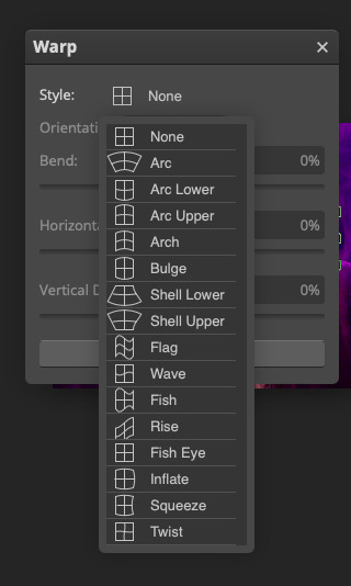
click on style > flag, and then you'll be able to adjust how "wobbly" you want the text to be (in this example the bend is at 40%)
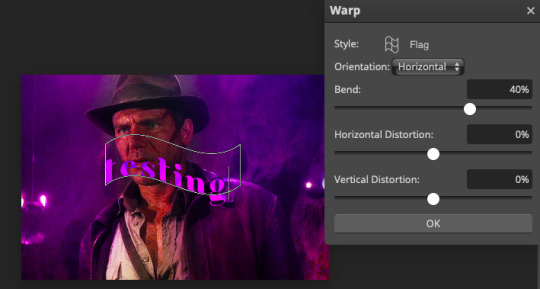
press okay and you're done! hooray!
iii. white outline
the last step is to add a line to make the text pop even more. first, create a new blank layer
right-click on your text layer and click on select pixels. click on the blank layer you just created. then you go to edit > stroke. these are the settings i use.
after pressing ok, you'll now have a white outline around your text. move the outline layer around until you're happy
this is how it looks when it's done!
really not my best work but :P this scene is meant for a different gifset but i kinda like this coloring lol hope this answers your question!
#allresources#photopea tutorial#gif tutorial#typography#usergif#photopea#tutorial#*tutorial#it's not exactly like the text in my other tutorial but it's the same#it's all about the colours you chose and the blend mode
277 notes
·
View notes
Text
Women's hairstyles 1h.
10 notes
·
View notes
Text

I just uploaded a tutorial video on designing a professional logo using the blend tool, and I hope it proves helpful to you. If you like it, please give me a thumbs up. Thank you!
Video:👉 How to Create a Professional Logo Using the Blend Tool in Illustrator
#logo#logo design#logotype#business logo#logo inspiration#creative logo#graphic design#logo designer#design#brand#bird logo#animal#bird#typography#logo tutorial#illustrator logo tutorial#adobe illustrator#dainogo#graphic designer#animal logo
46 notes
·
View notes
Text
How I did it in After Effects under the cut.
(instagram)
Used path animation for morphing, so I don't really know what I can add to that. Maybe I should record my screen while doing that.
Anyway that cool retro TV effect can be achieved by stacking these effects on Adjustment layer over the whole project:
Posterize time - 12;
Roughen Edges - Border - 2; Edge Sharpness 5; Fractal Influence 1; Scale - 100; Complexity 2;
Turbulent Displace - Amount 2; Size 100; Complexity 1;
Turbulent Displace 2 - Amount 30; Size 2; Complexity 2;
Gaussian Blur - Blurriness 8;
Sharpen - Amount 100;
Quick Chromatic Aberration 3 (free plugin) - Distort Aberrate 1% (Under 'Stylistic');
Noise HLS Auto - Grain; Lightness 5%; Grain size 2;
Animated changing colors by adding Gradient Ramp effect on the letter.
I also used wiggle(12,2) expression on the letters Position so it would kind of jitter around as things do in old TV tapes.
Oh, and of course some moving texture over the top (under Adjustment layer).
#art#drawing#illustration#artists on tumblr#artwork#animation#2d#2d animation#2d art#motion graphics tutorial#motion design#motion graphics#typography#text animation#type animation#typography design#typography art#typography animation#learning animation#2d artwork#retro aesthetic#retro style#mograph#digital animation#artists#digital art#digital illustration#digital drawing#digital painting
9 notes
·
View notes
Photo
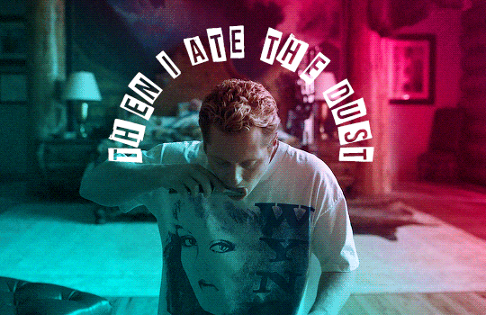

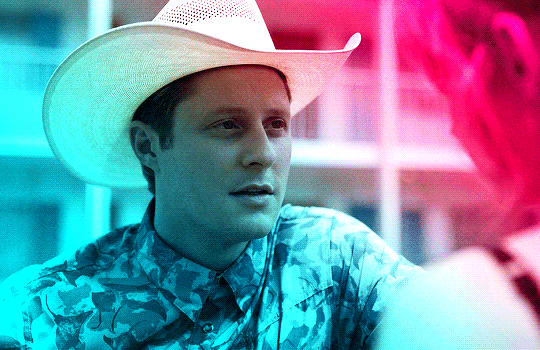
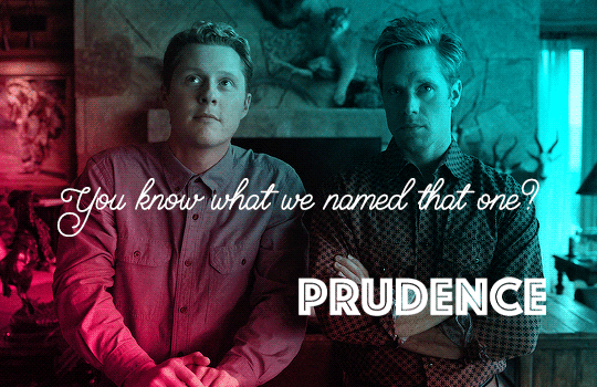
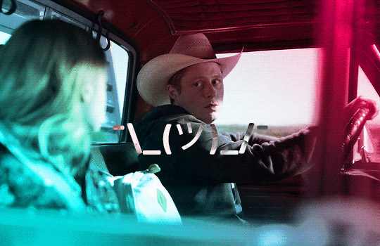


Billy Tillerson - Best Lines | Outer Range Season 1
#billy tillerson#outer range#outerrangeedit#userbbelcher#usersource#usergif#usersteen#usermbg#tvfilmsource#smallscreensource#chewieblog#noah reid#outer range: s1#not me using every tutorial i found on usergif#bless anyone who takes the time to make them#typography
247 notes
·
View notes
Note
/post/717036849048256512/mikelogan-michael-logan-is-a-fictional do you think you can make tutorial on how you made that text? thanks! :)
Of course! Thanks for asking 😊
i don't have a psd saved of that exact post, but this is close enough!
assuming you know the basics of making a gif (if you don't, check here), sharpen your gif and slap down your coloring. this particular example is using a black & white gif, but this effect can be really cool in color as well (more on that later).
create your text using whatever font you like. i find that this particular effect looks best with bold fonts rather than thin serifs or scripts. now we have this:

here are my settings in case you're curious:

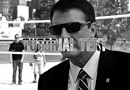
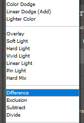
if you're looking to get this exact effect, make sure your gif is b&w and your text is white. now we're going to change the text layer's blending mode to difference using the drop-drown menu (where it says difference -- yours will say normal):

that gives us the main piece of the puzzle:
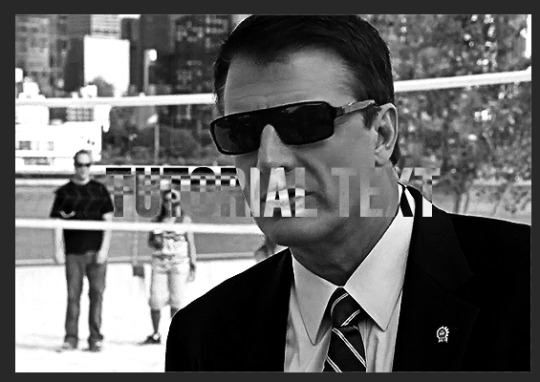
right now, the text is hard to read though, so let's add a thin outline by double clicking on the text layer. these are the settings i used:

normally i also add drop shadow at ~150 degree angle and 3, 3, 3 for the distance, spread, and size. regardless, the text is much easier to read now and we have our gif!
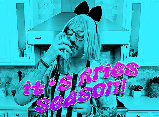
his sunglasses are so fucking stupid
the fun part with this effect is how many different color options you can play around with! here are some examples (using blending options and gradient or color overlays set to [usually] hard or linear light):
x

x

x
please let me know if you have any questions!! 💙
#answered#Anonymous#my tutorials#gif tutorial#completeresources#dailyresources#gifmakerresource#typography tutorial#typography
53 notes
·
View notes
Photo

anonymous asked 💬 hi! i know you guys already made a font rec but can i request a font combination rec?
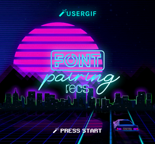
USERGIF FONT PAIRING RECS 🪄 PER MEMBER
Here are some of our members’ favorite font pairings! Check out our previous FONT RECS and our #typography or #fonts tags for more inspo! TIP: On mobile, slide your finger over the gif to slowly scrub through frames.
CREDITS:
— retro video game backgrounds: [one] [two]
— all fonts & links listed below the cut
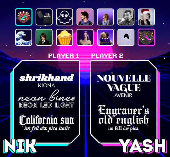
nik @sith-maul:
– shrikhand + kiona
– neon bines + neon led light
– california sun + im fell dw pica
yash @wakandasforever:
– nouvelle vague + avenir
– engraver’s old english + im fell dw pica
kate @zoyanazyalensky:
– golden hopes + biotif
– hamstring + aemstel
jennifer @antoniosvivaldi:
– reggy black + sevastian inside
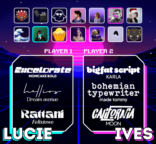
lucie @van-eck:
– excelorate + momcake
– hellios + dream avenue
– rattani + felixtowe
ives @jakeyp:
– bigfat script + karla
– bohemian typewriter + made tommy
– california + moon
abbie @midnightsdlx:
– nouvelle vague + intro
– amalfi coast + avenir
– buffalo script + abril fatface
v @shangs:
– nagita + gotham
– blacksmith signature + gotham
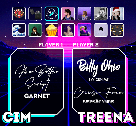
cim @itstruthtime:
– glow better script + garnet
treena @jeschastain:
– billy ohio + tw cen mt
– crimson foam + nouvelle vague
luz @lemoncupcake:
– breathing + avenir (all caps)
– quickpen + montserrat
hella @kathrynshahn:
– donitta + kiona
– flood + futura
– amalfi coast & bebas nueue
natalia @usersmidnights:
– losta masta + the artisan
– bougher + faminela
– georgia script + headwind
elio @djarin:
– nouvelle vague + lemon milk
– doctor glitch + lemon milk
– I tell you all my secrets + the bold font
#resource#typography#fonts#request#completeresources#allresources#userelio#useryoshi#userrobin#uservalentina#usertreena#usernums#userhella#usershreyu#userk8#uservivaldi#userives#*usergif#*tutorial#by nik
1K notes
·
View notes
Photo

[ID: A gif of the character Rene from Tamil film Natchathiram Nagargirathu dancing in the middle of a circle with her theatre troupe playing instruments and hyping her up. The text reads “guide to using senthamil fonts” that are on the right side with three different Tamil fonts that translate to Senthamil, ending with the word in English. /END ID].
I do not remember where or how I found this pack of Tamil fonts but after having the Senthamil font pack (all 285 of them) hanging out on my desktop for however many years, through some messing around and ctrl Z-in my way out of some fuck-ups, I finally have a handle on how to use them in photoshop(and other applications).
For a video tutorial, this one is very thorough and helpful one, it is in Tamil but pretty easy to follow and understand. If you have any questions please feel free to send asks here on userdramas or to me at @therukurals as well. The steps are below the cut.
1. Download Senthamil fonts, you can access via this folder here. I have also made a Cheat Sheet which has some shortcuts and all the fonts written out so you can easily find what you would like.
2. Download Azhagi+ from the website. Hover over the Downloads in the top right corner of the site and click on the 1st link (for Windows). Refer to the section outlined in orange. You can download in Mac if you use winehq.org to help run windows installations. Find out more here. And just a note, I am a windows user so I am not familiar with how well this works on Mac.

3. Set up your shortcut keys: In the section outlined by blue, uncheck all the boxes to clear each language keyboards hotkeys. I do this just for ease of use and also for not accidentally turning on another keyboard setting. This also allows me to use whatever hotkey I want for the Senthamil font setting. To set up your hotkey for Senthamil, refer to the section outlined in orange. Click on Tamil (under the Language L heading) then Stmzh_P (under the Font Encoding F heading) and then Phonetic Transliteration ( Keyboard Layout K heading). It will then pull it up in the section outlined in blue, you can then set the key to whatever you’d like (given you’ve unchecked the all the boxes first) I personally chose ctrl + shift + 9.

And you’re set to go!
4. To use in photoshop (or any other application like word, powerpoint, excel etc) first, make sure to launch the Azhagi+ app. It needs to be running for the hotkey to work. Then enter in your hotkey (for me I would then click Ctrl + Shift + 9) and with the senthamil font i want to use selected, I can type in Tamil phonetically via my English keyboard. Do note that your english key function then will not be working and to switch back using the same hotkey.
Just a note that you can use this process (minus the specific pathway for Senthamil) on other languages and keyboards from South Asia.
#senthamil#typography#usergif#allresources#completeresources#*gil#tutorial#southasiansource#admin post
50 notes
·
View notes
Note
hi alie! can i request on how to do this grey-white text? /post/721285784354865152/ thanks!

hiii, sure! it's quite simple actually, here are the steps for the text effect on this gifset (and settings/screenshots under the cut):
type out you text and select white for the color, then set this text layer's blending mode to Difference
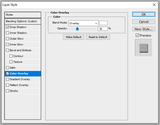
double click on the layer to get to the layer style options and add a Color Overlay. choose the color white (black also works) and set the blending mode to Overlay. play with the opacity slider as you wish, this will brighten your text and it helps for gifs that have a high contrast behind the text.
if you don't need to brighten the text, put the color overlay's blending mode to Hue, you're actually done right here, easy!
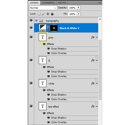
optional: if you're using the color overlay as an overlay like i have for that particular gifset, you need to create a mask of your typography. to do that hold the ctrl key and click on the text layer's icon (the "T", the yellow box on one of my screenshots). this will make a selection of your typography. if you have multiple text layers, hold CTRL + SHIFT to select multiple layers. once your selection is done, go to the top menu and Layer > New Layer > New Adjustment Layer > Black & White > Ok. make sure that layer is on top of the text layers.
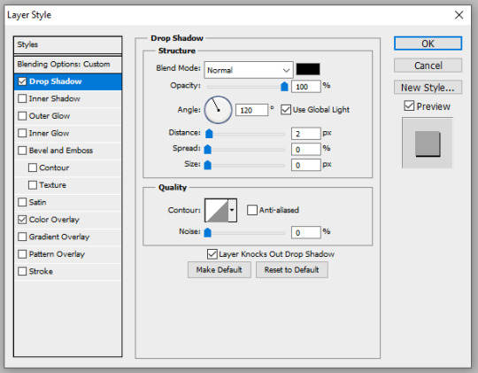
add a Drop Shadow if you want, and that's it, the effect is done :)
#alie replies#Anonymous#*ps help#photoshop#resource#tutorial#resources#allresources#typography#completeresources#resourcemarket#userabs#userdahlias#usercats#usersmia
232 notes
·
View notes
Last Seen Blogs
cherrymoon-12
The Sun Watches-the Moon Knows.
skinnycaats
aurele

amazon-giveaways-blog
Amazon Giveaways
piangerenellanotte-blog
LaMargheritaDiCrono
sparklyflowernight
cami