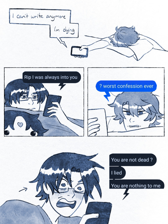
#new year numbers
Note
if you don't mind, some numbers?
Rolled you an 8; that's 2+2+2 or 2 to the power of 3. Two and Three are both prime numbers, but 3 is only there as a sort of tertiary afterthought, adding flavor without much substance. Two is the number of cooperation and getting along, and three, far from center though it might be, is the number of taking action.
You'd know what to make of that better than I would, but 8 suggests that there's some action that needs to be taken in your life around you; that you can trust those around you to handle what they need to handle, and that you handling your things will handle others' as well. We live in an interconnected world. The connections here are more important than the actions taken; eight is a ripple chain.
#red replies#jariktig#i hope this makes sense; I'm tired and that makes me metaphorical in language#at least I explained it better than '8 is when the other person at the end of your string is winding it the same way you are ' or '8 is#when two spiders tend the same web' lmao#also it occurs to me now that the likelihood of getting 7-implicated and 5-implicated numbers is really low#i may need to come up with a better system or go back to a proper d6 - 0 1 3 5 7 9#and cut the irrelevant nonprimes#9 isnt even prime i just find it easier to work with than trying to pick 11 13 or 17 to tap in instead since those all work like#modifiers more than signifiers and in a single number roll are basically useless#where at least 9 has a very specific energy#new year numbers
2 notes
·
View notes
Text
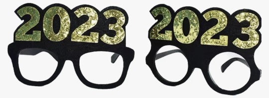
I’m not breaking any new ground here, but it’s obvious that the peak of novelty New Year’s Eve numerical eyewear was 2000-2009

10/10 for legibility, visibility, and typography
for years now, this industry has been stubbornly clinging to an idea that has become too cumbersome. if you will indulge me, I will now rate 2023’s new designs:


5/10 best I can say is “it gets the job done.” it does clearly read as 2023, but the typography is bad & the visibility leaves much to be desired.

2/10 happy 20?3, i guess. they started with a decent font, but these are illegible and everything about the eyehole placement sucks.
6/10 hear me out: this is an okay compromise. it’s a cop out, sure, but it’s a viable alternative. it satisfies the basic requirements of legibility, visibility, and typographical acceptability, yet it lacks all whimsy. this feels like when you don’t do a project the way the teacher intended but you pass anyway on a technicality. this isn’t school, though, so i’m failing this design.

1/10 come on, guys. if you’re going to use the top of the 2 as an eyehole, at least use a font with a more open design, perhaps something art deco. at least when you look in the mirror with those LEDs directly in your line of sight, you won’t notice how bad the glasses look.

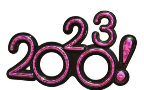
7/10 now we’re getting somewhere. like the first design, it uses the 3 as the second eyehole but it does so without compromising the shape of the number. unfortunately, the lack of outlines does negatively affect legibility and there may be some visibility issues for the left eye.


9/10 this is as good as it’s gonna get, folks. an actual graphic designer was clearly involved here. the typography is appealing, the color works, visibility looks good. nicely done.
-1000000000000000/10 :(
30K notes
·
View notes
Text
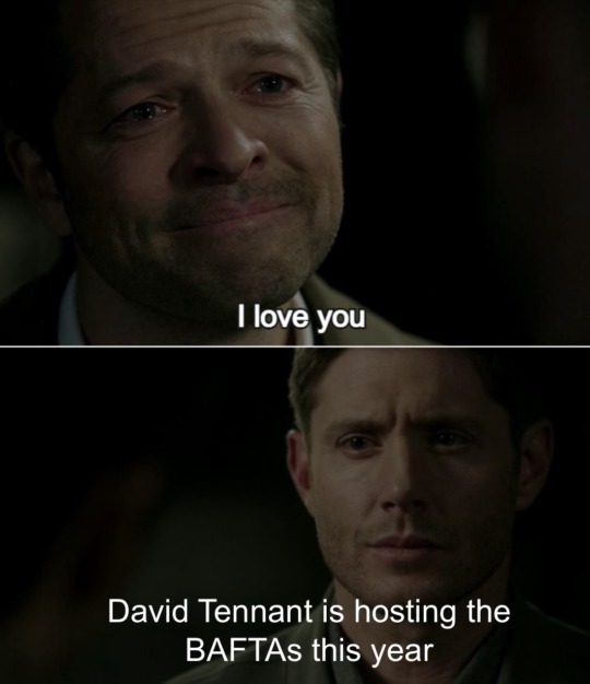
truly we are in the midst of a Tennaisance
#David tennant#baftas#AND THEY STILL REFUSE TO NOMINATE HIM#like clearly they know he’s one of the most influential and beloved actors of his generation#and will get them good ratings because his army of fangirls will tune in in droves!!!#But nominate him? Nahhhh#seriously though this is his YEAR he’s gonna do great and I will be watching#I hope they give him a musical number. As a treat#I also love that it’s the film baftas bc David is obviously WAY more prolific in television 💀#Like David I love you but you’ve been in like three movies that are actually good#Doctor who#good omens#broadchurch#destiel news
996 notes
·
View notes
Text
*tries to organize my thoughts*
*remembers i'm not in school and therefore beholden to neither heaven nor hell nor any man's grading system*
*joyously shredding & tossing all my carefully arranged 3x5 mental notecards into the air like so much beige confetti. raising my arms in victory, cheering raucously until i accidentally inhale bits of homemade confetti*
(*coughing up itty bits of paper like a cat evicting a hairball with a firm understanding of tenants' rights*) wait wat happens next
#i marie kondoed my thoughts and *i* feel great. but now my stream-of-consciousness has escaped containment#so many innocent bystanders at stake#every time i try to organize my thoughts i run out of plastic bins and have to make a trip to the container store where i get even more dis#racted so. you can't just hand me THIS brain and NO catalogue OR library classification system#and expect me to single-handedly sort through all this nonsense? bad form but fucking form not in my job description#aNYways. formal education sure did a FUCKING NUMBER on us huh#(a number i measure not in gpa or dollars of student debt.#but in the number of therapy sessions & medical debt it will take to recover.)#seriously folks. our education systems are...innately traumatizing for a huge number of students. and we NEED to address this.#the fact that it is culturally common for adults to have anxiety nightmares about school/exams...even decades later?#that is not cute. it is Alarming.#no one--much less entire generations--should be spending their developmental years in an environment of chronic stress & pressure & strain#and yet that is the reality for millions and millions of pre-teen and teenage and young adult students#this isn't healthy and it serves and empowers NO ONE#...except of course the many exploitative educational & financial & debt-collecting institutions thriving from the current balance of power#and of course it's a nefarious and powerful way to sabotage/erase the middle class#which billionaires and the wealth-inequality creators they finance couldn't possibly have any noteworthy interest in whatsoever#it's not like there's an elite group of people with huge financial incentives to drain/steal resources from the masses...#anyways sorry for going all Conspiracy Theory on you.#obviously the billionaires who control the vast majority of our resources and news and political campaign funding#are not tied to every single itty bitty social issue and i'm a silly billy to imply it#please tell elon musk to ignore this tweet i am so subservient and acquiescent#mr musky u r so good at inheriting slavery-built mining fortunes & buying other people's companies#& building rocket ships & fancy cars that do NOT explode/catch fire & also NOT running billion dollar companies into the ground#mr musky u r so talented genius billionaire playboy with 10 kids and ex-wives who find you creepy af babe u r basically iron man
2K notes
·
View notes
Text
pre-transmigration cumplanes because they are the most divorced guys who never met
#svsss#scum villains self saving system#cumplane#cucumberplane#shen yuan#shang qinghua#shen qingqiu#pippart#these guys are so funny. i love sy's one sided parasocial hate relationship with sqh#i think sqh should start writing after transmigration again#and that sy should independently find his shitty writing and scathingly critique it anonymously#i need them to complain to each other about each other without realizing it's the other they're talking about#i think that's what sqq should be doing during the three years binghe got eebie deebied#when sqq dies and sqh stops getting correspondence from his new number 1 hater he's like#“oh boy im so happy i finally wrote something that guy likes. or maybe mbj killed him now that im complaining to him and not sqq about him”#and then sqq revives five years later and the second he has a chance he immediately starts catching up on five years of hate writing
3K notes
·
View notes
Text
Edging myself in a pet's warm tight hole for hours so when the clock hits midnight I'm cumming deep inside them the instant the fireworks outside are exploding
Bringing in the year with me showing them that they're mine, the first thing we see being the sight of their tummy bulging with my warm cum~
#xochimilli writes#happy new years eve whores im still alive#t4t nsft#bd/sm kink#bd/sm pet#ftm top#ftm dom#t4t mlm#2024 is such an ugly looking number#ftm nsft#petpl@y#breeding pet#daddy's pet#petpl4y#queer nsft#mlm nsft#mlnb ns/fw#nblw ns/fw#nblw nsft#ftm ns/fw#subby puppy#bunny sub#kitty sub#puppyboy#puppygirl#subby bunny#daddy's bunny#daddy's puppy#tummy bulge#xochimilli's pets
596 notes
·
View notes
Text

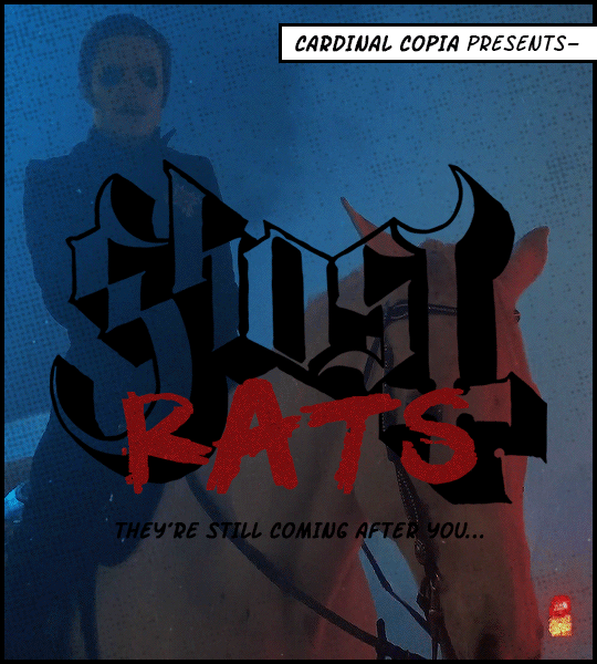
"And there's nothing you can do!" ⛧ Ghost - Rats for WORLD RAT DAY 04/04/2024
#this is so silly. happy rat day#the band ghost#ghost#lgifs#alltag#cardinal copia#DISCLAIMER: on the very (VERY) rare chance somebody recognises this format#from a gif post in another fandom about 3 years ago#i'm not copying anyone. that was also me#i really doubt there's any overlap of fan circles here but that old post has done some numbers so if you think you've already seen this#dw. same person#maybe i should have made an entirely new format but who has the time#also i've had the lyrics in my head as 'belief IS contagious' but apparently it's beliefs plural? not sure which one is correct
388 notes
·
View notes
Text
As someone who's been a Team Starkid fan since the beginning, since 2009... do the young fans who only know hatchetfield know the old lore?? Do you know about crying in the choir room?? Do you know the door gag? Do you know Liam's got a phone call? Do you know about the iconic accidental sing along SanFran Con appearance? This isn't me being elitist or anything, I genuinely want to know! I just feel so very much older than all of you, all the time. Does anyone remember Tanya and her gay little blonde bob???
#starkid#team starkid#I remember every year during the summer I used to rewatch all their shows in order of upload#it didn't used to take so long#I can't remember the last time I did it#part of me misses pre Twisted Starkid#but then I realize I don't actually miss it#I miss being a kid and a teenager and not having to worry about bills and taxes and my next car insurance bill and next meal#Starkid is such a actual company but it has been for a while#I feel like people only take it seriously niw that they don't do blatant parody musicals#anyway I'm so excited for Cinderella's Castle#as number 1 fan and defender of Cinderella and her story I am pumped and excited to see what Starkid does with it#I pledged 25 dollars to the kickstarter cause that's all I had to give last month I was the 1964th pledger#I know new fandom always finds old fandom cringe and stupid but there was a simplicity back in 2009 that I'll always miss
177 notes
·
View notes
Text
wizard of both ways
#pokemon#swsh#champion leon#wizard leon! Ive messed arounf with this piece for literal months#and like yesterday my brain was like okay either you finish this or you explode and die#so. been finishing this up#now I can return to work in peace....#this is! also a revision of an old design#which was kinda made up as I was goin so it wasnt the most coherent thing. but I was like well. its a wizard design#cowboy wizard... sword and pen..... being in two places at the same time..... this is what this wizard is about now#the number of wizard leons Ive got is still at a round ten rn I think. into this new year I'd like to shore up and make a zine for em#got a big to do list this year... hope I get to everything#but for now. we return to the good work. we live n we see#have a good day guys! I get a snack now. a botato jacket. I wish u the opportunity for the same
260 notes
·
View notes
Text
Augustine: *watches his brother die by suicide in a premeditated and successful attempt to force his soul down Augustine's throat, has just finished gagging down the remains*
John: damn that sucks
John: anyway i just had the best idea vis a vis religious nomenclature. Guess what youre going to be calling ur fellow lyctors
#My post#harrow the ninth#the locked tomb#the locked tomb tetriarchy#John: dont think of your brother dying as you losing a brother but gaining [insert number] new ones#John: also mercymorn is now your sister isnt that great!#this murder plan took ten thousand years longer than it should have i would have killed that man#(Joking)#Augustine the first
215 notes
·
View notes
Note
numbers pls?
Rolled up a 4, 2 to the power of 2. Two is the pure prime of working cooperatively and getting along; four underlines the necessity of such while diluting it down from a pure prime to a less stand-alone number.
I don't know your life better than you can, but this one is usually pretty obvious in what it means. "Lean on your friends, that's why they're there. Let your friends lean on you, too. We're all stronger together."
Might also mean you're going to either have a good year or a very bad year for your current relationships. I don't know. Keep an eye on that, though.
#red replies#stuffbyshelby2#still rolling one 0-9 d10 for this#the dice always give me actionable stuff so this is not like. a 'well this is just how it is' thing ever#its a 'pay attention! you can do something now or you can do it later'#new year numbers
1 note
·
View note
Text


♫ Oh... Oh... ♫
#*#rwrb#rwrb movie#red white and royal blue#alex claremont diaz#henry fox mountchristen windsor#taylor zakhar perez#nicholas galitzine#ngl the number of times i've watched the new year's party is concerning#THE LOOK ON HENRY'S FACE#and the way alex calls out to him aaaaaaa
578 notes
·
View notes
Text

fe engage hater to liker pipeline real
#fire emblem engage#fe engage#diamant#ivy#timerra#zephia#veyle#WHAT CAN I SAY MY MIND CHANGED WHEN I SAW THE MONASTARY MY CASTLE THING#honestly i think my number 1 gripe is the art style but it can look nice. sometimes…#fire emblem#yart#there are more designs i like but me tired#HAPPY NEW YEAR ITS LATE IK#sorry for being away things have been tuff over chrimbus period :(
3K notes
·
View notes
Text

Good morning 🍊
#the concern#oc art#artists on tumblr#happy new year all 🎉 here's to a good 2024#also hello new people from the selkie comic 👋 this is ajaya and she's one of the half-sisters of the human (amir) from that comic#amir has a number of half-siblings unknown to him because his father is a 250-year old wizard seeking permanent immortality#and has fathered a ton of children in the meantime to further his ends#anyway in my motw campaign ajaya causes problems on purpose but also has extremely useful gossip so my players let her stay#in that whenever I want to give my players an emergency plot hook she shows up with a mimosa like OH BTW HAVE YOU HEARD--#but she also did very much make a ghost battery go dangerously haywire and also steal the iron from an already iron deficient vampire
330 notes
·
View notes
Text
jade did everything she could to keep her daughter away from a world that took so much from her. the flattening of her character into a selfish evil war criminal who’d sacrifice her own daughter to save herself is racist character assassination and I’m SO OVER IT
#i can’t do this anymore you guys. i can count on one hand the number of ISSUES#that treat jade like a person instead of a caricature#far from a new phenomenon it’s been happening for at least 20 years#she would never introduce lian to violence. she let her go with roy for that express purpose#to prevent that#personal#jade nguyen#dc
363 notes
·
View notes
Last Seen Blogs

marketmarvels
Untitled

artisanhuman
Eternal WIP

wonusshi
Lilith

toomanybangtanfics
BTS Fanfiction Rec

hotandsweatymen
Sweaty Muscle Guys