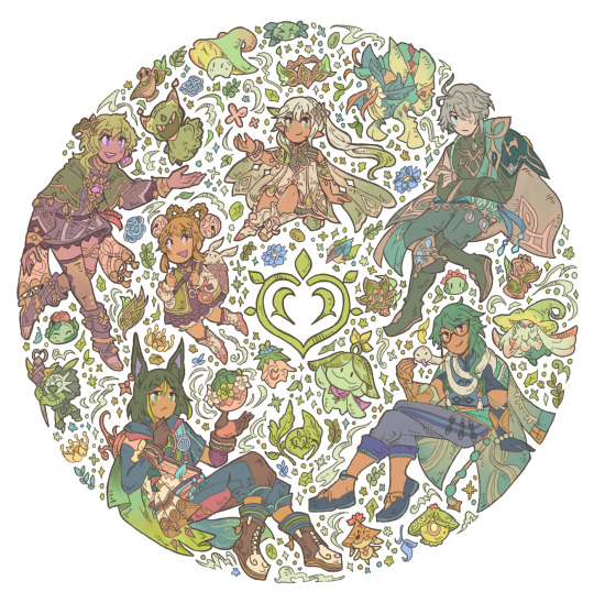
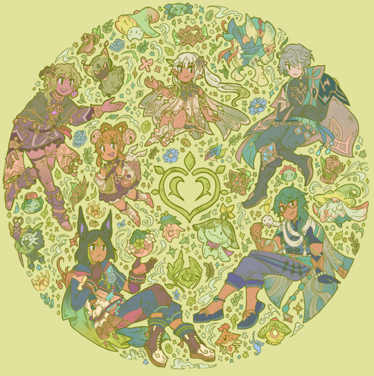
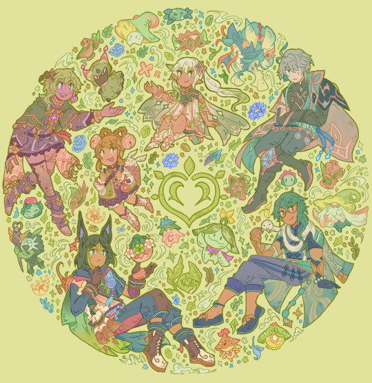
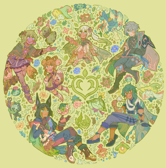
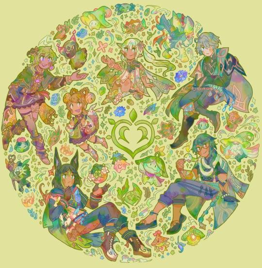
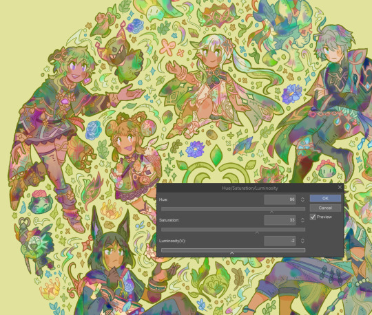
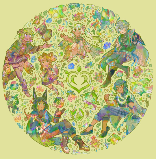
#so i ended up doing the lineart and flat colors for all of them too
Photo
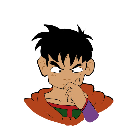

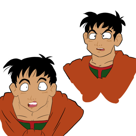
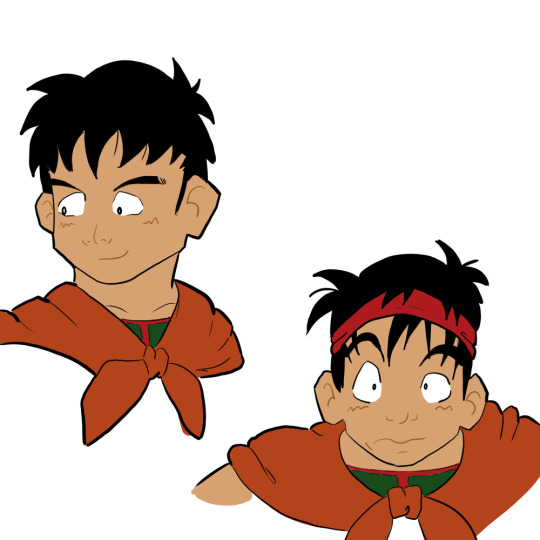
Trying to take making digital art more seriously, but so far all I’ve accomplished is “draw Yamcha a bunch of times” lmao
[Image ID: Eight digital drawings of Yamcha from Dragon Ball with different facial expressions.]
#yamcha#dragon ball#my art#fanart#this started off as me trying to do this practice exercise#where you just re-draw the expressions that a character in a cartoon makes#and this is supposed to make you better at drawing faces and drawing expressions#but i also really need to practice like... literally everything with digital art#so i ended up doing the lineart and flat colors for all of them too#i think i figured out some stuff with line weight while doing this#and i experimented a little with how i drew different features#so i guess i'm learning something!
31 notes
·
View notes
Text
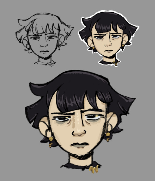
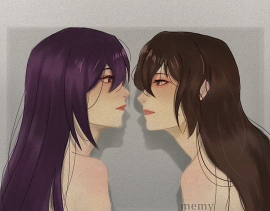
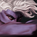
Yesterday I watched Cartoon Saloon’s short “Screecher’s Reach”, and thought Daal’s hair was almost exactly like how I envision Mathilde Lachance’s hair, so I decided to try and draw her. Today I stopped cleaning up the sketch after about an hour because I got bored, so it’s going here.
#nevermoor#nevermoor fanart#mathilde lachance#idk if anyone’s ever drawn her before (which makes sense bc no description) but I wanted to give it a shot#I’ve always envisioned her like. goth former art student. just the vibe of a pretentious 20s-30s artist who is also kinda goth. for funsies#when I said this blog is where I ‘dump��� my fanart I am being serious. bc sometimes I just quit part way through. lol.#I always try to be one of those ppl that ‘renders’ just by cleaning up their sketch + flats and then I always get bored and stop doing it#I need to stop avoiding doing lineart bc I actually enjoy doing it. when I do otherwise I just end up w a bunch of half finished stuff loll#anyways. I haven’t drawn in ages bc college sucked all my time and energy. but I just graduated 💪 and I’m excited to get back into things.#especially nevermoor stuff!!! bc I have so many ideas!!!!!#fun fact for if you’ve read this far: I like giving wundersmiths bright golden eye highlights when I draw them. just for fun!#the gold of wunder goes sooo well w the black/purple color scheme of morrigan. genius idea from jess. that’s why I always love drawing mog!#I may never draw stuff but rest assured I’m always thinking abt how I would draw nevermoor ppl/places/things and why#I have so many thoughts and my nevermoor brainrot is also is where my art/animation brain and media adaptation brain get to combine#I am going to be insufferable when (if?) the movie starts being made and I am not even sorry#anyways. enjoy this lq image. bc this is a screenshot and I have a problem with drawing way too small lol. oops.
49 notes
·
View notes
Note
They still feel off specially the eyes i could feel them about to manifest their own life and run off
Even my linework is ... Idk what's wrong and it's the problem maybe I'm staring too much but I don't think so
Sorry for bothering alot but i loved your last advice ty
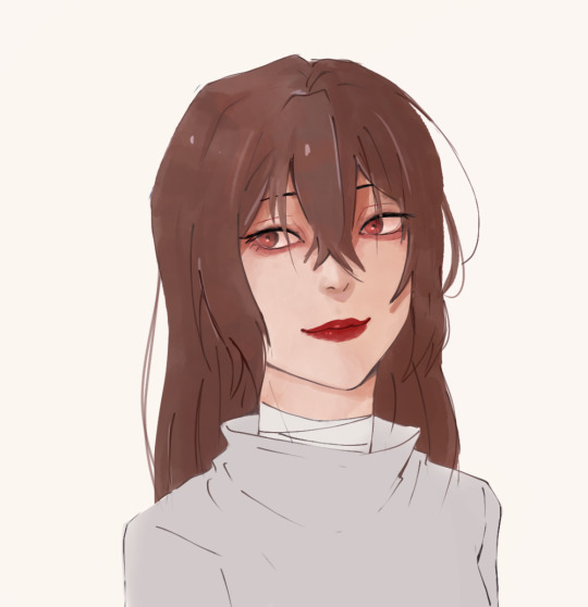
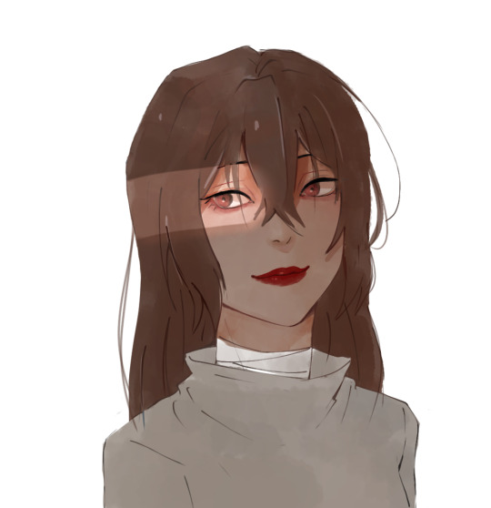
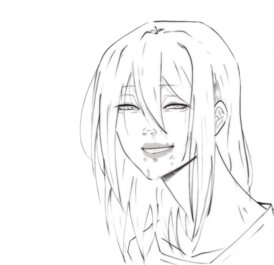
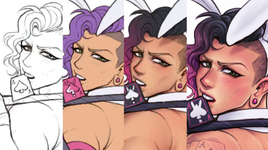
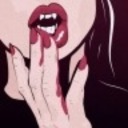
i think the main problem with the first picture has to do with the proportions and anatomy of the lower body area aka the neck and shoulders. i'd make the shoulders wider and add some sort of form to the neck so that it looks believable instead of a flat rectangle shape ( maybe make it slimmer a bit too? although that might be just a stylistic choice so you do you). That's the first thing i'd fix because otherwise the head looks too big in comparison to the rest of the body, and it can throw you off
I actually think you did a great job with the eyes, they have a lot of life and that comes from the fact that they are the most rendered part of your piece, which is not a bad thing. The thing is, while it is true that the eyes are the main focal point of a face and portrait in general, that doesn't mean you can neglect the other parts, so i think it is also a consistency issue or not figuring out exactly what sort of style or rendering you want to go with that holds you back (which is totally fine and normal ofc). So let's pick a semi-realistic stylized rendering style for this since this is the vibe i'm getting from this piece.
If that's the style we're going for, then the face should have a bit more form. You have to remember that our facial features ( eyes, nose, lips) are connected with each other via the planes of the face, right? So, for a semirealistic style, revisit your reference and try to idenitify what those planes are and how they connect to those features, and most importantly, where the shadows hit, and just accentuate them more, because at the moment they look like 3rd forms plastered over a 2d surface which is not right, our skin has form as well. Color-wise, don't be afraid to go darker with the shadows, they really make your drawings pop. Without looking at a reference, i'd def add some shadow under the lips, a bit where the lips connect to the nose, under the neck, and in the lower body area.
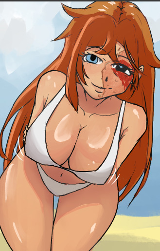
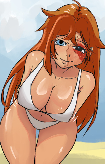
I'm really trying to avoid the most basic answer which is " practice anatomy !!1! " because everyone can say that however, at the end of the day, this is the main thing the face lacks. And tbvh you don't have to actually know anatomy, you just gotta know some proportions things that make the face look believable enough. I feel like the features are mostly just drawn from the reference without an understanding of the structure behind it. Something tells me that in the reference picture, the person had their head tilted a bit upwards, but here it's kinda flat and the features are just painted without following the motion. Try to draw over your reference picture the vertical and horizontal lines and make up the head shape behind it to figure out the way it is tilting and facing, because the lips, eyes nose, etc will follow that same sort of flow, they're not stationary. I'd also make the eyes a bit smaller, or maybe make the skull bigger bc i think they are touching the outer edge too much now, and also narrow the distance between the nose and lips just a bit. Kinda hard to explain without actually doing it myself. But really, try to play with that, and try getting comfy with drawing 3d forms i know it's easier said than done but..... there really isn't any shortcut unfortunately
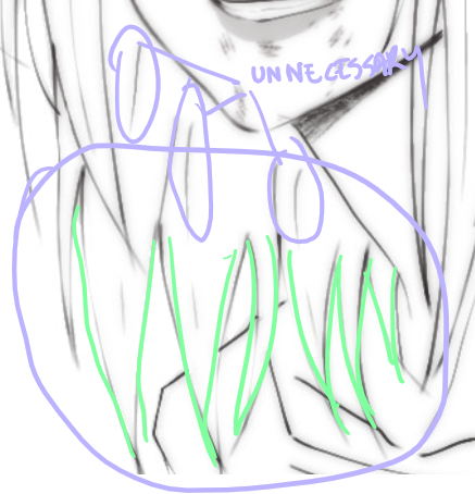
As for the lineart drawing, yes it's actually pretty solid, i like that duplicate blur thing you did, i'm familiar with that technique and it def has its perks so that's great. Im not an expert on lineart, however here i think there are too many " unnecessary" lines that could easily be omitted (purple). Less is more and all that~ The hair strands at the end feel too stiff and identical (green). If you notice, they all just end in this " V" shape and they rarely overlap thus making the image look flat. Try to break this pattern by introducing more spontaneity aka random hairflies, making the strands overlap, adding more shape variety etc
Make sure that the lines connect properly whenever they meet, and also although you already did it and i think that's great, you can make some lines even thicker, go even further and add even more lineweight. As a general thing, usually, the exterior or contour lines are thicker and whatever it is inside is thinner so experiment with that, you can start from the nose- thicker lines for the nostrils thinner for that nose tip i forgot what it's called and also add thin lines that just hint at the form. Lineart is hardd so i don't blame you, but if you're gonna keep the lineart in, try "shading" with black blocks so to speak, make sure the lineart layer can stand on its own, and pay more attention to the lower part area (neck and shoulders) even if it is less exciting to ink
#ok i lied it's long again#these are pretty fun to do can u blame me#ask iztea#you should also check in with other people don't take my word for everything#but since you asked my personal opinion here u go#sorry for any typos if there are any i'll fix them later#long post
69 notes
·
View notes
Note
AITA of I want art trades to be of equal time/quality?
this is a weird one but I had a spat with someone recently because they wanted to do an art trade, which i was open to do, but we hit a weird impasse. When I do art trades I like to put forth as much effort as my trade partner puts forward first, and would prefer that if i put art first that my partner reciprocates the same amount of time and care.
Art style, quality, experience, follower count means nothing to me in the exchange, just the level of effort. It feels unfair to me that I would put in hours/days of work on a painting to only receive something done in less than a few hours, especially since that would basically be doing a free commission. I'm willing to give smaller/newer artists with less experience or cheaper software more effort in my half on the account that I trust they're doing their best with what they have. It's meant to be fun!
This is not an instance of that. I've checked this artist's gallery and they were perfectly capable of producing extensively detailed pieces, so I agreed to do a more detailed piece, as long as they do the same.
This is where things get weird. They were perfectly fine with me doing something bigger and were very excited, and I brought up that in my listed art trade rules, I'd like them to do the same. They agreed, and we both went to work. I'm a slow artist, so it's been taking me some time, and I'm well into working on colors and rendering. in the middle of this time is when I get my half. it's just lineart with some shading. it was very beautiful, and I'm grateful! but it's not necessarily a level of detail that we agreed on. So I kiss my flat colors and rendering goodbye and just quickly rendered the lineart to match.
They get excited and ask when the final of my half will be done. Confused, now assuming what they provided was just a WIP, I say when they finish theirs. They go "oh but this IS my final :)" and I am... still very confused.
I brought up our agreement to do equal effort and they go "but I did that, this took me a long time" to which I point out I've been working for a few days now to produce a fully rendered painting, which wasn't even finished by the time they posted theirs.
They start getting defensive saying that exertion of effort varies from person to person which I fully agree as a chronically fatigued person! but I still feel really scammed that I'm putting in all this work and they can only provide what their commission form claims is a "colored sketch" (and on the cheaper end too.)
They keep getting weird and defensive and I decide to just call the whole thing off, giving them the art I did and that it was final. They get pissy and call me an entitled asshole for wanting to "break their back" over a free art trade.
I would be perfectly happy getting a rendered sketch, if that were what we agreed on in the first place!
I don't think I'm the asshole here, but being called "entitled" really got to me, especially considering we WERE doing work for free. So here I am. Am I the asshole for wanting equal parts effort? Or am I just being entitled? I'd share the art pieces we did here but I won't out of privacy for both me and the other artist.
What are these acronyms?
81 notes
·
View notes
Text
Okay can I talk?
eric belonging to @night-light-artz
Patches @eve-pie
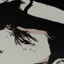
Okay for the image above I was doing a “mock” warrior cat book. I miss the old covers but anyway
I kinda feel my art is…boring. I mean it just feels that way. Sometimes I feel I rush myself to get things done, and to be honest I hate having to rush myself. I look back at my recent post and they just fall FLAT. Flat as in the colors are just boring as heck. Lineart? I don’t really like. Not only that but everything feels so unpolished
My anatomy/details
I hate the fact I miss crucial details of my chat starts or even other people characters. I mean, HAVE YOU SEEN HOW I DONT EVEN ADD SILKY’s ANTLERS 99% of the time? That bothers me. And I see other people add them and I’m just “well damn I’m so lazy I can’t even add antlers on my own fucking character”.
Not to mention the poses. Everything feels so stiff with me. So dang stiff that you may as well call my art wood and use it as a support beam. I hate how I don’t use references for my art. Maybe If I used them more and actually took my time stuff wouldn't look like your average horrific Netflix Original cartoon of some movie.
Backgrounds/minor objects.
Do not get me started. I hate all of them. They look so low effort. I mean, I know I can do better with them! But it seems like I worry about the main characters so much. In fact, I feel the background just falls flat or blends in too much with the characters that it looks. Messy. If I draw a cup, i'll skip over details and it will look awful! Which isnt good, as it shows im lacking severly.
Time
And for time I rush. I feel like I have to literally push things out by day’s end and well…it affects my art. Lately o just been so focus on the hour and time it just makes the art suffer. Even if no one else sees it I do. I love my painted style, but it takes quite some time. And forgive me but I hate just doing sketches to and posting it. I prefer my art to be colored in and all the way. Now im not saying i dont like it when other people sketch. That would be a dick-head move of me.
Some days I fear if I don’t post or read inboxes everyone is going to think I purely abandoned them. I try to focus on my page. but just giving them a sketch at the end well...it makes me feel as if I just dissapointed them. I think to myself and say "I could have done better than that. Why did you even do that in the first place {Name}. "
I have like so much on my agenda and plans and then i realize I can’t do it all in one day. Hell sometimes I just make one day spefically on one subject.
If that day was animation day; I focus on an animatic.
If a certain day is art day and I want to set up my commission page (which is so messy I deleted it) then that’s the settled day. But I feel like I’m going so slow. It's like I am running out of time, and time is just passing by as I look at my clock.
And I'm not blaming anyone it's just my stupid head that makes me feel this way. I know no one is trying to rush me. But head is like "Oh but what if- and why not-". It bothers me. It clouds my vision and i don't realize in reality...no one is saying the things my brain is saying. Sometimes I feel like I'm bothering people when i draw their charcaters so much and tag them. I fear they just say 'Aw great it's this one person again."Sometimes I feel I need to be MORE original. And some days i feel i just need to give up entirely. Some days I think posting everyday will aggervate folks. Sometimes I envy the attention of others, and when I see what they gain or what following I have i look back at myself and say "Well maybe if you did this better than MAYBE you people will be interested in ya". And damn do i slam my head in a wall. Everyone just seems so happy, and yet here I am fretting over if this fucking dog I drew looks remotely interesting. And I just feel it...blends in. Like what is there so special about my art?
MY BLOG
And for this blog, I don't know if I truly have an identity for myself. There's Silky, there is Minty and Syrup, there is Simon and there is Shrimpy. But who do they belong to? What roles do they even serve in this blog? I want them to be my identity. I don't want them being just some sort of character leech. They lack story, they lack purpose, they are thrown in tropes and gag. But what do they relate to? Nothing. Nothing at all. And yeah yeah I know im thinking to DEEP into this. But it's been on my mind so much. And hell call me crazy for talking about them if they are real, but they mean a lot to me. A LOT.
So I tried to make my art interesting here like, i tried referencing images space. I tried adding more anatomy to Snowy since I am tired of doing the usual standing up pose. I even wanted to make the background feel more detailed. I feel a bit better, but I still fear everything is too...eh...bland. Maybe it is just me.
Sorry for the ungodly word of text. I know I shouldn't vent here.
#vent post#artist on tumblr#super mario galaxy#eric velseb#patches bashful#silky silksong#welcome home#mario
31 notes
·
View notes
Text
No update today -- next chapter's cover has had a good chunk of progress made on it, but I'm too busy tomorrow to get it finished up to post at a reasonable time. (This works out well anyhow, as I'll be moving back down for college next week, so if the current page wasn't partially finished already I may have not had the time to complete an update.) In the meantime, finally getting around to posting ask responses (below the cut)!

I'm really glad to hear you're liking it! Life's been a little crazy lately, so updates have been more scattered than I'd like, but I'm still thoroughly enjoying making this comic, so I'm you're enjoying reading it!
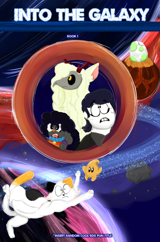
Looking at the timestamps, the first page was released on December 12th, 2020. So we’re just past 2 and a half years now!
The actual “development” of the story technically goes a bit further back to the time around the 1.4 update release, as I was getting really into the game lore and wrote up some worldbuilding ideas. Then in late November of 2020 I started planning a fanfic based on that, did a short 2-page comic set in that AU for fun, and then ended up expanding that original fanfic into the current, longer comic!

I’m gonna tentatively say yes! At least, one per Andrew and the Clothier each. There wouldn’t really have been a reason to make more than one of Andrew. There technically could’ve been more made of the Clothier, but one was all that was really needed.
Fortunately this current set of backgrounds outside of the dungeon is relatively simple, as I reuse the base coloring for the columns and adjust the perspective/lighting as necessary (each column is actually two pieces -- one “flat” side and one “angled” side).
I have a pretty limited capacity for doing backgrounds, so I tend to use tricks like this to reuse them where I can, haha. The first few backgrounds for an area tend to be harder, as I need to make assets and figure out how I want lighting and so on to work, but from there it usually gets easier.
It's still dependent on the background's design, of course -- backgrounds that are painted (usually outdoors) are a much different experience to work with than areas with detailed lineart and textured surfaces, such as the tavern and Andrew's kitchen. I'm slowly getting used to the perspective tools in Clip Studio Paint, though, which is helping a lot with drawing indoor spaces!

In all honesty, I was mostly focused on making it immediately recognizable even in silhouette, and that it fit well on the page, rather than focusing on making it perfectly to scale or the likes, haha.
Design-wise I find the Wall of Flesh to be super interesting -- it visually ties the “first” boss of progression (EoC) in with the last boss (Moonlord). And it’s overall very jarring, in that it’s easy to accidentally summon and turns the Underworld into an inescapable auto scroller in a way none of the other bosses do. And of course the story/lore significance, etc. etc. etc.
So when the time comes, I hope I can do it justice!

Honestly, I’m not sure! I still haven’t totally decided how that whole sequence of events will go -- some parts of it are very clearly planned out, others not so much. In a general sense, I do think that Chris’ reaction could vary significantly with the circumstances -- how much of a shock it is, and if he understands the significance of it -- but generally wouldn’t be good, in a horrified/panicking sense.
At the current point in the comic, Chris *does* have a general idea that something weird is up with Andrew, just based on what Heather/Malik/Becca were saying (including Heather’s mention of “burns”), plus Andrew leaving in a hurry that morning and brushing it off when asked about it. He doesn’t believe that Andrew is evil, of course, just that he’s dealing with some things, and Chris is appropriately concerned.
So- yeah, finding a doll of Andrew in the Underworld- honestly, there are a lot of ways for him to take it badly.
But hey, once he has the doll, Hardmode won’t be far away, and that’ll bring a whole new host of problems for him to focus on instead!
32 notes
·
View notes
Text
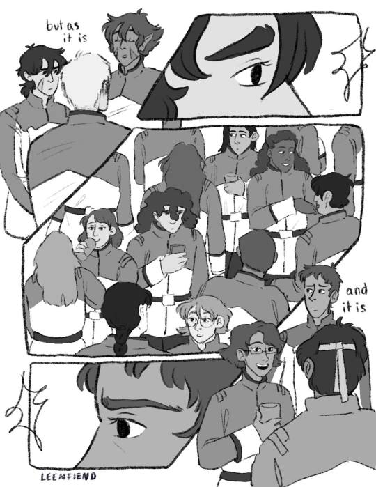
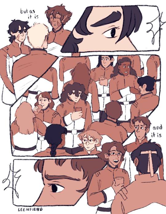
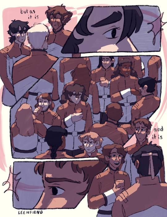
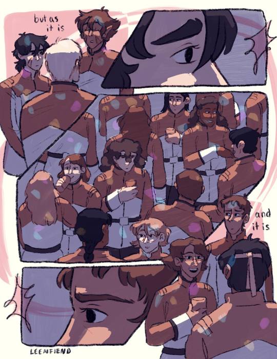
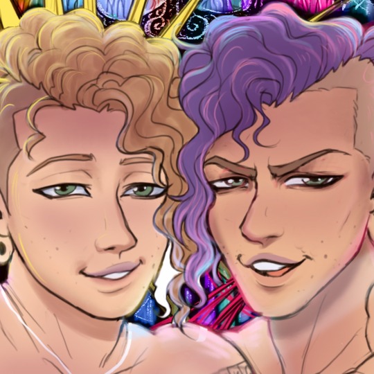
I thought the Two Slow Dancers comic would be a fun opportunity to break down my process a lil bit cause this was a lot of undoing and redoing and adding so for any ppl curious it will be under the cut!!
So to start off I actually only thumbnailed what is now page five and six, the original image in my mind was them reaching out to each other in different seasons clothing, I considered just making an animated version of that but then I connected it to the two slow dancers scene I had imagined in my head a month or so back and wanted to make it part of a small narrative:

(I actually did page six first - u can tell by the way my writing is nearly incomprehensible that this idea came to me like a vision in the night)
But then looking at that i said - well surely that doesn’t tell the story enough. I need more. And then I played two slow dancers on repeat for probably an hour while I thumbnailed a surrounding narrative for those two pages and ended up with this mess:
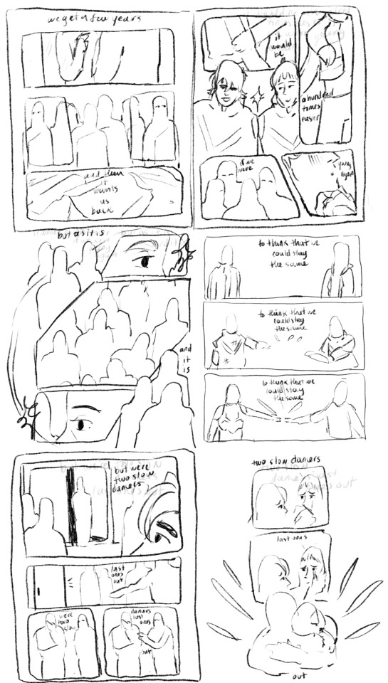
And from there I actually started working on the lineart two pages at a time - I like working on freakishly large two page spreads because to me it helps the flow feel more cohesive, I don’t look at them as isolated pages until I get to the shading part of the process.

But once I sent it to some ppl for feedback and reread it myself a million times I felt like the story still wasn’t reading the way I wanted it to - two out of six pages were “flashbacks/memories” pages and that ratio didn’t really allow for the other four pages to read as a cohesive story in my opinion so I kept trying to workshop two more pages for the front and I went through a few iterations:
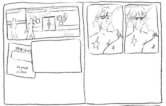
I thought at first I would show the outside of the garrison, give the audience more of a setting, and then show the flyer so we know Keith is getting ready for this celebration. But it was too literal for me (even though what I ended up doing was still pretty literal lmao). So then I started with the phone/text messages as a story telling device:
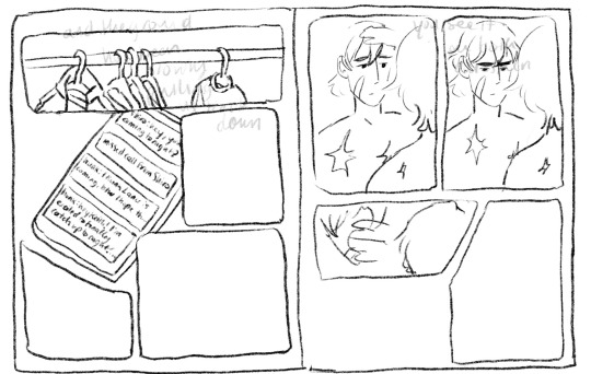
Also this is an example of how I almost always draw the comic panels before I decide what goes in them haha, unless I’m really sure what images I plan on focusing in on the panels almost always end up informing what goes inside if that makes sense. But I finally ended up here when I decided “that’s good enough”
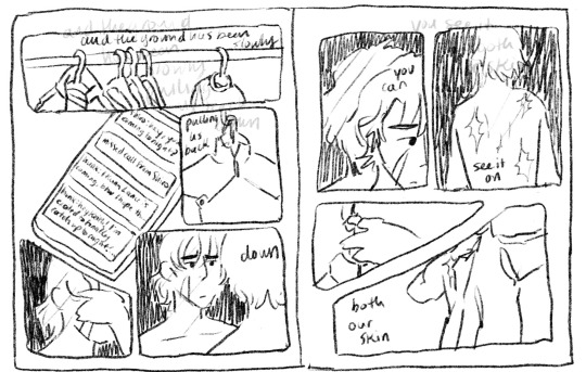
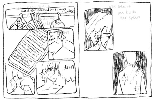
I even did most of the lineart for this composition before I decided the imagery of the jacket was just too repetitive, like we don’t need THREE PAGES of keith putting on a jacket.
So i kind of just moved the left page over to the right, and left the right page blank for most of the rest of the comic process. I finished most of the lineart on the rest of it before I finally circled back and decided to go with a tweak of what I originally thought was a lame idea (I had this image in my head of the lions silhouette against the glow of the Earth for the first page, but with the lyrics “the ground has been slowly pulling us back down” I thought it was just too cheesy, especially because that’s not what the lyrics mean either in the song or in the context of this comic and I didn’t want them to be perceived as so literal)

So this is the thumbnail I landed on for that which eventually turned into the actual final page.
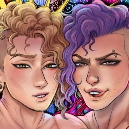
Once I had all of the thumbnailing done the rest was pretty fun work! Just lots of going back in and detailing out the scribbles I had first put down. Now in terms of color, I actually have a secret. Most times I don’t color much at all? It depends on the piece but for most of my comics what I do is this -
I flat greyscale color everything and then use a color curve adjuster inside of procreate to pick a color pallet:
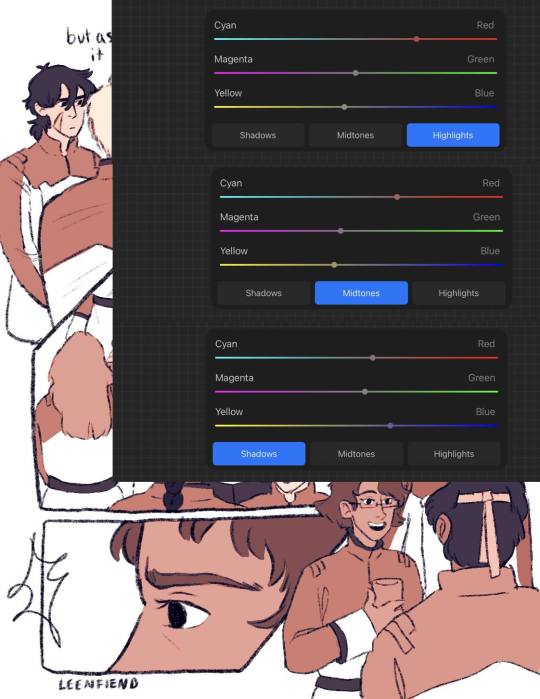
color adjusters are ur friend for picking color pallets i'm TELLING YOU!! I used to have a lot of trouble with cohesive color comps but it's a lot easier for me even without using this method now. Anyway I usually leave it here, in my other comics I don't have any shading or background elements outside of the panels but I figured since I was working so much on this comic anyway, I might as well light it a bit.
So I basically just scribbled over the whole composition with a purple marker set on a multiply layer and then erased out the places I wanted light to hit, and then added a soft light layer with colored lights to give it more of a party look:
The only hang up I had during the coloring process of all this was how to color the "memory" pages. I originally just wanted them to be more pastel/blue, I thought that would make them look distinct enough. So I painted/shaded this whole page before looking at it within the rest of the composition and deciding it didn't read well at all and ended up sliding the saturation down to zero and calling it a day:
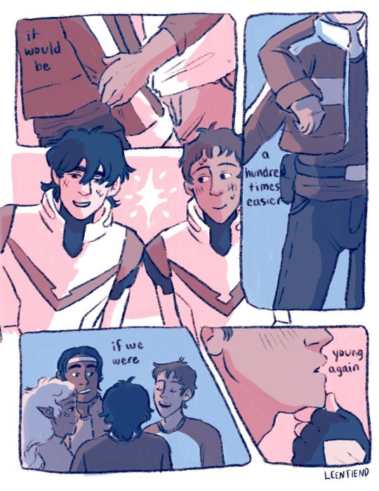
But I'm happy with that decision because it allowed for the "coming into color" moment with the other memory page and I think it connects better to the rest of the comic visually that way.
And that was the whole process! There were tons of other little adjustments I made along the way and other composition things I tried out but I do tend to erase instead of iterate in layers so this is the process I have to show you!
As a little bonus behind the scenes, here's the time lapse replay of that initial thumbnail for all eight pages! (it is sideways just because it's so large so if you're on a phone/tablet/laptop just turn ur screen sideways otherwise I'm so sorry lmao)
#my art#this is so long but i like 2 talk about process stuff lol#i also would love to see anyone else do a breakdown like this i LOOOVEEE seeing how other people work.#and feel free to steal any way I do anything ever (it is not stealing it's simply learning and using artistic practices that u are drawn to#colleen thoughts#also i use the 6B pencil in procreate for all of my linework ever and all of my thumbnailing im a one brush type of person#and it's like a default brush too lmao
23 notes
·
View notes
Text
my drawing process (thank you @pepper-ika!)
i draw and colour for a long long time. i don't do the traditional sketch + lineart + colour -- sketches are hard to line, they're kind of time-consuming and usually they end up better than the lineart, so i just draw like normal and clean it up before colouring. i start at the head and end at around the feet, kinda like a person showering (lol). here i'm using your typical pencil brush you can find in any standard art program.

a tip i got from another artist was to colour using a thick, opaque pen brush that varies a lot in width. it saves a Lot of time. before they showed me that, i made the mistake of using a soft, painterly brush to colour my art. it hurt my wrist because i had to press really hard to get flat colour -- when all that time i could have just been using a pen brush! also, i start with soft colours because they're nicer to look at.

2. i do colourful midtones like redness in the skin or maybe a blue five o clock shadow if they have one. from this point onward, i use a flat square-ish brush combined with a painterly smudger and a soft airbrush.
i read somewhere that you should apply perfume on the moistest parts of your body so i kind of use that same idea when drawing redness. usually i do it where skin meets skin: folded arms, a crunched back, closed hands, and that place where the thighs touch the buttcheeks, lolol. and of course: the nose, lips, and ears. it makes the skin look real and warm and lively!

3. i lay down my shadows and lights, usually in that order. and at this point, i'm throwing extra shadow on wrinkles, fat, bumps, lumps, etc. a body without rolls is like an angel without wings!
also i smudge like CRAZY here. just like how it's impossible to have "too much gravy" on your chicken, it's impossible to have "too much blending" when you're drawing skin. blend that ish.
when it comes to the colour of the shadows, i always make shadows the base colour but darker and more saturated, and i move the hue a little to the left (for example: orange goes to red, green goes to yellow, purple goes to blue). i do that with, like, every colour. i can't tell if it's lazy or not but at this point i'm too scared to ask.

4. finally i make some minor adjustments like liquifying to fix lopsided eyes or oversized heads/hands. when i was in high school, my art teacher would say "great, but watch the size of the feet, hands, and neck," lolol. he was right ofc. when i go "hm... that looks a little weird," i have to trust that gut feeling because when i do fix it, it ends up looking way better. here is a horrifying gif illustrating that.

AHH!!!
alternatively you could do a messy line and color, then do a whole paintover like i did here. this is awesome for details because you dont have to go back and change the lineart - you just paint over and add whatever you want and redraw the line to fit it.
i dont really use the different layer modes that much. in this one i used a gradient map of the drawing as an overlay. idk if that really does anything major but it does create a new range of colors to play with. i also used a multiply layer to cast a big shadow over the card (layer 8) because it has this tiiiny little pattern that would be a pain in the butt to draw shadows over. everything else is pretty standard.
(and no i dont name my layers... yes i will be changing my name and moving countries)
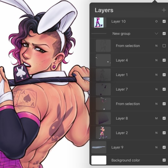
another thing worth noting: i use airbrushing A LOT. i remember reading somewhere that using airbrushes is like. a cardinal sin. it’s not, man. it’s great. airbrushes and smudging are dope and i use them all the time.

i hope you found this helpful! have a great weekend <3
33 notes
·
View notes
Note
The way you color is SO so pretty 😭 Do you have any tips for how you color? Or like a tutorial? 👀
Ahhh thank you soo much! ; ; Tbh I always feel like my coloring process is all over the place but I'll try my best to kind of explain my process!
So one thing I find that really helps with colors is picking and choosing the colors for your background/lineart first, as these will effect how your colors will look. Surrounding colors can easily make others look different; pinks can look green, reds can look purple, etc. So, for example, here's how my dendro drawing looks if you take away the background color and lineart:
Even like this, the colors still have a specific yellow/green tone to them but there’s no additional layers here that are effecting the colors; these are the base colors as they are with no adjustments. This is all because of the background and lineart colors I used while putting my base ones! So look again at the top picture, and then vs how it looks with the colored background and lineart I used while putting my flats and later when I went back to color my lineart.
See how different it looks just with the colored background/lineart? And then later with the colored lineart, how the colors pop more ever so slightly? Just this simple trick can help you pick your colors, even if you end up changing the background color later (so, say, if you want your base colors to have a different hue than your background). For example, here are some early iterations I went through (and tossed) using this technique for my TMA drawing:

I'm not used to working with darker colors, so unfortunately this technique didn't initially work out because they kept blending in too much with the background. I usually double check my colors on my phone, as they look different on my tablet/laptop/phone, and whenever I checked these iterations, I could barely see anything. I ended up changing the color of the background/lineart to something much lighter than what the final version would be (and actually, I think the background color I actually used was much lighter than the version here, but this is what I had in my file so it’s close enough). This is what I ended up using for my flats vs how it looks once I changed the background/lineart to what their final versions would be.

The colors are all the same, but they look completely different with just the simple change of lineart/background.
As for actually choosing them, colors are funky lil things that easily look different depending on what their surrounding colors are. So pinks can look like green, blues can look like orange, etc. etc. if you pick your colors right. If you look back on my TMA drawing, see how Martin's blue sweater isn't exactly blue? How Tim's purple shirt isn't even purple once placed on a white background. If this is something you struggle with, something I recommend to start is figuring out how your black/white is going to look. I personally will rarely use black/white on my drawings (not to say you can't use them of course!) as their hues can help decide everything else. Here are some examples of what I used for black/white in some of my drawings:


Also notice how I sometimes use multiple colors for black/white depending on character color palettes as well, as those will impact how they look too! A lot of this will be trial and error, so don’t be afraid to experiment with different combinations!
As for picking everything, I usually go with analogous colors, with complimentary colors used to help certain parts pop out.
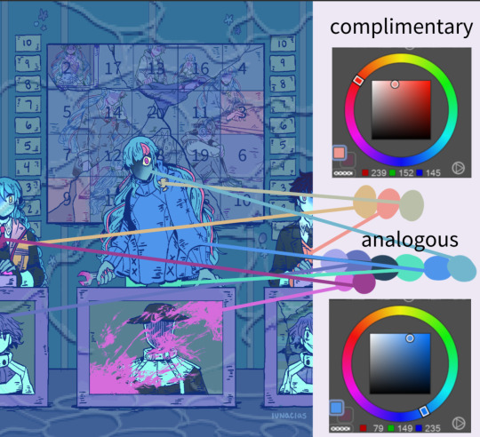
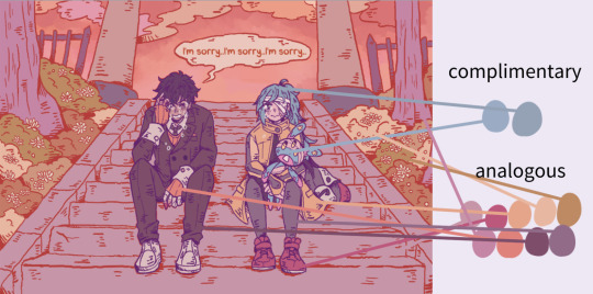
So for my Amame drawing, I stayed with blues/purples/greens (sometimes pinks) and very rarely dipped into orange. Whereas for the above Ryuki-Mizuki drawing, I stuck with oranges/reds for everything. Rather than use green for the bushes, for example, I stuck with something that’s more orange on the color wheel. Even Mizuki’s blue hair is more of a pale grey, despite how it looks in the actual drawing. Again, a lot of this will be trial and error! A lot of why it takes me so long to finish a drawing is because my flats will take up so much time as I experiment with different combinations.
After putting base colors on, I’ll usually go on to color my lineart. I will be honest, a lot of this is just eyeballing it alflajsdsd I’ll usually colorpick my flats and go for a darker shade/different hue than it, but also Ctrl + H will be your best friend if you need to darken anything or change hues. A lot of my issue is that I’ll use colors that are too light so my lineart gets lost, so I’ll usually adjust everything in between this and after shading. This will help everything pop out even more!


Like with my flats, I usually stay with colors that are analogous to whatever I’m using (so I’ll stick with oranges/reds if it’s a warm drawing or purples/blues if it’s a cool for example). But again, Ctrl + H will be your best friend!
As for shading/rendering, I wish I could be a bit more helpful here, but I’m really a “just throw colors down” kind of person. Layer modes are my best friend at this stage tbh, and my defaults are usually Multiply + Linear Burn + Hard Light (though sometimes I’ll do other layer modes depending on the drawing). Multiply I mainly will use for shading skin and pushing things to the background. So going back to my dendro drawing, I’ve used it for their skin and background elements (notice that Collei’s left leg is now slightly darker to add depth, etc). Depending on the drawing, I’ll use different colors for this step, this one in particular I used green to shade, though for their skin tone, I’ll stick to whatever I used with their flats..

Linear Burn I’ll use for everything else and this part is truly my “just throw down colors like it’s nobody’s business” stage. I’ll usually stick to colors that match whatever overall tone I’m going for, so in this came I kept mostly with greens, yellows, and some blues.
But again! Ctrl + H is your best friend! Adjust those bad boys and experiment with different combinations! I almost always will adjust this layer once I’m done with it; a lot of times, I’ll find different iterations I like a lot more than whatever I used!

From there, I’ll usually finish off with a layer set to Hard Light, which is, again, adjusted afterwards using Ctrl + H. I do this to add a lil shine to their hair and whatnot. Or, if there’s lighting, for that. For this drawing, I did adjust it afterwards with two overlay layers over everything (a light blue one and a green, set below 10% opacity), but that’s usually on a drawing by drawing basis.
Multiply + Linear Burn + Hard Light is my go to for most of my things tbh, but it’s also a case by case basis depending on how detailed my drawing is! My Amame and Ryuki-Mizuki drawings have a lot more going on after that, while my other TMA drawings follow this pretty much to a T (err... somewhat. My Guest for Mr. Spider one was a bit weird in terms of base colors, but everything else stayed the same). For rendering, I suggest trying different layer modes and opacities out as well! Or sometimes, if my base colors still aren’t cohesive enough to my liking, I’ll make the layer slightly more translucent and set the base color to whatever hue I want my drawing to be.
I hope this explanation could be of some help!! It ended up a lot longer than I thought it would be so hopefully it’s coherent enough to make sense of afsjdalds. I really love talking process so I’m really happy you asked me about my colors!
#please know I typed this up until halfway and. accidentally. deleted it.#thank you so much for this ask!#i love talking process alfsd#tbh if there's every any piece you wanna specifically ask the process of I am always open to talk!!#me: man i wish someone asked me for a coloring tutorial#me when it finally happens: WHHHH#anonymous#answered#tutorial#take a shot every time I say color alfsjd
70 notes
·
View notes
Text
OK SO EPISODE 11: TRAUMA GOT ME LOSING MY MIND TONIGHT READ BELOW TO SEE MY THOUGHTS
Shou and touichiro seemed pretty much the same except for two things. 1) touichiro's vision of Shou and his wife which was just... So good... The way that the coloring paralleled his vision of his wife in season 2 has me 😭 2) the other one I noticed was the double charge bomb they did together. This could have been in the manga and I just didn't remember it, but I'm pretty sure that's anime original and I am LIVING for it. Shou's trump card which he originally used to try and bring down his dad is now being used in tandem with his dad to help someone. It's so so good. (What's NOT so good is Shou's outfit, why is bones so determined to slander his sense of fashion?? But that's a post for another day lol)
(for an episode titled "trauma" it was rather hopeful in the end. Wonder if that has any sort of thematic meaning)
first, all the changes. I really adored all the build up they gave ritsu. His arrival was a bit abrupt in the manga, and I will forever love bones for not only having ritsu find the crash sight, but also find and take care of Teru. Literally yesterday I was thinking about how sad it is that Teru just gets left naked and hurt in the middle of the road, so that was very very nice.
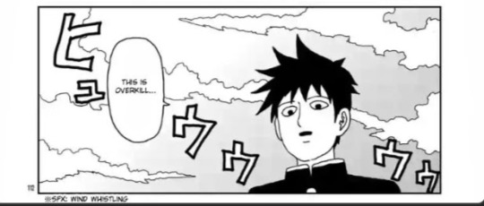
Back to more Ritsu changes since I'm following the episode's progression of scenes! I really miss the "man this is overkill" line. I know it doesn't fit the tone but it was just really funny ok?
But for some bigger changes, I noticed they took out the rhubarb wire that Ritsu saved a body improvement club member from. Which is interesting, I wonder if that's because of change of setting or censorship concerns.
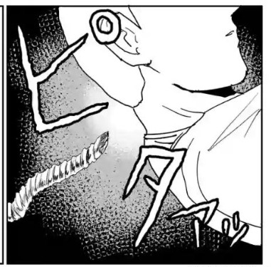
They also took out a lot of the implications of Ritsu's plan later in the fight. In the anime, he said something along the lines of "a big shock might stop nii-san" whereas in the manga...
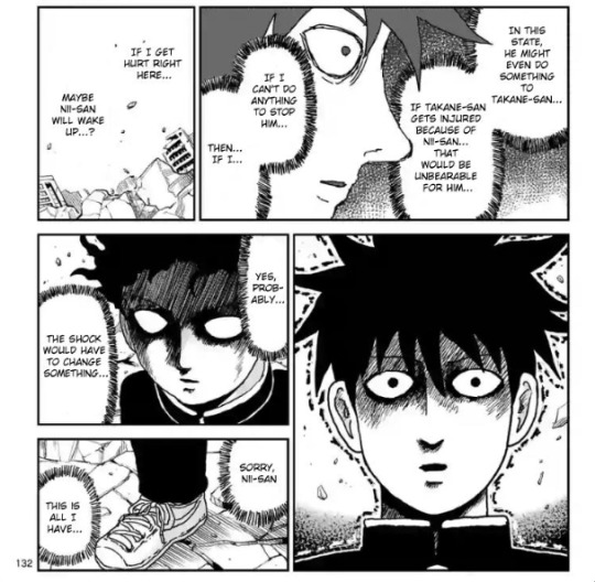
Yeah, he basically flat out says "maybe if I get hurt nii-san will snap out of it" which hoooo boy sure is a line of dialogue.
The final change I noticed was between the two "Mob" and "Shigeo", mainly in the art. I LOVE how they're doing it, with Shigeo being a blank white outline and Mob having blue lineart. It really helps differentiate them and make them pop. Super cool.
Now, do I miss some of the manga content and am I sad to see it go? Yes. But did bones do an utterly incredible job at adapting this? YES!!! so even if i don't like some of the changes, I like some of the other changes, and I love it overall.
As for overall hype:
OH MY GOSH 100% RITSU IVE BEEN WAITING FOR THIS MOMENT AND BOY DID IT DELIVER I AM FROTHING AT THE MOUTH I LOVE THIS I LOVE THIS I LOVE THIS
Also all of the parallels to previous things like having their fight on the bridge where mogami world Ritsu ignored him is spectacular. And the whole "I'm your little brother so let me help you" paralleling mobs "in your older brother, so I have to take care of you". And the music being the same as their original fight in the alleyway. I can't even...
SHOU CONTENT!!!! YES!!!! I CANNOT EVEN BEGIN TO DESCRIBE HOW HYPED I AM TO SEE MY BELOVED
Studio bones really just adores the super five huh? Hatori is still here lol and Joseph too
REIGEN AND SERIZAWA JUST SPRINTING PAST THE POLICE AKFJSKFKR YES THAT WAS SO GOOD
Tsubomi please move out of the way of the active tornado this is not a safe place my girl (and what an interesting character choice for her to wait, Tsubomi is such an enigma in all the best ways)
Oh rip to sakuri and koyama, you did your best. (Side note, imagine your ex CEO falling from the sky to duke it out with a magic middle schooler who just destroyed your workplace. Seasoning city is so wild lol)
Random side characters getting one frame my beloved! Minori moment!! Tokugawa and Shinji moment!!
In conclusion, episode 11 makes me lose my marbles and it was 100% worth the wait!
#mp100#long post#mp100 season 3#mob Psycho 10p#season three#ritsu kageyama#shigeo kageyama#shou suzuki#touichiro suzuki#teruku hanazawa#writing#text post#analysis#shinji kamuro#minori asagiri#tokugawa#no idea what his first name js lol#tsubomi takane#reigen arataka#serizawa katsuya#???#???%#sakurai#koyama#hatori#joseph#mob psycho 100
40 notes
·
View notes
Text
#17: Banged one out and a quickie.
Finished the second part of Zelink thing and did a "do it in your style" post by @murgoten

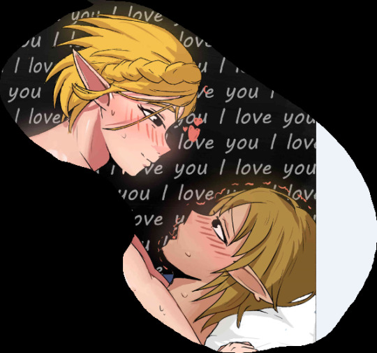
If you want to see a full version, you can see my twitter and reddit for it. Maybe the next thing I should do is TwiYor next ;)
I'm quite happy doing murgoten prompt cuz it made me do a quicker workflow that I needed. Just need more practice more dynamic poses and refined renderings in the end for the touches.
I wish I could show more of the process here but tumblr is scared of boobs so I sadly can't. Which is fair enough since it is just them straight up fucking so whatever really. But one thing I can talk about is my rendering process. Like I'm slowly getting an idea on how to do my own version. Flats, to shadows then soft edges then add highlights and saturated colors. It's probably the mixture of good shapes theory that I need to work on. Also learn how to lessen contrast. I do blen, but only lost edges. Only adding in colored lines around the end when I should probably do it earlier in the process.
You see it here actually in the quickie I did.
It's subtle but the it adds harmony within all colors. But not like every where though. Only where it realistically lands and/or make two things in the pic feel more like a group. Like that example from teal guy.


Stuff that I need to apply more next time. All this, just in lineart too.
2 notes
·
View notes
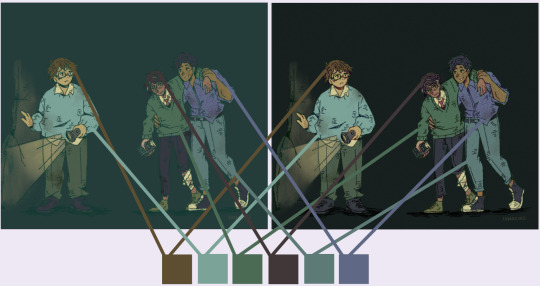
Note
How do you do your colors? Do you have a tutorial by chance?
aaa i dont have one onhand but i can go through my process? (this ended up being really long oops😭)
most of these arent like color theory rules or anything this is just how i like to do things
usually i choose 2-4 hues for the flats and pick some colors for my pallette off those
i generally like to stay away from desaturated colors but thats just cus super saturated colors r kinda my thing and i like em :]
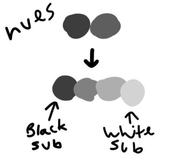
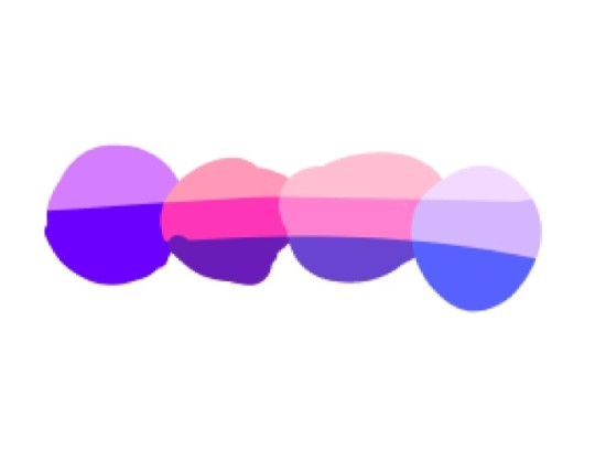
and in my color picking for the pallette i try to make sure i have a substitute for black and white! you can give the impression of those two colors without actually using pure black or pure white by replacing them with other colors that have darker or lighter values than the rest of your pallette (ill say more on values in a sec)

picture example of everything so far
nowww we talk about values!! a lot of people have a tendency to stay away from brighter more saturated colors cus they dont know how to use them in a pleasing way, and part of the reason for that i think is they arent checking values. values are a term to refer to white, black, grayscale colors, and when i refer to the values of your pallette, i mean how it looks in grayscale
this is how the colors i chose earlier look monochrome. i tried to make sure there was a good variety of dark and light values (could've done a little better than this tbh but you get the idea)
i Always check this when im picking colors cus i am prone to eyestrainy color clashy stuff and fixing values usually helps keep it pleasing
nowww we get into choosing shading and lighting colors. values also help for this!
i usually use a multiply layer for shading and a screen layer for highlights to start off with and choose a color id like for both. this time i did blue for shades and yellow for lights
also i avoid shading the black substitute sometimes cus sometimes it can look weird since i usually also make this my lineart color but thats not a hard rule or anything
but, while these are a nice starting point, im not satisfied with them so i merge all the layers and start adjusting them, making them more saturated and making sure the values look okay

aaaand it turns out like this!
usually this would be where people would stop but iiiii have been messing around with transitional shades as of late so i should probably talk about those too. basically i saw a painter say she avoids blending the base colors with the shading and lighting too much because it makes pieces look muddy to her, and that she prefers to make her own transition shades that keep the saturation up. so i took that to mean blast bright ass colors all over my piece as long as the values line up.
im still kinda figuring out how i like to do this and this is mostly just based off me like fucking around and isnt really apart of color theory rules from what i know but its how my pieces look the way they do

basically for each highlight color ill pick it, and move the hue level a little in the direction away from the base color, and then ill adjust that until the value is between the base color and the highlight, and then i repeat that process with the shading colors.

and it should look a little like this in monochrome with the values between the ones of highlights base colors and shading. cus it transitions between themmm thats why its a transition shade.

and this is how it turns out in color! the general idea is to make them pop while still being close enough to the base colors/shading/lighting that it isnt so jarring that it looks gross. im still fucking around and figuring out how to do this in a way that looks good to me but yeah! :]
that's my whole process basically. i did not realize itd make a whole essay but i hope its helpful in any way? feel free to ask for clarification if any parts are confusing
16 notes
·
View notes
Note
Something about my drawing feels off , i only got into digital drawing few weeks ago and I'm stuck at the same point and lost .. any advice?
mmm okay first of all this is really good- first impressions-wise, the proportions and anatomy look very solid so there are no major glaring issues so to speak
if you were to ask me, what i think this artwork needs is that sort of 'volume' or depth that most beginner digital artoworks lack. You can achieve this sort of volume in two ways depending on the style you are going for: either by improving the lineart, or by treating the lines just as part of the sketch and painting over them for a more.. ''painterly/rendered'' look
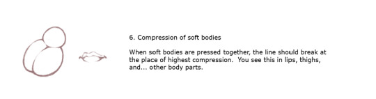
if you want to keep the lineart in, what i suggest is adding some "line weight" so that the artwork doesn't look so flat. What i mean by this is to thicken the lines where body parts would naturally overlap (like the neck and shoulder, the nostrils area, the corners of the mouth as well as the tip of the lips etc) and where shadows would normally be for the illusion of volume. After that, i'd also add more shadows and color variation in the colouring layer so that the skin looks more lively and again, for that volume. You can do it with some dark blue or orange on a multiply or an overlay layer, just experiment a bit with colors and blending modes.
If you want a more messy/painterly look (which is more down my alley or in line with my artstyle), what i'd personally do is i'd create a new layer on top of everything and just paint over the lines with broader strokes and a darker color in an attempt to add some volume to the shapes and to make the artwork look more cohesive and less "digital" because at the moment, i can tell that it is made up of a Lineart layer, then a Colouring Layer below, that very religiously follows the lineart layer and then maybe a layer on top of that for the other colors and the hair. This is a very common digital art process and a good one to keep in mind but a little secret i can give out that i've noticed in 80% of the artists who have this sort of drawing process is that they will always, always merge everything in one layer at the end and adjust things as they go. They will not keep the layers separated and just never revisit them in the process, despite what it may look like. There will always be something that needs fixing and they will fix it as they go so i suggest doing the same and being a bit more "freeform" with your layers
Anywayss, besides that, I'd also introduce some color variation like in the previous method. As a general tip, try to move the color slider around and don't just shade with a darker variation of the base color. I like how the hair is painted and the shine and everything, it looks very good and everything is pretty much set in place, i'd just render it even more, make it More voluminous. It's just missing a little pop a color: i'd add some blueish gray hues in the brown hair and for the purple hair i'd make it more rich by adding some deep dark blue hues and some faint yellow highlights (bc purple and yellow are complementary colors blabla) As for the shape, think of the hair as chunks of volume that reflect light and that are also affected by gravity.. or as spaghetti if u like flat hair like me bsjsjd
That's all i could think of; Again, it's very good and promising considering you started just a few weeks ago, so keep going at it! I hope it was at least somewhat helpful and that i wasn't being too technical with the wording (and that it made sense)
#i hope it didn't come across as mean or something#i have a bad habit of being pretty blunt with my words#and upseting people#the artwork is really nice and pretty but i was asked for critique so i pointed out some parts that could be improved#you don't even want to know what my art looked like a few weeks into digital art lmfao#this is 10x better#keep at it op!#and again hopefully i didn't offend with anything don't take it to heart you don't have to listen to me do what u want#ask iztea#if there are any typos no there aren't
51 notes
·
View notes
Note
👀 What's your favorite part of the art process? (And/or least favorite part-)
My answer for both is the sketching process bc 1) wow do I get down what I want perfectly here smtimes and 2) wow is it like pulling teeth to get something decent down other times. (Doesn't help that I've somehow merged my sketch and lineart steps so)
Uwah... hmmm..
I don't think I have one specifically.. all of the process from sketching to rendering, i both love and and hate them all
1) sketching, i also feel just like you :) its really nice to put down the thing that has been bothering your brain into something that's ... like its there, its not an abstract thought anymore :D. But also, its really frustrating if you can not do the idea justice because you either have yet the skill to make it or you are just physically and mentally exhausted :(
2) lining, its really nice seeing the rough ideas got more defined and you can add little details that makes you happy (not including making details for onmyoji characters design, they don't bring joy... even though they are beautiful.. even though i want to make them). What's not fun is looking at the anatomy you still suck at, or at the crooked construction lines, or that thing that make sense when you sketch and now that you have to line it.. it doesn't make sense anymore
3) coloring/rendering (i don't know what to call them), anon i have to say this step both give me equal part huge amount of joy and sadness. I love colors, they make me happy, but i basically colors as if im dumping buckets of paint to the canvas with hopes and prayers that it will make sense in the end. Its started nice but making them work is... a challenge, for me. Also sometime they ended up being too bright or too flat or too something that don't make me happy that day and i just delete them out of frustration :(
Uh.. this is pretty long anon, i hope this answers you question. If not, i'm sorry. Basically the gist is, i love everything and hate everything. But I love drawing so i love them all anyway :)
3 notes
·
View notes
Text
Wednesday Progress Shots:

More below the cut.
Original rough sketch.
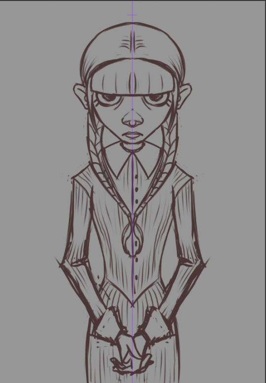
A more refined sketch; I decided I wanted it to be more like a creepy family portrait and added in her hands. I used symmetry for this one; I felt like it made it more uncanny.


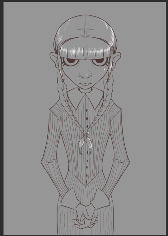
Lineart. I use a rough, pencil-like brush for my linework.

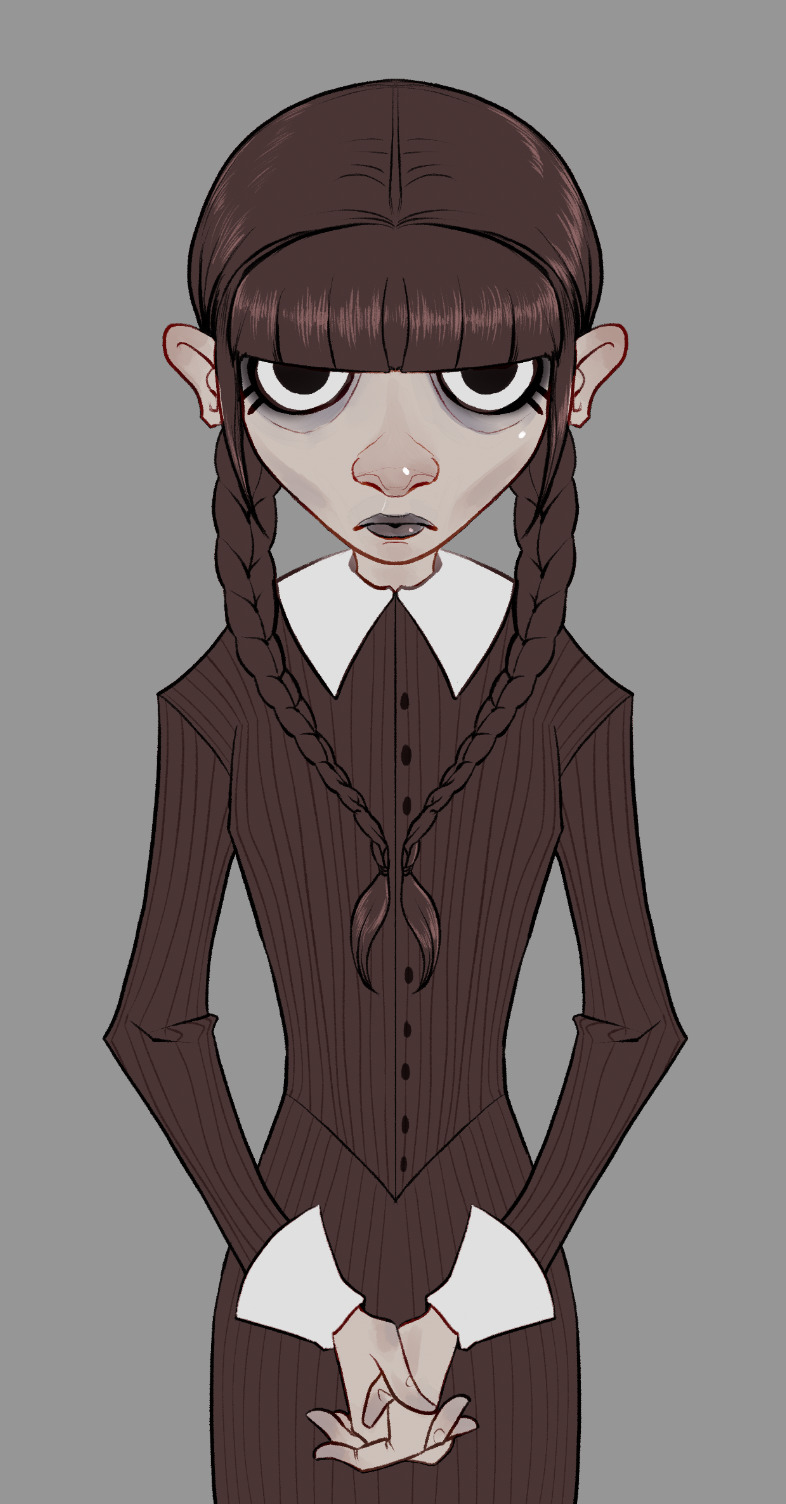
I painted in some flats. I always include a little extra color/rendering on extremities to give it a little more, er… life. x) I decided the "blacks" shoulder be the same deep maroon I used for the lineart so the lines faded at this stage. However, I go in and change them to overlay, or multiply, or color burn, depending on what looks best. :)
Flats, with lineart adjusted for overlays and color.

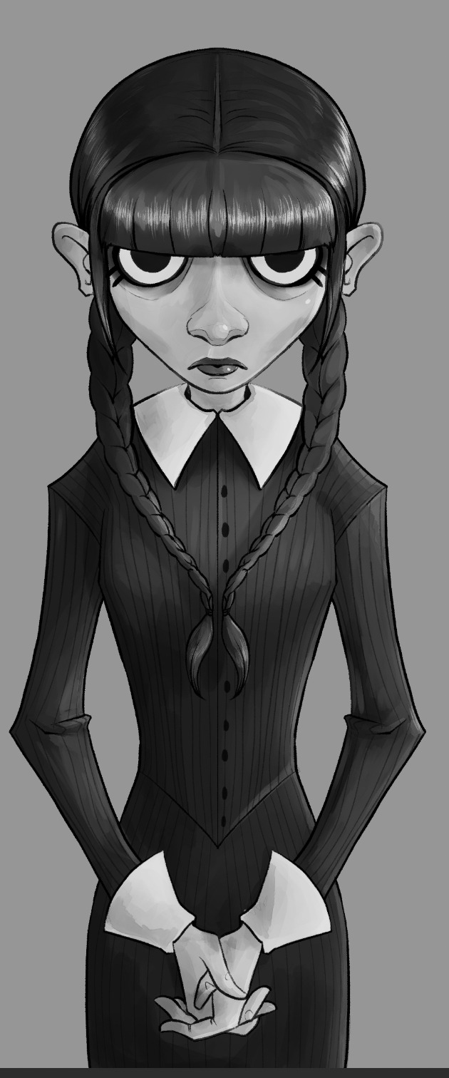
I paint in and plan an approximation of my light source(s) in grayscale.
Shadows added in two layers. How much I used and how many layers varies from piece to piece. Whatever looks good and feels right to me.
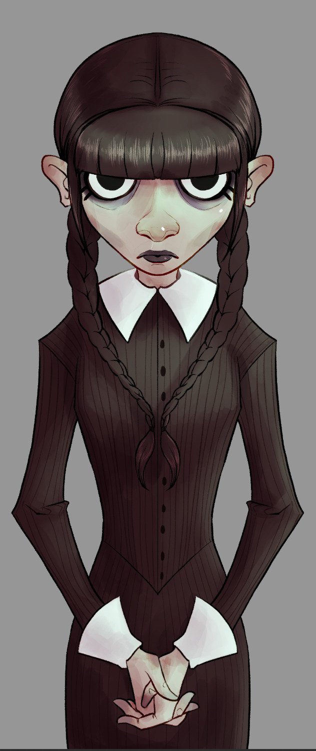


Once I've painted in my lightsource, it's just a matter of adjusting the colors until I like how they look. I went with a sickly green, cold light for this one. It wasn't bright enough originally, so I created a new layer. I continued adding details until I was happy with it.

Then I add a layer of green set on "darken." It knocks out any whites. I tend to play around with this setting on most of my pieces just to see how things look. Another thing I do frequently (that is, when I remember), is set up a layer that allows me to check my values at a glance (basically, an all-black or -white layer set to hue or color). I can make sure I don't have too many midtones and such.
Yep. She looks good like this, too. After this, and most importantly I like to let the work "breathe." Especially if I'm unsure about it. I let it sit for a day (sometimes longer, if I've got the luxury), before returning to it.


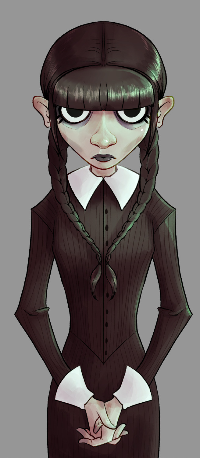
The left was what I had. Sure, she looked okay, but I decided some things were missing, and her hair was way too light to be Wednesday's sharp black. Originally when I saw the piece in my head, I planned my light source from directly above. As the piece developed it came more from the side. So I added a little shadow to her face, too. And yet, we are still not done. Umm. I like adjustment layers. I like adding a flash of unpredictability to my art. Keeps me from being too nitpicky, and forces me not to get too stuck with one version of a thing. I'm bad about things like that.
So… I smack on some curves, or adjust color balance. Sometimes I just put layers with different colors over them. In the end, though, I always add some noise, chromatic aberration, and sharpen.
…and let's not forget to sign it, either. Heh. I usually add a simple square with my real initials in it, as well as one (if not more) of my social media platforms. Anymore that tends to be my tumblr because I've taken a fancy to this place.
So. Yeah. A walkthrough my process that you never asked for and I didn't really plan, so there aren't any pictures of tools or anything. Umm. Questions from the class? x)
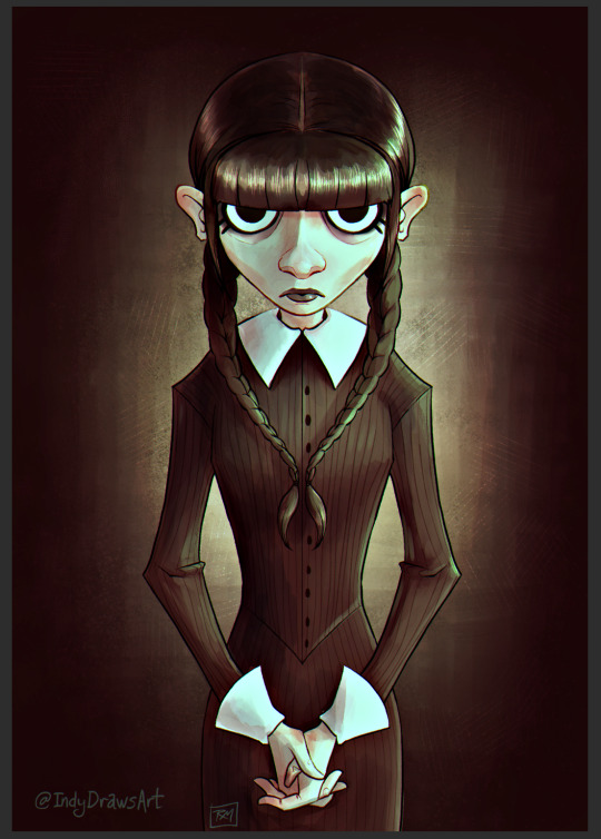
The final result:
#IndyDraws#IndyDrawsArt#my art#Wednesday Addams#Wednesday#Process#Progress#Walkthrough#i don't know how to tag this honestly#The Addams Family#fan art#csp#Clip Studio Paint#dunno if anyone would be interested in something more… official? like me actually trying to make this make more sense#i guess if ya'll would like i'd consider doing it#some of you ~cough biscia~ ~cough wizard-laundry~ have seen the shit-show my layers are lol
7 notes
·
View notes
Note
I want to preface this by saying that I really enjoy and look up to the work that you do. Do you have any advice for improving digital drawing skills? How you do anatomy, how you found and chose your tools and workflow, that sort of thing.
Hey thanks that means a lot, and I appreciate the questions!! I have a feeling this’ll end up being a long-winded explanation, so strap in.
To begin with I tried a lot of different programs, but I ended up on procreate because it just feels the most natural to me! I draw on an ipad with an apple pencil, pretty standard stuff there.
As for the specific tools I use in procreate I actually just use the default round brush under paintbrushes for pretty much everything. Aside from a few more technical brushes for effects and patterns and whatnot, but all those are default brushes too!
When I first started digital art a couple years ago I really had no experience with it whatsoever. I had done traditional art throughout my whole life up until that point, but digital was a whole new beast. A lot of my skills with traditional work definitely carried over, especially once I started to get more comfortable working in digital.
The main thing I can tell you, and which I’m sure you’ve heard countless times already is practice practice practice! You don’t have to slave away practicing eight hours a day and devoting your life to it, but make sure you’re drawing smart! Any drawing is good drawing, but if you really want to improve try and make your practice a bit more focused. Pick one specific thing you struggle with at a time and work on them individually. Drawing from reference is always a good place to start.
As for my workflow, it’s honestly pretty horrible, but it works for me, so that’s all that matters tbh. You just gotta mess around with different things until you figure out what feels most comfortable and natural to your process.
Typically I’ll start from a reference, then once I’ve got enought of the figure down I’ll start to make adjustments with the liquify tool and clean up lines. I personally don’t use any sort of gesture or skeleton when I sketch, I just go straight into the lines and adjust as I go, then clean them up to a point I’m happy with. I also use a ton of layers so I can move around parts easier.
After this I start painting in my flat colors on a layer below the lineart, pretty standard stuff there! Typically when I choose colors I try and keep them all in the same family or tones, so you’ll see all my vampires have very cool tones and a lot of purple. Even the black and white colors have some cool tints in them.
Once my flats are finished I move on to the shadows. I start with the biggest section of color first, usually the skin, and make a clipping layer above it. I set the clip layer to overlay, then depending on the skin tone I use a very dark blue or dark red color for the shadows. This also often takes a bit of adjusting transparency and other values, but I’ve eventually gotten a feel for it.
When actually painting in the shadows I start pretty basic just to block out shapes and get an idea of where I want the light source to be. Then I go back in finer detail. Once I finish with a pass of shadow, depending on how it looks I’ll duplicate the layer, adjust transparency, then use gaussian blur to soften the edges while keeping the original shapes in tact. I also use the smudge tool occasionally for finer adjustments as well.
I do a similar process for each block of color until it’s to my liking. Sometimes, especially on the skin tone, I’ll go back and add another overlay layer above the shadows to do some countershading, which just makes things look a bit more three dimensional.
Once all the shading is finished I go back on the skin very gently with a soft, red airbrush to give it a bit of warmth and life, especially around the face. After this I use a white noise brush on another overlay layer to add some subtle highlights and skin texture. For shiny things like hair I make yet another overlay layer, and use a random brush pack I found online that has some nice water effects.
Once all the rendering and other effects are complete I then go back to my lineart layer, make a duplicate, then color it in red with a clipping mask. I take this new red lineart and bring it all the way down to above where the skin tone layer is. This has a very subtle effect, but it makes all the difference imo. After that I go back to the lineart layer once again and make a clipping layer above it, then gently use a red airbrush around where the light hits brightest. I do the same with a dark blue airbrush on the parts with the most shadow. This gives the lineart a bit of variation in color!
Lastly I just sorta wing the background most of the time so I can’t give you much assistance there haha.
Again, apologies for the super long explanation that probably makes zero sense, but I hope you’re able to at least glean some amount of knowledge from my process!!
2 notes
·
View notes
Last Seen Blogs

frackkomander
Untitled
her-biness
I Have Three Hit Points
malkaviians-archive
Seaway
worldhell
BET ON LOSING DOGS
dommiartsss
Dommiarts