#these are much better imo :D
Text


[ store ] 🌱 january update
✦ new:
↳ webbedsite! i got a new website!!! please check it out :D :D :D
↳ custom linking charms 🥬🐟🍞
↳ gift cards added (!!!)
✦ 2023 stock leftovers available :3
as its a new site, please let me know if you encounter any issues so i can fix them! i hope you find something you like!!💖
🌱SHOP: peachcott.com 🌱
you can use the code "HAPPY" for 15% off for the rest of january!! ♪(´▽`)
#cott.txt#store#mine#WAAA I'M SO HAPPY IT'S LIVE NOW#have spent the entire month trying to get everything working the way i want it to awaaa but its done now :D#i'm trialling the new platform until march bc its significantly more expensive than my other one#so if youve ordered before please lmk if you liked the other storefront better or anything!!!#BUT YEAH it does cool things like newsletters and gift cards and a much nicer variant selection ui (imo) SO IM EXCITED#i hope you like it!!!!!!!!!
74 notes
·
View notes
Text
There's nothing wrong with people having their dearest most specialest blorbo be Eric ztd it is unironically good for the ecosystem and I always love seeing the different perspectives from other fans but what I am here today to ask is why is no one like that about Mira. whatever happened to feminism.
#every categorically insane man in this series has their dedicated fans and every popular character also has a bunch of red flags so like#to be fair no one's too crazy about Lotus or Alice either hm like people either outright dislike them conceptually because of their designs#or you know just have an appreciation for them as characters but not quite focusing on them much at all#like me#and like are the tropes that make up her character problematic? yeah! that didn't stop y'all from liking Saito a whole lot#now he's better woven into the narrative of the game he's in but then my point's back to Eric lol#like it is just fucking ludicrous the amount of stuff in the whole Series not to mention the game Alone that she's responsible for#but it does feel disconnected (being responsible for the Kurashiki's parents deaths)#frustrating (being responsible for injecting Phi whith Rad-6)#and overall just kinda glossed over? (beheading Junpei and killing off D-Team that one time because she was in cahoots with Zero)#so like I get why people wouldn't like her she's a bad plot device but THAT'S WHAT I'M SAYING#THAT'S NOT REALLY STOPPING ANYONE and it's not even like people are very vocal about hating her either#at most I've seen it be lumped in with some major complains about the game like as a whole#the way we find out so early she's a serial killer it's kinda shocking but not really? it ends up as just kinda ridiculous and underwhelming#imo that's the whole game but again even when it comes to people who Do Like this game#anyways free to reblog I Do wanna talk about this but I am absolutely Not putting this in the tag lmao could you imagine#like is the trope of having one big booba female character per game and for it to be a Defining Characteristic kinda not great? yeah#but also like shrug#we've let Uchikosh get away with worse
14 notes
·
View notes
Text
Is it a hot take to say re7 is the scariest resident evil game …
#I genuinely have no idea what people think the scariest rezi game is?#if I had rezi followers I’d do a poll but I’m so deathly curious#re7 and 8 are the most .. hm#controversial maybe? minus the re3make#because of the swap to first person but that was the point#the perspective swap was to make ‘em scarier and I think they did a good job#re7 at least#I don’t rhink re8 is very scary sorry😭#re7 just has a better premise#all the Mia cutscenes are fuckin. crazy. to me at least bc one of my biggest fears is getting stabbed with a huge kitchen knife like that#plus the baker house setting is purrfect imo#re8 is very much fairy tail vibes. not too spooky#the vampires aren’t scary theyre hot idk what you want from me. it was hot when ethan got his hand cut off by lady d ok.#I’m not scared of dolls or that ugly ass fish man neither so#not factories neither#just yeah. fairy tail. not scary#tbf I’m not scared of bugs so the whole bug part of re7 admittedly does nothing for me#which is a shame because it’s AMAZING#but no yeah re7 is so good and so so fucking scary LMFAO#god I need to peer pressure some of my friends into getting into the rezi series I need to be insane w someone abt it#unfortunately it’s a little hard to get into admittedly but once you’re in you’re IN
3 notes
·
View notes
Text
Heyyy does anyone know of any good free animation software that isn’t krita??
#it doesn’t even need to be a great art tool#i just need something that#has layers#i can import frames#let’s me move around frames#and actually compiles it into an animation#because krita has decided it doesn’t want to do that last part for absolutely no reason even tho it worked fine the other day D:<#I’m so mad#I’m so so so angry#and I hate the gui of krita anyways it sucks medibang is so much better (imo)#artist#artist problems#help#idek what to tag this as
11 notes
·
View notes
Text
Love to go back to my desk once I've woken up and see whatever weird thing I was working on at like 5 am. This one I think is genuinely interesting but also would look so deranged to anyone else 😭 I was writing a color coded guide to how I group drivers in my head with examples with different grids(i.e. how the demographics change) and now I want to write one for all of the 2000-now grids. Completely normal behavior what are you talking about
#let me know if anyone wants to see it :D i like to do these little projects for myself bcs its fun to be meticulous#but as i said i do think its really interesting what the demographic of the grid is#(how i group them is basically about debut year which comes with certain impressions on my part)#but i say it looks deranged bcs one time i showed my dad my f1 guide book#(i have a notebook where i wrote down guides of all the grids like with teams/drivers/team changes/etc)#(and also write down all of the race wknd results from this season)#and hes like '...oooookayyyyyyy 😶'#ITS FUN FOR ME OKAY#im just fond of 'record keeping' ig and i really think the older grids are interesting#id love to do the 90s but the further back you go the more confusing it gets tbh#like only a handful of drivers ik from then and also more drivers#i actually have written grid guides twice....sry its rly fun actually 😭#but bcs i switched notebooks and i wanted to make a better one#but it was so interesting bcs i made the first one when i was getting into f1 and then the 2nd one was like after i had watched older races#so the first time i only knew a couple drivers but then 2nd time i recognized practically every name#lmao this started bcs i had to write a 2023 guide to myself so i could memorize all the teams and drivers#and i remember really not knowing like any of them but now i think i could do back until 2018 from memory#before that gets a bit hsrd just because there's a lot of drivers that just come and go super quickly and leave not much impression imo#okay anyways now i must embark on my deranged organizational adventure#catie.rambling.txt
11 notes
·
View notes
Text
I would like to thank The Morning Show for feeding the millennial sapphics who always thought Elle Woods should have been with the intimidating brunette woman, I feel seen & heard 😌🙏
#ms witherspoon needs to improve her ability to perfom chemistry with same sex romantic partners but ive seen worse#julianna margulies is giving so much hot mommy dyke energy for reese to work with and yet she usually meets her with the gal pal vibes SIGH#she's no katherine heigl in jennys wedding at least. and this season (before uh the events of the last ep) they had better chemistry imo#i knew they wouldn't be end game 😔 but i didnt expect them to last this long so i will b gr8ful for what we had when we had it. rip ladley#i truly dont care about straight (or closeted assumed str8) actors playing queer roles as long as they can actually play them#to me that so-called discourse boils down to the ole annoying english teacher thing: 'can i play gay?' 'idk CAN you?'#reese at least doesnt seem to have a phobia of same sex saliva getting in her mouth like many other straggot actors ive seen in the past#am i making excuses for her bc i am one of the aforementioned sapphics who imprinted on her as a preteen? maybe so maybe so but I!D!C!!!#dani talks about tv#i'll lose it if cordley happens though. cory isnt a monster like other men on the show but the bar is low & theyve never been a good ship#im sure there are dedicated bradley x cory blogs here on tumblr dot com but i refuse to believe those people are real
3 notes
·
View notes
Text
edit: i ended up just ranting abt like the current vibe™ in the tags... sorry abt that but like also whatever i don't care anymore
#d#my food therapist really said the most real thing on planet earth when she said i'm meeting me at the same time everyone else is#i feel like a cringey overzealous emotionally dumb teenager who's a total embarrassment to everyone around me while i'm trying 2 say fuck i#cuz like this is the first time in my entire life i feel like i get to actually explore my identity and do like normal young people things#and i feel just. so so exposed in the sense that everyone is watching me make a fool of myself without a single shred of self-awareness#and it makes me so fucking mad cuz like i'm finally happy with myself!! i'm finally starting to feel like a fully formed person#instead of a 2d projection or an object or something monstrous hiding in the shadows because that's how i've spent until now imo#and like. it's hard to emotionally make peace with the fact things in my social life are changing because like. there's some part of me#that thinks that maybe if i stayed in that miserable place that maybe i wouldn't have any of the problems i have now#and like my life is a lot better. and i know that and i wouldn't change a thing. but like emotionally i guess i'm just#processing it as a fault of mine to have changed bc it's changing my relationships to others#and this isn't about any one specific thing like i've been having lots of small growing pains with a lot of ppl in my life rn i just am lik#there's a lot happening to me rn emotionally so i feel like everything i do is a fuckup and i'm just bracing for more people to go ig#which might happen or it might not and tbh either is ok at this point. i need to do this in order to live i think#idk why i'm even rambling about this i just have a lot of thoughts and i want to share them i guess. not like it does anything but like#what else is this app for at this point lmfao i barely even want to talk on here anymore because i feel like everything i say on here is#just pointless. i'm thankful i have a strong support system rn cuz genuinely i don't know what i'd do if i didn't like#i feel like everything is so much more emotionally Big to me on E and it's kind of hard trying to figure out how to manage it#like i'm basically finally getting to be me. for worse AND for better. and i just am like. insecure on some level i guess#not even over my appearance tbh i've kinda made peace with that. moreso my personality and what things i share with others#this whole post is so wholly unnecessary but i feel like i'm going to go insane if i don't get this out of my head#i've genuinely been avoiding talking about my emotions or my private life on here because i don't exactly feel safe on here anymore#which is like great. love it when my primary outlet for like. socially interacting with people casually gets compromised i love it#i literally softblocked like 30 ppl off of here so i could talk abt my weird sex stuff and my body and my deeper thoughts with ppl i trust#and then i still am too conscious about it! this always happens when i make a blog for myself to talk on#maybe i'm just not meant for talking abt things
3 notes
·
View notes
Text
Only a couple more days until bsd s4 starts I'm not ready-
#cant wait to see more of tecchou animated <33#also what light novel do yall think is getting animated this time personally i think its gonna be untold origins#cause the ones that havent been animated yet are untold origins 55 minutes beast and stormbringer#and beast and stormbringer would be much better as movies imo like they wouldnt fit in the main story#and i dont think its gonna be 55 minutes because barely anyone cares about that one lol#so id be willing to bet decent money that itll be untold origins :D#which yjs great cause i want to see babey ranpo animated <33#bsd#bungou stray dogs#seri speaks
6 notes
·
View notes
Text

xo kitty final post of thoughts (I promise) in the tags below if anyone cares and then imma dissapear into the void again and go back to trying to write my own sh-t lol 😆
#someone needs to draw up a relationship chart for this d@mn show#bc wtf it was actually too much even for the messy dramatic in me#like the amount of possible relationships in this short series of 10 30 min episodes covers like -#2-3 seasons worth of relationship permutations in like your standard american tv show lol#*xo kitty spoilers after this tag*#dae and juliana deserved better.#still trying to understand how kitty fell for someone who was a literal antagonist in the first half of the show -#and did so many hurtful things to her#like??? it didn't feel like enemies to lovers it just felt straight up antagonistic lol#not to mention i feel like constant interruption/straight up miscommunication got in the way of kitty and dae actually talking through -#the stupid conflict in the first part of the show#and i hate when that's used as a plot device too much - it becomes a crutch imo#did i mention that the fake dating plot just...didn’t hit for me#like they're fake dating but yuri was committed to the act in a way that made no sense considering her initial motivations 🧐#like eye -#and minho was meh - i didn’t hate him by the end#but there was no need to make him interested in kitty as well that just seemed random af to me too ngl#how are you suddenly in love bro you just met her and yall weren’t even spending time like that on the regular???#wished they'd spent more time addressing the loneliness he clearly feels with having a celebrity mom#and how he overcompensates for it by being overly committed/attached to his friends and their lives and parties and flings...#but anyways -#also wished dae just got more background with his family and money situation.#i enjoyed when he was on screen and would have liked to see more#but d@mn did he get shoved to the side in this story lol#best part was prob family drama with alex yuri's mom and professor snape lol#and q and florian. loved them <3#juliana was in this for all of maybe like 9 minutes total lol like wtf ik she was sent away but damn 😂#in 2023's internet age she and yuri couldn’t find each other despite their parent's involvement???#anyways - thank you for coming to my ted talk#this review is so unserious just ranting for fun so don't take it too seriously unless you agree then send me comments bc wtf was this lol
3 notes
·
View notes
Text
not sure if this is a hot take but the ain't afraid to die remake isn't. that good
#don't get me wrong it's a perfectly fine song but when compared to the original?? it lost pretty much all its soul??? at least imo#like bro the vocals are WAY too polished and i feel NOTHING#you could argue the og sounds a bit amateurish but that honestly gave it so much more depth#Especially when Kyo's voice broke and went slightly off key during emotional lines#also the last added line didn't do it for me man#it's so unnecessary. like the previous ending was perfect and left the song with this sense of bittersweet sorrow#but this one is just. kind of superficial when compared to the rest of the lyrics. idk mannnn#i swear im not a remake hater i just think this one's kinda bad#the guitar is WAY better in this version though#Luke rants#not tagging bc d/iru fans scare me
8 notes
·
View notes
Text
cherrizuki -> mochiinami
3 notes
·
View notes
Text
i honestly think i like it better that my ethnic genetic makeup is vague, it makes for very entertaining interactions.
#used to really want my brother to get a dna test to FOR SURE find out what we're mixed with but nowadays? ppl put too much emphasis#on that shit anyways and i think its simply more fun to have them guess and be wrong#what if: races are basically fake. anyone you consider 'white' bc they're european can actually have dark skin and vice versa for ppl#of other countries like africa n such#race is a fuck. ethnicities is a better way to gauge but also- *why* do we need to gauge that anyways?#if one person can assume im white and another person can assume im egyptian then whats tha fuckin point of these terms#HONESTLY honestly culture is all you rly need to know fr. this obsession w peoples facial features. skin colors and tones. the#origin of alllll of their ancestors is really fuckin weird and unnecessary and honestly some nazi shit.#i exist i am me i exist as i am and isnt that good enough?#the only time skin color is important is when you need to factor in how long someone can tolerate being in the sun + how quickly#you can absorb vitamin d from it. otherwise it really doesnt fuckin matter.#(yes it matters bc white supremacists made these distinctions and we have to use them to communicate points sometimes BUT#the goal is to get these terms to stop mattering to the general public imo bc personally i think theyre useless distinctions. like trying#to attach races to different colored cows or smthn. its nonsense.)
1 note
·
View note
Note
ok but what are ur thoughts on shishiba
tldr: yes
my word vomit answer?: he's my favorite order character, that man just oozes coolness. some of his quotes are so iconic ('i don't wanna have to think too much?' mood. 'the idea that we should give maniacs guns is old-fashioned.' okay pop off our hammer-wielding king. and him comparing assassin work to housework sent me. a true professional) and his latest design change also makes him look more cool. and i absolutely live for his dynamic w osaragi and nagumo. dying to see him and osaragi be more badass together
#hoping w the latest fights we're gonna see them kick ass i can sense the foreshadowing w them against another duo#i also feel like in the beginning i was like hm okay i don't vibe w the dude but imo his character got a major upgrade w development#was re-reading the manga and the beginning of it is quite diff to where we're currently at but for the better#what he did when he was first introduced is SO DIFFERENT from how i think he's currently portrayed e.g. his thoughts on killing#and civilian life involvement#no but fr i love shishiba. his vol cover is so cool too#honestly all the sakaday characters have so much drip#the drippiest fr they fight IN STYLE#i fear someone will d word in the exhibition arc but we're not gonna think about that now nope N O P E#Sakamoto days spoilers#i love this series sm w my heart ngl it's so fun to read#but im a fan of action flicks and the john wick series so are we surprised nope#ik it's joked about#but yes sakamoto days is basically a fanfic prompt among the lines of 'how would john wick be if his wife didn't die' lmao and i love it
1 note
·
View note
Text
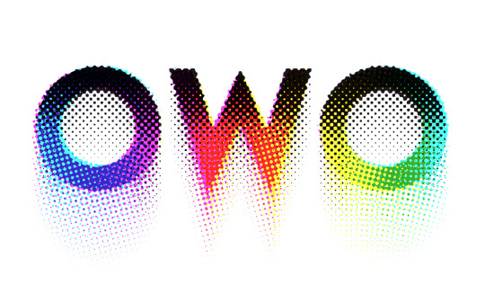
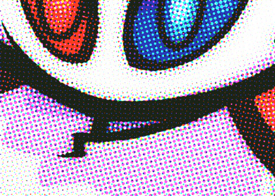
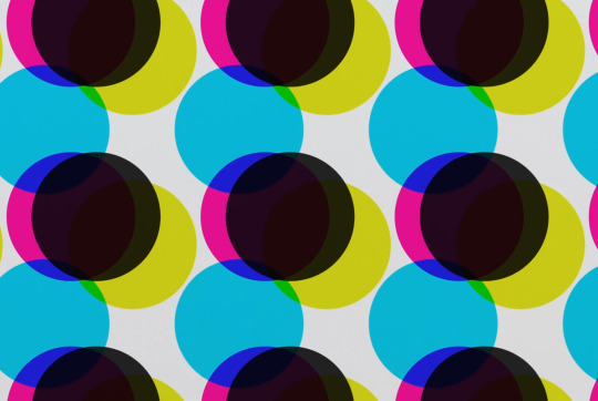
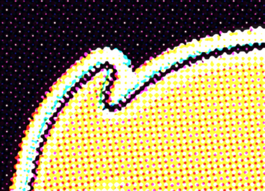
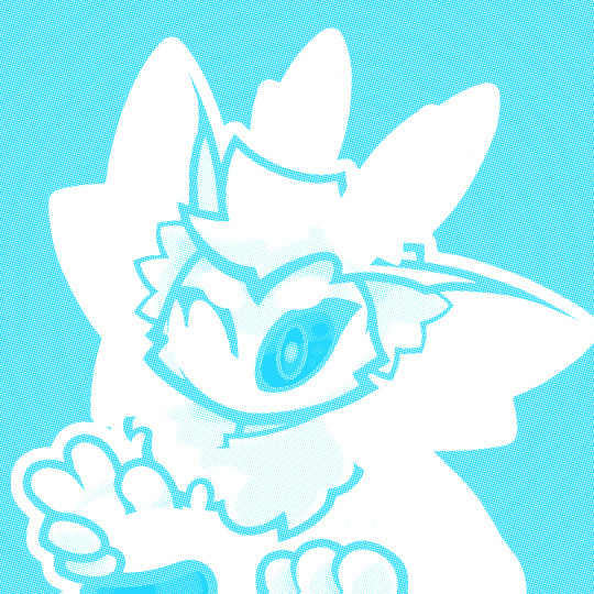
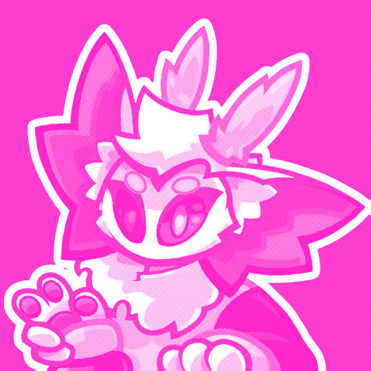
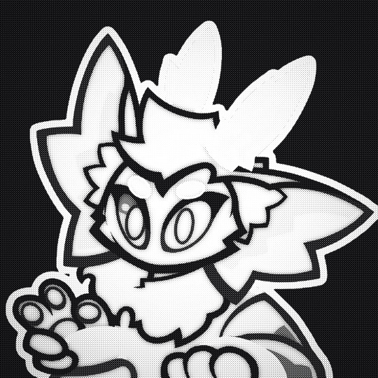
Was experimenting with halftone effects after watching this video and it almost has spiderverse vibes honestly. I actually learned some neat things about why printers use CMYK instead of just CMY so I thought I'd share !!
So in our optimal little computer space, Cyan (0,255,255), Magenta (255,0,255) and Yellow (255,255,0) all multiplied together gives us a perfect black (0,0,0) Awesome! The issue is that ink colors irl arent exactly perfect like this, and color is a bit more complicated irl compared to how computers represent it, so they aren't the greatest at combining into black if they aren't those perfect CMY values:
Left: CMY
Right: CMYK

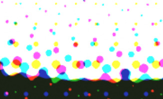
(thats not even black, its a dark blue in the original image but dark colors just look so much richer)
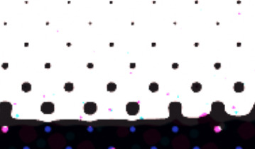
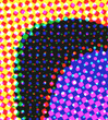
An important step to make sure you arent doubling up on the black values though is to divide the image by it's own "value" (the max of all 3 color channels) that way the value is equal to 1 everywhere, and you're letting the black ink take care of the value on its own.
Left: CMY (normalized value)
Middle: K (black)
Right: Combined


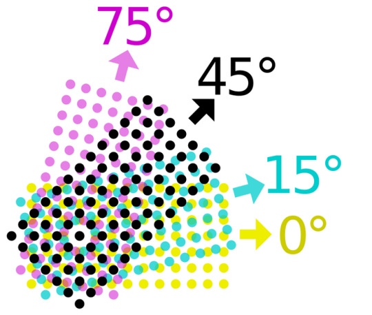
Now obviously the grids of dots cant be aligned perfectly with each other because you'd just get a bunch of black dots in unwanted areas, but if the grids are misaligned, then some dots become more prominent than others which tints the whole image. This was an issue because older printing methods didn't have great accuracy and these grids were often misaligned.
The solution was to rotate these grids such that they can move around freely while getting rid of that tint effect if they aren't perfectly aligned :D
(I have no idea how they came up with these angles but that might be something to look into in the future who knows)
SPEAKING OF MISALIGNMENT
I wanted to implement that in my own filter to get some cool effects, and I discovered another reason CMYK is better than CMY for lots of stuff !!
With CMY, you're relying on the combination of 3 color channels to make the color black. This means if you have thin lines or just details in general, misalignment can make those details very fuzzy. Since CMYK uses a single color of ink to handle value, it reduces color fringing and improves clarity a lot even if you have the exact same misalignment as CMY!
Left: CMY
Right: You guessed it! CMYK


(yes these comparisons have the exact same color misalignment, the only difference is using a fourth ink color for black)
ANYWAY I just thought there was a lot of cool information in this tiny little day project, I also just think it looks really neat and wanted to share what I learned :3c


EDITING BECAUSE THERE'S ONE MORE THING I WANTED TO ADD
So, I talked about how to get K in addition to CMY instead of just CMY, but how exactly do you separate CMY from an image in the first place?
Well, CMY is a subtractive color space, meaning the "absence of color" is white, compared to RGB where it's black. This makes sense because ofc ink is printed on white paper. You can use dot product to get the "similarity" between two vectors, and this can be used to separate RGB actually! Using the dot product of a color and red (255,0,0) will give you just the red values of the image. This is cool though because if we get the dot product of our image and the color cyan (0,255,255), we can get the cyan values from our image too! If we first divide our colors by their value to separate the value from them, then separate CMY using those dot product values, and using K for our final black color value, our individual color passes end up looking like this:

While it's called a "subtractive" color space, I find it more intuitive to treat white as the absence of color here, and then multiply all these passes together. It makes it much easier to understand how the colors are combined imo.
Notice how cyan is the opposite of red: (255,0,0) vs (0,255,255) and magenta and yellow are the opposites of green and blue respectively! This means you can actually kinda get away with separating the RGB values and just inverting some stuff to optimize this, but this example is much more intuitive and readable so I won't go too deep into that.
THANKS FOR READING
I know it's a very long post but I hope people find it interesting! I try my best to explain things in a clear and concise way :3
oh thank you I realized I should probably add an eyestrain tag
1K notes
·
View notes
Note
Aah!! As the strange anon who requested Naoya. I gotta say I totally agree with these headcanons! You got him perfect lol basically a d**k..unless your super hot, don't speak and magically anticipate exactly what he wants when he wants it...in which case he's slightly less of a d**k. Ooh please do gojo headcanons now I'm addicted haha
lmfao strange anon 😭😭 but fr you’re right tho, naoya would usually be the type to say “you look prettier with your mouth shut, keep it that way”.
♡.°₊Satoru is the type of man to…ˎˊ˗
content: jjk headcanons; half sfw/half nsfw; afab!reader; i love my cutie patootie boo boo bear pookie blue eyed king gojo >.<!!
n/a: i love this man sm, I already kinda did hcs of him before, but they were mostly nsfw, so i really scratched my head to not repeat them as best as i could.
these are my hcs! feel free to agree or disagree :b any request/interaction supporting this post is very much appreciated <3

sfw ver! ୨ৎ
Satoru is the type of man to… have gifting as his love language. Aside from being extra clingy, he’s the type to gift you stuff at least twice a week. They’re mostly things that reminds him of you or that he thinks you’d like (even though he might fail sometimes when it comes to treats, since he has a sweet tooth it may or may not be too sweet for you).
Satoru is the type of man to… act sassy/petty when jealous. Satoru isn’t the type to make a scene (at least not directed to you) or generally be ill-tempered/insecure. However, whenever he sees someone who looks at you in a different way than the others or tries to engage in a conversation with you that seems too intimate to be friendly, Satoru is the type of man to walk up to you and hug you from behind, giving you neck kisses. While you may think him being overly cuddly with you is normal due to his clingy character, Satoru is doing all that on purpose to let whoever is ‘bothering’ you that you already have someone else, with a damn smug smile plastered on his face (and maintaining direct eye contact with the stranger).
giggled and kicked my feet while writing this.
Satoru is the type of man to… try new things for you. So it is more than obvious that Satoru is old money rich. Like this dude was RICH RICH and spoiled rotten since he was child, not to mention that he’s a special grade sorcerer (he basically gets bank as a salary), therefore he’s accustomed to getting the finest things, either for you or for himself. What may seem expensive to you is probably normal for him. That doesn’t mean he’s some type of snob or is condescending about middle and working class. Satoru would be the type of be slightly skeptical when you take him to a ‘not so high-end’ restaurant, but since it was a “spot you knew”, it must be good, right? Satoru would be surprised to know that the food in the less wealthy places is sometimes even better than his common luxurious michelin-starred restaurant.
sounds like a cute trope imo
Satoru is the type of man to… taking pictures of you without you realizing it. It’s a hidden hobby of his, he thinks you look prettier when you’re distracted. Satoru has certain photo albums in his phone gallery that require a password, that is because you’d probably be embarrassed if you ever found out, but he really likes them, in the least creepy way.
Satoru is the type of man to… pretend not to know certain things as long as he has something to approach you with. Despite being good at pretty much everything, Satoru will lie and pretend to be terrible at something you are specifically passionate about so that you can teach him because he loves to see you get excited about sharing your hobbies and likes with others. His subtle way of knowing about you and collecting information he needs for when he wants to ask you out.
nsfw ver! ୨ৎ
Satoru is the type of man to… have public sex. Whether it’s at home or at some expensive restaurant’s washroom, nothing will stop him from pounding his cock balls deep inside you, though the thought of getting caught being freaky in public always gets his adrenaline rushing and his cock throbbing.
Satoru is the type of man to… have you modeling the lingerie he buys for you. He loves to see how excited you are to show him the little lingerie you bought with his card. But he loves it more when you thank him bouncing on his dick.
Satoru is the type of man to… have phone sex with you when he’s away. Due to his work, he has to sometimes to fly across Japan and this can take a few days before he comes back home. Satoru will call you late at night to ask how your day was then ask you to play with yourself, maybe even do a video call so he can see your pretty ‘o’ face.
Satoru is the type of man to… cover you in hickeys. He takes pride in letting everyone know he fucked you real good last night as well as to mark you as his. It also helps to keep other men from you, so he does this pretty often.
Satoru is the type of man to… fuck you in front of a mirror. Satoru likes to fuck you in doggy as well as to see your fucked out face, so he came up with the solution of placing a mirror in front of his bed so he can plunge his cock deep inside your walls just the way he likes and get to see you roll your eyes to the back of your head as he rearranges your guts. He also gets to look at himself and brag a little. (a little narcissistic from him if you ask me lmao)
#jjk#jjk x reader#jjk x you#jjk scenarios#jujutsu kaisen#gojo satoru#jjk gojo#jjk headcanons#headcanon#jujutsu gojo#jujutsu kaisen gojo#gojo x you#gojo x y/n#gojo x reader#gojou satoru x reader#jjk satoru#satorugojo#jujutsu satoru#jujutsu kaisen satoru#gojou satoru x you#jjk hcs
441 notes
·
View notes
Text
I haven't seen any posts about this yet but l've seen some fan art that makes me feel this needs to be said:
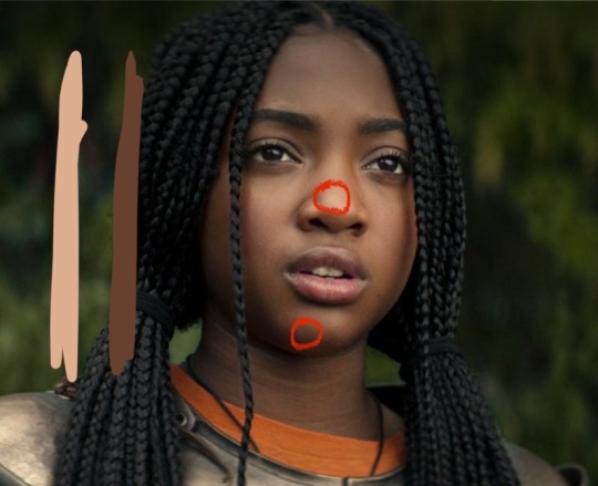
Don't forget Leah Sava Jeffries has darker skin when making Annabeth Chase fan art!
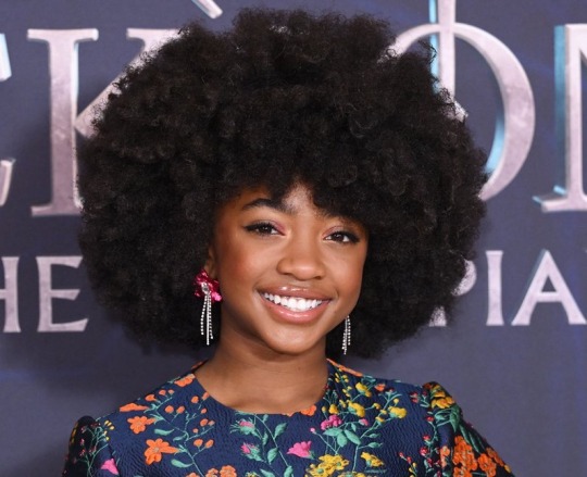
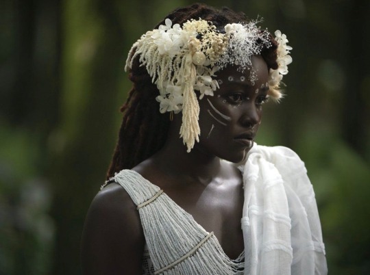
She is much closer to Lupita Nyong'o than Zoe Kravitz when it comes to shading, reflection, and complementary color usage :).
Lighting for dark skin is different on light skin. Light skin gets changed by lighting, and dark skin reflects the lighting. Below is a lovely shot of Nyong'o's character from Wakanda Forever in mourning. The filmmakers emphasize the umber qualities of her skin in contrast to the funereal white and (arguably harsh) light across her shoulder below.
Try to pick spots that aren't directly in or near the light, and try mixing 3 or more! You can put it into a color mixer online, or even color pick, lower the opacity, and lay the shades over each other until you find one that fits. And of course, the more 'realistic' you want to go with shading and lighting, the more shades you're going to want to be able to explore vivaciously :D.
Let's take a look at the same 3 beautiful actresses I mentioned at the beginning, with a bad color picked area and a better-ish color picked area. (Please keep in mind, these are not perfect comparisons, as I was not able to find pictures of all 3 actresses under the same kind of lighting.)
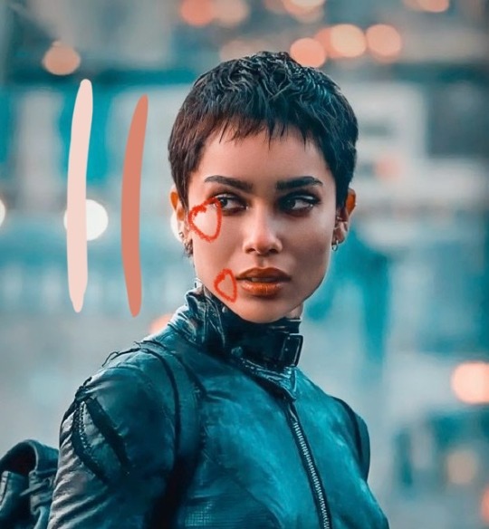
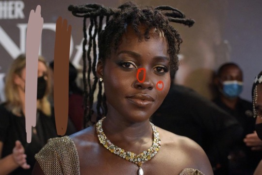
Kravitz's has a clear difference between the two, but they aren't too far apart, in comparison to Nyong’o’s and Jeffries’s. Note the dullness in the poorly picked shades as opposed to the better ones. Also keep in mind that while Kravitz has a rosy undertone (at least in that picture - it’s from The Batman, which has stylized coloring) Nyong’o has a slight cool undertone (I can’t pin down quite what, but the picture is definitely not stylized like Kravitz’s).
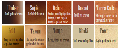
Jeffries runs more ochre or russet, but neither of those are pink. They are more red than terracotta or umber, but to call Jeffries’s face rosy would be wrong. Err more towards the golden when drawing her.
^^saved an image from a writing tutorial long ago, but can’t seem to find it. If someone recognizes it, I’ll link it.
EDIT: it’s from this post. Thanks @autumnrowancollector ! <3
And also, the darker skin gets, the less likely warm undertones are going to appear. Don't be afraid to use blue or purple or even green on occasion!
Additionally, cool lighting on dark skin is always a win imo.
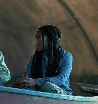
(I was going to use that picture of Jeffries as Annabeth by the lightning bolt, but then I realized the lighting on her face doesn’t quite match up with where it should hit from that angle, and I realized they kind of just turned everything bluer, so screenshot time!)
(Also if you want another really great live action example, check out anything Aldis Hodge is in, like Leverage and Black Adam)(and of course there’s Spiderverse <3 but I want to post pictures of Hodge)
Now, to here’s a list of more experienced people’s advice:
Black facial features & hair
Shading digitally for a (somewhat) monotone Black character
Stylistic choices and places to start looking for inspiration (besides a search engine).
Coloring Black people’s lips
A better coloration tutorial
Also a nice tutorial for Indigenous skin tones, just in case yall want to draw Piper or use this information for other dark skinned characters :).
EDIT: Some actresses who are closer in skintone to use for Annabeth, provided by the lovely @blackfemmecharacterdependency ! If you can’t find a reference for Jeffries in a specific lighting, maybe check out these ladies’ pictures! It’s a reblog, so scroll down.
TLDR: Don’t make Annabeth pink and pale, make her dark and golden.
#Annabeth chase#Percy Jackson#percabeth#leah sava jeffries#pjo#leah jeffries#art tutorial#percy jackon and the olympians#I love superheroes and so of course all of the actors I thought of were from superhero movies lmao#also for the record my advice is mostly from reading others’ tutorials and observation#and I don’t really use it a lot because I stick to lineart a lot lol#like down to mentioning Hodge (love himmmm) as a reference for good lighting on dark skin#there’s another post floating around here that specifically mentions him and Leverage for that#I’m tagging this as an art tutorial but really i want it to be more of a master post#master post so yall can see the tutorials I usually use#but then I ended up writing about Jeffries specifically because I’m dumb#I wanted to go to sleep four hours ago I’m dumb#I really want to draw her and ginger Percy but#irl it’s starting to get busy at school again :/
351 notes
·
View notes
Last Seen Blogs
blvnk-art
blvnk

kifs1990
Keeping It Firme Since 1990

fatlittlething
fatlittlething
akuswife
ariel'

bewaretheblackdog
midwest gothic