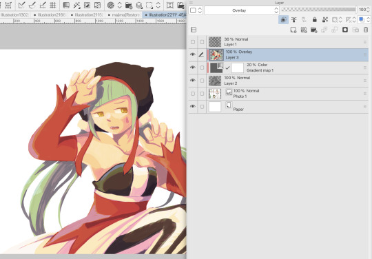
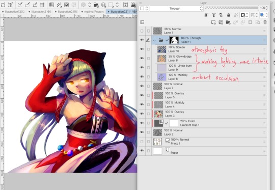
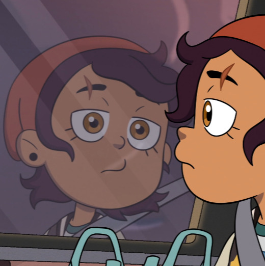
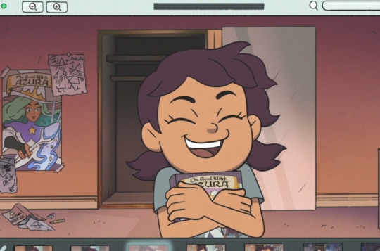
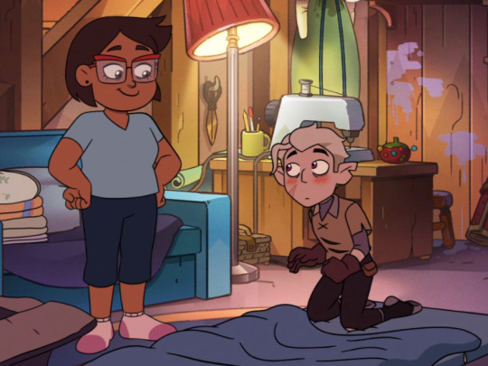
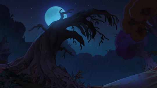
#usually I just do darks and midtones
Text
January of the Roses
@whump-queen @whump-in-the-closet @shydragonrider @imnotamurdereripromise @eric-the-bmo
#my art#artists on tumblr#illustration#digital art#procreate#tw blood#tw injuries#bloody art#soft shading#traced pose#oc art#my ocs <2#oc january#yeah his full name is january of the roses. I was feeling flowery when I named him#I love him he is so emo#he has murdered so many people and he is so sad about it#his theme song is mama by mcr too#also I actually did??? highlights for this#usually I just do darks and midtones#I think it looks decent
8 notes
·
View notes
Note
hi i'm sorry to bother you but do you have any tips on giffing dark indoor scenes? yours always look so good!
hi there! not a bother at all :) i can definitely try to explain the steps i usually take under the cut!
this tutorial will assume that you already know the basic steps of gif-making — if you don't, there are lots of great tutorials floating around on this site that can help you out! :)
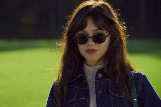
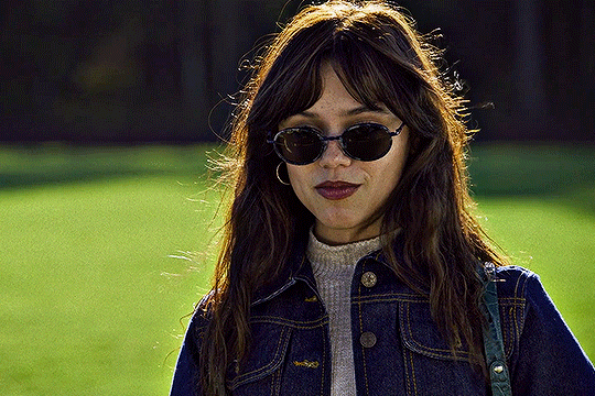
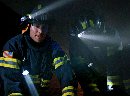
here's the gif i'll work with to explain my steps, the bottom being the original and the top being the coloured/brightened version.
before we start, a general tip i recommend keeping in mind: if you want to brighten a dark scene, you'll want to get your hands on the highest quality download you can find. 1080p is decent, but if your laptop can handle 2160p 4k hdr files* without sounding like it's about to explode, that'll get you even better results!
(*colouring hdr 4k files requires a different set of steps — the scene will appear washed-out on photoshop, so you need to make sure that you don't end up whitewashing anyone if you do choose to work with this type of file.)
since most of my downloads are 1080p, i'll use this type of file in this tutorial.
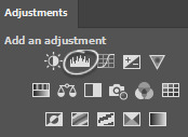
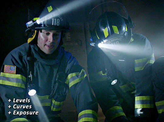
the first step of my gifmaking process with 1080p files is almost always the same no matter what scene i'm giffing. i make a brightness/contrast layer and set the blending mode to screen:
now my gif looks like this:
depending on the scene and how washed out it looks after this layer, i'll play around with the opacity. for this gif, i didn't touch the opacity at all. use your best judgement for this, because every scene is different!
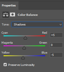
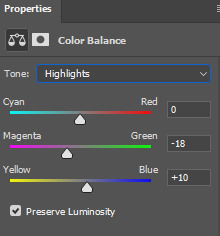
i find that dark indoor scenes are usually tinted in yellow or green. one of my first goals is to try to fix the undertone of this scene before focusing on brightening it any further. i go to colour balance for this, and play around with the midtones, shadows, and highlights.
again, every scene is different, so the amount to which you use colour balance will differ, but for this specific scene, my goal was to neutralize the yellow. i focused particularly on the midtones and shadows of the colour balance layer, moving the scales to the opposite of the reds.
doing so will help with neutralizing the yellow. the only reason i moved the scales towards magenta and blue (therefore making it a bit more red than less) rather than green and yellow in shadows was because i wanted a darker contrast in the blacks. moving them to green and yellow made the overall scene more yellow since there were so many dark spots that shadows affected. (you'll see what i mean when you start experimenting with your own gif — this part of the process really just depends on your preferences!)
our gif might not look that much better yet, but it will soon! our best friend channel mixer is gonna help us out. for an in-depth post about how to use this adjustment layer, i recommend checking out this tutorial.
i'm someone who prefers to make more than one layer for the same adjustment layer for a reason i can't even explain (i just find that it helps me stay more organized). so don't think of this process like i can only use this layer once so i MUST fix it NOW. you can create multiple layers of the same adjustment layer, because every layer on top will affect the ones underneath it.
since my priority is getting rid of the yellow tint, i went to the Blue section of the channel mixer and increased it in all of the scales:
this step alone has helped us out so much, because look at our gif now!
not only does the background look less yellow, but so does izzy's skintone.
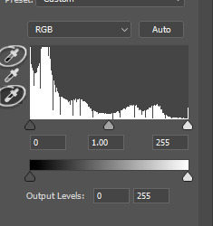
now i'm going to focus on trying to brighten the scene even more without destroying the quality. the levels layer can actually help out a lot with this.
the amount to which i move each toggle differs per scene, and i think experimenting depending on your gif works best for this layer.
side note: i prefer not to use the ink droppers on the side because the contrast in the result usually ends up feeling too strong for my preferences, but if you find that this works better for you, then go for it! basically, the first dropper with the black ink should be clicked before you select the darkest part of the scene that you can find, and vice versa for the third dropper with the white ink — click it, and then select the brightest part of your scene.
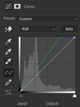
curves is the next layer that does fantastic work! unlike the levels layer, i do actually use the ink droppers for this. it's the same concept, with the first dropper being used on the darkest part of the scene, and the third dropper on the brightest.
try to think of curves as something that not only further brightens your scene, but also helps with the colour neutralizing process.
i grab the first dropper, then click the darkest parts of the gif that i can see. depending on the undertone of the blacks that you're clicking on, the tint of your gif might actually change significantly. this is why i prefer to click once, then undo the action if i don't like what it gives me. izzy's leather jacket was the sweet spot for this gif.
when i'm satisfied, i make another curves layer and use the third dropper to click the bright/white parts of the scene. for this gif in particular, the lights in the background were a good fit because they carried a yellow undertone — this meant that my curves layer actually helped to further neutralize the yellows in the scene as a whole!
(i manually dragged the curves graph upwards for the third dropper to make it brighter. i don't need to do this if the dropper does this for me automatically, but since the lights were pretty bright, it only changed the tone of the scene and didn't increase the brightness — hence the manual step.)
pat yourself on the back, because this is what our gif looks like now!
this is good, but it's not great — there's still just a bit too much yellow in the scene for my liking (sorry, i'm picky! :P)
i created another channel mixer layer and played with the toggles until i was satisfied:
ta-da! the gif as a whole is much less red/yellow now:
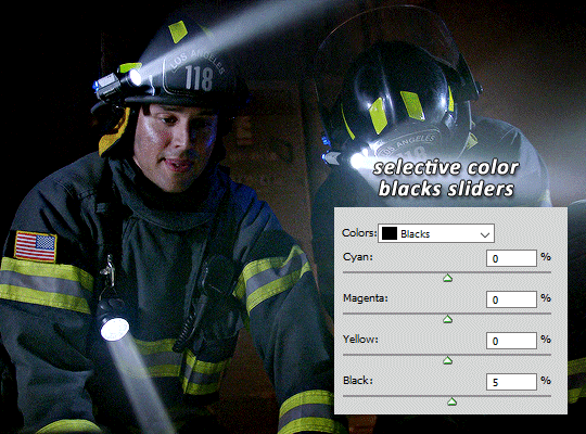
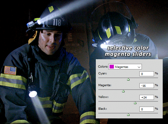
this is when i start fixing the colouring now — namely, his skin tone. selective colour will be your best friend here. i wanted to make his face just a tad brighter and less of a yellow-ish magenta shade, so i focused on the reds and yellows.
then, out of habit, i created another selective colour layer and took out more of the "yellow" in the whites to make them whiter, and increased the black (just by +1, since the contrast is pretty good enough already).
note: i switched to "absolute" for these two colours. basically, relative = less vibrant colour manipulation, and absolute = more vibrant/stronger colour manipulation. i prefer to stick to "relative" for fixing skin-tone since "absolute" can be a bit too strong for that.
our gif looks like this now!

his face looks brighter and much less yellow, so i'm satisfied!
this next step is not mandatory at all — again, i'm just picky and despise yellow-tinted scenes. i personally believe that indoor scenes that are yellow/green tinted make them look more dark than they actually are, so i do my best to get rid of these colours.
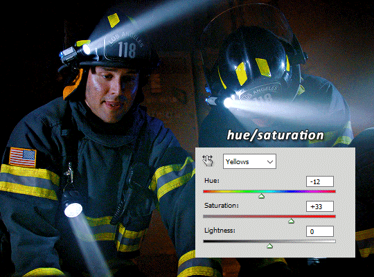
i also don't always do this, but for this gif, i just simply went to hue/saturation, selected the yellows from the drop-down menu and decreased its saturation.
be careful not to do this too much. depending on the quality of your download, this can significantly decrease your gif quality. i tend to worry less about this when i'm working with 2160p files, but again, those files require an entirely different set of steps when it comes to brightening/colouring.
since this was a 1080p file download (and one that was actually less than 1GB, oops, don't do that), i played it safe and decreased it by -39 only.
note: you also want to be cautious of colour-washing skintone when it comes to this step. i find that another selective colour layer can help perfect the skintone in case the yellow drains out of it too much, but skip the hue/saturation step if it's too difficult to work with — better to be safe than sorry.
anyway, this is the final gif!
that's usually what i do when it comes to colouring dark indoor scenes! i hope this tutorial makes sense, and if you have any further questions, don't hesitate to reach out! :)
#tutorial#gif tutorial#resources#completeresources#coloring tutorial#allresources#dailyresources#userraffa#userdean#uservivaldi#alielook#usercats#usermoonchild#usernaureen#userbarrow#userabs#useraish#useralison#userisaiah#*mytutorials#i am so sorry if this is incoherent#it’s so hard to explain things coherently 😫
635 notes
·
View notes
Text

Thank you @cobbbvanth for asking me for this; I’ve never been more flattered! ☺️ I’ve only been making gifs for a little more than 2 years, so I’m really still only figuring Photoshop out, and my colouring owes everything to other people’s tutorials (some of which can be found here). To be honest, I was only asked some tips, but I have no clue what to include and what to leave out; so, here’s my complete (if random) colouring process.
NOTE: This is a colouring tutorial, not a gif-making one. The tutorial that taught me everything I know about that (and to which I am eternally grateful) is this one by @hayaosmiyazaki.
I. SHARPENING
My standard sharpening settings are:
One Smart Sharpen filter set to Amount: 500 | Radius: 0,4
A second Smart Sharpen filter set to Amount: 10 | Radius: 10
One Gaussian Blur filter set to Radius: 1,0 and Opacity: 30%
One Add Noise filter set to Amount 0,5 | Distribution: Gaussian
II. BASIC COLOURING
This is the part where I add most of the adjustment layers available and just play around with them. Obviously different settings work for different scenes, but I do have some standard ones.
Brightness/Contrast
I usually up the Brightness to +10-30, and the Contrast to about +10.
Curves
For the first Curves layer I go to Auto Options > Enhance Brightness and Contrast, and then adjust the opacity until I’m happy.
I might repeat the above step if the gif still looks too dark to me.
I add another Curves layer, I go to Auto Options and this time I pick either Find Dark & Light Colors or Enhance Per Channel Contrast, and check or uncheck the Snap Neutral Midtones option, until I see something I like. I will then adjust the opacity.
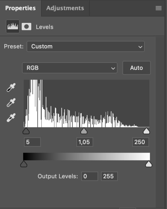
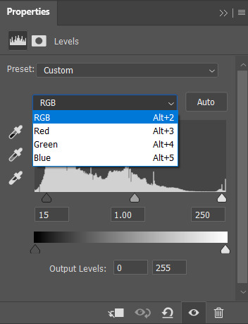
Levels
I add a Levels layer that usually looks something like this:
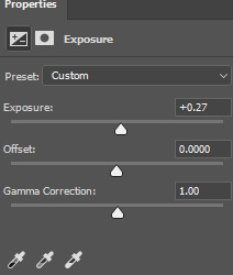
Exposure
I add an Exposure layer, where I usually set the Offset to around -0,0010.
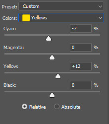
Selective Color
To make the faces look okay, I create a Selective Color layer, select the Reds and usually add some Cyan (+10-20%) and play around a little (±5%) with Magenta and Yellow too. I might also add another layer, select the Yellows and make slight tweaks there too.
III. FUN COLOURING
About colour manipulation: PiXimperfect just uploaded a tutorial that explains everything so much better than I ever could, so I highly recommend you go watch it. It’s made for static images though, and things are more complicated with moving images, so I also recommend @elizascarlets’s tutorial.
The reason I usually go for a softer colouring is that a more vivid one requires a lot of patience and precision, and I honestly can’t be bothered. Instead, I try to tweak the colous only a little, so that the edges can be a little rough without it looking too wrong.
One thing to remember is that each gif is different, and there isn’t one foolproof way to do this, so you will need to use a different technique depending on the gif you’re working with.
Okay, so, after I’ve decided what colour I want my background to be:
1. I create a Hue/Saturation layer and change the greens, cyans, blues and magentas to that colour. That’s easy enough, since it doesn’t mess with the face colour. I then set the blending mode to Color. If your background doesn’t include any yellow or red, you might be done here, like in the case bellow:
2. To change the yellows and reds, I create a new Hue/Saturation layer, select the yellows/reds, move Saturation to 100 (temporarily) and then play around with the sliders until the face colour isn’t affected. I then change it to whatever I’ve chosen and change the blending mode to Color.
3. If for whatever reason step 3 doesn’t work (the background is white or black for example, or just too red), I might create a Solid Color layer set to whatever colour I want, set the blending mode to Color and then select the layer mask and carefully paint with a soft, black brush over the people’s faces/bodies. I will then lower the Opacity, to whatever looks smooth enough. If there’s a lot of movement in your gif, you might have to use keyframes (see elizascarlets’s tutorial linked above). However, my main goal is to avoid using those; that’s why I try my hardest to tweak around as many Hue/Saturation layers as needed and not have to create a solid color layer.
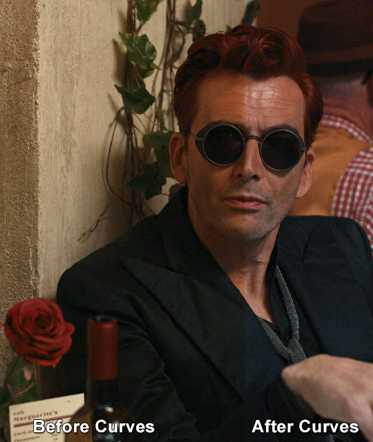
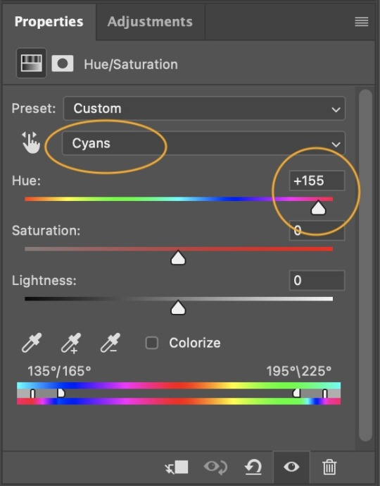
4. Once my background looks the colour I want it, I might add a Selective Color layer that matches my background color and then try to make it look more vibrant. For this Aziraphale gif below for example, I’ve selected the Cyans and then set Cyan to +100%, Yellow to -100% and Black to +60, then created another one, selected the Cyans again and then set Cyan to +20 and Black to +20.
5. If the gif has a white area, I create a Solid Color layer with a colour that matches the rest of the background and then set the Opacity low. I might also create a Selective Color layer, increase the Black and then play around with the colours.
IV. FINISHING TOUCHES
I create a Vibrance layer and set the Vibrance to around +30 and the Saturation to about +5.
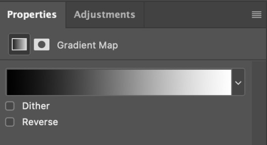
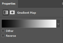
I create a black and white Gradient Map layer (with black on the left end of the spectrum and white on the right), set the blending to Luminosity and the Opacity to about 20-30%.
AAAND that’s about it I think! This ended up way too long and perhaps a little incoherent. I tried to make it as general as possible, so you might have to mix and match for best results. Feel free to ask me for further explanations about any one of these steps, and please tell me if you want me to go through the colouring of a specific gifset (although, as I said, I'm by no means an expert). Happy gifmaking!
#gif tutorial#allresources#completeresources#dailyresources#photoshop tutorial#chaoticresources#uservivaldi#userdanahscott#usersanshou#userfanni#userbuckleys#userrobin#tuserjen#userdavid#userzaynab#tusermimi#thingschanged#tuserju#usertj#userhallie#tutorial#minee
291 notes
·
View notes
Note
hi! not exactly a request but i do wanna ask, whats your process when you're rendering more paint like art? (if that makes sense, English isnt my first language so apologies hdskhsjdbd) i really love how you use the colors and im curious how you do it :0
i’ve been meaning to answer this one for a while so here’s how i painted miku in today’s post (put under the read more because yeah prepare for a long post
i’d also like to preface this by saying that i never follow a set way of doing things, so in terms of what my personal process is like, these are only broad strokes of what i do! sometimes i’ll combine or skip parts entirely, depending on how i feel. also, this is not a tutorial, just how i do things, so please don’t treat it like one :’D this will read like the ‘how to draw an owl’ picture if you do
first, like every artist, i sketch. more specifically, i’m getting an idea of what i want to paint later on. this could be how a scene is set up or in this case, how a character is posed. here i’m not concerned about details or getting everything perfectly, i’m only planning how the thing will be composed. maybe a lot of canvas size changing, or adjusting what miku’s doing (note how busted miku’s right hand looks from all the transforming!) however, i still have to be concerned with how clear the sketch will be to future me, because the sketch won’t be any good if i can’t read what miku’s doing

after that, i lay down a flat gray under the sketch, mainly focusing on giving miku a clear silhouette. this is also a good time to make adjustments to the composition on the fly if i suddenly feel like something can be improved upon, like shortening miku’s left arm from the sketch!
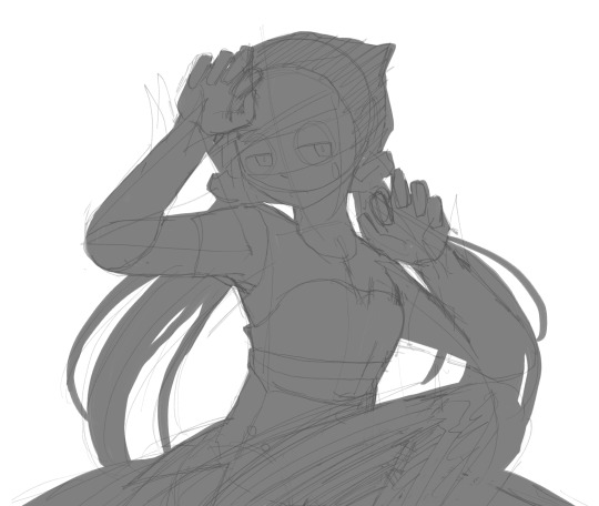
after painting a flat silhouette, i start shading in grayscale, focusing only on lighting. i usually do it in two passes, one for the lightest and darkest tones i’ll use (not black and white) and then a second for midtones to blend them better with the base gray but i forgot to screenshot the result of the first pass 🗿 nevertheless, here is where i can start adding some amount of details. i’m not including any extra accessories yet, just focusing on the base design of the outfit and the character herself (for anyone wanting to draw characters from That Gacha Game, this is how i personally make the process more bearable for myself.) i still use the dark gray to separate where certain details (like the facial features and fingers) begin and end, mainly to make colouring more bearable later.
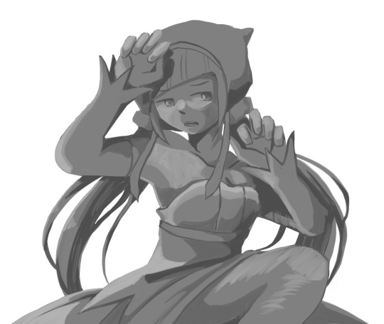
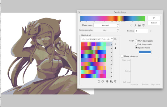
now here’s where i get the Good Colours. it’s a cheat lol. i put a gradient map layer over the grayscale painting so that there’s a little bit of color to start. some gradient maps can be applied as is, some need the layer settings adjusted to make it look good. this one, for example, is a (free) gradient map set from the csp assets store that needs you to set the layer opacity to 20% and to set the blending mode to color to achieve this result. in general, i tend to pick which gradient map i want to use based on vibes, or basically whether i want the work to be warmer or cooler, colour-wise. but this does do quite a bit of lifting for the colors in my stuff.
and then, finally, i add the colours. i add flat base colours in an overlay layer. at this stage, i’ve made the character silhouette clear enough that i don’t need to refer to the sketch anymore for what miku looks like. also, the gradient map layer does its magic by making the shading a bit more vibrant than it would’ve been without it. after that i paint over with a new layer to add details like the lace.
and then i put some extra shading on top. basically this is where the ‘better lighting’ happens. again, this isn’t a tutorial, so i’m not here to say what each part of the lighting is, but i’ve labeled which layers do which job. in other works where the lighting within a scene is more defined (from a window, from a small crack in the walls, etc) the glow dodge layer may be more opaque and sharper, but since this isn’t a work with that, the lighting was applied using an airbrush. the linear burn layer is also there to make the whole thing darker so the glow dodge doesn’t end up oversaturating miku. i also usually match the lights to the vibe i want, and use a complementary color for the shadows. so here you can see i have warm colors on the glow dodge layer, but light purple on both the linear burn and multiply layer.
and that’s it for the character—here’s a gif showing how each layer adds to miku! (sorry it’s so toasty)

as for the background, depending on the complexity, it may go through a similar process, or if i can settle with flat image backgrounds, i just go for that. it’s ok to use external image materials. i didn’t have a background in mind for this miku in specific, so i got some default csp materials and threw together something
and that’s about a rough overview of what my process for more finished works looks like! again, art is a fluid process so i never specifically stick to certain steps all the time, and you shouldn’t either. i can probably answer why i’d pick this colour over another in one particular work, but it’s something that kinda has to be learned on a grander scale. i think everyone can already feel what colors work with what atmosphere or what setting, even if they can’t immediately explain why. colors and composition do take some level of experimentation to find what works best!
127 notes
·
View notes
Text
I hadn't spotted these a year ago:
Oh my god, guys???!!! Parallels:


2. These are the same face - the Depression Face.

It tugs at my heart like nothing else, because...

3. Oooh never paid attention to this:
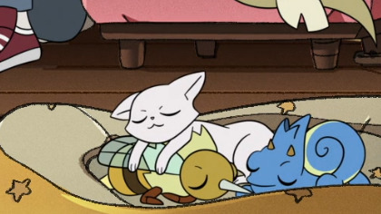
4. These lil' guys were moving and animated while sleeping here, aww:
5. The screenshot below, to me, is foreshadowing that Hunter may have expressed his wish to study at Hexside...but once that wish is actually granted, he too is gonna be depressed - at school, specifically - for months, and frustrated that he simply cannot be enthusiastic about classes the way he initially hoped. He'll push and push himself and judge himself for why he "can't even" enjoy lessons he's supposed to be excited about:

6. Do you think they took Hunter to the zoo's bird hall, before he carved Waffles (I personally view it as a good element of exposure therapy)? :

7. People usually put the S1 screenshot of Luz drawing light glyphs, next to the one with Flapjack fading away...but I saw this too:

It makes me wanna chew extra recycled cardboard about Luz and Flapjack parallels, specifically. Because of what they both offered to the world, if you think about it:

8. If Camila went through an outfit change like this in her nightmare:

Imagine the mayhem of Hunter's many nightmares with his many outfits :S
9. A really good reference for how Hunter healed pre-timeskip, is this sequence, where the order has been altered a bit below:


(who knows, maybe Willow recorded a lot of vids of him on her scroll T___T)
10. Wow this sums up the show doesn't it:
11. Ugh you can't tell me that...they wouldn't have had a similar-ish mirror scene with Waffles and older Hunter to these, if we had a full S3 or more seasons:

Him approaching a mirror with no palisman beside him...I can't imagine how that was in those horrible months. (Maybe he does this before heading out to conduct a Palisman Adoption Day)
12. I feel really happy, confidently believing that he unlearned this body language:
in the presence of adults, especially his new parental figures. Coercive control wasn't a dominating theme in his life anymore. And while we didn't see it onscreen, he would've found the space to even initiate connection via physical touch with his parents, like what Luz naturally does here:
I say "physical touch" specifically, because to quote @idlescree's amazing video analyses, Hunter's own physical body - not just his mind - was the ultimate and most intimate battleground for Belos to exert control, by possessing Hunter and using him as a puppet in the most direct way possible. So for Hunter to get physically close to family to express love after Flapjack's death, in spite of terrible spooky thoughts that he might still gravely injure others...that isn't a small feat at all.
13. I think his casual sweater is a plain gold colour, and his cosplay outfit has its yellow colour: because he's still influenced by Belos.
The black of the wolf tee and in the cosplay, feel to me like foreshadowing of his post-possession grief. Even after Flapjack is gone, Hunter still thinks about Belos and is still walking around in the same cosplay outfit.
His newfound freedom and healing is reflected in his timeskip design (calm midtones of orange and blue): when Belos has no more hold on him via a painful history. We would see a progression from the predominant darkness of the black colour to those peaceful midtones on his clothing.
14. Best one saved for last! It's a headcanon, but I draw a few connections.
@childlikegoblinqueen and I were talking about him likely returning to the place where poor Flapjack was slain, even if it takes a number of years before he can do so. Waffles will be with him.
Imagine...instead of running frantically in the night:
he calmly strolls during a beautiful Halloween evening, with autumn leaves blowing in the wind once again:
There are no horrors awaiting him, and very importantly, he can believe that.

And he visits the spot at the lake, and puts his hand to his chest:
but for once, he can smile while doing that specific gesture. All the times that he has put a hand to his heart in the show, he wasn't smiling (link).
He then leaves and then returns to his family (walking in the opposite direction of the portal above) to have an actually joyful Halloween celebration.
241 notes
·
View notes
Note
hi :) i love ur buffy gifs so much! they always look so nice!! would you be willing to do a coloring tutorial to show how you usually color btvs? or perhaps save the PSD the next time you gif buffy and share that?
oh i feel your pain!! and thank you so much <3
i colour each gif from scratch and don't save psds so i can't offer you something there but i've done up a buffy colouring tutorial here!!
Here's the uncoloured gif.

Step 1: The nice part about giffing Buffy is there is usually a grey or blueish grey pixel in the whites of her eyes that is perfect for a white point curves. I played around with different pixels on different points on the gif until I found one I liked.
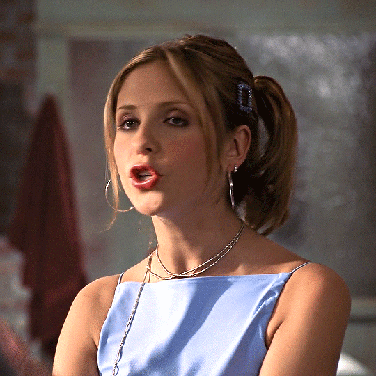
Step 2: I always like to do the brightening first so I added on Levels and Exposure layers. BTVS has weird highlights where its very prone to white or yellow/white patches so I try to use as little as Exposure as possible but I like the Gamma Correction part.


Step 3: Channel Mixer is a lifesaver for Buffy because it usually has such a warm tint. I pretty much only use the Red and Blue settings but it helps make the gif cooler without the effects on shadows and midtones like Colour Balance.


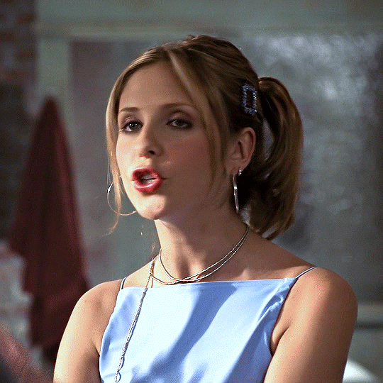
Step 4: Selective Colour is mostly just to fix skintones and background colours. I typically wind up adjusting the cyan and yellow sliders for the reds and blues until her hair and skin looked normal. Sometimes BTVS has magenta in the shadows on her face so I increased the yellow there (while it makes sense to actual reduce the magenta, I'm going to a natural skintone not green).
You can also see that there are some white spots on her shirt, right arm, and the right part of her face. On the white, I increased the blacks and reduced the yellows to fix the colour and reduce the brightness.


Step 5: Hue/Saturation doesn't make a hugely noticeable difference here but it's a good opportunity to make final tweaks to colours and reduce overall warmth saturation. My personal preference is to have lower red/yellow saturation so I lowered that and made slight Hue adjustments (the yellows were still a little red for my liking). There was also some magenta in her eyes and teeth so I completely lowered the saturation and upped the brightness to fix that.


Step 6: The gif is still a little dark for my liking so I threw on a final Levels layer to brighten up her face. Usually, I would use exposure but if I did that I would end up with some serious white patches.

And that's it!! Each Buffy gif is slightly different but I would suggest making the gifs cooler and increasing the brightness through Curves and Levels without using Exposure.
#gif tutorial#tutorial#tutorials#photoshop tutorial#coloring tutorial#hella's inbox#anonymous#hope it helps!!
74 notes
·
View notes
Note
do you have a coloring tutorial? your gifs are so nice and vibrant, how do you do it? :)
hi, here's a simple basic coloring tutorial that I use pretty much for all of my gifsets:

I won't get into the basics of making a gif as this is just a coloring tutorial, but here is my gif after I just crop and resize it:
and here it is after I sharpen it:
sharpen can affect the depth of shadows in a gif, so I do this before I add any coloring, but I know some people color first and only then sharpen, so both ways work!
alright, ready for some fun coloring? let's go!
before adding any adjustment layers, I suggest creating a new group, so all of your coloring changes can neatly sit in one place.
I always start with levels and curves, they often help to make the overall gif more natural if the lighting is too yellow, too dark, etc., it's a very useful guide, especially if you're new to gifmaking. so, let's start by clicking on the levels icon, a new adjustment layer should appear over your gif layers:
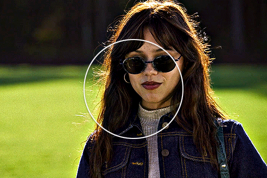
the next step is to click on each of these little icons (I usually only use the top and bottom ones) and to select the lightest and the darkest parts of your gif. pick the top one, select the darkest part and then pick bottom one and pick the lightest part, you should see some changes on your gif, sometimes they're subtle, sometimes they're very obvious:
in my gif the lightest part is somewhere near her shoulder where the light hits, the darkest part is her sunglasses (if there are a lot of dark/light parts, I just click around and see whichever looks more subtle. for example, I tried the part on top of her head where the light hit, but it made the gifset too blue because the lighting is yellowish, but since the whole scene is not very yellow, it looked weird so I'm sticking with her shoulder, it just simply looks better overall):
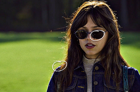
and then I do the same thing with the curve adjustment layer, selecting the darkest and lightest part of my gif just like I did with the levels layer:
while this is a good guide for beginners, it doesn't always fix all the problems. it can be quite harsh, so I recommend setting the opacity to a lower percentage and if it looks a little weird, sliding the arrows to one side and another with each color until it looks better to you:
like I said, it's a good guide but manual work is often needed, don't be afraid to mess around with the settings. for this gif I set levels layer opacity to 60% and curves to 37%.
moving on, I'm adding a selective color adjustment layer to fix how the skintone looks with red and yellow colors. it differs with each scene, sometimes the skin is too yellow and orange, so I add more cyan and less yellow but in this case I chose these settings and I set the opacity of this layer to 35%:
I want to mention that with poc it's very important not to mess around too much with their skin tone and not to white-wash and orange-wash them, there are quite a lot of tutorials on how to avoid doing that.
the next layer I add is exposure, I want to brighten my gif a little bit. you can do that by selecting either brightness or exposure layer like I did:
the scene I'm working with is pretty bright, so I'm not adding too much of exposure, here are my settings:
next up, I want to deepen the shadows a little bit, so I use a gradient map for that:
I use black and white gradient and set the opacity to 10%:
moving on, color balance is another great trick to make the gif look more smooth with one consistent color overall:
if I'm working with scenes that have a lot of green/yellow in them and I want to get rid of that, this is a quick way to slide the arrow to the opposite color and soften it a little bit by adding another color. I usually like to add more magenta to midtones and make the gif have a little bit of a pink look. here are my settings for this specific gif and the opacity of this layer is set to 30%:
and here's what difference it made to the gif:
as you can see, the colors outside the circle are less green on her skin and hair. it's all coming together nicely!
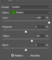
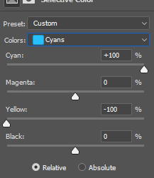
let's move on to the background colors. I add another selective color layer and I'm gonna play with the colors I want to enhance the most. in this case it's green grass and her blue clothes. here are my settings for these colors:
and finally, to enhance the vibrant coloring even more, I like to add one final hue/saturation layer:
here I like to add more saturation to the colors we're focusing on in the background and add around +20 of saturation. I did this to green, cyan and blue colors:
and that's it! here is the finished gif compared to the completely raw one:
this coloring tutorial is very basic, but it works for most scenes I work with, I just sometimes focus on other colors, add more or less layers but the overall process is very similar.
I encourage to mess around with all the settings and see which ones look the most pleasing to your eye. let me know if you have any questions :)
63 notes
·
View notes
Note
Hi! Your coloring on that recent may day gifset of eddie and buck is so incredibly gorgeous, do you think you could explain how you managed to color the scene like that, despite how dark and blue it is, with flashing lights? Only if you want to! Love everything you post 💌
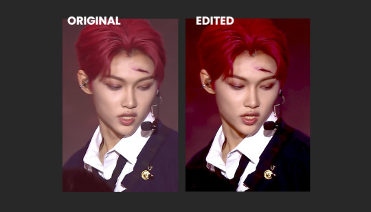
hiiii, oh my gosh thank you so much!! yeah this scene is so dark and cold, and with the flashing lights it's not the most ideal scene to color. what i did is mostly just worked on bringing back some warmth and light back into the scene, and keep the shadows deep enough.
you're lucky, this is one of the very few times where i actually kept my psd, so i can give you the exact details 😅
steps under the cut! (reference gifset)
this is how the gif looks sharpened without any coloring layers:

i usually start coloring by trying out the automatic settings of a curves layer, see if that helps. it sometimes does the heavy lifting for me, but for this particular scene it didn't do much. so i just brighten up the scene a bit with some levels, curves, and exposure layers. i prefer doing it little by little over multiple layers than all at once.
don't worry about the blacks being too lifted and gray, i'll fix that later.
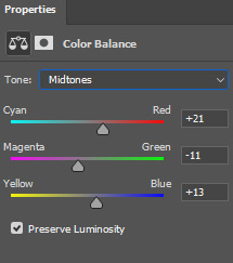
when the brightness is where i want it to be, i usually use channel mixer and/or color balance to bring back some colors in (or remove tones i don't want). for this scene i only used color balance to bring back some warmth (reds and yellows). i always use color balance in all three midtones, shadows, and hightlights (usually in that order too, but i often go back in between them to change the values as i need).

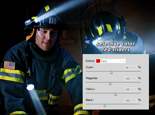
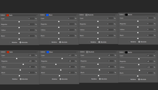
when the tones are where i want them, i go play around with the separate colors with a selective color layer (or two or three, depending. usually at least two). for this one i went in the blacks and added some more blacks, so the shadows are a bit more deep. then i went in the reds and yellows to bring more warmth.
and the magentas to make sure the skintones aren't too pink, then i went to the blues and cyans to enhance the blue tones from the lights i didn't touch the greens, neutrals, or whites for this scene.
i then like to add some vibrance and saturation with a vibrance layer. it's at this point that it really comes to life, and that i really see what difference a good selective color layer makes. sometimes i use multiple selective color layers to separate warm and cold tones, but i didn't feel the need to do that here.


i wanted the yellow stripes on their turnouts to be less green so i fixed it with a hue/saturation layer in yellow.
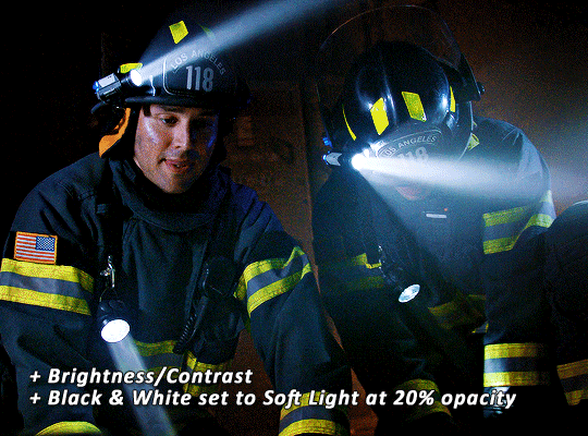
then i added my usual brightness/contrast and black & white layers on top to add more depth and contrast.
after these final touches, the skintone was slightly too deep for my liking so i went in and fixed it with another selective color layer in the reds, but you could always go back to the first selective color layer and edit the red sliders there, if you prefer to have less layers. i placed this layer between the vibrance layer and first selective color layer.
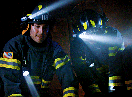
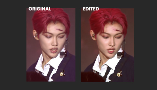
and that's it! here's the before after:
that's my process for most gifs i make :) i hope this helps
#alie replies#Anonymous#photoshop#coloring#*ps help#resource#completeresources#psd#userko#uservivaldi#tuserheidi#userautie#usermadita#userisaiah#userraffa
238 notes
·
View notes
Note
Hi! Do you mind sharing your coloring tutorial or tips? especially for the animation ones, they're so good! your gifs are crisp and HD
hi, anon. tysm! 🫶 i don't mind at all since i’ve gotten more than a few requests from before, ig it's time to give it a go. (more) details are under the cut. 😁

before we start, i want you to take note of the following things that will be helpful in the process of making/coloring gifs.
if you want to get the know-how on making gifs, @redbelles did us a solid and gave us this comprehensive guide that will save me the time for explaining lmao. 😅✌️
make gifsets without skipping frames. keep frame delay 0.05 and 0.06 for less than 25 frames. anything more or less is too fast or too slow. additionally, it's also important to note that if you're dealing w videos that are faster than 30fps you change the frame delay to 0.04.
gif using the the new dimensions (in this tutorial i used the dimensions of 540px x 510px since it's all about big gifs now 🙄).
use the standard sharpening settings (smart sharpen, amount 500%, radius 0.3px, remove gaussian blur and tick more accurate) also note the sharpening settings for 2d as you've specifically requested.
you can use action that will convert your gif back to frames and set your timing to 0.05 with a single click. basically photoshop will follow out all of these time-consuming steps for you! just download the action and double click it. it should now be added to your list of actions. to see your actions, go to window > actions. find the folder that says "GIF ACTION" and select the lines that says "CLICK HERE" and voila! ps will do all the hard work for you.
the coloring on your gifs will look good if you have a good base so try not to skip on video qualities. use high quality copies like 1080p or 2160p (4k ones are good) the higher the gb the better. it makes coloring so much easier and reduces grains.
*cracks knuckles* let's start!
for 2d animation's sharpening settings, it usually varies so i just move the amount around and see what looks or works better for a specific gif. i used amount: 189 and radius: 0.2 for this ponyo gif. anything can work between 189 to 350 for me but i maintain the radius at 0.2. again, you can just play the amount around until you find the one that looks good for your gif.

when i’m making gifs. i look for that notorious contrast between the light and dark parts. i think it gives life to the gif- so exposure, levels and curves are best to achieve that. for curves, just go to layer > new adjustment layer > curves. this layer is going to help brighten up the gif in certain areas, and darken others. select the white eyedropper. click the lighter part of the gif like the white/light part of the ship.
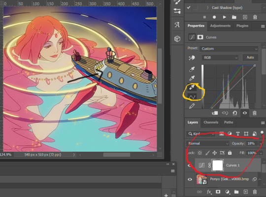
next, select the black eyedropper and click on a black/dark area of the gif (refer to the arrow bc i don't know which part of the ship is that called lmao).
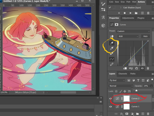
you can skip the black eyedropper if you're already satisfied w the result of the white one.
color balance and selective color are your two best buddies. they’re great when you’re trying to change some tones or specific colors of the gif, like the skin tone which is very tricky.
using selective color is pretty simple, here’s a really useful guide:
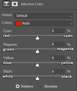
if you pull any of the tabs to the right, it increases the amount of color (cyan, magenta, yellow and black), and reduces the amount of opposite color (red, green, blue and white).
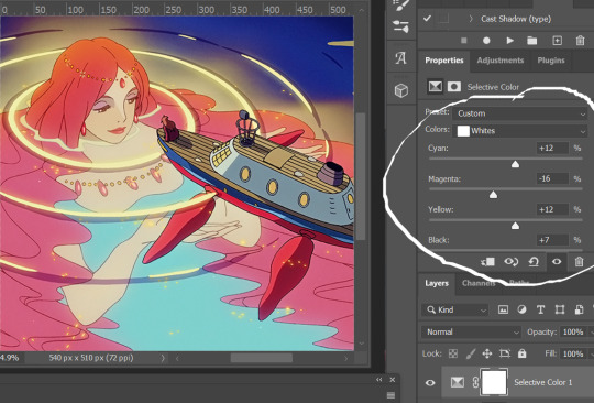

i also use the blacks and whites in selective color especially if the gif is saturated w colors to tone down some parts and make shadows more visible (idk if this is still making sense 😅).

in working with color balance, i use midtones and highlights sparingly. it's really helpful in removing or balancing out a certain tone.

here's my save setting ⬆️
idk why but ps puts the default frame delay to 0.07/0.03 so open your gif in ps again and don't forget to change the delay to 0.05.
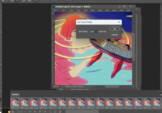
and we're done!

i sometimes go back and forth and do some tweaking until i’m satisfied with the result. this is how i color and i know it’s not perfect but i learn by constant practice. there’s really no standard in coloring so you can make yours the way you like it. just enjoy- until you get the hang of it and it becomes less daunting (or something like that). i hope this helps. if you have more questions, my askbox is always open 😊.
#completeresources#usergif#userpayton#usersugar#rresources#yeahps#itsphotoshop#userbells#dailyanimatedgifs#usercharl#usersavana#Chaoticresources#hisources#ps help#tutorials#ask replies#anon
177 notes
·
View notes
Text
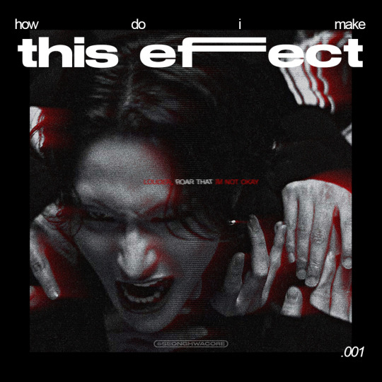
🏍 AKIRA-ISH MOTION BLURRED LIGHT EFFECT (or the cooler name, ✨Rear Sync Flash effect✨)
as requested for my carrot kid @renjunniez (and everyone) <3
⁕ Tool: Photoshop 2021 (PS)
⁕ GUIDE:
1. Open/place your picture of your choice on PS. For this set, I took a screenshot from the MV using VLC. Didn't bother to take it from VS.
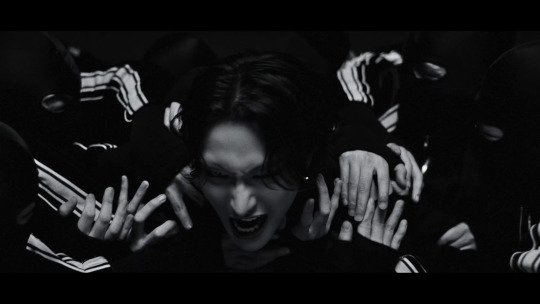
You need a black & white picture with dense shadow/black shade and focused highlight to achieve this effect. If your base is as colorful and bright as a 4 year old's imagination about the world of unicorns, you gotta need some adjustments. The effect still appears but give a totally different vibe. I put an example at the end of the tutorial.
2. Then, do the basic sharpening and resizing for the base layer. I crop them to 540x540px.
3. Copy the base layer and delete the sharpening smart filters. Double click the layer to open Layer Style panel.
On General Blending, change the Blend Mode to Lighten. On Advanced Blending, uncheck the Green (G) and Blue (B) channels, so you'll be left with Red (R) channel. And then, move the picture to the right because you want the red shadow to "trail" Seonghwa (your subject)'s movement.
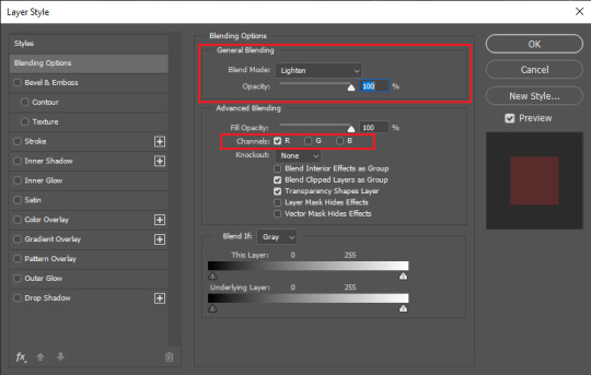
Your pic will look somehow like this:
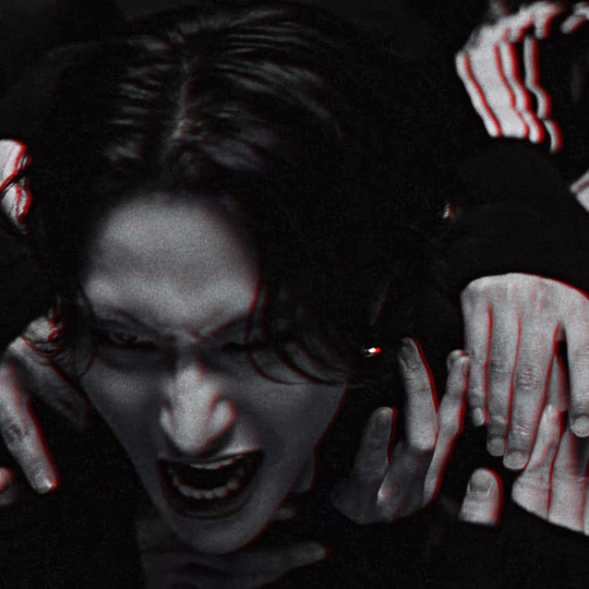
4. Go to Filter > Blur Gallery > Path Blur. The default option is usually Basic Blur. Change the option to Rear Sync Flash.
Now, you have to decide the direction of the "red trail". This is quite tricky because it's better if you apply the blur with the subject's real movement in mind. In this example, I imagined Hwa was swaying to the left in slow motion as he restrained from being dragged away. So, my path's starting point is from the left.
Once you've decided, click on a random point to pin a starting point and stretch the arrow to your desirable distance. You can also curve the arrow to give a more, well, fancy direction.
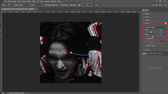
I set the Speed to 146% and the Taper to 17%. Uncheck everything else.
*Hover over the word "Speed" and "Taper" to know what it'll do to your pic
**If you wanna know more about Rear Sync or Rear Curtain Flash in photography [x]
5. After this part, basically you're free to do whatever with your gfx. These steps below are OPTIONAL.
5-a. First, I adjusted the lighting and contrast.
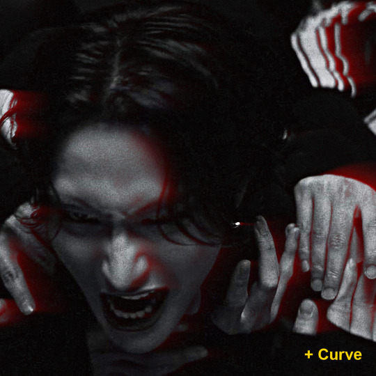
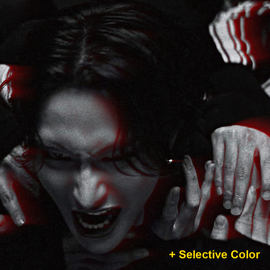
5-b. Then, I added text.
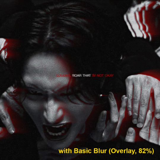
5-c. After that, I placed a lined texture. I set the blending to Overlay with 82% Opacity and gave it a Basic Blur effect from Path Blur. I definitely just fuckin around with this step and found out that it changed the opacity of the lines depending on where it's applied on: shadow, midtone, or highlight parts.
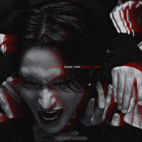
5-d. Lastly, add grains texture
Et voila! You'll get this effect 🤩
Now, if you have a bright, colorful pic as the base. For example, I use this The Real Hwa dontevenaskmehowmanypicsofhwaihaveinmyputer. The "highlight" part (the sky) is surrounding the "shadow" (Hwa in hanbok). Then, I applied the same effect.

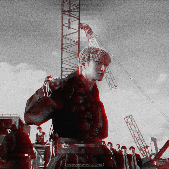
Still slay but definitely not as "dramatic" and intense as the dark mode version. Kinda lose the purpose of the trail to me. HOWEVER. I encourage you to fuck around and improvise 👍
Hope this helps!
#ann.txt#gfx tutorial#rear sync flash effect#if theres something i need to revise or if you want to discuss about this just lmk
25 notes
·
View notes
Text
hey everyone! this is my first tutorial on giffing! I'll be covering some of the basics of coloring and specifically my usual steps and preferences in editing!
A basic understanding of giffing is required here since I won't cover any of the first steps nor pre processing involved in giffing and we'll go straight into coloring in photoshop.
For this tutorial I'll be using this Felix set as an example:

For my gifs I usually always go for a really bright and clear look. I like to have vibrant colors and making the subject pop a lil. I try to achieve skintone accuracy but I tend to make my gifs just a tiny bit pink as well, avoiding super warm tones. (which in hindsight I realize I may have overdone the warmth for this felix set a bit but oh well)
Let's get into it!
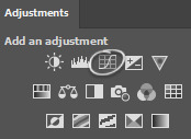
So after you have imported your clip and added any smart filters of your preference, you should start coloring (above the frame layers of your gif) by using a special type of effect called Adjustment Layer. You can find this tool on the bottom of the layers panel:

There are many options of Adjustment Layers, but for now we will be using: Exposure, Curves, Vibrance, Color Balance and Selective Color.
☆ Exposure ☆
this is always ALWAYS my first step. It's crucial for my gif to end up with that clear and bright impression. There are 3 settings here, exposure / offset / gamma correction:

The first picture is without any editing, the second is my editing for the Felix gif.
Exposure: Helps to highlight and overall light the entire image up.
↳ raise it up in tiny bits to add light
Offset: I use this to sort of "defog" everything.
↳ lower it to "defog" (in this case my overuse of it ended up removing most details from his dark clothing but I still like the final look)
Gamma Correction: similar as the one above, it helps to give more depth to the whole image.
↳ you can lower it to add depth, it might look confusing but as u drag the controller to the right, the number will go down, so it will be less than 1. In this case I raised it a bit so I turned it down just a lil.
↳ note: these settings will greatly affect the whole gif so try not to go too far with it, I usually only change these in tiny increments.
☆ Curves ☆
there's a lot that can be done with this Adjustment Layer. if you keep the drop down option as RGB, it will have a similar effect to the exposure Adjustment Layer I explained previously. You can just create points on the line and move them around and that will affect the image. The areas near the bottom of the grid affect the darker colors of the image, the middle afftecs the middletone colors and the top of the grid affects the lighter areas. Dragging the line upwards will make things lighter, and dragging it down will make it darker. Sometimes I use this to further complement on top of the Exposure layer, but again with caution.

The first picture is without any editing, the second is my editing for the Felix gif.
↳ note: Now the really interesting thing about this Adjustment Layer is if you click on the dropdown menu where it says RGB, you can choose between the 3 color channels - red, green or blue and make changes on those specifically. In this case, if you create a point on the line and drag it down, it will sort of remove that color from the image. If you do it around the top grid, it will focus on the highlight areas, in the middle will be middletones and at the bottom will be the darkest areas. This can be VERY useful when editing clips that have one predominant color, for example stages with red lighting.
In this case tho my use of this layer has been very slight, it's really only complementing what I had already started with the previous exposure layer. So it's giving him a bit more depth and contrast while also darkening the bg a bit more to help him pop.

☆ Color Balance ☆
this Adjustment Layer allows you to alter the balance of the colors within the 3 ranges of the entire image: highlights, midtones and shadows (darker areas). It can change the entire vibe of the image very quickly. I always play around with it a little bit. I usually like to reduce some of the warmness of the image and specially the shadows by turning the blue and cyan handles up.

The top row is without any editing and the bottom row is my settings for the Felix gif.

☆ Vibrance ☆
this Adjustment Layer is quite simple, with it you will manipulate how saturated and vibrant the colors will be. I usually raise vibrance a lot and saturation just a bit. This is because the vibrance setting is a lot more subtle than saturation.

The first picture is without any editing, the second is my editing for the Felix gif.

☆ Selective Color ☆
this Adjustment Layer is the true game changer imo. It gives you total control over most colors. I use it specially to adjust the skin tone usually. Usually to edit the skin colors you'd touch on red and neutrals. This is where I can add or remove warmth from the skintone alone if I want to. I also tend to mess with the blacks because I like to make it a bit blue.
The top row is without any editing and the bottom row is my settings for the Felix gif.
☆ Extra Color ☆
sometimes i like to add a color (usually some shade of blue) on top of everything and set it to a different layer mode such as lighten, overlay, soft light etc (i just test them out a lot). I also tend to mess with the layer opacity here, usually leaving it at around 60%. In this case, I used a dark blue to soften out the final result a bit while still giving Felix a pop of contrast. To be honest you can also do this step with the Gradient Map adjustment layer. But I built a habit of doing it this way since before I learned how to use that adjustment layer.

By itself each step doesn't look like much but when you add them up, you can see how they all work together:

☆ Final Comments ☆
I highly recommend playing around with all of these settings to get the hang of it and see what you like. Keep in mind that the order of your adjustment layers will also matter but it's up to you to find out your style and what works for you. You may also need to use the same adjustment layer multiple times depending on what you're editing so don't worry about your editing layers getting long.
I hope this is helpful! If there are any questions feel free to reach out to me :D
#giffing#coloring#tutorial#how to gif#gif tutorial#createskz#idk if that network applies sorry if it doesnt
134 notes
·
View notes
Note
I love your art so much! Do you have any of your brushes for sale, or any tutorials, especially on colour?
Hi!! Thank you so much! 💕
Honestly, my go-to brushes are all procreate brushes with slight adjustments (like stabilization, etc.) my personal preference is brushes that kind of mimic graphite pencils. The best thing you can do is find a brush that suits you & get very comfortable using it! Specific brushes won’t necessarily improve your work, it’s all about practice! (But yes, a nice brush does help!)
I do have a video on my favourite brushes:
I’ve never really made any tutorials, but I’m happy to try and relay what I know and what I’ve learned so far!
Colours are a big part of illustration! I could probably ramble on for hours, honestly—in any case, it’s always helpful to know fundamentals of colour theory. Once you learn and apply it, it becomes intuitive! I’m gonna stick to RGB colours because CMYK is it’s own thing (printing!)
There’s a handful of basic terms like hue (pure colours), shade (adding black to a colour), tint (adding white to a colour), tone (adding gray to a colour) and also opacity (transparency) that help us understand and define the complexity of colours.

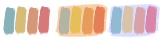
My colour choices are more often than not a gut feeling—but that does come from practice! There’s loads of colour palettes available online like this one, but if you wanna come up with your own, there’s some neat ways to do that using a colour wheel! Colours can broken down into primary, secondary and tertiary colours. We can also categorize them as warm or cold. With this we can make colour schemes!
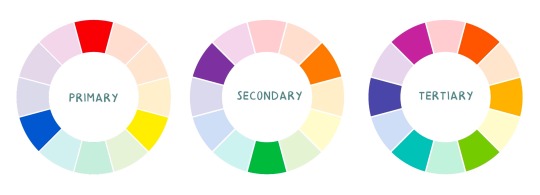
Some basic schemes!
Complimentary: two colours, opposites on the colour wheel
Analogous: three colours side-by-side
Triadic: three colours that form a triangle, evenly spaced
Monochromatic: using one colour (using different shades)
(Bonus) Monochromatic with accent colour : using one colour as a foundation and having an accent colour (similar to analogous, but one colour is used for a majority of the piece while the accent colour is used sparingly)

It’s also important to keep in mind that values (a colour’s range from dark to light) will look different on different colours. Sometimes, you’ll put two colours together and think “huh, something about this feels off” and it turns out, the colours just happen to be very close in value and melt together. Switching your piece to grayscale just to check on your values every so often can help with contrast and muddiness! A light tone on a darker tone will look brighter than it really is. Colours can also influence each other and trick your eyes.

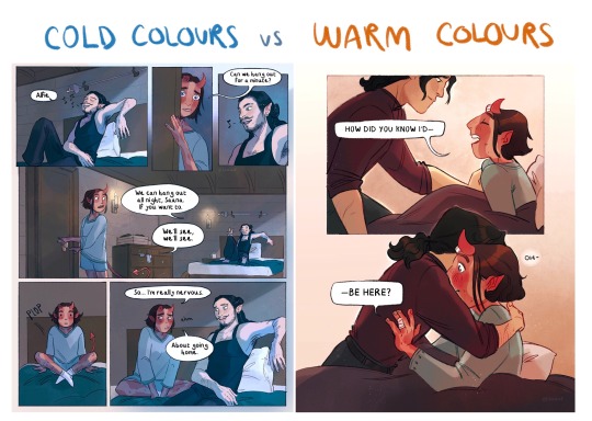
Environment is also a big part of choosing your colours for a piece. Determining what the setting is important! A sunset will make a drawing warmer, while a scene set in the night will usually have colder tones. Using only local colours (true colours, like green grass or blue sky) vs non-local colours (atmospheric perspective, accent colors that give depth, etc) can help enhance your drawing too. Don't be afraid of artistic interpretation!
Also, there’s always the option to use gradient maps (at least on procreate & photoshop but I’m sure it’s available in csp and other programs) where you draw in grayscale & apply a gradient map. The gradient map basically applies a color to every value (e.g all the shadows become blue and the highlights become orange) it can look really nice (and help out if colours just aren’t working that day yk)

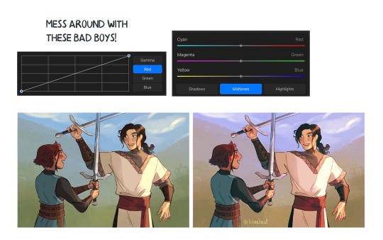
Another thing, when I’m drawing (and this is specific to me!) I tend to start with pretty desaturated colours. Once my illustration is done, I’ll duplicate & merge my layers to do colour edits. Most programs give you the option to play with curves or colour balance—menus that allow you to play around with the hue of the shadows, midtones and highlights. I tend to make my shadows more cyan-blue, my midtones a little warmer and my highlights warmer as well. Of course, this depends on the mood of the piece, whether it’s warm or cold, lighter or darker, etc!
You can always make adjustment layers on top of your work; a low opacity yellow, magenta or blue (or anything your heart desires) overlay to tie all the colours together.
I hope this helps a bit!! Happy to answer more questions to the best of my knowledge :^)
100 notes
·
View notes
Text


Decided to post all the progress pictures I had of this, from sketch to final painting. This is my favorite digital painting I've ever done, lol. Short description of the process below the cut.
Step one: sketch on paper. I usually make sketches for Serious Art on paper first, because I feel like it's easier to play around and get something... loose, with the right feeling.
2. redraw it digitally. This one changed a lot, because I couldn't get the framing right digitally, so I pretty much redid the whole thing.
3. this is where I thought about the lighting. I've been trying to get more intentional about my lighting, because that's what separates good art from great art. So I threw in the shadows while trying to think of what would be the most dramatic, as well as support the themes of the picture.
The rabbit needed to be in the light, and I liked the idea the light coming from behind him, the place he's turning to look at. Like he's looking at all the bright and good things that he has lost... It's behind him, something he can't get back. I also wanted the old-looking / Caravaggio-esque feeling, with harsh shadows.
4:9. These are all just painting in over the sketch. You can see my palette, I color-picked from a screenshot of the beast, but I would also create random similar colors, I wasn't strict about the palette when I needed something slightly different, especially in bloody/wound areas.
I used the built-in gouache brush in clip studio paint. Almost all of the painting is on one layer.
As you can see, I didn't do things the traditional way, where you lay down a midtone and build up darks and lights... I just kinda jump into it.
My least favorite part was the teeth.
10. the final picture. I added details like dust motes in the light, and one of my favorite little tricks, adding a bit of glow around the brightest parts with an airbrush.
If I were going to change anything, it would be the clothing, and the arm holding the rabbit (especially the bicep area) because I feel like you can tell I just phoned it in. There's also something slightly wonky about the mouth, but it would take way too much work to ever fix, so I never will lol.
#amnesia: the bunker#amnesia the bunker#the stalker amnesia#frictional games#amnesia game#augustin lambert
21 notes
·
View notes
Note
Hi there! I've belatedly seen your question about coloring, and I'm someone who likes to tweak color, so in case it helps, I thought I'd write up some things I might do. I don't know if you have the same tools I have, but I saw you use Color Balance, so I've used that for an example below.
I usually start by adjusting lighting levels so that the lightest and darkest points are where I hope them to end up. Then I'd adjust color hues which in your case was using the Color Balance tool. I might also adjust the saturation or vibrance because too much can cause colors to get extreme quickly. Here are some quick settings I did in Photoshop.
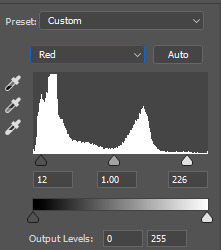
Levels: dark point=19, mid point=1.37, light point=249, output levels=18 to 255
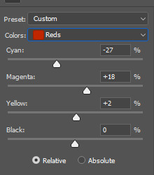
Color Balance: shadows red+13, green+5, blue-4; midtones red-8, green-9, blue+3; highlights red-60, green-28, blue-25
Saturation: reds-8, master-4
Here's the result:

I know it can be hard to translate setting between different apps, so I wonder if this will be helpful at all, but feel free to ask me questions if you're so inclined 😊
~ Dani
WOW, your results are incredible! Thank you so much for taking the time to play with this and to offer some tips! Adjusting lighting before trying to adjust colors hadn't occurred to me at all.
I'm using Adobe Premiere for the video editing, so same software company at least, but I couldn't find any lighting level settings like what you described. Through Googling, it looks like a setting called "Lumetri Color" is typically used for lighting corrections and it's broken out differently.
I have to go to work pretty soon, so I haven't had sufficient time to really dig into it and play with it, but I did mess around with it a tiny bit. I'll play more this weekend and see if I can get closer to what you were able to accomplish.
For reference, my original adjusted version (which I can see now looks soooo horribly orangey compared to yours!):

As a starting point, I just clicked the friendly "Auto" button on the Lumetri Color tab to see what it would do. A little better, still pretty orangey.

Then I tried to make some of the color adjustments that worked for you. It looked like your adjustments had been based on my adjusted version, so I'm not sure if my attempt at making it a direct mathematical adjustment was the right way to go, but I tried to add your adjustment #'s on top of my adjustments. So for example, I'd had Shadow Red set to -10 and since you said you added 13, I changed it to 3. When I changed all 9 settings it didn't improve too much, definitely nothing like yours:

But while applying those changes, I noticed that before I applied the last two (highlight green and blue), it looked closer to what you had. Still not there yet, but closer.

Once I have time, I'll play with some of the Lumetri sliders and stuff a bit more. It may also help just to have your beautiful image as a reference point. Thanks so much!
Addendum: Additional Efforts
I spent some more time playing with this. I present two versions for your judgment.
The first version isn't exactly like yours, but it looked pretty close to my eyes. So I was happy for a minute or two. Then when I started watching the video instead of just staring at the still frame, I felt like it looked a little too green. Maybe that's because I've spent so many hours staring at my previous orangey version that my idea of what looks normal is skewed.
So in version two I adjusted the Tint setting. I feel like this looks a little better, especially when I watch the video, but I don't trust my judgment at all. My color judgment was bad before, and now I think my eyes are permanently warped from staring at different shades for so long.
I'm including both versions below. For each version I'm including a side-by-side comparison with your example vs mine. I wanted to include a video clip for both, but it looks like tumblr limits it to 1 video, so I only included the video for version 2.
Please don't be afraid to tell me they both look horrible! I feel sort of like the proverbial monkey hitting a bunch of random keys and hoping I might hit upon Shakespeare by pure random chance. 😅
Version 1

Version 2

14 notes
·
View notes
Note
Your gifs are always so beautiful. How do you make them so HD?
first of all, thank you 🥹 im happy you like them.
for your question, it's a combination of things i guess. idk how to answer without getting a little bit into adjustment layers in photoshop (assuming you even use photoshop). i dont think i do things that differently from others. one thing i dont do is i dont use "action", i do everything from scratch. my cropping method is probably a bit different as i crop out everything i dont want without resizing it first and only resizing them afterwards to 540x540p, my favourite dimension. idk how everyone else does it. do share if you have a good method to reduce lost of quality when resizing.
im gonna talk a bit about the 4 adjustment layers i almost always use which i'll put into quotation marks under the cut below.
1. i use "levels" a lot to adjust the lighting. some people use "curves" or "channel mixer" which i find hard to get consistent results every time. they're useful when "levels" cant get me to where i want the colouring to go.
tips:

hike up your shadow input level for RGB between 5 to 10 to add more depth to the gif. (midtone and highlight can help brighten your gifs if needed)
adjust the Red, Green and Blue shadow, midtone and highlight input level to get rid of the yellowish tone and add some reddish tone (i love adding a little red tone idk, they just look better than yellow
2. "brightness/contrast" is important too. if the gif is too dark, i sometimes change the adj layer from normal to 'screen' and adjust the shadow input in "levels" to balance them out.

3. "vibrance" - i usually go for vibrance: 50, saturation: 10
4. "selective colour" - to fix or remove too much redness (normally in skin colour due to vibrance) by adjusting the black colour level in Reds.
idk, that's it really. hopefully this is somewhat helpful to you. and always make sure to use HD sources, anything below 720p will be harder to work with.
#ask#gifmaking#idk if this is what you're looking for. i just hope it answers your question. somehow it became a tutorial of sort 😄#the PS screencaps are taken from my latest sam reid gifset
16 notes
·
View notes
Note
Wanted you ask for your headcannons for Frank, 💝💔👗🔪🥇🎭❤️🔥💄😭 ( I love that man so much! 😭💙)
BLUE HEART ANONNN i missed you dude!! and ofc!! we frank fans gotta stick together FYWGWEUF
this will contain spoilers and the angst hc is a lil dark but that's how I do angst babey
💝: to me, Frank has always read as a physical touch and acts of service kinda guy. like, for example, he struggles a fair bit to tell Karen verbally just how much he loves her, but to show it he tends to touch and hold her a lot as well as help her out with things. the acts of service hc is even hinted at in canon cus Karen stated that he helps out fixing small electronic devices around the house.
💔: this is both a mix of my hc and au - and really what would probably happen in canon if this were to happen - but i don't think Frank can really live without Karen. like, in an au where Karen dies but Frank doesn't, i think Frank would probably off himself because the person he loves the most is dead.
👗: Frank has numerous Hawaiian shirts in his closet as well as the same coloured jeans. he doesn't care - or want to - wear anything else. ofc he will, and he has clothes other than Hawaiian shirts and jeans, but he loves his iconic Hawaiian shirt because its comfortable to him.
🔪: I think everyone agrees that Frank has anger issues, so i wont repeat the truth UYFEGWWFE but, with Frank's training in the military as well as the fact his job is pretty physical at times, he's trained in some forms of martial arts. though i can't see stuff like Karate, i see more Boxing, Jiu Jitsu, Judo etc etc. how to fight and take someone down if needed. I can also see him being really good at Jiu Jitsu and Judo UEWFYUFEW
🥇: I can see small and big things he's good at. like something small is I can picture him being amazing on the grill, but a bigger one is that I can see Frank being amazing at giving advice (though he sucks when it comes to taking it). as much as he's harsh, i feel like he's good at pushing people to do things that makes them happy, and I think he tries to get people to do things they love because for a while he struggled to understand just how important love really is.
🎭: Ooooh.. I don't think Frank would lie a lot honestly, but. He'd absolutely lie if it meant he was (or, at least he thinks he's) protecting his family. Though, you can always kinda tell when Frank is lying, because usually he's pretty blunt and honest. Sometimes too much.
❤️🔥: KarenFrank time teehee. Frank adores Karen, absolutely, and I can see Frank giving Karen this certain look anytime he sees her. I dunno how to describe the look other than just full of pure love. She could look absolutely messy, puffed out after trying to get the girls to stop playing in some mud or something, and Frank would still put his hand on her cheek and look at her as if she was the sun and he was the moon, basking in her light.
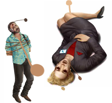
💄: I've given my physical hc for Frank a fair bit - the fact I see him as tanned, as well as having darker hair and more greying streaks - but recently I've used his skintone on his dead body (dark, I know) because the colour is around the same, but it looks more natural compared to the vibrant colours I tend to go for. Here is a screenshot of the way I colour-picked the skintone off of the bodies - I go for the midtone of said body instead of either the direct lighting or the deepest shadows.
😭: Well. There is an obvious answer to this one. But, instead of going that route I'm gonna explore how he felt more. I imagine Laura's death was the heavy ass stick on the camel's back. Because it was mentioned Frank was a solider before he was a cop, I'd imagine he'd have some sort of trauma related to that - especially with the fact he was in his 20s for a bit of the 80s, where a lot of wars happened. That likely PTSD mixed in with the death of his daughter probably made what was seemingly a small liking to whisky into an addiction, which lead to his life crumbling more when Karen divorced him. Might I add, they didn't even divorce because they weren't in love, it was heavily implied Karen was still in love with Frank, and then Frank was clearly still in love with her too, esp cus all the other women he got interested in in-game were just younger, more evil versions of Karen UEFGUFWE. From what I saw of the photo of Frank, Karen and Daisy - esp because she looks around 10-13 in that image while dying at 14-15, I presumed they were together - or trying to be together - for a bit, and then divorced. And even if Karen had full custody of Daisy, that image as well as Once Upon a Crime make me believe that Frank did have contact with Daisy, it's just Daisy didn't want to speak to her dad. Which, presumably, lead to more depression, and more substance abuse. This cycle only ends when he's dead - when he's with Karen and the girls again, and can live as a family all together again. It's clear that if Frank's family didn't crumble and fall apart - because of the actions of a dumb ass driver - we would have a very different Frank in-game.
those are my hcs!! sorry its long i love talking abt the knight family sm and if given the chance i will ramble abt them.
#criminal case#frank knight#karen knight#i LOOOOOVED writing this sm#thank you blue heart anon#i hope you msg me one day cus you are amazing bro and id love to talk abt frank with you
11 notes
·
View notes
Last Seen Blogs

lurvbunny-blog
LurvBunny

underwear-thief
Untitled

thelonelystoner305
Pictures Worth Thousands Words ;
duyungdodol
a mermaid made of dodol.

itsdonblog
Untitled