#wc doodles
Text
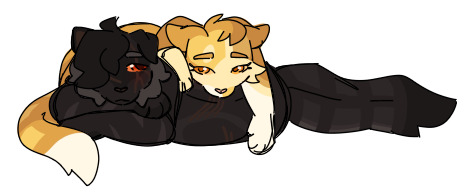
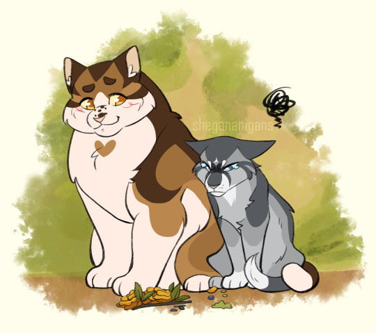
Obligatory ShadowSun art.
Also, I'm semi-back? I'm in between jobs at the moment so have a doodle while I'm on my off time lol
59 notes
·
View notes
Text
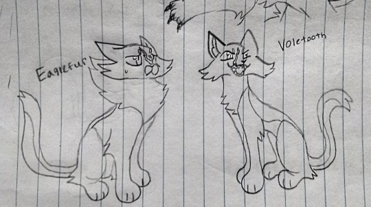
Did I mention Wolfstar is a grandpa?
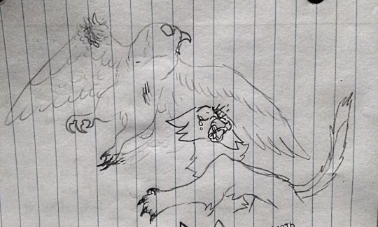
Ouch
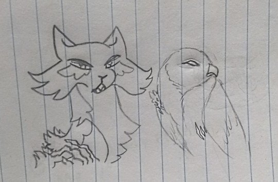
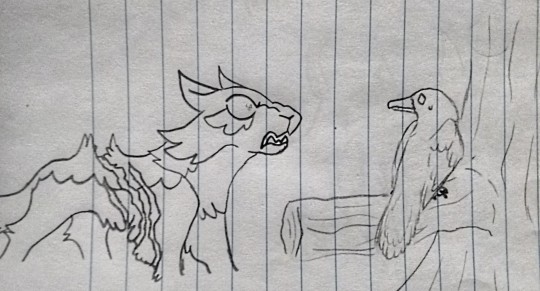
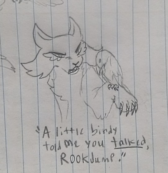
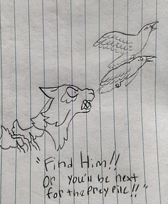
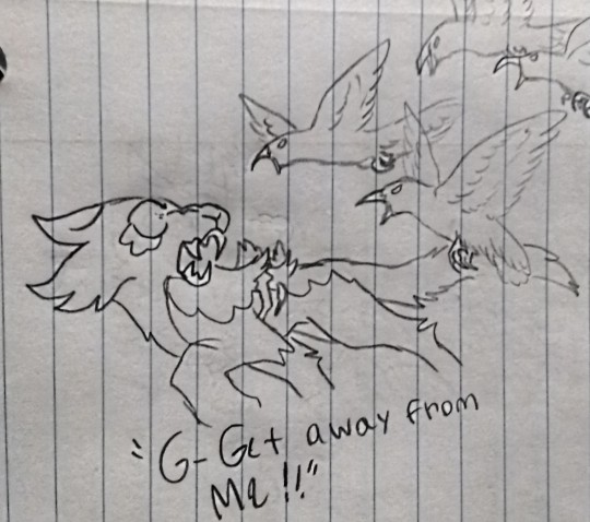
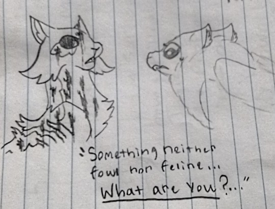
After nearly being killed by a hawk as a kit, Brokenwing discovered a strange gift he had with birds.
#Wc oc#Warrior cats oc#My oc#My art#Wc art#Warrior cats art#Wc doodles#Warrior cats doodles#Fanclan#Tw blood#Tw injury
34 notes
·
View notes
Text
so i've been listening to the warrior cats audiobooks and there's this scene where fireheart is explaining to bramblepaw and tawnypaw that their father tigerstar is a traitor and it's really dramatic and ends with bramblepaw getting upset and running away but at the beginning it said that fireheart tucked his paws under him so all i could think about was how he was loafing
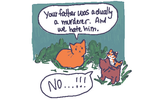
i drew fanart ^
#i know they look too young here but it's funnier. also i forgot it's fall/winter. warrior cats superfans don't come after me#doodles#warrior cats#wc
19K notes
·
View notes
Text


everything stays... but it still changes
#wc#warrior cats#thunderclan#yellowfang#cinderpelt#leafpool#hollyleaf#jayfeather#alderheart#flipclaw#the meds.... my everything#mine#fanart#oodles of doodles#spotted didn't get in because she died too early to teach anyone anything :pensive:
6K notes
·
View notes
Text

design by warriorsproject/nifty-senpai
#Leopardstar#leopardfoot#Riverclan#doodle#sketch#drawing#art#fanart#warriors#warrior cats#Leopardstar art#Leopardstar fanart#warriors art#warrior cats art#warriors fanart#wc#wc art#wc fanart
1K notes
·
View notes
Text

Firestar doesn't like Waffles⁉️
3K notes
·
View notes
Text

hollyleaf stuff cuz I reread sunrise
2K notes
·
View notes
Text

sweet spottedleaf
#cinnamon calico…..like dried autumn leaves….#spottedleaf#wc#warrior cats#artists on tumblr#art#digital art#cats#furry art#felines#kids lit#thunderclan#Erin hunter#medicine cats#climbdraws#wanted to doodle in the same style I used in 2018/2019 ish aka eyebrows#contemplating changing her keychain design to give her the white face
1K notes
·
View notes
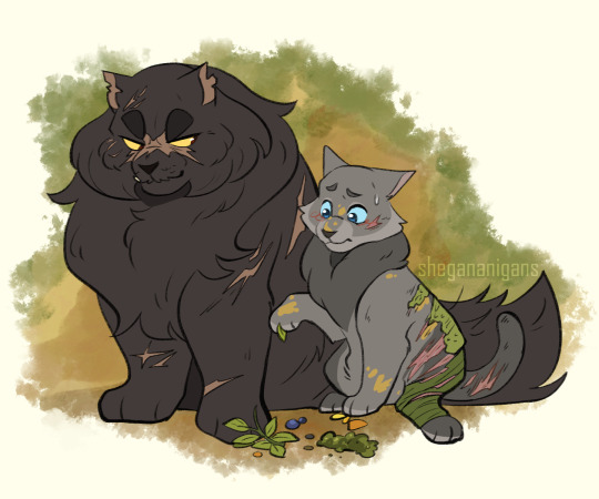
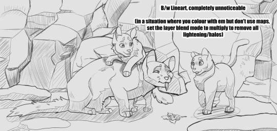
Text
Leafkit and Squirrelkit make "travelling herbs" for Sandstorm before she goes for a walk. They're delicious, she assures the kits, through tears in her eyes. They run away proudly, she rushes out of camp for the nearest creek to wash her mouth in. Nasty, she mouths, but she'll eat whatever they make. The kits' smiles make it worth a wet face.
~~~
Had a ton of fun with this one but don't wanna bog down the main post. A lot of unrelated-to-wc process talk below the cut!
So this was a bit of experimentation with a new brush which turned into exploration into gradient maps.
The original idea was simply to modify csp's mechanical pencil brush into something that felt a bit more natural. It started with simply turning on a bit of tilt-controlled thickness and setting my colour to about 80% grey, rather than black. It didn't quite feel right, but setting the brush to blend with the subcolour on each tip, setting the subcolour to the 80% grey and the main colour to the canvas' colour, then setting the brush's blend mode to darken gave me a brush that felt like it had FAR finer line control.
The lines themselves look like this (on a more saturated bg to show how the values layer/fade in and out with pressure and tilt):
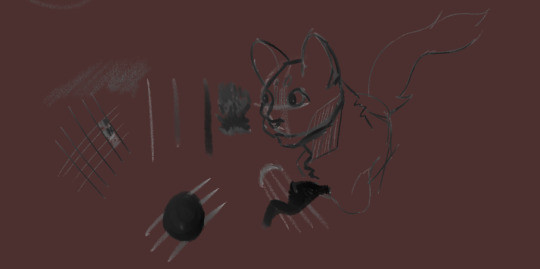
(edit to pic: completely unnoticeable when on the intended base colour*)
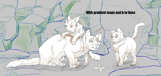
This is where the gradient maps come in. The way I usually change my linearts' colours is to make a new layer, mask over it, and manually paint. It gives a lot of control to your end result, but it's time consuming and often takes many adjustments to make it feel like it has enough contrast to make the drawing actually *readable.* If I wanted to add a gradient map to the lineart, it would be unable to read the transparency and would pick from the single value that the lineart is (usually black), then the transparency would take over. This gives me a dull result.
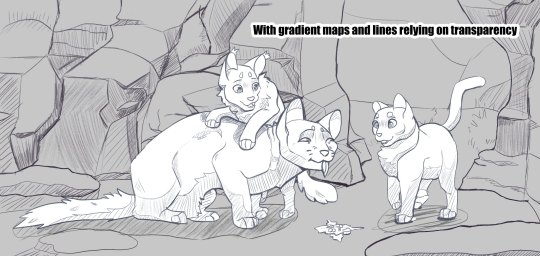
With the "transparency" being an actual colour, that gives it an actual value for the gradient map to read. So instead of having your lines fade from black to the colour behind it (often desaturating as it goes), it'll go from something like dark blue -> reddish-grey -> orange -> yellow. It adds a little something i think, and while I absolutely don't have this down pat, it could be something interesting to explore!
I also wanted to go further with this piece, namely painting it rather than a shading layer set on overlay with the aforementioned gradient maps all over it but ... it wasnt happening. The art skills clocked out for the day. That said, I definitely want to explore how this would look if I coloured everything for realsies rather than doing the fallback method. Could be where they really shine!
#warriors#warrior cats#squirrelflight#leafpool#sandstorm wc#btw. the post did get bogged. i talked a lot but damn it was fun to doodle around with !! give it a shot if u want!#2023 art
1K notes
·
View notes
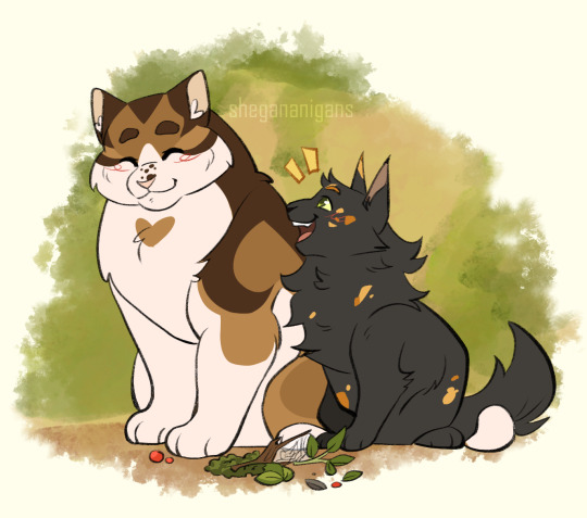
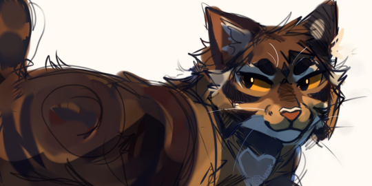
Text
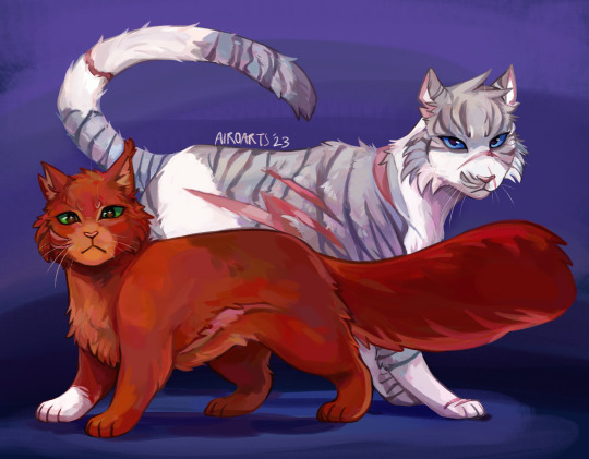
Leader and deputy
[Image description: a digital painting of Squirrelstar and Ivypool from Warriors. Squirrelstar is a small dark red cat with green eyes, standing in front of the much taller Ivypool, a gray tabby-and-white cat with blue eyes and many battle scars. The background is dark blue. end ID]
#i havent read a new wc book in years (They are not very good) but have been keeping up with The Happenings recently cause its fun#when was the last time there was a female leader+deputy? leopardstar and mistyfoot???????#anyway so happy forthem i hope they dont both die immediately#warriors#warrior cats#wc#squirrelstar#squirrelflight#ivypool#art#2023#I have actually been doodling a ton of cat designs like in classes in the last couple months lol#havent posted them because theyre just Designs and so many people post those all the time but if i get one (1) ask about it i can post them#also just have not felt like posting art recently even though ive been doing it. LOL#worried about squirrelstar cause um. i know cat ages have been generally increasing but she is older than her dad was when he died#if wc wiki ages are to be believed#her husband just retired to be an old man and she took his job#well whatever... i dont even read the books... i dont care... tch#ALSO EDITED CAUSE I REALIZED I PUT HER WHITE PAW ON THE WRONG SIDE#the first few rbs will have the wrong version but whatever. its fine. its fine
762 notes
·
View notes
Text

Have a Beepaw doodle. Wife picked her because she thought that her name was funny.
13 notes
·
View notes
Text
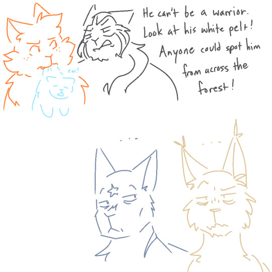
I can't actually remember who complained about Cloudkit's white coat but it was so funny in hindsight. That's your argument? Really? Right in front of the leader's nephew and one of the most respected warriors of the clan?
#collab doodles#collab fanarts#wc#warriors#warrior cats#fireheart#firestar#cloudkit#cloudtail#darkstripe#bluestar#whitestorm
289 notes
·
View notes
Note
Cloudtail 75 for the Spotify wrapped thingy :3
Leah you're breaking my heart and I'm letting you
Oblivious beauty I'm betting you don't even know what you're doing to me
#cloudtail#brightheart#warriors#warrior cats#wcs#ms paint#spotifygame2023#my hw watching me work on these 0.0#im sorry ms paint warrior cat doodles r more fun than the paper i have to write AAA#anyway i feel like brightheart would have a shirt that says “i love my dramatic hubby”
649 notes
·
View notes
Text
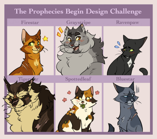
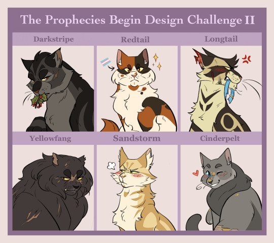
miss my friends from the woods...
here's the template! might do some of the other arcs too
#wc#warrior cats#firestar#graystripe#ravenpaw#tigerstar#spottedleaf#bluestar#darkstripe#redtail#longtail#yellowfang#sandstorm#cinderpelt#fanart#art meme#mine#oodles of doodles
758 notes
·
View notes
Text
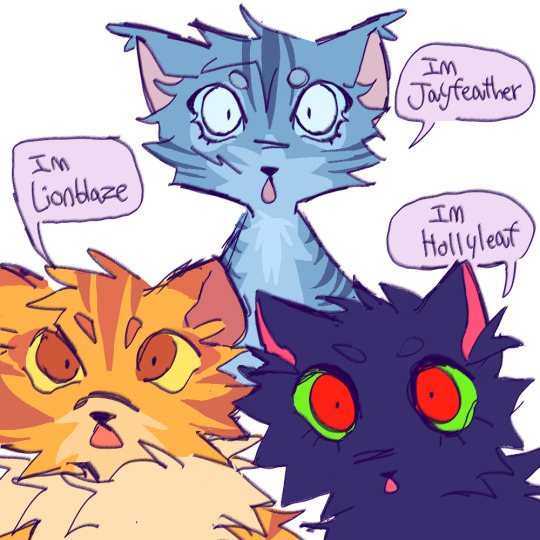

has anyone done this before
#warrior cats#wc#jayfeather#hollyleaf#lionblaze#warrior cats fanart#wc fanart#wc hollyleaf#wc jayfeather#wc lionblaze#my art#sketch#doodles#warriors#power of three#po3#wc art#warrior cats hollyleaf#warrior cats jayfeather#warrior cats lionblaze#warriors erin hunter#doodle
1K notes
·
View notes

Last Seen Blogs
videogamerant
"Lasciate ogni speranza o voi che entrate".
dough-belly
goofy and degenerate 💀

kittygoesinsomniac
Silly Things
littleblackheart13
Work Hard. Shop Harder.

loudgaybug
trafficlife lover + jay ferin appreciator