#Caravaggesque
Text
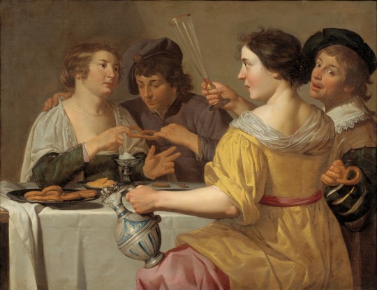
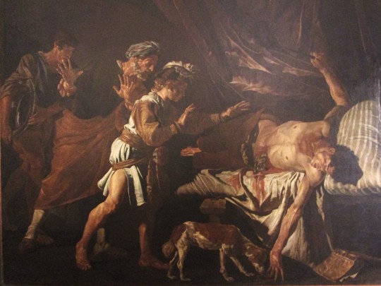
Pulling of the Pretzel
Jan Van Bijlert
#1600s#17th century#art#painting#art history#fashion#portrait#scene#genre art#fun#party#dutch art#Dutch Golden Age#Jan Van Bijlert#caravaggesque
139 notes
·
View notes
Text
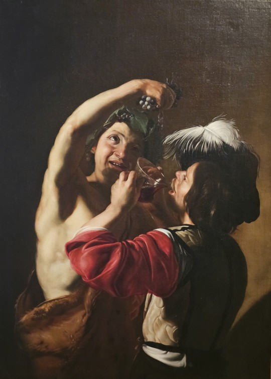
Bacchus and a Drinker; by Italian artist Bartolomeo Manfredi, 1621 | Held in the Palazzo Barberini
#painting#italian art#italian painting#bartolomeo manfredi#caravaggesque#caravaggism#bacchus#dionysus#17th century painting#17th century art#roman god
22 notes
·
View notes
Text
charlotte talks art history: carravagesque baroque art
And we are back at it again!
Hi everyone, and welcome to the second “charlotte talks art history!” Today the topic is baroque art, and specifically baroque painting in the Caravaggesque style! (this one’s for you @ilikeitbetterangsty 🥰 I hope you like it!!)
I do just want to quickly note that in the future I will likely not be able to do these kinds of longer posts so close together, but I had a lot of extra time this week and really wanted to write this one
Quick note: As with any art period, there were many styles of baroque art and many artists working in this period. My favorite kind of baroque art happens to be Caravaggesque, so we will be focusing on him and his style, but just know that there are many other forms of baroque art to explore if you’re interested!
Content warning for depictions of violence (specifically beheading), blood, and death throughout the post
~2800 words

As always, I’d like to start by defining some terms and giving a general overview
The term “baroque” generally refers to artwork created in the period after the Renaissance. Dating periods is really difficult, but generally the baroque period took place from the mid-1500s through the mid-1700s. It’s not fully clear where the term “baroque” originated, but some scholars suggest that it had to do with a fad for flawed pearls rather than perfectly round ones, suggesting a wider cultural interest in the unusual and the complex. Baroque encapsulates pretty much all artforms, from sculpture to music, but I will be focusing on painting in this post.
“Tenebrism” is a term associated with baroque art, and it describes the dramatic contrast of light and shadow in a painting
“Caravaggesque” means “in the style of Caravaggio,” a deeply influential baroque artist who I will discuss in more depth below
“Caravaggisti” refers to artists who paint in the style of Caravaggio
And now, the man himself: Caravaggio. A little bit of a bad boy in the art world, Caravaggio had a penchant for drunkenness and brawling, and he *might* have killed a guy that one time. As a result of his uh… more abrasive nature, he spent much of his adult life in exile and on the run (primarily in Italy). Aside from his personal habits, many artists of the time also really disliked his work. There are a number of reasons for this, and they’re worth exploring since they’re also what makes his art so distinctive and influential
Without further ado, let’s immerse ourselves in the drama of Caravaggesque baroque art!
One reason that Caravaggio’s painting was disliked by other artists was the fact that he flaunted many of the “rules” of painting held sacred by the influential artists and scholars of the Renaissance. I might do a whole post on the Renaissance later, but for now, here are some important tenets of Renaissance art you’ll need to know to understand why Caravaggio’s art was so shocking to some people:
Linear perspective: developed in the early 1400s by Brunelleschi (and also other people, but he typically gets the credit), linear perspective (also called one-point perspective) is something you might have done in art class. Essentially, you pick a single vanishing point, and all the lines point back to that one point, so everything is scaled based on distance. Linear perspective is actually a bit odd, since it’s not actually how humans perceive space (we receive visual input from both eyes, thus we do not perceive things as actually having a single vanishing point), however, it is an effective tool for suggesting receding space in 2-D works. Anyway, as soon as this method was discovered, people became completely obsessed with it, especially in Italy. On a wider cultural level, it also represented a kind of ordering of the world and served as proof of the development of art based on human intellect and careful study and observation.
I also want to note here that linear perspective was hailed as a way to make paintings seem like a “window onto the world,” showing viewers a possible reality rather than a constructed art piece. However, prior to this time, that was simply not necessarily a goal of art. Rather, it was meant to evoke emotional response, act as a catalyst for meditation, or even aid in religious devotion. So it’s not that earlier artists didn’t understand recession into space or were “bad” artists, it just simply wasn’t something that was as important to them. Even after the system of linear perspective was discovered, artists in some places just chose not to use it, since it didn’t serve the goals of their art, and it can actually distort scenes in its own way, since – as I mentioned above – it’s not a totally accurate representation of how humans perceive space.
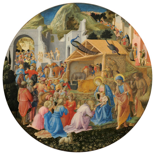
Fra Angelico and Fra Filippo Lippi’s Adoration of the Magi (ca. 1440-1460) does not use linear perspective. Although things that are farther away are smaller, there is no real “rule” for how they should be scaled, leaving the whole scene feel a little wonky and “off” (look particularly at the barn and its relationship to the landscape and the other architectural elements). Again, this is not because the artists are incompetent, but because this art had different goals and didn’t place as much importance on being "realistic." Compare this to Raphael’s Marriage of the Virgin (1502) which does use linear perspective. You can see the clearly defined space as delineated by the receding lines in the pavement that all point back to the structure in the background. It gives the overall piece a much more static, geometric feeling.

Exactness/realism (kind of): connected to the use of linear perspective to make paintings seem more “real,” many artists of the Italian Renaissance prioritized the study of anatomy and the careful construction of the human form. This attention to physical “accuracy” was called disegno (meaning drawing, design, drafting, etc.) and is epitomized by artists like Leonardo Da Vinci and Michelangelo. Leonardo dissected corpses to study anatomy and made thousands of anatomical drawings in his notebooks. A Renaissance writer named Giorgio Vasari (who I have huge beef with btw 😂 – maybe in the future I’ll write out a full Vasari callout post lmao) championed Michelangelo’s use of disegno, especially the way that Michelangelo articulated muscles and movement in his figures (I actually think that Mikey’s figures are hella ugly and the muscles look like weird bulbous growths but that's just my opinion lol). This interest in exacting realism led artists to place an importance not only on the delineation of space – as we saw with linear perspective – but also on crisp, clear lines that defined each figure in the composition, with each element being individually designed. Those in favor of disegno also criticized artists who favored “colore” (color, but in this sense also often meaning a looser handling of paint). Those in the colore camp used a more blended style that favored a more overall atmospheric affect achieved through color and texture rather than the clean, individualized figures of the disegno supporters. Colore artists like Titian were often criticized by saying that they could be “great” artists if only they learned disegno. Ultimately, we can see who “won” this debate by the fact that disegno artists like Leonardo and Michelangelo are vastly more well known then colore artists like Titian.
Here's an example of one of Mikey’s figures as opposed to one of Titian’s works (Michelangelo’s Expulsion from Paradise from the Sistine Chapel versus Titian’s La Gloria). You can see the careful articulation of anatomy in Mikey’s, whereas the figures appear softer and more blended in Titian’s piece, leading to a sense of overall cohesion rather than Mikey’s exactitude in each individual figure.

Idealization/restraint: lastly, we should discuss the Renaissance’s interest in idealizing their figures – especially those of religious importance – and the emotional restraint demonstrated by the vast majority of these figures. By idealization, I mean that artists made their figures beautiful – they made sure they conformed to the beauty ideals of their own time and culture. Though they would use models to help them capture movement and poses, most of the faces of these figures are not based on real people, but rather represent the artist's idea of “perfection.” This interest in perfection also ties into the emotional restraint found in much of Renaissance art. Put bluntly, people don’t typically look conventionally beautiful when they are doing anything that contorts the face, such as yelling, crying, scowling, etc. Therefore, many Renaissance figures tend to have very placid expressions, even in distressing situations.
Here are some examples of that idealized beauty and placid, emotionally restrained expressions: one of Raphael’s many Madonnas and Paolo Uccello’s Battle of San Romano (idk about y’all but to me those guys are looking pretty chill for being actively involved in combat)


But what does all of this have to do with Caravaggio and baroque art? A lot, actually, since Caravaggio looked at all these rules and conventions and basically said “artists really have to conform to a lot of expectations. Not me bc I do what I want – y’all stay safe tho.” Then he preceded to do absolutely none of the things listed above which created a compelling new style of painting and pissed a lot of Renaissance-lovers off in the process (so a win-win imo)
(sorry for all the Renaissance talk, but it's important for understanding the drastic changes found in Caravaggio's art)
So, finally – to the baroque!
If there’s one word to encapsulate baroque art, it would be this:
✨Drama✨
Movement, lighting, color, action – baroque art has it all!
Caravaggio really starts this transformation with his Calling of Saint Matthew (1599-1600). There are a few things to note here. While not as dramatic as it will become in the future, there is still a fairly high contrast between the light and shadows (tenebrism), leaving some parts of the composition obscured in shadow (which folks like Vasari would not have liked lol). In addition, the light here actually acts as a character itself; rather than being represented by an old man on a cloud or a disembodied hand reaching down from the sky, God is present in this piece as the beam of light, calling on Matthew by illuminating him. Another thing we see here is biblical figures being dressed in clothing that was contemporary to Caravaggio’s own time. Although this had been done before, it was with baroque art that this trend really took off. In addition to that, these people don’t look “special.” They don’t have halos, they’re not glowing with an otherworldly light, their features aren’t supernaturally perfect. Instead, they're depicted as un-idealized, normal people that you might pass on the street. And with that, we have the beginning of the Caravaggesque baroque

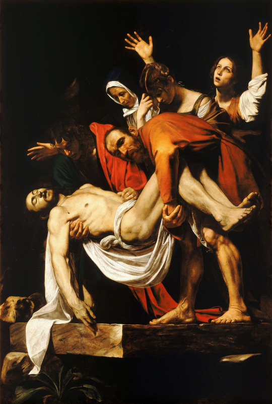
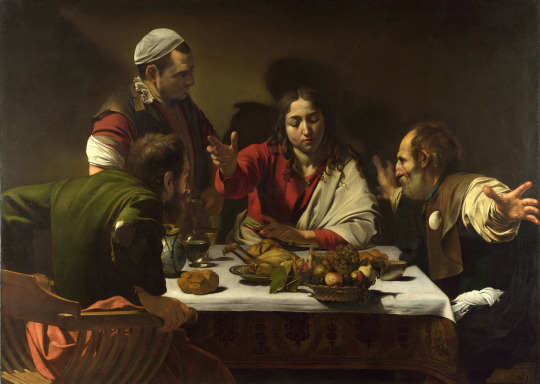
As Caravaggio continues to paint in this style, his departure from Renaissance ideals becomes even more dramatic. In The Calling of Saint Matthew, we perhaps still could have seen a deference to linear perspective and an interest in constructing realistic space, but this fades as we move further into Caravaggio’s career. He exchanges a “believable” space for a kind of murky darkness behind his figures that pushes the characters to the front of the picture plane, quite literally putting them in the spotlight. Here is where tenebrism becomes even more noticeable: we have deep shadows in the background contrasted with a bright light illuminating the figures, throwing them into sharp relief against the darkness. This also connects to the idea of drama, since Caravaggio’s canvases now almost appear to be stages. His figures are the actors, performing their roles at the front of the stage and the darkness behind them is the recesses of the stage, mostly obscured but perhaps revealing a few important props or set pieces. Here are a couple examples of this: The Deposition (1602-1604) and The Supper at Emmaus (1606)
Caravaggio also introduces much more movement and expression to his works. Connecting again to the idea of his compositions acting as stage plays, we see characters in the midst of dramatic actions filled with energy and passion. One good example of this is in The Taking of Christ (ca. 1602). The swirls of fabric, desperate reaching of hands, entangled body parts, and emotive expressions bring the piece to life and create a spiral of frenetic movement around Christ. Even in more still scenes, such as Saint Francis in Mediation (1606), Caravaggio’s depiction of forms and use of expressiveness in both facial features and body language still conveys powerful emotions to the viewer.

So, let’s check Caravaggio’s work against the Renaissance ideals for art:
Linear perspective – nope! In fact, he does away with any real sense of recession into space and instead pushes his figures to the very foreground of his compositions, leaving the background dark and obscured
Exactness – also nope! His use of paint is much more reminiscent of Titian than of Leonardo or Mikey. His figures swirl with motion and tend to blur into the shadows and other objects around them. Rather than clearly delineating each figure and object, they instead move together to create a cohesive scene united by color and movement
Realism/idealization – yes and no. Caravaggio embraces a kind of realism that the Renaissance scorned. He chose to depict the features of real, everyday people rather than idealizing his figures. Instead of making his backgrounds appear like realistic windows onto the world, he turns his canvases into stages, emphasizing the performativity and constructed nature of art rather than trying to convince us we’re looking at a possible reality
Restraint – hell no! Caravaggio’s figures are in motion, performing dramatic actions, and conveying intense emotions
So, in short, Caravaggio saw the Renaissance expectations for art and said “nah, fuck that.” And although he may have infuriated the Vasaris and Renaissance-lovers of the world, his new, compelling style was incredibly appealing to a large swath of patrons and other artists
Caravaggio’s influence was widespread, and his dramatic style was picked up by fellow Italian artists, but also as far away as France and Spain. The Caravaggisti (artists inspired by Caravaggio who painted in his style) could be its own post, so I will just quickly cover a few here.
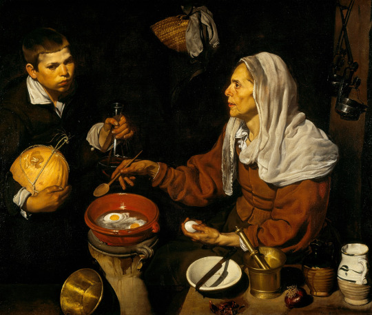
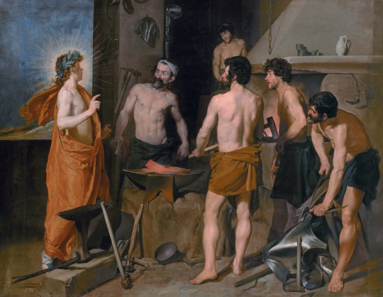
In Spain, we see artists like Juan Sanchez Cotan and Diego Velazquez clearly taking inspiration from the Caravaggesque style of painting. Although there is a heated debate about where and when Velazquez could have been exposed to Caravaggesque work, it is nevertheless clear that the Spanish painter’s bodegones (scenes of everyday life) and the unidealized figures found even in some of his historical and mythological paintings pull from Caravaggio’s interest in depicting real people. Here we have a bodegone from 1618 titled Old Woman Frying Eggs and a mythological painting, Apollo in the Forge of Vulcan (1630)
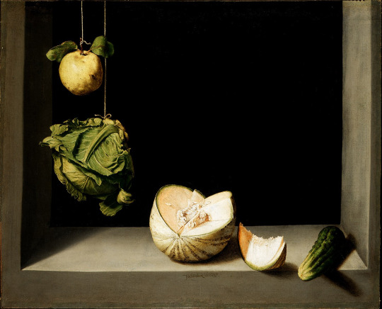
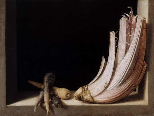
Even an artist like Cotan who mainly created still life paintings seems to be taking inspiration from Caravaggesque art. In these images, we see food items pressed closely to the picture plane, and even projecting out into our space. They are brightly lit with a deep, shadowed void behind them. This dramatic use of tenebrism is very Caravaggesque (the examples here are Quince, Cabbage, Melon, and Cucumber (ca. 1602) and Carrots and Cardoon (early 1600s))
And because I simply could not make a post about baroque painting without her, let’s talk about Artemisia Gentileschi (I love her, your honor). One of a very limited number of female painters from this period who have been widely discussed, Gentileschi used a distinctly Caravaggesque style with unidealized figures, dramatic contrasts of light and shadow, and emotionally-charged scenes filled with movement (the paintings here are Jael and Sisera (ca. 1620) and Annunciation (ca. 1630))


Let me end on one of my favorite paintings: Judith Beheading Holofernes by Artemisia Gentileschi (ca. 1620). This is an incredibly compelling piece, and is also a perfect example of the Caravaggesque style of painting. First, we have a very dramatic (and brutal) scene that is actively occurring as we look on. Judith is still in the act of beheading Holofernes, who is not quite dead yet, with his blood spraying outward in a gush of red. Holofernes’ face is contorted in fear and pain, while Judith wears a determined, focused expression as she passes the sword through his neck. The characters and action are front and center, brightly illuminated with the background dissolving into shadow. This piece screams drama and is quintessentially baroque

Okay, damn so this is even longer than my last one – sorry! If you read this far, thank you so incredibly much, and I hope this was informative or at least interesting!
Let me know how you feel about baroque art, and if you had a favorite piece. Does anyone else also have beef with Vasari lol? Are there any artists or works that I should talk about in the future?
If you’re interested in baroque sculpture, go check out Bernini – his work is so cool!
As always, thank you so much for being here and for listening to my unhinged ramblings about art!
Yours in Artemisia Gentileschi appreciation,
charlotte 💙
#charlotte speaks#charlotte talks art history#art#art history#baroque#baroque art#caravaggio#artemisia gentileschi#artemisia my beloved#diego velazquez#juan sanchez cotan#judith#judith and holofernes#judith beheading holofernes#caravaggesque#caravaggism#caravaggisti#tenebrism#tw blood#tw violence#tw death#tw beheading
15 notes
·
View notes
Photo
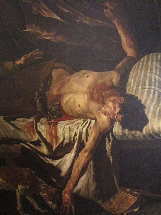
The Death of Cato, c 1640, by Matthias Stomer
Museo Civico al Castello Ursino - Catania, Sicily
Photos by Charles Reeza
#fine art#17th century#Dutch painter#oil painting#Caravaggesque#Baroque#drama#suicide#philosopher#Roman history
13 notes
·
View notes
Photo
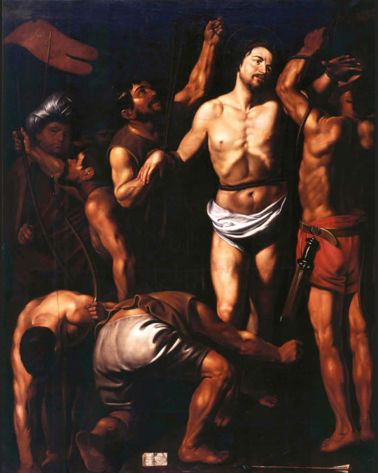
Louis Finson - The Martyrdom of St. Sebastian (1610)
28 notes
·
View notes
Photo
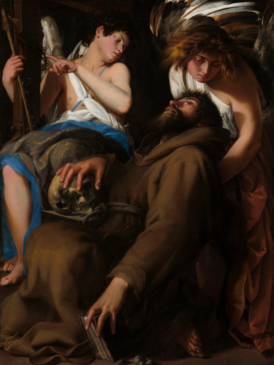
The Ecstasy of Saint Francis
Giovanni Baglione (Italian; 1566–1643)
1601
Oil on canvas
Art Institute of Chicago, Chicago, Illinois
#Giovanni Baglione#Baglione#Italian Baroque#Baroque art#Italian art#Italian artists#Italian painters#Italian paintings#17th-century Italian art#17th-century art#17th century#1600s#drapery#Caravaggesque#Caravaggisti#Italian Caravaggisti#Caravaggism#chiaroscuro#angels#wings#Crown of Thorns#ecstasy#skulls#Saint Francis#Saint Francis of Assisi#robes#gestures#religious art#Christian saints#saints
16 notes
·
View notes
Text
Touring caravans for sale Cheap caravans for sale New caravans for sale Caravans for sale eBay Touring Caravans for sale on site Caravans for sale Scotland Touring Caravans for sale on eBay 1 berth caravan for sale Related searches Cheap caravans for sale Very cheap caravans for sale Cheap caravans for sale under 500 Small caravans for sale Caravans for sale near me 2 berth caravan for sale Old small caravans for sale 2 berth caravans for sale autotrader Caravan for sale Scotland Caravan for sale NZ Caravan for sale Zimbabwe Caravan for sale Victoria Caravan for sale NSW #caravan #camping #caravanlife #travel #camper #vanlife #opala #wohnwagen #caravaning #campervan #campinglife #motorhome #camperlife #nature #chevrolet #wohnwagenliebe #diplomata #homeiswhereyouparkit #caravanning #opalass #caravanrenovation #comodoro #wohnmobil #opalaterapia #rv #motorhomelife #homeonwheels #adventure #glamping #bhfyphttps


#caravan#adventure#camper#campervan#camping#camperlife#caravaning#caravanning#campinglife#caravanlife#travel#vanlife#vacation#trip#travellers#motorhome#caravaggesque#caravan renovation#home on wheels#travel home#neil campling#camp lejeune#United kingdom#London#Manchester#leeds#Liverpool#Glasgow
3 notes
·
View notes
Text
Pirates of the Caravaggio
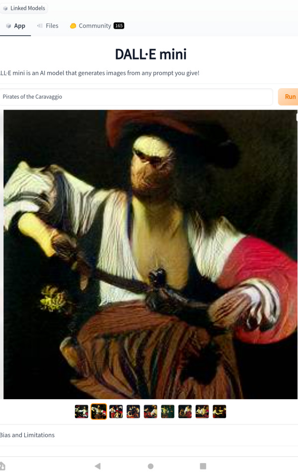
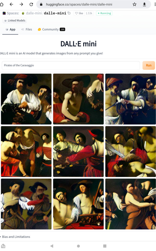
#dalle mini#caravaggio#caravaggesque#punny#Posting dalle mini pics here now instead of Reddit#its so i dont have to see anymore pictures of Walter White and Gigachad kissing in the backrooms#painting#renassaince#pirates#pirates of the caribbean
0 notes
Text

Jael and Sisera, c.1621
Giuseppe Vermiglio
11 notes
·
View notes
Text
Circe
Nicolas Regnier
#Nicolas Regnier#french art#art#painting#art history#17th century#flemish art#Caravaggesque#Circe#mythology#1600s
45 notes
·
View notes
Text
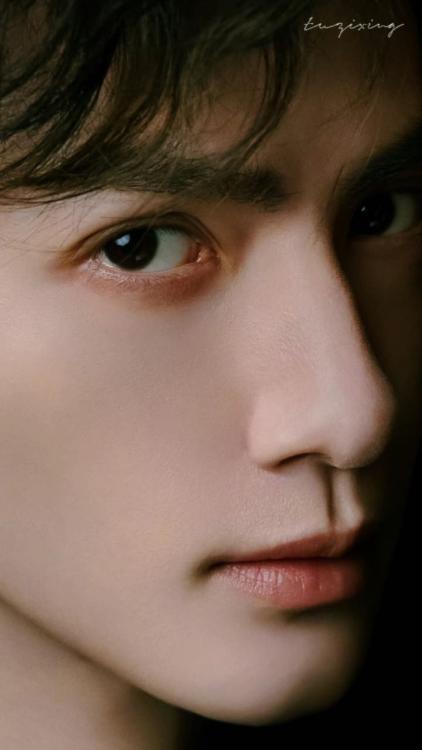
#everyone comfortable here in the afterlife? yeah i'm fine too#罗云熙#lyx spam#luo yunxi#these kilian photos - the photog has a lot to work with but they've also done a great job. very caravaggesque
8 notes
·
View notes
Text

Anima Mundi, "World Soul" by Roberto Ferri 2014
Roberto Ferri was born in Taranto in 1978. In 1996, he graduated from the “Lisippo” art school in Taranto. He began studying painting as an autodidact and, having moved to Rome in 1999, he deepened his research on ancient painting, from the beginning of the sixteenth century to the end of the nineteenth century. He devoted himself to Caravaggesque and academic paintings. ( David, Ingres, Girodet, Géricault, Gleyre, Bouguereau, etc.)
#roberto ferri#nudity#painting#artwork#oil on canvas#contemporary art#tasteful nudity#talented#human body#oeuvre d'art#fine art#anatomy#carravagio#surrealism#biblical#mythology
21 notes
·
View notes
Photo
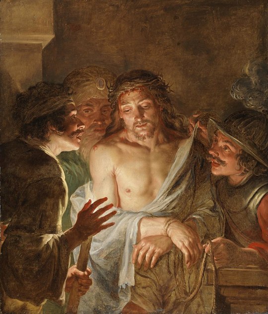
Jacques de l'Ange - Ecce Homo - 1640-44
oil on canvas, height: 116 cm (45.6 in); width: 98.5 cm (38.7 in)
National Gallery of Ireland, Dublin, Republic of Ireland
Jacques de l'Ange or the Monogrammist JAD ([c. 1621 – 1650) was a Flemish painter and draughtsman known for his genre scenes and history paintings executed in a Caravaggesque style. The artist was only rediscovered in the mid-1990s as his work was previously attributed to other Northern Caravaggists and in particular those of the Utrecht School.
74 notes
·
View notes
Text
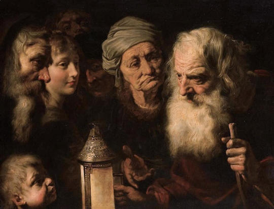
MWW Artwork of the Day (4/25/24)
Pieter van Mol (Flemish, 1599-1650)
Diogenes with his lantern looking for an honest man (c. 1635-45)
Oil on panel, 65 x 84.6 cm.
Private Collection
This arresting Flemish Caravaggesque painting, "Diogenes looking for an Honest Man," is an unrivalled masterpiece from the brush of Pieter van Mol, a relatively unknown artist from the orbit of Rubens in Antwerp. Perhaps the reason for Van Mol’s obscurity is the fact that he spent most of his career working in Paris and not in his native Antwerp. Born nearly eight months after Van Dyck in Antwerp in 1599, Van Mol likely apprenticed with Artus Wolffert and probably accompanied Rubens to Paris in 1625, when the master travelled there for the commission of the Medici Cycle in the Luxembourg Palace. While Van Mol’s oeuvre is replete with paintings of excellent quality, this picture is surely the artist’s strongest work. It was a celebrated treasure in several prominent French collections.
3 notes
·
View notes
Text
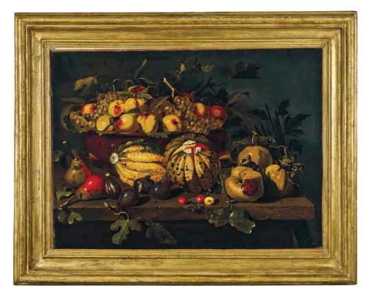
Caravaggesque Master, circa 1625
Melons, figs, pears and quinces, in front of a bowl with grapes and apples, on a wooden ledge,
oil on canvas
Dorotheum
10 notes
·
View notes
Last Seen Blogs

timcoartpottery
TimcoArtPottery

shireyishunjian
湿热一瞬间 / shireyishunjian - 众筹互免分享
matteogalli85
Matteo
lagard3nia
lagard3nia

neungames-blog
Dev Logs of Revoke