#I did some redesigns because I honestly think a lot of them could use some better visual story telling
Text
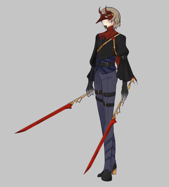
2023-12-24
MERRY CHRISTMAS EVE Y’ALL
(Lemme know if any of you are from my friend’s fic :3)
#digital art#art#fan art#illustration#persona 5#persona 5 royal#persona 5 royal fanart#goro akechi#sumire yoshizawa#p5#p5r#p5 fanart#p5 akechi#p5 sumire#I did some redesigns because I honestly think a lot of them could use some better visual story telling#violet persona 5#crow persona 5#Fic title in the comments!
393 notes
·
View notes
Text
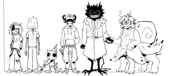

I am doing things I AM DOING THINGS I AM!
Explanations for designs and some head canons below here :3
Infected - Asian-American Autistic ADHD aroace (😈) trans. Yknow Wybie from Coraline? Yea like that but like incredibly annoying. His voice sounds like it’s coming from a shitty mic all the time
Lampert (design by @lucid-daydreaming-art )- Autistic 🇸🇪 ja aroace (😈) funny lamp guy Robots-esque probably kinda talks like baymax honestly, I mean a bit different but yknow, the general idea
(I talk about these 2 enough it’s the others turns)
Poob - I think they are a dumb little critter. They run around and their arms flail in the wind like paper. When they try to clap is makes dog toy squeaking sounds. I don’t think they abide by the rules of physics which is why they are stupid looking ❤️ they have hammer space but it is only for weed related items. The curator of the forever weed brownie, if you will. I think they sound like X from bfb. Aroace (😈)
Pest - literally hates poob because they are small and annoying. Uhhh funky legs because I think he would have funky legs. I stole his eyes because well no real reason, but I think if he was like extra pissed you would see his eyes. Since he is like thief maxxing I do not think he would be wearing anything beyond a hoodie and sweatpants, something trying to be non-assuming I guess. He has hair I think but it is very short no way would he want to deal with that. I don’t have a voice hc for him yet. Aroace (😈)
Bive - she a freakkkkk ehhh. I think she is like freakishly tall, has funny bird legs, raggedy ass scrawny tail, and is constantly covered in hair. Her teeth are kinda just floating on her hair head, so if you punched her hard enough they would just go flying out and she would have to put them back into her head silly girl. I think she is also trans hahaahhahahahaha!!! I think she kinda sounds like ENA from dream bbq, the uhh angry side I believe. Ace (😈)
Split - I gave her dog ears because I think they are cute :) she’s probably like normal ish height Bive is just weirdly tall. She looks very nice and friendly but could probably throw a boulder at you and you will die sowyyyy. Gods most chillaxxed soldier. She gives me kind older lady feelings, even if she weren’t older. I dunno she would be like one of those people who have a comically large purse full of hard candy except it would all be banana flavored. I think she has a slower voice, HAVENT gotten an exact idea for her voice yet but she seems very calm. Ace (😈)
Pilby - I didn’t really add or change their design because I already liked it a lot. I think they are very sweet and kind looking, would make a great plush too but I guess we are not ready to talk about that (YES I am still bitter about it) I think being around them is akin to looking outside a window at an apple orchard while it’s raining a bit. I think they sound a bit like raggedy Anne, based on the creators response too. Aroace (😈)
Spud! - I honestly did not have much come to me for his design, they are just a bit of a funky feller and im not sure how I would add to it honestly. Oh but I do think that they run like an ostrich and it is very scary. Also while drawing I was debating why he had a bow and decided that Gnarpy was like CONGRATZ IN ZURVIVING THE TEZTZ and now Spud! Just has a stupid little yuor did it ribbon. Honestly no clue for voice hc… aroace (😈)
Gnarpy - had a lot of fun with xis design honestly. The redesign reminded me a lot of Stitch so I kinda just shoved that into xim. I think they act a lot like Zim. Like a lot. Probably equally as stupid. I think xis second arms are retractable, like stitch, and xe uses that as a very very shitty disguise that everyone can see right through but just don’t mention because xe seems to be having a good time. I think xe sounds like Four from BFB (the earlier episodes mostly) aroace (😈)
DRRETRO - I think that her head that we see in the game is like a projection of herself, Wagstaff Don’t Starve style. Her body would be like excruciatingly normal besides her head, too. Like go to the hospital and see a nurse, that’s just what she looks like. Very normal, it’s a bit unnerving since her head is that. She’s like those overly friendly posters in a very uncomfortable place type of feeling. She doesn’t have fur either, she’s just a weird cat doctor thing. She acts exactly like Doctor Barber from Flapjack. No voice hc, but she speaks in meows so probably just meowing. Aroace (😈)
Mark - I started thinking about tf2 and Anton blast. Anyway, he is completely made from wood other than the clothes. Beard is carved in, not sure if I got that across in the drawing though. Uh yea I don’t have much I just really like engineer. He wears flannel and a construction vest just like any good law avoiding construction worker. Definitely does not so legal things on his construction sites but does not give two shits about that and also probably would try to employ Lampert when he was younger for free workers (no im not projecting what are you talking about). How on the nose would it be to say he sounds like engineer because I just drew wooden engineer with a beard. Ace (😈)
Wallter - sorry wallter fans I had no ideas while drawing him. I dunno he’s big and he’s cement, so I kept him blocky. Urrrrr he has a can of grey stuff jingle jingle. He is the cement embodiment of that one tweet that’s like “nothing better than a glass of wine, except for maybe #men. #yep #imgay! He kinda seems like one of those lowkey scary bald gay guys who are nice but are also scary and still bald. He’s bald. No idea on voice maybe concrete sliding on asphalt for 10 hours. Ace (😈)
#all of them are at least asexual#I MAKE THE RULES I WOULD KNOW!#sigh yes I understand if you have separate ideas I don’t control that don’t leave hate I am aware#I’ll tag when I finish the all of them in a separate post
251 notes
·
View notes
Text
my own attempt at “redesigning” some hazbin characters
(extra notes: i decided that everyone wears red for the most part because that’s the uniform color for the hotel. that’s part of why i didn’t change certain things like husk’s or vaggie’s clothing colors. - i’m 17 with the only character design knowledge being my own personal ocs, so of course, take my criticisms with a grain of salt! - everything is a bit poorly edited in terms of recoloring because i did this on ibispaint for fun.)
here are all the (re)designs together. under the cut is more info about my thought process and side by sides.
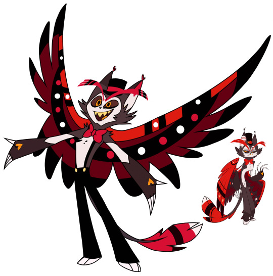
1. Husk

- The only things I changed were his pupils, the colors, and his tail tip stripes.
- I used his pilot colors because I realized they have a much warmer feel to them instead of the final design which made him look all greyed out and dead. Good for an old man, I suppose, but not good for when the inner wing is colored almost the same way as his fur, his pants, etc. Having these colors so dead makes him blend into himself too well, but changing the inner wings did a lot, I think.
- Gave him heavier lines under his eyes like eye bags, to replace the heavy fading eye bags that were in his pilot design.
- Got rid of the hearts next to his eyebrows. It felt like a bit much.
- In terms of his actual design other than the colors, I’m not mad about it! I actually adore the new pants and such. It was just the colors I had an issue with.
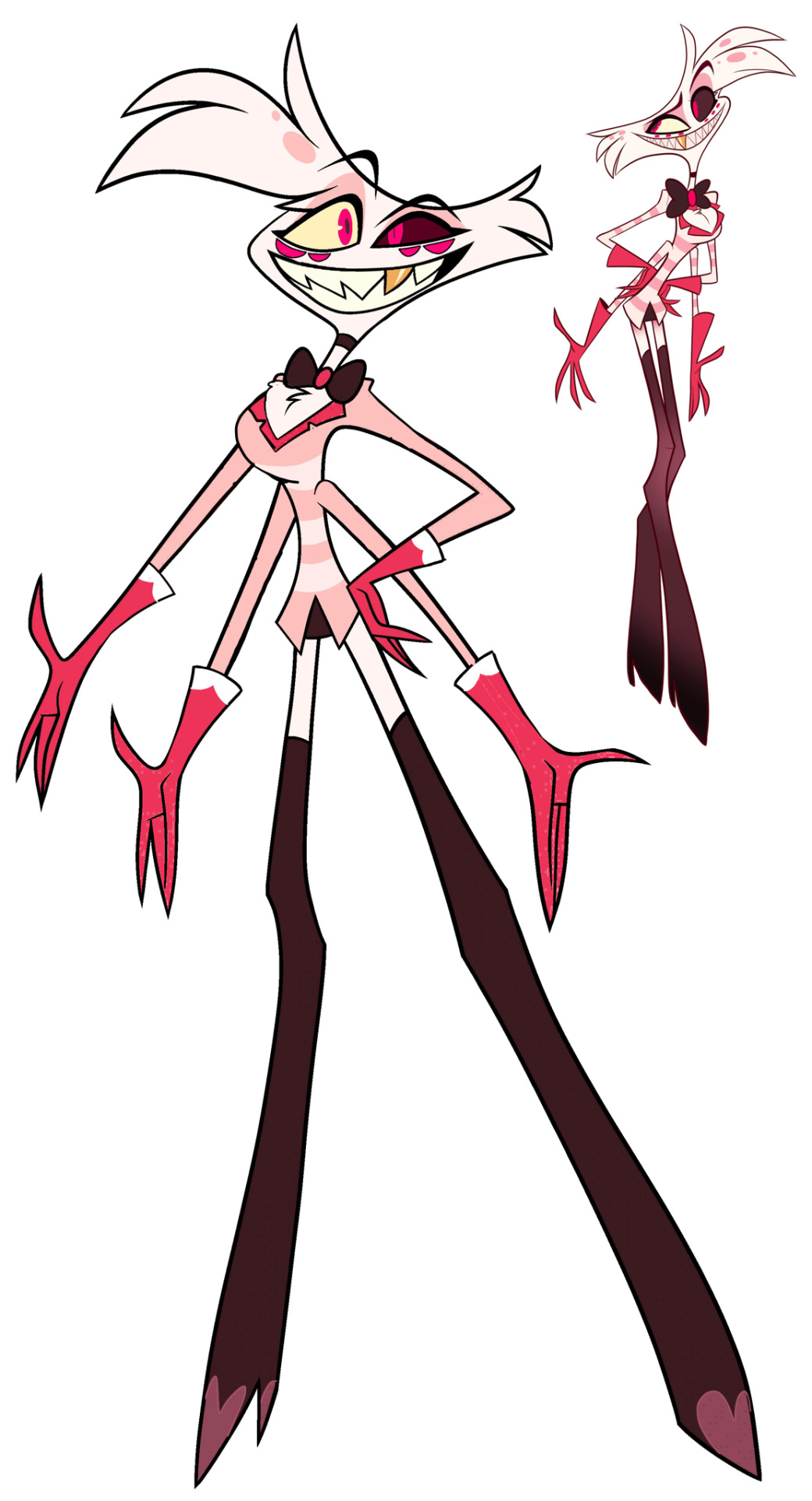
2. Angel Dust
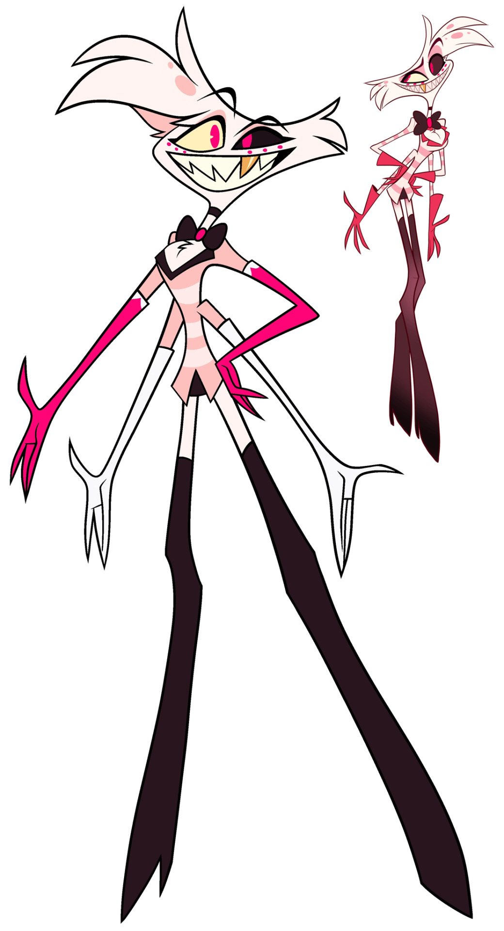

- God, he’s so ugly to me.
- He looks a lot like his pilot design, but for good reason. I realized that the pilot design also had more warm colors and not bright neon pink, so I used those colors instead. I really just.. changed all the colors.
- I hate his fucking gloves. I hate them a lot. So I replaced them with his usual short gloves, but gave them back the little white tips in the show design just to be fair. I have no idea why they decided to make the lower pair of gloves white, as it just looks like they aren’t wearing any gloves at all, alongside them having no pattern like the top gloves. It’s the weirdest design choice in the entirety of this design, to me.
- I made his extra eyes actually look like extra eyes instead of teeny tiny dots.
- Gave him his tit fluff back. Like, why’d they get rid of that? It’s apart of him, bro…
- Gave him pupils, cause he looks better with them than without them. I even gave him two different ones, just for fun!
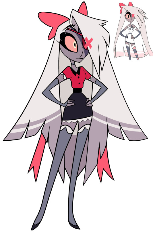
3. Vaggie
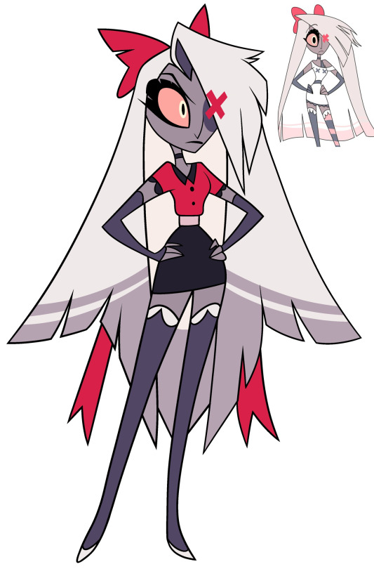

- Like Husk, I don’t actually hate Vaggie’s design. It’s the only one I have zero complaints about, actually. But I decided to mix in some of her pilot colors and traits to give her some sort of soft look, to mix in the loving girlfriend Charlie knows but also the ex-exorcist that she still is.
- I recolored her stockings, her choker, her (arm things?), and made her bow rounder, to try and tie in the idea that she’s wearing a uniform but also still wearing these softer things to be more comfortable. Again, just attempting to make her look less aggressive.
- Gave her an eyepatch so the X over her eye would make a bit more sense, design wise. Because we don’t see any form of scarring under there, I don’t think? I could be wrong. Would also explain how everyone else notices the X.
- I don’t know what the light pink middle was about, so I changed it to black.
- Recolored her sleeve frills to be white and gave her the same white frills on the bottom of her skirt. Honestly, I just thought it looked nicer.
#edits#redesigns#hazbin hotel redesign#hazbin hotel redesigns#tw vivziepop#cw vivziepop#vivziepop critical
29 notes
·
View notes
Text
Apparently Tumblr deleted this post so here I am posting it again.
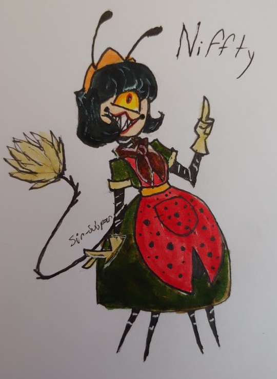
Nifty Redesign!
Is it Niffty or Nifty??? I need answers
So far- My fav redesign I've done!
Details under the cut!
Here's what I learned researching her:
From what I was able to find, Nifty died in the 1950s at the age of 22. She's Japanese, boy crazy, and hyperactive.
She's meant to be based off of a ladybug. She's obsessed with chores but is secretly very dirty: even crushing bugs with her bare hands.
.. yet she doesn't look anything like a ladybug. Which boggles my mind concerning the fact that many ladybugs are red or brown, and have patterns, yet Viv doesn't take advantage if that at all??
Overly complicated patterns mixed with the color red are Vivziepop's favorite thing of all time. Why doesn't Nifty look anything like a ladybug?

So, I decided to give her more bug features, I took a little bit of inspiration from things like The Jetsons and 1950s wallpaper patterns. I wanted to mix ladybug, hotel staff, and 1950s housewife together (since she's so boy crazy, I figured she'd want to look like her time periods standard of the quote on quote: "ideal woman" if that makes sense.)
I decided just to use my skin tone markers for her face, because I didn't want to make her the same white color that all the other characters are, and I did not want to make a Japanese character yellow. (Yes I know that they made her Japanese *after* making her yellow, but still.) I also made her hair black, but I kind of kept the Jetsons style hair. I'm aware that show technically came out in the '60s, but a lot of the fashion in that show was very 50s inspired
I did however, use yellow for some of the accents to the outfit like her gloves. Since yellow did seem to be like a popular color in the 1950s from what I could tell. Though it was a very colorful time period in general lol
I've seen some people give her a feather duster tail, and I honestly thought that was super cute so I did the same. I gave her four legs to match the bug thing and to make sense of how fast she is. And I gave her antenna, she's a bug, she should have them.
I gave her a ladybug themed apron.
I mostly used color palettes that were really popular on dresses from back in the day. And I gave her lipstick, since I noticed it seemed to be kind of popular back then, but maybe that's just me over thinking it.
So yeah, what do y'all think?
Next up I'm either going to do Cherri Bomb or Velvette. Velvette has been incredibly difficult, I want to cry aaaa
Edit: here are some of the early concept / reject designs I did. Lmao
Like I said, usually I have to draw a character a few times before I'm happy. And I don't want to make it seem like I think I'm so brilliant when I'm doing this. I'm showing you guys part of my process, including my mistakes
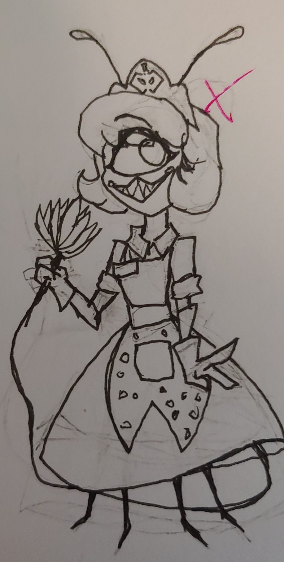
At some point I was going to make her a praying mantis. Because they're really cool bugs, but then I realized cleaning was going to be much harder with scythe hands
89 notes
·
View notes
Note
I'm curious for your thoughts on Dan Hibiki
Dan is real special to me mainly because he was the first time I actually had fun cosplaying, in terms of putting the outfit together and attending the event. I was very young at the time but he was my second cosplay, with the first technically being Bison the year before but I barely remember going as Bison and the costume was basically rented whole, where as with Dan I actually had to take the time to put him together peacemeal.
Looking for shitty ponytails and testing out hair gels and glue to get that doofy spit curl right, ruining a judo gi by cutting the sleeves and dying it pink, painting the eyebrows and kanji in the back and practicing those dumb faces and animations of his, and I was really happy that day with the reception I got. Best part of that day by far was when they were doing this cosplay wrestling thing where people could sign up to enter the ring, and I got to really ham it up with the taunts and pratfalls and Dan-isms I memorized from heart (and I did play the fucker a lot in SSFIV, not even ironically, his Hurricane Kick and normals were really solid in IV) and just, one of the most fun times I ever had. I think of Dan pretty fondly for that if nothing else.
Although frankly I think I like him a little less nowadays than I used to, mainly because a lot of the other characters grew on me more or got better redesigns over the years where as Dan's just, Dan, and Dan's always gonna be Dan, no more no less, little room for improvement because he was just kinda perfect at what he set out to do from the go. I think some of that also has to do with the fact that he pulled Blanka big time into his joke character orbit for well over a decade and I'm not really a fan of that? Idk it definitely got better with 5 and especially 6, just for a while there Blanka's role as being primarily Dan and Sakura's dumb sidekick really sucked and made me resent them a little, still can't say I'm too big a fan even if he doesn't take a backseat to them as much anymore.
Dan becoming essentially one of the co-protagonists of Street Fighter over the years I think has a lot to do with the devs figuring out over the decades that there was a lot more they could do with the character, besides taking potshots at SNK (and honestly in that regard, I feel like Remy does it better, in spite or maybe because they don't play him as a joke on purpose). And I do think Dan has several legs up other fighting game joke characters and not just because he came first, not just because he's funny, but because he's filling in some important niches and they ground him in just enough legitimacy, from a lore and gameplay perspective, that he's worth bringing back. Dan is a joke, but he is also important, in his own way, he's an important character for Street Fighter to have.
If your setting and story are defined as a gathering of the greatest fighters and representatives of martial arts and countries the world over, you kinda do have to address what does a Bad Fighter, The Worst Fighter, representing The Worst Martial Arts, looks like, and basing it on "the guys that ripped us off" is the icing on the gag. Both Dan and Sakura were designed around parodies of the Art of Fighting characters, but they did the right call in assigning Yuri Sakazaki's childish braggart antics to Dan and letting Sakura be treated more seriously.
As much as I may complain that Dan dragged Blanka into the funnyman idiot orbit, Dan's existence prevents a lot of other characters from becoming parodies of themselves (more so than they became, at least), at minimum it definitely pumped the breaks on Blanka and Sakura from doing that because, no matter what, they'd always have to suck less than Dan, because nobody (cept maybe Rufus) is allowed to suck more than Dan (I feel like Sean's joke status was a total misfire, but more on him when I got to Sean).
Dan also works because he's got a legitimate backstory and motivation to be here, and to be the way he is: His father was the one to take out Sagat's eye and Sagat mauled him to death in the ring for it, and desperately driven to take revenge, he took up training under Ryu and Ken's master Gouken until being expelled when Gouken learned his true intentions (and the last time a man with power-hungry intentions was trained in Ansatsuken, Akuma happened), and so Dan had to fill out the rest of his training on his own, which is why his playstyle is the way it is, why he's like Ryu but bad. Dan fills out the other end of a scale occupied by the prior shotos, the worst practicioner there is, the lame and pathetic counterpart to Ryu and Ken opposite Akuma as the strongest. Akuma is Bad Ryu, and Dan is Bad Ryu but in a totally opposite sense. He had symmetry with the existing characters and his backstory was treated with as much seriousness as he can be allowed to have, which isn't much most of the time, but just enough.
Dan being a joke from an in-universe also wound up lending a lot of meaning to Sagat's character arc, because Dan became the catalyst for Sagat's redemption. Sagat was confronted by this pathetic fool wholly consumed by revenge and struggling fruitlessly to defeat a stronger martial artist, and he saw himself in Dan, himself and his obsession with Ryu and the lows he'd stooped to in order to achieve that revenge, and so he lets Dan win, giving Dan his one and only victory that we know of. Sagat, at his lowest point emotionally in the series, who is still supremely prideful and regal and very much not a nice man even as a hero.
The strongest man alive letting the weakest man beat him in a fight to save said man from ending up just like him. If it was against anyone else, it wouldn't be anywhere near as meaningful, but starting the supremely prideful and mighty Sagat's redemption arc by having him realize the futility of his vendetta and let himself get beaten by Dan of all people, The Final Boss letting The Joke Character humiliate him, I think was a very inspired choice.

Much as I enjoy his characterization, I do miss a little how Dan was depicted sometimes in the Alpha series, where he'd be treated with a little more seriousness. Like in the backstory blurb describing how Gou died and how Dan still wakes up with nightmares about it, or in Sakura Ganbaru where Dan's kind of a comedic straightman to Sakura and they take some steps to show that Dan IS knowledgeable and observant about ki and martial arts, and is even pretty good at beating average fighters in local circuits; it's just he's Dan, y'know, and all his hard work and self-mythologizing can't make up for his incomplete training, ego issues and him hanging around Sakura and Blanka, who are freakishly talented and either quickly surpass his teachings or, in Blanka's case, never actually need it.
I don't like the Udon comics very much but I do think they get this right, I like the emphasis they put on Dan having a genuinely impressive ability to take a beating and playing up Dan as a guy who gets up to all these offscreen adventures and picked up all these other skills to make up for his incomplete training (and him becoming Chairman of the CWA I thought was pretty inspired). It nicely reflects what the games have done with him, where he's always showing off new skills and moves added to his playstyle, his fireballs get a little farther and stronger every game (and he doesn't fling himself back when firing them anymore), some characters even comment on his progress and potential. Dan is a joke by World Warrior standards, but by regular person or fighter standards, he can be impressive.
And I think Dan also stuck around the way he did because there's a certain necessity for a character who pokes holes at the premise and mythology, not just a comic relief for levity sake but someone who's there to help the writing avoid the pitfalls of excessive self-seriousness. A character who's an absurd cartoon of a martial artist but not in the cool badass way all the other characters are absurd cartoons of martial artists, instead someone who's kinda lame and full of himself the way that, really, most martial artists, especially self-taught, can be. Everyone on Street Fighter, no matter how nice they are as people or what truly motivates them, is joining the tournament sure that their martial arts are the strongest and that they can and will make their way to the top by beating all the other inferior fighters standing in their way. Dan is like that, it's just that nobody takes him seriously for it. He may not even be the funniest joke character in fighting games, but nobody takes as incisive a punchline to the genre as Dan.
Dan, in his own right, does represent an important, maybe even the most important, facet of martial arts there is: the kind that everyone does when they start out or just don't bother growing as people or fighters. In my experience, myself very much not excluded, the gyms and dojos of the world are full of Dan Hibikis trying to be something more by mythologizing themselves into former losers turned invincible fighting machine blowhards the minute they learn how to kick above their heads or take a punch in the gut, whose training is perpetually incomplete, who think they get to teach others, and who go out there thinking they'll get to show off that invincibility any second now and that once everyone sees how badass these karate chops are, or how much ass I can kick when playing Smash Bros or KOF or Street Fighter, I'll show em all how cool I am, just you mess with me and I'll show you my flying kick WA-TCHAAA! *miss* HUP, WORYEEAAHH *crash*

57 notes
·
View notes
Text

Charlie Morningstar Redesign! (4/7)
It’s the girl herself!!!
I could NOT stand the red in her suit so i made it a much nicer soft cream colour! I think red is a lovely colour but in the case of someone like Charlie who wants to brand herself as approachable and welcoming, a strong harsh red all over is not the way to go. The red of her horns and lower hooves and vest is already more than enough red and it pairs very nicely with the yellows and gold accents in the rest of her design in my opinion!
I always tend to draw her with this big hopeful eyes to contrast the kind of scary look that rectangle pupils give and I think it reflects her character pretty well. Charlie is absolutely a sweetheart but when angry her eyes become flatter and more threatening. She’s literally offered to kill a guy for Angel once so she has to have some kick in her, plus horns are good for stabbing! And accessories!! Like cute chains!!!!! My original Charlie redesign had her with a little apple cuff on her horn and I do miss it a little, but I think she looks alright without it too :3 she keeps it in a dresser somewhere
I’ve never drawn or designed a character with cloven hoof hands but I think I might do it more often after this. Thinking about her writing or typing with the little clicky sounds makes my brain happy and honestly walking with hooves has that special flair that heels just cannot achieve. Since she’s the hotel owner/staff she also gets her own custom little nametag like Niffty (the rest if the staff have them as well but not all of them wear them all the time like Husk, Van/Vaggie, or Alastor) I personally think Charlie made them all herself and let everyone write their own names, but she enjoyed picking colours and all that :)
Her red cheek things were a bit strange to me and I gotta be honest I didn’t like them very much so I replaced them with a softer peach gradient on her cheeks and hips to give an extra warmness to her. I want her to seem like the kind of person that can give a REALLY firm handshake and also a very good hug and talk about anything. Oh her little wave is supposed to look kind of like that weird royal wave I see those royal people do sometimes. I thought it’d be a cute little thing to add slightly-off regal mannerisms where I could.
I hope the goat motifs came through well enough, I really like abnormal legs (you will begin to notice this soon) and they really just add so much personality to me I love working with them. I wanted Charlie to be kind of chubby and soft looking hence the colour choice leaning more towards warm rather than hot and trying to use less pointed shapes with her like the little gold ball tassels on her bolo-tie. About the bolo-tie! The little gem on the inside is purple to symbolise the pride ring, but it also allows direct transport to other layers of hell. Sinners cannot use this even if they get their hands on it, but it’s still incredibly rare and valuable because of materials and such. It’s like an eco friendly private jet. Maybe Taylor Swift should get her hands on one of these! :)
And if anyone was wondering yes I did want the purple to also look a bit like a nether portal.. it was a good opportunity.
The last little details I want to note are the faint heart motifs on her ear and hooves. For the hooves it’s really cheesy but I think the metaphorical idea of leaving a tiny bit of love wherever she goes is cute and I like being sappy. The ear heart being a tear has always meant some kind of “hurt to get what you love” thing to me. I don’t fully know how to describe it but it’s not in a toxic mentality, she just does a lot of stressful stuff to get her dreams and passions going and I think shes great for that.
I plan on drawing her true form eventually and maybe showing a little animation of transformation (I just want an excuse to draw her tail again)

Overall Charlie is one of my favourites to draw and write for, shes just such a sweetie and I love her to death 🩷 she is quite literally the heart of the hotel and she is doing her best! Excited to post again later today :3 📻
10 notes
·
View notes
Text

Day 176! Alrighty, it’s time for my overall thoughts on the reboot/redesigns, whatever we’re gonna call them.
Overall, they feel less colorful, which is probably intentional bc it shows maturity and unity but personally I’m not the biggest fan of it.

This reveal actually got be pretty hyped for the other outfit reveals bc honestly these are some of the best outfits.
Kinda wish there wasn’t so much grey, like maybe a darker version of the inner coat color could have worked, but it’s fine.
With Miku, I just wish there wasn’t so much grey on her, but I like the sweater look.

They did u girls so dirty.
I know the blue is supposed to unite them, supposed to look like professional idol outfit, but there are only 2 ways to make these outfits stand out; composition and color.
There was a simple way to make these top tier by ditching the blue and using each of mmj’s personal colors instead. They would still look united bc the composition of their outfits are still very similar.
The only way to make the current colors work is to make the differences between each girl’s outfit more drastic. Give them each different shoe and sleeve lengths, the different styles of skirts are a good start but there needs to be more.
Their Miku is excellent (again why is there so much grey), not a fan of the pink instead of her previous blue accents but hey it’s good. And OMG THE BRAIDS AROUND HER TWINTAILS ARE SO CUTE!!
Yes, this is good.
Not an expert on street style but theses manage to look both banger and mature.
Kohane in suspenders 🥺💕🩷🥺💕💕, An looking more like Nagi 💔, Akito being the only one to keep a hoodie, and Toya in a turtleneck.
I just love the personal touches in these fits.
Miku what is that blouse 💀, give Meiko back her clothes.

10/10 theses could be magical girl designs
The toning down of their colors actually works because their previous outfits were very chaotic and didn’t have any harmony between them.
They really look like clowns now <3
1000/10 Miku, she is ✨gorgeous✨ and my favorite overall like out of everyone.

I like ‘em 👍
I liked the colored ribbons in their old designs and wished that they could have added a muted version of their colors as either part of an accent in their outfit or as a gradient in their dress.
But yeah these are great, I think the reason I didn’t like them at first was because Leo/need also has lots of grey in their outfits and it kinda lessened the impact of these outfits, if that makes sense.
Miku could probably go without that awkward clock belt on her chest, from afar it looks like she has some sort of random drill on her chest. But like overall second favorite Miku design.
24 notes
·
View notes
Text
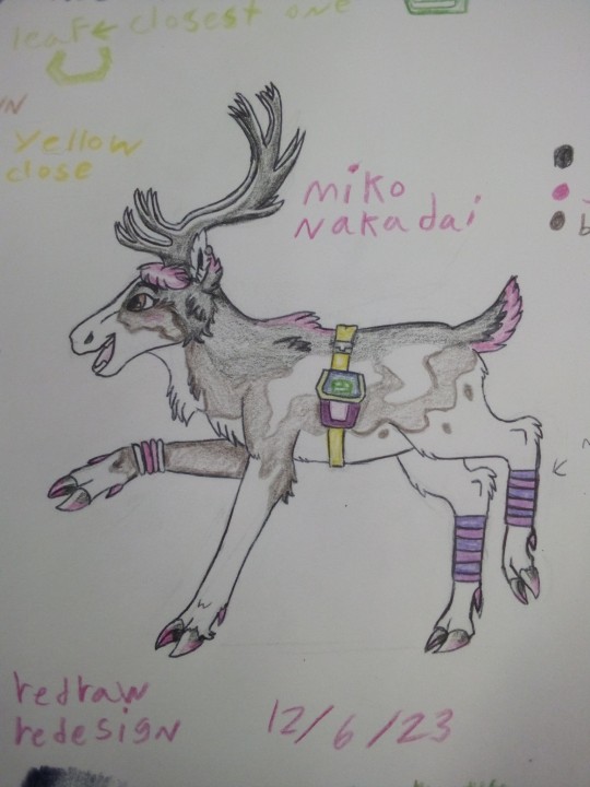
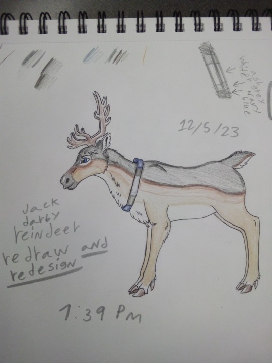
Allright here are my redraw redesigns of the tfp kids as reindeer
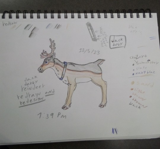


I personally think out of the three my favorite one was Miko I thought I did the other designs well but she kinda stole the show.
She also as you can tell drove me insane trying to find close or similar colors so oof I also had to simply her design a lot because I couldn't figure out how to include other things into her reindeer design.
My second favorite was raf because his was just kinda chill I feel like it could have been better but I really struggled with finding similar colors because I have a limited amount of colors to choose from .
Jack was my least favorite but that doesn't mean I don't like him I just hadn't finalized how I was gonna plan on how the clothing was gonna work so as you can tell with Jack I first thought to use the colors of his clothes on a collar of sorts but later with the other designs I went with bags because I thought the collars made them feel more like normal deer which I decided when designing Miko that instead of that they were turned in reindeer for some reason.
I am still finalizing on how and why this happened in my head.
So because of that when or if I get to it I will probably do something different for Jack like giving a bag or something that makes sense for him.
But other than that I'm satisfied
I also had Miko be a piebald reindeer and I think that really fit so yeah.
When Look at my old tfp kids reindeer drawing above it's honestly really fascinating seeing how I differ in my thought process when it came to how designed things I still have a bit of a soft spot for them but I really feel like I improved on my art.
Up close on the new designs.

#tfp#tfp kids#transformers#miko#raf#jack#miko nakadai#raf esquivel#jack darby#tfp jack#tfp raf#tfp miko#reindeer#tfp reindeer#redraw kinda ?#redesign#maccadam#my art#my post#transformers prime
12 notes
·
View notes
Text
That New Melia Design
Or How I Learned To Stop Worrying And Love The Rejuvenation Brainrot
So! People are dissecting the new Rejuv 13.5 trailer and I would like to add my bit to the fray on account of I have terminal illness of Melia, she is my all time favorite. And the new design she's got has raised my eyebrows.
And a lot of credit to @tlozypaka-tina bc their post really got me thinking more in depth about this design rather than just thinking it just a new design for the new version.
So first, that new design! Let's take a peek at it!

(Bear with me on the resolution being bad, it's a screenshot of a small part of a YouTube video)
And before we continue, let's just compare all of Melia's previous designs (plus throwing Emma in there for kicks)

Now, something important to note for all of Melia's designs (except for the Terajuma design) is that the primary color on them is white. Her first, fourth, and fifth designs all have white shirts, and her second design in Emma wears a white robe with a white bow. Her previous Terajuma design had her shirt be grey but there was a bit around the collar that was white.
Though it would take more time to say what this symbolism this has for Melia (if any, and this isn't just a motif for character design), we can contrast it to the new design shown off in the trailer, which (despite the monochromatic color filter) we can tell that she's wearing a darker shirt. It almost looks like a darker version of her first outfit given the design of the shirt and the exposed bra/tank top straps. Though of course her hair is too long for it to be a re-do of that design. Not to mention the eye shadow, which is something none of Melia's current designs have. It seems to be the same shade as her shirt too.
Also worth noting is that the expression looks far more smug and self assured than any of the expressions of Melia's other designs. And while on this blog we support girlbosses and women who know how capable they are, this is something worth noting. Going back to tlozypaka-tina's post their friend Vance notes that the expression here is similar to that on Melanie's vs sprite.
So, what's the thesis of this post?

Honestly this is a jokey way of putting it but I think it puts it best, between the smug look (being similar to Melanie's vs sprite) and the darker colors of the design, I think we're getting some kind of evil Melia, for lack of a better term.
EDIT: Everything below this point is based on speculation that happened due to me straight up missing Melia's powered up design. I have no good reason for this, I checked the Chapter 12 folder where it is. But I'm keeping it in the post just bc I don't like deleting stuff.
Now, to get into some baseless speculation here, I can already hear some people going "Hey wait, you forgot Melia's powered up design!".
And I'm glad you noticed dear reader, I sure as hell did. When I was gathering the different Melia designs I snagged them from the DeviantArt stash where Zumi posts all the character designs. I didn't grab powered up Melia because she wasn't there (I grabbed the pic above from the Fandom Wiki).
Now I would normally chalk this up to there being dozens of pieces of art in Rejuv and it's easy to forget to upload one, except for the fact that I swear this used to be there! I could be remembering wrong, or... there could be plans for this design when 13.5 drops that involve a redesign that will only be revealed when it's out. Related to the design of Melia we saw in the trailer? I dunno, but it's worth noting since I found it.
17 notes
·
View notes
Text
I think one of the things that bugs me about Duolingo's redesign is how similar it feels to school now.
Previously we were able to hop around subjects and do that as we please, but now it is a linear path organized into sections and units and lessons, just like the way a lot of languages are taught in schools- something it seemed Duolingo wanted to differentiate itself from.
Getting rid of the forums/locking them was also a strange move, as with the general move of the internet having things be behind walls (either of a discord or now private reddit page).
From a pedagogical perspective I suppose I can see the reasoning behind making the tree more linear as there are some things that ought to be taught before other topics- you wouldn't learn the subjunctive before you learned how verbs work, for example. However, especially regarding the asynchronous/self-study nature of Duolingo when combined with the gamificafion aspect, I think that it hinders it. With the old design, you could pick whichever topic you had unlocked that interested you, but now it forces learners into this predetermined path. So, if someone is not jiving with a topic, then it may ultimately be antithetical and cause them to not learn that day or lose their streak. This is especially prevalent with the hearts design because it can be rather disheartening to try and try again only to have to wait a set number of hours on a topic you just want to power through.
The streak of it all also is not helpful from a casual language learning perspective due to the incessant notifications- it becomes less about learning a language and more about pleasing the bird- much like perfect attendance in schools. A student should not feel pressured to put their health (mental/physical) at risk as then their learning will falter! You cannot learn effectively if your other essential needs are not met (shout out to Maslow's hierarchy).
It would be interesting to see Duolingo move to a week-based streak/attendance model, or reward the learner/user for what they have done, rather than what they haven't (ex. You did two lessons/practiced twice this week- that's awesome!). If they really must maintain the streak aspect, consider making it biweekly- so long as the user does something in a two week period, they are rewarded.
Now, would this potentially affect their learning statistics about how x number of hours = x semesters in university? Maybe! But learning isn't a race. You never finish learning. I started learning Spanish over seven years ago and I am not done. However, this race to fluency is a larger issue with how language learning is marketed (ex become fluent in Spanish in x number of days!) that is honestly unfair to the brand new learner. Fluency exists in levels, but this isn't an easy thing to "market" since most folks want an end all be all, they don't really like ambiguity.
This isn't to try to turn anyone away from language learning- it started as me making a fuss about Duolingo being strange and ended up... well this. Please learn a new language- for fun! You can learn it casually, picking up a few survival phrases (which are GREAT), try and read your favorite book, or watch a TV show!!
Language is all around us, it is ever changing and wonderful, and I think it is really neat.
#when did this post get so long#adventures in language learning: pedagogy#adventures in pedagogy: languages
29 notes
·
View notes
Note
Did you see Lavendertowne’s Hasbin redesigns? What did you think of them?
hi there! so i'll be honest, i originally saw the thumbnail for her hazbin redesign video and sorta avoided it, seeing as i'm not a huge fan of redesigns for the show given how commonly that ties into 'lol my art is so much better!' which isn't something i like to see as an artist. but i was curious because of this ask and i sought it out, and while lavendertowne has taken the video down due to many reasons, i'll still repost the designs i found here and give some brief commentary.
so! uh, i don't like these redesigns much. as others have already said, they're too human looking for my liking ( which is, ironically, one of my biggest complaints about the women's designs in the show! ) and they've lost most of their unique features or quirks. alastor for example has lost all his deer attributes completely, which isn't the worst thing ever i suppose, yet he wasn't given a new animal motif -- and the radio demon aspect also wasn't leaned into? at all? besides the ear piece but that's more modern & goes completely against the character's whole thing. i actually don't mind the new color pallet here other than the fact he looks more whitewashed than usual ... hmmm. and these issues are prominent in angel dust and vaggie as well, losing their animal motifs ( a spider and a moth respectively ) plus being stripped of unique traits. to be more specific, angel dust hardly looks like he works as a porn star or that he used to be in the mafia, and vaggie's exorcist eye is completely absent. i wouldn't bring this up if these aspects of them were shown in different ways, but as it stands they've just had these parts taken away and now there's this sort of empty hole, one that's been filled with a blandness. just not a fan!
for charlie and niffty, i don't think they look too bad ?? honestly, charlie's redesign is pretty good! i like the circus motif in her outfit and more lion-looking appearance ... she's sharper, a contrast to her softy personality which could make for some good development or characterization. though the crown (?) isn't something i'd keep, seeing as she isn't someone who likes reminding the people of hell about her power over them, unless it's in a compassionate manner ( aka, you're my people! ) ,,, still, i don't loathe it or anything, since i do love crowns and this one is a little more demonic looking than its actual design <3 niffty on the other hand is fine. just fine, i think. i don't like the monochrome look for her much since i believe the yellow-pink color scheme adds a lot to her overly enthusiastic personality, offset by her extreme love of violence ... but it's not bad! i suppose i have no real complaints. wish she looked more like a 1950s girlie, like with the famous poodle design on her skirt, though i could see the merit in removing it for this new take on her appearance.
all in all, these redesigns are not for me! i'll end this with a disclaimer that in spite of my distaste, i don't hate lavendertowne or anything like that. normally i love her work, or at least watching it. this is just my opinion <3
#my posts.#asks.#i didn't see the video but i guess my question from these designs are : did she watch the show?#not just clips but the actual thing. like did she know these characters in any deep ( or just a really good surface level ) sort of way?#this feels like she knew the barest minimum and had seen the critcisms about the art and then tried to fix it#without much care to the characters themselves#like. did she hear 'too much red' and wing it? 'too many pinstripe suits or suits or bows'?#obviously this isn't bad and she can do redesigns just to do them but it's an interesting observation to make!#anyway thanks for the ask! it was a pleasant surprise but a welcomed one lol
2 notes
·
View notes
Text
Part Two (Stellaron Hunters)
Like the last one with the Astral Express, I am listing my opinions on aspects of the HSR designs, including things I kinda dislike or at least would change about certain playable designs in HSR to help myself with planning some of my own designs/redesigns for future art!
And I am so excited to get onto three of my favorite designs in this game!! The Stellaron Hunters are my babies and I originally was going to include them in the AE part 1 post, but sadly exceeded some kind of limit on the post while rambling about both of the groups designs, so they get their own post! And y'know what if that gives me more room to talk about them, I am not upset!
Ofc, Disclaimer: I am not a professional character designer, I'm not saying any of my ideas for them are objectively better or improvements even, nor am I bashing any of these designs. This is just my opinion and I like most if not all of the playable designs at the moment! I just have a few thoughts regarding them.
The List part 2:
Silver Wolf: I really like her design, I think honestly the Stellaron Hunters (at least for the trio, still forming my thoughts on Sam's) are easily some of the best designed characters in HSR so far. I do think out of those three designs though, Silver Wolf might be the weakest? Not that it's bad ofc, as I just said I think they're some of the best designs, but alongside Kafka and Blade, it feels like there's more that could be done with her design. They went ham on having so many like "Haha look she's a gamer!" details on her outfit that it ends up a bit eye rolling when you keep seeing all the details. The buttons hanging from her belt, the controller garter, the pattern on the fabric hanging from her hip for no reason, the power button logos on her her belt in multiple places and the strap that hold her knife, and that's not even all of them. It's just a bit much. Yes, she's a gamer, we get that. It doesn't need to be sprinkled throughout her design this much, at least not in this way. Because the way they did it, admittedly looks a bit gimmicky since it's only visual details rather than anything more is the best way I can describe it. I would maybe give her a few more items in place of all of these little things. Give her a visible earpiece, or some other kind of hands off communication device. Give her more devices if you're gonna have her adorned with all these straps, make them useful. Though I have two (maybe three?) other bigger ideas that could either work for changing her up physically, either separately or somehow together in a design. I'm stuck between the idea of giving her comfier clothes, both to reflect her more laid back personality and also to fit more so with what she does, or giving her more of a tech wear influence in her design, especially considering PunkLorde is meant to be a cyberpunk themed place. I feel like there's a better way to reflect that influence in her design. Also I dunno about you, but when I think cyberpunk I think of Neons a bit. I’m not saying turn her whole color palette that, but I think in a few of the patterns or in little details adding tiny touches of neon would look cool and help make her pop out a bit. (Sorry this ended up rambling, when I actually draw my thoughts for her, it will come through cleaner and clearer. Overall, I really like her design still even if there's a lot of details I would preferably change.)
Kafka: Kafka is one of my favorite designs, I adore her, I adore the spider, the web, and even the butterfly motifs present in her design. Her color scheme has a sense of allure to it if that makes sense, well balanced throughout her from head to toe. If I were to change something, it would be to make her design more show-y, a little more over the top. As it stands, Himeko has a more ostentatious design than her. Which feels off to me. "Oh but she's going on missions, taking people out, and collecting Stellarons. Her practical design makes sense." Very true, but also these missions aren't merely just missions. They are performances, displays of acting according to Elio's scripts in order to obtain the results he needs for the future. Kafka, of the rest of the Stellaron Hunters we've seen so far, seems to be the one that best fits into the role of Elio's dramatic villain/anti-hero. I mean just compare her presence in the Luofu quest to like Blade also in the Luofu quests, or Sam in the Penacony ones. There is a difference in dramatics and performance. She beckons the audience's (and law enforcement's) eyes towards her, as she strings them along with her schemes and plans. She is made to be the one in the lime light, delivering monologues and putting on the best show for everybody. When we look at the few missions of the Stellaron Hunters we’ve seen so far, Kafka does fit the bill as the star of his show, his leading actor in the role of the antagonist. As such, I think Kafka could benefit from making her outfit a bit more dramatic, leaning into the role she plays even further. Especially when thinking about how playing up that dramatized version of herself would work with the facade she's hinted at putting up. I do adore it the way it is, I just think more could be done with it. Lean a bit harder in, and by nature of making her more over the top, that could lead to the potential for a more interesting silhouette depending on how it's handled. Maybe even some more elements to influence like making it more over the top could be inspired from the Kafka Stigmata in HI3rd
Blade: I can’t lie to y’all. I think his design is close to perfection. I think it’s so well done (even though the silhouette could use some work? Depending?), it’s absolutely packed with symbolism. However, aside from just some silhouette adjustments, something I would change is the emphasis of how injured he is. The injuries he feels every single day of his life, that can’t heal because of Jingliu essentially overriding the default state his body is trying to restore. It’s a big thing in his lore, so much so that it’s been mentioned multiple times including in a main companion quest and literally up front show to us face to face. That cg of him with the sword in his chest feels like somebody stuck a sword in mine every time I see it, I swear. But design wise, I feel like this point about him and his history doesn’t shine through as well, and it feels like the gravity of that time isn’t properly portrayed in his design. Like let me emphasize, Bailu’s words might suggest that the default state for some of his injuries is literally open and bleeding so... And you might think “Oh that’s funny, when he’s literally covered in bandages like his arm and chest.” Well, I’ll one up you by clarifying if you look up his jacket as he runs, you’ll see his model has bandages ALL the way down his torso!! But the thing is, this is covered by his jacket. We only see his hand bandaged and a little peek at his chest, but his face? Completely fine. The rest of his body? Perfectly covered not showing anything. If I could change his design just a bit, first off, I’m making his coat more tattered and broken. Yes he gets his coat replaced at times, but that doesn’t mean we need to always see it in pristine condition. He’s a fighter, making his coat have tears in it, leave the edges worn down, more fabric than just his red ribbons to be frayed at the ends. In those tears of his clothes, either show bandages (left up to you whether to be seen as fresh injuries covered waiting to heal or more wrapped remnants of Jingliu’s slashes) or scars on every single bit of skin that manages to peek out from that coat. And for some flavor, add some scars to his face however big or small. There’s no way I can believe Jingliu killed him hundreds of times and didn’t at least once go for a head shot. I bet that woman knows the extent of his healing like the back of her hand, I bet she could answer my question about how exactly Blade’s body would heal if his limbs were severed. If he has some part of himself not covered, it should have evidence that he was harmed there! Never let us forget that part of his lore! NEVER!!
(I promise I’m totally not insane about him, what ever could lead you to that conclusion?)
I want to say, I will eventually update this once we have more Sam lore, perhaps I’ll include Sam with the Penacony characters post to make it easier or I’ll just redo the Stellaron Hunters post and revise and revisit my ideas for these three! As it stands, I want to wait until we have more Sam lore and more things cleared up about them before I jump into talking about the armor design or things I know from leaks until it’s been confirmed or disproven so I can give better my thoughts about the design in relation to the character!! Please stay tuned, I can’t decide if I should go for Overworld Belobog first because I have more clear ideas (including a rant about one specific character) or if it’s best to go to Herta Space Station first in order to just go in order essentially. Who knows ! Well! I hole you enjoyed this, I adore the Stellaron Hunters and any time I am able to talk about them I am very happy :D
#basically to sum it up#kafka and blade’s designs need to lean in more to certain aspects#(the drama and the trauma)#and sw’s needs to ease up on the gimmick#but overall?#some of my favorite designs in the game#MWAH love them#okay im finishing this at 3:30 am and i need to sleep so ill schedule this for later#have a good day y’all <3#the stelle redesign btw is cooking in my wips im just making notes about what i would change or explore#so i can start making concept arts for the different ideas i hav#after her will probably be either himeko or march bc im still thinking of ideas for dh#and once i have this post done i might be doing belobog next#which as a heads up#will feature one of the character design opinions I feel so strongly about that it inspired this whole series of posts#(spoiler alert: the belobog design is servals and youll understand what i mean when i say i feel strongly soon enough)#hsr#honkai star rail#hsr blade#hsr kafka#silver wolf#stellaron hunters
6 notes
·
View notes
Note
I have two questions for you regarding kwami names.
First, I see you mostly dropped the canon naming conventions with including a double letter. May I know why? At least some of your kwami names would sound no worse with a doubled letter (like Styx and Luz could be spelled as Styxx and Luzz) and would contrast less with the canon ones since they belong to the same set and aren't supposed to stand out?
Second, you used the canon name Gimmi for a kwami that is an OC (their nature, form, powers and potential role in the story all very different from the canon), and the name didn't even seem to fit (in canon, I think "Gimmi" is from "give me" because it embodies the Wish). Would it not be better to go with a different name?
So, for the first question, I honestly didn't notice the pattern at first and was choosing names that I felt suited the kwami. Even with the newer ones, I picked names best suited for them.
Two, I know the gimmick of Gimmi, and while it borders on OC, it also isn't. A lot of what Gimmi is now in my canon is based of what we saw in show. It's why I put Gimmi more as a redesign and rewrite than an OC. It's colors were going to match Gimmi's, but I backed off that because it didn't look good. I did roughly keep the same eye color that Gimmi had. They are still kwami of reality on top of that, which was also intentional. They are a cicada because while looking at images of Gimmi, certain aspects made me think of a cicada. And yes, I know it's a fusion, but I personally saw more bug in Gimmi than cat.
5 notes
·
View notes
Text


My voice continues to allude me. I was such more squeaky today which was more painful. But thankfully I did not have to talk much at all. That did not stop me from still talking but still. I tried to rest my voice at least a bit.
I did not sleep well. I don't know what it is what at night I get this pathetic wheezy cough that keeps me up and makes me feel terrible. I was able to sleep but it was sitting up again. Which I hate.
At least I was able to sleep at little bit though. And woke up at 7 and was like. Wait it's Wednesday I can sleep later. So I reset my alarm for 745 and got a little extra rest.
When I got up James was there and that was nice. They also had a later start today because of extended hours. So they would come out with me to go for a bike ride and enjoy their free morning.
I had an alright drive but there was a bunch of traffic. Which was whatever. No one was waiting for me for anything. No one would even be in until almost 10. So I had time to just be alone and that was good. More rest for my voice.
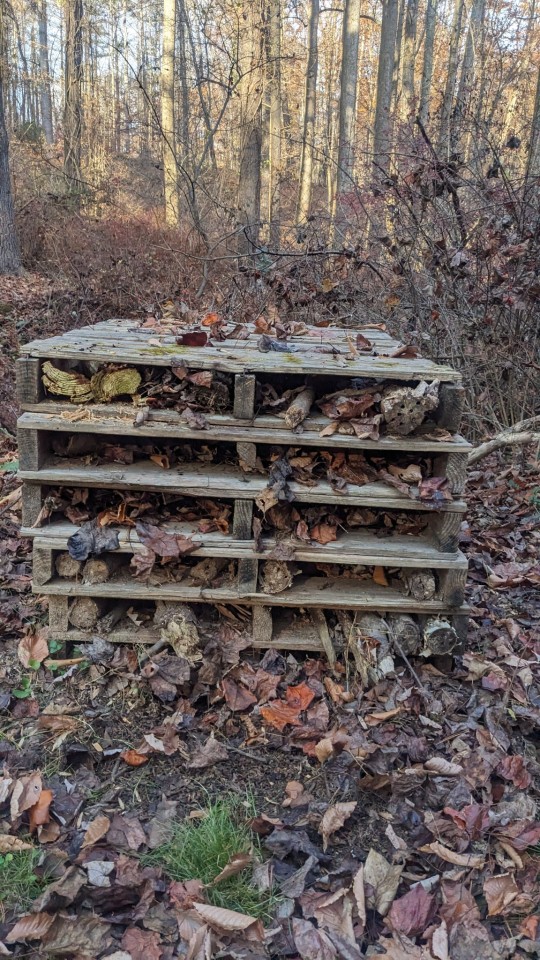
I spent that first hour in the very cold art building. My fingers would hurt from working and putting things away and sorting. But it was nice just having a specific task. And I was able to basically get everything put away and organized and ready for the spring. I did find out 3 hours later that I will have another field trip this season, which is shocking because it is usually too cold for kids to be outside for field trips but that's fine. At least I know now that it's all ready to go.
I went back to the office and soon people were coming in. Heather was the first one in and she told me all about her project that she came up with with maiden choice and creating a summer camp program week for them during our orientation in the spring / beginning of summer. And she was so excited about it and I thought that was so sweet. And I really think that if we can get the funding for it it'll be really cool. But with all the staff needed both on our end and theirs, it would cost somewhere in the ballpark of $37,000. Which is a lot for one week. But I think it would be really awesome for the group if we can make it happen.
Pretty quickly everyone else was there and I asked Sarah if she had made any headway redesigning the display poster. It is super out of date and the pictures are from like James's child. She said we had chosen some pictures but beyond that she didn't know how to really start laying it out if she didn't have the prints. So I suggested that I start throwing something together in Canva. And I actually got really really into this and I worked on it from around 10:00 until around 1:30. Just picking fonts and designing it and making a really nice. I ran it past Jess a few times too because she has such a good eye for it but her main comments were just that she didn't understand why everything was in capital letters. But that was just the font choice. And then she had some issues with some of the alignment but because we're going to be printing it to cut out and collage anyway I'm not that concerned about it.
Everyone else still had a few notes in the office. A couple little spelling things a couple changing how something is worded. They wanted to replace a few pictures to make things look a little bit more diverse. But overall everyone really liked my design and that always feels really good. I'm going to be designing some more signs and stuff and honestly they could not be picking someone who is more excited about it than me. Both excited and the correct person for the job because I have a good eye for signage and design. I'm also possibly going to be doing some smaller murals with Sarah and I'm really looking forward to that too.
Ever since the man that usually painted the signs passed away they haven't had anyone to really do it. One guy from Friends of puhtok has done a couple small things but if me and Sarah are really interested I think they'll really let us jump into a lot of it and that's really cool.
I did take a couple small breaks but by the mid-afternoon I kind of was just like bored of sitting and there wasn't a ton for me to be doing. I had printed out all of my summer lesson plans and start organizing those into what needed an example and what didn't. But I needed a break from the computer so I decided to go for a walk.
I walked up to the art building but then I turned around and went down the path towards the frog pond. It is completely dried up and there is no water in it at all. Very weird. And then I walked through the woods down to the Alaskans and over to the Glen. When I got to the Glen I saw that bee hotel has kind of fallen apart and so I've made that a new personal project. I want the bugs to overwinter well so I'm going to also build a couple bug snugs over there too. Since we don't really have any more groups except for a few here and there I will have time for these very silly projects that I have come up with. But it is also important to me that our bugs have somewhere safe to overwinter. And if I can make a nice little space we can also make a display sign for it and use it for educational purposes. In the meantime I took the bee hotel and I filled it with leaves. And tomorrow I'm going to bring my drill in a good bit and a gun to drill out some logs for solitary bees to live inside of. And maybe other crotters but I'm mostly I'm worried about the solitary bees.
I would sit on a bench for a while and watch TikToks on my phone. I found today that I do have a little bit more of a voice which is nice but it's so squeaky. And if I don't talk for any length of time it's really hard to get my voice back up again. I also sound ridiculous. Kind of like spinelli from recess. The TV show. Just really straining.
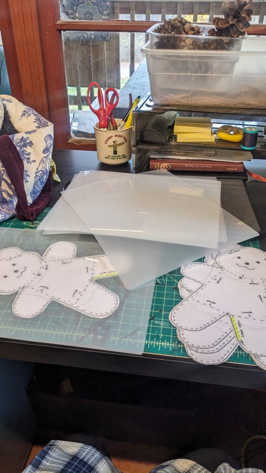
After my walk I came back to the office and started printing bear patterns for my workshop on Friday but also they will be used for my summer program. I wrote instructions on them about where to tuck and sew ears and where optional sew lines are as well like in the arms and legs to give it a more floppy appearance. And then just to make sure that they can be used over and over I cut them out and laminated them. And then I laminated them a second time. Because I find that when you cut them they start to separate but if you reheat it up it has a better deal and lasts longer. It takes a really long time to laminate stuff but I really enjoy it. It's that thing again about just having a defined task at the beginning and end. And it was just nice to sit there and work on that.
Me and Sarah would have a really nice conversation with Heather about plans for the winter and things that we want to do for the upcoming year to make camp a little nicer. Some exciting stuff and just little maintenance things. We also talked about doing more field trips and activities together as an office to go see what other things are going well at other places. And Heather suggested that we go on a trail ride as a staff group tomorrow. I don't know if Elizabeth or Alexi will do it with us but me and Sarah are totally down. And Heather is such a horse girl so it's going to be nice to see her ride too because I never get to see that. I just know that she does it at home. So I'm excited to see that.
We were stretching in the office and talking about figure skating and roller skating. We ended up talking to Chloe about roller skating later and we're going to try to get everyone to go roller skating with us so that is very cool. But she was also eating tortellini and I was like I should go get something to eat too. But the only thing I wanted was a hoagie. If I didn't leave right then I wasn't going to be able to get back to Manor Mill in time for our class.
So at 5:00 I left and I went to Wawa. It took like 20 minutes to get there because of traffic. And they took a while to make my sandwich mostly because they had a lot of like Uber orders. But it was fine. I mostly went there because I didn't have to talk to anyone. Can order and pay on a screen.
Doing my post right now is very rough and is making my throat feel very uncomfortable because I kind of have to hold the air in the back of my throat but I'm not really using my vocal cords as much as you would think. It is not comfortable. Once my post is done I'm going to try to be quiet again for a very long time. (Oops instead I tried scream singing to 100gecs and might have dislodged some thing and I can actually talk???)
I know again that a lot of typos in this and I'm doing my best and I will go back and edit them before I post it hopefully.
After I got my sandwich I ate it while I drove which I'm sure looked very silly. Eating a hoagie with hands and driving with my elbows. But I made it in one piece to Manor Mill. GPS took me the weirdest and most backwoods way possible but I made it there without hitting any deer or causing any accidents. And I was there exactly on time.
I didn't throw anything today but I did decide to make a few more small critters. This time I made stars shaped bears. So they're flat. I'm not sure how I'm going to glaze them because they don't really have a side to stand on. I might have to leave a note about them going on a pin or something. But beyond that I worked on trimming things and I got to get a few of my pieces that were glazed last week and they look great. The one feedback I have for myself is that you accidentally made the bears green. But that's okay they're not on a part you're going to eat anyway so I might just paint over them is fine. I think the blanket design looks so cute and my little house even though it came out kind of modeled it looks really neat. And I'm just really proud of them. Though the blue bowl is stuck to a tile. I put too much place on it I guess.
I would work on my bear vases from last week as well. Just trimming symbols and then once the bears were dry enough I worked on cutting them open. While they were hollow they were not very hollow. So I'm going to have to carve them out a little bit more. I also decided that I would put keys on them, the little triangles, so that the lid fits on the base nice. And they kind of kind of look like they can pee like pause. I might put a little details on them to make them more pot like. But in general I'm really happy with the work I made today and I just felt really productive. We also just had some really nice conversations and we're very silly. Me and Lindsey the teacher, who was practice week and me really bonded because both of our siblings have been in jail for so long. Mine is dead but still lots of common. And I told stories about her and I was just really nice because it was her birthday so recently and I don't really get to talk about her much. I try not to make too many jokes to make other people uncomfortable but I always say that she was a terrible sister. But she was my terrible sister and I've been robbed of knowing about all the terrible things that she would have done if she was still alive. And man was she good for a story. I do miss and I hurt for my dad and for her kids and her mom and I know that she's definitely very much in the forefront of everyone's mind right now. I know she is for me.
I decided to clean up and leave around 8:30. I wanted to get home so I can wash my hair and try to get more sleep tonight. Hopefully I won't have to sleep sitting up. Right now I'm okay coughing much. I'm mostly just really squeaky. But we'll see what happens. I'm really looking forward to seeing James and hugging sweetp.
I'm going to start doing some research from murals and me and Sarah going to go and clean the lodge before we go on a trail ride. I don't know what else the day will hold but I think it will be a beautiful day and maybe my voice will be back. I'm not holding out hope for that one but maybe
I hope that you all have a really good night tonight. I hope you sleep well and I hope that you are appreciating that you can talk. Because being basically silenced for the last week has not been fun. I'm miss singing most of all. Good night everybody. Be safe out there.
2 notes
·
View notes
Note
Listen I love star dress mix it’s a great idea but the outfits design could have gone better (loke x Virgo mix love it , love the spells but I don’t understand why she got wings if it was Aries I would understand since I heard Aries has wings but in FT she doesn’t ) (Aquarius x Scorpio mix , Lucy sweetie it looks horrible , I love the tail but that’s it ! I prefer Wailon redesign design , perfect combo of the spirits and love their designs😍 I like Aquarius x Gemini mix to be honest ☺️💜
Agree, most of the designs could be so much better! Honestly I don’t like all of them, but some of them had decent ideas.

Loke and Virgo feels good in concept, it goes from a evening dress + maid outfit to a royal ballgown. Perfect. I do feel it could be more unique though, cause none of that royal theming feels like Leo and Virgo as horoscopes, it’s just a cool pretty dress with wings, and doesn’t make sense for both of their very fist-and-legs close combat battle styles. Still, this is definitely the prettiest and my favourite. I think it’d also be cool if they had a knight version of this as like a Physical Combat Mode. We should have modes for these costumes honestly.

Scorpio and Aquarius feels overdesigned and clunky, but I like the idea of an oversized tail and armor dress. It has a cool and memorable silhouette, it’s just so wonky because there’s a swimsuit in the middle of it. The belt is just awkward, it makes her bikini bottom look like awkward wrestling underwear? Could be so much better executed. Bikini armor is a trope that’s existed in anime and RPGs for ages, and Erza even has a lot of them, so the balance can indeed be found. Mashima just didn’t hit it here. The idea would have been unique for Lucy’s arsenal, though.

I’ve got to say, I hate this dress, but I can kind of see why people like it.
Once I get past the annoying nakedness-- the waves and swirls that make up the bikini top are gorgeous. The black-white separation is an awesome design theme, and the long glove and stocking on just one side is really elegant. I adore the fabric at her waist, it’s a beautiful wave, all bubbly and cute and has the potential for an interesting silhouette.
Now if only there weren’t fucking G-string panties in the center of it.
Honestly, I get that Aquarius’ thing is swimsuits and that’s why everything that combines with Aquarius has a swimsuit in the center, but she’s ruining all the combinations because Mashima apparently has no idea that there are female swimsuits other than a triangle low-cut bikini.
Does he know that tube tops are a thing? One-piece swimsuits? High halter tops? Frills?? Mermaid wrap skirts??? Even just tying a shawl over the bottom instead of letting this girl fight in basically underwear?? This clashes horribly with Scorpio’s large armor elements, and it just apparently can’t be anything with Gemini because all the design elements Gemini contributes is a split down the middle. So Aquarius has to scream ‘I am water’ at us to remind us this is a Star Dress.
I’m sorry for ranting. Aquarius’ own star dress is my favourite of the basic dresses, so this is such a shame. I do think all these dresses were really fun concepts and they all had decent ideas that could be utilized really well!! Heck, Virgo and Leo’s dress looks amazing because they didn’t have to work with a swimsuit and Mashima knew what to do with their theme.
I just wished Mashima designed them with as much passion as he did the old Celestial World Dresses.
35 notes
·
View notes
Note
Might be an odd question, and I'm sorry if it's already been asked, but how did you come up with your fursona?
Not odd at all!! But it's a long story hahah I gotta start from the very absolute beginning. Minor warning for a mention of animal death.
So the first one was an orange and white cat with an olive green trench coat, glowing neon green eyes, a red bandanna (pirate-style, not ninja-style), and they had 7 stripes on their tail. They happened sort of on accident because I was actually 12 years old and couldn't draw humans in a way I was satisfied with and just drew people with cat heads instead. Idk where I got that idea from, probably Thundercats or Swat Katz or something lol. Eventually this character evolved from being based on my actual cat, Toby, to being a character I used to represent myself, 7oby. This fursona is what I refer to as 7oby v.1. They had a sword too, Excalon, that made a blade of frozen ice that was powered by the radiation that my fursona absorbed. I wanted to write a comic with them at once point and had a whole setting and cast fleshed out but this was right around when I entered a very dark period and self-criticism kept it from ever happening.
Unfortunately, Toby, the cat 7oby v.1 was based on, passed away in early 2013. I was really close to this cat, we'd been through a lot together. Around this time I was kind of falling out with the idea of having a fursona too and Toby's death made drawing 7oby v.1 feel... depressing. I tried mixing up their design a little around this time and decided it would be best to just retire them entirely.
This led to 7oby v.2, which was an android with a powerplug tail and 4 motorcycle exhaust pipes on his head lol. I was going through a lot of identity changes around this time (2013-2014) and had a falling out with a friend where they called me a robot and I got a little spiteful about it. I still kind of like 7oby v.2's design but he was a pain in the ass to draw. He didn't last long.
In 2015 I started missing having an actual fursona. I'd gotten a little back into the fandom and having a fuzzy guy I could draw hanging out with my friends' fuzzy guys is a lot of fun. But I needed to design a fuzzy guy again. I didn't know what species to go with and I didn't want to go with a house cat again so I asked my biologist friend for ideas and he suggested a spotted hyena. This was around the time I started realizing I was probably trans so I thought female hyena biology was especially humorous. 7oby v.3 was to be a hyena.
7oby v.3 has gone through a lot of changes haha
7oby v.3 from 2015 through 2017 was just a normal spotted hyena.
From 2018 on he had a robotic endoskeleton like a Terminator and could also make super heated holographic claws and stuff.
In early 2019 I got REALLY into Legend of Zelda and Ganondorf and was like "7oby v.3 is going to be a hyena/boar hybrid now." He still had the Terminator skeleton and laser hands but now he had tusks too. I think this was around the time I gave him lightning/fire magic and decided to combine him with my art mascot, the Somnivagrant, too. Somni's a genderless, amorphous, eyeless, dream demon. It kind of looks like a white dog/wolf and has a sun orb between its ears. The Somnivagrant hitches a ride on my fursona (like a ghost) for fun.
2021 7oby v.3 (the last redesign I've done) is pretty much the same as 2019 but I cleaned up his general anatomy a little and brought back 7oby v.1's Excalon as a giant laser gunsword. Of course.
I think v.3 has gone through more changes than the other two because I've also changed an incredible amount between 2015 to now, but I think, too, that on some level I just don't entirely vibe with v.3. Like v.1 was absolutely me, v.2 was honestly just a stepping stone, and v.3's just kinda... I dunno. I think it might be time for v.4.
#asks#v.3's been my fursona longer than the other two combined but I drew v.1 more by FAR#I redo my reference sheet every couple years and it's funny tracking my interests over time with them lol#I can post them all if anyone wants to see them
13 notes
·
View notes
Last Seen Blogs