#I’ll get right on this lol
Text
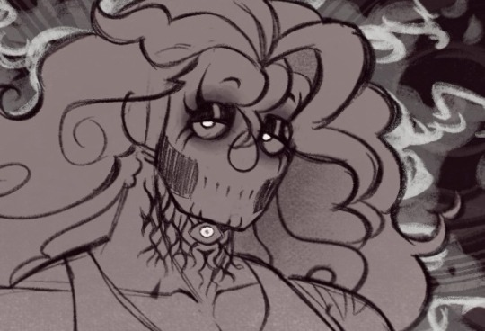
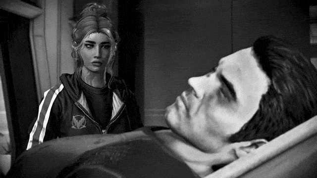
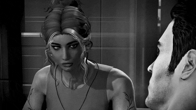
the way that one line from the new epilogue in an astarion romance is going to HAUNT me
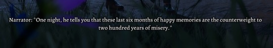
just. what a profoundly intense thing to confess to someone.
like, just these six months of newfound happiness with you exerts a force on his heart equal and in direct opposition to two centuries of endless torment, the gnawing hunger and exploitation. this flashbulb-bright fraction of his long life holds the same gravity to him as years upon years of darkness and suffering.
in all likelihood, he hasn’t even known his lover for as long as his worst memory lasted, that year sealed away to go mad from starvation and sensory deprivation, yet he still tells them this brief time has been so fundamentally and powerfully important that the weight of even that unimaginable hell is vanishingly small compared to this present he has now and the future ahead of them both.
how am i supposed to act normal about this.
#i need to lay down#just drop this in there right at the beginning why not!#that’s INTENSE. and completely sincere considering his demeanor at the party. god#he’s so… nice. in the romanced epilogue. i expected him to be a little smug and jokey#if tav told him the others weren’t doing so hot without the two of them around#but he takes it so genuinely and with visible disappointment?? literally shocked me#i thought he would say oh of course their lives have taken a turn without our impressive leadership lol!#and then redirect into something a little less flippant#but man. he just gets sad. astarion six months into a loving relationship is like a stray cat that instantly gets cuddly when you adopt it#dude went cotton candy marshmallow saccharine sweet in a HEARTBEAT#bless the others with your presence he says. i’ll always be here he says. we have forever after all he says.#head in my hands. how could they do this to me#astarion ancunin#astarion bg3#astarion#bg3 epilogue spoilers#bg3 spoilers#baldur’s gate 3 spoilers#bg3
5K notes
·
View notes
Text

Don’t think I ever quite said what my LGBTQ+ headcanons are for the boys, so these are my current thoughts! Always changing of course but this is what I feel most strongly right now.
#rottmnt#rise of the teenage mutant ninja turtles#rottmnt headcanons#rise donnie#rise leo#rise mikey#rise raph#donnie and leo’s sexualities being practically swapped was unintentional but it works way too well#same with mikey and raph tbh it was a happy accident#anyway I kinda hc raph as the type who doesn’t care about physical appearance just if you fight lol#Mikey’s more than happy with friends and family#Donnie is a BIG romantic but he needs time to sus a person out fully before he gets the hots for them#leo meanwhile isn’t keen on romance unless it’s with someone he grows to really really REALLY trust#I could go on and probably will later (knowing me) but it is late and I am tired haha#turtle art tag#curious as to what everyone else headcanons#the only one of these I’ll defend forever is Bi (female-leaning) donnie and trans leo#all the others can change over time but I really like where they’re sitting right now#I hope these are the right flags too because it was kinda hard to find them#went looking for transmasc flag in particular but I couldn’t find a solid agreed upon version 😭#ngl a big part of why I hc mikey as aro is because of a pun#my phone often misspells aromantic as aromatic and- and you get it- because aromatic herbs and- and Mikey is a chef do YOU GET IT#note that while I hc leo as bisexual (male-leaning) I still think he’s prob closer to demi in that as well just not as far into the spectrum#if that makes sense#headcanons are fun and hard to narrow down at the same time alas#I made this in like an hour can you tell djjdjd#I drew them all from memory so if there’s anything wrong…shhh#and if you’re wondering for April and Splinter#Both are Bisexual (female-leaning) but April is also Panromantic#I almost wanna make Splinter demiromantic too so Big Mama’s betrayal hits just a bit harder
187 notes
·
View notes
Text
Sparring🔥❤️💦 this was inspired by @mielemare ‘s fic “Friendly Blackmail” which can be read hereeee https://archiveofourown.org/works/51375847 they also have an amazingggg Blutaraverse series that’s currently ongoing and it is a MUST read😍 check it out out!

#katara#zuko#zutara#avatar the last airbender#my art#fic inspired#this actually took a while to do lol#anatomy is hard#also trying to find the right style#I’ll get there
265 notes
·
View notes
Text
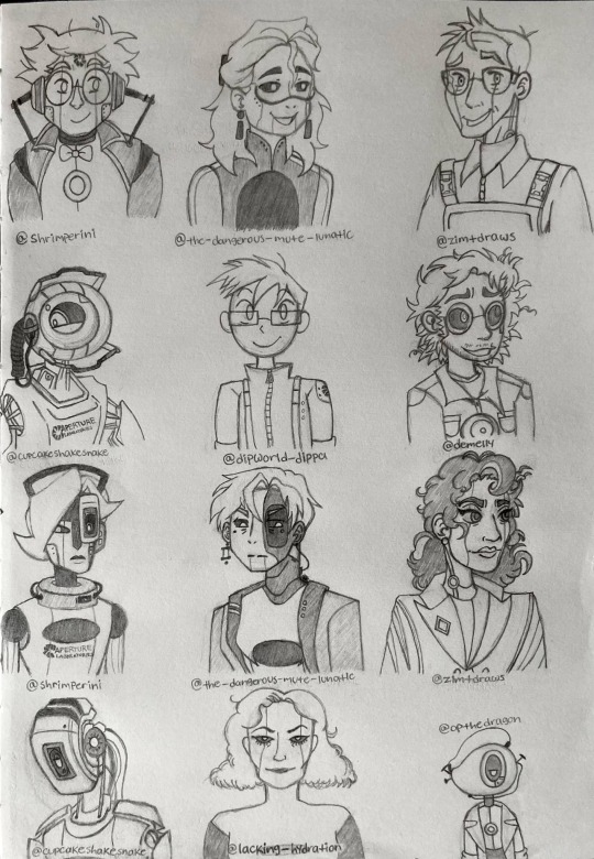
Was looking through some human/android GLaDOS and Wheatley designs before taking a stab at my own, and ended up doodling some that really stood out to me!
Now for the arbitrary ratings of each design for each character simply because I can lol
Wheatley
@shrimperini ‘s design: I like this one a lot! He looks very polite. 10/10.
@the-dangerous-mute-lunatic ‘s design: ??? ?????? Why is he so pretty??? I’m confused but I still really enjoy looking at this one. He’s getting a 9.5/10 only because he slays too much when we all know that, canonically, he would never
@zimtdraws ‘s design: This one feels the most like what Wheatley would look like if he was a human (or human-adjacent), at least to me. One of my personal favorites. 11/10.
@cupcakeshakesnake ‘s design: One of the best object head/android designs I’ve seen of Wheatley thus far. The body perfectly matches the clunky, industrial aesthetic that his core already has! 10/10.
@dipworld-dippa ‘s design: This one’s fun! I love the cartoony vibe he gives off. Another personal favorite. 11/10
@demelly ‘s design: I like how unconventional this one is. A good mix of not-quite-human, but not-quite-machine, either. I also like how messy he looks; the curly hair sticking out all over and clothes that don’t seem like they fit him quite right give off the impression of a disorganized individual (which, considering his status as a core that generates nothing but bad ideas and never shuts up about anything ever, is very fitting). 10/10.
GLaDOS
@shrimperini ‘s design: I like this look for her. Very clean and sleek. 10/10.
@the-dangerous-mute-lunatic ‘s design: This one is my absolute favorite. Intimidating, but also very pretty. Also really like how much her chest plate looks like the one for her canonical robotic design. 11/10.
@zimtdraws ‘s design: Another unconventional design, especially for GLaDOS. But there’s something about this one that’s so charming to me. The thick curls and darker skin tone is a nice addition that I don’t see all that often for her. 10/10.
@cupcakeshakesnake ‘s design: Another banger for the object head types! I love how smug and condescending she looks all the time. Just like the real deal. 10/10.
@lacking-hydration ‘s design: This one reminds me of a classic Disney film/Saturday morning cartoon villain. Love that for her. 10/10.
@opthedragon ‘s design: This one is so silly. She’s so small! But that only works to her benefit. I really like how emotive this one is, despite having a potato for a head. 11/10.
(I made sure to credit all of the creators here. But if you don’t wish to be tagged, let me know! I’ll edit the post as soon as possible.)
#portal#portal 2#glados#portal glados#glados portal#wheatley#wheatley portal#wheatley portal 2#my art#is it even a rating system if i gave them all 9s 10s and 11s lol#I would’ve added more but alas#there was not enough room on this sheet of paper#that being said: if anyone would like to request a doodle of their design feel free to send me an ask or reply to this post!#just can’t promise I’ll get to it right away haha 😅#still need to work on mine after all#shrimperini#the-dangerous-mute-lunatic#zimtdraws#cupcakeshakesnake#dipworld-dippa#demelly#lacking-hydration#opthedragon
350 notes
·
View notes
Text
I can’t explain why, but this is my favorite hilson edit ever and I can/will watch it on loop for an uncountable amount of times
#hilson#house md#gregory house#james wilson#im very bummed about my laptop dying on me and possibly having to replace the motherboard#or put money aside to buy a new one in…who knows how long 🙃#so i was looking through my tiktok playlists since i can’t do my usual late night genealogy#and i saw my house folder and got hit with a burst of nostalgia#i had already saved this edit to my phone bc i loved it so much and would be devastated if it was deleted#idk maybe it’s the lake scene in the middle that pushes the brain buttons just right#but the whole vibe i get from it is immaculate and i wanted to share in an attempt to cheer myself up lol#maybe i’ll make a mega post of my fave fics too bc why not#it’s not like i can do my genealogy work 😞#hasan't#personal#video#not my video#tiktok#not my tiktok
153 notes
·
View notes
Note
I was wondering if you have any tips for your perspectives? i dont really know how to do them that well but it seems you have a great handle on them!
Btw I love your art! its soft and happy, I really love your stuff :D
thank you sm!! i love hearing that my art looks happy it's such a nice description 🥺
and for the tips! you've probably heard of vanishing points and horizon lines a bunch of times so i'll try to just give a quick run down of how i understand them + their uses
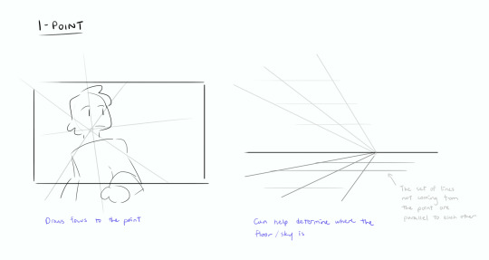


[2024 edit: just wanted to clarify that this third pic isn’t like a definite rule (none of these are tbf)- the horizon line can be placed at the top and still be close to the ground if you draw the grid right, same goes vice versa!]
tbh once you get the idea of how they work it gets easier to figure out where the points should be. it might help to think that the subject is what determines where the points are instead of the other way round if that makes sense? i learned a lot just by looking at storyboards for fun bc they're everywhere in them jhfkdg
also these grids aren't restricted to being only for the walls or the floor of a room- you can rotate it, put them anywhere you think you might need clarification on where the space around them is etc. just use as many as you need for whatever you need

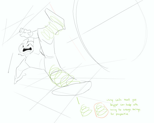
having multiple grids (like ^ where its above and below the character) especially close together narrows the focus to what's in the middle of them as well!
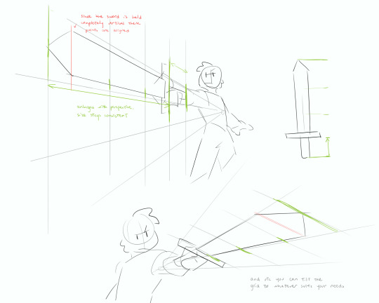
another way to do this is to think of the subjects being in a box and looking at them from an angle-
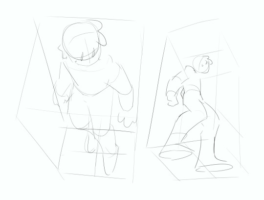
and if you want you can break them down to simpler 3D or 2D shapes to see which parts have to get smaller


if you were looking for more perspectives on poses i talk about it a little at the end here
i hope this was clear enough! it's a bit hard to explain but once i learned not to be too hung up on accuracy (ofc to an appropriate degree) and freehanded the grids it makes it a lot more fun to play around with :)
also take everything i say with a grain of salt bc i too am still learning 👍
#ill be real with you i still don't fully understand vanishing pts sometimes and most of the time i just. dont think of them LOL#just as long as i have an idea of approximately where it is then ill freehand it until i get it looking right#asks#my doodles#obligatory sorry for the long wait i’m still absolutely swamped with work 😔#good news tho my summer course is on its last week! i’ll have free time again soon wooo!!! (losing my mind)#sopuutorials#sopuuart
305 notes
·
View notes
Text
the way the broom closet and the infinite hole being nearly parallels to the other in that they are both areas of the game that stanley has immense attachment to but the narrator doesn’t understand why and makes an entirely huge fuss about his confusion for the affection towards these areas. I think what makes the infinite hole just as funny is the fact that despite succeeding in making a new game feature that stanley seems to really enjoy, he’s so much more focused on the fact that stanley is enjoying it the “wrong” way. aspects of the game that go hand in hand with the bucket.
#the stanley parable#the stanley parable ultra deluxe#YEAH ILL MAINTAG IT LOL#anyway. I find it interesting that the narrator has a specific way set in his head that stanley/the player-#-is meant to interact with the game. and when they don’t interact in the way that he expects them to#-he gets pretty heated or overal frustrated#which his reactions are the best best but it’s just interesting to think about#how the bucket the broom closet AND the infinite hole have this same issue#but also the general overall stance of the game and how we going about leading stanley around#it’s interesting!! it’s fun to examine!!#play my game right and you’ll be rewarded. play my game wrong and I’ll explode you to pieces#I just think it’s fun that every aspect of the game comes back to this singular conclusion!#no matter what. it’s always about choice. good good shit
72 notes
·
View notes
Text
RAAAAH this lil metal au has got me in a chokehold,,,, I’m making the content I want 2 see in the world

Had to doodle the gals 😔 my mind wouldn’t be stopped
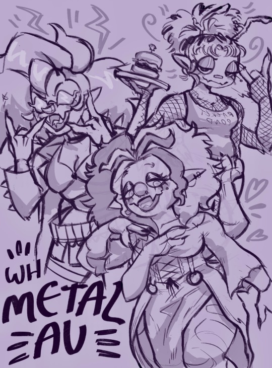
Daria belongs to @frenchfry99, Riley belongs to @wampabampa, and nina belongs to @evillillad! Drawing them was so fun I love bug ocs sm <333

Full (ish) versions in the cut below :] vvv


#wh metal au#hudson holloway#Hally holloway#daria d. dragonfly#riley rifa#nina noon#god even their names are cool B) alliteration slay#I’m having so much fun drawing my cringefail music men#I’ll work on their backstories whenever I decide to draw out the rest of their band lol#ough.. and..#gonna be honest …. the poses 4 the boys were supposed to convey a sort of spooky religious vibe#but it kinda looks like they’re saying ‘this dick ain’t gonna suck itself’#which is fucking hilarious#the bands first promotional art (never mind that half the band is missing) and it’s just ‘the Holloways want YOU to get on your knees 😔👇’#any credibility they stood to gain just [whoosh]#right out the window
62 notes
·
View notes
Text
still sorting out how to feel about it but fuck ncuti was just insantly beyond all expectations. King
#i feel sad his first appearance was sort of playing second fiddle to tennant and he didnt get a proper regen or anything#but i am soooooo excited for him to get started in earnest#plot wise probably my favorite of the specials but that was pretty unhinged#my full conclusion is that rtd is the most self indulgent showrunner alive which works for him but is also very Apparent lmao#doc who#doctor who spoilers#like whys ncuti feeling like a companion/side character in his own show like????#as someone who isnt a tengirl it’s like. Okay.#also as someone who enjoyed the donna tragedy SORRY#like these specials were really not For Me which is fine. but lets get going cmon 💪#i’ll just never be a happy ending enjoyer i need it to be at least bittersweet which is why i like this show lol. too happy booooo#me and capaldi being like ITS SAD. ITS ABOUT DEATH. rtd putting his hands in his ears and playing with action figures#which he has the right to do i wish him nothing but happiness also 14 and 15 sjould have fucked
82 notes
·
View notes
Text
I have an inkling Cardan accepted Locke as Master of Revels to lure Taryn to the palace so that her and Jude could reconcile. What do y’all think?
#also bc Cardan did this (comma) Taryn DID come to the palace to talk to jude about removing Locke’s title#it was 5 months since they had spoken#and Cardan knows how close Jude and Taryn were#he used to watch them in school all the time lol#he also probably knows Jude won’t apologize especially when she’s in the right#he told Locke things had been dull recently#I wonder if things had been dull because Jude was always bummed as hell without her other half#cardans always looking at Jude so in my brain I feel like he noticed something had been off#and a well seasoned strategist always waits for the right opportunity#I think that’s what Cardan did here#he had the perfect chance to get Taryn and Jude reunited without explicitly doing so#idk#I’ll probs add more to the tags later#jude duarte#cardan greenbriar#the wicked king
80 notes
·
View notes
Text

Realized I never posted this here! Toboggan is one of my favorite G3’s, I drew this last year and was finally able to get my hands on an in-box toy of her this summer ;w;
#my little pony#mlp#g3#toboggan#fanart#I think this year I’ll draw marshmellow coco cause she’s like my dream g3 right now lol#one day I’ll get my hands on the g2 kitchen sweetberry
446 notes
·
View notes
Note
i demand your arts

here u can have this one single piece of fanart i made for the fanfic that literally ruined my entire life
#the little house on the prairie halbarry…#if you know you know#halbarry#hal jordan#barry allen#kyle rayner#guy gardner#they r fuckin silly and nothing bad happens in the story i promise. everything is fine forever :)#i gotta be so honest right now that shit is the best thing i’ve ever read in my entire life i am so completely dead serious you dont even kn#i would do horrible ungodly things to farmer barry#what. sorry the demons won#okay honestly i could gush abt this fanfic for literal days it’s not funny i could make like a whole powerpoint abt it it’s been driving me#absolutely crazy please help me#im so normal abt it#my art lol#the absolute grip this shit still has on me… i’ll never get over it
449 notes
·
View notes
Text
Is there a One Piece rarepair ships week. Is that a thing. It should be a thing I think
#One Piece#AGHHH my friends and other people I know have been hosting such fun OP weeks 🤧#A rarepair week would be sooooo fun#Especially bc there’s so many interesting options!!#And so many of my OP buds also have rarepairs#A week for all the rarepairs 🥰#Sabosan…Konami…Lawlusan…Zolaw…Sabolaw…#OH MY GOD AND CORASHANKS. LISTEN TO M#I’m actually curious to see what is even CONSIDERED a rare pair in the first place#Like. I know Acesan and Sanuso aren’t as popular as Zosan for example#But they’re probably a little bit more widely known…right?#Shima speaks#COUGHS anyway#I wanted to do art for Luffy week today but I’m so comfy on the couch I don’t wanna get up…LOL#I’ll definitely do smth for him this week tho my silly goober <3333#But yeah I’ve never hosted a fan week before but it seems so fun. And I think rarepairs deserve more love#ALL THE LOVE
28 notes
·
View notes
Text
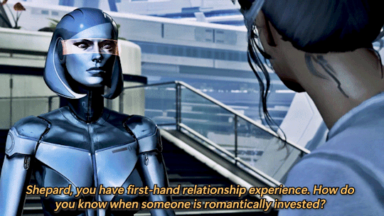
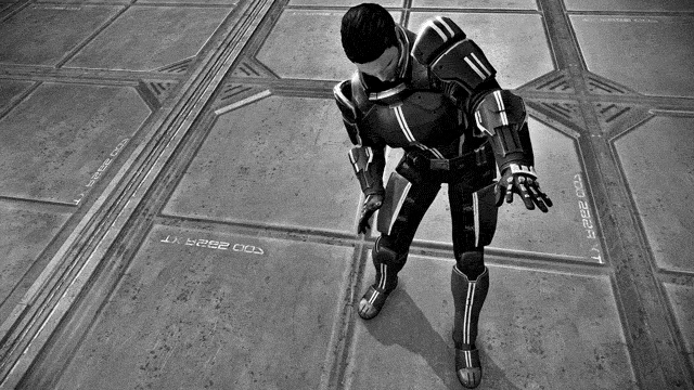


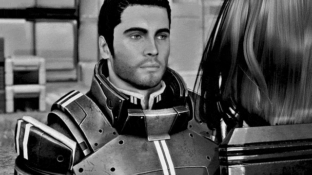
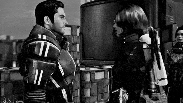
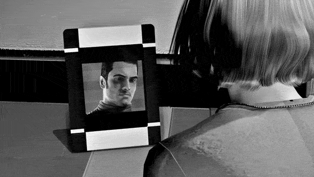

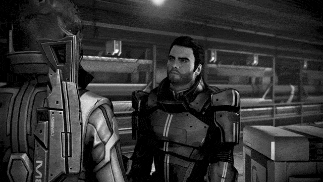
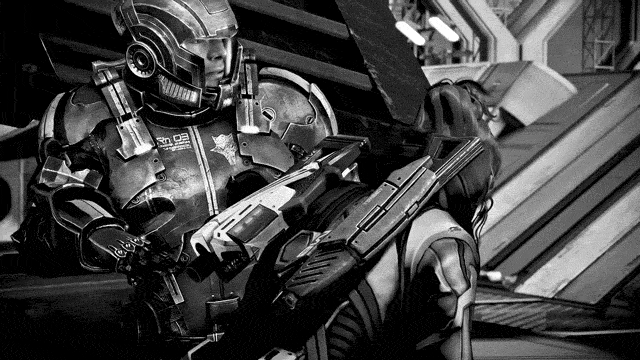
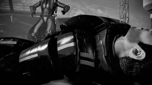
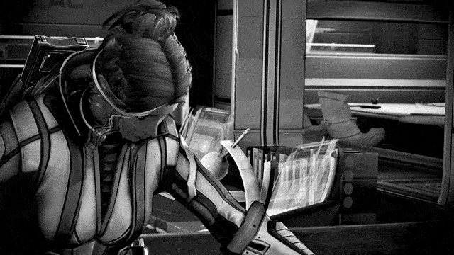


THE BEST OF SHENKO 1/?
The end of the world has a way of reminding you of all the things you forgot to say do.
Mass Effect: Legendary Edition (2021)
#mira makes gifs ✨#kaidan alenko#sophie shepard#EDI#shenko#fshenko#mass effect#mass effect legendary edition#dailygaming#OTP: you're real enough for me#i learned i am physically incapable of creating less than like 20 gifs at a time#but shenko stonks are up right now!!#gif’ing my favorite bisexuals gives me joy 🥹#even though ME2 is dry as shit for shenko content like it’s literally the sahara desert#like a whole ass 10 minutes max of cutscenes between shep and kaidan like come on#like 2 minutes in the prologue and like 8 minutes of cutscenes on horizon#and then an email and looking at the picture in your cabin before the suicide mission#i'm so sorry y'all ME2 shenko canon is absolute shit (besides kaidan being rightfully angry on horizon) which is why we ✨ignore it✨ 🥰#but i rant about ME2 VS treatment too much so i will not write another essay about it in the tags#i will say the EDI line isn't the exact quote from the game but i think about it a lot tbf#same with the quote i borrowed from anderson too lmao (which is also a tiny bit paraphrased)#i just love EDI asking shep for relationship advice when you get to follow shep and kaidan's relationship/struggles across 3 games#and anderson's quote about all the things you forgot to do in relation kahlee to is just *chef's kiss* when you think about shenko#like whether it starts in ME1 or ME3 shenko has some really fantastic moments across the series#two characters with strong morals who realize that they're falling in love and literally start to become each other's strength??#their soft place to land?? their support when they need it?? shenko will always have my heart#also the shenko quotes you get are the most fire thing in the world#you're real enough for me?? you make me feel human?? i want to be your strength- your soft place to land?? shenko you will always be famous#I FORGOT IM GONNA FIGHT LIKE HELL FOR THE CHANCE TO HOLD YOU AGAIN TOO LIKE??#but i’ll stop ranting now bc i do that wayyy to much in my tags lol. have a good day wherever you are! <3
24 notes
·
View notes
Text
Ok what are y’all’s fav horror movies? Or horror media in general
#jusr watched the ring and literally I could adopt that little girl and I could fix her#my thing with vengeful ghost media is it’s always funny to me because I’m like man what’s your fuckin problem#they never get revenge on the right people#like I promise the random ass family thag moved into your house 200 years after your violent death didn’t have anything to do with it bud#horror is so funny I love it#what if a spooky guy was like I’m gonna getcha#I’m gonna getcha#anyways my fav horror movies are anything by Jordan peele the Blair witch project and the shining (though I have issues with shining lol)#oh and scream I really loved scream#anyways I’ve been trying to get more into the classics but I’ll watch anything#love psychological horror the most#lea talks
24 notes
·
View notes
Text
so do yall think dnp aren’t gonna upload until Easter
#I’m gonna have two loonnngggg days at work tomorrow and Thursday#I would love a video one of those days#but I’ll take what I can get lol beggars can’t be choosers right#dnp#dan and phil
23 notes
·
View notes
Last Seen Blogs

callmeoppaa
きれい
thekamillaraincatcorner
Kamilla Raincat's Corner
viviora
Va sempre alla stessa maniera...

gwarbl3
Untitled
meldiem
Fire Fox Girl❄