#art musings
Text

A while ago I made a height chart for characters, and just to be goofy, I made a "50 Foot Harley Quinn".
We're all used to kaiju like Godzilla being 400 feet tall or more, so 50 feet doesn't seem that big, but it really is!
(Wolverine is tiny!)
103 notes
·
View notes
Text
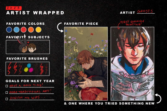
i also really liked this meme from last year, so here's a 2023 version :]
#i waffled the other day if i should do this or a proper summary but. i'm so bored at work so you get both#(it's the ever present siren call of getting to draw cheebs)#it was tough to choose a fave piece (by some miracle) but i kept going back to that one ;u;#it even made me get past my heebie jeebies wrt putting my own art anywhere near my blog design#(it's on the sidebar of my desktop theme)#art summary#art musings#meme tag
20 notes
·
View notes
Text
That action all artists know where you walk back and forth from the place where you a drawing over to the place with a large enough mirror asking yourself "now, how the heck does this limb attach to that other limb again?"
Back and forth. Back and forth. Back and forth.
8 notes
·
View notes
Text
Darker skintone without a dark marker?
You want to draw your dark skinned fave but have no marker? That's very sad but I see sometimes (really sometimes because who does traditional art in 2020s?) people just settling with what's basically just whitewashing. Which is even sadder.
And - in case of alcohol markers like Copics, Promarkers or Ohuhu - usually completely avoidable.
Let's see. I'll take two markers and I'm going to make photos on a cloudy day with a potato so pardon the quality of the pictures. The value change of the colours tho should be still clear.
From the set below I take the colour number 121 for super light and 148 for light brown.
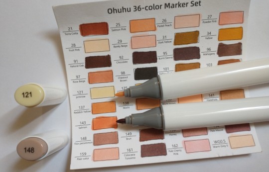
The one that's basically cream coloured obviously won't be fitting ever. The one of the pale pinkish brown is obviously also not sufficient to draw a dark skinned person, right? Maybe tan would go, but actual deep shade of brown? Nah.

Or....?
Well, actually... you can work with it. Because markers can layer. And they layer pretty nicely. Look what happened after one additional layer after it dried:

Better, right? Let's apply more after it dries. 3 layers look already pretty promising, no? And even more. 5 layers! After the third layer the difference is gradually getting smaller but it's a huge improvement from what it looked at one layer.


I actually got a decent brown there.
You can see as well that the super pale cream colour that'd be only useful for something like ghostly pale or shading a white sheet turned into a quite natural shade too and now can be used without making the character sickly pale. You can work on every colour like that. If you have an average light/beige skintone marker, there are still good chances that a bit of trial and error with layering colours on top of each other would eventually give you a more accurate tan/brown colour.
Imagine the possibilities with a mid value marker like the one I used. You could for example make a nice dark skin tone. You could make a tan skin tone. You could make a light brown skin tone. There are plenty of skin tones you can cover with something that looks like some uninspiring beige.
Now look.

I used this colour as a base colour for this guy. That pale brownish, pinkish marker that had no right to give him the right colour... until it had. You can still see its unlayered tone on some highlights but the rest is a nice saturated brown on the reddish side.
While pencils or watercolours might indeed make it impossible to get any darker than what it is marked as (but you still can mix and blend colours, y'know), alcohol markers give you plenty of options to darken the colour - one marker can provide you with a whole spectrum of tones. The basic tone it has is just the beginning and the lightest value out of the whole range. Just use this unique advantage of this medium and you won't "need" to whitewash.
Edit: do I have to recommend reblogging? It's not going to reach anyone without that.
25 notes
·
View notes
Text
i love the gap between the kind of work i like and the kind of things i'm making right now because it's objectively Hilarious from outside
my taste: complex, frequently bittersweet or outright dark works with ambiguity, heavy surreal elements, and opaque plots that leave ample space for interpretation; optional fourth wall breaks or metanarrative for bonus points
my current story: slice of life, harem-ish gag 4koma
i list my favorite pieces of media as shit like drakenier and horror games and challenging, opaque and surreal work and then i finally create something original and it's literally just about demons hanging out and having fun
#it is Excessively funny#i guess our taste and our creations aren't necessarily always the same but#it's so funny to me for no reason in particular#about me#art musings
12 notes
·
View notes
Text

I keep meaning to use my art tumblr more as a progression journal and documentation of thoughts and process.
I had fun with a mix media study on trying to figure out how latex shines. I used Colored pencil,paint marker, Water colors, Felt tip water based marker.
It was fun layering and adjusting to get the overlap I liked, Blue Base, Dark Teal overlayed then while the teal was still wet, (about 1 min after painting) in the darker value areas I did dense amount of a magenta marker and then with a fresh, wet brush tip, pulled from there.
The idea using the marker at the densest points vs water color was More control with a deeper hue that allowed it's self to work nicely with wet brush blending.
This is most likely one of the better guns I've drawn too. getting better at figuring out how to break things down in to easier shapes.
Not happy with the hands. I need to do more focused studies on just hands, I need more variation in the kind of hands I draw especially.
Background could have been more interesting as well, it's bland, even if it's just a sketch.
Also not my strongest ink work, Too shakey, I wasn't feeling confident in my strokes as I did this as I was too worried about mucking up the paint.
My line width isn't consistent and could use more contrasting weights to match the light source.
Overall I am very happy with this study, and it was nice to sit down and mull over parts of my thinking process into words as well as improvement notes to keep in mind going forward.
4 notes
·
View notes
Text
artmaking is valuable in itself.
what do i mean by that. what i mean is actual finished art doesn’t actually have to be your focus. artmaking can be about the process of exploration and discovery that you engage with when you create something. is making something really technically impressive awesome? yeah! but making something in general is awesome. even if you throw it away, you have created art. that is more than enough. listen to me you have tapped into a practice that is literally older than human civilization. that is so fucking cool.
7 notes
·
View notes
Text
Take me to art museums and make out with me✨
#dark academism#dark acadamia aesthetic#dark acadamia quotes#art hoe#dark academia art#art academia#dark academia books#art aesthetic#art moodboard#vincent van gogh#vangoghaesthetic#romantize your life#romance#date ideas#art museum#art musings#desi tumblr#make out#deadpoetswilde#dead poets aesthetic#dark academia moodboard#academia moodboard#academia aesthetic
57 notes
·
View notes
Text


Can I just say that I live for subtle touches… hands swiping against each other, arms grazing, knees press against each other, cheeks brushing, “accidental” thigh swipes. I just love the subtlety behind pushing comfort boundaries while both of you pretend like you didn’t notice. It’s really the simple things in life.
#sublte touches#love language#accidental touches#hidden love#old school gestures#love#romanticize#academia#dark academia#chaotic academism#soft aesthetic#classic literature#art musings#poetry#writersclub#tumblog
93 notes
·
View notes
Text
dude...i just realised...i can STUDY and TAKE INSPIRATION from other artists...to draw my little guys...
#dorambles#shitpost#art#art musings#talking#this is about a really cool piece of ninjago fanart i just saw#i love love loved the way they drew cole#so i am studying#got my notebook and pastel highlighters at the ready
4 notes
·
View notes
Text

mermay piece is going along...swimmingly > u > Got one done, working on the second of four in the piece! This one has been complex,but SUPER happy with results so far!
Odd step in this one...I have to paint the figures before I can detail in the coral reef/fish so can get a better feel for the composition, especially the "abyss" lower portion as the charater is the main light source.
Can't wait to show everyone this when done! Feel like I am art leveling up bigtime on this one!
9 notes
·
View notes
Text
I think i might draw some of my fantasy oc’s as if they were in different games I was first just thinking Fear and Hunger but I think darkest dungeon would be fun to do too! :3
I think it’d be a challenge and help me experiment with my style and push my drawing and observation skills and just be really fun to do, it’d be cool if other people joined in too
If anyone has any other games with interesting styles they think I should add to the list lmk!
#musings#art musings#my posts#digital artist#fantasy artist#art challenge idea#fear and hunger#darkest dungeon
4 notes
·
View notes
Text

(template) this is the first year in a while that 1) i've been able to do this at all (i think the last one might have been 2019?) 2) got to fill up every month AND 3) was absolutely spoiled for choice every single month!
i've talked about this before (and many of you have witnessed it firsthand), but i've had an absolutely rotten relationship with my art for years and years, so it's hard to put into words how it feels looking at this and knowing (and SEEING) that i've had so much fun drawing this year? putting together these art summaries often made me feel awful, even if i managed to maintain some semblance of peace with my art for the year, but this time around i... i think i still kinda do feel like crying, but out of sheer happiness for a change. i've spent so long thinking that finding joy in art is impossible. and yet! here it is!
i also want to say thank you to everyone who has cheered me on this year and your kind comments, i read them all and then reread them some more for good measure (i think it's probably very telling wrt my relationship with my art that in the nice tags screencap folder that i've had for a decade, half of those are from this year alone)
#i didn't set out to make this an ardbert/wol show but in terms of picking out fave pieces and what would look best in this format#it just ended up shaking out that way :'3#i also kept out the more experimental stuff like the fake retro comics stuff and my gouache fruits collection that i'm super happy with#bc of the format#art summary#art musings
20 notes
·
View notes
Text
On Goya, despair, and choosing to be haunted.
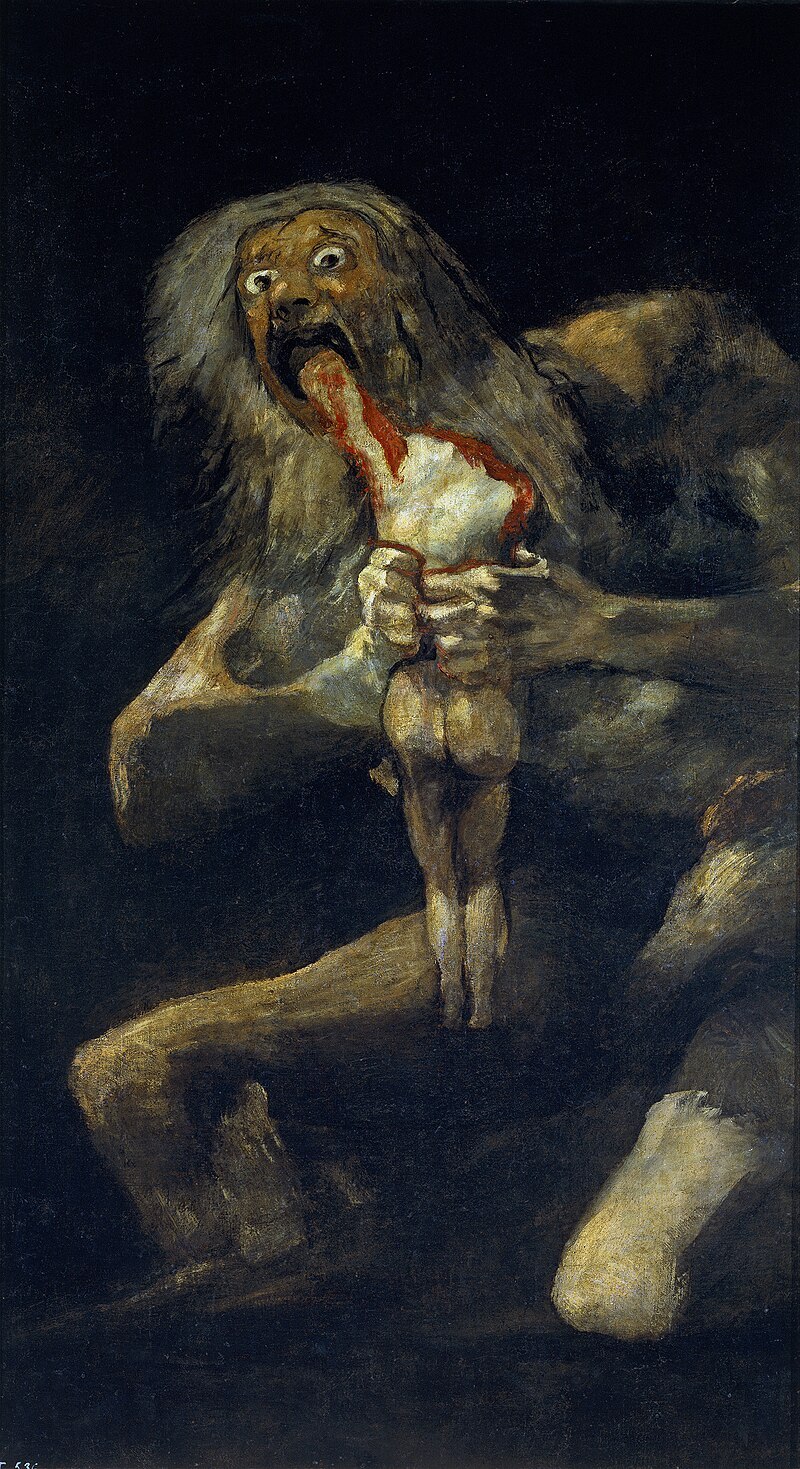
I can't sleep and I keep thinking about this, so I'm going to do a lil' post. I read a post here on tumblr about the painting Saturn Devouring His Son by Francisco Goya, specifically about how we don't actually know that that's what it's called. But the post included one detail that stuck with me: the painting wasn't painted on canvas, it was painted, along with the 13 other paintings in the series, on the walls of his home near Madrid, Spain.
So, context: in 1819, Francisco Goya effectively retires to a small villa outside Madrid. Political upheaval, the onset of old age and the loss of his hearing has left him tired, anxious and distraught at the prospect of his own future. He lives in the villa almost entirely alone, except for a single maid and her daughter (The maid and Goya may have been romantically involved, but that's not important to the story). Sometime during the four year period in which he lives in the villa, Goya paints fourteen murals on the walls of the two largest rooms in his house. These murals would later become known as The Black Paintings for their depictions of strange and unsettling scenes. Goya does not name the painting, he does not write about them, if he ever spoke of them there are no records of this occurring. If you never visited the villa yourself, you would never have known they even existed.
I keep thinking about this. There is a permanence to Goya's actions that sticks in my mind. It's perfectly normal to play with dark themes and motifs in art, but to actively decorate the walls of your house with it, to spend hours of your day, every single day, being watched over by your own grotesque and morbid creations, that feels like something else entirely. It feels like despair. It feels like the actions of a deeply haunted man, who created not because he wanted to, but because he couldn't find a way to stop. A man who *needed* to create, if for no other reason than his own survival.
If this was fiction that would have been the end of it: Deranged artist makes creepy painting, takes his own life, house is permanently mega-haunted, but it isn't. Goya lived for five more years after his time in the villa. In early 1824, he chose to move to Bordeaux to distance himself further from the totalitarian Spanish government. He left the villa empty, but he never forgot it. Every time Goya returned to visit Madrid, he would stay in the villa. If it had been up to him, he might have stayed there until his death in 1828, in the house he had chosen to haunt, surrounded by the evidence of his own misery. That's the image I like so much. I think it sticks with me more than the average story of the tormented artist, because it feels like he chose it. He could easily have painted those paintings traditionally, but no, it *had* to be on the walls. It had to be somewhere he could never hide from it, never look away.
Which brings us to my last point. You can't actually see The Black Paintings. Roughly fifty years after they were painted, the paintings were transferred to canvas. By this point the villa was probably in rough shape, and either way the paintings had a lot of work done to make them ready for display. We don't really know how much of the paintings we have today is the work of Goya and how much came from the restoration efforts. Every single title has been assigned after the fact. Goya wanted to created something permanent, or at least something that felt permanent to him, and yet he effectively took the paintings with him to his grave. In a way, that makes them more permanent than ever. A great painting will stay with you, but a painting you can never see will haunt you until the end of your days. Or at least it can, if you let it.
#francisco goya#goya#saturn#saturn devouring his son#art#art tumblr#art history#art musings#slightly long post#please correct me if I got anything wrong#and as always#discuss
2 notes
·
View notes
Text
I doubt that any digital artists actually follow me, so let this be a rhetorical question.
How do you even do digital art?? I can't draw a line on a tablet, even with heavy stabilising it's nit going where I want it and it's. kind of a zigzag?? How do you actually control it?
I legit have no clue how to gain any control over the sketches on a tablet, without the resistance of paper or general imprecision of light wash watercolour my hands are just too shaky. The tremors are barely even noticeable when I'm looking at my left hand usually and never affected traditional art this much.
12 notes
·
View notes
Text
In the time of black and white films, most film was what's called "orthochromatic". It did not render colour evenly accross the spectrum. Blues might appear brighter and yellows much darker. Or something. For this reason, the majority of films used grey sets and costumes so that they could predict exactly how the colours would come out in the final film. They intentionally made the sets look LESS realistic to get a more realistic outcome because the medium had some limitations.
When you draw stuff you're not rendering it in a perfect photorealistic way. I really hate the art advice to draw things "as they are, not as you think they are". Firstly, from what I've read, Quentin Blake seems to disagree and I'm gonna side with him. Secondly it just doesn't work for me. Maybe it's great for some people but in my experience if you're drawing a hand that has lots of tiny bumps in the shape that gives them a rich and detailed outline, that'll look awful and your best bet is to drastically simplify the shape to the essence of what people THINK a hand looks like. Sometimes there's no shadow somewhere, but there needs to be a shadow to convey the shape of the thing or its relationship to other objects. In my experience it's better to add the shadow at all times.
Now arguably if I was better at art I'd be able to get a good drawing out of the way the thing actually looks.... I'd have better proportions or placement in the tiny details so they'd still look good. But this is advice people give BEGINNER artists especially so... Maybe you'll improve better if you follow it? However in my experience the main barrier to improving is all my art looking like shit so I don't want to continue, and any advice that tells you to make art that looks like shit as a learning experience is misguided at best and intentionally trying to weed out "the weak" in a malicious and shitty way at worst.
As far as I'm concerned this is the opposite of correct and one of the most important skills in art is actually drawing what will convey what you want the audience to see NOT what you literally see in what you're drawing. A lot of the time this comes down to understanding the medium. Sometimes you can't meet the resolution of a detail or its colour as it is and you have to find the right place TO meet it instead.
Most of my best pieces happened when I stopped looking at where there were literal shadows in a reference and thought about where a shadow could fall to define a shape. Maybe I got less accurate lighting but you know what I also go? Art that didn't look like shit. Which was what I wanted.
5 notes
·
View notes
Last Seen Blogs
lovelylittlekittenstuff-blog
정국과 사랑에 빠진 새끼 고양이.

ask-ecstatic-rarity
Ask Ecstatic Rarity

hjbender
this mess is a place