#how do people work with larger canvases
Text
I couldn't decide on the color scheme and ran out of time
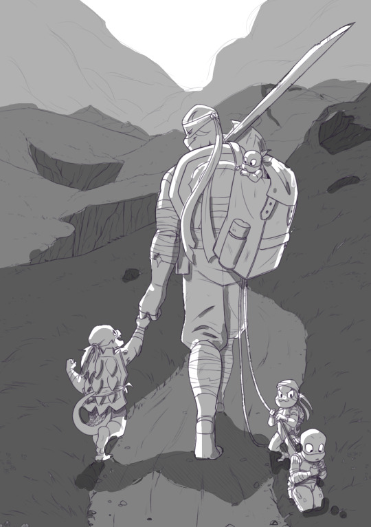
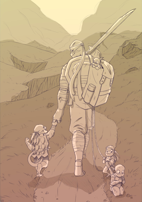

Color is not my forte, but this was a fun experiment!
#how do people work with larger canvases#my art program kept slowing down#abbeyofctiys#ctiys#rottmnt#rottmnt fanart#not mine#i mean i colored it but it feels weird to tag as my art yknow?#rottmnt future leo#rottmnt turtle tots#rottmnt donnie#rottmnt leo#rottmnt mikey#rottmnt raph
28 notes
·
View notes
Note
How come you finished welcome home commissions before other commissions?
Sorry to be kind of rude but a friend of mine commissioned something a while before you started posting about Welcome Home and it’s understandable that you are busy but the welcome home commissions were likely commissioned after you started posting about it so I don’t know why you did them first.
I already know I’m gonna sound like an ass for a moment but here we go-
Firstly this can be taken up privately by your friend if they’re concerned. I also don’t particularly appreciate this in my inbox but to answer, it’s just whatever I can get through quickest. My oldest of the ones sitting are from much longer ago than anything anyone in Tumblr has commissioned me for and I’m finishing those tomorrow (they’re from Twitter and Instagram respectively and I dedicated my entire last Saturday to them alone). Those two have been quite kind and expressed their concerns about turnaround themselves if need be
Anything that’s particularly fun and interesting gets done quicker and keeps space open when others are a bit stuck when I need a quick slot filled like last week to cover an expense, for example. Scraping by on harder/less interesting commissions slows things down
Truly, it’s not that I don’t like some commissions, they’re just harder to sit and focus on
Additionally, my time management has been awful this year because of several points of uncertainty about getting a job, a couple scares on my living situation, and not having a clear window of time consistently to know when to work on things that have been sitting (and of course, burnout is always an issue). It’s easy to find time to just. Scribble and doodle, maybe do a piece for myself, but getting actual work done is a little more difficult. I’ve discovered preclaimed adopts and taking up so many commissions in May last minute wasas a bad choice so I’m still quite literally 15 commissions in the hole to finish on top of your friend’s commission. So making sure that isn’t gonna happen again is all I can do, at the moment. I’ve been chipping away at em in little bits of free time as best I can, reorganizing my canvases, getting a good idea of what’ll be finished first and last, etc etc I’ve actually been quite productive for the last week or so
If your friend is upset they need to tell me. They’re the client, and the content doesn’t concern you directly if you haven’t commissioned me and are waiting. If they’d like a refund because the turnaround is too long, that’s for them to communicate with me and I’m happy to provide a refund. I’m not always gonna be the best artist for the job if you want quick work and that’s fine. I’ve refunded MUCH larger pieces before for that reason. Clients may check in at any time whether I’ve got progress to show for the time or not. And oftentimes I don’t! Sometimes it’s days or a couple-few weeks before I can get progress to people, it just happens and I’ve been working on making sure it doesn’t keep happening so I don’t have to make people expect to wait so long before they hear from me. Trust me, it’s always a bit disappointing when I can’t show anything
And now that I’m working as well, my ability to finish those things just depends on what days I get to myself during the week and atm thats 3 days this week so those 3 days are dedicated to downtime and paid commission work. Which quite frankly, is a bit exhausting. Fun puppet characters and scaly dragons and whatnot are fun and rewarding and I’m clearing my queue while doing something I’m enjoying and that gets me to the older stuff much faster
I’m very sorry the turnaround estimate was more than a little off and it’ll be tweaked for better preparation in the future. I’m also sorry if they’ve asked and I didn’t respond quickly or have sounded dismissive. Hell, some clients pester and pester and that certainly makes doing work for them unenjoyable. I think about these commissions every single day and how I can approach them so I can finish them by sometime in July
#I probably shouldn’t answer this so late bc I’m tired and burned out socially and was extremely pissed earlier#but while I hate to say it it’s true#commissions are hard work#people have sat for a long while and I hate that they do#all the time every day I’m thinking oh#surely I can get this sketch out for this person#pr I can do the flats for this person#just to make a LITTLE bit of progress#and it just doesn’t happen#I do try I really do#and some I’m more successful than others ‘]#half the time it’s no excuse but like I said#if this is so bad that you need to barge into my inbox just have your friends talk to me#I’m sure they’ll be a lot more respectful about it than you certainly were
64 notes
·
View notes
Text
i hate ai art I hate larger companies like target and disney and zara and every big fast fashion corporation you can think of stealing art from smaller artists because it's "free" in their eyes I hate computer generated art that sells for $20k on a printed canvas while someone is working their ass off for something they're genuinely passionate about I hate little kids and teenagers being talked out of pursuing art as a career just because it doesn't support most people financially I hate newer artists being pushed down by more seasoned ones just becayse their art isn't as "good" to them I hate when people are told they can't make art because they're too old I hate when people don't make art because they think they don't have talent I hate when artists quit and give up on their work because it isn't being recognized I hate how machines can replicate what passionate artists used to make until computer generated programs came around I hate how men in the art industry are called "effeminate" or "girly" just for doing something they love I hate how traditional art is seen as less worthy because of how desired digital art is I hate how people give up because they're being replaced by corporate copies of their work and I hate how they know they'll never beat the billionaires behind the industries that mass produce mostly stolen artwork because thats a handful of people against the world I hate looking through magazines and seeing canvases with 3 colors randomly thrown on a page by a computer selling for over $1,000 I hate how you have to be on tiktok or Instagram or have hundreds upon thousands of followers to be recognized as a "real" artist I hate how people treat quilting and crocheting and knitting and cross stitching and embroidery and sewing like "old lady" activities and not like you're creating something beautiful out of heaps of string or yarn or fabric I hate how expressive art is being put down because newer, more "aesthetically pleasing" art is becoming the norm I hate how cultural art is laughed at and how statues from ancient greece don't get taken seriously just for being different or in the nude I hate it all. I can't even sum it up into one sentence
52 notes
·
View notes
Note
hi! I just saw your biometrics au and I'd love to hear a little more about it :)
! yeah of course!
biometrics is an au that focuses primarily around jason (its slightly built up from the art because i found the original sketch in some old canvases but there was no info on what the au entailed, so i made something new) but its still pretty much the same as canon in the beginning but splits when jasons 15
at 15 jason gets kidnapped by the joker (as opposed to him ending up going to him) and smthn so he gets kidnapped As jason--not robin, so hes not got gear or trackers on him.
by the time hes found his arms been lost (it was infected--sepsis or whatever floats your boat but the infection was killing him) and one of his eyes has been removed (re: ripped out)
bruce and dick identify the body and theyre set to have a funeral except his body gets stolen from the morgue by whoever does the experiments on jason (im still not sure who exactly THAT is--definitely NOT the government or a govt sanctioned group, but definitely a larger group? anyway) and gets revived via a cocktail of drugs/other stuff idk dont think too hard about it ok
etc etc the experiments get run (the arm gets installed as does the eye) and when he wakes up/regains control of his consciousness hes like 20/21 ish so he's spent a chunk of time kinda stuck in time while the people worked. when he wakes up he stays with the organization for a little bit more for survival and learning how to move/operate with the prosthetics than because he wants to.
once he gets away he ends up using old robin connections and sets up his own area and around here is when he starts refining his arm (the original one was pretty clunky, he streamlines/updates it)
during this he finds out about tim and everything, etc.
he mostly goes after corrupt politicians and focuses more on things batman wouldnt necessarily focus on, which is his own way of avoiding him.
he does eventually run into dick at one point who recognizes him and theres a bit of a strained relationship there but jason lets him help out/stick around sometimes.
He does eventually meet up with bruce at some point, and it takes a while but they kinda get stuff sorted out . ish.
i particularly didnt wanna use the laz pit because i thought it would be interesting to approach the like. death + revival without it. like i think hed end up a little closer to where he was as a kid (also as a note i think he does struggle a bit with essentially dying as a 15 year old and waking up as a full grown adult . he has no idea how to do the taxes hes not paying someone help him)
9 notes
·
View notes
Text
Ziggy's Beginner Oil Painting Tips (Part 2)
I should probably rename this tutorial, it's more...Ziggy's Guide to Oil Painting in an affordable and more ADHD and Fatigue-friendly Way...but that's a long af title so Beginner it is.
For this installment I finally learned how to spell palette correctly xD
You can find part 1 Here
Contents:
Surfaces
Palettes and Related Tools
Easels
Surfaces
As previously mentioned I use packs of canvases that are stretched over cardboard and for the most part those serve me well, they're cheaper than wood boards that I used when I was a teen and take the paint better than pre-primed pads of canvas or oil paint at least as far as my experience with those goes.
Storage is a problem though because I paint *a lot* so at the moment I'm trying to find a way to make paper work for me.
I have used a watercolor sketchbook with thick paper before that I gessoed and that worked out just fine. People will say you shouldn't do that, but I say if it gets you painting, go for it, for a lot of people a sketchbook is much more comfortable than loose canvases and paper.

Archival? Probably not but my personal art doesn't have to be.
Palettes and Related Tools
My easel, which is meant for plein air painting (which I do not do XD) has a glass palette built in, glass palettes are great, you can stick a grey piece of paper underneath to better see the values of your paint against a midtone, and if paint dries on it all you have to do is scrape it off with a palette knife.
However, I only invested in that easel once I knew oil painting was for me (and I had a birthday upcoming haha).
Wood palettes are much more affordable however I've never used one and I imagine you will have to clean it with something pretty harsh so in place of those I would recommend disposable paper palettes or plastic palettes or use your initiative, I've used plenty of random surfaces as palettes!
Another *essential* tool, and probably the only tool I would recommend opting for a slightly higher end version is a palette knife. I bought a pack from Aldi and they were utterly useless...not bendy at all so mixing paint with them was hopeless. You're honestly better off buying plastic palette knives (what I did when I started) than cheap metal ones.
Some people use them to put paint on the canvas, I use them to mix larger quantities of paint on my palette and to scrape dried paint from wherever it ends up, and anything that helps make cleaning interesting and easy is essential for me.
Easels
My own easel is a Sienna plein air pochade box (with one screw replaced with a random bolt after I lost the original xD).

Really though, to start off with all you need is something that elevates the painting to a comfortable angle for you, a book display stand should work, and for a while I just used the stand for my old display tablet.
It's also important to consider whether you would rather stand or sit while painting, I choose to stand since I sit when I paint digitally so I figure this balances my standing to sitting ratio out a tiny bit. I have tried to use the above easel while sitting but that was extremely uncomfortable for me.
I recommend using whatever you can find/ have on hand to begin with, than you can troubleshoot what problems you have with that set up and choose the appropriate easel based on that. It's very important to be comfortable, and that's a very personal thing.
That's all I can think of for now...my asks are open if anyone has questions about oil painting!
2 notes
·
View notes
Text
Interview -- Kaitlin K.
NG: As someone working with paint, cut canvas, and even seeds, what draws you to mixed-media artmaking?
KK: I wanted to experiment with how else to express the themes (memory, childhood, nostalgia) I have been interested in with painting, and I do enjoy when a work has a tactile element. I wanted to understand if a different or additional media would be more successful. However, I am not sure I am liking the direction I was going with mixed media works or how I could move forward with it purposefully, so I think for now I want to want to focus back on painting. To experiment more with abstracted shapes, maybe "deskilling", the idea of "disruptors" in scenes, and misshapen or cut canvases. I need to explore how these different shapes could add meaning or what it means to take away something traditional. Like the canvases I just cut were traced from the shadows the morning light was making coming through the window of my studio.
NG: You’ve mentioned the importance of art festivals in your practice, particularly the overlap between that environment and your market knowledge that lets you know what you can make that will sell! What other influence/information do you feel you’ve benefitted from by participating in various art festivals?
KK: From working as an interior design consultant, I get good insight as to what people like to put in their homes. At art festivals I get a good understanding on what content people respond well too, which tends to be clouds. I get feedback from both visitors and other artists, which can be nice to hear commentary that is not solely academic based. I have only done a few so far that are juried/ of notable size but I do find them worth continuing to do since they seem to be the only opportunity I have to learn how to market myself rather than being research/academia focused.
NG: You described your process when you beginning a piece as very intuitive, letting the paint fall where it may before you make any specific compositional decisions. While in this part of the process, what questions are you asking yourself that eventually inform how you finish the piece?
KK: The first thing I make a decision on is color palette based on the mood I am trying to convey. Once I have general composition down the next thing I decide is scale, one big cloud or lots or small clouds, tiny trees far away or larger ones taking up the foreground, how far back should the viewer be from the scene? I think in upcoming works I want the viewer to feel distanced and like they are viewing the scene from above. Content wise I try to keep the shapes of the natural elements and structures, kind of "generic" in a way so they do not feel to evocative of a specific time or place, but I think moving forward I want to look through descriptions of landscapes in fairytales (Brothers Grimm, Hans Christian Anderson versions) to draw inspiration from those. Once I have all the elements in I want I will add as much of them (abstract shapes, foliage, waterfalls, etc) until the composition feels balanced to me.
0 notes
Text
Week 1 Homework [5/8/23]: Video Notes
FRANZ KLINE
Franz Kline's earlier works were far from abstract, depicting people or places utilizing many different colors.
From the 1950s onwards, Franz's work began to consist of abstract paintings with minimal color.
Many of the brush strokes within his abstract paintings feel very natural, almost as though all of them were done in quick succession.
Kline's abstract paintings that did feature color sometimes prioritized the usage of black in comparison to said colors, while others would do the opposite and overwhelm the canvas with color rather than black.
FRANZ KLINE | AB EX NY
Franz Kline usually painted with a white background and black or with black and a few other colors.
Many of Kline's pieces were too large for an easel, thus being painted either while the canvas is on the ground or with the giant canvas tacked onto the wall. The scale contributed to the feeling as though the paintings were going to engulf you.
His brush strokes showed an aggressiveness that could only come from someone using their whole arm or body to achieve.
ARTIST AGNES MARTIN - 'BEAUTY IS IN YOUR MIND' | TATESHOTS
Agnes Martin would get inspiration whenever an idea would suddenly come into her head while sitting in her rocking chair.
Before anything, Agnes would draw out an almost postage stamp-sized visualization of what was in her head. Then, she would later translate it to the larger scale of her canvas using intense mathematics.
Agnes believes that "From music people accept pure emotion, but from art they demand explanation." That is to say her paintings are primarily formed out of pure emotion rather than anything else.
While painting, Agnes seems to water down her paint so that it may appear far softer and lighter on the canvas.
It took Agnes 20 years to finally enjoy her paintings, working everyday throughout that timespan to get closer to what she wanted.
Agnes' earlier works featured many different colored blobs and shapes, something completely different from her more recent work.
If the artwork was not good enough or not quite right, Agnes would destroy the picture with a knife and then redo it.
HOW DOES FRANZ KLINE CREATE ART?
Franz Kline seems to create art via the intricate usage of positive and negative space to create balance throughout his paintings. This is done through very natural-looking brush strokes of varying sizes, those sizes primarily being extremely thick. It is common for his work to have the thickest or most eye-catching lines off to the side of the canvas rather than directly in the middle. He also most commonly would work with white canvases and black paint, however there are many times he would do the opposite and start with a black background with white paint on top.
0 notes
Text
Mens Burberry Belt
To preserve the brand’s status, Burberry launched a campaign that finally ended up saving the model. replica burberry belt womens Burberry suffered a double whammy, almost dropping every little thing within the process. During the 1980s and Nineties, the Burberry verify was one of the most copied designs on the earth of fashion.
Contact the seller- opens in a model new window or tab and request transport to your location. Burberry bans the burning of all unsold items and starts utilizing fur to make products. One of the company’s first measures was canceling licenses to spice up its exclusivity and scale back the Burberry check use to about 10% of its products. Burberry realized that its ubiquity would make the brand lose its status as a luxurious style house as a end result of upper-class customers have been looking elsewhere.
Gobbetti has pledged to make Burberry more luxurious by introducing products at larger worth points. One of the primary experiments in that strategy appears to have gone properly. Sales of the brand’s new “belt bag”, which sells for as a lot as £1,790 – the upper finish of the worth spectrum for Burberry other than baggage in specialist leathers such as alligator or python – had been “encouraging”.
All orders are shipped worldwide through our affiliate courier DHL. Please see the transport method as well as transport costs and delivery times on your destination here. That was my suggestion, to check thrift stores and attempt to find a jacket cheap with a belt that would fit. It can be good if thrifts offered even stray belts individually as a lot of people take them off and misplace or lose them. The future of another Bailey-led project, the set-up of a brand new £50m trench coat manufacturing facility in Leeds, additionally stays unclear.
Burberry merchandise are bought through Burberry.com, in Burberry stores and at chosen authorized malls, retailers and specialty stores. Most Burberry belts are produced from leather-based, and are obtainable in smooth, grainy or monogram finishes. Some are created from the brand’s e-canvas, which is constructed using renewable assets that require less water and create less CO2 than regular coated canvases. There are some pieces that come in a mix of each fabrics for a singular distinction of texture, or a woven material that is sturdy with just the proper amount of stretch. Offering a extra neutral take on Burberry’s iconic examine, this Italian-made black and gray belt makes it straightforward to work sample into your equipment assortment.
From its humble beginnings to its current status as a powerhouse model, here is the truth about Burberry that even its biggest fans do not know. All orders are shipped worldwide by way of our affiliate couriers DHL or UPS. wikipedia handbags This piece is in fair to acceptable condition with signs of damage. It might or may not have the unique box, dustbag or tags. This piece is in good to excellent situation with solely mild signs of put on and tear. This piece is unused or unworn with no indicators of wear without the unique dustbag, box or tags.
Mens Burberry Belt Size 110cm Two Tone Color With Leather. Only Selling Because It Doesnt Fit Me Anymore, Only Worn Once 100% Authentic Retailed Close To $400.00, Only Used It One Time. Please fastidiously review our delivery and returns coverage before committing to a bid. Generally, many of the shipping prices are borne by merchants when the order is shipped out.
This heritage remains key to Burberry’s iconic outerwear alongside a vision for fashion forward collections, inspirational runway reveals and an industry-leading position in digital know-how. Based in London, underneath the inventive direction of Riccardo Tisci, Burberry combines its heritage of innovation and craftsmanship in its design of womenswear, menswear, childrenswear, equipment and beauty. Thomas Burberry, the founding father of the British label and an erstwhile learner unfolded his first retailer in England. He started off with an apprenticeship in the drapery trade.
#replica burberry belt#fake burberry belt#cheap burberry belt#replica burberry belt mens#replica burberry belt womens
0 notes
Text
400s Mini crit + reflection
Ropu Wha 400 level mini crit
Us 400s in Ropu Wha decided to have a mini crit as we were put with different ropus and lecturers who didn't know our work super well for our week 10 crits. While having fresh eyes on our work was really nice and appreciated, we decided it would also be nice to have a small crit with us 400s who knew each others process, progress and current direction. It gave us a chance to have a safe and familiar space to be honest with each other about how we're progressing for Exposure/final hand in.
I actually really enjoyed our mini crit, it was nice to spend some time all together and all expressing how we felt about our progression over the last few weeks and years, and how sad it was that it's all coming to an end soon. It was also of course, nice to have some feedback from people who have seen my work evolve over the last few months and get their opinion on my current work in progress and the direction I'm headed in for final hand in.
Crit notes and feedback:
Like the move to all black - think it's really successful
Is it wet?
Like the shiny + matte finishes -> adds movement and gives chance to keep going
Doesn't feel unfinished
Different finishes give viewer options -> is it dry? Is it wet? Can I touch it?
'Liquidy' texture is sexy
Like how it's upside down -> can see some drips going up
Canvas looks smaller all black
Gloss paint is really nice -> gives depth
Changes every angle
Love the work in natural light
Like how work changes in light depending where you are
See emotion but it's not chaotic
Diary / journal entry
Black is sophisticated -> has meaning but doesn't feel overwhelming like some colours would
Makes you look at it for longer
Could explore a series of process -> do the same thing to multiple paintings and each time drop one off so you can see what layers are added to each work
Like the demand / conversation between audience and work
Didn't think the black could have so much depth
what happens if I created a full matte black painting?
Build texture even more but keep the movement -> make the paint really thick / contrasts between thin liquid drips
Texture creates shadows which add to work
Recognising when paintings finished
Trialling ideas on smaller canvases and then seeing if I like it and add it to a larger painting
Natural light changes and moves -> feels more emotive

^ The work I showed for our little crit - the newest layers being the ones of the new resene paints.
Reflection and progressing from here:
I briefly spoke to Emma and she said she loves the new paints and it's what she's been waiting for! She thinks the painting is super exciting so that was really really nice to hear!! Bit of a weight off my shoulders after hearing that haha I definitely think I'm in the right place at the moment with the black paint.
It was nice to hear some comments about how far I've come this year - when you think about my all blue paintings in semester 1 with participants to my now all black paintings that I create on my own. I'm really proud of my progression and feel very very content where I've ended up at the moment with my practice.
People really like my transition to all black and I agree although I do want to try a new painting with a layer of blue paint underneath - I for some reason feel like this will add a little bit more depth to the work while also acknowledging my progression this year.
I really have to think about what I want to do from now on - I have another canvas that fits my large frame so I have materials to make another work which would take a few weeks to make with the layers having to dry. But if I take the current black painting off the stretcher and end up not liking the new one then I'm not sure how well I could re stretch the current black painting back onto the frame...It's so heavy, I don't know if it would crack etc... So something to think about hard in the next few days. Is it worth the risk?... I think I know the answer to that though...
In the meantime I do have a few smaller paintings that I can work on top of to test some things out and push them a little bit further...
0 notes
Note
You totally don’t have to answer this, since you’re very busy, but I wanted to ask a question because I love your buttons and charms so much (I am so excited for them to arrive!!) I’ve wanted to make some fandom charms or buttons to sell on Etsy but, like, I have no idea... how it works, and I’ve googled and tried watching videos of other people explaining it, but I couldn’t quite understand ;-; like I’m mainly confused on, how do you know what size your canvas is supposed to be when you draw on it, so the image doesn’t come out blurry? And how do preorders work? can you recommend what site/company you use that makes your charms and buttons and such? Again you don’t have to feel obligated to answer, I’m just very very lost :’D please have a wonderful day!
sure! lemme break it down into pieces here:
how to know what size your canvas is supposed to be:
your canvas should be, at bare minimum, the size of your final product at 300dpi. some products require bleed (prints, buttons) and some manufacturers might ask for a higher dpi, it just depends.
my recommendation is to start big and just scale it down to whatever size you need later--always scale down, not up, so that you don't lose quality. i tend to start with 7000x7000px canvases for my charms/buttons, which translates to a 11.66x11.66in canvas at 600dpi, which is huge compared to a final product that'll be 3" tall at most.
this does make your file sizes way larger though, so if you're running low on storage space and need to be more economical, i'd say just use a canvas that's the size of your final product + a little buffer for breathing room at 600dpi.
so for a charm that's 3" tall, i'd probably start with a 3.5x3.5in canvas (3" for the charm, 0.5" for breathing room while you're drawing) at 600dpi
and for a button that's 2.25" in diameter, i'd go with a 2.75x2.75in canvas at 600dpi
how do preorders work:
preorders are handy in two cases: when you don't know how much demand there is for a product and want to avoid over/under stocking, or when you don't have enough funds to make that initial investment to stock the product yourself.
scenario 1: you want to sell a charm design, and buy 50 of them to stock in your store. you only sell 20 of them. if only you'd run a preorder, you'd know exactly what the demand was for the design, and you'd only buy as many charms as you need.*
scenario 2: you want to sell a charm design. you know it'll be popular, and that you'll easily sell 100 of them, but you don't have the funds to buy 100 of them at once yourself. if you run a preorder, the orders that come in will fund the purchase.
*very important to running preorders: when you place the order with the manufacturer, always buy a few extra. i do maybe 10-20% extra at least.
this is why: suppose that 100 preorders are placed, and you order exactly 100 charms to fill them. when your order arrives, you find out that 3 charms were misprinted, and can't be shipped out for the preorder--so you're down to 97. while you're trying to figure out what to do about the 3 orders that you can no longer fill, you then find out that 5 of the preorder packages you sent out went missing in the mail--meaning those orders need to be refunded or replaced, meaning that in total you're now out 8 charms. then, while you're contemplating placing a reorder, you find out that there's still demand for the charm from people who missed the original preorder. if you'd ordered 120 charms in the beginning, you'd instead have 12 charms left at the end of these mishaps, which you can sell as in-stock product.
what site/company to use for charms/buttons:
for charms, the most beginner-friendly place imo is zap!creatives. their selection should be enough to cover the basics. i also used to buy from inkitlabs, who iirc is a little pricier, but their print quality is the highest out of all the places i've tried, so it's not like it's not worth it.
if you need more niche features/effects, then you'll have to head over to alibaba. you'll have to do your own searching for companies, and vetting/evaluation of those companies, but they have more specialized finishes. just search for "custom acrylic charm" or similar, and set the MOQ (minimum order quantity) down to 10 or so (however many you plan on ordering at once).
here's where the trade-off comes in though: generally, when buying from a us/eu/uk based company, the products will cost more, but the shipping will cost less. when buying from alibaba (china-based companies), the products will cost less, but the shipping will cost more. so if you're buying a lot of products, it might be worth it to pay more for shipping with a company on alibaba. but if you're only ordering a quantity of 10 or so, it might be better to just buy from a us/eu/uk based company.
this goes doubly for buttons. buttons are a lot cheaper than charms, and are actually common in us/eu/uk companies, so if you're only buying buttons, it's usually better to buy local instead of heading over to alibaba.
115 notes
·
View notes
Text

COMPREHENSIVE GIFFING TUTORIAL (vapoursynth + ps cc 2018)
+ some tips and tricks on color correction, blending and subtitles
You guys asked for it, so here we are! This is by no means the gold standard to giffing. Rather, this is simply my process and my own preferences. Take it as you will. Additionally since I use a mac some of my controls/panels may look different than what you would see for windows users.
DOWNLOADING YOUR SOURCE
This step is extremely important to the quality of your gifset. If you want high-quality gifs I would recommend giffing sources in 1080p whenever possible (especially if you’re going for larger dimensions). You may get away with 720p for smaller gifs. For kdramas, your go-to source would be dr*maday or torrents. (you can search my faq tag if you’d like to know specifics on finding and downloading torrents).
IMPORTING + PROCESSING YOUR FILES WITH VAPOURSYNTH (VS)
Please note that this tutorial does not cover basic installation and set-up of vs. If you would like to know how to download and set-up vapoursynth (it works for both mac and pc) along with some of it’s basics you can find more information at: https://hackmd.io/@nibreon/vapoursynth-book/%2F%40nibreon%2Fvapoursynth-book
Once you’ve identified what portion of your video you’d like to gif, simply drag your video file into VS. Specify the start time and duration of the clip you’d like to import. Typically you’ll be aiming for ~3-8 second clip depending on how big your gifs will be. I am very lazy when it comes to importing. The less of it I have to do, the better. Therefore, I often import clips that are 10-15 seconds long, sometimes even up to 20 seconds. I wouldn’t recommend going over 15 seconds most of the time though, because this will usually bring you over the 500 frames photoshop allows you to import at once. (when I do go over, I will sometimes import the processed VS file into PS in segments). You can also choose to import the VS output as segments if you want all your gifs on separate canvases. (I'll go into more detail on this later)
Once you’ve imported the clip into VS your screen should roughly look like this once the resizer pops up:

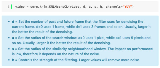
In the top left is where you will be applying your cropping, sharpening and denoising filters. Cropping: Keep in mind the Tumblr dimensions: 540px for full-width gifs and 268px for half size gifs, 177/178/177px for 3 gifs across. The height is completely up to your own preference. Usually I work in 540x300px. Once you edit those parameters you can drag/resize your video file to fit your new canvas. Sharpening + Denoising: You can choose to skip this if you would rather sharpen in ps. I personally do all my cropping, denoising and sharpening in vs. I use finesharp and KNML for sharpening and denoising respectively. Once you select those two filters from their drop down menus, be sure the select the checkbox as well. You should now notice 2 additional lines of code in the top right box. The line that reads: video = core.knlm.KNLMeansCL(video, 0, 6, 4, 1.2, channels="YUV") is where you will adjust your denoising parameters. You will only be adjusting those 4 numbers. I usually use: 0, 1, 0, 1.2. Now find the line that reads: video = hnw.FineSharp(video, sstr=0.22). These are your sharpening parameters. once again we’re only adjusting the number at the end. I typically use somewhere between 0.33-0.55. Depending on the quality of your source and preferences these parameters may change.
Here is a breakdown of the KNML parameters (source: @/nibreon HackMD):
Once you have finalized your parameters, copy all the code in that top right box and paste it into your vapoursynth editor. Note: you can ‘inactivate’ certain lines of code by adding the # symbol at the start the line. That line of code will then be greyed-out. This is what your code should now look like (the highlighted section is the part I just copy and pasted):
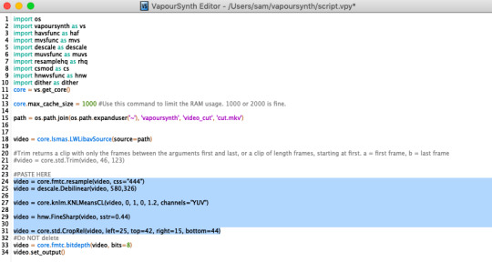
If you would like to preview your filters and see if you need to make any adjustments, simply navigate to the top bar and select script > preview. If you like what you see, great! If not, you can adjust the parameters directly in the editor until you see a result you’re happy with. Once you’re happy you can move onto the final step in vs: processing.
Processing: Once again, navigate to the top bar and select script > encode video. Another window should pop up. Make sure you set ‘header’ to ‘Y4M’ then click ‘start’. Patiently wait for that to finish processing. The longer your clip is and the more filters you add, the longer it will take.
IMPORTING YOUR CLIP INTO PHOTOSHOP (PS)
Now you’re done with the vapoursynth section! Not too hard, right? I use the timeline method when I gif. To import your video file into ps navigate to file > import > video frames to layers. Here you can use the sliders to further specify what range you would like to import. Make sure the ‘make frame animation’ box is checked. To optimize smoothness of your gif, avoid checking the ‘limit to every _ frames’ box. Hit ‘OK’ and wait for the frames to import. Depending on the size of your clip, ps may notify you that you are importing a large file and it may take a long time to process, simply say ‘ok’ to this. UNLESS you get a message saying it will limit to 500 frames. This means your clips contained more than 500 frames and you should select a smaller section to avoid cutting out any critical parts. (Note: you can always go back and repeat this process to select a smaller range of frames from the same video clip until you’ve imported all the frames you need).
Timing: You can adjust the timing of your gifs before converting to timeline. Select all the frames (Navigate to the icon with the 4 bars at the bottom right of you screen. Select “select all frames”). Click the drop down next to the timing of any of the frames. Select ‘other’ and input a your preferred timing. I personally use ‘0.04′ but I've seen people use anywhere from 0.4-0.8ms. Also as a note: when you convert your gif to timeline it has a tendency to mess up your timing so even if you input 0.04 or 0.05 it won’t actually be that timing later. If you want the true frame rate you can set your timing right before saving. You can also adjust timing at the end. (see export/saving gif section for more info)
Now the next part can be tedious and for that reason I’ve created numerous actions to speed up this process. But for the sake of this tutorial I will walk you through the steps. At the bottom of your screen is your timeline. As you can see, it defaults to frames, but we want to convert this into a smart object so that all your coloring/edits are made to all of the layers. To do this: 1) Navigate to the icon with the 4 bars at the bottom right of you screen. Select “select all frames” 2) Now select all your layers in your layer panel. On mac you can use cmd + option + A as a shortcut. 3) Back to the icon with the 4 bars, select “convert to video timeline” 4) Right click on all layers (which should still all be selected) and find “convert to smart object”
(Aside: Actions) actions are SUPER helpful to streamlining your giffing process. you can find actions people have made available on resource blogs like itsphotoshop OR you can choose to make your own custom actions. To do this, all you need to do is locate your action panel. Then from the controls at the bottom of the panel select the one that looks like a sheet of paper to “create a new action” Once you’ve named it and hit ‘ok’ the record icon should now be red. PS will now basically ‘record’ whatever you do. To stop recording hit the square icon. Now whenever you want ps to execute the same set of steps you just did, you can locate the action you just made and ‘play’ it by selecting the triangle icon. I highly recommend making an action for the steps I just outlined above to convert your gif into a smart object timeline. It will make your process much faster and more painless.
COLORING
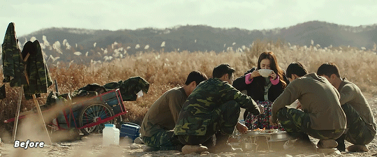
Now the fun part! I focus on emphasizing the colors already present in the video source or getting rid of some less-than desirable overtones when I color. It gives the gif a natural look, but makes everything pop a little more. We will be working with selective color, curves, levels, and brightness/contrast mostly. This is the original gif I will be using to demonstrate coloring:
Curves: I always start with curves. The first curve layer I use to set a desirable black point. To do this, locate the top dropper icon from the curves panel and select the darkest point of your image. This will set that section to “true black” Feel free to play around with this until you find a desirable outcome. Now add another curves layer. This one we will be using to adjust the brightness/contrast. First, I always start off with ‘auto’ and see where that takes me. If you like the outcome, great! If you don’t play around with the different curve points until you get an outcome you like.

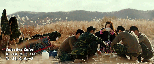
Selective Color: This adjustment layer will be your best friend. For me, I will typically work with reds, yellows, and black. If the source has a lot of blue/cyan I will use those too. Basically look at your source and determine which base colors you’d like to emphasize/alter. For blacks I usually up the black by +1-5 depending on the source. For reds, it also depends on the source. But I will typically either decrease cyan (to make red stand out more) or increase cyan (to make the red not look so overexposed). You want to be careful here. Overexposing the red can make your skin tones look like red tomatoes! And for my content base, where most of the actors are of asian descent, we should be emphasizing the yellows and NOT the reds (see aside on color correction + skin tones for more info). After altering the reds to my liking, I do the same process for the yellows. To bring back natural skin tones and color, you will likely want to darken the yellows, expose them a bit more and maybe even up the yellow slider. A common rule of thumb: if you want to make any of the colors less exposed, increase the cyan. If you want to increase exposure on any of the colors, decrease the cyan. If you want a color to appear more strongly or prominently, increase the black. The magentas and yellows I use more to adjust hues. You can add multiple selective color layers to further emphasize your changes.
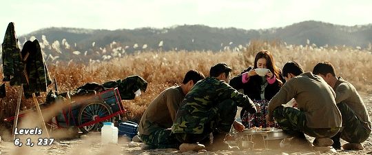
Levels: Now we will work on the lighting some more. This creates more contrast and depth to your gif, often making them look ‘crisper’ To emphasize the bright parts, move the right-hand slider to the left. The emphasize the dark parts, move the left-hand slider to the right. You may also choose to move the middle slider to adjust more neutral lighting. Do so until you find a setting to your liking.
Miscellaneous: Depending on your gif you may need to play with other adjustment layers. Some other ones I often use are the brightness/contrast and exposure to adjust lighting and add more dimension to the gif. For additional color correction I use color balance and to a lesser extent hue/saturation and vibrance.
(Aside: Color correction + skin tones): We are anti-whitewashing and anti-redwashing when it comes to asian media. Like I mentioned earlier, natural asian skin tones have yellow undertones, not red/pink. Therefore when you’re bringing in color you should be mindful of this delicate balance. Adding more red does NOT equal un-whiteashing. Be VERY careful how you balance the yellows with selective color/hues/color balance.
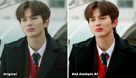
^^ Here is an example of what I mean by overexposing the reds. Poor seungho is looking as sunburnt as a cherry tomato. Note: if your original source is already overexposed with red, fix it! You can do this by applying the same basic principles I explained earlier. Try upping the cyan on the reds in selective color, or shifting the color balance to favor cyan over red with the color balance adjustment layer. You may also choose to favor the yellow over blue.
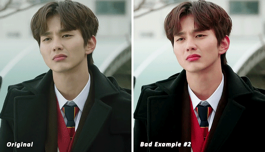
^^ Now this is straight-up whitewashing. This is what happens when you are not careful with your correction of yellow. I’m not saying you can’t touch the yellow slider or get rid of some yellow form the overall image (because sometimes it is very much needed), but you should be very mindful how your corrections can affect skin tones. If you decide to decrease saturation of yellows, or decrease yellow in the selective color section of the reds, do so with caution. If your reds are looking too pink, add some yellow in the red selective color, up the yellow and black of the yellow selective color.
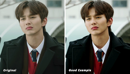
^^ If you hit that happy medium, you can emphasize the natural skin tones without overexposure. Here the underlying tones are very much still in the yellow range.
(Aside: Blending): I will very briefly talk about how to blend two gifs together. First make sure you’ve imported both your gifs into ps and converted them into the timeline format. On one of the gifs, right click the gif layer in the layer panel > duplicate layer > select the canvas of the gif you’d like to blend the gif with. On the canvas you just copied your second gif to, you can now drag the two layers around the on the canvas to get your desired positioning. On the top gif apply a layer mask. This can be found in your layers panel at the bottom, and is indicated by the white rectangle with the circle. Next, make sure you select the mask in the layer panel (it will show up as a white rectangle on the layer you applied the mask). Grab your paintbrush tool and make sure your color is set to black. Now you can effectively ‘erase’ the part of the top gif you don’t want to show anymore. I recommend setting your brush hardness to 0% to get a smoother transition. You can also play with the opacity settings. If you want to add back in a part you erased, just switch to a white paintbrush and you will be able to undo what you had just ‘erased’ with the black. When you merge the gifs, they will play the same number of frames. This means your blended gif length is limited by the gif with the fewer number of frames. You can move around your timeline layer and shorten the included portion by dragging either end of the timeline layer in until you get both gifs to play the parts you want.
CAPTIONS/SUBTITLES
I often get asked about my subtitle font/styling settings. Personally I find the best fonts for subtitles are calibri and arial. I use calibri with the following settings: 12-14px, bold italic plus faux bold, 1px black stroke (optional: drop shadow set to ‘multiply’ at around 85% opacity), and tracking (VA) set to 75. If you would like your subtitles to fade-in or fade-out you can apply the ‘fade effect’. Locate the b/w square icon in your timeline panel. Select fade and drag it onto your text layer in your timeline. You can then right click on the wedge shape to adjust your fade duration. I usually use 0.35s. If you drag and drop the effect towards the beginning of your text you can get the fade-in effect. To get the fade-out, simply drag and drop your fade towards the end of your text layer.
SAVING/EXPORTING YOUR GIF
We’ve reached the final stretch! If you need to adjust your frame rate timing: you will need to revert your timeline to frames. To do this: 1) Navigate to the icon of 4 bars at the right of your timeline panel. Select convert frames > flatten frames into clips. 2) Navigate to the icon of 4 bars at the right of your timeline panel. Select convert frames > convert to frame animation > when promoted hit ’ok’. If at this point you see more than one frame in your timeline panel, delete the frames until only one is left. In the example below I would delete the first frame by hitting the trash icon from the timeline panel.

If there is only one frame, leave it as is. 3) Navigate to the icon of 4 bars at the right of your timeline panel. Select ‘make frames from layers’ You will most likely need to delete the first frame in your timeline panel (it won’t have your coloring). Sometimes ps adds in some ‘blank’ frames as well, delete those too. Now you can adjust your timing.
Once your timing is set: When you’re saving your gif, just keep in mind it must be under 10mb. Navigate to file > export > save for web. When it comes to your save settings I typically use either selective diffusion or adaptive diffusion. I also also occasionally use adaptive pattern (I find this is best for dark scenes without a lot of contrast). Set colors to 256, quality to bicubic and looping options to forever. If you want to preview your gif, hit the preview button in the bottom left. Otherwise, go ahead a hit ‘save’ and you’re DONE!


ADDITIONAL RESOURCES
Feel free to check out my ‘ps things’ tag for more photoshop stuff/mini tutorials. Additionally @/nibreon and the hackmd site I linked previously are your best resources for vs questions. If you would like to see my giffing process in motion feel free to check out this video. It’s sped up but you can slow down the playback. Additionally be sure to check out resource blogs like itsphotoshop for more helpful tutorials and resources.
If you reached the end of this beast, kudos to you! I hope this helps and never be afraid to reach out with any questions.
523 notes
·
View notes
Text
satin robes & city smoke
pairing: chrollo lucilfer x reader
tags: smut
warnings: badly written smut!!
unedited as of june 6th
。・:*:・゚★,。・:*:・゚☆
you didn’t know how, but the packages always managed to find you. it didn’t matter if you were wrapped in a thick acres of trees or warped city skylines, nothing could stop the delicate bundles of lace from finding your arms. they were wrapped in the same shell every time, two fish emblazoned on the corner and a cross stamped on the inside flap.
really, how discreet of the sender.
-
there was a beautiful sort of despair that surrounded yorknew city. you never get used to the smell or the people but there’s a comfort in knowing that absolutely no one can rock your shit, that the foundation of the city rests idly in your hands and in just a wink you can send the city crumbling. the power in it all keeps you going, it gets you going.
you own this city.
the spider tattooed on your back decrees it.
-
a conversation from five years ago
“ since when are the legs more important than the head?”
besides you chrollo laughed.
“i’m serious!” you sat up, jabbing a finger into his chest, “if you really want to make this happen you can’t hold yourself to a lower regard. you can’t be the most useless one.”
the man beside you sighed, “tell me, my love. would you die for me if it meant the safety of the group. could you sacrifice yourself if it meant the rest of us live.”
the smell of burnt metal wafts over the two of you and you scowl.
“that’s the dumbest question i’ve ever heard and you’ve said some pretty stupid shit to me.”
“hm. and i’d like to think that i’m the smarter one of the two of us.”
you scoff, “would i die for the safety of the group?”
he nodded.
“we live in meteor city, i don’t even consider myself alive right now.”
-
but you do know something about the packages; besides the contents and what they’re meant to be used for. the packages are markers, date setters, they keep track of how long you’ve been away. the bigger the bouquet the longer you’ve been gone and the larger the reward for your return. sometimes the packages are nothing more than palm sized bundles, delicate lace decorating the inside and outside.
the theme of the contents sitting inside stay the same.
the one sitting at your feet is different though. instead, the trademark fish and cross are gone, a twelve legged spider in it’s stead. the classic lace wrapping is painted red and you almost wish that the king could see the smirk decorating you’re face.
it seems you’ve been away from the city too long.
-
the black dress fits nicely, oh who are you kidding, chrollo was the one who sent it to you, of course it fits exactly. as you make your way towards the hotel you bask in the warmth of the city; the heat of street food, the smell of middle-aged men who’ve been left wifeless after losing their money in gambling schemes, it almost brings a smile to your face.
and of course, the thought of chrollo waiting for you at the top floor of a highrise hotel has your thighs tensing in anticipation. the face you’re making right now must be a little much because when you arrive at the front desk the heart rate of the poor attendant spikes and her fingers quiver on the keyboard.
“h-here you go. please-please enjoy your stay.”
you tilt your head a little and flash a smile, “i’m sure i will.”
the elevator is empty when you step on and press for the top floor. you’re sure he can sense you by now if the shift in the air is anything but a dead giveaway.
the lust enveloping your figure sparks at your fingertips and makes its way up until its rattling at your jaw. your toes curl inwards as the aura around you grows stronger, and your tongue goes numb at the sight of the doors sliding open.
in front of you is a sight worthy of the most expensive canvases, delicate enough to view but almost too dangerous to touch.
and its all yours.
his back is broad and worn, his scapula protruding like wings, and your eyes can’t help but follow the way his lower back dips harshly into the waistband of his pants. when you look back up your eyes are caught by his own. his hair falls loosely around his face and internally you sigh.
“took you long enough.”
you hum, stepping into the hotel room, penthouse actually, and you can’t help the wash of pride when his eyes rake over your figure taking in every inch from the bottom of you calves to ‘those sweet sugary lips’ of yours.
“miss me?” you tease, accepting his outstretched hand. he pulls you closer, his hands wandering to the down curve of your spine, while yours loop around his neck, resting on his shoulders. tracing your lips with his thumb he smirks,
“i take it you got my presents.”
“you can see can’t you?”
softly, chrollo unzips your dress, exposing the titillating lingerie beneath it. his gift to you.
it’s horrible how weak you make him, just the sight of you has his guard down for the count. he’s known you for years but he’s caught off guard everytime the two of you meet like this.
“i knew you’d look good in this,” he muses, “-look good in everything but you look even sexier in my gifts.”
“your ability to suck at being subtle is astounding.”
at that he laughs.
“can’t help it.” he sighs against your dewy skin, “gonna eat you up.”
your eyes flutter shut at the words and you let him guide you to the massive four post bed in the middle of the room. quick enough, he maneuvers you onto your back refusing to tear his eyes away from your silky curves. he likes you like this, squirming idly in his palm, right where he wants you. where nothing but time can pass over the two of you and leave you unscathed.
“stop teasing.” you plead, shifting your hips upward to graze against his. he ignores your words, opting to press kisses against your neck and leave you whining instead. swollen pink lips ghost over yours, refusing to meet them. “have you missed me?” his lips trace over yours.
“obviously.” you croon, “you’re the one who took forever to decide a time and place.”
lowering himself between your legs he parts your thighs just a little more, his hands massaging the smooth skin. using his teeth he drags your black panties down, eyes widening at the string of arousal sticking between you and the thin strip of fabric.
“chrollo i swear—”
but he doesn’t waste any time with a retort or tease instead delving his tongue into your core, not even bothering lick you open. you mewl at the feeling of his tongue working itself against your clit, you’re sure he’s mouthing prayers between your legs like your a deity meant to be worshipped.
they weren’t kidding when they said “you’re body is a temple.” it is infact a temple, a place where he could offer up everything to you. usually his body, his mouth...
his tongue moves in and out switching between spreading your pussy lips open and stretching your tight walls so they’re ready to take his cock. he loves this part, watching you squirm on his tongue, fingers holding your hips down because if he lets up for second you’ll snap your legs closed in embarrassment. and he can’t be having that, no, not after he’s waited six months to taste your arousal.
“thinking about something?” he ponders aloud, his face stained with your slick. he grins at the sight in front of him. you’re flushed, sweat dripping down the side your face and your eyes screwed shut. your nipples are pert against the lace.
ah cute, he thinks to himself, so helpless
and then he’s wrapping his mouth against your nipple, soaking in the moan you release, only encouraging him even more. his long fingers are pushing your soiled panties aside entering your pussy so gently, you almost scream at the way he flicks his wrist, pumping two fingers so fast you can’t tell if you’ve just orgasmed or if it’s really been that long since you’ve had something so deep inside you. but just the thought of his cock had you mewling , the idea of him filling you up, marking your walls with his cum while he works his mouth against yours; and decide you’ve had enough of his teasing.
you pull his mouth up to yours, almost regretting it when the cold air hits your bare pussy. you can taste yourself on his tongue, it’s not bad but by the way he eats you out you’d think your arousal would be the sweetest thing the world. your tongues work against each other, trying so hard to make each other submit.
but chrollos known you for years, he knows your endgame when you pull stunts like this, and absolutely revels in the sound of surprise you make when he sucks on your tongue.
“bastard.” you growl.
“behave and you’ll be rewarded.” he murmurs, “you know the rules.”
slowly, he unzips his pants revealing the hard outline of his cock. it takes all your willpower not to just flip him over and ride him till you’re crying.
but that will come later.
you whine impatiently as he slides his cock against your folds. you know he gets off on the idea of edging you, teasing you till your begging for him to fuck you, so you can’t help the nasty moan that spills out of your mouth when he slides his entire length inside you.
“oh f-fuck please,”
you don’t even know what you’re begging for, and you think that you might’ve come just from the feeling of his dick inside you but you have no time to decipher the pleasure running through your veins, not when he’s moving his hips so thoroughly against yours. your fingers knot themselves in his hair, and moans are pulled out of your mouth. incoherent garbles of his name are echoed across the room but all you can here the low grunts and groans up against your ear. he’s not a moaner or screamer, but the noises he does make enough to get you to clench tighter around his length .
“chrollo, baby please.”
he groans low in your ear, “want you to scream, wanna hear my good girl screaming my name.”
it’s not hard for you to comply.
your thighs are trembling when he lifts them over his shoulder, and he pulls you onto his cock. the sight of your legs tossed so easily onto his shoulders and the view of his impeccable abs push you closer to edge you’ve been waiting six goddamn months for. your hands find purchase on his shoulders as he pounds you recklessly, with no hesitation. he knows you can take his cock, he knows how far he can push you, and you forget he’s been waiting for this release too.
“never going to let you out of my sigh again.” he growls, “gonna fuck your pussy so hard it’ll be molded to my cock, never gonna be able to take some other bastards.”
“don’t want anyone else’s,” you pant, “only yours, only ever wanted yours.”
it only takes a few more slams of his cock and your orgasm rips through you so harshly you think you might pass out. you can hardly feel your legs and your hands are numb from gripping his shoulders so tight, but he doesn’t stop. he still hasn’t come and you know he won’t stop until he’s had his way with you, even if it means turning into his own pillow princess. so when he does come, spilling his load deep inside you with your name on his lips, you almost sigh in relief. you love the man you really do, but his stamina is unmatched and you only have an hour tops until he’s mounting you again.
-
nuzzling his face into your neck you bring a hand up to push his hair back.
“don’t leave.” he says childishly against your neck.
“—i know you want another round of course i won’t leave.”
it’s unbearable how adorable he looks like this. he’s just finished fucking your brains out but there he is, a pout sitting on his lips.
“no, that’s not what i meant.” he props the two of you up against the headboard, somehow keeping you stuffed with his dick, “don’t disappear again. stay here.”
“with you?”
“who else.”
you can’t say you love him out loud. it would be like admitting you have a weakness. there’s a reason you don’t stay in one place to long. a reason you act like you’re just another one of the spiders legs.
he makes your heart crescendo. and that’s dangerous.
your souls love each other too much, and maybe that’s more hazardous than keeping yourself away from each other. so when the sunday morning dawn comes over the horizon, you let him keep you in his arms, wrapped in satin sheets and city sunshine.
-
#hxh#hxh imagines#chrollo#chrollo lucilfer x reader#chrollo x reader#chrollo imagine#chrollo scenario#hxh x reader#hxh imagine#chrollo smut#hxh chrollo
517 notes
·
View notes
Note
MY GOD i have been looking at your artwork for months now, and I still can't stop getting the puppy-dog eyes over it! I was wondering how you stumbled across your very distinctive art style, since I'm having a really hard time choosing a style that I like to roll with, that would really be "me". Was it a happy accident, or did you just choose a style because you knew you liked it and were going to perfect it, to hell with time restraints?
Well, I never thought too much about how I got my style but I'd say it's a long mixture of my natural handwriting, the need to learn how to sketch as small and efficient as possible to be able to draw as many readable scenes between paragraphs in textbooks without making it suspicious (in my comic style's case at least), and "stealing" tiny little details I like off other people's art styles that catch my eye and incorporating them into mine to make a completely new one.
I got to mine mostly naturally but I think the best way to find yourself an art style (or two...or three) that fit you is to:
1. Let your natural hand movements in. Don't try to force an angular style on a round hand and vice versa.
2. Ask yourself the purpose of it. My comic style was made to save time and space while retaining readability, so in most cases, small details had to go. (This is something that I don't respect while drawing comics on larger canvases and add half a million mini book titles in...) So, think about if you'll be more likely to create your pieces large or small and about what you plan to do with them. For art pieces, you can have a style as complicated as you wish, for comics, you'll probably need an art style that is quicker to draw so you don't take 15 years on a 3 panel comic.
3. Don't be scared to steal. Ok, that sounds a bit harsh but basically yes. I mostly draw how I want, how it feels natural to me and from how I know the world works but every now and then I see an art style I like that contains a (usually quite little) detail that is a goal. It might be the curve of the fingers, the simplification of the eyes, the type of brush used, or even just the visibility of strokes and I try to replicate that with the style I already have. Sometimes it doesn't fit so I just forget it, but sometimes you hit the jackpot.
4. If you incorporate something and it doesn't feel right after a while, just drop it. Don't try to incorporate it further into your style. When I was about 15 I saw an artist I admired draw swirly cheeks, I absolutely fell in love with that detail and promptly started adding similar ones to my drawings. They looked great for a while but as my art style grew they started looking weird and drawing them felt forced. So I dropped them.
5. Every art style has a better chance of growing if you understand the world around you. I might be a bit biased here because I have both a comic style and "wannabe old master" style, but a great way to grow and personalise your style is to do realistic still lifes and human (or animal) body studies. Might sound boring but if you know how to draw something correctly, you have an easier time simplifying it in your very own way.
Aaaand...I probably just rambled without actually answering the question. Sorry.
144 notes
·
View notes
Note
i tihnk changing mediums / positions helps, but at the same time you're still using the same limb. but i definitely find traditional art easier on the joints — especially larger canvases. i think drawing from the shoulder really is what makes the most difference, and an overhand grip, which are things you can't really do digitally. i find that my hands / wrists hurt a lot more with digital art because of how i hold the pen. so uh. i think working traditionally part of the day is better than spending the same amount of time working digitally, but working less is even better. i'd love to actually apply the 4 hour work day to my art, i think it'd be so healthy
I’ve heard a lot of people say drawing from the shoulder is easier on the joints. I haven’t heard the bit about larger canvases though! I’ll have to try that out. I know I definitely need healthier habits with my time spent on artistry, I think it’s going to take a while to sort things out in my head regarding that. A lot of that stuff gets rooted in internalized ableism. Hopefully come summer if I land a conservation internship though, and I’ll split my time up differently
#asks#anon#it’s such a hard thing to determine your limits. last semester I was in a crisis because I was overloaded by science#this semester I have joint pain (although part of that is our messed up weather)
2 notes
·
View notes
Text
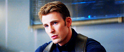
The Artist
After a less-than-perfect meeting with controlling S.H.I.E.L.D. higher-ups, Steve Rogers discovers a small art studio just down the block from the Avengers Tower. He meets a woman inside who may come to mean more to him than he first realizes.
masterlist
Steve Rogers is frustrated. He joined the Avengers, fought alongside S.H.I.E.L.D., made a hundred hard choices and maybe dozens more all so he could protect those he cared about. Those who couldn’t throw up a fist against their enemies.
Yet now, he’s not entirely sure that what he’s doing is considered good. S.H.I.E.L.D. and the government are fiercely restrictive over what he and the Avengers do, and Steve is sick of it. Steve used to be able to pride himself on his gut reflex, on being able to always do the right thing. Is it bad that he’s not sure he can do that anymore? That when his fists come up bloody, he may be looking into the eyes of an innocent instead of a twisted soldier?
Steve supposes that’s why he snapped today. It was just another mandatory meeting, imposing yet another set of rules on what Steve is or is not allowed to do as Captain America. Steve’s usually controlled calm had cracked, and he had unleashed an incensed rant upon the S.H.I.E.L.D. higher-ups sent to speak to him.
To cool down, Steve had headed out of the Avengers tower, dressed in the ordinary clothes of a civilian so he could blend in. He’s not quite sure where his feet are taking him- down a few streets, turning a few corners. He glances at the shops he passes, not paying much attention to them, until one in particular catches his eye and he stops in his tracks.
It’s a small store, not displaying neon lights or garish decorations. There’s a slightly faded banner hanging in a window, and a larger sign propped up above the door. It’s an art studio, tucked away within the hustle and bustle of New York. Steve knows at once that he has to go in.
The studio itself is like a breath of fresh air after spending years trapped inside. The windows are open, letting in a breeze every now and then. The walls are covered floor to ceiling in the art of its students, with self-portraits and still lives peering out at him from every possible inch of space. As Steve walks past the front desk into the main room, he smiles at the sound of music piping from a stereo in the corner. Jazz, a nice slow song. Maybe Chet Baker.
There are only a few people in the room, working dutifully on their canvases and papers. The room has tables scattered around it, spread over with objects of every size and shape for use in a still life. There are fake fruits and flowers, dusty glass bottles and compact wooden boxes. It feels like home.
Across the room, a woman leans over the shoulder of someone seated at a computer, pointing out different aspects of possible reference images. When she sees Steve approach, she says one last sentence to the searcher before walking over to him, head swaying gently to the beat of the music.
“Hi, welcome to the studio! The name’s Y/N. Y/N L/N.” She looks to Steve expectantly, and he glances back before coming to his senses. “Steve. You’ve got a nice place here.” He gestures around the studio, and the woman smiles. “Thank you. It’s come together from bits and pieces, started a while ago by a friend and I.” The two of them look back at the gathered artists before Y/N turns back to Steve.
“You know, we’ve got an open hour every night from 7 to 8 if you want to drop by. You don’t have to pay or anything, just bring your art and be prepared to work.” Steve smiles at her. “That sounds pretty good. I might have to take you up on that.” Y/N flashes him a grin. “I hope to see you there, Steve.”
After Steve makes it back home, he finds himself still thinking about the woman from the studio. Steve had always enjoyed art, and something about that place makes him want to try again. So, it’s not exactly a surprise that he finds himself standing before the studio door the next day.
He ends up staying the entire hour, and then again the next day. He’s not sure why, but he feels drawn to the studio. The art, Y/N’s company, it all is a happy respite from the responsibilities that threaten to crush him on a day-to-day basis.
A month or two goes by before he realizes he loves Y/N. It’s a slow understanding, but something about her gentle smile and flashing eyes makes him want to spend the entire day with her. Steve hasn’t had the luxury of falling in love in a long time, but he thinks it would be more than alright to fall in love with her.
They’re walking home one night after a date when Steve’s good spell finally ends. It was an otherwise perfect night, the moon and stars casting a net of light across the city. Y/N’s hand is clasped in his, and they’re strolling down the streets peacefully.
Steve has always taken satisfaction in his good instincts, but the two have been walking for a while before he realizes that the streets are oddly empty for a New York night. The main street is just a block or so ahead, and he starts to pick up his pace a little bit.
However, it’s too late for this. A man dressed in black steps from the shadows to halt in front of Steve and Y/N, stopping them in their tracks. “Apologies, Rogers. You won’t be going anywhere tonight.” Steve’s jaw clenches, but then he looks to Y/N. “Let her leave. She hasn’t done anything to you.”
The man shakes his head in mock sorrow. “I’m afraid not. She might know something.” The man makes a slight gesture with his hand, and more men emerge from the shadows. Steve curses silently. This is not how he wanted the night to go.
The man extends his hands. “If you come quietly, I can promise you that she won’t get hurt.” Steve just shakes his head. “I know how these promises turn out. We aren’t going anywhere with you.” The man sighs. “I had hoped this would end more easily. Well, have it your way.” With that, the fight begins.
After a while of throwing punches and dodging bullets, Steve begins to wish he had brought his shield with him. Tony always had some way to summon his suit from a wristwatch or phone, why couldn’t Steve have done the same? With a panicked jolt, he realizes he hasn’t heard anything from Y/N. Quickly, Steve throws the man in front of him to the ground and spins around to face his girlfriend. What he sees makes him freeze in place.
Y/N apparently does not need any help, because she’s just finishing off another soldier. Four more lie unconscious at her feet. Steve looks around and realizes that all of the enemy soldiers are taken care of, and he fixes Y/N with a cold glare as he finally understands why she was able to fight off all of the guards.
“You’re a S.H.I.E.L.D. agent, aren’t you.” Y/N looks away from him, but mutters one word under Steve’s bitter gaze. “Yes.” Steve shakes his head, feeling anger rush into him. “You’re just like Sharon. Another person S.H.I.E.L.D. planted in my life to keep me docile. Did you ever love me, or was that just another order?”
Y/N’s head flies up. “No, never. I promise you, Steve, I haven’t done anything that wasn’t what I wanted to do. What I feel for you is real.” Steve just scoffs disgustedly. “How am I supposed to believe that? We’re done. I don’t want to see you again. Tell your supervisors that they’ll need another guard.” With that, he walks away, trying not to react to Y/N’s brokenhearted calls.
The next day, Steve stalks up to Fury with the simmering rage of a lion. He doesn’t let the director speak, just confronts him with hushed and furious tones. “How long has Y/N L/N been posted to keep sight of me?” Fury sighs. “I see you’ve found out. She’s already told me about what happened. To be honest, I think you should be thanking her. If it was anyone else, they probably would have been kidnapped or killed by those HYDRA agents.”
Steve doesn’t want to hear it. “That’s not the point, Fury. You can’t keep forcing people into my life and expecting me to be fine with it.” Fury raises an eyebrow. “That’s a strong way to put it. She was just there across the street.” Steve takes a step back, confused. “What do you mean, only there?” Fury looks at him questioningly. “Her only assignment was to keep an eye on you, and be a distant acquaintance that you could trust if necessary. I wouldn’t exactly call that forcing someone into your life.”
Steve nods slowly, then turns to leave. His thoughts are a jumbled mess in his head, but he’s still thinking clearly enough to remember the way back to Y/N’s apartment.
It takes her a moment to respond when he knocks. When she opens the door, she looks more than a little surprised to see him. “I thought we were done.” Steve sighs. “I want to apologize. You weren’t faking it. I talked to Fury, and he said that your assignment never involved getting close to me.”
Y/N nods. “I love you, Steve. I promise. I know the circumstances aren’t exactly great, but I never meant to hurt you.” Steve smiles. “I know. I think the main question is this- will you forgive me for storming out of walking you home and accusing you of being a sleeper agent of S.H.I.E.L.D.?” Y/N laughs. “Only if you forgive me for keeping my status as an agent a secret.” Steve nods, grinning. He has Y/N back, and everything is just as it should be.
#steve rogers#steve rogers imagine#steve rogers x reader#steve rogers imagines#captain america#captain america imagine#captain america x reader#captain america imagines#avengers#avengers imagines#avengers steve rogers
52 notes
·
View notes
Text
Learn Log #4 - Grassy Grove
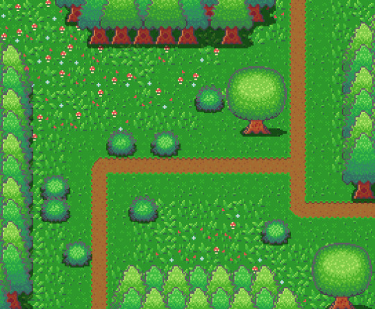
On week 4 of my pixel art journey, I learned how to make objects of nature including grass, bushes and trees. Unfortunately, I had to postpone this to this week when the learning and blog post was set for last week as I was just preparing for a return to university (it’s all online – social distancing dw). Anyway, I ended up making the forest scene you see above, and it was a lot of fun. I think that the GUI elements last week had a focus on technicality and exactness. Letters are very rigid, and we have somewhat set ideas about what each character should look like. However, nature is more flexible and therefore logic isn’t as heavily involved.
Tile Sets
Before jumping into the actual elements of this week’s piece I want to talk about making pixel art tiles. You will have probably noticed that the nature scene is quite rigid like each element is set into a box. This is because I’m learning pixel art to make games and games often use tile sprites to build their environment.
Tile sprites are the floors and sometimes walls of the environment. They often loop or repeat to cover the environment, however, some engines have tools allowing game designers to build environments tile by tile.
In the first case, the tile sprite will have to be created with its looping in mind and details may be added to provide variation in the environment. However, these added details may highlight the repeating the pattern and the more a detail sticks out the obvious the repetition becomes. Additionally, smaller tiles will repeat more frequently, and this also shows repeating textures.
The second scenario requires variation to be created from the creation of multiple tiles. This is great for creating variation; however, the tiles will also have to line up with each other which may be trickier for more rigid surfaces like rocks or bricks.
Since Unity has a tile builder tool and I was creating a natural environment where tiles wouldn’t need to line up so clearly – I decided to go with the second option.
The size of the tiles may also dictate the size of the rest of the game. For example, a bush may be 1 tile large in terms of level design, so the size of that bush is determined by the size of the tile. This also goes for the player whose sprite will typically range from 1 tile to 2x2 tiles. I decided to just make my tiles 16x16 as I enjoy learning within that space.
Grass
A grass tile is typically made of a green background with blades of grass texturing the surface. Many people may open up a couple of green canvases and start texturing them with green lines, however, there’s a much better way to do things I think. Since we’re working with 16x16 tiles there’s a limited number of shapes that look like grass and are small enough to fit within the tile. So, if we make a bunch of lines in green then we have blades of grass that we can copy and paste into each tile (the blades should typically be a lighter green as light will be hitting them).
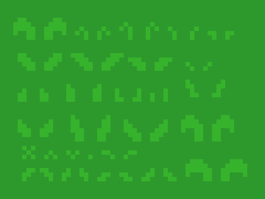
However, having blades of grass like this make tiles look flat. Adding shading will fix this issue by giving the grass depth, however, more complicated shading will obviously make the background more complicated which can affect the readability of your game.

Each blade of grass can now be copied into a 16x16 canvas to make grass tiles. I made 4 grass tiles shown below putting approximately 10 blades into each tile. I made each tile with different elements of the environment in mind such as short grass, long grass, bushy grass and leafy grass.
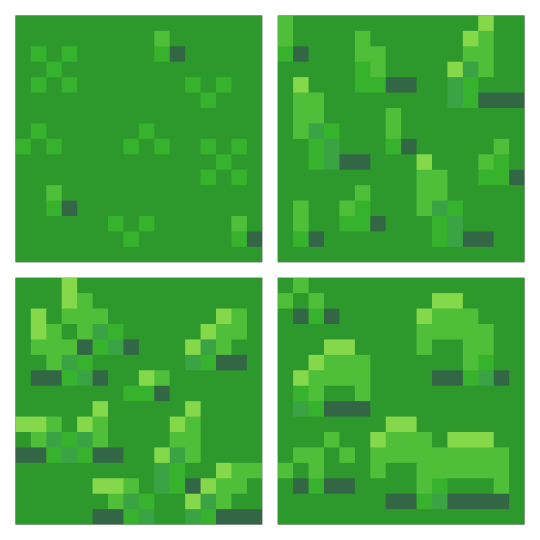
With these tiles, I created a larger image to test the repetition of the tiles. The repetition wasn’t a big issue; however, I didn’t think the leafy grass fit with the rest of the grass, so I decided to leave it behind for the next stage.
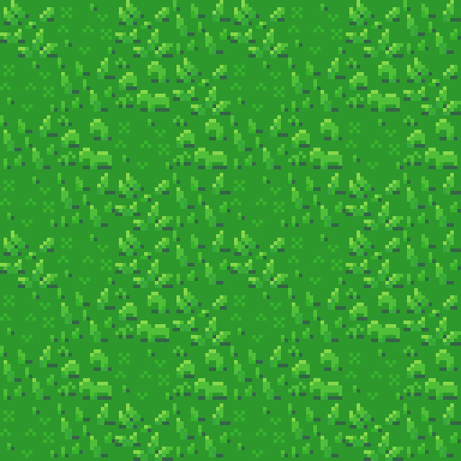
Next, I was going to add an extra tile for each of the current textures to reduce repetition as well as two flower variants for each tile type to add some colours into the textures. I did another test of the tiles’ repetition and overall look and it looked good but somewhat cluttered though I figured that this wouldn’t be an issue when I deliberately place the tiles rather than randomly scatter them.
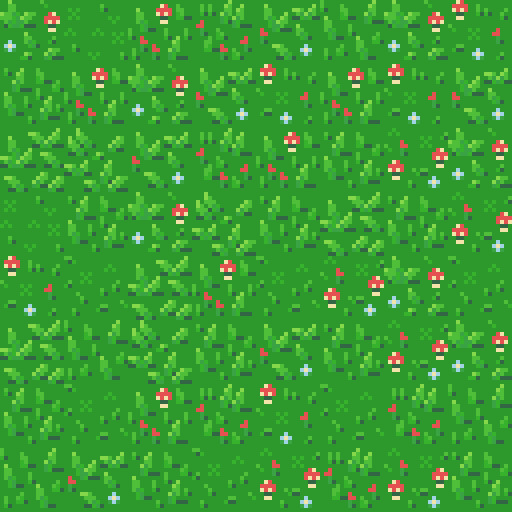
I had in my mind the type of scene I wanted to make for this week, but it required dirt paths. Luckily this wasn’t an issue to make. I made two variations of the straight, one-way paths as they would be tiling and altered one of these tiles slightly to make the curve and intersection tiles.

I then assembled these 15 tiles into the image below.
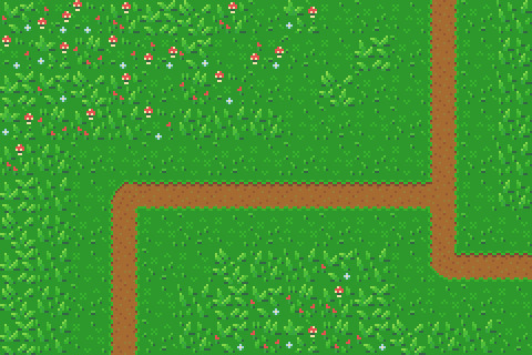
Trees
Next, I wanted to add some plant life which would involve trees and bushes. I decided to do trees first as they would be larger than the bushes. First, I started with the shape of the tree which would be fairly basic. I made a rough tree trunk shape to start with and topped it with a circle that was a little squished before refining the shape a little more to get what’s shown below.

I then added colour into the tree. A simple brown for the bark and 4 shades of green for the leaves. These greens were made by colour picking the base green background and hue-shifting it towards yellow so the tree would stand out more from the background.

The colours are organised into ovals to help give the tree a sense of depth. The dark shades wrap around the edges of the tree to show the tree’s roundness. The colour thins out as it goes around because you’re viewing the shaded leaves from a side-on perspective.
Next, I blurred the lines between these circles by mixing the colours slightly. This was the start of adding leaves onto the tree. Quickly after that, I added more detail to the leaves by spotting the head of the tree with lighter greens. The details added were in ‘leaf-like’ shapes like hearts, single lines, and arrows. They don’t look like leaves individually and can’t receive much detail themselves (such as a stem) but together they make the tree look nice and bushy. I also added some detail to the tree trunk including shading.

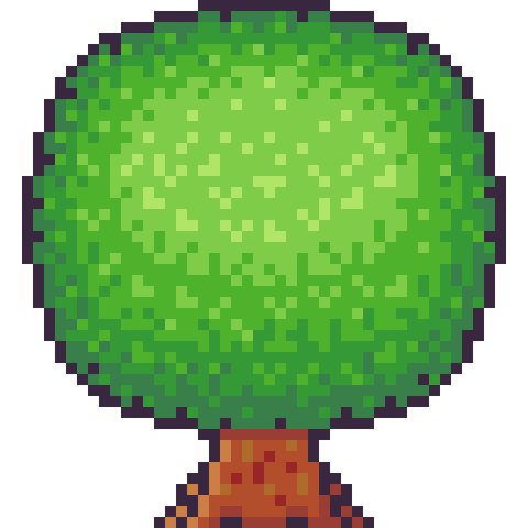
The tree trunk seemed a little off when I checked it out with the image I had so far, unfortunately. So, I added some extra trunk at the bottom along with a nice shadow. This shadow was the colour black at a transparency of 127 (or half transparency). This works really well as a quick and easy shadow on detailed background, but it does, unfortunately, mean the shaded area is not hue-shifted as typically preferred. The final product is below.
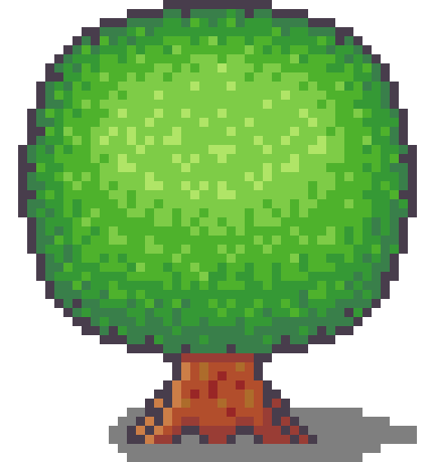
Looking at this sprite you may think it would be difficult to construct a game environment due to the leaves, trunk shape and shadow involved. However, we can place each section down as a separate 16x16 tile with the main trunk tile being a collider and other tiles not having a collision box (like decoration tiles – we don’t want players to run into tree leaves). This works out really well, and I focused on the main trunk tile when positioning the sprite in the piece. Which is shown below.
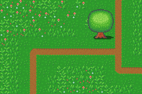
However, the scene below is bit lonely so I thought I’d add some pine trees as a level border. The process of the pine tree is similar so I won’t describe each step but will show the images. This time around I did shape the tree a bit more wildly with branches and leaves sticking out from the tree. I also hue shifted towards bluer colours rather than the more yellow colours I used in the round tree.

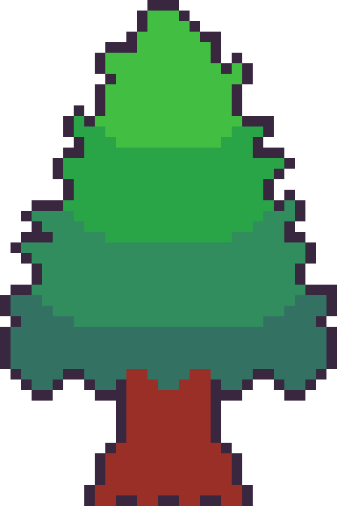
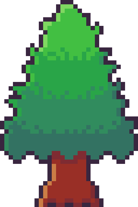

Next, it was time to add more trees into the scene and add some grass beneath them. I made the grass beneath them short grass simply because it looks a bit neater than the other grass types.
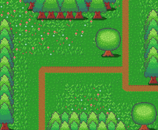
I think it looks pretty neat! I made a pine tree variant by swapping the colours with that of the round tree for some variation which worked as a nice, easy trick. But it would look livelier with some bushes.
Bushes
You might have looked at the trees just before and thought, ‘That kind of looks like a bush on a stump.’ That’s because the techniques used to make bushes and trees are typically very similar depending on the style of the game. Since we’re using a 16x16 size which is somewhat limited they will likely turn out in roughly the same way.

I started with a circle shape that was modified at the bottom to be a bit flatter. This will hopefully give the impression that the bush is touching the ground and rounds out on the top

I did a similar process in colouring the bush as I did with the tree, however, I used fewer colours as I didn’t have as much room for highlights with the bush. The colours used are actually the same as those in the pine tree.
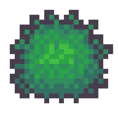
I then adjusted the outline to give the bush a wilder feel as well as texturing the inside of the bush to create the appearance of leaves.
The bush still felt a little flat, so I added highlights to the top of it to add a greater sense of depth. The highlight was rounded towards its end at the bottom to enforce the rounded nature of the bush. This required me to add another outline tone for highlights which I might apply to other elements of the picture. I was pretty happy with the bush, so I made another for variation and added them into the picture with some shadows.
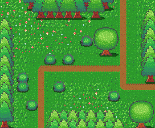
The picture looked pretty good, but I thought some touch-ups might make it just that little bit better.
Touch-Ups/Conclusion
To touch up the piece I added some more trees for denser looking forest, added the lighter outline colour to the tress and expanded shadows around some of the pine trees. I’m pretty happy with how it turned out. I think the shadows could use some refinement at the top border of trees. I also think that top border highlights the repeating pine tree trunk which could also be changed to tile better. I do wish my bushes were a bit leafier than shrub-like, however, I think my ability to make leaves on both bushes and trees will improve as I practice. I also think a 32x32 base picture would allow me to make some more defined leaves. The lighting on the pine trees also uses a different technique to the round tree so next time I’ll try to be more consistent with that. Overall though I’m happy and I quite like the outline highlights as they make the image a bit softer.
That concludes week 4 of learning how to make pixel art. Next week I’ll be looking at sand, water and rocks to make a top-down beach scene.
My learning and this blog post wouldn’t have been made possible without these fantastic resources. Go check them out if you wanna learn some stuff about pixel art!
How to Draw Tiled Pixel Art by TipTut
Creating Variation in Pixel Art TutsByKai
Pixel Art 101: Grass by Pixel Pete
How to Make Pixel Grass Tiles by TutsByKai
RPG Grass Background Tiles by HeartBeast
Pixel Art 101: Trees by Pixel Pete
[Let’s Pixel] Tree by HeartBeast
[Let’s Pixel] Spruce Tree by HeartBeast
Pixel Art 101: Bush by Pixel Pete
203 notes
·
View notes
Last Seen Blogs
yandere-toons
Requests: Yes
cyberfinik
Без названия

feverandfuss
Fever and Fuss
theladypeartree
The Lady Peartree
jaybyrd3x
I Post What I Want 👹