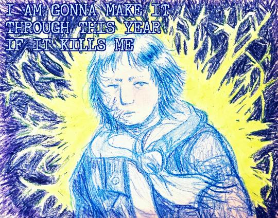
#i have one in this exact color
Text


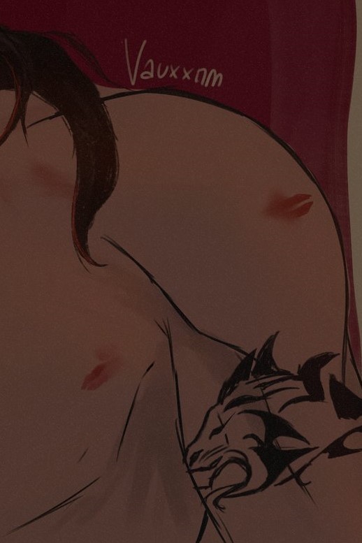


I much prefer the cropped ver than the full finished ver, but it feels like a waste not to post, I worked hard on the tattoo
#twst#レオナ・キングスカラー#leona#leona kingscholar#twisted wonderland#art#what#im quite proud of this#this is my specific lipstick colour actually#i have one in this exact color#haha#lipstick#yeah
242 notes
·
View notes
Text
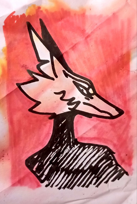
Hello @canisalbus, have this wrinkled doodle of Machete
#very sorry about the look of it#it is in fact a little doodle on a corner of a sheet#which I found again because a cup of water fell on my stack of freehand phone sketches#so it not only wrinkled but it also have soggy colors#I managed to save all of my drawings#very sorry it's not a fancy nor high quality fan art#but I through I conveyed well his proud/annoyed look#(sorry not finding the exact word to convey what I'm trying go say)#well. hope you like it.#thank you for your art it's very good and inspiring and you're one of my fav artists#have a nice day
1K notes
·
View notes
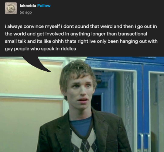
Note
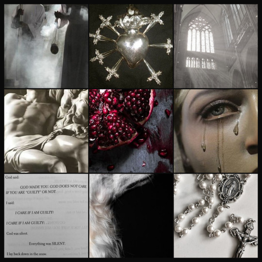
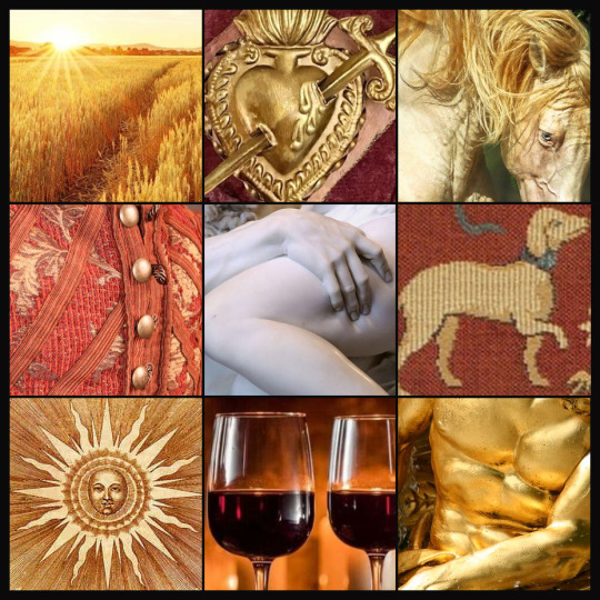
I thought I might try my hand at moodboards, too :')
.
#aaaa these are so good hhhh#holy moly#it's funny I actually considered many of these as well#the Pieta and the weeping Mary#I tried to find a good pic of a trurifer to include the incense somehow but didn't have much luck#that one is perfect#the matching milagros/ex-votos for both is such a nice touch#I WAS SO CLOSE to putting that exact picture of Proserpina's thigh on Vasco's moodboard it was already there but got edited out#same brain cell#I don't know why but the golden field hit me in the feelings it has such Vasco vibes#and it's neat how both of these have a very unified color schemes but the center panel stands out#thank you! I didn't expect another set this was such a wonderful surprise hraah#gift art#dancing-coyote#own characters#Machete#Vasco
308 notes
·
View notes
Text
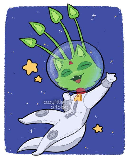
i got an alien aisha from a fountain faerie quest 🥺 i named her cosmica...
#neopets#alien aisha#aisha#cats#art#neopets fanart#nostalgia#y2k#doodles#Twice Ever in my life have i used real life money to buy a fictional currency for pretend items. the second time was to make a slot#just so i could make and paint a brand new neopet bc all my free slots were full. best $5 i ever spent#now her name is not exactly cosmica but i don't want people finding my account. but also i need you to know i got reeeaaallly lucky#with the name. its hard to brag about the name without giving away the exact name asdfjklsdf#i have three fucking aishas. i like the cats ok#there are lots of pets i would like to own in theory but pet slots are limited and i don't want to buy another one#unless they release a really really cute color for the vandagyre. then i will make. ONE more
380 notes
·
View notes
Text
One of the biggest things that makes me see Leo as trans is absolutely the size of his carapace in comparison to his brothers’.
And I’m not talking about height! I’m specifically looking at his shell here, because when you compare him to the others, particularly Donnie who is nearly the same height as Leo, it’s very clear that Leo’s carapace is much longer in proportion to the rest of his body.
Like - standing side by side, even though Donnie is shorter his carapace ends noticeably higher up than Leo’s does. And I like this not only because it really helps push the idea that Leo could very likely be trans (or intersex!), but it’s also just a fun design difference between them.
(It also lends way to future scenarios of Donnie eventually getting taller than Leo, but sitting down still has Leo being the taller one haha.)
#rottmnt#rise of the teenage mutant ninja turtles#rottmnt leo#trans leonardo#rottmnt headcanons#rise leo#trans leo#it’s like 4 am and I’m having trans leo feelings again sorry guys#totally get if other people disagree with me on this! but it’s always gonna be my no.1 headcanon fr#his complexion the vibrancy of his colors staying even in adulthood his general demeanor and this? this hc is LOCKED in my brain#plus the times Leo’s depicted in pink white and blue throughout the series like I KNOW it wasn’t on purpose but damn if it doesn’t help#(his nails are also the exact same as his toe nails/claws but I don’t super count this one tbh)#(even though it is TECHNICALLY another point in favor of trans leo)#(mainly because all the boys’ nails are very much more humanoid than turtle)#(just like how their tails aren’t really a factor either since we see them only in their baby forms and never again)#I really like the idea that he was a female red eared slider pre mutation#and Lou Jitsu’s dna paved how his humanoid features came out (aka a more masculine build and voice)#but his turtle features are all very much more in like with a female res#love the thought of rise bros meeting og comic turtle boys and Leo being like wait you guys are res too?? but…you’re not colorful……#one headcanon I have is that - you know the cute chirping and stuff we have the boys do?#I like to think that Leo’s chirping actually sounds more feminine to himself and his bros (so he tends to not do it)#idk I love thinking about this hc a lot and there’s no time like four am to talk about it huh?#future scenario has future Donnie going up to future Leo all smug like ah Nardo how’s the weather down there#and Leo’s all like good *sits down* why don’t you join me :)#Donnie: …*sits and stretches his neck out to be taller still*#Leo calls him a cheater but Donnie calls it ‘making use of his species’s advantages’#but yeah basically for many turtles the case is - bigger carapace? female. smaller carapace? male.#so it’s very interesting to take that knowledge and apply it here#did you know one of the turtles that this rule of thumb DOESNT apply to is alligator snapping turtles? male ones are the bigger ones there!#by a big difference too so Raph’s size makes a LOT of sense
137 notes
·
View notes
Text
I genuinely don't mean to be That Person and I do think everyone is definitely entitled to their own opinion and nothing should be exempt from criticism but I think everyone criticizing hazbin hotel over the designs is honestly a little mean? Yes, all the characters are stick thin, that's bad and there should be more variety. Yes, the designs are cluttered, not good for an animated show by regular animation standards.
But criticizing the style as something to grow out of in your teenage years? Saying how ridiculous the facial expressions are, or the palette?? Who cares about the general style tbh??
You probably have friends or peers who have similar styles and similar design preferences who are going to see you say all of that and think less of what they do because of it. Vivzie isnt going to see your mean post calling it an edgy art style but your peers are. And honestly ESPECIALLY any younger artists and teenagers that draw like that are going to take the hit.
I'm not eloquent enough to make a better more nuanced post I do think there's a point to be made about how people on this site defend all art styles and want to be supportive of artists and "cringe culture is dead" but the second something is unpopular enough they start riffing vitriolically on how it looks instead of the things actually worth criticizing (of which there are many).
#thunderclap#making this unrebloggable because if this escapes containment its gonna attract so many undesirables#i have reblogged one or two of the jokes that i felt were silly enough but this week i have seen a LOT of posts#that just rag on the art style#and honestly!! who the hell caressssssssss. every single fucking animated show in recent years looks the exact same#they all use the same style the same colors same vibes. hazbin; despite its faults; is actually visually fresh and new#YES even if its visually a fucking mess!!!! it matters a lot that its different looking in a landscape of samey animation!#i dont even a diehard hazbin fan i just thought it was ok but its so fucking annoying to see people say this shit
90 notes
·
View notes
Text
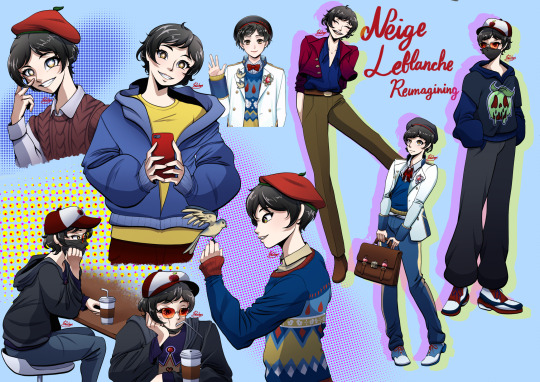
I caved and drew the character I swore I wouldn’t draw (repost)
#I have negative coloration with the word#redesign#so I’m just gonna call this reimagining#especially when this is like—#a type of add on/fix it type of project#I hate him but I do genuinely want him to be a better character#and his design is just— a person thing that bugged me cause I didn’t like how boxy his silhouette look#if Che’nya can have style with the same exact material#so can literally every other one off characters from RSA#disney twisted wonderland#twisted wonderland#twst#twst Neige#neige leblanche#twisted wonderland neige#devilg04#digital art#art
164 notes
·
View notes
Note
if you’re taking requests can i request more sam and max art? your last art of them started up the sam and max brainrot for me again and now i spend my time watching clips from the games on youtube lol
MAN ive been replaying the games myself..........im just so glad that theres someone else who likes them!!!!! OFC you can have more art <33333
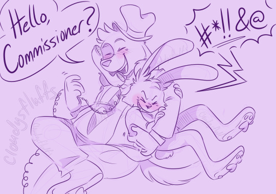
(ns//fw and/or fetish blogs please dni🙏🙏)
#tickle art#my art#sam and max tickle#lee!max#ler!sam#to be h i dont usually go for lee max content just because i. honestly CANNOT see him as being a lee in just abt any context......#and just favor lee sam#BUT. i had this idea and it was just to good to pass up#its sort of a redraw??? the first (?) piece of snm art i ever drew in my life was a little comic#about this exact concept (sam wrecking max to stop him from answering the phone)#but i never posted it and its So Old and So Bad but its too good of a concept to go to waste#IN RETURN FOR THIS ONE BEING MADE SO QUICKLY/IN A RUSH/NOT COLORED HAVE AN HC:#max is most tklish on his feet. bc rabbit feet are lucky :]
98 notes
·
View notes
Note
Not sure if you really do asks but I wanted to know; how you do your little comics?
They’re so high quality, with the painterly style and all, and you seem to make so many of them!
my ask policy is i'd like to do em better but generally if i dont reply instantly or have an easy answer i'll let them gather dust in the box and fail to ever get to it
luckily for this one i have an easy way out since i can just point you to the post i made on that a while ago which is pretty much entirely still valid
#replying/reposting for a reminder i guess#still use the exact same pen and brushes & my watercolor tray is still that nasty#this post or another version of it shouild have ended up in an FAQ section that i never got around to make either#extra details huuhhhh idk#uncolored comics backlog is still pretty bad if i dont get back to it efficiently enough i'm at risk of runnin out of colored ones 2 post#due to being day-busy again past few weeks i'm even dealing with a couple comics not having been entirely drawn either#not great not ideal the funk i'm in is still preddy real#eh i'll work it out#bla bla bla
53 notes
·
View notes
Text
If you surrendered to the air you could ride it.!!! .....I give up, I surrender etc.
#this is technically sort of semi inspired by an old mike crew drawinf#my art#mike crew#tma#the Magnus Archives#need to go down the mike crew tag again#problem is 90% of it is he shows up in one chapter from some unrelated tma fic. on account of being a side character LE SIGH#i know why that is the case but like stilllllll le sigh. just bc he had like 3 episodes worth of content doesn't mean i haven't created#rich inner world of him.#when people draw him blonde it is so frightening..#unrelated i just always think that when i see those designs#like the dogs with bright blue eyes. im shakign please give them contacts etc#i have 1 million drawinfs of mime crew this exact angle pose face drawing medium color scheme etc..#umm whats that quote. about art and obsession#*guy at the party meme* they don't even know all the sing lyrics i relate to him
40 notes
·
View notes
Text
#am i the only one who is always weirded out by how his t shirt is the exact same color as the blue trim on the theater?#i'm not even going to talk about his choice of date outfit but i guess he probably doesn't have a lot of non uniform clothes#like minds#alex forbes#eddie redmayne#like minds 2006#murderous intent#murder boyfriends#nigel colbie#nigel colbie x alex forbes
41 notes
·
View notes
Text
Adventures in the Capitol (part 37 on Masterpost)


And here's the masterpost link if you would like to read the rest
#rune factory 5#rune factory#rf5#fancomic#aashi doodles#rei has a lot more siblings coming up and ofc one of them was going to be training to be a knight as well#i went a bit insane again and colored this all in one sitting#bleh#am i going to make a bit of a weasley's family dynamic for rei's family ? why yes . yes i am#omg me thinking abt weasley's in the exact chapter that i give ares round glasses#damn subconcious she is a powerful source#why does ares have round glasses this chapter u may ask#he lost his last pair in the lake during the Bea and dragon event and i got bored of the reactanglish ones so for now he has round ones
34 notes
·
View notes
Text
“The production design has evolved into an angular, grungy, asymmetrical setup, borne out of the ‘dirty nightclub in an arena setting’ creative brief I was given,” Taylor said, citing the creative influence of Matt Vines and Seven 7 Management. “Louis is a phenomenal performer, and the crowd is captivated the entire time. We started knocking ideas around, speaking to Louis about his inspirations and influences, which we then developed into a creative deck... reflective panelling and fabric were printed to look like heavy concrete slabs... to provide a “low-level, clubby feel” to the set...in closing, Webber referenced the ‘rainbow-inspired’ track, She Is Beauty We Are World Class, which demonstrated the strength of the special effects package."
#tech design#production profile article#the rainbow bit is slightly off topic#but I know what the people want lol figured folks would enjoy that#the article tells us exactly what lights they use to acheive it which I actually found fascinating because it allowed me to go look#to see if it was a package thing they just used or not and no#it's custom arranged to be like that they will have had to program each exact color just so#also the pattern they use for saturdays is not one of the standards that comes with the light
27 notes
·
View notes
Text
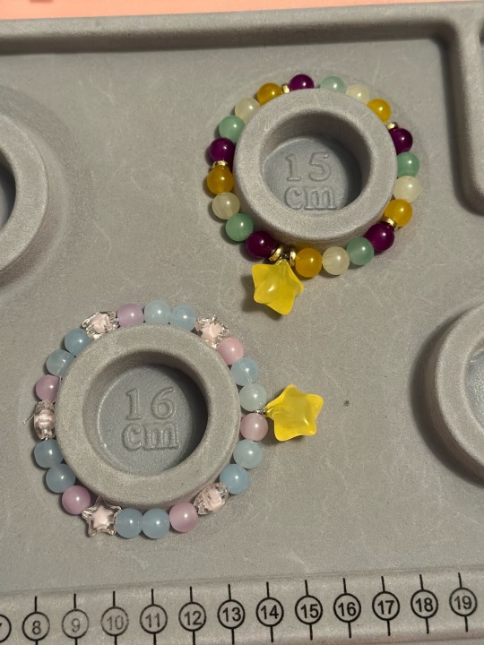
Johnny Joestar and Gyro Zeppeli inspired matching bracelets!
#my art#jjba#jojo#johnny joestar#gyro zeppeli#I didn’t have the exact colors but I tried my best to match#I really loved how the one for Johnny looked the star beads were my favorite part!
17 notes
·
View notes
Text

☠️➕⚾️🟰💛
A gift for @oh-gh0st of Shinushi
#hahahahahahhahahahaha#i have had this illustration stuck in my mind for over a week and finally just had to draw it before i went crazy#like idk i just …….. remember asking them abt typical dates and they hang out a lot#and i further asked them in dms if they would play at the park together and they told me shinrei would watch jyushi play#and i just got the vivid image of him doing this exact pose on the swings and shinrei just watching him#and i juust… they are so cute to me they are so perfect#one of my otps when it comes to friends insert/canon ships for ososan#they are so cutie#i also wanted to mess around with a like more rough textured coloring shading style?#i was just messing around#i hope it looks so#ewhat decent#but uhhh yeah i hope u like this ghost#sorry if it wasnt ok that i did this but i hope it is… i like them and hold them in my hands like that image u drew last night#ososan#osomatsu san#shinushi#jyushimatsu#my art#spice.ososan#;3; ty
64 notes
·
View notes
Text
Honestly I think it would do us all well to go back to kinda cringy feminism again for a little bit idk cause I think maybe for some people the discourse somehow circled back around to supporting sexism just rebranded or whatever so its more aesthetic
#personal#instead of progressing the discourse into idk more inclusion of women of color and trans women#it went in the direction of like glorifying women being stupid and romanticizing beauty standarts#also weird centering of men all over again in feminism and in general for some reason#remember in the early 2010s when emma watson was like obliterated for that 'he for she' campaign#because it prioritized men in feminist discourse and then thats the exact direction where things went later on (and where it is currently)#people care more abt like 'haha this is my golden retriever bf he drinks respect women juice!' than about actual women speaking abt feminis#like being a feminist isnt about social change and women prioritizing each other its abt how dudes are hot when they do the bare minimum!#also have you noticed the rise in lesbophobia both in the sense of persecution of lesbians themselves#and of lesbians relationships and culture which other wlw are also part of (its giving lavender menace)#and also remember how we had the me too movement and then immediately after#everyone still fell for a smear campaing against a victim of domestic abuse?#anyway i would really love to get back to basics of like women should support each other!#and beauty standarts overwhelmingly negatively affect women and girls!#and we still need to incentivize girls to seek out intellectual pursuits especially in STEM and leadership roles!#because we continue to be underpresented in those fields and the only way to enact change is to bring our perspectives to those areas#instead of asking politely for guys to throw us a bone!#also stop acting like its cringe to openly and vocally center and prioritize women in every sphere of our lives possible!#and also maybe go back to actively trying to do that! and considering that a good thing!??#because we're the ones who should have our backs most of all?? idk idk#also where are the teeth??#why is everyone so afraid of being angry now???#its like some people circled back to being afraid of being mistaken for man-hating or something#just for pointing out common sense aspects of oppression without adding an asterisk about how men suffer too!#i thought we all knew there is no such thing as reverse sexism!!!#idk!!!#and this isnt me condoning choice feminism many women are evil and actively work against their own interests#or antagonize other women to make themselves feel important such as terfs etc#but idk its like everyone internalized that 'well women can suck too' so hard that its become like#'*most* women suck and we dont even have to keep trying to empathize and prioritize each other and our issues anymore'
25 notes
·
View notes
Last Seen Blogs
tobioemoji-remade-blog
i remade
5stargold
⭐️5StarGold⭐️

mannyharlem
mannymusings

nunuxhoho
Nunu X Hoho
casualswiss
Gone West