#redesign rants
Text
My Reimaginings for the HB/HH Rings + Hellborns
My ideas for a redesign of the setting and its inhabitants to have it make a little more sense! I'll put all this under the cut so it won't be too long on the dashboard:
Okay! So, I've noticed QUITE a few slight discrepancies between some of the rings. I wanted to share how I would do it, based on some critiques I've seen. This is in no way anything negative, I just want to share how I would do it. With that in mind, know that I tend to be a bit blunt with my criticism but know that it's out of me thinking that it would be the obvious option, personally, and not out of any rudeness.
The Flaws
I want you to know that I in no way know anything about demonology, but I do know a bit about Dante's Divine Comedy and the emotions associated with colors. I'm going to go down the list in the show's order, one by one, and then give my versions at the end.
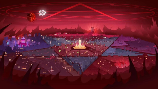
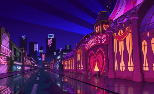
First is the Pride Ring, where the main cast of both shows reside. Now, I want to point this out: why are ALL of the sinners only confined to this ring? That doesn't even make sense from a biblical retelling perspective. Didn't the entire journey through Inferno show that there were sinners on every level of Hell?
Anyway, first off, I really don't see this as the Pride Ring. I expected this to be the Wrath Ring, which is what I thought until I saw the actual Wrath Ring. There's this thing called "color psychology", which is the study of how colors influence emotions or give clues to the atmosphere of someplace. Historically, purple has always meant royalty and wealth, since it was the most expensive color to dye your clothes in. I think that would be a more fitting color for the Pride Ring. As for the design, It's cool, but doesn't say Pride. It says New York, which I think would be the opposite of Pride.
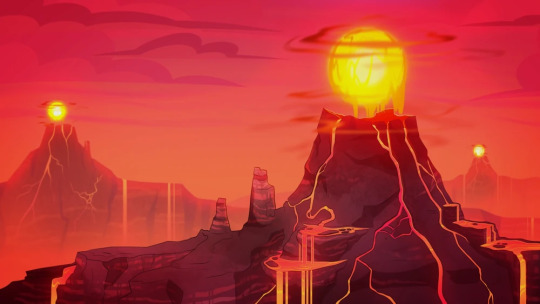
Next is the Wrath Ring, which looks great. I have no actual criticism of the ring's design itself since it fits really well. I like the volcanic elements and the fiery sunset sky, and the fact that it's where many hell beasts/animals reside makes sense. Also, it is mainly rural and has fire-related weather (flaming tornadoes) which also makes sense. I have no fixes for this. Good work!

The Gluttony Ring is the same way. I appreciate the fact that the sky has hexagonal shapes in it (not shown above) and that it's mainly plant life since the actual Beelzebub is an insect, and most people associate insects with being outside. There are a few things I'd change, like pushing the plant aspects a bit and having the buildings look more like various insect nests, not just beehives, maybe a few dens or plant-inspired buildings (I really like how Zootopia's world is built because it was made with the builders in mind: animals. Since they use organic structures in real life for their homes, they made some buildings have a curvature that fit their "ancestor" instincts, it even extended to their cars at one point. I highly recommend reading The Art of Zootopia to see their creative process with a bit more polished language).
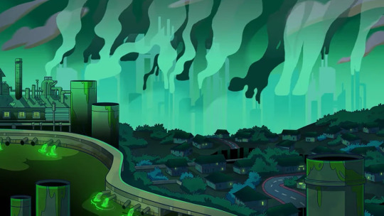
Okay, why did they make the Greed Ring green?? Everyone knows that green is the universal color of Envy, so why is it here? I get that making it green works much better than any other color, and I agree, it does look better, and it's the same color of money, but I have an alternate idea. Make the Greed Ring yellow.
This might not sound like a good choice, but here's my reasoning. I love that the Greed Ring is a polluted, overly industrial cityscape, that fits amazingly. But if you look at real-life smog-filled cities, what color are they?

Yellow. Or at least a dirty, dark yellow-brown. So what I'm saying is that you don't even need to make it a bright yellow, making it a dark yellow-brown would really show how filthy the Greed Ring is. Also yellow is the color of gold so it also makes sense symbolically.
I have my gripes with the Lust Ring. Why is it dark blue?? The color symbolism was right there, pink and red are the most associated colors with lust!
However, I do like the fact that it's always night in the Lust Ring, it's very symbolic of the "nightlife" aspect of the emotion. I just don't know why they chose a normal sky color over something else.
I am a sucker for good color combinations, but I don't really think making the night sky dark blue made sense. It doesn't even have to be a drastic change, just shift the night sky's color to the warmer side a bit. If the ring does have a day and night cycle, and I'm just stupid, make the day go from hot pink to light pink from top to bottom, then have the night sky go from red/magenta to hot pink, with white stars (or just make the sky a lighter version of those two options). It would look mega pretty!!
The Envy Ring is one we haven't seen yet, but I wonder what we'll get since we already used up our green card with the Greed Ring. Someone I was talking about this with said that since the Envy Ring is ruled over by Leviathan, the ring will be ocean-themed and blue, like the ocean. I like that idea since sea blue is, in fact, a real color (and I also think that those 2 twins from the Mammon episode are from there, because of the way they acted and since they are fish-themed), and the theme fits. But the problem is. Sea green is a real color too.
Wait, this was the Sloth Ring?? I assumed this was part of the Lust Ring because of the colors, and because I was holding onto some hope of the color psychology making sense!
But. I LOVE this ring. The more pastel color of the ring actually relaxed my eyes a bit, which I think was the intention. I love the floating islands and the waterfalls, it all gives off a very relaxing atmosphere. My only design change would be to change the sky to a color like baby blue since blue as a color is actually scientifically proven to reduce feelings of stress and anger.
My Rendition
Now that we have all that out of the way, here's my version of how I would've done things.
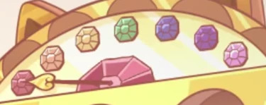
I would match the colors of the rings to their corresponding color. I would arrange them in the way that they are in the show, but we'd risk that cool rainbow gem order up top. But if we want to arrange them in rainbow order, they'd be inaccurate to the order of the rings in Inferno (I think??), so you can choose which order you'd like, I'm just doing this for myself. Also I realize that they aren't really based on the nine levels of Hell, but the 7 Deadly Sins, which is fine by me, I find that making more sense.
Red = Wrath (an obvious choice, since red signifies strength, danger, and actually stimulates energy in real life)
Orange = Gluttony (it just makes more sense than yellow, plus if we're assuming the bee motif, it's the actual color of refined honey)
Yellow = Greed (color of gold and matches the smoggy city it's depicted as)
Green = Envy (another obvious choice, plus since Leviathan rules over this ring, it would match the ocean aesthetic as sea green)
Baby Blue = Sloth (soft blues actually cause a relaxed response in the brain)
Purple = Pride (color of royalty, also associated with arrogance and wealth)
Pink/Hot Pink = Lust (OBVIOUS CHOICE)
The Hellborns
Now my headcanons on what the overall citizens of each ring would be. I actually have an idea for slight species dimorphism for all the imps in each ring but I'll have to design that another day. I want my rainbow imps dammit
The Wrath Ring would have the highest imp concentration, with any other demon species being the lowest here. Imps who are born here are red in color, about the same shades of red that we see in all imps in-show.
The inhabitants of the Gluttony Ring should be bug/insect demons since the ruler of the ring is literally an insect. Imps born here are shades of orange.
The Greed Ring would have those shark demons seen in Exes & Oohs, but someone I was chatting with said it would make more sense for all the aquatic demons to be in the Envy Ring, so I don't know. Imps here are born in shades of yellow.
The Envy Ring would have mainly fish/aquatic-themed demons. Imps born here are shades of green.
The Sloth Ring should make the demons there have more themes of ungulates or ruminant animals like goats, sheep, and pigs because Baphomet is not a demon species. Imps born here are shades of blue.
The Pride Ring is where demon royalty mainly resides. Imps are rarely born here and if they are, they're usually born into servitude. Imps born in this ring are purple.
The Lust Ring is where incubi and succubi live (like Verosika). Imps born here are shades of pink.
For Hellhounds, I think they should be found in all rings rather than mainly in the Gluttony Ring. Even though the reason that's where they are is because Cerberus apparently guards this ring is very clever, it doesn't make that much sense. I also think they should all be grayscale and have their eyes correspond to the color of which ring they were born in (I love achromatic color schemes with one bright color to add color to it).
Anyway, those are my thoughts! I hope you enjoyed this interpretation of mine!
#redesign rants#hazbin hotel#helluva boss#hazbin critique#helluva boss critique#hazbin critcal#helluva boss critical#I'm not really ''in the fandom'' enough to call myself this but I've watched the shows#long post
66 notes
·
View notes
Photo
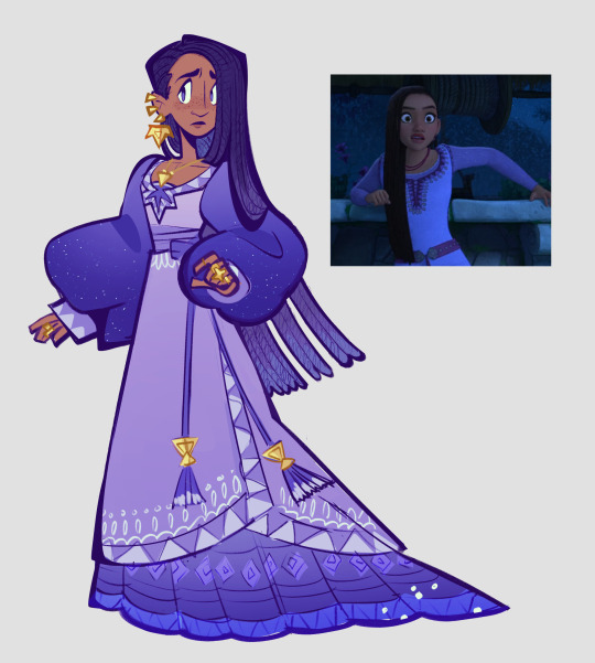
ive been so sick past week but seeing the new disney trailer for Wish awoke something petty inside of me. So petty I went bout redesigning the protagonists look cause I’m sorry but her outfit...? Kinda bland. Wanted to try adding lil bit more ‘oomph’ to the design.
#disney#disney wish#like its so blatently designed with the toy in mind#i do like her hair and i like purple but shes not giving me much#redesign#i guess#on twitter i tried being nicer but in tumblr im tearing into it i ranted to my friends online#how much i dislike recent disney designs cause theyre so safe#then again the god damn mouse has always been safe
3K notes
·
View notes
Text
"because its hell" doesn't hold up.
When you create a setting from scratch, you have total control over it. You get to make the rules. You can't excuse a flaw in writing or presentation with "it is hell, it has to be this way!"
Here is one paraphrased example from Hazbin Hotel I've heard recently in response to a critique of calling the main characters too reliant on pinks/reds:
"All the characters have red in their color schemes because they are from the Pride ring and the rings are color coordinated."
While this gives an in-character/in-lore explanation for the color schemes, what it doesn't do is change the fact Hazbin Hotel's characters having a hard time standing out from the background. An in-character/in-lore justification should NOT be prioritized over the overall quality of a project.
As a writer, you have control over the constraints of your story. If you write yourself into a corner, you can't just throw up your hands and give up. You have to be willing to rework your lore and stories to make them stronger.
If excessive cursing is grating and making certain moments within your story less impactful, you should reel it in because it makes the presentation stronger. If your color based lore is causing the visuals of your project to suffer, it is time to reassess the lore.
Just because something is logically consistent within a world, doesn't make it a good writing/art choice.
A setting's rules should serve stories and characters, not the other way around.
#please... stop using that as an excuse. it is an admission that the writers could have fixed the issue by thinking through the-#worldbuilding/lore more... but they didnt. Anyway#that's my personal take/rant on how stories should be written.#hazbin critical#hazbin hotel criticism#vivziepop criticism#hazbin hotel critique#hazbin hotel redesign#helluva boss redesign#vivziepop critical#helluva boss critical#hazbin hotel critical#Dys rants
514 notes
·
View notes
Text
Flash warning!
What’s worse? Your greatest shame coming back to life, or your greatest shame coming back to life and being happier than you?
Tldr: I rant about the most homophobic lesbian
Remember I made all this up! And I love reading all the replies yall leave!
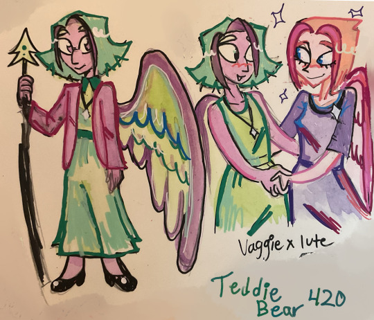
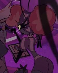
So there are a lot of songs that make me think of vaggie and lute, the angst of killing your crush and being attacked by your best friend is just so juicy, plus friends to enemies to lovers is one of my fave tropes ever!!
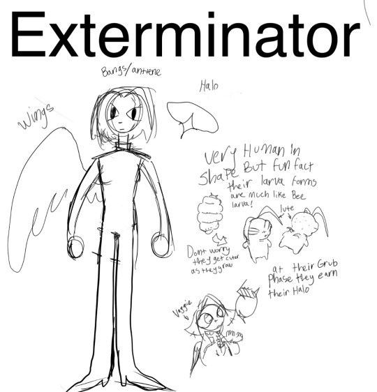
I’ll always wonder about what vaggie and lutes life was like before the betrayal? So in the perfect world exterminators are heaven born critters, grown from bug eggs, they are raised to protect heaven from the outside in, basically they were born and raised to be nationalist soldiers.
Military indoctrination with bugs
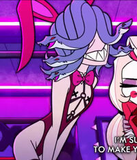
Oh! And a design element with the halos is that every angel type is different, like the exterminator halo has a 4point star! The cardinal directions! And they can magical girl transform, that’s why I draw lute with a star pin/necklace.
But back to toxic yuri

Lute has this contradictory mind set, she is the most holy thing and can’t be capable of sin while also being the most wicked thing in all creation, capable of great acts of violence.
She loves the violence but she hates the shame and guilt that comes with that, so she takes it out on other things/people. Then she starts to hurt her friend, who she has a crush on btw. Very bad for her holy ego, she loves vaggie, but she also hates the way that vaggie makes her feel. Vaggie alway had the softest wings, and the brightest eyes, lute loved to smell vaggie, lavender, she recalls.
Lavender makes her feel safe and angry at the same time, it makes her face hot and tummy sick.
She had to get rid of vaggie to make all these difficult go away. It did at first, she had Adam, Emily and others to distract her. Lute became the second in command and personal chaperon to Emily! She was living the dream! She believes that it was for the best that she killed her crush, vaggie had to be put down for her sinful, tempting ways!
But the guilt and shame finally come to a head when she sees vaggie again in heaven
And not only alive… but alive and happy with some demon!
#teddz stuff#hazbin hotel#hazbin hotel redesign#hazbin hotel critical#hazbin hotel lute#vaggie#vaggie x lute#very long rant!#i’m crazy#what do y’all think about the exterminator halo concept I did here?#I think it’s cause they need to blend in with the rest of heaven#so their entire fit changes in and out of uniform.#lute x vaggie#fallenwings
144 notes
·
View notes
Text
Being in multiple fandoms is so tough as an artist cause I want to draw everything, but I have time to draw nothing ahhhh. Even when I do just picking what I want to do is it's whole issue.
#I want to do next gen mlp cause that was something I've thought about since I was like 12#I want to expand on my lmk aus#I want to draw more Meows Morales and Friends stuff cause it's adorable#I want rant and rave about the mess that is Helluva Boss and make redesigns and rewrites for funsies#...I also want the four years of my life I spent waiting for it to get good back#I want to draw Epic The Musical stuff but I CANT DRAW PEOPLE#I want to make art for the animated movies I liked as a kid like Lion King and Balto#I want to make jttw art#suffering. sobbing. dying. so much to do no time
270 notes
·
View notes
Text
gonna be honest… i don’t like the ninjago fandom outside of tumblr. it’s like they’re the people who don’t make an effort to understand anything outside of their own reality. i just saw someone literally ranting about how lloyd needs to stop being mad at garmadon because it’s “not a big deal” and “old design lloyd would never”.
like…??
1. old design lloyd (literally just pre-puberty lloyd) WOULD (exhibit a: how he reacted to his mothers return [post about that coming tmrw]).
2. OLD DESIGN LLOYD HADNT BEEN THROWN THROUGH A BUILDING BY HIS FATHER.
DOES TRAUMA MEAN NOTHING TO THESE PPL?!?!!?
and on top of that, they said “old design lloyd wouldn’t have gotten scared of his reflection”. best friend… old design lloyd wouldn’t have k*lled the overlord either. it’s not in his nature. say old design lloyd got oni form. i bet my whole bank account he would have been just as horrified by his reflection. im fully convinced the tumblr community is the only group of people who actually care about character development and progression because all i see on instagram, youtube, and twitter (through screenshots) is just bitterness at the redesigns and a lack of understanding that trauma actually effects ppl and isn’t quirky.
#llannas rants#i promise i will stop talking abt this at some point#i just get so frustrated when people don’t even make an effort to understand a character#lloyd’s personality didn’t change much after the redesigns#but outside the safety of tumblr no one seems to realize that#RAGH WHY DO I GET SO WORKED UP ABT LEGOS#ninjago#ninjago fandom#lloyd garmadon
117 notes
·
View notes
Text
Just remembered how much I love my villager redesigns


The most ever. Probably my favorite mob I've redone
#minecraft#mineblr#minecraft art#minecraft resource pack#minecraft texture packs#minecraft cottagecore#sorry for the lazy flatworld screenies i was testing something#i forgot how much i love my villager redesign and i needed to rant about them
83 notes
·
View notes
Text
a Persephone panel edit!
I love Persephone with short hair honestly, it was cute (just maybe in a different style so she doesn't look like a Rachel self insert) and I loved her lighter colors in the pilot and earlier seasons compared to the highlighter pink we see now. Also wanted to add some green in there, since goddess of spring and all.
Lore Olympus, the panel, and the LO interpretation belong to Rachel Smythe and her crew!
#anti lo#anti lore olympus#lo critical#lore olympus critical#lo rant#lore olympus criticism#lore olympus edit#lore olympus redesign#lore olympus rewrite
246 notes
·
View notes
Note
If you had to write Helluva Boss, what would you change?
Get ready for a long ass rant. I’m actually planning on doing a full rewrite of Helluva and Hazbin with redesigns as well. But the major things I would change for Helluva are:
Blitzos and Stolas’ relationship: How they met will be the same as “The Circus” but they actually form a bond. Like, Blitzo is bored from being forced hanging out with Stolas by Paimon but after Stolas shows him his interest for pirates, he immediately becomes interested and they talk and play pirates like little kids do and Stolas falls for him even more. Then after they met again in the timeskip, instead of Stolas getting sexual and Blitzo SA’ing him, Stolas tries talking with Blitzo and telling him how much he missed him and even confesses his love for Blitzo but notices that he is trying to steal the Grimore and decides to make a deal with him that Blitzo could have the Grimore but meets Stolas once a month on the full moon to give the book back and just hang out. They do eventually fuck after a while but they actually both consent. While Stolas actually loves Blitzo, Blitzo wasn’t interested at first but as they continue their relationship, he actually starts slowly gains feelings for Stolas, but due to trust issues and his dark past, he tries to hide it.
Striker: He is going to remain mostly the same, but there are some changes I want to add. First off, he doesn’t make fun of Moxxie for not having much physical advantage like he did in the introduction episode, in fact, he actually gets along with him and relates to him. And second, his plan for stopping the Goetia family and bring equal rights to all creatures of hell will remain, but he won’t be presented as the bad guy, more of a gray area at first, then he realizes that Stolas isn’t like the rest of the Goetias and regrets trying to kill him before.
Millie: As shown in the show, shes just violent and loves Moxxie to death. While that’s great and all, there needs to be more outside of her relationship with her husband. In my version, she very overprotective of those she loves, violent, loves her husband to death, has family issues, sibling rivalry, especially with Sallie May, secretly has self confidence issues, sometimes speaks unclearly due to her verbal problems, on the autistic spectrum, has severe anger issues, and hates being alone. Also, the reason why she hated Chaz so much was because he has secretly cheated on her multiple times and all Millie wanted was someone to truly love her.
Blitzos relationship with Moxxie: It’s mostly the same, but Blitzo doesn’t call Moxxie the r-slur, isn’t ableist towards him, doesn’t SA him, doesn’t threaten to rape him, and actually treats Moxxie better after the events of “Truth Seekers” and even forms a good, healthy bond with him.
Sallie May: I think she’s cool and all but I wished that she had more character since she was merchandised so much. In my rewrite, she’s actually going to be shown as an actual character. She’s going to be shown as confident, high mighty, has a sibling rivalry with Millie but she cares for her and even killed for Millie before.
Stella and Octavia: For Stella, she won’t be shown as a complete antagonist. Stella was arranged to marry Stolas since they were children but she wasn’t a complete monster, though she had anger issues. Stella actually cares for him and Stolas and Stella actually had a pretty good, healthy relationship before he cheated on her. She was heartbroken after that and the reason why she hired Striker to kill Stolas was because the family manipulated her too. For Octavia, everything’s the same, except that in my rewrite, she doesn’t completely forgive Stolas but she doesn’t hate him and Stolas actually improves as a father and he and Octavia slowly start to have a good father daughter relationship again.
I know that was a lot. I like to rant so if you want me to share my ideas for my Hazbin rewrite, expect more of my rants.
#helluva boss critique#helluva boss criticism#vizziepop critical#helluva boss#helluva boss redesign#helluva boss rewrite#i like to ramble#i like to rant#stoliz#stella helluva boss#octavia helluva boss#striker helluva boss#blitzo helluva boss#stolas helluva boss#moxxie helluva boss#sallie may#millie helluva boss#paimon helluva boss
178 notes
·
View notes
Text

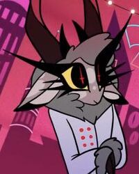
Pentious but redesigned as an Eastern Hognose snake!! I love hognoses so I had to create Pentious as one :]
#paws draws#art#my art#fanart#I have so many reasons for him being a hog nose I will rant if anyone asks#hazbin hotel#hh#hellaverse#sir pentious#pentious#hazbin hotel redesign#hazbin hotel art
23 notes
·
View notes
Text
Blush Blush Controversial Opinion ™️
The title is a joke, I don’t think this is really that controversial but I’m not sure
(Heads up for long kinda-ranting and long-winded nitpicking)
.
.
.
.
.
.
.
.
.
.
.
.
.
.
.
So I have gotten the news that Seth has been added as a dateable boy and I went to the Crush Crush wiki to look at the new info added on the pages and to also save some pictures for reference (I normally do this) and after a few days, I have come to a conclusion that idk if anyone else has about Seth, but I don’t think that his design is very… “demonic”, I guess?
I’m not saying his current design isn’t good, I LOVE his design and how cool it looks, and I think his animal form is one of the coolest looking in the game yet, it’s just that his fully changed form isn’t that demonic-looking at all. I have also had this thought when I did his Phone Fling, he just looked like a Regular Guy, and when he was added as a dateable character, this just confirmed that thought for me.
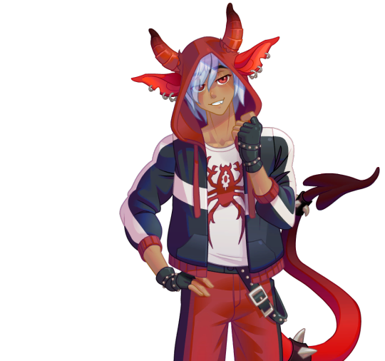
His hybrid form looks more like a demon than his actual form!
I’m not in any way criticizing the artist for this game, they can draw things I wish I knew how to draw, and to be fair, it is an anime (?) game and they do have to make the boys look somewhat like that. I can just headcanon that this is just a form Seth takes on in the Overworld to avoid drawing attention to himself, but I also wanted to edit some things, just for me and for some practice on how to do this. I’ll just say that I made a form that he takes on at the house, where he is not as susceptible to being spotted by people. Keep in mind that you don’t have to agree with me on this, this is all just my thoughts on this.
Breakdown
So, I wanted to go over each feature that I thought needed some work in order to give a better understanding of the things I am talking about.
First are his eyes.
Seth’s eye color is pretty unusual for a human (red), but in this world humans can have any eye color including purple (Dmitri), yellow (Volks), and orange (Eli, although in some expressions his eyes are brown). At least I expected more unnatural eyes, like slit pupils. Nothing too extravagant, but at least that. I will add this to my comparison.
Second are his physical features.
There is nothing to know that he is a demon apart from his horns. Not even little things like making his teeth (or just his fangs) slightly bigger than normal or little details like that. If you took away the horns, you wouldn’t even know he was a demon, but I like the creativity that his hood has horns to hide his actual horns. The horns are a bit too small and almost look decorative, not like an actual part of his body. I at least expected a type of tail. I will once again headcanon this as he hides his tail when in public to reduce suspicion of him, but I will add the tail in my revision. I also made his ears pointier, which I thought was a hallmark of demonic creatures, but that’s probably just me.
Third is a major pet peeve of mine, the hair. (Oh my gosh, I need to put a small rant warning here):
I have noticed that this is a problem with almost all of the guys, the lack of almost any body hair. They all either have no body hair at all or when it is drawn, it looks like an afterthought. They all look completely hairless and weirdly shiny like they’re covered in oil, when skin usually has a matte texture (not shiny/glossy). Men have a higher amount of body hair, and I am not saying to just completely blanket them in hair, but at least add something like arm or leg hair or something. I have noticed this after a while and since then, and today, it looks weird every time I do. It’s like SPS is almost scared to add anything but facial hair to them. It can be a hard task to add hair to a character since it looks off sometimes, but you get better at it over time and it gets more natural every time you do it. I’ve been scared of adding facial hair and body hair in general because of how weird it would look, but I’ve gotten more comfortable with it. And idk if anyone has said this yet, but facial hair can do wonders in aging a character. Every male character I’ve added facial hair on immediately looked somewhat older. It sounds like I’m overreacting, but holy crap, it makes a HUGE difference. I know that everyone is not into body/facial hair, but it was just bothering me. Seth is a 918 year old demon, he should have some sign of aging! But then again, idk if his age in “human years” is something younger, since I assume demons are immortal, so this is just a speculation that he should look slightly older than he did look. I tried not adding too much hair on his body and face, and I tried following the male body hair pattern, but I’m still pretty new to this. I also fixed his head shape since I thought it looked kinda weird.
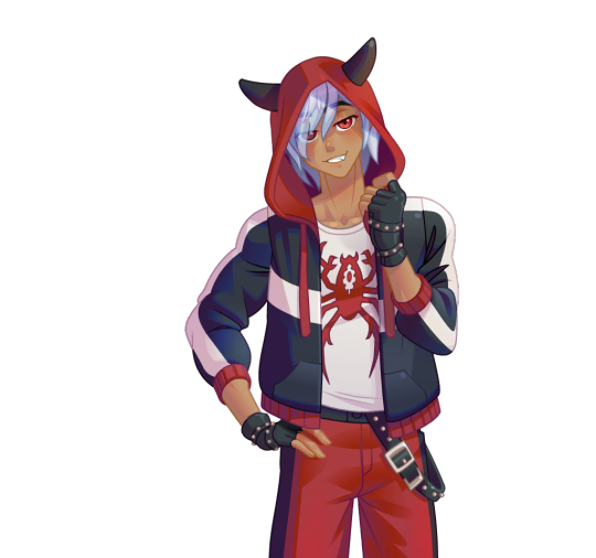
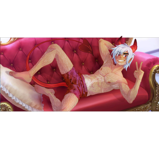
Revision
Here is my revision of Seth (I used the Lover event photo b/c it shows what I was talking about better). Idk if I overdid it or made him look too old or what, but I think I did pretty good overall.
.
.
.
.
.
.
.
.
.
.
And here is a gif comparison between the original

Feel free to tell me what you think!
Again, this is just my opinion on him. You do not even have to agree with me, I just wanted to share my thoughts and see if anyone else felt the same way.
14 notes
·
View notes
Text

I liked the sketch a lot :>>>
The fake episode has been rotting my brain
#I also fell in love with the sketch pencil and also the redesigning of Ink mk#Summoned ink mk is completely different from the actual curse since it’s what mk remembers of the curse#lego monkie kid#lmk#my art#monkie kid#lmk qi xiaotian#lmk fake episode#lmk mk#speck art#let me rant let me rant let me rant let-#lmk ink mk
69 notes
·
View notes
Note
2. What's your favorite and least favorite design in either show?
9. Since you mentioned drawing your redesigns, I have to ask - is there any way I could see Verity having a jolly ol' time on a swing? I was looking over your art again and the thought just struck me on impact out of nowhere.
13. Where does Lilith fit in Hellbound Hostel? Is there anything planned for her yet / concepts you're tossing around?

9. I know this probably isn't what you were imagining but!!! I love conversations on swings and I wanted to draw Eden and Verity together.
2. Favorite and least favorite designs are hard to figure out, most designs I like have glaring details I don't and designs I dislike have potential somewhere in the design. I'll pick the ones from Hazbin that I like/dislike the most as they are, speaking roles only.


Carmilla Carmine is my least favorite design. Her hair completely throws her design off balance imo. I hate the fact none of these characters have ears and I thought Carmilla’s earrings were dangling from her hair at one point. When her hair is down, her design is better I guess… but then there isn't anything that screams hell or sinner in her design. The hairstyle at least alludes to horns, without it she is just a grey human with red eyes and slightly big arms. I kind of wish she kept her extremely long fingers from the pilot, but that wouldn’t tie in well with her fighting style imo??? Eh.

Breaking my own rules since they never speak but, but this design ruins every scene it is in. What an attention grabbing eyesore, it was impossible to watch the overlord meeting with her just sitting on the side orz


Sir Pentious is probably my favorite design in the show, but the story behind his design just makes me sad. I don't like his tail and the eyes pasted all over it, slithering on your eyes?? ow. The hood acting like hair and flaring out is very enjoyable to watch. His palette is also more balanced than most characters. Prefer him without the hat though.
Breaking the rules again, my real favorites are background characters.


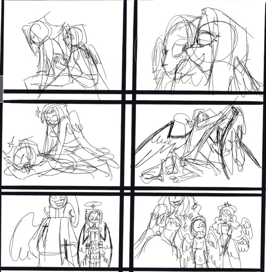
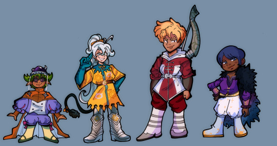
13. In Hellbound Hostel, Hellborn are created through a ritual that only requires one participant. Eden is more like a creation to [Lucifer] than a daughter and she has no mother. Sort of an [Adam] parallel. I might shift Lilith's role/traits to one of the Sins, Idolatry.
The Sins are effectively Eden’s family as they are all fallen angels that rebelled with [Lucifer]. A lot of the early/pilot stuff with Lilith shows her as wanting rebellion from sinners and I think Idolatry would also stoke that flame. She is a champion of individualism and finding your own “gods” to worship. She believes that the free will that humans were granted makes them superior to The Creator.
As for the aspect of someone from hell residing in heaven as a potential villain? I have some ideas but most of the conflict I’m figuring out right now is episodic conflicts centering around the hotel, like a power outage and trying to get residents excited for a hellborn holiday.
Thank you for asking! :D
#dys draws#dys rants#ask game#hazbin hotel redesign#hellbound hostel#hazbin critical#hazbin hotel critical#hazbin hotel rewrite#hazbin hotel criticism#hazbin hotel critique#charlie morningstar redesign#vaggie redesign#reblog
98 notes
·
View notes
Text
every art critic, teacher or tutorial maker who tells you that your character designs must be conventionally attractive or appealing is a big fat liar
89 notes
·
View notes
Text
Found a really cool brush and (still practicing on my tablet) I’ve decided to color my Maine 6 redesigns STARTING WITH- applejack
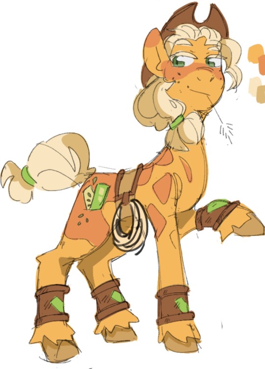
I decided to give applejack her moms hair consistency but her original colors are still the same besides from the added orange on her back that runs in her family. Her cuffs are also a apple family tradition something that connects them with the family and that everyone has made when reaching a certain age (so as to not lose it)
#my art#sketch#my little pony#mlp g4#mlp applejack#mlp redesign#I based the redesigns off their parents and original designs#might look weird but who cares#ranting
24 notes
·
View notes
Text
I'm not a fan of most or really any designs of this series because I think the outfits looks even worse than sds which not all of the outfits in sds is bad. You can't really tell if this is in old fantasy or not with the outfit choices in 4kota. Especially some of the female designs which I'm not a fan of or just plain bland.
The four knights of apocalypse. Okay I practically know nothing about this series except for the infamous parts and I tried reading the manga but I don't really like it. Spin off anime/manga of kids isn't really my thing since most start of boring.
#my fyp#4kota#rant#4kota lancelot#4kota gawain#4kota percival#4kota tristan#tristan liones#percival#gawain#lancelot#i will do more characters of 4kota then sds because man i have a lot to do#4 knights of the apocalypse#four knights of the apocalypse#character redesign#character deisgn#character design#nnt#sds#seven deadly sins#nanatsu no taizai
39 notes
·
View notes
Last Seen Blogs

eliamgrootx-blog-blog-blog
that's how superheroes learn to fly.

burt40hinton
The Life of Healy 570
tactica-prodigium
Tactical Prodigy

princess-pengy
Princess Pengy! 🌟🐧
jongkongemas-blog
Beli Emas & Pelaburan Emas