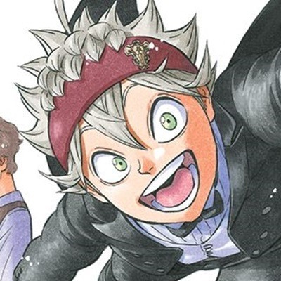
#the black and white with red it’s so iconic
Text


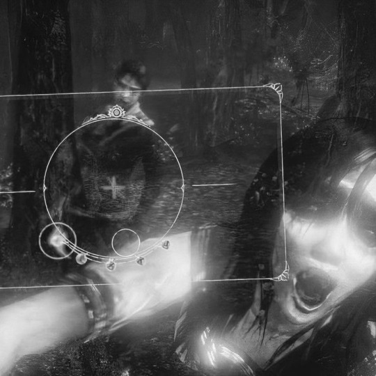
𝐓𝐇𝐄 𝕯𝐄𝐕𝐈𝐋'𝐒 𝐏𝐑𝐎𝐒𝐄
(⠀free gdoc template⠀)⠀&⠀kai's first doc post !!
⠀⠀a⠀BLACK BUTLER THEMED⠀prose template — minimal palette of black & white with a hint of red. five pages accompanied with visuals belonging to the manga; a fervent immersion into the depths of hell's greater pleasures—the manipulation of the soul. easy to use in the bounds of each page, utilise for info-dumping, rambling, introductory prose and or muse manuscription.
⠀⠀A CONTRACT⠀to be written⠀. . .⠀the last page featuring familiar concepts to Black Butler's⠀FAUSTIAN CONTRACT — a pact with the devil.
⠀⠀⠀⠀𝐂𝐔𝐒𝐓𝐎𝐌𝐈𝐒𝐀𝐓𝐈𝐎𝐍 !
⠀﹙ ✦ ﹚⠀any image featuring a gradient is a drawing, which you can customise to your liking by replacing the backing image with whatever visual you like !
⠀﹙ ✦ ﹚⠀careful with how much you type as the foundation of most of the sections for writing are tables, so forewarning before you go experimenting how much you can put into it.
⠀﹙ ✦ ﹚⠀some main images are beneath text meaning you can't select them if you click on a table above it, try right-clicking above the image and selecting it on the pop-up—most, if not all, pngs are above text.
⠀⠀⠀⠀𝐔𝐒𝐀𝐆𝐄 !
⠀⠀DO NOT REMOVE CREDIT⠀the main credit source is a small four-pointed star ( ✦ ) either in the header of footer of the first page of my docs.
⠀⠀TO COPY⠀—⠀file > make a copy
⠀⠀TO COPYLOCK⠀—⠀share > settings icon ( ⚙ ) > uncheck "Viewers and commenters can see the option to download, print, and copy"
﹙ ! ﹚⠀all the art⠀used in the doc belongs to yana toboso's Black Butler.
﹙ ❤ ﹚⠀feel free to like & or reblog
#google docs template#rp resources#rp doc template#google doc template#prose template#gdocs#roleplay resources#rp template#discord rp#discord roleplay#black butler#sebastian michaelis#template#themed template#oc sheet#writing
18 notes
·
View notes
Text


(:̲̅:̲̅:̲̅[̲̅:✧:]̲̅:̲̅:̲̅:̲̅)

˚ @y-ujin & @iluvrei 🎥
#sos: the event#giselle#aespa#kpop#black moodboard#white moodboard#grey moodboard#brown moodboard#dark moodboard#grunge moodboard#aesthetic moodboard#draincore moodboard#aespa giselle#giselle moodboard#giselle icons#aespa messy moodboard#aespa moodboard#blue moodboard#red moodboard#alternative moodboard#bios#locs#coquette moodboard#symbols#pink moodboard#cottage moodboard#retro moodboard#xxxtentacion#y2k moodboard#old moodboard
114 notes
·
View notes
Text


I summoned the spring storm, and my wounded heart wept.
Shunran VBS icons・★
For @sekaitransparents 1000 followers event (prompt 3: fav cover or fav comm)・★
Free to use, please reblog and credit if using・★
#shunran isnt really my favorite cover of all time but ill be damned if i could actually decide that#but i had wanted vbs to cover shunran for a really long time and then they did so i picked it#links: lyric/transparent credit#that line is tweaked a little but I don't remember if it's from a different translation or my own translation...#if anyone knows lmk 🙏#been yapping in the tags too long. onto actual tags#project sekai#project sekai icons#vivid bad squad#vbs#vivibasu#kohane asuzawa#azusawa kohane#an shiraishi#shiraishi an#akito shinonome#shinonome akito#toya aoyagi#touya aoyagi#aoyagi toya#aoyagi touya#black#white#red#blue#yellow#sekai 1000 follower special
20 notes
·
View notes
Text


#ʕ ′ ᵔ ‵ ᪲ ʔ 👧🏻 ׁ ͏͏ ͏͏ ͏͏ ׅ ͏͏ ͏͏ ͏͏ ♪#kolyasz#asta my beloved#he's so special to me#black clover#asta#anime icons#anime layouts#manga icons#manga layouts#beige aesthetic#red aesthetic#grey aesthetic#black and white aesthetic#gothcore#twitter packs#dividers
39 notes
·
View notes
Text
y’all… what if… 6US… is a… purple album?!
#alison speaks?#5sos#5sos6#5 seconds of summer#i’m speaking it into existence right now#the theory is absolutely coming from them doing BLACK+WHITE+GREY WITH POPS OF COLOR on sgfg followed by color icon YOUNGBLOOD#so like naturally you go from neutrals/browns/beige with pops of primary colors on 5sos5 to PURPLE ALBUM 6US (read as 5sos6)#LIKE IT CAN FEATURE OTHER SECONDARY COLORS#ITS ABOUT THE BLEND!!!!#GIVE US A COOL COLORED ALBUM AFTER THE WARMTH IN THE AESTHETICS OF 5SOS5#PURPLE ALBUM!!! AS BLENDS OF THE REDS AND BLUES!!!!!#A BALANCE!!!!!#5SOS!!!!!!!!
8 notes
·
View notes
Text
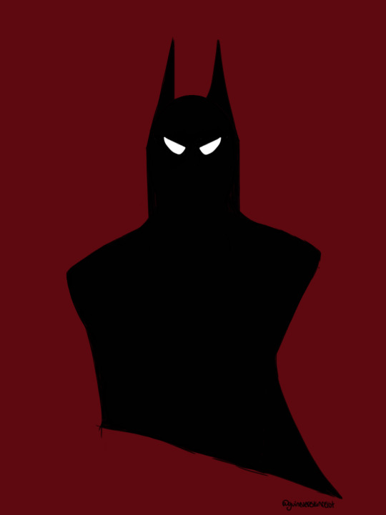
the gothest goth in gotham 🦇
#batman#bruce wayne#batblob#dc#fanart#detective comics#the batman#digital art#illustration#art tag#userleah#uservickytoria#useremrys#usercroft#nessa007#userbbelcher#chewieblog#anyway i was inspired by my new icon to draw batman bc he is so shaped and i love the black red and white color palette#it's simple but its fun#lizzie.draws.art
46 notes
·
View notes
Text


All icons have been bordered.
#I fucked about with them for so long to try and get just the black and white and red look but#chaos' didn't wanna play ball#and I thought having his turk ones in black and white was apt so---#good enough for the moment#hhhh#I gotta make his remake icons now lol
6 notes
·
View notes
Text
One of the most aggravating feelings is the desire to change your blog aesthetic but, not knowing what you want to change it to.
#i am really tempted to do something oddinary themed but i don't know if I'd like my blog being fully/mostly green#plus i want to incorporate hyunsung and 2min pictures but there aren't a tonne of them where green is a major colour#i was also considering doing something specifically venom related since that's my queen on that album#i might do the venom one but i think the black and white mayyyy be too simple#maybe I'll incorporate some red into it too#i don't think I'll post anything with actual spiders#probably just spiderwebs#i also just really love the picture of hyunjin i have as my icon#i wasn't kidding when i said those pictures of him might be my favourite of all time#anyways I'll figure it out#i want to switch things up on both blogs#the issue with the other blog is that i want to use like 9 different idols for it lol so i have to settle on only a few to make my icon#header etc#rj talks
2 notes
·
View notes
Note
omgg you modded your 3ds :0 what games did you get
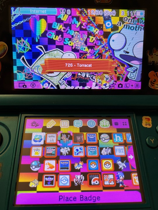
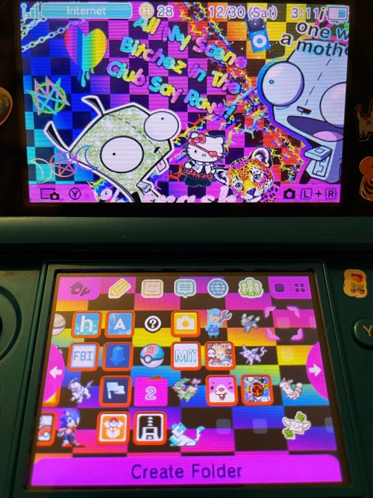
Welcome to my very epic modded 3DS :D I’m gonna download pokémon x, rhythm heaven, and sonic generations tomorrow but it is currently late (I need to set the clock for daylight savings lol it’s an hour ahead rn, it’s 2am) and I thus want to go to bed <3
#spent the last two hours installing alpha sapphire lol. I gotta do bigger cias from qr cause my laptop doesn’t have a ton of space :p#I have a bunch of other cool themes installed rn too I just think this scenecore one fits the vibe the best for showing off my home screen#I’ve been mostly using a club penguin fishing minigame theme tho cause I love opening my ds to that classic music#it’s pretty much all pokemon games rn. I have red yellow leaf green silver crystal soul silver sapphire emerald alpha sapphire diamond#platinum black and white 2. lol#and of course breaking bad ds is there. I did not expect that game to be so fun#I’ll probably shuffle the cube w checkpoint to put x below that and just move my folder over to the next cube idk#the folder is really just for old stuff I don’t use (download play eshop etc) I kept it cause it was my 27th folder and that’s my favorite#number so. special 27 folder yaay#also idk if I’m gonna keep the Cyrus ac settings badge I just like the idea of badge app icons and that’s the only one I have#zoracontent#asks#anon
6 notes
·
View notes
Text
bless my chinese prof for allowing us to submit all the assignments until the end of the week and not until the end of the day. she's the real one
#im feeling so dizzy today.. low blood pressure gang rise u- wait no don't#also she is so iconic. she has dark red hair and she's wearing black lipstick in some of her photos. she also has tattoos#we also showed up in the exact same t-shirt once. a white one with a cute goth girl with a tbh creature-like face expression#[ 💚 𝐥𝐢𝐧𝐚 𝐭𝐚𝐥𝐤𝐬 ]
2 notes
·
View notes
Text
everytime i think I'm done learning things about unova...
#zorua is originally from there oh my god#what does it mean what does it all mean#the black n red the white n teal *sits down*#also the shiny one looks like mint chocolate how cute#kae.txt#i have to finish playin bw forreal#unova has so many iconic pkmn too so many i dont know but so many i do !
32 notes
·
View notes
Text
why am i just now making the realization that ranboos icon is blue but his brand is everything but blue
7 notes
·
View notes
Text
also to the person who tagged my "flash fam game night" art w ace/wally 2 NOPE thats just regular ol wally west, not ace, thats my hc for him and im stickin to it babes
#iris and wally r black and bart is mixed black/white/filipino lads im not changing my mind#yeah sure the red hair was iconic but like. theres literally so many redheads in dc comics. the wests dont have to be
3 notes
·
View notes
Text
hmmm..... normally i try to be as non-specific as possible when it comes to the listeners/readers, but i’m wondering if maybe i WILL have to decide what colour they’ve chosen to wear :(
#sorry for the rambling today my head is just v full#if i have to choose a colour to wear then it WILL be red#i dress in fucking vampire colours irl#red and white and black is always a winning combination#but like..... not everyone likes wearing the same colours#and not all colours suit all skin tones equally so you might be like 'i would NEVER choose to wear that'#to use the red example from above#red doesn't wash me out bc my skin tone and hair colour etc are a particular way#but my best friend (who is uber pale blonde hair blue eyes)#HATES wearing red bc she thinks she looks washed out and it overpowers her#(it doesn't she is v pretty in all colours hehe)#but you see what i mean#anyone can wear any colour regardless of how they look - avoiding certain colours bc of how you look is bullshit#but depending on your individual opinions you might say 'i would NEVER choose x colour to wear' and it fucks up the immersion#and i HATE that#we shall see#also lmao i say 'i always wear red' while sitting here in orange trousers and a white and blue shirt#ykwim#the orange trousers are iconic
6 notes
·
View notes
Text
wiiish i could use vampire pallette without. serif font
#its just harder to read but i love black red white#also new icon and title/bio quotes :3 quotes still mad house by creature feature lyrics just different ones lol#plan to change theme colors too but they changed mobile browser editor to fucking SUCK a bit ago so ill do tht next im on desktop#it speaks!#bitching bench
1 note
·
View note
Text


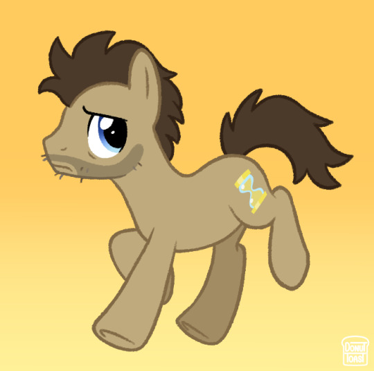
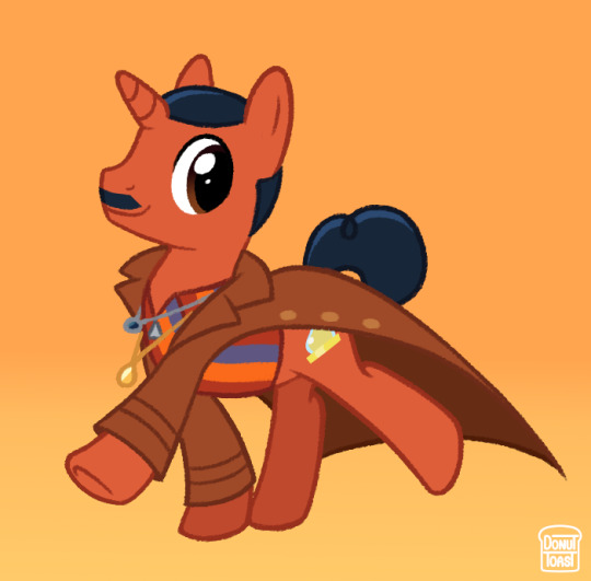
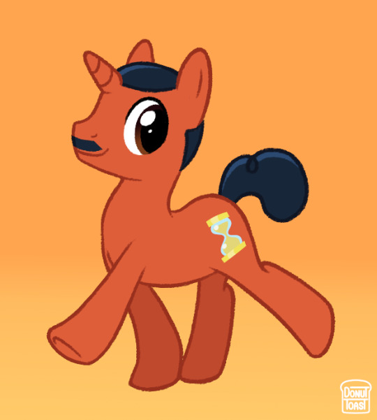
I haven't seen any MLP Doctor AU designs past Capaldi's era and I really think that's such a shame! So here's my take on the 13th, 14th and 15th Doctor :o]
Once again love to ramble about certain design choices!
Since the 13th Doctor wears ear jewellery depicting a golden and silver hand holding each other, I thought it'd be fun to change that into 2 horseshoes instead! I also gave a heavier focus on the more subtle rainbow on her coat because I feel it'd be more fitting for a MLP AU and something that could make the design a bit more balanced. I'd also tried to make her blue at first, but felt yellow actually felt more like the 13th somehow.
I decided to give 14 his iconic Doctor Whooves design, with the only difference being messier hair and some rough facial hair. I was definitely looking at it more with a nostalgia factor, which ultimately fits perfectly with what the 60th anniversary specials ended up being!
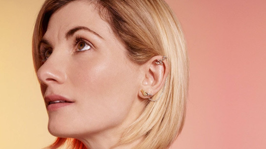
15 was a toughie, I'm not going to lie. A thing about MLP AUs I tend to dislike, is when an artist gives them the same colour as their skin. It tends to look silly with white characters, but I've noticed it's seen (at least USED to be) as less silly when it's with darker skinned characters. So with that in mind I wanted to make 15 the general colour he's themed to have in promotional material (orange and blue) and make it darker! ... but dark orange IS brown. So after some tinkering I decided to base his colour on the more earthy red Ncuti wears in this image.
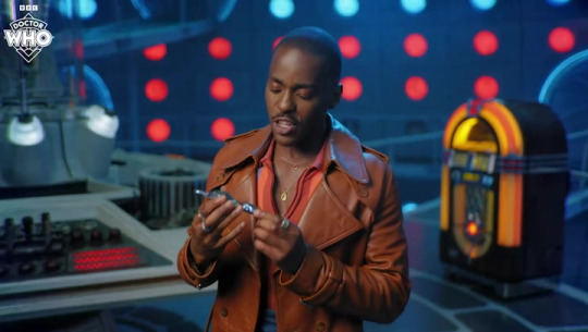
I also decided to tone his hair blue instead of going with black to really hammer in that orange/blue theme 15 has!
Thank you for reading this far! I'm really passionate about this sorta stuff so it really means a lot :oD
#I was so torn between making a genuinely David Looking 14 but I think the doctor whooves design is just too iconic to pass up on#not what i expected to give 100% of my energy today but we roll with it#donutdrawsthings#fanart#doctor who#doctor who fanart#doctor who au#new who#nuwho#nu who#the doctor#mlp fim#mlp g4#mlp art#mlp au#my little pony#mlp fanart#doctor whooves#thirteenth doctor#13th doctor#fourteenth doctor#14th doctor#fifteenth doctor#15th doctor#character design#design#au design#my art#digital art#au art
1K notes
·
View notes
Last Seen Blogs
sirena-sims4
Sirena
sku11dragon
SkullDragon
leinamichelle
Anastasia Potato
leinamichelle
Anastasia Potato
nerdyqueerandjewish
Beit Kvetch