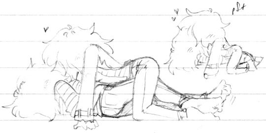
#this is a redraw i’ve drawn them in this pose 2 times before but in their hs uniforms..
Text
Half a dozen in one (1 | 2 | 3 | 4 | 5)

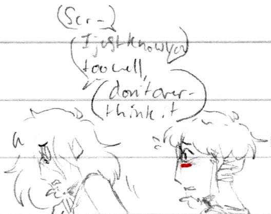
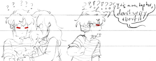
Oh no the Apotheosis is back and it wants to play, that’s never a good thing

Scriabin is not into it
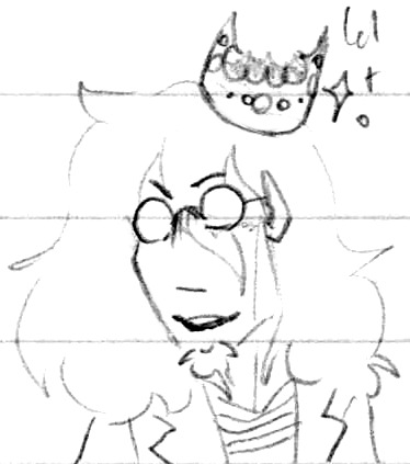
I wanted to draw King Scriabin but I goofed up the crown so bad lol, at least his face is cute ✨
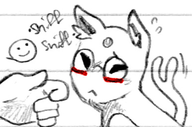
Pokemon Vargases! From that time that I forgot how to draw their Pokemon versions lol. You have to approach Espeon!Edgar gently, he’s easily spooked
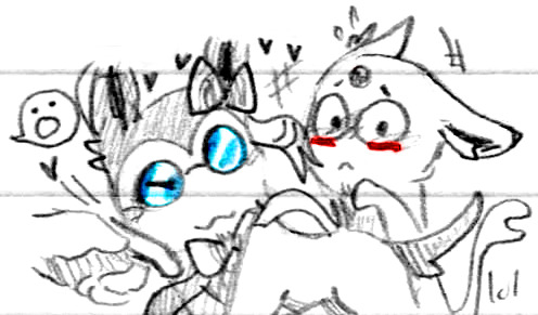
Sylveon!Scriabin is such an attention hog, poor Edgar haha

*puts my feelers around you condescendingly*
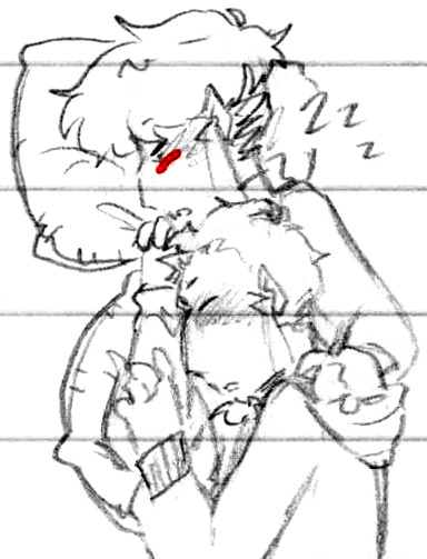
Sleeping on each other, always ♥ Even sleeping, they’re still intertwined lightly, Edgar’s hand on Scriabin’s shoulder and Scriabin’s on Edgar’s arm ♪

I had an idea about Scriabin “reading” Edgar’s mind by guessing how he feels about something, but I unfortunately forgot the specifics just as I was writing it down, so frustrating

I do remember that it was something a lot closer to how Scriabin felt about that thing and he was describing how he felt, not just Edgar, but he realized too late
Made him feel isolated :(
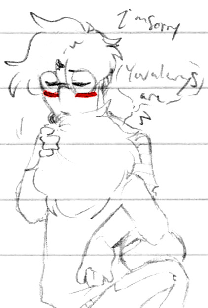
Apology hugs 💕

Who wrote this eviction notice, this is a cave?? I just think they turned out really cute here haha ♪
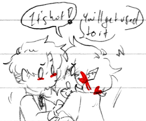
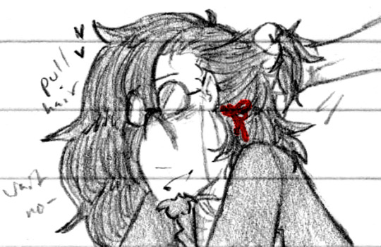
Stop being naked >:0
Don’t wanna get used to it >:(

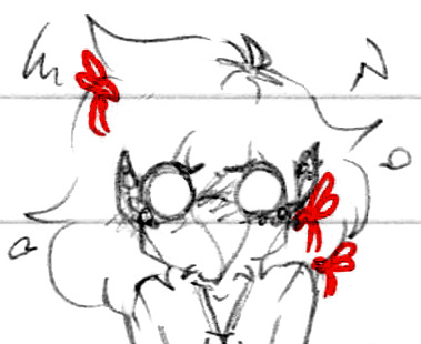
After all the Father and Daddy puns, I had to lol. Lady!Edgar with her hair down is just so prettyyyyyy
Two mops, makin’ out

For whatever reason, I started a teeny tiny little ScriAnimal series - first up is Scriabat with hand-wings because lol
I was watching a video of someone with their bird who was munching on the inside of their glasses stem haha

Scriabird is here to scream and knock things off the counters

And cutely chew on things

We are stopping this sketchdump for a Jake appreciation minute ♥ Thank you for appreciating Jake, now back to our regularly scheduled programming

A quick and silly digital doodle - waxing via tape is not recommended

Got the urge to draw dragons again, Scriabin needs to settle and Edgar is in protecc mode. His hugs are even harder to escape than normal!

The original sketch for sleepy Edgar - I couldn’t decide whether to use “World’s #1 Dad” or “World’s Best Dad”, so I just used both for the final version lol. Did Todd give it to him? Did Scriabin? Did they both get him nearly-matching mugs??

One of the early drafts for the ‘17 redraw; this was actually all drawn on one layer (on purpose! lol), which was a really fun experiment with some brushes I rarely use. I liked the angle of Edgar’s face too, he looks so smug haha ♪
Tiny Edgar doodle for a quick reference, he’s so cute ♥
I wasn’t kidding when I said it took a while to get Alone Together right, I was this close to giving up and just doing it the easy way several times before finally getting the trick down - I’m glad I didn’t but sheesh!

I started a pretty long mini idea that I managed to get like 90% of the way through before deciding I didn’t like it lol, but there were still some really fun poses and expressions

“What is it?” Light concern Edgar ♥

Probably the most complex panel of the set, as much as I like the leg poses I’m also frustrated by them lol - didn’t help that my page smudged >:P

A little bit of expression practice, the cute thing is Scriabin

I heard it, we all heard it, everybody saw!

Couple’a Scriabins to practice hair differences. I’ve gotten used to making him simultaneously fluffy and sleek like on the left, but I really love a True Floof look too, with many more starts and stops, it’s really fun ♪

Uppies!

Oscillates between “Why” and “You can’t tell me what to do”

Brain baby
Weirdly enough, this was actually inspired by a skin-horror idea I had but decided was a little too body-horror-y and so I repurposed it lol
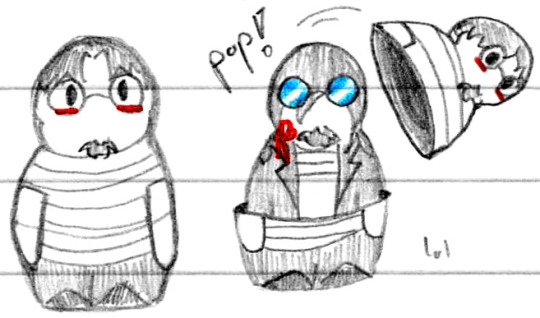
Some goofy matryoshka dolls haha. They remind me of Near’s finger puppets from Death Note somehow hmm

More hair differences, using opposing methods of line directionality while shading and texturing Scriabin’s hair. Pushing up from under gives this really nice line weight; it’s harder to do consistently because I keep wanting to sweep down, but when it works, the shadows fall exactly where they should and it’s lovely ✨ And like I said, pulling down is a lot easier, and because of that I can get these really uniform lines - I prefer the tapered effect, but pulling definitely has its uses and-
Hey wait a minute-
Golden floof ✨ This is actually really hard to see IRL lol
Edgar Warmup to see if my tablet was working properly, didn’t have time to pull up refs so from memory it is!
And that’s February through May again! Lots of silly little things, and a surprising number of scrapped larger ideas hmmm
#💟#Doodles#Sketchdump#Art#Edgar#Scriabin#Jake#A short and sweet one this time around#Also wow Nny didn't get any placement this time around - I guess he did show up a big more frequently in normal sets lol#Kind of anyway#Got a few of the classics running around - Apotheosized!Edgar - Lady!Edgar - Snake Charmer#Mostly all regular Vargas stuff tho ♪#And no blood! Wow!#That I Definitely got out of my system in the meantime lol#I think the only ones I didn't talk about as much as I wanted to were the Scriabirds - I actually love drawing birds I just don't very much#They're simultaneously so sleek and fluffy and poofy and goofy! Love birds!#And Scriabin's coat was really fun to draw over wings haha ♪#I really should draw the Vargeons again - ironically the birds turned out way more how they're supposed look lol#I still have a few more longer ideas that I'd like to finish up that didn't quite make the cut for May#I started them in May but it's looking increasingly like they'll be a June+ thing lol#Guess it's yet to be seen on whether or not they'll make the next sketchdump! Since I've jinxed it every time so far haha ♪
76 notes
·
View notes
Photo


I think this is my biggest yearly art-dump to date!
A lot of it is personal/friend art, though
I’ve numbered them as usual, so if you want to know what the heck you’re looking at, its all under the Keep Reading;
1. I watched most of the Predator movies with my friends, and during one- I drew these two. the fisher’s hat one for a joke- the other was a meme image we shared from a con.
2. Emojis I made for an Isle server Discord
3. Tried to play a different game of D&D with a different friend, because I’m terrible at improve and at speaking in general, I asked if I ‘could play a druid stuck in wildshape, and his quest is to find someone to unstuck him’. He was a horse that kicked a chicken as a distraction to some guards so my to-be party member to sneak around and knock him out. His name is Kurr.
4. Played Cenozoic Survival with friends, and made two National Park styled posters. We were kelenkens that killed other kelenkens (the Kele-Killers), and a pack of Direwolves that lived in the swamp.
5. Drawing of Vivi from FFIX and a chocobo for the Nyancave
6. A sketch of my favourite Berserk character, Serpico. and the walking meme with Serpico, Guts and Isidro
-You’ve entered the Nyan-zone-
Everything here was posted to r/Nyancave on Reddit.
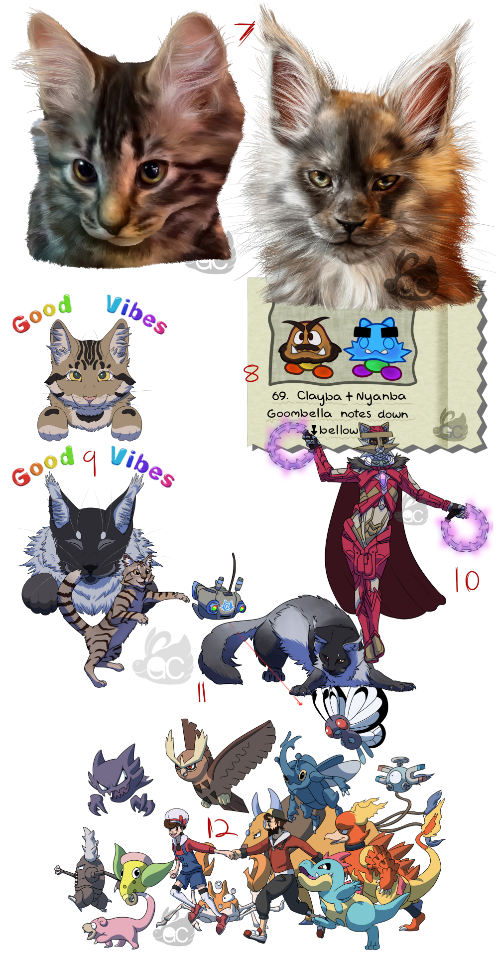
7. Nyancave’s cats, Nia and Dante drawn when they were both young kittens.
8. Nyancave as Super Paper Mario’s enemy descriptions
(original said “These two are Clayba and Nyanba.
Two nice Goombas who play games on a thing called ‘Mushtube’.
Max HP is 4, Attack is 2, and Defence is 0.
Aw, I like these guys, they play good games and have all around great vibes.However, Clayba does have an ability called ‘cheese’, which lets him exploit the game mechanics, so watch out, Mario!”-Goombella)
9. Good Vibe Kitties for when Nyanni wasn’t feeling very well.
10. Nyancave as a CONSOL from Xenoblade Chronicles 3.
11. Nia and Dante playing with B12 from Stray.
12. Clay and Nyanni’s Pokemon Nuzlocke Soul-like teams (at the time)
-Its OC World time-
Everything here is from headword/RP with friends that We’ve been slowly planning out over the course of a year and a bit. Its a mix of final-fantasy-esq magic and dinosaurs.
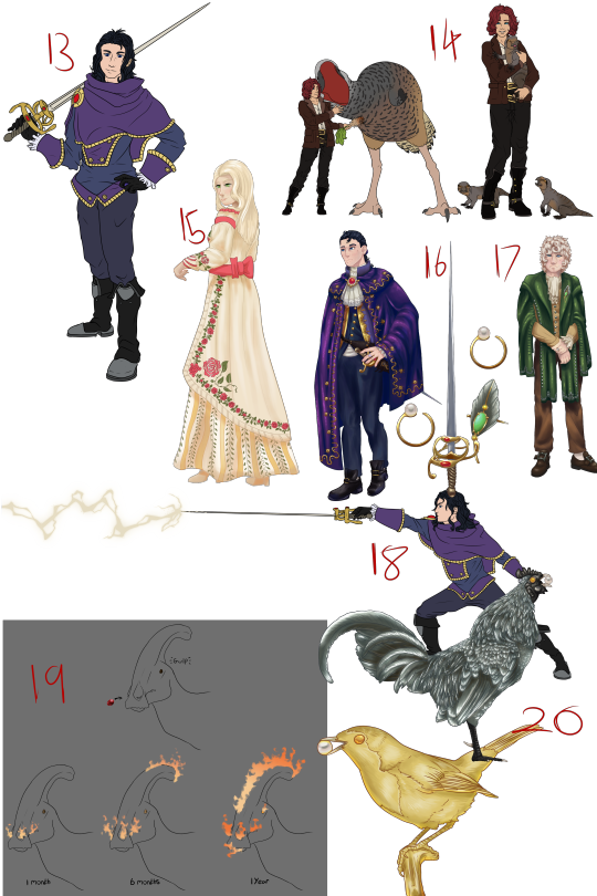
13. The first redesign of Lupin, my old Keykid OC that was in last year’s art dump as well.
14. The redesign of another keykid, Ember. She has a pet Drornis.
15. The redesign of another keykid, Lilly- she’s now a noble woman.
16. Second (technically third) redesgin of Lupin, made him look fancier and more sharp. the items on his right are his ring and rapier.
17. The redesign of another keykid, this time Iberis. They haven’t changed much, but I did redesign them before this; their look was hard to get down.
18. Lupin using his rapier to cast some lightning magic. drawn alongside the first redesign.
19.The processes on how a dinosaur becomes magical. it eats a magic gem, and if it survives, it inherits magical propeties.
20. Two ornamental birds that serve as ‘communication’ devices, with the chicken being about the size of a novelty landline, and the robin, the size of a brooch.
21. Caustiopteryx. A Caudiopteryx that has acidic elemental powers and isn’t looking so great anymore.
22. Stryaticosaurus. A Stryacosaurus that has lightning elemental powers.
23. Dryovoidus. A Dryosaurus that has void-like powers that can turn into a puff of smoke at will.
24. Pyrosolophosaurus. A Parasaurolophus that has fire elemental powers.
25. Dinosaur mounts. not exactly domesticated, but tame enough to let a rider on their backs and steer them.
-KH art that didn’t make it-
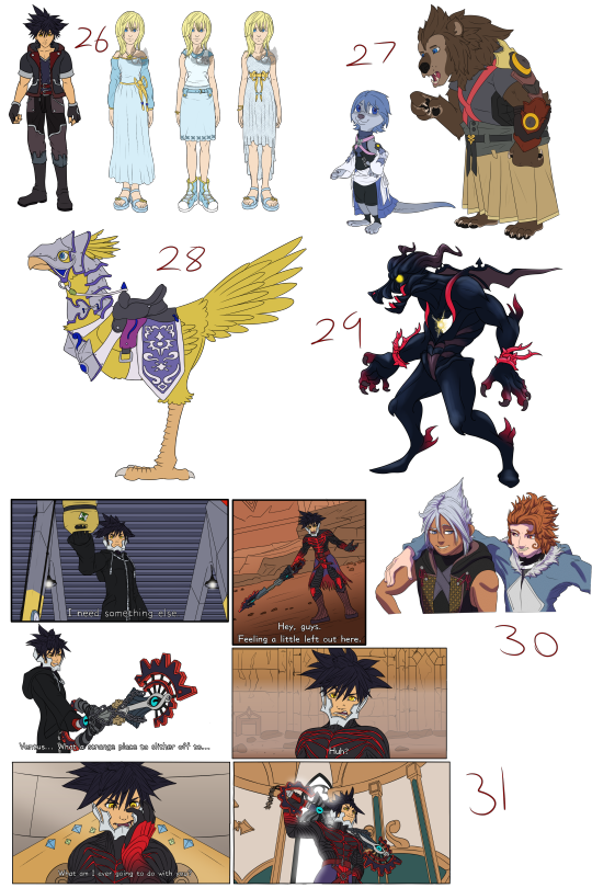
26. First draft of my Vanitas fan outfit and several designs of Namine’s before landing on the final one I chose.
27. First round of Zootopia Aqua and Terra- before I drew them in their final poses.
28. Chocobo draft of the Dilan and Xaldin chocobo mount design.
29. Lycan/werewolf Pureblood Heartless/Darkling idea.
30. A redraw of that scene at the end of BBS with Xehanort and Braig- only this time Xehanort and Bragi.
31. Redraws of Vanitas’s scenes in KH3 but with his helmet off. I wish it were off, because the whole reveal to Sora could have taken place else where.
-Warrior Cats?-
Friends got me into a Warriorcat clan generator thing witch is kind of like a rouge-lite drama-simulator? its hard to describe.
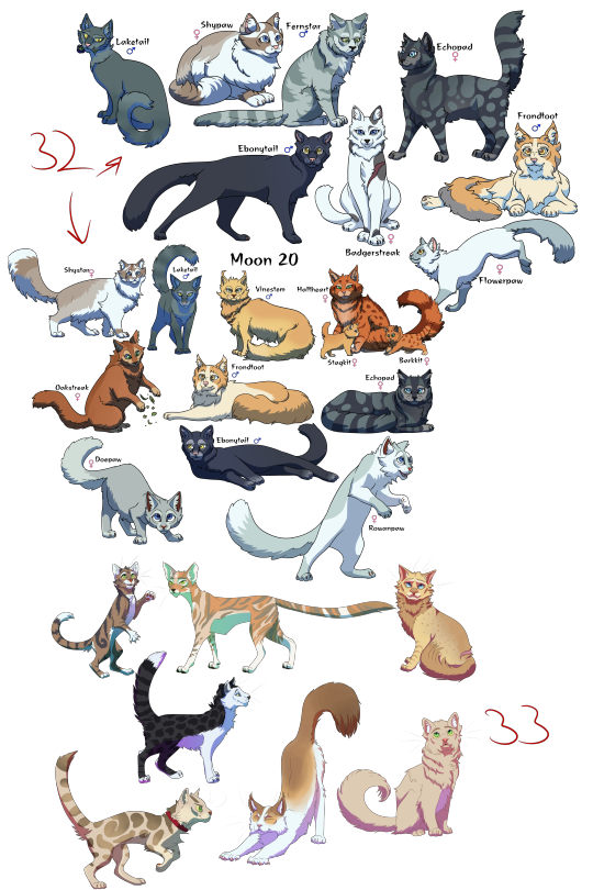
32. First major clan. absolute drama. Halfheart murdered a lot of cats by using the medicine cat, Laketail, and so did her daughter, Barkkit- only with a more claws-on-approach. 10/10 would recommend reading that book.
33. Current clan. Less drama- more survival. They’re not labelled, but we have; Lilacstar, Boulderheart, Flipleaf, Skyclaw, Blotchpaw, Owlfur and Wormtail.
9 notes
·
View notes
Text
OKAY I’m gonna make this post now or else I’m gonna forget
(warning: video has flashing sometimes)
This is the speedpaint of the fanart I made of @birch-forest, @bedrock-to-buildheight and @light-blue-glazed-terracotta! It’s a bit cringe in a some places but I wanted to post it for a couple of reasons.
All three of you have seen the art now
The drawing process was pretty interesting in my opinion
This was my first time taking drawing seriously in a long time
So here are some things to notice in the speedpaint.
I started with red lines outlining the three characters I already made in MS Paint
I’ve never made poses before so for birch-forest I made you look like a mannequin before I added flesh and bone
For a brief moment the eyes and eyebrows of birch-forest were drawn with a 2 pixel brush (the rest of the art is with a 3 pixel brush) because I was doubtful over whether I could squeeze in all the details of your minesona in a dramatic pose
(Turns out I could squeeze it all in, and later in the drawing I replaced the eyes and eyebrows with a 3 pixel brush redraw)
Cactus Walker (aka bedrock-to-buildheight) originally didn’t have pricks, that was something I added later when I had already began coloring
The idea I got for light-blue-glazed-terracotta to hold up a sign of themselves was based off of Dream (that was the cringe part 😬)
I couldn’t figure out how to draw your hair and only came back to it once I had colored birch-forest
The stripes on birch-forest’s design were made by drawing straight lines and erasing where they went over the line-art
I used a Google-searched image of “woman with long hair” or smth like that to nail the flowing hair in front of light-blue-glazed-terracotta
The colors used in the background of the artwork were colorpicked from your guys’ blog appearance on mobile (that’s why you can see screenshots of your blogs flash from time to time)
The “black” used in the line-art isn’t actually pure black, it’s a dark gray I colorpicked from a default Tumblr color palette (the difference becomes apparent when you look at Cactus Walker’s pants, which is colored a pure black)
For a time I had this really hideous background that used the colorpicked colors I mentioned earlier, it was just a bunch of colors blending into each other and it just looked like your eyes weren’t focusing
(I later replaced it with the current background, where the floor is a solid color and its opacity is lowered so it’s softer and doesn’t stand out as much)
I got the design of light-blue-glazed-terracotta and her skin from NameMC, it’s a website where you can search up a person’s Minecraft IGN and you get all of their skin and past username info
I realized after I had finished coloring everyone that I forgot the wings and the heart on the overalls of birch-forest, oh my god your sona has so many details how do you remember them every time you draw them
I made the watermark in the bottom left from scratch, as I do with all my watermarks
I realized at the very end that I missed ANOTHER detail of birch-forest, it was the antennae, oh my god how many details does your sona have
And that’s the end of it! Remember I didn’t draw this all in one go, this took several hours over the course of two days
Also birch-forest I’d like to formally apologize and say that I made a mistake in the original post, I didn’t know that your sona represented your actual self, I’m sorry I only found out about that recently
Aight cya 👋
#mineblr#peysi talks#original post#fanart#birch-forest#bedrock-to-buildheight#light-blue-glazed-terracotta#long post#flashing tw
46 notes
·
View notes
Note
Hello there! I absolutely adore your art style, it's clear enough that even when scribbly you can tell who everyone is and simple enough that you probably don't need to spend hours doing a single pose. Any tips for how to speed up how long it takes to draw characters? Or just drawings tips in general? Thank you for your time and for getting me thoroughly on the MadaTobi bandwagon, I've been coloring some of your coloring pages for them and they're always adorable.
When it comes to speed, there is only one way. Do it over and over and over again. Get familiar with the character, draw them in different situations, different clothes, different moods. Sometimes to hit just the right expression, I have drawn (when it's eluding me the most) upward twenty versions of the same expression and then still picked attempt #2. I've drawn Tobirama and Madara well over a thousand times by now. Doodle doodle doodle away without intent to make grand images, sketches you can be ready pick out one or two and throw the rest away, because they were just training for your hand and brain for when you actually do make those drawings you want to be the more refined ones.
(unrefined babbling under cut)
When I make sketch studies I often do so with a timer, and, important to me personally, a pen that can't be erased. What ends up on the paper ends up on the paper (spending too much time with digital tend to slow me down overall, way too easy to stop to fiddle with everything and make it into a habit x'3 for example go in and change the angle of an arm individually for half an hour, instead of having to draw the image all over again). Trying to get sketches down under five minutes, three, single minute, is a horror, but oh so useful and can be a real fun challange. The feeling when you finally manage more than just a head and an arm during the time is such a reward! I spent six very stubborn months a couple years back making speed studies every day. I barely had energy for any other arting, but built skill in a way that make me grumpy about not having done it again, but it is so exhausting and a chore... :p (I mostly made not humans, though. I chose weird things, objects placed together that weren't usual, emptied a penbox on the table, and so on, no pre-concieved ideas how it should look when you have some potatoes on a glass jar.)
Things like inktober or huevember or dogaust are good, too. To within a contained timeframe sit down every day with a very focused theme or excersise make a good difference. If one has little time, just make sure to pick something small enough to focus on that you can do it as many days as possible. A five minute sketch every day for example. Or just doodling, but always with the same tool. Or, as you mentioned characters, make something with the same character over a month. Drawing patterns help the penmanship, drawing dogs or cats every day will make a difference over a month. Arting a big full drawing everyday because a few fulltime or very very experienced artists do, when oneself tend to take a week or at least a cuple days and rarely make one on top of another? That's setting oneself up for failure. Set yourself up for success, it's more fun and better for the mental health <3 All the small repeated things matter a lot in the long run for putting tools in your skill toolbox for when you want to level up :3
The only times I spend hours on a pose, is sometimes for the elaborate full colour drawings. But, with those, I'm usually refining a sketch by redrawing it with small iterations of changes many times over before having a basis I'm pleased with.
Complete rambles, hope some made sense, and it wasn't too tiring hearing the same old omg DO EEET AGAIN AND AGAIIIINNNNNN x'p
#how I art#how long ago was this ask I don't know?#the phone app is SUPER stingy telling me about the ask inbox#tumblr peak performance :thumbsup:#I forget to check few times I'm on a computer x'D#maybe I should make sketch studies for inktober this year#it's about time#it was ages since last I regularly kept that up and it's noticable x'p
13 notes
·
View notes
Text
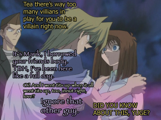
Yugioh S3 Ep 43: Tea Can Just Knock Over Joey Wheeler With Her Index Finger
Guys guys guys, my favorite Character is back. That’s right--the storyboarder!
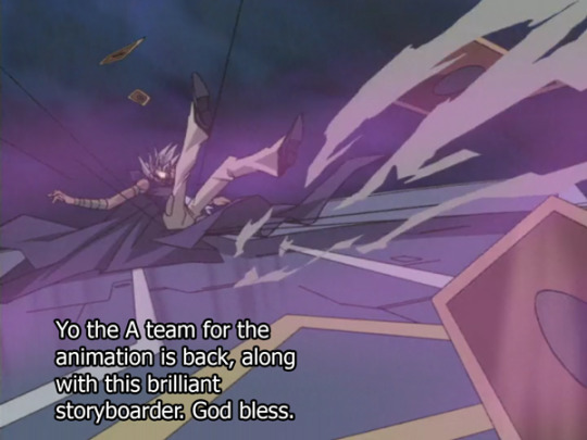
So this episode looked helllla nice for a Yugioh episode (again, this is Yugioh, it will win no awards.) It wasn’t as nice and fluid as the episode where they temporarily killed off Joey Wheeler, but I give it a good 2nd place.
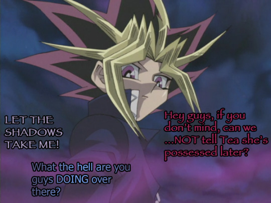
You can tell we’re getting to the climax of the season because they’re throwing down their most entertaining art people onto the screen, giving us about 5 zillion dutch angle fashion close-ups of Marik’s cabbage face, and a whole lot of zany and hard to very hard to draw fish-eye lens angles of Pharaoh.
Also, everyone wears flared bell-bottom pants now. New stylistic decision, as decided just now. Everyone in pants now has flares. Even if their pants are cargo pants. How very 00′s. (my pants were flares from like birth until 2006, it was a good trend, super comfy, bring it back.)
(read more under the cut)
First off, Evil Marik decided to rewrite Marik history a little bit with some hilarious retconning that only the most evil Marik would think is legit.
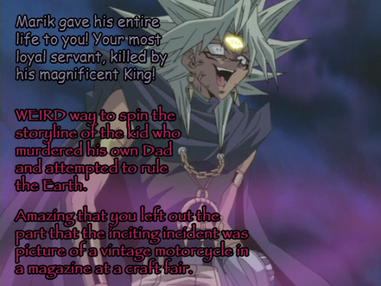
I mean I was there when Marik was introduced and was a complete asshole all of S2. I remember when Odion considered murdering the hell out of his little brother because this Marik guy was such freakin tool and his Dad was an evil cultist bastard. I...I’m gonna go on a limb and assume that calling Marik a “loyal servant” is a freakin stretch. Marik made his choices. Yes, his bad side killed his Dad, but they have made sure to indicate that yes, this is the evil inside of Marik, something that he himself caused--but most of the things that Marik has done (with the exception of killing his own Dad) is still Marik. He did that.
The fact that his evil side can’t quite connect that his good side and evil side are at all the same however, is fitting for an evil Marik to think. More and more, Marik and Marik are becoming 2 different people, and this game is the deciding factor to finally give this guy full autonomy of his other half.
We’ve seen this type of contrast before with Bakura and Ryou--where Ryou and Bakura don’t really get along but have always been clearly different people, so the culpability of what they do tends to fall on Bakura. (which is a pretty GRAND assumption, I still think Ryou is a precious but absolutely still shady little bastard) So, it’s a little different that Marik considers himself two completely different people when it’s just...not the same. Marik’s alter ego is just an ego. More like how Yami was in Season Zero but a little bit more evil. Both Marik’s have the same upbringing and the same source.
It’s been kind of an interesting progression now I can look back on it, where slowly the two have been clashing to the point that they are in fact different, disparate people now. The fact that Marik points out how his situation similar to Yugi and Pharaoh being a host is almost like “well yeah, it would have been nice to see how the whole Season Zero Yami evolved into more of a separate person over time, I’m glad you inferred that, and I’ll never get to see it, thanks” But again, all that is inferred. Whether Yami Yugi eventually became Pharaoh over time or whether Pharaoh is a big retcon of Yami Yugi for the new series in order to keep the culpability for what he does off of Yugi Muto was never directly spoken in the show so it’ll be left to your fanfictions.
Meanwhile, Yugi has decided that they’re going to try and purify the Marik situation and save the good side. This is sort of the Yugioh thing, to dispel the bad forces from people and leave behind hollow husks, so yeah...it tracks. I mean...there’s very little Marik left to save, but it’s better than a husk, amiright? Better than what happened to freakin PaniK, RIP. I’m sure erasing over half of your identity will go over real well for Marik and be absolutely painless.
And then we had a lovely scene that, for those people doing scene redraws from anime, as has been a popular trend on art blogs lately--this is your episode for Yugioh. This episode’s got moody lighting, we’ve subdued all our weird ass colors into one concrete palate (remember how green the carpet used to be?) we got interesting elements of Marik being here despite being chopped into pieces. We got so many ellipses drawn in perspective (y’all I could write an entire posts just about ellipses but I’ll spare you). It’s like Yugioh gave itself a redraw.

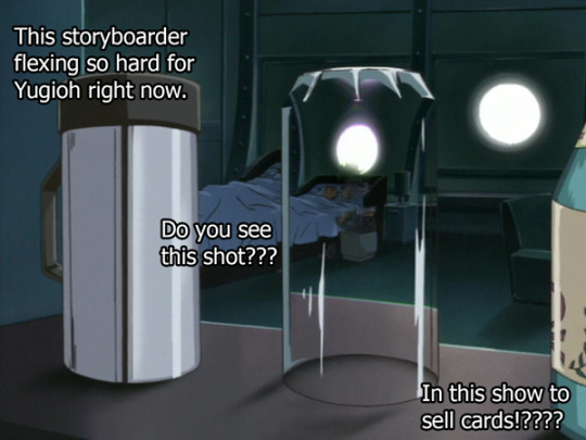

I can’t believe this shot came out of freakin Yugioh.
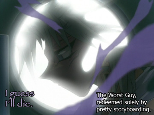
Also, this guy was an ASSHOLE for the past 2 seasons but the show was like “time to make him likeable” and so they dropped some good ass cinematography and sung that sad backstory tune on the trumpet and you know what? It works.
+++++++++++++++RANT ABOUT REDEMPTION ARCS FEEL FREE TO SKIP THIS MASSIVE WALL OF TEXT++++++++++++++++++++++++
Now I think the arc of Marik is pretty simple and people are pretty chill with it. But, I’m gonna talk about villain redemption arcs just in general--gonna sidetrack a little from Yugioh for a moment. Partly because I watched 6 seasons of Once Upon a Time, which is basically Villain Redemption Arc Controversy: The Show.
It bothers a hell ton of people when TV shows have to make a villain redeemable, but there’s only one episode left so they put their hands up and say “but I swear the good side of him was always good” But, does that mean Marik’s going to make up for all the murder and sending people to the shadow realm? No. He never will. Even if Marik was completely his bad half the whole time, it still wouldn’t make up for the damage done. Dead people are...DEAD.
Marik can’t actually make any choices right now to redeem his character. All he’s doing is accepting he will never be a full person ever again. Hence why he is in slices and pieces, and in several shots is trapped either in an empty glass or a window. The choice to redeem him is entirely on other people.
And that’s the thing about redemption arcs that I want to bring up--how much of a character’s redemption relies on what the villains do to “Make up for what they did”, and how much relies on everyone else to redeem them. I think the tendency is for people to assume that the villains should be doing 90-100% of the redeeming, but unless they have a time machine--they can’t do any. Even if they freakin die to sacrifice themselves it’s still like “that character was basically little Stalin, right?
I’ve seen like a million ways to write a redemption arc, but none of them, not a single one that I can think of, can ever truly make up for the things the villian has done. There’s no way that Darth Vadar was suddenly going to become a good Dad, no matter how many Palpatines he can toss into a...whatever that was at the end of that movie. That’s the riddle behind what makes redemption arcs so engaging--By all cultural standards these villains should always be tagged a “bad guy” but, we, the audience, are being challenged to ignore those standards.
And I know a lot of people see redemption arcs as a quasi-religious sort of adventure into atonement, where we’re supposed to see ourselves as the villain searching for some type of forgiveness from a higher, most-likely-a-reference-to-Jesus-power, but I don’t really see them that way. Maybe it’s because, I dunno, I haven’t killed anyone recently or possessed other people’s minds or strung them up to anchors and dropped them into the ocean. But if you see yourself as a Marik, then go for it, I won’t stop you.
But, to me, a redemption arc is more of a question posed for us as viewers. Since it is impossible for the writers to ever fully redeem a character, the only ones doing the redeeming are the people watching it, who’s reaction will differ wildly from person to person, and that’s what makes it fascinating.
And like, that’s my thesis here at the very last paragraph of this long meandering rant. Redemption arcs aren’t about “hey is this person good enough to be redeemed (because that will never happen)” it’s “are you too good to redeem that person?” It’s a large scale experiment on the viewers watching and that’s why it makes people so freakin pissed and uncomfortable. Every redemption arc calls them out directly, and for some people it’s just like--the world ends or something. I have seen actual internet mobs develop over...a villain redemption arc. Which is weird.
And so I’ll leave it with my other spicy take that...you don’t have to redeem every villain when the question is asked. I mean these aren’t real people. The questions of “would you redeem this person” is asked entirely hypothetically. And that’s what makes up stories, not just the interaction of the people inside the stories, but when it affects the moral structure of the readers directly, and seeing how for some people, that can be a very intense and deep reflection. (which usually leads to a hell ton of either retconning fanfiction or a hell ton of really, really angry posts)
bro’s just told me that Yugioh is just a redemption arc for season 0 Yami Yugi. Bro and his spicy headcanons. This one holds some water though, lol.
++++++++++++END OF A SUPER LONG RANT ABOUT VILLAINS THAT I HELD IN FOR THE ENTIRE 6 SEASONS OF ONCE UPON A TIME, WOW A LOT OF PEOPLE HAD OPINIONS ABOUT CERTAIN CHARACTERS THAT THEY JUST EXPECTED EVERYONE ELSE TO HAVE, AMIRIGHT????+++++++++++
Anyway, back to jokes.
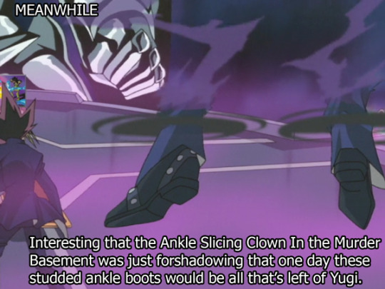
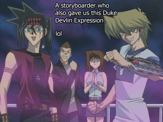
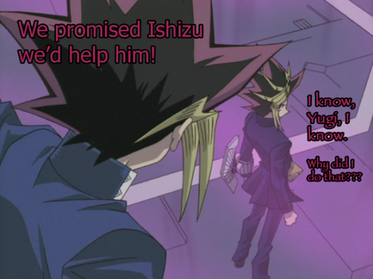
Again, Storyboarder just...nailing these weird ass shoes that are somewhere between a dress shoe and a boot. Shoes are hard to draw, y’all. This storyboarder. And they even made sure that the shoes looked very small and precious the way Yugi shoes would be. Little Cinderella size 5 Yugi shoes.


Oh finally.
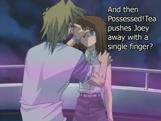
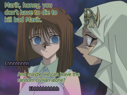
So it was only a matter of time before the people who actually care about being possessed noticed this situation, it just took like...a season longer than I thought it would. I’ll be honest it was quite cathartic for them to actually address for the first time in what feels like a long time “SHOOT, GHOSTS!?!?”
Although it was kind of funny that the biggest reaction to all of this came straight from Joey. Yugi still doesn’t care, Tristan’s decided to just accept this, and Duke is just slowly backing away. But Joey’s going to try and do the work that Yugi should have done last episode.

HOT DAMN.
So, lets go over the Yugioh power chart here. Tristan can punch out Bakura. Tristan can also defeat Seto Kaiba with a broomstick. Joey can kick Tristan, even when Tristan is armed with a broomstick, so hard that Tristan flew through a metal door and bent it completely over backwards. Tea, however, can knock Joey completely over with one single index finger.
How has this girl ever been abducted? Was she just bored?
Bro wants to bring up that she once incapacitated a man with her butt. Just falling on top of a guy and hitting him with her butt of steel. Was she even in danger from the shipping container when she could just bat it away? She once choked out Season 0 Yugi Muto. She was always fine.
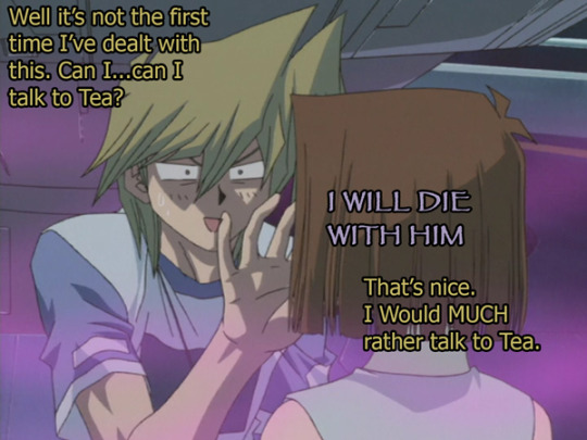
Credit to Joey, he keeps trying, and it gives us, for the first time, a sneak peek into what it must be like for Yugi and Joey to hang out on the offtimes that Yugi switches over and Pharaoh hasn’t quite gotten the memo.
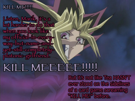
This is in fact, the second time that she’s done this.
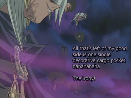
(meanwhile, sitting next to Odion, is one single cargo pocket floating in the air, gently smoking a purple haze like incense)


Welcome back Odion! I only now just realized how freakin jacked your neck is.
Like y’all his neck is wider than his head, hot damn.
Anyway, this show is secretly all about the power of big brothers, so I assume he’s going to start the mile long crawl to the top of the tower and then just...walk in...just walk right into a shadow game...?
...no one thought to stay with Odion? Like not even Serenity? Or at least leave him a weelchair? what the hell?
Odion always gets the worst wrap, this poor guy.
Anyway if you just got here, this is a link to read these recaps in chrono order from the beginning and watch my progression of knowing nothing about Yugioh to knowing a lot about random facts about Yugioh but still knowing absolutely nothing at all just like Socrates.
And here’s that shot of Marik for y’alls anime scene redraws, knock yourself out.

#Yugioh#ygo#episode recap#photo recap#S3 ep 43#Yugi Muto#Marik Ishtar#Tea is possessed again#Tea Gardner#Odion ishtar#Ishizu Ishtar#Joey Wheeler#Duke Devlin#Tristan Taylor#Seto Kaiba#man alive why do I list all the characters all the time there are so many characters#guest appearance by this wonderful storyboarder
28 notes
·
View notes
Photo
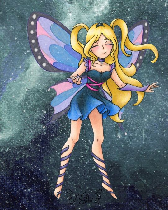
Fairy Enchanting
A bit later than I expected, but here we have the art that I used for the examples on my Commission Sheet!
(Unoriginal title is unoriginal and also a pun based on "very enchanting")
When I started thinking about putting together a commission sheet in the first place (which was something I wanted to do for the new year, as before I was just using a lengthy pricelist), I knew that I wanted to make a piece of art specifically for it and track my progress as I went, so that I would have an example for each stage in the process I take commissions for. And for the art, I more or less wanted to "go all out" since it's supposed to be an example, and I figure the example needs to be as close to top-notch as possible. Admittedly, I probably could've done even more than this, but me being me I procrastinated and ended up having less time to work on this that I initially expected, so...
In deciding what the drawing would be, I also decided to return to my roots a little, and a do fairy as an homage to back when I used to do Winx art all the time. Likewise, as Enchantix to this day is my favorite transformation from the show, I drew heavy inspiration from it, and I'm sure that's so obvious that if you know the show I probably didn't have to point it out to you.
Anyway. I actually didn't start completely from scratch with the sketch; I re-used this pose from a previous sketch I did that never saw a full-finished piece. I liked that other sketch okay, but it didn't feel like a "finish me" project. I did have to alter the feet because the original sketch was made with feet for ballet slippers (bigger heels, more rounded/curved toes, etc.) and much later on in the process I ended up angling the leg on the left more outward, as that felt more natural for the direction I was taking this new sketch in.
In sketching all the bits that make this sketch otherwise unique from the old one, as I mentioned, I was taking heavy inspiration from Enchantix. One of my favorite parts of the transformation has always been the leg-wrap/barefoot sandals, for reasons I can't explain. So those were a must. I also really like how the Enchantix outfits tend to be short dresses that are more form-fitting at the top and more flowy and soft at the bottom. Here, I decided to bring the ribbony look on the leg wraps up into the bodice, and to frame the collar/shoulder area I used a sleeve & choker style similar to what I did for the dress for Ink Dance, which itself was based on a dress I actually own and love to pieces despite never getting a chance to wear it because of how fancy it is. The main difference for both of the drawing versions is that I skipped the lace overlay that connects the sleeves and choker, mostly because both pieces are traditional and drawing lace/mesh traditionally, especially when it's so teeny, is a nightmare I do not want to engage with. And the choker part fits nicely, as in Enchantix each fairy has a necklace (usually a choker) that holds their fairy dust bottle. I'm not sure if this fairy has one or not, but she very well could!
Enchantix usually has long gloves, but I altered these to be shorter and fingerless (more like Magic Winx or Believix gloves) since this fairy is also based partially on myself, and I'd be more likely to wear that kind than the full-length formal gloves. And for the hair, as is maybe obvious, I was primarily inspired by Stella's for her Enchantix, since I've always loved that part of the transformation sequence for her's.
Also, even though it doesn't look that way on my commission sheet, IRL I drew only one wing and left it separate, off to the side, to make positioning and flipping it easier.
Once the sketch was done, I did try inking it traditionally/by hand once, and I just really wasn't happy with how it turned out. And I also realized I had drawn the skirt billowing/ruffling in completely the wrong direction anyway; It was moving to the left when it should've been moving to the right like the hair. So I had to take time out to fix that.
As opposed to wasting more paper trying to ink traditionally after that fiasco, I instead went with what had been my gut instinct anyway; I scanned the sketch in and did the lines in Photoshop.
Well, most of the lines. I was a dumb-dumb and when I did the lines for the wings, 1. it took forever because they're large curves everywhere and 2. I used a slightly bigger brush than for all the other lines, as I had mistakenly thought I was going to be re-sizing them significantly and the lines would be altered to for me when I did that. When I realized that wasn't the case, I did not want to have to redraw most of those curves again and risk not being able to get the right a second time. So I ended up booting a copy of the wings I'd already done into Paint Tool Sai and made use of the linework layers to redo the wings without having to draw the same line fifty times. Then I booted that back into Photoshop and adjusted the wings to be angled/aligned with the rest of the lines as I saw necessary. It was also at this point that I played around with positioning the leg on the left more outward than what it was on the sketch and ended up going with the position you see here.
I could have then gone back and added weight to the lines in some places, but at this stage, I was already thinking that I wanted to print the lines out and use my digital lines to hopefully get cleaner traditional ones, as opposed to just printing the lines off outright. (Mostly because I wanted to use some super thick mixed media paper that I would bet serious money will not go through my printer.) That's what I ended up doing, and I have to say that attempt went a lot more smoothly than me trying to ink from the original sketch. And once I had the initial lines done, then I went back and thickened them in certain places.
And I should probably mention here that the wings were a little tricky to figure out how to handle traditionally, as that's not something I've had to do very often. I ended up using my clear stardust gelly roll when I did the normal inking, and then, later on, I used colored pencils to go back over the outlines before coloring them in.
After doing some tests, I started coloring with markers for the hair and skin, and a little colored pencil for some blush. I tried to get a little more bold with the shading than I usually do, which I'm sure still looks pretty tame compared to most. But I'd rather the shading be too light than too dark.
Originally, I thought I was going to do all or mostly all of the coloring with alcohol markers. (Sidenote: is it just me or does it seem like there’s a lot of alcohol marker related stuff going on in the art world lately??) But then I did some testing with the lines I originally inked and didn’t like, and was reminded why I normally don’t use alcohol markers for gradients like the one on the skirt...frankly, I’m not very good at them...yet. Even though the test went better than expected, I still wasn’t happy with it.
Then I tried a few more tests with watercolor, and that didn’t fare much better. Watercolor would’ve worked if the gradient wasn’t also supposed to be shaded, I think, but trying to shade it without using another supply wasn’t working.
That left me with good ol' tried and true colored pencils. But colored pencils are relatively slow and textured, and I didn't really want that for the skin. The texture would've worked for the hair, but I didn't want to make the time investment for it either. And so I ended up sticking to my mixed media instincts and I used the colored pencil exclusively where I had to (on the dress so I could get the gradient for the skirt right) and then I used alcohol markers everywhere else, shading and all.
With the alcohol marker doing most of the work, then I came back and added additional shading/highlights with the colored pencils as needed to everything except the skin. I added blush, but otherwise, I was quite pleased with how the skin turned out and didn't want to touch it for the risk of ruining it.
The dress is supposed to be black/really dark gray, but I did brighten it up a bit with some of the blues from the skirt gradient as opposed to pulling out specific grays, so it definitely looks/feels more navy in the final product.
Although my relatively dark/saturated color choices for her outfit made figuring out what to then do with the wings more challenging.
I didn't want the wings to be the exact same colors as the rest of the drawing, because then they'd blend in too easily and be too distracting from the rest of the piece. But at the same time, I wanted them to match/look like they belong. (Again, similar to how the wings are in Enchantix)
After some back-and-forth testing and a LOT of color sampling, I decided to color the wings in with alcohol markers in colors that were similar to her clothes but overall lighter/more pastel and outline them and the sections inside the wings again in colored pencil. Most of the colored pencil is slightly darker than the marker colors I picked, but I went with purple for the black/gray rims of the wings because I thought a dark gray or black would be too harsh.
I'd already decided I wanted to do a slightly more complex background digitally, but even with that in mind, the traditional drawing still felt like it was missing one more thing after that. Namely, the wings didn't seem special enough.
I realize that sounds a little weird; I was just talking about how I didn't want the wings to be too distracting, but I think there is a delicate balance to having them be special in the way fairy wings should be while still not overpowering everything else. And I'm not sure I achieved that, but I at least tried to.
Though not a perfect solution, I ended up adding some metallic watercolor on top of the "true" (less purple-y) blue and pink sections on the wings. You can't really tell here on the scan, and what little you can appears to be the wrong color, but in person, both colors now how a lovely pink or blue sheen to them when you move the picture in the light. (The metallic paints, in this case, are very opalescent, so they're almost completely transparent when you see the flat color despite still have a really pretty metallic sheen in the light.)
After that, I felt there wasn't much more I could do traditionally, so I scanned it and moved on to that background.
At this point, I was kinda pressed for time because me being me, I had unintentionally put making my commission sheet off to the last minute. I really wanted to have it finished before the ball dropped on New Years' Eve ("new year, new me" and all that jazz), and I still hadn't finished my example art by sunset time the day of. So I had to keep things moving.
Early on, I'd had the idea to either digitally make a slightly more complex (but not too complex; I wanted to keep at least a little of the sanity I have left) background or perhaps make a special watercolor piece to use as the background. Unfortunately, I just didn't have the time for that anymore if I wanted to have the commission sheet finished by my self-imposed deadline. (And if we're splitting hairs, in theory, I could still go back and change the background if I wanted to, for reasons I'm about to go over, so of all the things to get rush-cut that's really not so bad.)
What I ended up doing instead was taking some of the left side of my Starfall Mountains painting (I was looking for a background-type thing I'd already done/made that would suit this drawing or that I could quickly tailor to make it work, and I'm just as surprised as anyone else that this frustrating tiny painting ended up being the one I liked best of my options) and I blew it up to comfortable cover the background here, flipped it around so the colors would flow a bit better, and used the hue/saturation slider to make it more of teal color for a little more contrast.
But of course, there was still just one more thing missing, even after all that.
After a little tinkering, I decided I didn't like trying to making the wings transparent (I could do it, I just didn't like the way it looked in this case), so I went in and added a touch of sparkles digitally to both tie them more into the piece as a whole and to give them a little more pizzazz.
And finally, blessedly after all of that, the artwork was finished, I was very happy with it, and I could move on to making the actual commission sheet.
I have to say, for as rushed as it was towards the end, I do really like how it turned out. More particularly I like just how blended both digital and traditional art ended up being here. To me, this is the next step beyond what I was able to do for mixing digital and traditional art with my Doodle Moon piece, and if I weren't currently in the middle of a tablet crisis, I'd really want to do more with this concept of going back and forth between the two on one artwork. However because of the tablet situation, the thought of really trying to do that right now kinda fills me with dread, so we're gonna have to wait a little while on that.
I do also really like the anatomy/proportions in this. Which is not something I normally feel comfortable saying.
It's not the best art I've ever made or anything, but looking at it makes me happy. It's good to see it finished and it's good to think of where a lot of the ideas for it came from. (Re: Nostalgia for my life a few years ago)
I'm not sure if I will since it kinda counts but also kinda doesn't(?), but I'm tempted to put this and some of my old Enchantix drawings up on the "Draw This Again" template, just to show how far I've come. I'm still thinking about it, we'll see.
Speaking of "we'll see," I got word that the sketchbooks from the contest I made Designiest Design for back in October are finally in, which means the prize packs should be sent out anytime now! I'm excited to see how the sketchbooks turned out and get my hands on the Powder Pack and see how said powders work! I was admittedly starting to wonder how that was coming along, so that was some good news and a nice surprise I'd really been needing here lately. Rest assured, there will almost definitely be an art piece talking about that stuff once I have it in my hands!
____
Artwork © me, MysticSparkleWings
____
Where to find me & my artwork:
My Website | Commission Info + Prices | Ko-Fi | dA Print Shop | RedBubble | Twitter | Tumblr | Instagram
#fairy#enchanted#enchantix#enchanting#fae#faerie#magical#magical girl#magic#winx#winx club#galaxy#space#mixedmedia#digital art#traditional art#alcohol markers#colored pencil#acrylic#photoshop#photoshopcc
2 notes
·
View notes
Text
I got this question on deviantart, and I felt like reposting my answer here, in case anyone is interested :P
THIS IS GONNA BE A LONG REPLY BUT BEAR WITH ME LOL
When I first started drawing/am I self taught :
I've been drawing since kindergarten. Anime specifically, since I was about 8 years old. so that's been uh...18 years since I've started drawing in the anime-esque style? I am self taught on these areas. I picked up a digital artist tablet at the age of 13 or so, (it was a wacom Graphire 4 4x5 in) so it's been 13 years of digital art practice i've gotten in. I have picked up several how to draw books over the years until i surpassed some of them. But even now i'm constantly referencing tutorials and poses, looking for ideas and color palettes, etc. I have taken some schooling in college for art. I took beginner's drawing and color theory and maybe a little of art history but that's about it before i quit lmao
What inspired me to draw in the first place/what I first drew:
The thing that inspired me to draw in the first place was my favorite cartoons. from a very young age i knew that cartoons weren't real, but it fascinated me that actual people could create almost living people. I related to cartoons, and even though they were fake characters, I just loved the idea of creating a whole world of my own. So I took up drawing in kindergarten. First things I drew were flowers, rainbows, trees, etc. But My first biggest undertaking was powerpuffgirls. lol This was the series that started it all. Began drawing tons of powerpuffgirls stories and oc's. For the next few years I would watch different things like all the standard cartoon network shows. But I watched yugioh and dbz and other anime things too. What also got me into anime art style was the online game neopets lol Their faeries designs ( http://images.neopets.com/games/pages/icons/screenshots/586/4.jpg ) kind of had an anime resemblance, so I started drawing those for a while. When I was 8 or 9 years old my father bought me my first how to draw manga book (this one in particular: https://www.amazon.com/Art-Drawing-Manga-Ben-Krefta/dp/1841931713 ) looking back on it, this book is terrible and the anime in it is so ugly looking lol. However, i used that thing religiously and began making my own characters like a blue elf girl and a human friend of hers. ( in fact, here's the post. i tried redrawing them recently lol: https://shock777.tumblr.com/post/145898896143/finding-old-art-is-the-best-cause-you-can-redraw )
...Then the real transformation began once I started watching Teen Titans when it aired in 2003. I was 10 at the time. That show started my love for japan. The language interested me and I began researching Japanese songs and trying to sing along to them. I didn't know what the words meant, but the artistic style and meshing of western cartoons and anime of the show really piqued my interest. My earliest drawings of them suckedddd XD;
As Teen Titans drew to a close near 2006-2007 ish, I picked up Naruto and then it was all over since then lol my anime style and weeb days really came into full force lol I thank naruto though. I learned how to draw more realistic anatomy as opposed to cartoony anatomy. It was a very wild ride, but it's all documented here on my deviantart page as I got this exact account around the same time! I started posting my work in 2008, so you can go back far enough into my gallery and see the progress XD; I keep the old cringe up because it just motivates me and hopefully others, to keep drawing and keep going farther! :)
PHEW lol long history there XD I do have some of my old art!!! If you wanna see some, I've posted a little here: https://shock777.tumblr.com/tagged/old-art plus I already said there's a few still on my dA gallery haha
Tips I can give to you:
1. And I think this is most important, JUST KEEP GOING. It's soooo tempting to quit drawing when things aren't going right and when you're not happy with how your art looks. Trust me, every artist I've ever known including myself have gone through this. It's so easy to compare your work to someone else's. The thing is, we're all in this together. No one expects a newborn to be able to file taxes or drive a car lol. We all have to evolve and change, and that change comes from consistent work. Art isn't an inherent talent, it is hard work that is honed over several years of blood, sweat and tears lmao JUST KEEP GOING. as I've mentioned, my old cringe art is still on my dA page. Back then when I was younger I was less concerned with things being perfect and I spam posted almost every doodle. And I began a "fanbase" i guess because of those days and my consistent posting. I've had this freaking deviantart page for 11 freakin years. If I had stopped drawing whenever I felt my art was imperfect or not good enough, I would have stopped posting around 2009. so...just keep going. And I'd even dare you to post your "shitty doodles" that you think aren't that great. Because you never know what someone else will see in it that you don't. Be confident, and never give up!
2. Soak up any tutorial and really focus on studying your favorite artist's styles. If there's something you want to replicate in your art that someone else is drawing, try to see how they do it. sometimes artists have tutorials posted and sometimes they don't. I have a few posted on my youtube channel ( https://www.youtube.com/playlist?list=PLRB9xQBsGpfetNJbmXWZ1fL9d5IlqQs1w ) and some in my gallery. Don't exactly copy some things stroke for stroke, but try to add your little spin to something. Like sometimes I will see art senpai drawing a specific eye style I wanna replicate, but I don't like one part of the process. So sometimes I'll just add my own little addition, or just omit that process completely. Usually though, if the art style isn't necessarily super unique, you can copy a lot of mainstream styles without anyone really griping saying "oh you're just copying so and so's art style". It's important to look up to art senpais i think. They make me want to try harder lol
3. Take an art class if you're able. Color theory really helped me grasp things that I never had before. LIKE REFLECTIVE LIGHT FOR INSTANCE. I never drew that shit but now I do because DUH it's so freaking obvious lol It also helps to learn what colors neutralize others, complementary colors, analogous ones, etc. It's nice to have an eye for what matches together and to know the principles of art. I still have a lot of work to do when it comes to perspective, which we did cover a little in class lol but work on your own pace. If your college near you offers a class for beginners, take it if you're able. it will help you view things differently.
4. Copy realistically. Like, I'm talking look at a freaking object in your room and try to draw it. Once you can draw it semi realistically, you can then add your own little stylistic choices to it. Like so many artists who draw chibis or cartoony things, they more than likely know the proper proportions of people and anatomy. But they draw the proportions all whacky and it creates their own style. However it does help to know how they work in reality lol
5. TRACE OVER POSES. Sometimes I do this. I'm not saying to trace someone's art, but if you see some kind of pose on say a google image, or a stock photo, try sketching over it to get a feel for where the joints connect if you're working on anatomy. It reaaaallly helps you memorize where the arm would end, or where the torso connects to the hips.
6. Take advice and criticism well. If someone sees something you don't about your art, they may be on to something. It's not wrong if someone gives you a heads up that a proportion seems lacking or something seems too big or out of place. It will actually help you to see what others see. Sometimes we get in the habit of drawing something a certain way and it's hard to break that habit especially if you've drawn the same thing several hundred times. It will help you in the long run to just accept that you're always going to be improving. You'll never be perfect at drawing, so what do you have to lose? Just keep walking forward and learn what you can.
7. Flip the canvas. This is more or less a digital art tip, but please flip the canvas to make sure the proportions are not off. lol A lot of professionals have to flip the canvas until they get a feel for where things are placed. Another good tip is to use a stabilizer of some kind to draw straight lines. Paint tool sai has one at the very top of the window. It helps tremendously.
8. Draw what you like and don't feel bad for not drawing everything everyone else likes. Don't sacrifice your morals or your personal desires for something everyone else likes. If you're paid to draw something you don't like, thats another thing. but don't let people pressure you to draw stuff that you don't want to. You'll be much happier, and build an audience that is much like-minded to you. Be considerate of what your audience likes, sure, but remember at the end of the day, art is something to express one's self. Art is not and should not be a job. Even if you get paid money to draw or design things, it's important to take a break and draw something for yourself every once in a while. Be self indulgent, and treat yo self from time to time :)
And uhhh...that's all I can think of for the time being. :') let me know if you have any further questions or if I need to clarify anything :) Thanks again!
7 notes
·
View notes
Text
Art Growth Compilation

I really enjoy doing posts about improvement in art.
It makes me feel better about my work, especially with how busy I am these days.
I wanted to compile all the comparisons I’ve made over the years and kinda discuss the posts, for myself or others.
I thought it’d be funny to start with comparing how I first drew on a tablet, using dodge and burn tools, to how I do now which is using layers and actually painting. It’s funny to look back on that, you know?
I linked the post I made, compiling all the month to month memes from 2003-2017 that I try and do yearly. And everything else is under a cut ;w;’‘/

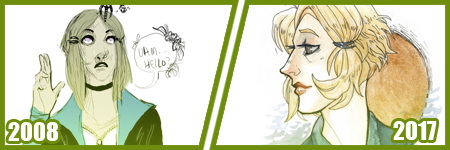
Most artists have done a drawing of themselves and a few Pokemon, or their team. I did that in 2010, and was dissatisfied with my work...
I took a crack again in 2013 after I’d learned to draw more animals and not be so Edgy(tm) I really liked the results. I still didn’t use references though, because I was lazy. I just didn’t want to. I still was on that boat feeling like I was CHEATING. I wasn’t being CREATIVE if I looked at references.
Artists get stuck on using reference and it’s AWFUL. USE THEM. USE TWENTY. LEARN!! It’s so HELPFUL, I wish I had started sooner.
In 2014 though -

I tried again.
I had gotten better at anatomy, but most of all, I started to work off references more. I started to really focus on not stylizing so much, but to work on actually making things look like things. I started to work on caring about COMPARISON sizes. Composition!!
While Pokemon reference sizes are -wiggle hands- and while my team changed up, I was satisfied that I could draw Arbok ACTUALLY like a cobra now, Meowth is easy given it’s just a noseless cat so to speak, Haunter is literally a triangle cloud - I was satisfied having drawn that team.
My secondary team in the new games? I was excited to draw them. It was fresh and new and FUN and it turned out PRECIOUS.
I learned better how to proportion things in an image for layout, and just... making characters feel COHESIVE in the same space.
It was a nice thing to keep visiting. I have a sketch in the works for an update even hopefully.
These pieces are kind of interesting to me too, because they’re towards the end of my era of THIN lineart?
My lineart has gone from this, and THIS, to this.
Literally I use to not believe in line weight, I can still do thin work of course, but I’m not a fan of trying to FORCE it like I use to? Even the second link, I went from the SMALLEST brush in Sai, to using a marker brush that had barely ANY give, to a custom brush on Sai that acts like a Paint Chat brush I use to use with friends online!
That’s what I mean about style too, like you may reserve yourself about things - like not coloring black in and outlining with white, or certain ways you do things. But the growth and changing and figuring FUN ways to color that black etc is where the fun of art comes in, to me??
Learn. EXPERIMENT. PUSH!
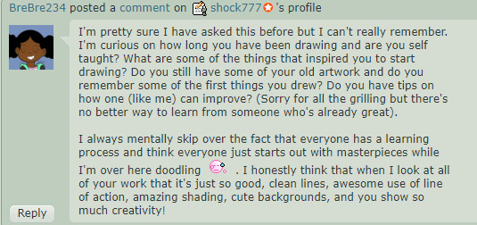
A few months ago, I did my first redraw. Of this piece from 2012.
Six years difference.
This was interesting for a number of reasons. There’s aspects I like more in the old one, but not many. I really like the pose a bit better, but I like the casual closeness that I did in the new one because that’s more my Shepard.
But technically speaking, it’s worlds better because I took time. I paid attention to details. I did fun things instead of rushing. I took time with my coloring and didn’t SMEAR it around. I had a friend who use to complain I drew so fast and they felt so SLOW, but I love what that taught me. I started taking more time on my art, and enjoying it more since I caught more mistakes and vastly improved. By leaps and bounds.
It’s amazing what a difference six years makes in not only style, which is often a FOCUS of these things? My style has come awkwardly and naturally to me over the years of critically picking certain things apart? but I really love where it’s gotten.
I have things I want to get back to, but I love... where it is, and CAN be?
But it’s wild to me how much change happens in technical handling? It’s a hand in hand thing, you can’t focus on one or the other only, or the other suffers.
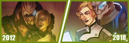
Honestly this has been my favorite improvement to notice though?
Kisame was a character I felt I should be able to draw EASILY? Not so much. Itachi? ALSO EASY. Not so much??
Kisame has weird eyes to grasp how to draw? Thus focusing on them kept making them wonky to me!! On top of that, he’s everything I’ve been use to drawing for AGES because he has a muscular body, with a smaller waist? ... that was something I was use to drawing? I still was awkward getting back into the swing of that... Drawing HIS HAIR though? NOT SO EASY....
But like, Itachi should have been easy, but I have a thing about him appearing too feminine as he gets drawn because his eyelashes, and I’ve really found a nice... medium at this point?
But even still like my face styles and eye styles are finally to a comfortable point for me? I have stopped focusing on some weird things with Itachi’s hair and just... DO IT? But even still like...
The improvement here is literally just if I don’t know how to do something, or I’m not satisfied with how I do it? I just keep at it.
It’s a theme of this post honestly... repetition, persistence.
Keep drawing it. Keep trying to figure out what it is that’s catching you off about how you do it. Don’t like how you do eyes or how they fit on the face? Look at facial structures and references and figure it out. Draw them separate and figure out how to apply them to what you are.
Remember there’s a skull in there. I draw the holes in the skull like the eye sockets, and the nose area to help my proportions for SURE.
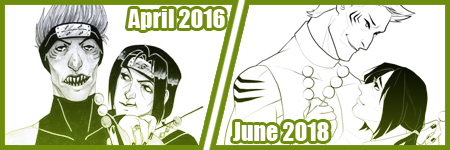
I’ve also gotten to a nice marriage in my lineart? The piece before the recent one, those lines feel HARDER or HEAVIER? The newest piece seems...softer? Like I’m lighter handed again?
I really like critiquing my own growth on what is good or working better for me? Older pieces it looks like I’m putting lineweight for SAKE of it versus where it goes now?
INTERESTING.
Like this lineup -

My style shifts so RAPIDLY, it still is noticeably MY style to people, but parts shift so VIOLENTLY because I’m constantly picking at what I don’t LIKE.
It’s funny too in the case of Kisame and Itachi because consistently I’m drawing the SAME character over and over - can make you REALIZE how you’re doing something wrong?
Like, here’s a difference of eight years, and it’s all the brush I use now, and it REALLY shows how my style has changed - in the aspect of one point of reference?
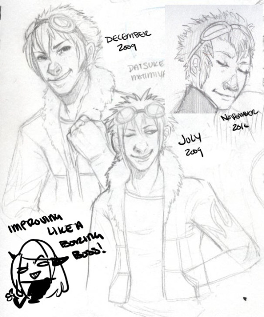
I have a childhood favorite character too, of Daisuke, and I use to be bad at drawing boys, and I use to be SUPER bad at drawing fluffy hair?
It was something I specifically started to learn to do? And I started to draw Daisuke every few months or years for a while. Especially when I started to first REALIZE I didn’t like my style that much?
But the middle one was July 2009, top left is less than 6 months later, and the last one is about a year later. DRASTIC DIFFERENCE. But next -
This one was in 2012, when I started to do more with teeth, or first dipping my toes into anatomy. I started to focus more on HANDS too, I was super bad at them. Overall I started to focus more on making my art have...ages? Like a boy versus a man. Facial features being DIFFERENT.
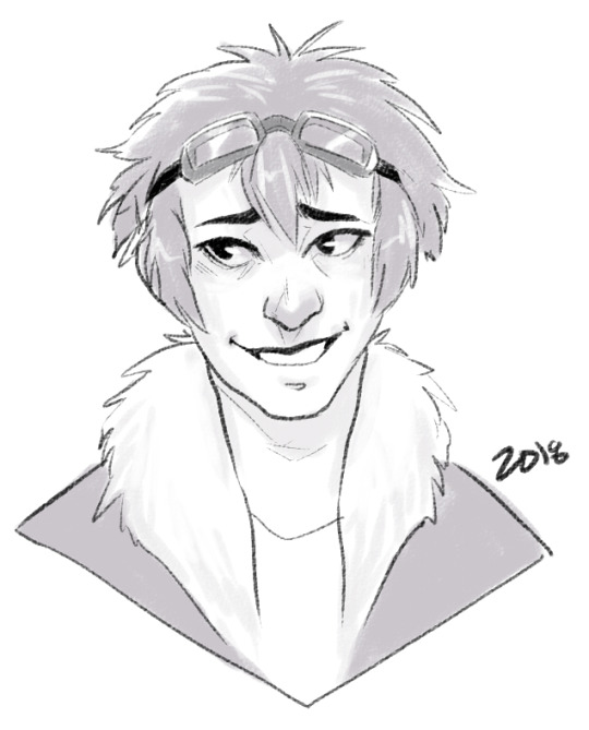
I can look at this boring little bust and see that he comes off more of a teenage boy to me now. I need to work more on figuring how to draw asian features especially the eyes. Sometimes I hit the mark, other times I don’t.
but between this and 2012? Not too much has changed. I do hair fluffier now, and I angle the eyes better. The teeth not being outlined doesn’t give that weird effect where I might give him TOO MANY TEETH....
People do that and it’s easy but whoof.
So there’s still learning and adapting to do in QUICK drawings, you know? but I can still see there’s good things. That took me like 5 minutes to draw? Not bad honestly.

In it’s own bracket is original characters though too?? But also divergent of STYLE shifts because like...
OKAY. Nightmare Syndicate’s story.. started for me in 7th or 8th grade, that was when I was...14? 15? I’ve been fleshing it out for like 13 years, that’s wild haha!! I love my kids and all.
But okay so SIALI. She’s still fairly similar but I restructured her face for SURE. She’s gotten less edgy, she’s.... a teenage girl.

FELIX?? CHRIST. He’s been such a long journey!! More on that later?
Rot and even Cor?? Rot and Cor are a shorter span of development, but Rot started in Highschool so almost 10 years ago, and Cor has been fairly solid - but even just DRAWING him over three years? Go look at how much he changes.. I’m not married to concepts easily. haha!
People act like making a character you’re STUCK with it. Like Oh boy, I better make this character good, from the get go!!
I only worry about that with small potatoes like my Pillar(Gods) designs I just made for the comic?? Even still, small things will change with them I’m sure.
But not only has Felix and Siali changed, but they’ve GROWN with my style and DEFINED it even. I’ve had to adjust my style to support Felix’s look honestly a LOT. Bend my rules. Break my anatomy stickler attitude - and honestly, that’s the thing.
You have to learn the rules and anatomy BEFORE you can break them. A style built upon broken anatomy will fail you down the road if you just excuse everything with style.
Learn to draw the hands. Learn to draw the feet. Figure out the face. Bones exist. You can break the FUCK out of it once you learn how to do it, you know? Like I’ve seen so many styles I LOVE who are cartoony and BROKEN AS FUCK, but there’s still some STRUCTURE to it. Most of those people can still structure a face just fine, and the reason exaggeration works so well is because there’s like unwritten rules for what works and doesn’t based on that?
Idk.
Felix has a very elongated torso, he’s like 7′ or 8′ tall so I mean?? He’s... broken anatomy, but he’s... lanky - but his muscle is LITHE and stretched. It makes contextual sense. That’s the important part.
But even designs, it’s important to understand designs YOU make, or like... to understand they’ll CHANGE and that’s growth within your art too?
Like okay, example. Felix has a millipede inspired monster form. But with designing that? I still have to know how millipedes and SNAKES work because there's bones and vertebrae in there??

But there’s also the difference of like... CONCEPT, versus execution. You can design a fucking badass character, but understanding your own concept is SOMETHING.
I had no idea how this would play out, until I was mapping out his ‘midsection’ spikes? and man. MY STYLE WAS MADE FOR THIS CHALLENGE NOW. Which is so interesting how smooth my style has always been? Felix has defined ANGLES in it, and it’s hilarious tbh?
But even too, I’ve had to work with Felix’s monster form FACE, to break the rules to make it WORK the way I need it too?
On the anatomy subject too, like when I first got into Marvel comics 6 years ago or so? I had no idea how to do muscle structures?? I was so BAD at it.
I can look at this left image and CRINGE so badly at how NONE of those are muscles?? THOSE ARE THINGS I PERCEIVE AS MUSCLES. Like...
A course I took taught me to draw what I see, not what I know. That’s the whole point of that post that goes around about drawing a shrimp. Look it up. It’s hilarious and cute.
But it’s like, asking an artist to draw a bike, you can tell who uses reference and who WINGS it. It’s funny, but like it’s what you know versus what you see.
I started to study anatomy like crazy and was seeing improvements days at a time. The right image was done like... a month later? already I can see the muscles under the pectorals? those look normal now. the abs aren’t dough lumps under the skin in a perfect 6 pack, they’re the actual plane shapes.
I was trying to find a good reference for myself of learning to make men ‘thicker’ too in terms of the waist etc since the left is really...thin.... but...

A bit better, but even still, comparing these two - they’re 2 months apart? and I can see understanding more about arms and how they connect to the body, where the planes ACTUALLY lay for the chest and obliques and such?
I can see improvements from July 2012 up there, to - WHOOPS. I FORGOT TO CHANGE THE YEAR LMAO... TO FEBRUARY 2013...omg
I mean, I could go on and on about improvements I see, when I go through my art though? Gosh.
Like I’m seeing so SO many bad hands and feet in my old stuff, and just CRINGING because tricks I learned for myself by now?
I give so many pointers and streams and screenshares on discord still to help people with art and it cracks me up?? Like...
I dunno. I’m pretty mediocre tbh, but god damn.
21 notes
·
View notes
Text
My Process for the Watch_Dogs 2 Animation
After I saw the video that was posted on November 14, 2016, my mind immediately picked out my favorite moments, which I sketched below and shared on Twitter the next day. These drawings would later become keyframes for the animation, which are major poses that show clear emotions.
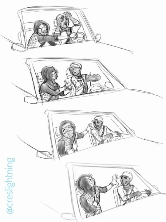
I thought that would be the only piece I would make based on that video. Instead, my animator’s mind kicked into overdrive during the next two days with my first idea, which was to make reaction GIFs with the major parts of the video. The list below shows the parts that would have become the GIFs.

The first step in creating the animation was screenshotting the video for the times on the list above to create full reaction gifs. I watched the first part repeatedly to find the keyframes, then took screenshots. Next, I placed the images into folders for that part. I previewed the first image in the series and flipped through them as quickly as I could, since I knew I would be animating on ones rather than twos on the frame rate of 24 frames per second (On ones: 24 images = 24 frames per second; On twos: 12 images or every other frame = 24 frames per second).
I ended up taking numerous screenshots and deleting them when necessary. The challenge in this method was that I couldn’t take the keyframes first and then the in-betweens because of the time stamps on the file names. I also had to time the animations by feeling them out - I used my experience in rhythm and timing from playing music and sports as well as traditionally animating with DragonFrame (stop-motion animation software) to time the animation.
I repeated the entire process for the other major parts - each with their own folder.
I hadn’t picked the project up again until Christmas, as I was finishing college and also played Watch_Dogs 2 when it was released. Seeing the interactions between Marcus and Wrench throughout the game made me even more excited to work on the animation and gave me ideas on how to improve it.
Before I dove into animating everything, I made a test animation. I imported the images for the first part into Clip Studio Paint as a timeline and made a rough character animation. I sketched the base anatomy to get a feel of the movements to see if the characters animated well. I hadn’t finalized Marcus and Wrench’s designs yet because I was more interested in seeing how the animation would play out since this was my first rotoscoped animation.

In January, based on the method from 8:54 – 10:41 in this video, I simplified Marcus & Wrench’s designs to basic shapes (with character design principles in mind), but would still be able to recognize them.
At this point, I had all the major parts screenshot for the GIFs and simplified the characters’ designs for a hand drawn animation. When I looked through all the rough animations I made, it suddenly hit me that instead, I should animate the entire video to test my skills that I’ve learned during school as a personal challenge – the 12 principles of animation, gesture drawing, drawing quickly & accurately, facial expressions, body language, and perspective.
I had synced the animations to the video and had most of it already animated - I just needed to animate the in-betweens. By the end of January, I had the entire animation sketched and timed to the video.
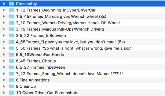
Folders #1 to #7 were created by the end of January - the rest were created towards the end of the project.
I also did a color test (between all the animating) to get an idea of what the animation would look like because at that point, I had planned to color the animation too.

I completed the final character drawings in next two weeks, using my simplified designs of Marcus and Wrench and in-game photos as reference. I didn’t pick the animation up again until August since I had other commitments, but I continued to think about how I could improve the project.
In August, I began working on the animation again. I studied the Cyber Driver car so I could simplify it into large shapes like Marcus and Wrench and would still be recognizable. I took numerous screenshots of the Cyber Driver car from all angles to aid in my drawings and kept 3-4 photos open as I drew to keep the car as visually consistent as possible.
As I animated the car, I considered the timeline for coloring and drawing details on the characters and car. I did another color test to try to figure out the most efficient method to color and my speed and accuracy.
Unfortunately, Clip Studio paint is a pixel program rather than a vector program like Adobe Illustrator and Flash (now known as Adobe Animate), so using the paint bucket to fill wasn’t effective. It left a halo between the edges of the color and the lines. I researched various methods – one such method in Clip Studio Paint is to use reference layers to fill the small spaces completely without erasing the lines, but it proved ineffective, probably because my lines were too thin and the line weight was much thicker in the tutorials.
After trying numerous methods, I decided not to add color or detail for several reasons:
-I was more interested in showing the movements of the characters.
-Coloring the entire animation with only one solid color (instead of including lights and shadows) would mean some of the animation could get lost in big blocks of color when their arms, hands, and clothes overlap.
-The lines were too thin.
After I checked that the character and car animations synced with each other and with the video and audio, I proceeded to clean-up. I erased unnecessary lines and made drawing changes where necessary to ensure the smoothest transition possible – each of the files had 3 to 24 frames, with 20 files total.
I added all parts to iMovie again and watched the whole video numerous times to make sure I didn’t miss anything – erasing lines, character and car details (i.e. sometimes I forgot to draw Marcus’ facial hair or Wrench’s “A” on his neck since there’s 300+ frames). I would look at one aspect as the video played several times (such as Marcus’ facial hair). If I missed something, I’d go into the Clip Studio Paint file and edit it, export it as an animation and import the part into iMovie. This continued until I was satisfied.
I then storyboarded the ending since I wanted to include all DedSec members. I had wanted to do that since the beginning, but didn’t know how to until the end. I thumbnailed, sketched, then drew the finals for the last frame of the rotoscoped animation and two new frames for the ending. To make the animations more “lifelike” as it played, I redrew the 3 frames using the original ones as a guide. When I alternated the original drawings with the redraws, it would create a “shaky” effect. I timed out the “shaky” frames by animating on twos on 24 fps in Adobe Flash. I exported the endings and imported them into iMovie and timed them too.
Finally, I added the intro black screen and credits at the end.
With that, I finished my animation over a period of a year for Watch_Dogs 2’s first birthday – one of my favorite projects to date.
6 notes
·
View notes
Text
miiikaelson replied to your post “It’s almost four in the morning, and I’m too busy drawing our...”
ref shots ain't bad at all and i'm impressed at your ability to draw from sight!! thats reaslly hard, and the perspective is super duper well done
also impressive the fact that you went to so much trouble to get an in-game reference. i dunno how much of a reference u used for emily but whether from sight or original its a fucking + and i cant wait to see the finished project
the wrinkles are nice, and so are the blood dripping and the little details above her mark (that i nearly missed!!) it all looks really nice and her face looks like HER face which is another hard thing. its nice.
ok, compliments done. im reblogging it to my art favorites and emily tag now. bc its so good and i cant wait.
wait compliments not done. the bodies make nice details bc they like direct TO emily and u got some design techniques with the behead guy. i had to take a lengthy design class. i now see design in everything. u did well.
First of all, you’re an absolute DEAR, and I adore you oh my god. I was going to reply to this last night but it was around 5am and I just ended up falling asleep whoopsies.
2) MAN THE PERSPECTIVE. DON’T EVEN GET ME S T A R T E D. It took me about an hour to set up the damn picture I wanted for the reference because I can draw Dunwall pretty decently without a reference but Karnaca’s got a really, really, really specific look whereas Dunwall is just sort of “London steampunk-ish.” And THEN it took another twenty minutes to take the damn photos because leading lines and balancing the foreground vs background, and negative space blah blah blah I’ve studied art basically my entire life, and a part of me wants to go “Fuck it” and ignore the basic principles of design, but it’s ingrained in me and I can’t. I’m getting off topic. PERSPECTIVE. RIGHT. I had to redraw the entire background around ten times because all of my ref pics were from drastically different positions and I was screaming trying to figure out where the focal points were but I think I kinda sort of got it in the end.
3) I’ve only drawn Emily about four times or so before so I have a decent understanding as to how her face looks (it helps that her moles happen to be in the same places my moles are, which is kind of freaky and creeps me out a bit) so those little details are pretty easy to figure out BUT, because I wanted to get things perfectly right I used a couple dozen refs from different sources to figure out how I wanted Emily to look. (She looks so different in every single version that I wanted to find a middle ground.) And @ominousdeer ‘s dozens of photos of Em were amazing (I did use a direct ref of ominous’ for the pose because I couldn’t be bothered to sit down for four hours scouring the internet, or fiddling with sketches), as well as my eight billion screenshots of Em during the first cinematic trailer for her (the one from the E3 announcement) ‘cause I feel like that’s how Arkane wanted her to look if she was hyper realistic, and it’s also the only one where she decently looks biracial and goddammit, I want to preserve what few biracial characters there are because I sure as hell never found any characters that were biracial in the media when I was growing up that I saw myself in.
4) The Mark!!! I didn’t give her a sword because the whole point of the piece is “blood on my hands” etc etc etc, making her crimes a little bit more personal, and in my original version of this, she was also weaponless (but her hands were covered in a LOT more blood), but narrative wise it didn’t make sense as to how she’d kill them 100% bare handed, and then I remembered that the Mark glows when it’s being used so tadaaaaa glowing, smoking Mark
5) Ahhh thank you! There was a lot of careful body placement when I was setting up my ref (which is HARD because you either fucking launch them across the entire map but they ragdoll which is nice for randomization of body placement, or you gently sit them down and they just rest in a sort of loose T-pose which is so unnatural looking and doesn’t at all make it seem like they’re dead.) I had to end up throwing bodies from down the alleyway and off of buildings (the scene is actually the Overseers’ offices where Mindy sends you to go get a body in Mission 2 of D2) so I cleared all the Overseers and threw them off the top of the building hoping it’d work... it wasn’t... fun. (Yes it totally was. Especially since I left the civilians alive so there was a lot of chaos.)
1 note
·
View note
Text
EPISODE 1:
Aloha, fellow Sakuga Seedlings!
Welcome to my case study series, Brain Vomit.
Name’s
Tuchimuchi Yoshinori – or just Tuchi...
And I enjoy animation. Especially animation from the eastern archipelago of Japan, also called “Anime”
In this series, right here, I’ll be exploring Japanese Animation Production and enlightening this growing community and myself to the power they have in this expansive animated medium.
In this episode, we will focus on Defining Anime, Production Roles that go into creating anime and more!!
I welcome you all to join me on this exploration into Anime.
Without a moment’s hesitation, let’s start with the crust and make our way downward!!
What is Anime?
Anime (アニメ) the word, is moniker for Japanese Animation.
Anime, the art form, is a style of Limited Animation that came into prominence during the rise of Disney in the 1960’s, although Japanese animation dates back to the beginning of the 20th century. The most prominent and well known anime began from Osamu Tezuka -- known for Astro Boy, Black Jack and Kimba the White Lion -- creating new techniques after being inspired to simplify Disney’s rigorous animation aesthetics.
As manga began to be noticed as the popular thing in the 70s, anime began to shift from a Disney imitation to a new style of its own.
Sakuga (作画) is a catch-all term in Anime, where a certain scene or event’s production value and animation quality exceed the usual fare. It’s often these moments that enraptured our eyes to anime and got us interested. This can be anything from effects, to characters to background animation! Sakuga is limitless in it’s potential EPICNESS!!
Here are some awesome examples by Web Animator’s Yotsube and Bahi JD!

I know, it’s pretty damn cool. And Sakuga, there is actually a word for it! Literally translated from “Creating Pictures”. The name for this community that I call “Sakuga Seedlings” comes from the pun of “Saku” also being read as “to Bloom”.
(Source)
Some of the most famous anime were created by the world renowned Studio Ghibli and Hayao Miyazaki.
But other important, often forgotten legends are:
Hideaki Anno, Katsuhiro Otomo, Mamoru Hosoda and Makoto Shinkai.
If you haven’t heard of these guys, check them out. I’ve linked to their wikipedia articles in their names, so feel free to click on them and get a basic gist of what these guys are about.
In a future episode I plan to go over each and every one of them!
Next, I know you all saw that word “Limited Animation”...
Q: What is Japanese Limited Animation?
Unlike most Disney animation -- or Full Animation, where every frame is painstakingly drawn to create an almost true to life smooth motion -- Limited Animation is a style that takes advantage of the limited frames, partial frame changing and movement to create visually stimulating works. This is a much cheaper method and can be used to varying results.
Most Western TV cartoons and pretty much all anime is Limited Animation.
Full Animation is In an environment in which redraws most every frame are MANDATORY to create as realistic/fluid as possible movement. Unlike it though, limited animation often breaks traditional norms by keeping redraws to a restriction (often by getting creative with animation styles and shortcuts), but allowing for a more dynamic visual spectrum, as they are, ironically, not limited by realistic standards of full movement.
Many techniques of Limited Animation can be incorporated into more Western Full-Animation as well.
Limited animation is not limited to Japanese Animation, but because that is the focus, I want to focus my attention there.
(source) (source) (source)
So let’s, compare them!
Q: Compare Limited vs Full Animation
Let us compare Disney’s Full Animation and Limited Animation.
For this example,

vs
Compare to Disney, which has very realistic perceptions of movement to Limited Animation.
Limited Animation often MUST exaggerate movements, repeat frames and manipulate the camera far beyond to get the sense of movement without frequent redraws.
It takes advantage of the mind’s magnificent ability to fill in movement on it’s own.
Note this: All of this is considered Sakuga. Pretty cool, right?
This type of animation still on paper before colored and composited is called “Genga” (原画).
No, not the Pokemon, Gengar! Nix the “R”!!
(Thank god, for now Tumblr gives have the sources -- so I can save time on listing them. As the series goes on, I’ll be grabbing actual clips and editing them in my own way, so those sources will have to be better defined...)
Q: OK. Back to Anime, How is Anime Produced?
Using the anime Shirobako as a fantastic launchpad, as well as other studies, Anime Production is built upon multiple roles and hierarchies.
(If you are at all curious about Japanese Anime Production, watch this series; It’s on Crunchyroll for free. I’m not being sponsored, but I recommend it. Linked above.)
(I will also be leaving Executives, Producers, Writers, Voice Actors and Sound Crews out of this list, which have a different important roles. But I would like to give this focus eventually along with Marketing Techniques, etc.)
For now, I’ll use basic definitions to keep things simple, but the most common roles in any anime production are:
Director: The individual in charge of keeping production staff on task and keeping the overall visual aesthetic. For Example: Akiyuki Shinbou of SHAFT fame.
Animation Director: This is the head person in charge and oversees all of the individual animation production. They are ALWAYS talented Key Animators with years of experience and have the last say on EVERY FRAME USED THE FINAL PRODUCTION. They have other responsibilities such as as Redraws and Correction.
Character Designer: The person who either creates or adapts designs for TV animation. This is Episode 2’s main message in a nutshell. But to sum it up here, it is not uncommon for Animation Directors and Character Designers to either be the same person, or a pair who have worked together on a lot of stuff.
Key Animator: The people in charge of drawing key poses (important movements and poses). There can be very few or very many depending on the production staff. We’ll get into that at a later time. These can often be Freelance Animators as well, which is very important as Studios often Freelance and can get different feels because of it.
In-Between Animator: The people who draw in-betweens to keys, connecting them all together and clean-up. These people refer to the Key Animators, while Key Animators refer to the Animation Directors.
Color Artists: Pretty straight forward, depending on whether traditionally or digitally animated, add color and shade to the basic animation. During the days of Cel-Shading, these were hand-painted, but with technology, tools like Photoshop, Toonboom and After Effects are more commonly used.
Check Artist: This person reviews each frame and checks for inconsistencies. They help the central aesthetic, style and models are on point. If not, a frame may have to be redone. When these guys mess up, we get things like this. These also can be Animation Directors themselves. Many roles can bleed into one another, if that wasn’t obvious enough. (Show example of animation error)
Background Artist: These guys design the backgrounds, whether 2D or 3D. We’ll get into this more later as well. My 3D knowledge is very limited, so I’ll do my own homework on more information on that.
Compositor: This group puts everything together, can take care of digital effects and edits such as atmospheric lighting and weather, depending on the production company. These guys create the crisp polish you’ll see in Ufotable Productions.
I know you must be thinking, these are very similar to Western Production Studios, and you’d be right.
They are very similar, as each piece is needed to produce like a well oiled machine. But there are many VERY important differences. If you know Animation History, Anime production was based on and eventually deviated from Disney’s original model.
Now that you have most of the basic pieces to understand we can begin digging in the differences from the ground up, work to each role and it’s importance and how that all comes together.
Now we can start to looking into the question of,
Q: What is different about Japanese and Western styles of animation production?
Not in the aesthetic choices, but in the setup and philosophy of animation.
It all comes down to the production at hand, but the main basic philosophy is something I like to call “Western Order and Eastern Individuality”.
This is a good start and the start of some of my liberal take on defining different parts of anime and animation -- A main point of this series was to break down and find a way of defining little things like this in a more digestible method:
So, what is the Western idea of “Order Animation”.
Well, how staff is put together is what dictates it.
If you look at any Disney frame, what do you see? Animation that is completely kept on model and shows the visions of the Director and Animation Leads based on strict values of Order and Perfection.
This is often formed by having teams for every character and aesthetic throughout the entire picture remaining as physically consistent as possible.
It’s very impressive that they can get this group of people so on point! I admire it, even if it isn’t the philosophy I prefer in my own tastes in animation and production.
Then, there is the Eastern idea of -- what I like to call -- “Individuality Animation”. This is just another way the production team is staffed and ordered. Most Key Animators have what are called Cuts -- specific scenes in each production that they are in charge of animating. Think about a Cut like cutting a camera in a film to a new scene. Many film making techniques are used in animation, this should always be kept in mind constantly.
Once again, this goes more onto which you find better in your opinion, but I tend to find these definitions slightly ironic based on their respective cultures, but there is a lot of truth to them.
Q: Now, why does this Individuality Animation interest me?
Because, it allows for every Key Animator and In-Betweener to add their own spice and flair to a scene, to the point where based on the animation, you can tell which individual worked on it.

-- AND THIS IS WHAT I LOVE!

LOOKING AT A PIECE OF ANIMATION AND BASED ON STYLISTIC AND AESTHETICAL TROPES, YOU CAN POINT OUT A SPECIFIC ANIMATOR OR ANIMATORS INSPIRED BY ONE ANOTHER!!
I believe Order Animation tries to represent a company as a whole, which is great in its own right.
While Individual Animation tries to represent the identities of those who worked on it. Which I am much more in support of and interested in. If you’ve ever met me, I am the type that remembers faces and personalities more than names and the bigger picture. With how I work and how I love to meet new people, Individuality Animation allows me to really get to the heart of an animator.
Ahem, I lost my composure there! Haha!
Next on the chopping block:
Q: Digital Animation vs Traditional Animation...
How are they addressed?
Simply, are Keyframes and In-betweens hand-drawn on paper and then scanned for clean-up and color?
Or are they drawn on digital tablet or are they 3D models?
Traditional Animation is still very common in Japanese Animation production, and most every anime you’ve seen started as hand drawn on paper.
Digital Animation uses programs such as Photoshop, Flash, ToonBoom and etc. to draw everything. Animators that focus on this medium are lovingly called Web Generation Animators. Believe it or not, one of the eldest animation studios, Tatsunoko has evolved to include many web generation animators.
youtube
(From the Studio Tatsunoko produced “Yoru no Yatterman”, hosting a wide array of web generation animation talent!)
In a later episode, I will do a more complete diegesis on Digital Animation Programs as it’s one of my favorite topics.
3D Animation is a new sensation that started an arise in anime at the start of the 2010’s. All of these anime are produced in 3D animation softwares, but are produced using techniques descended from Limited Animation. Look as series like Guilty Gear Xrd and Black Rock Shooter for some amazing examples of this.
youtube
youtube
(Guilty Gear Xrd belongs to Arc System Works. It is on PS3, PS4 and Steam PC, Go play it! The GDC also produced this great video on how the 3D Cel-Shaded style was used to imitate sprite anime form the previous entries! It’s about an hour long, but super informative!!)
Mixed Media is often used, where anime can be produced using all three methods for different reasons, be it backgrounds or the animator had a preferred way of animating. Most modern anime uses a form of mixed media from Pokemon XYZ’s 3D Camera to To Aru Majutsu no Index’s 3D Background design. It’s more common than you’d think.
(Most noticeable at 0:39 and 0:58. Look how the ground around Ash’s feet is swiveling in a new way. Or how the camera follows Pikachu to Pangoro and Honedge. Fun Fact: Quick Attack is ineffective on Honedge, it’s a Ghost type!)
youtube
(Pokemon XY belongs to OLM, Game Freak, Nintendo and Creatures Inc., OLM actually means Oriental Light and Magic, inspired from Industrial Light and Magic, known for Cinematic VFX.)
But these can be used in a myriad of creative ways to make each cut feel distinct depending on which animators are behind the wheel.
Since I’m focusing on Japanese Animation Philosophy, as it’s what I know better and prefer, I will focus on that through most of my future studies.
However, you are free to use whichever method you want!
The great thing about art and animation is that you have a choice in how you go about doing it. I wholeheartedly believe in having whatever style interests you and making the most of your creativity.
If I can help bring in a new interest or skill set into your work, or just entertain you with my geekiness about anime, then it will all be worth it.
Who knows, you may be surprised at what we discuss!
I’ll call this episode a wrap for now! Next time we’ll be discussing the basic principles of animation.
If you haven’t gotten a copy of the Animator’s Survival Guide, I highly recommend finding a copy of it! It’s a must-have for animators of all skill levels, even amateur ones like me.
I’ll see you all next time!!
ON THE NEXT BRAIN VOMIT!!
EPISODE 2: ANIMATION PRINCIPLES ARE THE MOON PRINCESSES?!!
STAY TUNED NEXT SATURDAY AT 7PM EST FOR NEXT EXPEDITION INTO SAKUGA GOODNESS!!
DON’T MISS IT, OR I’LL HAVE TO PUNISH YOU!!
Remember: Always bloom proudly,
– TUCHI OUT!!!
#sakuga#animation#case study#new tumblr#new series#new style#tatsunoko#sailor moon#space patrol luluco#yatterman#yotube#bahijd#hiroyuki imaishi#pokemon xy#guilty gear#guilty gear xrd#disney#one punch man#gifs#brain vomit
14 notes
·
View notes
Text
Annotation #2
“The Hawkeye Initiative: Pinning Down Transformative Feminisms in Comic-Book Culture through Superhero Crossplay Fan Art,” is an article about a fan art site that changes sexist drawings of comic books, to show the issues in how women are shown in comics. Starting in 2012, the website has one job: to take covers and panels from comic books of women drawn overtly sexual and in positions that a normal body could not reach, and redraw them using another superhero, Hawkeye. They keep the pose and sometimes the costume, but occasionally use the original, over-sexualized costume that Hawkeye himself used to wear, hence why he is the subject of these re-creations. They call out the sexism and degrading of women done in these comic books in a humorous way, while showing the extreme differences that the men and women of comics are dealt.
The source is reliable due to the fact that is is published by the University of Texas Press. This is a group that publishes over 90 books a year and 11 journals in a wide range of fields, publishing the research of scholars and students. The press is 100% affiliated with the University of Texas, and is a professional, scholarly journal. They have also been around since 1950, showing that they are reliable and have lasted a long time. The author, Suzanne Scott, has also been published before, covering topics related to this in “Fangirls in Refrigerators: The Politics of (In)visibility in Comic Book Culture, Transformative Works and Cultures.” She is knowledgeable in this department of study.
This website is a good cross between fandoms, art, and feminism, which are all things I want to focus on for my paper. I’ve known about this website for a long time, so finding an article over something I already knew about makes it easier for me to figure out how to use it. I think this article is a good example of how fan art isn’t just art, but can also be used for other things, such as activism, seen here. By making these low-key and funny drawings, the website is taking these issues and thrusting them into a new light, and giving a new perspective to people who may not see the issues at hand.
.
.
.
Sources
Coppa, Francesca, “Women, Star Trek, and the Early Development of Fannish Vidding, Transformative Works and Cultures,” no. 1 (2008): http://dx. doi:10.3983/twc.2008.0044
Scott, Suzanne, “Fangirls in Refrigerators: The Politics of (In)visibility in Comic Book Culture, Transformative Works and Cultures,” no. 13 (2013), http://dx.doi.org.proxy.bsu.edu/10.3983/twc.2013.0460.
Scott, Suzanne. “The Hawkeye Initiative: Pinning Down Transformative Feminisms in Comic-Book Culture through Superhero Crossplay Fan Art.” Cinema Journal, vol. 55, no. 1, 2015, pp. 150–160., www.jstor.org/stable/43653492.
Stevenson, Noelle, “How Are You I'm Fine Thanks,” 2012, http://gingerhaze.tumblr.com/post /37003301441/how-to-fix-every-strong-female-character-pose-in.
0 notes
Link
Deep Dive is an ongoing Gamasutra series with the goal of shedding light on specific design, art, or technical features within a video game, in order to show how seemingly simple, fundamental design decisions aren't really that simple at all.
Check out earlier installments, including creating tension in Card Thief, achieving seamless branching in Watch Dogs 2’s Invasion of Privacy missions, and creating the intricate level design of Dishonored 2's Clockwork Mansion.
Hi, I’m Barney Cumming, artist and designer of Crawl. I created the art and animation for the game, and will be talking a little about the process and decision-making that went into the project. I've been working as an animator, designer and artist for video games in Australia over the last eleven years, with these past four under the banner of Powerhoof, a two-man games company started with programmer buddy David Lloyd.
I started making pixel animations on the computer at roughly eleven (around 1993), using HyperCard and a program called PC Animate Plus. In 1999 I started animating with 3D Studio MAX R3, which led me into the games industry; initially as a 3D animator, and later as a designer. In 2013, Dave and I quit our industry jobs to have a go at making something a bit more personal to our tastes, and to escape the crushing boredom of the mobile market and all those microtransactions.
Crawl is our first commercial game, a local-multiplayer dungeon crawler where all the traps and monsters can be controlled by your real-life friends. The art style is very low resolution, with screens tending around 150 pixels high (where screens on the NES for example were closer to it’s full 240 pixels high). Crawl uses off-grid, scaled and rotated sprites, (rather than adhering to classic restrictions in these areas), to give a style which freely combines elements from modern and retro sensibilities.
In developing this low-res art style for Crawl, we start with a simple list of requirements:
It must be efficient enough for our one-person art team to create and animate upwards of fifty unique monsters, as well as innumerable hero weapons, environments, props, menus etc, within a reasonable timeframe.
It has to be visually striking. Not just look good, but look good in some unique way that stands out from the way other games are looking good.
As I’ll be making all the art, the style should emphasize the things I’m good at, quick at, and experienced at, and deemphasize all my weaknesses.
It should be fun to make. If we’re going to be working our asses off on this thing, it’s best not to choose a style I already find laborious. Fortunately if we meet the other three requirements, this one tends to be a given.
Despite all my industry experience being with 3D art/animation, and not having touched pixels for a good fourteen years, after initial testing it quickly became clear that pixel art could be just the right tool to let us realize our design. If I took the resolution low enough, I could give the impression of “knight” “demon” or “spider” very quickly (compared to modeling, texturing and rigging in 3D), I would have access to all the fluidity of 2D animation (which you can’t ever get from a 3D rig), while magically being freed from how slow I usually am at drawing in 2D. I could focus on my strengths - animation and character movement - and avoid all my weaknesses.
I knew my tiny little 5 or 10 pixel high monster sprites wouldn’t be visually striking compared to all the amazing game art out there, but keeping them so low-res (so quick to draw and redraw) would allow me to really go crazy with the animation fidelity, and seeing such modern high-fidelity animation applied to such low-resolution art (which we’re used to seeing with only the most rudimentary animations) was a pretty bold look to my eye, and not one I’d seen anywhere else.
If we were trying to be visually appealing in the same way as other games, going for a well-trodden style but just trying to outdo everyone on execution alone, we’d have needed so much raw art firepower to be noticed above all the competition. So this technique of making our own little competition off to the side in which there are no other competitors, is a sneaky way of standing out without quite competing. It’s a bit like wanting to break the world high-jump record, but seeing it’s way too high, so creating your own “highest jump while also wearing a sparkly hat” category and winning that instead with a much lower jump (and a much cooler hat).
So the style goal I set was to take incredibly low-resolution characters, reminiscent of the games I played as a child, but instead of recreating the way those old sprites really moved, I’d animate them to look how they did in my imagination. As a kid, those clumsy two-frame attacks were heroic lunges, and the simple run animations were athletic and full of life. I wanted to recreate the version I saw through the rose-tinted lenses of my childhood imagination.
For the smaller characters, the animation process is simple. I’d start with the key poses (frame numbers with boxes around them) which in this case is mostly one frame for each swing of the sword, with the pose being drawn in the posture the hero holds on immediately after each swing. Beyond that it’s mostly just inbetweens, apart from a few cases (frame numbers with underlines) where I’ve pulled part of the pose out a little further from the upcoming key, to give a stronger anticipation.
You’ll notice practically none of my inbetweens are actually half way between the two poses. If things are moving very smoothly and robotically you’ll get half-way inbetweens, but in the case of combat (and most other animations in an action game) the movements are very staccato, so half-way inbetweens won’t suit. To get the desired movement, most of my inbetweens are actually copies of either the previous or next keyframe, with slight tweaks to indicate which direction the movement is about to go in (or which is has just come from) and some delayed and tweaked body parts to indicate where the force and weight are pushing, dragging and pulling things down. The actual “action”, the biggest movement of each strike, tends to happen between two of my frames, and I just draw a big motion-blur smear to indicate the movement of the blade over that time. This technique, which amounts to mostly just cushioning around keyframes, gives very snappy, staccato results.
For larger, more complex creatures, I’d do most of the animation work using fairly simple stick-figure type lines (which are very quick to draw and redraw) before painting over with full detail once I’m happy with the movement. Any style or process which allows you to change your mind and redraw a pose quicker, will always result in better animations as you are freed to take more risks.
You can see the process is quite approachable when broken down into simple individual tasks, with the most important decision being the order in which to do it all. If you work hard on secondary movements before you’re entirely happy with the primary, you’ll end up having to redo all that work once you change the primary. Or even worse, you’ll be tempted to just accept an imperfect animation, to avoid redoing the work.
Immediately after animating that bird creature, I decided I didn’t like the direction I’d taken and redid the animation from scratch. The efficiency of low-resolution allowed me this extra creativity and experimentation, by stripping much of the sunk-cost in time spent experimenting. If this animation has taken a few days rather than a few hours, I probably wouldn’t have bothered to try again.
Of course as a small team we still try to minimize the wastage and reuse anything we can. When it came to designing combat functionality for the bird creature, I had initially envisioned him having a big “squawk” as one of his attacks, where sound waves would fly out like projectiles, and make the hero dizzy on contact.
The attack wound up playing badly in-game, no matter how much I tried to make it work. Although the attack was scrapped I did quite like the squawk animation, so when I settled on a “grab and bite” move, I reused the old squawk frames for the anticipation on his grab.
The speed of drawing in that art style wasn’t only about making better animations, it was about game-design efficiency and the ability to experiment. I could have a brand new character designed, animated and fighting in game within a day, allowing even our most risky ideas to be tested. With a higher sunk-cost for each failed experiment, we’d have been both risk-averse in our initial ideas (playing it safe and designing moves similar to ones which had worked in the past), and much more prone to making do with not-quite-right gameplay after all that work had been done for the art.
For us little developers, art can be a tightrope between visual impact and cost. We were lucky enough to find a style for Crawl that we loved the look of and was also efficient to make, but with that now old-hat, it’s time to find a new twist for the next game. Maybe low-resolution but wearing sparkly shoes this time?
0 notes
Last Seen Blogs

earthen-people
Earthen People

vkktechlogs
VKkTechLogs
ultimatecutenesspeaks
Ask the Ultimate Cuteness

dermageniqreviews-blog
Dermagen IQ

maybelleparker
May Parker💞