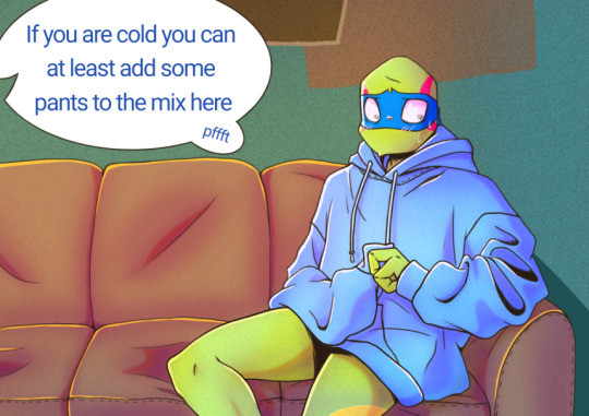
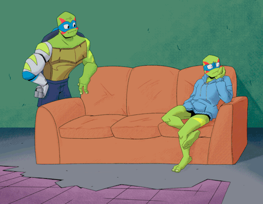
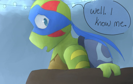
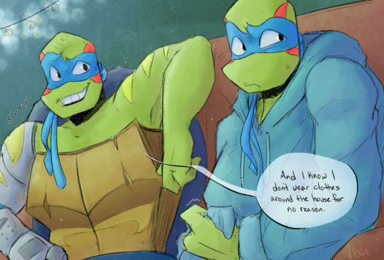
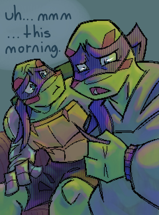
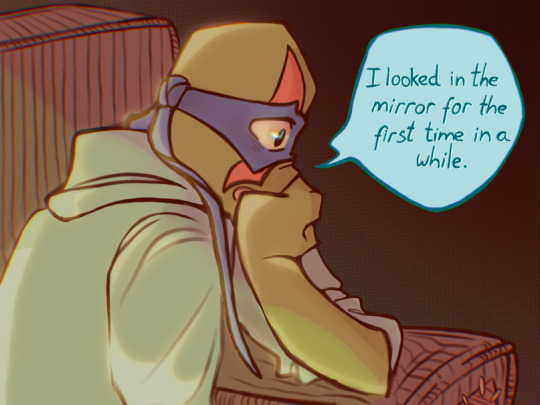
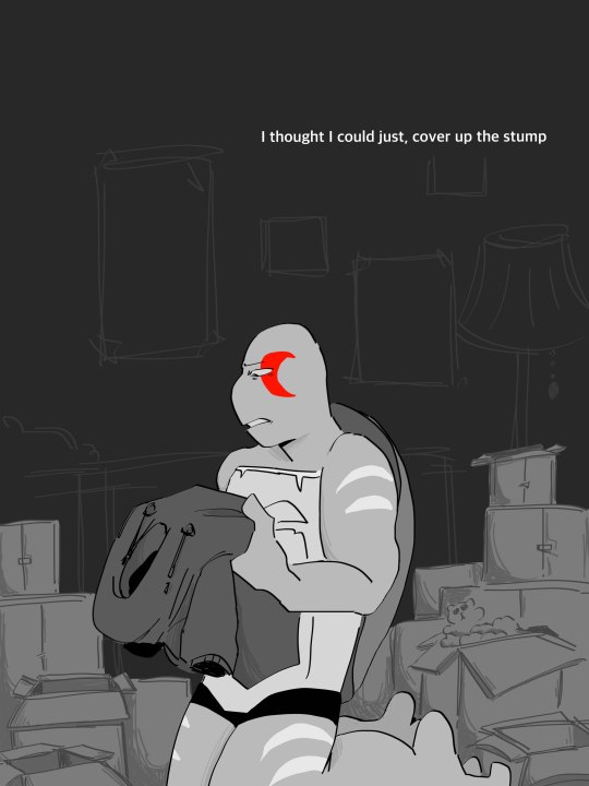
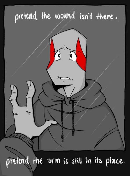
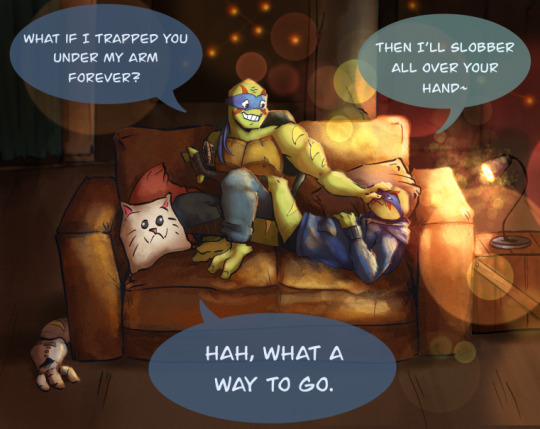
#to the artists who worked on this:
Text
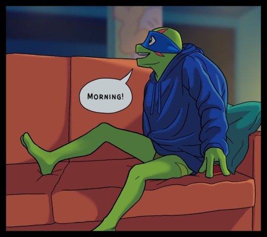
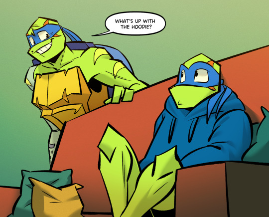
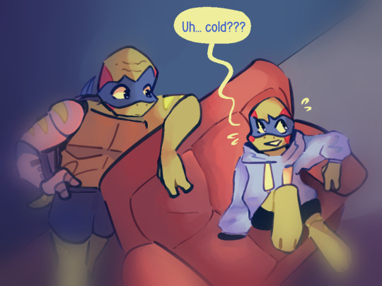
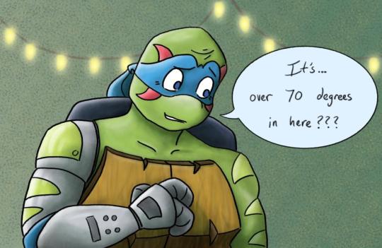
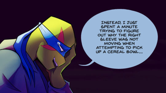
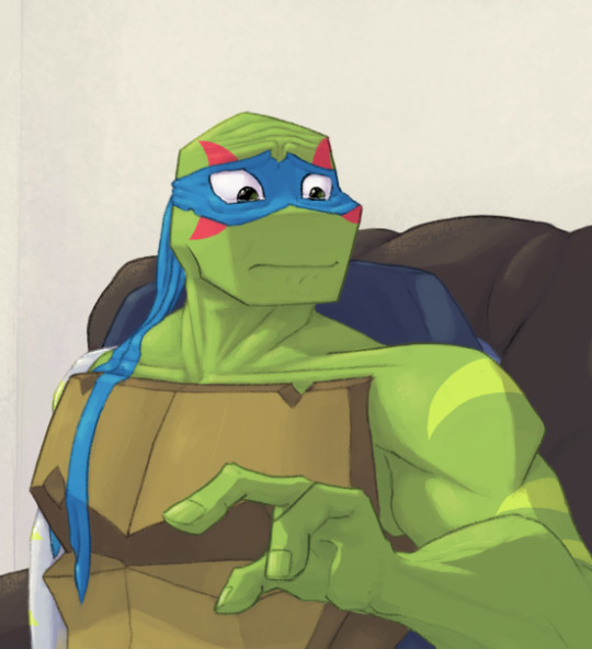
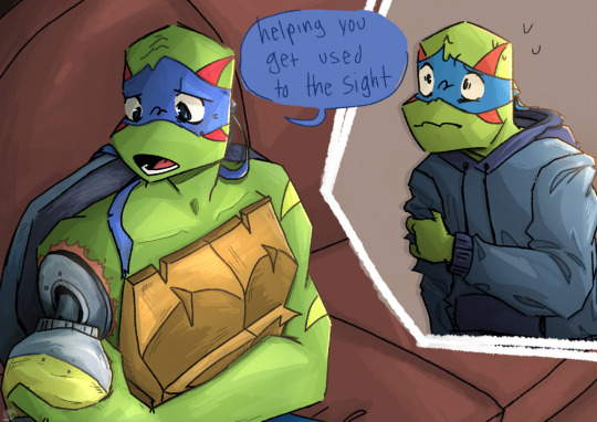
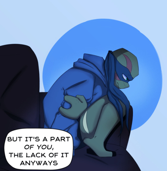
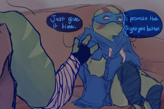
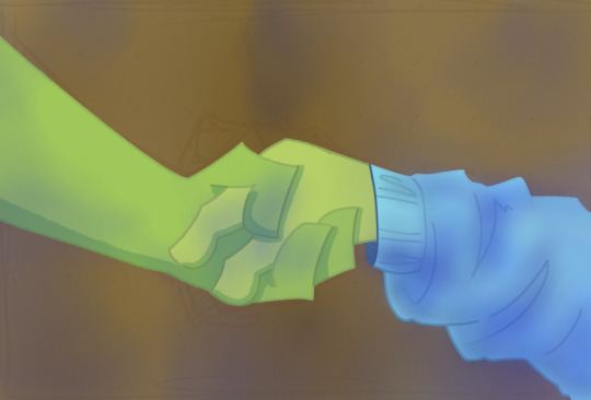
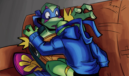
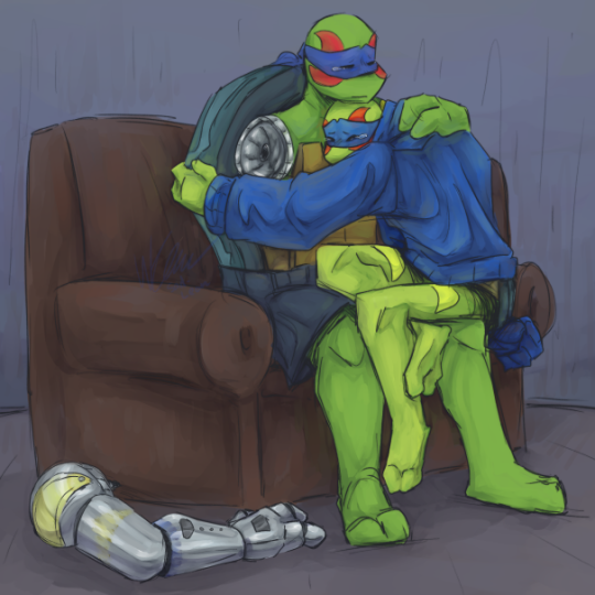
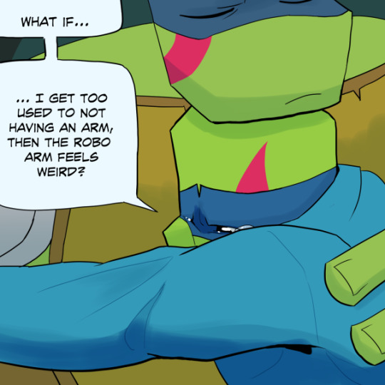
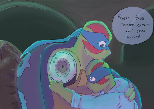
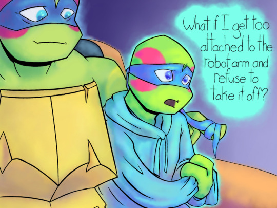
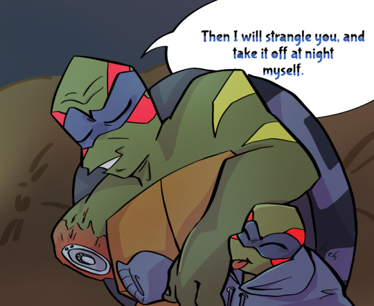
Here it is, the 2 Arms Left Collaboration Comic!
Big thank you to everyone who participated! This was such a cool project! There was so much talent put into this thing and I am amazed by the results
Enjoy the finished product everyone!
=-=-=-=-=-


=-=-=-=-=-
The wonderful artists, in order of their panels appearance, go check them out!!
To help count without eyes getting lost, the people highlighted in orange were a part of the black and white flashback sequence!
1 @tangledinink
2 @roquog
3 @sunnyyyteaaa Sun!
4 @apollo-not-in-space
5 @wraenata
6 @abbeyofcyn
7 @dianagj-art
8 @rbtlvr
9 @vangh17a
10 @avidlylivid
11 @butterfilledpockets
12 @thegunnsara
13 @manga-toons
14 @idiot-mushroom
15 @centerofleesmind
16 @sunnyyyteaaa Tea!
17 @volcanicsleep
18 @phykoha
19 @princesskkfish
20 @cokowiii
21 @y0unginhumans
22 @bluesgras
23 @karmacomesaround
24 @heckitall
25 @sad-leon
26 @blue-star-doodles
27 @teainthesnow
28 @cartoonhostage
29 @hatchi-matchii
30 @last-hourglass
#2 arms left#rottmnt#to the artists who worked on this:#now that the comic itself is posted#feel free to post your individual panels separately if you would like <3#I cannot take all the credit here aa!#I dont think anything like this has been done before#definitely a first omg#definitely an experiment if nothing else#a very fun one though!#cw blood#tw blood
4K notes
·
View notes
Text
i do unironically think the best artists of our generation are posting to get 20 notes and 3 reblogs btw. that fanfic with like 45 kudos is some of the best stuff ever written. those OCs you carry around have some of the richest backstories and worldbuilding someone has ever seen. please do not think that reaching only a few people when you post means your art isn't worth celebrating.
#i often wonder about how many things would be considered classic or high art had they only received the marketing#how many short films that were made for class could have been the most powerful thing you'd ever seen? if you'd seen them?#“you know the greatest films of all time were never made” etc etc#but like. these works of art ARE being made. it's just enjoyed by a smaller audience with equal impact though#i think about this one furry i used to follow on insta who had the coolest worldbuilding ever. it's been years.#thought prompted by that sketch of nimona from ten years ago that was just for a character design#posted to the creator's tumblr and now it's nominated for best animated feature film at the oscars#and by the genuine emotional reaction a fan comic made me feel. how much work had gone into it. how beautiful it was to me.#idk what to tag this but i hope whoever needs to hear it does#writing#writer#fandom#fandom culture#artist
58K notes
·
View notes
Text
People against piracy fail to realize that no, I can’t just ‘buy it.’ They stopped making DVDs and Blu-Rays. They’re barely offering digital copies for download. I am not spending money I could use for food or bills to pay for a subscription service just so I can always have access to a beloved piece of media. Especially not when the service will remove media on a whim without concern for how the loss of access to that piece will make its artistic conservation nigh impossible.
For example, I recently learned that Disney+ had an original film called Crater. It’s scifi, family friendly, and seems cool - I would love to buy it as a holiday gift for my little brother! But: it’s exclusive to D+ and THEY REMOVED IT LITERALLY MONTHS AFTER ITS RELEASE.
The ONLY way I can directly access this film is through piracy. The ONLY available ‘copies’ of this film are hosted on piracy websites. Disney will NEVER release it in theaters, or as something to buy, and it may NEVER return to the streaming service. It will be LOST because we aren’t allowed to purchase it for personal viewing. If I can’t pay to own it, I won’t pay for the privilege of losing it when corporate decides to put it in a vault.
So yes, I’m going to pirate and support piracy.
#ra speaks#piracy#media piracy#pirate to make hondo ohnaka proud#obligatory ‘don’t fucking pirate small authors/artists works wtf dude’ statement.#anyone who’s seen my media bitching before knows I’m a hype man for indie films this ain’t about them#this is about corporate streaming services killing physical media bc sales numbers are less impressive than number of streams#edit: USAmericans stop telling me to buy DVDs and blurays at Walmart. think outside your borders for a hot sec. fun thought exercise.#your experiences are not universal#edit: WHO GOT THIS TO 100k. I JUST WANT TO TALK (this post is my second to hit 100k woahg.)#in other news: fix your fucking posture. drink some fucking water. and go the fuck to bed if it’s late bc it’s for me rn. peace and light.
107K notes
·
View notes
Text
Good.
11K notes
·
View notes
Text
tumblr glitch that hath rended my dash asunder:
free shitpost generator??? why isn’t this an official browsing mode. anyway here are my fav screen grabs, all hits no misses:


pure poetry. it’s like trying to tune into a specific radio station but you have giant lobster claws instead of hands
#also i’m sorry to the artists whose works are in these: the glitch wouldn’t let me see who posted anything so i dont know how to credit you#if you recognize your piece here then contact me and i’ll append your username to the original post#hellsite (derogatory)#tumblr glitch
19K notes
·
View notes
Text
14 yrs ago i started playing magic the gathering as a kid, and i had the dream to do art for them
3 yrs ago i tweeted about those dreams:
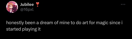
today i’ve released 11 official magic the gathering cards, and it’s honestly so surreal and insane to me! i did that!! i fulfilled a childhood dream, and i honestly couldn’t be more proud 🥹
#as someone who never had support it’s wild to me to ACTUALLY DO IT BITCH!#my hs counselor said i’d never amount to anything and id be lucky to work fast food#only bc i was disruptive and hated the southern culture i was raised in#hope she chokes on my success :)#pixel art#artist on tumblr#aesthetic#illustration#i am so fucking powerful#i put 18 but it’s rly like 14 yrs ago lmao oops#i edited the age for clarity sake after doing the math!!!!
8K notes
·
View notes
Text
happy 60th to one of my lifelong faves🕯️
update: prints now available!! @
#prints now available!#doctor who#doctor who 60th anniversary#doctor who fanart#dr who#artists on tumblr#digital illustration#I didn’t draw all of them okay that’s way too much perspective work for a bastard#this may also have been a illust for a certain zine#can’t wait for iplayer to hurry up and gimme the goods#:3#basil draws
4K notes
·
View notes
Text

Fiona has a higher STR score than both Lydia and Kasper which also means — she can carry them
#illustration#art#artists on tumblr#curse of strahd#curse of strahd art#fiona wachter#lydia petrovna#kasper dunant#hope you enjoy my post-work doodles#cleric dump stat str who's with me#poor guy can barely lift his own wife…
4K notes
·
View notes
Text

recently played skyward sword and OOF it's so damn good
prints | also playthrough on my gaming channel!!
#zelda#skyward sword#art#artists on tumblr#digital art#been a hot second since I drew something outside of work#I love when you get so obsessed with media that it rekindles your motivation to do stuff again#also I haven't even uttered a sentence in the tags for like#eons#hope y'all are doing well!!#elgatoiberico#also who is gaming channel#if you do happen to venture there I hope you enjoy bread and cheese dfghgd
2K notes
·
View notes
Text
i got my isbn today for the book. 8 months to go. my mom and i were talking about what the next steps are. i was eating trail mix, standing on one foot, phone tucked into my ear.
"yeah," i said. "the problem is that tumblr as a market is like, not something that can be studied." there's this weird wave of nostalgia and affection for this place that came up over me: how lovely we avoid consumerism. okay, it sucks as a creator. but also? keep stickin' it to 'em.
my mother made the sound at the back of her throat that i also make, the one that means i've got an idea. "you should figure out some kind of reward for presale amounts. maybe you give out poems or a mug or a signed book or something. would your followers like that?" my mother is sweet, and kind, and i have no idea how to explain on this website you can buy someone crabs.
i put more m&ms down the hatch. i had to speak through peanuts and almonds. "if it passes 25 thousand i will print the book out in its entirety and eat it live on camera."
"oh god. no, you don't have to do that." she was anguished. "just tell them that you'd love them to read it, and that they've inspired you to write. you got started on that site, and they helped you keep going. raquel, you love these people. the community? you talk all the time about the other writers and artists and whatever else. tell them that you're hoping for their support, they'll come through."
"no," i assured her. i discovered i had dropped an m&m, but an ant had already found it, so it belonged to him now. i will let his little life have a surprise blue treasure in it, too. "i'm gonna fuckin' eat the book."
#writeblr#:)#the small secret love i have for y'all. the way i am filled with gratitude.#for the nosebleed club. for stephen particularly.#for every artist i've ever been in contact with and collaborated with.#for every person who has commented on my work and passed it along or fallen in love with it#for every silent 'just hitting like' follower and for every person who sends me dms and for each of you#i know i suck at replying bc i have anxiety. but like. you keep being here. so i keep writing.#i legit wouldn't be here without you.#thank you sophie thank you katie thank you carolyn thank you stephanie thank you jess#thank you if you're reading this#i got too overwhelmed with love and have to stop writing this FAR too early into the thank yous bc im about to cry with love
7K notes
·
View notes
Text
i’d say they’re going on a road trip but they don’t even have a car smh
#*paul mccartney voice* boy / you’re gonna baldur that gate / baldur that gate / a long time#looking up refs of their OG outfits while drawing this made me realize that half of them wear the same boots#how peculiar!#first thing on my mind while drawing this was the wyllstarion agenda#second thing was lae’zel is the dad who didn’t want tav to adopt an owlbear#but now she’s best friends with the owlbear#also important: gale has shy tall guy energy#and astarion has rambunctious short king energy#canon bends to my will#people on insta yelled at me for not including halsin but this is the OG companions ok :(#im actually working on a halsin piece rn!#artists on tumblr#bg3#bg3 fanart#baldurs gate 3#bg3 astarion#bg3 gale#bg3 karlach#bg3 lae'zel#bg3 wyll#bg3 shadowheart#one day ill add a background to this#noah.jpg
2K notes
·
View notes
Text

harpy slaying the serpent soup bowl
#/ the only commonality between snakes and harpies is death or rage that follows#ceramics#handmade angels#ceramic art#ALSO this is inspired by a instagram pottery artist who’s @ i don’t remember but i love their work 🫶🏽 dm if u want me to track them down
9K notes
·
View notes
Text
oh my god i forgot to post my absolute favorite strip from gay comix (issue #2, 1981)

#this collection is full of so many hilarious vignettes#between the fictional and biographical they range from hilarious to saddening but theyre all candid looks at#lgbt life in the 60s 70s and 80s#id recommend it if you're interested in older underground work#edit: for ppl who notice the opening blurb i will say this:#1. Many artists in the underground comix scene (yes the lgbt ones too) delighted in being overly provocative for the sake of it#hence the cringeworthy 'political unity is not the goal' line#2. i worried abt this too when i started going thru the issues but there are quite a few strips and comics focusing on the trans experience#that said. there are unfortunately not a lot of transgender artists involved in this collection#3. given the preceding two points i think its fair to say that a good chunk of the strips in gay comix just. Suck#but like they actually said it's important that we're capable of recognizing that a full 40 years down the line#so we can actually learn something from the life experiences the mistakes and even the lack of perspective tht sm of these artists displayed#nocturnal writings
14K notes
·
View notes
Text
I think 90% of my gripes with how modern anime looks comes down to flat color design/palettes.
Non-cohesive, washed-out color palettes can destroy lineart quality. I see this all the time when comparing an anime's lineart/layout to its colored/post-processed final product and it's heartbreaking. Compare this pre-color vs. final frame from Dungeon Meshi's OP.


So much sharpness and detail and weight gets washed out and flattened by 'meh' color design. I LOVE the flow and thickness and shadows in the fabrics on the left. The white against pastel really brings it out. Check out all the detail in their hair, the highlights in Rin's, the different hues to denote hair color, the blue tint in the clothes' shadows, and how all of that just gets... lost. It works, but it's not particularly good and does a disservice to the line-artist.
I'm using Dungeon Meshi as an example not because it's bad, I'm just especially disappointed because this is Studio Trigger we're talking about. The character animation is fantastic, but the color design is usually much more exciting. We're not seeing Trigger at their full potential, so I'm focusing on them.
Here's a very quick and messy color correct. Not meant to be taken seriously, just to provide comparison to see why colors can feel "washed out." Top is edit, bottom is original.
You can really see how desaturated and "white fluorescent lighting" the original color palettes are.
[Remember: the easiest way to make your colors more lively is to choose a warm or cool tint. From there, you can play around with bringing out complementary colors for a cohesive palette (I warmed Marcille's skintone and hair but made sure to bring out her deep blue clothes). Avoid using too many blend mode layers; hand-picking colors will really help you build your innate color sense and find a color style. Try using saturated colors in unexpected places! If you're coloring a night scene, try using deep blues or greens or magentas. You see these deep colors used all the time in older anime because they couldn't rely on a lightness scale to make colors darker, they had to use darker paints with specific hues. Don't overthink it, simpler is better!]
#not art#dungeon meshi#rant#i'm someone who can get obsessive over colors in my own art#will stare at the screen adjusting hues/saturation for hours#luckily i've gotten faster at color picking#but yeah modern anime's color design is saddening to me. the general trend leans towards white/grey desaturated palettes#simply because they're easier to pick digitally#this is not the colorists fault mind you. the anime industry's problems are also labor problems. artists are severely underpaid#and overworked. colorists literally aren't paid enough to do their best#there isn't a “creative drought” in the anime industry. this trend is widespread across studios purely BECAUSE it's not up to individuals#until work conditions improve anime will unfortunately continue to miss its fullest potential visually#don't even GET ME STARTED ON THE USE OF POST-PROCESSING FILTERS AND LIGHTING IN ANIME THOUGH#SOMEONE HOLD ME BACK. I HATE LENS FLARES I HATE GRADIENT SHADING I HATE CHROMATIC ABBERATION AND BLUR
2K notes
·
View notes
Photo
belobog trailblazing
#honkai star rail#hsr#hsr dan heng#hsr march 7th#hsr trailblazer#hsr stelle#honkai star rail fanart#fanart#digital art#digital artist#artist on tumblr#for people saying oh but dan heng left us for the sketchy fight club so he should be on leash too#he's a single mom who works two jobs#goes to have fun One Time while the kids are asleep#and suddenly everyone is VERY JUDGEY#but like yes sometimes he loses their single shared braincell too
6K notes
·
View notes
Text
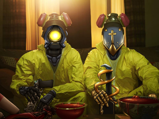
MACHINE. We NEED to COOK.
#aka guess who started playing ultrakill#my art#artists on tumblr#ultrakill#gabriel ultrakill#v1 ultrakill#my explanation for this is boredom on a slow work day#breaking bad#? i guess
1K notes
·
View notes
Last Seen Blogs

laz-eye-occultism-jewelry-blog
Occultism Silver Jewelry

paintedwhitewalls
Untitled

imawgine
imawgine
willel
Will & El