Last Seen Blogs

retatally
ミ☆
brownsugarnspices
حجز فنادق البحرين

ultra-mumac
MuMAC | Directory of young Mexican artists

plutaraplanet
King Of Spicynoodles. Michael

my-personal-rants0
Just your reg guy
Text

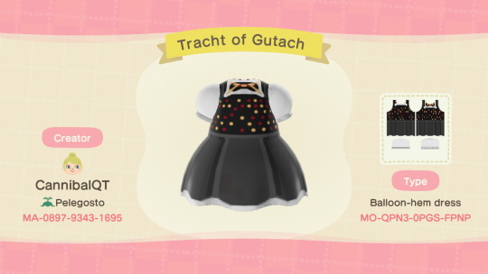
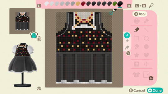

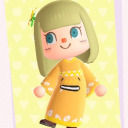
My Tracht of Gutach is based off this photo of the same name. Trachts are a folk clothing worn by a variety of Germanic peoples. I was inspired to recreate this 1900’s photo before my visit to @ACNH_Stories’ turn of the century German town. You can see photos of her island, Isla D’Eau, over on my ACNH-dedicated blog! 🇦🇹🇨🇭🇩🇪
#acnh#animal crossing new horizons#my designs#acnh designs#acnh fashion#designs#Germany#german#swiss#Austria#tracht#historical#historical recreation
8 notes
·
View notes
Text
The State of This Page
I’m incredibly grateful for everyone who has enjoyed and used my designs. I am going to continue to post them here when I feel a strike of inspiration. However, for some time I’ve found the bounds of this blog restrictive. I have primarily used my twitter account to focus on personal content outside designs, but I wanted to share on tumblr too. So, from now on this blog will be used exclusively for my custom designs, and my new blog ACNHPelegosto. Older post which do not feature my custom designs will be transferred to the new blog, and then deleted so it’s easier to find just my designs on this page.
I hope many of you will follow me to my new blog and enjoy my other ACNH content!
3 notes
·
View notes
Text

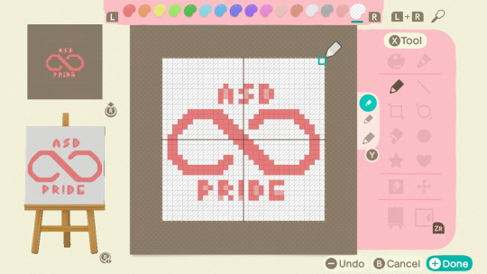
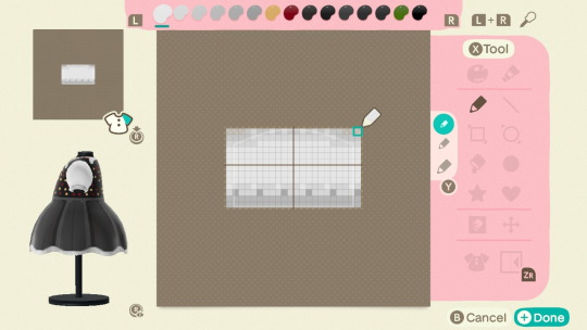
ASD Pride Symbol
I won’t be uploading this design to my MA, but I’m still happy to share with everyone. I made it on a day that was emotionally rough for me, so I don’t want to be reminded of it whenever I see my posted designs. Figuring out how to make the infinity symbol was tough. I tried doing the rainbow gradient but I couldn’t ever find a way to make it look non-segmented. The font was lifted from this guide by u/Li5y on Reddit.
3 notes
·
View notes
Text
The State of This Page
I’m incredibly grateful for everyone who has enjoyed and used my designs. I am going to continue to post them here when I feel a strike of inspiration. However, for some time I’ve found the bounds of this blog restrictive. I have primarily used my twitter account to focus on personal content outside designs, but I wanted to share on tumblr too. So, from now on this blog will be used exclusively for my custom designs, and my new blog ACNHPelegosto. Older post which do not feature my custom designs will be transferred to the new blog, and then deleted so it’s easier to find just my designs on this page.
I hope many of you will follow me to my new blog and enjoy my other ACNH content!
3 notes
·
View notes
Text
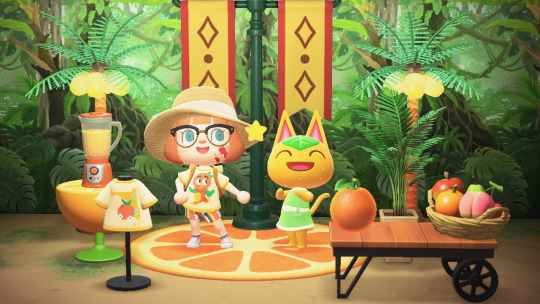


Orange Bird Tee
TIL of the adorable “Hello Sunshine” collection for the Epcot International Flower and Garden Festival, so I made a shirt inspired by the collection. You can learn more about the history of this tangy bird here!
#disney#epcot#acnh#animal crossing new horizons#orange bird#my designs#acnh designs#acnh fashion#designs#epcot international flower and gardens festival 2020#little orange bird#ac tangy#tangy
0 notes
Text

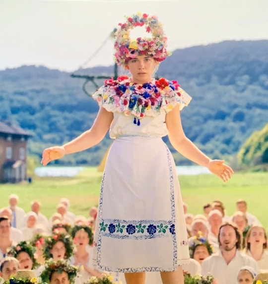


Happy May Day!
For the occasion, I made Dani the May Queen’s dancing dress from Midsommar (2019).
#acnh#acnh designs#animal crossing new horizons#midsommar#midsommar spoilers#my designs#acnh fashion#horror#horror fashion#may day#may day celebration
67 notes
·
View notes
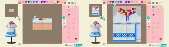
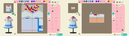
Text
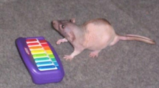


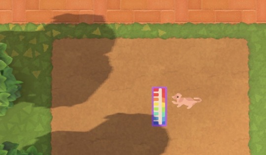
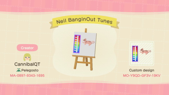
Neil Banging Out the Tunes April 13 2006
#acnh#animal crossing new horizons#neil banging out the tunes#niel banging out the tunes#my designs#acnh designs#rat#meme
624 notes
·
View notes
Text
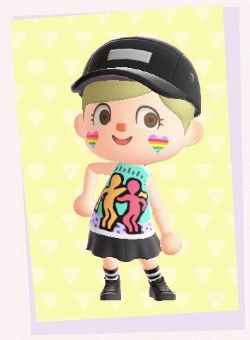
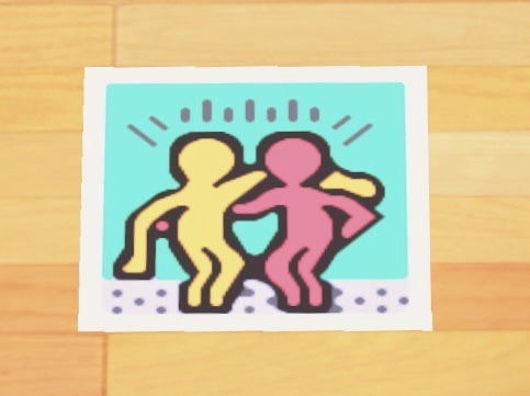
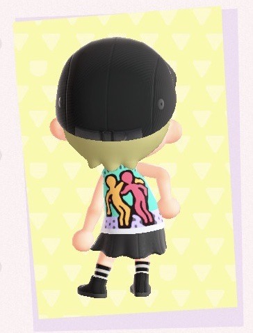
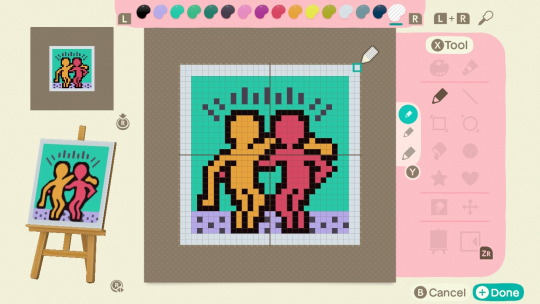
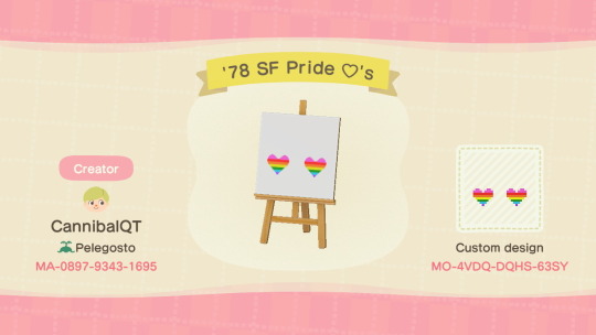
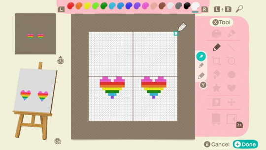
Behind the Design: Best Buddies by Keith Haring & ‘78 SF Pride 💟’s
Original post here
History
Keith Haring was an openly gay pop-art/grafitti artist who lived 1958-1990. His work tends to feature minimalist outlines of people and animals in bright colors. Haring passed at the age of 31, but passed leaving a distinct — and queer — mark on the art world. Haring first painted this piece in 1987, but did not finish the entire print series until 10 days before his death. In 1989, Haring gave his blessing for the organization Best Buddies to use his art as thier logo. Best Buddies, the organization, is a community outreach program which helps provide social support for people with intellectual disabilities.
The ‘78 San Francisco Pride Flag was made by Gilbert Baker for use in the San Francisco Gay and Lesbian Freedom Day parade. Each of the colors in the flag has a separate meaning: sexuality, life, healing, sunlight, nature, magic/art, harmony, and spirit. Bakers flag served as the progenitor to the modern pride flag. The colors pink and turquoise were removed, as the dyes for these fabrics were more expensive than the standard rainbow colors.
The Design
I first learned about Haring when Funko made him a pop figure for New York Comic Con in 2019. I’ve been in love with his artwork since. Best Buddies sticks out to me as it is a perfect intersection of my identity: being gay and disabled. I am bisexual and autistic, so it’s rare to find anything that addresses both of these. Part of the beauty of Haring’s work is how simple it is. I always struggled with metaphorical meanings, but Haring’s works are succinct in interpretation. Best Buddies is about unity and friendship among people. It serves as a perfect logo for Best Buddies the organization, as even those with minimal language comprehension can grasp it’s meaning. My university even has a local chapter of Best Buddies for non-degree seeking students! I tried to keep the artwork as identical as possible. I hope to make another design based of Haring’s work soon.
The ‘78 pride flag is my personal favorite pride flag. It’s soft pink is one of my favorite colors. If you notice in the hearts there’s two rows of pink compared to every other colors single row, I did this because I love the color so much! Additionally, combining Haring and Baker’s work helps show across America the in the 1980’s, queer artist made massive contributions in their respective fields and to the acceptance of the LGBT+ .
#acnh#animal crossing new horizons#my designs#acnh designs#acnh fashion#behind the design#behind the scenes#lgbt#pride#keith haring#long post
4 notes
·
View notes
Text

Best Buddies by Keith Haring & ‘78 SF Pride 💟’s.
Donate to Best Buddies here and learn about the Keith Haring Foundation here
#acnh#animal crossing new horizons#pride#lgbt#queer#queer history#lgbt history#keith haring#best buddies#disabilities#actuallydisabled#my designs#acnh designs#acnh fashion
42 notes
·
View notes
Text
Behind the Design: The Travolta Dress
Original post here
I originally made a version of this dress when I was 13, in ACNL. I ported that version in ACNH, as shown in the first photo, but wasn’t totally satisfied. So I remade it, as seen the second photo! Lady Diana, and this dress in particular, mean an awful lot to me. I think it’s the most beautiful dress ever made, period. If I had ever went to prom, I would have wanted my dress to look like hers. Unfortunately the real one is in a private collection, and I could never be able to touch it since I’m highly sensitive to velvet. Oh well, at least I can wear it in Animal Crossing and my dreams.
Got A Request?
My ask box is open to request! You can additionally reblog and post a comment on any of my post and I’ll see it.
#acnh#animal crossing new horizons#acnh designs#acnh fashion#my designs#behind the design#behind the scenes#new horizons
0 notes
Text
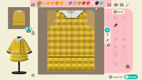
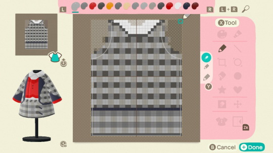
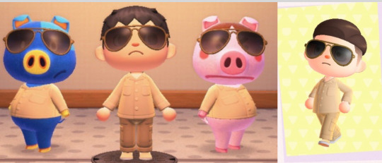
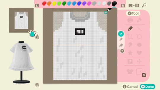
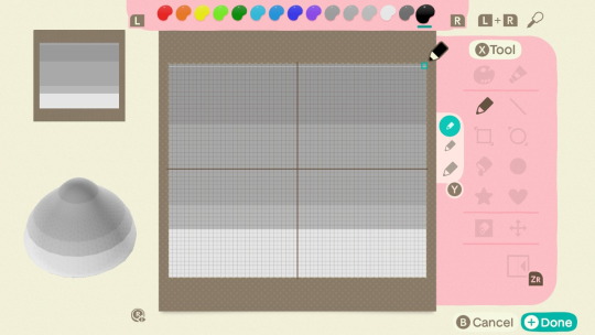
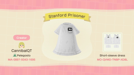
Behind the Design: Gaurd and Prisoner from the Stanford Prison Experiment
Original post here
It was unclear if the request was for the prisoner or gaurd uniforms. I made the prisoners tunics, but I assembled the gaurd uniform. The gaurd uniform I made consist of the beige open-collar shirt, beige cargo pants, brown pilot shades, and beige slip-on loafers. Really, anything beige plus the glasses and you have the outfit done. I’d definitely adjust some parts of it, but I did what I had with my current Able Sisters’ selection.
The prisoners uniforms were a bit different. I wanted them to look wrinkly and cheap, so I added additional off-white lines to achieve this effect. Originally hats were just random stocking caps, so I used the more uniform ones from the 2015 movie to make them more distinct. The paper bag hat would have been more authentic, but alas I had seen it in my or any of my friends Able Sisters’. The number tags for prisoners are visible on both the left breast and mid-back as they were in real life. Overall both were fairly simple designs, but the devil was in the details.
Got a Request?
My ask box is open to request! You can additionally reblog and post a comment as @eraserheadfemme did and I’ll see it. Request don’t have to be psychology related, I just happen to enjoy the field. For other psych fans, checkout my meme blog @actuallypsychology .
1 note
·
View note
Text

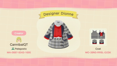
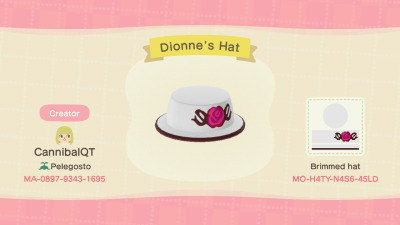
Design ID’s now avalible.
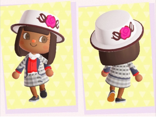


Cher Horowitz and Dionne Davenport from Clueless
Dionne’s hat is fairly simple minus the band, so only the photo of that is shown. The rose was made with guidance by this tutorial
160 notes
·
View notes
Text


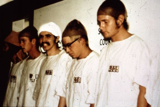
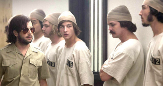
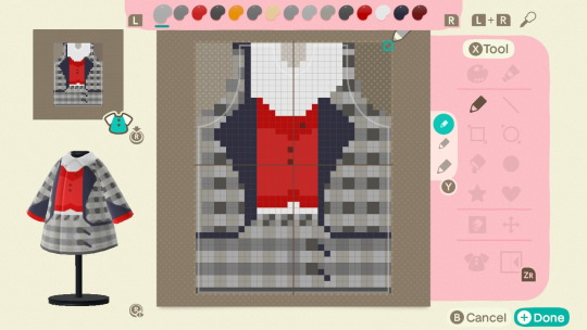
Guard and Prisoner from the Stanford Prison Experiment
As requested by @eraserheadfemme
History
The Stanford Prison Experiment was conducted by Philip Zimbardo in 1971, to observe the effects of perceived power. Zimbardo originally published his work as A Study of Prisoners and Gaurds in a Simulated Prison with colleague Haney Banks, but republished his findings three times and later wrote the book The Lucifer Effect based on the experience. Zimbardo’s direct findings are of no significance to the field of psychology, due to failure of replication and blatant fraudulent data. However, indirectly the study was a part of the catalyst for the later writing of the Belmont Report, which ensures standards of saftey and care in human experimentation.
#acnh#animal crossing new horizons#stanford prison experiment#psychology#philip zimbardo#zimbardo#my designs#acnh designs#acnh fashion#prisoner#gaurd#uniform#designer id#long post
123 notes
·
View notes
Text
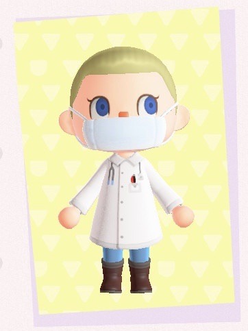
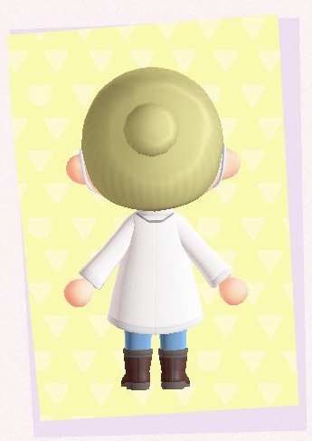
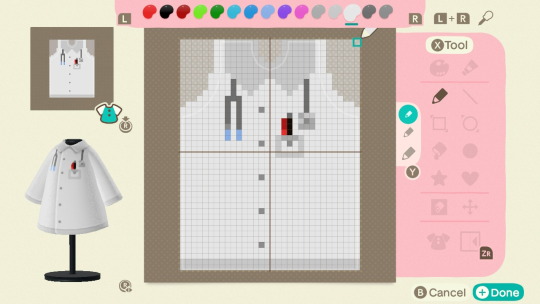
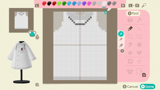
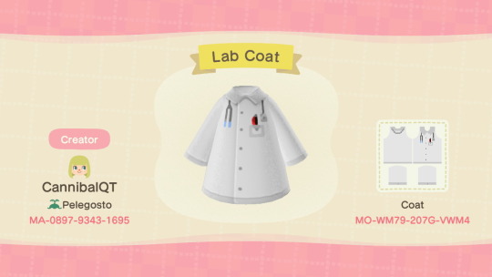
Lab Coat
54 notes
·
View notes
Text

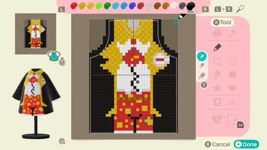

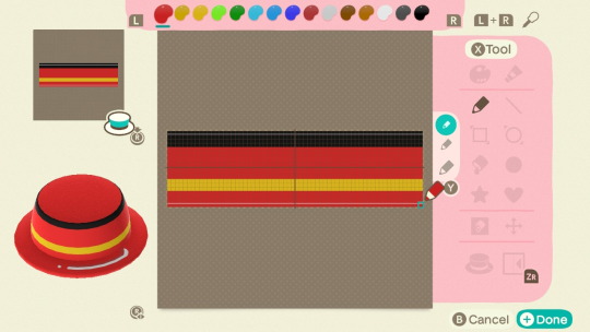
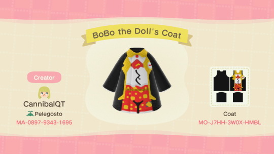
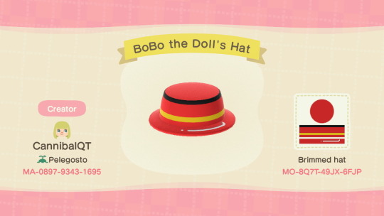

BoBo the Doll
The BoBo doll was a key feature in Albert Bandura’s series of studies regarding social learning theory, especially in his work Social Learning through Imitation (1962). The BoBo doll served as a punching bag children had the option to hit, after watching an adult model hit, kick, and punch the doll. While there is some concerns about ethics and temporal sequence bias of the study, it played a key role in defining the field of social psychology.
#acnh#animal crossing new horizons#psychology#bandura#my designs#acnh designs#acnh fashion#bobo doll#bobo the doll#clown#clowns#tw clowns#trigger warning clowns#cw clowns#//clowns#clowns //#alfred bandura#clowncore#kid core#kidcore
314 notes
·
View notes
Text
Cher Horowitz and Dionne Davenport from Clueless
Dionne’s hat is fairly simple minus the band, so only the photo of that is shown. The rose was made with guidance by this tutorial
#acnh#animal crossing new horizons#clueless#80s aesthetic#my designs#acnh designs#cher horowitz#dionne davenport#80s films#80s nostalgia
160 notes
·
View notes
Text
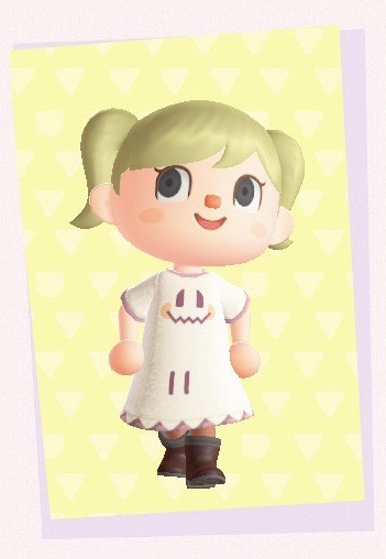

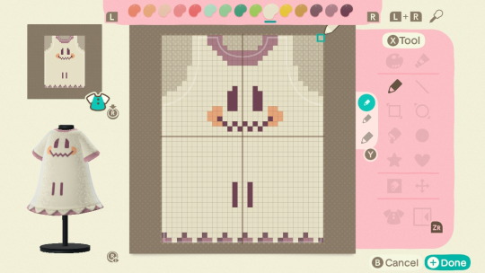
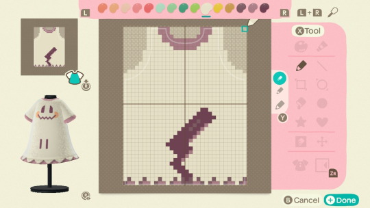
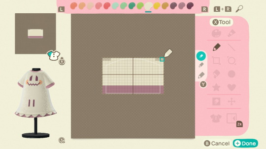
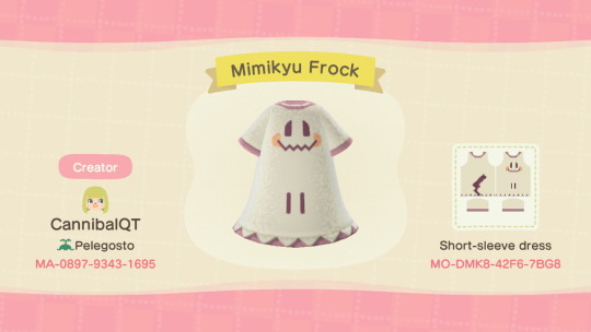
Mimikyu Frock
#acnh#animal crossing new horizons#pokemon#mimikyu#pkmn#pokémon#my designs#acnh designs#acnh fashion
477 notes
·
View notes