Last Seen Blogs
genshin-impact-redesign
Genshin Impact Fanart & Redesigns
blogshadowace
Untitled

cooganchase
Reblog, Reblog, Reblog
frasinapoletaneeh
frasinapoletanee

goqueenstay-blog
Untitled
Text
PROGESS PHOTOS


0 notes
Text
WEEK 11
For the studio brief this week we worked on out patterns in illustrator. I won’t need a pattern for me label but created one that matches in with the overall theme.

I went with a leaf pattern with different shapes and sizes of the original to create interest. As I said I wont be using it in my design but found the process interesting and am keen to experiment with using and creating more patterns now that I have an understanding of the.
MOCK UP
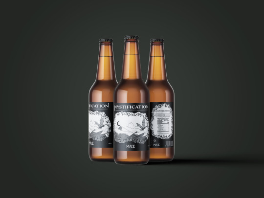
I’m using the FREE BEER BOTTLE MOCK UP that Crystian showed us in the tutorial today as it fits all of my needs. The bottle is the right shape and the background of the label is transparent. This allows for the rounded corners of my labels and means I can seamlessly incorporate the spilt without there being any white/black space in between. Once I scan in my drawn out label at uni I can place it into the Photoshop file.
I took some time after this tutorial to speak with Crystian about my assessment. I’ve been feeling at a bit of a loss as to how I actually make what I want in to as a label and had to lot of questions but he’s super cleared things up for me now. I’m to embrace the hand drawn style of my label, draw it out on paper and then scan it in to add the nutritional information, barcode, and drink name on using the programs. Then I can place the completed idea into a mock up! It’s a little different to the way other people are working it but I feel far more confident this way. Now just to really get into it.
0 notes
Text
WEEK 10
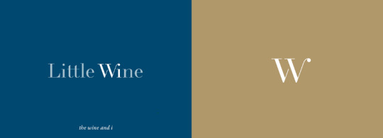
In the Week 10 tutorial we were tasked in groups to find a label imaging case study that we likes. My group found Little Wine on Behance.

https://www.behance.net/gallery/96796909/Little-Wine?tracking_source=search_projects_recommended%7Cdrink%20label%20
We enjoyed the simplicity and gradients in the artwork, as well as the way the shapes on the label effected the way it sits against the bottle. The small details that this brand uses add to the whole impact. For example the ‘W’ and ‘i’ highlighted in the name to connect to the phrase they use: “the wine and I”.
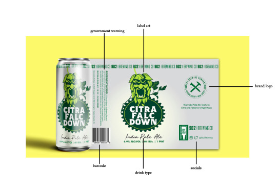
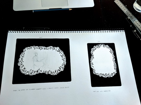
This is my Flat Label Anatomy Diagram. I do longer want a label that wraps all the way around my bottle, but I think all of the examples Crystian showed us provide some clear guide lines as to what our own must include. I’m woking on envisioning all that mind needs to include. Now that it’s separated, how to I keep the two cohesive?
0 notes
Text
WEEK 09
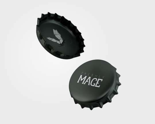
This week I focused on developing my logo ideas, while simultaneously picturing how it will fit within the overall label design. I started with just the words, deciding on ‘mage’ as it incorporates the magic feel, and ‘freshly’ to incorporate that it’s juice.

Moving forward with ‘FRESHLY MAGE’ I replicated this same idea in a larger form. This meant I could better gage the form.

I need to copy the reversed version of this onto black paper because on the label it will be nestled into the dark area of the leaves along with ‘MYSTIFICATION blackcurrant juice’ on the top and the bottom.
I’ve completed this task of developing my logo by hand at Crystian’s recommendation as it will better gel with my hand-designed label.
https://www.pinterest.com.au/erthomas47/fresh-ideas/
This is the new mood board I’ve created for the self-directed brief this week. The idea of putting gold into my design is really appealing to me.
0 notes
Text
WEEK 08
This week we saw everyones pitch presentations in the tutorial. It was super interesting to get a proper insight into the directions every one has been exploring and the different ways of tackling this assessment.
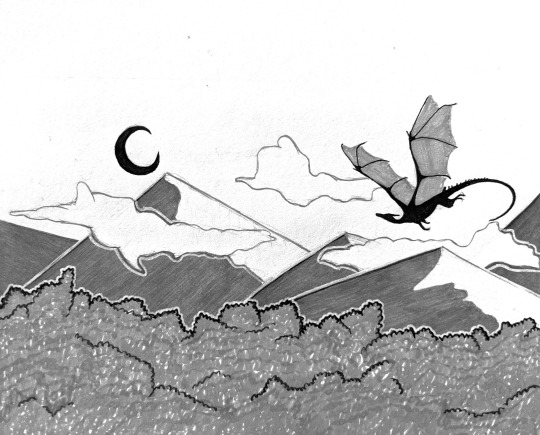
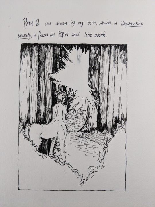
The direction that was chosen in the vote for me is ILLUSTRATIVE SERENITY. This is the black and white line work direction and I’m excited to get into designing the layout of the label. The self directed brief this week was to develop a logo but as my label is more prominent so I’m doing that first. Crystian said to do it in whichever order made more sense.
This is my idea so far. After filing it in I decided I want the label to wrap all the way around the bottle and the leaves to take over with a space in the middle on the back for the nutritional information. Will work on this further to work out where everything fits, the composition needs work.
I’m a little unsure as to how I make all of this come together? Will keep working and ask some questions soon I think if it doesn’t become clearer.
0 notes
Text
WEEK 07
Ahhh yes the week to record and get everything all together, plus the extended holidays with everything due Tuesday of Week 8.
I’ve spent a lot of time composing my rationals and putting my slides and final pages together for the assignment, as I didn’t want to over plan the audio and have it sound super clunky. I was pretty happy with the look and composition of pages to present in the end.
Loom really was a struggle for me. When I’d try to record it wouldn’t let me stop recording, or even navigate around my screen. Needless to say I got very frustrated, it meant I couldn’t exit the application so had to manually shut down my laptop too many times for it to be fun. Once I finally did get it to work there was a lot of pressure on me to make sure I didn’t stumble over my words as I wasn’t sure if I was going to be able to try again. But I got a recording I wasn’t too unhappy with!
I don’t think it’s a program I’ll be using again on this computer. I do know how it works now though and it has been helpful for tutors to send me videos showing me how to use some other programs.
Will hear in Week 8 which direction I will be taking from the vote.
0 notes
Text
WEEK 06

In preparation for my pitch presentation I’ve redesigned a third version of my mood boards to make them neater, more dynamic, and make sure I included all the necessary elements for them to meld well with what I have to say. Through the whole process I’ve struggled a little to find images that accurately depict the ideas I have in my mind for me label ideas. Hopefully though the mix of my latest mood boards and being able to use spoken word I will better convey the depth of my ideas so the people in my tute can make a well informed decision on which path I should take.

We’ve been asked to have a think about how we will create and deliver our pitch presentations; form, programs, writing down ideas. My brother recommended using audacity to record and combine everything together, but when Loom was recommended as the program to use I decided I’d stick with that as it looked simpler to understand.
Now just to create all of my slides and get my rationals in place. As I missed doing it before I’ll add my key words here for each direction.
1 note
·
View note
Photo

WEEK 05
ADVICE IMAGE
This advice has been given to be in many ways so far but not necessarily in these words “progress through creativity”. It means that in able to move forward with any idea or to develop an idea in the first place you’ve got to experiment and draw, scribble everything and explore all of your creative paths. Have the bravery to try something new and dive out of your comfort zone by stretching that creative muscle everyday.
My skillset with InDesign, Photoshop, and Illustrator is very minimal at the moment and I had a big struggle even trying to create something as simple as this. I wouldn’t even day I’m happy with this finished product but I’ve moved within the constraints of my knowledge and google searches. I want to work on becoming more confident and streamline with these programs because currently they make me so so frustrated. Not good at not knowing how to do things, but I will work on it !!
PEER FEEDBACK
Was good to take a look at how other people are progressing with their ideas and tumblr blogs. Viewing and trying to critique someone else also made me more aware of what my own it missing.
2 notes
·
View notes
Photo
WEEK 04
In my tutorial, I received some feedback on my mood boards.
The difference between my two designs could be that one has a perspective like in my central image for my illustration image, creating a foreground mid-ground and background. I was told I should make a clearer difference between my two ideas because despite it being clear in my mind my boards were not portraying that very well.
I have taken away some of the images in my purple path and added a picture of the original bottle I found that has been my main inspiration so far. I've added a colour pallet as well as a lettering idea that suggests white writing that pops against a dark background.
In my second illustration path, I’m struggling to find label designs that already exist that are similar to what I'm envisioning, but I've added some more black and white landscape images to better show the direction I’m planning on taking. I have added a colour palette to this one as well that is monochromatic aside from the one shade of green I'm considering on adding as a feature. I also found some typography that I really like the look of because of its simplicity and clean lines.
ALSO missed my keywords from last week so here they are now!
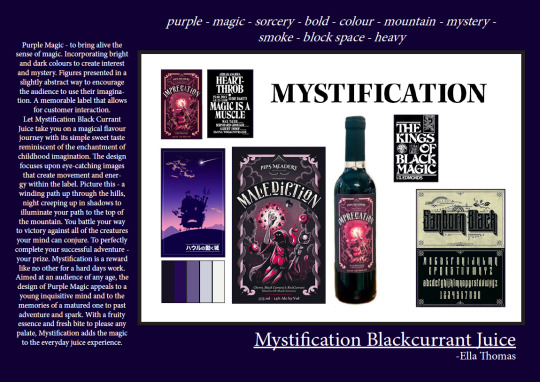
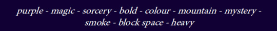
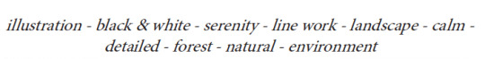
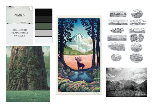
purple - magic - sorcery - bold - colour - mountain - mystery - smoke - block space - heavy
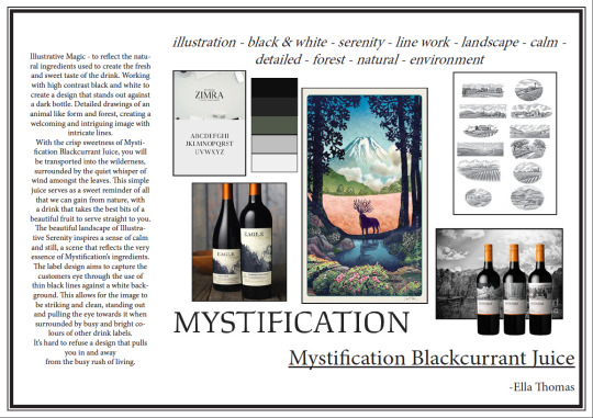
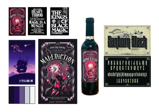
illustration - black & white - serenity - line work - landscape - calm - detailed - forest - natural - environment
1 note
·
View note
Photo
WEEK 03 (more, post tutorial)
These are my mood boards created in InDesign for my Tutorial. The two directions I want to take are different in terms of design.
The first purple path is based around magic and darker tones, reflecting the dark nature of black currant juice in colour and theme. I am envisioning a sorcerer holding on onto a crystal ball with smokey purple and black colours. The bulkier lettering in the two smaller text images suits my idea because it’s heavyset.
The second illustration path is a lighter and airier take. I’m thinking of using mostly black and white linework, maybe with some slight touches of green/blue colouring. I want to incorporate hills, trees and a deer or centaur in the mid-ground. The focus will be on nature and life, with a clear bottle to contrast the dark of the drink with the light of the bottle.
DRAFT DESIGN RATIONALES
Purple path - to bring alive the sense of magic. Incorporating bring and dark colours to create interest and mystery. Figures presented in a slightly abstract way to encourage the audience to use their imagination. A memorable label that allows for customer interaction.
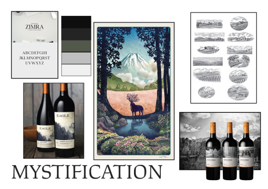
Illustration path - to reflect the natural ingredients used to create the fresh and sweet taste of the drink. Working with high contrast black and white to create a design that stands out against a dark bottle. Detailed drawings of an animal like form and forest, creating a welcoming and intriguing image with intricate lines.
(these aren’t long enough I know, just still unsure about what actually needs to be in a rationale???)
1 note
·
View note
Link
WEEK 03
My three boards relating to this class are,
for: blackcurrant
for: mystification part 1
for: mystification part 2
1 note
·
View note
Photo
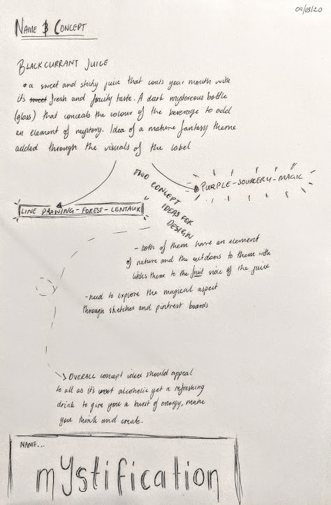
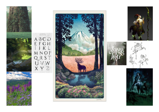
WEEK 03
Finally settled on a name and concept for my beverage! Was a bit of a struggle to get past my own self doubt concerning the ideas but I’m very happy with where I’ve settled. I have two clear directions for design ideas in mind and now I need to start sketching them out and exploring the construction of them/what sorts of images I want to include within each of them.
My pinterest boards are helping me to compile visual ideas and inspiration, I shall attach the link in the next post. They are public for all to access.
0 notes
Photo
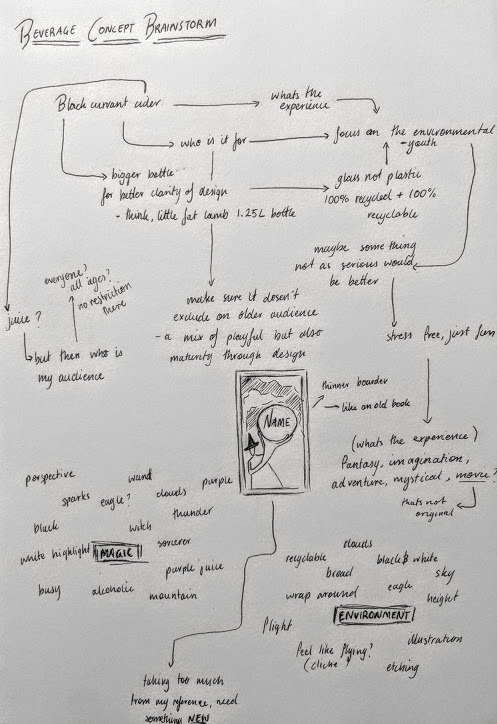
WEEK 02
These are my mind maps and initial ideas from my tutorial activities today. While I have strong visual images for the label of my beverage in my mind, I feel like they lack direction in terms of my audience and strong relation to the product. As I’m trying to develop these designs more and make better connections to the bigger questions, it seems like I’m hitting physical walls in my mind. It’s blocking my creativity and making me feel as if none of my ideas are original (with the knowledge that no idea is original).
I think my solution to this problem is to take these mental images I have and run with them, creating some rough design ideas to them apply the who/why to and adapt them from that angle. I can always return to my original mind maps, make a few more maybe? Stay confident in my creative ability and not get lost in deciphering my process as we don’t have the luxury of huge amounts of time to allow that.
0 notes
Photo

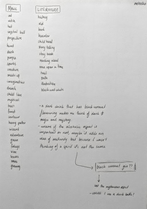
WEEK 02
Reworked sketch-notes, begun in the lecture and expanded upon after the tutorial.
1 note
·
View note
Photo
WEEK 01
During my Woolworths expedition it became apparent to me that to my personal taste, the designs of most beverage labels are ineffective. Many of them followed similar design patterns to each other which made them look organised on the shelves, but meant there were few that stood out. Despite this, the few that lean further one way or the other weren’t difficult to find.
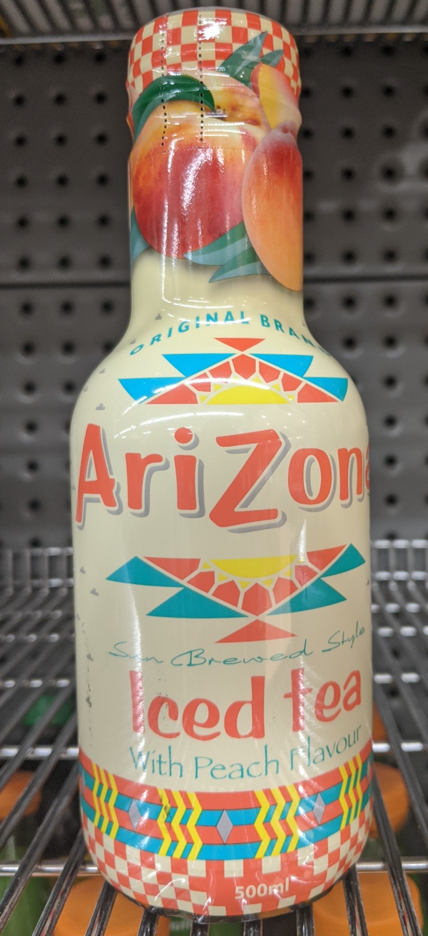
The ARIZONA ICE TEA gives a hopeful impression from a distance. It has colours that have the ability to work well together within the design and looks to be fun and exciting. When you are able to clearly see it the illusion is broken. The label is a mash of different styles and ideas all pushed together. There are five different fonts that change with each line of text. The styles of graphics also clash with each other, with the peach images at the top of the label being a mix of realistic and simplistic drawn images. These issues makes the label feel tacky and disconnected. It’s difficult to know which aspect of the design to focus on due to the repeated bright colours and different sizes and styles of writing.
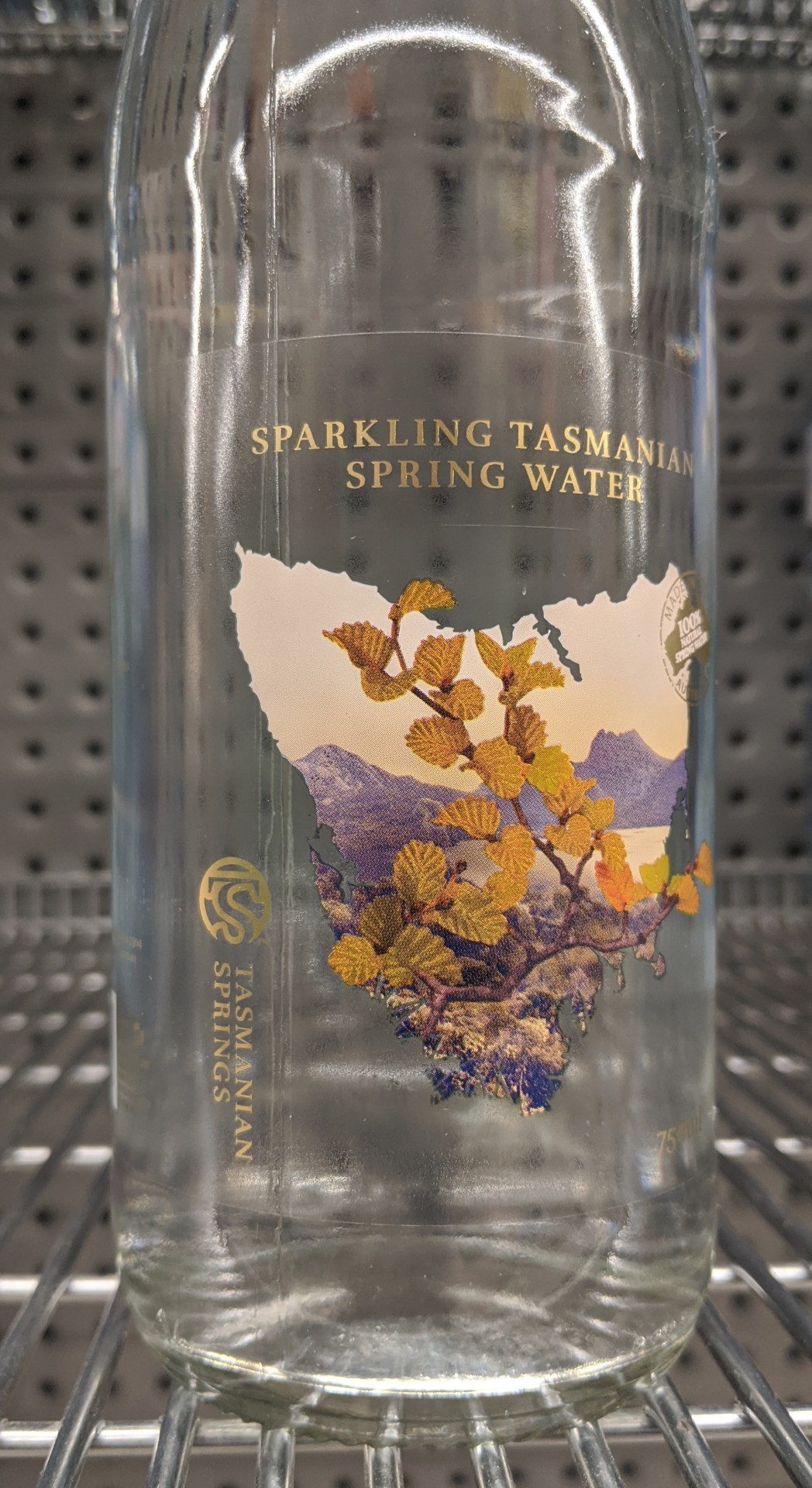
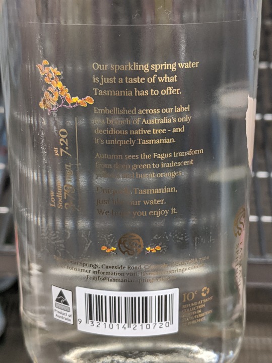
The SPARKLING TASMANIAN SPRING WATER is simplistic and eye catching from a distance, revealing its detail and beautiful arrangement closer up. The clear label behind the image and text shows the water within the bottle, giving the impression that the beverage is fresh and clean. The muted purples and oranges in the image of Tasmania compliment the gold colouring used in the text. The intricate design shows texture and depth, repeated in a smaller image of the leaves on the back of the label. This beverage label is effective due to its simplicity and clean lines, working perfectly with the attributes of the product it is aiming to sell.
0 notes