#Anyway if you want to know my opinions on the VISUAL designs -- I like that Lambda is a tortle :]
Note
your post about bladelore was really interesting, do you have any thoughts about the designs of the ferronises?
(message from future Van as I edit this -- Beware Ye Of The Unmarked Asspulls in this answer. Also SPOILERS THROUGH THE END OF CHAPTER 7)
Yeah, like, I'm kind of two minds about them? I definitely think the way they take on similar features to a big source of cultural trauma (Faced Mechons for Keves, Sirens for Agnus) of the two kingdoms supports the idea that ether is still a kind of collective memory, the way it was presented in XC2. They're weapons of intimidation, first and foremost, built to bolster the forces and make them more comfortable taking risks and choosing fight over flight, to feel like they've got something dangerous backing them up, but I also feel like they're subtly designed to reinforce the sense of hopelessness that is instrumental to the war working as intended. Z wants everyone to give up, the goal is to make everyone into Moebius and arrive at a kind of heat death of the universe that way.
From a practical perspective, I don't think the Ferronises are a new development in the war.... but I do think the war was probably initially fought without them, with everyone just under the one Big Flame Clock at the Castle. But we now that people do figure the war out, and if everyone was concentrated together, they'd just figure it out quicker, so eventually the amount of people fighting in the war necessitated they get split up and scattered across Aionios to stop them from seeing too much of the big picture to work it out like Alexandria did. So, basically, I'm taking the long way around to say that I think Flame Clocks preceded Ferronises, and Ferronises were conceived as extensions of Levnises, and are probably historically represented as such.
I think there's also a certain amount of incentive for Z to keep growing the scale of the war as more people became Moebius and started requiring Things To Do in the Eternal Now -- a lot of the Consuls in the game are or at least appear to be pretty new to their jobs, or at least have enthusiasm for it, which could be a ramp effect to embracing the true Endless Now of Not Doing Anything Ever Again after they get their petty victory or revenge or whatever it is that drove them to become Moebius in the first place. Maybe Ferronises were initially built to allow the Consuls to spar amongst themselves, and then as they got bored of that, new Consuls would take over.
Which brings me back around to the actual designs of the Ferronises -- lots of animal motifs to go around, but off the top of my head nothing really seems to match up that strongly with its Consul, other than maybe the miko outfit on Mu paralleling I's design. One that really leaps out is R with her fox design placed alongside the very scorpion-y Colony 11. Since there's a limited amount of Consul Titles to go around, if the ramp theory is correct, the Ferronises may be designed to spec by their original Consuls, but as they are now they're more like.... tabletop RPG factions, they all come with their own "playstyle" so to speak. Hell, depending on how circular you want to see the timeloop as, maybe colonies tend to have the same commanders over and over in a cycle, which would bring some periodic consistency to the game of war.
During the events of the game, we may actually be in a lull between campaigns, with a lot of consuls electing to not play, leaving Z to having to pull up a bunch of new Moebius to fill the seats around the gameboard, because if the war cools off too much, the people of the Kingdoms are gonna start asking questions again.
#van's answers#Xenoblade Chronicles 3#What do I even tag this at?#does this fandom have some kind of established Moebius Meta tag?#Xenoblade 3 spoilers#anonymous#long post#man I hope this is even remotely what you wanted to know about lmao#I CAN go into detail about some of the Ferronises if you want!! I promise!!#I just started writing and realised that I've never really talked about The War(tm) before#when it comes to the Ferronises themselves I really wish we'd seen more of them out in the field#I'm still salty that Lambda wasn't a part of the final attack on Origin like c'mon#you're telling me Isurd wouldn't feel like he owes the gang a life-debt. Really. R e a l l y.#Anyway if you want to know my opinions on the VISUAL designs -- I like that Lambda is a tortle :]#Also my friend pointed out that Gamma looks like a moth and I can't unsee it now
10 notes
·
View notes
Text
"people are mad that that artists wanted to be paid" no, people are mad that they HAD places of revenue they could have invested in and instead decided to fuck everyone over and piss off their fans who have been there since the buzzfeed days
(+ the only reason they're now saying they're not pulling content is BECAUSE of the backlash, and this isn't even going into how any growth is now impossible if it's their own platform, they are NOT big enough or produce enough content for this)
like, apparently they have a patreon? have never heard of it. absolutely no advertisement on it, when PLENTY of people would subscribe if they plugged it at ALL (like, fans love bts content, early episodes, extra/uncut stuff, having their names be credited at the end, a discord, etc) but I've never heard of it, and according to people who have subscribed, they didn't find it worth their money (not an ideal baseline for their own service)
they have merch? make more and better quality/nicer designs (or just fun quotes! so much of my stuff from their buzzfeed days is just shane quotes, but the only stuff I've bought from them now is their jackets and the professor doll, nothing else. I've looked at their catalog, it's ugly. put a funny quote on a shirt and I'll buy it guys, it's not that hard)
a youtube membership for similar stuff to the patreon, yt livestreams, USE THE PLATFORM YOURE ON MAYBE???
explicitly asking fans to turn off adblock for them on their videos
but, like, I am absolutely not paying $60 just for like 1-2 shows that only get like 4 episodes a year. they do NOT have the content for this on their own (and why tf do they have 25+ employees???? bro what) - not to mention, the inaccessibility the new platform and ability for non US based fans to even subscribe
people watch bc of the dynamic between Shane and Ryan, some of my favorite episodes are ones where we get the random text on screen- nothing fancy
tbh I get what they want but it's been my opinion that too much of their stuff that I watch has become a) formuliac and b) overproduced without much to show (imo mystery files comes to mind, it's Fine but I only enjoyed the banter vs all the unnecessary visuals, the same with ghost files)
I've seen people mention how expensive just the ghost hunting stuff is, and like yeah, maybe stop buying that big fancy brandname equipment without and instead ask for sponsors to advertise your stuff, all that stuff is nonsense anyway so it's not like you're lying about like betterhelp or something
and idk, maybe having a show where you apparently eat gold and caviar isn't the best if you're struggling with money (esp bc who watches it? not me)
what they need is someone who actually knows anything as their ceo, having less than half the staff they do, and investing in the avenues they already have with SOME pay walled content (not all), and maybe learn how to actually produce their shows without bleeding themselves dry bc the fans watch for THEM not the "production value"
#watcher#watcher entertainment#listen guys this is the dumbest thing you could have done#long post#ive just seen a lot of 'you guys just dont want to pay artists' bro i was ALREADY giving them money and supporting them#this is NOT how to do that this is how to shoot your fanbase dead#also like many people cant afford this now? especially when its an exorbitant amount for almost nothing
161 notes
·
View notes
Text
Kung Fu Panda 4 Review
Ok, I saw the movie yesterday and I have some thoughts. I think the film is good, but no where near the level of the first two. It's more like the third tonally. But tbf, nothing can top the second film in my opinion. KFP 2 really stepped up in its depth both in terms of its villain and message. The fourth film is very much the opposite. It's also very predictable and you can easily figure out what was gonna happen pretty early on.
What I liked: the animation is still gorgeous. Seriously, there were some very visually pleasing shots. The character models all looked great and I thought it was cool how the villain still has scales when she transforms. The music is also really nice and fun to listen to. The voice acting was also good and I thought Awkafina did a good job (major step up from Scuttle).
Po's dads were also really fun when on screen. It's nice to see them bond over Po and they do work well off of each other. They were the best part of the film, animation aside. The villain is also pretty cool with her abilities. We will talk about her more in a bit. And I did like Zhen and I'm looking forward to see what they do with her in the future. She's energetic and I did like her design.
What I didn't like: too. much. comedy. Ok look, I know this is an animated film for kids, but what made the first three films (particularly the second one) so good is that the balanced the jokes with depth. This film does have some messages, but it's intercut with so many jokes during dialogue that it takes away from it. They really needed to let this film breathe and have more serious moments to just talk and let things sink in. The villain brought back the old villains and stole their abilities (this was in trailer so not really spoiler). Why don't they do more with that? There is so much untapped potential here.
And that's my other big issue with the film: so much potential. Some of the ideas in this film are really, really good, but they only scratch the surface with it. I wanted to know more about the villain. I wanted to see our fave villains interact more. I wanted to see the villain use her powers more. But we don't get that; we only get the bare minimum. In simpler terms, there's no big "wow!" moment that the other films had.
Spoilers below (tread carefully)
Why did they bring the villains back if they were going to do almost nothing with them? The climax of the film was the Chameleon stealing the villains' abilities and fighting Po but we pretty much saw that in the trailer. Tai Lung gets to do some stuff, but I wanted more. Half of his lines were jokes anyway and I didn't vibe with it. Why did they bring him back if he was just gonna comment on things? I don't remember our favorite snow leopard being this comical. He did quip, but there was still a hardened edge to him. Idk. Maybe he got therapy in the spirit realm. Shen and Kai get crumbs, but again, they could've done so much more. And wasn't Kai destroyed completely?
With Shen and Tai Lung, I would've wanted to see more. I'm glad Tai Lung did finally come to respect Po and it does make sense. But Shen? The last time we saw him he rejected Po's help. Unless he too got the same spirit realm therapy Tai Lung did, him bowing to Po does feel very OOC. Nitpicking further, why was Shen brought back anyway? The Chameleon presumably doesn't know who Po is and Shen isn't a kung fu master. With the exception of the fanservice route, this choice only makes sense if the Chameleon was aware of Shen's actions in Gongmen and thought his level of evil would fit her vibe.
Nitpicking aside, there was so much opportunity for Po to confront his villains again and have a deep, serious moment with them. Whether either side likes it or not, they're reunited for a short amount of time. Why not capitalize on this great opportunity?
Speaking of the villain, so much untapped potential. Her design is great, her abilities are really cool, and Viola Davis does a good job voicing her. So why doesn't she get to do more? Imagine a really cool fight sequence where Po confronts her, but she shifts so much that it begins to mess with his head. Or she transforms into the older villains and Po is caught off guard? Instead, we get half the climax spoiled for us in the trailer. What was really cool about the other three was that we got multiple fight scenes with them to showcase their abilities. Thus, the final battle dialed it up to an 11 and we got a truly epic finale. Here, it feels like there should've been more, but there wasn't. Even her backstory feels lacking. It's there... but only surface level. Even Shen, arguably the cruelest of them all, had nuance and depth.
Also, why couldn't we get more of the Furious Five outside of a glorified cameo? Tigress and Po friendship is truly amazing.
As much as the jokes miss, there are some good bits. Shifu trying to deal with Po's shenanigans always crack me up. I also like the bit where Po tries to meditate and his thoughts get in the way. Because hey guess what, that's what my head is like and it's really freaking hard to quiet it down. So, there's that. I just wish the writers didn't feel like they had to insert jokes in almost every line of dialogue, you know? Li and Ping dad adventures are great except half the lines are jokes about how worried they are for Po or how not tough they are. Why not have a deeper conversation? I think it would make everything feel more natural.
I also wish Po himself was a tad more mature. I'm not expecting Shifu or Tigress levels of seriousness, but I felt that he kinda was a bit too childish. Po is one of those characters who loves to have fun, but knows when he has to be serious. However, he also likes to lighten things up with comedy. In this movie, it felt like he only really leaned into the comedy side of things. He had his moments, but I'll be honest, I really missed the "the only thing that matters is what you choose to be now" levels of dialogue. The proverb joke got old real fast, ok?
Grace Randolph from Beyond the Trailer described this movie as episodic and I can see it. The story bits are very segmented between the villain, heroes, and Po's dads. The flow and pacing of this film really needed to be upgraded.
Ok, that's all I got for now. I'm sure I'll think of something else to say (aside from encouraging everyone to rewatch KFP 2 because I'll never get enough of that film).
#kung fu panda#kung fu panda 4#kung fu panda 4 spoilers#po#zhen#tai lung#lord shen#kai the collector#the chameleon#master shifu#mr ping#li shan
104 notes
·
View notes
Text
Recently, I was sent a job listing. It called for a graphic designer "to produce direct response static & video ads for various social media channels, such as Facebook, TikTok, Snapchat, and YouTube." So, even though it was asking for a graphic designer, it wasn't a graphic design job—it was an advertising/social media/videography job. The career I've dedicated eight years of my life to is the bit the ad referred to as 'static'.
Ever since, I've been thinking about this idea that video is the future, and also I have been (not coincidentally) extremely depressed. Not to be all "you kids and your phones," but...
In advertising, your consumer's attention is money. Video is THE most attention-demanding form of advertising and therefore the most bang for your buck. It's why Facebook fudged their own stats for the effectiveness of pivoting to video so aggressively in the first place. If your consumer is reading something—a magazine, a poster, a book, something on their phone—then they're still listening, and if something else demands their attention, they'll just look up. If they're listening—to somebody talking, to music, to a podcast—then their eyes and hands are free to do whatever they like. They can look at the world around them, which involves many forms of competing visual advertising.
Video is a media form that doesn't stop. It keeps talking when your consumer looks up, and then keeps moving to grab their visual attention again. The best method for advertising is one that a consumer has to exert energy to not pay attention to.
(—This is why I hate video so much as somebody with ADHD. When my dopamine and blood sugar are low, focusing past someone playing TikTok audio is hard enough for me that it hurts. I've never had the same problem with radio or with like... idk, billboards. And TV is kind of bad, but at least it makes predictable sounds, whereas every person who films a TikTok with sudden screams or yelling in it is, in my opinion, going to hell.)
This is why the UI for platforms like TikTok and Instagram have autoplay, algorithms that disappear things you've seen so quickly, no scrub bars, and don't have skip or pause buttons. Your consumer has to keep their phone in hand to keep swiping or scrolling to properly engage. If that consumer can't stop a video or go back, then the platform can train them not to look up until the video is over. Anxiety that a user will lose their place or not be able to keep up with what is happening is part of what keeps them from looking away.
This is also a reason to be suspicious of why so many tech companies are obsessed with VR in general. A phone that people have to hold and look at and listen to is pretty good, right? But they can ultimately still put it down when an ad plays. It would be way better if we could put the advertising somewhere that tracks and follows their eye movements so that they literally can't look away.
We all know that text is still a better, faster, and more information-dense delivery system. Sometimes I see people mourning the pivot to video because it's a worse way to consume information. They're right! It is! But social media platforms have NO INTEREST in providing their users with like, actual reliable information. If they did, then social media companies would have no interest in AI.
(—This is also why they have no interest in fighting misinformation on their services. People who get radicalised are very engaged platform users. And the people who radicalise them come with massive budgets for ad spend.)
All social media platforms want is to get consumers hooked on their content so that they'll continue to deliver ad revenue. Video is the best way of achieving that. That's why we're all pivoting to algorithms and video. That's why Tumblr Live exists and Snapchat miraculously has not died.
Anyway. I chose to become a graphic designer.
#graphic design#DON'T pivot to video. Just never do it.#source: I have worked in communications for five years#remind me to post about how Facebook farms what my old comms team called 'rage clicks' sometime#writing essays on tumblr dot com
154 notes
·
View notes
Note
Heyooo! It’s me again (i hope i’m not bothering you by asking questions like these) I started making a comic and I’m struggling with the typography
Any tips or recs to look? I really like your work and that’s why I am asking :)
Heyo!
I can dish out a few tips but they aren't really hard rules so take them with a grain of salt and artistic freedom.
The most important thing imo is the presentation of the text on the page. The shape and number of speech bubbles will be registered way before any of the contents so it needs to looks the part.
The first tip would be generally avoid the speech bubbles being overly thin and long. The example below is pretty tame but believe me, I’ve read comics with the wormiest of speech bubbles and they tend to not look good.

Sometimes the automatic alignment of the text will look closer to a square (especially if there are many short words in a sentence) so feel free to go in and move the text around via the enter key so it looks more like the rhombus. You won't always be able to achieve it especially if the first word in a sentence is long (e.g. the word "hypothetically") but a rhombus should be the goal.
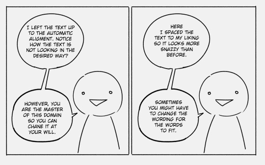
While we're on the topic of speech bubbles I like mine to have really short "tails" (the bits that indicate who is speaking), unless I REALLY want to make sure the reader knows who is speaking in a scene.

Also I always make the tails point directly towards characters mouth unless it would make the scene confusing (for example if two characters have mouths really close to each other or something, I might make one tail point a bit higher/lower/to the left/right to differentiate between the two speakers. But that’s like a super specific problem and could be avoided with proper frame layout.)
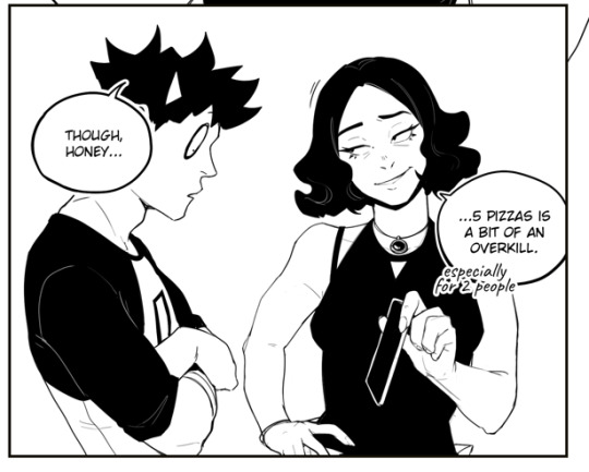
And like, never skip the tails unless its the same character monologuing at length. Nothing breaks emersion more than when you have to stop and turn into an investigator to determine who is speaking in a scene.
Now for the fonts themselves, in my opinion the size of text should be unified between speech bubbles and across pages when it comes to a single font. Example, all casual speech - arial, 14; all thought bubbles - Calibri, 15.
That is of course unless there is artistic merit to changing the font and/or font's size. Making someone yell, suggesting a threat or sarcasm, indicating a playful tone or something akin to that - lean into what you're trying to communicate visually.
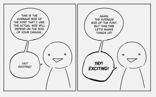
All fonts are not made equal and sometimes you will have to adjust things manually e.g. letter spacing or line spacing. Generally I try to keep the spacing the same regardless of the font, e.g. "yay exciting" had massive gaps between the lines which I've shrunk to make it look more visually cohesive with the rest of the dialogue. Same with these ones:

At the end of the day typography and everything pertaining to speech bubbles is design work and what designs do is communicate a message and serve a function. I’ve had this picture saved on my pc for years now (reverse google search doesn’t tell me who made it but it’s like the bible to me so I will share it, I am almost certain it was made by tryinghuman but I might be wrong):
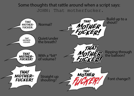
Really every part of a speech bubble can be “designed” down to a single word. The position of text, fonts, the shape of the bubble etc. And every change will culminate in an effect and the goal is to have that effect reflect what you’re going for.
Make it legible or illegible, make it see-through, capitalise one word, cover speech bubbles up with other objects, make them crack or fall apart. Not every speech bubble needs special treatment! But once in a while it’s nice to throw something different in to spice things up.
Also, and this is a rule that was bestowed upon me during a graphic design class, don’t use more than 3 fonts per page (again, unless there is artistic merit to it like e.g. purposefully trying to communicate a sense of chaos. Otherwise it just looks a bit unprofessional. In my opinion anyway.)
And the last thing I will say, and this mostly applies to comics in English, is some “speech” fonts include capital “I”s both with and without serifs. The serif I should generally be reserved for the pronoun “I”.

There is so much more when it comes to text in comics like the flow of bubbles across pages, splicing text across bubbles for communicating speech patterns or intentions of the characters, and there are tutorials about it out there but I wasn’t able to find my favourites on command............. sorry................ But I’m peppering this in just so you’re on the lookout for all the other cool things that go into comic making :)
Hope this helped!
577 notes
·
View notes
Text
Bestiaryposting: Holghras Results
Now for what everyone -- or at least a certain percentage -- has been waiting for: the results for the Holghras! Anyone who found that sentence confusing can catch up by checking this page: https://maniculum.tumblr.com/bestiaryposting .
This time around, they should all fit into one post, as the response was a little smaller. I see how it is: everyone wants to draw Spooky Corpse-Eater With Magic, but nobody wants to draw Horny Bird With Problems.
I kid, of course. The Wutugald had some pretty clear visual elements that people could hook onto, but the Holghras entry is mostly about its behavior and doesn't give much information on what it looks like beyond "it's a bird". So it's pretty clear why people might have a harder time drawing artistic inspiration from that one. (And I really and truly appreciate those of you who took a crack at it anyway.) The level of physical description is going to vary a lot entry to entry, I'm afraid -- to some extent I think it's about whether it's an animal the reader is expected to be familiar with, but there are definitely a few detailed visual descriptions of animals most medieval Europeans would have seen because the author wants to do some symbolism. So it's a toss-up. Anyway, here's the link to the description people are working from:
And the results, again roughly in order of appearance. If yours isn't here, let me know -- I saw one post that said something about Tumblr eating their original attempt, presumably out of Bird Homophobia. I'm happy to reblog any that I missed due to Tumblr's functionality.

@bruncikara (link to post here) gives us our first interpretation. I really enjoy the medieval bestiary style, including the use of the Generic Medieval Plant that always reminds me of mutant asparagus. I think the border is designed to evoke the thorns in which the Holghras nests, which I also appreciate. The bird's pose, flat on its back with its neck curved up, is great, and it's shown performing its signature Hide With Dirt move. I think at least some of the inspiration comes from quails here, judging by the head... feather... thing... [Wikipedia break] ... okay, apparently it's just called a "plume", which I should have guessed. This is the first example of the common (and correct!) assumption that the Holghras is a member of the order Galliformes.
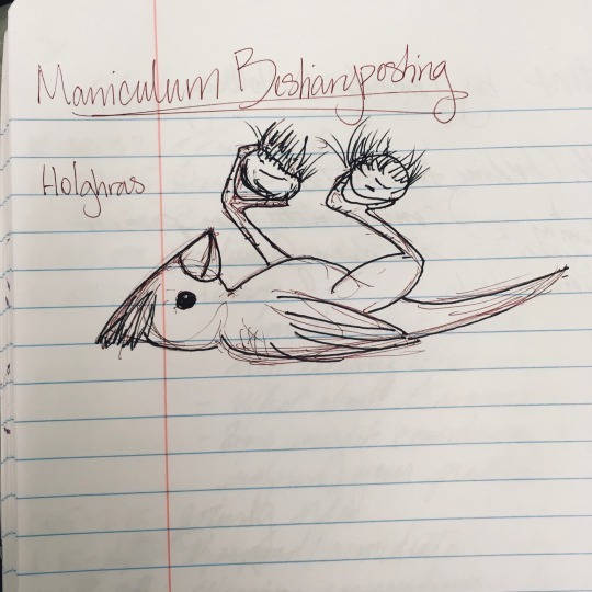
@jamiethekeener (link to post here) gives us this one, also posing with its signature dirt clods. I'm reminded of a cardinal, personally. The artist provides a brief comment on their design, noting that they are not a bird expert. I think this is a pretty cute juvenile bird, and the way it holds the dirt comes off as kind of playful.
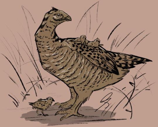
@silverhart-makes-art (link to post here) has produced another very naturalistic drawing, which (in my non-expert opinion) manages to look very much like a real bird without specifically looking like any bird in particular. They apparently do know birds, because they specifically name-drop Galliformes in their description of their design decisions. I like the decision to also include one of the bird's Signature Behaviors, i.e., the mother carrying her chicks.
@pomrania (link to post here) has given their Holghras a selection of striking features, which they explain in their post. There's a lot in that post, actually, and I really enjoyed reading the whole journey of this particular drawing. You should go read it too -- the post linked above also provides a draft version, a link to a series of progress sketches, and a link to an explanation of their design choices that includes rumination on how to make a bird look "slutty". Go check it out, we'll be here when you get back.
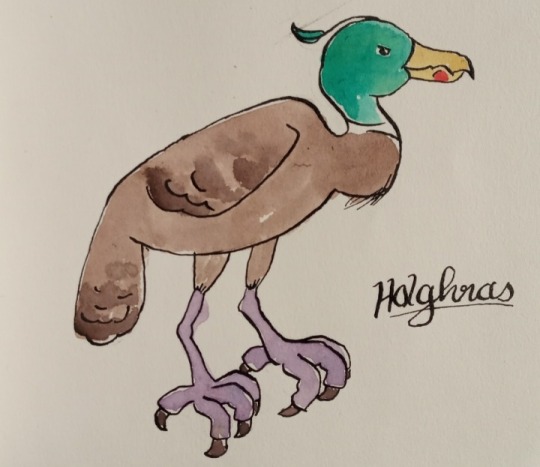
@sweetlyfez (link to post here) describes her design choices briefly, indicating that her goal was to pick Bird Attributes that could look unsettling in combination and suggest that the bird depicted has a "terrible sex life". Mission accomplished, I think -- that bird does not look trustworthy. Also now we know that thing on its head is just called a plume, so good for us. I really like the effect the -- watercolor? I think? I don't know art -- provides, and that seagull-esque spot on its beak really is a great touch.
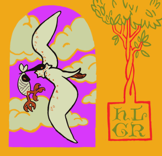
@rautavaara (link to post here) has done another beautifully stylized drawing with a very pleasant color scheme. They provide a brief explanation of their design decisions in the linked post. I'm particularly struck by the fact that this version of the Holghras apparently carries its young in the same way that the folkloric version of the stork carries babies: in some kind of cloth wrapping held in the beak. I also like that the chick's feet are sticking out.
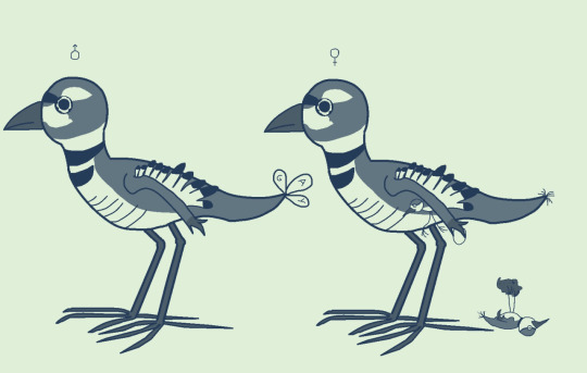
@mobileleprechaun (link to post here) apparently had some trouble posting this, but I'm glad they got it through, because it's delightful. I like the little bird on the right with its feet sticking straight up, and the other one under its mother's wing/arm. When I first saw this, I was briefly puzzled why the drawing contrasted male and female birds, because they looked quite similar -- then I noticed the tailfeathers -- then I looked more closely at the male's tailfeathers and cracked up a little bit. The linked post provides a brief explanation of the design decisions, including why the wings look so much like arms. It also has a couple tags that I find funny.
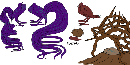
@karthara (link to post here) provides this excellent image as well as a brief explanation of their design choices. I love the over-the-top tailfeathers on the extremely-sexy purple male Holghrases, and the babies dangling from under the female's wing, and the fact that the clod of dirt being held up by the juvenile is at least as big as the bird holding it. Also, those ridiculous tailfeathers are apparently inspired by the Onagadori rooster, which means we're back with the Galliformes.

@embervoices (link to post here) did this adorable drawing of the juvenile Holghras. I particularly like that she's taken a different route than having it just hold up the dirt: this one apparently has a little hidey-hole like a trapdoor spider. This is just very cute all around, I like it.

@cheapsweets (link to post here) provides this excellent and action-packed depiction, along with a wonderfully detailed explanation of their design decisions. (I love reading those.) From their post, it's clear that they also know more about birds than I do, and also name-check the Galliformes as the most likely category. Apparently the bird-people of Tumblr have this critter's number. Also, that is a masterful depiction of a bird running off with an egg, I have to say.
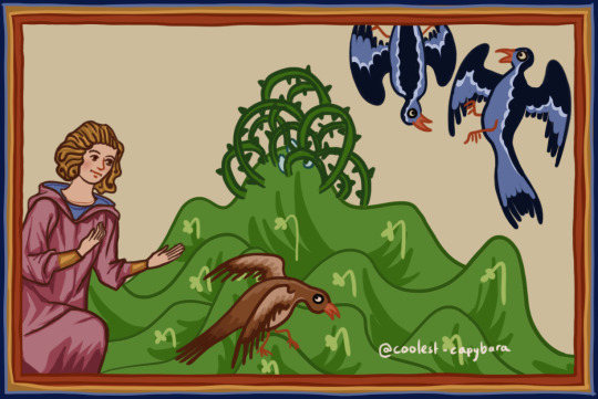
@coolest-capybara (link to post here) has done another medieval-styled rendition, which I really enjoy. This is also, I believe, the first appearance of a human in any of these drawings. (Well. Live human, at least.) I enjoy the depiction of the female bird doing her fake limp to lead the human away from her nest while the males engage in their weird drama up in the right. They provide an explanation of their design choices and inspiration in the linked post.

@scarlettbookworm (link to post here) has given us a drawing that showcases several of the odd behaviors described in the entry. The linked post also provides a description of their design process and an explanation of their decisions. I think this is another very cute picture of a bird holding up dirt, and I enjoy the one at the top shouting "HOLGHRAS!" The egg-stealer over in the bottom right is very good also.

@moustawott (link to post here) has drawn this very vulture-like Holghras in what I have to say is a very well-done bushy area. I had to look twice to realize the background was actually cleverly-arranged splashes and blobs of color that strongly suggest that we're in a bush. Very good art, love the style, and that fuzzy baby Holghras is cute as hell. The linked post provides an explanation of the design decisions.
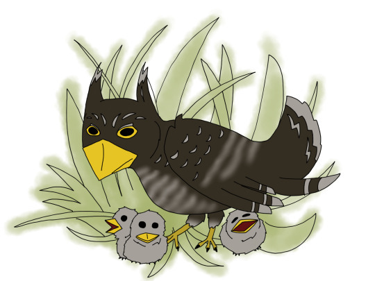
@strixcattus (link to post here) gives us this rendition of the Holghras, which they describe as being inspired by a prairie chicken and a potoo. Prairie chickens are, of course... Galliformes. Another tally mark in that column. I'm particularly delighted by the giant mouth on the chick in the bottom right. As they did last time, the artist has provided a detailed modern-naturalist interpretation of the animal, which is of course in the linked post. I recommend checking that out; maybe it's just because I'm the kind of huge nerd that I am, but I think these are great.
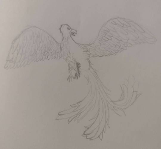
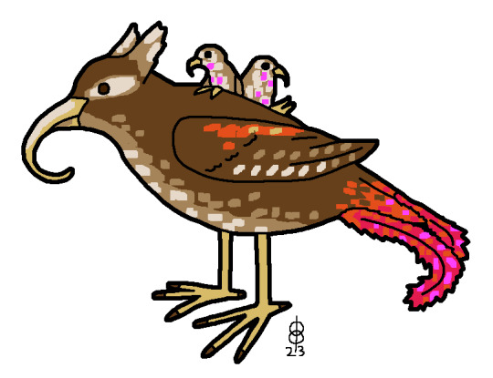
@treesurface (link to post here) gives us a Holghras that they describe as a cross between a bird of prey and a bird of paradise, which I think is a pretty good idea that fits both the aggressive behavior and the mating behavior described in the entry. I enjoy the fact that multiple artists have decided this bird Likes Big Tailfeathers (and it does lie, but about different things).
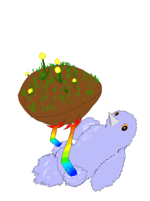
@ashfly (link to post here) gives us this picture of a juvenile Holghras holding up its clump of dirt. They also indicate that they have an idea of what it is, which I really hope they'll share now that it's posted and the bird's out of the bag, because I was 100% certain nobody would guess this one. The fuzzy bird is cute, of course, and the rainbow legs are really striking. (Pride legs, perhaps?) I also like that it's clearly looking over at the "camera" to see if we're buying it.
And finally, the official medieval depiction:

... hm. Yeah, some absolute bastard apparently cut out a bunch of the miniatures in this manuscript at one point. Luckily, we have the Ashmole Bestiary over at the Bodleian Library, which is extremely similar, so we can get an idea of the image that was here:
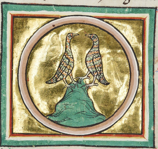
And also, this entry in the Aberdeen Bestiary comes with two images. Here's the other one:

I'm going to assume the choice of coloration was up to the individual artist and the missing Aberdeen illustration was also brown, because the Ashmole version of the egg-stealer also has the more colorful pattern:
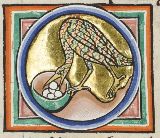
Anyway, in case you haven't recognized it from these helpful and very accurate images, this is the partridge. Now you know what's going on in those pear trees.
I don't actually have anything else to add about that. I was frankly a little surprised there was even an entry for "partridge".
65 notes
·
View notes
Text
I hate when they change like vital plot points of a book to fit in a movie. I mean, first of all the iconic F outfits. The Circus of Talents. We lost Princess Uma, a bad bitch if there ever was one. Anyway thoughts below but I can’t add a read more on mobile so sorry. Spoilers obviously.
Thoughts on the School for Good and Evil movie
Good
- The design and aesthetic of all of it was beautiful. I mean like everything was elegant and stunning and just visually incredibly pleasing.
- Sofia Ann Caruso is a great Sophie, she’s cringey and mean and overdramatic. She is the love child of Megamind and Regina George.
- Also Theron and Washington made great professors.
- The Tedros had a cool sword, iconic dumbassery, was pretty and also had cool fits which is how I like my men personally.
- Sophie and Agatha’s friendship at the start was super natural and well written.
- Soman cameo.
- I loved the little addition of Professor Anemone previously being a history teacher. It was just such a nice little touch to the world building and her character.
- The inherent creepiness of the casting for Rafal. I mean I always imagined him looking like a teenager but him looking like he’s in his twenties and trying to claim Sophie as his child bride really adds that extra layer of ickiness.
- Literally everything with Gregor Charming. An icon, a legend, he is the moment.
Bad
- Sofie Wylie is a good Agatha but they wrote her so blandly. Also like where was the initial awkwardness? We deserved bitchy goth loner Agatha. And like it would’ve been cool if Agatha was more conventionally unattractive. Like no hate to Sofie Wylie she’s absolutely gorgeous but it would’ve been nice if she did have that whole thing of yeah people don’t think she’s pretty but then her personality begins to outweigh that.
- Where the actual everloving fuck where Anadil’s rats? I was promised little rats. I was robbed.
- Why were all the Ever girls such bitches? I mean like passive aggressive? Yeah sure. But they were outright bullies.
- The plot change of Rafal purposefully letting Good grow complacent and vain. I think it’s more interesting when you have Good who genuinely have grown complacent without the manipulation of true evil or whatever. It adds more weight to it.
- The Circus of Talents was iconic and we deserved to have the wolves and fairies reveal.
- The blood magic? I mean like what? You have regular magic, no deus ex machina necessary.
- More development between our girls and Teddy. Like I love him being a pathetic little scrunkly but it felt like everything happened in two days. This may have been better adapted as a show considering it’s meant to be covering a whole year of school.
- We deserved hot pink finger glows.
- Lack of iconic book characters: Princess Uma, Castor and Pollux, the Golden Goose, the little pets they had, Anadil’s rats (yes I’m bitter), the librarian dude whose name I’m forgetting, he has Giles vibes, the seer, you know the dude.
- I wanted to see Hort’s frog pajamas.
- The actual explanation for the nemesis stuff like in the books.
- Where was the witches/Agatha friendship? Sophie betraying Aggie to avoid going home? Dovey caring about Good?
- More mean Sophie. Give the people what they want
- It felt so queer-baity. I know the book three twist but like it was just annoying.
Edit - Also the iconic line ‘I’m worse than my father. Because I still love you.’
All in all it was a fun movie but having loved the books as a kid I felt like they didn’t really get done justice. Two and a half hours wasn’t enough to cover the whole story adequately in my opinion.
#school for good and evil#sge sophie#sge movie#soman chainani#agatha of woods beyond#charlize theron#kerry washington#lady lesso#kit young#sofia wylie
1K notes
·
View notes
Text

bliss redesign based off one I made in my teens
thought process + various other bits and bobs under the cut
I was 15 and annoyed by everything that moved when this character first came out, so in my own head I was very much making a Point with this redesign. Hence, I made very minimal changes. I wanted to work with what was already there and basically just make the existing design more thought-through. Little breakdown ahead (keeping in mind i myself am very much An Amateur who doesn’t know shit and am just ranting about my opinions and i also haven’t seen a single second of the 2016 reboot so i don’t know much about Bliss to begin with)
1. one of my Biggest pet peeves with Bliss is that the powerpuff girls each have bangs that are simple, memorable, and iconic while also being unique from each other and being reminiscent of irl little girls hairstyles. It’s very neat and clever and I like it a lot
and then Bliss has this confusing jumble of shapes that looks like it changes in style halfway across her forehead
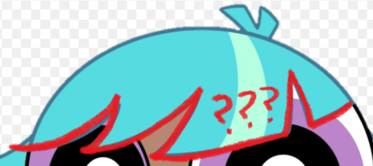
i have absolutely no idea what the intent is here. My only guess is maybe it’s meant to look weird on purpose like she was trying to cut it herself or something (I suspect it’s something like that since she seems to have normal looking bangs as a little kid from what I can see) but it doesn’t really come off that way if that’s the case. It just looks like baby’s first PPG OC where you Understand that it’s meant to be hair and that it is made out of shapes but have 0 understanding of hairstyle or character design in general. Heck I might have put this exact hairline on a character in the past at the age of like 8
So in my redesign she’s got 5 even notches across her bangs, not thee most exciting change but it does the job I think. It is pretty reminiscent of Blossom but they look different enough from each other that I wasn’t too worried about it
2. low-hanging fruit time, Bliss’s hair color is horrible on the eyes. I’m bewildered at the decision to do this, especially since there is just so much of it, I struggle to think of how she could exist in any scene without hogging all the viewer’s attention constantly. That said, I understand they wanted her to have an unnatural hair color to really signal that she is a Fresh new Teen character from the late 2010’s, which is. Whatever, that’s fine, so she gets purple hair now. I kept the streak for the same reason, especially since she’s got a lot of hair, so no harm in a little extra interest in there.
I also learned recently that her hair glows sometimes? which i did Not know when first drawing her but well i think the darker color helps anyway. It adds some contrast for when she’s normal vs when she’s glowing and makes the latter appear more,, idk threatening or powerful or whatever the mood generally is when she’s doing that.
I did re-add that toothpaste blue to her eyelids though. I like to think it’s also the color of her lasers. It’s a cute color, just not as like 70% of this character’s palette
3. real talk I was drawing this from memory and didn’t mean to change the way her hair flares out from her head. realistically I think the original is fine, maybe just a little boring but fine, so that part of the redesign was an accident. Only thing is, it’s in the exact same position in every screenshot I’ve seen? It doesn’t seem to whip around when she’s flying or anything which looks weird and probably looks weirder in motion, especially since it takes up so much space onscreen. Idk it’s a strange decision, esp since the original show liked to use the ppg’s hair to emphasize their movement, so I’d just bring more movement into her hair. I mean if nothing else it’d make her look cooler.
very very rough little visual of what I mean
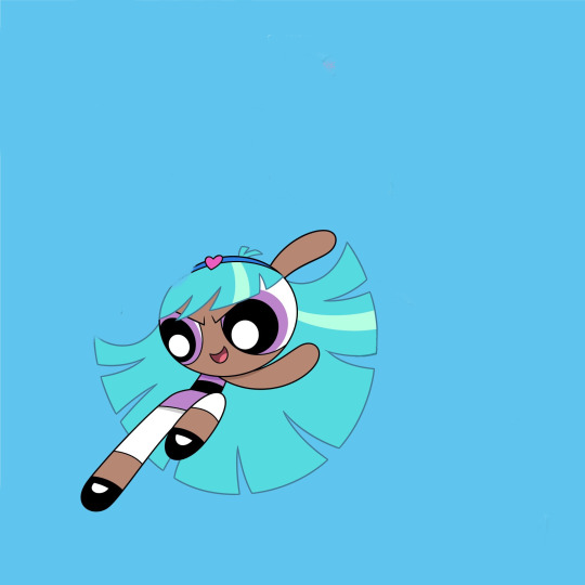
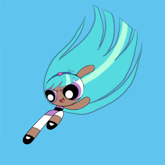
I also ended up making it shorter in my redesign—again, not really intentional, but I think it’s better that it eats up a little less of her silhouette
4. Her headband is largely the same, I didn’t hate the idea of her having an accessory, so I just toned down the colors. I’m not personally a fan of the powder blue and that pink heart is very bright and just doesn’t go with the rest of her (once again the color of her hair is doing it no favors). I also moved the heart over. Not necessarily needed I think, but I feel like it reads quicker as a headband and not a weird crown that way+introduces some asymmetry into her design that I think is nice.
5. my biggest gripe other than her bangs are her hips. I’m not against adding anatomy to this character design to make her read visually as older than the girls, but it’s so awkwardly done and distracting. I feel like it even interferes with her line of action more often than not (which is not helped by her unmoving hair).
Part of the issue is she still has the teeny tiny torso, just… with those square-ish hips slapped on, which makes her legs look all gangly and stretched out. I tried to balance out the proportions more in my redesign, as well as change the hips to a flared skirt. I think it helps differentiate her from the girls and still implies hips underneath, it just also functions as a less clunky transition from her torso to her legs.
Lengthening her torso also allows the stripe to look more like a belt above the skirt, which I think helps to sell her as “similar, but not the same” from the ppg
6. Her leggings(? Idk Im not a fashion person) aren’t a bad idea I think. like a more mature version of the girls’ stockings, but I think the white makes them look really distracting. It would help to make them a darker color I think, but since I wanted to keep them reminiscent of the girls’ socks I kept them white and just shortened them.
7. Not really sure what Bliss is wearing on her feet. I think they’re Mary Janes, but they’re drawn a bit different from the girls’ and I honestly think it’s too babyish a shoe for her to wear. I’m not sure what she’s actually wearing in my redesign either honestly, but the goal was just to make them look like the girls’ Mary Janes while clearly being something different.
8. Uh her signature color is something I’ve contemplated changing a lot but to be real I think it’s fine. I feel it was a very bad idea from a marketing standpoint because people were hype about Bunny and would obviously be mad they didn’t get her once the character actually dropped (and in the long-run she would just end up being overshadowed by the character everyone has already assigned that color to) but I’m personally not bugged by her being purple beyond that. If I were to draw them together though I think Bunny would have a more pinky shade of purple and Bliss leans more blue.
Loosely on the same topic, because of Bliss I’ve had a running headcanon that “only child” types of powerpuffs tend to come out purple. Kind of like how trios tend to have a red, blue, and green. It’s a fun little piece of fake lore to rotate around in my brain
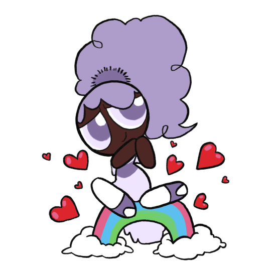
Anyway with all that out of the way, here’s some redesigns I decided to have some fun with. Wasn’t being too precious about recognizability or simplicity or anything like that, but I did run out of steam partway through. There’s also one based off Whoopass Bell bc idk, why not

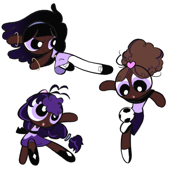
Finally, here’s some OCs I only ever drew once before out of a desire to give Bliss her own teen girl archetypes to form a team with. This is Bee and Beetle, who I’ll probably definitely forget about again immediately after posting this

#ppg Bliss#the powerpuff girls#my art#powerpuff oc#under the cut anyway#trying to do an interesting background#i got bit by a drawing bug and felt the strong need to finish this post today#i’ve been meaning to put together some art and a little ramble about bliss for a while#largely because idk if or when i’ll ever actually talk about her again#i also skimmed through this post once or twice so sorry if it’s incoherent#anyway this took a long ass time i need to take a nap or something
40 notes
·
View notes
Text
A Discussion Of LavenderTowne and Hazbin Hotel
So, a little while ago, a YouTube channel called LavenderTowne ventured into the Hazbin Hotel fan space to propose some criticisms and fan redesigns of the characters.
I had thoughts on the original video, but those are irrelevant because its reception was… tumultuous, and in my opinion disproportionate. The video has since been taken down, and LavenderTowne uploaded a follow up to it (link). In which she stated that her experience with the Hazbin Hotel fandom wasn’t the most pleasant, something I would like to address.
So, this post will be an academic discussion of the designs from the second video. Because I think her criticisms were interesting and because I want to show that it is possible to disagree with someone without being unpleasent.
Also, I want to give LavenderTowne a more welcoming experience with the fandom, and try to make up for some other members of the community.
Let me explain.
SPOILERS AHEAD (Hazbin Hotel)
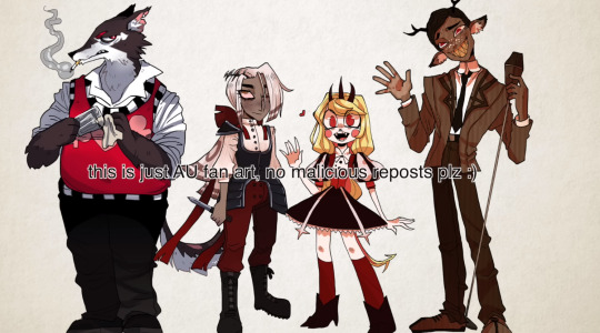
I'm going to start with something that needs to be said. You can disagree with the rest of my post, but this is non negotiable:
It is never, under any circumstances, acceptable to harass someone for their opinions, especially about art. I don't care if you take issue with conclusions or perceived motivations, actions like I observed are not ok, and are not welcome in this fandom.
I hope I made that clear.
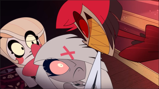
Anyway, I am going to be addressing the second video, because LavenderTowne took the first down, and I'm not about to intrude where I'm not wanted.
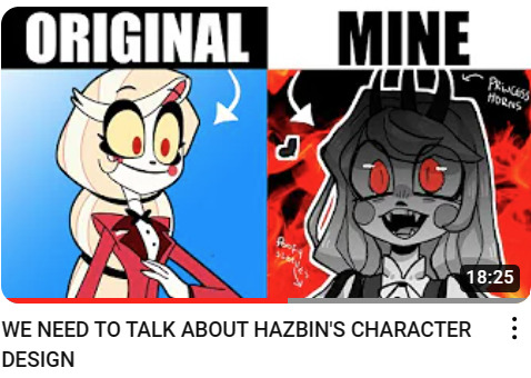
LavenderTowne mentioned the overarching stylistic choices, and I think that is a good place to start with this post, because they are good source of difference. Several of LavenderTowne’s criticisms are leveled at the Hazbin Hotel visual style itself, discussing what specific elements didn’t work for her and how she would personally draw things differently.
That is what I want to discuss here. Rather than the specifics of artistic technique, I am going to talk about the character design decisions brought about by the difference in style. This isn’t a question of skill, but an examination of the ideas presented.
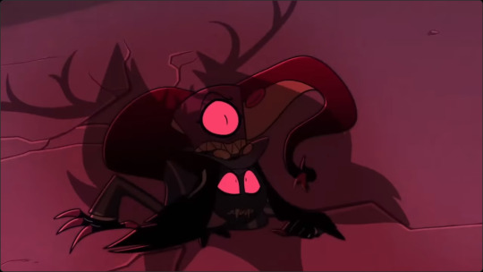
Both LavenderTowne’s style and that of the Hazbin Hotel team range on the scale of realism, as is the nature of art, and that has caused a few of the design decisions that they have made. But it has also had a weird effect on the implied plot that is worth discussing.
Hazbin Hotel is more cartoony, for example, which means its logic is a bit more fluid. Vaggie's eye scar, for example, is shown over her hair, which isn’t how scars work in the real world.
This is a way of getting the tone across. Sir Pentious, at one point in the series, gets caught in the blast of an explosion and sent flying across the city. The design style lets you know that this is being played for a laugh and that he will probably be fine. If LavenderTowne had drawn Sir Pentious in her style, I guarantee that version of him would not survive the event, because hers is grittier (that’s the wrong word, but you get the point).
I do, however, really like the colour palette shift in LavenderTowne’s designs. Don’t get me wrong, I like the limited palette of the actual show, and I think it suits the setting more than the pastel aesthetic of LavenderTowne’s style.
But, those pastel colours are gorgeous and they are a really neat way of solving one of the problems that LavenderTowne identified and I agree with, that being how difficult character differentiation is when everyone has the same colouration as each other and their background.
Now, neither of the two options are implicitly better, there is just a different design sensibility going on.
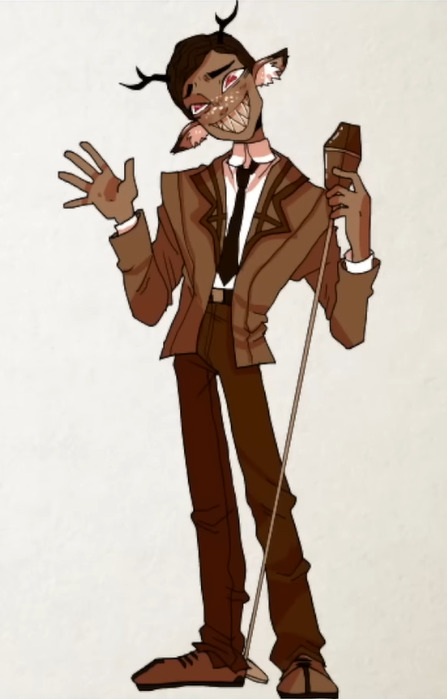
As for the designs themselves, I actually prefer LavenderTowne’s Alastor over the original. I would like to see how it interacts with Alastor animation and transformation, but I think the design overall works better for the character. I like the horns being more pronounced, and I like that neat hairstyle. I think it's much more suited to an overly refined character who revolves around appearances.
“Just because you see a smile, don’t think you know what’s going on underneath. A smile is a valuable tool, my dear! It inspires your friends, keeps your enemies guessing, and ensures that no matter what comes your way, you’re the one in control.”
I think that Alastors original hair style is more about looking cool than looking refined. The shorter style, combined with the more prominent antlers, gives that air of someone actively concealing their more wild undercurrents.

That being said, I'm not as sold on Alastor's expression in LavenderTowne's design. This is a stylistic choice, but I don't think that the Cheshire Cat smile translates over to the alternate design as smoothly as his concept. In the original, that smile was the thing that denoted him as malicious, but LavenderTowne's design seems more huggable, at least to me.
LavenderTowne did raise an interesting point about the voodoo symbolism, a point that others have raised, and I think is worth noting. Incorporating that aesthetic as synonymous with dark magic in a setting based heavily off Christianity is funky, thematically. It's a use of stereotypes as shorthand, which carries the baggage of those stereotypes, intentionally or not. However, I am about as far from qualified to talk about this in detail as possible. I recommend that you listen to the opinions of people who know more about this than me, and who's case this is to make.
Husk’s design is another that I like, but this one I have slightly mixed feelings about. The body type change addresses another of LavenderTowne's criticisms of the series, again in relation to character differentiation. That is a strength of the video, LavenderTowne gives criticisms, and explains what she means and how she would go about doing it.
Interestingly, that body type issue is something I disagree with. I think the way that LavenderTowne has handled the issue she identified is fascinating, and one of the best parts of her process. But this is simply an issue I don’t see as a problem.
The criticism is that the silhouettes of the characters are exceedingly similar, meaning that identifying them is difficult, as well as limiting in terms of variety of proportions. I could point out Sir Pentious or Husk here, but that is arguing in bad faith because Husk is very clearly the exception to the rule, and Pentious actually conforms to her observation. Without his hood out, Pentious’ silhouette difference is in his tail, which is rarely onscreen.

The reason I am ok with this, is that Hazbin Hotel has a thing for transforming character designs. Charlie, Valentino, Emily and Serah, Lucifer, even Adam, Vaggie, and Lute, as well as a ton of others. All of these character designs shift as the story progresses, revealing aspects of them that they have kept secret. I like having the baseline similarities if everyone gets a moment where they show off how different they are from that baseline. I think that is a cool story beat that, for me at least, outweighs the problem of similarity. I’m sure LavenderTowne would disagree with me here, and that is more than fine.

Back to the point, Husk is a character who is surprisingly acrobatic and martially competent, and the slight shift in the alternative design switches him into more of a bar brawl type character. This feels like the guy who would just deck you and tell you to cool off, rather than throw something at you. He looks like the type of bartender he is, cool and calm, and ready to offer advice when needed.
The removal of the wings is an interesting choice. On the one hand, it clears up his design and makes him look more down to earth. On the other hand, it leads into my main bugbear with this design. I don't think this version of Husk looks like an overlord.

This is subjective, and I am struggling to quite explain it. But the wings, as well as his voice, give a sense of gravitas to Husk. Without that, Husk looks relatively unremarkable.
The outfit plays into this. While I prefer it and its subtlety, there is little that marks this version of Husk out as higher ranking.
Again, this isn't a case of the original designs being objectively better. This is a different design that communicates different things. LavenderTowne’s Husk is a humble bartender rather than an overlord playing pretend. I simply like the story that the original offers more.

Vaggie’s new design is both my favourite design of the four, and the one that is the furthest from the story of the show.
I love the quieter eye scar, I love the silhouette, and I think moving the ribbons to her back is a genius bit of visual storytelling.
The outfit is cool (I especially like those boots), but there's an asterisk to that, because I don't think it entirely suits Vaggie as she is presented in the show.
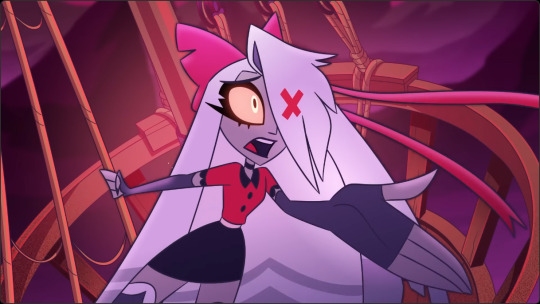
At the risk of oversimplifying, Vaggie is a fairly uncomplicated character. Not because she's written to be shallow, but because the show doesn't have time to explore her personality.
So, you get her past, which is fascinating, and it leaves some interesting things on the table.
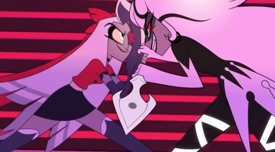
For example, Vaggie has zero self preservation instinct and will burn herself to the ground for Charlie. This isn't complex, but it's remarkable how much the writers (and animators if you’re looking for that kind of thing) get out of this one detail.
Most notably, her character grows into realising that love means living for someone rather than dying to keep them safe. This culminates in the defeat of Lute, the embodiment of her past, who doesn't think to move out of the way of a collapsing building.

Similarly, Vaggie was an angel and wants to hide that aspect of herself. This makes her multifaceted in backstory, but the reveal doesn't have time to dwell on her characterisation, so it just feeds into what I said before.
I think that with another season of time to develop, Vaggie’s characterisation will become as complex as her backstory. But that doesn’t come quickly.
The point I am making is that I don't think this version of Vaggie would wear armour until the end. She doesn't think she can get killed, so why would she need to protect herself?
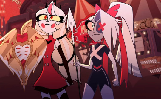
Which means that LavenderTowne's design would work for the last episode of the show, if it had wings, which is sacrificing the single best piece of foreshadowing I have seen in a long time. Seriously, I cannot stop gushing about those ribbons.
What we have, then, is a version of Vaggie with a slightly different story and personality. To me, LavenderTowne's Vaggie looks like a character who craves safety. She seeks Charlie because she offers emotional stability and kindness, the one person in hell who Vaggie doesn't think is against her. But she would wear the armour and outfit because of the injury. She realises she can be wounded and grabs the heaviest set she can find, the twin coloured trousers come from that desperation, and add to the imbalanced aspect of her design.
This version of Vaggie is defensive rather than offensive, and though it renders Out For Love obsolete, I find it more interesting than the original.
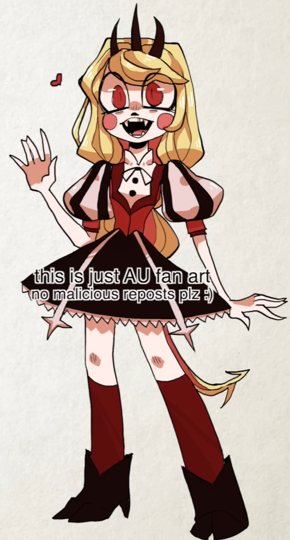
Charlie's design, however, I'm not such a big fan of. I'm sorry LavenderTowne, I really am. But this design really doesn't sit right with me.
Hazbin Hotel has a circus theme going on. The main foyer has a circus tent affectation, for example, and Charlie gives off the aesthetic of the ringmaster.
Charlie is very overtly the antithesis of a Disney princess, and that comes across in her design. Instead of wearing a floaty dress, she wears a suit and suspenders.
Yes, the hooves and horns being more prominent is a cool alteration that I appreciate, but the alternate outfit really doesn't feel like Charlie.
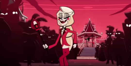
I think the difference is in the framing. To me, LavenderTowne's Charlie comes across as naive and optimistic, where the original design is more relentlessly hopeful, and that second one matches how she is in the series.
Charlie in Hazbin Hotel showcases true hope. Not optimism, hope. The type of emotion that keeps getting knocked down, but picks itself off the floor ever single time, and gets ready to try again. Charlie has no proof of her philosophy, no basis. She's not trying to recreate phenomena, she doesn't even know she can succeed. That's why she needs the hope.
I don't think that LavenderTowne's design has that vibe. Instead, this Charlie seems younger, which contributes to the naivety. It feels like it leans into her regular design, so the more fearsome transformation comes as a shock, mostly.
On the other hand, the three horn tiara element is genuinely really cool. It gives that air of reality, and hints at the transformation without giving it away. They round out the design and make the “this is a demon princess” clear.
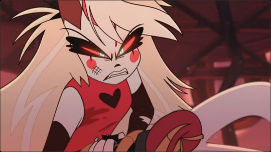
Interactions between this Charlie and Adam, Lute, or Sarah would be interesting, as this version seems designed to foil off them, rather than the other way around. Especially Emily, this design seems genetically engineered to mirror her and make her question her ideals just through existing in the same place.
In short, this Charlie seems more gentle than the original, which might help in some aspects, but I prefer the original.
One again, this is my opinion, and not objective by any stretch of the imagination. If you disagree with me, good, that's the bread and butter of how analysis and discussion exists. But I hope I have shown that disagreement is possible without aggression.
Which brings me to my conclusion, and I have something here that I hope you will like.

LavenderTowne's designs feel like they are made for the same story, but paced differently. They feel like a different style of musical. They feel like they were made for a version of Hazbin Hotel that had more episodes and has time for subtlety, something that the original show unfortunately didn't have.
The story feels the same, but the minour changes make it seem more drawn out. The tone is different, and that effects the entirety of the rest of the story.
In other words, she is designing an AU, something she makes explicitly clear at least five times in her video.
LavenderTowne mentioned in her video that she might do a follow up with a few more characters. I would be intrigued to see this, because I want to know what Angel Dust would look like in this version of the story, as well as the actual angels and even the Vees.
I also am fascinated by how the art style affects the tone of the story. And with LavenderTowne's permission, I might have a crack at writing some of the key scenes from the show to fit this aesthetic and tone. I think that would be an interesting thought experiment.

Final Thoughts
LavenderTowne’s designs were dope as all hell, and the points she raised were worth discussing.
I love the series, but I understand that it's not everyone’s cup of tea. Content warnings should get that across, but also some people just won't like elements of it for any number of reasons, and that is ok.
I think @ohnoitstbskyen put it best in his discussion of the finale of the series. (Link). In his closing remarks, he spoke at length about people who will discover the show and the effect that it will have on them. That sentiment, boiled down, became the title of that video, and concisely says what I have taken just under 3000 words to talk around.
“This show will save someone’s life, but it isn’t for everyone.”
But let me be clear about why I wrote this.
I saw some of the shit that people wrote about LavenderTowne's original video, and though a lot of it was positive, a fair chunk was not, and I want to put my foot down. Disagreement about art is healthy, but if you think that involves harassment at all, then tell Husk he still owes me a drink.
On a lighter note, this is my first post about Hazbin Hotel, so for those who are reading my stuff for the first time, hello. I am Ari, I do media analysis, and I plan on doing a series on Hazbin Hotel, going through each song with lyrical and musical analysis once I finish my current one on Wicked. So, if that interests you, maybe stick around.
#rants#literary analysis#literature analysis#what's so special about...?#character analysis#hazbin fanart#hazbin hotel fanart#hazbin hotel#hazbin alastor#hazbin charlie#hazbin vaggie#hazbin husk#lavendertowne#I will write for this AU if LavenderTowne lets me
24 notes
·
View notes
Note
You have m o r e ?!?!? Omg they're amazing, I love them already and it's only been like 90 seconds (I've just been staring at them because. Wow.)
Wait but are you actually getting rid of them/ discontinuing their story? I mean, I saw that post about Sisyphus, but I would love it if we got to see more of these guys. I mean, no pressure if you weren't but I just wanted to let you know that I'm a really big fan of your work. I appreciate that, for your nonhuman characters, while their designs are very visually appealing in the artistic sense, you can tell that they're not at all supposed to be attractive in any modern human idealized sort of way (and what does it mean to Objectively Attractive anyway? Popular opinion is so hypocritcally subjective) but instead that each individual drawing, whether it's a character of your own creation or your take on a preexisting one, is crafted to serve their exact purpose on the page (whether it's Humor of Incongruity, expressing frustration, evoking the beauty in the imperfect, etc.), because you can see both the soul of that being and the way the Otherness of their design sets them apart as new and interesting yet accentuates the uniquely human part of their character (however buried and twisted that part may be, in some cases. Looking at you, Valek.)
. . . I was going somewhere further with this but I lost where I was. I'm sorry, it's late and I'm tired, but I just saw this and felt I had to say something (other than "cool monsters go brrr"). I know we're just strangers on the internet, and I'm not any sort of people person. We don't know anything substantial about each other, and we'll probably never meet. But I hope you know that, for whatever it's worth, there are people out there who see what you're doing. And that it's beautiful in all of it's imperfection, and beautiful *because* of it. And that, miniscule though my knowledge of you may be (because who can truly know anyone?), I can *see* the beauty of your soul shining through the crack of your art. And that I get a little bit of joy and inspiration every time I come across your work, so I hope this clumsily, hasty little message can give at least some of that joy back to you.
(P.S. I wrote this as a AtNC reblog, but by the time I finished writing this I figured it'd probably be better to send as an ask, so that you can decide what to do with it. You are in no way obligated to make any sort of response to this. From what I understand, you don't believe in a benevolent higher power, and that's okay, I'm still on the fence about whether I do or not, but I just... felt oddly compelled to write this. Like something was telling me I had to try to convey this to you, because you needed it. It's fine if you don't understand what I'm saying, I'm not sure even I do, but just hope that wherever you are, whatever you are doing, whatever you are going through, you know there's someone out there who cares for you, and that your existence is w o r t h something immeasurable.)
I hope you're okay. You are stronger than you know.
First of all, thank you. It took me a while to reply because I've been very busy with schoolwork, but I've reread this message at least several times a day and it has brought me such joy each time.
To answer your question, no, I'm not discontinuing or getting rid of anything - I assume this has to do with my monster OCs, and there are two major stories of them so far.
One is Walter, which I simply decided not to use for schoolwork after being told its plot is too boring. That's all. I will do what I want with it in my own time. The other is that one with the mutated office workers, which fortunately got the OK from the professor. Both are still very rough works in progress.
I'm very glad that you like the way I draw... er, things, for lack of a better wording. Things I draw for myself may turn out far from "conventionally attractive", but I like it that way. You made me think about an aspect of my art that I never really considered before, but you have a point; in a way, I could be trying to humanize characters not by giving them a more human face but by giving them their own ways to express humanity.
That being said, I don't know what an "AtNC" reblog is supposed to be, but I wouldn't have minded either way. Your kind words are appreciated all the same.
#snake got an ask#anonymous#Regarding “humanizing”: One thing I like to do is make expressions and body languages out of inhuman features#It's fun
34 notes
·
View notes
Note
I won't pretend to totally understand what's going on with sm (other than that they seem to have shat the bed), but in terms of how hybe had tried to buy them earlier and how it's often accused of trying to be a monopoly, do you think there's a point where hybe could get too big in a way that's detrimental to the rest of the industry? Ik they're not literally a monopoly and that there are much smaller companies than hybe, sm, yg, and jyp (hybe is also small compared to the rest of the music industry) but do you think there's any truth in the anger at how big of a chunk of the kpop industry hybe controls or is it just jealousy at them outgrowing the original big 3?
***
I feel like you answer your own question within your ask… because if we think about it: as of January 26, 2024, HYBE’s market cap is ~55% more than the rest of the Big 4 combined. HYBE is itself a hub of ‘mid-sized k-pop companies’, one of which is BigHit, which drives roughly half of their topline. Meaning, the primary driver behind HYBE outperforming and dwarfing the better capitalized and more prestigious competition, is BTS.
It’s simply a fact that HYBE is the biggest company and BTS is the reason why. Like, it’s so obvious there’s no tactful way to highlight it. And it’s a fact it pisses off a lot of people here.
If you ever get into a conversation with a typical k-pop stan, before long, unprompted, they will tell you HYBE has no really, talented idols and that whatever prestige or talent the company has in vocals or dance, was technically bought by acquiring Pledis. It’s not particularly a big deal, just something funny I first noticed in k-pop discourse about 2 years ago, once the idea of HYBE, and Seventeen as a HYBE group, started settling in with k-pop stans.
The average k-pop stan doesn’t really know how to think about HYBE in general, because HYBE is structured nothing like the rest of the Big 4, from its ethos down to its operating mechanics, and so the points of reference k-pop stans have in the Big 3, don’t always apply to HYBE, in my opinion.
Anyway, yeah there’s this weird resentment that often manifests in the misplaced superiority complex you see in some stans of Big 3 groups. In a sense, I don’t blame them. It’s the nature of this industry for there to be a hierarchy. It’s sport after all. But like I’ve said, the politics this space creates is highly toxic, the tribalism is entrenched and the primary thing k-pop stans do in fandom is stoke unending feuds, and shit talk other groups and idols. Some groups are acceptable targets for everyone to dunk on. BTS from debut was designated as one such group, but from the jump it was clear they weren’t going to settle for anything less than the top spot. BTS wasn’t supposed to be the group, to breakout. They didn’t have k-pop approved vocals cred, they didn’t have the typical idol visuals, their rapline never went on Show Me The Money, so how could they be legit?
BTS was a group that did things their own way from the start and that by default pissed off a lot of people. Most of those people are still here. And because people are predictable, some of that latent dislike of BTS bleeds into everything connected with BTS and so, HYBE.
And, not to keep wacking this horse corpse, but I want to point out yet one more obvious thing.
When people talk about Big 3 privilege, something they’re talking about is the latent buy-in those three companies: SM, JYP, and YG will always enjoy in this space. Groups from those companies will always enjoy support from a sizeable army of company stans. SM entertainment has the most, followed by YG, then JYP. This is why Big 3 stans are the people who set the temperature for what dominates the chatter in k-pop. K-pop stans will always tune in to groups and releases from Big 3 companies and are generally pre-disposed to always giving their stuff a chance on the assumption their idols are more talented.
The size of those company stans dwarf the stans of smaller companies like Cube, KQ, Pledis, and until some years ago, BigHit Entertainment. Except for BTS and ARMYs, none of these companies have company stans big enough to rival Big 3 fandoms, and so the cache of these companies are seen as inferior to Big 3 agencies. And as HYBE is simply a collection of mid-sized companies (who on their own couldn’t stand a chance compared to the Big3), examples include: Pledis, Source Music, KOZ, Be:LIFT, ADOR, then the groups from HYBE are implicitly seen as less talented than their Big3 peers. Plus they get the additional ddaeng for being linked to BTS, specifically.
All of that felt very silly to type out but it’s what I’ve observed. Watching the logical conclusions of this political dynamic in k-pop fandoms play out in real time during the SM-HYBE-Kakao drama (1st season) was super fascinating lol. It confirmed practically everything I think about k-pop stans and BTS.
#bts#Hybe#bang pd#kpop industry#BigHit#kpop fandom#bts army#bts fandom#fandom behaviour#sm entertainment#kpop
24 notes
·
View notes
Note
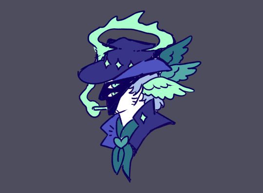
if you don't mind the feedback, here are some thoughts on the gay cowboy pin (re)design, not intended to be overly critical or negative by any means, just some food for thought; if this is unwelcome you are more than encouraged to skip reading and delete this ask.
whilst this may be due in part to the simplified design being a rougher sketch, i feel that many of the key elements of the original design have been lost in translation to the simplified one. the smoke halo, the strong, unobscured profile of the character, the wings framing his head - the contrasts between ordinary and the divine which are, in my opinion, what made the design so striking, but most of these are absent in the simplified redesign.
if you do want to pursue simplifying designs i think the best approach would include identifying those key elements that gave the original design its visual intrigue and attempting to maintain them
I don't know what it is about my Pride Angels but they seem to get the most unsolicited critique! I know you all mean well and I do want to make good designs. But I'll admit, it chips away at my artistic confidence. I'm curious if any other artists struggle with that or if it's just me.
Anyway, my goal with the simplification is to make the designs easier to manufacture as small pins so they can be more affordable. For this reason I got rid of some of the trickier shapes in the Gay cowboy design. You may notice I'll get rid of other more detailed or complicated components in other designs.
I understand the points you raised Anon, and you must feel quite strongly about it if you took the time to write all this up. So I took a stab at another iteration on the design keeping what you said in mind. I do like this one better.
26 notes
·
View notes
Note
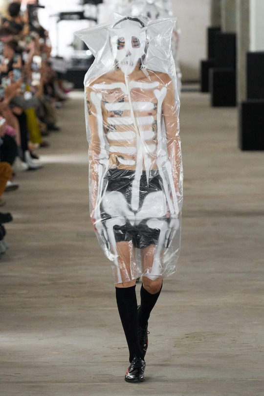
if you could style each of bangtan what kind of style would you put them in and which fashion house do you think fit them
oh, what a fun question!
note: please take this with a grain of salt, bc i don't really know shit about fashion, really. so this is just a bit of fun, and definitely something i'd love to hear others' opinions on!
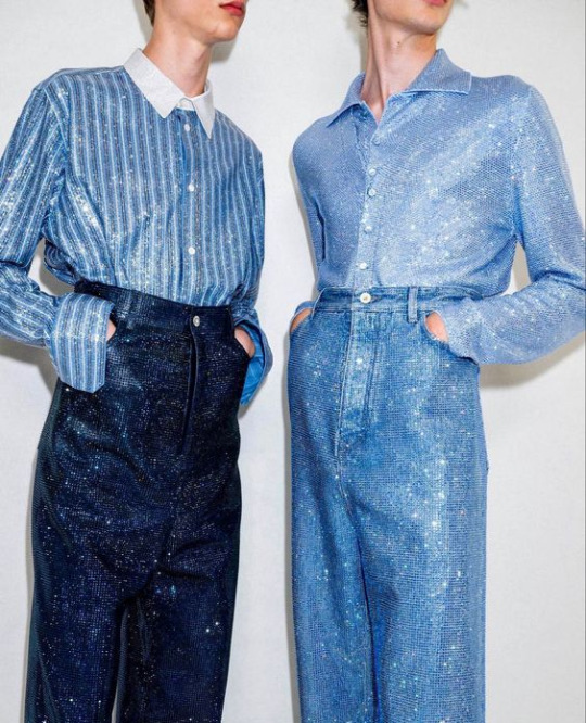
namjoon — i love namjoon in more traditionally-feminine clothes. the juxtaposition of his size (tall, thick thighs, etc.) with the skirts/flowy pants and tops just... really works for me.
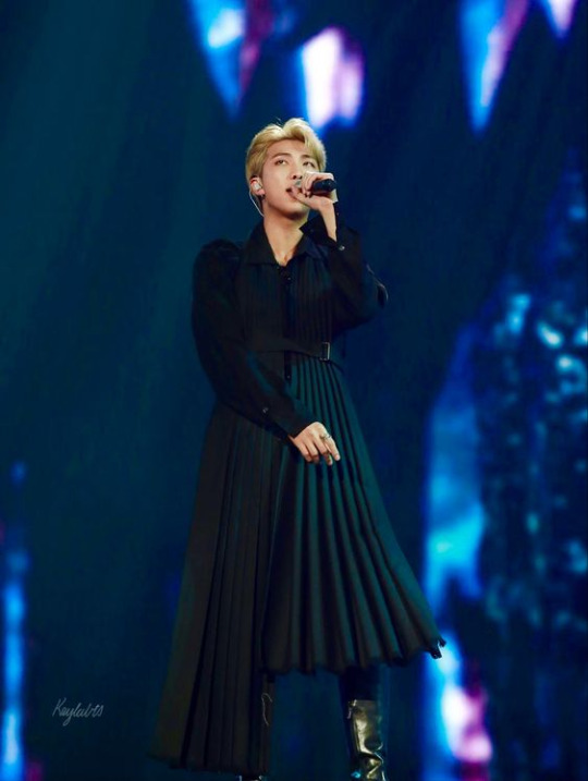
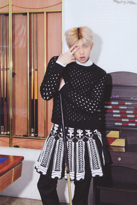
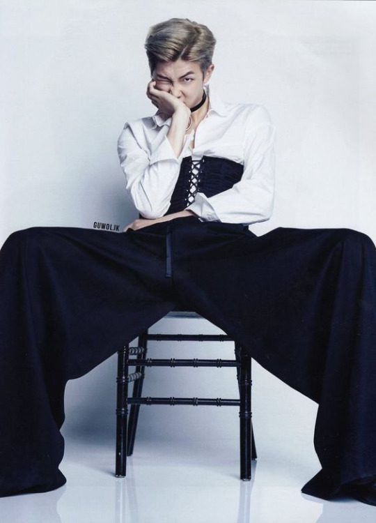
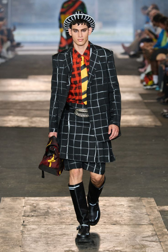
so, for namjoon: moschino. for better or worse, they're always doing something different, and i think they could actually do something really inspired and cool with namjoon's vibe. even though i get the vision, bottega is just... so boring to me.


seokjin — hard to choose here, when he canonically looks good in everything. but me, personally? i love him when they style him edgier. perhaps it's because he's my bias, but he's just so soft and •ᴗ• so looks like this really work for me, bc it's not really what you'd expect him to wear??:
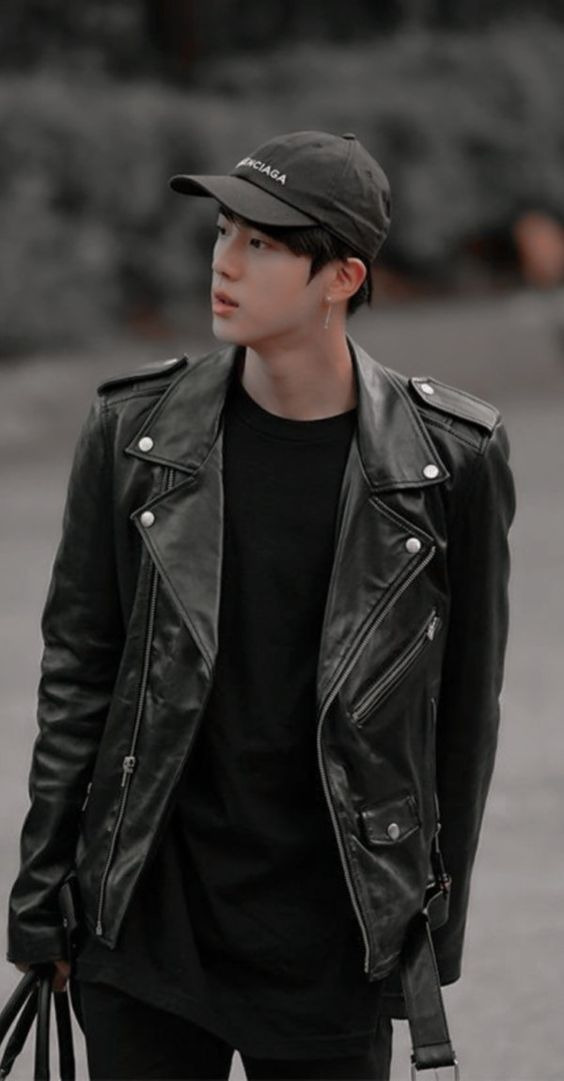
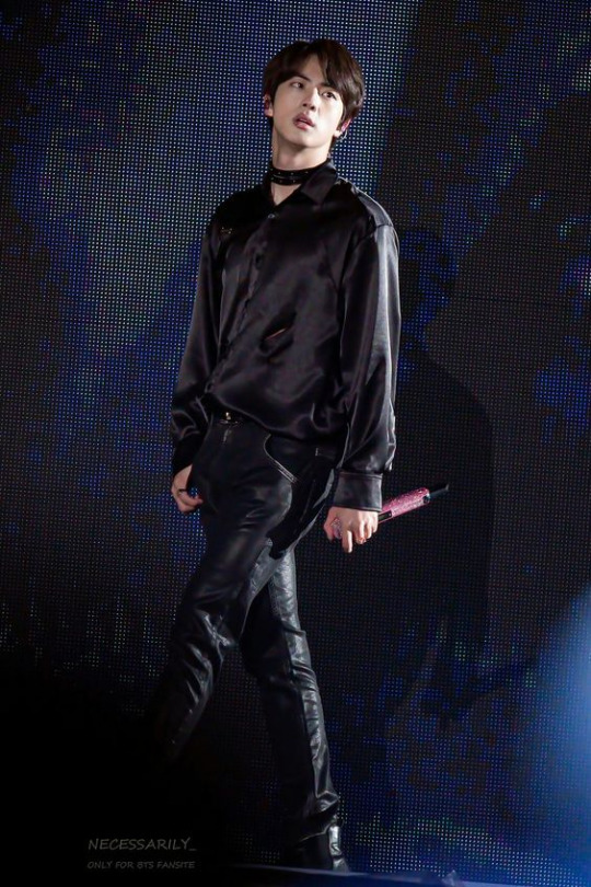

so, for seokjin: alexander mcqueen. one of my favorite designers for my favorite boy. there's structure, but it's still visually stimulating. edgy but not so much that it'd distract from the person wearing the clothes.

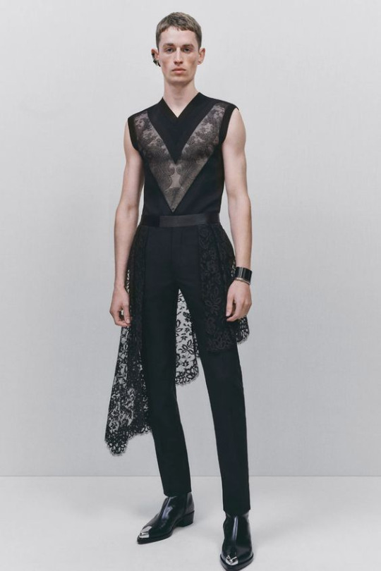

yoongi — i'm getting lazy with the pictures here, but i actually really like yoongi's deal with valentino. there's a nice balance of soft and bold which really works for him and fits with his vibe. however, i think we can (and should) make yoongi weirder.
so, for yoongi: ichiro suzuki. very, very weird (affectionate) clothes, and i think he'd be super into it. also highly inspired by art, so maybe yoongi and namjoon will be sharing clothes.


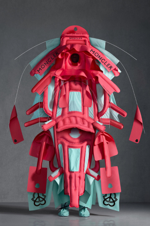
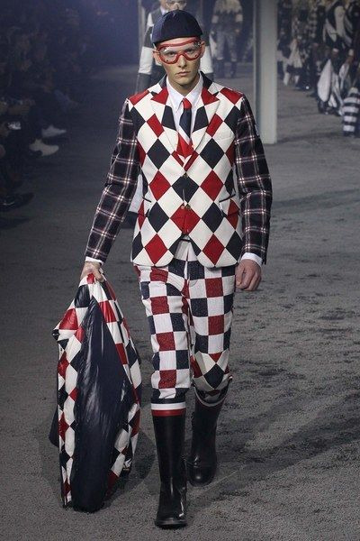
hobi — already a fashion icon. doesn't need any input at all from me, but i'm a mission to make bts as weird as possible, so we're going full send with this choice. hobi can truly pull off anything, and someone with that kind of power should embrace it.
so, for hobi: moncler. there's a little bit of everything here. there are more traditional options, and then there's weird as fuck, and i think he'd have a lot of fun working with that kind of scope.

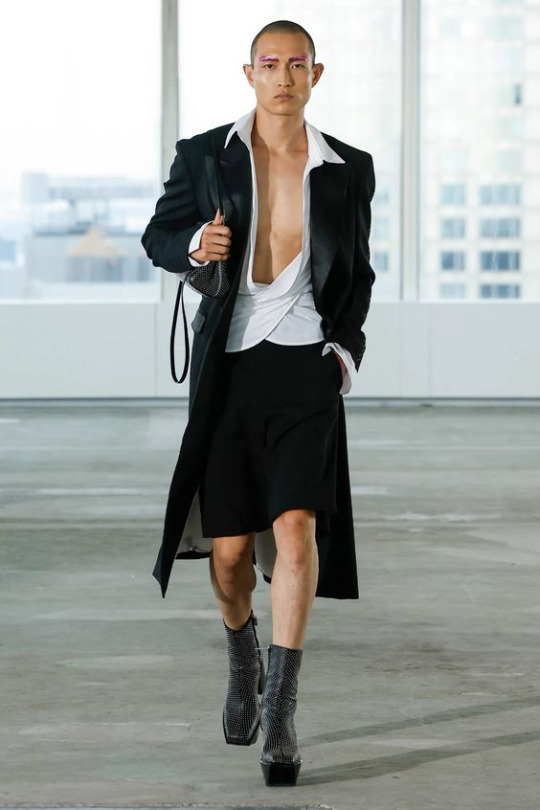
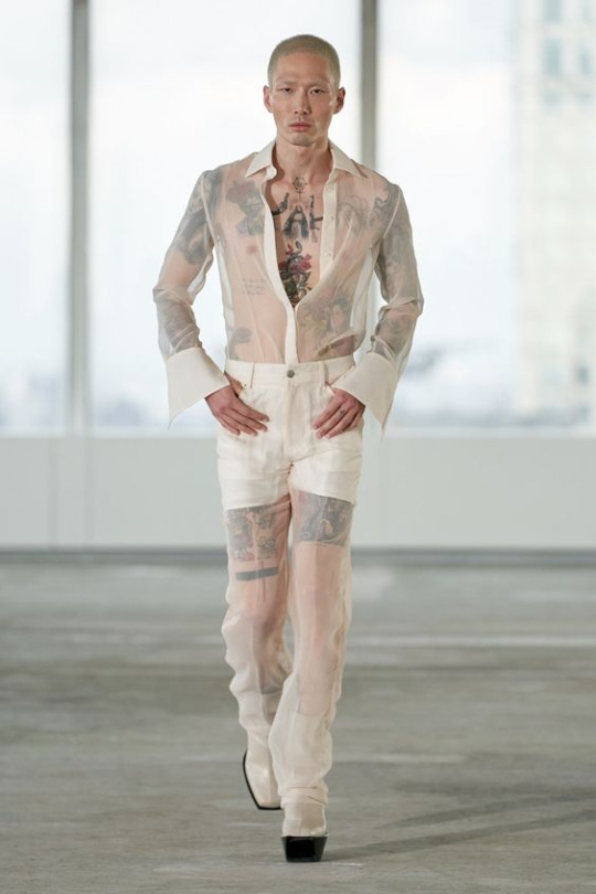
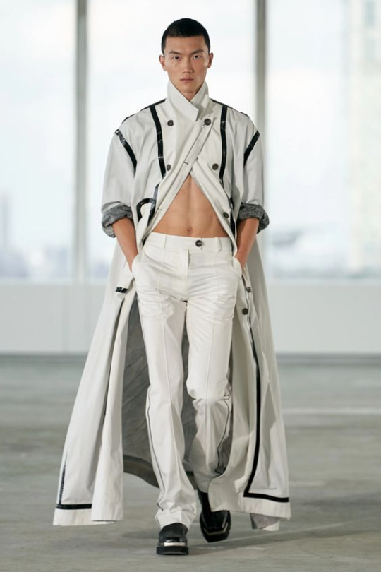
jimin — another one that doesn't need my help, but alas, here i am to offer it anyway. gender seems to be a bit of a spot for jimin, so i'm hesitant to push him too far in either direction. something right in the middle would be my pick, because he can already pull off anything, might as well have fun with it.
so, for jimin: peter do. there's just... layers to this for me. it looks soft but it isn't really, and that's what jimin embodies to me. anyone can wear these clothes.
taehyung — i just get less useful the further we go down the age order, huh? he's got an aries moon, so taehyung's going to do what he wants, and he needs fashion that's going to reflect that. something stubborn, fiery, cool. something you can wear to a jazz show but also a gay club in paris, you know?
so, for taehyung: walter von beirendock. my weirdest pick yet, but this is fashion anarchy, imo. this is designing whatever the fuck you want. this is self-indulgent. this is complete disregard for the rules, and to me, that's taehyung 1000%, and i need to see him in these neon yellow pants.

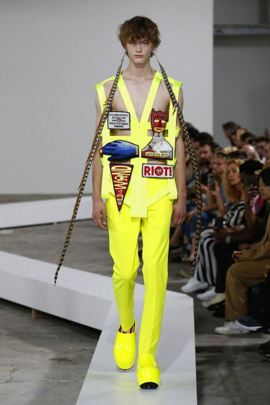
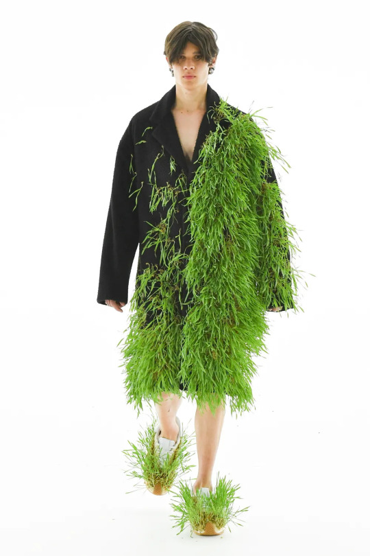
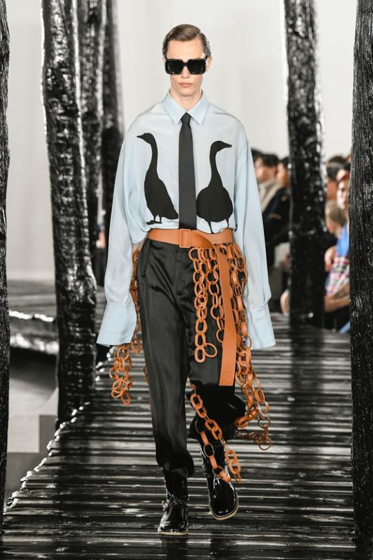
jungkook — alright, last entry. what i love about jungkook is that he's grown up so publicly and had to do all that awkward "figuring out who you are" shit on the biggest stage in the world. that shit sucks, so he's really brave and cool for doing it, and he says endlessly that all of his members are reflected in him, so that just means he gets the weirdest choices of all.
so, for jungkook: because he's brave and cool, loewe. most people would probably not want to wear a grass jacket with grass shoes, but jungkook is brave and a little rebellious, so i bet he would. and he'd look damn good in it, too.
18 notes
·
View notes
Text
Okay so I haven't posted in like 12 years and I know I'm like a week late, but what's everyone's thoughts on the live-action ATLA teaser? I'm genuinely very interested to know, because I certainly have thoughts, and I've definitely seen some polarised opinions. What do you like about it, and are you worried about anything?
Anyway, my long personal thoughts are below the keep reading line. I probably haven't said anything super new, or any hot takes but they're there.
First, what I loved about the teaser. It looked visually stunning! The shot composition all looked amazing (to someone who knows nothing about film), the visual tone was definitely there, and the set design was gorgeous! The entire time I was just going "oh my god, oh my god, oh my god" but in a good way. The characters especially look great. In particular, I loved Suki, Aang, and Zuko. I know some people were disappointed with how the characters looked, but I really think it's the best we could have gotten considering the wide disconnect between animation and live-action, and I think it's something people need to remember.
The acting obviously hasn't been shown very much, so it's still up in the air in that regard. I've been trying to convince myself I'm cautiously optimistic, but quite honestly I've gone straight to pure excitement, despite my worries.
We're also getting more flashbacks, as shown by the fact there's a scene of the Air Nomad genocide. More worldbuilding and backstory is definitely something I'm very happy about, so I'm excited to see where it goes. The thing that stumps me on it is whether they're going to do it well. In the film that shall not be named, Shyamalan put references to the original show everywhere, but he never took the time to understand why they worked. It was like he wanted us to say "Wow! They said the thing!!!!!" as if we'd clap at the screen without actually thinking about anything. I'm really, really hoping that's not the case here.
The tone is definitely something that people are concerned about, myself included. The teaser was very serious and dramatic. Of course, the show has those moments but it's overall very lighthearted. It's a show about friendship first and foremost, and those positive messages are highlighted throughout the series. I'm hoping this teaser is more Netflix saying "Look at these cool effects!" and less "This is the overall tone of the entire series!".
The humour also comes to play in this. ATLA has a lot of jokes. You know this, I know this, they work, I don't have to talk about it. I'm curious about the humor in the live-action series because a lot of the humour in ATLA works because the show is animated, and wouldn't work in the live-action setting. In the film that shall not be named, Shyamalan tried to take jokes from the show, but they just fell completely flat because it was the completely wrong genre and just created tonal dissonance.
The last big thing I'm worried about is the characters, particularly Katara and Zuko.
I'm worried about Katara, because film has had this tendency in the past (and I know this is probably outdated) to "tone down" a female character's more "unsavoury/unladylike" traits. This is a bad example but it's the best my brain can come up with, but Hermione in the HP films compared to the books. In the films she was smart, brave, never wrong, and never made fun of. In the books, she was smart, yes, but also naive, and really mean and judgy sometimes.
Katara is a strong female character because she's not perfect. She's hotheaded and can hold a mean grudge, but those make her who she is. Also, in the film that does not exist, other character's strong moments are inexplicably given to Katara to make her more "badass" without actually putting in the work for her.
I'm worried about Zuko for an entirely different reason. I'm scared they'll "tone back" his assholeness in the first season, and possibly even give us his backstory a lot sooner. I really don't want this, because the whole reason his redemption arc works is because he was a villain first. He did bad things, but he atoned for them. His backstory explains his actions but doesn't excuse them. If we're sympathetic to him too early, the payoff is going to feel a lot cheaper, and like he didn't actually work to make himself better because he was already there.
Okay wow that was a lot, but that sums up all of my thoughts/concerns/excitement for the show. I'm really stoked to see where they go with it, and even if it's a disaster I'll probably enjoy it anyway honestly.
#atla#avatar#avatar the last airbender#avatar live action#avatar the last airbender live action#zuko#aang#sokka#katara#toph#suki
24 notes
·
View notes
Text
So about this Canto V... (Spoilers)
I rather say it straight, my review is quite negative, so if you loved Canto V, you should ignore this. I don't like to put bad vibes in the main tag, but I wanted to give my opinion on this Canto.

This Canto was... Disappointing. I love Ishmael, I love Moby Dick, I truly do, and I had high expectations. Especially because, I know Project Moon is good at making us feel things, so I was confident with this Canto. I was confident it would be as good as the last one. But... There are things.
I'm not going to talk much about the CG or character designs. I will be honest, the new characters designs were really mid, Queequeg and Ahab were the two to stand out, and yet, even so, I did not saw them very great. Yet god knows I love evil old women and butch she/her himbo.
I feel sad that Nai_Ga had to, well, literally carry the entire visuals of the Canto, did every background, every character, every CG. I hope he's paid tripple for his work. But also it felt like rushed, naturally, when you're the only artist working on a whole game's chapter, there's high chances that it will look low quality. But at the same time, since VellMori left the crew, I can't say much. I really, really hope they can find new artists.
I love your art style, Nai_Ga, but dear god we need to discuss how you draw muscled arms.
ANYWAY, now into the real subject; what really disappointed me in this chapter. The feels.
I AM going to compare it a lot to Canto IV, naturally. It was the previous Canto, so it's hard to not compare them, especially with how good Canto IV was. It's like eating a very dull and mid dessert after an absolute banger of a feast.
The characters were not attaching. At all.
Let's talk about Ahab first, the main antagonist. She's... Well, a very fucked up old lady. She's senile and obsessed by her revenge. Which, well, makes sense! But it gives no sympathy whatsoever to the character. Comparing to Dongrang, the antagonist of the previous Canto, she was not a grey antagonist. She was all black. All evil. Which is BAD when Project Moon has been serving us really morally grey characters before.
She's obssessed, she's ready to throw her crewmates to death for her own desires, she just wants to kill that Damned Whale. And this was so, so bad when at the end, Ishmael spares Ahab. WHY would you spare this absolutely madlad. Sure, Ishmael doesn't want to be like her, but Ahab had absolutely no reason to be left alive. She will just be more evil, AND join the evil people gang to be even MORE evil. That's fucked up.
Yes, Kromer was also some unhinged feral woman, but she fought for something and was not just evil, but smart. She was scary BECAUSE she was smart. Ahab, at first she was shown as charismatic, that she can manipulate... But she quickly, way too quickly fell into "just some senile old woman." Starbuck and Queequeg followed her because she was the reason they were still alive, she was their lighthouse. But at the end of the dungeon, even after she shouted with absolutely no shame that she's ready to kill her crew, after Queequeg discovered with horrors that she sacrified everyone to make her way to the heart, she... Still joins Ahab? Without, even a second thought? Queequeg, you KNEW Ahab had not a single care for you, that she was ready to use your body for the steps that would lead her to her ambition. WHY, you followed her, and DIED for her till the end.
And Queequeg is my next point. She could, she SHOULD have been a character I enjoy a lot, but instead I felt neutral about her. A character we can associate to her in the previous Canto is Dongbaek. And now, we get a hint; all the Pequod crew was introducted way too late. They got introduced at the start of the Dungeon, and all died at the end of the Dungeon. Compared to Kromer, to Dongrang and Dongbaek who were introduced way before. We saw the memories of Sinclair and Yi Sang with them, we saw the interactions, the good moments, and that's how we got attached to them.
Unfortunately, for the Pequod's crew, from the start of Canto V to the start of the Dungeon, we got absolutely nothing. Just their names mentioned. We should have got flashbacks. We barely saw Ishmael interact with Pip or Starbuck, and even her interactions with Queequeg, they were sure, adorable and heartwarming, but I could not feel the attachment between them that much as I was able to feel it between Yi Sang and Dongbaek.
Dongbaek gave us an amazing boss fight, despite being not the final boss (Queequeg had a boss fight too, but! Too bad! It was just some random looking fight.), she gave us amazing memories of her and Yi Sang, and she died a heartbreaking death.
Queequeg, not only you had to guess that she was dead because at no moment it was showed, but all she got is around five lines of dialogues, Ishmael's crying sprite, "oh no!, anyway. that whale's not going to die alone."

Then we got Pip, Starbuck, and Stubb. Who? They appeared, they had a bit of dialogues, then they disappeared. Reduced to atoms.
This is really sad, because Project Moon always had a talent to make us attached to characters, then once they were growing into our hearts, kill them. I mostly think about Xiao, about Yan, we saw those characters evolve throught the story of Library of Ruina, we followed them, we saw their struggles, we saw their feelings, we fought them, the music playing behind broke our hearts, and we killed them. It was painful, it was hard, and even after they're gone, we will still think about them. We will read their books and discover even more. The promise Xiao and Lowell made that she broke after his death, how Yan had been chosen as a messenger just after he tried to take his own life away.
Queequeg, Ahab, and the rest of the Pequod's Crew are forgettable. And this is AWFUL for a Project Moon game.
And Ishmael's evolution... The conclusion felt, quite random. A few time I felt bad for her during the Canto, and it was good! But at the end, it felt rushed. She dropped a "my friends are Limbus Company now" randomly. She did not even interacted with anyone during the Dungeon. All the Sinners were just looking from far away like "go white girl go". She could have teamed up with them, she could have created bounds with them. All we got is Heathcliff saving her to make the Ishheath fans scream because Ishmael is a dark skinned himbo magnet.
I hope at least, Ishmael will play a really good part in Heathcliff's evolution in his Canto, the next one, but that's disappointing that during Ishmael's, it wasn't much. She could have got closer to Outis during the final fight, since both were already working as a team on the boat before, she could have got closer to Rodion, who helped her, or maybe Don! It's sad she was just, here, alone, against Ahab. It broke the whole purpose of "finding her new self", and she seemed that she came to this conclusion randomly.
So yup. Big disappointment. I probably set the bar of my expectations too high, maybe, but I'm not the only one sharing this, as I discuted it with some people before. I can complain about other points, like how Moby Dick just appeared for one scene, that Queequeg's death was absolutely useless to the story, or the lack of new abnormalities. But I'm being annoying.
Mili's song was fire tho, as always
#limbus company#project moon#ranting#long post#anyway love yall#im not really much into PM stuff anymore#and I was expecting to come back to it with this new chapter#but well lol#lmao even#guess ill sleep until Don's chapter#make it extra silly please#also the review isnt that big or developed im sorry#i dont feel like analysing everything again#i didnt roll middle don im PISSED#the battle against Ricardo was more memorable than Queequeg's battle send tweet#as I said to a friend#“it felt more like a moby dick fanfic with yuri than a project moon story”
22 notes
·
View notes
Note
This is a pretty random one, but how did you design the logo for Ingress?
Little did you know, I love to answer questions about ~design~.
The Ingress logo has gone through about 3 different official versions, but at least 50 different conceptual iterations. I'm a graphic designer by trade and profession, so I approached it any other way I would approach making a logo.
The first iteration of the logo I have less information on the development of, but I was looking at a lot of advertising from the late 1800s to early 1900s. For example, these advertisements have a lot flourishes on the text and warping letters, as was common in that era.
I took that concept and made the first iteration of the ingress logo at the comic's inception in 2017. My graphic design skills weren't as strong then, and I mostly just took a font I thought fit and slapped it around a little bit to try and get the look I wanted.
I wasn't particularly happy with how this one turned out, and it only ended up being used for a few months on the first version of the website and on a single printing of the first chapter of the comic, but I also didn't put a ton of time and energy into making this one. So, I went back to the drawing board soon after I made this first one.
The second iteration of the logo took a lot of inspiration from the same sources, but I first took a lot of time drawing out concepts in my sketchbook to try and get the right visual look for how the logo should be.
At first I played with the idea of including a little picture along with the logo. I thought maybe Toivo's glasses would be a good thing to try to include in the 'g' in Ingress, or that Rocky or Toivo's hat should appear in the logo. These were all discarded for cluttering up the logo, because the words themselves are all pretty long. Eventually, I started playing with the shape of the word itself, which very quickly lead to the last S becoming the signature swirl.
Next was iterating on this concept with fonts.
That lead to the second iteration of the logo, and the longest running version of it.
I chose a textured font to give it that "worn" feeling that was so popular in the design world in 2018. There were a ton of brands doing textured stuff to give their brand an edgy feel, but I did it to make it feel old and like it was from the late 1800s.
This would still be the logo today, but I ran into a problem: the font I used, Goldsmith Vintage, had a limitation on how long you could use their font for free and for printing. Fonts aren't particularly expensive, but if you want to use a font for publishing, you need a special license and those fees can rack up in price pretty quickly. It was unlikely that the people who made the font would come after me for using it, but I decided to not take that chance and instead refresh the logo one more time, this time putting more of my own hand in it.
This time, I took a different approach. I liked the old logo, but I was having a hard time finding a font that I really liked and would get the same feeling as the old logo... So instead, I decided to use calligraphy to draw it myself.
I rewrote the word Ingress Over and Over and Over, and specifically I rewrote the S's to try and get the perfect shape of it. Then, I picked out specific letters that I liked.
From those letters, I picked the ones I thought looked best, and smashed them together into one rough version of the logo that I liked.
And then from here, I made a digital version of the logo in Adobe Illustrator so I could get a nice crisp vector version. Also, I made rough versions of it, so I could keep doing the same 'old' look.
And... that's about it!
Ultimately, I think the new one is really fun, and I really like the fact that the latest one was made with my hand directly. Those aren't letters you can find in any font, they're my letters.
Maybe you can tell but, I have a lot of opinions on letter shapes.
Anyway, thanks for asking, and I hope this was as entertaining for you to read as it was for me to blather on about.
17 notes
·
View notes