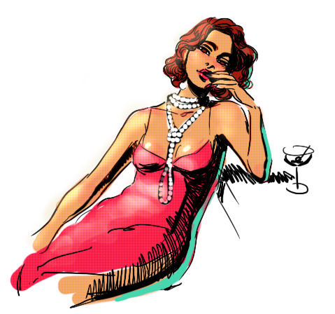
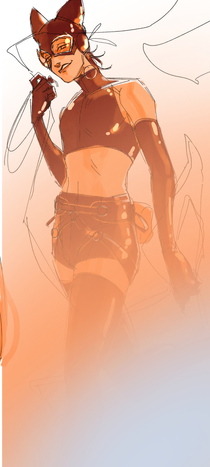
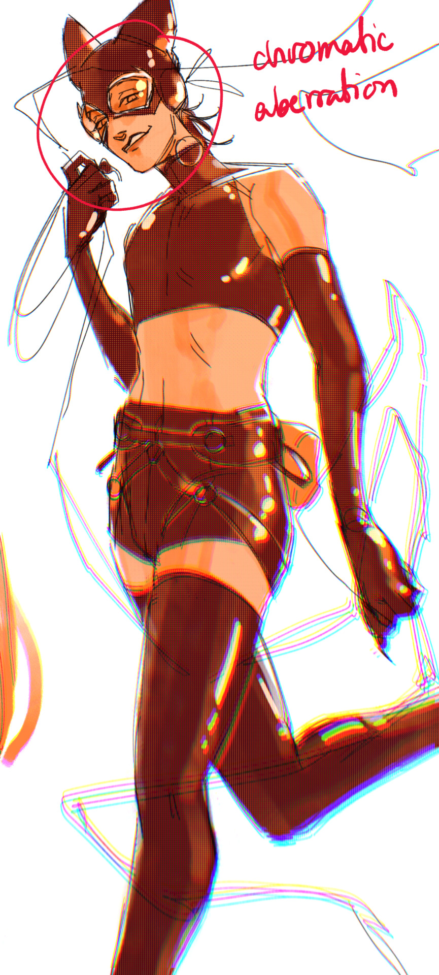
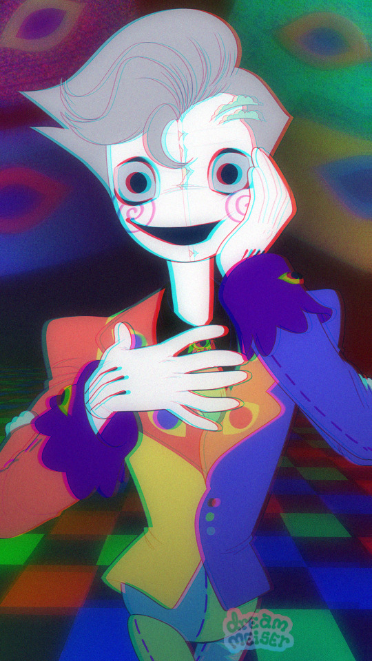
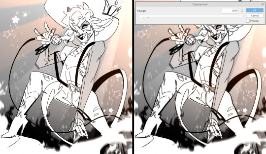
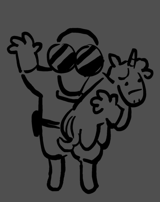
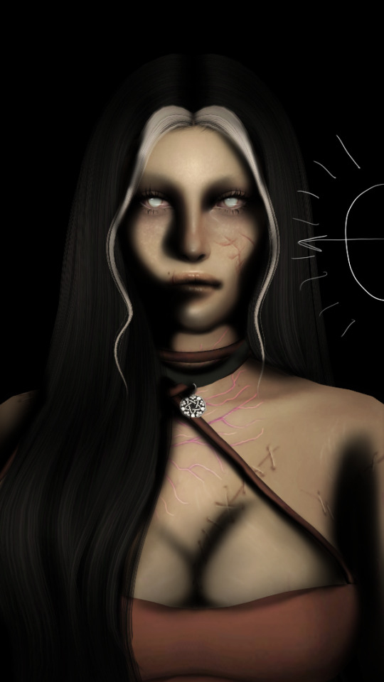
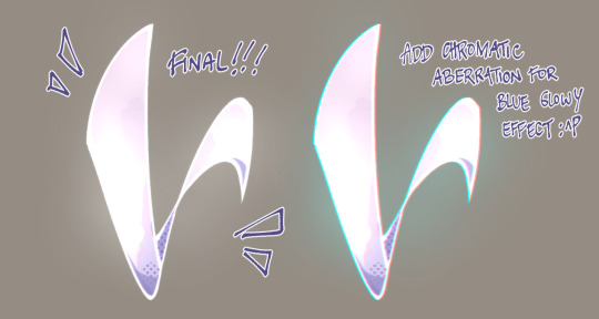
#I LOVE the chromatic aberration you put on this!!
Text

FUNDING FOR THIS PROGRAM WAS MADE POSSIBLE BY—
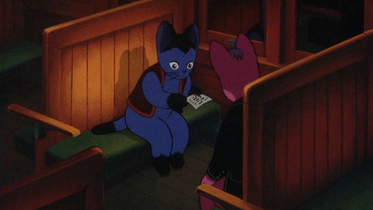
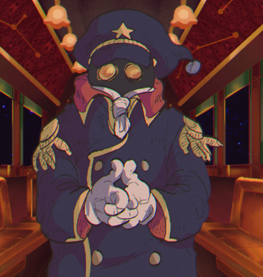
#re-found this song and thought of the gonermaker sequence and how gaster talks. image wouldn't leave my brain#we love the fourth wall breaking old man#ANYWAYS:#digital art#krita#gimp#fanart#gaster#wd gaster#deltarune#OKAY!! IMAGE HAS BEEN EXCORCISED#eyestrain#due to the chromatic aberration effect I actually did by hand btw fhak. but it's not overly pronounced unless you open it up#(that's what I used gimp for lmao)#i didn't even think about the precise red when doing the soul in krita but it looks like I either hit or got VERY CLOSE to the true ff0000#without even thinking about it too hard hfjkadhs#GOD DAMN IT. put this into the ut tag automatically despite literally thinking about DR the entire time
218 notes
·
View notes
Text
POKEMON DLC THEORY
Ok so I just finished The Teal Mask and saw the data leaks... And I've got a theory for what part 2 of the DLC has in store.
Spoilers for the teal mask and the data leak under the cut!


It's very obvious the story takes inspiration from the tale of Momotaro, the peach boy who befriended a dog, pheasant and monkey to defeat the ogres looming over the land. We've got the ogre, the companions... but where is the main character of the story?
@v0id-echoes went really well into depth in this post about the implications of the loyal three being called the "retainer" pokémon and the entries stating they've been altered by their chains... Which suggest there's some other force who could've put these chains on them and made these 3 work for it.
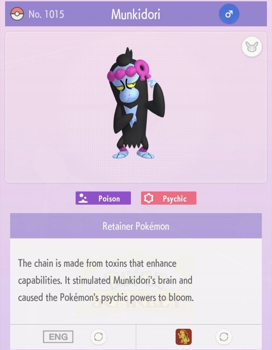

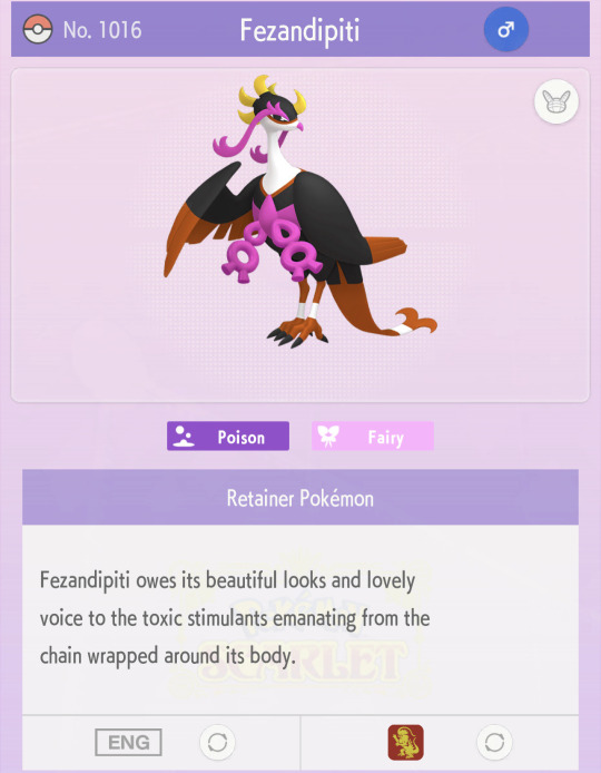
But who is to say that control stops with pokémon?
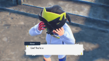
Gif by @jadeazora
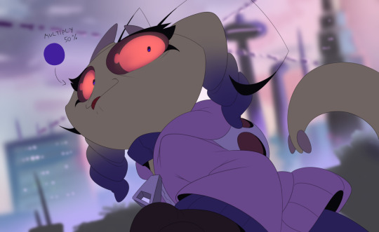
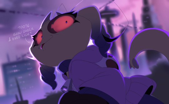
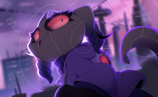
When Kieran first loses it, there's this chromatic aberration effect going on as he spirals... which I'd never seen before in a Pokémon game and to be honest at this point in the story the conflict wasn't bad enough yet for it to make a lot of sense. But this effect ALSO shows up when you're about to fight the loyal three 🤔
You can't really see it well in this gif besides like? Around his headband and white clothes.
It's shortly after this event the 3 are revived from the dead through his negative energy (I assume)..... throughout the story there are multiple scenes where the characters around us state he's acting abnormally and later on as Kieran meets ogrepon, ogrepon doesn't fully trust him either. (Which is so sad) but quite telling there's Something Else Going On.

I think IF there's going to be another mythical, it's going to be dokutaro (the possible leaked name for this pokémon AND likely the missing Momotaro character), who latched onto Kieran's love for the ogre and turned it into a twisted obsession with a drive to take it. Which also makes sense with Kieran's character design, with him having purple undertones in his hair. He also supposedly pulls up his hair at the end of the story, symbolising that purple in his hair is now exposed. He could also possibly be tying his hair back with a purple band or something of the sorts.
Gif by @jadeazora again
There's also something to be said about his main clothing colour being white, both is school uniform and festival attire. White is a colour of innocence and purity! And I think that might change in part 2 if this is really the way the story is going to go....
But long story short:
I think Kieran might by influenced by this mysterious Dokutaro figure and slowly corrupted to become our (and Ogrepon's) enemy.
#pokemon dlc spoilers#pokemon dlc#the teal mask spoilers#the teal mask#the hidden treasure of area zero#pokemon teal mask#pokemon the teal mask#pokemon kieran#dekutaro#pokemon leaks#pokemon theory#theory#okidogi#munkidori#fezandipiti#pokemon spoilers#pokemon#pokemon scarlet#pokemon sv spoilers#pokemon scarlet and violet#pokemon sv
197 notes
·
View notes
Note
Hey there!
I really like your art so I wanted to know, what are your main brushes?
And do you have screen recordings of you drawing?
Thanks a lot if you'll answer!
Btw: you should def start streaming!!
Hi ! I don’t record my stuff that often cause it puts a lot of strain on my laptop but I have a few timelapses recorded ! They should all be under the #timelapse tag ! I’ve thought about streaming but idk if it’s something I wanna do yet haha
As for brushes, I made a post here that includes some of my most used brushes !
Other brushes I like using:
This cloud brush set (asset id: 1723992)
Tiger brush set (asset id: 1928933)
Chromatic aberration brushes (asset id: 1907932)
And I really love Devin Elle Kurtz’s brushes on gumroad ! Big fan of the rake brushes
92 notes
·
View notes
Note
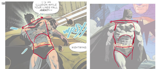
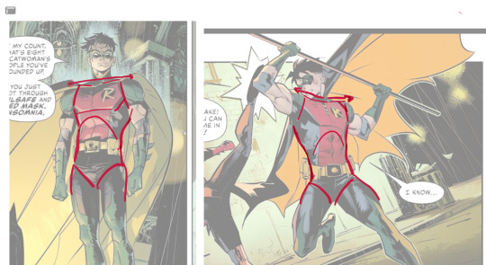
do you have any tips for drawing dynamic poses? i always love the way you draw bodies!!
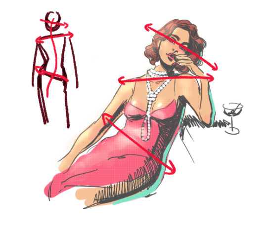
i know this has been said a million times but the way i draw bodies significantly improved after i started drawing more frequently from reference. if i cant find a reference for a pose on the internet, i'll just use myself or a friend. i spend an unfortunate amount of time just standing in front of my mirror looking at my own joints. pay attention to where your body curves!!
other than that though—honestly my anatomy/pose knowledge is a whack amalgamation of art tips i've accumulated over the years (i miss old school deviantart/tumblr style art tutorials). i also like to look at how artists i admire draw bodies—what details to they include, what anatomical short-hands etc
i think i'm still figuring out how to draw dynamic poses, but here are some cheats i've picked up (under the cut coz this got long again):
gonna use this stray!tim as a base
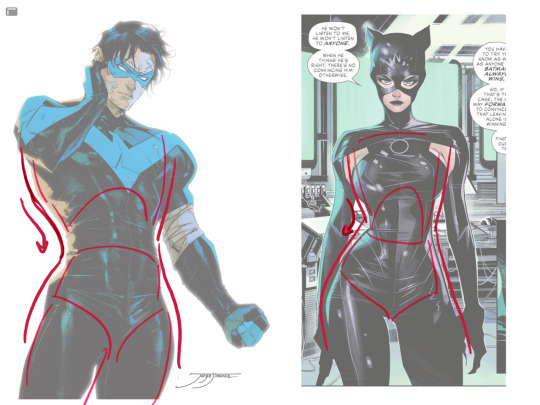
the easiest way for make up a pose is to start roughly with the head, collarbones, ribcage, and pelvis — you can build everything from there
here's a couple more of what i mean by the ribcage-pelvis deconstruction:
2. push your perspective a little!! imo things look more dynamic if you move your sight-line up or down—the horizontal orange line here. if you look at the panels above, the sight lines tend to be a little low, at around the character's torso or waist. i did the same below with stray!tim
to do this i usually try to get a sense of the space im working in by putting in some sloppy perspective grids
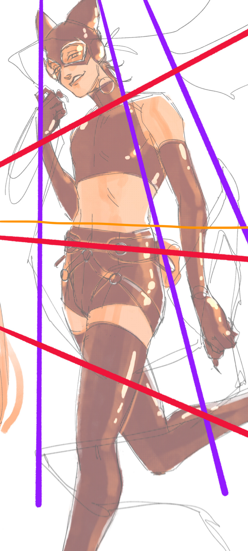
3. S curves!!! exaggerate the lines of the body. the body naturally has parallel horizontal lines—an easy way to get a body to look less rigid is to tilt those horizontal lines which in turn curves the vertical line of the body
this is what a mean by horizontal lines—usually i use the eyes, shoulders, and hips:
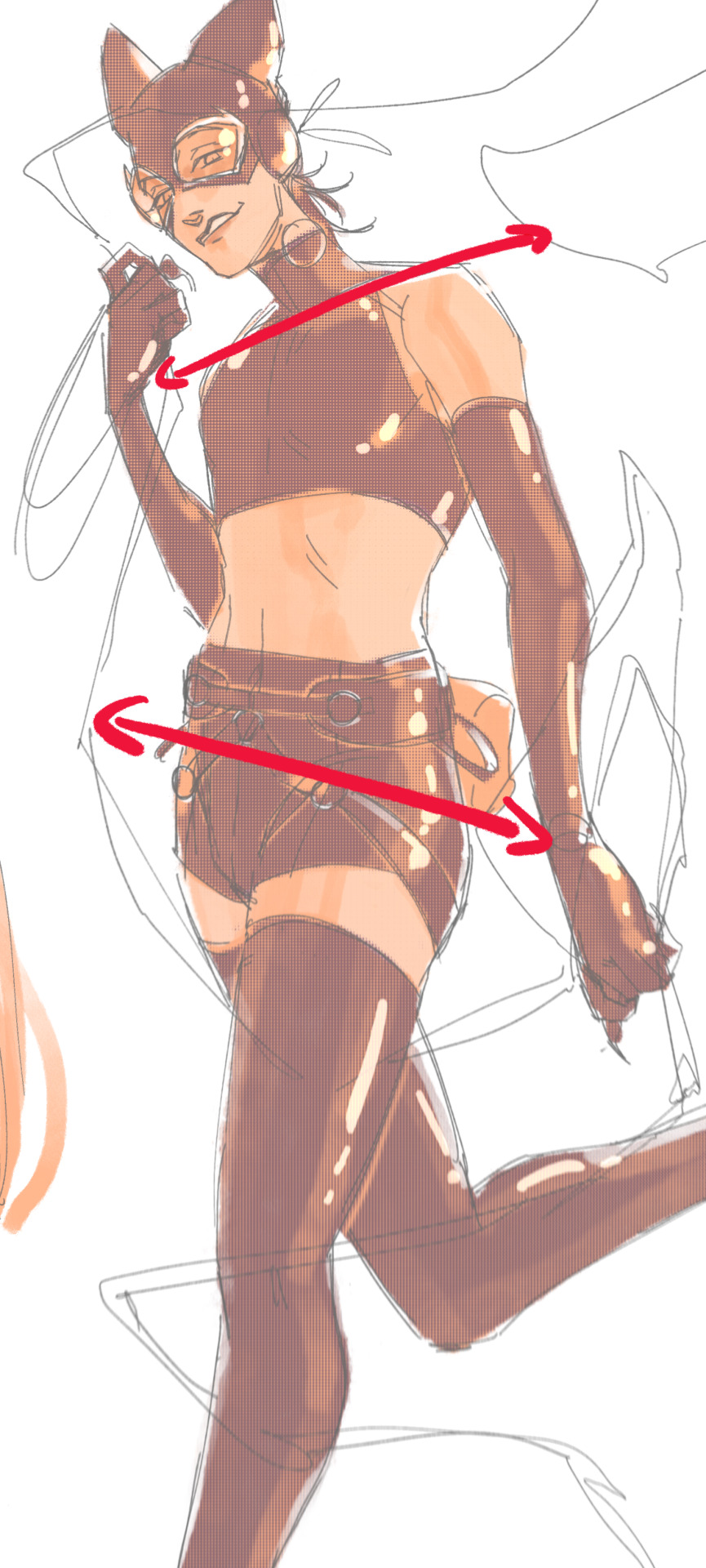
i'm gonna use caterina as a better example—usually you want the horizontal lines to sort of zigzag:
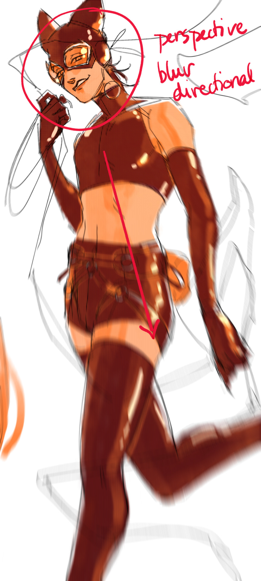
i've also picked up a couple visual tricks that don't exactly add dynamism to a pose? but they do give a static pose a little more oomph. a lot of this is done by visually highlighting one specific point of the body
for our purposes, i'm gonna make the focal point tim's face
motion blur! there are a couple ways to do this. i actually dont like working with traditional motion blur because you have to mess around with selections, so i usually fake motion blur using postional perspective blur:


2. gradient lighting—you can add a lot of depth this way. usually i like setting the gradient in the direction of the focal point, e.g. tim's face
below, i added a layer above the base drawing, used an airbrush to get this gradient, and then set the layer to color burn and lowered the opacity. you can also clip the lighting layer to the base drawing and set it to multiply

below, i did the opposite—instead of adding a gradient shadow, i added gradient light. i set the layer to add this time (instead of color burn) and then lowered the opacity again.
this kinda serves to desaturate the parts of the piece that are less important (ish i was kinda sloppy here), driving the eye to face—the most saturated. the motion blur does a similar thing, where the only thing "in focus" is tim's face
the gradient also sort of adds a directionality to the piece—it starts at the bottom right corner and goes up towards the upper left, causing your eye to follow that same path, which drags your gaze up tim's body
here's what it looks like when i combine 1 and 2:

3. chromatic aberration's been pretty popular recently. it does a similar thing as perspective blur but with more eyestrain (although i went with a really exaggerated version below just to show you what it does) but it looks cool!
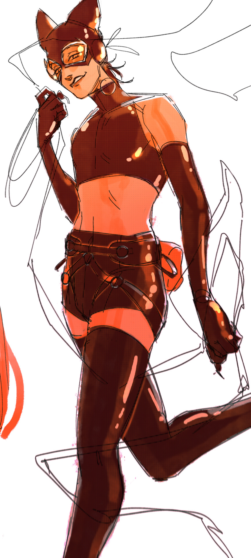
bonus cryptid tim as a reward for getting to the end :-)
#red talks#sart#art tutorial#YeAH UH this got long lmaooo i was on the bus for a Sec plotting this out so#also i am neck deep in a reincarnation/regression manhwa stress hyperfixation so i havent had the brain space to draw#so you get this instead!#if anyone wants recs lemme know lol#thank you anon :)))
48 notes
·
View notes
Note
I have to say, I recently found your blog and the way you create the whimsical and nostalgic feeling backgrounds, to the use of chromatic aberration, the shading being reminiscent of 90s/80s shows, and the dynamic poses and tone is quite interesting & very admirable to the eyes. And I want to know if it’s okey to ask two questions.
1. Who would you say is the most difficult or easiest character to draw?
2. Are there any plans collaborating with others in producing merchandise like Makeshift for plushies to aid with producing the show?
Hi there! My goodness, thank you so much for the kind words!! I'm really happy you're enjoying the work put into making everything look like it is of its era :oD I have a lot of fun!
For characters, I would say the most difficult one to draw has been Teddy! He has a lot going on and is very flashy, so tracking that in animation was a fun challenge, but I think he is still manageable with care :o) My artists and I have a love-hate relationship with his Magician hat haha!
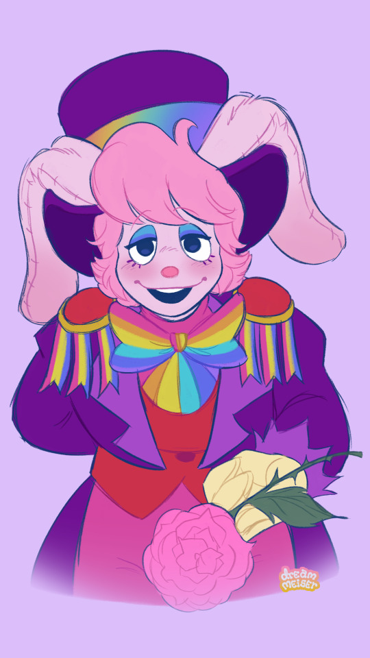
As for who has been the easiest, Roy is always a lot of fun to draw due to his simplicity! He is just a little (albeit worn and torn) egg-shaped fella with very nice hair and a very dashing suit. :o)
As for collaborating with companies like Makeship to create merch, that would be really cool, I'd love to do that, or to create campaigns for Dreamalong merch as well. :o) I don't know if there's enough interest in my project right now to fund a plushie but it's definitely a goal of mine. If this project gets more eyes on it I think it would be doable!
#Makeship pspspsps you wanna make some merch together?#thank you for the ask!#dawm project#dawm asks#dawm#dream along with me
47 notes
·
View notes
Note
I'm in love with the colouring/rendering of your art, do you have any tricks you use to get that look? scrounging around for cool stuff I could look into for my own work
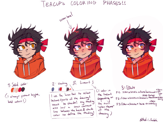
Awww ty!! Andddd below this message is a small picture about how I do my coloring :)
Phase 1: Solid Coloring (usually I use bold or highlighted colors to make my art pop out!)
Phase 2: Shading (be sure to focus on the lighting for shading! For shading, I use the lasso tool to select certain areas and use airbrush to shade!)
I forgot to put this in, but I also have a multiply layer at <50% for contrasting shading (this helps make the drawing more “in depth” or shaded :D)
Phase 3: FX
F1: Filter > Artistic > Anime Background > <50% soft light
F2: Filter > Artistic > RGB Chromatic Aberration (Moving) > 100% opacity
optional but you can also combine this with Chromatic Aberration (Zooming) but only use this filter with very little pixels
F3: Filter > Artistic > Noise > <50% Overlay
Hopefully this helps!!^^
81 notes
·
View notes
Text
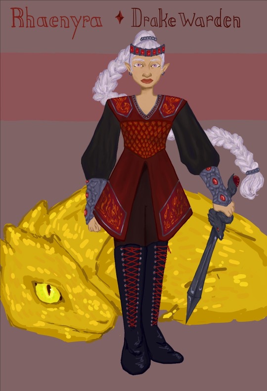
Ok first of all. Its my dnd au and i make the rules and i think it would be cool if rhaenyra is a trans woman. Obviously this does not work at all with the actual world asoiaf/f&b, but i do what i want. This would create different issues of inheritance (i think??) but ultimately she would be the heir, and she and alicent could get married <3 . Now her actual dnd lore; i think that she would be far more of a warrior if given the opportunity (i also think this about the canon world, but idk if that's due to hotd or what), so i decided on drakewarden ranger.
I definitely knew i wanted to do something with dragons for rhaenyra, (moreso than i have for other targs) so i spent a while thinking about which classes are closest to dragons in the f&b sense. Draconic ancestry sorcerer was a possibility, but i've already done sorcerer for dany, and i want variety. Fizban's treasury of dragons is really cool, and i considered making rhae a dragonborn (since i feel like i've been playing it really safe in terms of the fantasy races i've used so far) but i think that the dragon differences between dnd and asoiaf make it weird to have someone in your family who fucked their dragon. Also drakewarden is cool. Ranger is a fun class if its played right, and its combined options for ranged/martial/ and a little spellcasting makes it great for the role that the heir to the throne would play on the battlefield. I think her favoured enemy is also dragons, since both her enemies and allies having dragons means that she would have had to learn about them. Since i am designing her at about 10th level, she gets another faovured enemy, which could be either beasts (if we lean more into asoiaf's low fantasy worldbuilding) or aberrations (lets get weird). Im leaning toward aberrations due to how i am as a person
For her race i did do half-elf (boring i know, bite me) but with the gift of the chromatic dragon feat, she would be able to take give herself resistance to elemental damage, and drakewarden gives her the ability to do a breath weapon attack (like how dragons breathe fire or acid or whatever). I thought about elemental adept as her other feat, but i also gave that to dany, and im avoiding repetition. The aberrant dragonmark feat gives access to a sorcerer cantrip and 1-level spell, i chose booming blade and chaos bolt, as well as a flaw associated with the dragon mark, i think she gets horrific nightmares after using the mark.
Now for the usual last details, i think her stats go (highest to lowest) dexterity > charisma > strength > intelligence > constitution > wisdom. A healthy balance between mental and physical stats i think! Though i may have nerfed her spellcasting by putting wisdom as low as i did. Oops. For her fighting style, dueling makes sense for how an heir would be taught to fight.
Ok as per usual , if u read all this im in love with you and you can summon me in one (1) online argument to back you up.
#digital art#my art#illustration#fanart#asoif fanart#asoiaf girls#dnd art#rhaenyra targaryen#rhaenicent kinda#dnd au#drakewarden#dnd ranger#rhaenyra fanart#digital fanart#fire and blood#valyrianscrolls#syrax
23 notes
·
View notes
Note
I love how you do color and line art in your drawings! Really curious about the process, any tips on how you do it?
I’ve shared a speed-draw to show the process before, but I’ll do it again for you; some stuff has changed since then.
As you can see, I start by putting a sketch done by hand and do another sketch on it. By using the transform tool and flipping the canvas, I can get the sizes right. I then test the set of colors I have in mind to see if they work or not, which in this case did.
The next step is to do the line art! I mainly do thick line-art to highlight my colors later on. Using the felt tip pen (hard) in ibisPaintX I try to do clean cuts and use the transform tool if I need to.
When finished with the line-art, I start to put down the color base. Bases are usually dimmer than the highlights to give off the contrast feel of my drawings!
Special effects vary between each drawing! Since I wanted to give Silvers powers a luminous feel I draw them on a separate layer, put it on top, and set the layer mode to overlay as you can see. I then selected the layer and used the selected area to copy part of the line-art and used an FX named “Chromatic Aberration (zoom)” to creat the effect you see!
Adding the highlights is the main task later on and I sometimes will color parts of the line-art with violet to make it look better. I experiment a lot when drawing so I can’t give you concrete tips here but to have a vision and try to follow it as you can!
Hope this was helpful! I apologize if I got some terms wrong but this is the best I can explain it!
Please have a nice day ✨✨
110 notes
·
View notes
Note
hello! i really loveeee your art it’s so nice and your style is just 💋 i was wondering, idk how to even ask but. how do you get that sort of blurry beautiful look?? idk how to describe it but it’s so cool i just want to touch your art ahahah. if that doesn’t make sense just know i love it!!
Thank you~! Here's a small tutorial.
You're gonna make a copy of your linework and blur it by 20%, and then set opacity to what looks best. You can also color the copy a bright color and set it to multiply.
Repeat the step but put it behind the character/flats to give the whole character a glowing effect. This time use screen, or glow instead of multiply.
And finally I love my filters like chromatic aberration, and use that as often as I can. Just don't give people a headache though lol. You can find filters aka "Autoactions" on the clipstudio warehouse. Good luck hunting~
239 notes
·
View notes
Note
Hi, not a request, just wanted to ask what program you use for your drawing? Your art is wonderful, I really love it. I've been trying to learn how to do the FX like you did in the "Be Polite" piece (the rainbow-y effect on the outline specifically.) If you would be so sweet as to share your process or at the very least a few tips to guide me in the right direction, I would appreciate it so much <3
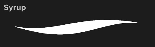
Of course! I use Procreate for all of my digital art, which if you don’t have already, is totally worth the $13; it’s super versatile, not to mention satisfyingly easy to navigate. If it interests you, I use this Syrup brush for pretty much everything, including the Sniper piece (just crank the stability way down in settings).
But anyway, the FX! Unfortunately, the effects I used on this particular piece came specifically with Procreate, and as I am not as familiar with other programs, I could not tell you whether they possess the same features or where you could find them.

Halftone will give you that “comic book” look, while Chromatic Aberration produces the rainbow one you asked about; you can adjust each to your liking.
However, I do remember a little trick from when I did not have Procreate that might give you what you’re looking for. I got some lines:
Duplicate this layer a two or three times, then set each of these duplicated layers to Alpha Lock and color them each red, green, and blue, or whatever you’re going for:
Offset each of the layers in a different direction from the original line work. I put blue off to the left, red to the right, and green a little upwards.

If that looks a little whacky, then play with opacity and layer settings (I used 50% opacity and Color Dodge).

And now we have Pyrovision. It kind of does the trick, and hopefully this is helpful knowledge! But who knows maybe you already found this tip
As for my process I will probably create a separate post, if that appeals to you. Thank you very much for the ask, it makes me really happy to see some interest my stuff. Have a nice day! :-)
11 notes
·
View notes
Text
Bloodborne is seriously the most beautiful game of all time i think about this every single time i replay it but genuinely. Just exploring yharnam and staring in awe at how gorgeous everything is, its never about graphics, bloodborne has a noticeable stylization i think in a way even stronger than other fromsoft games, and the use of lighting and color palettes is just so good it makes me want to Be there. The game is already so stunning as it is ingame but i think having access to the map viewer on my own to the side made me appreciate it even more i love seeing the way everything is constructed and put together with just the flat textures before applying any engines and even as flat surfaces you can just feel the cohesion in the backgrounds, even textureless stripped of everything that makes it "beautiful" it still feels so unique and already gets the vibe across and that explains how the game feels the way it does visually, which is something i think a lot of current gen "high fidelity" games struggle with. Hard to explain what I mean but I feel it. Also i love the slight like chromatic aberration effect bb has on the edges of the screen it adds such a nice touch to the atmosphere honestly. Sighs dreamily
#like every single location is so unique and has its own style separate from each other#but in a way thats really cohesive and still makes it feel like part of the same thing#and theyre all so beautiful in their own way#ppl dunk on the forbidden woods and nightmare frontier a lot for what i think are#just gameplay reasons but their blind hatred of those areas extends to the way theyre often excluded when#people talk about all the 'prettiest areas' and whatnot. but i think they deserve the love just as much as anywhere else#when youre not panic running through it the woods are really beautiful and well crafted#its all so skillfully put together to give exactly the atmosphere it needed#theres so many parts of it that feel iconic to me or at least could be#and the nightmare frontier i think genuinely has some of the most stunning environment designs#that were introduced by it later reused in the hunters nightmare. so it should#have its own little pedestal as The OG i think. like all the spirals and etchings that feel like#a naturally occurring phenomenon but also does not look like one. you know what im talking about?#and the strangely bright sky and fog in the distance... so so good#i have paragraphs upon paragraphs to say about each area obv but these two feel so underrated#do the fucked up graves in the woods mean nothig to you... does the little cave you spawn in in the frontier mean nothing to you...
14 notes
·
View notes
Text
sorekara setting design
Here are some notes on the development of SOREKARA's style and presentation. If you couldn't already tell, SK takes a lot of inspiration from 70's/80's anime, Nobody's Boy Remi being the reference point for much of it. I've always respected Dezaki for his monumental work so I've always wanted to pay tribute to it (especially the early stuff). I don't think I was as successful as I'd like to have been, but alas! There is still more to come! So without further ado!
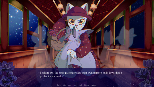
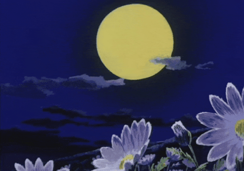
I was just talking about Dezaki , but now I shall talk about something completely different. To set the tone, I created the cat and the trolley setting first. The Girl's design should be plenty obvious (lol). But the background here I paid special attention to... I find the paints of Night on the Galactic Railroad to be very unique. They have a line less, airbrushed quality to them that blends in surprisingly well with the characters. I did some research and studied 児玉喬夫 Takao Kodama's work, as they were credited with setting design for this film as well as Genji Monogatari. Actually, if you look at Genji Monogatari's backgrounds, they have the exact same airbrushed quality! I had never done a background like this before (I am certainly not an environmental artist) but I think I did a fairly good job of it.

...I immediately switched gears and without thinking, went back to Dezaki works. I can't say I was very faithful at all. The night sky is easy to paint, with it's notable color spray and paint blots, but I diverged quite a bit with the watercolor textures. Shichiro Kobayashi is the artist I looked to the most, and this project made me appreciate him more than ever before. Just looking at his paints gets me emotional... The vibrant colors, the dramatic angles, you can just feel his reverence for life overflowing from the work. There really isn't anyone better. I need to study more if I'm to capture even a fraction of his skill. That being said, I did make sure to animate the backgrounds slightly with the sparkles on the water-- The reflection of light on water is my favorite to draw! Also, flowers are a very important motif (for various reasons, ohohoho). Kobayashi seemed to love drawing flowers, the paint around the edges give is a delicate look. Actually, if you look at the textbox...
Instead of full-color CGs, I opted to use "postcard memories". This was a technique Dezaki used where he would show a detailed, scratchy-lined illustration to highlight important moments instead of fully animating them. It creates a really memorable image that draws out all of your emotions! I tried to emulate them (the more single-toned ones, that is) for the game. It was 1/3 Dezaki worship, 1/3 time-saving technique, and 1/3 excuse to draw lots of scratchy lines. I love scratchy lines. This way, I could make a lot of memorable shots that were visually interesting without overworking myself.
As another note, I looked to Akio Sugino's character art when drawing. The characters don't really look like Sugino characters, but I was emulating his shading technique with (once-again) the scratchy lines. Ah, I was in heaven. Looking at his older work, the linework is hardly ever clean-- but the rough, hand-drawn edge gives everything a tactile quality and the strong anatomy makes everyone so gorgeous. It's like an engraving come to life.

Finally, the anime effects! On the left you can see soothat before his values are adjusted (very dark, isn't he?) and on the right you can see he is in-game, values adjusted with a more appropriate "anime" look. This is because anime cells are put onto a CRT screen, so they end up looking very different. I created an auto action in CSP to adjust the color grating and line quality of every asset before popping them into the game for the chromatic aberration to take effect. The lines are slightly crunched a blurrier compared to the original. It gives it a more "physical" look. The colors are fixed up-- you'll see there is no pure black. If you look at a physical anime cell, you'll see they more often than not do not include pure black. There is usually a tint of green or red in there.
The chromatic aberration filter... I don't know how noticeable it is to the average player, but the game actually has a built-in filter that creates a slight "chroma" effect to emulate the look of frames through a crt/light. This means the red + blue + green values of the entire screen are split up and adjusted to layer slightly off from each other, giving it a little visual interest. It was AN EXTREME doozy to put in, with my poor programmer coding it and re-coding it until the end. It seemed simple at first, but there are parts where the game zooms in which totally broke the filter! It made out eyes bleed! But it was repaired in the end, so blessing upon you, Sandy. You saved my life.
The reason why I looked to Ie Naki Ko/Nobody's Boy Remi specifically is because that's where I feel the most "pure" energy from. It is a show that leans incredibly hard on it's techniques to get by but because of that it really embodies what I love about old anime-- It has a selfless reverence for its subject that drives you to watch and surrender your heart. Dezaki's powerful directing, Sugino's gorgeous drawings and Kobayashi's majestic paintings come together to make a work that shines. The setting is truly at the forefront with the characters getting lost in the grandeur. That's the attitude I had with SOREKARA: "There are things much greater than us, so isn't it wonderful that we are able to see them side-by-side?" There are many animation techniques that are cost-effective while still being utterly beautiful, I would love to copy them someday but I wasn't able to go that far yet. At least not in the demo. There's still time, I suppose... Studying limited animation from old anime is actually extremely useful when creating visual novels. Understanding the placement of cells and their layering/movement has given me even more ideas for stories!

I ended up going on a rant about anime again ^^" But it's so beautiful, you must now understand my heart going into the work. I always think of my characters and their journey, of course, but before that I think of the setting. I want the player to experience beautiful and mysterious things alongside their traveling companions. There is still so much more to make. I hope to incorporate more Dezaki-style techniques in this and future works. Please remember the true message of my works.... Not that love finds a way, or that your connections can transform your world...it's that....anime is very, very cool.
Thank you for reading 🙇🏽♂️
17 notes
·
View notes
Text
shading and lighting tutorial!
this was requested by an anon. a little before we start! i use procreate on my ipad pro with an apple pencil. unfortunately procreate is the only program i know but i imagine similar features exist in other programs as well. i feel like i need to say that i am in no way an expert on shading and i know it's not always accurate. also if you end up using this tutorial in some of your edits please feel free to tag me, i would love to see it! if i've missed something or if i explained something badly don't be afraid to ask me about it. okay long post ahead!
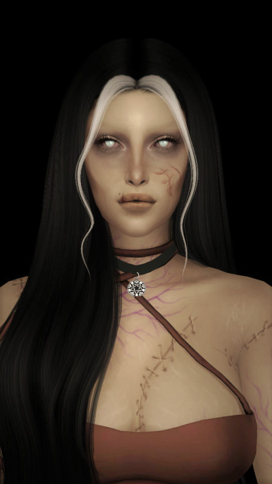
so i'm going to just make a little simple edit of my girl. this is a screenshot taken from cas that has the sunscreen filter on it from the built in windows photo editor on 20% intensity.
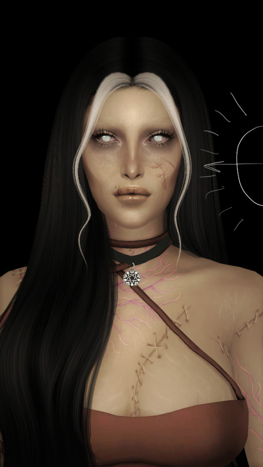
now i've added my normal little touch ups that i usually do, eyelashes, catch lights and highlights as well as touching up her scars. everything is painted with the soft airbrush except for some highlights that are painted with the 2B compressed charcoal brush. before adding highlights however you should figure out where you want the light to come from. i've drawn a little ugly sun for you to see where i've placed my light.
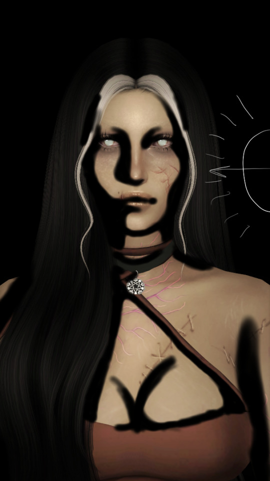
now i use the soft airbrush and paint with black where the shadows would be. if i would have fixed up the hair (which i didn't for this one because it's my least favorite part and i didn't have the energy) i would have made sure to make the shadow layer behind the hair ones since i think it looks better if the hair isn't shaded the way the face is. then i blend all of the black out with the smudge tool with the soft airbrush so it looks a little softer.
then change the layer to soft light and change the opacity to 60% and voilà! you have soft shadows! if some shadows still look to harsh for your liking just go back in with the smudge tool a little more.


now do a layer on top of everything and kind of circle the part you want lit up the most with black again, smudge it and set the layer to soft light at 60% opacity.


this step is not a must, i don't do it very often anymore but if you want some extra color or light you can do this. choose a color you want your light source to be. i tend to feel like intense colors look the best. paint it where you want the light to come from, then use the gaussian blur tool until your satisfied.
now you can leave it in the normal layer setting or play around a bit with different ones until you find something that you feel fits. for this one i decided on using the difference layer setting on 70% opacity.


a step i always almost forget is shading the eyes! to do that you just repeat the normal shadow process. paint it black, smudge and put the layer to soft light on 60% opacity. it adds so much, i highly recommend this step! now you're done with the first part. now save it as an image and start a new canvas with that image.


if you want to use gaussian, motion or perspective blur now would be the time. i didn't for this one but i almost always do. this next step is also totally optional. we are going to use chromatic aberration in the displace setting on 90% opacity and slightly pull it to the side. then use the normal chromatic aberration between 5-10%. it just adds a lot of fun and weird color that i just love and makes the edit look so much more alive. then use sharpen, i usually do 10-15%. and after that use bloom. my edits are almost always dark so i use a lot of it. i think i did 35% for this one to give it a little glow. then use noise. my go to is 3% on max octaves. then go into hue, saturation, brightness and change the saturation to 55% (you can do however much you want but these are my go to's) and brightness to 49%.

now go into curves and play around. i always make the gamma brighter but the colors i play around with so much.

completely optional again but i've recently started to add a gradient map, especially instant or noir. for this one i used noir on 20%. and that's it, we are done!
before/after.
hopefully this is understandable and helpful. have fun!!
130 notes
·
View notes
Note
Do you put a paper texture over your comics? There's an almost dappled effect I've noticed on the most recent Spike comic, and I love looking at them because they remind me of water colors!
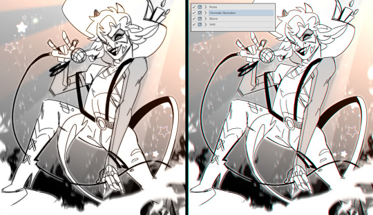
Yes, we do! there are a few effects on the comics, lemme list them for you:
Paper texture
Chromatic aberration
Gaussian blur
Noise
(aaaand sometimes I adjust the levels in the image)
36 notes
·
View notes
Note
Recently found your art blog from the IZ tag and I really love how your lineart/shading combo looks like actual show screencaps from a distance. I was wondering if you had any tutorials for how you pull that off, especially for pieces like /post/722388451213918208/attack-on-drawile ? I ask not because I'm trying to rip your style or anything but I really have a thing for animated screencap + cel shading quality fanart that doesn't just look like grainy VHS footage.
So I don't have a tutorial and I never tried to make one, but I'll try my best to give a quick rundown here. My process is very messy and I usually rush through and don't reflect back on it.


The background I made by planting blobs onto the screen I color picked from different anime backgrounds (got no pic tho). Then I used the ClipStudio colorize feature to blend them into one big sky blob and added some building blobs per hand (picture 1). I then blurred it all with gaussian blur (picture 2).
I always use the same line brush, it's a photoshop round brush on the smallest size that will work. The colors of the character I pick straight from the reference.

From there I only use colors I find in the background to shade the character. In this case I put a purple multiply onto the flat colors to merge the character more into the scene. Then I put a gradient map onto the entire image, usually on Hard Light mode and 50% opacity.

From there I think the key is to stay simple in your shading. Animation usually isn't heavily shaded, it often only has a lighter rim and darker shadows. I picked only one color for all shadows, the same purple I used for the gradient map and that's found in the background.
Last step is random stuff that looks fun- making the rim light stronger with a big glow with a soft airbrush and also adding the little particles. I also made some soft airbrush shadows to the large parts like the tail and arm, because a hard shadow that big would have been to much.
I didn't use any grain or chromatic aberration filters. They may have added to a screenshot feel but that wasn't my focus here.
Hope that helps!
21 notes
·
View notes
Note
(omg hi ur on tumblr !!) i loved your post with the sprite redraws, can i ask how you added the glow effect to nahyutas scarf? thanks!
aww thank you, glad to hear that!! <33 and the glowy effect is pretty simple to do actually!
step 1: change your lineart color to the base color you used for the scarf slash thing slash w/e.
step 2: duplicate your lineart layer and gaussian blur it to at least 5% (or more, up to you!), then set the layer mode to add (glow) so the outline of it glows :^]
step 3: make a layer with the blending mode add (glow) above the whole thing. then get your soft airbrush, get a very light color, then put it in the areas where you want it to be super glowy! :^D
bonus step: do a little chromatic aberration as extra pizzazz :^P
and that's it, hope this helped ya! <33
50 notes
·
View notes
Last Seen Blogs

lunareaum
𝖮𝖧, 𝖳𝖧𝖤 𝖬𝖨𝖲𝖤𝖱𝖸!

chillisrealobjecttime
We Making It Out Of The Plane With This One Boys

heymoonplzforget2falldown
It’s Obvious That You’re Dying

davidfrandsen53
The Blogging of Glerup 687

malikedobrazil-blog
Tout et Rien