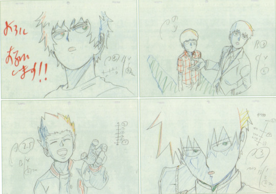
#also your art is very cute and pretty. I really love the shapes and proportions of the characters!!
Text
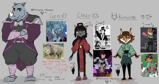
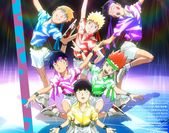
The bands back together! And they’re old lol
Art Notes/Rants below ⬇️
⚠️Warning⚠️
it is very long, I got a lot to say apparently lol
❗️They’re all aged up btw! In case you’re all wondering why i’m even redesigning them lol
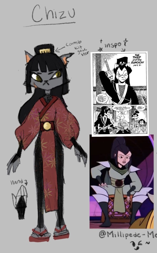
🐱Chizu Mini Rant: I hate Chizu’s design in the show. Not the clothing more so the body model. I hate that they made her the stereotypical curvy cat girl with a tiny hourglass waist and tiny hands and feet. Really weird proportions, Like we’re going back to the betty boop era but no one else in the show looks like this? (Also, No hate to people who are curvy btw love you) It just doesn’t feel like it belongs in the show. Maybe if she were shorter, it would work better? Idk Also she’s like the only one in a full skin tight suit (like I get animation, but they didn’t even bother giving her implied loose clothes or armor like the other ninjas? Maybe bc she was undercover? but then she should’ve been wearing something closer to the bg character models) It’s like they’re trying to make her sexy but like why?????? for why????
I really liked the concept art of Chizu. She’s got a more sharp/rigid and square silhouette but still some curves (w/o it being weird). She still has tiny hands but her head isn’t the size of a watermelon and her face isn’t super tiny, the proportions are good. She’s all power stanced up lol She looks mean and menacing, someone not to trust or mess with. It’s literally spot on. ✨chef kiss ✨ It’s also probably why they didn’t really go with it, they probably rounded her out to be more appealing for the reveal? or she was hard to animate cause she did have baggier pants idk. Who am I, but a rando with a hard boiled egg for brains.
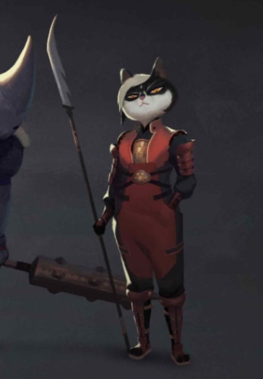
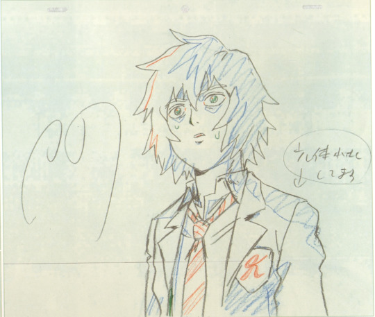
Art Notes: I took a lot of inspiration from the comics and I did want to keep her iconic red so she was still recognizable & stand out from the neko ninja. I made her a regular black cat! (with the idea of black cats being less likely to be adopted & be strays) (;-;) (I know she was kidnapped but still!! The stray cat vibes!!!) I gave her a more lean and tall figure, kinda like the comics but also to play off of Kistune’s height and it give scrawny stray cat vibes . . . again lol. It’s also a body shape I don’t see a lot in physically strong female characters (or maybe I do and just don’t remember? Idk but she can definitely kick your ass & she’s not here for anybody’s bullshit lol) I gave her the iconic ponytail from the comics along with the comb Kitsune usually wears. I wanted to give her green eyes (bc black cat & red and green) but i just kept them yellow. Maybe i’ll go back and change them. Her outfit is mostly inspired from Karai (bc she’s a ninja from eons ago & the gang is a little more traditional) just (pretend cuz i’m lazy) with traditional Japanese patterns. Chizu definitely got kunais and stars up her sleeves, but bc she doesn’t have to be a ninja anymore, I imagine her more into wearing pretty dresses with patterns and cute things. Stuff she never got to wear/ enjoy as a kid, you know. The show really wants to push her to be a bad ass girl boss who hates everyone and everything and is too cool and edgy for games but idk. I like to think she left the ninja stuff behind her and started living her own life based on exploring things rather than just being the cool ninja with an edgy backstory. I think she uses ninjitsu as a means of self defense but doesn’t like being connected to it b/c of the kidnapping and stuff. (We also see how she doesn’t really care about the tradition of ninjitsu cause during the show, she has no fucking clue what to do with the neko ninja, she just wanted them to stop hurting people and wanted to free the babies lol) Usagi and Kitsune are the ones who indulge her childish side. She wears a lot of red but her favorite color is pink. Kitsune def hypes her up and goes feral when she wears pink.
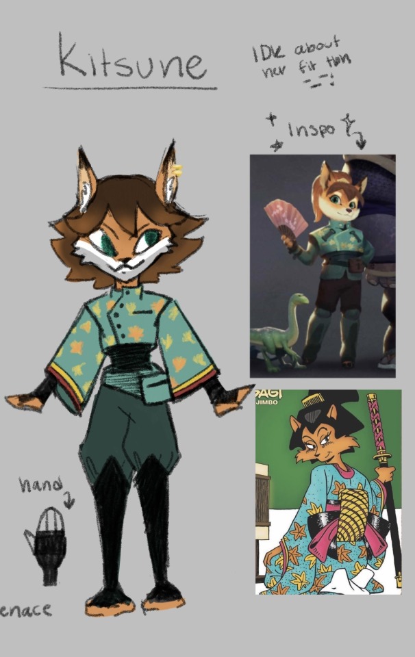
🦊 Kitsune Mini Rant: I hate Kitsune’s clothes in the show. Idk it just doesn’t look right on her. It’s got no shape it’s got no hiding spots for stolen goods. It’s not Kitsune. I like the concept art fit, it’s really cute. (She looks like a mini tank who will fuck you up in a cute way) but still #1 thing missing. Hiding spots for stolen goods!!! She needs some loose sleeves or flowy clothing like in the comics. (btw: I know it would be harder to animate in the show therefore I accept what they gave her but still!!!)
Art Notes: I’m not too sure about Kitsune’s fit tbh. I’m still workshopping it. She just needs something with loose sleeves! (Like she for sure is stealing shit and putting it up her sleeves, you can’t tell me i’m wrong/ it’s also where she could keep her fans!) I think i’m obsessed with her sleeves cause I imagine her gambling or playing a game of cards with a bunch of dangerous criminals and someone accuses her of cheating and she goes “What?! Me?! No, no. I’m just that good or maybe . . . you’re just that bad-” Then all the stolen cards fall out her sleeves and she just goes -fuck. and it turns into this picture vvv

ANYWAYS!!!! I gave her short hair bc idk, a girls gotta change it up sometime 💅 I actually liked her hair mimicking a fox tail but I feel like she would get bored of it and chop it all off one day. She's definitely the one who cuts and dye’s her hair at 1am then cries about it the next day. She’s got visibly longer ears and sharper face. Kitsune and Usagi wanted to get piercings together cause they’re besties and want to be edgy (she lowkey got it on her left ear to match Chizu) and so they did and Usagi’s Auntie was so PISSED lol. They got chewed out. Her hands and feet should be a little darker but i forgor. Also she’s got dark teal wrappings so it would be hard to tell anyways. I gave her the crop top with buttons from the concept art and the sleeves from the comic. They have the same maple leaf print from her comic too (i’m just lazy) and the cuffs are just lined to mimic the layers she had. She’s got her little pack, she’s also got some more smaller ones on the back (kinda like Leo). She also made a comment about not having money to buy herself shoes so . . . she’s got no shoes lol. It just wrappings under her shin guards. (no shoes just like Leo smh) It helps her be more sneaky tho >:)
Oh and they’re dating but i feel like that’s a given lol. I saw people shipping them at first and it literally went -> *sees ship* Oh they’re shipping the only two main female characters together again- yeah that’s greeeat- *Watches the show* oh. nvm I retract my sarcasm, they’re def gay for each other, thats nice. This is nice -w-
which is pretty funny, cause I think they don't like each other in the comics? (from what I saw in the singles panels I used as a reference at least) Chizu’s legit ready to kill Kitsune lol
Post Note: I totally forgot Chizu chose a bow and arrow as a weapon so now she’s just the stereotypical tall archer . . . i’m gonna go now ;-;
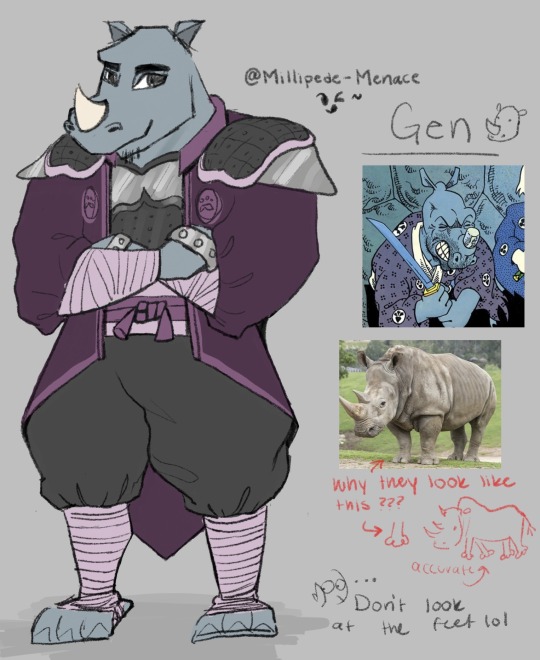
Gen Mini Rant: Holy Moly dudes, he was sooooo hard to draw ;-; I don't hate his design at all, actually it's one I like the most. I just don't like that there's not a lot of contrast on the 3D model and he kind just blends into a purple blob. (for me at least) I defiantly didn't do him justice but that's the best it's gonna get (from me that is.)
Art Notes: Don't look the feet . . . for any of them but mostly Gen lol. I don't really like the purple I chose but every color combo I did just looked bad idk. I can't do color, don't look at me man. Me and purple do not mix. He's still a bounty hunter so I wanted to keep his armor but I wanted him to have a long tail-coat/cape-ish jacket cause he would look cool as hell with one of those >:) (prob not practical but still) I wanted to add elbow and knee pads, but he's a rhino, he can take it. Also how can bad guys hurt him if he's too busy beating them up with his brass knuckles? He's still got his clubs but he likes clanging his fists together. lol His horn grew back! He's also got a goatee and everyone makes fun of him. The gang always threatens to shave it off in his sleep. I took more inspo from the show than the comic cause I don't really know Gen in the comics and what I did find was just miyamoto usagi but purple ;-; (clothes wise)
I wasn’t kidding, I had a lot to say, any survivors?
Feel free to suggest or critic my designs!! :0 Im not a design person and its mostly just for fun, but i looooove hearing people’s takes, especially hot takes >:) i like poking brains, its fun ^^
#samurai rabbit#usagi chronicles#samurai rabbit: the usagi chronicles#i am cringe but i am free#my art#no flirting with the lifeguard#lifeguard au#chizu#kitsune#murakami gennosuke#gen#rottmnt#at least I tried idk#rottmnt redesign#sketch
31 notes
·
View notes
Note
How would you rank all the Ultra Beasts? Like, from most to least favorite?
Oooh.... very inch-resting question. I've vaguely thought about this before, but never actually thought to put my favorite ultra beasts in order!
Just a disclaimer first, though-- I don't actually *dislike* any of the UBs. At most I'm pretty neutral ;D
Rankings below :)
Nihilego
My absolute FAVORITE genre of pokemon generally tends to be the eerie-but-cute (and-maybe-dangerous-too) Creature. Nihilego is a faceless, incomprehensibly ominous head-crab-type parasite... that makes cute little sounds and twirls when it's happy and acts so so innocent!!! I love it!!! What a simple yet appealing design (being a cloudy, pastel blue with a bell that looks quite like a sun-hat), conveying a sense of uneasiness within it. It almost looks like a harmless little girl, but.. somethings still not right...? Maybe its the fact that its a parasitic glass jellyfish leaping For Your Face
It's appearance also makes me think about what it predates on in its home-world!?!
Anyways, she's my adorable, freaky little daughter. 10/10
2. Pheromosa
That being said, my second favorite genre of pokemon is pretty much just 'Girl,' and, Yes, the cockroach applies. I personally enjoy the idea of this little girlboss of a pokemon getting haphazardly Dropped into an entirely different galaxy, and just going "Ok" about it... How calm...
Very odd proportions, too-- I do wish the pokemon company had gone further with Bug Traits in the design, but I also personally love the eyes and crown, so I would miss those if they had changed it to be something less humanoid XD And while I love the distant, spiteful attitude it had in the anime, I also enjoy the idea of a more curious and playful buggy, who's just trying to make sense of a new world
I also keep on forgetting that Pheromosa's FAST!!! Very amazing quality to have. Much speed.
3. Kartana
I didn't know whether I liked Kartana or Stakataka more, so just pretend they're the same in terms of rank.
How is this a pokemon!?! A tiny origami samurai!?! CUTE!!! In my opinion, I think Kartana is one of the more peculiar UBs-- especially judging from how it acts in Pokemon Refresh in the SM games. I'd love to go more in depth about Kartana, really, but I don't know what to say XD It's a slicey, dicey, little guy. And I like it lots!
Paper-cut is an understatement!
4. Stakataka
Before I had much interest in Ultra Beasts, I probably would've said Stakataka is my favorite of the group. It's a real big block, is what it is, but I think it's rather endearing... it's a bunch of little giblets, coming together to make... a bigger giblet. Awesome!! It also reminds me of Guardians from Legend of Zelda: Breath of the Wild, and I really love those guys
I kind of want to ride it like a horse...
5. Buzzwole
Buzzwole is an INCREDIBLE pokemon. With the same strangeness as Pheromosa, it's a BUG, but rather than being elegant and graceful, it's... completely JACKED!?!? A mosquito on 'roids!! What kind of creature is this thing sucking the blood out of, anyway!?!
I picture Buzzwole as a typical nice jock-- very wholesome, but also very very dense. And also it's a huge mosquito-- did I mention that? Crazy. I want to be its friend.
6. Poipole
From here on out I don't feel as strongly on any of the Ultra Beasts. No problem, though-- I still have opinions!
I like Poipole's position as the "starter pokemon" of Ultra Space. Fun, in how, unlike a normal starter, it's still just as dangerous as the rest of the Ultra Beasts XD ("While spraying opponents with this venom, it laughs wildly!") It's a very cute, almost techno-looking pokemon, and once more the odd, vibrant colorations and body shape really sell it as an Alien. The concept art for it is also adorable, too!!
Ah.. wait... I think I'm starting to like Poipole more just from talking about it...
7. Blacephalon
Blacephalon has a very cool name! Asides from that, while I do like its colors, and the fact that its Head Explodes (which is VERY cool,) I've never really felt much for clown pokemon... It seems like a silly little goober, though-- It has eyes that can emote each side of its head! That's adorable!
Also it's as tall as Pheromosa, at 5'11". I did not know this. I am now terrified.
8. Celesteela
I can safely say that Celesteela is the kindest rocket I have ever seen. XD Just look at that sweet little smile! Of course, it's not really noticeable, when one zooms out to view the rest of the body. I want to like Celesteela more but... it doesn't really... move much? I can't detect much of a personality from it-- it's kind of just there. Sort of to be expected, though. Baby Celesteela, as portrayed in the anime, is very adorable though, and I would like 5 of them.
9. Xurkitree
Xurkitree sort of falls under the same category as Blacephalon for me, just in terms of vibes, I suppose. I appreciate its very joyful, carefree saunter, but nothing else really sticks out to me in terms of what I might like about it...
10. Naganadel
Poipole's evolution! I simply don't like it quite as much, though. It's a little hard to look at right, and I've always thought it looked a little stiff. It's lost all of Poipole's personality :(
However, it has an amazing shiny!
11. Guzzlord
"AAAAAAAAAAAAAAHHHH"
... That's it XD I never cared much for Guzzlord at all. Big hungry guy.
Anyways, that was a lot longer than I expected it to be XD Thank you for asking!
33 notes
·
View notes
Note
Could you explain your drawing process? I'm a new artist and I love your style 💛 I'd love to know how you achieve it
Absolutely! I did a little tutorial for you anon, so have a look below the cut and I’ll walk you through how I did this rough little sketch.
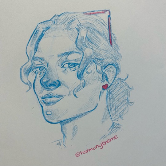
first off, i browse my very cheap set of coloured pencils and choose what i’m feeling for that day. these are two weeks old and it’s very obvious which are my favourites haha. i also look for a reference photo!


I chose a cute little turquoise colour for this, one that doesn’t show up on camera very well, and one which I later found out doesn’t erase very well. my reference is a very cute old pic of omar. i already decided here that i couldn’t be bothered drawing his hand lmao.
so, when it comes to guide lines, I tend not to use them when I’m doing side on profile shots, I’m not sure why, I think I’ve just been drawing so long that I don’t really need them anymore? but for this angle, I will use them, just to ensure I have the proportions correct for the angle and so that things line up right.

my guide lines, like my art lol, are definitely in my style. I wasn’t classically trained, but my mother was an artist, and so I’ve used a mixture of her teachings as well as my own research since then. I usually work out the rough shape of the face, centre line, the rough size and position of the nose, then to measure out the distance between eyes and eyebrows. this can all be messy, and as long as you’re using something erasable, you have plenty of freedom to change as you go.
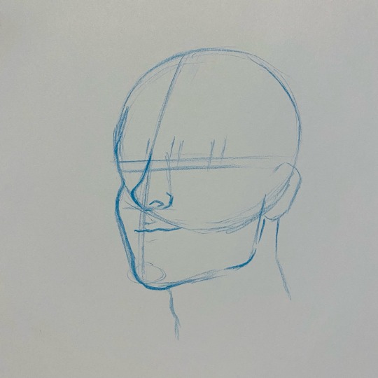
here I am next working out the jaw shape and defining the nose. as you can see with the mouth, it lines up better with the centre of the nose than the guideline I’ve set out, and that’s fine. it looks better that way.

erasing guidelines, defining features.
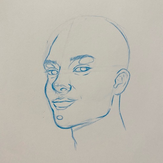
now here i am adding my daisy-ism’s in. these are the highlights/lowlights I add to almost every picture, even if the refefence does not have it. shadowing under the nose and mouth, a highlight in the brow, the tip of the nose and the chin.

hair time! as you can see, in my reference, he doesn’t have a visible bun, but I think it looks way cuter and more complete this way. I’m just doing a basic hair outline here, working out the shapes and flow, then putting in his lil sunglasses.

shading time! my shading is pretty stylised, but the gist of it is, looking at the reference photo, laying in some cross hatching for the heaviest areas, and making sure the highlights are left unshaded. I use my coloured pencils for shadow AND warmth, which is why I like to have heavily shaded noses and chins in my art. 😌 this also extends to knuckles, fingertips and ears. also shoulders, elbows and knees if those are exposed.
then I shade the hair and add in my final details. so, my little lower eyelashes that I always do, my signature and whatever else I want to add. in this I just gave him a lil heart earring and coloured his sunglasses pink for this.
when it comes to hair, my advice is for you to fake it ‘til you make it. hair is hard, really hard, but my best tips are to section it out and shade each section individually. pay attention to your reference photo and where the highlights and lowlights lay. you don’t need to draw every strand! the inference of hair is always more effective than every single strand drawn out one by one.
also, its okay if the final result doesn’t look exactly like the reference. mine never do either! it’s impossible to get everything right, but the important part is having fun and enjoying the process.
and here is the final result! i limited my time on this one as i’m super busy today - usually i would refine it a lot more and spend a tonne of time making sure the shading is smooth, but you get the point, and that’s the important thing. i hope that helps, and if you have any questions, please feel free to send me an ask, or dm me any time! i’d love to help you on your art journey. ♥
#my art#ask#anonymous#idk what else to tag this is it doesnt fit in the yr tag#but i hope whoever sent this gets to see it! i'm a couple of days late replying#<3#again this is ROUGH#i am aware#this was just a quick little sketch for the kind anon <3#tutorial
68 notes
·
View notes
Note
just curious, what’s your favorite and least favorite character design? my least fav for sure has got to be female byleth for reasons i don’t want to get in to yep ok have a good day 😁
IOops this accidentally became a rant, sorry
Okay so, to preface this all, I’m not a character designer and I’m actually pretty bad at it, but my rule of thumb with really unappealing or fan-service outfits is whether or not it makes sense character-wise and how much it tells the player about the character. For example, I think we can all agree that there’s quite a bit of fan-service elements in Hilda’s design. Boob window. However, it’s not unrealistic to imagine Hilda picking out those clothes for herself. Her costume tells you almost everything you need to know about her character on a visual level. She’s confident, pretty, attention-grabbing, and high maintenance while the gloves and laced girdle give a nod to her Viking-maiden roots.
Taking it to female Byleth, I don’t think that her outfit works on either front. Her design is definitely my least favorite and it’s not helped by the fact that you have to look at her at all times. Whatever. The huge, solid mass of boobs, the buttoned bib, the big eyes, the feather hair, the bellybutton, the ripped tights, the booty shorts. She’s a merc out in life and death situations with an accessible, pale, tacky 2000′s “stab me” stomach cut out and a wedgie. Which could be excusable if, like Hilda, there was reason to believe that that her costume was character choice. But she doesn’t really have much character, and what there is gives the impression of a very stoic, dry, blunt person. I have no idea why they’d have gone that route when the sexual appeal of more “utilitarian” costuming (aka, form fitting armor that at least pretends to be functional) for characters like her is scientifically proven AND would say more about the singular personality trait she possesses. Okay, well, I know why they didn’t do that and I think it’s lame. This dysfunction of “character designer wanted a sexy girl but it’s kinda random and just shoved in the game without any thought” actually reminds me a lot of Xenoblade 2′s leading ladies, Hikari and Pyra. Although considering that their bad designs led to a lot of people hating the game for superficial reasons while accepting female Byleth’s design, I guess I’m just bitter. Jumping to a different comparison, then, look at 2B from Nier Automata. Her design is fine as hell which is kinda hypocritical of me considering that it's explicitly fan-service, but I think it also shows the most damning thing for female Byleth. Her whole look, despite having a dozen different element thrown in, is boring. Maybe it’s the colors (dressing her in all black and white would have been really interesting considering the colors of the three lords are so heavily emphasized as a part of their characters) or maybe it’s just the way the desperate elements come together. But, like I said, I'm not even slightly knowledgeable about character design and I know that despite Three Houses being mostly separate, they had to appeal to a larger aesthetic brand to which I have little experience with. And, ultimately, a lot of people find her cute or sexy which...To each their own, I suppose. I don’t pretend that fan-service doesn’t work on me (2B... Cloud’s arms in the remake... Seph's shirtless Smash skin...) but when it’s this obviously inserted in by the character designers rather than feeling organic in any way AND looks bad I'm just not super interested.
The other worst designs for me would be all four of the Ashen Wolves post timeskip. I don't think it's controversial to say that they didn't try with the clothes, even if I love their designs from the neck up (Yes, even Balthus. He looks like the type of guy that would let you sit on his shoulders at a rock concert so you could see the stage). While there are other designs I think are unappealing, those are for purely aesthetic reasons and so I can't maintain the opinion that they're actively bad or that I even truly dislike them.
As for favorite looks... I actually have a few so sorry you're getting all of them because despite the shit I'm talking, I actually really really love the character designs in Three Houses.
Ferdinand's post timeskip is one of my favorite designs, if not my favorite. The hair, the coat, the armor, the spurs, the colors. You know exactly who Ferdinand von Aegir is just by looking at him. He’s wealthy, handsome, confident in his appearance, a hero, a princely type character, his battle form is mounted combat which is traditionally aesthetically reserved for nobility and leaders... I love it. The only reason I cannot say he IS my favorite is because of the three Lords. But before them, my honorable mentions include post timeskip Hilda, Dorothea, Lorenz, Felix, and Hubert. Granted, I could make a case for why I like almost all of the student’s post timeskip looks.
For the Lords, I obviously have to start with colors because, weirdly enough, Persona didn’t invent primary colors but are actually used as shorthand. Blue is the color of honor, loyalty, sincerity, sadness, and depression. Something I’ve always found very interesting is that blue is very rarely found in nature. To me, that’s always made it seem more lonely which, at least in this case, is thematically relevant. People call Dimitri boring pre timeskip and while I won’t defend his hairstyle (okay, actually, I probably would because he tucks it behind his ears and idk why but that’s one of the cutest things ever) I really like how unassuming he is. Bland. He’s supposed to be the plain shortbread cookie to caramel deLite Claude and strawberry meringue Edelgard. It is not in his character to draw attention to himself or stand out. To me, he kinda looks like an old Barbie prince, like he should have been named Dominic. Also I love the blue eyes/blonde hair thing and his more angular features. It really helps to sell him as the fakeout chivalrous prince type. Post timeskip, Dimitri's black armor is amazing. I love the fact that it’s a lot more intricate up-close with the different little shell-like pieces and the fact that his boots are furry. I love the big cape and the black and white fur around his shoulders. It’s really cool how they used his costume to change the shape of his in-game model to match the bodily proportions of the character art. It’s easier to see when you change his costume into the DLC ones, but the fur and cape build up his shoulders and chest look more broad while keeping that tiny little waist. The choice to give Dimitri an eyepatch is probably my favorite thing about this design. It’s genuinely inspired. Such a simple detail yet it tells the player everything they need to know about adult Dimitri when they see him post timeskip, in one frame the player can begin to understand the extent of his loss over the past five years. The subtle shadow under his eye in the first few Azure Moon chapters and the messy long-ish hair really help to sell the feral prince aesthetic as well, as it’s from those small cues the player gets that he’s exhausted (in more ways than one) and doesn’t maintain himself. None of these things are intentional choices by Dimtiri, they’re the result of what his character has been through.
Yellow is an intense, energetic color. Mostly, people think of it as being warm and inviting, the color of the sun and positivity. That intensity can be overwhelming, though, too visually demanding when compared to its primary counterparts. Don’t stare at the sun too long. Buuuut, it’s okay to stare at Claude. Claude not wanting to wear tight pants in either of his costumes is not only a mood, it is iconic. Pre timeskip, the softer lines of his silhouette makes him look kinda slouchy, kinda lazy. Like he’s not too concerned with appearances. But those adorably messy curls, the little braid, the clearly tended eyebrows, and earring make it clear that he DOES care about appearances and is very aware of his allure. And that’s before he even starts winking. It is honestly so in character that as many people picked him first on the basis of being thirsty, that feels like an intentionally Claude thing even if it was inserted by the designers. The contrast of his complexion with his seagreen eyes is gorgeous and instantly adds a kind of mystery and intrigue to him considering the setting... but it’s sf funny that nobody looked at bronze god Claude among a sea of white faces and thought something was up. Post timeskip, they used the same trick like they did with Dimitri to change Claude’s in-game model to match his canon appearance. The way they designed his uniform makes him not look as twink-ish, like he’s actually muscular and imposing and has the strength he’d need to shoot a war bow with a 120lbs draw weight. Also like Dimitri, you can instantly tell what Claude’s been up to. Like, he was very pretty pre timeskip but when he shows up in the Goddess Tower after those five years in all that gold, he demands your attention. Like a gentleman general with the excessive aesthetic ideals of the Alliance and details to imply his heritage. The quilted pants are amazing from both an aesthetic and practical standpoint. He’s a mounted unit riding a creature with scales, of course he’d want something on his legs for protection. And the chinstrap. I love that so much, it definitely makes him look more adult. He’s got such a cute soft baby face, it’s fun imagining him experimenting with different styles during the five years to get the most desired physical reaction to him as a leader.
Frenchfries, meet forehead. No, actually, Edelgard’s design is really fantastic. Claude and Dimitri both have realistically colored eyes and hair and then there’s Edelgard. Dimitri shrugs off attention physically and Claude shirks it with a wink but Edelgard commands the players attention from the very start. Although I’m sure there’s a lot of things to associate with white hair and purple eyes, my first thought was Daenerys from Game of Thrones. Otherworldly beautiful by with an edge. Red, of course, is The power color. Strong emotions, love and hate. Red is also associated strongly with blood, which is very important to Edelgard’s plot. Granted, I think the red and black association is even more powerful than JUST red and red is the cheapest play to make in regards to displaying villainy (I mean, there are some pretty universally recognized associations with red and black and it led to people making some unfair comparisons between Edelgard and a famous dictator) but I think it was effective and well used and I genuinely enjoy its use in her case. Anyway, if I had a major complaint about her design it would be the weird ashy color of her hair whereas Lysithea’s hair is pure white. Which doesn’t even matter with the AMAZING hair horns. Ram horns can actually symbolize quite a few things, but their association with power and strength is pretty universal I think. They’re also used in demonic imagery. I love that THIS was her alternative to a crown. Edelgard views herself as a force of war and power before she thinks of herself as royalty. She also mentions that she isn’t super vain, but she loves to do her hair, so the hair being the most elaborate part of her look is entirely in-character. Edelgard’s ensemble is, like Claude, very militaristic. I love that they kept her in a dress that embraces femininity without showing skin as that wouldn’t really suit her Also, again, Edelgard demands your attention. She’s dressed all in bright bright red waving around a giant axe. She is a symbol as much as she is a combatant, someone to follow. I didn’t really mention their secondary lord costumes, but a girl in sexy armor is literally everything and I love that they had the balls to put their main sexy waifu girl in full body armor.
Okay I’m sorry I realize this was excessive and probably didn’t need explaining and I’m not sure I even articulated my thoughts properly but anyway I love their designs so here is the positivity I’ll put into the world.
#fe3h#ferdinand von aegir#claude von riegan#edelgard von hresvelg#dimitri alexandre blaiddyd#haha i htae byleths design this was all just to justify my abject disgust for the way she looks#nobody sent me anything about dimitri's dick so this is what i've been reduced to
111 notes
·
View notes
Note
Hi, I didn't really know who to reach out for this question, but do you have any tips on how to find your own unique fashion style? I'm not really looking to hop on popular clothing trends on social media e.g. eboy/girl or cottagecore, so I'm not exactly sure where to start! I come to consult you because I've seen some of your posts and you look very well versed in fashion and you seem to know your own personal style. My wardrobe is very outdated and I would like to update it to reflect the truest expression of myself. Thank you 😊 You don't have to answer this if you don't feel like doing so btw 😅
EEEE more fashion asks i love these thank you!!!! warning this got a lil (very) long so its under the cut :^)
so first and foremost the most important part about curating your own style is to learn more about your body and what flatters/doesnt flatter it. it's learning some basic fashion 'rules' pertaining to proportions, cuts, etc. there are plenty of resources on this if you dont know where to start (kibbe body test, video, video) but keep in mind this step has nothing to do with your weight!!!! i could talk wayyy more about this but at the end of the day, some clothing is just more flattering for specific body shapes - that doesnt mean you cant wear something that isnt perfectly flattering, but knowing your body and knowing what flatters it will make you understand your own style and help guide the pieces you buy. fashion 'rules' arent necessarily meant to be followed, but just understood so that 'breaking' them is a conscious choice. (it also really helped with my insecurities???? like this step is basically recognizing that its not your body thats unflattering, its the clothing, if that makes sense???)
also remember that every 'style' works for every body type. i.e if you want to be a 60s vibe but youre too curvy for shift dresses, there are plenty of clothes in a similar style that would look great on you <3 basically, if you dont like the way a piece looks on you, you can still achieve the same vibe with a different article of clothing thats more flattering. but also umm.... you can just wear the unflattering thing if you want LOL if it makes you happy... then it becomes your own controlled decision <3 live love laugh follow your heart
okay. now that you have that out of the way. there are a million ways to develop a sense of style, and no particular order in which i recommend them. what i love doing is creating pinterest boards for the spring/summer or fall/winter seasons and just filling them with pieces i would wear in a perfect world. i dont mean like cottagecore aesthetic boards, just boards full of runway looks and clothing pngs that i like. i also love making little outfits for characters which can influence my own style. everyone thinks of their style differently; i think of my own outfits as little vignettes with narratives behind them, but other people are more concerned with just wearing things they think are pretty, other people view it as an expression of art or their identity, and other people just want to feel comfortable!!! its all up to you and what youre drawn to!!
one thing that tan france mentioned once was to go online window shopping by going onto the website for a brand you like (regardless of whether its affordable or realistic!) and just adding things to your cart that youre interested in. dont worry about how expensive they are or anything, and when youre done, remove all the items you like the least. and then keep reviewing and removing until you have just a handful of really nice items you really like, and keep doing this with other brands until you can identify common threads between the pieces you like. you dont have to buy them!! in fact maybe its better if you dont!!! and the websites dont have to be like zara or h&m ... go on balmain or chanel if you want, play pretend and have fun!!
re: the last bullet point, i think a big turn off for people in terms of fashion is the idea that you need to wear something palatable and 'appropriate.' its like looking at a runway and thinking "its nice, but i would never wear that in real life." but honestly????? in a perfect world i would be wearing full gowns to the supermarket!!!! if your ideal style is imaginative but unattainable, your style in practice will be a microcosm of it. basically... dream big... dont be afraid to 'overdress' if its what you like!! one of the best pieces of advice i ever got was from my aunt, who offered to by me a plastic tiara. i asked her when i was ever going to wear it irl, and she just looked at me and said "??? you can wear it whenever you want to!!" so true!!! wear a tutu to mcdonalds. wear a bedazzled tux to prom. who cares
accessories, nail polish, hair, jewelry, perfume and makeup goes a long way in developing style. i dont wear a ton of makeup, but just putting some color on my cheeks achieves a kind of sunkissed lovestruck vibe that i strive for. i paint my nails red because i think its chic or bright colors so they contrast with a toned down outfit. even wearing no accessories is an accessory in itself. accessorizing (or specifically not accessorizing) is like adding texture to an outfit imo
anything that advises you about 'absolutely necessary essentials everyone needs' is entirely wrong. there is no one size fits all; i.e everyone says you need one good pair of denim jeans, but i havent worn jeans in two years!!! an essential for ME is a pair of neutral wool shorts, but an essential for another person could be a thick knit sweater or for another person, a flannel. the idea that everyone needs a 'little black dress' or a 'basic white t shirt' is preposterous. YOUR essentials depend entirely on YOUR style. a pair of denim jeans is useless if you hate wearing jeans!!!!
as for my personal style, im mostly influenced by movies, books, songs, characters, feelings, colors, high fashion, and costumes. ultimately, you should worry less about what you want to be and worry more about what you already like. every piece i have kind of plays into some narrative ive constructed, or otherwise theyre all special to me :) if you want to update your wardrobe, dont feel the need to over consume fast fashion (or any fashion for that matter) to do so. if you take it slow and buy pieces you really love, every item will have a story and you'll begin to develop a more stable internal style and they'll last longer :)
let me know if you have questions or want me to talk more about any of this because i really love answering these kinds of questions!!!!!! especially the body type thing because thats such an important but long winded thing i couldnt really fit it all LOL
some more videos + resources about style and fashion i think are interesting:
deep dive into kibbe body types
pinterest aesthetics, fatphobia, and white washing
lies about clothes to unlearn in your twenties
studio ghibli: how clothing shapes identity
breakfast at tiffanys style analysis: the reinvention of onself with fashion
will the millennial aesthetic ever end?
go viral, post #spon, get canceled: how social media transformed fashion in the 2010s
analyzing the "is it a cute outfit or is she just skinny?" meme
41 notes
·
View notes
Text
Mob Psycho 100 Interview Translation - Character Designer Kameda Yoshimichi - Otome Visual 2017
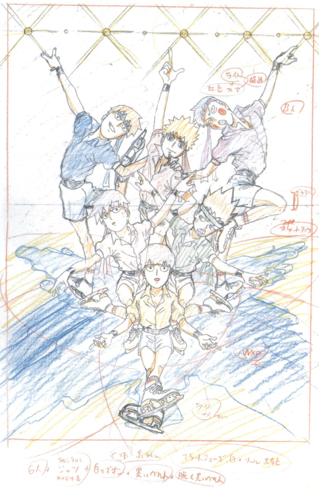
Summary-style translation for Character Designer Yoshimichi Kameda’s 4 page interview from Otome Visual 2017, regarding elements in the creation of Mob Psycho 100 such as: what inspired this cover art, the influence of fan art in the anime’s creation, Tsubomi’s design, the process behind the package art for the DVDs, and more. Includes some genga. Under read more;
[TN: The reason why I elected to summarise this interview rather than do a full write up is because a lot of the information given gets covered in December 2016′s Animestyle010, in “The Making of Mob Psycho 100.” I typed that one out in full over on twitter but that’s a long interview, and I don’t have the time or energy to reformat it for Tumblr, but if you’re interested in a very in-depth look into how Mob Psycho 100′s anime came to be I’d really recommend checking it out. Direct quotes are given in “” here. Enjoy!]
---
*~The genga illustration for Otome Visual’s cover~*
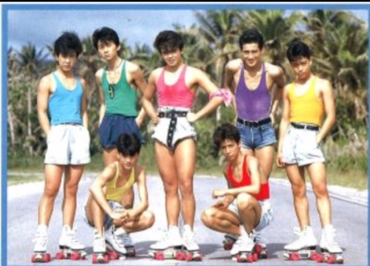
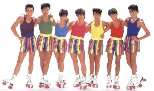
“With the recent popularity that Skating Anime has had, what’s this - a Shouwa idol collab?! It’s all in the little details in their clothing - their wrinkled shirts, white trousers, black belts - both around their waists and arms.”
*~Kameda’s comments~*
“Can you heaaaar me!! I am currently speaking directly into your braaaain!!! What I’m grateful for with this commission is I was able to design the cover in any way I’d like!! A cover is a reflection of current times, so, of course, I went for ice skating! You wouldn’t be able to find this kind of amazing content in any time period other than now! That’s what I first thought! Like, Mob Psycho 100!! If there’s not a certain Mob Psycho 100-ness present in the art then what’d be the point, so, the characters are being very serious but they’re also pretty laughable. I tried to create a piece of art from which you could hear their voices!!! What’s with it being Shouwa-esque?? Being lame is incredibly cool!!! Huh? Does that describe Mob Psycho 100?? Can’t answer that if you ask!!!! Please feel the amazing Paradise Ginga x Mob Psycho 100-ness here!!!!!!”
---
Kameda describes how he wasn’t sure how best to adapt the manga into an anime format at first, since from the art he was shown he immediately knew it to be very unique - the idea of using Flash to animate the show was raised but quickly shot down
Originally, upon being asked about the show, he based his thoughts on what a web image search for Mob Psycho 100 gave him rather than having the actual manga in hand. “For the most part, the results that came back would be fanart (laughs). It’s a bit strange - at that time, it was difficult to find art uploaded from the manga. If you could find anything, it’d just be art from the covers. So for the most part, an image search of Mob Psycho 100 would just bring you back fanart. A lot of that fanart would be… a shounen in a cool pose wearing a school uniform with smooth bobbed hair & sharp cat-like eyes, sort of like Hiei’s eyes (from Yu Yu Hakusho). Very different from the manga’s art. But when I looked at that art, I thought; this could work. Fanart is, fundamentally, ‘fans drawing what they like’, so I thought, ‘the anime having this kind of art would make the fans happy.’ Well, it didn’t work out that way, obviously. I was told the anime’s art should resemble that of the manga. (Laughs)”
He hadn’t read the manga so all he had for reference was art from volume 1 and the fanart he found online. “But I like things like spirits and urban legends, so seeing Dimple - a floating supernatural fiery ball - and being told the manga touches on the occult caused my interest to soar.”
Says that Teru is the easiest character for him to draw. “He’s overflowing with confidence, so it’s easy to put him into some cool poses. Mob and Ritsu in comparison, not so much. [...] With Reigen, he has a lot of poses that are like, he’s trying to look good. He takes a solid stance. I suppose Spirits & Such has such a shady air to it, and you have to hide that somehow, right? So, Reigen injects confidence into how he presents himself. A model-like stance.”
“The anime is faithful to the manga… ah, actually, Tsubomi-chan was changed with a ‘let’s make her more like a heroine’ conversation. So, I did so, but reading recent events in the manga I can’t picture her in her anime form (laughs). The manga’s Tsubomi isn’t much like a heroine, so I’ve found myself wondering, if we animate up until this part… just how will we approach it? The anime’s Tsubomi is so bright and sparkly, so she wouldn’t have snot hanging from her nose (vol.13 of manga), would she…? (Laughs). Perhaps we went a little too far with making her a heroine. Maybe, if we do season 2, we’ll turn her back into a normal girl (laughs). Well, Tachikawa-san is clever; I think he’ll find a way to make do with her current design.”
---
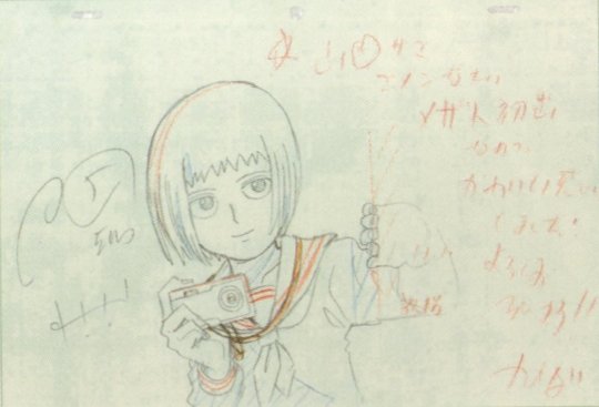
Picture text: "This is Mezato's first appearance, so I decided to make her cute!! Thank you in advance!!"

Picture text: "That girl was telling me such a stupid story this morning... aidzuchi* isn't easy, you know... I'll just ignore her tomorrow..." [* sounds made to indicate that you're listening to someone speak]
---
Asked about his favourite characters; “I love Mezato Ichi from the Newspaper Club. When I drew her in her character sheet in that pose where she’s holding her camera, I came to see her as being quite cute. So now I focus on her a lot; in fact, when I draw genga I sneakily choose the cuts that have her in them (laughs).”
“I also love Mob. Reigen stands out the most so your eyes naturally jump to him, but I love the balance that Mob has. His heads tall ratio... or rather, his face, and the way his body is proportioned? It makes him lovely. Ritsu is around the same height as Mob, but, how can I put this - the cuteness that Mob has, is lacking in Ritsu… due to the latter being quite standoffish, I suppose (laughs).”
Ritsu’s hair changing through the first season is discussed, and how it is purposefully shortened during the latter half. “I paid attention to making sure his hair was long especially while he was being possessed by Dimple. So it’d resemble thorns.”

“I feel Teru-kun is the most ‘yang’ of all the characters. The rest are more ‘yin’ in nature. Because of this, it’s easy to play around with his expressions - he’s fun to draw. Speaking in terms of Dragonball, he’s kind of like Mob Psycho 100’s Vegeta (laughs).”
“In episode 9, Dimple possesses one of Claw’s security guards, right? I don’t really understand why that security guard is so popular.” Q: What do you mean? “Because he’s just some middle-aged dude (laughs). He doesn’t even appear for long…”
After discussing the huge amount of SG!Dimple commissions received: “Unlike SG!Dimple, I don’t really get asked to draw Shou-kun. With this commission I thought to myself, I /have/ to include him here, and so I added him in. The initial brief excluded him.”
Asked about moments that stuck with him; “When Teru chokes Mob in episode 5. [...] Mob’s pained expression as he’s being choked is good, but Teru-kun’s face shows us… envy, jealousy, distress, anxiety.”
“Also, the ‘super real Reigen’ sequence from episode 12. The tension between Reigen and Sakurai is funny, but the art itself has had me laughing since production. It’s funny no matter how many times I look at it!”
Kameda’s idea to have the characters make number shapes for the volume art came from him watching ‘Tonneruzu no Minasan no Okage deshita’, specifically the ‘Mojimoji-kun’ segment of the show (where they try to make numbers from their bodies)

Volume 6’s cover art was first planned to have a whole ensemble of characters, but Kameda changed his mind on this - “if we do a second season, we can leave that for volume 12 (laughs).”
Volume 4's cover was originally planned to feature only Onigawara and Gouda, but Kameda found himself wanting to include the rest of the body improvement club
Regarding the pose we see on vol 6’s package art, “My original thoughts for that cover were to have Reigen and Mob in a ‘hell wheel’ pose, like, Mob pulling Reigen’s legs and arms… but that wouldn’t be very fitting for the final volume.”

His message to the readers; “Thank you for your support! With sales, the ‘this is popular!’ message gets conveyed, and the more support you give us, then there’s no doubt we’ll be able to produce season 2 and season 3!! Season 2 relies on your support. It’s in your hands - thank you!!”
---
Crossposted on twitter here.
173 notes
·
View notes
Text
Imposter - Kaka/Yama
So this is another request from @vibgyoroygbiv for the amazing art that you can find on their blog here. Seriously, I fell in love with this art from the moment I saw it and could not have asked for a cuter scene to capture with words. Thanks for letting me! You can also find this piece on A03 and FF.
After scrubbing through his damp hair, Kakashi blinked at the reflection in the mirror. Dark circles beneath his eyes suggested that he needed sleep more than a shower, but there were more important things to take care of first. Kakashi had been out of the village for two weeks at a kage summit, and for some idiotic reason, he'd left Tenzo behind to look after the village. He made a mental note to never make that mistake again; the days apart had been miserable.
The pair had been dating, officially, for over a year now, a reality that continued to amaze Kakashi. He'd expected that Tenzo would get sick of him or realize that life was easier without him. Instead, impossibly, Tenzo seemed more determined than ever to stick by Kakashi's side. He couldn't put his gratefulness into words, so he didn't try. Besides, Tenzo knew, he had to. Why else would he put up with the chaos that was Kakashi?
Frowning, Kakashi ran his fingers through his hair to perfect the spikes. He hated the way it laid against his forehead when wet; it made him look more like his father than he cared to admit. He spent a few seconds adjusting the way it fell before giving up. The bedroom was dark enough that Tenzo wouldn't notice anyway. If Kakashi hadn't been covered in dirt and half asleep from rushing back to surprise Tenzo two days ahead of schedule, he wouldn't have bothered with a shower either. The cool water woke him up enough to be semi-functional, at least.
Pulling on a clean pair of boxers, Kakashi flipped off the light. He'd been as quiet as he could be, but wasn't certain that he hadn't woken Tenzo up accidentally. The man was the head of Anbu after all. When Kakashi had first arrived back at the apartment, he had felt the flicker of Tenzo's chakra in the bedroom. The steady strum of sleep hadn't altered over the past fifteen minutes, but he moved silently just in case.
After letting his eyes adjust to the darkness, Kakashi slipped into the bedroom. It was brighter there, pale moonlight streaming through the open curtains. The scene was nearly identical to the one that Kakashi had expected. Tenzo lay on his right side, on the far side of the bed. If Kakashi had been there, an arm would have rested across his hip or shoulder. Tenzo always seemed to want to be touching Kakashi when they slept, maybe to convince himself that he was really there.
Kakashi crept closer, curious to see what Tenzo did with his hands when Kakashi's body wasn't available. He paused a couple of feet away, frowning at the bed. Tenzo had his arms curled comfortably around . . . something. The shadows were deeper with the blankets and sheets, so it took Kakashi a couple of moments to recognize the shape of his replacement. The lumpy form looked almost like a teddy bear, but the proportions were wrong. Then, Kakashi saw the flash of silver against Tenzo's cheek.
"What the hell," Kakashi huffed without thinking. He followed the pale hair of the plushie down to a partially covered face that could only be meant to mimic his own.
Tenzo's entire body tensed at the sound. His eyes flashed open, found Kakashi, then he relaxed with a sleepy half smile. "I didn't expect you home for a few more days."
"Obviously," Kakashi grumbled, gesturing at the atrocity locked in Tenzo's arms.
Pushing into a sitting position, Tenzo flipped on the bedside lamp. Kakashi blinked against the invasion of light, staring hard at the plush that had fallen near Tenzo's hip. The man followed Kakashi's gaze, a blush appearing high on his cheek.
Kakashi stalked toward the foot of the bed, staring at his image in miniature. Whomever made it clearly had no idea what he looked like. The far too spiky hair was the wrong shade of grey, closer to white than Kakashi's silver. And his headband hadn't slanted at that ridiculous angle, it had been adjusted slightly to cover the sharingan. That much of his face wasn't hidden by the mask either, and the eyes were entirely wrong.
"It doesn't even look like me," Kakashi growled.
"Oh really?" Tenzo's laugh made Kakashi's cheeks flush with embarrassment. "Who said anything about it looking like you?"
Realizing he'd been caught by his own words, Kakashi rolled his eyes. "Okay, fine. I guess there's a passing resemblance."
Tenzo's smile widened into a playful grin as he plopped the plush into a sitting position beside him. "He's actually pretty cute." He brushed through the hair with familiar ease, rearranging the way the strands poked up, then tugged at the mask. "They stitched it in place, so your secret is still safe with me."
The warmth in Kakashi's face grew. This wasn't how he anticipated his night going. He thought that he would come home and wake Tenzo with a sleepy kiss. They'd been apart long enough that his body had intentions past that, but he hadn't allowed his fantasy to go any further. Now, the entire scenario fled his mind. He couldn't think of a single word to say as he looked dumbly at the pair on the bed.
After a moment, Tenzo lifted the plush and held it near his face, stitched eyes challenging Kakashi with their very existence. "That doesn't look anything like me," Tenzo growled in a mockery of Kakashi's voice, making the plushie's head bob angrily. "I'm much more serious in real life."
Kakashi's right eye twitched when Tenzo answered in his normal voice. "I know, but they probably thought your normal expression would be too scary for a toy."
The whimpery, whiny noise that Tenzo made definitely didn't sound anything like Kakashi's manipulative prodding to get his way. His mind rejected the possibility that anything older than a ten year old girl could make those sounds naturally.
"Aw, don't pout. I still love you," Tenzo murmured in a sing-songy voice that Kakashi had heard only a few times before. It took him a startled moment to realize that the man wasn't talking to him. Rather, he spoke to the plush that he hugged tight to his chest.
Kakashi didn't have to fake the growl that rose in his throat at the sight. He knew the jealousy surging through his veins was irrational, but he couldn't stop it. Tenzo's arms were supposed to be around him, not some stuffed imitation. He leaped toward the bed, landing beside Tenzo on his knees. The man cringed away in an attempt to pull the plush out of Kakashi's grasp. Having none of it, Kakashi made a swipe at the offending object, clamoring half on top of Tenzo to reach it.
"Hey! That's mine," Tenzo complained as Kakashi plucked the doll from his hand. His lower lip stuck out in an overdone pout.
Ignoring the look, Kakashi tossed the plush over his shoulder. His gaze met Tenzo's as he leaned in closer. "And you're mine."
Their lips met in a rush of longing that Kakashi hadn't even been conscious of until it melted away. Tenzo's hands stopped trying to push Kakashi off and came to rest on his chest instead. When they pulled apart to breath, Tenzo chuckled. "You can't seriously be jealous of something that looks like you, can you?"
"Yes," Kakashi answered matter-of-factly, nipping at Tenzo's throat. "Besides, you've got the real thing right here in front of you. Why waste time with a cheap imitation?"
Tenzo licked his lips, brown eyes smoldering under the intensity of Kakashi's gaze. "I guess that's true." He trailed a finger along Kakashi's shoulder, leaving chillbumps in its wake. "You're home early."
"I missed you," Kakashi answered, kissing one corner of Tenzo's mouth. He savored the curve of the man's smile, then brushed his lips against the other side "I wanted to surprise you, not find you happily in bed with someone else."
Tenzo's laughter filled the room as his fingers traced down Kakashi's spine. "You know, you're kind of cute when you're jealous. I think I'll keep little Kakashi around for a while."
"Little-" Kakashi spluttered, trying to pull away to find the plushie. He'd just tear the thing to bits, or crisp it with fire jutsu so Tenzo couldn't-
Kakashi lost his train of thought and forward momentum when Tenzo wrapped tight arms around him. Warm lips brushed along his throat, then kissed over his collar bone. He groaned, forgetting everything but the torture of two weeks without Tenzo's touch.
"Why don't we talk about it later," Tenzo suggested, voice lowering with desire in a way that set Kakashi's blood to racing. "I have an idea on how to make it up to you."
Grinning, Kakashi nuzzled against Tenzo's neck to nip lightly at his ear. "You have a lot to make up for."
#Dimi Writes#Requested Work#Commission work#Kakayama#Tooth rotting fluff#I love these dorks#so much#And that art is amazing and perfect#check it out!
19 notes
·
View notes
Text
Butterfingers and Honey Lips (M) [Preview]
Pairing | Namjoon x Reader
Genre | Sweeter than sweet fluff, smut / College!AU, Bakery/Coffeeshop!AU, 5+1 Things
Warnings | Explicit language, dirty thoughts because we’re all hoes for our president, more smutty parts to come uwu
Summary | All long limbs and adorable dimpled smiles, Namjoon just can’t seem to be capable of acting normal around you for the life of him. But the more he messes up, the more you find him endearing.
“Coffee or tea?”
“Yes.”
Or, five times Namjoon embarrasses himself in front of you, and one time he does Things Right.
This is a very belated birthday gift for my soulmate Ayv, @piedpipers – you deserve nothing but the best, and I hope you enjoy this little preview ☁️💫🌻💞🌝💛
The small ball of your life is defined by a few constants: every Friday morning specifically, you’ll find yourself surrounded by the pleasant aroma of roasted coffee beans and freshly-baked goodies, soft acoustic jazz wafting from the speakers, slivers of sunlight filtering through the windowpanes and redolent freshly-picked blooms by the counter. Sunflowers and white tulips are this week’s pick.
A strong advocate of habit, you’ve come to find solace in the heartbeat of the familiar place, a home away from home. Having worked at the little quaint café down the street for the past few months, all these constants have come together to blend into a cacophony of comfort, warming your heart like a fresh brew.
It’s like baking your favourite Strawberry Shortcake – each ingredient is essential from the preparation process to the end product. But there are, of course, obstacles along the way. In the F&B service industry, you literally serve your biggest foes every single minute – customers, or rude customers to be exact.
During your stint working at the café, you’re proud to say that you’ve faced almost every type of customer – from the burdensome ones who take an eternity to order, to peppy teenagers who always have the weirdest combinations of ingredients (and even have the audacity to ask for latte art), to sleep-deprived and caffeine-addicted college kids, and to grumpy working adults who don’t have time or half the heart to even order properly.
In other words, you’ve met so many oddities in the past few months that no customer should shock you by now.
Or so you thought.
Because you’ve never imagined (okay fine, you have had come up with cute scenarios about meeting a boy in your café before, but that’s a secret) meeting a customer… like the guy standing before you, all long awkward limbs and painfully adorable dimples.
You’ve just barely managed to get past the lunch crowd and you just need to serve one more person in the line before you can finally take a breather, but when your eyes land on the last customer, they widen at the sight and warmth violently flares in the full of your cheeks.
Wow, is all you can decipher. He’s blessed with amazing proportions and height that could rival a model's. His hair is tousled into gentle waves, parted down the middle with strands gracefully falling over his forehead. He’s wearing a basic black tee, but it complements his sun-kissed skin and does all justice to his lightly-muscled arms.
You don’t realise that you’ve been holding your breath as you watch the intimidatingly attractive customer stride towards you and when he settles in front of your counter, looking up at the overhead menu, you take in a shaky gasp to regain composure.
“Hi,” you greet and do a victory cheer mentally when your voice doesn’t waver as much as you expected it to. Flashing him your trademark professional smile albeit the internal crisis boiling inside you, you proceed to ask, “How may I help you?”
The stranger averts his gaze from the menu and locks eyes with you for the briefest of seconds, so briefly that you would have missed the glint in his cocoa eyes if you blinked. He then reciprocates your smile, naturally flaunting his dimples, before peering into the glass display at the assortment of pastries and snacks available.
Namjoon has stumbled upon the café down the street while running some errands before heading back to his apartment. He isn’t a heavy coffee drinker, though he looks like he worships it, but he needs some caffeine and probably some sugar pumping in his blood to prepare himself for the long night ahead. Don’t ask him why he decided to bring pain into his life by enrolling into one of the most prestigious Engineering programmes in the country, unless you want to feel his wrath.
“Um, w-what would you recommend?” He asks, pointing to the display, almond-shaped eyes flickering everywhere but the girl behind the counter. You try to ignore his stutter, too engrossed by his voice that’s so deep in timber, infused with honey and velvet.
You’re somewhat glad that he’s not looking at you because you swear your cheeks are dusted with a tint of pink like a teenage schoolgirl – but holy shit, this customer is really attractive. Your eyes linger at the small dimple that creeps out of hiding when he smiles.
You gulp internally, still keeping your smile on your face but you’re very sure that your face is as red as the strawberries in your favourite Strawberry Shortcake.
“These cupcakes!” You slide over and point to the white chocolate lychee cupcakes, “They’re fresh out of the oven and I spent at least a decade frosting it.”
He nods to himself. “Oh okay, I’ll have that then.”
“Do you want to get it as a set?” You ask further, pointing to the mini promotion menu on your right.
He nods.
"Coffee or tea?"
“Yes.”
“Huh?” You blurt out, trying to refrain your lips from curling up and repeat, “Coffee or tea?”
“Oh! S-Sorry, right, um coffee please,” he chuckles bashfully and—
Oh! Hello there, cute dimples.
"Having it here or to go?"
The stranger catches approximately zero words from your mouth and simply nods his head, still staring unblinkingly at you. You wonder if there’s something on your face or…?
“Yep, okay.”
“Um… Here or to go?” You repeat again, cheeks turning red.
He blinks frantically to snap himself from his stupor and gasps, “Oh! Right…”
You chuckle at the stranger’s response, disregarding the fact that the epitome of humiliation is standing in front of you. Instead of feeling embarrassed for him, you’re actually quite amused.
“Um… to go?”
“Okay!” Grabbing a cup off the shelf, you fish out a pen from your pocket and turn to him, hand poised over the cup. “What’s your name?”
You hope you didn’t sound too eager because technically, you don’t really need his name because there aren’t any other orders, but you really, really want to get his name at the very least.
“O-Oh, Kim Namjoon,” he mumbles, scratching the back of his head awkwardly, “Namjoon.”
When you hand him his coffee and takeaway box with sparks of mirth dancing in your eyes, you don’t fail the deep red tinting Namjoon’s cheeks as he saunters away with his head hung low, cursing himself in embarrassment.
Well, that was interesting, you think to yourself.
Namjoon’s pretty fascinating.
And hella cute.
In between brewing more coffee, frosting more cupcakes and interacting with even more customers, you hope to see that one customer again. Kim Namjoon, the attractive boy who embarrassed himself in front you, but you could only think about his cute dimples and honey lips.

Raise your hand if you’ve ever been personally victimised by baristas taking your order because I might or might not have said “yes” to “Coffee or tea?” before.
I also created a progress page! Please look forward to my future fics and also, be patient with me 😔Managed to write 10% of this fic for Ayv because I love her so, so much!!
My ask and message boxes are always open, HMU if you want to scream about stuff or let me know what you think about the fic!
↳ masterlist
↳ wips/updates
#bts fics#bts scenarios#bangtan fics#bts fanfics#namjoon fics#bts smut#bangtan#namjoon fanfics#namjoon#bts#namjoon scenarios#namjoon smut#bts fluff#namjoon fluff#bangtan fluff#bangtan smut#bts cafe au#bangtan scenarios#bts bakery au#bymoonchild#butterfingers and honey lips#my ask box is feeling a little lonely 👀😔🌚#bye going back to doing work lel :(
370 notes
·
View notes
Text
some HANDY TIPS/references for drawing someone using a cane
mostly about hermann bc Lets Be Real who else is even out there to be drawn with a cane but this applies pretty generally
height: the handle should be at about hip/wrist level, and its almost definitely going to look too short if youre not used to seeing someone use a cane. theyre really not that tall.

canes that are too tall (even by just an inch!) will REALLY mess up your back and can cause a lot of pain, so its one of those things thats pretty small and insignificant, unless you actually use a cane, then its like Oh My God Please Love Yourself And Take That To A Hardware Store You Must Be So Uncomfortable
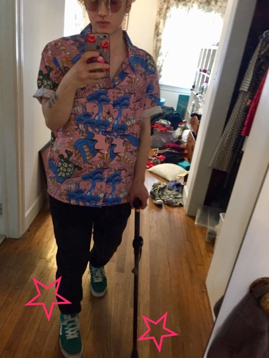
this is what standing normally with a cane will generally Look Like (it doesnt usually get much farther away from the body than this and stays pretty upright):
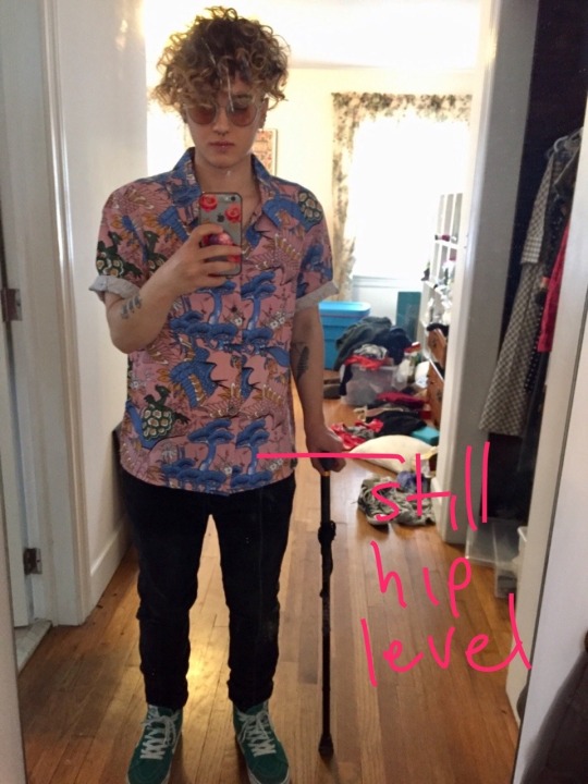
like it really does look almost awkwardly short but thats what its supposed to look like. the arm should be relaxed but not bent-bent, because thats when the back problems come in. its basically functioning as a third leg, so it needs to be the same length as the characters actual legs starting at the hip joint. it shouldnt change the characters posture unless theyre leaning really heavily on it like if theyre really tired, so it needs to be short enough that their shoulders stay pretty straight even when theyre leaning weight on the cane (sorry for the black cane on black pants lol i couldnt find my green one)
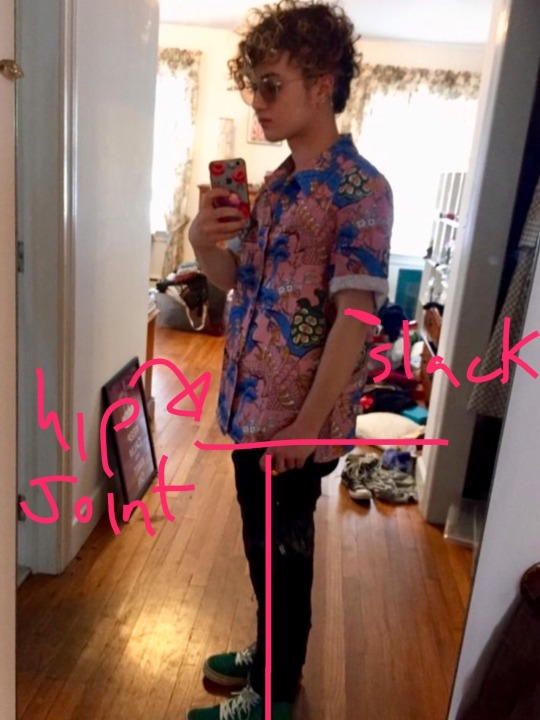
the cane goes on the side opposite whichever side needs support, which in hermanns case is his left, so his cane needs to stay in his right hand. some people switch depending on their needs at that specific time, but hermann never seems to do that. the cane stays on the ground for the same amount of time as the opposite foot and moves in tandem like That:
handles!:
ive seen a lot of art with hermann using one of those hook-handle canes, but this isnt the kind he uses. most people dont use those, because they get SUPER uncomfortable or even painful because theyre not at all shaped to the hand. his cane is solid wood with a handle similar to mine (below), which you can see most clearly in a couple shots when hermann is up the ladder for his chalkboard and his cane is hanging up on a lamp. not all canes look the same! try to find references for the specific character


if theyre standing up, their hand needs to be on the cane and the cane needs to be on the ground. for most people, the circumstances where they arent leaning on their cane are pretty specific and very brief, like if you need to get your wallet out of your bag and you need both hands free (and you either have an attachment on the bottom so itll stay upright, a wrist strap, or you veeeery carefully balance it on something, because it Will Undoubtedly fall over otherwise). burn gorman kinda misses this one a few times but the one that really jumped out at me was when hermann finds newt after he drifted for the first time, and he drops his cane on his way down to the floor. BIG ouch. until the character is fully seated, they need to use their cane (or lean on something else) While theyre getting fully seated. even when i have done something careless and hurt myself, its not because i did something like drop my cane right when im bending all my joints with a lot of pressure on them, because 1-muscle memory and 2-I NEED IT or else i probably wont be getting down on the floor in one piece. which leads me to the end of this, which is:
basically treat the cane like another leg, because thats basically how it functions both literally and figuratively. its the same height as the leg, it moves like another leg, it gives support the way another leg would, but mobility aids are also kind of an extension of the self, so disabled people generally are Really Not Okay with someone messing with or picking up or taking their mobility aids, because its really taking someones mobility and independence. ive seen a lot of art thats otherwise really cute that still makes me kind of uncomfortable because while im sure the artist just wasnt aware of this whole thing, its something that able-bodied people sometimes do in real life as a joke, and its really scary. if you treat it like a third leg, youve got your proportions pretty much down and you can avoid something that, in real life with a real disabled person, would unintentionally be Really Shitty and potentially put someone in danger. most of these things are pretty small and easy to miss if you arent used to seeing someone using a cane or using one yourself, but if you Do, when people get it right it makes a really big difference! i cant help noticing when things are a little off but i always notice when its drawn accurately
EDIT: i feel like a total idiot but there is at least one scene where hermann uses his cane in his left hand that i had missed (i was kind of in a grump over inaccurately drawn canes when there are already so few characters with canes so i made this post in a bit of a rush). the problem here is that its not really consistent with his kinda-canon disability based on some Bonus Content that i saw referenced on a wiki somewhere, which was his hip being shattered during a kaiju attack (tho ive mostly seen people writing him w their own disabilities). if he had an injury to A hip rather than a systemic issue, he would probably use the cane pretty exclusively in one hand because its only one side that needs the support, and the rest of him is fine. for systemic issues (like chronic illnesses that impact mobility), theres more of a likelihood that someone would switch hands depending on which side needs more support, but not always (i only ever used my cane in my right hand bc my left leg is consistently worse). this part kinda depends on the characters specific disability. sorry for the mistake earlier
#had to repost this bc i fucked it up the first time lol#not to be like Please Give Me Notes Thank You but ive been noticing this A Lot#and i think its just bc most ppl dont have much of any frame of reference for what someone using a cane actually looks like#So Heres A Reference#also apologies for the MESS the only full length mirror is in my moms room dkfjgh
203 notes
·
View notes
Text
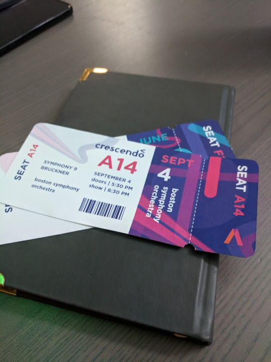
Inquiry 2 - “Crescendo”
Background
I am taking six classes this semester, and five of them deal specifically with art/design. Most of them have to do with the context and ideation behind art, and I really enjoy these because they provoke some interesting ideas. The philosophy class I’m taking, aesthetics, especially likes to deal with art as a way to portray things that you wouldn’t usually be able to - kind of seeing it as an alternative to speech for things that speech or writing fails to evaluate.
Although yes, most of these are about art, I find that there are a lot of parallels to the world of design. The obvious one is that design is visual communication, but I like to take it deeper than that. I’ve always loved putting meaning into my work on a deeper level, even in something as subtle as the colors (in some for-fun works, I made my name the hex color #bada55 just for giggles), and perhaps, for me, that’s where I find the art in design.
Anyway, these classes have prompted a lot of interesting discussions with friends of mine, and one of them led to us trying to paint a color without using that color - instead working off of how that color feels visually. Our pieces relied more on shape and composition, and it turned out to be a really interesting thought experiment and produced some pretty cool abstract works:
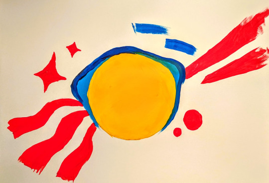
So imagine my surprise when the next day our workshop was to create something based on how music made you feel! I included this not to take away from the workshop, but because I think the color exercise was really when my concept for Crescendo began - how to make something visual in a way we’re not used to.
Concept
Conceptually I wanted this project to build on the aforementioned background, but doing that in a class about adventuring didn’t sound very challenging. Usually that means it’s time to seek out a more interesting angle, so I thought: why not make unconventional branding? Usually a brand has to be made with purpose in mind, but in a class about adventuring, surely it’s appropriate to pursue expressive and conceptual branding instead.
The Brand
Crescendo is what I called my made-up concert hall. I thought a music arena might be a good choice because usually they don’t need to advertise themselves too heavily - the focus is on the musicians visiting, because everyone has heard of the venue already. Crescendo is a music theory term meaning to get louder, notated by an angle bracket of varying lengths, so it seemed like an appropriate name and unique marker.
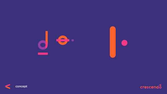
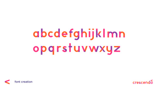
When we did do the “digital mixtape” exercise in class, I found that I reused a lot of visual elements, no matter how the song changed, largely transparency, lines, and circles. What I find interesting (and incidental) is that music notation is largely made up of the same. Most notes are lines and circles, with differing fills to notate length of the note. I decided to use these three design elements to build my branding, and this decision was made before the font was attempted.
Not Quite Futura
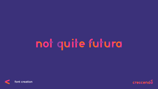
So believe it or not, this actually isn’t my first kind-of-a-joke font...
A year or so ago I partially designed a font I nicknamed “Discount Helvetica” for a poster about modern design. Neither font is really intended to be popular or necessarily a real font, but both allow for an in-depth personal study of how type works. At worst, if I ever do decide to make a real font, I’ll know from experience what details to pay attention to. Thanks to the first font being a much more complicated grotesque, I didn’t have a whole lot of difficulty with “Not Quite Futura.” Most of it was just shapes. Despite the name, this was not made by looking at Futura at all. The proportions were based on the serif Ovo, as it was still fairly rounded, but quite readable.
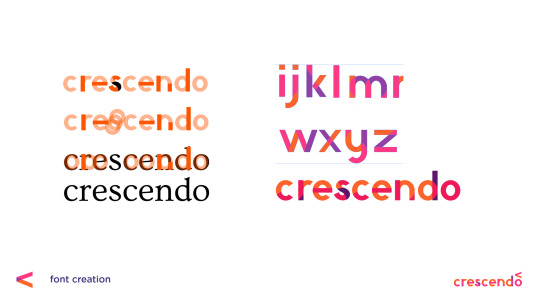
Once I did all of this, however, the transparency created by the shapes to make the letterforms just... wasn’t pretty. To some degree I had to pick and choose which overlaps to keep. The end font hints at how it was made, but it doesn’t give away everything, probably for the best.
Promotional Media
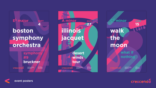
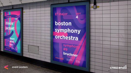
I don’t think it has been much of a secret that I love Josef Müller-Brockmann‘s work, and Swiss modernism in general, but that’s because it makes a lot of sense to me. The way this style portrays music has always resonated with me, so it was definitely a thoughtful decision to build off of that for my own work. Fortunately my color scheme and shapes and use of transparent layers definitely keeps the posters distinct.
It’s important also to consider the context. These posters are something I imagined hanging in a really large frame (much larger than the printed ones I could bring in to class) - the kind of thing you see in malls or subway stops. A viewer should be able to look at these and recognize an artist they love and the style of the concert hall.
While definitely this project didn’t seek to be especially conventional, it is worth noting that this strategy of eye-catching, but stylistically memorable posters is something I’ve seen in the real world before. In Melbourne, Australia, which I’ve spent a little over a month in, many of the train stations have poster campaigns that you get accustomed to. You do not even have to read it to recognize the “Dumb Ways to Die” train safety campaign. You see a cute figure being chewed on by a shark and remember to avoid that yellow line. It seems to function well there, so my choice in using a recognizable style over hitting the viewer in the face with the logo is based somewhat in experience.
The tickets turned out to be one of the most fun parts, which surprised me. There was something really satisfying about holding them in my hand, and they are definitely the kind of thing I would want to keep to remember a concert by. I did get a comment that they look kind of like plane tickets, but I think I will just attribute that to the fact that I’ve been in considerably more planes than concerts. ;)
Taking it Back to the Screens
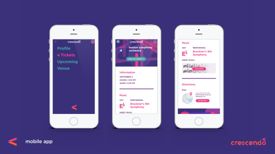
The great thing about conceptual branding as an idea, though, is that it can truly be applied to anything, including interaction, and that is an area I hope to explore in future adventures without question. To kind of illustrate the possibilities, I did a very brief mockup of an app to keep track of your tickets to Crescendo’s shows, but the point was more how this concept of line, circle, and transparency, can inform interaction elements, even the little things we might not think of.
A really great real-world example of this is the loading icon on Google Home’s setup app, which I will link to as I don’t think I can get the gif on this post. Those colors and shapes are all throughout their branding. They could have left the loading icon as some typical spinning wheel, but instead took the opportunity to make it something personalized that still reminds the user of their identity. That’s the world I tried to step into, and why I think simplifying branding down to shape, opacity, and color has an appeal. You can do a lot more with branding that starts simple than something that is confined to a logo. Probably something to keep in mind for the identity systems class next semester.

In this screen you can kind of see how my branding is influencing the hamburger menu we’re all so used to. Firstly I made the hamburger a little more rounded. There aren’t many squares in any of my brand materials in this project, so I tried to round out the form without losing the idea that it’s a menu. I also had the idea that when clicked on, interactive elements would then gain color and transparency, kind of like how music comes to life when someone touches an instrument.
Looking Back
Did it work? I will admit (and hopefully this doesn’t shoot my grade in the foot here) that this isn’t something I’m most proud of. I think I can do better, but I had one week and I think sometimes the deadline requires choosing a less-than-inspired idea.
However, I don’t think the experience wasn’t valuable, as I learned and thought about a lot along the way. There are aspects of interaction and conceptual unification that I had never considered before that got to be explored. I got to practice with designing a font, and further embed conceptual elements into that. I have really flashy tickets to concerts that don’t exist. Oh, and it was fun? Even if I wasn’t in love with the idea, there were lots of new things to explore along the way as I fleshed it out anyway, and I think that’s really the point.
As for if it is effective or not, I think it’s cool that most of the people I asked who professed to be really into music said the concept resonated with them visually.
1 note
·
View note
Text
8 - Guiding Bolt
Kreet lay awake in her cell for a long time that morning before finally succumbing to nervous exhaustion. Becoming an officially recognized Acolyte was reason enough. Knowing the Abbot supported that decision was even more inspiring. But for all that her mind kept straying back to that kiss. She realized that, as much as she had learned from Ka'Plo and her time here in the Monastery about humans, she knew shockingly little about their social life outside of the Cloister. Being raised in what was essentially an all-male institution certainly didn't help. There were certainly other boys here besides Brand and Karl, but she didn't spend much time with them. There was a sort of bonding between the three of them since they'd all been outsiders. But they were all too young to really care much. Their lives were essentially tied up around avoiding getting punished and unbridled play when they could get away.
But now she realized just how much of an outsider she really was. She looked down at herself. She'd never given much thought to just how different she really was from everyone around her. She'd seen pictures of kobolds and knew her body would start changing soon. Her hips would widen to the ridiculous proportions she had seen of the female kobold shape. Her tail would lengthen. Her horns would continue growing. She would lose the inherent cuteness of her youth. Standing only 3 feet tall, at best she might grow another foot. The boys were already much bigger than she was, and that difference would only increase.
Why had he kissed her? The hug was clear enough. It was a comforting touch, meant to reassure her that she was important to him. But she had never been kissed before, by anyone! Sure it was just a peck. Insignificant really. Just an expansion of the hug, she felt sure. It wasn't even a gesture that was universal. Only humans and others with similar facial structures kissed. Her kind certainly didn't! But she had read enough to know it was a significant action for them. It both bothered and delighted her in ways that she couldn't understand. But she did understand one thing, the Cleric and the Abbot were going well beyond their Rule in allowing her to become an Acolyte. They saw potential in her, potential worth breaking that Rule for. She swore to Pelor that she would do her utmost to see that the potential would not be wasted. She would do her very best to become a true Cleric.
----------------
The days after that were hectic. She didn't spend much time with Karl and Brand, though she did go with Brand to visit Karl as he was recovering. But she poured herself into her studies. During her formal class time with the Cleric she remained focused and only rarely did she find herself looking at his eyes and beard rather than the topic at hand. She also learned that being a Cleric was more than healing spells and magical wards. The purpose of a Cleric was to go out into the world and assist Pelor in bringing Light. She understood now that Light was a euphemism for Good, and that she could support wholeheartedly. But the Cleric also pointed out that she had another goal as a Cleric. She would also be an ambassador for her race. Her diminutive size would never inspire fear, but if she kept herself on the right path and did Pelor's will, she could show the world above that the kobold was not necessarily a creature of evil.
As part of the training to be a Cleric, she must also become proficient in Martial Arts though. Experience with blunt weapons was assumed of a true Cleric, but she found the training difficult. Her mind was keen, but her body just didn't fit the regimens that were ascribed to the human cleric. In this area both her and her tutor were treading new ground. Weeks went by, but try as she might she simply could not muster the power or finesse of wielding a weapon more complex than a solid shaft.
The scaled skin of a kobold did not reveal brusing like human skin did, but she certainly felt them anyway as she trudged to the training area where the Cleric awaited after breakfast one morning. This was the day dedicated to physical training and she was not looking forward to it. She felt sore in a dozen places since the last training. Worse yet, she still was only training against a straw dummy. She had not dared to spar with Brand yet, and Karl was still limping from his fall. As she passed within the low stone wall that defined the training ground, she saw the Cleric sitting and meditating within. She headed to the weapon rack and took down her shortened stave, sighed, and began stretching exercises.
"Kreet, I've been thinking..." her Master said through closed eyes.
She halted her exercises and walked over to him. "Sir?"
"Do you know why we practice in the Martial Arts, Kreet?" he asked, opening his eyes.
"To defend ourselves and others when we begin our Apostlate," she said, practically quoting from one of the handbooks.
"That's right. We could do little good in the world if we got ourselves killed the minute something attacked us. And things will attack us. Besides the minions of Darkness, simple wild beasts, marauders and bandits are everywhere out there in the wider world."
"And they would kill me on sight," she muttered, looking down at her clawed feet.
"Kreet, I'm not going to lie to you. They would. You will always be well-advised to stay with a group out there. You need to know how to handle some weapons anyway. But I think maybe we've been going about this all wrong. I've been trying to teach you human tactics which work well for humans. But they are perhaps not the best for a kobold like yourself. Perhaps we should try to learn kobold tactics instead. What do you know about kobold fighting?"
Kreet had brightened up until that last question. "I'm sorry, Sir, but I was very young when I was taken out of the caverns. I never learned anything about fighting. I've read all I could find about kobolds in the library, and Master Ka'Plo's books of course. But they don't say much about actual fighting. They go into great detail about some of the kobold traps, but it seems like when it got down to actual fighting, kobolds are just berserkers."
The Cleric nodded agreement. "Which isn't a very good tactic when your biggest fighters are only four feet tall. Nevertheless, Kreet, your Creator gave you some pretty impressive weapons given your size. Those teeth are not just for chewing up potatoes and beef. I notice you've been filing down your claws too. Stop doing that. You're not a human and those are superior weapons you should keep honed. I've seen how nimble you are with them, and I notice they are partially retractable too. I've no fear you'll accidentally hurt someone with them."
"No Sir. I just... I didn't want to stand out too much I guess," Kreet explained sheepishly.
The Cleric put a hand on her shoulder, "Sorry Kreet. But... you will stand out whether or not your claws are filed. And then there's your foot-claws. Kreet, those are deadly if you learn to use them."
Kreet, who had been sitting before her Master, lifted a foot and looked at it. The modified sandal had been cut away to make room for her claws. "My feet?" she said, contemplating the massive claws there.
"Obviously. Let those claws grow back out again too. Kreet, those are your best weapons. With them and your massive legs behind them, you could eviscerate the most powerful wild animal. They won't pierce armor, but there's always a weakness somewhere you can exploit if you need to get physical with an opponent. Primarily you should avoid that, but you won't always be able to. Today we're going to work on ways you can best use those weapons. And I'm going to armor myself because once you've gotten good at their use, and let the grow back to their normal size, you could really cause damage."
Kreet looked back at her foot and wiggled her massive 'toes'. She smiled, just a little.
-----------------------------
From that day on, she no longer dreaded the Martial Arts training. After a few months her claws on her hands and feet had recovered their natural shape and sharpness. For his part the Cleric took his knowledge of the hand-to-hand Martial Arts techniques and tried to expand it to accommodate both the benefit of a strong tail and the detriment of short stature. He also implemented some moves the Dwarves had perfected, which turned shortness into a benefit. The training was still tough, but now Kreet felt it was a type she was comfortable with. Her legs and tail grew ever stronger.
However, her friend Karl had not grown stronger. As days became months it became clear that the limp that he had gained since the fall was not going away. The other boys had begun to call him Karl the Gimp behind his back and, on occasion, to his face. Not Brand of course, but neither Brand nor Kreet could be around to defend their friend at all times of course, and boys can be hurtful at that age.
"Why didn't you just let me die?" Karl confessed one day when they were alone in their secret treehouse. Brand had been unable to join them that day so it was just Karl and Kreet this day.
"Karl, they're just saying that to bug you. You know that, don't you?"
Karl turned to her, tears in his eyes. "I know it, but it works damn it."
Kreet scooted closer to her friend and wrapped an arm around him. "They call me Gator you know," she said, trying to comfort him.
Karl snorted and looked down at his friend. "Kreet, We call you Gator too!"
"I know. But you are my friends. It's different."
"I don't think I'm going to be a Cleric, Gator," Karl said, laying back against the wooden floor. "I'll never pass the Physicals now."
"Of course you will Kay," Kreet responded, using their nickname for him. "You're the best Acolyte of us all!"
"Except for the Martial Arts. I saw you the other day in the Training Ground. Kreet, you're incredible!"
"Aww, you're just saying that because you love me," Kreet teased.
"No, really. That high kick you did with your tail. That was really something!"
"Well, thank you Kay. But I hear you can do the Guilding Bolt already!"
Karl wiped the tears out of his eyes, which suddenly sparkled with Mischief. "I can! Wanna see?"
"Really! You really can?"
Karl nodded triumphantly.
"Prove it!" she challenged him and he stood up and walked to the door. Kreet crawled beside him, head between his legs and looking out to see the fabled Guiding Bolt spell. Outside the only thing visible was the leaves and branches of the trees around them. Their treehouse was very well placed, deep in the woods that grew beside the Monastery and as of yet had not been discovered by anyone besides the three who built it.
"What should I hit?" he asked, looking down at the snout poking out between his legs.
"See that black tree towards the left? Hit that!"
"You got something against that tree Gator?" he snickered.
"Sure, it's a Guiding Bolt magnet! I hate that tree. Kill it Kay!"
The boy closed his eyes and concentrated, then he opened them again, serenity on his face.
Nothing happened.
"Wait, wait... I gotta get my head straight. Gator, could you move your head. You’re distracting me.”
Kreet moved to his right and poked her head out between his knee and the door edge.
“Now, let me try again."
He repeated the ritual, hands outstretched towards the tree. When he opened them, a blinding flash of light leapt instantly from him to the tree, breaking the trunk with it's force halfway up it's length and parallel to their treehouse.
"WHOA! Did you see that?" Karl asked, impressed by his own magic.
But Kreet did not see it. Kreet was completely blind.
"Kreet! Are you alright?"
"Karl, I can't see! Are my glasses still on?"
"No, they came off when you fell back. Here," the boy said, putting her glasses in her hands, his beginning to shake. She put the dark glasses back on, but she was still completely blind.
"Oh shit," she said.
"Oh shit is right! Maybe it will come back after a while."
"Sure it will. Let's just... wait here a while."
They waited as the afternoon wore on.
"No, it's alright, I'm not really a girl anyway. Not like you mean." Kreet was saying. She was keeping her eyes closed, hoping that would help them recover. It also let her forget about her blindness for a while and not panic.
"Yeah, I guess that's true. Anyway I was taking my clothes to the laundry and she was in that side room - you know, the one with the bath?"
Kreet nodded. Of course they all knew every inch of the Monastery and it's grounds by now.
"Anyway, she was in the bath with the door wide open!"
"Oh wow! Did she see you?"
"I think so, Gator. I think she left it open on purpose!"
"So..." Kreet led him on, "...go on! What did you see?"
Karl held his hands under his breasts, but then realized Kreet couldn't see him.
"Her jugs! I'm telling you those things were as big as melons, all bouncy and stuff!"
"Wow! Did you see the nipples!?" Kreet asked, every bit as interested as the boy.
He nodded, but again remembered she couldn't see him. "Yeah! One anyway. Pink as your tongue!"
Kreet sighed. "I'll never have nipples. I wonder what it's like?"
"You'll never have a dick either," he said.
She estimated where he was and slapped him hard with her tail. "Guess what you’ll never have?" she snickered.
"OW!" he cried.
"It's getting late. They're going to start wondering where we are," she said.
"Want to try it again?" Karl asked hesitantly.
She nodded and put the sunglasses on. This time she also covered her eyes with her hands. Then she slowly opened her eyes.
She saw nothing.
She looked up at Karl, or at least where she thought he probably was. "Nothing. Karl, I'm scared," she admitted.
"Me too, Kreet. I'm so, so sorry! I didn't think about your eyes!" he cried.
"I didn't either," she cried along with him.
They hugged and cried together, Karl repeating "I'm sorry! I'm sorry!" while Kreet tried to comfort him, but it was hard to comfort someone else when you’re panicking yourself.
Finally, though, they had to get down. Karl guided her and held her hand as they found their way back to the Monastery.
-------------------------------
2 notes
·
View notes
Photo
I ❤ Comics
Because I’m so incredibly creative, this month of Year of the Pony has been all about lurve. All kinds of the stuff! Self-love, romantic love, familial love, and, of course, some good ol’ fashioned friendship/platonic love.
But, we all know there’s one love to rule them all: dorky/fanatic love!
The obsessions and ideas that rule our hearts and, in MLP’s case, drive us ponies.
As much as I don’t want to take all this too seriously, this kind of love really is something special. For many of us, it’s the reason characters stick with us for so long, through any kind of mood you can imagine. It’s why we get lost in fantastical worlds on our screens and pages, and come back feeling like we’ll never forget the adventure we went on. It’s common ground to socialize in if we wish, or a quiet comfort that yours and yours alone.
These things mean so much to us that it becomes a part of our identity. I’m a Brony, I’m a Rainbow Dash fan, I’m a this that or the other. We want people to see us for things we love because we’re just that proud of them. So long as there’s a healthy dose of perspective in the mix, I think that’s a good thing.
And one of the nerdiest, if not the nerdiest MLP topics I could think of to geek out over is the official IDW comics (the Enterplay trading cards, Star Trek cast members voice-acting for the show, and upcoming table-top RPG, Tails of Equestria, obviously deserve some honourable mentions here, but the comics just gave me more to talk about on a technical level)!
I figured the best way to go about this would be to go by artist (sorry colorists, letterers, and editors; you’re necessary and appreciated but apparently not glamorous). Last month, when we dove a little into Design and Animation, I didn’t really get to talk about the teams behind the work---which is mostly because MLP is a script-driven show as opposed to a storyboard-driven show, so the same animation teams and the same style goes into every episode (unlike Steven Universe, for example, which is ‘board-driven)---but here, who’s working on a comic makes a massive impact on how it’ll turn out.
With that said, we’ll stick to the most reoccurring artists (and gloss over the writers to save on time); if you’re ever curious, you can check out this page on the wiki for a full list on who did what, but I really ramble on too much as it is.
Artists
Here’s a big name! Andy Price, the man with the shadows and long, bendy pones. Price excels a quite a lot in terms of expression, and I think it’s because he adds such a sense of drama to these characters without taking away the cuteness or light-hearted personalities we’ve come to love.
If anything, he’s gotten to add personality, especially to characters like Celestia and Luna who express their emotion much less visually in the show. Just take a gander at the sketches he gives out at conventions!
And as to the shadows, look at how involved the shading is in these inked panels:
Just look at how much of his panels are darkened, and just how much more dramatic it looks than it would with flat or lightly shaded colours.
Even a simple scene can benefit from Price’s style:
See where the shadow draws your eye (even when the shot is coloured)? To the sinister looking rat emphasizing the books, to Sunset, and to the shocked librarian who would know these books best. If you’ve read this issue, you know Sunset’s reading some books she’s really not supposed to---and in fact this is what leads to her downfall.
It’s a simple panel, there’s not even a lot of dialogue on the finished product, but you can tell Price uses shadows to compose his shots in a way that tells the story visually.
Also, a word on page layout (this isn’t necessarily exclusive to Price, but since we’re talking about layout in terms of one panel...):
This is one of those things that I had a hard time finding a place for in this post that I would kick myself for if I didn’t talk about. It’s something exclusive to the medium and something that’s extremely impactful (as comic fans know).
It’s the flow of the page. How your eye moves from one panel to the next, and how different movements are expressed.
Price is one of the many MLP comic artists who do this effectively. In the first example there, you can see how the emotion shifts as we go down the page, how Celestia’s mane both transitions us into the next panel, and seems to hide her reservations from Sombra, Luna, and Starswirl.
And in the next example, there’s this wonderful transition mid-panel at the bottom there that takes us from the interior of the train to an exterior shot outside of it for Applejack’s final line of the scene.
It’s things like this (and even the layout of the word-bubbles, because those take a surprising amount of consideration to place in a panel) that shows you the artistry and thought behind these comics, and Price’s art in particular.
A personal favourite of mine, for sure.
What’s special about Amy Mebberson’s art-style is how it’s tweaked just so from the show, but certainly stands on its own as it draws emphasis to the roundness of these designs.
You’ll probably notice the simplicity of Mebberson’s designs, especially compared to someone like Price, but look how that works to her advantage:
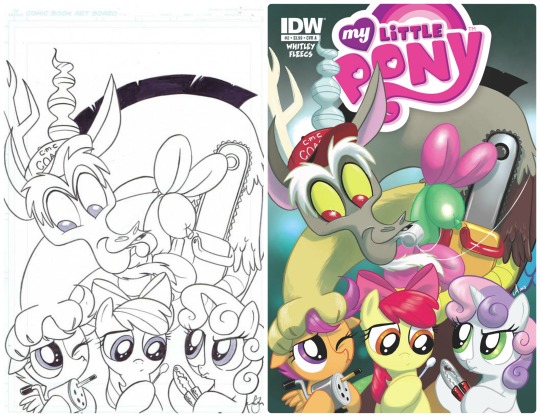
Check out how close to the show it is, but just a touch rounder. Cute, right? The eyes are cartoonishly big, the heads closer to perfect circles than we normally see even in a 3/4 angle shot, it just brings your attention to how sweet these characters are.
Then there’s the fact that her work will often be coloured with a really soft, soothing texture to boot:
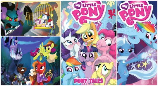
That powdery softness only makes these ponies cuter---and here I thought they had laws against that kind of thing!
Another awesome big player!
The thing about Hickey’s art is that it’s often coloured so that the manes are especially shiny, making the characters draw focus and pop off the page.
And even when things aren’t especially shiny, she still often finds ways to use the background to emphasize the characters:
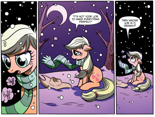
(Underrated moment in the comics award might have to go to this, by the way)
It’s a very simple snowy scene, but that matches the tone so expertly, so isolating Applejack, her breath, and the snow is an excellent choice to get the emotion across.
And when things are glossy, it strikes me how energetic the characters can still look.
When things look this polished, the worry tends to be that you might make the characters look stiffer, but Hickey’s style strikes such a great balance between polish and flexibility.
This art style comes with its pros and cons, in my opinion, but it can still serve MLP pretty well. Garbowska’s art is often coloured as if with coloured pencils, which gives everything a really soft, soothing finish, and in addition can make for some pretty cute pones.
The downside is two-fold: The characters can seem like they all have Same Face syndrome, if you know what I mean; and the ponies are often posed in needlessly anthropomorphic poses (we’ve certainly seen a few more human-like poses throughout the series---yes, Lyra, we love you, you oddball---but there are some poses that just seem uncomfortable and [to use a slightly redundant word] unnatural for them to want to be in).
Still most definitely a great part of the team, just with a few quirks that come along with the sweetness.
Welp. Guess I couldn’t steer clear of controversy entirely. Jay Fosgitt’s art style in and of itself is divisive among fans---like, really divisive.
The reason being the drastically different shape to everything. Compare a Fosgitt head to a Mebberson head, for instance, and you’ll see there’s a lot more emphasis on the foreheads and cheeks than on the muzzle or an overall roundness.
It’s a very distinct style that comes with its advantages and disadvantages. Fosgitt’s not afraid not go for some extreme expressions, for instance, and that can really serve the story well in chaotic and/or comedic situations, but he’s also had that same problem of putting ponies on their hind-legs when it doesn’t seem organic for them to do so, and combined with the proportions exaggerated the way they are (like sometimes I don’t know how those necks keep their heads up), that can make for an off-putting panel or two.
It’s definitely cartoony. I’ve never been able to place exactly what artstyle it reminds me of, but cartoony is a good word. It’s grown on me, personally, especially considering the improvement from issue to issue, but I thought I’d mention this never-ending debate so you could make up your own mind.
Tony Fleecs is a great addition to the team. He’ll often give the eyes a point or just a different shape, which takes some of the cartoonishness out, but still allows for some great expressions in a way we don’t normally get to see, with our bulbous-eyed characters.
It can especially work if he’s trying to capture something menacing:
So, I think he’s among the better ones.
On the other hand, there have been a few times Fleecs’s art has lacked depth solely because of how things are shaded, like here (I can obviously tell where everyone is in relation to each other, but it’s flatter than if there had been some shadows to it):
But overall that feels more like a nitpick.
Now, we’d be here all day if I started going into all the cover artists (as much as we appreciate their work), but there’s one in particular that’s done enough that I’d feel remiss leaving her out.
Sara Richard is a good name to know because once you know it, you’ll always be able to point out her art. She’s got some of the only traditional art in our little roster, and it’s often got some gorgeous swirls. So many swirls.
If I wanted to be crass, I could call it colour and swirl porn... so I will. It’s colour and swirl porn, and I love it.
Writers
To preface this section, I’d like to take a moment to steal a catchphrase from the ever insightful MovieBob, previously of Escapist fame: comics are weird.
Really, even the best and brightest of the medium will occasionally have some really out there arcs or issues. For every intellectually stimulating, deeply meaningful story you can tell with these characters, there’s a silly rendition of them that’s just... odd. The same Batman who comes to grips with the death of his second ward, Jason Todd, is the same one who later owns a Batcow, thanks to his son Damien.
Yes, Batcow is canon.
So, if genre-defining superhero comics have been known to divulge into stranger stories from time to time, it absolutely follows that we’d see the same from colourful, pony-based children’s comics. Basically, that shark-jumping weirdness just... comes with the medium.
You can make all sorts of arguments about the origins of that oddness---the creative freedom available, attention-grabbing to boost readership, the Comics Code Authority heavily censoring violence and delinquent behavior in the 50s and 60s which forced writers to come up with tamer but also more creative stories, etc---but one thing is clear, if you’ve noticed some interesting choices mixed in there, it might just be a comic book thing.
But, then again, there are also issues that go way more in depth than you would think!
In particular, I have to make mention of my absolute favourite arc (I never claimed to be unbiased): Reflections. For the details, the comedy the lore, the immaculate world-building, and the emotions---but most of all the character-building.
Starswirl is an absolute delight, the good King Sombra breaks your heart, Twilight faces exactly what I wanted her to face once she became a princess, and the Princesses and their sisterhood get to be developed even more here than they have been in the show (especially Celestia; here’s hoping season seven really will break that streak).
Okay, example time.
Here’s a detail that was just pointed out to me recently that really nails all of this on the head (and granted, I don’t know whether this came from its writer Katie Cook, or the artist Andy Price, but if nothing else it shows you what they can do together):
Two silent frames that tell us so, so much.
It’s a simple idea, that these parallel universes have developed in different ways, but that tells us so much about why Equestria’s technology is the way it is. Having the power to jump to more technologically advanced universes has allowed our Equestria to be as anachronistic as it has been---to have arcade machines and silent movie theaters, but not automobiles or light bulbs in common use.
But this is what the comics can do: contextualize.
Take characters and worlds we love and expand on them in new lights. Some weird, strange, or just cute for the sake of being cute, but some more involved and some even inspired.
The comics, overall, can be pretty divisive in this fandom. There are fans who frequent them for every new issue, and those who have sworn off them entirely. Artists and writers we revere and some we outright revile. But when all is said and done, being able to take on this new perspective of MLP in an entirely different medium is something I for one really appreciate---especially when it’s this good.
Here’s some more pony analysis for you! The whole compilation post here, or three of the latest/most relevant, just for you:
EMLP: Design & Animation, Pinkie Pie’s Editorial, and Top 10 Cutest Families
Year of the Pony
Header Image and Art Wouldn’t be Possible Without...
Luna and Celestia by dSana
Elements of Harmony by SpiritofthwWolf
Elements of Harmony by TechRainbow
There’s of course all those great comic artists and writers to go check out, but aside from the official art in this post, there’s some hard-working fan-artists who made some stellar vectors! Check ‘em out!
Love Me Some Comic Books
#IDW comics#yearofthepony#mlp#my little pony#friendship is magic#my little pony comics#mlp comics#mlp:fim#mlp: fim#My Little Pony: Friendship is Magic#twilight sparkle#rainbow dash#rarity#fluttershy#applejack#pinkie pie#spike#spike the dragon#princess celestia#princess luna
18 notes
·
View notes
Text
Spotlight #15 - Queenofcats17 (Fiona)

Tell us a bit about yourself:
I’m Fiona, just an awkward potato trying to navigate the world now that I’ve graduated high school. I really like science fiction, fantasy, and anything to do with gods/angels and demons appeals to me, hence why I’m involved in this fandom. I’m a writer and an artist and those two things are my favorite things to do in the world. Although I appear small and adorable, I know I can have a bit of a temper and a less than clean vocabulary. But I try my best to be friendly and inviting, because I believe most everyone deserves kindness.
When did you get into the fandom and how did you stumble upon it? I think I’ve been here since the very beginning. I found the comic when I was scrolling on Tumblr and found the original thing Orange did. After that I was pretty much sold, because demon and forcefully cheery girl? That’s my jam right there. I didn’t get into the fandom until recently when I discovered the fanworks blog. After that I immersed myself in all the fanfiction and art. The people in this fandom are so talented and have such amazing ideas. Then I wrote a fanfic and people seemed to like that, so I continued.
Who are your favorite characters/pairings?
Like pretty much everyone, I think, I ship Natan. My favorite character is probably Natalie, due to how much I relate to her. Uriel is also a favorite, as is poor Michael Pangakos. I find I like the whole cast, with the exception of Jericho because fuck that guy. Oh, and other pairings I like are probably Kristi/Michael, Laila/Felix, Ganthea, Uriel/Raphael, Zadkiel/Yup in a cute platonic family way. If anyone can make Zadkiel less stabby it’s probably that child.
Favorite moment in the comic?
My favorite moment was probably when Natalie freed Luci from Hell’s grasp and he was just so damn happy. I just loved seeing that big smile on his face and how absolutely giddy he was. For once he seemed genuinely happy. It made me feel all warm and fuzzy inside. I do enjoy the occasional warm fuzzy in between bouts of soul crushing despair.
What is your biggest inspiration as far as your art (and/or) writing goes?Probably the books I read for writing and a lot of mangas for art. Not to mention the various Tumblr artists that make me want to get better. But books and everyday life always give me so many ideas and I can’t get them out of my head until I have them written down. A lot of my ideas come from books where other people depict angels or demons or gods, or I start thinking about something random and it suddenly makes sense to make it a part of my story.
What would you say is your favorite piece that you’ve done so far?
I’ve only done two pieces so far, but Valentine’s Day was by far the most popular. I was really pretty surprised when I saw it had gotten 32 notes. It might be more now. I do like my bootlegger fanfic though. Even if I never finished it. ^^” But I love both of them equally. V-Day was more lighthearted, meant to be a pick-me-up from the emotional trauma of the recent update.
What would you say is one of your favorite things to draw/write?
The things I love to write the most generally pertain to angels, demons, gods and the like. All those things tend to fascinate me, and I enjoy seeing just how human I can make them. For drawing, I tend to draw my characters, and even then it’s mostly girls. I find girls a lot easier to draw than guys for some reason. I taught myself to draw using Tokyo Mew Mew so my style is anime.
What do you think influences your art/writing style?
For art, I’d definitely say the mangas I read. Since I taught myself to draw using manga, like Tokyo Mew Mew, my art tends to be influenced by it. I often use mangas to practice different styles or different eye shapes or something. They’ve also been helpful in figuring out proportions and the like. As for writing, I’m definitely influence by writers like Jim Butcher, Neil Gaiman, and Terry Pratchett, because they’re what I grew up reading. I think I learned and adapted my style based on what they wrote and what I thought sounded good in what they did. I want to immerse people in my work, I want to be descriptive. I want people to enjoy my work and be just as excited about it as I am.
What are some of your hobbies you enjoy?
I like writing, drawing, reading, swimming, and of course anything to do with cats. My current blog is actually one I made after making an RP blog for one of my OC’s, (askthedemonhunter), who happens to be Jack the Ripper as a girl and a demon hunter. I’m weird, I know. I also like watching crime dramas in my spare time, like Bones, Criminal Minds, Elementary, Major Crimes. I especially like Criminal Minds because it goes inside the minds of these people and figures out what makes them do what they do. I love a good mystery. While watching these shows my cat will often just jump on me and sit there, so I will generally pet him so he won’t meow at me. He’s a whiny baby.
Before joining SaM, what was a fandom you were part of and are there any fandoms you’re into outside of SaM?
I was into Gravity Falls, Pokemon, D. Gray-Man, and D N Angel prior to SaM. Also Supernatural, but that was in middle school and the less we talk about my middle school time the better. I’m still into Gravity Falls and Pokemon, but I’ve also gotten into Miraculous Ladybug, FFXV, Steven Universe, My Hero Academia, Undertale, and a lot of others. A LOT. ^^”
Is there anything else you’d like the fandom to know about you or anything you’d like to say to the fandom as a whole?
I think this fandom is just so talented, and I’m really happy to be among such amazing and creative people. Not to mention it’s awesome to have an excuse to be able to explore my fascination with demons and angels and compare how other people’s interpretations compare to my own of these creatures. You guys are great and I appreciate all the support you give to writers and artists.
Check out their writing tag below for other awesome pieces!
http://queenofcats17.tumblr.com/tagged/fanfiction
11 notes
·
View notes
Text
The Body Positivity Movement
Or the Ashley Graham Effect.
Recently, Ashely Graham went undercover on Undercover Boss: Celebrity Edition, in order to help out some deserving people she’d found through social media that were plus sized and wanted to be models, run non-profits and do dance. And I’ll be honest, I don’t watch a lot of Undercover Boss, in fact the last one I watched was the Bridal Store episode, you know, the Bridal chain that has subsequently filed for bankruptcy and gone out of business. Most of the episodes don’t interest me.
Watching Ashley Graham go undercover into the fashion world was a cringe worthy experience. She knew what she was getting into. She knew exactly what she was getting into and she still (hopefully mostly for the cameras) got a bit cheesed off. I admire her grit and tenacity and applaud what she’s doing, even if it’s a big disingenuous for her to be going on something titled “Undercover Boss.” Because the open call she went to at the model agency, she didn’t own that modelling agency. She couldn’t walk back in and rip that guy with the European accent a new one about representation and that’s not the way we do things here. Not in 2018.
Ashley Graham is at most a major influencer (she’s been on Top Model, they’ve made her into a Barbie and so on.) The most that showing that on National Television will do is hopefully shame that agency into rethinking their policies. Because that agency and that policy of not hiring plus sized models is the normal and not the exception.
Being a “body positive” or “body inclusive” company has been more of a marketing campaign for a long time. (Does anyone else remember that Dove soap campaign?) Rather than companies trying to honestly and realistically include and embrace a large group of people as their customers. Instead, they’ve been focusing on the small side of dead center. (Petite being another major ignored group of people. And if you’re plus sized and petite, yeah, um, you don’t exist to the fashion world.)
It’s hard for me to take this “movement” seriously when I get texts from my best friend about not being able to find clothes that fit at popular middle priced chain stores. I see it as a gimmick when it only brings up “embracing” every size instead of also pointing out there may be underlying causes to “every size” such as PCOS. When I know the reasons that brands aren’t “inclusive” because of numbers on a spread sheet.
The biggest cringe is that this has been going on for decades, in fact, we’re getting close to 50 years since Twiggy became a popular super model and changed the way designers and magazines thought about how fashion was presented on the runway and in fashion images. This isn’t the first time that the idea that designers don’t know how to work with normal or plus sized people has been exposed on public television. It’s been shown repeatedly on Project Runway and all other fashion programs like it. It’s been going on in America’s Next Top Model. And we’re finally, after over a decade of this, making some headway that models being 5 foot 11 and a standard size 6 is not healthy.
(I’m 5’2” and a standard size 4 on top and a 6 on bottom and let me tell you, I don’t always feel healthy! I’ve been mistaken for a model plenty of times and I go, “uh, I’m 5’2”, far too short. Sorry.)
My first real experience with this that sank in was over a decade ago now when I went to the Academy of Art and took my second Fashion Business class. (I had one at Bluffton Uni and it wasn’t named the same thing so I had to waste 3 hours of credit time and take it again.) Bluffton was a Mennonite small country college. Most the girls there were from Middle Class Christian Homes. (Yes, that’s all caps.) Going to the Academy, I met a completely different class of people. We were asked 2 questions that stuck out to me. One was “What is the STANDARD average size of the American consumer?” And the second was “Does anyone know what NASCAR is?” (This was around Cars so there was and wasn’t an excuse.) I knew the answer, second class after all (the first class at least wasn’t so far off in guesses,) the other girls didn’t and they didn’t know what NASCAR was either. The answer, over a decade ago was a standard size 12, btw. We are probably up to a standard size 16 for average, maybe an 18.
Marilyn Monroe was a standard size 12. I’m talking US standard 34, 27, 36 Bust, Waist, Hips in INCHES. (That’s 97, 69, 93 for you metric people.) The US does their sizing by 5cm increments, Europe by 4 to 6cm increments. But regular people don’t really fit these pretty measurements. They’re usually bigger on bottom than they are on top and thus a different size. (Despite all sizing done for brands being done to your BUST measurement. Funsies huh.)
Being from an upper middle class home in the middle of Upstate New York where the only more “country” you can get is to either a) live in a trailer park or b) live in the middle of nowhere. I was the ONLY one in that class to know what NASCAR was because that was Sunday afternoon for most my neighbors and my father’s friends. (And football, let’s not forget football. Then there’s hunting, snowmobiling and… fishing.)
My point is that a lot of fashion students and many fashion designers have no clue at all about the average American consumer and fashion programs are not engineered, designed or even remotely plugged into educating designers on how to design clothes for the “average” market. Despite the lip service to “average” size in my fashion business class. (Blocks were made to standard size 8, probably would have to redo them for size 6 later. Croqui fashion sketches were 9 heads tall and very thin with broad shoulders and no hips.) They’re isolated either by income class or being so down the rabbit hole of fashion magazines and imagery, they’ve lost sight of our Wal-Mart and Target standard consumer if they knew it to begin with! (Oh, Paris Hilton.) And if you want to see this in action watch any episode of Project Runway that involves “real women” and prepare to whimper or scream at the television.
People like Christine Hunsicker who started Gwynnie Bee that has clothes from size 10 to 32 (and now 0 to 32) are rare in the fashion industry. She’s fulfilling a niche that is grossly under served. Seeing her on PR: Fashion Startup was a breath of fresh air. When Project Runway put models of all sizes into the program, it was overdue! (Thank you Tim Gunn!) And the reactions to All Stars that was filmed at the same time, aired after that model inclusive normal seasons and didn’t have models of all sizes was telling. Viewers wanted to know why Project Runway looked like they were taking a step backwards.
Which was great, it was really great to see that reaction. It was amazing to see how much the audiences loved the different sized models.
(PR:AS weren’t, it’s just television fantasy that made them think that because of how filming a show works. No one at Project Runway was certain how the all sizes of models was going to work out with general audiences. They wanted a test run to see how ratings would do. Now, it's moving back to Bravo with the original producers for 2019. Fingers crossed!)
Back in the 1950s, when Marilyn Monroe was popular, fashion models were closer to Victoria Secret sized models than Twiggy (of late 1960s and of the 1970s fame.) Yes, the styles of the 50s did emphasize larger proportions more if not balanced correctly. But everyone wanted to be size 12 and have curves. And yeah, this is coming back and it’s a good thing. Being healthy, having realistic proportions, less photoshopping, less unrealistic expectations on both girls and boys. I am down with that.
The sad part is now, 50 years later, size 12, yes, TWELVE is considered “plus size” and thus, an entirely different fashion market than regular clothes. (Though some of this is due to vanity sizing and not standard sizing.) Many brands don’t want to go into plus sized clothing because it’s a huge material expense, despite the fact that if they provided cute, fashionable clothes to the plus sized market at a decent quality, they’d have a huge customer base.
(Clothing quality is going to be another blog post sometime. I hear this complaint a lot.)
Designers are going to have to be retrained. Design programs are going to have to be changed. Fashion drawing is going to have to be adjusted. Thinking that models are walking hangars that clothes are ‘displayed’ on is a mindset that’s going to have to go.
Runways were originally displays for buyers to see how the clothes would look on real people, real consumers. The ones that shopped at their stores. (So, you see now how attitudes like those of the CEO of Aeropostale and Abercrombie & Fitch started.)
I’m happy for the people Ashley Graham helped. I’m glad that we have models like Ashley Graham and that we have things such as Full Figured Fashion Week. I’ll be even happier when we stop making these false dichotomies and embrace every one of every size and don’t have “ideal looks/customers” related to size and skin color and just have “customers.” When models of all shapes, sizes and skin tones walk down every catwalk and we see it as normal that’s probably a fashion utopia.
Because right now it still feels like a marketing gimmick and that is beyond sad.
0 notes
Text
The Best Sofa In The World
The Best Sofa In The World
Interiors
Lauren Li
The Statement Sofa
Do you want a sofa that has something interesting to say? A sofa that doesn’t just facilitate conversation, it IS the conversation!? The statement sofa is the main event in the space. They are sculptural and different, they’re conversation starters, they’re friends with big personalities.
1. Bohemian by Moroso from Hub
The Bohemian range by Patricia Urquiola is a favorite of mine (let’s face it, everything by her is my favorite) because it ticks a lot of boxes. It has a traditional element, with echoes of the old Chesterfield buttoning style but in a completely new way. The Bohemian is the perfect fit for a formal room in a Victorian style space, but with an edge. We have specified this in a pink and blue armchair version (it takes on a whole other personality), and are waiting for the sofa in divine green leather to arrive for some very cool clients. It’s an investment piece, for sure, but I’m a huge fan of the Bohemian.
2.Agent 86 by Grazia & Co
I’m so excited to share this exclusive on The Design Files! It’s the brand new sofa design from Grazia & Co. It’s cool and low, bulky but light. It doesn’t have legs as the seat floats on an upholstered base. Actually, I haven’t seen anything like it and I’m really LOVING it.
3. DS-600 by DeSede from Domo
Yes, it’s slightly crazy but also incredibly clever and totally original. Known as the never-ending-sofa, there is nothing else that even comes close. Each module locks then zips together forming a sofa that can gently bend and curve its way through the space. It’s even a bit of a movie star, and has made a few cameo appearances in films such as The Hunger Games and more recently it made an appearance at Club Unseen by Studio Pepe in Milan. Although it was designed in 1972, I feel it’s making resurgence right now. If you were thinking that a leather sofa made in Switzerland sounds expensive, then you’d be right!
The Go-To Sofa
These sofas work well in almost any space. They are great for family life, as the sofa that everyone including the cat wants to curl up on! The go-to sofa has to work hard as well as look gorgeous. We watch tv, entertain, relax, sleep, and sometimes eat dinner on them. Fabric choice plays a big part in choosing a sofa that is the right fit for you.
These options tick all of the boxes of comfort, durability and quality. They will last for years.
1. Phoenix by Arthur G
This sofa is a chameleon. It is extremely comfortable and the fabric selection can really change the entire look. For example, a velvet fabric looks luxurious whilst a linen fabric is more natural and casual. The design is timeless and simple, it’s a great go-to and is exquisitely made in Melbourne.
2. Zaza designed by Charles Wilson for King Living
It’s pretty safe to say, that King is the ‘go-to’ place for sofas. They know how to do them very well. Within each range are a million different configurations and fabrics to select from. When I first saw the new Zaza, which is to be launched at Denfair this week, I thought to myself, ‘Oh! I like what you did there with the folding armrest’. I like the low back profile and that it’s a bit finer than some of their other sofas.
3. Wallace by Carmenes from Ajar
I first tried this sofa at Denfair last year and it was just divine! Those armrests are like soft squishy pillows and provide the comfort, without the loose cushions that needs fluffing up. It’s so comfortable and always looks neat and tidy.
4. Wilfred by Jardan
The Wilfred looks so gorgeous and plush, but still has a light appearance. The floppy arm-rest over the solid oak frame gives it a lot of personality and a casual vibe. When it was released a few years ago, designers kind of lost their minds and we are still in love with this guy. I’ve seen it ‘dressed up’ with a leather side and back detail by a very clever designer (Hi Gillian). It’s incredible how upholstery selection can totally change the look.
Small Space Sofas
A lot of sofas are just ENORMOUS and they won’t fit in the living room of an apartment, that’s if you can even get them up the lift in the first place! And let’s face it – apartment living is on the rise and just because it may be small in size, it doesn’t mean that your sofa can’t be extremely comfortable and gorgeous! In fact, I would argue that because it’s smaller, more of the budget could be invested in a quality sofa and fabric, rather than something huge, just to fill a big space.
1. Togo by Ligne Roset from Domo
The Togo is having a bit of a renaissance at the moment as many designs from the 70s emerge. These modular sofas are low, plush and extremely comfortable, they seemed to know how to relax back in the 70s! A single section is perfect in a small space, but equally, two or more sections can be joined together to fill a much more generous space. The Togo is made in France by Ligne Roset and has a youthful vibe.
2. Camille by ANACA sTUDIO
The Camille is most perfectly proportioned sofa with a slightly playful vibe. Designed by Melbourne based French/Australian furniture designer Anne-Claire, there is something very cute and sophisticated about the Camille, maybe that’s a French thing? Anyway, it looks gorgeous in upholstered in a plush velvet and it’s extremely comfortable!
3. The Offset by Menu FROM tHE aPARTMENT
What I love about this sofa is that it’s both delicate and boxy at the same time. The fine arm profile is maximizing the seat space, which is perfect in a small space. Designed by Norm Architects, its both homey and architectural at the same time.
The Modular Sofa
I am a bit conflicted about modular sofas. I get it, they are great because you can lie on one end and sit on another and some spaces just suit modular sofas perfectly. However, they are just SO BIG! I prefer two sofas and some armchairs for variety and interest. Modular sofas should have a light, streamlined appearance so that they don’t completely overwhelm the space. However, these modular sofas are absolutely gorgeous – they are perfect for Netflix binges, rainy Sundays and theatre rooms.
1. Tufty Time by B&B at Space
The Tufty Time is one of those sofas known by name. It’s kind of famous amongst designers. I would go so far as to say that it is a design classic of our time. It was designed in 2005 by visionary designer Patricia Urquiola.
It’s a modular sofa with the ottoman at the core, allowing for multiple configurations such as for the seat to be very deep, or the armrests high or low. You can design some creative configurations perfectly tailored to needs of the space. It invites lounging however it always looks smart and the upholstered form doesn’t need plumping up. One to save up for!
2. Gentry Sofa by Moroso from Hub
This is the really the ultimate modular sofa that designers love to use. Its refined shape, soft seat cushion, and elegant legs make it a modern classic. It looks gorgeous in fabric and leather, even in quilted fabrics because the shape is simple.
3. Arkley by Jardan
The Arkley Modular sofa from Jardan‘s brand new ‘Art Series’ range launches TODAY! (It’s so new, in fact, that it doesn’t appear to be on their website yet… whoops!). An uncharacteristically curvy, retro-inspired shape ensures this eye-catching piece is destined to be a future classic. We love it in the smaller 3-seater shape, too! All Jardan’s pieces are made in Melbourne, which is always a plus.
The Cane Sofa
You know what I mean; it’s that sofa in the entry that you use to throw your coat on. Or the sofa in the bedroom that you bought with ideas to sit and read on, but you’ve NEVER sat on it, it just gets piled with clothes. This kind of sofa looks gorgeous, but comfort is not its most important function.
1.Belladonna by Sika from Domo
This rattan sofa is so sweet and romantic; it would add a touch of bohemian whimsy to any space. It’s an iconic piece designed in Denmark in 1951 and is back in production in Indonesia where rattan is grown in abundance. Rattan is a solid fibre whereas bamboo is hollow, in case you were wondering!
2. Cane sofa by Curio from ClickOn
If you have been living under a rock these past few years, you may not have noticed that cane webbing is having a serious moment. This cane sofa is refined and elegant and it would look perfect in a sunroom.
The Leather Sofa
I have a few rules about leather sofas:
1. Never have two leather sofas in the room. It will be too much leather and feel heavy and overwhelming.
2. Instead, one leather sofa and one fabric sofa, to soften the look and allow the leather to be the focal point.
3. Never, EVER use shiny leather. It needs to look natural with a matte subtle feel, not stretched tight and slick.
4. Leather looks gorgeous in an array of natural colours from cream, beige, tan, cognac, greige, light brown through to dark brown, even forest green.
5. I am not convinced that a bright white leather sofa is ever a good idea, and I’m yet to meet a black leather sofa that doesn’t look sleazy. If you know one, please introduce me.
There are so many gorgeous leather sofas out there, however I have narrowed this down to three.
1. Tiki sofa by Fogia from Fred International
So light and elegant with a slightly curved profile to the back and arms, the Tiki stands out from the crowd. Designed by Norwegian designer Andreas Engesvik it’s a modern classic in my book, and a sofa I regularly covet.
2. Dawson by Arthur G
This sofa is absolutely stunning in person. What isn’t conveyed in the image is the open seam at the corners of the buttery soft leather, so you see the lovely raw edge of the leather. It just feels incredible and natural. And because these sofas are made entirely in Melbourne, they offer the luxury of customisation. It’s always worth asking the lovely team at Arthur G if there are images of their sofas in other fabrics, as it really helps get the ideas going.
3. Klassik by Great Dane
With a slightly mid-century Scandinavian vibe, this is a true classic. The high back makes this an extremely comfortable sofa, without being bulky. It looks beautiful in leather, however there are some lovely fabric options available. This style is sofa can also often be found in vintage stores – try Grandfather’s Axe for similar secondhand options.
The Curvy Sofa
Curves are back baby! There are a few sculptural sofas that have been released recently and they make quite a refreshing change from the square bulky shapes we’ve know and love!
1. Julep by Tacchini from Stylecraft
This generously proportioned sofa is almost more like a sculpture than a sofa. The Julep sofa is inspired by the Avant-garde furniture of the Fifties, I think its beautifully feminine and just gorgeous.
2. Stay Sofa by Gubi from Luke
What you see is what you get with a sofa like this. This neat shape is always going to stay the same, no plumping, fluffing or faffing required. This is a great option if you have a sofa in the centre of the room, as its curves look beautiful from every angle.
The Share House Sofa
Ok, so you live in a sharehouse. This doesn’t mean that you have to sit on that skanky sofa that’s just always been there, but no one knows where it came from. Get your housemates to pitch in to buy an affordable sofa. Failing that, make them pay a price-per-sit fee (!).
1. Denver by Oz Design Furniture
This sofa definitely gives good bang for your buck! It’s generous in size, so great for lounging with friends, but also looks contemporary and smart. (And we’ve just noticed it’s on sale now!)
2. Como Sofa from clickOn
The fine arm profile of the Como sofa allows for more seat space, with those two little cushions included to soften the look. A nice classic design and neutral colour options makes this such a neat, versatile little sofa with a neat little price to match!
3. The Hold from Curious Grace
Your housemates will be well impressed that you found such a cool sofa at a great price. Although brown velvet sofas are fairly common in share houses, I would take a bet they don’t look as gorgeous as this! (It comes in heaps of other colours too!).
4. The Mellow from Curious Grace
The great thing about the Mellow sofa, apart from its affordability, is that it is robust and sort of ‘unflappable’. This is a sofa you won’t have to be too ‘careful’ with, if you know what I mean. The structured design and smooth upholstery always looks neat, and if you select a dark colour like this, it will hide all manner of stains.
The Dream Sofa
These are the sofas that designers lose their minds for. When we specify them for our clients, we get insanely jealous and possessive, we just want them for ourselves.
1. Maralunga by Cassina from Space
When I asked my designer friends what their favourite sofa is, the Maralunga (available at Space Furniture) came up more than a few times! Another design from the 70s that is relaxed and instantly recognizable with its folding backrest. If you can find an original in good condition, its better than winning the lotto!
2. Sesann Lounge by Taccini from Stylecraft
This sofa gives me that feeling of walking out of Baby Pizza wishing that I wasn’t wearing jeans, apart from that, I am in love with this sofa. Bulky and soft at the same time, the Sesann Lounge was designed in 1969 and later went into production.
3. Maker &Son
I am seriously concerned that if I sit in this sofa by Maker & Son, I may never be able to move again! The commitment to serious comfort is just beyond comparison!
Constructed with pure comfort in mind, this couch is built in the traditional way, using materials like French jute webbing, traditional horsehair layered with soft clouds of cotton, wrapped in hessian and canvas all topped with feather and down plump cushions. It means that there are no poly-materials at all. This is a sofa that’s really going to look after you, and give you permission to just… flop.
4. The Cloud Sofa by & Tradition
If you ask me what my favourite sofa is, well it changes…. at home we have the Togo and it’s a great sofa for a young family. It doesn’t need any plumping up and the kids can jump all over it, and it doesn’t matter. It always looks good. However if I had to choose another, the Cloud by & Tradition is a firm favorite. It has the right amount of structure and softness, it looks good from all angles, and it’s comfortable and elegant.
And, if all else fails…
If all of the options above left you feeling a bit, meh….? There is a secret weapon out there that allows you to have the extra deep seat if you’re tall, or the wider arm at the perfect height, so that you can rest your head and fall asleep within three minutes. Or the perfect fibre fill that you don’t need to fluff up all the time. Maybe you’re more driven by the things you don’t even see, like an all-natural fibre filling free of formaldehyde, that you don’t want to inhale. You may need an extra hard-wearing sofa, which uses a luxury outdoor performance fabric such as the Perennials 100% solution dyed acrylic. These outdoor fabrics might sound a little but believe me they are GORGEOUS!
There is another world of sofas that are custom-made to your specific requirements, if you work with an interior designer to help realise your vision.
Beyond choosing a different leg or fabric, there are so many options out there that an interior designer can introduce you to. Interior designers have a wealth of resources when it comes to sourcing the perfect fabric, as well as furniture fabricator contacts that are trade-only (sometimes the ones who actually supply sofas to your favourite stores). It means that you will own a sofa that your neighbours won’t have… because your sofa is about what fits perfectly for YOU!
0 notes
Last Seen Blogs
brainrotlesbian
Aspen
brokenguitarstr1ng-blog
A Wheezy Dance
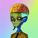
infinati
Infinati
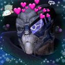
jackals-ships
Untitled
thevisualvamp
The Visual Vamp