#and i tried to make it look painterly
Text
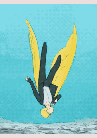
i am the emissary
and i shall never die
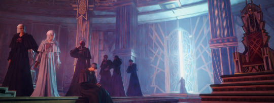
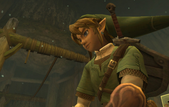
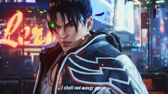
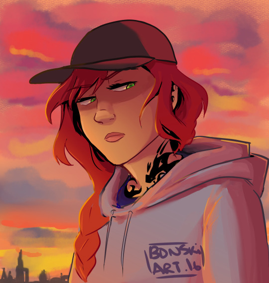
#ffxiv#ff14#elidibus#themis#venat#emet selch#lahabrea#hermes#i think the parallels between themis and venat are really interesting#their physical similarities and everything else#i really liked the new raids and new i had to make something with themis in this room it's honestly just an amazing space#i tried to capture the moments before the sundering#when the convocation resolved to sacrifice the life on the planet and venat stood up against them#the timeline is a bit mushy of course#especially after the flashback scene in ew#but eh creative liberties i guess#i wanted to capture a mix of grief and resolve#and i tried to make it look painterly#it's something i've been experimenting with but this is the first time i pulled it off in a way i like#click to see the full res version!#ffxiv 6.4 spoilers
734 notes
·
View notes
Text
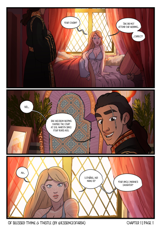
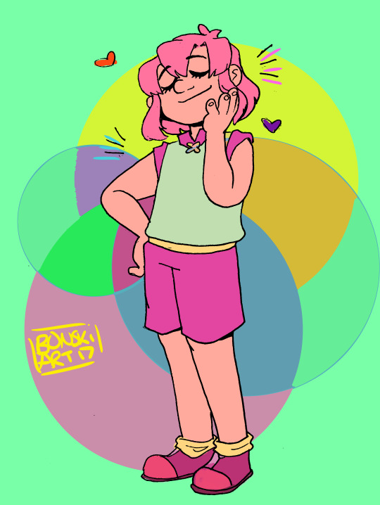
Of Blessed Thyme and Thistle - Chapter 1 | Page 1
Faramir's cousin, Lothiriel, comes to Minas Tirith to become a companion of his new bride, Eowyn, something that he hopes will ease Eowyn's rough transition into Gondorian Society. Eowyn, for her part, decides her new companion would in turn make the perfect bride for her brother Eomer, King of Rohan. Matchmaking shenanigans ensue 😏
Yayy I finished page 1!! I plan to do at least another page this weekend, but do let me know if you'd like me to continue!! I survive on encouragement 😆
Also yes i know i Know "Black" is the color of Sauron, shhh let's just pretend that now that Sauron is out of the picture Normal people can be goth or wear black without moral issues lol
#eowyn x faramir#faramir x eowyn#eowyn of rohan#faramir/eowyn#faramir#farawyn#eothiriel#eomer x lothiriel#eomer eadig#lothiriel of dol amroth#eomer/lothiriel#lotr#lord of the rings#tolkien fanart#lotr fanart#my art#Enjoyed making this! like i said i'm hoping to finish another page or two this weekend :)#also let me know if you don't mind this coloring/painterly style I'm doing here 🤔#It's... interesting but i think it fits the vibe and is certainly better looking than if I tried to detail everything with lineart...#let me know tho if you like this so far (i know it's only just begun) and whether you'd like me to continue!#I also plan to do another page of Romance in Rivendell this weekend if I can manage it#also for those curious those pale markings on Eowyn's arm neck and chest are scarring/marring--effects from fighting/defeatig the witch kin
187 notes
·
View notes
Text
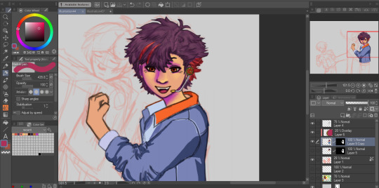
i gave up so hard
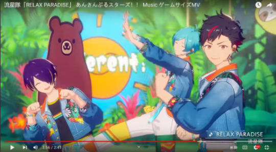
from this screencap from the relax paradise mv that i was immediately so obsessed with when i first watched. Theyre all so cutie. Kanata is so silly. Tetora
#tetora nagumo#my art#idk if like him w the color or not#i tried making like painterly bc i wanna learn to paint but it us so hard i just like DONT get it#but i will keep practicing.#there was a completely failed attempt to color him it looked so bad like he looked sickly and dead and scary#i like the lines alone tho#also i first started this sketch when the relax paradise mv came out#And accidentally abandoned them for so long
1 note
·
View note
Text
A Canary’s Final Flight
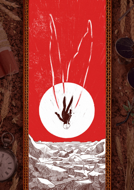
My piece for @trafficzine 4th edition! Get it for free here! 200 pages of excellent art and fics, incredible work from all participants and from the mods especially!! huge shoutout to the mods for real
Process notes under the cut! (I struggled a lot so it's a bit of a novel)
So the entire process was a Ride. I knew when I picked this prompt that I was going to have a hard time, because Jimmy’s final death had been illustrated a billion times over by extremely talented artists. But I had a Vision of the snapshot of the second before the impact, when everything is still but you know what’s about happen. It was very much inspired by the clip of Fog by Jabberwocky, bu the thing is, they have the advantage of all the build up of the fall, and that’s when the trouble started.

This was my first version, and obviously it wasn't working. And I was trying so hard, with so many iterations! Small wings, big wings, no wings, different poses, less backgrounds elements. I'd done compositions were everything seemed peaceful but something is Wrong, but it wasn't working this time.
So instead I focused on what rendering I'd like to do - I tried a painterly approach, for that visceral feeling, but it wasn't working either (but hey, I did keep the red sky, so, progress)
At this point I'd been doing back and forths for weeks and I was just as lost as at the start. Now that's my tip for people who make art of any kind, in situations like that, stop thinking about how you can make the best piece possible, and think about you can have fun with it (because when you aren't it's visible). And for that was, 1 - going back to using ink and pen nibs and doing way too detailed inking, and 2- looking at Dave McKean's covers for Sandman (which, funnily enough, was also a reference for my previous trafficzine piece)
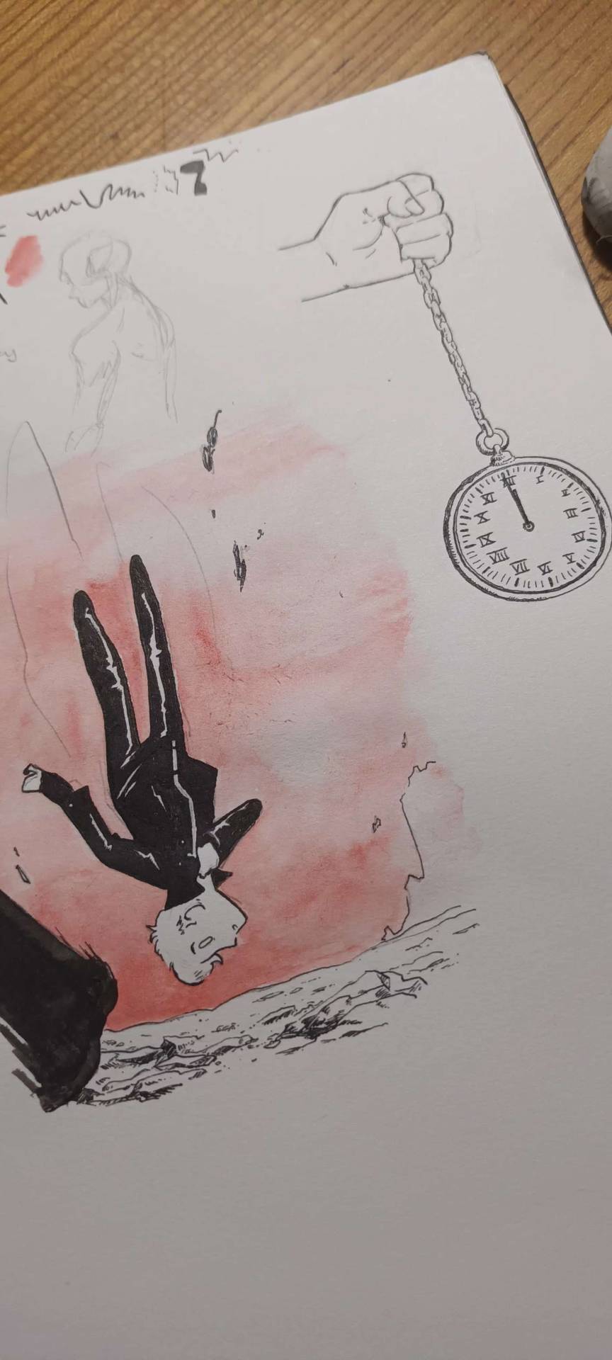
And from there I was actually going somewhere! Between the jagged rocks, the red sky, and the increased verticality with the borders, I had hit the vibes I wanted.
I did some experimentation with the border, and even though I really liked the bad boys I drew they were taking too much away from the lonely desolation, so I actually used Red (Unecessary Redstone)'s idea of all of Jimmy's worldy's possessions scattered on the ground post impact, with the idea to make it looks like the central image is his grave being dug.
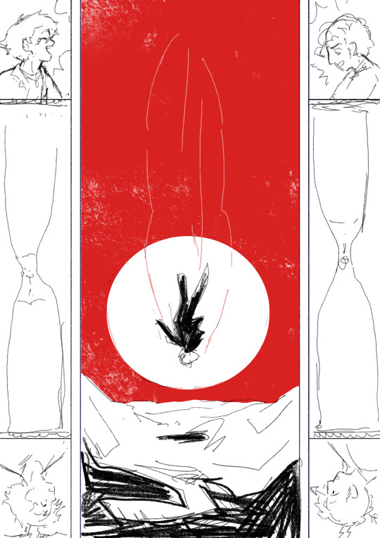
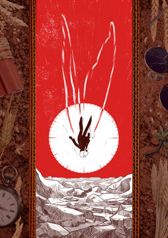
(and yes for a short amount of time the were supposed to be clock markings on the sun, but there was already enough going with the wings so I scrapped that) (also fun fact the reason why the wings aren't fully material but more ghostly is because my toddler cousin was watching me draw the very first draft and asked why he didn't just use his wings and i went :( so the wings are a metaphor now)
So from there I found a bunch of picture and took some myself, cut and assembled everything together, added shadows in all the appropriate places, and repainted some elements so that everything would look better intergrated (some of the wheats are basically 100% handpainted, the cardboard as well). This took a suprisingly long amount of time, but I was done!
Well I wasn't expecting to have that much to say, but I hope if you're still reading, it was at least interesting!
#trafficzine#limited life#limlife#limlife fanart#jimmy solidarity fanart#solidaritygaming#i forgot all the tags augh#curse of not posting often#mcyt fanart#mcyt#zine illustration#zines#my art
1K notes
·
View notes
Text
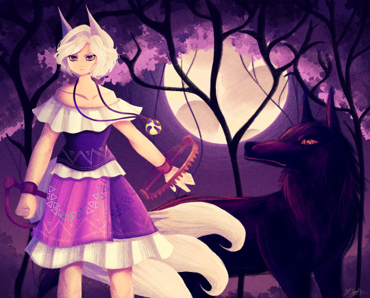
Ok the WIP I posted a little while ago is no loner a WIP yipeeeeeee I am so tired of looking at this drawing.
Artist's Notes:
THIS DRAWING IS FINALLY DONE YAAAAAAAAAAAAAAAAAAY!
Ok so this drawing was a WIP that I had had sitting around for a while, and so because I wanted to do a test run with the new face style I'm trying out, I decided to pick it back up again. Now you may notice that compared to the other version of the WIP, the shading is different, and that's because I had to change all of it to match the light source of the moon, which was.... not exactly fun (especially cuz I stayed up late at night to finish this which was tiring), but it was worth it because I am a lot happier with the shading now. Also, when I initially redid the shading on the white trim of her outfit, I ended up making them look like indiscreet white blobs that just looked... bad, so I had to fix that and I think it looks a lot better.
My favourite parts of this drawing have to be the face and the hair, though I'm not surprised about how much I like the hair since hair is my favourite thing to draw. Also the wolf, I really like how the wolf turned out, since I also love drawing animals from time to time. I also like how the background turned out.
Also, Enoko's design was a hit hard to get right, and I decided to add the white trim separating her shirt and skirt mainly because I didn't like how abruptly it changed in the original design. Also, for some reason her dress makes me think of 1800s-y southern/western clothes, which has given me the headcanon that Saki gave her these clothes when they first met. Makes me wanna draw the two of them together in very western styled clothes, I think it would be cute. I also changed up some of the colours on her original design to fit in more with the palette that I was going for with this piece. Also, I like how her tails turned out, mainly because when I was working on some of the sketch for this I tried to make them smaller, but they didn't look right so I just went "fuck it" and made them big and poofy. Also drawing her wolf ears was fun, I like drawing simplified wolf ears like that. Overall, I'd say I did a good job incorporating elements (like the bear trap hands, the tails, the gem) in a way that didn't feel like they were out of place in the piece (something I was concerned about with Enoko's design).
All in all, I wouldn't call this my best work, but I do like a lot of aspects of it. I've also noticed that I'm kinda getting a bit frustrated with certain parts of my style like the lighting (mainly the lighting), so I think I wanna try and branch back into that more painterly style that I started out with when I first started posting here while still mixing in some elements of my lineless style. Also, I need to get better with my colour values, mainly just for clarity since I kinda think that's where this drawing falls flat a little.
99 notes
·
View notes
Text
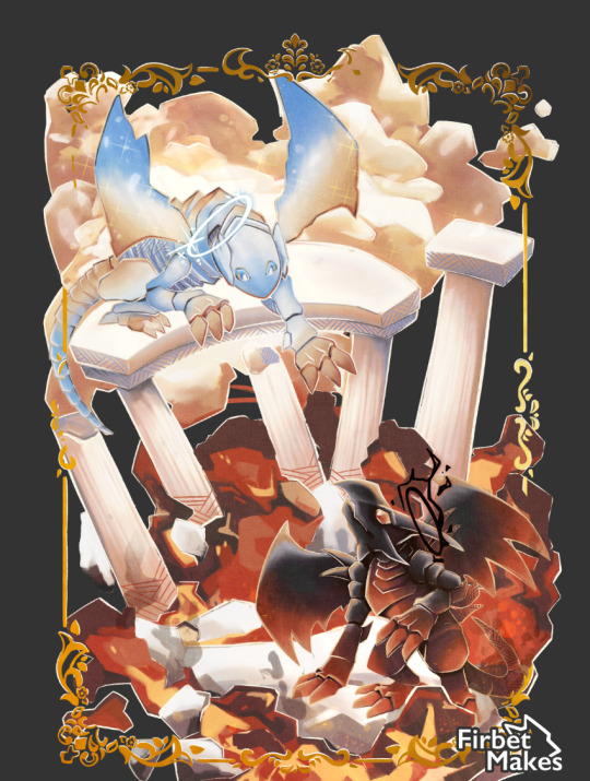
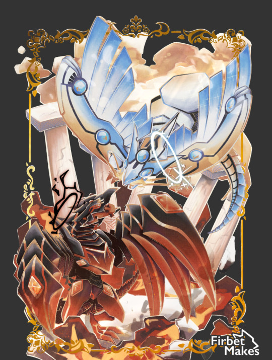
Twin Concepts, Conflicted Battle
I forgot to post this :0000. My standee piece for @aygozineproduction ‘s Dragon's Den zine!
I wanted to make a completely different style of illustration, focussing on a rococo painterly style. I tried out recreating that elegant battle feel so many classical paintings have (harder than it looks)
I love this piece alot, this zine was just a blast!!!!
#digital art#zine#ygo#blue eyes white dragon#red eyes black dragon#yugioh#dragon#fanzine#art#illustration#artists on tumblr#illustrator#bewd#rebd#seto kaiba#joey wheeler#ygo dm#fanart
70 notes
·
View notes
Text
was talking about it the other day but its sad how we are never going to get really big budget games w/ funky artstyles again. like if you look at the majority of big budget releases lately, they are all kind of going for the same thing as far as actual modeling goes- hi fi, super detailed complex models that try to portray as much detail as possible. which is fine for certain games, but it makes me miss the big swings devs used to take.
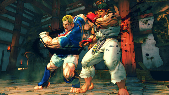
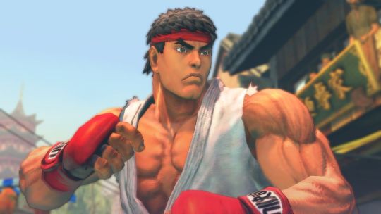
take street fighter 4 for instance- despite being over 10 years old at this point, it still looks REALLY good. great art direction, has a weird painterly look so everything has a cool watercolor style to it, models are expressive, etc. and this was a BIG release, its not some indie game (where most big stylistic swings tend to be made nowadays).
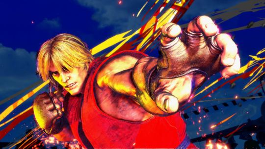
compared to street fighter 6, which is going for photorealism (with strong choices made as far as animation and color goes) it looks dated in the context of graphics generally, but looks WAY better than its contemporaries from the same time period. my fear is that street fighter 6 wont look that great in 10 years time.
side note, its also why street fighter 5 was really only loved by hardcore fans. it does nothing particularly well! its a halfway point between realistic and artistic to the point where it feels like a side-grade rather than an improvement or even its own original idea!

whatever leaps were made in lighting and texture quality are essentially irrelevant here. fucking gross!
the thing is, i dont think this is a deliberate choice that devs are making right now. from what i can tell, recent rendering tech has made it way easier to achieve a handful of lately- hi fi LIGHTING, increased TEXTURE DETAIL and HI POLY COUNTS come to mind. these are cool, but if youre a dev who wants to make a triple A product, you kind of have to use whatever tech is on the table to make a product look cutting edge. none of those encourage taking wild stabs at cool art directions. devs used to use those cool art directions because it was the ONLY OPTION THEY HAD.
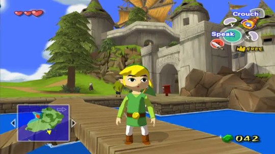
classic case being windwaker right. the gamecube was a huge graphical leap from the n64, where even getting a model to look like something was a challenge. compared to ocarina of time, windwaker looks absolutely fucking incredible. it got a lot of pushback at the time for being too kiddy, but really the strength of its style is a result of doing as much as they possibly could with the platform they were working on. no high poly counts, the shading tech was relatively simple, and the textures (while a huge improvement over the n64!) are still basic compared to what we have today. windwaker still looks impeccable to this day, and even the HD remaster they made which, ahaha, improved WHAT

LIGHTING and TEXTURE DETAIL. but without a real consideration for the original artstyle (or why it even existed... which was the gamecubes limitations) it just looks worse.
in response to this pushback (i think, idk i didnt work at nintendo at the time) they gave twilight princess a way more "realistic" look. but given the rendering restrictions of the time, it still has a fairly robust artstyle
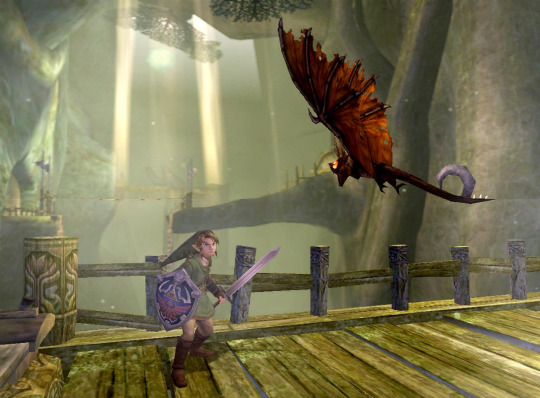
proportions are more realistic obviously, but in order to achieve that realism without the kind of lighting tech we have now the "lighting" is BUILT Into the textures. look at links sword, how it kind of darkens near the hilt, or how the shadow on the keese's wings is just kind of painted in specific areas. i would argue that twilight princess looks a LOT like street fighter 4 in that area-
damn! they almost look like theyre from the same game! but twilight princess was celebrated for being "realistic" while sf4 was noted for having a funky watercolor style (thats built into the focus attacks even!). its so so smart, because the devs knew they couldnt go for photorealism (like so many games of the era tried at and completely failed at!) so they went for a mix of cool stylistic decisions that allowed a game to look GOOD in a subjective, artistic way.
Not that games don't try and apply artistic principles now, but its a lot less unique. look at mario odyssey
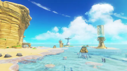
its just a beach. and it looks great, its well rendered, but its just a beach. colors are clearly intentional and very pretty, but it's nothin that special right now, probably will look even less special in 10 years even compared to levels in the same game.
what im curious about is when are we gonna get back to that kind of artstyle meets rendering tech! if ever! current tech makes it so devs are kind of forced to go down the same boring path. look at mortal kombat 1:
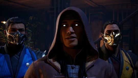
im sure there are some leaps in texture and lighting, but they keep taking shortcuts. all the faces are modeled after REAL peoples faces and they mocap for expressions/conversation, which gives a really boring look to it. the fact that mk11 and mk1 look so similar so many years apart (4 i guess isnt that much but there have been leaps!) is disappointing to me.
then you have tekken 8, which is like the best looking game ive ever seen. for a while i found it hard to put my finger on why, but my brother said something really smart i feel- they made all of these models by hand. theyre essentially digital statues. they didnt pull actual face models, they just worked on their features until it looked correct. on top of the lighting and texture work, it creates a look not unlike the renders tekken has been using for years. which is convenient for them, because they can finally match the kind of real-time fidelity they've been chasing for like 30 years

hell it looks BETTER than that. so what im trying to say is im hopeful that art direction will catch up with the kind of rendering tricks/strengths we have.
i think tekken 8 feels like how soul calibur 2 probably felt at launch. does a lot of the same things given the time period
i still think hi fi rendering doesnt make for a good looking game, but rather where the focus lies for the player. for tekken it makes sense that they would focus their horsepower on detailed models and stages- youre gonna be lookin at that forever. look at elden ring

texture wise, SUPER low res for 2022. maybe even 2020. but what they do with the horsepower is genius- they focus on scale to translate locations of objectives to a player while also reinforcing the feeling of adventure, on top of extremely strong choices in color and lighting. i hope, going forward, games focus on how they can use this kind of tech to reinforce a games "gameplay mission statement" while keeping strong artistic choices present rather than focusing on being able to wow someone with a couple of screenshots at the cost of BOTH of those things. im just ranting though french press got my ass
133 notes
·
View notes
Note
Since you're on the topic I have genuine question about AI art designs from a non-artist.
In your opinion would using an AI tool to generate a reference for a commission (whether it be for character design or pose) be an appropriate use of said tools?
I thought about this as well and I gotta say, personally I don't think so.
Barring for the purpose of this ask the whole "AI art is stolen art" thing (which I stand by fiercely), AI generated images are really janky, especially reference sheets. There are details everywhere that make no fucking sense, anatomy is deformed, they have a lot of nonsensical parts to them so its just one big jumble of nothing.
And, it's pulling from designs created by existing artists and warping them to fit your prompt. It's work that another artist already made, used by an AI that's trained on a specific dataset. It also pulls from popular things that people enjoy: tried and true color combos, the most popular shapes that big artists use, theres a LOT of waifus, and a lot of the art genuinely comes in the same painterly style that's really hard to color pick from. some even come with color swatches that don't match the colors on the reference
In short, it's just a machine generating something that looks neat at first glance, and then is actual hot garbage when you just... look at it closely. Not to mention that an AI prompt can be iterated, and the AI pulls from everything it has, for every prompt, so what you end up getting is completely samey designs with small changes. Good for concept art assistance, but not if you want to create a Legit Character. The AI will give you something that it has already spit out a thousand times over and then some, with no regards to composition, design technique, color theory, because all it knows is what it has been fed and what the artists its ripping off of know (meaning if they have mistakes, the AI will as well. But in a far less human way)
Meanwhile, when you commission someone you are likely to go for someone whos art style will actually fit what you want to get, or someone whos art style you enjoy. Usually these artists will be people you've followed for a while and you at least know them enough to know what they can do. And they are also reactive, you can tell them to actually change and tweak details of what they're making for you. And not taking into account the bad actors out there (as there are always bad actors in every discipline) you will have something that has been made specifically FOR you, not just what a machine thinks you would perceive as eye candy.
As for poses... just draw it badly in ms paint. The AI will not give you the pose you want for the aforementioned reason: broken anatomy (and also because it will pull from its dataset of poses it can warp features onto. It's a lot more limited than you think.)
If you want a pose prompt for a commission just draw it really badly in ms paint or on a napkin and write annotations for the artist (arm goes here, this guy is grabbing this thing, etc etc) Most of us if not all of us will GLADLY interpret your pose for you and draw whatever you want us to.
And like. Literally if you're going to get commissions anyway, why not commission a design first thing of all?? Or buy an adoptable from people who already make them by hand? It will genuinely be so much better than just hoping a machine does all the work for you. Please support artists
#ask#anon#AI literally destroys peoples livelyhood btw like just dont use it its really easy#artists get their styles stolen and sold off as things they didnt draw. voice actors get their voices stolen to say things they never said#we live in an actual fucking hellscape of generated content because it is not regulated and we NEED regulations because it gets sm worse#the best thing you can do with AI is just not fucking touch it at all. my final message goodbye
89 notes
·
View notes
Note
seeing all these visually awesome new animated movies coming out in the wake of spiderverse and wondering when dc will get on the bus. they could do such a cool bat animated movie or smth if they tried
U all need to check out Julienchery on twitter. I'm pretty sure he's making a short film, & so far all of his clips are divine. Just look
I love this animation renaissance. And amazingly, all these films that r inspired by spiderverse still have their own unique style. Spiderverse is like a comic, Puss n Boots is more painterly, & TMNT is sketchy & more stop motion.
So I love Julien's take on this. A older comic book style w it's use of detailed inky black shadows to suit the darker vibe of the bat.
194 notes
·
View notes
Text
Habismal In Different Colors
Plaintext: Habismal In Different Colors

[ ID: Fanart of Dr.Habit and Kamal Bora from Smile For Me the game in different color palletes. These versions are from my AU Roseverse.
The changes in the artists interpretation of the deisgns are as follows. Kamal has a lot of acne, eyebags and thick brows. His hair is has streaks of older age in it. Habit has a muppet-like appearance with fur, longer hair, cheek patches with a splash of freckles, stitches and scars on hands plus an X shaped one near his mouth. He has on lipstick. His long coat has a bush-like collar with feathery parts holding flowers.
To the top left, the first doodle is them locking lips in a sweet kiss, Kamals face towards Habits as Kamal puts his hands on Habits shoulders. Both their eyes close in bliss. The color pallete used is pink, rose, peach and salmon pink. The brush is thickly chalky. This pallete is written out over the doodle in loopy handwriting as " Bimbosophy".
To the bottom of it, is a doodle of Kamal stands and leans down, burying his nose in Habits bountious hair happily, running his hands through. Habit looks up and smiles cutely, his hands held below his chin. He is settled on the ground. The color pallete used is a pale sandy color, desaturated red, light grey, washed out oranges and a dark brown. The brush is textured with little thick lines all over the drawing, so that it almost looks like a blankets texture. This pallete is written out in fancy handwriting as " Lily Eater" with a heart on the I.
To the right, is a doodle of Habit dipping Kamal, grinning at him wildly while Kamal looks entranced in the gesture, smiling slightly with eyes going wide. Kamals shirt is going open. The color pallete used is very bright. It is bright pink, neon blue, a slightly more sky blue, bright lime, neon yellow. The brush used is painterly. There is a red and blue glitch effect making the coloring of the doodle look smudged. This pallete is written out in sharp letters as " Dream Toxic".
Finally on the top is a very simple doodle of Rose and Buddy, my sona-esque OC and my friends OC. Rose is a little dark-haired, glasses-wearing plant nymph based on a rose. He is a kid. Buddy is an anthromorphic cat person with long poofy hair. She is an adult. Rose sits down and weeps a single tear over " Why is drawing them kissing SO HARD". Buddy replies that " What matters is that you have fun, bro"
end ID]
--
Used pallettes from @color-palettes !!!! I had a blast making these!!! They look soooo good and beautiful, the colors
I also used different brushes :) ( smiley emote)
My friend said the bottom brown one reminded them of a grandma's blanket <3( cute smiley emote)
Also bringing back Habits very first Roseverse design, I'm OK with using it again..Kamal has been mostly brought back too.
I tried to just cut loose and draw with this...I half-suceeded!! Sometimes, I need to be less uptight about how I draw and just....have fun!!! I looked back through older drawings I'd been thinking "well it's nothing great" of in the past, but now when I look at them after a while, they look talented and elaborate, really unique to me, hehe. Art is truly magic.
#colourpod#my art#habismal#dr habit#kamal bora#eyestrain tw#color palletes#fanart#s4m#smile for me game#roseverse au
24 notes
·
View notes
Note
I really like your style. Was it intentionally designed, or did you just sort of fall into it over time?
I wouldnt say I intentionally designed it, as in I haven't sat down and Engineered a specific style, and instead it was more of me finding what I liked and wanted to incorporate into my style.
You could probably trace my style back to its influences. I used to draw really round shapes (I still do but like they were just ovals and circles...I guess i just like that shape) until I started watching How to Draw Anime tutorials in middleschool T-T (shoutout to Mark Crilley lol)
But when I first joined social media back in 2016, I found all these crazy artists with really unique styles that really influenced me. I was drawn towards artists like star_bite/prince_canary and rawrgyle/grassflu who have very dynamic expressions and character poses :0 (also they ended up working on a Batman and Superman project respectively and how wild is it that my icons from forever ago now work on projects aligned with my current interests!!!) And as you get exposed to different artists you get exposed to the many ways you can Draw things and along with your natural affinities towards certain things (such as me being attracted to Bright and Bold colors and Shaped styles) you kind of naturally build a style.
And part of that is also just having fun Trying things out? Sometimes I wouldnt even try to emulate their style as much as I tried to just...do what they were doing? As in making my ocs and putting them in fun poses, and doing color palette trends and such etc.
I hope that helped! If you're curious I can break down some of my style checkpoints over the years. As you can see there was still some major anime influence in my style back then when I first joined social media around 2015/2016
Around that time, I also discovered the fandom around the Cartoons popular at the time, so I drifted away from anime and drew things like gravity falls/steven universe/otgw etc etc so it got Rounder I guess. I really liked how stylized characters looked and got obsessed with Shape Language and assigning characters distinct Shapes (box vs triangle vs circle etc). I also read a lot of webcomics and stuff like that so those played a part I guess


And then around 2019 I saw more artists drawing anime fanart with really sharp angles, which was completely different but so cool to look at so I tried to incorporate more angles into my art. I still had that very cartoony style but tried to push the Sharpness a tad bit more if you can tell. (I think the name of the artist I liked was jeluto?)


I think around this time I also focused a lot more on color as well and did a lot of paintings then and whenever I did more Painterly stuff I tended to switch Styles into something Less Cartoony T-T

Then by 2020, I revamped my ocs, actually tried to break down and study my own style and how I would draw them, and my style kinda fell into a mix of round vs sharp edges I guess. I tried to give myself Rules which I would follow when stylizing a character to keep it more consistent and intentional.


Then in 2021 some of that Fun Part of stylizing characters into something more Cartoony kind of took a backseat as I focused more on Pose Work and Body Expression instead which I think helped a lot :0

And here's some recent stuff from the past year! Still very cartoony, but less so than 2016 I'd say, and still using really bold colors!! Still love my Soft Vs Hard angles B]
And overall have stronger pose work :) I'm sure my style will evolve as I learn more and experiment more, because one thing I want to focus on is backgrounds and environments :0


60 notes
·
View notes
Photo


my attempt with what I have available to me to try and make a spiderverse style character concept bust/portrait. I can’t replicate the style no matter how hard I try (I do get close tho, but it never really looks right to me). I can’t really do painterly styles, it’s not my thing, but I tried!!! There was an attempt here!!
This is a self portrait nonetheless!!
#my art#phone art#spidersona#spiderverse#not entirely happy with it but that's ok. I do prefer that other one. that fake screenshot image I made last year. I like that one way more
80 notes
·
View notes
Text


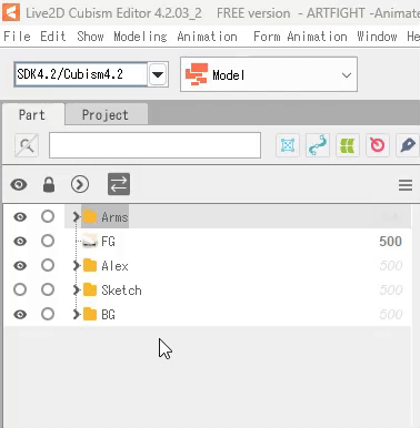
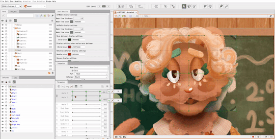
EEE thank you @l3o-lion !! To answer your question, most of the animations I post on here are tweening, specifically with Live2D.
I like using it for gentle looping animations & backdrops. (Character animations are a whole different beast? I usually only keep them to a couple functions like 'HandMove' or 'HairGoWoosh'" but this is the VTuber-making software so it's totally possible to make more complex characters. )
I made a tutorial for how I animate with L2D below the cut, if you'd like to see the details! :D
This is the file for that Artfight attack. (quick disclaimer for anyone reading out of context: THIS IS NOT MY CHARACTER DESIGN, they belong to Finchstick over on Artfight!)
I drew the image itself in Krita - for this one I tried to go for more of a fuzzy, painterly style because I wanted to make it look like a muppet. L2D can handle fuzzy textures and gradients without too much trouble most of the time which is something I really like about animating with it.
______________
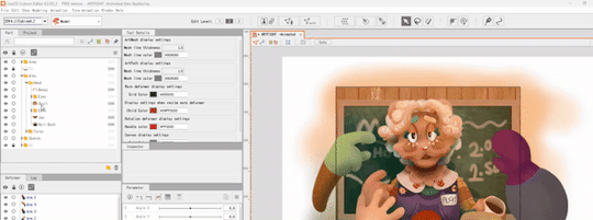
So! Each different moving piece has to be its own layer. Naming and organizing them into folders helps a lot once I export it into L2D. The finished image needs to be saved as a .PSD file.
After it's done, I'll open the .PSD file in L2D and it'll look something like this:

Once the file is open I find the moving pieces of my character and select them. (I also lock the static layers before doing anything )
_______ M E S H E S ________
Once I have my piece selected, I open the automatic mesh generator ( located above the image, to the left ) and automatic mesh it.

(Keep the mesh generator window open and select / apply mesh to each moving object.)
______ D E F O R M E R S _______
Once the pieces have a mesh on them I apply warp deformers for each part. (I try to apply the deformer for each body part to the largest piece making up that part. For example, the part being used for the head deformer here is the upper part of the head.)
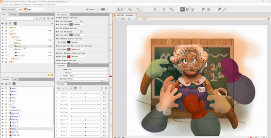
Each part of the face also gets a deformer - each eye, the mouth, etc - and those get shoved into the parent "head" warp deformer.
The deformers allow for parts of the face to move with the head, but they also allow for you to set more parameters per part and make your model look more dynamic. (There's a 3 parameter limit in the free version but if I need to make another parameter work I'll just brute force it and make a 'head deformer deformer' etc)
_____ P A R A M E T E R S ______
Once the deformers are set up, I start setting the parameters.
The program opens with these default parameters which are all intended for rigging a face, you can make your own custom parameters at the bottom of the window.
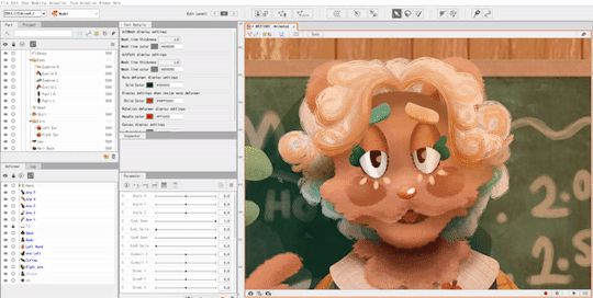
As for the green dots here, they represent points of extremes on the parameter! You can change what these are by moving the slider over the green dot, and moving the mesh on the selected object.
This can be a bit tedious, but it's fun to watch the model look more alive the more parameters you finish.
______ A N I M A T I N G _______
After I save my model as a .CMO3 file I open a new animation file in L2D, and drag and drop the .CMO3 into the window.

The model shows up much larger than the window. You can resize the window in the bottom left, (third and fourth fields from the top,) and shrink the model to fit inside.
(The free version has a limitation on how big your image can be in order to be exported. It usually takes me a bit of trial and error to get the right size for the image.)
The window below your image shows your tracks. You can have multiple models per animation, I usually just use one. The purple track represents the model while the orange represents the duration of the animation.
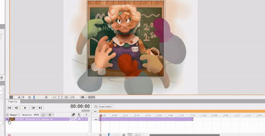
With that out of the way, it's time to set the keyframes! Under the purple model track there's a green drop-down window called 'Live2D Parameters'. Here, you can adjust your parameters in order to move your model to the right position.
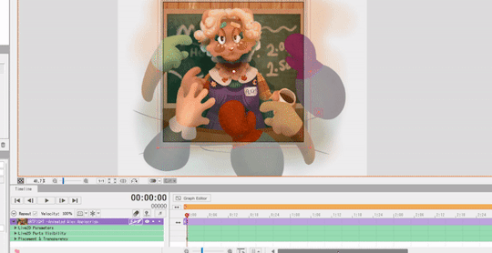
(In order to make a looping animation, you can copy all parameter values in the first keyframe by left RIGHT clicking the dot on the green Parameters track, and then paste them to the last rendered keyframe.)
I adjust the parameters and keyframes until I feel satisfied with the result. Once I'm done, I just go to File > Export Image/Video > GIF animation or Video.
I make sure my image is sized correctly, and save! And that's about it. ( For this specific animation I also put some effects over it in Clipchamp. )
18 notes
·
View notes
Note
What are your main inspirations for your art style? Like, how did it become how it is today?
Asking because I love it so much!
oh boy!!
i'll definitely say that kim jung gi's work has inspired if not directly influenced my artstyle (lineart wise that is), then we have denis sarahzin and aleksander brodziński and perhaps a bit of leyendecker and loish - i feel like my rendering style was inspired in some ways and to varying degrees by theirs, in addition to me wanting to evoke either a traditional marker look or a soft painterly feel in some of my pieces. i also have to mention kienan lafferty's rendering style here, too! i spent a lot of time studying the way he paints when i was new to digital painting!!
however, it's a bit hard to pinpoint exactly every artstyle ever that has affected my own, because during my teenage years especially, my art style changed frequently and drastically whenever i saw cool art™ and tried to incorporate elements of it into my own... lately though i feel like i started trying to reach a balance between what feels natural/comfortable to draw while also making it look appealing AND experimenting a little! :)
thank you for the ask and much much love!! 💕
#ask#faq#i hope this makes sense HJHKADAAdDAGJK#when it comes to artstyles my stance is to genuinely fuck around and find out what works for you best
23 notes
·
View notes
Note
Your shading is definitely the most unique and best part of your art imo. I’ve been trying to word what the style reminds me of in terms of adjectives and I can’t really come up with any that feel like they perfectly encapsulate your art. Glossy, luminous, saturated/vibrant, and shimmery are all sorta accurate. Then it kind of hit me. It reminds me of technicolor??? Ok it’s not an adjective and maybe I’m crazy but that’s like the vibe to me. That being said what are the adjectives that you feel best describe your art
Hello!!! This was such a great read!!! Seeing someone really dig deep into my style and really analyzing it really means a lot to me!! I really like your technicolor comment, I really try to make any art I make as vibrant as I can! When I first started out with digital, all my colors were really washed out and muddy 🥲 so I tried my best to work on that!!
I’m also glad you like my shading ^^ I try my best to be able to convey textures as realistically as I can!! Metals, clothes, fabrics, skin, etc. being able to render those both quickly and as accurate to reality as I can is what I strive for in my art!
As for adjectives I’d use, I’d say that my art can be very quick and messy, as in if you’d look real close there’s things here and there that show that I didn’t really go too in depth with details but I put enough down for others to fill in the blanks! I’d also say my work is a bit painterly, as I don’t try to smooth out brush strokes or any obvious marks!
#asks#thank you for the wonderful analysis!!!#seeing that you care enough about my work to look into it#it makes me really happy!!!
15 notes
·
View notes
Note
How do you get that painterly texture on some of your work?? Like the one w Viktor from arcane where he’s holding the shimmer
On the Viktor piece you mentioned, I got the painterly look by using "Rebelle 5", which is an art software that has tools that specifically tries to mimic traditional art mediums. I honestly don't really recommend the software, especially to people who are just starting out, but I bought it a while back when it was on sale, so... might as well use it, right?
You can still get your art to look like an oil painting by using overlay layers and such, but that heavy-paint sorta look really isn't achievable unless your art software has tools that can create that effect. I would absolutely love to make a tutorial video or something like that in the future to really show how I do it though, so thank you for the inspiration! 😊
#thank you so much for asking too!#there are other art softwares out there that can create the same effect I'm pretty sure#but I'm so used to using Clip Studio Paint that I don't really feel like switching#-or even look for other softwares to use instead#if you're using CSP and are looking for great painterly brushes though' I recommend DAUB brushes!
31 notes
·
View notes
Last Seen Blogs
lufega25
Sin título
s-hhs-sw
college studyblr
fbatcat
the rot consumes

theescape5-blog
The Escape

derbe111138
Unbetitelt